INTERIORS
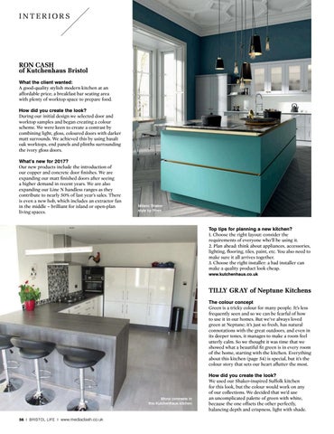
RON CASH of Kutchenhaus Bristol What the client wanted: A good-quality stylish modern kitchen at an affordable price; a breakfast bar seating area with plenty of worktop space to prepare food. How did you create the look? During our initial design we selected door and worktop samples and began creating a colour scheme. We were keen to create a contrast by combining light, gloss, coloured doors with darker matt surrounds. We achieved this by using basalt oak worktops, end panels and plinths surrounding the ivory gloss doors. What’s new for 2017? Our new products include the introduction of our copper and concrete door finishes. We are expanding our matt finished doors after seeing a higher demand in recent years. We are also expanding our Line N handless ranges as they contribute to nearly 50% of last year’s sales. There is even a new hob, which includes an extractor fan in the middle – brilliant for island or open-plan living spaces.
Milano Shaker style by Wren
Top tips for planning a new kitchen? 1. Choose the right layout: consider the requirements of everyone who’ll be using it. 2. Plan ahead: think about appliances, accessories, lighting, flooring, tiles, paint, etc. You also need to make sure it all arrives together. 3. Choose the right installer: a bad installer can make a quality product look cheap. www.kutchenhaus.co.uk
TILLY GRAY of Neptune Kitchens The colour concept Green is a tricky colour for many people. It’s less frequently seen and so we can be fearful of how to use it in our homes. But we’ve always loved green at Neptune; it’s just so fresh, has natural connotations with the great outdoors, and even in its deeper tones, it manages to make a room feel utterly calm. So we thought it was time that we showed what a beautiful fit green is in every room of the home, starting with the kitchen. Everything about this kitchen (page 54) is special, but it’s the colour story that sets our heart aflutter the most.
Mono contrasts in this Kutchenhaus kitchen
56 I BRISTOL LIFE I www.mediaclash.co.uk
How did you create the look? We used our Shaker-inspired Suffolk kitchen for this look, but the colour would work on any of our collections. We decided that we’d use an uncomplicated palette of green with white, because the one offsets the other perfectly, balancing depth and crispness, light with shade.