FOCUS
Scenographic Fashion Shows
Alfonso Cuaron’s Cinematography and the Mexican Culture
The Art of Capital
Art, Politics and Maurizio Cattelan
What Matters in Contemporary Art?
Visual Environment Interventions
Indian and South Asian Aesthetics
Volume 1 | Issue 1 | March 2019 artstyle.international
Associate
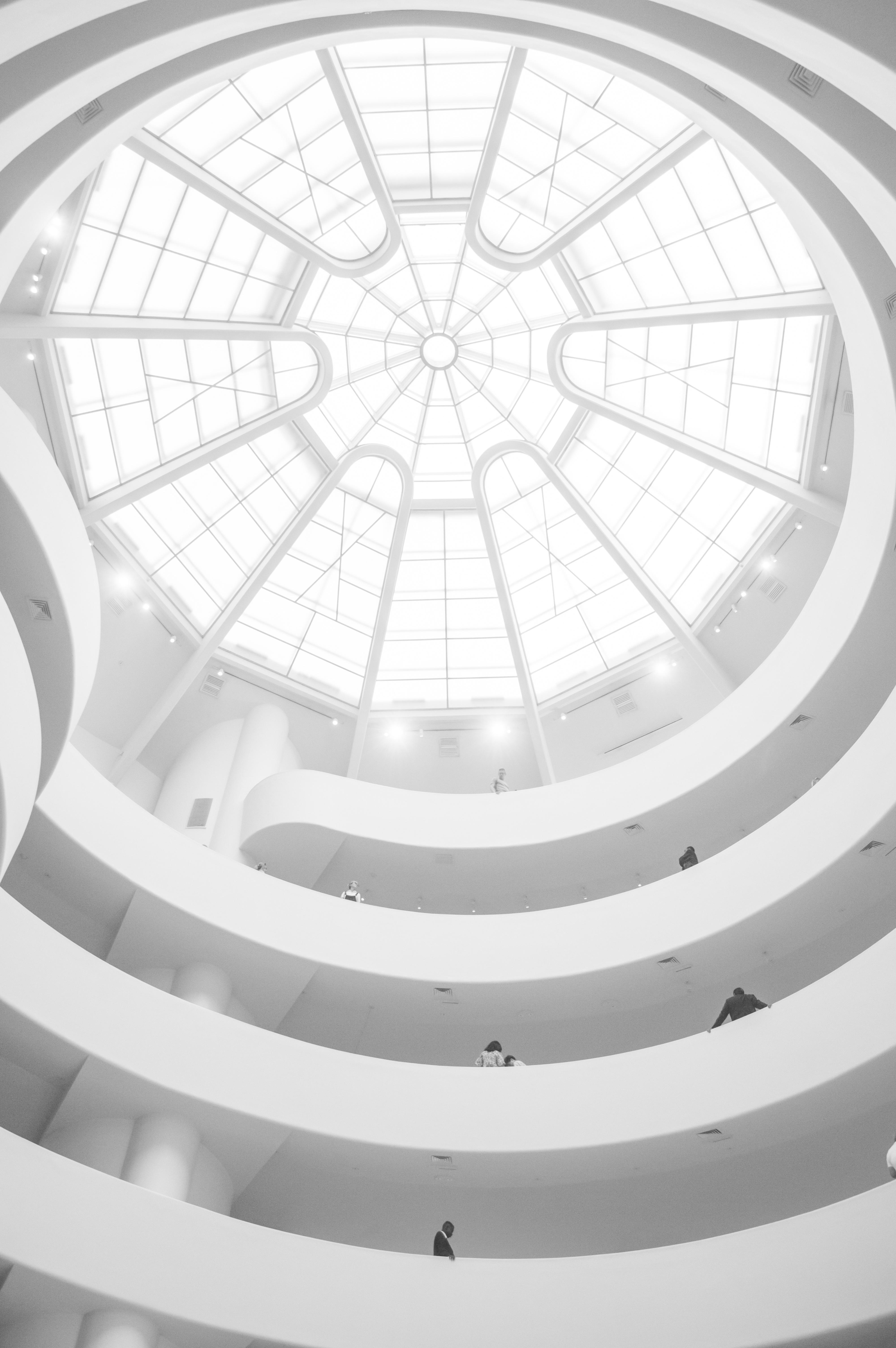
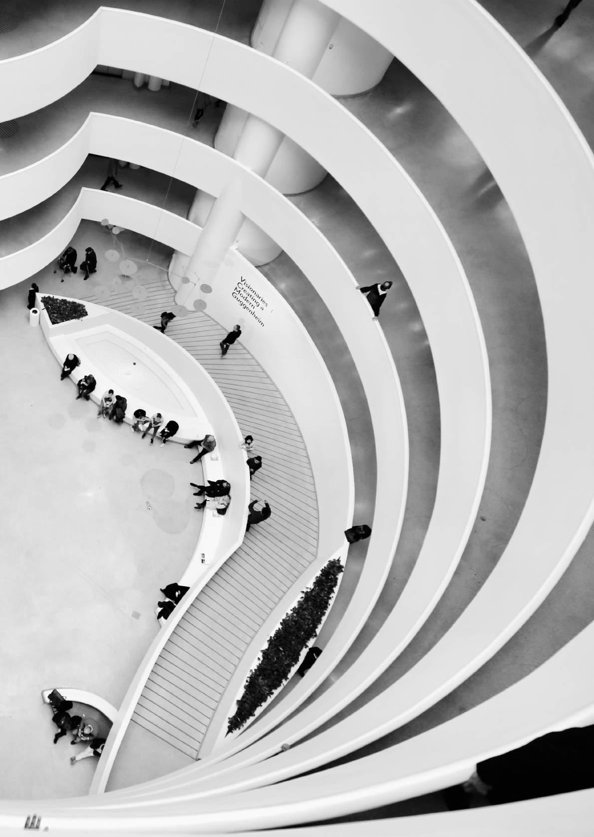
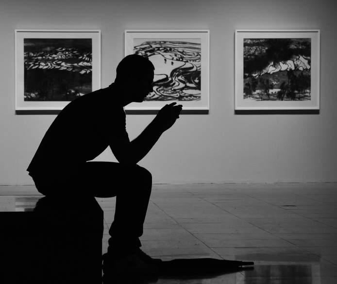
 Cover photo by Drew Patrick Miller
Solomon R. Guggenheim Museum, New York Design by Art Style Communication & Editions
Denise Meyer
Editor in Chief and Creative Director
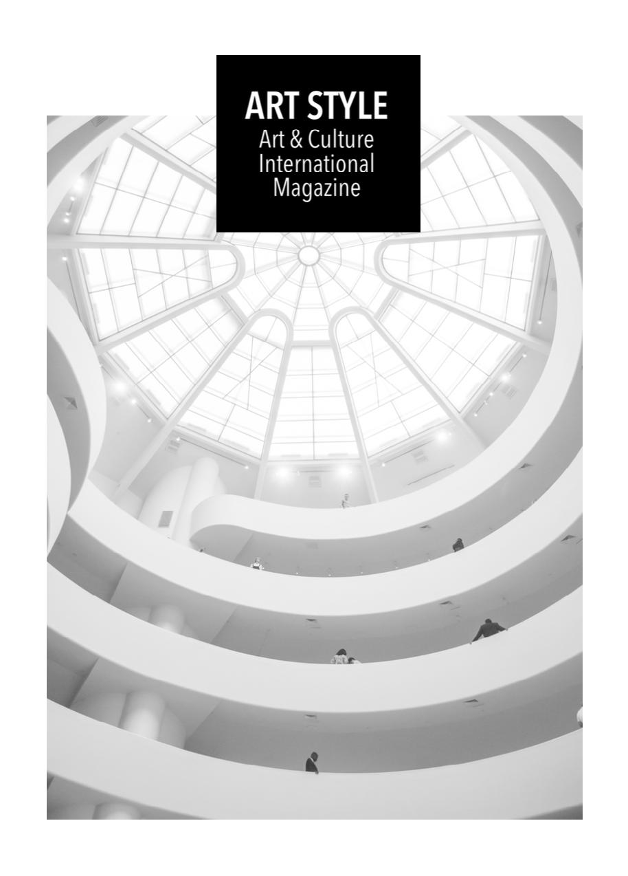
Cover photo by Drew Patrick Miller
Solomon R. Guggenheim Museum, New York Design by Art Style Communication & Editions
Denise Meyer
Editor in Chief and Creative Director
Christiane Wagner
Editors
Lambert Art Style | Art & Culture International Magazine editorial@artstyle.international +1 347 352 8564 New York +55 11 3230 6423 São Paulo
Laurence Larochelle Martina Sauer Collaborator Marjorie
Art Style | Art & Culture International Magazine is an online, quarterly magazine that aims to bundle cultural diversity. All values of cultures are shown in their varieties of art. Beyond the importance of the medium, form, and context in which art takes its characteristics, we also consider the significance of socio-cultural and market influence. Thus, there are different forms of visual expression and perception through the media and environment. The images relate to the cultural changes and their time-space significance the spirit of the time. Hence, it is not only about the image itself and its description but rather its effects on culture, in which reciprocity is involved. For example, a variety of visual narratives like movies, TV shows, videos, performances, media, digital arts, visual technologies and video game as part of the video’s story, communications design, and also, drawing, painting, photography, dance, theater, literature, sculpture, architecture and design are discussed in their visual significance as well as in synchronization with music in daily interactions. Moreover, this magazine handles images and sounds concerning the meaning in culture due to the influence of ideologies, trends, or functions for informational purposes as forms of communication beyond the significance of art and its issues related to the socio-cultural and political context. However, the significance of art and all kinds of aesthetic experiences represent a transformation for our nature as human beings. In general, questions concerning the meaning of art are frequently linked to the process of perception and imagination. This process can be understood as an aesthetic experience in art, media, and fields such as motion pictures, music, and many other creative works and events that contribute to one’s knowledge, opinions, or skills. Accordingly, examining the digital technologies, motion picture, sound recording, broadcasting industries, and its social impact, Art Style Magazine focuses on the myriad meanings of art to become aware of their effects on culture as well as their communication dynamics.
The Art Style Magazine’s Scientific Committee
Dominique Berthet is a University Professor, he teaches aesthetics and art criticism at the University of the French Antilles (UA). Founder and head of CEREAP (Center for Studies and Research in Aesthetic and Plastic Arts). Founder and director of the magazine Recherches en Esthétique (Research in Aesthetics). Member of CRILLASH (Center for Interdisciplinary Research in Literature, Languages, Arts, and Humanities, EA 4095). Associate Researcher at ACTE Institute (Université Paris 1 Panthéon-Sorbonne). Art critic, member of AICA-France (International Association of Art Critics). Exhibition curator. His research focuses on contemporary and comparative aesthetics, contemporary art, Caribbean art, and Surrealism. He has directed more than 50 volumes, published more than 110 articles and ten books among which: Hélénon, “Lieux de peinture” (Monograph), (preface Édouard Glissant) HC Éditions, 2006; André Breton, l’éloge de la rencontre Antilles, Amérique, Océanie HC Éditions, 2008; Ernest Breleur (Monograph ) HC Éditions, 2008; Pour une critique d’art engage L’Harmattan, 2013.
Lars C. Grabbe, Dr. phil., is Professor for Theory of Perception, Communication and Media at the MSD – Münster School of Design at the University of Applied Sciences Münster (Germany) He is managing editor of the Yearbook of Moving Image Studies (YoMIS) and the book series “Bewegtbilder/Moving Images” of the publishing house Büchner-Verlag, founder member of the Image Science Colloquium at the Christian-Albrechts-University in Kiel (Germany) as well as the Research Group Moving Image Science Kiel|Münster (Germany). He is working as scientific advisor and extended board member for the German Society for Interdisciplinary Image Science (GiB). Furthermore, he is a member of the International Society for Intermedial Studies, the German Society for Semiotics (DGS) and the German Society for Media Studies (GfM). His research focus lies in phenosemiotics, media theory, and media philosophy, image science, perception studies and psychology of perception, communication theory, aesthetics, semiotics, film studies and history of media as well as theory of embodiment and cognition.
Marc Jimenez is a professor emeritus of aesthetics at University Paris 1 Panthéon-Sorbonne, where he taught aesthetics and sciences of art. With a PhD in literature and a PhD in philosophy, he translated from German into French T.W. Adorno’s Aesthetics, August Wilhelm Schlegel’s philosophical Doctrines of Art, and Peter Bürger’s Prose of the Modern Age. Since 1986, when he succeeded Mikel Dufrenne, he directed the aesthetics collection Klincksieck Editions Collection d'Esthétique, Les Belles Lettres. He is a specialist in contemporary German philosophy, and his work contributed, in the early 1970s, to research on Critical Theory and the Frankfurt School. He is also a member of the International Association of Art Critics, participates in many conferences in France and abroad, and has been a regular contributor to art magazines. Recent publications: La querelle de l'art contemporain (Gallimard, 2005), Fragments pour un discours esthétique. Entretiens avec Dominique Berthet (Klincksieck, 2014), Art et technosciences. Bioart, neuroesthétique (Klincksieck, 2016), Rien qu'un fou, rien qu'un poète. Une lecture des derniers poèmes de Nietzsche (encre marine, 2016).
4
Omar Cerrillo Garnica is a Mexican professor and researcher, member of the National System of Researchers (SNI), Level 1. He is Ph.D. in Social and Political Sciences and a Master in Sociology at Universidad Iberoamericana, both times graduated with honors. He also made a post-doctoral research at the Autonomous University of the State of Morelos, where he searched about digital communication involved in social movements. Now, he is Director of Humanities at Instituto Tecnológico de Monterrey, Campus Cuernavaca. He is author and coordinator of the book Cardinales Musicales, Music for Loving Mexico, published by Tec de Monterrey and Plaza & Valdés. He is specialist in social and political analysis of art, music and culture; subjects throughout he participated in national and international academic events with further paper publications in Mexico, Chile, Argentina, Brazil and France. In recent years, he has specialized on digital media and its cultural and political uses.
Pamela C. Scorzin is an art, design and media theorist, and Professor of Art History and Visual Culture Studies at Dortmund University of Applied Sciences and Arts, Department of Design (Germany). Born 1965 in Vicenza (Italy), she studied European Art History, Philosophy, English and American Literatures, and History in Stuttgart and Heidelberg (Germany), obtaining her M.A. in 1992 and her Ph.D. in 1994. She was an assistant professor in the Department of Architecture at Darmstadt University of Technology from 1995 to 2000. After completing her habilitation in the history and theory of modern art there in 2001, she was a visiting professor in Art History, Media and Visual Culture Studies in Siegen, Stuttgart, and Frankfurt am Main. Since 2005, she is a member of the German section of AICA. She has published (in German, English, French and Polish) on art-historical as well as cultural-historical topics from the seventeenth to the twenty-first century. She lives and works in Dortmund, Milan and Los Angeles.
Waldenyr Caldas is a full professor in Sociology of Communication and Culture at the University São Paulo. He was a visiting professor at University La Sapienza di Roma and the Joseph Fourier University in Grenoble, France. Professor Caldas has been a professor since 1986 as well as the vice-director (1997-2001) and Director (2001-2005) of ECA - School of Communications and Arts, University of São Paulo. In his academic career, he obtained all academic titles until the highest level as a full professor at the University of São Paulo. Currently, he is a representative of the University of São Paulo, together with the Franco-Brazilian Committee of the Agreement “Lévi-Strauss Chairs,” and a member of the International Relations Committee of the University of São Paulo. He is also associate editor of the Culture Magazine of the University of São Paulo. Its scientific production records many books published and several essays published in magazines and national and international collections.
5
Content
Editor’s Note
Essays
Theatre of Fashion: Scenographic Fashion Shows as Theatrical Practice in Design
by Pamela C. Scorzin
Roma: a Portrait of Mexican Segregational Society by Omar
Cerrillo Garnica
The Art of Capital by
Waldenyr Caldas
To What Extent can Maurizio Cattelan be Considered a Political Artist? by
Margherita Medri
What Matters in Contemporary Art? A Brief Statement on the Analysis and Evaluation of Works of Art
by Christiane Wagner
Visual Environment Interventions by
Ewely Branco Sandrin
A Study of Art and Architecture of Avudayar Kovil Temple of Pudukkottai District, Tamil Nadu by Dr.
S. Udayakumar
Revisiting the Time of Yoginīs V S Sruthi
Geoffrey Bawa: A Legend in Tropical Modernism by Jordan Wright
Information Submission
Peer-Review Process
Author Guidelines
Terms & Conditions
11 25
101 119 131 155
37 49 69 85
Editor’s Note
Dear readers,
Welcome to the first edition of Art Style Magazine. This magazine is open to the public and contributes to the knowledge and information of arts and culture. In this inaugural edition, the arts are addressed in several essays; their varied contents consider sociopolitical dynamics and cultural diversity. The focus is innovation through a constant transgression with the ancient rules of imitation of nature which held the beauty ideal that is, Fine Art in the Academies. Today, however, the arts have become increasingly close to aesthetic freedom. There are no more comparisons between the distinct features of each art, which does not seem to hold any common goal of an abstract beauty ideal. This ideal is far from everyday life. The main feature is the art of each artist in his or her creative freedom and motivation. And in spite of the dissolution of the fine arts, the arts have always been connected by their functions, forms, and contents aiming for a masterpiece, the possibility of the “total art” or the evolution of each art separately, and by the similarities of the processes of creation, which have always been the object of artistic theories and themes.
In the 1950s, Theodor Adorno supported the convergence of the arts as a fundamental form of modern art, unlike the later ideas of Clement Greenberg, who advocated purism in art. We know, however, that there are limits in the processes and techniques proper to each art. But artistic achievement has developed new ways of techniques, specific to each art, and has counted so far with the talent of the artist in his or her art. Not just in one art, but in other arts as well. The artist either develops one or the other masterfully. Moreover, the relation of the arts to cultural transformations and the development of science and technology should be considered. Nevertheless, the convergence of the arts the idea of a total art or "total work of art"(Gesamtkunstwerk) is not something current, and it is an aesthetic concept associated with German composer Richard Wagner. This composer was also a playwright, critic, theorist, and orchestra leader, concretizing his idea of a total work of art where all arts were merged into one unit in Der Ring des Nibelungen (The Ring of the Nibelung)
In this sense, this edition highlights the essay about Scenographic Fashion Shows by Professor Pamela C. Scorzin of the FH Dortmund University of Applied Sciences and Arts, which deals precisely with the relation of different artistic practices. A collaboration of practices of design, theater, music, and the visual arts meeting a great event, typical of our era that is, in the way of a “total work of art.” Another essay highlights the award-winning Mexican film Roma in all the aspects of artistic creation related to its sociocultural meaning, written by Mexican professor Omar Cerrillo Garnica. However, in a general way, all arts should be systematically guided by the "art of capital," as Professor Caldas explains in his essay. Other notions highlighted exemplify the striking activities of art concerning politics, such as the essay on Maurizio Cattelan's artwork by Margherita Medri. Therefore, searching for a more accurate interpretation of contemporary art, I present A Brief Statement on the Analysis and Evaluation of Works of Art. Furthermore, included is Visual Environment Interventions by Ewely Branco Sandrin, as well as Indian and South Asian Aesthetics with Udaya Kumar, Sruthi, and Jordan Wright, completing this first edition of Art Style Magazine.
Enjoy your reading!
Dr. Christiane Wagner Editor in Chief
Theatre of Fashion: Scenographic Fashion Shows as Theatrical Practice in Design
Pamela C. Scorzin
Abstract
Contemporary fashion design is increasingly taking to the stage – in the figurative sense, but also quite literally. Scenographic practices, familiar to us until now only from the theatre, the concert stage and the opera, today are progressively turning up in the conquest of consumption’s commercial spaces. However, here, too, “scenography” does not just mean creating a visual background, a pretty décor or striking set design for the presentation space and the staging of fashion and brands. In the contemporary fashion context, scenography is much more of an aesthetic activity that weaves together individual creative cross-media practices in a transdisciplinary holistic work of art that speaks to the totality of audience senses and, via the bodily sensations induced, conveys a certain type of knowledge. Simultaneously, the scenographic practice in the design process induces a shift in the audience’s focus to the overall atmospheric staging from the commercial promotion of the individual designer collection. In an engaging manner, here the scenographer’s art and story-telling generate for seasonal fashion an emotionalising spectacle that, though transient and fast-paced, nevertheless through its unique imagery lays claim to and promises a universal, enduring substance like the arts do. It furnishes a device for generating significance by touching off sensory experiences and triggering emotions. Thus, in today’s theatre of fashion, all are becoming equally entitled actors and performing cast members: from the stylish product to the choice of the model presenting it, to the choice of real location and participating audience that instantly plays live via smartphone on the relevant social media platforms and in the virtual Internet space.
Art Style | Art & Culture International Magazine 11
In this, the scenographic fashion show1 forms, in the sense of Bruno Latour’s ANT,2 a unique stage production event from the creative and processual collaboration of human and non-human protagonists. This notion follows Latour’s idea that both the materiality and nature of all scenographic components must be considered and also that material artifacts always substantially contribute to dramatic action. At times, however, beyond the performative holistic staging of fashion, the scenographic event today attracts more attention, interest, and resonance than a fashion designer’s seasonal collection alone. In this sense, scenographic fashion shows are magical mises en scène, which, through reception and/or participation, give rise to (bodily) sensations and emotions and let the audience dream along. In the nexus of commercialism and creativity, they are “ a theatrical expression of the brand’s seasonal vision, to evoke a sense of wonderment, inspiration and creativity, enchantment.”3
Art Style | Art & Culture International Magazine 12
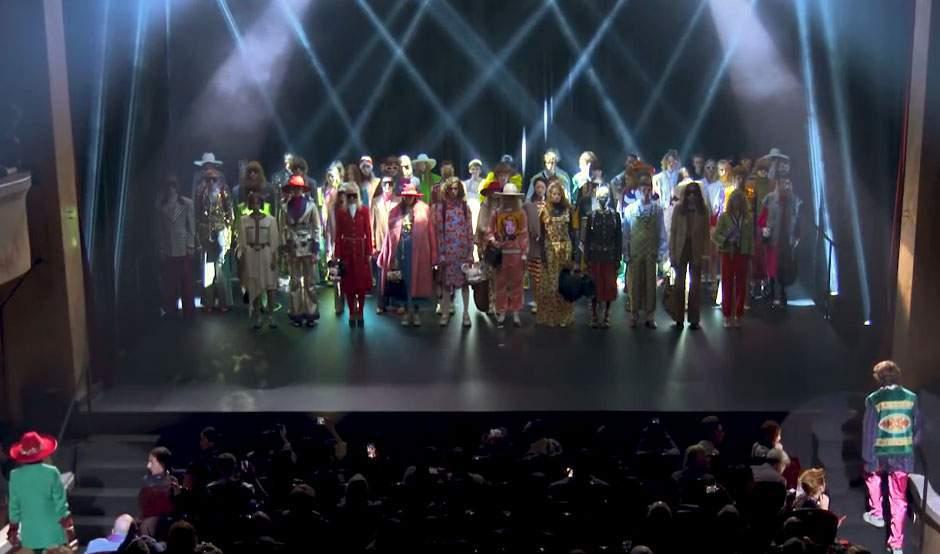
Figure 1: GUCCI Spring/ Summer 2019 Fashion Show at the Le Palace Theatre in Paris © GUCCI
Fashion going on stage
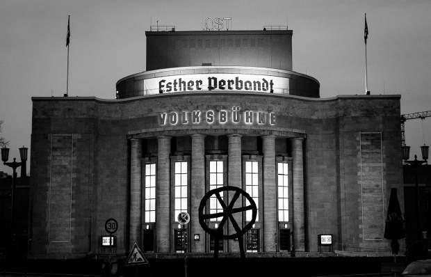
During Berlin Fashion Week 2016 the German fashion designer Esther Perbandt, also based in Berlin, repeatedly used the renowned Volksbühne on Rosa Luxemburg Square as the setting for debuting her latest unisex collections 4 (Fig. 2), most recently with an existing stage set by Bert Neumann, while her Belgian colleague Dries van Noten took over the great stage of the world-famous Opéra Garnier for his current designs and Alessandro Michele let debut the Gucci Spring/ Summer 2019 collection at Paris’s legendary Le Palace theatre (Fig. 1) In this way, the distinctly modern separation between fashion design, art, music, theatre, and spectacle today is rapidly fading away. Both these instances are not just somehow about the special creation of costume design for stagings of the repertoire, for which the French couturiers Christian Lacroix 5 , Jean-Paul Gaultier6 or Iris van Herpen, for example, have become known meanwhile, but about a scenographic fashion show that presents, over and above the particular concept and theme, a creative idea and stylish vision that emotionally affects everyone involved. By addressing all the senses simultaneously, it functions as an efficient translator and emotionalising transmitter of fashion design. That a (high) culture venue on occasion is chosen as a member of the cast in staging the advertising performance’s presentation has, above all, strategic importance, and, at the same time, it is characteristic of the scenographic action and thinking in this new creative realm.
Art Style | Art & Culture International Magazine 13
Figure 2: Esther Perbandt: Fashion Show Grotesque, Volksbühne Berlin, 2016.
Photo by Claudia Weinhart.
For, in today’s international commercial fashion industry, the conception, generation, and realisation of real, physically perceptible, scenographic spatial experiences capable of being experienced emotionally through their impactful atmospheres and visual narratives even also effect the tactical communication of immaterial, more enduring values. These include specific “brand philosophies” or prestigious auras for the exclusive fashion and luxury houses that are designed to lastingly counteract with certain (local) traditions, symbolisms, and enduring values the notorious momentariness and short commercial lifespans of global fashion products and modish styles.
In the following, scenography will be treated – using a few select, recent performative stagings in the contextual space of a globalised fashion and brand name world – above all as a holistic and theatrical spatial practice in design between different yet equal actors/creatives, which, mainly by cultivating temporary relationships through reference building and network structures, eventually develop symbolic fields of meaning and effective spatial narratives. The scenographic sphere here is generally understood as a structurally organised, temporary setting of special event sequences and significant linking of bodies and their specific actions as well as of active, or rather performing artifacts. Those creative activities then define and determine the specific character of the semantic field and, in doing so, also call forth in each case its aesthetically constituted special atmosphere.
What is it, therefore, that lets a scenographic space first appear as a creatively designed construct and even as a temporary inspirational and creative space of an eventful nature that can turn into an experience which triggers fashion knowledge? Does it perhaps most notably require as a first act for this the performance of creative skill that the senses can perceive and experience? If nothing else, just like creativity always “needs room,” of course, here it is produced, first and foremost, on a stage 7 while, at the same time, it is being vividly negotiated on a kind of metalevel. Moreover, the scenographic spaces form and change as the creative storyline unrolls and, in this sense, they consist solely of actions – here as scenographic activity that issues from a scenographic consciousness and design knowledge. In this context, we propose to understand “creative” in its modern meaning as fashion that is regarded by a target audience as somehow “hip” or “cool” – that is, as generative, novel, original, innovative, unconventional, subjective, effective, relevant, aesthetically surprising and avantgarde, i.e. fashionably striking. Alluding to and
Art Style | Art & Culture International Magazine 14
explicitly referencing the high-cultural, tradition-rich field of the fine arts here is, basically, foremost the boldest and simplest but also the most effective strategy for strategically positioning or establishing yourself on the expansive landscape of human creativity as fashion designer. Besides, direct cooperations and fertile collaborations in the fashion industry with famous contemporary artists in any event have been steadily rising for decades. These often involve two-sided alliances that, in so-called win-win situations, also signify a mutual leveraging up and bestowal of respect and, what is more, that generate along the way a high degree of media attention when they are first sensationally brought to a stage. From the use of the artist’s distinctive signature to artistic-modish redesign of a brand’s product palette, from the scenery and costumes of a scenographic fashion show to the invention of a specific form language for retail design and a label’s flagship architecture, today these eclectic cooperations extend to the great theatre of fashion: prominent collaborations by Daniel Buren, Jeff Koons or Yayoi Kusama with Louis Vuitton,8 by Tobias Rehberger with MCM, or by Kanye West with Adidas and Balmain furnish impressive, very recent examples.
Art Style | Art & Culture International Magazine 15
Dries van Noten
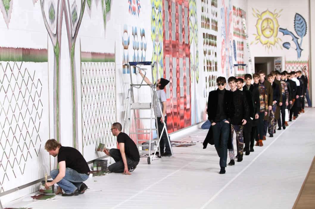
Directly visible and immediately experienceable did the Belgian fashion designer Dries van Noten (born 1958 in Antwerp) bring his subjective creative design strength and boisterous free artistic creativity on stage: in a scenographic performance to the glamorous catwalk for his men’s Fall/ Winter 2012 collection:
While the choice of male models one after the other introduced the seasonal collection’s current looks in classic parade down the conventional long runway, the two Dutch artists Gijs Frieling and Job Wouters (aka Letman) worked simultaneously with their assistants on a large wall right next to the runway. It represented a set design under construction right before the eyes of the audience. The frieze-like work in progress, on the one hand, formed an uncompleted, optical-decorative background for the otherwise quite conventional showing of the men’s fashions, but, on the other hand, it also illustratively and picturesquely repeated on the wall’s white
Art Style | Art & Culture International Magazine 16
Figure 3: Letman and Gijs Frieling for Dries van Noten Fashion Show Menswear Fall 2012, Paris. Photo: Richard Bord.
space some of the design looks being shown in the new fashion collection – as it were, reversing the design process that takes place in the studio with the first sketches and putting to paper of the material patterns and outfits. Inspired by the contemporary street – ranging from street art through subculture to street styles –and brought to the blank white design sheet by hand before once more returning to the street, contemporary fashion today develops in a permanent creative process fed by mutual influencing and aesthetic interplay while the formerly separate stages merge. The circular process of creative form finding and processual pattern making here was put on stage by Dries van Noten in a symbolic live performance that was also accentuated acoustically as a spectacular side-show before – and for – the audience’s eyes. As a critic observed in the NZZ:
Dries van Noten brachte am Donnerstagabend im Grand Palais Frank Zappa und Oscar Wilde zusammen auf die Bühne – zumindest als Geräuschkulisse zu einer sehr assoziativen Show seiner Menswear. Zappa telefoniert mit Suzy Creamcheese, während ein Schauspieler mit gestelzt britischem Akzent aus “The Happy Prince” von Wilde vorlas. Im Hintergrund malten Künstler der Letman-Gruppe an einem immensen kalligrafischen Fresko, während davor Dries neue Ideen defilierten. So verstörend und unfokussiert das Umfeld auch wirkte – Van Notens Looks wirkten angenehm vertraut 9
A majority of many voices may have waxed euphoric about the metaphoric live performance by the two young graffiti artists, but many critical and admonishing voices unfortunately spoke up on the Internet fashion blogs regarding this original “artistic side-kick” to herald the total sell-out of contemporary art and its descent into trivial decorative ornament or as a creative shorthand for commercial, visual merchandising and a new, chic status symbol, as summed up in a post by another Internet blogger using the pseudonym artlovingfashion “ It seemed like an unnecessary use of the artists’ talent, even an exploitation of involving (gasp!) REAL artists in a fashion show.”10
Art Style | Art & Culture International Magazine 17
Conclusion
It became clear in the last few years that (fashion) design, music, theatre/stage, contemporary art and performance arts were increasingly collaborating and cooperating in manifold ways11 – and not only in the service of a mutual up-valuing and reciprocal influencing, but especially in claiming to communicate more universal and lasting values that far outlast a fashion season and that, indeed, by their symbolic claims are also eternalised. These impactful, trans-disciplinary collaborations lead not merely to a cross-over, but precisely also to exciting convergences in which, for example, the time element winds up in striking turbulences and paradoxes: thanks to scenographic treatment, the voguishevanescent all at once is also communicated as the timeless-universal.
But, this form of artistic-creative teamwork concerns not only the commercial fashion consumer product but even also the ways it is produced and presented on a creative stage in each case expressly built for it. From a thematic perspective, increasingly to be seen here is an extremely self-reflexive and self-referential staging of performative creativity and processual production in the design context, that esthetically occupies both real-physical and virtual-digital spaces. In each instance, this goes hand in hand with performative presentations of seasonal products stylistically attuned to each other, with a very specific theme and motto for the fashion collection, that then generate a scenographic field ranging from presentations and displays in the real showroom to performative representations on virtual social media platforms. Trans- and cross-medially, this variant of a holistically conceived symbolic mise en scène culture, that involves all the senses simultaneously, generates a new, highly-networked social communications space and, moreover, establishes a highly aestheticised experience and happening space that, per actor-network theory, 12 consists expressly of human and non-human actors as well as creative agents (i.e., designers and their production(s)) Each time, one of these conceptual, comprehensive aesthetic cross-linkages vogue-ishly opens a strategic relational field based on the structure, organisation, and configuration of a flexible, interactive network. Installed thus within the objective-physical space, through temporary artistically-creatively, modishly-stylistically aligned and performatively-directorially linked practices, is an ephemeral, eventful scenographic
Art Style | Art & Culture International Magazine 18
space13 as a forced aesthetic total production for one season, but which, by virtue of its transcendent symbolism, like art, claims for itself a universal eternal value that it is supposed to outlast. What is more, if the thematic leitmotif in this specific manifestation of performative-directorial production space once again is “creativity” as such (cf. Dries van Noten) – precisely in the sense of a meta-discourse on the imaginative, astonishing staging of creative processes, inventive consumer products, and productive achievements in fashion design – then, it surely is worthwhile to take another, separate look here at the aesthetics and rhetorics now brought to the stage/ theatre of fashion for decidedly total visibility and an immediate experience facilitated by the respective scenographic action. After all, they are ostensibly not just to be the ultimate end-result, brought about by a distinct inspirational and creative space, but rather in turn are themselves also to be validated as translationalmediating agents and actively engaged producers of an overall creative atmosphere that, in the end, deeply affects the recipient consumers or involved participants.
This can succeed, for example, if specific atmospheres and emotionalising narratives for production spaces and platforms are defined, planned, and then brought to the stage, i.e., actualised: for instance, creativity performed theatrically in and through fashion. Particularly in fashion design today, creative methods and practices are readily staged as techniques and processes of creation and production of (real as well as symbolic) space and visually brought to the stage or put in the media spotlight. Precisely in contemporary scenographic fashion design, hidden creative processes today are simply negotiated with the very same creative tools, methods, and techniques mainly in a space and on a stage, staged spatially and brought to a platform of perception and reception. They are presented mainly in emotionalising narratives that bring creativity scenically to the stage in a self-referential andreflexive manner, but simultaneously also what we think we know in a given situation about creative processes, their environment and genesis. This knowledge is modishly temporalised and scenically spatialised scenographically, i.e., holistically and addressing all senses, with, and in, image spaces and stereograms, and it is ultimately made evident with its diegetic meta-stagin 14 Manifested scenographically in this way, it can also be applied to other strategies of rhetorical translation and aesthetic communication. For our case example, this means, specifically, a
Art Style | Art & Culture International Magazine 19
contemporary fashion design that conceives and spatially implements cross-media scenographies for itself and its promotional communication and that may, for example, explicitly make use of the “art and creativity” subject and motif, and also avail itself for this of the characteristic, if not clichéd spatial categories – such as the workshop, manufactory, and factory, atelier and studio, museum, gallery white cube, exhibition, theatre, performance space and concert stage, etc.
In doing so, these unique fashion-art collaborations now strategically pursue a rhetoric of valorisation, a strategy of mercantile value-added production: the (ephemeral) fashion design thus defines itself and articulates itself (self)confidently as (universal, symbolic) art form. And, as an efficient transference and communications form, the former today relies in turn on the “art of scenography” for efficiently communicating fashion design.
In sum, scenography conceptually considers structures and settings, lights and projections, sound, smells or props as well as costumes in relation to space and content, such as objects and artifacts or scripts and texts, acting or performing bodies, and last, but not least, the audience as participants. Thus, by translating contents synaesthetically, and herewith allowing special atmospheres along with bodily sensations to develop, by evoking spatial images that arise from theatrical and/or artistic concepts and ideas, and by leading the audience step by step to the core of an alluring narrative, efficient encounters between performers and audience can be created and hereby aesthetically formatted. It allows staged artifacts and consumer products to be individually (re-)interpreted and experienced with all the senses of the human body, even by means of interaction and immersion in a predominantly non-linear and multi-perspective way: This can be considered as the new holistic approach and highly innovative dimension of today’s scenography as an effective agency in an expanded performance culture, which efficiently translates and connects. The fashion products displayed in such a trans-nationally and interculturally cross-linking way then function as hubs and nodes within a larger network of social communication and global cultural exchange. In this newly networking and integrating scenography – as in its formative tradition of the total work of art, the so-
Art Style | Art & Culture International Magazine 20
Summary
called “Gesamtkunstwerk” (Gottfried Semper & Richard Wagner) – different (new and old) media and creative practices blend, interact and synthesise rather than being brought into mere opposition to, or competition or rivalry with, one another. This kind of holistic scenography today crafts commercial spaces primarily generated from their content and information, and it is herewith more than just the sum of its various art and design practices. In fact, as an all-encompassing visual-spatial and temporal construct, scenography has somehow become the epitome of our current “ convergence culture” these days. And, last, but not least, scenography can also be seen as a highly inter-disciplinary, trans-generic, inter-medial, cross-modal and polysensual approach to creating entire new stages and theatrical events for a new understanding, hence knowledge production; a salient (re-)interpretation and subtle validation of commercial fashionable artifacts.
Author Biography
Pamela C. Scorzin is an art, design and media theorist, and Professor of Art History and Visual Culture Studies at Dortmund University of Applied Sciences and Arts, Department of Design (Germany). Born 1965 in Vicenza (Italy), she studied European Art History, Philosophy, English and American Literatures, and History in Stuttgart and Heidelberg (Germany), obtaining her M.A. in 1992 and her Ph.D. in 1994. She was an assistant professor in the Department of Architecture at Darmstadt University of Technology from 1995 to 2000. After completing her habilitation in the history and theory of modern art there in 2001, she was a visiting professor in Art History, Media and Visual Culture Studies in Siegen, Stuttgart, and Frankfurt am Main. Since 2005, she is a member of the German section of AICA. She has published (in German, English, French and Polish) on art-historical as well as cultural-historical topics from the seventeenth to the twenty-first century. She lives and works in Dortmund, Milan and Los Angeles.
Art Style | Art & Culture International Magazine 21
Notes
1 On this, also see Pamela C. Scorzin: Scenographic Fashion Design. Zur Inszenierung von Mode und Marken. (Bielefeld: transcript 2016); also Federico Poletti: The Fashion Set. The Art of the Fashion Show. (Dublin: Roads Publishing 2016).
2 Bruno Latour: Eine neue Soziologie für eine neue Gesellschaft. Einführung in die Akteur-NetzwerkTheorie. (Frankfurt: Suhrkamp) 2007; by the same author: Reassembling the Social. An Introduction into Actor-Network-Theory. (Oxford: Oxford University Press 2005).
3 Poletti 2016.
4 I would like to thank Professor Birgit Wiens (Berlin) for this reference. On scenography and the theatre also see Birgit Wiens: Intermediale Szenographie: Raum-Ästhetiken des Theaters am Beginn des 21. Jahrhunderts. (Paderborn: Fink 2014).
5 See Alain Madeleine-Perdrillart: Christian Lacroix et les arts de la scène. (Kat. Paris: INHA 2014).
6 See lastly Jean-Paul Gaultier 2016/17 on the “THE ONE Grand Show” Review in Berlin’s Friedrichstadt-Palast; see the website at https://www.palast.berlin/de/index/shows/the-one-grandshow/#grandshow (last accessed: February 2019)
7 Compare Patrick Primavesi: “Inszenieren” in: Jens Badura et al. (eds.): Künstlerische Forschung. Ein Handbuch. (Zürich/ Berlin: diaphanes 2015),155-156.
8 See Annette Tietenberg: “You can have your cake and eat it too. Daniel Buren teilt den Kuchen mit Louis Vuitton” in: Hannelore Paflik-Huber (ed.): Let’s mix (all media) media together & Hans Dieter Huber. (Berlin: Cantz 2016), 92-99.
9 Jeroen van Rooijen: “Paris Menswear – Dries van Noten” (20 January 2012) accessible at http://laufsteg.blog.nzz.ch/2012/01/20/paris-menswear-dries-van-noten/ (last accessed: February 2019).
10 Access under this URL: http://artlovingfashion.com/2012/01/21/art-on-the-runway- dries-van-notenmens-fallwinter-2012/ (last access: February 2019).
11 Cf. Pamela C. Scorzin: Scenographic Fashion Design. Zur Inszenierung von Mode und Marken. (Bielefeld: transcript 2016), passim.
12 See Bruno Latour: Eine neue Soziologie für eine neue Gesellschaft. Einführung in die AkteurNetzwerk-Theorie. (2005) Frankfurt M. 2007; and by the same author: Reassembling the Social. An Introduction into Actor-Network-Theory (Oxford: Oxford University Press 2005).
13 On the scenographic space, see Brejzek, Thea; Mueller von der Haegen, Gesa; Wallen, Lawrence: "Szenografie", in: Günzel, Stephan (Pub.): Raumwissenschaften. (Frankfurt M.: Suhrkamp 2009), 370-385.
14 On this, see also Scorzin, Pamela C.: "Metascenography. On the Metareferential Turn in Scenography", in: Wolf, Werner (Ed.): The Metareferential Turn in Contemporary Art and Media. Forms, Functions, Attempts at Explanation. (Amsterdam/ New York: Rodopi 2011), 259-277.
Art Style | Art & Culture International Magazine 22
Roma: a Portrait of Mexican Segregational Society
Omar Cerrillo Garnica
Abstract
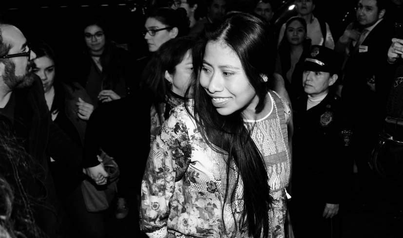
Through recent years, Mexican filmmakers have become very successful in international cinema contests, particularly in American Academy Awards, the Oscars. In 2018, the film “Roma” was pointed to be the new Mexican sensation, getting ten nominations for the contest. This movie generated many controversies in the Mexican, like an exhibition ban in theaters; the Oscar nomination in the category of Actress in a Leading Role for Yalitzia Aparicio, a rookie indigenous actress; and some others caused by the social situation pointed inside this story located in the Mexico early 1970s, a very particular context. This essay analyzes some of these controversial issues surrounding “Roma”, in order to explain how the post-colonial society in Mexico preserves many of their original values based in gender, class and race segregation, all put together in the narrative structure of Alfonso Cuaron’s masterpiece.
Art Style | Art & Culture International Magazine 25
Figure 1: Yalitzia Aparicio Photo: MX MM Proyección de Roma, Milton Martínez Secretaría de Cultura de la Ciudad de México Licensed under CC BY 2.0.
Mexico has one of the most important movie industries in Latin America through history. The first cinematographer arrived at the end of the 19th Century, during the last years of Porfirio Diaz, the dictator who wanted all the French culture embellishing Mexico. The creation of the Lumière brothers become another important statement for modernizing the country. Paradoxically, the new invention becomes one of the most important icons for the Revolution that overthrew the dictator. With the revolutionary troops, there was always people carrying those huge and complicated machines that registered the common scenes of the war (García Riera, Breve Historia, 1998)
The great moment for Mexican movies came through the 1930s when the “ranchera” music started to crossover with the film industry. “Allá en el Rancho Grande” becomes the first stone of a very impressive building that was the so-called Golden Age of Mexican Cinema (García Riera, Breve Historia, 1998). Many important films are part of this epoch. In most of these titles, the movie is strongly related to very notorious actors, actresses, directors, photographers, musicians, and other ones. The most iconic figure is Pedro Infante, an actor that took part in films like “Nosotros los Pobres,” “Angelitos Negros” or “Dos Tipos de Cuidado”; followed by Jorge Negrete, who starred a remake of the classic “Allá en el Rancho Grande ” Great comedians like Mario Moreno “Cantinflas” participated in movies like “Ahí está el detalle” or the big Hollywood production “Around the World in 80 Day.”1
The most famous actress of this time was María Félix, the big star of “Doña Diabla” or “Doña Bárbara.” In addition, the glorious Spanish director Luis Buñuel created some of his most important movies in México: “Los Olvidados” and “El Ángel Exterminador” (Monsiváis, Rostros, 1993). Many other names may be included in this list to make a complete statement of the splendid period of the Black and White Mexican movies, but this is not a paper about those times. The Golden Age dropped down with the oncoming color cinema, in the 1950s. Many of these important stars participated in very simple productions, which preferred quantity of products instead of quality. This slum extended for four decades.
Art Style | Art & Culture International Magazine 26
Introduction
The 1990s started a slow but constant renaissance of Mexican cinema, when directors like Guillermo del Toro –“La Invención de Cronos” (1993)–, Alfonso Cuarón – “La Princesita” (1995)–, and Alejandro G. Iñárritu – “Amores Perros” (2000)–delivered their opera prima and starting what will become a new great era of Mexican cinema (González Vargas, Las rutas, 2006). Today, these three movie directors are the new Mexican sensation in the Hollywood industry, winning 5 Oscars for Best Director in the last six years. The last movie of this important saga is “Roma” by Alfonso Cuarón, a story of a family indigenous house cleaner, a very uncommon situation in Mexican films. Through this statement began a very complex controversy surrounding many of the most archetypical figures in Mexican culture. In the following lines, I will analyze this situation.
The First Issue: the Netflix Situation
Even when the movie has not been exhibited, a huge controversy began through the company behind Cuarón and his movie. Netflix, the big monster of movie and TV series through Internet streaming, challenged the also enormous Hollywood industry by sponsoring the production of a movie that was conceived to be a masterpiece since the very first idea Cuaron has to film it.
The big problem initiated when the two big movie-exhibiting companies in Mexico (Cinépolis and Cinemex) rejected to project “Roma” in their theaters. These companies argued that Netflix and Cuarón required certain technical applications in theaters for its exhibition. The director denied this through his Twitter account: “It is not true. Even the 4K projection and Atmos sound is the best way to watch “Roma,” we are exhibiting the movie in many 2K theaters and 5.1 Sound Systems” (@alfonsocuaron, November 21, 2018). The real reason for this exhibition controversy was that common exhibitors are not ready to compete with a very different agent like Netflix. The common organizations in the cinema industry are specialized in just one of the many roles inside the business: there are companies that produce films, companies for distributing and others for exhibiting. Nevertheless, this is quite imprecise, because the big stakeholders like Disney, Fox or Universal owned companies in every single stage of the process. The big deal point with the master
Art Style | Art & Culture International Magazine 27
of streaming is that they are catching new young audiences that preferred to stay a whole weekend at home watching a complete TV series. Netflix started as a distributor and exhibitor, both at the same time. However, in 2013, they started to produce their first TV series –House of Cards– and in 2015 their first own movie –Beasts of No Nation–. Many of these productions were nominated for Emmys, but the Oscar was not an easy deal to go for. Even “The Square” was the candidate in 2017, “Roma” become their very first Netflix’s bet to win an Academy award. In the Mexican context, the big exhibitors felt menaced by the consequent airing on the Internet, so they considered that the primary business, the exclusiveness, was not respected (Vértiz de la Fuente, “Cinépolis,” November 22, 2018). A concise argument in times of constant changes in the movie industry. The new era demands better answers and wider strategies to compete with Internet-based companies inside all cultural industries, not only cinema. The global companies developed new strategies for the streaming era, but in Mexico, companies like Televisa or Cinépolis are far from being true competitors for Netflix.
The Second Issue: Mexico City is Not Just a Scenario
This film is an autobiographical oeuvre. Cuarón made it as a tribute to his child nurse, “Libo.” For that reason, the film recreated the quotidian life in Mexico City in the early 1970s. Adding black and white cinematography, the whole film was seen as a nostalgic piece of art that transports the spectator to places, objects, sounds, and topics that were essential at that time. At the first exhibitions, controversies began running out in social media. Some people loved the film; some others hate it. One of the first arguments stated in these allegations was the city by itself. The supporters said this was a movie that “only ‘chilangos’2 can understand”. Obviously, it is a false argument. As Sergio del Molino stated, “it could be that the ones that completely know Mexico City understand less about “Roma” than foreigners, because chilangos perceive too many details about the city that they are missing this is not a movie about them” (Del Molino, “No entenderá Roma”, December 19, 2018). Sergio del Molino has a strong argument about this controversy, but the main thing observing
Art Style | Art & Culture International Magazine 28
the city is not if a native is really understanding the movie. That is just the symptom The real sickness hides in this endogamic statement. Obviously, you don’t need to be born in a certain city to have a full understanding of a film, a novel or whatever another piece of art is located at. The argument itself tells us a lot about the historical controversy between chilangos and “provincianos”3 during the 20th and 21th centuries in Mexico. Chilangos are considered overweening when they traveled around the country; on the other side, provincianos are seen as unwise people that can be easily cheated at the big city. Neither is correct, but it explains a lot of regionalism and ideology permeating through Mexican society since Pre-Hispanic times4 At the end, “Roma” is not a story about the city, but the presence of the city is quite important for the narrative. We must remember that “Cleo”, the main character, is an indigenous woman that comes from some place in the Mexican “provincia” to get a job as a housemaid. Her battle is not only against maternity, she is struggling against the hostile and adverse urban environment. Therefore, the right part of the controversy is that we must consider the city not just as a scenario for “Roma”, but as an antagonistic power, that confronts Cleo to her new reality. The city is not a passive scenario; it interacts with Cleo to build her battles throughout the film.
The Third (And Most Important) Issue: A Kaleidoscopic Segregation
The final controversy with “Roma” began in January 2019 when the movie received 10 nominations to Oscars, including Yalitza Aparicio for the category of Actress in a Leading Role. The problem now was if this woman is a “real actress” and if she “deserves this nomination”. For haters, Yalitza was acting as she used to be in “real life”, she will not be able to make a second acting job; the Oscar nomination was a clear excess just because Cuarón and the other filmmakers are “in fashion” at Hollywood at this moment This part of the analysis needs a better separation of all the problematic issues interacting here. I am going to start with the basis of this argument: the acting situation and its conditions. This can be solved through the ideas of Jacqueline Nacache (Le Personnage Filmique, 2003), who stablishes that the movie actor is more than just a person trying to be a different persona:
Art Style | Art & Culture International Magazine 29
The film character, as a being who belongs to the diegesis, is built from a large amount of distinct and combined elements: light, color, shooting takes, editing, staging, sounds, and silences. Moreover, it is built in close interaction with actions and situations. In many films, the plot and its structure, the spectacle, the spectacular action, is made at the expense of character formation (Nacache, Le Personnage Filmique, 2003).
We can notice that the film actor does not depends in an academic formation that launches him or her to de movies industry. A good actor understands that he is part of a more complex creative system that includes cameras, lights, microphones, art design and many others essential stuff to create a film. Following these ideas, it is unnecessary to question if Yalitza has any further experience in acting. She was ideal for a role that is quite special in the Mexican film history. Cuarón needs a darkskinned woman to recreate Cleo, so Yalitza was ideal for that; but even more, he needs that she can understand the whole situation that the director was trying to generate through this film. Acting in movies is not about shouting and exaggerating poses and faces; it is about to recognize where is the camera and what it is going to capture to put it on the big screen (Benjamin, La Obra de Arte, 2003).
The acting stuff is just an alibi whacking the true ideological problem behind Yalitza’s nomination. The big deal is about a three times segregated person: female, indigenous and poor. All the big stars in the Mexican cinema history, from Pedro Infante to Diego Luna, they are male, young and racial dominant. A few women triumphed in cinema industry in Mexico, and no one is dark-skinned. The major concern here is about the big historic segregations inside Mexican society: gender, race and class.
Yalitza is victim of a very common crime that spectators do through movies or TV series: the substitution. People are not allowed to see Yalitza by herself, because they wanted to watch Cleo instead. They don’t see the woman who partnered her sister to a movie audition and finally she got the role; they still watch the housemaid. They are not able to see an elementary school teacher who prepared herself to interpret a house cleaner in a movie; they still watch a person who speaks an indigenous language at first. However, the worst and most paradoxical part is that they see what they do not used to see; so that is why they feel that Yalitza did not do anything special.
Art Style | Art & Culture International Magazine 30
Slavoj Žižek said about “Roma” that it left a bitter taste when he watched it (Žižek, “Roma”, January 15, 2019). The main reason for that is that is a fake celebration of Cleo’s kindness. Nothing really happens through this story. Cleo turns back to clean dog shit and prepare a milk shake for the boy. She can be apologized because she is in a kind of “ideological blindness”: she cannot see that she is condemned to be always the loyal servant for Sofía. I agree with Žižek in the main idea of the ideological analysis. The film is brutal because at the end, after all the enormous drama that Cleo must past through, she stayed as the same oppressed person.
The film would be very ambitious if it establishes a completely new reality for Cleo, something like she studied at college and become the new doctor that can save further risky pregnancies. The film makes a social proposition on the very first level of the struggle for segregated people: visibility. In societies where exclusion is widely practiced and shortly viewed, as it happens in Mexico, a film that allows the erased people to be seen by the others is a really huge victory.
Art Style | Art & Culture International Magazine 31
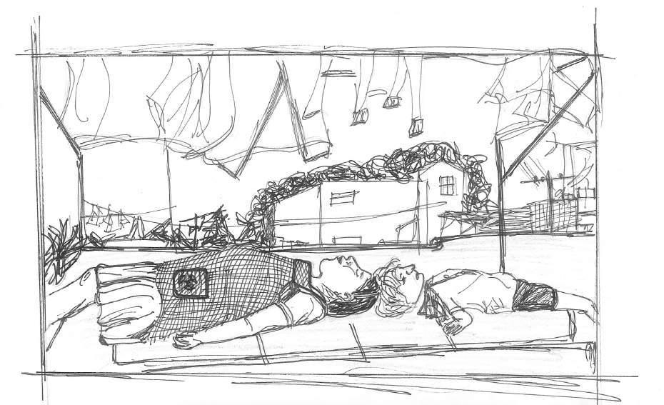
Figure 2: Illustration by Renata Elizondo, February 28, 2019.
Even more, we must see the film outside the film. Yes, Cleo was condemned to be a happy slave after 2 hours 15 minutes; but after a year and a half in rehearsals, filming, exhibiting and promoting the movie, we saw a real qualitative difference not in Cleo, but in Yalitza. She was at many fashion magazine’s cover like “Hola”, “Vogue” or “The Hollywood Reporter”; she was in a Hollywood red carpet and in many TV shows giving interviews. After this entire movie situation, she will never be just an elementary school teacher. If “Roma” has a bitter taste for Žižek, Yalitza will taste it sweet forever.
Conclusion
It’s hard to say if the Mexican success in filming industry should continue ahead in further contests to come. Maybe, “Roma” will be the last of the masterpieces executed by Mexican filmmakers in Hollywood industry. That’s hard to say and hard to predict. Nevertheless, what we are able to say is that this movie will be the most iconic of this Second Golden Age of Mexican Cinema. All other movies (“Birdman,” “The Shape of Water”, “Gravity” or “The Revenant”) are American movies directed by Mexican filmmakers. “Roma” is the first one in this list that was entirely made in
Art Style | Art & Culture International Magazine 32
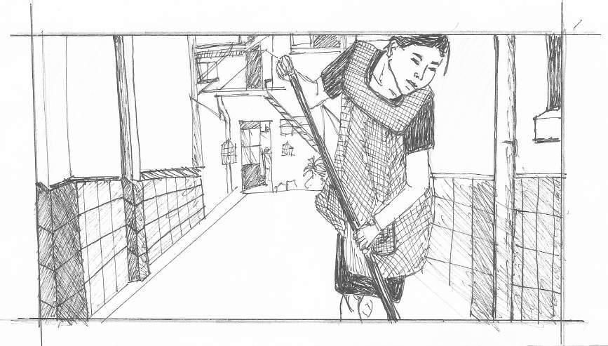
Figure 3: Illustration by Renata Elizondo, February 28, 2019.
Mexico, with Mexican crew, Mexican actors and in Mexican scenarios. There is no longer possible to ask if these awards are for Mexican cinema. We have here the first Mexican movie to win an Oscar for Best Movie in a Foreign Language. A real success for Mexican movies. However, “Roma” is successful not only because it deserved Oscar, Golden Globes and Palms D’Or As we identified throughout this essay, there are other victories like shifting the movie market, promoting new people for performing in front the camera, but also being a polemic issue that turns back Mexican society to question how historically we watched to indigenous women (if we ever look at them). The big success is to reveal hypocrisy inside a society that prefer to watch other racisms, other classism, and other kind of women, instead of watching the unclean clothing wearing ourselves.
Cuarón and his masterpiece will become a very important icon for Mexican and Latin American movies history. Perhaps, in the near future, we will talk about Alfonso Cuarón at the same level as we used to do about Luis Buñuel; or we can mention Yalitza Aparicio as the most important actress in Mexican cinema, instead of the white gorgeous classic icon of María Félix. This are glorious times for Mexican movies. Perhaps the best ones we ever seen, and “Roma” should be the greatest piece of art delivered through it.
Author Biography
Omar Cerrillo Garnica is a Mexican professor and researcher, member of the National System of Researchers (SNI), Level 1. He is Ph.D. in Social and Political Sciences and a Master in Sociology at Universidad Iberoamericana, both times graduated with honors. He also made a post-doctoral research at the Autonomous University of the State of Morelos, where he searched about digital communication involved in social movements. Now, he is Director of Humanities at Instituto Tecnológico de Monterrey, Campus Cuernavaca. He is author and coordinator of the book "Cardinales Musicales, Music for Loving Mexico”, published by Tec de Monterrey and Plaza & Valdés. He is specialist in social and political analysis of art, music and culture; subjects throughout he participated in national and international academic events with further paper publications in Mexico, Chile, Argentina, Brazil and France. In recent years, he has specialized on digital media and its cultural and political uses. E-mail: ocerrillo@tec.mx
Art Style | Art & Culture International Magazine 33
Notes
1 He won a Golden Globe for the Best Actor in a Comedy (1956)
2 Chilango is a word used to name the people born in Mexico City
3 Provincia, in the Mexican context, means the other places of the country that are not the big capital city. Therefore, provincianos named the people coming from all around Mexico to reach prosperity at the central place of the country.
4 One of the reasons that contributed to the fall of Mexico against Hernán Cortés during the Spaniard Campaign in the 16th Century was the allegiance of Tlaxcala to Cortés because they didn’t want to be more Aztec vassals
Bibliography
Benjamin, Walter La obra de arte en la época de su reproductibilidad técnica. México: Ítaca, 2003
Cuarón, Alfonso “No es cierto Aunque la proyección 4K y sonido Atmos es la forma ideal de ver ROMA, estamos exhibiendo la película en muchas salas 2K y sonido 5 1 ” Twitter, November 21, 2018 https://twitter com/alfonsocuaron/status/1065484917843337216
Díaz, Cristina “¿Por qué Cinemex y Cinépolis no compraron copias de Roma, la última producción de Alfonso Cuarón?.” Huffington Post, November 22, 2018.
https://www huffingtonpost com mx/2018/11/22/cuaron-le-entra-a-la-polemica-de-cinemexy-cinepolis-vs-roma a 23597271/
Fuente, Columba Vértiz “Cinépolis da su postura de por qué no exhibe Roma,” Proceso, November 22, 2018. https://www proceso.com mx/560735/cinepolis-da-su-postura-de-porque-no-exhibe-roma
Molino, Sergio. “No entenderá Roma quien conozca la Ciudad de México,” El País, December 19, 2018.
https://elpais com/cultura/2018/12/18/television/1545145915_114528.html
Monsiváis, Carlos Rostros del cine mexicano. México: América Arte Editores, 1993.
Nacache, Jacqueline 2009. “Le Personnage Filmique,” Cours Théorie Littéraire
https://effetsdepresence.uqam.ca/upload/files/articles/personnage-filmique.pdf
Riera, Emilio García Breve historia del cine mexicano: primer siglo, 1897-1997
México: Ediciones Mapa, 1998.
Vargas, Carla González Las rutas del cine mexicano contemporáneo: 1990-2006. México: CONACULTA, 2006.
Žižek, Slavoj “Roma está siendo celebrada por las razones equivocadas,” El Libro Vakero, January 15, 2019. https://odeenrocha.wordpress com/2019/01/15/roma-esta-siendocelebrada-por-las-razones-equivocadas-por-slavoj-zizek/
Art Style | Art & Culture International Magazine 34
The Art of Capital Waldenyr
Caldas
Abstract
This essay addresses the mercantile relationships between artistic production and capitalist society. From the end of feudalism and the beginning of the Renaissance to the present day, art as a product that requires creativity and talent from its author is a creation that enjoys very high prestige as an integral part of capitalist society. The essay’s aim is to analyze how both art and capital are situated contemporaneously. In complex societies, as we know, the role of the media is of great significance, due to the decision-makers characteristics. For this reason, art criticism is systematically included in the media. Thus, the media is analyzed for artistic production in its various segments, and also the relationship between artists, galleries, consumers, and media. The background of this analysis focuses on how artwork adopts the position as another commodity in capitalist society. Like any other good, art becomes a product to be traded by artists, gallery owners, art dealers, and consumers who ultimately play the role of people in the business. However, none of this is new, insofar as we can empirically perceive; the logic of Capital is capable of transforming everything into something merchantable that is, into merchandise.
At another point in the essay, I devote myself to the discussion for establishing the aesthetic quality of a work of art. I attempt to interpret the role of the art critic that adopts almost the right to establish and make public the quality of some work, where the aesthetic criteria beauty and quality are in question. At this point in my discussion, I anticipate the very probable possibility that, in the analysis of art criticism, the values of a class culture prevail and that a critical review or speech reflects the values of mainstream culture, as consumption in capitalist society is stratified.
Art Style | Art & Culture International Magazine 37
Art Style | Art & Culture International Magazine 38
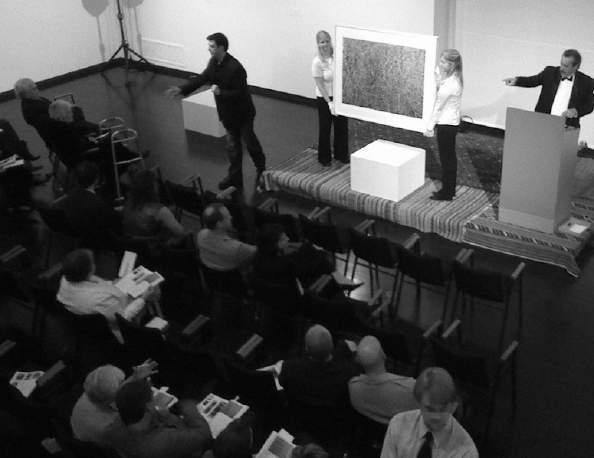
Art auction and buyers gathering
Photo by MC Morgan under CC BY-SA 2.0 license.
Buy now or make offer!
The first one is for $1,000, the second for $90,900 or the last one for $186,890.
What is the origin?
It was mainly in the Italian peninsula that the Renaissance reached its greatest moment. At that time, artists like Giotto, Titian, Michelangelo, Botticelli, Leonardo Da Vinci, and Raphael, among others, rescued as we can call it Greco-Roman aesthetics, rationalism, and experimentalism. Therefore, it should be noted that this revival was not random or intuitive. These Renaissance masters sought their instruments of redemption to work precisely in the knowledge of a history of ancient Greek art. Thus far, this choice was conventional. However, the above text encourages us to think about an issue, which is at least uncomfortable: we want to know where and how the Greeks developed this idea of beauty that so influenced Renaissance painting, crossed time, and remains to this day in the agenda of academic discussions. To the attentive reader, one question is inevitable: the ideal of beauty for whom? It is quite probable that, historically, this concept would have remained circumscribed to the citizens living in the Acropolis or even to those educated men who frequented the agora (from
Art Style | Art & Culture International Magazine 39
The concept of image: Art Style Magazine’s art direction. Photo: Art Gallery, Pixabay
Greek, assembly), when they were lecturing there in open air assemblies for the people. Helots in ancient Greece, the helots came from the people the Spartans subjugated, and consequently, the helots held a status between slave and free men and slaves would hear long speeches of a theme, which had nothing to do with their reality and their daily life: the ideal of beauty. But what I am doing here is an unpretentious preparation for reaching the main question that encouraged me to write this essay that is, the relationships between art and capital. In the Renaissance period, for example, patrons, bankers, powerful merchants, and noblemen among others bought works of art for social recognition and prestige.
That is a fait accompli. There is unanimity among scholars about it, and therefore there is no need to discuss it here. Even so, it should be noted that art, still in its first stages, was not a product for the economically well-off. Perhaps the best example is the fact that, until the 15th century, artists were considered artisans, although some works already dealt with relevant social issues, such as social inequality, religion, and politics.
Either way, the capitalist system which only emerged in the 14th century, when feudalism began being dismantled gave way to various changes in the productive sector and labor relations. It was at this moment, precisely in the face of these transformations, that a new social class emerged in Europe, known as the bourgeoisie. They were people skilled in the negotiation of negotiations, and for this very reason, always objected to profit through commercial activities of the most diverse. Strictly speaking, this class would be formed with the emergence of the commercial Renaissance that would modify the whole economic panorama of the European continent. It was the bourgeoisie, the social class par excellence, who began to worry and invest in their social status. To this end, works of art would become one of the main products for the attribution of status. From this context, very little has changed respect to this day.
In the present, the work of art remains an essential instrument for status assignment. Now, this assignment happens in a very pragmatic way. In the society of Capital, everything becomes a commodity, and art could not be different. Taste, beauty, entertainment, health, culture, and so many other institutions have become the products of relationships of exchange in capitalism. And this pragmatism, in the case of the arts, lies precisely in the confluence of interests between art and the consumer market. First is the artist who produces a work; the mercantile rules of capital make the artwork a commodity. Alternatively,
Art Style | Art & Culture International Magazine 40
a segment of the society almost always cultured and wealthy buys the work of art as a form of attribution of status, investment and, in some cases, by mere ostentation. In other situations, it may also occur to buy art for the pure pleasure of owning a work that one considers beautiful. We cannot discard this alternative; none of them are despicable. However, they all have no other options and are co-opted by capital. It is clear that this reasoning is the logic of the economic system of Western countries.
Art Style | Art & Culture International Magazine 41
Art auction Photo by MC Morgan under CC BY-SA 2.0 license.
A question of taste?
In 1988, when I wrote my book entitled Utopia of taste (Utopia do gosto), also have I mentioned these usual questions to open a debate on the subject. Since then, I have studied and rethought the matter. It has been thoroughly discussed with academics specializing in this subject, but in all discussions, there has not ever been a plausible scientific explanation to accept. All the observations and analyses that have been undertaken have encountered the subjectivity of opinions, or just allowed the prevalence of dominant culture as a parameter to determine the beauty, the ugly, the quality of a work of art or a novel, among many other cultural products. In any case, we continue to seek a more satisfactory result for this issue. When speaking of beauty or aesthetic taste, for example, the opinion and concepts of the learned prevail. It starts from the very questionable premise that educated people are better able to establish what is ugly or beautiful, or good or bad in a play. From these concepts, one determines what is and what is not a work of art. But here, I will not exhaust the reader’s patience by entering into such a déjà-vu discussion as this one.
Thus, the people who work with art criticism, in terms of the art market, give to some works, and not others, the status of a work of art. In this scenario, here are some questions or reflections that need to be, if not answered, at least considered: Should we accept as fact the opinion of a scholar of art criticism when he names one work as art and another as non-art? In doing so, would it not only be reproducing and further consolidating the eventual prevalence of an aesthetic taste belonging to the educated segments of the economically and culturally dominant class? It is true that there is a recurrent and extremely negative situation in all of this. In the media, for example, professionals of socalled art criticism, with due exceptions, almost always use the most subjective criteria to write about a particular work. At the same time, the reflexes of this criticism soon appear. This professional can either promote this work to the state of a piece of art, or merely isolate it and, along with it, its author. In the first case promoting the work of art art criticism gains contours that must be analyzed with caution. In possession of an efficient communication vehicle, one would expect the art critic to make a balanced and equanimous analysis an impartial reflection, finally, an opinion with equity, providing the reader with the technical, aesthetic, and interpretive elements of the work of art. In this last item, the ideal would be to listen and reproduce the words of the author of the work and artist to avoid wishful thinking, indeed. However, this care rarely happens.
Art Style | Art & Culture International Magazine 42
The goal is almost always to give the reader an analysis of that work, as if it were something innovative, of unique quality and rare beauty. To this end, the excessive use of phatic discourse that is, a way of communicating with the reader without the transmission of any essential messages is what one sees. It is at this moment that the so-called worship discourse gains the status of an “official” evaluation. Yes, official quotes, because the analysis of the work serves as a basis, persuasive argument to value it even higher in the art market. But it can also, of course, serve as a devaluation of that same work or others. Everything depends on the connective points between art criticism and the eventual presence of an “entourage” that ultimately works to promote the artist, no matter what his or her work may mean. What matters is fulfilling the goal of bringing the artist to celebrity status. And it is well to remember that this process has unfolded and now reaches much more sophisticated levels. A very typical example comes from the 1960s. At the time of the Jovem Guarda Program, the advertising company Magaldi & Maia undertook a work of extreme competence by promoting Roberto Carlos, the main idol of Brazilian youth, who was in charge of the evening performances on Sunday in the Record Television.
We see, therefore, the mercantile character of the arts. What we cannot forget is that works of art, like so many other things, are goods at the disposal of the consumer, and there is nothing wrong with that. Perhaps the mistake is even the artist, who does not accept the rules of the consumer market and tries to change it. For example, artists with proper theoretical training challenge the logic of capitalism, which resists taking their rules. That is legitimate. It is understandable that the artist wants to give much more significant meaning to his or her work than the simple exchange of money for a product that is, for a commodity. But it is necessary to understand that we are in a society of capital, and therefore, behind the discourse of art criticism is a hidden concept of valorization or devaluation of the work, which almost always has a strong resonance with the consumer market, collectors, merchants, and even speculators, among others. And after all, what is art for in a consumer society? Like everything in a consumer society, art is guided by profit maximization, and we should now think a little more on the commodity character and analysis of art criticism of the speech. Mercantilizing the work of art is perfect, because it meets the logic of capital, where everything becomes a commodity. And precisely because of this mercantilizing, it must generate profit, no matter what this commodity is.
Art Style | Art & Culture International Magazine 43
At that moment, the pragmatic objectivity of capitalism removes the romantic aura of the work of art and the possible excellence it may have, transforming it into a consumer product like any other. In the case of fine arts, for example, the most recent painting produced by the artist, as well as the previous ones, become a salable product available to the consumer like any other commodity. It is natural, then, that this professional set aside an old and worn anachronistic thinking of the public domain, according to which, the artist should only paint their screens when inspired to do so. This argument does not proceed; it is a nonsense, an immaturity without space in the contemporary world. The artist is a professional like thousands of others and has a product to sell. He or she is not only an artist but also a merchant who wants to live on his or her art, and therefore, there is no other way but to put a product to sale. Consequently, the artist can sell directly to the buyer or, if he or she can and should prefer, leave the galleries to act as the intermediary between the author of the work and the consumer. But even so, the artist must negotiate with the gallery owner, among other things, the price of the work and the commission to pay for exposing the artworks to sale. That is what the artist produces it for, and that is what he or she
Art Style | Art & Culture International Magazine 44
Image concept. Photo licensed under CC0 1.0 Universal (CC0 1.0).
is prepared for. Capitalism as a whole, and the art market in particular, are not for amateurs. One must keep that in mind. When great collectors, gallerists, and traders of the arts with very few exceptions buy a work, they are neither interested nor concerned with the inspiration of the artist. The buyer’s goal is always mercantile, and he or she wants to be sure that that work is an investment that will profit well soon. That is the logic of capitalism, and opposing it means professional failure. It is these conditions that the artist must adapt to and respect. Besides, of course, he or she must produce something that meets the trends of the art market. This tendency, in other words, means adapting one’s work a little to the aesthetic taste of the market, something that only the professional attentive to changes can perceive. However, the artist does not stop to be innovative as well as those who have the talent for it. It is evident that the already established professional lives a very different reality from the one described above. The prestige of a well-known artist, built up throughout his or her professional career, gives him or her considerable autonomy in this regard. The signature on an empty canvas may have much more value than a picture of another little-known artist.
In all work activities, there are different stages in the profession. My analyses here are more directed to those artists who live in an intermediate situation between well established and anonymity. There are many that is, they do not yet have their work consolidated in the art market, but neither are they beginners, much fewer amateurs. Almost always the relation of buying and selling these artworks passes through tax situations on the part of the buyers. By galleries, the investment is much more considerable. The gallery owners know that they can impose conditions that are very favorable to them and very unsatisfactory to the artist. All these advantages favor the businessperson, who for the most part uses the law of supply and demand to their advantage. A work to buy must be known and offered to the public interested in the arts. It cannot be confined in the artist’s studio; it must be seen and visited to find a buyer, finally.
Beyond the existing commodity character on the art market and it is essential for the development of this commercial activity it should be mentioned in some situations, a kind of vicious circle involving all interested parties i.e., the gallery owners, art dealers, artists, art critics, curators, museums or cultural institutions, and collectors. It is almost impossible to keep this activity only restricted to the gallery owners or other professionals in the field, and we should stick to this aspect of the art market relationship. As a matter of market interest, this vicious
Art Style | Art & Culture International Magazine 45
circle is as follows: the gallerist understands that a specific artist may interest the market more than his or her colleagues and competitors. From that moment on, the artwork and artist are systematically worked out by the art critic’s review in a complementary manner that we show later. The artist and artworks are followed by criticism from art critics and curators, and so the artist becomes known (and some, of course, recognized). This system of art involves market projections, advantages, and the greater interest of collectors, and cultural institutions; finally, the whole structure of the art market increases significantly.
Throughout this journey, the review of art critic plays a decisive role in promoting the nominated artist by the gallerist. The critic continues to work on his or her subjects in the fine arts with a hyperbolic discourse filled with complementary qualifying adjectives. It turns out that this text, almost always unintelligible, gains contours of a phatic discourse in a skillful play of words, but that notoriously reduces itself only to reproduce the technique of logomachy. The difference between this professional and the television program presenters is that the professional uses a more refined logomachy, also notable for using the vernacular in his or her review as nothing else. One might even think that the art critic finally decided to use linguistic skills about the technical socio-inherent in the fine arts system, and for that reason, he or she elaborated a worshiped discourse for well-read people. No, but that is not it, and it stays that way. People read the skillful logomachy review and understand very little, but enough to know a few words that it is the matter of the work.
The artistic métier (with some exceptions) come to respect the work of that artist and attribute to him or her a level of quality based on this logomachy criticism in its essence, but favorable, without reflecting on the notoriously mercantile character of the message with the seal of a person seen in the universe of the arts as a specialist. As the opinions of art critics are almost always a kind of “thermometer” for evaluation of the artwork, the way is now open for the professional success of that artist. The credibility gained from the review of the art critic is the mark of quality achieved by the artist and gallerist a condition that ultimately remains subjective which are the aesthetic criteria of an analysis of the artwork. And here I return briefly to the most sensitive point of this essay: it does not seem reasonable that a professional, more experienced and skilled in his or her work, can determine the good, average, or bad quality of work, especially in the arts, something extremely subjective. What criteria or elements would the critic have used to reach conclusions? If one takes advantage of this scholarship, it is the art critic, with an eventual vast culture in the arts. Yet we
Art Style | Art & Culture International Magazine 46
should accept his or her opinions with some reservations. Because in it is contained all the cultural repertoire acquired in the academy, in the experience of the critic’s work environment and even in other situations. Also, we can say: the critic’s opinions are only reflecting the culture of the social class to which he or she belongs. It is quite likely that the critic is reproducing only the patterns of the aesthetic taste of his or her social class. It is precisely here that subjectivity resides. The opinion of this art critic cannot and should not serve as a parameter to evaluate and consolidate an aesthetic appreciation of a piece of art. The vast culture and experience in the art métier do not credit one to a degree of this importance. No one has the authority to do so. If so, we would be allowing the learned scholars to determine what is good and what is not good taste, what is fair or poor in various artistic manifestations. Moreover, common sense tells us that we should not allow anyone to determine our taste, our aesthetic appreciation. Now, when the art critic evaluates a work of art, he or she is using all repertoire and knowledge on the subject. But ultimately, the greater weight of his or her analysis at this time is undoubtedly guided by class culture, by cultural values to the universe to which he or she belongs. It is natural for the critic to reproduce them in his or her work, just as people in other social classes do. It is not by chance that in the society of capital, the production and consumption of objects are stratified.
Author Biography
Waldenyr Caldas is a full professor in Sociology of Communication and Culture at the University São Paulo. He was a visiting professor at University La Sapienza di Roma and the Joseph Fourier University in Grenoble, France. Professor Caldas has been a professor since 1996 as well as the vice-director (1997-2001) and Director (2001-2005) of ECA - School of Communications and Arts, University of São Paulo. In his academic career, he obtained all academic titles until the highest level as a full professor at the University of São Paulo. Currently, he is a representative of the University of São Paulo, together with the Franco-Brazilian Committee of the Agreement “Lévi-Strauss Chairs,” and a member of the International Relations Committee of the University of São Paulo. Its scientific production records many books published and several essays published in magazines and national and international collections.
Art Style | Art & Culture International Magazine 47
To What Extent can Maurizio Cattelan be Considered a Political Artist?
Margherita Medri
Abstract
This essay investigates the question: ‘To what extent can Maurizio Cattelan be considered a political artist?’ Throughout the essay, various sculptures by the Italian artist, Maurizio Cattelan, are analyzed in pursuance of the answer to the research question. The investigation is aided by knowledge of Cattelan’s life as an artist and an understanding of a definition of political art. The analysis runs through four different sculptures created by Maurizio Cattelan, including La Nona Ora, Him, L.O.V.E, and America, which have caused plenty of controversy surrounding their respective themes and messages. A separate analysis of each piece is given and includes evaluation on the historical background, title, public reaction, Cattelan’s possible offered narrative, and the political aspects. Each investigation of the individual pieces is concluded with a deduction of the political content and the counterarguments.
The general analysis of this essay examines each piece in contrast with the definition of political art established. For each piece, a conclusion is reached on the extent of political-themed content it provides, allowing it to be considered a political piece or not. These individual evaluations intersect and form the main conclusion reached in the investigation, which is that Maurizio Cattelan can be categorized as a political artist. This exploration makes use of a range of primary and secondary sources, including extensive research on essays, articles, interviews, newspapers, magazines, and books written about the topic or artist. Museum exhibitions were visited, and a movie about the life of the artist was used for analysis and even a personal interview with Maurizio Cattelan was conducted. Maurizio Cattelan's satirical reputation and provocative art cause the political agenda within his work to be difficult to ignore.
Art Style | Art & Culture International Magazine 49
Art Style | Art & Culture International Magazine 50
Figure 1: Maurizio Cattelan, All, New York: Guggenheim Museum, 2011
Photo by Davide Costanzo. Licensed under CC BY 2.0.
Introduction
I enjoy controversial art and, as an Italian myself, Maurizio Cattelan has always been a subject of discussion. I genuinely admire the way Cattelan’s pieces are able to lead debates on distinctive aspects of society and still retain a fair amount of humor. I had various possible questions as options to explore, all which centered on the irony and message of his works. “To what extent is Maurizio Cattelan’s work inspired by Marcel Duchamp?” was one of my first questions since it would have allowed me to analyze the humor is the art from a more historical context. However, I felt that question limited me since I would not be exploring the social impact of the work. The next question I pondered on was “To what extent does Maurizio Cattelan’s work reflect modern society?”. While this would allow me to focus on the societal impact, the satire would be ignored.
Art Style | Art & Culture International Magazine 51
Figure 2: Maurizio Cattelan, All, New York: Guggenheim Museum, 2011
Photo 1 by Mark B. Schlemmer. Photo 2 by Davide Costanzo. Licensed under CC BY 2.0.
Finally, I chose to analyze "To what extent can Maurizio Cattelan be considered a Political Artist" mainly because he has such a strong reputation as a jokester. His art has been deemed as being sarcastic and always poking fun; therefore the political message is habitually overlooked Cattelan creates this fine line amid satire and sincerity within his art that really interests me to discover the true intention of his art pieces. Due to the debates and provocation caused by Cattelan’s work, I assume, throughout this essay, I will discover his work to be political. For the following segments of this essay, I will be analyzing various pieces by Maurizio Cattelan and determining the theme and intention. In order to manageably fit my analysis into the 4,000 words of this essay, I have selected only four pieces for evaluation. The pieces I have chosen have been of Cattelan’s most famous and controversial. I have chosen these because they are the most disputed. Through analysis, I will be able to conclude whether Cattelan’s art is made for provocation and simple fun and irony, or if he is truly attempting to challenge society.
Cattelan’s Life and Work
Maurizio Cattelan is an Italian artist, best known for his satirical sculptures, which have gained him the reputation of the art world's jokester. He is one of the most valued Italian artists currently on the market and is also very successful internationally. Maurizio Cattelan was born in Padua, Italy in 1960 (Biografia) and began building wooden furniture when he moved to Forli in the early '80s. That allowed him to enter the world of architects and artists without ever attending any art school. Cattelan trained himself and hosted his first solo show in Bologna in 1988. In the 1990s Cattelan began to produce the realistic sculptures for which he is most famous today. In 2005, Cattelan began focusing on curating so he could invest time in art that would create a commentary rather than just merely exist and appeal to the public. In 2011, he retired and only recently emerged from retirement in 2016 with a new piece (Troyer). Maurizio Cattelan’s pieces range through taxidermy, wax figures, marble, paintings, photographs, and Styrofoam figures. Rarely will one of his pieces contain only one type of material, as usually, they are a combination of many different objects. It is noteworthy that Cattelan has admitted to not making his own work (Cabrol). He is merely the idea behind the piece, but people he hires create the tangible art. By observing his pieces, it is evident he enjoys very realistic representations. It could be to stimulate a stronger reaction from the viewer from observing a life-like creation.
Art Style | Art & Culture International Magazine 52
Maurizio Cattelan believes that his artwork is incomplete without the viewer’s reaction. In other words, the reaction one has to a work of art is what makes the piece become what it is or should be. He has explained in interviews that he never intends on creating controversial art pieces, he only creates the piece and waits for a reaction to complete it (Cattelan). The message within his works is sometimes very challenging to read, but is generally construed in many different ways. The meaning can be very evident or covert and sometimes it is difficult to comprehend because of the simplicity of the piece. Some of Maurizio Cattelan's pieces are simply recreating a representation of a pun, and this simplicity can cause people to want to search for a deeper meaning. People will still find their own interpretations in pieces with no specific denotation. It is also important to recognize that a significant part of his message lies within the title. The entire understanding of some art pieces can be formulated after reading the title, and this is especially true for Cattelan’s work. Interpretations of art are very subjective, even if Cattelan clarifies the message himself. This is because he strongly believes that the meaning of his pieces lie in the hands of the spectator. It is important to explain this since within this essay I will analyze his art. Although I will be observing various perspectives about his work, they are all also not objective.
What is Political Art?
In Italy and internationally, Maurizio Cattelan is regarded as a satirical artist. His pieces are also recognized as speaking out about society, but mainly the observer’s focus lies on the public reaction to his commonly controversial pieces. To determine whether Cattelan’s art can be considered political, it is imperative to understand what qualifies and defines a political artist, and in that way, political art Well-known Chinese contemporary artist and activist, Ai Weiwei, explained: "if somebody questions reality, truth, facts; [it] always becomes a political act" (Stone). If using this definition, then art would be political if it challenges anything that is widely accepted and followed. However, in an article by Caoimhghin Ó Croidheáin, a politically themed Irish artist, political art is defined as any art that “either implicitly supports or explicitly opposes the status quo” (Croidheáin). This definition includes art that supports systems and ideas, not only art that fights the norm. These definitions gather a large portion of art under the label of political art. However, a lot of art is created for beauty, personal significance, or just ironically. A political artist would need to persistently challenge or support the system, and although Cattelan seems always to be doing something to confront what is seen as common, his art has also been interpreted as merely satire and nothing beyond
Art Style | Art & Culture International Magazine 53
La Nona Ora
In 1999 at the Kunsthalle Basel, Maurizio Cattelan first exhibited La Nona Ora (The Ninth Hour). In 2000 it was exhibited at the Royal Academy in London and additionally at the Zacheta Gallery of Contemporary Art in Warsaw (Lee) The piece was later sold for a total of 886 thousand dollars (Biografia). The piece features Pope John Paul II in papal regalia crushed by a meteorite (See figure 3). The original presentation was under a broken skylight with glass shards scattered across the floor He appears to still be clutching his staff sturdily as though to signify his devotion to the Church. The title of the piece La Nona Ora translates from Italian to The Ninth Hour. This title refers to the ninth hour of the day after dawn. Traditionally this is said to be around 3 p.m. and consists of prayers done by the Divine Office. Now it is usually referred to as midafternoon prayer, and it commemorates Christ’s death (Cabrol) The ninth hour is recalled as the hour of Christ’s demise. In relation to the piece, the title appears to be summoning death for the church, however, it is simply providing a critique on the Church and a plea for the Pope
The piece came out in 1999, in the middle of the uncovering of the Pope John Paul II scandal It was becoming apparent that the Pope had turned a blind eye to various scandals involving the Church, including the sexual abuse of children by priests and involvement in Mafia corruption (WAS HE SUCH A SAINT). The Pope’s silence tainted the Catholic Church with scandal. Due to the relevance of this particular Pope, Maurizio Cattelan's piece caused a lot of controversies. It was fairly new information, which meant that some frowned upon the Church, while others sustained high regards for the Church and the Pope. Showcasing the current Pope slammed on the floor by a fallen meteor was guaranteed to be scandalous for the public. At the exhibition in Warsaw, two nationalist party deputies pushed the meteor off the Pope and struggled to stand him upright (La Nona Ora (The Ninth Hour), 1999) When associating this piece with the Church scandals, it seems Maurizio Cattelan is criticizing the way the pope handled the events. However, Cattelan has explained that his intentions were very different. Cattelan grew up in a Catholic home and still retains a lot of respect for religion. He has admitted to having high regard for Pope John Paul II and that originally this piece was meant to feature the pope simply standing with his staff. He had not been persuaded by the piece, and hours before it was show cased he decided to integrate the meteorite. The glass of the skylight above had been broken, so as to appear that God himself
Art Style | Art & Culture International Magazine 54
had sent down the meteor. Cattelan explained that he respected the Pope for continuing to hold such a stressful position and take accountability for the Church despite his Parkinson’s disease (Bonami). In a time of turmoil for the Church, Cattelan endorsed God to send down a meteor to put the Pope out of his misery, in a sense. It seems Cattelan is liberating the Pope from his duty for he is old and ill. The meteor acts as a metaphor for the faults done by the church (Lich).
In this piece, Cattelan presents us with a very controversial realistic wax sculpture. Is it a political piece? Maurizio Cattelan himself has stated that he was conveying a “political message to the Church” (Cattelan). However, his message came more in the form of empathy for, in the eyes of Cattelan, an exhausted and burdened Pope. It is also important to note that Cattelan has always strongly believed the art is what the viewer makes of it, which means that each person will also have his or her own way of inspecting and recognizing art, regardless of the artist’s original intention. As an artist from an Italian religious background, Cattelan knew perfectly well that his piece would cause controversy (Lich). Although he claims that his intention was never to provoke (Cattelan), the resulting vexation was obvious and inevitable. It is only a question if Cattelan simply ignored this, or if he sought public shock.
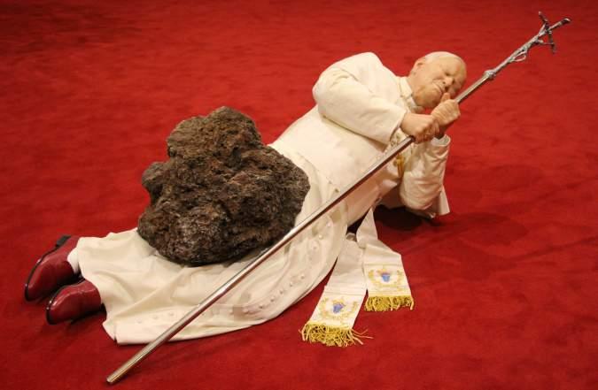
Art Style | Art & Culture International Magazine 55
Figure 3: La Nona Ora, 1999 Maurizio Cattelan - Not Afraid of Love Exhibition at Monnaie de Paris. Photo by Fred Romero November 12, 2016 Licensed under CC BY 2.0
Him
Made in 2001 with wax, polyester and real human hair, Him has become one of Cattelan’s most recognized works. Its most famous exhibition was one where the sculpture was placed in a Warsaw ghetto in Poland. Recently in 2016, the piece was sold for a record $17 million (Associated Press)
Him is a sculpture, which depicts Hitler kneeling and praying (See figure 4). The sculpture is reduced in size, which causes Hitler to appear like a child asking for forgiveness. The child-like appearance could also represent innocence as a guise of evil. Hitler is looking upwards, and this suggests he is praying to God ‘Him’ or ‘He’ are usually terms used when speaking about God, yet Maurizio Cattelan uses Him as the title of the piece. The title could be insinuating that Hitler is, in fact, turning to religion in this piece. He appears very stern and rigid. His face does not reveal much emotion; however, the way his body is sculpted resembles a remorseful young boy. The suit, chosen by Cattelan to fit the statue, is eerily similar to a schoolboy’s outfit. Having the body and clothing of a young kid creates a very ominous contrast with the face of Hitler This, once again, could suggest concealment for evil not only in the case of the Nazi's but in general.
Maurizio Cattelan has said that Hilter is a representation of pure evil, but that it “even hurts to pronounce his name” (Shepard) and for this Cattelan must have adopted the name Him, so as not to utter his name. This criticizes the fact that Hitler has become a taboo topic rather than a point of discussion. The piece becomes the spark of discussion on the nature of evil.
The controversy about Him increased when it was displayed in the Warsaw ghetto. Many Jews had been killed there or held until they were sent to die in concentration camps (Gera) Ari Kohen, a Schlesinger associate professor of political science and director of the human rights program at the University of Nebraska, commented on the placement of the piece by affirming that it “suggests either a serious lack of judgment or outright anti-Semitism” (Wecker). He argued that the piece, instead of studying Hitler’s actions, being assigned to one of the places affected by the Nazi’s, actually humanizes the crimes (Wecker). This view stems from the mask of innocence placed on Hitler by having him appear as a young boy, guilty of his actions and
Art Style | Art & Culture International Magazine 56
asking for forgiveness. However, lawyer Zofia Jablonska claims the piece is “provocative, but it’s not offensive. Having him pray in the place where he would kill people- this is the best place to put it” (Gera) Poland’s chief rabbi had seen Him before the installation and had approved it. His reasoning was that he understood that Maurizio Cattelan was initiating a discussion by asking ethical questions through controversy and provocation of the public (Gera). This sculpture, by exposing an offensive emblem, dismantles a societal symbol for evil. Forcing the public to confront this figure and question the nature of crimes, allows Maurizio Cattelan to deconstruct taboo. It seems to me that this piece opened the floor for debate and allowed for people to realize ranging opinions and Cattelan confirms this (Shepard) Would Cattelan’s artwork then, be considered a political piece? It could because his attack on the prohibited discussion of Hitler and the Nazi regime is a political gesture. He is allowing the public to question society and perspective.
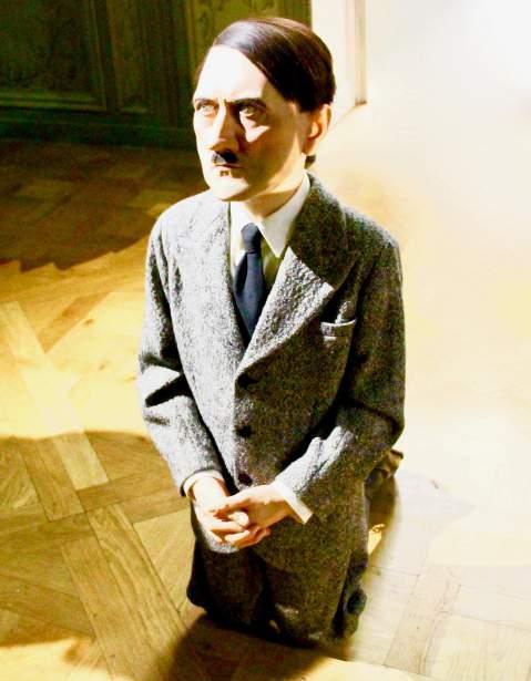
Art Style | Art & Culture International Magazine 57
Figure 4: Him, Maurizio Cattelan - Not Afraid of Love. Exhibition at Monnaie de Paris.
Photo by Fred Romero. November 12, 2016. Licensed under CC BY 2.0.
Maurizio Cattelan created L.O.V.E in 2010 as a donation to the city of Milan. Standing at 11 meters, the Carrara marble statue (Nicolin) overlooks the Milan Stock Exchange in Piazza Affari (See figure 5). The sculpture offers a giant hand with all fingers sliced off except one, the middle finger Originally the statue was planned to stay in the square for only two weeks, but eventually, Cattelan donated the piece to the city under the terms that it would not be moved from Piazza Affari (Cirillo). After many lengthy negotiations, the city announced that the statue would not be moved for the next 40 years, “Il 'Dito' di Cattelan rimarrà per sempre in piazza Affari” (La Repubblica Milano, February 27, 2017).
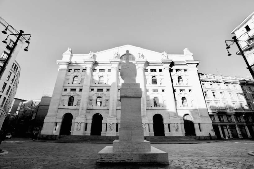
Art Style | Art & Culture International Magazine 58 L.O.V.E.
Figure 5: L.O.V.E., 2010. Maurizio Cattelan in Piazza Affari, Milano
Photo by Bruno Cordioli, December 25, 2011. Licensed under CC BY 2.0.
A giant middle finger placed directly in front of the Milan Stock Exchange leaves little to the imagination for the significance of the piece. However, there is much more behind the gesture than it seems. Maurizio Cattelan explained in an interview that he specifically made the piece for that particular placement in Piazza Affari (Cattelan). The hand would depict an old Italian fascist salute, had four fingers not been chopped off. Cattelan decided to alter this historical gesture and in a way replace it with a new one, the middle finger. The stock exchange is placed in the building Palazzo Mezzanotte, which is characteristic of fascist-era architecture (Passariello) Not only is the statue made of marble, just like the building, but it is also set very high up on a pedestal which, when viewing from the front, allows the piece to be placed perfectly between two columns and directly under the arch. Although Cattelan only explicitly speaks about the pieces meaning in relation to fascism, it is undeniable the connotations it has against financial institutions
The name of the piece, L.O.V.E., stands for Libertá, Oddio, Vendetta, and Eternitá, which is Italian for Freedom, Hate, Vendetta, and Eternity (Graffio) It, of course, spells the word love, which seems ironic since there is an implied hatred or opposition in the piece. The spelling of the word in contrast to the implication seems to represent the piece quite well. The 3-story hand faces away from the Stock Exchange so that it could be seen as the bankers making this gesture to the world (Duggan). Not just everyone in the world, but mainly the lower classes, dissatisfied with the current economy. Rather than supporting the bankers, however, Maurizio Cattelan is insinuating the attitude they have and the power and money they have to get away with it. The name, then, shows the disguise as a good thing to help the people and the unveiling of how the bank truly works. Cattelan has never explained or commented on any of these possible hidden meanings, the only explanations he has offered have been about the piece’s critique on Italian fascism. It is clear that Maurizio Cattelan was, in fact, creating a political statement with this piece. He is, in fact, opposing fascism and also possibly the Italian financial system Because of this possibility, L.O.V.E has sparked its own fair amount of controversy, mainly from Italian bankers and those who work in the Milan Stock Exchange. Milan’s politicians, on the other hand, have fully embraced the piece and helped advocate the anti-fascist message (Passariello). Although the statue’s serious message has been questioned, since it appears as a childish move played by Cattelan, the piece’s political theme is carried out no matter what the true significance is. Cattelan’s way of expressing disapproval also managed to generate consciousness about Italy’s fascist past and economic present.
Art Style | Art & Culture International Magazine 59
America
As Maurizio Cattelan’s return to the art world after his self imposed retirement in 2011 (Kennedy), he is installing America currently, in September 2016 (Cattelan), in the Guggenheim Museum of New York, USA. Since 2011, Cattelan has worked on various projects, such as a magazine Toilet Paper, which he creates with photographer Pierpaolo Ferrari (Lokke) He stated in an interview that "Actually, it's even more of torture not to work than to work" (Kennedy) Thus his return is marked by his creation America, an 18-karat solid gold functioning toilet (See figure 4).
In this piece, Maurizio Cattelan is critiquing the fortune of the art market and the ridiculous luxuries possible only for the rich. It may seem hypocritical or ironic, considering Cattelan is one of the most expensive artists alive today (Kennedy) Cattelan has, however, always been critical of the excess of money floating around the art world and its influence on the superficiality and authenticity of art (Silverton). America being a completely functional toilet will replace the museum’s porcelain toilet and be accessible to the visitors of the museum. People will be allowed to use the toilet in the standard bathroom of the Guggenheim (Kennedy) Cattelan has explained that the piece only truly becomes a work of art with someone sitting on or standing over it (Graham). Naming it after the USA is a clear indication of the piece’s critique on the inequality and economic disparity that is far too ingrained in American society.
Many have associated this work with Marcel Duchamp’s Fountain (Kennedy) and Piero Manzoni’s Merda d’Atrista, also known as Artist’s Shit (Jones). Duchamp’s urinal became an icon for discussion on the production and value of art (West). Is everything produced by an artist considered art? Manzoni's piece also exhibited at the Guggenheim Museum of New York, which featured his own feces as an artistic expression, commented on contemporary art earning its value from artist labels (Mansoor). America features the same themes and additionally speaks out about American society. Inspired by Franz Kafka’s novel Amerika (Kennedy), Maurizio Cattelan’s golden toilet embodies the illusion of the well-known ‘American Dream’ (Williams). One is allowed a moment of privacy with Cattelan’s extravagant piece as merely a taste of the lives of the increasingly wealthy (Graham). It symbolizes the deception and fantasy that has become the American Dream
Art Style | Art & Culture International Magazine 60
For most of Maurizio Cattelan’s pieces, he allows almost all interpretation to be in the eyes of the viewer. While, for this piece, Cattelan has offered up a suggested narrative. In this instance, he has noted that the piece is not intended to be a joke. Many times, his pieces are interpreted as solely satirical works, while here he avoids this label. Cattelan confirms America’s commentary on the art world and also its exposure on economic unfairness. He does so in a seemingly discreet and honest way of stating that, although he usually opposes influencing people on how to view his art, he believes people may notice this implied meaning of the piece (Kennedy). In terms of its political connotations, this piece seems to express its political opposition to the American system and wealth overtaking the art world explicitly. It is maybe one of Maurizio Cattelan’s most openly political pieces, only because of his admittance to the meaning behind the dazzling interactive gold toilet. The response from the art world was to alter the name (Cattelan). Although Cattelan had already begun formulating this creation for a while, it was announced during the American presidential primaries. Cattelan has been known to anticipate future events with his art, and America easily ties into the relevant topic of a presidential candidate, billionaire Donald Trump, gaining so much power and success (Kennedy). Due to the timing, it had been suggested to Cattelan to use the name Amerika from Kafka, rather than the English spelling America (Cattelan). This interesting historical setting for the introduction of this piece creates the perfect grounds for even more political meaning. This piece has been displayed in the New York Guggenheim Museum.
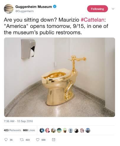
Art Style | Art & Culture International Magazine 61
Guggenheim Museum on September 15, 2016]
Conclusion
To conclude, I believe Maurizio Cattelan implicitly creates political pieces, while allowing and inspiring the public to create new or different interpretations. Many interpretations conclude with political messages, while some doubt Cattelan’s credence as an artist, viewing his work as “tendentious tchotchkes” (Maurizio Cattelan
The Movie). Since Cattelan believes that it is the people’s reactions that create his artwork (Cattelan), then a political interpretation would cause the piece also to be political. Due to the political agenda being undeniable most of Cattelan’s pieces analyzed, I can conclude what I had expected, which is that Maurizio Cattelan is a Political Artist.
Several of the pieces I have examined could be labeled as political for the way they support or break down societal systems. Nonetheless, Maurizio Cattelan does not claim the title of a political artist, and various critics refuse this label for him as well. Regardless of this, my conclusion states Cattelan as a political artist because of the politically charged themes he typically presents
L.O.V.E. and America explore historical and relevant topics and create awareness and discussion on their respective issues. This, in turn, names them as political artworks. Of the pieces I analyzed, they are the only two that can fully and undoubtedly claim this title. This is due to Maurizio Cattelan offering significance for the works, causing them to be less affected by differing interpretations. The meanings, given by Cattelan, tie into political themes.
La Nona Ora is considered Maurizio Cattelan’s most famous work because of the attention it attracted (Smith). It is simply visually provocative and implies a political message. Although Cattelan stated that the piece held political connotations, the meaning he gave to it carries pity and compassion for the Pope, not an opposition to the Church.
Him tackles taboos, but that alone does not make it political. Depending on the interpretation it can be seen as political or not. However, Maurizio Cattelan has confirmed no meaning for both Him and La Nona Ora alike; therefore no political title can be assumed.
Art Style | Art & Culture International Magazine 62
Finally, although I have concluded that Maurizio Cattelan can be considered a political artist, there are various aspects left unanswered and uninvestigated due to the word limit of this essay. With more space, I would have tied the political themes of the pieces into Cattelan’s own political affiliations It would also be interesting to analyze his artistic inspirations further and observe the possible political messages and effects they have had on Cattelan's art. As for this essay, my conclusion and hypothesis have been confirmed, but further research could provide a more in-depth and broad analysis of Maurizio Cattelan's political art.
Author
Margherita Medri, United World College Costa Rica. Email: margherita.medri@uwccostarica.org
Art Style | Art & Culture International Magazine 63
Maurizio Cattelan, Not Afraid of Love. Exhibition at Monnaie de Paris.
Photo by Fred Romero. November 12, 2016. Licensed under CC BY 2.0.
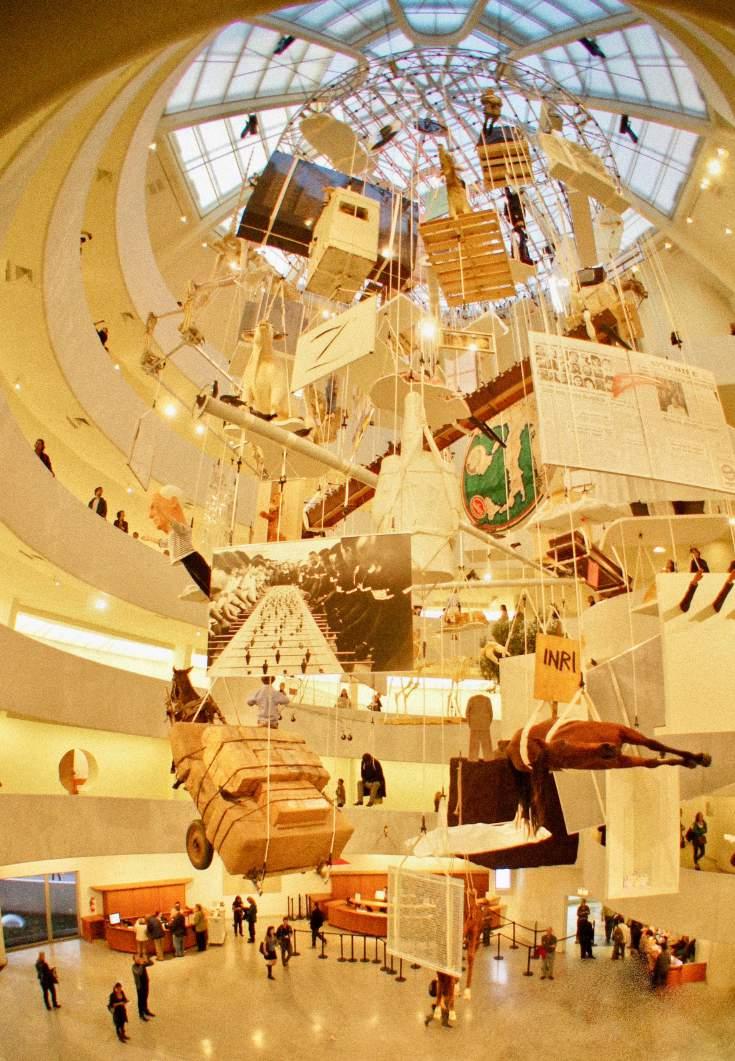
Art Style | Art & Culture International Magazine 65
Figure 8: Maurizio Cattelan, All, New York: Guggenheim Museum, 2011
Photo by Davide Costanzo. Licensed under CC BY 2.0
Bibliography
Lokke, Maria. "MAURIZIO CATTELAN’S TOILET PAPER." New Yorker 18 Nov. 2011: n. pag. Newyorker.com. Web. 7 Sept. 2016.
Mansoor, Jaleh. "Material Value: Jaleh Mansoor on Piero Manzoni at Gagosian." Artforum International May 2009: 89+. Questia. Web. 8 Sept. 2016.
Maurizio Cattelan The Movie Dir. Maura Axelrod. Perf. Maurizio Cattelan. Maurizio Cattelan The Movie
Maura Axelrod Productions, n.d. Web. 09 Sept. 2016. http://www.mauriziocattelanfilm.com/
Nicolin, Paola. "Maurizio Cattelan." Artforum International Dec. 2010: 273+. Questia Web. 6 Sept. 2016.
Passariello, Chrisina, and Sabrina Cohen. "At Milan's Bourse, Finger Pointing Has Business Leaders Up in Arms." The Wall Street Journal. N.p., 13 May 2011. Web. 6 Sept. 2016.
http://www.wsj.com/articles/SB10001424052748704681904576317781140034982
Shepard, Jack. "Hitler Statue by Maurizio Cattelan Sells for £12 Million at Christie's Auction House." The Independent. Independent Digital News and Media, 9 May 2016. Web. 05 Sept. 2016.
https://www.independent.co.uk/arts-entertainment/art/news/hitler-sculpture-maurizio-cattelan-sells-for12-million-at-auction-christies-a7019976.html
Silverton, Lily. "ARTIST MAURIZIO CATTELAN ON MORTALITY, THE INTERNET AND IDENTITY." Hunger. Hungertv, 5 May 2016. Web. 7 Sept. 2016. http://www.hungertv.com/feature/artist-mauriziocattelan-on-life-the-internet-and-identity/
Smith, Roberta. "A Suspension of Willful Disbelief." The New York Times. The New York Times, 03 Nov. 2011. Web. 08 Sept. 2016. http://www.nytimes.com/2011/11/04/arts/design/maurizio-cattelan-at-theguggenheim-review.html?_r=0
Stone, Dickon. "Art for Your Sake." Editorial. European 29 May 2014: n. pag. TheEuropean. The European, 29 May 2014. Web. 31 Aug. 2016. http://www.theeuropean-magazine.com/dickon-stone/8519why-art-is-by-definition-political
Troyer, Madison. "An Artist Profile and Inside Look." The Culture Trip Global Food Art Culture Travel Recommendations Maurizio Cattelan An Artist Profile and Inside Look Comments. The Culture Trip Ltd, 29 Jan. 2016. Web. 29 Aug. 2016. http://theculturetrip.com/europe/italy/articles/maurizio-cattelan-anartist-profile-and-inside-look/
“WAS HE SUCH A SAINT? Two Years after His Death, Pope John Paul II Is Being Fast-Tracked to Sainthood. but an Explosive New Book Accuses Him of Hushing Up Scandal after Scandal in the Vatican - from Mafia Corruption to Paedophile Priests ...and Even Murder." Daily Mail (London) 6 Apr. 2007.
Questia. Web. 4 Sept. 2016.
Wecker, Menachem. "‘Outrage’ over Hitler Sculpture in Warsaw Ghetto Neglects Meaning of Maurizio Cattelan’s Work." Chron. Hearst Newspapers, 28 Dec. 2012. Web. 5 Sept. 2016. http://blog.chron.com/iconia/2012/12/outrage-over-hitler-sculpture-in-warsaw-ghetto-neglectsmeaning-of-maurizio-cattelans-work/
West, Patrick. "Duchamp and His Urinal: He Was Just Taking the Piss." New Statesman (1996) 13 Dec. 2004: 12+. Questia. Web. 8 Sept. 2016.
Williams, Gregory. "The Happy End of Kippenberger's Amerika." Artforum International Feb. 2003: 97+.
Questia. Web. 8 Sept. 2016.
Art Style | Art & Culture International Magazine 66
What Matters in Contemporary Art? A Brief Statement on the Analysis and Evaluation of Works of Art
Christiane Wagner
Abstract
This essay seeks to provide an idea of the basis of the main theories of contemporary art criticism. It begins with the assumed knowledge and tradition of the Academies of Fine Art, with their ideal of beauty and classical structure. The importance of such traditional references has its origin in the Renaissance in the 16th century, in Florence with Giorgio Vasari (1511–74), in Haarlem with Karel van Manda (1548–1606) and, above all, in Paris with Charles Lebrun (1619–1690) of the French Royal Academy, which established the first strict rules for the fine arts and was a reference for Europe as a whole. Academies of Fine Art were established in the major European capitals, and from the 19th century, in the Americas and worldwide. The themes and rules presented over the course of history always related to the functions of art and the legacy of classical thought as tradition. However, values and ruptures, ethics, ideologies and political ideals, and the progress of science have conditioned the fundamental importance of the renewal of Western thought. This essay concerns the decline of tradition in the arts, the lack of ideologies guiding modern art, and the transition to contemporary art. The main theories that marked this transition period 20th and 21st century are analyzed with respect to the art, its criticism, and the theories to the understanding and transformative sense of artistic creation. Such creativity usually appears strange or transgressive to the public and primarily to be seeking a legitimation of the artist’s autonomy of choice and freedom of thought. On the whole, this essay presents the main aesthetics notions relating to the critical analysis of traditional European cultures and, more recently, American ones too. American culture, in which the languages of art are based, is analyzed for its effect on occidental philosophy. Both theories of art and contemporary aesthetics are emphasized so as to better understand the work of art’s current aim with regard to the discernment of theoretical, prescriptive, and ideological thinking in the visual arts.
Art Style | Art & Culture International Magazine 69
Art Style | Art & Culture International Magazine 70
Dan Peterman, Kassel Ingot Project, Iron ingots, produced in collaboration with DK Recycling und Roheisen GmbH, Duisburg, Germany
Photo: Christiane Wagner, documenta 14, Kassel, Germany, 2017.
The dissolution of the traditional values of the fine arts, developed during the 17th and 18th centuries, was the reason art in the late 19th century could no longer be understood or assimilated in its purposes. Thus, at the beginning of the 20th century, a conservative public prevailed against the provocations of the artistic avant-garde in the face of modern society’s utopias. A series of artistic, avant-garde movements emerged, bringing art and social reality closer together, reaching their peak in the 1960s. Then came artistic achievement that was no longer understood by the ideologies prevalent until the end of the 1970s. Art entered a period where it sought meaning from the lack of orientation, which was understood as a crisis for it. However, this moment meant the end of modern art for many art theorists and historians. References to artistic creation no longer held the same senses due to the lack of aesthetic criteria and the ideologies that guided modern art to its peak. Therefore, there was no meaning for contemporary creations and, especially, for art criticism. If, first, the meaning of these creations was not clear, then any judgment of aesthetic value would be without the necessary basis for the formation of opinion, classification, and definition on what could be accepted as art. Thus, through theories of analytical thinking, a possible and plausible reading began to drive art criticism, providing a language for reading and understanding works.
The 1980s proposed a new context for society. The individual gradually established and affirmed its autonomy of choice and participation. In art, the process was the same, but without the striking ideologies that modern art defended at that moment of social and political involvement. It was underground art for the system and often provocative, which – contrasted in the following years, post-time – became more allowed without objecting or resisting, a period known as postmodern. Thus, in contemporary art, through context and concerning modernity, we can understand the postmodern period as a moment of transition and know that it is a neologism, not specifically meaning an artistic movement or wave but only an expression to define this moment of changing values understood as the crisis of modernity. The social, political, and economic history in their cultural paths and experiences have always been transferred to art. However, these cultural experiences belong to the historical moment, in the Hegelian sense of the spirit of the time, Zeitgeist – by which the individual in his/her consciousness acquires autonomy and the notion of freedom for its development and evolution.
Art Style | Art & Culture International Magazine 71
Introduction
Therefore, this individual or artist in his/her current socio-historical context, wherein meaning exists in globalization, democracy, and, above all, consumer society is conditional in all these experiences becoming the aspiration of an idealized democracy. Such process is analyzed when the authenticity criterion of art transforms the artistic production relations and social functions into art, in respect of cultural value as political and social progress seeking the “democratization of art”, and to discuss the democracy and the sociopolitical context regarding inequality, post-colonialism, exploitation of minorities, immigration, race, gender, and climate change. For example, in documenta 14, curator Candice Hopkins stated: “a set of masks from the series, The Undersea Kingdom, co-produced by Canada Council for the Arts, was specifically made for ‘documenta 14,’ by Beau Dick, who was a hereditary chief, an activist, and a cultural leader, was an active means for the First Nations communities to resist the more than 500 years of colonization ” as figures 1 and 2 show.
Art Style | Art & Culture International Magazine 72
Figure 1. An installation view of Beau Dick’s The Undersea Kingdom at documenta Halle. Curator: Candice Hopkins. Photo: Christiane Wagner, documenta 14, Kassel, Germany, 2017.
Moreover, this kind of artwork should be situated in the socio-historical context to understand the meanings of this creation. However, on the one hand, it is essential to the historical and anthropological aspects; on the other hand, a direct relationship with the ordinary allegory of celebrations for a general audience is more common. Furthermore, the relation of the object and its sense or function should be considered when being displayed in one of the most representative contemporary art events, “documenta 14.”
Art Style | Art & Culture International Magazine 73
Figure 2. Beau Dick, The Undersea Kingdom, co-produced by Canada Council for the Arts.
Photo: Christiane Wagner, documenta 14, Kassel, Germany, 2017.
Languages of Art
With the autonomy of art, globalization, and the ideal of democracy, we find the works of analytical thinking in the world of art among contemporary texts that propose a theory of the language of art – to greater relevance, the publications of Nelson Goodman. In these works, we discover the characteristics of nominalism – i.e., limited awareness of a representation of signs or words, evoking something that is unique, because the ideas or generalized concepts are not represented. This professor has served at Harvard since 1967 and been a partner of the Walker-Goodman Art Gallery in Boston for 12 years, a great collector of ancient and contemporary art; he also founded Project Zero at Harvard, stimulating analytically rigorous research that encompasses the knowledge of the cognitive arts. In treating objects and qualities, this theorist affirmed that there is no external ontological foundation opposing metaphysical “platonism ”
Platonism in this sense is a contemporary view. It is obviously related to the views of Plato in important ways, but it is not entirely clear that Plato endorsed this view, as it is defined here. In order to remain neutral on this question, the term ‘platonism’ is spelled with a lower-case ‘p.' Platonism is the view that there exist such things as abstract objects where an abstract object is an object that does not exist in space or time and which is therefore entirely non-physical and non-mental.1
Therefore, Goodman theory offers relativistic constructivism, by which the world would be constituted of diverse worlds and of the diversity of objects that are in him; this would not be discovered but constructed. However, in this universe of different forms of object representation, the author understands it as various forms of the world, depending on how the different manifestations or appearances of objects are perceived or understood. In this way, knowledge would be possible only through organization and classification to distinguish or resemble categories – thus justifying that this organization is not offered by nature, but by the human through various means. In short, for him, there are many ways of sorting and organizing infinite versions of worlds –Ways of Worldmaking (1978). But Goodman also defends the existence of a general criterion, specifically in the universe of the arts, so that work can be accepted through what is called the “mode of reference and types of symbol systems.” This criterium is presented in Languages of Art (1976), to favor the predicates that allow more efficient use of our cognitive resources and linguistic and thinking
Art Style | Art & Culture International Magazine 74
habits, building worlds. His systematic study of symbols and symbol systems aims at understanding how the process of perception works and creative attitudes in the arts; the analysis of schema types and symbol systems allows us to address some persistent problems concerning representation and description. The set of symbols (scheme) is related to the references (domain or medium), a proper relation of the symbolic system that determines the elements, providing a syntactic structure that establishes a normalization for that element to symbolize, as well as a semantic structure that specifies the symbolized element. This process allows us to identify the references denotation, exemplification, representation, expression, etc. elements in symbolic action by syntactic and semantic function. However, without properties to define any emotion just a logic rather than emotional, a form of symbolic relation as communication it becomes a technical and distant analysis of aesthetic experience. But Goodman defends the aesthetic experience as a dynamic relation, by which the identification of symbols becomes part of the process of interpreting works
Communication thus becomes the primary purpose for symbolization, as humanity must communicate to relate socially, through symbols and means of communication. Therefore, the work of art is understood as communication medium, transmitting messages, and in this way, also becomes an object of the communication sciences. Symbolization is a method of interpreting, reading, and understanding fundamental to cognitive goals in analyzing a work of art. However, regarding the aesthetic experience, we can conclude, in the author’s definition: “the aesthetic properties of a picture include not only those found by looking at it but also those that determine how it is to be looked at” (1976, 111–112). In short, Goodman did not differentiate science from art, as in the empirical observation of aesthetic experience. Art and science would be a symbolic system and a means of constructing the world Ways of Worldmaking (1978). However, since Baumgarten, aesthetics has strictly existed in another dimension, not the dimension of logical knowledge, because it instead belongs to the dimension of sensibilities and emotions. However, for Baumgarten, art is a medium, the principle of knowledge, not just the medium of representation, while Goodman defines an aesthetic based no longer on an essence with tradition in Western Europe. Goodman’s philosophical orientation with an Anglo-American art of thought defines analytical aesthetics to include an understanding of works of art as a form of communication, a message medium. However, beyond the infinite possibility of meanings and the many contents of what art can express, Goodman disregarded classical notions of the traditional philosophy of art.
Art Style | Art & Culture International Magazine 75
The most significant are pleasure, satisfaction, and relational issues to aesthetic judgment, like beauty, taste, and the evaluation of works especially, which he placed in a secondary relationship called an aesthetic symptom, classifying elements and distinguishing them between aesthetic and non-aesthetic. Also, he distinguished the aesthetic notion of art to say that what matters is not the beauty of the artwork, but its aesthetic function. For Goodman, the object of art is not itself a work of art; it only becomes a work of art if the individual sees it in that way or if the context allows it. The example used to clarify his reasoning was the use of a Rembrandt painting to cover a broken window. In this situation, Rembrandt’s painting ceased to function as a work of art, but regained it when it was again inserted into a museum. This example was found in Goodman’s article, When is Art?, wherein one does not question what art is, but when it is. Thus, Goodman renewed his analytic aesthetics by asserting that there is art when something functions symbolically as art.
The Transfiguration of an Ordinary Object into a Work of Art
However, in response to Goodman’s question and the other questions on the meaning of some everyday objects that have acquired the status of a work of art such as Andy Warhol’s Brillo Boxes (1964) or Duchamp’s readymade Fountain (1915) Arthur Danto sought answers by comparing two situations: first, if the objects were exposed as a work of art; second, if they could be found or bought for a banal value in any establishment of products of daily use.
However, even if they are in different situations, Andy Warhol’s Brillo Boxes (1964) or Marcel Duchamp’s readymade Fountain (1915) do not distinguish between their equivalents in the supermarket, which was also the intention of the artists: a copy identical to the original. With this, Arthur Danto concluded that only interpretation could clarify this transfiguration of an ordinary object into a work of art The Transfiguration of the Commonplace (1981). However, only knowledge about the arts could allow such an interpretation, exclusively limiting this experience to the artistic universe, and not to that of the population. The artistic universe represents only a small part of society, made up of artists, gallery owners, art dealers, curators, critics, art theorists and historians, aesthetes, and finally, all who are interested in this universe.
Art Style | Art & Culture International Magazine 76
However, what counts as an interpretation to consider such banal objects works of art is quality. And, for Danto, it consists of the fact that these qualities are aesthetic. But for these aesthetic qualities to be perceived, it is necessary to encounter the aesthetic experience of the object presented as a work of art so that it can be reacted to and analyzed as art or not art. For this experience, both Arthur Danto and Nelson Goodman considered interpretation the best medium, without judgments of subjective values based on taste and qualitative values. As for what the public has to say, it is only considered in the face of a possible coincidence with the interpretation that the artist himself/herself gave to the work. All the work of interpretation, according to Danto, aims at a better understanding between the intention of the artist and the reception of the public. The personal aspects of the artist and his/her environment are of little interest to this interpretation. The sense of art is only that of a product wherein it is decided that it can be inserted into the dynamics of the artistic universe, articulating its course through language and communication.
The interpretations of Nelson Goodman and Arthur Danto are no less subjective and with pretension to universality in the sense of Kantian reason, as the taste is not a judgment on the beautiful object, but the relationship between the representation of this object and our faculties, the understanding, and imagination. Without rules and without purpose, taste is a subjective feeling. However, it also exists as a hypothesis of universal communication in agreement with those who possess an aesthetic common sense. Such is the meaning of Kantian reflection. Moreover, in confirming this universality of the work, as a consequence of these interpretations, the work would be inserted into the world. Therefore, the historical and sociocultural aspects would not fail to be aesthetically considered.
Art Style | Art & Culture International Magazine 77
Art vs. Not Art
Furthermore, Thierry De Duve – an emeritus professor at the Lille 3 University, philosopher, art historian, and heir to a European tradition of knowledge – has analyzed artistic achievements since 1975. He has considered a growing accentuation in the direction of Adorno’s reflections on artistic production in relation to capitalist society, referenced by Horkheimer on Cultural Industry in 1947 in Dialectic of Enlightenment (Dialektik der Aufklärung) and, on art in relation to the Cultural Industry, in Aesthetic Theory (Ästhetische Theorie), published in 1970. In this sense, Thierry De Duve concentrated on the representativeness of Marcel Duchamp’s work, specifically on the readymades, conditioning them to a process of modernist practice to establish a daily object as a work of art. This process consists, first of all, in the choice of the object, then the presentation to an audience, the reception of that audience, and the role of an institution to label such an object a work of art.
Therefore, according to Thierry De Duve, following these conditions, art would be only an institutional game, conditioning the values of modern art as rules and norms for contemporary art. And, contrary to this sense for Thierry De Duve, it is necessary to separate Duchamp from this norm – values of modern art aiming at the rupture of tradition. However, this process begins with the personal aesthetic game of someone responsible so that such an object is named a work of art, and with that appointment, inserts itself into the modern jurisprudence such that the history is constructed. However, in commenting on the readymades, De Duve analyzed Duchamp’s sense of distancing from the conventional work of art, when the artist stated in an interview with Georges Charbonnier in 1961 that art is to make and is always an act of choice (it is still choosing). Thus, readymades are not mere found objects but chosen objects. It is a meeting between the object and the author. In this sense, an ink tube can be seen as a readymade, since it is the first choice to be able to elaborate the painting. Therefore, for this relationship, De Duve established a comparison between the painter and the professional artist. And, from this situation, it seeks a resolution in Kantian theory, in the sense of natural beauty and artistic beauty. Through the transcendental Kantian aesthetic, De Duve understood the status of the work of art concerning the readymade, transferring the sense of the beautiful to the sense of art. What is meant by a paradigm shift is the beauty, which was formerly related to the absolute, the idea of perfection, in a relationship with nature. In this way, art can now be understood as art related to the historical context of modernity: art versus not art.
Art Style | Art & Culture International Magazine 78
Finally, this conception of the history of art as jurisprudence almost demands the constitution of a place of transmission different from the galleries and museums of contemporary art, in which future works can arise in an appeal to a climate and environment without needing precautions to be institutionalized. It is difficult to find non-institutionalized artwork in the universe of contemporary art. As well as not being part of the system of art in general, considering evident, all exchange of values relations. This also applies to public works, which is precisely why these have corporate sponsorships and government tax support or incentives. For example, Cloud Gate is a public sculpture by artist Anish Kapoor, hosted by AT&T Plaza at Millennium Park, Chicago, Illinois as figure 3 shows.
Art Style | Art & Culture International Magazine 79
Figure 3 Anish Kapoor, Cloud Gate Chicago, Illinois. Photo by Alex Powell
Visible World of Art and the Return of Real
In the 1970s, art critics and historians Hal Foster and Rosalind Krauss, creators of the prestigious art magazine October, stood out. These American critics and historians followed the same criteria and methods to develop their theories on contemporary art. Rosalind Krauss developed the main method. It eliminates transcendence for the understanding of art, recognizing that any abstract exteriority concerning art conditions the rupture of art with the visible world. Her theory follows the European line of sign language, the semiology of Ferdinand Saussure. And, unlike the formalistic method used by Clement Greenberg, she understood that the works presented a diversity of perspectives and a series of representations, independently of the relationship between the artist and his/her work. Rosalind Krauss’s theory of contemporary art is used in many criticisms. However, by itself, this work is entirely represented in the analysis of Picasso’s collages by considering them a visual metalanguage. As each piece of newspaper pasted covers the preceding, the absence of the original plan is manifested. The difference between figure and ground disappears, the sign appears as the shape and performs the work, and more important meaning representation. The origin of the painting ceases to be represented. There is only the idea of the original object as representation, without the need for painting, and there may be another ideal representation, which could be something else –not the simple designation of absence as represented in the collage. Finally, Rosalind Krauss’ theory continues to develop, breaking with tradition in the history of art by defining new methods and concepts for knowledge through art, contributing to the criticism of 20th and 21st century art
Hal Foster presented – in his work The Return of the Real (2001) – a non-idealistic view of the history of art in his theory on modern and contemporary art. He introduced a transdisciplinary method through a recontextualization of the historical challenges of contemporary creation. His critical analysis linked the past with the present, establishing the interdependence between modernism and postmodernism, thus redefining the avant-garde notion of the years 1910-1920 to the present day. Be it new-avant-garde or post-vanguard, Foster has, as great reference, the work of Peter Bürger for this analysis of time and the vanguards in its limits. In retrospect, the aspect of non-linear historicity – or anachronistic – is supported by Walter Benjamin’s theories. Throughout his work, Foster demonstrated, through genealogy, the understanding of this new vanguard from the pop art of Warhol to the kitsch-art of Jeff Koons in its repetitive aspects that, according to him, can present its subversive characteristic.
Art Style | Art & Culture International Magazine 80
Final Consideration
The history of art has long been guided by reference systems such as the concept of imitation mimesis natural or ideal beauty, harmony and the established criteria that still influence our perception and our understanding of current forms of creation. In modern art, breaking with the academic canons and with traditional values, the art presented itself in a transgressive and subversive way. In contemporary art, all its meaning is different from that of modern art, instead of an approach to art and life. Before there were criteria to establish the meaning of art and select the reference and, in the present day, the absence of these criteria, with only time to choose among the contemporary works, those that mark history are those that become unforgettable while others are forgotten, according to the values of the sociocultural context of our day. The great controversy at that time is strictly related to the repertoire of classical theories and the critic of modern art to analyze contemporary art achievements, to explain or legitimize the present creation. Before, every object of art was related to the ideal of beauty. However, this standard does not make sense anymore – first, due to the dissolution of the fine arts as a result of the breakdown of traditional criteria and norms, and then as a consequence of sociocultural transformations. From the turn of the 19th to the 20th century, a new sense was found for the history of Western art, which, when analyzed by American theorist and art critic Harold Rosenberg (1907- 1978), would be conditioned to a redefinition, compromising the notion one had about art rather than specifically about the current work of art. However, for the philosopher and esthete Marc Jimenez (2005), nowadays, it is not a matter of questioning the artistic achievements in their particularities, problematizing them, and refusing them as works of art in the face of the old notions about art. But, instead, it is about enabling new aesthetic experiences or, rather, creating a new worldview.
However, to evaluate the quality of a work of art, the values of aesthetic judgment and taste remain under discussion, as well as the search for criteria and norms for a reference. Indeed, the criteria established for the selection of artists and works by public or private institutions are of great interest, especially for those who relate to the universe of the arts and then to the public. These criteria for the selection of the artist and his/her works are almost always, today, established by the curator. But this is not a general rule. The curator or art critic has great significance in mediating his/her aesthetic judgment between the artist, the institution, and the public, forming an opinion through communication and establishing notions and values that encompass the entire universe of the arts. However, the criteria that guide artists, gallerists, curators, critics, and cultural institutions have remained, since the beginning of the 20th century, without definition. It is no novelty that after modernism, the criteria established during the previous centuries no longer held any meaning. In our day, 21st century art found in galleries, museums, and cultural institutions has become an object of specialists, professionals in the art and culture market.
Art Style | Art & Culture International Magazine 81
Author Biography
Christiane Wagner is the Editor in Chief, founder and head of Art Style Magazine Visiting Professor of Aesthetics and Sciences of Communication, Postdoc, UNICAMP, (2014-2018). PhD in Sciences of Art and Aesthetics, Université Paris 1 Panthéon-Sorbonne, First Class Honours Thesis. Master in Science of Communication and PhD in Design and Architecture, University of São Paulo. She attended the Academy of Visual Arts, Frankfurt, graduated at the College of Fine Arts, São Paulo. Recent publications: Aesthetic Experience: Visual Culture as the Masterpiece of Nonhumanity, On Culture: The Open Journal for the Study of Culture, Gießen, 2016; Poïésis: entre la raison et la sensibilité. Les nouveaux médiums de l’art, French Journal for Media Research, Toulouse, 2017; Art and Perfect Illusion: From Architecture to Cinema. On the Era of Technological Convergence “Image Evolution. Technological Transformations of Visual Media Culture”. Yearbook of Moving Image Studies, 38-61. Marburg: Büchner, 2018. Artworks and the Paradoxes of the Media-Transmitted Reality. [Accepted publication] 21st International Congress of Aesthetics, 2019. Aesthetics and Cultural Aspects of Bauhaus Towards a New Conception. [Accepted publication] 21st International Congress of Aesthetics, 2019.
Researcher ID: T-9766-2017 | ORCID: 0000-0002-3445-1446
Note
1 Balaguer, Mark. "Platonism in Metaphysics,"
The Stanford Encyclopedia of Philosophy (Spring 2016 Edition), Edward N. Zalta (ed.) https://plato.stanford.edu/archives/spr2016/entries/platonism/
Bibliography
Adorno, Theodor Ästhetische Theorie. Frankfurt: Suhrkamp, 1970.
Carrier, David. Rosalind Krauss and American Philosophical Art Criticism: From Formalism to Beyond Postmodernism. London: Praeger, 2002.
Danto, Arthur. The Transfiguration of the Commonplace, Cambridge: Harvard University Press, 1983.
De Duve, Tierry. Nominalisme pictural: Marcel Duchamp, la peinture et la modernité. Paris: Minuit, 1984.
____. Kant after Duchamp. Cambridge: MIT Press, 1996.
Foster, Hal. The Return of the Real. The Avante-Garde at the End of the Century. Cambridge: MIT Press, 2001.
Goodman, Nelson. Languages of Art. Indiana: Hackett, 1978.
____. Ways of Worldmaking Indiana: Hackett, 1976.
Hegel, G.W. F. Vorlesungen über die Ästhetik. Frankfurt a. M.: Suhrkamp, 1986.
Jimenez, Marc. La querelle de l’art contemporain. Paris: Gallimard, 2005.
Kant, Immanuel. Kritik der reinen Vernunft. Stuttgart: Reclam, 2006.
____. Kritik der praktischen Vernunft. Stuttgart: Reclam, 2008.
Art Style | Art & Culture International Magazine 82
Visual Environment Interventions
Ewely Branco Sandrin
Abstract
Art is one of the elements that intervene visually in spaces, qualifying and transforming them into environments. In view of the growing number of subway stations in current operation and under construction, this essay presents an overview of the permanent and temporary art inserted/displayed in the public spaces of the Companhia do Metropolitano de São Paulo (Metro) subway stations, with the aim of offering observations that may contribute to future projects in the fields of contemporary art, architecture, and design. The methodology used was a comparison study based on the quantitative and qualitative data available in bibliographies, dissertations, and material published in the media regarding the Metro system, combined with photographic records of the artworks and on-site research conducted with users, maintenance technicians, and exhibit monitors for the temporary works that employed technological devices.
The results show that both the permanent works and the interactive pieces, representative of the technological and social-behavior transformations that the contemporary world has experienced, were very well received by users/viewers/participants. There is evidence of a diversity of cultural, social, historical, emotional, aesthetic, environmental, ecological and, above all, political and economic meanings that have together with the absence of curatorship, public policy, and hybrid and innovative project solutions influenced the processes of conception and installation/presentation of this educational cultural element in the open spaces under study.
Art Style | Art & Culture International Magazine 85
During the 1970s, with the government's objective of promoting the revitalization of Praça da Sé [Sé Square], a process of complete reconstruction and visual intervention was carried out, which transformed the square. The revitalization project was intended to make the "environment pleasant, ample, and renewed" (Ferrara 1986, 130-131), and with the installation of the Sé Station below, presumably, accomplish changes to its appearance and utility. However, construction of the station triggered the area's destruction. The square became very large, and the subway vents created visual pollution. As a starting point for the project, extensive research was carried out by a commission of the Municipal Urbanization Agency. Architects, engineers, Metro technicians, historians, and art critics performed a survey of artists, techniques, and visual programming, and presented models in order to select the works that would make up the Sculpture Museum. Fourteen sculptures were installed in the square, in addition to Garatuja (Doodle), by Marcello Nitsche, installed in the station's stairway access, and Untitled by Alfredo Ceschiatti, located inside the station.1
Widely publicized in the press, the project required demolition and an extensive construction site as it was being executed and featured a wide variety of materials and decorative features that gave the place the air of a "pile of kitsch," which included the artworks. According to Lucrezia Ferrara, " space was designed for the scale of the monument but not for its use." Works of art were scattered around the square as "effective tools" without, however, considering the social and cultural diversity of the user/viewer (Ferrara 1986, 130-131). Faced with deficiencies in its ability to offer transportation services, and in an attempt to mollify relations with its users, Metro's administration adopted as part of its Total Quality Management Program its "art allied with technology" approach as a more active channel for closer consumer relationships, a continuing tool for improving its system and services, and a cultural element that would serve as an "instrument of humanization" (Giosa 1994, 7). In this context, the process of installing the art in the stations occurred timidly, together with the presentation of musical concerts and the installation of a few visual artworks. The Art in the Subway Project and the Cultural Action Program were also implemented in the 1970s, launched under the responsibility of the company's Marketing and Communications Department.
Art Style | Art & Culture International Magazine 86
Introduction
The Art in the Subway Project
Following the example of metro stations internationally, large mezzanine spaces, internal and external gardens, access corridors to platforms, and departure and arrival platforms came to be viewed as spaces conducive to visual environment interventions The positive reactions of the subway users, demonstrated by their acceptance, preservation, and appreciation of the artworks, as evidenced by both the formal surveys conducted by the company and by on-site observation of user behavior, resulted in the Art in the Subway Project. Conceived by museologist and historian Radha Abramo, the project took shape and was launched in 1978 with the inauguration of the Sé Station but didn't gain momentum and became a priority until 1988. Currently, the network has 77 stations in operation. Distributed in 38 of these are 106 works of art from Metro’s permanent collection, by a wide variety of artists: Alex Flemming, Alfredo Ceschiatti, Amélia Toledo, Antonio Peticov, Caciporé Torres,
Art Style | Art & Culture International Magazine 87
Figure 1: Subway Station Trianon Masp. Photo by Kaique Rocha. Licensed under CC BY 2.0.
Claudio
Salvador, José Roberto Aguilar, Maurício Nogueira Lima (Fig. 4.), Marcello Nitsche, Maria Bonomi, Mario Gruber, Milton Sogabe, Odiléia Toscano, Renina Katz, Tomie Ohtake, Waldemar Zaidler, and Wesley Duke Lee, among others. They include sculptures, murals, panels, paintings, and installations placed for the most part in internal spaces with the highest concentration of subway users/art viewers. The materials used are diverse, conventional, durable, and easy to maintain. Acrylic and oil paints are the most commonly used media, with a few exceptions: natural elements, glass serigraphy, and digital printing on vinyl. As to the specificity of the works in relation to the locations where they were inserted, the collection ranges from works coming directly from artist's studios, which are totally detached from their context, to those specifically designed for the social, historical, cultural, physical, ecological, and environmental contexts relating to the history of where they are placed.
Art Style | Art & Culture International Magazine 88
Tozzi, Cleber Machado, Gilberto
Figure 2: Subway Station Trianon Masp.
Photo by Kaique Rocha. Licensed under CC BY 2.0.
The Cultural Action Program
Inaugurated in 1986, the program features temporary presentations of an artistic and cultural nature: music, dance, theater, cinema, cultural workshops, poetry, literature, tourism, and thematic exhibitions of art and artworks developed using technological devices. The MASP (São Paulo Museum of Art) showcases, located inside the Trianon-MASP Station, are exhibition spaces that, through Metro's partnership with MASP, complement the dissemination of art by allowing the user/viewer who hasn't visited the museum to experience rare works from the collection, as well as nonpermanent contemporary works. In the Sala Museu de Arte Sacra (extension gallery to the Museum of Sacred Art), located inside Tiradentes Station, temporary exhibitions are offered free of charge. All the modalities mentioned above have their particular value in terms of social and cultural practice, which merit in-depth study. However, works presented at three technological art exhibitions will be highlighted here the Cybernetic Art Exhibition Itaú Cultural Collection (2010), and the 11th and 12th International Electronic Language Festivals (FILEPAI 2010 and 2011), because they showed works that clearly represent the technological and social-behavior transformations that the contemporary world has recently undergone
The Cybernetic Art Exhibition, the result of a partnership between the Instituto Itaú Cultural and the São Paulo Metro, exemplifies the meeting between culture, art, and technology. Understood as art developed using contemporary technologies, "cybernetic art requires constant interaction between the observer-participant and the artwork or with the subsystems that compose the work," (estadao.com.br, 2010) and only through this interaction is the work completely realized. The intention of putting in the installations was to show these artistic expressions to a public that had never visited the institute, giving them the opportunity to see cybernetic art through other means, in a public space. Monitors oriented the public about the exhibits at the Metro's Red Line (Brás, República, and Corinthians-Itaquera), and Blue Line stations (Tiradentes, Paraiso and Sé). The projections exhibited were: Descendo a Escada (Descending the Staircase) by Regina Silveira, a structured interactive projection on a trihedral space formed by the ground and the angle of two vertical screens, generating a "dynamic virtual continuum"; OP_ERA: Sonic Dimension by Daniela Kutschat and Rejane Cantoni, an interactive and immersive installation in the shape of an open, black cube with surfaces consisting of hundreds of luminous lines resembling the strings of a musical instrument that could be played by the viewer, tuned with the proper tension, they vibrated according to the frequency of light and sound determined by the relative position and the interaction style of the viewer/participant; Text Rain by Camile Utterback and Romy Achituv, an animated rainfall of colored letters that was unleashed by the viewer's presence and body movements, as along the projected silhouette of the observer letters accumulated that could form words or phrases from the verses of
Art Style | Art & Culture International Magazine 89
Evan Zimroth's poem "Talk, you," which was displayed on a surface located in front of the projection plane; Reflexão#3 (Reflection#3) by Raquel Kogan, various numerical sequences were projected on the plane of a dark wall and reflected on the surface of a pool of water on the floor, the interface worked by means of a keyboard that regulated the speed of the projection's movement; Ultra-Nature, by Miguel Chevalier, colored digital plants were triggered by the interaction of participating viewers who, through means of sensors, caused modifications in the projected images; Les Pissenlits (Dandelions), by Edmond Couchot and Michel Bret, a flower garden activated by viewers blowing into a microphone.
Also, in 2010, the Federation of Industries of the State of São Paulo, through the São Paulo Industrial Social Services, backed with the Cultural Incentive Law and sponsorship from Santander Bank, held the 11th International Electronic Language Festival (FILE). It sought to emphasize the importance of interactive public art "by understanding and absorbing new social phenomena brought about by technology and, in this way, build strategies that could interconnect with these new mass behaviors" (Barreto, 2010, p.91). Participating at the event were: FILE Prix Lux, an award for artists from around the world who developed innovative interactive art, digital language, and electronic sound projects, and the first edition of FILEPAI (Interactive Paulista Avenue = Interactive Public Art), a digital public art project that occupied subway stations and various spaces along Avenida Paulista Games were installed in the external access areas at the Trianon-MASP and Consolação stations. At the Paraíso station, they were installed in the area near the platforms. At the Brigadeiro station, it wasn't possible to appreciate the games due to the incidence of direct sunlight on the equipment screen, which made it impossible to see the images. The same problem occurred at the TrianonMASP station, which restricted the presentation of the games to the internal area only. Computer mice and controllers were used for the interfaces
In 2011 the 12th International Festival of Electronic Language-FILE and the second edition of FILEPAI were held. In several spaces on and around Avenida Paulista interactive facilities, games, animations, and machines were presented. Games created by various artists were placed inside Vila Madalena Station, the interface used was keyboards and mice. Animations occupied the internal space of the Trianon-MASP Station, all of them created by Rafaël Rozendaal, and the interface was achieved through means of computer mice. The installation Via Invisível (Invisible Way), by Soraya Braz and Fábio Oliveira, a glass-covered panel with small radiofrequency sensors that lighted up when stimulated by electromagnetic transmissions such as the use of cell phones in their proximity, was replicated in the exterior areas of the Brigadeiro, Consolação, and Trianon-MASP stations.2
Art Style | Art & Culture International Magazine 90
The meaning of the art in the subway stations
The philosophy of the Art in the Metro Project is based on the ideas of Baruch Spinoza and John Ruskin. Through Spinoza, it advocates the simultaneous exercise of ethics and aesthetics, made possible by incorporating works of art into the furnishings of daily life. It would be "a good social service,” “a good thing,” “useful,” “that brings social harmony," since it is "capable of arousing the sensitive awareness, perceptiveness, and sensitive aspect of our emotions." From Ruskin, the project advocates that "all art is teaching," since it is an element that exercises an "educational social function," (Abramo 1994, 16).
For Marcello Glycério Freitas, one of the coordinators of the Art in the Metro Project, "contact with the work of art makes possible emergence of sensibilities and emotions, a moment of reflection, a slowing of daily life and the humanization of the space." Works of art "become the emotional link needed to establish other company-user connections. They ameliorate the large spaces, add color to the gray concrete pathways, provoke thought with the issues they raise, excite the imagination, and positively predispose people to the services offered" (Freitas, in Giosa 1994, 7). The element of art allied with technique and sensitivity may highlight the architecture, bringing a better quality of life to the arid spaces of the subway; it could signify the transmission of "educational messages through elements which sharpen curiosity by their aesthetic nature, encouraging respect and the idea of preserving collective spaces" (Freitas 1994, 10-11). The union between artwork and architectural space should occur without interference in the functionality, visual uniformity, and aesthetic design of the stations. As practical examples, we saw the Department of Child Welfare working together with artists and other agencies involved with street children in urban art and social inclusion project in which they learned to work with a variety of media. The work they produced was transformed into a ceramic panel installed in the exterior access area at the Brás Station (Abramo 1995, 57-60).
Françoise Schein developed another experience of a collaborative nature at Luz Station. Based on works created around the theme "Human Rights" in the subways of Paris, New York, Brussels, and Lisbon, he developed a pedagogical kit for teaching the subject in schools. In the educational material, students made illustrations that were later reproduced in ceramics used to compose the artistic panels installed in the stations. In São Paulo, work that presented artistic/cultural, educational, and social/sociological elements was developed with young people and children from disadvantaged districts. At Se Station, Claudio Tozzi valued subway users in his own unique way by including them in the process of selecting one of the three proposals he was developing. The Colcha de Retalhos (Patchwork Quilt) was chosen, which demonstrated user/viewers identifying with something that they helped produce. The kinetic work of Renina Katz solved a problem of an aesthetic nature by intervening in a breeze at an air ventilation outlet. At República Station, located on the site
Art Style | Art & Culture International Magazine 91
of the old Tupiniquins trail (an ancient indigenous route), all the works are based on the theme of restoring the collective memory. At the Trianon-MASP Station, the panel Um Espelho Mágico da Pintura no Brasil (A Magic Mirror of Painting in Brazil), by Wesley Duke Lee, is an exhibition of images from the MASP collection printed on sheet vinyl, creating a relationship between the museum and the station's surroundings. At the Sacomã Station, in honor of a Jequitibá-Rosa tree Metro had transplanted at Padre Lourenço Barendse Square, the mural Árvore Subterrânea (Underground Tree) was installed, created using recycled ceramic waste, reinforcing the idea of recycling and optimizing resources.
In the conversations of Freitas and Abramo, there remains a protective attitude regarding the "utilitarian character" of the works (Santos 2006). The scope of the project wasn't limited to just users but to the entire community that benefited from the Metro company's corporate image, seen positively in the sociocultural life of the city. Policies for the exchange of artworks and media communications agreements with other subway companies brought dividends. One such case was the exchange made in 1994 between the subway systems of São Paulo and Lisbon, with the insertion of the work Brasil-Portugal: 500 anos-a Chegança (500 years–the Arrival) by Brazilian artist Luis Ventura at Restauradores Station in Lisbon, and the works Vias da Água (Waterways) and Vias do Céu (Skyways), by Portuguese artist David de Almeida, at Conceição Station in São Paulo.
For artists, it is meaningful to have their work exposed to a wider audience than would be achieved in museums and galleries, while private companies realized that investing in works of art at the stations would mean investing in publicity. Temporary technological artworks were inserted into the stations’ environments with the objective of presenting contemporary artistic expressions to those who hadn't visited the institutional museum spaces of Itaú Cultural and FIESP, and to emphasize the significance of interactive public art. In search of the meanings attributed to these works, we conducted interviews with users/viewers/participants, as well as monitors and maintenance technicians during the Cybernetic Art Exhibition and the first and second FILEPAI events. The responses of the users/viewers/participants presented similarities regarding their high degree of receptiveness and even their lack of awareness of comparable works. Installations, games, and animations were understood as works of art because they were "interesting," "entertaining," "creative," "beautiful," "innovative," and "different." Such characteristics, according to the users, resulted from their authors' "creativity" in search of "expressing an idea," and "caught their attention," "attracted them," and "aroused their curiosity to know how they functioned." Interacting was seen as a way of "playing" that "feels good," "entertains," "relaxes," "relieves stress", "distracts," "breaks the daily routine," "improves the environment," and "brings art closer to people" (Users/Viewers/Participants, in Sandrin 2012, 421).
Art Style | Art & Culture International Magazine 92
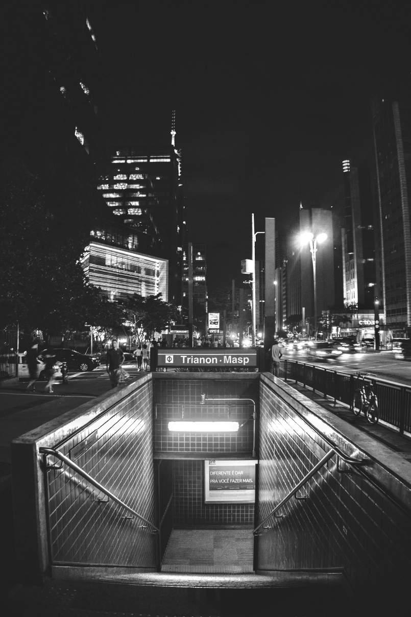
Art Style | Art & Culture International Magazine 93
Figure 3: Subway Station Trianon Masp.
Photo by Kaique Rocha. Licensed under CC BY 2.0.
Abramo states that the exposure of the contemporary observer "to the speed and intersection of kinetic images, TV, and cinema" has raised the level of awareness for works of art. In her view, "the state of contemplation was not lost or replaced, it was added on to by the fragmented perception originating from the acceleration, the 'multi-awareness' of the work of art and its surroundings." In the spaces of the subway stations, observers don't stop in front of the artworks to contemplate them (we will see later that this is not quite true), but as they make their way to the train, they "accumulate forms, colors, and lines that they then mentally arrange in correspondence with the work seen. With this approach, the viewer adds to the initial pleasure of physically admiring the work the greater pleasure of recreating it abstractly in memory" (Abramo 1994, 16). For this type of enjoyment, some works should be designed to be located in places with more rapid traffic flow, while others that would allow a pause, a more contemplative contact, may occupy spaces with slower traffic. In other words, perception and enjoyment in distinct moments of transit imply a need for greater care in the selection of artists, spaces, and works. In Santos' view, perception and interaction with the permanent works of art vary "from not even recognizing their existence, to assimilating their utilitarian purpose they exist to break the routine or occupy empty spaces." The perception of the artworks and of the space itself occurs "as long as" the user waits for the train, "as long as" they're waiting for someone," when the continuously 'verifying' gaze observes and registers the surroundings while in transit...that gaze that registers the existence of an element that is out of the ordinary" (Santos 2006). These statements have been confirmed, in part, during the investigations on the temporary artworks. Although the users/viewers/participants don't frequent the stations in their daily lives with the purpose of contemplating works of art as if they were in a museum or gallery, there were cases where they had gone to the stations specifically for just this purpose, to view the artworks, to show them to someone, or interact with them. Many of the interviewees stated that not everyone has the time, habit, interest, and money to attend galleries and museums. The presence of art in public spaces such as the subway system "facilitates contact with art," "arouses one's interest," and "makes it possible to know what is being done that's new without having to go outside one's daily routine" (Users/Viewers/Participants, in Sandrin 2012, 421).
According to the monitors' statements, people who interacted with the artworks included those commuting from work, students, and people visiting other works in the exhibitions installed on Avenida Paulista or in the FIESP gallery, but "the largest traffic flow was the subway users themselves." The installations attracted all age groups, while the games and animations received more attention from children and young people. Another aspect to consider is the confirmation that users returned to re-examine and interact with the works. Many, because of a lack of time, didn't stop to interact the moment they first saw them but returned specifically to bring their children. It was "as if they were educating a new generation with that kind of art" (Monitors, in Sandrin 2012, 421).
Art Style | Art & Culture International Magazine 94
High school and college teachers asked their students to visit the Cybernetic Arts Exhibition to help develop their work. Despite the embarrassment caused by questioning if they needed to pay to play, street kids interacted with the games installed at the Trianon-MASP Station, which were located outside the entry turnstiles. Some users/viewers/participants preferred to interact with the games in the station environment, although they were available on the internet. In the case of the piece Via Invisible (Invisible Way), there was no need for monitors due to its simple operation, presented in an explanatory text displayed beside the work. The animations were also quick and straightforward to interact with, requiring less time, and consequently didn't disturb the flow of the space or the daily routine. The presentation of the games in English was pointed out as an obstacle to understanding what the characters were saying; another observation pointed to the publicity surrounding the events, which should have been greater.
Art Style | Art & Culture International Magazine 95
Figure 4: Artwork by Maurício Nogueira Lima. São Bento Subway Station.
Photo by André Deak for Art Outside the Museum. June 24, 2011. Licensed under CC BY 2.0.
Conclusion
The overall picture points out relevant questions to be considered during the conception and insertion/presentation of artistic works in the subway stations. It should be noted that access to the artworks is limited to those buying subway tickets. Half of the stations in operation don't have permanent works, while in 16% of those that do, there are a large number of artworks installed. The transitory locations of the works in the subways persists as a common practice, such as Marcello Nitsche's Garatuja (Doodle), which was moved to the station's interior garden where the work of Alfredo Ceschiatti had been installed. This was contrary to the artist's desire that "people pass by the work, underneath it, or through it, interacting with it in their hectic everyday commutes" (Hatanaka 2009, 74). The piece by Sergio Ferro, Cenas e Sonhos Latino Americanos I e II (Latin American Scenes and Dreams I and II), was moved from Barra Funda Station to Vila Prudente Station. Although formally and aesthetically it has fit harmoniously into that space, greater care is necessary with this type of operation, as regards the meaning proposed by the artist at the time of the work's conception.
The interactive technological works were very well received by users/viewers/participants, as were the permanent pieces. A wide variety of cultural, social, historical, emotional, aesthetic, environmental, ecological and, above all, political and economic meanings were observed, which have influenced the process of insertion/presentation of this educational, cultural element. To this end, measures need to be taken to create public policy that encourages implementing visual environment intervention projects in completed subway stations, and those still under design. Integrated work practices among the professionals involved would undoubtedly lead to reductions in the transitory placement of the artworks and reduce wasting financial resources during the execution of architectural and artistic works.
The position of a curator, responsible for the harmonization of the artwork throughout the subway system, is fundamental. Publicizing the tax incentive law would be another measure that would spark the interest of private companies in sponsoring the execution and preservation of the artworks since the Metro company lacks its resources. Implementation is currently the responsibility of the artists, who are already subject to internal regulations that, in most cases, have functioned as obstacles instead of serving as guideposts for creativity.
Reflections and actions within the academic sphere of the contemporary artist, architect, and designer are extremely important in that they seek to provide future professionals with broader training, which will enable them to achieve both hybrid and innovative design solutions appropriate to each context.
Art Style | Art & Culture International Magazine 96
Author Biography
Ewely Branco Sandrin is an artist, curator, designer, and architect with a Ph.D. in Design and Architecture from the University of São Paulo, where was also Assistant Professor for the last few years. She participated in the assembly of exhibitions of plastic arts in Belgium and Johannesburg and works as a design coordinator on urban visual projects and exhibits as an artist at both collective and individual art exhibitions. Her recent significant exhibitions include a collective at the 14th International Poster Art Festival in Uiwang, Korea in 2017 and an individual exhibition at Pinacoteca Benedicto Calixto, Santos, Brazil in 2019. Since 2005, she works at Ateliê Claudio Tozzi as coordinator of projects for urban panels and design of books and catalogs as a curator, assistant in plastic arts, graphic designer, and collaborating architect. Recent projects: the itinerary exhibition of Tozzi's graphic works, which was sponsored by Caixa Cultural São Paulo (2018). Recent publication: "Interpretations of Art in the Subway of São Paulo," Cultural Magazine of the University of São Paulo (2018). Her research interest lies in visual phenomena with image and color. E-mail: ewelysf@hotmail.com
Funding
This work was supported by São Paulo Research Foundation (FAPESP).
Notes
1 Works at the Sculpture Museum and their respective artists: Aparência do Inacabado (Appearance of the Unfinished) by Caciporé Torres, Diálogo (Dialogue) by Franz Weissmann, O Espaço Cósmico (Cosmic Space) by Yutaka Toyota, Condor by Bruno Giorgi, A Estética vem do Sul (Aesthetics Come from the South) by Francisco Stockinger, Sombras em Mutação (Changing Shadows) by Sergio Camargo, A Lírica das Nuvens (Lyric of the Clouds) by Nicolas Vlavianos, O Voo da Liberdade (The Flight of Liberty) by Felicia Leirner, Luz e Sombra (Light and Shadow) by Ascânio Maria Martins Monteiro, Emblema de São Paulo (Emblem of São Paulo) by Rubem Valentim, O Rigor Construtivo (Constructive Rigor) by José Resende, Untitled by Mário Cravo Junior, Dinâmica das Linhas (Line Dynamics) by Amilcar de Castro, Totem da Sé (The Sé Totem) by Domenico Calabrone.
2 The photographic record of the permanent and temporary works and their respective data can be visualized in the thesis Arte/Arquitetura/Design: tecnologias atuais nas estações de metrô de São Paulo (Art/Architecture/Design: Current technologies in the São Paulo subway stations), defended in 2012, by Ewely Branco Sandrin, with the support of the São Paulo Research Foundation, available at the FAUUSP website: www.dedalus.usp.br
Art Style | Art & Culture International Magazine 97
Bibliography
Abramo, Radhá. A filosofia do projeto Arte no Metrô. In: Companhia do Metropolitano de São Paulo. Arte no Metrô. São Paulo: Alter Market, 1994..
_. Praça da Sé, Cidade Universitária, Metrô. In: Seminários de Arte Pública, São Paulo: SESC, 1995, 57-60.
Barreto, Ricardo. In “FILE São Paulo: PAI: PRIX LUX=File São Paulo 2010” [editorial conception] Ricardo Barreto, Paula Perissimoto]. São Paulo: FILE, 2010.
Catálogo Companhia do Metropolitano de São Paulo. O Metrô de São Paulo. 1987-1991: tecnologia e humanização. São Paulo: Alter Market, 1991.
______. Arte no Metrô. São Paulo: Alter Market, 1994.
Catálogo File São Paulo. Catálogo File São Paulo 2011: Festival Internacional de Linguagem Eletrônica
= FILE 2011: Eletronic Language International Festival / [concepção editorial Paula Perissimotto e Ricardo Barreto; tradução Luiz Roberto M. Gonçalves, Cícero Inácio da Silva].
São Paulo: 2011, 88-91.
Estadao.com.br. Metrô-SP expõe arte cibernética em estações. April 16, 2010. www.estadao.com.br/noticias/arteelazer,metro-de-sp-expoe-obras-de-arte-cibernetica-emestacoes,539193,0.htm
Freitas, Marcello Glycério de. Arte nos subterrâneos do metrô de São Paulo. In: Companhia do Metropolitano de São Paulo. Arte no Metrô. São Paulo: Alter Market, 1994, 10-11.
Ferrara, Lucrécia d´Aléssio. A Estratégia dos Signos. São Paulo: Editora Perspectiva, 1986, 130-131.
Folheto Ação Inscrever Estação Luz do Metrô. Ação inscrever estação luz do metrô-primeira fase 2011. Françoise Schein: Estação Luz. São Paulo. Brasil. Arte no Metrô, 2012. Giosa, Celso. Apresentação. In: Companhia do Metropolitano de São Paulo. Arte no Metrô. São Paulo: Alter Market, 1994.
Hatanaka, Conceição M. Arte no Metrô: obras de arte no espaço público do Metrô de São Paulo Dissertação (Mestra em Arquitetura e Urbanismo) - Faculdade de Arquitetura e Urbanismo da Universidade São Judas. São Paulo: 2009.
METRO.SP.GOV.BR. Cultura e Lazer: Arte no Metrô. February 10, 2012.. www.metro.sp.gov.br/cultura-lazer/arte-metro/arte-metro.aspx. Monitors. Statements taken from monitors during the Cybernetic Art Exhibition–Itaú Cultural Collection, held in partnership with Itaú Cultura (April 17 to May 23, extended until May 30, 2010) and the 1st and 2nd editions of FILEPAI, part of the 11th and 12th International Electronic Language Festivals (FILE), held in partnership with FIESP and SESI (July 27–August 7, 2010 and July 19–28, 2011). Ewely Branco Sandrin, interviewer. Location: Subway stations of São Paulo. Statements recorded by the researcher. In Sandrin, 2012, APPENDIX B, 2012, 421.
Sandrin, Ewely B. Arte/Arquitetura/Design: tecnologias atuais nas estações do metrô de São Paulo
496p. Tese (Doutora em Arquitetura e Urbanismo) – Faculdade de Arquitetura e Urbanismo, Universidade de São Paulo, 2012.
Santos, Ricardo Gomides. Obras de Arte no Metrô de São Paulo: um estudo junto aos seus usuários. 2006, 179 p. Dissertação (Mestre em Psicologia) Faculdade de Psicologia, Universidade de São Paulo. São Paulo: 7, 64-65, 2006, 108-109.
Schein, Françoise. Por que a arte nos metrôs é fundamental? Palestra realizada no evento: Metrô, Engenho e Arte do Programa de Inteligência Corporativa da UNIMETRO do Metropolitano de São Paulo, 2012.
Seminário de Arte Pública. Um breve histórico sobre arte Pública na Cidade de São Paulo. SESC São Paulo, 1995.
Users/Viewers/Participants. Statements taken from users/viewers/participants during the Cybernetic Art Exhibition–Itaú Cultural Collection, held in partnership with Itaú Cultural (April 17 to May 23, extended until May 30, 2010) and the 1st and 2nd editions of FILEPAI, part of the 11th and 12th International Electronic Language Festivals (FILE), held in partnership with FIESP and SESI (July 27–August 7, 2010 and July 19–28, 2011). Ewely Branco Sandrin, interviewer. Statements recorded by the researcher. In Sandrin, 2012, APPENDIX B, 2012, 421.
Art Style | Art & Culture International Magazine 98
A Study of Art and Architecture of Avudayar Kovil Temple of Pudukkottai District, Tamil Nadu
Dr. S. Udayakumar
Abstract
The temple of Tamil Nadu has a long history and archaeology among the temple in South India. The temple in South India context has always drawn the attention of students, researchers as well as scholars of various hues for a long time due to multiple tradition myths and mysteries surrounding it. When we trace the origin of the temple, there is mention of the Kuttam and Kovil, both meaning are mentioned in Sangam literature. There is an interesting theory about the history of the temple in Tamil Nadu. In ancient times the public used to assemble in every village at a particular place to discuss the needs of the village and grievance of the public. Besides, such places of the congregation also served as a court of justices to punish the offender, but later it changes into religious practices with the excellent art and architecture.
History of Avudayar Kovil Temple
This research has taken a challenge to understand the art and architecture of Avudayar Kovil temple in Tamil Nadu. Avudayar Kovil temple belongs to Pandya dynasty. Saint Manickavasagar, them heading the cabinet of Pandya king, came to this place Tiruperundurai, now Avudayar Kovil to buy horses. He heard the sound of "Shivagama mantras there and saw a guru sitting there. The Prime minister fell at the feet of the lord and begged him to teach him wisdom. While learning, Manickavasagar plunged into deep meditation when he opened his eyes, he found his teacher absent in the place and understood that his guru was none other than Shiva himself."1
Art Style | Art & Culture International Magazine 101
He spends all the money he carried for buying horses in building a temple for him "Guru-Shiva and dedicated himself to the service of Lord. As the saint failed to carry out the order of the king, he ordered the saint to be arrested and jailed. Lord Shiva converted the foxes in the forest into horses, brought them to the king as instructed by Manickavasagar. After delivering the horses, Lord went away. However, at midnight, the horses became foxes and started howling. Angry king, made Manickavasagar stand on the sands Vaigai river, in Madurai under the scorching sun. To teach a lesson to the Pandya who acted against his devotee, Lord made Vaigai flow in spate king ordered to strengthen the banks to avoid a breach."2 Lord also came to Madurai as a coolie for the repair work. The king struck him with a cane for not doing the work properly. The blow only feels on the king and everyone in Madurai leaving its scar on them. The king came to know that all that happened was Lord shiva's design, fell at the feet of Manickavasagar and begged his pardon.
Study Area
Avudayar Kovil temple is located in the small town named Avudayaurkovil (10°47’N 77°49E), which is around 14 km from Aranthangi city of Pudukkottai district in Tamil Nadu state, India. The town was called as Thiruperunthurai in the ancient times. Avudayar Kovil temple (the word "Kovil" means "temple" in the Tamil language). Avudayar Kovil is called Thirupperunthurai in the inscription and intimately associated with Saint Manikkavasakar. Avudayar Kovil temple is attractive not only due to spiritual reason but also due to its architecture and sculpture.
Aim and Objectives
This study attempts to collate all the existing research that has been undertaken in the field of architecture, and potential contribution to the existing body of knowledge through a structural and sculpture analysis of Avudayar Kovil temple architecture. This study comprises the details architecture plan of the temple, iconography, and Iconometry of sculpture in the Avudayar Kovil temple. The study will include the structure of pillars, ceiling, and painting of the Avudayar Kovil temple. Studying the detail iconography and story description of each sculpture of the Avudayar Kovil temple and the study also counts the complete sculpture and pillars and mandapam of the Avudayar Kovil temple.
Art Style | Art & Culture International Magazine 102
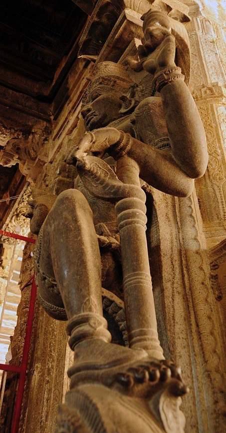
Art Style | Art & Culture International Magazine 103
Sculpture view in Avudayar Kovil.
Photo by Ravindraboopathi. Licensed under CC BY-SA 3.0.
Sculptures of Avudayar Kovil temple
The most important sculptures of Avudayar Kovil temple and a devotee visiting temple cannot afford to miss the rare sculpture of temple.
1. Dundi Vinayaka sculpture
2. Stone chain with a snake spinning around
3. Udumbu-a lizard-like creature and the monkey
4. One thousand pillars carved in a just two pillars
5. Sculpture lords and mothers in 1008 temple
6. Horses of various countries
7. 27 sculpture representing 27 stars
8. Various signs of dance art-Nattiya Kalai Mudra
9. Pillars expressing seven musical sounds
10. The shade of Koodalavi appearing as the neck of a cow
There are no Nandhi and Bali Peeta in the temple as both lord and mother are formless. The palm leaves and the writing pin used by Manickavasagar are still safe in the temple and temple noted for epigraphy farm, stone flooring, and beautiful sculpture
Manickavasakar
Manickavasakar was a 9th century Tamil poet Tiruvasakam. He was one of the main authors of Saivite Tirumurai, and his work forms one volume of the Trimurti. According to account the king of Pandya dynasty has selected Manickavasakar as a part of his region after seeing his military acumen. The Manickavasakar sculpture is made up of granite stone. The Manickavasakar sculpture is carved along with the pillar which is facing towards the main shrine; this indicates that Manickavasakar is always facing Lord Shiva. The headdress is similar to Buddha headdress style, but the author does not indicate to say that it belongs to the Buddha period, it just to say that it looks like. The description of the headdress is each lamb of hair is round; if we look little detail, it seems like the honey bees. He is wearing one Rudraksha mala near to his neck, three long Rudrakshas near to his breast and two Rudraksha mala on his right and left arms. He is wearing a short dhoti which is up to nee, He held his hand near to chest in a humble manner, and he stands on Kamal Pedam (Fig. 1)
Art Style | Art & Culture International Magazine 104
Vinayaka sculpture
Lord Vinayaka is praised as Ugandha Vinayaka, Lord Vinayaka is the god of wisdom, intelligence, luck, and fortune. The iconography of Ugandha Vinayaka has same as other Vinayaka but an essential aspect that in this temple Ugandha Vinayaka has sat with Devi, its unusual among Vinayaka of other temples. Ugandha Vinayaka located the left corner of the main shrine. The very important and distinctive aspect of Ugandha Vinayaka in the temple is he sitting with goddess Kali with two hands. "Elephant head, wide mouth, and large ears: The large head of an elephant symbolizes wisdom, understanding, and a discriminating intellect that one must possess to attain perfection in life.3 The trunk and two tusks with the left tusk broken. Elephant eyes and the four arms and various objects in the four hands, the left side of the body symbolizes emotion, and the right side symbolizes reason (Fig. 2).
Athmanabhar
"Lord Shiva here is Athmanabhar, and his consort here is Yogambikai. However there is no actual granite representation of Lingam or Ambal, and that is why this temple is called the AvudaiyarKoil."4 In AvadayarKoil, God is bereft of any form. After passing through several thresholds, devotees stand before sanctum and peep in hoping to have a glimpse of the Linga (also spelled as lingam), as is the case in all other temples. But it is empty! Only a Peeta is formed, and devotees are asked to pay obeisance to it. The bottom-most Peeta is the Saktipeeta, and it represents the fusion of Shivam and Skati for the realization of the Supreme Truth. Since no Linga (also spelled as lingam) or idol is consecrated here, the Lord is known by the name of Atmanadha- Lord of the Soul.
Varagunavarman II Pandiya King
In the later years, Pandiya king extends the temple with beautiful sculpture and pillars. The Pandiya king sculpture was carved 8 to 9 feet, and his headdress was carved different from other Pandya kings, even the hairs have carved in details manner, his eyes are carved prominent, a nose is sharp, he is standing in Samb Pathamstyle. He is in Namaskara Mudra, and he is well decorated with full of ornaments. He is craved in a big mustache (Fig. 3).
Art Style | Art & Culture International Magazine 105
Mahishisurmardini
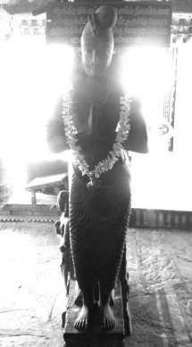
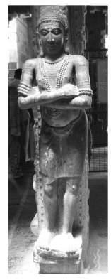
According to Markandeya Purana, Durga or Mahalakshmi had killed a demon called Mahishasur. So she was called as Mahishisuramardini. Vishnu Dharmottara Purana describes her as Chandika with twenty hands and sitting on the back of a lion. Padma Purana mentions her as Nanda. Svayambhava Manvantara said that Vaishanavi killed Mahishasura on the Mandara Giri. Matsya Purana, Silparatna, and Rupamandana ascribed her with eighteen hands, and Devi Mahatmya characterized her with a thousand arms 13 Most of the stone panels of Mahishisuramardini found in Goa are of four arms (hands). The four-handed stone panels are generally depicted with Trishul in upper right hand, and a sword in lower right hand, Dhal (shield) in the upper left hand and holding a tail of buffalo with a lower left hand. (e.g. Mahishisurmardini sculpture at Limgao). This sculpture is a masterpiece for simplicity and facial expression. Simple ornamentation of a necklace, Kankanas (bangles) in the hands, Kiritmukut, broad ears and chest, show the sculptural features of the early medieval period. Some of the panels of Mahishisurmardini are depicted while piercing a spear into buffalo's (demon Mahisha) body. In Avudaiyar Kovil Mahishamardini carved in between two pillars with eight hands and sitting on buffalo (Fig. 4).
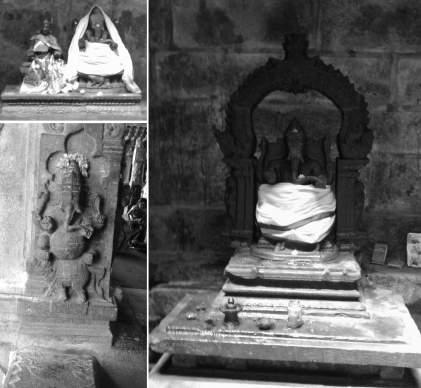
Art Style | Art & Culture International Magazine 106
Figures: 1. Manickavasakar. 2. Vinayaka sculpture. 3. Varagunavarman II Pandiya King
Dwarapalakas
Dwarapalaka is the door-keepers of the temples, and sculptures representing them are noticed invariably in all the temples. The sculptures of these "Dwarapalaka are found carved both in relief as well as in the round. They are always carved in pairs. The forms of these sculptures closely resemble those of the main deity. They are four-handed and the attributes they carry vary based on the creed to which they belong."5 The Shaiva Dwarapalaka holds the trident, and the kettle drum in their upper hands and the Vaishnava Dwarapalaka hold the conch and the discus in their upper hands. The mace is common for the Dwarapalakas of both the creeds, which is held in their lower left hand. Their lower right hand is disposed in various gestures like the Tarjanimudra, Abhayamudra, and Swargahasta. But the commonly found gesture is the Tarjanimudra. Their faces are shown as ferocious, and they wear a Kirita, which is occasionally shown with a halo of flames. The carving of the prominent canines shows the ferocity of the face. They are shown as standing with one of their legs firmly placed on the ground while the other leg is lifted across the other leg and shown as resting upon the mace. The left leg of the Dwarapalaka to the left side of the doorway is shown is lifted while the right leg of the Dwarapalaka to the right side is shown as lifted. This is a posture common in Tamil idiom, whereas the Dwarapalakas in the Kamataka idiom is sometimes shown in Tribhanga or Dwibhanga. The Texts prescribe that the Dwarapalaka shave to be provided for all the doorways of all the four directions. Dwarapalakas are found carved at the doorway of the Gudhamantapa. They are sometimes carved on the pedyas of the Dwdrabandha. They are even found in the Mahddwdras of the temple. The temple of Brihadishwara at Tanjavur has Dwdrapdlakas carved on the Mahddwdra. The Dwarapalakas sculptures are found in almost all the temples of the region of our study. They are found carved in the round as well as in relief all their forms are as described above. Sculptures of Dwarapalakas that deserve mention for their good workmanship are those found at Shukavaneshwara temple at Salem, Kailasanatha temple at Kargudi and the Soundararja Perumal at Salem. The Mahddwdra of Kamanatheshwra temple, considered as one of the earliest Mahddwdras of the region, has the sculptures of Dwarapalakas. They exhibit the features of Chola sculptural art. A sculpture of a Dwarapalakas is carved attached to the shaft of a Bhadraka pillar. Strangely, this sculpture is not carved near the doorway (Fig. 5).
Art Style | Art & Culture International Magazine 107
Pillars of Avudayar Kovil
Pillars are supporting the corners of Garbhagriha and Antharala are known as canton pillars. The canton pillars are prominently shown in the rock-cut cave architecture. Here the canton pillars are chiselled in the monolithic rock in the corners of Garbhagriha and Antarala. Whereas in Avudayar Kovil at Avudayar, these pillars were prepared in granite rock and arranged in the corners. Pillars supporting various mandapas of the temple are found in various shapes, such as square pillars, round pillars, projected square pillars, octagonal pillars, sixteensided pillars, star-shaped pillars, etc.
Yali Pillars
In Hindu temples, different animals or creatures have been used, which is sometimes thought to be a guard at the gate of the temple. The Yali has been made of the different structure and body parts and in some cases, it looks like a body of cat and head and face of a lion and the nose of the elephant and the tail is sometimes look like almost all of the structure is made a 3D model. Yali is considered a sacred animal which is very dangerous in look so makes it powerful and it is made using the body parts of other animals like lion, elephant, snake, etc. Yali has been an integrated part of the pillar in Indian history because of their carving on the pillars. The power of Yali is considered to be so much more than the lion and the elephant. They have always increased the beauty and art of the pillar (Fig. 6).
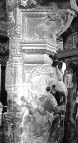
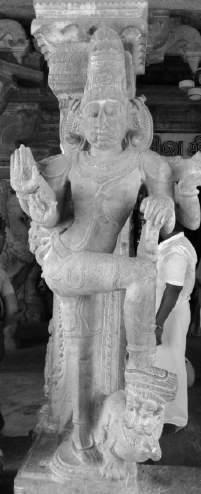
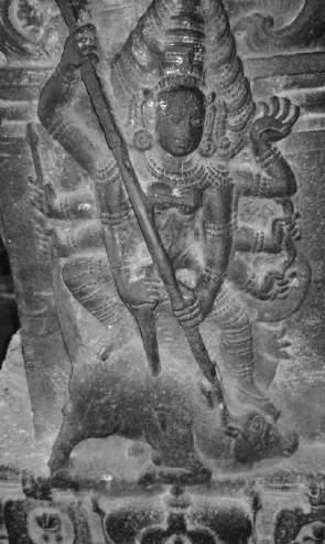
Art Style | Art & Culture International Magazine 108
Figures: 4. Mahishamardini; 5. Dwarapalakas; 6. Yali in Pillar
Pillars with Horse
Asvakanta Pillar possesses a rampant horse attached to a Citrakhanad shaft. These horses always have human mounts and are quite tall. The pillars of this type are found in umpteen numbers in Tamil Nadu. Asvakanta variety is noticed in quite good numbers in the Avudayar Kovil. Some variants of this type of pillars are also noticed. They are called variants not because of the change in the theme of the figural sculpture, but in the depiction of these figural sculptures. Wherever they are shown in relief, they are of course carved as rampant animals identically on both sides of the Bhadra part of the pillar shaft (Fig. 7).
Pillar with lamp
"Throughout time sacred monuments have provided spaces to facilitate a dialogue between man and god. Though light has been such an important element in the design of sacred monuments, not much has been written on the subject."6 The lamp pillar of Avudayar Kovil is 9 to 10 feet in height; there are four levels of lamps between distances of 2.5 feet and the lamp is round shaped. Each level of the lamp is debited of sculptures and the pillar lamp is located in the left and right side in the main shrine (Fig. 8).
Architecture of Avudayar Kovil
The science of architecture (Vastu Vidya) was a branch of occult knowledge from the Vedic period. "Avudayar Kovil is noted for the Zephyr (granite) roof work. The ceiling of the Kanaga Sabhai (golden hall) is a grandeur creation in stone. The ropes, rafters, and nails all are made granite."7
The bow-wielding Muruga, Kali and Siva's Rudra Thandavam (wild dance) is the finest specimen in sculpture art. Many renovations have been carried out, much of the current structure dates to the fifteenth CCE. The temple covers an area of over 10 acres (40,000 m2) and faces south, constructed so that the setting sun strikes the sanctum even though it is cloistered within three circumambulatory paths. The thousand pillared halls have several delicately crafted pillars with depictions of Oodhwa Tandavan of Shiva, Kaaraikkaak Ammaiyaar, Dhanurdhara Subramanya, etc.
Art Style | Art & Culture International Magazine 109
Gabhagraha
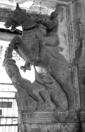
"The most important part of a temple, its very heart as it were, is the Garbhagrha or sanctum."8 That is square with a low roof and with no doors or windows except for the front opening. The image of the deity is stationed in the geometrical Centre. The whole place is completely dark, except for the light that comes through the front opening. Over the roof of the whole shrine is a smaller tower. There are no images, iconic or anionic, in the sanctum. In the Shrine of the Lord, only a Pitha, is under worship (Fig.9).
Vimana
Vimana (temple with its towers) have been sought to the erected and not for the sake of god. The place where the chief deity is installed in the sanctum is called Garbagraha, and the tower over it is called vimana.
Antharala
Antarala, a narrow passage connecting the Garbhagraha and the Mukhamandapa to the mandapa (pavilion or hall). As already stated, in most of the temple the Antarala is identical with Mukhamandapa or Sukanasi pillar with Pandya king.
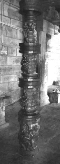
Art Style | Art & Culture International Magazine 110
Figures: 7. Pillars with Horse; 8. Pillars with lamp; 9. Garbhagrha
Mukhamandapa
In front of the Garbhagrha and contiguous to it is the Mukhamandapa, sometimes called Sukanasi or Ardhamantapa, depending upon its proportion relative to that of the Grabhagrha. Apart from being used as a passage, it is also used to keep the articles of worship including Naivedya (food offerings) on special occasions. There 16 different pillars such as Yail pillar, horse (Fig.10).
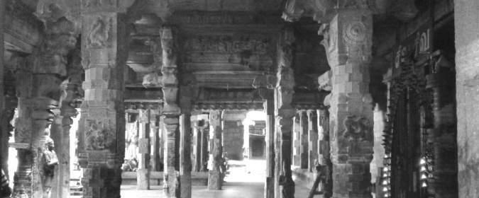
Ceilings
Ceilings are different types. 1) Domical Ceiling; 2) Flat ceiling; 3) Rectangular ceiling; 4) Square ceiling; 5) Circular ceiling; 6) Rotated square ceiling; 7) Octagonal ceiling, etc. The outline of these ceilings is generally square, because the Garbhagriha, Antarala, and Mukhamandapa are square. Square ceilings are further classified into flat, rotated, circular and octagonal. Flat ceilings are generally found at the corners and on the sides of the central ceiling in the Sabha-mandapas. Two rotated squares by placing two squares, one over the other, are called trabeated system (Kadalikiikarana). Here the upper one is smaller and turned 45 degrees over the lower. The lower square is achieved by placing four triangular slabs over the corners of the Ankara formed by beams or walls. Placing smaller triangular slabs over the corners of the lower square forms the upper square. A flat slab is placed at the top for covering the central gap. The space of the ceiling is reduced at the top by creating these squares. The lower square is exactly half of them, and the upper square is half of that of the lower. A flat slab one-fourth of the size of the Ankara is used at the top. The squares not only reduce the areas but also break the monotony of the comparatively plain interior. The ceilings of the top slabs are decorated generally with circular lotuses. The ceiling of the Kanaga Sabhai (golden hall) is a grandeur creation in stone. The ropes, rafters, and nail all are made of granite. The bowwielding Muruga, Kali and Siva's Rudra Thandavan (wild dance) is the finest specimen in sculptural art (Fig.11).
Art Style | Art & Culture International Magazine 111
Figure 10: Mukhamanadapa
It has been generally accepted that the Avudayar Kovil classical school of painting tradition influenced the classical Pandiya painting tradition of ancient South India. The painting of Avudayar Kovil includes Gaja Lakshmi, ceiling louts painting, Lord Shiva, Gaja Samharamoorthi, Manikkavacakar, etc. The basic colours such as white, green and red ware used in Avudayar Kovil. The colour used in the traditional mural painting of Avudayar Kovil is generally obtained from three different sources, mineral, vegetal and chemical. All colour "cannot be used in murals, among them only such mineral colours that are lime resistant are suitable for mural painting. Five are the basic colours (Panchavarana-Yellow, red, green, white and black of which white is the wall itself and all other pigments are prepared from stone and leaves;”9 the wall preparation is an elaborate process, and on the specially prepared wall, the picture is drawn first in line and coloured, the iconography of most of which are based on Dhyanaslokas Colour is applied in a sequence such as yellow, red, and green, black and must be clearly demarcated by black line (Fig.12).
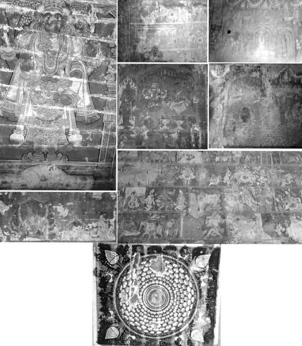
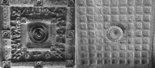
Art Style | Art & Culture International Magazine 112
Significances of the temple
Saint Manickavasagar established the original shrine. "More than 1200 years old based on the predictions of Manickavasagar's period and south facing temple which is a rare kind in Siva temples. This temple was called Tiruperundurai, Sathurvedhimangalam, and Sivapuram. This temple is full of sculptures with minute details and perfect chiselling.”10 Avudaiyar Kovil mandapams (hallways) are decorated with breathtaking sculptures. The granite roofs are assembled and are marvellous pieces of construction. "Some of the sculptures are Tundi Vinayagar, stone chains, two pillars with thousand legs, 1008 Sivalayas god and goddess sculptures, horse sculptures are world-famous. The larger than life monolith figures of Agni and Agora Veerabadras at the entrance and Kaalidevi, Subrahmanya with a bow,"11 Bikshadanar, Sankaranarayanar, Urdhuvathandavar, Pasupatheeswarar, and Narasimhamurthy are noteworthy. Two other sculptures of "Kuravan and Kurathi" exhibits the excellence of the artists for minute details from toe to hairstyle, to the veins and bones of the body lovingly recreated makes the visitor wonder at the dedication of the sculptors of that era.
Avudayarkoil- Sabthaswara pillars Avudayarkoil-Saint sculpture, the most aweinspiring work is seen insides of the Canopy and Sunshades are known as "Kodungai," which stretches all around the Mandapams. The work was done under the stone that forms the sunshade or overhang of the roof. It usually sits on top of the beam stone and is a superb example of the craft of the 9th-century artisans. There is a popular story that states that any contract written for all subsequent temples specifically exclude the structure of Athmanandha Swamy's Avudaiyar Koil from being replicated. Sculptors from these parts consider the sculptures of this temple as a benchmark in carving. The rafters, tiles, padding with hinges and decorative nails chiseled out of stone looks as though they were done in wood and iron. All over the ceilings are decorated with flowery patterns and stone chain links. Tiyagarajamandapam of this temple has a stone chain, and Panjatsaramandapam has Sabthaswara pillars. Thiruvasakam was originated from this shrine. That is no Lingam in the sanctum. Instead, it only has the base, formlessness (Avudayar), which has a metal cover placed on it. This represents formlessness, the absolute ultimate. This temple does not have a Nandhi, Dwajasthambam and Navagraha statues. Instead, Navagrahas are represented as pillars. Utsavamurti of the temple is Manikkavasakar Pittukkumannsummanthakadhai (Tiruvilaiyadalpuranam) has happened in this location. Pradosam is not celebrated in this temple. Brahma was taught the Gayatri Mantra here by Atmanathar. Hence this place is also called Chaturvedapuram. "As soon as we entered right atop were these KodungaigalTiled Terracotta Roof simulation. The planks, the nuts, the bolts, the wooden logs, everything is sculpted of rock!"12 The best way to depict the awesomeness of Avudaiyar Koil is the words in the ancient contract signed by any Vishwakarma Acharya who begins to build a temple. Any temple can be built with any detailing except "The Pillars of Tharamangalam.”
Art Style | Art & Culture International Magazine 113
The Granite Grills of Thiruvalanjuzhi
The Tiled Terracotta Roof simulation of Avudayar Temple
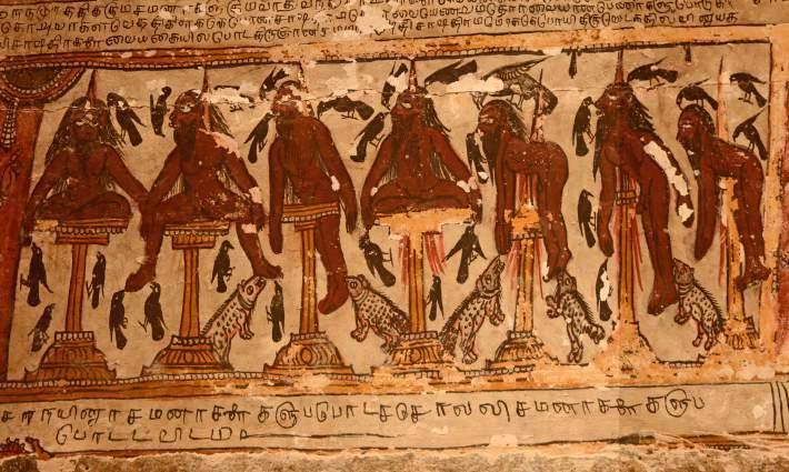
It's amazing how they built this temple. Nowhere near the locality of this temple was any granite hillock. So the granite must have been brought all the way from Pudukkottai! All over the temple, we can find a lot of meaningful sculptures. There is no separate shrine or idols for Navagrahas (nine plants) similar to another temple. They are found only in the pillars. The 27 stars have figures in this temple. There is a Sapthaswara pillar (musical pillar), and the stone chain is a famous sculpture in this temple.
Acknowledgment
I would like to thank Akshara Foundation Grant to complete the research paper on Avudayar Kovil. I would like to thank all staffs from Avudayar Kovil Tamil.
Author
Dr. S. Udayakumar is a Post Doctoral Associate at School of Humanities National Institute of Advanced Studies Bangalore. E-mail: archaeology1987@gmail.com
Art Style | Art & Culture International Magazine 114
Mural on the ceiling of Avudaiyar Koil at Pudukottai District showing the impalement. Mural also depicts Crows and other unidentified animals feeding on impaled copses.
Photo by P. Jeganathan. June 24, 2016. Licensed under CC-BY-SA-4.0.
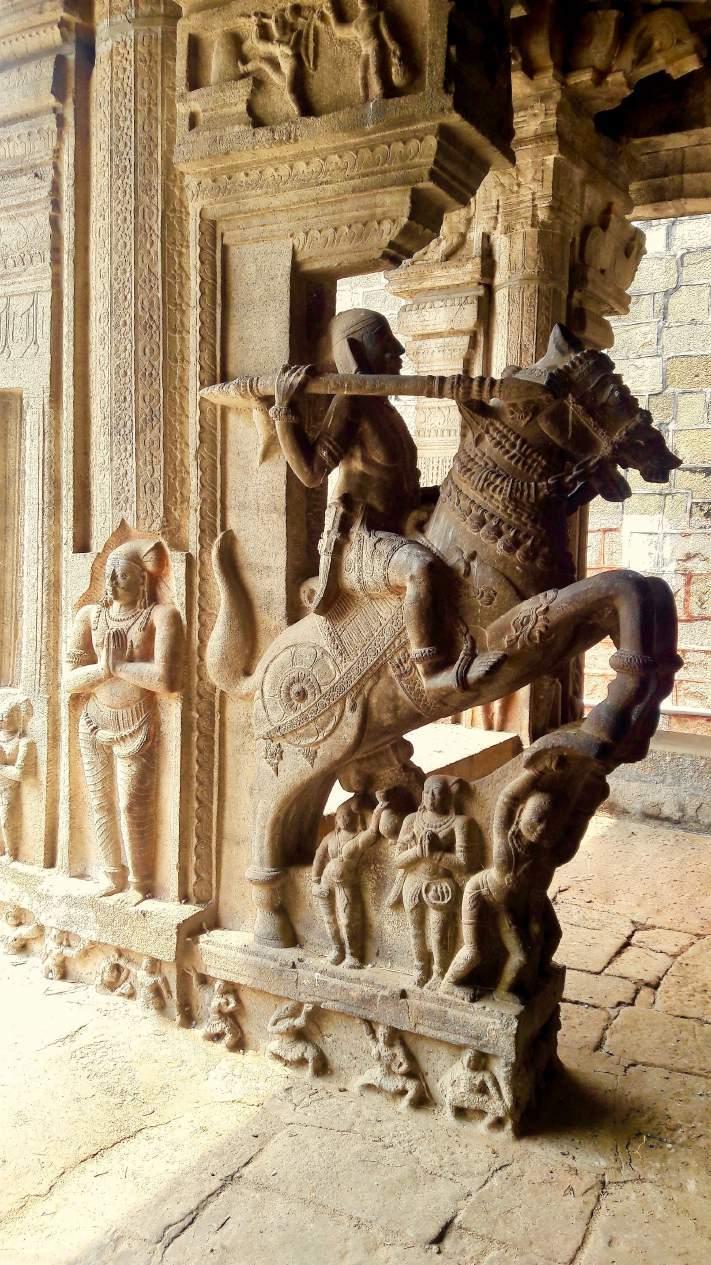
Art Style | Art & Culture International Magazine 115
Athmanatha Swamy Temple Avudayarkoil
Photo by Ssriram, Licensed under CC BY-SA 4.0
Notes
1 Athmanathar Temple : Athmanathar Temple
https://temple.dinamalar.com/en/New_en.php?id=641
2 Athmanathar Temple: https://temple.dinamalar.com/en/New_en.php?id=641
3 Hindu Deities: Lord Ganesha. http://koausa.org/Gods/God8.html
4 Home | Pudukkottai Business Diary. http://www.pudukkottaibusinessdiary.com/
5 Dvarapalaka, Dvārapālaka, Dvara-palaka: 4 definitions. https://www.wisdomlib.org/definition/dvarapalaka
6 Temples in the Southern Region of Tamilnadu, India.
http://oaktrust.library.tamu.edu/bitstream/handle/1969.1/ETD-TAMU-2001-THESISM83/2001%20Thesis%20M83.pdf?sequence=1
7 Tamilnadu Tourism: Avudaiyarkoil, Aranthangi, Pudukottai. https://tamilnadufavtourism.blogspot.com/2015/12/avudaiyarkoil-aranthangi-pudukottai.html
8 Temple Architecture – Devalaya Vastu – Part Five (5 of 9 )
https://sreenivasaraos.com/2012/09/09/temple-architecture-devalaya-vastu-part-five-5-of-7/
9 Preparation techniques of pigments for traditional mural
http://nopr.niscair.res.in/bitstream/123456789/10308/1/IJTK%209(4)%20635-639.pdf
10 Chennaitian: Avudayar Koil – The formless ultimate god.
http://chennaitian.blogspot.com/2011/08/avudayar-koil-formless-ultimate-god.html
11 This God doesn't have shape - Avudayar Koil Temple http://www.arunachalaramana.org/forum/index.php?topic=8304.0
12 Avudaiyar Koil, Pudukottai - Tamil Nadu | My Travelogue. http://travel.bhushavali.com/2012/02/avudaiyar-koil-pudukottai-tamil-nadu.html
Bibliography
Acharya, P.K. An Encyclopedia of Hindu Architecture. London, 1946.
Acharya, V.A. Indian Temple Architecture: form and Spaces. Research Paper, Department of Architecture & Planning, I.I.T.Roorkee, Roorkee, India, 1991.
Barrett, Douglas Early Cola Architecture and Sculpture. London: Faber and Faber, 1974.
Nagaswamy, R. South Indian Temple as an Employer, in R. Nagaswamy (ed.) Studies in Ancient Tamil Law and Society, Madras: Government of Tamil Nadu, 1978.
Meister, Michael W. and M. A. Dhaky, ed. Encyclopedia of Indian Temple Architecture. Vol. 1, Parts 1 and 2, South India, Lower Dravidadesa, 200 B.C.-AD 1324. Philadelphia: American Institute of Indian Studies, University of Philadelphia Press, 1983.
Michell, George. Architecture and Art of Southern India: Vijayanagara and the successor states, 1995.
Michell, George. Hindu Art and Architecture.Thames And Hudson, World of Art, 2000.
Prabhakar, Shankar. The Vastu Vidya of Vishvakarma, Studies in Indian Architecture, Asia Publishing House, Mumbai, 1979.
Raman, K.V. Temple Art, Icons and Culture of India and South-East Asia, Sharada Publishing House, Delhi, 2006.
Sivaramamurti, C. Indian Painting, National Book Trust, New Delhi, 1996.
Vatsayayan, Kapila. The Square and Circles of the Indian Art Roli Books International, 1983.
Volwahsen, Andreas. Living Architecture: India, Macdonald & Co. Ltd., London, 1969.
Art Style | Art & Culture International Magazine 116
Revisiting the Time of Yoginīs
V S Sruthi
Abstract
This essay revisits the time of Yoginī worship in the present day India and the historical processes and transformations which had led to the decline of their worship in the contemporary. This essay seeks to answer who are these Yoginīs and what is the historical transformation of the idea of Yoginī and their cults. Yoginīs and their temples seem to inspire people in a deep sense of fear. The concept of Yoginīs is connected with the Asta Matrkas or Eight Mothers from the Agni Purana which mentions that the sixty-four Yoginīs is derived from the eight Matrkas in groups of eight. Even though the Agni Purana was compiled in the 9th century, the cult of Matrkas was known since the Kushana period.1 The earliest known orthodox text that contains a list of 64 Yoginī is the Agni Purana in its 52nd chapter titled, Devipratimalaksana or "Attributes of Images of Goddesses." This essay further attempts to understand the concept and emergence of the cult of Chausath Yoginīs and their temples. A comparative analysis of two central India located temples and the images sculpted there is also undertaken in this paper.
Introduction
Yoginīs and Yoginī temples occupy a curious position in Hinduism. Yoginīs and their temples seem to inspire in the people a deep sense of fear which prevents them from speaking about them such that the very knowledge of the existence of Yoginī Temple at Hirapur in Orissa became public as recently as the year 1953. It was discovered by K. N. Mahapatra, eminent historian, and archaeologist of Orissa.2
Art Style | Art & Culture International Magazine ______ ______ 119
The term Yoginī has diverse interpretations. However, the Yoginīs of the Yoginī temples is the patron deity of the heterodox tantric sect known as the Kaulas3. David White in his work on south Asian tantra focuses on the medieval cult of the Kaulas, where the rites were grounded in the cults of the Yoginīs. They were the medieval heiresses to the Matrkas (Mothers), Yaksinis (female dryads), of earlier traditions who, like them, were often represented as supernatural or preternatural hybrids between the human, animal, bird. The traditional worship of local deities in their own context used to happen in ancient times in the same way we see them today. These are often feminine deities who are angry and hungry, angry because they are hungry. The cultus consists of feeding them in order to be pacified. A paradigm shift occurred from feeding the deities towards a type of erotic-mystical practice involving a group of females collectively known as the Yoginīs, led by the terrible male ShivaBhairava. The Kularnava Tantra indicates that the Yoginīs are the special deities of followers of the Kaula path. The ritual practices of the Kaula school, referred to as the five "m"s, commencing offerings of fish, meat, grain, wine and climaxing with ritual sexual union. Kaula doctrine states that the followers will achieve bliss that is termed Kula through such bhog (enjoyment) as opposed to Yoga (renunciation). Kula is defined as a state in which the mind and sight are united, and the sense organs lose their individuality and sight merges for the ultimate bliss arises from the union of the two. In the Kaula ritual circle, each sadhaka was to think of himself as Shiva and of his partner as Devi, and in this manner trying to anticipate the bliss of Kula. The Kaulajnananirnaya speaks of the Yogins whose home is in the sky, and it tells us that when they wander the earth, they assume the forms of the various earthly creatures, animal, bird, and human.
The mid-millennium saw the surfacing of Yoginī cults that seem to have been substratum cults in many areas4 which were focused on the worship of female deities, associated with notions of fertility. The archaeological and textual evidence points to the emergence of the Yoginī cult to only around the ninth century. The cult must have existed much before that time. It must have got popularity and influential around the ninth century for the concept of Yoginīs to be incorporated into texts. The concept of Yoginīs is connected with the Asta Matrkas or Eight Mothers from the Agni Purana which mentions that the sixty-four Yoginīs is derived from the eight Matrkas in groups of eight. Even though the Agni Purana was compiled in the 9th century, the cult of Matrkas was known since the Kushana period.5 The earliest
Art Style | Art & Culture International Magazine ______ ______ 120
known orthodox text that contains a list of 64 Yoginī is the Agni Purana in its 52nd chapter titled, Devipratimalaksana or "Attributes of Images of Goddesses." This chapter names and describes the images of the 64 Yoginīs, hence indicating that the images of the Yoginīs were already being made. The incorporation of the Yoginīs into heterodox text such as the Agni Purana also means that the cult had a significant following with a powerful influence for it to be included in the mainstream Hinduism.6 The numeric importance of the number sixty-four in astrology could have alluded to the existence and worship of Yoginīs in the group of sixty-four. The Aitereya Brahmana refers to the 64th step as the last magical step that gives entry to the heavenly world. The concept of Yoginīs also finds its mention in Kalhana's Rajatarangini in the story of King Baka.7
The existing temples are made of stone which is also dated to around the ninth century. The earlier temples could be built of other materials dated much before which could not stand the test of time. Perhaps terracotta images of the Yoginīs were made for placement in such temples explaining the use of the term pratima (images) in the Agni Purana. The significance of the cakras and mandalas as objects to worship and meditate upon possibly allude that the Yoginī cult first emerged where worship was entirely based on these mandalas. The Yoginī temples may be a later concept which came up after the popularity of the cult and royal patronage.
When we think about the basic structure of a temple, the type of building that immediately comes to mind is a tall closed building with either a pyramidal towering structure with a darkly hidden sanctum called the garba griha housing the main deity of the temple. However, we find the Yoginī temples to be entirely in contrast to them. There is not much evidence directly related to the construction or the patronage of Yoginī temples. The existing temples are spread over Rajasthan, Orissa, Madhya Pradesh; however, we cannot conclude the Yoginī cult was restricted to these areas based on the surviving remains. There is no evidence of Yoginī temple in Assam in the present, but the worship of Devi Kamakhya at the Kamakhya temple in Assam includes the invocation of the 64 Yoginīs. There is evidence suggesting Yoginī worship in Bengal as it was a center of tantrism and origin of several tantric texts.8 With reference to Yoginīs in Kalhana's Rajatarangini, the Sakta practices, tantric traditions relevant in Kashmir and Nepal makes it possible for the following of Yoginī cult.
Art Style | Art & Culture International Magazine ______ ______ 121
Yoginī Temples
The Yoginī temples generally are in circular form (fig.1) but also a few instances of a rectangular form. Circles have been used all over the world to mark the boundaries of sacred areas. The Yoginī temples are a circular enclosed sacred area with a circular courtyard without a roof, and it is open to the sky. The entrance into these temples is in nature of an interruption in the circular wall. The circular wall contains figures of the Yoginīs while at the center of the circle is an open pavilion housing an image of a God Shiva. Within this sanctified area were enacted the rites of the Yoginī Cult in order to appease these Yoginīs. The rituals practiced are to be performed in secret; this could be the reason why these temples are often situated on a mountain away in the outskirts of the towns. Yoginī Temple consists then of an open circuit of Yoginī surrounding a central image of Shiva the entire group being exposed to climatic changes. Vidya Dehejia in Yoginī Temples of India writes that:
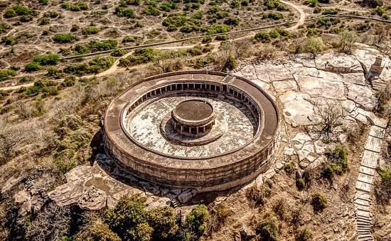
Art Style | Art & Culture International Magazine ______ ______ 122
Figure 1: Aerial View of Chausath Yoginī Temple, Mitauli, Gwalior
"The Yoginī Temple generally takes for its form the circle that purest and simplest of symbols yet one of the most powerful and widely used. The circle represents the sun, the seeing eye, the zodiac, time and eternity; it is Nothing, and yet it is all expresses most effectively the complementary concept of completeness and separateness: a circle is complete in itself and separated from everything outside of it. The circle is also the symbol of the Self, of a self-contained psychic whole, "It expresses the totality of the psyche in all its aspects, including the relationship between man and the whole of nature" and "always points to the single most vital aspect of life - its ultimate wholeness."
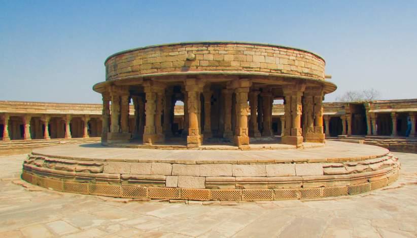
Art Style | Art & Culture International Magazine ______ ______ 123
Inside Mitauli Chausath Yoginī Temple
Photo by Swapnil Karambelkar. Licensed under CC BY-SA 4.0
A dozen ruins of Yoginī temples lie across central Indian region which means the Yoginī cult appears to have reached a peak of popularity during the 10th and 11th century. There are no inscriptions relating to the construction of the Yoginī temples, but the stone construction must have involved considerable expenditure which may have been a result of royal patronage. The Skanda Purana elaborates further on the abilities conferred by the Yoginīs, which also includes a list of names of the 64 Yoginīs. It also promises the royal worshipper with great wealth and victory. The Kaula path, with its claims to direct access to power in and over the world, was attractive to kings and princes in the medieval period conferring royal patronage. Certain dynasts of the Somavaṃśi, Kalacuri, Chandella, and other royal houses were themselves, followers of the Kaula sect, Yoginī temples became the focal point of the kingdom's religious life. Some of the temples are Bheragat Yoginī temple of 81 Yoginīs, Khajuraho Yoginī temple, Mitauli Yoginī temple, Shahdol, Lokhari, Rikhiyan. Shahdol, Rikhiyan, and Lokhari are Yoginī sites which consist of Yoginī images without a temple. There are two intact temples of sixty-four Yoginīs in this regionMitauli Yoginī temple and Khajuraho Yoginī temple. The existing temples do not have any Yoginī images. We shall confine ourselves with only two temples - Mitauli Yoginī temple and Khajuraho Yoginī temple. The former has a circular floor plan while the latter has a rectangular floor plan.
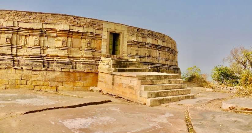
Art Style | Art & Culture International Magazine ______ ______ 124
Figure 2: Entrance to the Mitauli Yoginī Temple
Mitauli Chausath Yoginī Temple
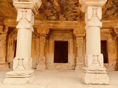
Mitauli is situated in the Morena district of Madhya Pradesh. The first mention of this temple and village appears in the annual report of the Gwalior Archaeological Department for the year 1942-46.9 Before being identified as a Yoginī temple, and it was earlier called Ekattarso Mahadeva Temple. The Mitauli temple was commissioned by the Kachchhapaghata King Devapāla (1055 – 1075) at a time when this family was breaking away from the Chandellas, the powerful lords who built Khajuraho.10 This temple is located on the top of a hill in the secluded part of the village. It has a circular floor plan where the entrance looks like an interruption of the circle (Fig.2). The temple has a circular ground plan having a circular wall with a circular pavilion with two concentric circles at the center of the temple. The temple is constructed over a high plinth.
The circular walls consist of a series of small cells, each meant for a Yoginī. On the outer side has sculptures most likely that of Shiva and Sakti and on the inner side has a series of niches housing Yoginī, which are now empty. A significant number of the Yoginī sculptures from the Mitauli temple are housed in the nearby Gwalior Archaeological Museum. Now, each niche and the central shrine presently accommodate a Sivalinga (fig.3).11 Each of these small cells has an open mandapa supported on pilasters and pillars on the front. The roof of these cells and the mandapa are presently flat. There is also a circular shrine facing east in the center of the courtyard. Each cell originally had sikhara, but during the course of conservation, these smaller shrines were made flat-roofed. The main shrine in the center also appears to have initially had sikhara on the top, instead of a flat roof.
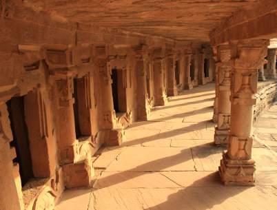
Art Style | Art & Culture International Magazine ______ ______ 125
Figures: 3 Shivalinga, Inner Niches 4. Inner corridor, Photo: Pankaj Saxena License: CC BY-SA 4.0
Chausath Yoginī Temple
The Khajuraho Yoginī temple has a rectangular ground plan. There appear to be two others rectangular Yoginī temples in central India at Rikhiyan and Badoh, so there must be some prevalence of rectangular Yoginī temples at least in this region. Though the Yoginī temple at Rikhiyan is no longer in existence, however, the Yoginīs obtained from the site are carved in sets of four on long rectangular slabs which have no curvature along their length which suggests that like Khajuraho, it was rectangular. It is located not far from the main group of Chandella temples. It has been suggested that this temple belongs to the ninth century on the basis of the use of granite for its construction. The temple is built on a rocky promontory about seven meters above a plain. There are a total of sixty-five individual cells in the structure of a miniature temple with a pyramidal tower, and a distinct base moulding placed side by side to form a rectangular structure. 0f the sixty-four cells, thirty-two cells of equal size are set in either side of the entrance gate and another cell, larger than the other located directly opposite the main entrance to the complex. Each would have housed a sculptural representation of a Yoginī, but today all of them are empty (fig. 5). However, there exist photographs of three Khajuraho Yoginīs out of sixty-four taken in the year 1955. This is the most primitive in construction and unique in being quadrangular and not circular on plan. The three surviving images, representing Brahmani, Mahesvari, and Hingalaja (Mahishamardini) are massive and squat in form and are among the oldest sculptures of Khajuraho. The latter two are inscribed as Mahesvari and Hingalaja.12 Although an enclosure of cells characterizes many other architectural examples in India, Yoginī temples are unusual in that the perimeter, rather than a prominent central shrine, receives the most significant emphasis.
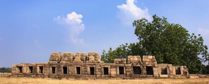
Art Style | Art & Culture International Magazine ______ ______ 126
Figure 4: Khajuraho Yoginī Temple. Photo by Taru. Licensed under CC BY-SA 4.0
It is possible that this relates to the feminine concept that Yoginī temples portray, in which the idea of the enclosure rather than the enclosed, expressive of the female as opposed to the male reproductive organs, is stressed.13 The Chandellas (9th - 13th century) was an influential and powerful dynasty in central India. Frequent invasions by Mahmud of Ghazni and raids put the monarchs into a constant threat. Chandella monarchs must be paying attention to the Yoginī cults. We cannot ignore that one of the Yoginī temples is located at Khajuraho, which was their capital, even though there is no direct evidence to connect the Chandellas with any of the Yoginī temples.
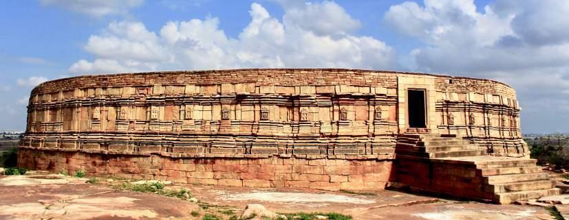
Conclusion
The concept of Yoginī remains a complex one to understand. With its gradual loss of royal patronage post-twelfth century, the Yoginī worship declined. Tantric practice became increasingly removed from its real-world referents, with its external rites being internalized and brahminized. Speculation could be Sankaracharya's condemnation of the Yoginī cults in the eighth century and pushback by Vedantic monasticism.14 Another reason could be the rise of devotional cults to Shiva and Vishnu. An interesting note is that the circular Yoginī shrine of Mitaoli inspired British architects during the Raj who built the Indian parliament which is both circular and has a circular courtyard.15
Author Biography
Sruthi V S is a postgraduate student of Arts and Aesthetics from Jawaharlal Nehru University, India. She has a keen interest in Indian Aesthetics and to revisit history through the lens of the visual culture. E-mail: vs.sruthi21@gmail.com
Art Style | Art & Culture International Magazine ______ ______ 127
Figure 5: Khajuraho Chausath Yoginī Temple Photo by Ramakrishna Kongalla. Licensed under CC BY-SA 4.0
Notes
1.Vidya Dehejia, 68-87. Some of the Matrkas had a bird and animal heads. A broken panel in Mathura Museum, belonging to the 2nd century AD depicts a set of five goddesses with such heads; each has a child on her knee indicating that they are mother goddesses. The Yoginī sculptures at the Hirapur Yoginī temples also have a bird and animal heads.
2.V Guhan, “Yoginī temple of Hirapur.” thehindu.com http://www.thehindu.com/fr/2003/10/17/stories/2003101701580900.htm (Accessed April 11, 2018)
3.David Gordon White, "Tantra in its South Asian Context," In Kiss of Yoginī: “Tantric Sex” in its South Asian Context (Chicago and the University of Chicago Press). "Kula" or "Kaula" was the operative term for the "Sakta" cult prior to the eleventh century. "Sakta" is a relatively late term applied to those cults, scriptures or persons associated with the worship of Goddess as Sakti. This term came to be used after it has been mixed into the orthodox practices and the popularity of the "Kaula" Yoginīs went out of fashion.
4.Romila Thapar, “Threshold Times: c. AD 300-700” In the Penguin History of Early India: From the Origins to AD 1300, (UK and The Penguin Press), 317.
5.Supra, note 1.
6.Vidya Dehejia, “Yoginī Temples of India: A Preliminary Investigation.” Art International, 25 (1982), 6-29. It must be remembered that the acceptance of Yoginīs within the orthodox religion did not mean that the rites associated with the Kaula sect condoned or more practice by the Hindus in general.
7.Rajatarangini (12th century) contains the story of a lovely Yogesvari who captured king Baka (the period king Baka refers to the period soon after the Christian era) as an offering to a circle of goddesses (devicakra). We find he uses the term Yogesvari and Yoginī as synonyms. His story of Siddhimat being resurrected by a circle of Yoginīs (Yoginīcakra) of semi-divine characters belongs roughly to the Gupta period.
8. Vidya Dehejia. The Agni Purana appears to be written in the western part of Bengal. The Mahabhagvata Purana which refers to Yoginīs as functionaries of Devis were also written in Bengali.
9.Saurabh, "Mitawali- Yoginī Temple Mystified," Indian History and Architecture. http://puratattva.in/2016/04/09/mitawali-Yoginī-temple-mystified-3639 (Accessed April 15, 2018)
10.David, White. 149.
11.Asibhopal.nic.in http://asibhopal.nic.in/monument/morena_mitaoli_ekattarsoma.html
12.(Accessed April 15, 2018)
13.“Chausath Yoginī Temple.” asibhopal.nic.in
http://asibhopal.nic.in/monument/chhatarpur_khajuraho_chausathYoginītemple.html
14.(Accessed April 12, 2018)
15.Susan Huntington, In the Art of Ancient India, Buddhist, Hindu, Jain, (New York and Tokyo and Weatherhill) 468.
16.David Gordin White’s Kiss of Yoginī cites- Nagaswamy, R. “The Sixty-four Yoginīs and Bhūta Worship as Mentioned by Śakara in His Commentary on the Bhagavadgītā.” Berliner Indologische Studien 9–10 (1966): 237–46.
17.Patanaik, Devdutt. “Chausath Yoginī Temples” devdutt.com https://devdutt.com/articles/indianmythology/shakta/chausath-Yoginī-temple.html (Accessed 18 April 2018)
Art Style | Art & Culture International Magazine ______ ______ 128
Bibliography
Asibhopal.nic.in http://asibhopal.nic.in/monument/morena_mitaoli_ekattarsoma.html
(Accessed April 15, 2018)
“Chausath Yoginī Temple.” asibhopal.nic.in
http://asibhopal.nic.in/monument/chhatarpur_khajuraho_chausathYoginītemple.html
(Accessed Aprul 12, 2018)
Dehejia, Vidya. Yoginī Cult and Temples. A Tantric Tradition. New Delhi: The National Museum, 1986.
Dehejia, Vidya. “Yoginī Temples of India: A Preliminary Investigation.”
Art International, 25 (1982):6-29 http://vidyadehejia.com/wpcontent/uploads/2015/07/Dehejia-Yoginī-Temples-of-India-19821.pdf
Guhan, V. “Yoginī temple of Hirapur.” thehindu.com
http://www.thehindu.com/fr/2003/10/17/stories/2003101701580900.htm
(Accessed April 11, 2018)
Huntington, Susan. The Art of Ancient India, Buddhist, Hindu, Jain. New York & Tokyo: Weatherhill, 1985.
Patanaik, Devdutt. “Chausath Yoginī Temples” devdutt.com
https://devdutt.com/articles/indian-mythology/shakta/chausath-Yoginī-temple.html
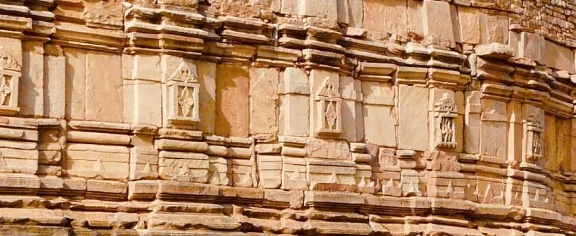
(Accessed 18 April 2018)
Saurabh, "Mitawali- Yoginī Temple Mystified," Indian History and Architecture. http://puratattva.in/2016/04/09/mitawali-Yoginī-temple-mystified-3639
(Accessed April 15, 2018)
Thapar, Romila. Threshold Times: c. AD 300-700”. The Penguin History of Early India: From the Origins to AD 1300. UK: The Penguin Press, 2003. White, David Gordon. Kiss of Yoginī: “Tantric Sex” in its South Asian Context. Chicago: University of Chicago Press, 2003.
Art Style | Art & Culture International Magazine ______ ______ 129
Geoffrey Bawa
A legend in Tropical Modernism
An investigation to what extent, does Geoffrey Bawa utilize space and place in his architecture to develop his concepts of tropical modernism?
Jordan Wright
Introduction
Sri Lanka (previously known as Ceylon) is an island, with 21 million people. It is home to rich and diverse traditions of architecture. An architect that stands head and shoulders above all is Geoffrey Bawa. A rare architect who primarily sought to use environment sensitivity with cultural awareness, Bawa fused local building traditions with modern designs, the prime example of an architect of the present day. The structures he designed and developed are standing legacies in the region and influenced architecture worldwide.
This paper will study the works of Geoffrey Bawa through the field of visual arts. By investigating his work by virtue of analyzing his use of space and place to depict his perspective on interweaving modernism, cultural sensitivity and the beauty of the environment. The approach developed the form of tropical modernism and the concept of vernacularism and Bawa believed that architecture had to be experienced rather than described or studied theoretically.
I intend to investigate Bawa’s work and architectural concepts by reviewing his structures in the context of Sri Lanka rather than other masterpieces he constructed in South-East Asia. The introductory segment describes his architecture, followed by a survey of the historical perspective, primary influence as well as a study of Geoffrey Bawa and his career In addition, rich illustrations of Bawa’s works through documentary plans and my own photography have been included to further visualize his talent.
Art Style | Art & Culture International Magazine 131
Architecture During the Era
During the 1960s, Bawa became renowned in the field of architecture, a time of selfgovernment after decades of being under colonial jurisdiction The social and economic state was impaired which impelled Bawa to establish a fresh approach. With increasing communal tension after independence in 1948, Bawa incorporated classical Sinhalese concepts into the creation of his new architectural designs (Robson, 2004, 50). These buildings consisted of pitched roofs, natural features such as courtyards, verandas, glassless windows and water bodies. The layout of the buildings followed a simple concept of axial composition, a design with a central axis that focuses on reciprocal symmetry. Bawa exemplified this approach in architecture.
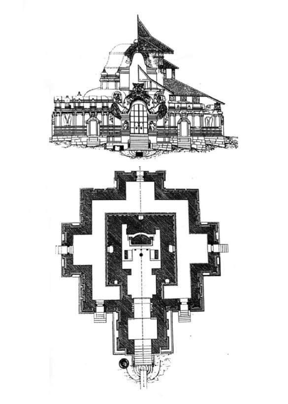
Art Style | Art & Culture International Magazine 132
Drawing Layout Plan 1: Layout Plan of the exterior view of the Lankatilaka Temple, near Kandy (Robson) that shows the concept of axial composition
Serendipity: Who was Geoffrey Bawa?
Geoffrey Bawa was one of the most important Asian architects of the twentieth century (Robson, 2004, 12). Originating in Sri Lanka, he was born in 1919 in what was known as British Ceylon. He came from a wealthy family and graduated from Cambridge in 1938 having studied English and Law. Following a short career as a lawyer, Bawa acquired a rubber estate in Ceylon, which he converted into a series of tropical gardens inspired by his visits in Italy during his time in Europe. For the reason that he lacked the technical skill of architectural design, this compelled him to earn a degree from the Architectural Association of London in 1957 (Robson and Posingis, 2016, 15).
After his graduation and upon his return to Sri Lanka, Bawa embarked on a new stage of his life and formed a group of like-minded designers and artists whose mission was to launch new ideas of creating buildings. In the initial stages of his work, Bawa incorporated international modernism, the style of which he was trained in London (10). He later shifted his focal point to vernacularism, a concept of embracing local traditions, materials, and needs Bawa’s unique style, blending traditional concepts while incorporating the post-independence colonial architectural style. His approach was very flexible as it took into account several contrasting architectural styles that best adapted to the Sri Lankan way of life. He incorporated the celebration of his culture this way:
I prefer to consider all past good architecture in Ceylon as just that – as good Ceylon architecture, for that is what it is, not Dutch or Portuguese or Indian, or early Sinhalese or Kandyan or British colonial, for all examples of these periods have taken Ceylon into first account – Geoffrey Bawa (Robson, 2004, 41).
Various elements from Sri Lankan history greatly influenced Bawa’s work; these include pitched roofs, verandas, courtyards, use of water and the awareness of external influences taken from Classical Sinhalese architecture, circular arch openings from the Portuguese and conventional layout plans from the British. Likewise, his work was also influenced by Jane Drew and Maxwell Fry, who were ‘tropical modernists’ using simple functionalism, cubic architecture and sharply edged forms (Comfort Futures par. 1 and Robson, 2004, 51). The tropical modernism style developed a foundation for the majority of Bawa’s work. The need to exploit and adapt to the tropical environment drove the concept of contemporary tropical modernism. Bawa’s ability and talent to successfully use such concepts resulted in inspiring architects worldwide who operate in similar climates. “Most of all I remember him as a person who observed critically with amusement” (Sansoni, Dominic).
Art Style | Art & Culture International Magazine 133
Modernism
This is a concept of architecture and design eminent in the early 20th century as a result of the development of technology and society, rational use of materials, and openness to structural innovation (RIBA, Modernism) Features included in Modernist buildings are open plan, flat roofs, large windows, and steel or reinforced concrete. Designs incorporate rectangular or cubist shapes and elements of simplicity and minimalism. Another key feature of modernism design is the asymmetrical composition of buildings and landscape. The form of Modernism influenced Bawa, as it set a bedrock for his understanding during his training in the AA (Architectural Association) (Robson and Posingis, 2016, 15). It developed into his approach of tropical modernism for which he is so well-known.
Tropical Modernism
Similar to Modernism, Tropical Modernism is an architectural style that includes the components of wide, open spaces, natural ventilation, rational use of local resources, and buildings features that equip cooling elements that are important to the location that he frequently worked. Geoffrey Bawa was one of the earliest advocates of this style, and it is a design evolution which primarily focuses on exhibiting sensitivity to the cultural context while interweaving the beauty of the environment and the principles of Modernism. This architectural style demonstrated that the cultural notion of a particular location could influence the architectural style that was developed.
A well-known concept underlined by many is the implication of space and place which are, two fundamental elements in the stages of architectural process and development. Space, an open, subjective and abstract conceptualization, can be defined with the presence of a tangible object- as the notion of space is linked to objects. In a like manner, the place is the backdrop concept of space, as it is simply the location and it can be considered as the amalgam of the arrangement of space and the built form. It includes a direct connection with the world. For instance, in Lunuganga, his rubber estate near Bentota, Bawa utilizes large windows to create a sense of the size of space as well as to connect the interior space with the exterior context.
Bawa, evidently applied these architectural conceptualizations in his work as he incorporated the style of modernism with relation to nature, prioritizing cultural sensitivity. By incorporating the different architectural styles of Sri Lankan history, Bawa blended the prominent features into a style of his own. He recognized the place of Sri Lanka, expressing awareness of the local lifestyle to depict an archive of features that would be most suitable for living in a tropical climate. His structures incorporated verandas, sloped roofs, internal courtyards, overhanging eaves, glassless windows and ponds- structured to maximize the degree of ventilation, natural lighting, openness, and solitude (Comfort Futures, Bawa par. 1).
Art Style | Art & Culture International Magazine 134
Ceilão: Historical Perspective
Sri Lanka has such a rich history. It is located between the Bay of Bengal and the Arabian Sea neighboring India. It sits in the middle of the Silk Road which is now known as the ‘One Belt, One Road’ strategy for growth by the Chinese Government. The Silk Road resulted in the arrival of seafarers from all corners of the world as well as the occupation by the Dutch, Portuguese and British (Robson and Posingis, 2004, 27)
The Sinhalese Classical Architectural Structure
Architecture in the late stages of the Anuradhapura kingdom and during the middle ages featured ‘Sinhalese classical architecture.’ This concept included the ability to process external influences, such as the use of water, open spaces, and the creation of air currents for cooling (Robson and Posingis, 2004, 34). This became a prominent feature of this period of architectural style. This influenced Geoffrey Bawa’s approach to his work.
Traditional Sinhalese architecture exhibits compositions of buildings with the inclusion of water as well as the study of geometrical shape in conjunction with its layout. Another feature was the use of verandas and courtyards. Courtyards allowed for integrated natural ventilation (34) inside the house as it constitutes a unique relationship between the inside and outside spaces, verandas separated the public and private spaces which allowed for the circulation of air. These features were prominent in the architectural style of Geoffrey Bawa
The Portuguese Period
In the 16th century, the Portuguese arrived in Sri Lanka with the intention of regulating the shipping lanes of the Indian Ocean (Anjalendran, et al, 2016, 19). They were the first to employ the concepts of the Western Classical architecture styles- installing large windows and circular arched openings. Likewise, the buildings incorporated the building style of vernacularism. This approach influenced architecture during the Kandyan Period (20).
The Dutch Period
There is limited evidence of Dutch architecture in Geoffrey Bawa’s work however he utilizes a series of cultures to bridge various buildings with the main informatory, that stimulates the Dutch colonial villas present in Galle.
Art Style | Art & Culture International Magazine 135
The British Period
In 1796, the British forces out the Dutch from Ceylon after a military campaign eliminated the rule of the last Sinhalese’s monarch of the Kingdom of Kandy. They became the first foreign power to rule the whole island. The British made significant and broad changes in Ceylon: they brought in the concept of turning the “large garden” into an economically beneficial plantation system which altered the landscape of the country. They also established a pervasive civil administration, introducing a network of roads and railway and the development of buildings in the neoclassical style to express their imperial gravitas (Robson and Posingis, 2004, 38).
During this period, major buildings (town hall, general post office, banks, governor’s residence, hotels, railway stations, and some schools) adapted to traditional British architectural styles as they disregarded the approach of the Dutch and Portuguese. Civil Buildings present in Sri Lanka grew exponentially as the country developed and the economy stabilized. They were grand in stature which emulated the power of the occupying colonial powers. An example is the National Museum of Colombo, which was built on a grand scale by the British Governor of Ceylon, Sir William Henry Gregory, to exhibit the historical artifacts of Ceylon (National Museum).
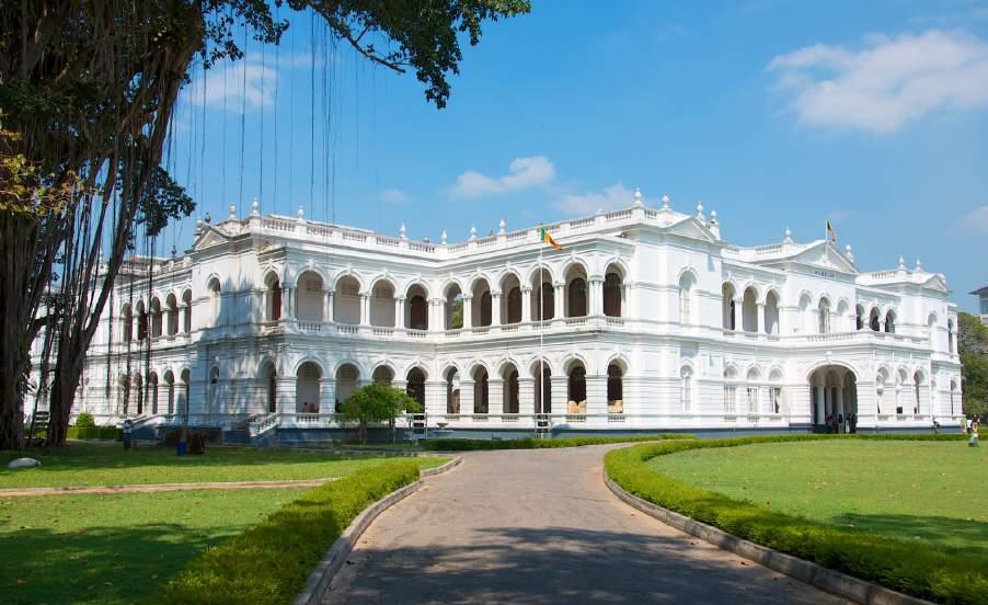
Art Style | Art & Culture International Magazine 136
Figure 1: The National Museum of Colombo (National Museum)
Photo by Iris Liu. Licensed under CC BY-NC-ND 2.0.
On the other hand, dwellings and smaller buildings were still based on the Dutch architectural style which advocated the continuity of previously introduced forms. These included the concept of compact bungalows accompanied by large gardens and verandas (38). A conventional bungalow plan would consist of a central hall attached to two sections of enfiladed rooms aligned on opposing sides which extended from the front Porte cochère to a posterior veranda (38). With time, there was the addition of a second floor including bedrooms that were arranged on both sides. Servants’ rooms and kitchens were situated outside incorporating Dutch-Sinhalese detailed designs which were later changed to Italianate elements; a common concept implemented in the practice of the British colonies. Bawa’s childhood home was an Italianate style two-story building built in the 1870s.

Primary Influence
When Geoffrey Bawa initiated his career in architecture in Sri Lanka, he studied the concept of modernism and the cultural implications that resulted in his establishment of a new style of design. With this new development, there were a number of primary factors that influenced his approach to the construction of buildings, such as the architectural principles of modernism and influences of architects like Jane Drew, Maxwell Fry and Ulrik Plesner (Robson and Posingis, 2004, 51; Robson, 2016, 17).
This influence is evident in his works in the early years which consisted of simple functionalism, sharp-edged forms, and cubic architecture. The tropical modernist concept sufficed as the fundamental platform to Bawa’s approach to architecture.
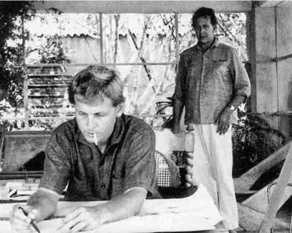
Art Style | Art & Culture International Magazine 137
Drawing Layout Plan 2: Layout Plan of the Chapel of the Goodshepered in Bandarawela (comfort futures) Figure 2: Ulrik Plesner on the left and Geoffrey Bawa standing in the background (Robson)
Ulrik Plesner, a renowned Scandinavian Modernist, inspired Bawa’s engagement with tropical modernism which was promulgated by Drew and Fry. They collaborated with establishing many industrial designs such as the classroom development in Bishop’s College (1960) in Colombo. The building was designed in sharply edged forms and utilized the white cubic architecture on spaces in the façade (Robson and Posingis, 2004, 51; Robson, 2016, 17) This created an enticing aesthetical view under the vigorous daylight of Sri Lanka
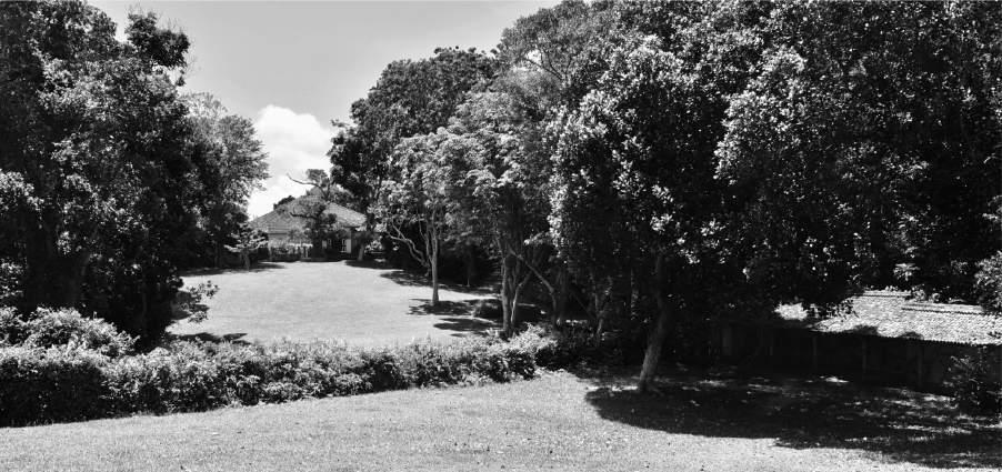
They soon discovered that the Tropical Modern approach did not complement the humid climate of Sri Lanka as the features of the building created cramped and stale interiors, and the white façade became faded. They concluded that modification was required to adapt to the tropical climate and their designs needed to adopt overhanging eaves and crossventilation as fundamental principles of a building.
Exploration of Geoffrey Bawa’s Buildings
The context of architecture during the period immediately after independence was particularly uninspiring (50). Bawa’s early works coincided with the social disorder, economic tension and common strains present in post-independence in Sri Lanka His architectural profession began in sync with the need for greater creativity Bawa adopted and advocated the architectural approach that gave attention to the sensitivity of the cultural context while interlinking it with the principles of tropical modernism. A style which proposed that the place and the cultural notion is capable of influencing the use of space.
Art Style | Art & Culture International Magazine 138
Lunuganga Garden (1948. Dedduwa, Bentota)
Figure 3: The view from the cinnamon hill towards the south façade of the house. Photo by Jordan Wright.
In 1948, Geoffrey Bawa’s journey into architecture commenced with the purchase of an old rubber estate near Bentota. He transformed this working plantation into an 8-hectare tropical garden inspired by the British and Italian gardens that he had previously seen on his travels to Europe (Robson, 2016, 116). The Lunuganga residence and its adjoining buildings demonstrate Bawa’s utilization of nature that encompasses the design of space. Primarily conceived as a shifting sight; each space contained a different sense of place which continually developed with age. This highlighted Bawa’s intention that the building would live with the natural surrounding and embrace the environmental context, a primary goal of a tropical modernist approach.
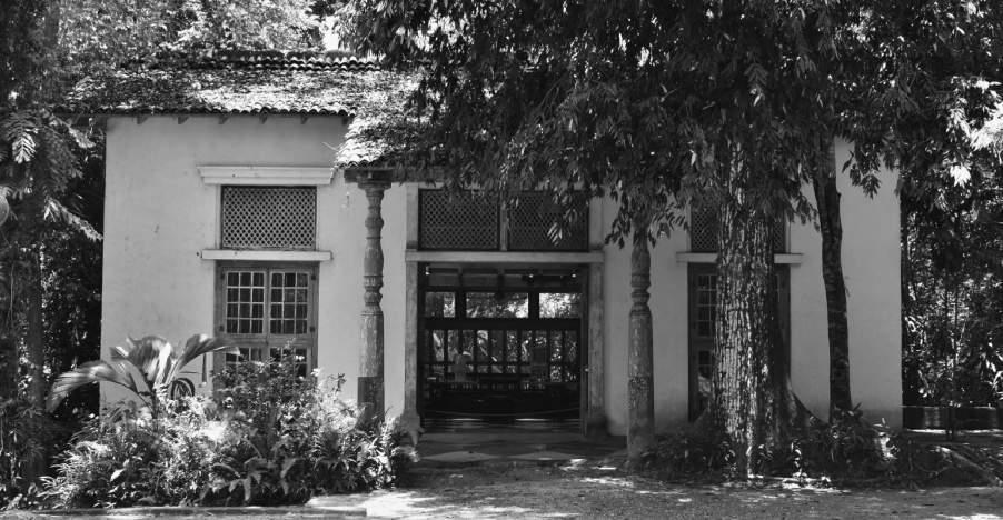
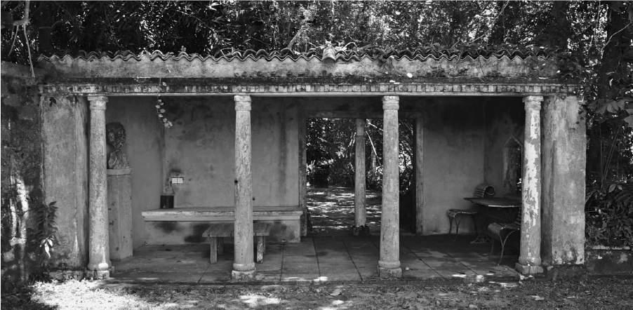
Art Style | Art & Culture International Magazine 139
Figure 4: North View of the summer house garden Photo by Jordan Wright.
Figure 5: View of the pavilion expansion of the house Photo by Jordan Wright.
In addition, Bawa ensured that there was no barrier separating the interior and exterior of his buildings with frequent use of verandas and glassless windows that created a sense of space (evident in the image above). This allowed protection from the sun, monsoon rain and permitted cross-ventilation preventing claustrophobic and congested areas. This displayed Bawa’s awareness of the environmental context in the hot, humid climate of Sri Lanka and the lifestyle that he wished to encourage. The open area of tropical nature defines space, and the materiality of the building is modulated by the installment of verandas that constitutes space, which is seemingly divided into light and shadow. The architectural design was also conscious of cultural sensitivity by adopting pitched roofs which were classically Sinhalese in nature. The Lunuganga separates itself into some contrasting spaces that all include a unique sense of place, these interlinked with pathways and the garden is divided into a perpetual number of spatial niches. A moving space that includes a series of scenographic snapshots. During his lifetime, Bawa enjoyed these spaces at various times of the day- as recounted by a tour guide on a recent visit.
Art Style | Art & Culture International Magazine 140
Figure 6: View of the side façade of the house from the garden viewpoint
Photo by Jordan Wright.
Bishop’s College (1960-63. Boyd Pl, Colombo)
Figure 7: Classroom Block for Bishop's College, 2018, a view of the façade
Figure 8: An interior insight of the breathable wall- permitting natural lighting Photos by Jordan Wright.
In 1963, Geoffrey Bawa completed the construction of a classroom block in Bishop’s College, Colombo (Robson, 2016, 130 par. 2). A three-story classroom building (seen in Fig. 11) with two upper levels for classrooms and a ground floor as a portico much like a veranda, the façade incorporated a breathing wall to permit the free flow of air and cross ventilation in the manner of the tropical modernist approach. This ground floor has since been transformed as another level of classrooms due to the increasing demand for space.
The general design concept for this building was the use of white edged forms and cubic architecture for the exterior. The aesthetically appealing building however weathered with the exposure to the sun. The breathable wall (Fig. 12) encompassed the rhythmic inclusion of circle holes that admitted natural lighting that shifted depending on the position of the sun. This gave the impression that the interior and exterior areas integrate. This is a classic example of Bawa’s earlier approach to architecture.
Gallery Café (1961 and 1998. Alfred House Rd, Colombo)
In 1998, Paradise Road Gallery Café opened as a restaurant, one of Colombo’s most desirable and fashionable destination for gatherings. Originally a commissioned house it later became Bawa’s Colombo office (Robson, 2016, 32). An exhibition of Bawa’s architectural approach, space is divided into three pavilions that constitute a sequence of three open courtyards. This design allowed for natural ventilation, creating a sense of surprise as each space was encountered, it also gave recognition to the Sinhalese architectural styles of the past. Bawa’s approach of vernacularism is evident

Art Style | Art & Culture International Magazine 141
Figure 9: Paradise Road, Gallery Café, 2018, Entrance Archway Photo by Jordan Wright.
with the use of granite support and arch-shaped clay tiles for the roof arranged over cement sheets.
The layout included a front entrance with a courtyard which connected to a central gallery court that subsequently adjoins to the final gallery court, consists of the dining space (Fig. 9 and 10 a collection of linked spaces due to the adoption of the axial composition. In current times and despite being surrounded by high rise structures, the outdoor spaces remain comfortable due to the well-designed cross-ventilation features of the building as it advocated the free flow of air.
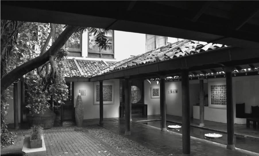
Art Style | Art & Culture International Magazine 142
Figure 10: The central gallery court-evident of the overhanging eave, sky-to-floor courtyard Photo by Jordan Wright.
Figure 11: Corridor of the central gallery court next to the pond Photo by Jordan Wright.
The physical arrangement of the building is narrow and deep in length, with compact neighboring buildings on all sides. Bawa acknowledged this arrangement, to later include a design that promoted natural ventilation to prevent stale, claustrophobic spaces as this approach was more suitable for the tropical climate. The central gallery court (Fig. 10) includes overhanging eaves and pitched roofs that allow the monsoon rain to drain into a central pond. Bawa’s acceptance of the environmental context was evident as the internal courtyards and façade were planted with lush trees and walls covered with a creeper that further softened the surrounding buildings and enhanced the connection with nature and natural decay. Moreover, the implication of trees assimilated shade from the sun in the same manner as overhanging eaves- a factor for protection.
A small boutique hotel located in Bentota, with a neighboring rail line (Robson, 2016, 110), Bawa designed this hotel to continue his architectural approach of tropical modernism. The building adopts an introspective collection of open spaced, free flowing areas with the inclusion of verandas and courtyards. Similar to Lunuganga garden, Bawa incorporated a pitched roof and overhanging eaves to accommodate the tropic climate and which permits cross-ventilation An infrastructural design that adjoins so seemingly to the nature that surrounds it. The use of white forms (in Fig. 6) created problems as it would deplete with exposure to the sun, thus needed frequent maintenance to sustain its original characteristics. The assemblage of these tropical modernist concepts permitted the building to facilitate connection to the local landscape, both in appearance and socially.
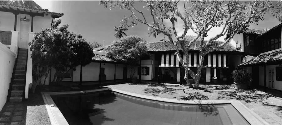
Art Style | Art & Culture International Magazine 143
Bentota Club Villa (1976-. Galle Road, Bentota)
Figure 12: Bentota Club Villa, 2018, a view of the pool court of the Mohoti Walauwe (Robson, 2016 111)
Photo by Jordan Wright
These tropical modernist principles can be seen from the figure (6) with the tropical overhanging eave and modest space allocated for a verandah to compensate with the climate. Bawa’s hotel incorporated the general principle of no doors as he linked one bu ngalow with another along long corridors- the concept of axial composition. This created a free-flowing space which ultimately became Bawa’s trademark.
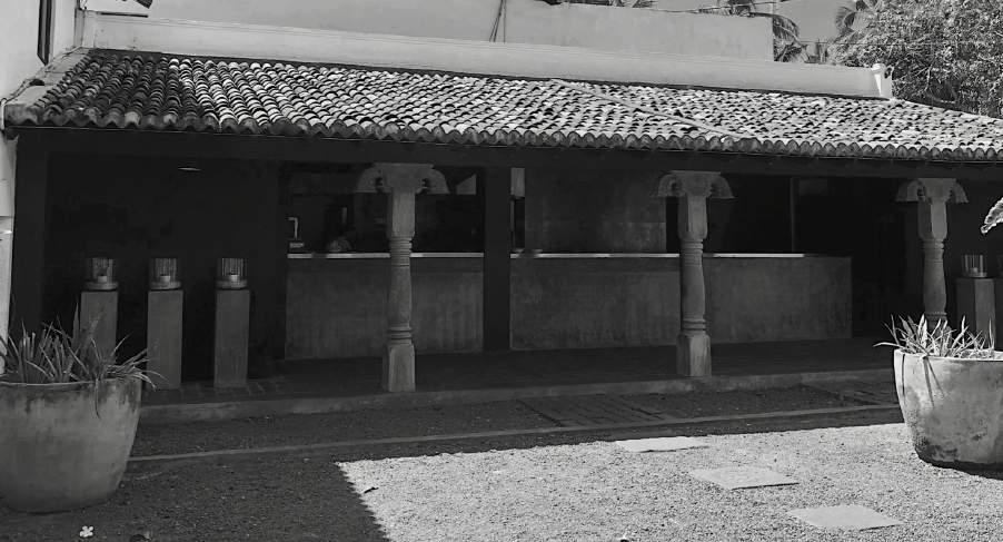
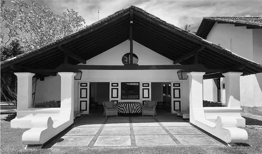
Art Style | Art & Culture International Magazine 144
Figure 13: The west front of the initial villa- evident of the use of overhanging eaves and veranda permitting open flow Photo by Jordan Wright.
Figure 14: Walkway along the side of the building Photo by Jordan Wright.
Conclusion
The most prominent architect in Asia. Geoffrey Bawa successfully designed many standing legacies and has influenced architecture worldwide. A leading creator in Sri Lanka, he has adopted the approach of tropical modernism with the awareness of cultural sensitivity, merging local traditional buildings with modern designs. With the research by virtue of analyzing Bawa’s use of space and place in his buildings, this investigation has examined four of Geoffrey Bawa’s renowned designs: Lunuganga Garden (1948), a classroom block for Bishop’s College (1960-63), Gallery Café (First built in 1961/ Transformed in 1998) and Club Villa (1976-) (Robson, 2016; Robson and Posingis 2004).
To conclude it is evident that Bawa utilizes the architectural style of tropical modernism in unification to the environmental awareness and cultural sensitivity. Bawa’s approach to his commercial designs followed as he adopted the consolidation of vernacular architecture. The place being the backdrop concept of space, it can be considered as demonstrating adjustment to space. Bawa acknowledges the humid climate of Sri Lanka thus advocates the development of his architectural approach of tropical modernism to abandon his decision of using white forms, flat roofs, and sunscreens as it was not ideal in this type of architecture
Bawa, acknowledging the economic and social instability, he embraced the use of locally produced materials and referred to classical Sinhalese concepts in his designs Bawa’s recognition of the context of Sri Lanka, adopting traditional rooftops that would be appropriate for a place that suffers humid climates and monsoon rains. The roof was a fundamental component to function for protection from the sun and the rain thus it allowed for the free flow of space, cross-ventilation and an open area. He utilized the concept of pitched roofs which conflicted with the modernist approach of flat roofs to best suit the environmental context of Sri Lanka. Bawa discovered that an architect working in this kind of environment must accommodate the prospect of decay as the buildings constituted by Bawa upheld the intention that they would live with the natural environs to espouse the environmental context. This resulted in the removal of a barrier separating the exterior and interior spaces by utilizing verandas and internal courtyards- principles of a tropical modernist
The architectural styles he adopted enabled the landscape and building to entwine. Rhythm in Bawa’s work adheres to the elements like verandas, overhanging eaves, and courtyards, admitting for a mesmerizing experience –entirely designed to echo the local environment, the tropical climate and the cultural context. The premise of Bawa’s work was the use of space within the building, the space encompassing it thus the relation between the two. To treat each space, so it associates with an insight of place Bawa was an inspiration to many generations of architects, and his legacies live on in Colombo and the region.
Art Style | Art & Culture International Magazine 145
Anjalendran, Chelvadurai, et al. The Architectural Heritage of Sri Lanka. Talisman, 2016. Comfort futures, “Geoffrey Bawa.” Retrieved from: www.comfortfutures.com/geoffrey-bawa/. 25 June 2018 "Garden History, Vol. 37, No. 1 (Summer 2009), pp. 126-128." Bawa: The Sri Lanka Gardens by David Robson and Dominic Sansoni, edited by David E. Cooper, The Garden History Society. JSTOR, The Garden History Society.
Lewcock, Ronald, et al. The Architecture of an Island: The Living Heritage of Sri Lanka: A Thousand Years of Architecture Illustrated by Outstanding Examples of Religious, Public, and Domestic Buildings Colombo, Barefoot (Pvt.), 2010.
“National Museum.” Https://Lanka.com, 24 Oct. 2016, lanka.com/about/attractions/national-museum/. RIBA, “Modernism.” Retrieved from: https://www.architecture.com/knowledge-and-resources/knowledgelanding-page/modernism. 20 May 2018
Robson, David. Geoffrey Bawa: The Complete Works. 2004 ed., Thomas & Hudson, 2004.
Robson, David and Sebastian Posingis. In Search of Bawa: Master Architect of Sri Lanka. Talisman Publishing Pte, 2016.
Sansoni, Dominic. Personal Interview. 30 June 2018.
Taylor, Brian Brace, et al. Geoffrey Bawa. Revised edition. ed., Thames and Hudson, 1996. Wright, Jordan. Photographs of Geoffrey Bawa’s buildings, image 3-21. April 29 2018.
Appendices
A. Interview Questions:
1. In general, what do you know about Geoffrey Bawa?
2. How would you describe Geoffrey Bawa’s personality?
3. Do you know anything about tropical modernism as an Architectural style?
4. How does Geoffrey Bawa approach architecture to develop his concepts of tropical modernism?
5. How does Bawa use space and place to develop his concepts?
6. Do you know anyone who might have influenced Bawa’s approach to architecture and how?
7. Do you think the traditional Sinhalese architecture of adopting the use of water, open spaces and air currents for cooling and the British establishment of compact bungalows accompanied by large gardens and verandas, influenced Bawa’s work?
8. If so, in what way did it influence Bawa’s approach to tropical modernism and the concepts he established?
9. What do you think about the difference between Bawa’s approach to architecture in contrast to modern architecture?
10. Do you think that place (in the context being Sri Lanka) influenced Bawa’s decision of adopting the Architectural style of tropical modernism?
B. Unedited Interview responses with Dominic Sansoni
1. Geoffrey Bawa is someone I have known all my life; our families have been friends for many generations. I remember as a young boy, being a great storyteller. Stories around a dining table were fun and amusing. Then, of course, there was GB the architect. He had a superb eye for photographs, and way back in 1978 when he lent me his Leica M3 and a 21mm wide-angle Summicron lens to use while I was at Lunuganga.
2. Geoffrey was quiet and spoke softly. He was very aware and of course so smart. He preferred meeting with a very small group of people, or preferably just one or two, rather than large gatherings. Most of all I remember a person who observed critically with amusement. I was very honored when I was invited to work on the book Lunuganga - a record of that fine property near Bentota. I worked alongside an architect, Christof Bon (who helped design the Barbican in London, do look him up…). Geoffrey was very clear that the book would be in black and white. He was most aware of the tonality of a garden rather than its color. Working on that book with Geoffrey as a very strict and severe editor of final images was a great experience.
3. Very definitely. [Question 3,4,5,6,8,9,10 was not answered].
Art Style | Art & Culture International Magazine 146
Bibliography
Additional Pictures for Exploration of
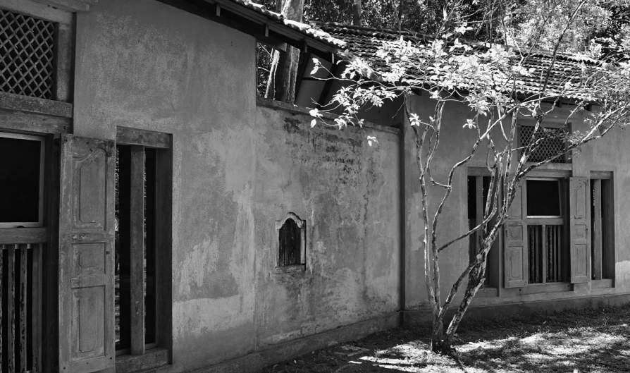
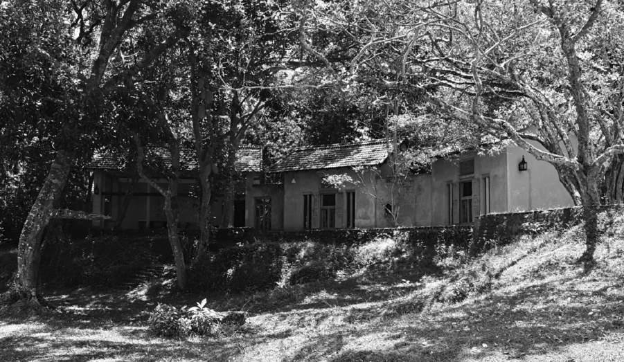
Geoffrey Bawa’s Buildings
Lunuganga Garden
Art Style | Art & Culture International Magazine 147
Figure 15: Facade of the cinnamon hill house
Photo by Jordan Wright.
Figure 16: Facade of the cinnamon hill house, close up view Photo by Jordan Wright.
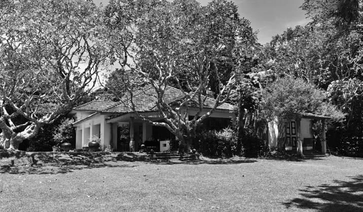
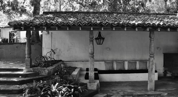
Art Style | Art & Culture International Magazine 148
Figure 17: View of the house and the north terrace
Photo by Jordan Wright.
Figure 18: Sitting area in front of the entry court from the South Terrace
Photo by Jordan Wright.
Figure 19: Bridge adjoining two gardens
Photo by Jordan Wright.
Art Style | Art & Culture International Magazine 149
Figure 20: Bawa's Bedroom court Photo by Jordan Wright.
Figure 21: View of the Pavilion extension of the house and the Eastern Terrace
Photo by Jordan Wright.
Analysis of Work Cited
1. Anjalendran, Chelvadurai, et al. The Architectural Heritage of Sri Lanka. Talisman, 2016.
Architect C Anjalendran's (assisted by some assistants and students) book offers a record of Sri Lanka's architectural heritage. It documents many compelling and frequently overlooked buildings across Sri Lanka. This book features detailed architectural measured drawings alongside photographs and insightful text, which the focal point is to examine the broad cross-section of buildings of contrasting nature and from different time periods. This includes the analysis of the ancient classical era of Anuradhapura and Polonnaruwa, through primitive times, the colonial interval and through the years succeeding Sri Lanka's regain of Independence in 1928.
In the procedure, Anjalendran includes an examination of the different buildings that hold contrasting features designed to be informative to how styles and forms develop through influence and time. The content provided in the book offers reliable and concise material of the different buildings supported by detailed drawings and illustrations. It gives an overview of buildings that hold significance in Sri Lanka, with the different styles and features. The text includes the submission of architectural jargon to provide a thorough understanding through the lenses of a researcher that’s the focal point is examining buildings. The main objective is to display the different architect’s authority and how each include their own unique character.
Text included in the book is appropriate to my study of architecture in Sri Lanka, it permits a more profound understanding of context such as history. Its concise structure and format will help as a template when I analyse works of Bawa.
2. Comfort futures, “Geoffrey Bawa.” Retrieved from: www.comfortfutures.com/geoffreybawa/. 25 June 2018.
This section of the website, Comfort Futures, is dedicated to providing informative material on Geoffrey Bawa's life and his approach in architecture. It explores Bawa's stages of his career with a focus on his personal development in the field of architecture. Providing an insightful description of the tropical modernist approach hence his primary vision of all his buildings. This is completed with an analysis of the Kandalama Hotel's design and the close correlation with the environment.
In the process of evaluating the viability of this work, it provides descriptive and useful information through an analytical approach towards Bawa's use of space and place. Comfort futures offers material that's text focal point is to examine the physical designs of the infrastructures and how his architectural approach of tropical modernism has interwoven the environment surrounding it. In addition, information about his personal history is provided beforehand to allow the readers to grab an understanding of Bawa as a person.
The text included on the website page is useful with my investigation of how Bawa uses space and place to develop his concept of tropical modernism. The framework of the text will give me an idea of my exploration of his buildings.
Art Style | Art & Culture International Magazine 150
3. "Garden History, Vol. 37, No. 1 (Summer 2009), pp. 126-128." Bawa: The Sri Lanka Gardens by David Robson and Dominic Sansoni, edited by David E. Cooper, The Garden History Society. JSTOR, The Garden History Society.
This section of the book (Bawa: The Sri Lanka Gardens by David Robson and Dominic Sansei) Vol. 37, No. 1, is complete with very descriptive and informative material that concisely focuses on Geoffrey Bawa's gardens especially the one situated at Lunuganga. It explores his utilization of modern construction and the relationship with the tropic landscape while including a fusion of vernacular style. Thus, it compares Geoffrey Bawa's perspective to the architectural aspects with his brother Bevis Bawa, and this likewise scrutinizes both of their gardens. In the process, this section offers viable analysis of the gardens and its close relationship with their overall concept in interlinking with tropical design and design based on local needs and availability of construction materials. The inclusion of comprehensive data is planned to inform the architectural fields that are the focal point is Bawa's work. A remark amount of the text contains Bawa's appreciation towards the tropical aspect and this link to tropical modernism. This passage does not hold any photographs and sketches to support the text as its approach is very formal and is primarily for researches of an architectural field. Consider the cultural background that influenced Bawa's sensitive treatment towards his incentives.
Text included in the section is accurate information that ties with my area of study of tropical modernism. It acts as an introduction to this area of research as we examine Bawa's use of tropical designs.
4. Lewcock, Ronald, et al. The Architecture of an Island: The Living Heritage of Sri Lanka: A Thousand Years of Architecture Illustrated by Outstanding Examples of Religious, Public, and Domestic Buildings. Colombo, Barefoot (Pvt.), 2010.
The architecture of an island is a book that offers information that is descriptive on the designs of buildings situated in Sri Lanka. This book is complete with a record of ninety-five monuments which focuses on the architectural component. Through its description, it adopts architectural jargon. The sections in the book are arranged according to the buildings type and nature, and collectively it is organized in chronological order. Within it, offers information on the changing forms and styles of buildings. In the process, this book provides examples of different buildings and architectures across Sri Lanka equipped with text that analyze the work. The text focal point is to examine the significance of changing forms and styles of buildings, with the many established example they are all analyzed through different perspectives as distinguished artist and architects present each work. The inclusion of text supported by photographs clarify the themes and evaluate the sketches.
The text included in the chapters could easily be incorporated to my study when I analyze the buildings of Bawa as it can act as a template for my examination, how the information is structured and formatted. The framework of the text would assist how I analyze the subject and express my views on the subject.
Art Style | Art & Culture International Magazine 151
5.RIBA, “Modernism.” Retrieved from: https://www.architecture.com/knowledge-andresources/knowledge-landing-page/modernism. 20 May 2018
The Royal Institute of British Architects provides a section on their website dedicated in providing information about the architectural concept of modernism. It includes superficial information on the history of the coming of this architectural approach; hence it provides clear and precise material on the characteristics of this style and qualities that should be anticipated when examining modernist buildings. The information included in this website will help my process in explaining the concept of modernism before I explore the tropical modernist approach. It will give the readers an understanding of the architecture styles which will enable an easier awareness on my investigation of Geoffrey Bawa’s architectural approach thus how it impacts his use of space and place.
6. Robson, David. Geoffrey Bawa: The Complete Works. 2004 ed., Thomas & Hudson, 2004. Robson's book provides accurate and viable information on Geoffrey Bawa, entire with the early life of Bawa, the architectural influence in Sri Lanka from colonial powers, an insight to the works of Edwards, Reid and Begg, the exploration of his buildings with a focus on the architectural approach, a portfolio on his most important works.
The sections in this book provide descriptive and insightful material on his buildings while depicting in-depth appreciation to his early life. Robson includes photographs derived from Geoffrey Bawa archive in Brighton and Colombo. Illustrative material to permit a simpler depiction of grasping Bawa's life and the understanding of the buildings. The intention for this publication is to supply comprehensive documentation and acknowledgment of Bawa and his work. The information included in this book is valuable for my study on Bawa. It gives me an insight into his perusal life, the architectural influences through history and insightful description of his work. The format of this book will enable me an understanding of what structure is most applicable to investigate how he uses space and place according to his tropical modernist approach.
7. Robson, David and Sebastian Posingis. In Search of Bawa: Master Architect of Sri Lanka Talisman Publishing Pte, 2016.
Robson's book provides authentic material on Geoffrey Bawa, complete with his life, education, his judgment on architecture, and administers an inquiry of the 44 Bawa Buildings situated across Sri Lanka. The chapters in Robson's book are very descriptive and offer architectural jargon on every building designed by Bawa. This inquires texts, contemporary and archive photographs, and a profusion of drawings that depict the individual constructions. In the process, Robson incorporates concise summarization designed to be informative to both architectural fields and for people that have significant interest to Bawa's work. Robson offers material for researchers with the focal point of studying the architectural aspect of Bawa's buildings. Although, his preliminary explanation is to assist Bawa's believe that architecture can only be completely comprehended through written explanation, pictures and should be experienced face-to-face. This text presents an abundance of reliable information that focuses on Bawa from a biographical aspect.
Art Style | Art & Culture International Magazine 152
Chapters in this book could simply be incorporated in the structure of my Extended Essay. Several chapters exclusive to Bawa's buildings enables students studying his work an endowment of thorough understanding as well as information of places for primary research involving visiting the buildings. The chapters that analyze Bawa's background information addresses the writing process that associates with architectural components and would serve to generate discussion when carrying out questionnaires as well add context to my paper.
8. Taylor, Brian Brace, et al. Geoffrey Bawa. Revised edition. ed., Thames and Hudson, 1996. Taylor's book includes descriptive text and illustrations which focuses on a range of Bawa's work. Included with documentary plans, background information of Geoffrey Bawa, Chronology of Bawa's works, and distinct emphasis on the substance and significance of his architecture in relation with the character of the natural landscape as well as the interface of Western traditions. The chapters in the book include material of Bawa's buildings alongside an eloquent of architectural jargon.
In the process, Taylor incorporates descriptive analysis on Bawa's work planned to inform researchers, that’s the focal point is to examine Bawa. Taylor offers original copies of Bawa's architectural plans and includes photographs which permit a visually understanding of his buildings. His main intention for this publication is to provide the concise reader understanding of Bawa's message in his work, and to highlight Bawa's relation with including the elements of time, history and geography. The insight comes from visual examination as the book includes more pictures and architectural sketches than text. Although, the text is essential because of its descriptive information, reliable context, and its architectural approach. Several chapters closely focus on Bawa's appreciation on Western humanist traditions in architecture, particular significance on Bawa's gardens and an examination of his private houses, schools, offices and public buildings are represented. Sections within this book are valuable to my study as I have access to reliable information of Bawa's work and his intentions. I can utilize his architectural plans and photographs to examine how he adopts space to depict his message. Hence, it allows me to analyze how he links his buildings to elements of time, history, primarily geography and the relationship with tropical modernism. Some of the text provided would be appropriate to include in my analysis.
Author and Photographer
Jordan Wright
The Overseas School of Colombo
E-mail: jwright19@osc.lk
Art Style | Art & Culture International Magazine 153
Art Style | Art & Culture International Magazine
Art Style Magazine is an open access, biannual, and peer–reviewed magazine
Submission
Art Style Magazine publishes both themed issues and issues with a variety of themes. If you are interested in publishing in the current themed edition, check out the call for papers for details on the upcoming editions. You are also welcome to contribute an extended essay or scholarly article on one of our past issues’ themes or a new subject. You just need to follow our Author Guidelines and submit your essay or scholarly article for evaluation. We will get back to you with acceptance or nonacceptance feedback after the reviewers have evaluated your contribution. If your submission is accepted, we will inform you about the publication schedule.
Peer-Review Process
Papers submitted to Art Style Magazine are subject to strict peer review and published in the online issue when two external reviewers have approved them. Deadlines and publication dates are designated in each respective issue’s planning stages. We will get back to authors with acceptance or nonacceptance feedback after the reviewers have evaluated the contributions, and we will inform them about the publication schedule.
Plagiarism
Papers submitted to Art Style Magazine are automatically checked for plagiarism; if a paper is plagiarized, it will not be accepted. All published articles go through the plagiarism scanner and must meet the ethical standards of academic conduct. If plagiarism is discovered in a published article, the plagiarized piece will be removed, and the author will no longer be able to publish in this magazine.
Research Publishing Ethics
Art Style Magazine outlines the best practice principles for publications. We defend the best practices in our publications and follow top institutions’ directions on teaching, science, and research worldwide. With this practice, we wish to remember the fundamental values of recognition of merit and the originality of researchers and authors. Therefore, we present here the central notions of good conduct and research publishing ethics, based on the Committee on Publication Ethics (COPE), the United States National Science Foundation’s policies and procedures, the European Science Foundation’s code of conduct, and the FAPESP São Paulo Research Foundation’s code of good scientific practice.
License and Publishing Agreement
Authors are required to sign a License and Publishing Agreement, when a paper is accepted for publication, retaining copyright while allowing the Art Style Magazine to publish under the terms of that agreement. Authors of Art Style Magazine are invited to accept and agree to be bound by the terms and conditions of Creative Commons Attribution License (CC BY-NC-SA 4.0).
Author Guidelines
Language: American or British English Everything written should be proofread.
The extended essay should be submitted to editorial@artstyle.international
Required structure
Required structure of the extended essay: title; abstract (approx. 300 words); introduction; body of the essay; conclusion; author biography (at least 150 words), endnotes, bibliography (only authors cited in the text should be referred to in the bibliography). Please, use The Chicago Manual of Style system, in Microsoft Word format (.docx). The extended essay must be of a word count of minimum 3,000 and maximum 5,500 (excluding figures, endnotes and bibliography). Page setup A4 (210 by 297 mm), default settings (based on the normal Microsoft Word template). Title: Times New Roman 16 pt, flush left. Sub-title: Times New Roman 14 pt, flush left. Sub-section Heading: Times New Roman 14 pt, flush left. Text body: Times New Roman 11 pt. Line spacing: 1.15, justified. Quotations: more extended quotations should be single-spaced and separated from the text. Also, we accept scholarly articles with a limit of 8000 words (including endnotes and bibliography). Page setup A4 (210 by 297 mm), default settings (based on the normal Microsoft Word template).
Figures: images are required color or monochrome in RGB color mode. Please, set the resolution of images destined for web pages to 72dpi, and save images in jpg or png format only. Resolution: between 1500 and 2500 pixels wide. Don’t enlarge a small image to avoid pixelated images. The related images to incorporate into your paper should have permission from the image owner or use pictures in the public domain. You can choose royalty-free photos with a Creative Commons or similar license. Otherwise, you can create some images of your own The editorial team will evaluate the images and choose the most appropriate. The author is responsible for the images used in the article, attending to the recommendations indicated in this guide, besides using the image under Creative Commons Attribution License (CC BY-NC-SA 4.0).
Captions for figures
Works of art can be cited using this format:
Figure 1: Artist’s name, Title, Date, Medium, and support. City, Collection. License information.
But include the publication citation for where the artwork’s image was found unless you have viewed the artwork in person. Any image that is being reproduced publicly should consider adding copyright information, i.e., who owns the right to an image or if it is under a Creative Commons Attribution License.
Before you submit your essay, please ensure your paper is ready for submission. Essays and articles submissions that do not meet these recommendations will be returned.
For more information, please see: The Chicago Manual of Style and Magazine’s Author Guidelines
Terms & Conditions
Publishing in Art Style Magazine is free of charge for anyone, there are no article processing charges or other publication fees. Art Style Magazine is independent and supports the Open Access Movement. Art Style Magazine is following what is recommended in international guidelines of the Berlin Declaration on Open Access to Knowledge in the Sciences and Humanities.
This magazine is available under the Creative Commons Attribution License (CC BY-NCSA 4.0) All authors (have) permitted the publication under this license There is no copyright transfer towards Art Style Magazine, the authors hold the copyright and publishing rights without restrictions. Papers submitted to Art Style Magazine are automatically checked for plagiarism; if a paper is plagiarized, it will not be accepted. All published articles go through the plagiarism scanner and must meet the ethical standards of academic conduct. If plagiarism is discovered in a published article, the plagiarized piece will be removed, and the author will no longer be able to publish in this magazine. The editors of Art Style Magazine cannot be held responsible for errors or any consequences arising from the use of information contained in essays published on the Art Style Maganize’s website. Authors agree to the terms and conditions and assure that their submissions are free of third parties’ rights. The views and opinions expressed in the essays are those of the author and do not reflect the views of Art Style Magazine. The authors of Art Style Magazine’s essays are responsible for its content. Images from other sources should be fully acknowledged in the caption. The Art Style Magazine website provides links to third-party websites. However, the magazine is not responsible for the contents of those linked sites, nor for any link contained in the linked site content of external Internet sites.
Editor-in-Chief and Creative Director
Christiane Wagner is the editor-in-chief, founder, and creative director of the Art Style, Art & Culture International Magazine, and a member of the College Art Association of America in New York. She has been a visiting research professor at the University of São Paulo. She was a research visiting professor of aesthetics and science of communication, UNICAMP (Fellowship CAPES 2014–2018, qualification for a professorship, Habilitation, Venia Legendi). Both universities (USP and UNICAMP) are ranked as the best universities in Latin America. She was awarded a doctoral degree (Promotion 2014) in Germany in the science of art and aesthetics, recognized by the Hessian Ministry of Science and Art. She has a Ph.D. in science of art and aesthetics from Université Paris 1 Panthéon-Sorbonne with highest honors (mention très honorable/summa cum laude). Also, she holds a Ph.D. in design and architecture (with highest honors) and a master’s degree in science of communication (with highest honors) from the University of São Paulo. She gave lectures and participated in panel discussions at the Stuttgart State Academy of Art and Design, Germany; L’École des Arts de la Sorbonne – Université Paris 1 Panthéon-Sorbonne; Universität Wien; Contemporary Art Museum of the University of São Paulo (MAC USP); Institut für Kunstgeschichte, FAU – Friedrich Alexander Universität, Erlangen Nürnberg; The City University of New York (CUNY), New York City College of Technology (City Tech); University of Hertfordshire, London, and in many international conferences. Prof. Dr. Christiane Wagner is a scientific advisor of the São Paulo Research Foundation FAPESP in cooperation agreements with national and international research funding agencies including the UK Research Councils, the Agence Nationale de Recherche (ANR) in France, the Deutsche Forschungsgemeinschaft (DFG) in Germany, and the European Commission. She has several publications, including peer-reviewed articles, books, and essays in German, English, French, and Portuguese, some of the many languages, including Spanish, in which she is fluent.
Associate Editors
Laurence Larochelle is a PhD Candidate on Sociology of Communication and Cultural Studies at the Communication Department of the New Sorbonne University (Paris, France). She is currently working as a Research and Teaching assistant (ATER) at the University of Burgundy –Franche-Comté. She has two master degrees on Sociology (University Paris Descartes) and on Communication (French Institute of Journalism, Panthéon-Assas University). She has worked as a teaching staff at the New Sorbonne University, at Paris Descartes University, at Saint-Denis University and at the University Paris XII. She has published papers in French, in English and in Greek and she has worked as a researcher in France as well as in Cyprus. Since 2018 she is member of the board of the Research Committee 14 (Sociology of Communication, Knowledge and Culture) of the ISA (International Sociological Association).
Martina Sauer runs an Institute of Image and Cultural Philosophy: www.bildphilosphie.de. She is a senior editor of Art Style | Art & Culture International Magazine and a scientific advisor at the Society of Interdisciplinary Image Science and the German Society of Semiotics. She was a scientific associate in philosophy of art, aesthetics, and design in Basel, Zürich, Bremen, and Witten, as well as a scientific associate at Bauhaus-University Weimar. Cf. for publications: researchgate.net, academia.edu, philpeople.org, and bildphilosophie.de.
The Art Style Magazine’s Scientific Committee
Dominique Berthet is a University Professor He teaches aesthetic s and art critic ism at the University of the French Antilles (UA)
Gary Bratchford runs photography projects, writes, and teaches Photography at the University of Central Lancashire (UCLan), United Kingdom, where he is a Senior Lecturer.
Lars C. Grabbe, Dr. phil., is Professor for Theory of Perception, Communication and Media at the MSD – Münster School of Design at the University of Applied Sciences Münster (Germany).
Marc Jimenez is a professor emeritus of aesthetics at University Paris 1 PanthéonSorbonne, France, where he taught aesthetics and sciences of art. He is a specialist in contemporary German philosophy, and his work contributed, in the early 1970s, to research on Critical Theory and the Frankfurt School.
Pamela C. Scorzin is an art, design and media theorist, and Professor of Art History and Visual Culture Studies at Dortmund University of Applied Sciences and Arts, Department of Design (Germany).
Omar Cerrillo Garnica, is a Mexican professor, researcher, and director of Humanities at Instituto Tecnológico de Monterrey, Campus Cuernavaca.
Waldenyr Caldas is a full professor in Sociology of Communication and Culture at the University São Paulo. He was a visiting professor at University La Sapienza di Roma and the Joseph Fourier University in Grenoble, France.
Click to view the scientific committee members and their full bios.
Art Style Maganize’s website: artstyle.international
ISSN 2596-1810 (Online)
ISSN 2596-1802 (Print)
Theodor Herzi, 49 | 05014 020 Sao Paulo, SP | CNPJ 00.445.976/0001-78
Christiane Wagner is a registered journalist and editor: MTB 0073952/SP
© 1995 Art Style Comunicação & Edições / Communication & Editions
Art Style | Art & Culture International Magazine editorial@artstyle.international +1 347 352 8564 New York +55 11 3230 6423 São Paulo
Magazine is a product of Art Style Communication & Editions. Founded in 1995, the Art Style Company operates worldwide in the fields of design, architecture, communication, arts, aesthetics, and culture.
The