24-25.qxp_Grid 18/04/2019 18:26 Page 2
OVER THE COUNTER
The Real Thing
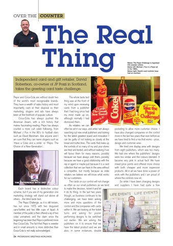
Below: The Pepsi Challenge is ingrained into popular culture. Below left: Micheal J Fox in a Pepsi ad in the 1980s. Below right: David’s card controls have had an overhaul.
Independent card and gift retailer, David Robertson, co-owner of JP Pozzi in Scotland, takes the greeting card taste challenge. Pepsi and Coca-Cola are without doubt two of the world’s most recognisable brands. They have a wealth of sales history and most importantly cash at their disposal so their marketing, slogans and ads have always been at the forefront of popular culture. Coca-Cola has always pushed the American dream, with a rich history that makes fascinating reading. Pepsi has always courted a more cult celeb following, from Michael J Fox in the 80’s to football stars such as David Beckham. Ask anyone and I am sure that they can name slogans such as ‘Have a Coke and a smile’ or ‘Pepsi. The Choice of a New Generation’.
Each brand has a distinctive colour scheme, but if you are of my generation one marketing strategy will stand out above all others…the blind taste test. The Pepsi Challenge, as it is still known, has run since 1975 with two disguised cans/bottles and two little cups of liquid. A member of the public is then offered a sip of two colas unmarked, and the claim since the beginning has been that Pepsi is preferred more than Coca-Cola. The fact that Pepsi is sweeter and in small amounts is more distinctive than Coca-Cola is not really acknowledged. 24
PROGRESSIVE GREETINGS WORLDWIDE
The whole taste test thing was at the front of my mind upon reviewing cards from a publisher that I had long since had my mind made up on, although normally I had dismissed them. As retailers we can often be set in our ways, and while I am always searching out new small publishers and looking for the latest greatest board and innovation I can be guilty of not looking as closely at the bread and butter lines. The cards that make up the controls of so many of my and your stores are tried and tested, and without realising it we will favour them for many reasons, possibly because we have always sold them, possibly because we have a good relationship with the rep or agent or maybe just because it is a card collection that we can have in the area without a competitor, but mostly because as indie retailers we believe we will know what works for our customers. The cards on our control will not change as often as our small publishers as we tend to make the decision, ticket it and let it do its thing. In the last two years though, as business continues to be challenging, we have been asking more and more questions of the control and the companies with cards within it. We are looking at the ticket turns and asking for poorer performing designs to be switched out earlier. We are asking the publishers on it to ensure that we have the latest product and we are also, in some instances, double
pocketing to allow more customer choice. I have also changed companies on the control more in the last two years than ever before as we have tried to find a mix that works - price, design and customer wise. We tried one display area with designs from eight publishers, which was too many. We had one where the publishers’ designs were too similar and the colours blended. It became very pink in actual fact! We have mixed price points and offered more choice with both cheaper and more expensive products. All in all we have done a power of work with the publishers and I am proud of where the controls now sit. So while I have been changing designs and suppliers I have had quite a few