90-91_93_Mocha Mousse.qxp_Grid 17/01/2025 11:48 Page 1
Design Focus: Mocha Mousse
Lucy Ledger, head of creative at The Great British Card Company
With the wealth of product newness at the recent PG Live show, retailers were spoilt for choice as to which launches to rave about. Following on from last month’s Viewpoints, the good news keeps flowing as PG shares more buyers’ top picks that are now pepping up their product selection in their stores.
EARTHY PLEASURES Lex Rogy, founder of Little Roglets Colour Relevance: “It’s a very warm and earthy colour, and I think we could all do with a bit of grounding after the whirlwind of the last few years. It feels very appropriate to me and I’m happy about it as it’s a colour I use so much in and out of the business!” Mousse On The Loose: “I use this colour a lot as it’s one that Above: Lex with her Grandad, who totally steals the show, ahead of the complements and Mocha Mousse curve. goes with most tones, especially for little details which tie everything together. Also, I’m rather partial to using it as a backdrop as it’s a very calming colour, and it makes me just want to dive into the image.” Simple Pleasure Indulgence: “For me, a Above: One of Little simple pleasure indulgence would be Roglets’ brand new children’s designs capturing having a moment of peace with a the colours of Neapolitan ice cream using warm cup of tea on my brand new sofa, browns, pinks and creams listening to the birds outside. That which ties in with the year’s colour of choice. makes me sound really old, doesn’t Left: A card from Messy Meadow range that features it?! I am definitely appreciating the Mocha Mousse. simple moments more and more.”
90 PROGRESSIVE GREETINGS WORLDWIDEZZZZ
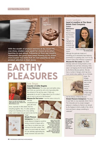
Colour Relevance: “Mocha Mousse being the Pantone Colour of the Year highlights the aesthetic of simplicity that is in line with current Above: Lucy Ledger is on point with her drinking habits. trends. Although this particular shade isn’t something you’d necessarily have featuring prominently on a greeting card, it isn’t to say it doesn’t have some influence or presence.” Mousse On The Loose: “Our 2025 everyday cards are moving towards a more minimalistic look and feel, embracing ‘white space’ and tapping into the trends identified by the Mocha Mousse pantone. We also have a number of designs which tap into a more neutral colour palette, like our Animalia range. Our Vintagio collection also uses a more subdued choice of colours, despite being a male range, which leans into the themes of Mocha Mousse.” Simple Pleasure Indulgence: “This time of year feels so cosy especially where I live in The Cotswolds and my simple indulgent pleasure is meeting my friends in an old pub by the fireplace to drink a bottle of fizz. Life is short and there is always something to celebrate!”
Above: A design from GBCC’s Animalia range. Right: The GBCC Vintagio male range incorporates echoes of Mocha Mousse.