SAN FRANCISCO


THE DESTINATION FOR DESIGNER LIGHTING


SHOP NOW: VISUALCOMFORT.COM
KEARS LARGE BRACKETED WALL LIGHT
IN AGED IRON WITH CLEAR GLASS
DESIGNER: IAN K. FOWLER
CIRCA LIGHTING IS NOW


 Sense. Modular sofas, armchair and ottomans, designed by Studio Roche Bobois. Cestello. Cocktail tables, designed by Gabriele Fedele. Mariposa. Floor lamps, designed by Marcel Wanders. Botanica. Rugs, designed by Emmanuel Thibault.
In-store interior design & 3D modeling services.(1) Quick Ship program available.(2

French Art de Vivre by Flavien Carlod, Baptiste Le Quiniou, for advertising purposes only. (1) Conditions apply, contact store for details. (2) Quick Ship Program available on select products in stock, subject to availability. Images are for reference only and models, sizes, colors and finishes may vary. Please contact your local store for more information.
Photos


KOA IVORY RUG STARKCARPET.COM 844.40.STARK
AN EXPERIENCE Like No Other


Your private showcase awaits at a Thermador Experience and Design Center. Explore luxury bespoke kitchens and discover how true craftsmanship, design, and innovation can bring your unique vision to life.







©2023 BSH HOME APPLIANCES CORPORATION. ALL RIGHTS RESERVED. Book Your Exclusive Showing THERMADOR.COM/SHOWROOMS Open Now: Irvine | Chicago | New York Coming Soon: Miami | Washington, D.C. | Houston | Beverly Hills

hunterdouglas.com
©2022 Hunter Douglas All trademarks used herein are the property of Hunter Douglas
LIVE BEAUTIFULLY
What does it mean to live well? To be perfectly at ease, in comfort and style?
Innovative product designs pair with gorgeous fabrics and control systems so advanced, shades can be scheduled to automatically adjust to their optimal position throughout the day. Creating a new world of beauty, convenience and energy efficiency — morning, noon, and night.
 Pirouette® Window Shadings with PowerView® Automation

FLAGSHIP STORES: MINOTTI BOSTON BY DDC GROUP, 210 STUART STREET - T. 857 990 9008 MINOTTI CHICAGO BY ORANGE SKIN, 419 W. SUPERIOR STREET - T. 312 573 2788 MINOTTI LOS ANGELES BY ECRÙ, 8936 BEVERLY BLVD - T. 310 278 6851 MINOTTI MIAMI BY DDC GROUP, 3801 NE 2ND AVENUE - MIAMI DESIGN DISTRICT - T. 305 306 9300 MINOTTI NEW YORK BY DDC GROUP, 134 MADISON AVE @ 31 STREET - T. 212 685 0095 ALSO AVAILABLE THROUGH MINOTTI’S AUTHORIZED DEALERS AGENT ANNA AVEDANO T. 240 441 1001 - ANNA.AVEDANO@MINOTTI.COM


CONNERY SEATING SYSTEM | RODOLFO DORDONI DESIGN BOTECO COFFEE TABLE | MARCIO KOGAN / STUDIO MK27 DESIGN DISCOVER MORE AT MINOTTI.COM/CONNERY


STAPRANSDESIGN.COM 650.851.8436
Escape the Ordinary
Experience breathtaking views from the sky at 181 Fremont. Our luxurious wrap-around observation terrace, located a soaring 470 feet in the air, allows residents to fully take in the stunning beauty of the bay and San Francisco cityscape. The well-appointed amenities and social gathering spaces within the building only add to the exceptional living experience at 181 Fremont - where you can escape the ordinary.
Scan for a video journey through 181 Fremont.


PRICED FROM THE $2MS TO $15MS. PRICING UPON REQUEST FOR THE TOP FULL-FLOOR GRAND PENTHOUSE.


1.628.200.0530 / INFO@181FREMONT.COM / 181FREMONT.COM

THIS IS NOT AN OFFER TO SELL BUT IS INTENDED FOR INFORMATION ONLY. THE DEVELOPER RESERVES THE RIGHT TO MAKE MODIFICATIONS IN MATERIALS, SPECIFICATIONS, PLANS, DESIGNS, PRICING, SCHEDULING & DELIVERY OF THE HOMES WITHOUT PRIOR NOTICE. EXCLUSIVELY REPRESENTED BY COMPASS DEVELOPMENT MARKETING GROUP, LICENSED AS COMPASS, DRE #01527235.
DISCOVER THE GENIUS IN YOU
 Retro Black Petrified Wood
Half Dome inspired Create your own masterpiece with endless stone and tile possibilities

Your Mind + Our Materials
1480 Industrial Road,
| 650-595-2500 | www.davincimarble.com
San Carlos, CA 94070
Calacatta Oro Marble
Breccia Capraia Marble
JEFFREY COFFEE TABLE


Shown


100% MADE IN EUROPE
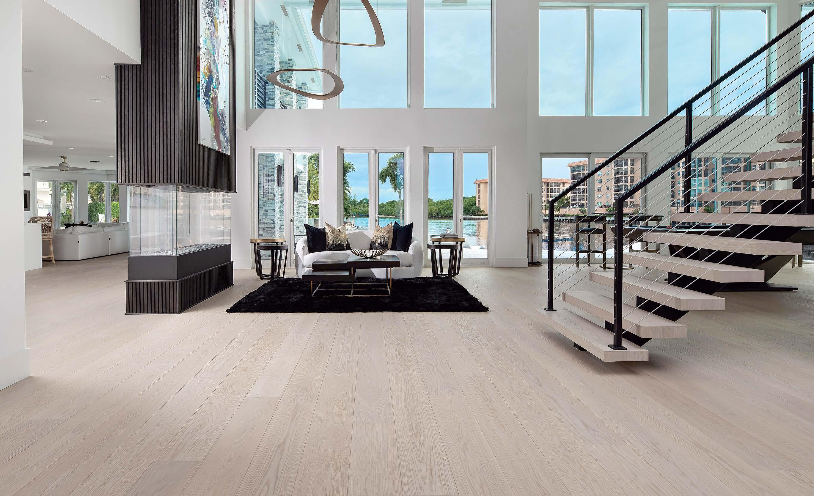


CUSTOM DESIGNED FURNITURE FOR YOUR FLOOR @LegnoBastone | Phone: 239.206.1898 | www.LegnoBastone.com


 NEW YORK CHICAGO DALLAS NASHVILLE BOSTON SAN FRANCISCO GREENWICH PALM BEACH SHORT HILLS CANNES JAKARTA
TERRA COLLABORATES WITH AN EXTRAORDINARY TEAM OF DESIGNERS, MANUFACTURERS AND ARTISANS ACROSS THE GLOBE TO CREATE EXCEPTIONAL OUTDOOR FURNISHINGS. OUR PREMIUM QUALITY AND CONTEMPORARY EUROPEAN DESIGNS ARE IN-STOCK AND READY TO TURN YOUR OUTDOOR SPACE INTO A PERSONAL SANCTUARY.


WWW.TERRAOUTDOOR.COM I 888.449.8325 I NATIONWIDE SHIPPING

MAR APR
56 DESIGN DISPATCH
The little black book of all things new and fabulous in the local community.

Radar
66 EVOLUTION
Leading landscape designers weigh in on the growing appeal of showcasing art in natural surroundings.
70 HUE


Gardener Ellen Ogden Ecker pens an ode to the sights of spring and the color of new beginnings.


72 INSPIRATION


Florida-based sculptor Jorge Blanco is on a mission to spark happiness through eye-catching art.


74 INNOVATION
With a line of outdoor planters and a new Miami outpost, Adam Sirak is making waves in landscape design.
Market
90 MATERIAL


Textile artists stitch one-of-a-kind creations for Luxe featuring this season’s performance fabrics.

100 TREND

Find inspiration in the jaw-dropping terrain of three U.S. National Parks.
108 SPOTLIGHT


From benches to loungers to dining chairs, herald alfresco living with colorful outdoor seating.
Living
134


KITCHEN + BATH
Hotelier Liz Lambert unveils her collection with Perennials and her charming ranch in Marfa, Texas.
142 THE REPORT
A look at how today’s pool houses are being designed as backyard vacation destinations.
48 EDITOR’S LETTER
Scene
2 0 2 3
C O N T E N T S L U X E S O U R C E C O M

LIAIGRE AT DE SOUSA HUGHES SAN FRANCISCO DESIGN CENTER TWO HENRY ADAMS STREET, SUITE 320, SAN FRANCISCO, CA 94103 DESOUSAHUGHES.COM STUDIOLIAIGRE.COM

MaggettiConstruction.com | 408.559.3439 | Lic# B-546024 OBSESSIVE PERFECTIONISM NEW CONSTRUCTION | MAJOR REMODELS | KITCHENS | BATHROOMS
cater to the client for the life of the home.” Mitch &
Maggetti
“We
Dave

COME SEE OUR NEW LOCATION!!! PACIFIC DESIGN CENTER 8687 Melrose Ave. Suite #B515, West Hollywood, CA 90069 (213) 748-9563 FURNITURE • LIGHTING • ACCESSORIES • OUTDOOR • C.O.M • TO-THE-TRADE • HOSPITALITY 800.274.7730 | PALECEK.COM
FEATURES
Friendly Disposition
A designer and her friendturned-client teach a classic San Francisco home to speak with an elegant Southern accent.


Written by Maile Pingel
Photography by John Merkl
168
English Lessons
Magic happens in a Marin County dwelling when a designer marries a moody British vibe with a sunny California nature.
Written by Christine DeOrio
Photography by Haris Kenjar
COVER: A rarely used formal living room becomes a cool
178
Painting the Sky
Artist Elaine Coombs had always painted landscapes, but things changed during the pandemic when she started looking up.
Written by Deborah Bishop
Photography by Kristen Loken
182
All the Right Moves
A series of relatively small changes lead to big results in a Mediterranean-style Bay Area house.
Written by Monique McIntosh
Photography by Douglas Friedman/Trunk Archive
by
ON THE
lounge when reimagined
interior designer Casey Howard. She surrounded the space with textured Mark Alexander wallpaper and outfitted it with a Burton James sofa, Theodore Alexander chair and Global Views table. Artistic Tile’s
Pinnacle Nero Marble covers the fireplace. Page 182 158
L U X E S O U R C E C O M C O N T E N T S


Copyright 2023© Signature Kitchen Suite, 111 Sylvan Ave., Englewood Cliffs, NJ 07632. All rights reserved. “Signature Kitchen Suite” and the Signature Kitchen Suite logo are trademarks of Signature Kitchen Suite.
French door that satisfies them
Introducing our new fully integrated 48-inch French Door Refrigerator/Freezer; designed to fit any kitchen’s style and every entertainer’s needs. Thanks to its impressive capacity, and features like the exclusive 5-mode Convertible Drawer and Dual Ice Maker with Craft Ice™, your favorite foods and growing guest lists will be well taken care of. That’s how we stay #TrueToFood SignatureKitchenSuite.com Friedmans Appliance Pleasant Hill | 925-808-2950 Friedmansappliance.com Learn more about how we stay True to Food by visiting our showroom near you:
Designers, epicureans, and guests. The
all.
Possibly the Best Four-Season Private Community in the U.S.


At all points of Martis Camp’s compass you’ll find connections, escapes, peace, joy and assorted pockets of serenity that provide a healthy balance to the layers of our workaday worlds. There’s Tom Fazio golf, a Beach Shack on Lake Tahoe, a slope side private ski lodge with direct ski access to Northstar CaliforniaTM and skies that range from pitch black to technicolor. Come discover that place you’ve dreamed of –the one that links you to life’s most important moments.

Access to and use of the recreational amenities are not included in the purchase of homesites and require separate club membership. Obtain and carefully review the offering circular for Martis Camp Club before making any decision to purchase a club membership. Information deemed reliable but not guaranteed and should be verified. Martis Camp Realty, DRE License #01997809 MARTIS CAMP HOME 651 $6,995,000 • 4,712 sq ft • 6 bedrooms • 6.5 bathrooms MARTIS CAMP HOME 469 $13,995,000 • 7,430 sq ft • 5 bedrooms • 5.5 bathrooms
– Forbes
800.721.9005 MartisCamp.com


extremely fine handwoven Wool & Silk Canterbury silk | C9225 pibl BOKARA.COM creator of the most beautiful rugs in the world 50 Enterprise Ave N, Secaucus, NJ 07094 | 201-601-0040 | sales@bokara.com Elegance h a n d m a d e since 1975 custom | contemporary | traditional | AUBUSSON | SAVONNERIE | TIBETAN | ANTIQUE
DESIGN DIRECTOR
Pam Shavalier
ART DIRECTOR
Candace Cohen
PAMELA LERNER JACCARINO VICE PRESIDENT, EDITOR IN CHIEF
EXECUTIVE EDITOR
Brittany Chevalier McIntyre
SENIOR MANAGING EDITOR
Colleen McTiernan
MANAGING EDITORIAL DIRECTOR
Kelly Velocci Jolliffe
MANAGING EDITORS
Krystal Racaniello, Clémence Sfadj
HOMES EDITORS
SOUTHEAST
Kate Abney
COLORADO, LOS ANGELES, SOUTHERN CALIFORNIA
Kelly Phillips Badal
PACIFIC NORTHWEST, SAN FRANCISCO
Mary Jo Bowling
GREATER NEW YORK
Grace Beuley Hunt
STYLE DIRECTOR
Kathryn Given
ASSOCIATE EDITOR
Khadejah Khan
AUSTIN + SAN ANTONIO, DALLAS + FORT WORTH, HOUSTON
Paulette Pearson
ARIZONA, CHICAGO
Shannon Sharpe
MIAMI, PALM BEACH + BROWARD, NAPLES + SARASOTA
Jennifer Pfaff Smith
DIRECTOR, SPECIAL EDITORIAL PROJECTS
Katy Olson Wenzel
ART
ART DIRECTOR
Maria Pluta
SENIOR GRAPHIC DESIGNER
Jamie Beauparlant
GRAPHIC DESIGNER
Ellen Antworth
ASSOCIATE GRAPHIC DESIGNER
Kyle Anderson
SENIOR RETOUCHER
Christian Ablan
MARKET
SENIOR MARKET EDITOR
Sarah Shelton
DIGITAL
SENIOR DIRECTOR, CONTENT DISTRIBUTION
Amanda Kahan
SENIOR MANAGER, DIGITAL CONTENT
Ileana Llorens
WEB EDITOR
Michelle Yee
ADAM I. SANDOW CHAIRMAN
ERICA HOLBORN
CHIEF EXECUTIVE OFFICER
CHIEF OPERATING OFFICER
Michael Shavalier
CHIEF DESIGN OFFICER
Cindy Allen
CHIEF SALES OFFICER
Kate Kelly Smith
CHIEF MARKETING OFFICER
Margaux Caniato
EXECUTIVE VICE PRESIDENT + DESIGN FUTURIST
AJ Paron
EXECUTIVE VICE PRESIDENT, DIGITAL + STRATEGIC GROWTH
Bobby Bonett
VICE PRESIDENT, HUMAN RESOURCES
Lisa Silver Faber
SENIOR VICE PRESIDENT, PARTNER + PROGRAM SUCCESS
Tanya Suber
VICE PRESIDENT, BUSINESS DEVELOPMENT
Laura Steele
VICE PRESIDENT, STRATEGIC PARTNERSHIPS
Katie Brockman
DIRECTOR, VIDEO
Steven Wilsey
SANDOW DESIGN GROUP OPERATIONS
SENIOR DIRECTOR, STRATEGIC OPERATIONS
Keith Clements
CONTROLLER
Emily Kaitz
DIRECTOR, INFORMATION TECHNOLOGY
Joshua Grunstra
SANDOW was founded by visionary entrepreneur Adam I. Sandow in 2003, with the goal of reinventing the traditional publishing model. Today, SANDOW powers the design, materials and luxury industries through innovative content, tools and integrated solutions. Its diverse portfolio of assets includes The SANDOW Design Group, a unique ecosystem of design media and services brands, including Luxe Interiors + Design, Interior Design, Metropolis, DesignTV by SANDOW; ThinkLab, a research and strategy firm; and content services brands, including The Agency by SANDOW – a full-scale digital marketing agency, The Studio by SANDOW – a video production studio, and SURROUND – a podcast network and production studio. SANDOW Design Group is a key supporter and strategic partner to NYCxDESIGN, a not-for-profit organization committed to empowering and promoting the city’s diverse creative community. In 2019, Adam Sandow launched Material Bank, the world’s largest marketplace for searching, sampling and specifying architecture, design and construction materials.
This
magazine is recyclable. Please recycle when you’re done with it. We’re all in this together.

Brown Jordan is a registered trademark of Brown Jordan Inc. Mastering the art of outdoor living since 1945. brownjordan.com
KATE KELLY SMITH EXECUTIVE VICE PRESIDENT + MANAGING DIRECTOR
SENIOR VICE PRESIDENT, OPERATIONS

Tanya Suber
GENERAL MANAGER Scott MacClements
VICE PRESIDENT, PROGRAMMING + EXPERIENCES
James Nolan
NATIONAL PUBLISHER Michelle Blair
HOME FURNISHINGS DIRECTOR
Blaire Rzempoluch
NORTHEAST DIRECTOR
Amy McMillan Tambini
WEST COAST DIRECTORS
Lisa Lovely, Carolyn Homestead
MIDWEST + SOUTH CENTRAL DIRECTOR
Tanya Scribner
SALES OPERATIONS DIRECTOR John Baum
EXECUTIVE ASSISTANT Bianca Buffamonte
SALES ASSISTANT Janice Hyatt
INTEGRATED MARKETING
DIRECTOR, DIGITAL STRATEGY Samantha Westmoreland
DIGITAL STRATEGY MANAGER Kasey Campbell
SENIOR MARKETING DIRECTOR Jana Weill
INTEGRATED MARKETING MANAGERS Verity Lister, Frank G. Prescia
INTEGRATED GRAPHIC DESIGNER Antoinette Childs
EVENTS MANAGER Gabriella Laimer
EVENTS COORDINATOR Rachele Daszkal
PARTNER + PROGRAM SUCCESS DIRECTOR, PARTNER SUCCESS Jennifer Kimmerling
PARTNER SUCCESS MANAGER + TEAM LEAD Brittany Watson
SENIOR PARTNER SUCCESS MANAGERS Lauren Krause, Susan Mallek, Molly Polo
PARTNER SUCCESS MANAGER Isabel Tragos
LUXE PREFERRED, PROGRAM SUCCESS MANAGER + ANALYTICS SPECIALIST Victoria Albrecht
LUXE PREFERRED, PROGRAM SUCCESS MANAGER Stephanie Fritz
NATIVE CONTENT EDITOR + TEAM LEAD Greta Wolf
NATIVE CONTENT EDITORS Elizabeth Johnson, Heather Schreckengast, Matthew Stewart
DIRECTOR OF PRODUCTION Kevin Fagan
CIRCULATION + DISTRIBUTION
SENIOR MANAGER, MANUFACTURING + DISTRIBUTION Stacey Rigney
ARIZONA PUBLISHER Adrienne B. Honig
SALES ASSOCIATE Catherine McGlynn
AUSTIN + SAN ANTONIO PUBLISHER Jim Wilson
SALES ASSOCIATE Addie Szews
CHICAGO REGIONAL PUBLISHER Kathleen Mitchell
DIRECTORS Tracy Colitte, Carolyn Funk, Taylor Greene
COLORADO REGIONAL PUBLISHER Kathleen Mitchell
PUBLISHER Terri Glassman
DIRECTORS Travis Gainsley, Katie Martin
DALLAS + FORT WORTH PUBLISHER Rolanda Polley
SALES ASSOCIATE Addie Szews
GREATER NEW YORK PUBLISHER Trish Kirsch
ASSOCIATE PUBLISHER, NEW YORK Donna Herman
ASSOCIATE PUBLISHER, CONNECTICUT Amy McMillan Tambini
DIRECTOR, NEW YORK Maritza Smith DIRECTOR, HAMPTONS Michelle A. Giannone
HOUSTON PUBLISHER Amy McAnally
SALES ASSOCIATE Addie Szews
LOS ANGELES PUBLISHER Tiffany O’Hare
ASSOCIATE PUBLISHER Virginia Williams
MIAMI, PALM BEACH + BROWARD, NAPLES + SARASOTA
REGIONAL PUBLISHER Stacey Callahan
DIRECTORS Jennifer Chanay, Susan Goldstein, Karina Gonzalez
PACIFIC NORTHWEST PUBLISHER Debby Steiner
DIRECTOR Cathy Cruse
SAN FRANCISCO PUBLISHER Lisa Lovely
DIRECTOR Sara McGovern
SOUTHEAST PUBLISHER Sibyl de St. Aubin
DIRECTOR Suzanne Brandt
SOUTHERN CALIFORNIA PUBLISHER Alisa Tate
ASSOCIATE PUBLISHER Kali Smith
Luxe Interiors + Design (ISSN 1949-2022), Arizona (ISSN 2163-9809), California (ISSN 2164-0122), Chicago (ISSN 2163-9981), Colorado (ISSN 21639949), Florida (ISSN 2163-9779), New York (ISSN 2163-9728), Pacific Northwest (ISSN 2167-9584), San Francisco (ISSN 2372-0220), Southeast (ISSN 2688-5735), Texas (ISSN 2163-9922), Vol. 21, No. 2, March/April, prints bimonthly and is published by SANDOW, 3651 NW 8th Ave., Boca Raton, FL 33431. Luxe Interiors + Design (“ Luxe ”) provides information on luxury homes and lifestyles. Luxe Interiors + Design SANDOW, its affiliates, employees, contributors, writers, editors, (Publisher) accepts no responsibility for inaccuracies, errors or omissions with information and/or advertisements contained herein. The Publisher has neither investigated nor endorsed the companies and/or products that advertise within the publication or that are mentioned editorially. Publisher assumes no responsibility for the claims made by the Advertisers or the merits of their respective products or services advertised or promoted in Luxe Publisher neither expressly nor implicitly endorses such Advertiser products, services or claims. Publisher expressly assumes no liability for any damages whatsoever that may be suffered by any purchaser or user for any products or services advertised or mentioned editorially herein and strongly recommends that any purchaser or user investigate such products, services, methods and/or claims made thereto. Opinions expressed in the magazine and/or its advertisements do not necessarily reflect the opinions of the Publisher. Neither the Publisher nor its staff, associates or affiliates are responsible for any errors, omissions or information whatsoever that have been misrepresented to Publisher. The information on products and services as advertised in Luxe are shown by Publisher on an “as is” and “as available” basis. Publisher makes no representations or warranties of any kind, expressed or implied, as to the information, services, contents, trademarks, patents, materials or products included in this magazine. All pictures reproduced in Luxe have been accepted by Publisher on the condition that such pictures are reproduced with the knowledge and prior consent of the photographer and any homeowner concerned. As such, Publisher is not responsible for any infringement of the copyright or otherwise arising out of any publication in Luxe Luxe is a licensed trademark of SANDOW © 2011. All rights reserved. No part of this publication may be reproduced or transmitted in any form or by any means, electronic or mechanical, including photocopy, recording or any information storage and retrieval system, without
the written permission of the Publisher. ADDRESS SUBSCRIPTION REQUESTS AND CORRESPONDENCE TO: Luxe, P.O. Box 808, Lincolnshire, IL 60069-0808. Email: luxe@omeda.com or call toll-free 800.723.6052 (continental U.S. only, all others 847.559.7358).
SUBSCRIPTIONS 800.723.6052 ADVERTISING 917.934.2800 sandowdesign.com luxesource.com CORPORATE HQ 3651 FAU BOULEVARD, BOCA RATON, FL 33431 561.961.7600 @luxemagazine @Luxe Interiors + Design
NATIONAL SALES DIRECTORS
REGIONAL SALES DIRECTORS
KRYSTA RODRIGUEZ

Actress, Stage & Screen
Founder, Curated by Krysta Rodriguez
DRESS IN: TAMBOURINE TRAPS
BRINGING ART TO LIFE CHICAGO DALLAS NASHVILLE NEW JERSEY NEW YORK SAN FRANCISCO NJ SLAB GALLERY 844-302-9366 ARTISTICTILE.COM

Dallas, TX | $3,995,000 Allie Beth Allman & Associates Erin Mathews — 214 520 8300 Search VOVA on luxuryportfolio.com
™ | luxuryportfolio.com
your home is a personal
of
of Luxury Portfolio International
companies
to
in the journey. Explore over 50,000 of the world’s finest properties
on luxuryportfolio.com each year. @luxuryportfolio CHICAGO +1 312 424 0400 | LONDON +44 20 7872 5525 | NEW YORK +1 212 521 4390 | SINGAPORE +65 6408 0507
Well Connected
Finding
process
discovery, and the accomplished global network
® member
are ready
assist
marketed
Redding, CT | $8,500,000

Welcome to 229 Umpawaug Road, the quintessential estate of exceptional quality on the premier scenic road in Redding, Connecticut.
William Raveis Real Estate, Mortgage & Insurance
Stacy Young — 917 816 6733
Search FXFL on luxuryportfolio.com
Minusio, TI | CHF7,950,000
Mediterranean holiday villa — Sophisticated ambience, spacious rooms, heated outdoor pool and lots of sunlight.

WETAG Consulting
Iradj ALEXANDER-DAVID — +41 91 601 04 40
Search DQKH on luxuryportfolio.com
La Jolla, CA | $3,495,000
Incredible opportunity to indulge in oceanfront living at La Jolla’s premier high-rise building offering an unparalleled lifestyle of luxury.

Willis Allen Real Estate
Drew & Tim Nelson — 858 215 3739
Search XRVK on luxuryportfolio.com
Islip, NY | $1,299,000
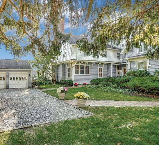
Historic 6,000 sq. ft. home located in the South Shore Hamlet of Islip. Coach Real Estate Associates, Inc.
Susan Simmons — 631 338 1936
Search LKQL on luxuryportfolio.com
©2023 Luxury Portfolio International.® Offering is subject to errors, omissions, change of price, or withdrawal without notice. All information has been supplied by third parties and should not be relied on as accurate or complete. Equal Opportunity Employer and pledged to the letter and spirit of Equal Housing Opportunities.
Drawn to Spring

Welcome to our March/April issue! It’s the season of renewal, green shoots and bucolic surroundings. In this issue, our editors bring fresh perspectives on landscape design and sculpture gardens, the latest in outdoor seating and incredible pool houses. We also head to a west Texas ranch that’s both laid-back and chic for a primer on alfresco entertaining. And, of course, our line-up of fabulous homes. May it all bring you endless inspiration.
Pamela Jaccarino VP, Editor in Chief @pamelajaccarino

L U X E S O U R C E C O M E D I T O R ’ S L E T T E R


Fine Solid Bronze Architectural Hardware 866-788-3631 • www.sunvalleybronze.com Made in the USA


415.883.9465

©2023 The Container Store Inc. All rights reserved. WF155144 1/23 Creating common areas that aren’t. Schedule a free design consultation at containerstore.com/custom-spaces. Discover custom spaces worth sharing. From media centers and pantries to closets, offices and garages, let us help you create a personal space designed around your style and all the things you love.
de sousa hughes

SFDC Showroom 320 phone: 415.626.6883 desousahughes.com
Photo: JosŽ Manuel Alorda


LaCantina is proud to be part of the JELD-WEN global family of product brands and companies. 11-98260 07/22 ALL THE FEATURES, FOLDED IN. MORE GLASS AND LESS FRAME EASIER OPERATION STREAMLINED DESIGN VISIT YOUR LOCAL DEALER FOR INFORMATION ON THE ALL NEW V2 FOLDING DOOR LACANTINADOORS.COM CUPERTINO | SAN CARLOS | SAN RAFAEL ARGOWIN.COM


SCENE
WRITTEN BY ANH-MINH LE | PRODUCED BY COLLEEN MCTIERNAN
IN GOOD TASTE
ECO TERRENO WINES & VINEYARD URBAN TASTING ROOM AND LYON & SWAN SUPPER CLUB


Eco Terreno Wines & Vineyard’s new tasting room and supper club, designed by Eva Bradley and Alicia Cheung of Studio Heimat, transports patrons to the lush, rolling hills of Alexander Valley. The interiors of both establishments, located in a historic building in San Francisco’s Jackson Square neighborhood, are inspired by the vineyard’s grounds, as well as their regenerative farming practices. “It was our first time working on a tasting room,” Cheung notes. “We really enjoyed immersing ourselves in the farm, its biodynamic methods, and telling their story through material, space and light.” In the ground-level Urban Tasting Room, behind banquettes sheathed in Pierre Frey mohair, a pencil-on-linen mural by local artist Rafael Arana depicts views of Eco Terreno's picturesque landscape. The stairwell descending to the subterranean space housing Lyon & Swan also features Arana's work and helps to conjure the feeling of being transported. “You’re going underground literally and conceptually,” says Bradley, “so the mural of the earth’s layers is meant to help you feel like you are submerging yourself into the ground.” Once downstairs, guests can sink into sumptuous leather and mohair seating while enjoying a show and taking in a Serge Gay Jr. triptych portraying a night of revelry. ecoterreno.com, lyonandswan.com
ON VIEW
VARIATIONS ON FREEDOM
Multidisciplinary artist and Stanford University alum Kiyan Williams’ evocative works will be showcased at Altman Siegel in San Francisco, March 9–April

29. Their inaugural solo exhibition with the Dogpatch gallery features a series of new works, including two pedestal sculptures relating to their prior installation, “Ruins of Empire.” The 2022 show, part of Public Art Fund’s “Black Atlantic” exhibition in New York’s Brooklyn Bridge Park, reimagined Thomas Crawford’s “Statue of Freedom” that surmounts the dome of the U.S.
Capitol in Washington, D.C. Williams' piece was composed of earth, rather than bronze, giving the surface the appearance of decomposition and decay. For the Altman Siegel show, Williams offers a fresh interpretation of the 1863 monument. Visitors will also be able to experience a Williams’ first: a largescale sculpture incorporating light. altmansiegel.com

in
good taste photo: frank frances. on view portrait: lyndsy welgos, right photo: nicholas knight.
056 L U X E S O U R C E C O M

OPEN HOUSE ARMADILLO
Sacramento Street can now further tout its bona fides as a design destination. Armadillo, the American and Australian rug maker, has opened its first showroom in San Francisco, joining the likes of de Gournay and The Future Perfect in the Presidio Heights neighborhood. Trade and retail clients alike can browse Armadillo’s vast offerings, courtesy of the outsized samples on display in the light and airy 700-square-foot space. Each of the brand’s collections are handmade by artisans in India who draw on generations of experience and expertise, from handdyeing and sun-drying to spinning and weaving fibers into flat-weave, hand-knotted and braided rugs. Mojave, the latest release, is a luxurious take on jute, at once elegant and understated. armadillo-co.com


TALKING SHOP
TAL PALO
Tal Palo is a “reflection of our favorite things,” says Adriana Dominguez of the hybrid shop and cafe she and husband Aaron Porter opened in downtown Los Altos following a three-year stint in Guadalajara. Dominguez chatted with Luxe about what customer's can expect to find. talpalo.com
Tell us about the concept. Often, Mexico does not come to mind when people think of luxury goods. We hope to highlight the craft of the country and its arts. Mexican goods deserve to be celebrated and valued as world-class mastery.
Is there a common thread among the products? We carry hand-crafted items that tell stories and keep traditions alive. Many of the goods are imported from Mexico by designers who work with local artisans and producers to rescue ancestral techniques.
CHECK IN GRADUATE HOTEL PALO ALTO
The 1929 structure previously home to Hotel President has been brought back to life, while preserving its storied roots. Historical elements like the façade and entry marquee have been restored, while other details, including the Spanish Colonial-style tiles and wooden ceiling beams, were replicated to resemble original features. According to Graduate Hotels CEO and founder Ben Weprin, the 100-room, six-story property embodies “the spirit of the community through distinct design rooted in storytelling.” Indeed, its proximity to Stanford University is deeply reflected in the interiors, with nods to famous former students, as well as hallway carpeting that depicts a timeline of major achievements in the school’s history. Not to be missed is the President’s Terrace rooftop bar—an ideal spot for taking in 360-degree views of the downtown. graduatehotels.com


open house photos: sharyn cairns. talking shop photo: adriana dominguez. check in photo: courtesy graduate palo alto. 058 L U X E S O U R C E C O M S C E N E D E S I G N D I S PA T C H

www.dunkirksf.com
863 7183 dedon.us Spirit of Place
101
Henry Adams Street, No. 355 San Francisco, CA 94103 · 415
STATE OF THE ART
M STARK GALLERY
As a kid, Marianna Stark "dreamed of opening an art gallery in a beach town,” she says. Earlier this year, she did just that. Here, she shares the vision for the new venture in Half Moon Bay. mstarkgallery.com
What prompted you to open M Stark Gallery? Opening my own gallery is the fulfillment of a lifelong dream. When I graduated from UC Berkeley in 1993 with an art history degree, I didn’t see a way to support myself in the art world. I embarked on a career in specialty retail instead. In my spare time, I immersed myself in art through museum groups, serving as a volunteer board member for multiple visual arts nonprofits. This proved to be the ultimate backstage pass, rewarding me with an informal degree in the business of art.
Why downtown Half Moon Bay? As a white box contemporary fine art gallery,
READING ROOM
LODGE: AN INDOORSY TOUR OF AMERICA’S NATIONAL PARKS

Interior designer Max Humphrey brings the great outdoors in with his new coffee table book out April 4.
Two of the 10 destinations highlighted are right here in Northern California: Yosemite’s Ahwahnee and Curry Village.
“I’ve always loved our national parks and wanted to make a book that did justice to the historic lodges—something lodge-y, not stodgy,” says the Portland, Oregon-based author. “They are timeless and fresh, and I wanted to capture that.” At the Ahwahnee, which dates back to 1927, Northern California artist Robert Boardman Howard painted the linen-covered walls with local fauna; the dining room boasts a soaring 34-foot-high wood-beamed ceiling; and the stained-glass panels are the work of Jeannette Dyer Spencer, a longtime San Franciscan who studied at the École du Louvre.

“It’s what you picture if you close your eyes and dream about what a historic lodge should look and feel like,” observes Humphrey.
“From the drive in, past Half Dome and Yosemite Falls, to the granite exterior and then the Art Deco-meets-Arts and Crafts lodge vibe inside the hotel, it’s the full package.” gibbs-smith.com
M Stark Gallery is a different option from the town’s well-established collectives, craft and open-studios scene. But I was inspired by the eclectic mix of nurseries and garden shops, as well as boutiques selling home goods, gifts, apparel and more— all in an incredibly charming setting.
Is there a through line for the artists and works? We focus on pieces that relate to the natural world. The inaugural exhibition, through March 26, features 83-year-old Jerry Ross Barrish, whose sculptures are made from found objects, primarily beach plastic (left). Next will be a group show, “Sneaker Wave,” on view April 1 through May 21, featuring work with themes related to climate change and capitalism’s lack of respect for nature. Participating artists include Squeak Carnwath, Dan Lythcott-Haims, Sam Perry and Tabitha Soren.

state of the art photo: pete collom. reading room photo: david tsay. 060 L U X E S O U R C E C O M S C E N E D E S I G N D I S PA T C H


Live Beautifully... LocallyOwned&GloballySourcedfor25Years. FURNISHINGS | LIGHTING | DESIGN | INSPIRATION SANTA ROSA: 1125 W. Steele Lane 707.568.4044 | SOLANA BEACH: 412 S. Cedros 858.481.4341 cokasdiko.com


A PLACE WITH A CADENCE ALL ITS OWN. AN ICONIC RANCH COMMUNITY WITH A TOM FAZIO DESIGNED GOLF COURSE SET WITHIN A 20,000-ACRE NATURE PRESERVE. TEN MINUTES FROM CARMEL-BY-THE-SEA | 833.620.6768 | SANTALUCIAPRESERVE.COM


 DESIGNERT: Matthew Lechowick BUIILDER: Kinetic Partners
There's a word for the way an expanse of doors blends the indoors and outdoors into one space. It's called biophilic design. But whatever you choose to call it, the effect is the same – your favorite spaces become better, sunnier, and filled with fresh air as they're transformed into a paradise of nature. Another defining element of doors made with rich wood interiors, aluminum clad exteriors, and no compromises. SierraPacificWindows.com 800-824-7744 A Division of Invite More Outside, Inside. Watch our brand video Belmont Design Center 1501 El Camino Real, Unit H 510.673.7513 Orinda Design Center 23 Orinda Way, Suite 306 800.824.7744 Novato Design Center 94 Galli Drive, Suite A-1 800.824.7744
PHOTO: Kat Alves Photography
RADAR
From boundary-pushing landscape design to alfresco art, the world of outdoor living is as dynamic as ever.

E V O L U T I O N | H U E | I N S P I R A T I O N | I N N O V A T I O N
Grounds for Celebration
THE LATEST SCULPTURE GARDENS FEATURE MUSEUM-QUALITY WORKS THAT ENGAGE WITH THE ENVIRONMENT, INVITING WONDER AND INTROSPECTION.
WRITTEN BY MICHELLE BRUNNER
JAMES DOYLE DESIGN ASSOCIATES
It would seem that Mother Nature shouldn’t need much embellishment, but in his new book, Intersection of Nature and Art, landscape architect James Doyle makes a convincing case for using world-class sculpture to enhance outdoor environments. “Once you set the right piece in a meadow, it ends up making sense; the scale is correct, and it adds whimsy and artistry to the natural surroundings,” he says. For art connoisseur clients, outdoor sculpture gardens provide an opportunity to expand their collection and experience pieces while communing with nature. “Some homeowners may want these works front and center, while others will prefer them to be more of a surprise that’s discovered as the landscape gradually unfolds,” says Justin Quinn, partner at JDDA. At a historic estate outside Philadelphia, an Antony Gormley sculpture punctuates the expansive grounds. Whether situated to inspire public awe or private contemplation, an artfully placed sculpture has the power to beguile onlookers. jdda.com

photo: neil landino,
courtesy the images publishing group.
R A D A R E V O L U T I O N L U X E S O U R C E C O M

www.PaulFerrante.com
ARTERRA LANDSCAPE ARCHITECTS

While northern California vistas take pride of place in landscape architect Gretchen Whittier’s designs, even the most breathtaking scenery can need a little coaxing. “Sometimes you have to reshape the view, and we often use sculpture to accentuate the end of a vista or create a focal point,” she says. For a Napa Valley project, finding the right location for a monumental tree sculpture by Ai Weiwei required much deliberation. Whittier ultimately landed on the entry courtyard, where it serves as a crowning centerpiece. Placing art en plein air also helps to create a dialogue between interior and exterior spaces, visually extending the living area. “When you see a piece of sculpture through a window, and it feels like part of the decor, a beautiful connection is made.” arterrasf.com

MIRADOR GROUP
For architect Jerry Hooker, using sculpture in landscape design isn’t just about creating an aesthetically pleasing composition—it’s an opportunity to craft a personal narrative. A partner with Mirador Group, Hooker has used art to enhance the grounds of many projects, including the private roof terrace of a new condominium in Houston. Hooker created three separate garden “rooms” housing a sculpture that holds special meaning to the homeowner. Providing clients with such thoughtful landscapes encourages the kind of introspection one might experience in museums, a similarity not lost on Hooker. “Every single person will have a different interpretation,” Hook er says. “That’s the purpose of art.” miradorgroup.com
R A D A R E V O L U T I O N L U X E S O U R C E C O M
top photo: cesar rubio. bottom photo: divya pande.


Hera by THERUGCOMPANY.COM
Green Thumb


AVID GARDENER ELLEN ECKER OGDEN REFLECTS ON THE SIGNIFICANCE OF GREEN HUES AS A WELCOMING OF THE SEASON AHEAD.


It’s a gardener’s spring ritual: waiting and watching for hints of green. Who knew that a color could hold so much promise and ll me with such a sense of hope. Like listening to music wafting through the air, shades of emerald and sage begin to layer through my garden the surrounding Vermont hills. I notice how fresh, minty green buds give to blooming leaves, and celadon spears of asparagus poke through the soil. Emerging plants move to a tempo all their own like a well synchronized orchestra.
Weeks ago, I went through the sacred processes symbolizing spring: cupping a handful of soil and inhaling as I put it to my nose. Healthy and organic, the mixture smelled sweet like chocolate cake and felt rich and crumbly in my palm. Preparing soil was only my rst act before pushing and sowing seeds for peas and lettuce in long, straight rows. Within a week, tiny sprouts have given way to tendrils, then so much more.
garden in a lush valley between the Green Mountains and Taconic Range, where pine, pistachio and jade tones blanket the verdant landscape like a giant tapestry of color coming together to create a rich work of art. As I follow a well-worn path from the woods, freshly punctuated with lime-colored buds peeking through the ground, back to my own garden, I pause. A medley of green hues will soon emerge to mean one thing—spring is here.
ILLUSTRATIONS: RAMSAY GOURD, COURTESY ELLEN ECKER
AND THE COMPLETE KITCHEN GARDEN, STEWART,
&
OGDEN
TABORI
CHANG, AN IMPRINT OF ABRAMS.
Lush illustrations showcasing Ellen Ecker Ogden’s garden depict a variety of green tones found in the flora she plants. These include pea vines, ferns, tender lettuces, dandelions, ramps and herbs.
R A D A R H U E L U X E S O U R C E C O M


An American Story ® ESTATE FURNITURE FURNITURE WEATHEREND WEATHEREND.com • 800.456.6483 Yacht Finish & Bare Woods • availaBle at JanUs et cie® shoWrooms design to BUild made in maine
Whether soaring 20 feet above a bustling city street or punctuating a serene park, Jorge Blanco’s vibrant, aluminum sculptures are instantly recognizable. The playful silhouettes—depicting everything from human forms in motion to fruit and abstract shapes—are his vehicle for spreading joy. “Art is communication and feeling,” says the Sarasota-based artist, whose practiced sculpture for nearly 50 years. “I always have the same intention in my work: communicate happiness, energy and enthusiasm.”
Blanco’s penchant for art began in his native Venezuela. As a child, he discovered Auguste Herbin’s colorful and geometric paintings, which had a profound impact on
Bold Strokes
ARTIST JORGE BLANCO’S SCULPTURES
CAPTURE THE DELIGHT HE FINDS IN LIFE’S SIMPLE PLEASURES.
WRITTEN BY KELLY VELOCCI JOLLIFFE
his work. While Blanco’s early sculptures portrayed darker subjects, his artistic language shifted to express a more positive point of view upon meeting his wife, Elena, in 1984. “The world has two sides,” Blanco explains. “One is sad, scary and painful, whereas the other is about beauty, smiling and comfort. I choose to focus on the latter because it is encouraging.”
Bold primary hues or bright white coloring are hallmarks of his work, which include 30 permanent public sculptures, in addition to private commissions, throughout the U.S. and abroad. His pieces directly reflect the inspiration he finds in day-to-day life, whether that be sports or the color of a piece of fruit.

Before embarking on a new sculpture, Blanco closely surveys the site where the work will live, observing shadows cast by the sun, wind conditions, vegetation and surrounding architecture. Each design originates as a humble paper sketch, evolving into a model and then a technical drawing before reaching its final machinecut, powder-coated form. “It’s important to me that people smile when they see my work,” Blanco muses. “It is a gift that encourages me to continue working.”
jorgeblancosculpture.com
Nueve a large-scale, aluminum powder-coated commission, is a tribute to life and nature that lives on the grounds of a large Caribbean estate.
R A D A R I N S P I R A T I O N L U X E S O U R C E C O M
photo: elena hernandez-ron.


OCEAN MASTER M1 PAGODA WITH CUSTOM ART TUUCI.COM MOMENTS OF WONDER.
Home Grown
BETWEEN A THRIVING LANDSCAPE AND EXTERIORS BUSINESS, A DEBUT LINE OF PLANTERS AND A NEW MIAMI OUTPOST, THERE’S NO TIME FOR MOSS TO GROW UNDER ADAM SIRAK’S FEET.
WRITTEN BY MAILE PINGEL

photo: daniel collopy.
R A D A R I N N O V A T I O N L U X E S O U R C E C O M
Inspired by the rich history of Istanbul, Orion II and Saturn III are part of Adam Sirak’s new collection of cast concrete planters with The Future Perfect.

“My practice is about telling stories,” Adam Sirak explains. Whether creating the garden at Art House of San Clemente, an artist-in-residency program outside Los Angeles, or a rooftop green oasis in West Hollywood, Sirak takes an uber-creative approach to exterior design. This approach has brought him residential projects throughout L.A., where he lives, and new hospitality work including a forthcoming hotel near Joshua Tree National Park.

His love of gardens was inherited from his parents, both of whom are landscape designers in South Florida. “I grew up in a masterpiece garden, and we were always taking trips to botanical gardens or the Everglades. It was plants, plants, plants,” he says, laughing. Now, Sirak is working with them to establish an office in Miami from which he can operate.
“Gardens are transportive, they’re living expressions of time and place. I find that endlessly inspiring.”
For his latest venture, a line of planters, the designer was inspired by an interest in classical antiquities and ancient civilizations. “I’ve used every planter under the sun and thought, where’s the one that’s really cool?” Sirak let ideas develop organically, sketching hundreds of prototypes by hand. Soon a collection developed; the drawings digitized, the molds made, and casting done at his California facility.
The made-to-order planters caught the eye of David Alhadeff, founder of The Future Perfect, who now carries the line, which takes cues from the Byzantine, Roman and Ottoman empires of Istanbul’s history. At once ancient and modern, the designs can tell any story one might imagine. sirak.com
“I think of front yards as portals: They should welcome you into the garden and set the tone,” Sirak explains of this West Hollywood project. Although short on space, the fountain acts as a centerpiece while the sound of bubbling water adds a serene note.

photo: daniel collopy.
R A D A R I N N O V A T I O N L U X E S O U R C E C O M


An American Story ® ESTATE FURNITURE FURNITURE WEATHEREND WEATHEREND.com • 800.456.6483 Yacht Finish & Bare Woods • availaBle at JanUs et cie® shoWrooms design to BUild made in maine
“The key to the design was openness. We wanted to bring the outdoors in, especially on the main level, and allow for outdoor areas on different levels of the home.”
 Adam Steiner, Cornerstone Architects
WesternWindowSystems.com
DesignBetter


DISCOVERIES
LEFROY BROOKS

The XO range of bathroom fittings, covering showers, taps and accessories, takes inspiration from designs of the 2000s. This modern, minimalist collection offers clean, straight, angular lines. Available in polished chrome and brushed nickel. lefroybrooks.com


GROTHOUSE
Grothouse crafts the ultimate in luxury wood surfaces, making gorgeous bespoke pieces for every room in the home. Designs are fully customized, like this walnut butcher-block table with brass accents. grothouse.com

J. TRIBBLE
A premier builder of custom-designed sink bases, J. Tribble’s handcrafted cabinets are a valuable asset for designers with a discerning eye, and for homeowners looking for something truly distinctive. jtribble.com

TEAK WAREHOUSE
Modern and eclectic in design, this hand-poured concrete tabletop with warm teakwood legs would make a bold statement in a clean, contemporary home or turn-of-the-century villa. teakwarehouse.com

F R E S H . D E S I G N . F I N D S . | NATIONAL |
P R O M O T I O N


DISCOVERIES
ARCADIA CUSTOM
THERMADOR


Your private showcase awaits at Thermador Experience & Design Centers. Explore bespoke kitchens and discover how true craftsmanship, design and innovation can bring visions to life. thermador.com/showrooms

the collection to enhance Experience
real wood can without on and unlimited


Explore the reimagined VistaWood window and door collection to enhance unique architectural style. Experience the warmth and character only real wood can provide, without compromising on today’s designs—narrow sight lines, large glass and unlimited configurations and customizations.


arcadiacustom.com

NOIR TRADING, INC.


The Mars chair is a unique statement in hand-carved walnut that features an arching back and armrests with a graded arch design on each plane of the frame. Arch reliefs are highlighted in white for a graphic emphasis. Priced at $2,607. noirfurniturela.com

STARK
A contemporary take on a traditional Moroccan design, the Lesa rug features soft neutrals and bold graphics. Stark Performance Acrylic fibers provide the perfect union of luxury and high-end performance. starkcarpet.com

F R E S H . D E S I G N . F I N D S . | NATIONAL |
P R O M O T I O N


What Inspires You, Inspires Us. Make the most of your outdoor space with exceptional exterior porcelain tile products Crossville makes and stocks here in the USA. Visit CrossvilleInc.com to order free samples of our gorgeous floor and wall tiles and porcelain slab countertops.
Step Foot Outside
Featured - Stone Fiction porcelain tile collection, responsibly made in Crossville, Tennessee


De Mattei CONSTRUCTION 408.350.4200 www.demattei.com Peninsula South Bay Santa Cruz Carmel-by-the-Sea LIC. # B-478455


Luxury Windows and Doors Thermal Steel | Thermal Aluminum | Wood
NOTABLES
CHRIS HOWARD ANTIQUES & MODERN


Designed by Giuseppe Scapinelli in 1955, this unique Brazilian liquor cabinet is crafted from rare Jacarandá-da-Bahia and Pau Marfim. With an inlaid diamond pattern on the doors and dramatic curved legs, it is an eye-catching piece and the perfect addition to any high-end interior design. Priced at $14,000. antiquesandmodern.com
TOKEN


The Stella Cabinet by NYC design studio Token uses 1960s abstract painting as a reference point. Utilizing the pattern pattern-making potential of marquetry woodworking, this cabinet is a showcase for a formal organization of subtle optical geometry. It is available in a variety of American hardwoods and customizable dimensions.


tokennyc.com/stella


BRIGHTBOUND
Created by Napa/Brooklyn brand Brightbound, the Gemma Chandelier has a jewel-box look that elevates any space. The organic quality of the pear-shaped glass is accentuated by lathe-turned wood caps and studiomachined metal components. Its sophisticated, warm and versatile design is an instant classic.

Photography by Adam Potts. brightbound.com/gemma-chandelier
TERRA OUTDOOR LIVING

When it comes to reclaimed teak, “What’s old is new again.” Terra Outdoor Living’s Sea Ranch Collection preserves the warmth and beauty of reclaimed teak with sustainable, clean, innovative designs. terraoutdoor.com


S O P H I S T I C AT E D.C U R AT E D. S T Y L I S H . | SAN FRANCISCO |
A D V E R T I S E M E N T
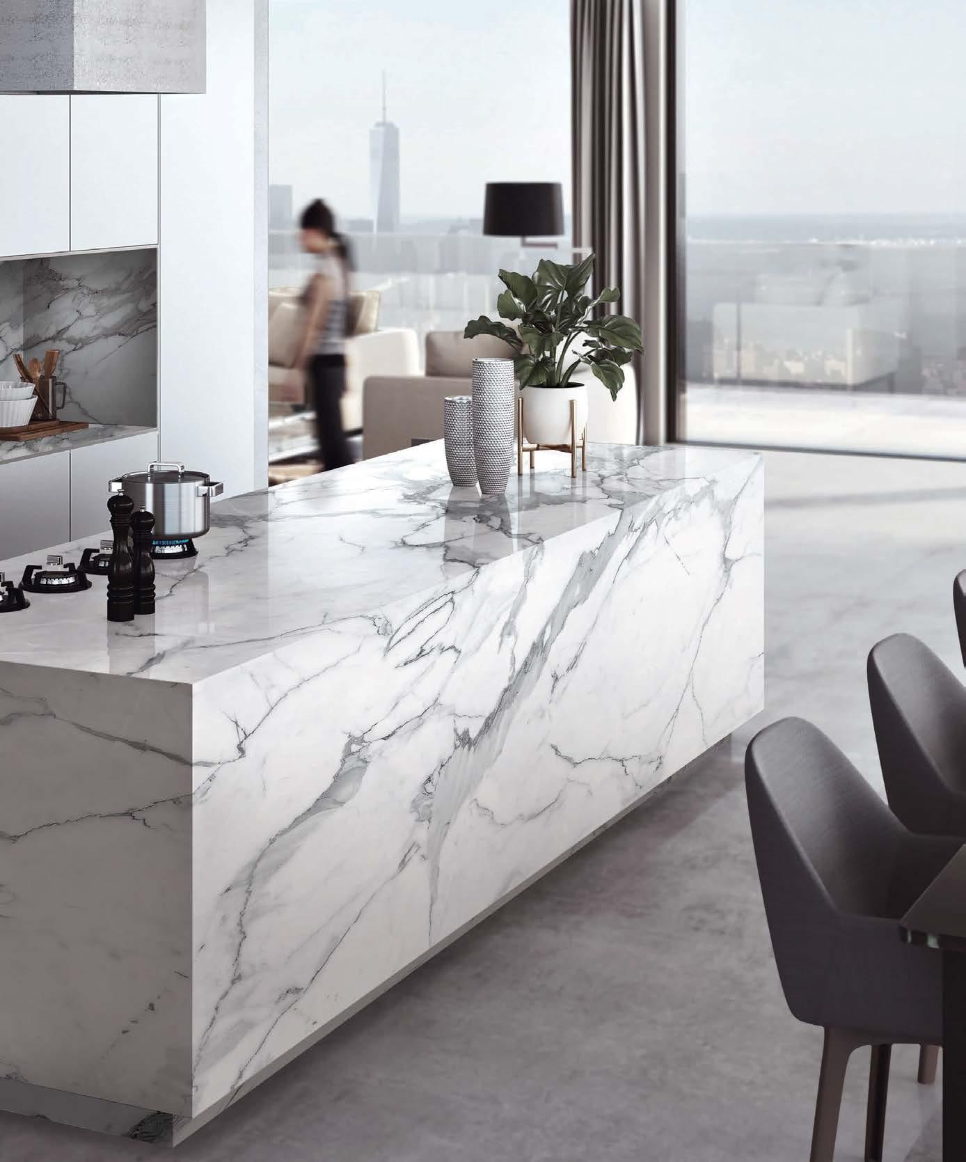


In Stock Exclusively at Carmel Stone Imports Palo Alto 650.800.7840 | Sand City 831.583.1011 | Carmel 831.250.7435 carmelimports.com Symphony Quartz by Aurea Stone brings innovation to the next generation of engineered stone. Using a patented printing technique and Nano-Ink Technology, Symphony's surface is a perfect representation of natural stone. This technology results in a unique surface with depth and clarity, high definition in every pattern, amazing translucency and authenticity.
Walls


LANAI: SALT, LANAI: PUTTY, LANAI: LAKE PHOTO: JONATHAN ALLEN
MARKET
Discover performance fabric masterpieces, America’s diverse natural terrain and must-have outdoor seating.

M A T E R I A L | T R E N D | S P O T L I G H T
Common Thread
WITH SPRING RENEWAL AS THEIR PROMPT, FOUR ARTISTS CRAFT ORIGINAL WORKS OF ART USING THE LATEST PERFORMANCE FABRICS.
HOPEFUL JOURNEY
“It’s like a bouquet of flowers,” says Atlanta-based Jamele Wright Sr. of his colorful creation drifting, 01 The piece was made with Pierre Frey’s newest performance lines—Outdoor Prints, Guethary and Enchantee—as well as objets trouvés like copper wire, broaches and driftwood from nearby Lake Lanier. “I’m always bringing found materials into fine art,” says the multidisciplinary artist. Wright’s hanging
pouches are reminiscent of gris-gris bags carried by African Americans during the 20th century’s Great Migration from southern states to northern and western cities (Wright’s own grandparents were among the millions who uprooted, moving from Alabama to Ohio). The pouches held good luck charms and tokens for those in search of a better quality of life. septembergrayart.com; pierrefrey.com

M A R K E T M A T E R I A L L U X E S O U R C E C O M
WRITTEN AND PRODUCED BY KATHRYN GIVEN AND SARAH SHELTON | PHOTOGRAPHY BY FRANK FRANCES


ONIRIKA
Unveil the essence of immersive hi-tech design. Cosentino North America 355 Alhambra Cir Suite 1000, Coral Gables, FL 33134 786.686.5060 ™ @cosentinousa Find inspiration at cosentin o.com
Designed by Nina Magon
BLOSSOMING BEAUTY
Textile artist Maggie Dillon specializes in portraiture, and while her color palette is usually more subdued, the saturated hues and bold prints of Sunbrella’s new Perspectives collection led her to compose the stunning portrait, You Belong Among the Wildflowers

“I seek a feeling of calm in my work, and the title felt like a deep breath of fresh air,” says the
Sarasota resident. The collection’s orangey red fabrics inspired the striking scene featuring a woman surrounded by poppies (a fitting choice as the flower blossoms in springtime).
“I toyed with the idea of a woman smelling the flower,” says Dillon, “but came up with a more playful version with her hiding behind the bloom.” maggiedillondesigns.com; sunbrella.com
M A R K E T M A T E R I A L L U X E S O U R C E C O M

E X T E R I O R S
LIGHT TOUCH
Dana De Ano starts each piece with an examination of the materials. “I hear what they have to say,” says the Chicago-based visual artist. “We have a conversation and then I play.” In this case, De Ano listened to the colors and textures of Donghia’s Lake Hill Performance/Outdoor collection. She was particularly drawn to the neutral colors and textural feel of its rich boucle and chenille designs.
For Front Lawn, the artist was inspired by Chicagoan’s determination to regrow their surrounding landscapes after the long winter months. An alumna of the Art Institute of Chicago, she categorizes the piece—and her work as a whole— as drawings that use untraditional materials, whether that be paint, fabrics or found objects. danadeano.com; kravet.com

M A R K E T M A T E R I A L L U X E S O U R C E C O M


Shouldn’t All Rooms Be Living? annsacks.com | 1.800.278.8453
BLUE PERIOD
“I love working with textiles because there is such a wide range of possibility and freedom to experiment,” says Liz Collins, a Brooklyn artist and designer who conceived Blue Window No stranger to performance fabrics, Collins recently launched a capsule collection with Pollack which she used here alongside standouts from the brand’s latest line, Art School. Collins relied on her years of
textile experience to create this graphic arrangement featuring layers of rectangular cuttings in an echo chamber-like framework that successfully aligns with her selfdescribed “vibrant, electric, textured and contrasting” style. When it came to color, Dynamic Expansion on the outer frame (a personal favorite) guided her selection of blue patterns that followed. lizcollins.com; pollackassociates.com

M A R K E T M A T E R I A L L U X E S O U R C E C O M


888.826.4766 | VERMONT USA | LUXE@VTFORGE.COM | HUBBARDTONFORGE.COM Chrysalis Lighting Designs: Emerging 2023 All Designs and Images ©1989 - 2023 Hubbardton Forge, LLC. All Rights Reserved. Hubbardton Forge is the registered trademark of Hubbardton Forge, LLC.
LLOYD FLANDERS
lloydflanders.com
Today’s elevated outdoor lifestyles demand furnishings that offer elegant design, and enduring quality and ease. Since 1906, Lloyd Flanders has been crafting superior furniture that takes outdoor living to new heights. “The outdoor environment can be harsh, so designing products that withstand the elements while providing beauty and comfort drives our design team daily,” says CEO and creative director, Jess Flanders. “To achieve this, we use

all-aluminum frames, the highest-quality vinyl and our unique loom material.” Patented in 1916, Lloyd Loom is the firm’s proprietary process for creating wicker furnishings. “And our special loom material comes in 20 different finishes to meet the aesthetic wants and needs of our clients,” says Warren Juliano, president of Lloyd Flanders. “We’re proud to be the only manufacturer of woven outdoor furniture made entirely in the United States.”

EXTERIOR INSIGHTS
Bryan Echols, senior vice president of sales and marketing, shares the ins and outs of outdoor excellence.
Name some unique places that have included your designs. We’ve seen our furnishings on cruise ships, high-rise condominium balconies, in outdoor seating areas at restaurants and breweries, at landmark locations like New York’s Waldorf Astoria and The Breakers in Palm Beach, in films like The Green Mile, TV series like Revenge, as well as music videos like Kenny Chesney’s Old Blue Chair
How do you include clients in the creative process? We offer Lloyd Loom Lounge Galleries with a dedicated Lloyd specialist to our retail partners to showcase our multitude of design, material and color options. Digitally, clients and salespeople can build their own look online and collaborate with us virtually to achieve a final custom design.
How are you responding to the increased demand for sustainability? We pay careful attention to the availability and sustainability of the materials we use, the energy resources required during the manufacturing process and the impact our products have on the environment.
What’s new and next? While neutrals will always be important aesthetically, we’re seeing significant growth in our brightly-colored finishes and fabrics. Our Sea Glass, Denim Blue and Woodland Green are all extremely popular right now.
Top From the Southport Modular Seating Collection, this sofa, lounge chair and square end table boast an ebony frame finish with Peacock color panel inserts. Bottom An All Seasons settee, settee swing and end table in ivory are the perfect complement to these high-back porch rockers and ottoman in a charcoal finish.
NATIONAL LOOKBOOK | INDOOR + OUTDOOR LIVING
Photography Top by Alan Cresto; Bottom by Dustin Halleck
| lloyd_flanders
A D V E R T I S E M E N T
“We design and create outdoor furnishings that deliver exceptional durability, style and comfort right here in the U.S.”


LUXURY OUTDOOR FURNITURE LLOYDFLANDERS.COM | LLOYD_FLANDERS SCAN TO LOCATE AN AUTHORIZED DEALER
PARKS & REC
From sea to shining sea, get to know the latest landscapes to join the National Park Service.
Sandy Spectacle


New Mexico’s ethereal White Sands marks state’s second addition to the National Park name hails from the rolling gypsum dunes 275 square miles, earning it bragging rights world’s largest gypsum dune field. Not your beach sand, gypsum is a hydrous, soft mineral that’s used in a wide range of applications, including architecture and art. The otherworldly terrain is a popular backdrop for commercials, music videos and films. nps.gov/whsa


the to list. Its name hails from the gypsum dunes covering 275 square it as the world’s gypsum dune field. Not your typical beach sand, gypsum is a soft sulfate mineral that’s used in a wide range of architecture and art. The terrain is a for commercials,


 WRITTEN AND PRODUCED BY SARAH SHELTON
Diapositive
Clockwise from top right: Junit To ee and Junit Fruta Lamp by Julia Jessen for Schneid / $473 each / stillfried.com Pecosa Wallpaper in Air / $375 per roll / eskayel.com Rhythmic Bold Mask Sunglasses in Rainbow / $260 / zimmermann.com X Chair in Lavender by Sun at Six / $660 / foromshop.com Ru e Co ee Table / Price upon request
/ julianchichester.com
Lilac
GETTY IMAGES. M A R K E T T R E N D L U X E S O U R C E C O M
Desk by Ronan & Erwan Bouroullec for Glas Italia / $6,550 / artemest.com Addled Tall Glass in Strawberry / $191 / shoprira.com

Fade Proof | Bleach Cleanable | 5 Year Warranty thibautdesign.com
DeCamp
Lune
OUTDOOR PERFORMANCE
Sofa from McKinnon & Harris in Cestino. Pillows in Saraband and Kaia Stripe.
Mountains Majesty





The origin of California’s Pinnacles National Park traces back some 23 million years after volcanos erupted and formed the unparalleled landscape that exists today. From caves and foot trails to woodlands and canyons, the park’s extraordinary reddish rock formations are particularly noteworthy. Located east of the Salinas Valley in Central California, near the infamous San Andreas Fault, and just 40 miles from the Pacific Ocean, the climate is as diverse as the land, with cool, wet winters and hot, dry summers. nps.gov/pinn


materials-marketing.com
Exuberant
Clockwise from top right: Lapis Lazuli Square Clock / $645 / seamanschepps.com Sedona Travertine / Price upon request
/
Marmo Footed Glass Bowl by Vetrerie di Empoli / $1,800 / lustare.com
Le
Bambole Two-Seater Sofa in Ochre Boulée by Mario Bellini / Price upon request / bebitalia.com Ombrelle Pedestal Table by Cristián Mohaded / $2,265 / roche-bobois.com
Rug / Price upon request / samad.com Fireleaf Golden Coral Necklace / $28,800 / mishfinejewelry.com
GETTY IMAGES. M A R K E T T R E N D L U X E S O U R C E C O M


Bridge the Gap




Don’t be fooled by its name: Though West Virginia’s New River Gorge was recently added to the National Park Service, the New River is one of the oldest rivers in North America. Nestled in the Appalachian Mountains, the park covers 70,000 acres of forestland which provides visitors plentiful opportunities for hiking, whitewater rafting and rock climbing. This postcardworthy destination is also home to the New River Gorge Bridge—the third highest in the country. nps.gov/neri

 Clockwise The shinola.com Claret Dolomite / Price upon request / demurodas.com Petrova Fire Screen / $1,495 / arteriorshome.com Chair Price Tura Seeded Glass Low Voltage Sconce / Price upon request / hubbardtonforge.com Ombré Fog
Clockwise from top right: The Runwell Shoulder Bag / $650 / . Gem Cabinet in Claret Dolomite / Price upon request / . Cleo Chair by Marcel Wanders Studio / Price upon request / fendicasa.com . Tura Seeded Glass Low Sconce / Price upon / Ombré Table Runner in Fog / $80 / stfrank.com
GETTY IMAGES. M A R K E T T R E N D L U X E S O U R C E C O M
Sourcing the highest quality marble, quartzite, quartz, granite, and soapstone for a meticulously curated collection to ensure your search for surfaces ends with Architectural Surfaces. Visit a showroom today.

Natural Stone | MetroQuartz | PentalQuartz | Tile
Three Generations of Design
LILLIAN AUGUST DESIGN DEITY CONFESSIONS of a
Some say that three is a magic number. For Lillian August, it certainly is. For more than three decades she has been a leading figure in the world of high-end interior and lifestyle design. With her son and co-founder, Dan Weiss, and now the addition of her granddaughter and marketing director, Eliza Weiss, by her side, August’s world-renowned brand boasts three generations of talent, skill and expertise that continues to bring traditional elegance and innovative ideas to her celebrated lines of fine indoor and outdoor home furnishings, textiles, wallcoverings, lighting, wall décor and rugs. In the following interview, August shares insights into her history, design aesthetic and unique eye for quality, detail and color, as well as the 15-year partnership she shares with Sherrill Furniture– all of which has made both Lillian August the woman and Lillian August the brand truly legendary.

Share a bit of your brand’s history and evolution. I began designing textiles in the 1970s with a line of English country house-inspired quilts and crafts. This allowed me to expand into licensed collections of fabrics, wallcoverings, and later, furniture with outstanding makers like Sherrill Furniture. With my granddaughter joining, we are reaching younger lifestyle customers with fresh designs and creative expressions like our recent outdoor fabric license with Tempo Fabrics and exciting new wallcovering designs with Wallquest.
Describe your aesthetic. Whether it is historic or fresh from the Paris runways, color, patterns and textures have always inspired me.
What are the hallmarks of your brand’s personality? Lillian August is a go-to brand for interior designers wanting to achieve unique lifestyle looks with exceptional quality and classic design.


We work in a wide variety of styles because our customers live in different parts of the country and have different wants, needs, tastes and visions. And the fact that we offer so many fabrics, finishes, colorways and customization options allows our pieces to adapt to any fresh design ideal our clients can dream up.
What is exciting you creatively right now? Our latest designs are leaning into three unique lifestyles. First is Hollywood Regency, which blends maximalist glamour with bold, bright colors and patterns. Next is New Traditional, which will expand into indoor and outdoor textile collections that combine a traditional coastal concept with a fun, youthful twist. Finally, our Vintage Roundtop mixes natural materials and relaxed finishes for a masculine, mountain house feel that represents Dan’s aesthetic point of view.
What constitutes good design? Timelessness, great taste and an original mix of colors, materials and creature comforts.
30 Years | 3 Generations of Design | Love How You Live
I N P A R T N E R S H I P W I T H L I L L I A N A U G U S T

lillianaugust.com @lillianaugust @sherrillfur niturebrands
“I am so proud to be celebrating 30 years and 3 generations of hard work and success with our family, friends, colleagues and fans of great design.”
LILLIAN AUGUST
Outdoor Invitational
TAKE A SEAT ON ONE OF THESE FABULOUS ALFRESCO FINDS AND SAVOR A MOMENT IN THE SUN.
WRITTEN AND PRODUCED BY KATHRYN GIVEN AND SARAH SHELTON PHOTOGRAPHY BY FRANK FRANCES
EN MASSE
Los Angeles-based Bend Goods takes cues from modern architecture and midcentury design to craft their wide range of wire furniture. The sleek powdercoated Rachel Chair, shown in Peacock Blue, White and Yellow, features grated construction that allows air to easily filter and water to drain from the seat, making it an ultra-practical outdoor option. On the floor, Chilewich’s Boucle Woven Floor Mat in Tangerine and Bamboo Woven Floor Mat in Spring Green are fitting en plein air accompaniments. bendgoods.com; chilewich.com

M A R K E T S P O T L I G H T L U X E S O U R C E C O M

FLEXIBLE FORM
Silicone rubber is Philadelphia-based designer Nick Missel’s material of choice. For his Cube series—exclusive to Frampton Co. in New York City—Missel devised perfectly imperfect textured perches that begin as a mold made from discarded cardboard and layered with silicon until the ideal shape and size are achieved. The gel-like surface of each one-of-a-kind piece comfortably cradles the sitter, allowing them to ever so slightly sink into its surface. shop.framptonco.com

M A R K E T S P O T L I G H T L U X E S O U R C E C O M

LANGUID LOUNGER
Meet the Sloth Chair, the latest debut from Maximilian Eicke’s studio Max ID NY. Portable, foldable, stackable and handwoven of a synthetic fiber, the dramatic curves of the chaise mimic the shape of waves and sand dunes. Available in six colors, this uniquely cool take on the classic sun chair remains lightweight for toting to the beach yet stylish enough to be a permanent poolside fixture. maxidnystore.com

M A R K E T S P O T L I G H T L U X E S O U R C E C O M


bevolo.com • 504-522-9485 • 521 Conti • 304 • 316 • 318 Royal • French Quarter • New Orleans We Make ...Too. ELECTRIC
JARDIN DELIGHT
French flair is synonymous with Fermob, the chic outdoor furniture and accessory company whose work can be found scattered across Paris’ parks and green spaces. Fermob tapped Frédéric Sofia to rethink legendary designs in their Luxembourg collection (shown), which are inspired by the iconic garden of the same name and its original furniture from 1923. The low-back, aluminum Compact Bench (in foreground) is Sofia’s latest interpretation. The 57" Bench in Ice Mint, 2/3-Seater Bench in Frosted Lemon and 2-Seater Garden Bench in Opaline Green—their newest hue—round out the colorful offerings. fermob.com; chilewich.com

M A R K E T S P O T L I G H T L U X E S O U R C E C O M

STACK ‘EM UP
Quincy Ellis is the color guru behind Facture’s molded resin furniture and objects. Working out of a large Brooklyn warehouse, he brings designs to life that push the boundaries of color to realize striking combinations and gradation shifts that appear simple to the eye but require complex construction. Featuring smooth, matte finishes with gradual hue variations, the Meld Stool, Scale Pyramid and Meld Side Table (from top), can function as compact outdoor perches or bold tabletop surfaces. Custom shapes and colors are available. tulestefactory.com; chilewich.com

MARKET SPOTLIGHT LUXESOURCE.COM
FORTINA for

Fortina is an exceptional architectural system that deceives the senses by mimicking the appearance of wood slats and louvers using lightweight aluminum with hyper-realistic nonPVC surfaces.

This system was the ideal choice for this luxury residential home as it not only provides the same organic feel and warmth of real wood, but also offers several advantages such as lower cost, reduced environmental impact, ease of installation, fire rated, and consistent color and finish. The Fortina Louvers offers the perfect solution for emulating the look of wood without any of the limitations.

Photos ©B+N Industries, Inc.
bnind.com | 800.350.4127
ICON REIMAGINED
On the cusp of their 20th

M A R K E T S P O T L I G H T L U X E S O U R C E C O M
anniversary, Danish design brand HAY was approached by American legacy manufacturer Herman Miller to reimagine a selection of Eames mid-century furnishings and accessories, including the classic Wire Chairs, shown here in Powder Yellow, Black Blue, Mint Green and Iron Red. With HAY’s fresh take on color and Eames’ world-famous designs, the collaboration bridges the past and present to excite modern-day collectors and vintage enthusiasts alike. hermanmiller.com

LUXURY PERFORMANCE FABRICS AND RUGS PERENNIALSFABRICS.COM
LISTEN NOW ON WITH A new podcast tackling the ins and outs of appliances and trends for residential homes and professional projects alike. ajmadison.com | 1-800-570-3355

JULIANCHICHESTER.COM london | new york | atlanta | high point Find us at WITFORD – San Francisco - Laguna Niguel JULIAN CHICHESTER
2023 KITCHEN & BATH DESIGN COMPETITION
BEST OVERALL BATH
FIRST PLACE | PRIMARY BATH
Mary Maney, CKBD

Crystal Kitchen + Bath
crystalkitchen.com | crystalkitchenbath
Photography Rob Grosse of Spacecrafting
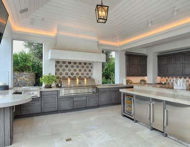
The Serene Luxury primary bath by designer Mary Maney, CKBD, of Crystal Kitchen + Bath in Crystal, Minnesota, won Best Overall Bath due to an elegant design that overcame myriad structural challenges. Marble is incorporated throughout the bath to add a feeling of luxury, while a rug pattern with a mosaic inlay centered in front of the freestanding tub creates interest. The resulting space, with its minimalistic style and fluid lines, combines a mix of tradition and modernism for a truly compelling bath.

I N P A R T N E R S H I P W I T H N K B A
Mary Maney CKBD
There are many different rooms and moments that make up a home. But it is an undeniable truth that the kitchen and bath are at the center of it all. They bring the function every household must have, but they’ve also become the hub of the home in another way: they often serve as a design foundation, setting the tone for everything else. Each year, the National Kitchen and Bath Association celebrates the very best of these all-important spaces in its Kitchen & Bath Design Competition. Keep reading to explore the iconic concepts that are taking their place in NKBA history in 2023. nkba.org/designcompetition
BEST OVERALL KITCHEN FIRST PLACE | SMALL KITCHEN
Sarah Robertson, AKBD Studio Dearborn studiodearborn.com | studiodearborn

The Creek Lane Kitchen by Sarah Robertson, AKBD, founder and principal of Studio Dearborn in Mamaroneck, New York, was designed for privacy, serenity and a connection to nature. It was also a kitchen that had to effectively accommodate the homeowners’ five cats, hence the “must-have” floor drain for the pets’ watering station. The beautiful mix of materials and integrated details combined with the practical storage and functionality of this kitchen made it a clear winner.

2023 NKBA KITCHEN & BATH DESIGN COMPETITION
Photography Adam Kane Macchia Photography
I N P A R T N E R S H I P W I T H N K B A
Sarah Robertson AKBD
FIRST PLACE
Crystal Kitchen + Bath Crystal, Minnesota crystalkitchen.com | crystalkitchenbath
Photography Rob Grosse of Spacecrafting
PRIMARY BATH
FIRST PLACE
D’Amore Interiors Denver, Colorado damoreinteriors.com | damoreinteriors
Photography Tim Gormley of TG Image
SECOND PLACE
Kendall Ansell Interiors Coquitlam, British Columbia kendallansell.com | ka_interiors


Photography Janis Nicolay Photography

Kendall Ansell Principal Co-designer: Katelyn Woods, Senior Interior Designer


SECONDARY BATH

THIRD PLACE
EOLO A&I Design Miami, Florida eolodesigns.com | eolodesign
Photography Eugenio Willman of Emotion Works
Sandra Diaz-Velasco Principal Architect


SECOND PLACE
Henrietta Heisler Interiors Inc. Lancaster, Pennsylvania henriettaheislerinteriors.com
henriettaheislerinteriors

Photography Justin Tearney Photography
THIRD PLACE DeMane Design Gig Harbor, Washington demanedesign.com
Photography Tammy Dwight Architectural Photography
 Mary Maney CKBD, Designer
Gina D’Amore Bauerle Owner
Nichol Hollinger CKBD, Senior Interior Designer
I N P A R T N E R S H I P W I T H N K B A
Nancy Finneson CKBD, Interior Designer
FIRST PLACE
Lori Carroll & Associates
Tucson, Arizona loricarroll.com | lori_carroll
Photography Jon Mancuso
Lori Carroll
Interior Designer
Co-designer: Kat Saucedo, Designer
POWDER ROOM
FIRST PLACE
Welton Design Group Surrey, British Columbia


welton_design_group
Photography Tracey Ayton Photography
SECOND
PLACE
Jaque Bethke Design
Scottsdale, Arizona jaque.design | jaquebethke
Photography Edward Zak Photography
Jaque Bethke Interior Designer and Architect
SPECIALTY KITCHEN
THIRD
PLACE
Jaque Bethke Design
Scottsdale, Arizona
jaque.design | jaquebethke
Photography Phil Johnson of Provisuals Media
Jaque Bethke Interior Designer and Architect


SECOND
PLACE
Doug Walter Architects Denver, Colorado | dougwalterarchitects.com dougwalterarchitects

Photography Justin Tearney Photography
THIRD
PLACE
Studio Stratton
San Diego, California studiostratton.com | Studio Stratton Inc.
Photography Martin Mann Photography
Lance Stratton

Residential Designer
Co-designers: Kate LeCount and Tom King

2023 NKBA KITCHEN & BATH DESIGN COMPETITION
Rebecca Foster Director of Design
Douglas Walter CMKBD, Architect
I N P A R T N E R S H I P W I T H N K B A
FIRST PLACE
Bluebell Kitchens Wayne, Pennsylvania | bluebellkitchens.com bluebell_kitchens
Photography Christian Garibaldi
LARGE KITCHEN


FIRST PLACE
Studio Dearborn Westchester, New York studiodearborn.com | studiodearborn
Photography Adam Kane Macchia, Macchia Photography
SECOND PLACE
Marla Nazzicone Designs Toronto, Ontario mndesign.ca | marlanazzicone


Photography Mike Chajecki
THIRD PLACE
Bluebell Kitchens Wayne, Pennsylvania | bluebellkitchens.com bluebell_kitchens
Rebecca McAlpin


SMALL KITCHEN
SECOND PLACE
Estee Design Interiors
Toronto, Ontario esteedesign.com | esteedesigns
Photography Mike Chajecki and Victoria Malanowski, Mike Chajecki Photography
THIRD PLACE
Nar Design Group Sacramento, California nardesigngroup.com | nardesign
Photography Fred Donham, PhotographerLink
Photography
Lori Kurnitsky Designer
Marla Nazzicone Integrative Designer Lori Kurnitsky Designer
Sarah Robertson AKBD, Founder and Principal
Svetlana Tryaskina Co-Founder
I N P A R T N E R S H I P W I T H N K B A
Nar Bustamante President and Principal Designer
NKBA’s 2024 Kitchen & Bath Design Competition opens for submissions on April 1, 2023. All entries are welcome, including non-member submissions. Cash prizes of $100,000 will be given out to award winners, with Best Overall Kitchen and Best Overall Bath each taking home $20,000. For more information and to enter, please go to nkba.org/designcompetition.
2023 NKBA KITCHEN & BATH DESIGN COMPETITION
Chosen by a panel of NKBA-Certified Master Kitchen & Bath Designers, these distinguished projects and their creators represent the best and brightest in the industry.”
- BILL DARCY, CEO
I N P A R T N E R S H I P W I T H N K B A


LeatherLeatherFurnitureGallery www.leatherfurnitureca.com 935ElCaminoReal MenloPark,CA94025 650-617-0220 AnniversarySale Celebrating20Years


Art for Your Floor Etsuko 9' x 12' Exquisite beauty, lifelong quality, truly one of a kind. 650.327.5040 | STEPHENMILLERGALLERY.COM | MENLO PARK




CA# B-575968 Custom Home Building and Renovations for over 30 years conrado.com 408.867.2095
LIVING
Elevated entertaining in west Texas and a round-up of next-level pool houses have Luxe yearning for sunny days ahead.

K I T C H E N + B A T H | T H E R E P O R T
Home on the Ranch
THE MARFA, TEXAS, RETREAT OF HOSPITALITY MAVEN LIZ LAMBERT SPEAKS THE LANGUAGE OF PLACE.

WRITTEN AND PRODUCED BY KATHRYN GIVEN
PHOTOGRAPHY BY BUFF STRICKLAND
STYLING BY LAUREN SANDERS
L I V I N G K I T C H E N + B A T H L U X E S O U R C E C O M

“I strongly believe that a home should feel of a place,” Liz Lambert explains of her Marfa, Texas, abode, which is a true reflection of the surrounding area’s distinct culture. For the Austin-based hotelier, who made her mark designing some of the country’s top hospitality destinations, far west Texas inspires everything from materiality and building techniques, to the items she uses for decorating and entertaining.

Lambert’s residence is situated on her family’s sprawling cattle ranch located between
the Chinati and Davis Mountains. When she returned home to Texas after a stint in New York City, Lambert set out to find a home near where she grew up. Fortunately, she didn’t have to search far after realizing an existing bunk house structure on the property could be transformed with a few tweaks. Soon, a screened-in porch and section of the kitchen were built using traditional adobe masonry and outfitted with regionally sourced furniture. “A lot of friends helped me put this house
together,” Lambert explains. “Most of what you see in here is local and really speaks to where we are.”
Whether guests prefer lounging by the water tank or escaping the Texas heat with a dip in the alfresco bathtub, the ranch celebrates life outdoors and the natural beauty found in this corner of the country. When it comes to the interiors, there is an honest purity to the space that allows for an easy, laid-back lifestyle in which friends
L I V I N G K I T C H E N + B A T H L U X E S O U R C E C O M
At Liz Lambert’s home in Marfa, the screened-in porch acts as a gathering spot for relaxing and entertaining. On the table are terra-cotta plates collected in Mexico and textiles from Lambert’s collection, Perennials by Far West, including pillows in Serape Stripe and placemats in Baja Stripe.


77 CONNECTICUT STREET, SAN FRANCISCO, CALIFORNIA 415.552.5001 BATHANDBEYOND.COM

portrait:
L I V I N G K I T C H E N + B A T H L U X E S O U R C E C O M
With a view that stretches for miles across far west Texas, the porch features a Playa Stripe runner along with a dog bed upholstered in Baja Stripe and pillows in Campo Stripe.
nick simonite.
come and go with ease. Most meals are served family style by Lambert’s brother, acclaimed chef Lou Lambert, who uses the Wolf Range for pinto beans as much as he does the campfire for grilling dinner.
For the table, Lambert gathers pared down native flora and fauna along with objects collected from the land. Place settings feature beautiful terra-cotta plates and bowls made in neighboring Mexico. “I think simplicity is beautiful,” Lambert notes.“I gravitate towards places where things fall away; the simpler a place is, the more you feel at home.”
One motif the aesthete does collect in abundance, though, is stripes. The classic print was the starting point for her new textile collection, Perennials by Far West, made in collaboration with the performance fabric and rug company. “I’ve had a history with stripes,” Lambert explains. “From using them in projects to collecting hand-woven Peruvian
textiles and Nepalese saddle blankets. So we began by examining each of these patterns.” And what evolved was a colorful, bohemian-inspired line comprising five fabric and three rug designs that work just as well indoors as they do outside.
Lambert, a partner at MML Hospitality, and her team at Lambert McGuire Design, put their heads together with Ann Sutherland at Perennials—bonding over Texas and tequila— to dream up patterns fitting in any number of applications while still evoking the place for which they were inspired: far west Texas. “T he idea was to start with stripes and put together a collection where each pattern could live on its own while also complementing one another,” she says. The line is already right at home on the ranch: Lambert’s used it for upholstering vibrant throw pillows, dog beds and even a camper van. At home indeed. perennialsfabrics.com; farwestcollective.com


LIVING KITCHEN + BATH LUXESOURCE.COM
The open-air bathtub behind the bunkhouse becomes essential during dusty, dry summers on the ranch. Hanging is a striped robe used at El Cosmico, Lambert’s hotel at the southern edge of the city.


All Weather Handcrafts Exceptional Custom Aluminum Windows & Doors 800.680.5800 | allweatheraa.com ENHANCE HOW YOU EXPERIENCE THE WORLD
SMITH DEVELOPMENT & CONSTRUCTION COMPANY I PHOTOGRAPHY MILES MINNO
Sweet Escape
TODAY’S HAUTE POOL HOUSES ARE BEING DESIGNED AS DESTINATIONS UNTO THEMSELVES.

gutter: brie williams. LIVING
LUXESOURCE.COM
WRITTEN AND PRODUCED BY GRACE BEULEY HUNT
THE REPORT
 The louvred façade of this South Carolina retreat creates a shaded dining terrace. Designer Elly Poston Cooper lined the pool deck with crisp white chaises to echo the symmetry of the architecture by McAlpine.
DAILY SANCTUARY
Elly Poston Cooper’s clients would have loved a vacation house, but there simply wasn’t time for one. The solution? Transform their South Carolina property into a getaway. “They wanted to create the magic of taking a holiday in their own backyard,” elaborates Poston Cooper, who joined forces with McAlpine on the design of an enchanting pool house boasting a chef’s kitchen, bunk room and lofted lounge. “We wanted it to feel like a destination,” she adds, pointing to kicky flourishes like the rattan drums, shuffleboard table and Peter Dunham Fig Leaf fabric on the lounge chairs and pillows. “It plays off the grounds and feels great for summer, but fresh and funky the rest of the year,” the designer notes. Meanwhile, beanbag chairs in Heather Chadduck’s Little Bamboo print can easily move to the pool deck or lawn, where the thoughtful addition of a white stone wall caters to movie screenings. While the outbuilding has hosted fundraisers, birthday parties, and even a wedding, the everyday delights are what assure Poston Cooper of a mission accomplished. “On Sunday nights, they’ll order pizza to the pool house and have family dinner,” she says. “It’s where they go to unplug.” ellyposton.com

L U X E S O U R C E C O M
daily sanctuary photo: brie williams. rustic raucous photo: karyn millet. L I V I N G T H E R E P O R T
RUSTIC RAUCOUS
“It truly is a catchall,” shares Julie Massucco Kleiner of the souped-up pool house she designed for a sports-loving family of entertainers. Kleiner’s clients sought to create a party HQ on their new San Juan Island, Washington, property, and an existing storage barn at the edge of the forest was just the answer. In collaboration with Studio AM Architecture & Interiors and Wygal Builders, Kleiner revamped the structure from head-to-toe, refinishing the exterior with a dramatic charcoal stain. Inside, the team implemented a world-class entertaining program tailored to large gatherings that includes a full kitchen and bar (replete with beer keg and wine systems), “the world’s largest sectional,” per Kleiner, and rolling pool and ping-pong tables wi th hard-top covers that can easily be pushed together to create a makeshift 60-person dinner table. Carrying the space’s blue-and-white scheme through to the exterior living areas, Kleiner selected an Ann Sacks tile with “a retro, Slim Aarons feel,” to rim the pool, complemented by striped chaises and scalloped umbrellas. From its flexible, fun-first amenities to the preppy palette that nods to the family’s east coast roots, the finished result is “very atypical,” Kleiner admits. Just as intended. massuccowarner.com


photos: hulya kolabas. styling: mieke ten have. L U X E S O U R C E C O M L I V I N G T H E R E P O R T
GANGS ALL HERE
It’s not often that clients buy a house specifically because its acreage is perfect for erecting the pool house of their dreams. But that’s exactly why a young family purchased their Scarsdale, New York, abode, tasking Alisberg Parker Architects and Lucy Harris Studio with rendering an entertainer’s paradise on its outskirts. “It was our job to design something that belongs with the landscape and aligns with the architecture of the main house,” says principal Ed Parker, who echoed the existing structure’s palette and stonework while spinning things in a decidedly modern, laid-back direction. “It really feels like a retreat—almost like having a weekend home in the backyard,” reflects director of architecture, Shaun Gotterbarn.

“They wanted a place to relax, k ick back with friends and feel like they’re getting away from it all,” adds designer Lucy Harris who, aided by team members Kelley Roach, Jaclyn Doherty and Stephanie Saltzman, channeled the hospitable, hard-living chic of a boutique hotel for the interiors. Custom furnishings in sinuous shapes, natural material details and a fresh palette of blues and neutrals energized with red accents lend an off-duty vibe that’s “still elegant, but less buttoned up,” Harris notes.
While boasting plentiful amenities (including guest quarters and a semisubterranean basketball court), the beating heart is the pool-level lounge with its showstopping wet bar backed in book-matched marble. “It’s a little bit show business and a little bit sculpture,” muses director of interior architectural design, Will Jameson. “We got to play with some fun ideas, like the wooden slats on the front that shimmer as you move like a Bridget Riley painting.” The swank space merges seamlessly to the outdoor living areas, aided by bifold glass doors and garage-style windows. “You can have 30 people over at the drop of a hat with all the different seating areas,” notes Parker—and the clients often do. The husband hosts a basketball league, the wife runs a tennis group, and the kids’ entourage lives in the pool come summer. Concludes Harris, “It really is a playhouse for everyone.” alisbergparker.com; lucyharrisstudio.com


415.690.6022 Cell | 650.847.1553 Office 321 University Avenue | Palo Alto, California altinrugs.com
INDOOR + OUTDOOR LIVING
Indoor-outdoor living is undergoing a true renaissance right now. As more people embrace working, playing and entertaining from home, pursuing a rich and varied lifestyle—both inside and out—has become essential. That is precisely why today’s homeowners are demanding that their interior and exterior spaces provide them with the same flexibility, luxury, highly-personal style and gratifying creature comforts. In response, designers, brands, makers, manufacturers, artisans and craftspeople are conceiving and producing innovative goods, services and designs that deliver on these wants and needs, while allowing homeowners and their families to move seamlessly between the two environments. Turn the page to meet these creators and learn how their talents and skills are taking the indoor-outdoor lifestyle to new and greater heights.

S P E C I A L A D V E R T I S I N G S E C T I O N
Glass Concepts
|
SAN FRANCISCO |
ATHERTON APPLIANCE & KITCHENS / BSC CULINARY
650.369.1794 | athertonappliance.com | athertonapplianceandkitchens
As outdoor living continues to become more paramount than ever before, the art of the open-air kitchen is top of mind for homeowners and their design pros alike. Enter, Atherton Appliance & Kitchens, and its Bay Area counterpart, BSC Culinary. “We specialize in helping our clients find the products they need to create outdoor kitchens that leave the user wanting nothing,” says Tom Papageorge, the company’s CEO and president. “Whether you’re most focused on cohesive colors and textures, blending with the landscape, durability or unparalleled culinary performance, we can help you find the right solution.” In fact, with brands like Kalamazoo, Wolf, Hestan and Lynx in their lineup, the Atherton and BSC teams can probably satisfy all of those desires in one go. “Customer care is our business, and we pride ourselves on finding you the absolute best solution no matter your need.”


AN EXPERT’S WORTH
In addition to working closely with the professionals at Atherton/BSC, homeowners should, Papageorge recommends, always involve a designer and/or architect. “We love to collaborate with these visionaries for perfect results,” he says. “They assist us in ensuring an ideal install and provide so much value in the form of finding solutions for the homeowner.” They also advise hiring the pros for maintenance, because they can assure that no extreme weather damage or ignitor failure is happening.
MUST-HAVE DUO
According to Papageorge, there are two features nearly every client wants out of their alfresco culinary space.
• Convenience:
“They want to design kitchens that are just as robust as those indoors, so they never have to run inside to grab something. Everything they could possibly need should be able to fit in the outdoor kitchen.”

• Community:
“We also often get requests for seating areas wherein the whole household and/or guests can watch the chef of the day in action as they enjoy a drink.”
INDOOR + OUTDOOR LIVING | SAN FRANCISCO
Top This new outdoor kitchen features a full suite of Kalamazoo appliances and products, including a built-in Hybrid Fire grill and the Artisan Fire pizza oven. Left A Kalamazoo combo made to impress, the Hybrid Fire grill and Gaucho grill each have their role in this alfresco space. Right Kalamazoo’s weather-tight Signature Series cabinetry pairs well with a range of the brand’s appliances in this chef’s paradise with a view.
Photography Courtesy of Kalamazoo
“We help homeowners create outdoor spaces that are enjoyable and perform at their best for years to come.”
S P E C I A L A D V E R T I S I N G S E C T I O N

ATHERTON APPLIANCES & KITCHENS | REDWOOD CITY, CA | +1.650.369.1794 BSC CULINARY | SAN FRANCISCO, CA | + 1.415.626.6246 THE HYBRID FIRE GRILL KALAMAZOOGOURMET.COM
FLEXFORM | 33SIXTY
415.800.6576 | 33sixty.com | 33sixty.sf.la
Slowing down, reclaiming time and embracing green spaces results in exceptional outdoor lifestyles. “With this in mind, Flexform has created an exciting new collection of outdoor furnishings,” says Gregory Herman, principal at Flexform-33SIXTY. “Designed for year-round outdoor living, these pieces revel in the beauty of the changing seasons.” For nearly a decade, Herman and his expert staff have been bringing the artistry and elegance of Flexform’s Italianmade furnishings to their discerning clientele from their showrooms in Los Angeles and San Francisco. And with the arrival of Spring, they are proud to present this breathtaking new collection. “This line of furnishings weds elegance with functionality and durability,” Herman adds. “While a sophisticated blend of nature-inspired colors and materials marries culture, tradition and innovation that complements the perfection of the natural world.”
SYLVAN STYLE
Gregory Herman shares his unique indoor and outdoor insights.
• What makes your offerings truly unique? There is a focus on organic materials like iroko wood, Cardoso stone and lava and woven synthetic cords that look and feel strikingly natural.
• Share some of your clients’ most popular requests. They are demanding materials that are low maintenance and offer longevity. Our new metal outdoor collection, Camargue, has all of this. Made of aluminum, Camargue performs beautifully and stacks easily for winter storage.
• Talk about your collaborative approach with clients. We offer complimentary design services to help our clients evaluate and decide how best to include indoor design details in their outdoor spaces.
• What are your favorite ways to connect the indoors with the out? Flexform has taken a design approach where the majority of their furnishings can be used in both indoor and outdoor spaces to create seamless interior and exterior beauty and luxury.


INDOOR + OUTDOOR LIVING | SAN FRANCISCO
Top Designed by Antonio Citterio, the Atlante Light daybed provides comfort and style, naturally. Bottom This chic and inviting grouping designed by Antonio Citterio consists of Atlante Light daybeds and a sofa and armchairs from the Camargue collection.
“Known for incredibly comfortable sofas, we bring Flexform’s cozy, soft and welcoming feeling to the great outdoors.”
S P E C I A L A D V E R T I S I N G S E C T I O N

Flexform Los Angeles T
5460
Francisco T
310 424
Flexform San
415 800 6576 by
GLASS CONCEPTS
415.256.9766 | glassconcepts.net | glass_concepts_LLC

They say that the eyes are the windows to the soul. When it comes to new home construction and renovation, windows are the soul of any project and the key to exceptional indoor-outdoor living. As the co-owners of Glass Concepts, Jeff Wilcox and Jonmarie Maloney and their expert team have been bringing superior quality windows and superlative customer service to their discerning clientele in Marin County and across the Bay Area since 1998. “Living and working in Marin, we have a unique perspective when it comes to world-class architecture and design, and are able to seamlessly match that level of excellence with our products, our staff and our clientfirst approach,” they say. “Our premium windows bring functional luxury to any home and allow our clients to effortlessly embrace their interior and exterior environments and experience the best of indoor-outdoor living each and every day.”
CRYSTAL CLARITY
Maloney and Wilcox share their enduring insights and expert outlook.
• Share your most popular and most unique client requests. All of our clients want large windows and doors that allow them to enjoy the view and move effortlessly between their indoor and outdoor spaces. Some of our more unusual asks are tea houses, indoor-outdoor dwellings and ADUs.


• What are your favorite ways to bring the outdoors in?
‘Warm Contemporary’ is our aesthetic philosophy, which involves bringing organic elements like wood and natural fibers and textures into today’s cool, modern structures.
• How are increased demands for sustainability playing a role? We pride ourselves on selling only windows that are Title 24 compliant. And as a licensed Loewen dealer, we represent a brand that have been stewards of the land and leaders in sustainability in their production and resource management for over 100 years.
• What does the future hold? We look forward to the day that intelligent glass is readily available. By intelligent, we mean smart glass with technological advancements. We see the demand for large glass increasing in the future.
Top Designed by Polsky Perlstein Architects, this Shingle home uses an expansive bi-folding door, which allows the indoor kitchen to connect seamlessly to the outdoor space. Far left & Left This contemporary Polsky Perlstein Architects-designed home in Larkspur, California, features a Loewen MultiSlide pocketing door. The innovative design lets the door’s panels disappear into the pocket, creating an uninterrupted flow between the indoor kitchen and outdoor dining room.
Photography Jason Wells
INDOOR + OUTDOOR LIVING | SAN FRANCISCO S P E C I A L A D V E R T I S I N G S E C T I O N
The skilled hands of our craftspeople ensure our fit-and-finish is unparalleled. Their dedication has earned us our reputation among discerning architects, builders, and homeowners.

LaRue Architects | Foursquare Builders | Casey Dunn Photography 58 Woodland Avenue, San Rafael, CA 94901 Phone: 415.256.9766 • glassconcepts.net L U X U R Y F E N E S T R A T I O N HANDCRAFTED
LOE W EN .C OM
TRAILSCAPE
530.852.5155 | trailscapeinc.com | Trailscape Inc.
Exploring, enjoying and fully connecting with one’s property is key to an exceptional outdoor lifestyle. And when that connection brings a higher level of safety, security and value, outdoor living achieves even greater heights. As the president of Trailscape, Randy Martin has assembled an award-winning team of professionals who design, build and maintain stunning trails for private landowners and public entities. “Trail building is both art and science,” Martin shares. “The art is augmenting nature’s beauty and giving the user a sense of flow, while the science involves navigating terrain challenges to create trails that bring surprise and delight for decades to come.” Another important aspect is the safety a Trailscape trail brings. “Our trails eliminate excess brush, open up the land and create effective firebreaks that help protect our clients, their families and their properties.”
TRAIL GUIDE
• What makes your work truly distinctive? The depth of our experience. Our team of five core lead trail builders combine expertise, artistry and problem-solving skills to create magnificent trails that inspire clients to explore their properties.

• How do you include the client in the process? Our crews are made up of people who care, who communicate well and who listen, listen, listen. This allows us to give each client exactly what they want and exceed their expectations.
• Share your top tips for keeping trails vibrant, enduring and healthy. We have a maintenance side of our business that can effectively service the hundreds of miles of trails we’ve built over the past 14 years.


THE RIGHT STUFF
“Our experienced crews and specialized equipment allow us to create paths through seemingly impossible terrain,” Martin shares. “Within our arsenal of tools are jack hammers for breaking rock as well as small percussion charges. It’s a delicate process that enables us to remove what we need and leave the rest healthy and intact.”
“Our trails allow access to previously impassible land and act as effective firebreaks to protect families and property.”
Above Trailscape opens up previously impassible land to exploration and enjoyment. Top This beautiful view is just waiting to be unearthed and discovered. Left Doubling as effective firebreaks, Trailscape trails protect families, homes and properties from the devastating impacts of fire.
Photography Courtesy of Trailscape
INDOOR + OUTDOOR LIVING | SAN FRANCISCO
S P E C I A L A D V E R T I S I N G S E C T I O N




Contact us for your custom trail and firebrake plan. 530.852.5155 | TRAILSCAPEINC.COM | LIC #915744 Randy Martin We build trails that make inaccessible land enjoyable and firesafe.

LUXESOURCE.COM 158
Friendly Disposition
A historic San Francisco home’s gracious spirit is revived with a little Southern charm.
 WRITTEN BY MAILE PINGEL
PHOTOGRAPHY BY JOHN MERKL
Architecture: Stephen Sutro, Sutro Architects
Interior Design: Lisa Hilderbrand, Hilderbrand Interiors
Home Builder: Joey Toboni, The Toboni Group
 In the living room, designer Lisa Hilderbrand paired a Louis Philippe mirror from Avery & Dash with a lamp from Chairish, an antique Austrian chest and contemporary charcoals by Jean-Marc Louis.
A T.H. Robsjohn-Gibbings slipper chair adds a modern note.
n a city known for its vertical Victorians, arriving at this 1907 home in Pacific Heights feels positively sylvan. The house is that rarest of things in San Francisco architecture: It’s wider than it is tall. And with windows on all four sides, its rooms enjoy an abundance of daylight, not to mention views that stretch to Alcatraz Island.
“With a courtyard entrance and symmetrical façade, it’s very stately,” says architect Stephen Sutro. And while pushing open the wide, original front door reveals several grand entertaining rooms, this is very much a family house designed for easy living—though it took a while to get there.
The home had been well cared for and retained many period details (leaded windows, fireplaces, pocket doors), but renovation work revealed a failing foundation. That made for a bigger project than was wanted by the homeowners—a young couple with two children—but it ultimately gave them the chance to improve the home in ways they hadn’t initially imagined. “We had to jack up the house, so we thought we might as well dig down two feet and make the undeveloped basement level a proper living space,” the wife says. “It was like doing surgery,” adds Sutro, explaining that lowering the floor not only gave the downstairs rooms proportions that matched the main rooms, it leveled the house with the garden, making it immediately accessible.
“This project was about knitting new into the old,” continues Sutro, who worked closely with project architect Sammy Calabrese, general contractor Joey Toboni, and the homeowners over a two-year period. The team replaced the rigid geometry of the central stairway with a sweeping design and enlarged the galley kitchen by transforming a semi-enclosed rear porch into a breakfast (and homework) nook. “We wanted the house to feel fresh—a house has to fit the patterns of contemporary family life—but we wanted to do it without changing the original language or spatial relations,” Sutro continues. “The home was reconstructed, yet you can feel the period architecture as you walk through,” Toboni adds.
Maintaining the home’s historic feel was critical, as it was why the couple chose the
house in the first place. “When first married, we had a sleek, modern loft and I loved it, but when our oldest child was born, I found myself wanting to change things,” the wife says. “I grew up in a traditional Colonial-style brick house, and I wanted that sense of solidity.” To create the layered interiors she envisioned—antiques, interesting artwork, sentimental touches—she called on longtime friend and interior designer Lisa Hilderbrand, who also worked on the family’s interim rental. “We’ve been friends since college,” recalls the New York- and Connecticut-based designer, who shares a love of antiques with her client. “We have the same practical sensibility, too,” the wife adds.
Together, they set out to create rooms that Hilderbrand describes as “comfortable and classic, not intimidating or fuddy-duddy.” Much of it was realized on what the wife describes as a “starsaligned, four-day shopping trip in New York City,” where the two found more than half of the home’s furnishings, including the living room’s 1950s glass chandelier and a pair of Pierre Frey swivel chairs. “It was like inviting people to a party, like creating conversations,” the wife adds. Speaking of celestial bodies: In the dining room, hand-painted Italian wallpaper on the ceiling depicts a moonlit sky, paying homage to the couple’s engagement, which took place on Bright Moon Mountain in China. (The moon is a recurring theme throughout the home, appearing on a Japanese screen on the lower level and in a painting of the California coastline in their bedroom.)
Keeping the formal rooms from feeling too fussy are natural-fiber carpets. “They create such a pretty backdrop for fancy woods,” the designer notes. Countering the big, public spaces are cozy, tucked-away spots, too, like a sitting room just off the kitchen. And there is, of course, the home’s new lower level with entertaining space, a wine cellar, and the husband’s study. Its bluestone floors flow outside to the barbecue and sitting areas that flank a small lawn—an elegant design devised by Sutro and the wife.
“This house could be pulled out of Charlottesville. It’s genteel but not stuffy,” the wife says. “You just feel special going into this home,” Hilderbrand adds. “It’s like a wonderful embrace.”
LUXESOURCE.COM 161
I

LUXESOURCE.COM 162
The living room banquette is upholstered with Jed Johnson Home fabric, and a painting attributed to Paul Rand from Chairish hangs above. Pierre Frey swivel chairs are covered in a Kravet velvet. Set within the room’s paneling is a Jane Churchill wallcovering.


LUXESOURCE.COM 164
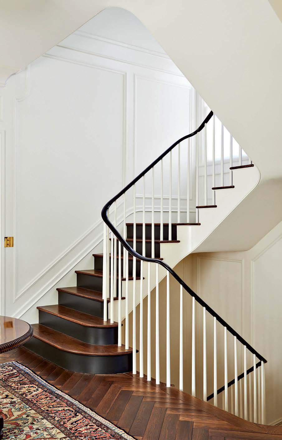 Right: To lighten the stairwell and extend it through all three floors, architect Stephen Sutro worked with Coyne Stair to devise a more fluid, sinuous design. The antique Sarouk Fereghan carpet was found at auction and restored.
Opposite: In the husband’s mahogany-paneled study, an antique secretary was reimagined as a bar cabinet. The leather chair is from F.S. Henemader Antiques.
On the ceiling is a Holland & Sherry wallpaper, while a jute rug by Fibreworks grounds the space.
 The home’s exterior was refreshed with Farrow & Ball’s Hardwick White for the walls and Clunch for the trim. A Bevolo gas wall lantern illuminates the garden, which includes a sitting area with Brown Jordan seating and a vintage Giacometti-style table from Chairish.

“This project was about knitting new into the old.”
L U X E S O U R C E C O M 167
–STEPHEN SUTRO
ENGLISH LESSONS
With moody colors and organic patterns, a designer infuses British sensibility into a young couple’s breezy Marin County abode.
 WRITTEN BY CHRISTINE DEORIO | PHOTOGRAPHY BY HARIS KENJAR
L U X E S O U R C E C O M 168
 Interior Design: Heidi Caillier, Heidi Caillier Design Home Builder: Kurt Brellin, Brellin Company
 The office is cozied up with Farrow & Ball’s Card Room Green on the built-ins and a Rose Tarlow Melrose House stripe on the walls and window shade. A lamp from Faithful Roots illuminates a Serena & Lily chair.
It’s not often that a brief stumps Heidi Caillier, but the designer felt perplexed when she first considered two seemingly disparate visions for a contemporary Kentfield dwelling’s interior renovation. A Pinterest board created by her clients displayed one thing: sunny, Californiacool rooms draped in simple, neutral fabrics. But the words the young husband and wife used to describe their dream home—moody, layered, British—evoked a cozy Cotswolds tableau. With its tall, beamed ceilings, wide-plank wood floors, white walls and sweeping views of Mount Tamalpais and the San Francisco Bay, the couple’s contemporary residence certainly lent itself to the former vision. “It had this easy, breezy, expansive interior that was all very connected to the landscape, which is just classically Northern California,” Caillier says. But by slipping in some muddy neutral colors and organic prints, the designer decided, she could achieve a sense of warmth and comfort appropriate for both sides of the pond.
“Color and pattern are tenets of British interior design,” Caillier explains. “There must be one or the other; that’s what creates interest. Pattern, in particular, is really useful in this house for that reason. It takes what would otherwise be very simple spaces and makes them feel layered—often with just one print.” In the living room, a pair of classic, clean-lined sofas upholstered in a brownon-ivory floral linen grounds an eclectic arrangement of vintage rattan armchairs, a bone-inlaid coffee table and a Moroccan Tuareg mat. “The fabric pattern—which has been a favorite of mine for a long time—feels very special in a large dose like this; it makes the entire room,” the designer says.
The adjacent dining room’s sage-green wallcovering has a “pattern so small in scale that you don’t really register it,” Caillier notes. The element adds a warmth that’s emphasized by simple, rush-backed dining chairs with brownstriped seat cushions. “Those earth tones, used here and throughout the house, go a long way to making the interiors feel more understated,” she says. “There are no bright colors; everything feels of the earth, which allowed us to create a
coziness that’s not out of place in a very sunny California home.”
A charming guest bedroom in the Maine vacation abode of New York City-based architect Gil Schafer inspired the design for the primary suite, in which a vertical floral print on linen extends from the walls up onto the ceiling, where it’s fitted between the wood beams. “An upholstered bedroom is the coziest thing you can imagine; it feels like you’re in a cocoon,” says Caillier, who layered that diminutive design inspired by Indian block prints with new and vintage textiles in feminine florals, a ticking stripe and a Japanese stencil print—all united by their neutral tones and organic, handcrafted quality. Lest the room’s cane bed, traditional English bedside cabinets and patterned fabric lampshades lean too far into British territory, Caillier was careful to create balance with California-inspired elements, from a deep window seat with a ticking-stripe-upholstered French mattress (which she says feels a bit more contemporary) to natural linen draperies.
On the other hand, in the reimagined kitchen, Calacatta Gold marble countertops and soft-green cabinets—installed, along with other new finishes, by general contractor Kurt Brellin—might feel a touch too beachy when lit by the room’s broad skylight. So Caillier added a walnut island top and delicate, pleated porcelain light fixtures to bring that British sensibility into play. “Often, in that part of the world, you’ll see super small-scale pendants hung a little lower over a big chunky island,” she says. “I think it feels really charming.”
From classic English pendants to vintage and antique lamps, the statement-making light fixtures Caillier sourced for each room “go a long way in pushing the design forward,” she says. But it’s the dining room’s cluster of balloon-like frosted-glass orbs that provides the most powerful impact. “It’s a fairly modern fixture, but it doesn’t feel modern in the right setting,” the designer explains. “Here, it swings the farm table, chairs and console away from the traditional zone and puts them in that vague area of ‘what is this design style?’ It’s the place where my work always falls.” Which, in retrospect, makes this home’s unconventional creative brief right up Caillier’s alley after all.
LUXESOURCE.COM 171
 Above: A navy grass-cloth wallcovering by Phillip Jeffries and sofas upholstered in a Carolina Irving Textiles linen set the mood in the family room. Through the passageway, a row of Devol counter stools and Calacatta Gold marble backsplash are visible in the kitchen.
Opposite: Purchased at Nickey Kehoe, nautical paintings by Old Jack—a retired fisherman whose identity remains a mystery to all but the English gallery that represents him—hang above the fireplace. They complement a coffee table covered in an antique textile and an RH rug.

LUXESOURCE.COM 173

LUXESOURCE.COM 174
 Above: Devol’s pleated porcelain pendants, Classic Brass knobs and pulls from Chown Hardware and a butcher block island countertop add English charm to the sunny kitchen. The custom cabinets are painted in Portola Paints & Glazes’ Against The Grain.
Opposite: An Apparatus light fixture prevents the Shoppe Amber Interiors table, Hollywood at Home chairs and Swedish console by Chelsea Textiles from feeling too traditional. The result is a dining room with an aesthetic that’s hard to pin down—just how designer Heidi Caillier likes it.

LUXESOURCE.COM 176
 Above: Two Michael S. Smith patterns—Jammu on the walls and Wallace Vine for the sink skirt— give the powder room a layered look. Caillier emphasized this with a rattan Soane Britain sconce and antique mirror from Bureau of Interior Affairs.
Opposite: Penny Morrison’s Ashok fabric applied to the primary bedroom’s walls and ceiling give the room a cocoon-like quality. The Serena & Lily bed is dressed with Hollywood at Home and John Derian throws and flanked by Penny Morrison lamps.

LUXESOURCE.COM 178
PAINTING THE SKY
Artist Elaine Coombs has her head in the clouds.
 WRITTEN BY DEBORAH BISHOP
PHOTOGRAPHY BY KRISTEN LOKEN
For many years, Elaine Coombs’ paint palette was daubed with countless iterations of the color green. Known for her intimate landscapes, Coombs depicted alpine forests, sundappled glades and lush tree canopies in which the sky played a supporting role. Then, a few years ago, her attention shifted upward. Clouds, in all of their ethereal manifestations, became the focus of her obsession—and the green pigments went into storage.
“When the pandemic hit, I worked at home for a while,” recalls Coombs, who grew up amidst nature in Ontario and currently lives in San Francisco. “I found myself painting the view framed by my apartment window, and my husband and I took long walks in the Presidio and nearby neighborhoods that inspired me. Being outdoors helped me feel calm and present, and I wanted to find a way to convey that feeling.” The artist took hundreds of photos— especially at the dramatic “golden hours” just after sunrise and before sunset. Eventually, she began capturing more sky than land in her shots.
Once her studio reopened, Coombs started dedicating herself to skyscapes. More abstract than her previous work, these paintings tread the line between figurative description and state of mind. They glow with a subtle shimmer, thanks to an underlayer of gold or silvery pearl metallic paint that captures the translucence of the sky. She recently started working with a metallic blue that shifts from vibrant to pale as the viewer moves—much as the sky can change hues on a dime depending upon atmospheric conditions.
Interestingly, Coombs does not use a brush; rather she employs a kind of pointillist approach, using a palette knife to apply color with a controlled series of strokes, marks and dots. As you approach the canvas, the clouds begin to pixelate; pull away and they shift back into focus. At the moment, the artist cannot imagine returning to painting landscapes. “There is still so much more to explore in the clouds,” she says. Asked if she has captured the apocalyptic skies during the California wildfires, Coombs demurs. “I’m too much of an optimist,” she explains.
In fact, the artist radiates a kind of radical positivity and a desire to share joy with others. “My hope is that, even in trying times, people might see my work and feel inspired to notice the beauty in the everyday,” she says. “And of course—once in a while—remember to stand still and look up.”


L U X E S O U R C E C O M 181
A painting, Expansive Skies (gold) hangs in artist Elaine Coombs' studio (opposite). The painter sprinkles inspirational words and quotes around her workspace (below right and bottom left), saying that they remind her of the purpose in creating art. Many of her works are sparked by photographs of the clouds she takes herself (bottom right).
All the Right Moves
This dramatically remodeled dwelling is simply the grand sum of small updates.
 WRITTEN BY MONIQUE MCINTOSH
L U X E S O U R C E C O M 182
PHOTOGRAPHY BY DOUGLAS FRIEDMAN/TRUNK ARCHIVE
 Interior Design: Casey Howard, Casey Howard Interior Design
Home Builder: Reynaldo Cruz, ABC Painting and Remodeling
 Designer Casey Howard refreshed the media room with Benjamin Moore’s Balboa Mist and Super White on the walls and trim, respectively. To one side of an arched passageway are an abstract artwork by MarbleWish and Interlude Home ottoman; a Joelle Somero painting hangs just beyond.
R
eimagining a house sometimes requires a scalpel rather than a bulldozer. To the welltrained eye, the boldest transformations can emerge from carefully reframing existing architecture in a new light. This approach felt intuitively right to interior designer Casey Howard, who Carolyn and Kevin Comerford recruited to rejuvenate their home just outside of San Francisco, where they live with their three children.
The couple liked the general footprint of their Mediterranean-style abode, so there wasn’t “a whole lot structurally that we wanted to change,” Carolyn notes. However, the cherrywood floors and cabinetry felt dated, and the duo wanted a new atmosphere that nodded to contemporary sensibilities. At first, they toyed with pivoting the entire dwelling toward a modern farmhouse look, an aesthetic that was the style du jour at the time. But the more Howard explored changing rooms, with their formal arched doorways and tall ceilings, the more convinced she became that some things should stay the same. “We felt that we should be true to the bones of the home,” the designer explains. “We knew we could strip a bit of architectural detail to create a more warm and welcoming transitional space.”
Collaborating with general contractor Reynaldo Cruz, this gentle metamorphosis began with some precise editing, such as removing the Roman columns running along the central hallway, which gave more visual breathing room to appreciate the graceful archways, elegant crown molding and sweeping curved staircase. Eliminating a few key walls enlarged the couple’s bathroom, allowing for the addition of a wet room, floating vanity and walk-in closet. “There was a lot of unused space there, so opening it up gave their suite a more elevated feel,” Howard says.
With these structural adjustments in place, the designer turned to refocusing the interiors from a material perspective, and the results are a testament to the power of finishes in uplifting the mood of a home. European white oak flooring replaced the cherrywood, and the textured grain and knots infuse a softer, organic quality throughout. Millwork became more modern and crisper, shifting the nature of the abode to contemporary elegance. The new white cabinetry and brass-accented range hood brightens the
kitchen, a contrast to the dark glamour of the primary bathroom suite.
The walls and ceilings became a blank canvas for bold textures and color. “We worked to create a unique vibe within each space,” Howard says. The designer also enjoyed injecting graphic accents into unexpected places, from the hexagonal wood-veneer wallcovering lining the living room’s ceiling to the delicate chevron paper on the couple’s closet doors. But she was also unafraid of letting patterns and textures envelop a space, like the slabs of veined marble that encircle the primary bath’s shower.
The special occasion spaces underwent the most dramatic changes. The neglected formal living area became a debonair media room with smoky gray wallpaper and a new fireplace featuring stained shiplap and black marble. Before the remodel, “we only used it at Christmastime,” Carolyn notes. “Now it has a cool lounge feel. It’s become a fun place to hang out that we never had.” In turn, Howard covered the dining room with what she describes as a “floral wallpaper with a moody edge.”
The plethora of new materials and motifs could theoretically become overwhelming, “but we kept to a monochromatic color scheme with a mix of light and dark neutrals,” the designer explains. “You feel that cohesion as you transition through the house.” This tonal harmony carries to furnishings, which favor dark woods, metallic accents and fabrics ranging from plush velvet to nubby bouclé. The pieces themselves follow the home’s transitional bent, offering “a mix of sharp, modern edges with some curved silhouettes,” Howard notes. Yet comfortable approachability remains a stylistic through line, from the living room’s cozy sofas to the kitchen’s custom curved banquette. In contrast, the statement light fixtures serve as true “conversation pieces,” Howard says, with details such as Sputnik starbursts or crystal shards.
Filtered through a fresh lens, the familiar walls feel entirely new to the family. Though the layout remains mostly the same, they find themselves moving differently through each space. Or rather, they linger longer—from early mornings together around the kitchen island (one dedicated stool for each member) to late nights in the media room “putting on some music and playing pool,” says Carolyn with a smile. “Casey helped us reform our ideas to better fit the home we have, and it has changed the way we live in it.”
LUXESOURCE.COM 185
 The cozy living room features matching Patricia Edwards sofas covered in Colefax and Fowler fabric and paired with twin Interlude Home coffee tables. Howard lined the ceiling with a wood-veneer Schumacher wallpaper, highlighting the Nellcote Studio light fixture.

LUXESOURCE.COM 187

LUXESOURCE.COM 188
 Right: An alcove in the kitchen was turned into a built-in bar, featuring customized Omega Cabinetry from Diablo Valley Cabinetry with a maple finish and a warm Calacatta Vagli marble counter and backsplash. The hardware is by Schaub & Company.
Opposite: White Omega Cabinetry, a New Ravenna tile backsplash and Calacatta Vagli marble countertops distinguish the kitchen. Kravet barstools pull up to the island, with fixtures from Hudson Valley Lighting above.
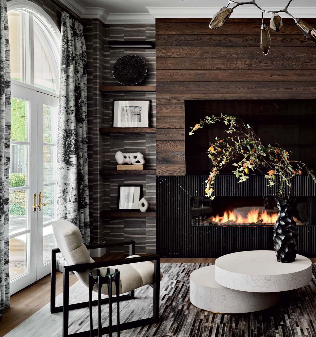 Howard wrapped the media room in warm Mark Alexander wallpaper. A Burton James sofa, Theodore Alexander club chair and Global Views rotating cocktail table form a cozy seating area by the new fireplace, clad in Artistic Tile’s Pinnacle Nero Marble.

“ We felt that we should be true to the bones of the home.”
L U X E S O U R C E C O M 191
–CASEY HOWARD

LUXESOURCE.COM 192
 Above: The new walk-in closet is anchored by a John-Richard light fixture and a central storage island built by Blueline Custom Builders and topped by Silestone countertops. The closet doors are covered with Thibaut wallpaper and finished with Schaub & Company hardware.
Opposite: Shades of black and gold define this glamorous guest bedroom, from the Porter Teleo wallpaper to a Robert James Collection metal-trimmed four-poster bed. A Roman shade made with an S. Harris sheer filters the light.
 Above: Book-matched marble slabs surround the new open-concept wet room in the primary bath. At the center are a freestanding MTI tub with Watermark Designs hardware and a spiky Visual Comfort light fixture.
Opposite: For the primary bathroom, Blueline Custom Builders created a floating fluted wood vanity, which is accented by twin Hudson Valley Lighting sconces and a Made Goods mirror. The bouclé ottoman is by Kardiel.

LUXESOURCE.COM 195
PORTFOLIO
ESCAPE THE ORDINARY
181 FREMONT
Escape the ordinary at San Francisco’s 181 Fremont, an unparalleled condominium with Platinum LEED certification. Each corner home offers spectacular views and hand-selected materials from around the world. Additional amenities include a private Residents’ Club and direct access to Salesforce Park. Priced from $2,500,000.
181fremont.com | 628.200.0530

START THE JOURNEY TO LUXURIOUS SECURITY
CASORO JEWELRY SAFES
Securing valuable jewelry and watches in an elegant safe provides true peace of mind. Casoro’s ready-to-ship and custom-designed safes combine maximum burglar and fire protection, convenient organization, programmable watch winders and exotic woods with expert design assistance and white-glove delivery.

casorojewelrysafes.com | 714.550.4123
INSPIRATIONAL ABSTRACT ART
LETICIA DEMEUSE
Reflecting her extensive travels and the beauty of Southern California living, Leticia Demeuse is a Brazilian-born, SoCal artist whose celebrated works are found in private collections across the U.S., Europe and South America. Fascinated by Brazilian modernist architecture, she loves to deconstruct its forms and find them later in her work. Visit Demeuse’s online gallery to explore her paintings and bespoke abstract art.
CONSUMMATE KITCHEN CREATIONS
LUXURY DESIGNER
The kitchen has evolved from a utilitarian space to the most important designed room in the home.

Donna Johnson designs amazing kitchens that are a primary gathering spot for family and friends, and the true heart of the home. So why not let her create another great “no ordinary kitchen?”
luxury-designer.com | 949.697.5869
DESIGN FOR YOUR LIFESTYLE
DORA BRIGHAM INTERIORS

After 26 years in the interior design industry in Orange County, Dora Brigham Interiors continues to provide unique and functional spaces for its clients. The team’s experience spans from contemporary to traditional, custom new builds to remodels, with every design reflecting the client’s look and lifestyle. dorabrighaminteriors.com

I D E A S + I N S P I R AT I O N
leticiademeuse.com | 858.525.3589
| 714.743.9247 P R O M O T I O N


download the designtv app INTERIOR DESIGN Virtual Product Tour Product LIVE: AURA In the C-Suite At Home LUXE INTERIORS + DESIGN METROPOLIS Metropolis Forums Product LIVE: THINSCAPE® with Wilsonart Think Tank Metropolis Likes Meet the Maker with Delita Martin Moving Forward by Standing Still Location Luxe Luxe Local Stream on-demand video from the authorities on design
PROMOTION
SIGNATURE SERIES
PORTFOLIO
BEAUTIFY EVERYDAY LIFE
NADDOUR’S CUSTOM METALWORKS
Luxury and function go hand-in-hand in every piece crafted by Naddour’s Custom Metalworks. From stair railings to doors, gates and custom iron pieces, the Naddour team is ready to help design dreams.

LUXURY REAL ESTATE EXPERTS

RANCHO REAL ESTATE GROUP
CATRYN FOWLER TEAM
Rancho Real Estate Group specializes in representing clients in a diverse range of real estate transactions throughout San Diego, including private gated golf communities, oceanfront properties, luxury high-rise condominiums, resort real estate, luxury leases and land for custom homes. ranchorealestategroup.com | 619.850.6978
AN ATMOSPHERE OF UNOBTRUSIVE BEAUTY STUDIO
BALESTRA
STUDIO BALESTRA evokes an atmosphere of unobtrusive beauty. Based in Los Angeles, their carefully-curated collection brings beauty, simplicity and authenticity to any living space. Each rare antique piece is a unique work of art that reveals natural textures and old-world patina.

MODERN BESPOKE LUXURY
JILL LEWIS ARCHITECTURE
Jill Lewis Architecture is a boutique studio specializing in contemporary residential architecture, with offices in San Francisco and Palm Springs. Through a highly-collaborative and thoughtful process with the client and builder, they create a bespoke piece of architecture uniquely suited to the site and the client.

BUILDING FAMILY DREAMS
CAVANAUGH CONSTRUCTION
As the father-son team behind Cavanaugh Construction, Dana and Mac Cavanaugh have built an award-winning team that brings more than 20 years of outstanding expertise, old-world artistry, cutting-edge innovation, exceptional detail and a true collaborative spirit to the luxury homes they create for their discerning clientele.
cavanaughconstruct.com | 619.435.6155
CUSTOM GLASS AND SHOWERS

CUSTOM GLASS SPECIALTIES, INC.
Specializing in custom glass partitions and full frameless shower doors that fit any specific opening, as well as bifold doors and mirrors, the experts at Custom Glass Specialties work hard to make homes and businesses more beautiful, luxurious and expansive.

P R O M O T I O N
I D E A S + I N S P I R AT I O N
studio-balestra.com | 323.380.7544
nmetalworks.com | 714.546.3003
jilllewisarchitecture.com | 415.636.0480
customglassspecialties.com
619.474.4613
|

IRG’s Calacatta Vagli Marble


Redefine classic elegance.


Design: Elena Cabrese Studio | © Vivian Johnson Photography Discover more about Calacatta Vagli Marble www.marblecompany.com 415.657.0280 Brisbane 925.829.1133 Dublin 916.387.0481 Sacramento THE stone destination.
 MONTEREY LOS ANGELES PALM BEACH LONDON MONACO | SUMMITFURNITURE.COM


 Sense. Modular sofas, armchair and ottomans, designed by Studio Roche Bobois. Cestello. Cocktail tables, designed by Gabriele Fedele. Mariposa. Floor lamps, designed by Marcel Wanders. Botanica. Rugs, designed by Emmanuel Thibault.
In-store interior design & 3D modeling services.(1) Quick Ship program available.(2


 Retro Black Petrified Wood


 DESIGNERT: Matthew Lechowick BUIILDER: Kinetic Partners


 Adam Steiner, Cornerstone Architects


 WRITTEN AND PRODUCED BY SARAH SHELTON


 Clockwise The shinola.com Claret Dolomite / Price upon request / demurodas.com Petrova Fire Screen / $1,495 / arteriorshome.com Chair Price Tura Seeded Glass Low Voltage Sconce / Price upon request / hubbardtonforge.com Ombré Fog
Clockwise from top right: The Runwell Shoulder Bag / $650 / . Gem Cabinet in Claret Dolomite / Price upon request / . Cleo Chair by Marcel Wanders Studio / Price upon request / fendicasa.com . Tura Seeded Glass Low Sconce / Price upon / Ombré Table Runner in Fog / $80 / stfrank.com


 Mary Maney CKBD, Designer
Gina D’Amore Bauerle Owner
Nichol Hollinger CKBD, Senior Interior Designer


 The louvred façade of this South Carolina retreat creates a shaded dining terrace. Designer Elly Poston Cooper lined the pool deck with crisp white chaises to echo the symmetry of the architecture by McAlpine.


 WRITTEN BY MAILE PINGEL
PHOTOGRAPHY BY JOHN MERKL
 In the living room, designer Lisa Hilderbrand paired a Louis Philippe mirror from Avery & Dash with a lamp from Chairish, an antique Austrian chest and contemporary charcoals by Jean-Marc Louis.
A T.H. Robsjohn-Gibbings slipper chair adds a modern note.


 Right: To lighten the stairwell and extend it through all three floors, architect Stephen Sutro worked with Coyne Stair to devise a more fluid, sinuous design. The antique Sarouk Fereghan carpet was found at auction and restored.
Opposite: In the husband’s mahogany-paneled study, an antique secretary was reimagined as a bar cabinet. The leather chair is from F.S. Henemader Antiques.
On the ceiling is a Holland & Sherry wallpaper, while a jute rug by Fibreworks grounds the space.
 The home’s exterior was refreshed with Farrow & Ball’s Hardwick White for the walls and Clunch for the trim. A Bevolo gas wall lantern illuminates the garden, which includes a sitting area with Brown Jordan seating and a vintage Giacometti-style table from Chairish.

 WRITTEN BY CHRISTINE DEORIO | PHOTOGRAPHY BY HARIS KENJAR
 Interior Design: Heidi Caillier, Heidi Caillier Design Home Builder: Kurt Brellin, Brellin Company
 The office is cozied up with Farrow & Ball’s Card Room Green on the built-ins and a Rose Tarlow Melrose House stripe on the walls and window shade. A lamp from Faithful Roots illuminates a Serena & Lily chair.
 Above: A navy grass-cloth wallcovering by Phillip Jeffries and sofas upholstered in a Carolina Irving Textiles linen set the mood in the family room. Through the passageway, a row of Devol counter stools and Calacatta Gold marble backsplash are visible in the kitchen.
Opposite: Purchased at Nickey Kehoe, nautical paintings by Old Jack—a retired fisherman whose identity remains a mystery to all but the English gallery that represents him—hang above the fireplace. They complement a coffee table covered in an antique textile and an RH rug.


 Above: Devol’s pleated porcelain pendants, Classic Brass knobs and pulls from Chown Hardware and a butcher block island countertop add English charm to the sunny kitchen. The custom cabinets are painted in Portola Paints & Glazes’ Against The Grain.
Opposite: An Apparatus light fixture prevents the Shoppe Amber Interiors table, Hollywood at Home chairs and Swedish console by Chelsea Textiles from feeling too traditional. The result is a dining room with an aesthetic that’s hard to pin down—just how designer Heidi Caillier likes it.

 Above: Two Michael S. Smith patterns—Jammu on the walls and Wallace Vine for the sink skirt— give the powder room a layered look. Caillier emphasized this with a rattan Soane Britain sconce and antique mirror from Bureau of Interior Affairs.
Opposite: Penny Morrison’s Ashok fabric applied to the primary bedroom’s walls and ceiling give the room a cocoon-like quality. The Serena & Lily bed is dressed with Hollywood at Home and John Derian throws and flanked by Penny Morrison lamps.

 WRITTEN BY DEBORAH BISHOP
PHOTOGRAPHY BY KRISTEN LOKEN


 WRITTEN BY MONIQUE MCINTOSH
 Interior Design: Casey Howard, Casey Howard Interior Design
Home Builder: Reynaldo Cruz, ABC Painting and Remodeling
 Designer Casey Howard refreshed the media room with Benjamin Moore’s Balboa Mist and Super White on the walls and trim, respectively. To one side of an arched passageway are an abstract artwork by MarbleWish and Interlude Home ottoman; a Joelle Somero painting hangs just beyond.
 The cozy living room features matching Patricia Edwards sofas covered in Colefax and Fowler fabric and paired with twin Interlude Home coffee tables. Howard lined the ceiling with a wood-veneer Schumacher wallpaper, highlighting the Nellcote Studio light fixture.


 Right: An alcove in the kitchen was turned into a built-in bar, featuring customized Omega Cabinetry from Diablo Valley Cabinetry with a maple finish and a warm Calacatta Vagli marble counter and backsplash. The hardware is by Schaub & Company.
Opposite: White Omega Cabinetry, a New Ravenna tile backsplash and Calacatta Vagli marble countertops distinguish the kitchen. Kravet barstools pull up to the island, with fixtures from Hudson Valley Lighting above.
 Howard wrapped the media room in warm Mark Alexander wallpaper. A Burton James sofa, Theodore Alexander club chair and Global Views rotating cocktail table form a cozy seating area by the new fireplace, clad in Artistic Tile’s Pinnacle Nero Marble.


 Above: The new walk-in closet is anchored by a John-Richard light fixture and a central storage island built by Blueline Custom Builders and topped by Silestone countertops. The closet doors are covered with Thibaut wallpaper and finished with Schaub & Company hardware.
Opposite: Shades of black and gold define this glamorous guest bedroom, from the Porter Teleo wallpaper to a Robert James Collection metal-trimmed four-poster bed. A Roman shade made with an S. Harris sheer filters the light.
 Above: Book-matched marble slabs surround the new open-concept wet room in the primary bath. At the center are a freestanding MTI tub with Watermark Designs hardware and a spiky Visual Comfort light fixture.
Opposite: For the primary bathroom, Blueline Custom Builders created a floating fluted wood vanity, which is accented by twin Hudson Valley Lighting sconces and a Made Goods mirror. The bouclé ottoman is by Kardiel.


 MONTEREY LOS ANGELES PALM BEACH LONDON MONACO | SUMMITFURNITURE.COM