3 minute read
Rules of Design


the center section should be larger. And you may also remember I augmented that rule to state that if the grouping were a part of a larger mass, then the rule for that larger mass could be applied. This is the case here. Considering the entire upper dominant section of the primary mass, the three divisions become a part of six equal divisions and so comply with Varnum’s rule (image 3-17).
The next level down brings you to just one of those doors. Varnum’s rule for three horizontal divisions of a mass is that the center section should be larger, with the top and bottom sections varying. And so, it is (image 3-18).
Advertisement
To break down the major vertical divisions of each door, let’s begin with the top and the bottom sections. They are arranged in a similar manner and the same rules apply to both. They are both divided vertically into three sections, with the center sections larger and the outer sections equal. This again complies with Varnum’s rules. There is one more thing to take note of here, though. Isolating an individual top or bottom section as a single unit, you see a three-section pattern—stepping back for just a moment you see that three-section pattern repeats six times across the width of the entire bookcase, and once again complies with Varnum’s rules for more than three vertical divisions (image 3-19).

That gets you to the center section of each individual door, which again consists of three vertical divisions. This time they are equal, but—if viewed in their larger context (across the width of the entire bookcase)—they comply with the rule for more than three vertical divisions. Note that the center sections of each door do not have the same vertical spacing as the upper and lower sections. That is, the divisions of the center section are segregated into three equal partitions, while those of the upper and lower sections are not equal. This irregularity breaks up the monotony of predictability while still maintaining perfect symmetry (image 3-20).
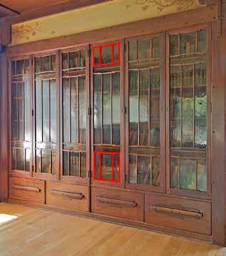
The second Greene and Greene example I would like to use to discuss combination divisions is a bookcase from the Culbertson House (image 3-21). This piece plays out a little differently than the last example and shows a way to successfully break the rules. It also is one of the few examples where, I believe, the Greenes (or someone at the bench) made a mistake.

First, notice that the primary mass is grouped into three major vertical sections. As Varnum states, the center section in this case should be dominant (image 3-22). To enhance the center’s dominance, it is proud in height, width, and depth—but in an understated way. The width is not substantially wider than the outer sections, and the Greenes did not employ a prominent center pediment. Look at the overall design and its nine vertical divisions (including all three major vertical divisions). All nine are the same width, except for the very center of the nine, which is marginally wider. This quietly works to enhances the dominance of the center of three vertical divisions (image 3-23).
Now here’s where I see the mistake. (I admire the work of the Greenes so much that calling this out feels a bit like blasphemy.) Go to the lower section. Take a close look at the crotch veneer doors on either side of the dominant section. To balance the piece, the veneer patterns should mirror image from one side to the other. But they do not! The doors on the left side emanate from the center, with the more figured grain to the left side of each individual door. Now look at the doors on the right side of the piece. It’s the same as on the left—figured grain to the left side. (The arrangement of the escutcheons is how it should be—mirror image.) Here’s a thought experiment to help show why this veneer feels wrong. If you were to visualize placing the bookcase design on a teeter-totter, it would not be perfectly balanced—it is heavier on the left side!
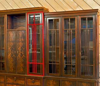
This is a good segue to my next topic of visual weight. Focus your attention on the glass panels of the doors. Varnum’s rule states that in a mass divided into three horizontal sections, the center should be dominant and its top and bottom sections should vary. The center section is indeed dominant, but its top and bottom sections are close to the same size. Nonetheless, the design works! Notice the vertical bars that pass through all three segments. The bars are not all equal. The center bar reaches all the way from the
Image 3-22: The primary mass grouped into three vertical sections. To enhance the center’s dominance, it is proud in height, width, and depth—but in an understated way.
Image 3-23: All nine divisions are the same width, except for the very center of the nine, which is marginally wider.


Image 3-24: The center section is indeed dominant, but its top and bottom sections are close to the same size. Nonetheless, the design breaks the rules and works!