Calming & & Natural Natural Calming
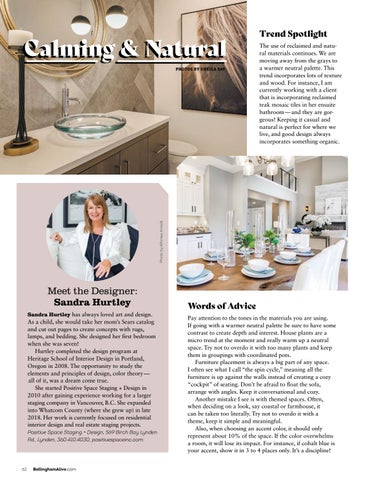
The use of reclaimed and natural materials continues. We are moving away from the grays to a warmer neutral palette. This trend incorporates lots of texture and wood. For instance, I am currently working with a client that is incorporating reclaimed teak mosaic tiles in her ensuite bathroom — and they are gorgeous! Keeping it casual and natural is perfect for where we live, and good design always incorporates something organic.
Photo by Alfonso Arnold
PHOTOS BY SHEILA SAY
Trend Spotlight
Meet the Designer: Sandra Hurtley Sandra Hurtley has always loved art and design.
As a child, she would take her mom’s Sears catalog and cut out pages to create concepts with rugs, lamps, and bedding. She designed her first bedroom when she was seven! Hurtley completed the design program at Heritage School of Interior Design in Portland, Oregon in 2008. The opportunity to study the elements and principles of design, color theory — all of it, was a dream come true. She started Positive Space Staging + Design in 2010 after gaining experience working for a larger staging company in Vancouver, B.C. She expanded into Whatcom County (where she grew up) in late 2018. Her work is currently focused on residential interior design and real estate staging projects. Positive Space Staging + Design, 569 Birch Bay Lynden Rd., Lynden, 360.410.4030, positivespaceinc.com
62
BellinghamAlive.com
Words of Advice Pay attention to the tones in the materials you are using. If going with a warmer neutral palette be sure to have some contrast to create depth and interest. House plants are a micro trend at the moment and really warm up a neutral space. Try not to overdo it with too many plants and keep them in groupings with coordinated pots. Furniture placement is always a big part of any space. I often see what I call “the spin cycle,” meaning all the furniture is up against the walls instead of creating a cozy “cockpit” of seating. Don’t be afraid to float the sofa, arrange with angles. Keep it conversational and cozy. Another mistake I see is with themed spaces. Often, when deciding on a look, say coastal or farmhouse, it can be taken too literally. Try not to overdo it with a theme, keep it simple and meaningful. Also, when choosing an accent color, it should only represent about 10% of the space. If the color overwhelms a room, it will lose its impact. For instance, if cobalt blue is your accent, show it in 3 to 4 places only. It’s a discipline!