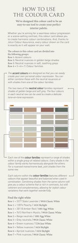
HOW TO USE THE COLOUR CARD We’ve designed this colour card to be an easy-to-use tool to create your perfect interior palette. Whether you’re aiming for a seamless colour progression or a scene-setting contrast, this colour card allows you to create harmonic colour combinations. And, thanks to Jotun Colour Assurance, every colour shown on the card is exactly as it will appear on your wall. The colours in this colour card are divided into the following groups: Row 1: Accent colours Row 2: Neutral nuances in golden beige shades Row 3: Neutral nuances in soft, soothing greys Row 4 + 5 + 6 + 7: Colour families The accent colours are designed so that you can easily create your own personal colour expression. You can either combine these with the neutral neuances or with shades from one of the colour families. The two rows of the neutral colour families represent shades of golden beige and soft grey. The four colours in each neutral row can be used to create a delicate tone-on-tone expression.
Each row of the colour families represent a range of shades within a single group of related colours. Every shade in the colour family works harmoniously alongside the others. For a nuanced monochrome look, pick shades from the same row. Each column within the colour families features different colours that appear beautiful and balanced when used in combination. Combining shades from the same column will give you a colour scheme that is rich in contrasts, but still coherent and complementary, allowing for stylish colour variations that work together wonderfully.
Find the right white Row 1 – 3377 Slate Lavender / 9918 Classic White Row 1 – 12074 Peachy / 1624 Skylight Row 1 – 20118 Amber Red / 1001 Egg White Row 1 – 7613 Northern Mystic / 9918 Classic White Row 2 – Beige neutrals / 1001 Egg White Row 3 – Grey neutrals / 9918 Classic White Row 4 – Green nuances / 7236 Jazz White Row 5 – Yellow nuances / 1624 Skylight Row 6 – Apricot nuances / 1624 Skylight Row 7 – Pink nuances / 9918 Classic White