[accomplishment]
WORK IN PROGRESS - WILL UPDATE IMAGES IN WEEK 7
success
Final Words
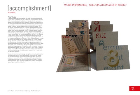
The experimental accordion design has been my favorite explorative project while at SCAD. During my GRDS-709 course in Winter Quarter 2011, I received valuable feedback and direction for the accordion design from Professor Henry and my peers. I utilized only chipboard as the pronounced material to exploit the article “Graphic Design Theory?” I was confident with my choice of material and execution of the panel design. However, during my MA Review in the Spring Quarter 2011, the Review Board challenged me to explore different materials and to intertwine my Interior Architecture background into the mix of Graphic Design more. During the summer of 2011, I studied different materials from acrylic, to Formica plastic laminates, to wood veneer and thin metal sheets. I purchased different wood graphic paper and bought bold French colored paper too. Surely, somewhere in the mix of the materials I could create a unique composition that spoke interior architecture intertwined with graphic design. Next, I began by printing the article on the different materials. When the cherry wood successfully went through my printer, I fell in love with the printed results. The article, “Graphic Design Theory?” read beautifully on the wood veneer. I compared the wood veneer accordion to the original chipboard accordion and decided the end result needs to POP more. After running different ideas through my head for a few days, finally I thought the two accordions should be merged together to create the interior architecture intertwined with the graphic design result. Next I decided to add a POP of Neenah Eames paper to the composition. Because of Eames’ exposure in the architecture and design world, the choice was a perfect fit to connect the two more diligence. Overall, the accordion panel design exemplifies strong visual hierarchy, consistent grid rhythms and nice aesthetics throughout that support the article successfully. Having the opportunity to utilize chipboard and cherry veneer to the fullest definitely made the project speak a theoretical personality. The overall composition articulates a pleasant flow of the article while providing a great use of positive and negative space, type integration, and unity.
page
Jamie Turpin . Wood + Chipboard Design . Portfolio Design
.50