
STYLE GUIDE 000

60.1699° N, 24.9384° E

Kaamos is a Finnish-Canadian streetwear brand based in British Columbia, Canada.
The brand aims to tell the authentic story of post-soviet tensions between Finland and its neighbouring countries through brand designs and social media communication. Kaamos is stylistically inspired by the industrialization, militarization, and the culture of an Eastern European post-Cold War atmosphere.
Kaamos streetwear exhibits thoughtful design decisions that achieve the visual style of various micro-trends in the industry through clothing and social marketing.
There is no shortage of competition in this industry and while there are a lot of streetwear brands out there with different purposes and demographics, there isn’t a streetwear brand that accurately capture the pride of streetwear culture in Findland.

Kaamos believes in being informative, creative, clever, and authoritative in tone. We strive to create an engaging and memorable experience for our customers and audience by speaking in a voice that is both professional and knowledgeable. We prioritize the use of language that is inclusive and avoid any offensive or harmful language towards any persons(s).
FUNNY vs. SERIOUS NEUTRAL
FORMAL vs. CASUAL CASUAL
RESPECTFUL vs. IRREVERENT NEUTRAL
MATTER-OF-FACT vs. ENTHUSIASTIC MATTER-OF-FACT
On February 24th 2022, Russian forces invaded the northern front of the Ukraine from Belarus, following up with a full scale invasion as part of the Russo-Ukrainian war. As neighbouring European countries have begun standing in solidarity with the Ukraine, many charitable actions have formed in support of the region.
Kaamos firmly stands in support of all democratic European countries and values of humanity, and thus pledge to donate 10% of all proceeds to the Canada-Ukraine foundation as part of the Ukraine humanitarian crisis.


Primary Wordmark
Minimum Size
Print: 5.156” x 0.983”
Digital: 327 x 55PX
Secondary Wordmark
Minimum Size
Print: 6.146” x 1.3646”
Digital: 590 x 130PX
Monogram
Minimum Size
Print: 0.3125” x 0.28125”
Digital: 16 x 16PX
Title
Lead
Sub-heading
Paragraph
Lorem ipsum dolor sit amet, consectetuer adipiscing elit, sed diam nonummy nibh euismod tincidunt ut laoreet dolore magna aliquam erat volupat. Ut wisi enim ad minim veniam, quis nostrud exerci tation ullamcorper suscipit lobortis nisl ut aliquip ex ea commodo consequat, duis.
 + Billqo Regular
+ Avenir Black
+ Avenir Light
+ Billqo Regular
+ Avenir Black
+ Avenir Light
Heading and subheading point size is 2:1 (eg, 30pt heading - 15pt subheading).
Leading
Small type sizing uses auto leading. Medium type sizing adds 3 points of leading to the type size (eg, 30pt font - 33 leading).
Large type sizing adds 20 points of leading to the type size (eg, 120pt font - 140 leading).
Kerning
Letter tracking is 25 (maximum).
Type should always be set to flush left or center justified. Never use right justification.
Lorem ipsum dolor sit amet, consectetuer adipiscing elit, sed diam nonummy nibh euismod tincidunt ut laoreet dolore magna aliquam erat volupat. Ut wisi enim ad minim veniam, quis nostrud exerci tation ullamcorper suscipit lobortis nisl ut aliquip ex ea commodo consequat, duis.

CMYK: 67-0-30-0
RGB: 16-230-220
HEX: 10E6DC
CMYK: 0-0-0-7
RGB: 238-238-238
HEX: EEEEEE
CMYK: 0-0-0-0
RGB: 255-255-255
HEX: FFFFFF
BLACKENED GREY STONE GREY
CMYK: 0-0-0-87
RGB: 33-33-33
HEX: 212121
WINTER BELL
CMYK: 0-0-0-80
RGB: 50-50-50
HEX: 323232
CMYK: 13-15-0-20
RGB: 170-166-204
HEX: AAA6CC


Associated brand photography builds on the brand identity and it is critical to supporting the brand voice. Both our audience and current or potential customers need to see consistent imagery style across all social media platforms and landing page.

Crip, bright lighting, high resolution, high quality. Web: 72 PPI; Print: 300 PPI

Absolutely do not use photos with unprocessed noise or pixel loss. Brand textures, logos, and Lightroom presets are provided for post-processing.
Avoid busy backgrounds unless a shallow depth of field is present to compensate.
Avoid the use of photos that capture moments that feel staged or disingenuous. Lifestyle images should feel natural and authentic to the environment they’re representing.
Avoid using photos with high points of unprocessed saturation. Post-processed saturation is factored into Lightroom presets for the brand.
Absolutely do not use images that are licensed or SES. Only use global-rights or free-licensed images, and always include photographer rights in metadata info.

Emotion-based imagery possesses an intimate quality. Each captures a moment in time that displays a range of emotions from content to intensity. Images should create a stand-alone visual tone independent from the brand.


Environment-based imagery evokes a sense of destination. Each photograph should provide context for the brands visual bias for the culture and streetwear demographic.
Lifestyle-based imagery should appeal to the demographic of our audience. Photographs should create a sense of belonging for the audience and intimate connection to the brand.


Using cold tones in photography mean incorporating a slight blue or violet hue to the image. It conveys different emotions depending on the subject and compositions. Less is more when post-editing brand photographs.

1:20 midtone, shadow, and highlight shifts are used to just slightly manipulate the original tone of an image.


In using a monochrome filter on brand imagery, we don’t want to remove all color from the photo. These Lightroom settings retain some of the natural shadow points and rather than removing color correction, desaturation is used to fade highlights into a cold white tone.

Texture is a technique used for creating visual interest and surface quality in a design. It creates a physical illusion that leads visual elements. Avoid using textures in every piece of content, the purpose is to add a physical quality to an otherwise 2D element. They should be used sparingly and on specific types of pillar content.

Use only with pillar content or ad-content. Never use with product photos or ecommerce elements.
Always apply the texture above the logo layer and below written content.


Overlay > 95 Op > Greyscale BGs


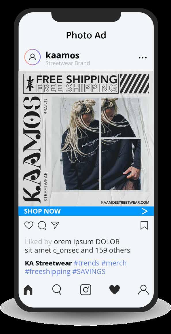
Digital ad messaging should be simple, direct and communicate a goal to the end-user. Digital ads should always provide a clear call to action. Digital ads should be handled with clear intent. Due to space constraints, text needs to be legible and always include a brand element.
Keep the message focused and simple. Do not make the enduser work to understand the message. The logo or variation of the brand should be prominently visible. Try to include human presence and product shots as much as possible.
When arriving at the landing page the end-user should be able to easily find what they clicked the ad for (eg, Ads should be current with the product rotation). Always use the same creative elements in an ad as the creative elements on the landing page.
Absolutely do not use CTA phrases like “click” or “click here”, but phrases like “Order Now”, “Instant Savings”, “Discover” to provide an implied benefit to the end-user.
Target ads for primarily Instagram, Youtube, TikTok, and Facebook.

Focus primarily on shopping ads, explore ads, and story supporting ads.
Track and measure KPIs to make data-driven decisions on retargeting ads. We want the user to feel like each time they visit the site they’re experiencing something fresh being offered to them. Consider pixel-based retargeting to re-display ad material.
File Type: .JPG or .PNG
Max File Size: 30MB
Min. Image Width: 500 Pixel
Min. Aspect Ratio: 400x500
Aspect Ratio Tolerance: 0.01
Rec. Resolution: 1080x1350PX, 1080x1080PX
Text Limit: Two rows of text can be displayed.
File Type: .JPG or .PNG
Max File Size: 30MB
Rec. Resolution: 1080x1920PX
Text Limit: Less than 20% of image.
File Type: .JPG or .PNG
Max File Size: 30MB
Rec. Resolution: 1080x1080PX
Image Ratio: 1.91:1 to 1:1
File Type: .JPG or .PNG or .GIF
Max File Size: 150KB
Rec. Resolution(s)
250x250PX - Square
468x60PX - Banner

728x90 - Leaderboard Banner
300x250PX - Inline Rectangle
120x600PX - Skyscraper
160x600PX - Wide Skyscraper
