29 minute read
PROJECT: Styling the web


Styling the web page
In this part of the project, styling will be applied to the framework created in HTML. CSS allows programmers to have much better control over the layout of their website. The look of the site can be kept consistent by using a single style sheet, which makes the maintenance of a website more efficient. This also saves time and makes it easy to update the design.
Advertisement
What the program does
Use the HTML elements of the web page created in Build a web page (see pp.216–33). You will use CSS to select and style these HTML elements individually in this second part of the project. Each element will be formatted according to its role and function, making the web page easier to navigate.
START
Add visual styles and layout definitions for the HTML elements
Check that the web page is easy to read and follow
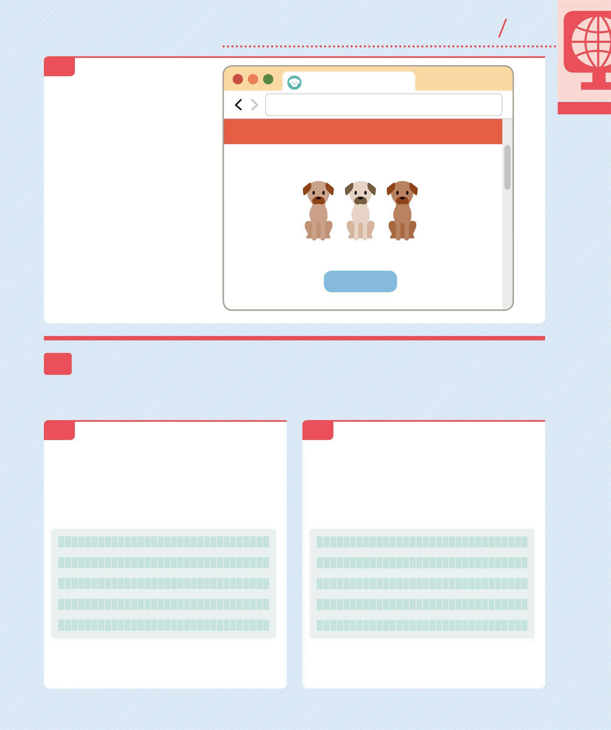
Pet Shop
file:///PetShop/index.html
PET SHOP
Free shipping
Home About Shop Contact
PET SHOP
SHOP NOW
LOVE FISH
THE WIDEST RANGE OF FISHES Indoor and outdoor, we’ve got them all!
CLICK FOR FISH
END Styled website
The long vertical web page from the HTML part of this project will now appear styled, with clearly defined sections and formatted text and images. Adding CSS makes the web page more visual and individual.
Project requirements
To add styling to your web page, you will need the HTML file and images folder from the first part of the project. You can continue using Visual Studio as the development environment.
HTML FILE
IMAGES FOLDER
DEVELOPMENT ENVIRONMENT
YOU WILL LEARN
❯ How to use CSS style sheets ❯ How to create buttons with rollovers ❯ How to add CSS animations and transitions
Time:
2–3 hours
Lines of code: 315
Difficulty level
WHERE THIS IS USED
CSS is used in all modern websites where visual appearance is important. Using CSS, it is possible to give every element of a website a distinct style. A well-presented web page will encourage interaction with the user and will be easier to navigate as well.
1 Setting up Before you can start styling the website, it is necessary to create a special CSS file to contain the code and link it to the HTML file previously created. The following steps will create a dedicated “styles” folder and the CSS file inside it.
1.1 CREATE A NEW FOLDER You will first need to create a new folder in Visual Studio to contain the CSS style sheets. In Windows, right-click on the project name “PetShop” in Solution Explorer. Then, select Add and choose New Folder. Name this folder “styles”. The full path to this folder should be “C:\PetShop\styles”.
On a Mac, open Finder and create a new folder called “styles” inside the website folder “PetShop”. The full path should be “Users/[user account name]/PetShop/styles”. Then, open Visual Studio, right-click on the project name “PetShop”, select Add, and then choose Add Solution Folder.
Solution
PetShop Build PetShop Rebuild PetShop Clean PetShop Unload

View Archive
Run Item Start Debugging Item
Add Add New Project... Add Existing Project...
Add Solution Folder
New File... Add Files...
The solution folder named PetShop
Adds the styles folder inside the solution folder
1.2 ADD A CSS FILE The next step is to create a new CSS file inside the styles folder. Make sure to name the CSS file “global.css”. In Windows, the full path to the CSS file should be “C:\PetShop\ styles\global.css”. On a Mac, the full path to the file should be “Users/[user account name]/PetShop/styles/global.css”. The website folder PetShop should now contain the images folder, the styles folder, and the HTML file.
IMAGES HTML STYLES
PETSHOP
LOCATING FOLDERS
In Windows, if you would like to see where a folder has been created from inside Visual Studio, go to the “Solution Explorer” window, right-click on the folder you want to locate and select Open Folder in File Explorer. This will open an instance of File Explorer at the location of the folder.
On a Mac, to see the location of a folder from inside Visual Studio, go to the “Solution Explorer” window, command-click on the folder you would like to locate and select Reveal in Finder. This will open an instance of Finder at the folder’s location.
1.3 REFERENCE THE CSS FILE It is necessary to link the newly created CSS file to the HTML document so that the styles can be applied to all its elements. This reference to “global.css” file must be made using a <link> tag within the <head> tag of the “index.html” file. The fonts for this web page will be selected from the options
ADD COMMENTS
At the top of the “global.css” style sheet, add a comment with the names of the fonts and the list of colours to be used in the website. Add this information inside a comment block “/* */”. Anything inside a comment block will be ignored by the browser. These comments are only included to help the programmer standardize the style of available in Google Fonts. To do this, you will link the Google Fonts website to “index.html”, and specify the fonts you want to use. The fonts Anton and Open Sans are used here, but you can pick any other font you like.
<head>
<meta charset="utf-8" />
<title>Pet Shop</title> <link rel="icon" type="image/png" href="images/favicon.png"> <link href="styles/global.css" rel="stylesheet" /> <link href="https://fonts.googleapis.com/css? family=Anton|Open+Sans" rel="stylesheet"> </head>
Title to be displayed in the browser tab Link to the custom “global.css” file where all the styles are defined
Link to the CSS style sheets for the Google fonts
1.4
the website and provide an easy reference. Notice that the “font-family” definition contains the name of the primary font being employed, and a secondary font type to use if the first font is not available. You can also choose a different colour scheme for your website if you like.
Text color : #333; Dark blue : #345995; Light blue : #4392F1; Red : #D7263D; Yellow : #EAC435;
Orange : #F46036; */
This font will be used for headings and other prominent text elements
This font will be used for normal paragraph text elements
Hex codes for the colours to be used
HTML
CSS
2 Styling the page elements Now that the CSS file is ready to contain all the style definitions, you can start by adding the styles that affect elements throughout the page. The next few steps will show you how to do this.
2.1 DEFINE THE HEADERS Start by defining the “h1” and “h2” headers used throughout the website. The styles specified here will be applied to each instance of the two headers. Both headers will be styled the same, but with a separate font-size definition.
The “font-family” property defines the preferred font to use and the fallback font type in case the preferred font is not available
Only “h1” headers will have the font size 110px
Only “h2” headers will have the font size 30px
body { } h1, h2 { margin: 0; padding: 0; font-family: "Anton", cursive; font-weight: normal; } h1 { font-size: 110px; } h2 { font-size: 30px; }

The <body> tag appears by default Applies the style definition to all “h1” and “h2” headers on the web page
The headers will use the Anton cursive font
MARGIN AND PADDING
Margin is the space measured from the border, outside of the element. Padding is the space measured from the border, inside the element. There are different ways to describe the margin and padding styles.
MARGIN
BORDER
PADDING CONTENT
STRUCTURE OF MARGIN AND PADDING IN A WEBSITE Code
margin: 40px;
MARGIN STYLES
Output
40px on top, bottom, left and right
20px on top and bottom 40px on left and right
10px on top, 20px on right 30px on bottom, 40px on left
0 on top and bottom and equal space on the left and right (same as centre align)
margin: 20px 40px;
margin: 10px 20px 30px 40px;
margin: 0 auto;
Page elements
Every website is made up of various elements serving different purposes. CSS can add unique styles to every element.
PET SHOP
FONT TYPE
FONT FAMILY
FONT WEIGHT
ADD VERTICAL SPACERS
Each section of the web page can be separated with white space to make a website easy to follow. These white spaces are created through standardized vertical spacers throughout this website. In CSS, you can use compound style signatures to associate the required style definitions.

2.2 ADDING ELEMENTS ON NEW LINES Now create a style for “clear”. This is required if the previous element does not have a fixed height or is set to float to one side. The “clear” property is used with values such as “left”, “right”, or “both”. It prevents floating objects from appearing on the specified side of the element to which “clear” is applied.
.spacer.v20 { height: 20px; } .spacer.v40 { height: 40px; } .spacer.v80 { height: 80px; } .clear { clear: both; }
Compound style signature with the classes “spacer” and “v20”
The height will be 40px if the tag has both “spacer” and “v40” classes
The height will be 80px if the tag has both “spacer” and “v80” classes
2.3
Selects all the elements with the class “clear”
This instruction will place the next HTML element on a new line
USE MULTIPLE CLASSES IN THE HTML TAG TO ACHIEVE MORE MEANINGFUL AND
TARGETED STYLING
2.4 STYLE THE BODY TAG Add the style definitions for the <body> tag from step 2.1. The style signature is “body”. The style definition will set the values for the margin, padding, font, background colour, and font colour.
The default font size for all the text on the web page
body { margin: 0; padding: 0; font-family: "Open Sans", sans-serif; font-size: 15px; background-color: white; color: #333; }
No space between the browser window and the web page
The background colour for the web page
Hex code for dark grey, the font colour for the body text
Styling the individual elements
In this section, you can add styles to the individual HTML elements from the top of the web page down to the bottom. Each section can be seen
3as a horizontal layer, with its own visual style and spacing requirements. Start by adding styles to the first element on the web page – the promo bar.
3.1 DEFINE STYLE SIGNATURES The Promotional Messages, Subscribe, and Footer sections share some of the same style definitions. They all need to be centre aligned, with white text, and a minimum width of 1000px. Add this code below the code added in step 2.3 to give all three style signatures the same definition.

clear: both; } #promo, #subscribe, #footer { text-align: center; color: #fff; min-width: 1000px; }
The selectors apply the same style definition Hex code for the colour white
The elements must be at least 1000px wide
PROMO
IMAGE
CONTACT US
SUBSCRIBE
FOOTER
COPYRIGHT
3.2 BACKGROUND COLOUR FOR PROMO Next, you will add a background colour to the Promotional Messages section to make it more visible on the web page. This style only applies to the promo section.
#promo { background-color: #F46036; }
Hex code for orange in the colour scheme 3.3 ADD PADDING TO THE PROMO DIV Add padding around the text in the Promotional Messages to introduce some space from the border. The style will be applied to all the promotional messages contained within the “promo” div.
The space between the <div> border and its text content Selects all <div> tags within the <promo> tag
SAVE
3.4 VIEW THE PAGE View the page by opening a browser and entering the url into the address bar. In Windows, the url to the file on your local computer will be “file:///C:/PetShop/index.html”. On a Mac, the url will be “file:///Users/[user account name]/PetShop/index.html”. If the page does not update in the browser when you refresh, the browser may have cached a previous version of the site. Empty the browser cache by going to the history settings and selecting “Clear browsing data”. This will force the browser to get the latest files.
Pet Shop
file:///PetShop/index.html
• Home • About Free shipping The promotional messages will now be displayed with the styles applied

3.5 DEFINE THE WRAP CLASS Add style definitions for the “wrap” class created in HTML. Most of the website’s information is contained in this class. The “wrap” div has a fixed width of 1000px. The horizontal margins adjust automatically to keep the <div> in the centre of the screen if the screen width is more than 1000px wide.
color: #333; } .wrap { margin: 0 auto; padding: 0; width: 1000px; } #promo > div { padding: 15px; }
Add this after the code from step 2.4
Aligns the “wrap” element to the centre of the page
TOP MENU
3.6 DEFINE THE TOP MENU Now add the style definitions for the Top Menu section. This panel will run across the full screen and will contain the menu items and logo. Set a fixed height for the menu and add padding in all directions for the list of menu items contained in the panel.
padding: 15px; } #topMenu { height: 60px; } #topLinks { float: right; padding-top: 20px; }
Add this after the code from step 3.3
Space between the “topLinks” border and the list it contains 3.7 DEFINE HORIZONTAL MENU LISTS The menu lists in both Top Menu and the Footer are horizontal, so you can give them the same style definitions. The menu items should align left within their container lists, so that they appear in a horizontal line with the first item on the left.
The two selectors share the same style definition No bullet points will be added to the list items
#topLinks ul, #footer ul { list-style-type: none; margin: 0; padding: 0; overflow: hidden; } #topLinks li { float: left; }
Hides content that overflows the element’s dimensions
The element floats to the left of its container
STYLE THE HYPERLINKS
The hyperlinks in the Top Menu will have one style for their normal state and a different style for when the mouse is hovering over them. The keyword “:hover” is a pseudo-class and instructs the browser to apply that style when the mouse is over the element. Add a “transition” instruction in both style definitions
3.8 to make the mouse-over effect smoother. Here, three versions of the “transition” instruction have been included, each one intended for a different browser. Including multiple instructions for different browsers is not very common, but is required occasionally.
#topLinks li a { color: #333; text-align: center; padding: 16px; text-decoration: none; -webkit-transition: all 250ms ease-out; -ms-transition: all 250ms ease-out; transition: all 250ms ease-out; }
Centre aligns the hyperlink contents No underline beneath the hyperlink
Transition instruction for Google Chrome browser Transition effect when a mouse moves off the hyperlink
Transition definition required by older Microsoft browsers, such as Internet Explorer
#topLinks li a:hover { color: #4392F1; -webkit-transition: all 250ms ease-out; -ms-transition: all 250ms ease-out; transition: all 250ms ease-out; text-decoration: underline; }
Hex code for the colour blue Transition effect when a mouse moves over the hyperlink
Underlines the hyperlink when a mouse hovers over it
TRANSITIONS
All major web browsers use different names for the “transition” property, so your CSS style definitions must include all three versions of the “transition” instruction to ensure that the transition effect renders correctly on the browsers. When a browser is implementing the CSS style definition, it will ignore the instructions intended for other browsers and apply the instructions it understands. A warning message about the invalid CSS properties may appear, but these can safely be ignored.

LOGO STYLES
PET SHOP PET SHOP
3.9 STYLE THE LOGO The next step is to style the logo in the Top Menu. The logo is used three times on the page (in the Top Menu, the Banner, and the Footer), so you can encapsulate the logo font styles in its own class called “logo”. The small logo in the Top Menu is a hyperlink back to the home page, so you will need to define both its normal and hover state.
#topMenu .logo { float: left; padding-top: 13px; font-size: 24px; color: #333; text-decoration: none; } #topMenu .logo:hover { color: #4392F1; } .logo { font-family: "Anton", cursive; }
Places the logo on the left of the “topLinks” element Sets the font size to 24px No underline on the logo hyperlink
This will make the logo appear blue when the mouse hovers over it
The default font for the logo
SAVE
3.10 VIEW THE WEBSITE Save the code and then refresh the page in the browser. The Top Menu section will now be laid out with the small logo on the left and the hyperlinks on the right.
The favicon (see p.221) and page title appear in the browser tab
Styled logo in the Top Menu section now has a transition effect Pet Shop
file:///PetShop/index.html
Free shipping
PET SHOP
Home About Shop Contact The Top Menu appears as a horizontal list of hyperlinks
3.11 STYLE THE BANNER The next section to be styled is the Banner, which will contain the name of the website and an image. First, set the styles for the “banner” div by defining its width, height, and alignment. It should include a background image as well.
3.12 STYLE THE BANNER LOGO Now you can add styles for the logo appearing inside the Banner section. In the HTML document, the logo appearing in the Banner section also has an <h1> tag. So this logo will receive style instructions from both “h1” and “logo” style definitions.
Link to the background image for the banner
#banner { background-image: url("../images/banner.jpg"); background-repeat: no-repeat; background-position: center top; width: 100%; text-align: center; padding-top: 300px; color: #333; }

Centre aligns the contents of the banner
Hex code for dark grey text Space between the top border of the banner and the text inside
#banner .logo { margin-top: 20px; }
The background image should not repeat vertically or horizontally
Selects the “logo” elements inside the banner
Space between the top border of the logo and the element above it
3.13 ADD STYLES TO THE HYPERLINK The next step is to add styles for the “action” div and the “Shop Now” hyperlink. This link style definition will also contain the “transition” instructions to animate the change in styles between the normal and mouse-over states.
#banner #action { font-weight: bold; width: 200px; margin: 20px auto 0 auto; }
#banner #action a { -webkit-transition: all 250ms ease-out; -ms-transition: all 250ms ease-out; transition: all 250ms ease-out; padding: 20px; color: white; text-decoration: none; border-radius: 30px; background-color: #4392F1; }
#banner #action a:hover { -webkit-transition: all 250ms ease-out; -ms-transition: all 250ms ease-out; transition: all 250ms ease-out; background-color: #F46036; padding: 20px 40px; }

The horizontal padding will increase to 40px when a mouse hovers over the button Hex code for the colour orange Style definitions for the div that contains the hyperlink
Three versions of the transition instruction
Hex code for light blue
Transition effect when a mouse moves over the hyperlink
SAVE
3.14 VIEW THE WEBSITE Refresh and view the page in the browser. You can now see the background image in the Banner, and the animated rollover effect on the “Shop Now” link.
4.1 DEFINE THE LEFT COLUMN First, you will define the left column of the feature box. This will take up half of the space available. By default, every new div occupies a new line. However, since this element must float left, the next element (the right column) will appear on the same line.
The banner background image will be displayed above the banner text
The banner call-to-action button with transition effect Pet Shop
file:///PetShop/index.html
PET SHOP
Free shipping
Home About Shop Contact
PET SHOP
SHOP NOW
4 Feature box styling This section will add styles for the “feature box” control, which splits the page into a left column and a right column. The styles for the control
Selects all the elements that have both the “feature” and “leftColumn” classes
.feature .leftColumn { width: 50%; float: left; text-align: center; }
The width of the left column is set at 50% of the container’s width
Aligns the contents to the centre of the left column are defined as classes and are applied to multiple elements on the web page. The class definitions also allow alternating the position of the images on the page.
4.2 DEFINE THE RIGHT COLUMN Add the code below to define the right column. This definition instructs the browser to include a margin on the left of the space available, where the left column will sit.
Selects all the elements that have both the “feature” and “rightColumn” classes
.feature .rightColumn { margin-left: 50%; width: 50%; text-align: center; }
Aligns the contents to the centre of the right column
4.3 STYLE THE NON-PICTURE
ELEMENTS
Now set styles to define the non-picture side of the feature box. In HTML, you used a div with class=“text” (see p.225) to indicate the non-picture elements. You can now define the left and the right text columns with the same definition.
.feature .leftColumn .text, .feature .rightColumn .text { padding: 80px 20px 20px 20px; min-height: 260px; }
Selectors for the “text” divs in the left and right columns
4.4 DEFINE THE NORMAL AND MOUSE-OVER STATE Add this code to define the normal and mouse-over state for the hyperlinks that appear in the “text” divs. Similar to the Shop Now button that you styled earlier, this will also be styled as a button that changes colour when the mouse hovers over it.
Selectors for the <a> tags in the “text” div in the left and right columns
.feature .leftColumn .text a, .feature .rightColumn .text a { -webkit-transition: all 250ms ease-out; -ms-transition: all 250ms ease-out; transition: all 250ms ease-out; padding: 20px; background-color: #4392F1; color: white; text-decoration: none; border-radius: 30px; } .feature .leftColumn .text a:hover, .feature .rightColumn .text a:hover { -webkit-transition: all 250ms ease-out; -ms-transition: all 250ms ease-out; transition: all 250ms ease-out; background-color: #F46036; text-decoration: none; padding: 20px 40px; }

“ease-out” defines the speed of the transition effect
Transition effect when a mouse moves off the hyperlink
Sets rounded corners for the border of the hyperlink
Transition effect when a mouse moves over the hyperlink
The text is not underlined when the mouse hovers over the hyperlink
4.5 DEFINE THE HORIZONTAL RULE You will also need to add a style definition for the horizontal rule appearing in the feature box. This rule will separate the heading of the column from the text below it.
Sets the colour for the horizontal rule to dark grey
Sets the width of the horizontal rule
.feature hr { background-color: #333; height: 1px; border: 0; width: 50px; }
4.6 DEFINE THE IMAGES Now that you have styled the text columns, it is time to define how the images in the “featureImage” div will be styled.
Resizes the image width to 500px. The height will adjust automatically Selects all <img> tags inside the “featureImage” div
.featureImage img { width: 500px; }
SAVE
4.7 VIEW THE STYLE DEFINITIONS Refresh the browser to see the new style definitions being applied to the web page. All the feature boxes will now have the correct styling, with images alternately appearing on the left and right.

Pet Shop
file:///PetShop/index.html
LOVE FISH
THE WIDEST RANGE OF FISHES
Indoor and outdoor, we’ve got them all!
CLICK FOR FISH The image will appear in the right column with the correct width
BROWSER TEST
New CSS features are constantly being added to browsers. However, there is no point using these features unless you are sure that your website users will be able to take advantage of them. Old browsers will ignore modern CSS instructions and the styling of the HTML document will not conform to the expected layout. Fortunately, all modern browsers accept CSS3, though there may be small differences in the way they process some instructions. It is advisable always to test your web page in several different browsers to find the set of functionality that they all have in common.
ADD STYLE TO EMAIL HYPERLINK
In the “index.html” file the “feature” class is used not only to advertize the three product categories, but also for the Contact Us section appearing further down. In this step, you will
4.8 use the “feature” layout definitions to style the Contact Us section, which includes a hyperlink that opens a new email in the user’s email program.
.feature .leftColumn .text a.emailLink, .feature .rightColumn .text a.emailLink { color: white; text-decoration: none;
transition: none; padding: 10px; border: 0; background-color: #4392F1; } .feature .leftColumn .text a.emailLink:hover, .feature .rightColumn .text a.emailLink:hover { -webkit-transition: all 250ms ease-out; -ms-transition: all 250ms ease-out; transition: all 250ms ease-out; background-color: #F46036; }
Selects the “emailLink” hyperlinks in both the left and right columns
The “:hover” pseudo-class selects the hyperlinks when a mouse hovers over them

Hex code for the colour orange
4.9 DEFINE MIDDLE IMAGES The next section that needs to be defined are the images that sit in the middle of the page. The “middleImage” div containers must align their contents to the centre of the div, to make them appear in the middle of the page. The <img> tags should also display the images with a consistent maximum width.
Selects all <img> tags inside divs with the “middleImage” class
.middleImage { text-align: center; }
.middleImage img { max-width: 1000px; }
Aligns the “middleImage” contents to the centre of the page
SAVE
VIEW THE IMAGES
Save the code and then refresh the browser in order to see the updated web page. The image will now appear centre aligned on the page, just below the feature box.
4.10 CHECK THE IMAGE STYLING You will notice that the other instances of the “feature” and “middleImage” divs are all styled correctly throughout the page. This is because you defined those styles as classes, so they can be used multiple times on the same page.
Pet Shop
file:///PetShop/index.html
LOVE FISH
THE WIDEST RANGE OF FISHES Indoor and outdoor, we’ve got them all!
CLICK FOR FISH
4.11
Pet Shop
file:///PetShop/index.html
HAPPY DOGS
EVERYTHING YOUR DOG NEEDS Make sure your pooch eats well and feels good with our range of doggie treats.
CLICK FOR DOGS
The “fishImage” element will be centre aligned The “dogImage” element will be centre aligned
5 Styling the remaining elements Now that you have defined the styles for the main elements of the web page, you can continue adding style definitions for the remaining sections. In the next few steps, you will style the scroll button, the map, the subscribe section, and the footer.

5.1 STYLE THE
SCROLL BUTTON
Now you need to add style definitions to the “Scroll to top” button. The button should have 50 per cent opacity in its normal state, and should display at 100 per cent opacity when the mouse hovers over it. The “Scroll to top” button should be set to invisible when the page opens. The button will be activated in the third part of this project, using JavaScript (see pp.292–95).
#scrollToTop {
display: none; The button is invisible when opacity: .5; the page opens background-color: #F46036; Sets the colour of the button to orange
padding: 0 20px; color: white; width: 26px;
Sets the size of the up-arrow font-size: 40px; text in the button
line-height: 48px;
The button stays in a fixed position in the bottom-right corner of the page
The hover state is active when a mouse moves over the button
position: fixed; right: 10px; bottom: 10px; border: 1px solid white; border-radius: 30px; } #scrollToTop:hover { opacity: 1; -webkit-transition: all 250ms linear; -ms-transition: all 250ms linear; transition: all 250ms linear;
cursor: pointer; }
5.2 STYLE THE CONTACT US SECTION The next section of the page that needs styling is Contact Us. The “feature” div has previously defined its two columns. The left column contains the text elements while the right has an embedded map from Google Maps. You will need to add an instruction to format the map’s “iframe” element correctly. Then, save the code and refresh the browser to check if the section is displaying correctly.

The map width will be 100% of the space available in the right column
Pet Shop
file:///PetShop/index.html
.contactMap { width: 100%; height: 400px; }
The email call-to-action button, styled in step 4.8
EMAIL: CONTACT US
TEL: 012-345-6789
INFO@PETSHOP.COM
Pet Shop 80 Strand London WC2R 0RL A white border around the orange button makes it easier to see
The cursor is displayed as a pointer
SAVE
A dot on the Google map shows the exact location of the address
5.3 STYLE THE SUBSCRIBE SECTION The next element to be styled is the Subscribe section. This will appear below the Contact Us section on the web page. Add this code to set the style definitions for the Subscribe panel and the heading appearing inside it.
#subscribe h2 { margin: 15px 0 20px 0; color: white; font-size: 24px; font-family: "Open Sans", sans-serif; font-weight: bold; }
Hex code for light blue. Sets the background colour of the Subscribe section
Distance between the text and the top border of the Subscribe panel
Sets the text to white
Specifies the font used for the “h2” headers

5.4 STYLE THE INPUT FIELD The Subscribe section has a text field where users can enter their email address. Add styles for this text input field to define its size and appearance, as well as the style of the placeholder text that will appear inside it.
#subscribe input[type=text] { border: 0; width: 250px; height: 28px; font-size: 14px; padding: 0 10px; border-radius: 30px; }
Ensures that only text fields are selected
No border around the email address text input box
Adds space to the sides of the text input box
file:///PetShop/index.html
SUBSCRIBE TO OUR MAILING LIST
JOIN NOW
5.5 STYLE THE SUBSCRIBE BUTTON Add the code below to define styles for the “subscribe” <input> button and its hover state. The button will implement a transition on the “background-color” from dark blue to orange when a mouse moves over it, and then back to dark blue when the mouse moves off it.
Selects the input button in the “subscribe” div
#subscribe input[type=submit] { border: 0; width: 80px; height: 30px; font-size: 14px; background-color: #345995; color: white; border-radius: 30px; -webkit-transition: all 500ms ease-out; -ms-transition: all 500ms ease-out; transition: all 500ms ease-out; cursor: pointer; } #subscribe input[type=submit]:hover { background-color: #F46036; -webkit-transition: all 250ms ease-out; -ms-transition: all 250ms ease-out; transition: all 250ms ease-out; }
Sets the button width to 80px
The cursor will be displayed as a pointer when the mouse is over the button

Repeat the transition instructions for the mouse-over effect Hex code for the colour dark blue
Transition instructions
Hex code for orange in the colour scheme
5.6 VIEW THE WEBSITE Save the code and refresh the browser to view the updated web page. Ensure that the panel is appearing below the Contact Us section and rendering correctly.
STYLE THE FOOTER
You can now style the footer for the web page. Start by adding styles for the “footer” div, and then add styles for the unordered list and the list items containing the links.
The text is aligned to the centre of the left column
A placeholder text hint inside the email text input box Pet Shop
file:///PetShop/index.html
EMAIL: CONTACT US
TEL: 012-345-6789
INFO@DKPETSHOP.COM
Pet Shop 80 Strand London WC2R 0RL
SUBSCRIBE TO OUR MAILING LIST
Enter your email address Join Now The button with rounded borders and transition effect will be displayed
5.7

Sets a fixed height for the Footer section
Does not show bullet points in the unordered list
No space between the list border and the list items
Displays as an inline-block element to allow padding and margin
Places the list items next to one another from the left
#footer { background-color: #F46036; height: 80px; } #footer ul { list-style-type: none; margin: 28px 0 0 0; padding: 0; overflow: hidden; display: inline-block; }
#footer li { float: left; }
5.8 ADD STYLES TO THE FOOTER HYPERLINKS Next, you will need to add styles for the hyperlinks that appear within the Footer section. When the mouse hovers over them, the colour of the text will change from white to black.
Styles will be applied to all anchor tags that are inside list items within the “footer” div
#footer li a { color: white; text-align: center; padding: 20px; text-decoration: none; font-size: 18px; -webkit-transition: all 250ms linear; -ms-transition: all 250ms linear; transition: all 250ms linear; }
#footer li a:hover { color: #333; -webkit-transition: all 250ms linear; -ms-transition: all 250ms linear; transition: all 250ms linear; }

STORE FINDER
SHIPPING
The footer hyperlink text will appear in white
The hyperlink text will not be underlined
The text colour of the footer hyperlink will change to dark grey
FAQ
5.9 STYLE THE COPYRIGHT SECTION The last element to style is the Copyright section. In this step you will add styles for the “copyright” div and the logo it contains. Add this code and then refresh the browser to check if the Footer and Copyright sections are displaying correctly.
Aligns the “copyright” contents to the centre of the page
Selects the tag with the id “copyright”
Overrides the default style definiton for “logo” with a sans-serif font
#copyright { text-align: center; background-color: #345995; color: white; height: 40px; padding-top: 18px; font-size: 16px; }

#copyright .logo { font-family: "Open Sans", sans-serif; font-weight: bold; }
The “copyright” text will appear in white
Space between the top border of the “copyright” section and its text
Selects the tag with class “logo” inside the tag with id “copyright”
SAVE
Pet Shop
file:///PetShop/index.html
SUBSCRIBE TO OUR MAILING LIST
Enter your email address Join Now
Store Finder Shipping FAQ
© 2020 PET SHOP
The copyright text appears in the centre of the page with an HTML entity for the copyright symbol