52 minute read
PROJECT: Responsive website


Responsive website
Responsive layouts enable programmers to create and publish the same content on any digital platform. This is achieved through a clever use of HTML and CSS. In this project, you will use HTML, CSS, and JavaScript, as well as JQuery and Bootstrap, to create a responsive website.
Advertisement
How it works
The focus of this project is to build a responsive website using JQuery and Bootstrap (see pp.284–85). Each element of the website will be programmed using HTML, CSS, and JavaScript at the same time, to see how they work together to achieve a visual effect. You will use JQuery in the custom scripts to target HTML elements, and then use Bootstrap to add responsiveness to the website.
Hamburger button
TRAVEL-NOW
file:///Travel-now/index.html
TRAVEL-NOW
START
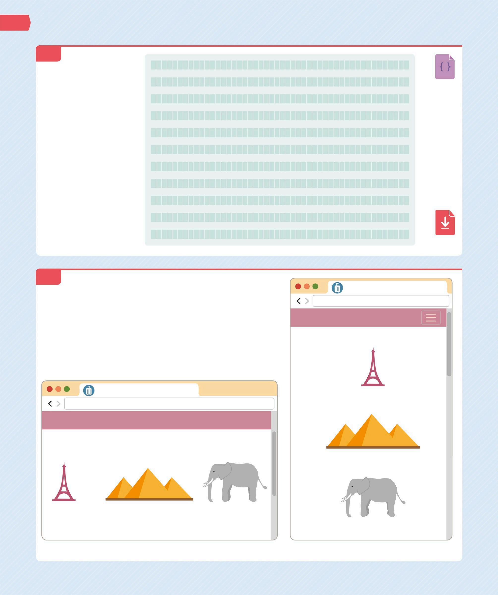
Build a responsive home page using HTML, CSS, and JavaScript
The elements adjust their size and align vertically when the screen size is reduced
Final website
The website created in this project will be divided into several sections, many of which will contain hyperlinks to other pages of the website. All the elements will be programmed to make them fit any size of screen.
TRAVEL NOW
We all dream of a great holiday. Contact us to make your dream come true!
NARROW SCREEN
TRAVEL-NOW
file:///Travel-now/index.html
TRAVEL-NOW Home Deals Contact Us
Create a master-page template and then duplicate it to produce the other pages of the website TRAVEL NOW
END
YOU WILL LEARN
❯ How to use Bootstrap grid layout ❯ How to use Bootstrap controls in your website ❯ How to use JQuery to target
HTML elements
TIME:
3–4 hours
Lines of code: 659
Difficulty level
WHERE THIS IS USED
Responsive layouts allow the website to be programmed once and to render correctly on a variety of devices, such as desktops, tablets, and smartphones. This compatibility with varying screen sizes means that this technology is often used by sites to reach a wider audience.
Project requirements
This project will require several programming elements to build the website.
Text files
You will need HTML, CSS, and JavaScript files to build this website. You can either use a simple text editor to create them or a dedicated IDE like the one used in this project.
Development environment
The IDE (see pp.208–209) “Microsoft Visual Studio Community 2019” is used in this project. It supports a large variety of programming languages and paradigms.

Browser
The Google Chrome browser is used to run the code in this project. Its “Developer Tools” can be used to better understand what you see in the browser. However, you can use any browser you are comfortable with.
Images
Get a copy of the images folder for this project from www.dk.com/coding-course. These images will be used to build the website. You can also use your own images if you like.
1 Getting started To create this project, you first need to install Visual Studio (see p.217). You can then add all the essential folders and files that are required to create the home page of the website.
TRAVEL-NOW
file:///Travel-now/index.html
NAVIGATION BAR
FEATURE IMAGE AND TITLE
This layer will contain a company logo and the Top Menu links to other pages on the site
This layer will display a sentence about travelling that will change every five seconds
This layer will be a carousel with images that will link to other pages on the site
PRIMARY MESSAGE
QUOTE
POPULAR DESTINATIONS
LAST MINUTE DEALS
COPYRIGHT
Home page design
The elements of a home page can be understood as a series of horizontal layers that sit one above the other. This home page will have seven layers. Some of its common elements will be repeated on every page of the website.
1.1 CREATE THE FOLDERS The first step is to create a website folder on your computer to contain all the files for this website. Name the folder “Travel-now”. Then, open a new project in Visual Studio and create a solution file called “Travel-now.sln” and save it in the website folder. Follow the steps from Build a web page (see pp.218–19), to do this. Paste the previously downloaded images folder inside the website folder. The path to the website folder on your computer should be as shown below. 1.2 ADD AN INDEX FILE Follow the instructions given in Build a web page (see p.219) to create an “index.html” file. Add this file to the website folder. Visual Studio will create the file with the minimum code required for a valid HTML page (see p.220). If you are using another development environment, you may need to type the code into the new index file.
Users/[user account name]/Travel-now
MAC
C:/Travel-now
WINDOWS INDEX.HTML
ADD A STYLE SHEET
Now add a “styles” folder for the website (see p.243). Then, add a new CSS file called “global.css” inside the styles folder. The styles defined in this file will apply to all the pages of the website. In Windows, right click on the styles folder and select Add. Then, choose Add a new item and select Style Sheet.
1.3 On a Mac, right click on the styles folder and select Add, then choose New File. Go to Web and select Empty CSS File and save it. Now add the colour and font references for the website at the top of the CSS file. You can refer to these later when you need them.
CSS
Comments contained within these marks are ignored by the browser Font used for headings and logos

font-family: "Merriweather", serif; font-family: "Open Sans", sans-serif; font-family: "Merienda One", cursive; Text color : #000; Dark blue : #345995; Light blue : #4392F1; Red : #D7263D; Yellow : #EAC435;
Mauve : #BC8796; Silver : #C0C0C0; Light gray : #D3D3D3; */
Font used for normal paragraph text
Font used in the “quote” section
Hex codes for the colours used on the website
1.4 ADD STYLES TO
THE BODY
Add the style definitions for the <body> elements below the comment section. This will set the values for the margin and padding (see p.245), font, font colour, and background colour. As these styles are applied to the <body> elements, they will be used for all the text elements in the document. You can override the default font styles for the headings, buttons, and hyperlinks later.
Sets the font and colour definitions
body { margin: 0; padding: 0; font-family: "Open Sans", sans-serif; font-size: 15px; color: #000; background-color: white; }
Instructs the browser to make the <body> element fit the entire width and height of the screen
CSS
1.5 ADD SPACERS Next, add style definitions for the vertical spacers that will be used throughout the website. These will create standardized white spaces between the various sections of the page.
CSS
Compound style signature with classes “spacer” and “v80”
.spacer.v80 { height: 80px; } .spacer.v60 { height: 60px; } .spacer.v40 { height: 40px; } .spacer.v20 { height: 20px; }
This spacer can only be applied to an element that has both “spacer” and “v20” in its “class” attribute value 1.6 STYLE THE HEADERS The next element to be styled are the headers. Define the font styles for the “h1”, “h2”, and “h3” headers that will be used throughout the website. All the headers will have the same font, but a different font-size definition. Add this code just after the spacers added in the previous step.
Font used by all the headers
h1, h2, h3 { font-family: "Merriweather", serif; } h1 { font-size: 60px; } h2 { font-size: 30px; } h3 { font-size: 20px; }
This property defines the preferred font to use and a second font type in case the preferred font is not available Only “h1” headers will have the font size 60px Only “h2” headers will have the font size 30px
Only “h3” headers will have the font size 20px
CSS
1.7 STYLE THE CORNERS Many elements of the website will require rounded corners. Reuse the “roundedCorners” class so this visual characteristic can be shared by the elements. If only one number is stated in the border-radius definition, then all four corners will exhibit that property. Add this code to “global.css” just after the code from the previous step.
Only the top and bottom corners are rounded
.roundCorners { border-radius: 15px; } .roundCorners.top { border-radius: 15px 15px 0 0; } .roundCorners.bottom { border-radius: 0 0 15px 15px; }
This definition applies to all the four corners
CSS
These refer to the four corners – topLeft, topRight, bottomRight, and bottomLeft
1.8 ADD A SCRIPTS FILE Now add a new folder called “scripts” to the website folder. This will hold all the JavaScript files for the project. In the Solution Explorer window, right click on the project name Travel-now to create the folder. Then, create a new JavaScript file called “app.js” and add it to the scripts folder. Follow the instructions given in Animating a web page (see p.291) to create this file.
1.9 MAKE A FUNCTION Add this code inside the “app.js” file. This will declare a variable called “app” that is a self-executing function. Add a property called “websiteName” and a method called “getWebsiteName” inside it as an example of how to add functionality to the app class.

This file will contain an “app” class function that will be instantiated to hold all the global scope variables
APP.JS SCRIPTS TRAVEL-NOW
Round brackets around the function instruct the JavaScript Engine to run that function immediately
var app = (function () { /* Properties */ var websiteName = "TRAVEL-NOW"; /* Methods */
return { getWebsiteName: function () { return websiteName; } } })();
Name of the website
JS
2 Creating the navigation bar The first element to be created is the navigation bar on the home page. This bar will appear on all the pages of the website. In this section, you will program the navigation bar and then add some hyperlinks to it that will connect to all the other pages of the website.
2.1 ADD THE TITLE AND FAVICON Go to the “index.html” file. Inside the <head> tag, add a <meta> tag with the “viewport” definition as shown. This allows the HTML document to adjust its content to fit the screen. Without the viewport meta definition, a browser with a narrow screen will zoom out to try and show the whole page on the screen. Next, add a <title> tag and then the favicon (see p.221) definition.
2.2 ADD THE MODULES Now add references to the JQuery and Bootstrap JavaScript files in the HTML file. Inside the <head> tag, add the <script> tags and <link> tags just below the <link> tag to the favicon. The “src” attributes in the <script> tags point to the online location of the modules from where they can be retrieved.
HTML
<head>
<meta charset="utf-8" />
<meta name="viewport" content="width=device-width, initial-scale=1, shrink-to-fit=no"> <title>TRAVEL-NOW</title>
Instructs the browser to display the HTML document at the correct resolution
This text will appear as the tab title in the browser
This attribute points to the “favicon.png” file in the images folder

This <script> tag for Bootstrap contains an “integrity” attribute that ensures the downloaded file has not been manipulated
<link rel="icon" type="image/png" href="images/favicon.png"> <script src="https://code.jquery.com/jquery-3.3.1.min.js"> </script> <script src="https://stackpath.bootstrapcdn.com/bootstrap/ 4.2.1/js/bootstrap.min.js" integrity="sha384-B0UglyR+jN6Ck vvICOB2joaf5I4l3gm9GU6Hc1og6Ls7i6U/mkkaduKaBhlAXv9k" cross origin="anonymous"></script>
Reference to the JQuery file
HTML
The “src” attribute in this tag <script src="scripts/app.js"></script> points to the “scripts/app.js” file
<link rel="stylesheet" href="https://stackpath.bootstrap cdn.com/bootstrap/4.2.1/css/bootstrap.min.css" integrity= "sha384-GJzZqFGwb1QTTN6wy59ffF1BuGJpLSa9DkKMp0DgiMDm4iYM j70gZWKYbI706tWS" crossorigin="anonymous"> <link href="https://fonts.googleapis.com/ css?family=Merienda+One|Merriweather|Open +Sans" rel="stylesheet"> <link href="styles/global.css" rel="stylesheet" />
Link to the custom CSS file – global.css The custom CSS file is added at the end as it must overwrite the default Bootstrap CSS definitions
ORDER OF TAGS
The order in which you declare the JavaScript files is important. This is because JavaScript functions must be loaded into the JavaScript Engine before they can be called. For example, JQuery must be loaded before Bootstrap because Bootstrap uses JQuery to execute its functions. This is also true for your custom JavaScript files. They must be added to the HTML after the JQuery and Bootstrap files in order to call their functions.
JQUERY
BOOTSTRAP
APP.JS
OTHER CUSTOM JAVASCRIPT FILES
Link to the Bootstrap CSS file
Imports the fonts used in the website
2.3 ADD A BOOTSTRAP
NAVIGATION BAR
Next, inside the <body> tag, add a <nav> tag to contain all the Bootstrap navigation bar elements. If the screen is wide enough, it will display the Top Menu list horizontally along the top of the page. If the screen is narrow, then the Top Menu will be replaced by a “hamburger menu” button – a button resembling a hamburger, used to toggle a menu or navigation bar. When this button is clicked, the Top Menu will display a vertical list.
Tells the navbar when to collapse to a hamburger menu button
Fixes the navbar Sets the background position at the top colour to mauve
HTML
2.4 ADD A BOOTSTRAP CONTAINER The navbar must run across the full width of the screen, but the Top Menu logo and hyperlinks must only occupy the centre of the page where all the page contents will go. Add a <div> with class = “container” inside the <nav> tag. This Bootstrap class defines the margins on the left and right of the element. Then, inside the “container” div, add an <a> tag to display the company logo. When clicked, this will hyperlink to the home page.
HTML
<nav class="navbar navbar-expand-md navbar-dark fixed-top bg-mauve"> <div class="container"> <a class="navbar-brand logo" href="index.html">TRAVEL-NOW </a> </div> </nav>
Contains all the HTML elements that need to appear centred on the page
This Bootstrap CSS class specifies that the element must appear inline with some padding and margins This custom CSS class defines the font to be used for the logo
2.5 DEFINE THE HAMBURGER BUTTON Inside the “container” div, below the “navbarbrand” </a> closing tag, add the “navbar-toggler” <button> tag. This element will perform the “hamburger menu” button functionality. When clicked, the button displays the Top Menu as a vertical drop-down list.
HTML
This attribute manages the state of the drop-down menu
</a> This class contains <button class="navbar-toggler" type="button" data-toggle= display properties, such as margin "collapse" data-target="#navbarCollapse" aria-controls= and padding
"navbarCollapse" aria-expanded="false" aria-label= "Toggle navigation"> <span class="navbar-toggler-icon"></span> </button> </div>
The “aria” classes are used by assistive technologies, such as screen readers for the blind, to make sense of the complex HTML
2.6 ADD HYPERLINKS TO THE NAVBAR Next, add the “navbarCollapse” div, which will contain an unordered list of the actual hyperlinks that will appear in the Top Menu of the website: Home, Deals, and Contact Us. Place it inside the “container” div, just below the closing tag for the “navbar-toggler” </button>. Then add a spacer div after the </nav> closing tag.
</button>
<div class="collapse navbar-collapse" id= "navbarCollapse"> <ul id="topMenu" class="navbar-nav mr-auto"> <li class="nav-item active">
<a class="nav-link" href="index.html">
Home <span class="sr-only">(current) </span></a> </li>
<li class="nav-item">
<a class="nav-link" href="deals.html">
Deals</a>
</li>
<li class="nav-item">
<a class="nav-link" href="contact.html">
Contact Us</a>
</li>
</ul>
</div>
</div>
</nav>
<div class="spacer v80"></div>
Indicates whether the navbar is in the “collapse” or “full-screen” state Contains style definitions for the unordered list
Contains style definitions for the list items that will appear as a horizontal or vertical list, depending on the width of the screen
Anchor tags hyperlink to other pages on the website

Closing tag for the “navbarCollapse” div Closing tag for the “container” div
Closing tag for the “navbar” div Each <a> tag is a member of the “nav-link” class, which specifies mouse-off and hover style definitions for the navbar hyperlinks
Adds a vertical height of 80px between the navbar and the next element
2.7 SPECIFY THE BACKGROUND COLOUR Now go to the “global.css” style sheet to set the background colour of the navigation bar. Add this code immediately after the lines added in step 1.7 to set the style definition for this bar.
.bg-mauve { background-color: #BC8796; }
HTML
SAVE
CSS
2.8 STYLE THE LOGO The next step is to style the logo that appears in the Top Menu. Add the “logo” class to specify the font to use for the company logo. Then add style definitions for the logo that appears in the navbar. The navbar logo is a hyperlink, so you will need to define both its normal and hover states. If you are unsure what CSS style definitions are acting on an element, use the Developer Tools (see p.281) in Chrome to view the styles.
RUN THE PROGRAM
Now test the code to see if the navigation bar renders correctly. In the Solution Explorer window, right click on “index.html” and open the file in the browser of your choice. You can also open the browser and type the website’s url into the address bar. In Windows, the url will be “file:///C:/Travel-now/index.html”. On a Mac, the url will be “file:///Users/[user account name]/Travel-now/index.html”.
Hover state of the hyperlink
.logo { font-family: "Merriweather", serif; font-weight: bold; } .navbar-brand.logo { color: white; } .navbar-brand.logo:hover { color: white; }
The default font for the logo Normal state of the hyperlink This will ensure the logo remains white when the mouse hovers over it
CSS
SAVE
2.9
TRAVEL-NOW
file:///Travel-now/index.html
TRAVEL-NOW Home Deals Contact Us
WIDE SCREEN
TRAVEL-NOW
file:///Travel-now/index.html
TRAVEL-NOW
Home
Deals
Contact Us
NARROW SCREEN
3 Adding a feature image The next element of the home page that needs to be managed is the feature image. Each page on the website will have a “feature image” banner that will cover the entire width of the page and contains the page title.
3.1 CENTRE THE CONTENTS Go to “index.html”, and after the “spacer v80” </div> closing tag, add a “container” div so that all the contents appear centred on the page, regardless of the width of the screen.
</div>
HTML
ADD THE FEATURE IMAGE BANNER
Now, inside the “container” div, add the feature image for the home page and an “h1” header with the title of the page. You can even use a different image on each page
3.2 of the website if you like. The “homeIndex” and “featureImage” classes are used to specify the background image for the home page.
<div class="container">
<div class="featureImage roundCorners homeIndex"> <div class="text">
<h1>
TRAVEL-NOW
</h1>
</div>
</div>
The “featureImage” div will appear on every page The “homeIndex” class specifies the background image to be used for the home page
Text that appears in front of the image
Closing tag for the “featureImage” div Closing tag for the “text” div
HTML
SAVE
CENTRE THE IMAGE
Open the “global.css” file and add some styles to specify the position of the feature image on a page. These styles allow the browser to automatically fit the image to any size of screen. Add this code to the end of the CSS file.
3.3 STYLE THE IMAGE TEXT Now add some code to style the text that will appear in front of the image. The “text” div defines a space in the middle of the “featureImage” div, which will contain the heading.
CSS
.featureImage { width: 100%; position: relative; height: 400px; background-size: cover; background-position: center; } .featureImage.homeIndex { background-image: url (../images/ feature.jpg); }
Specifies the width and height of an image Specifies the actual image file that will be displayed on the page
3.4
CSS
.featureImage .text { margin: 0;
Specifies the color: black; text colour
position: absolute; top: 50%;
left: 50%; Positions the text to start in the middle width: 80%; of the page
color: #000; text-align: center; -webkit-transform: translate
(-50%,-50%); transform: translate
(-50%,-50%); }
Repositions the text so that it fits in the middle of the page
3.5 ADD RESPONSIVENESS The name of the website needs to be displayed at different font size, depending on the width of the screen. Use the “@media screen” instructions to tell the browser which definitions to apply according to the size of the screen.
@media screen and (max-width: 400px) { .featureImage .text h1 { font-size: 22px; } } @media screen and (min-width: 401px) and (max-width: 767px) { .featureImage .text h1 { font-size: 32px; } } @media screen and (min-width: 768px) { .featureImage .text h1 { font-size: 80px; } }

Size of the “h1” header at the minimum screen width Instructs the browser to change the font size depending on the width of the screen
Size of the “h1” header when the screen width is changing Size of the “h1” header at the maximum screen width
3.6 RUN THE PROGRAM Save all the files and refresh the web page in the browser to see what the website looks like at this point. The feature image and its text should resize according to the width of the screen.
TRAVEL-NOW file:///Travel-now/index.html
TRAVEL-NOW
Home Deals Contact Us
TRAVEL-NOW file:///Travel-now/index.html
TRAVEL-NOW
CSS
SAVE
TRAVEL-NOW
TRAVEL-NOW
4 Adding a message The next step is to manage the “primary message” section of the website. This message is a paragraph of text that will display the main intention of the page in a prominent font.
ADD THE MESSAGE TEXT
Open “index.html”. Then, within the “container” <div> add another <div> tag with class=“primaryMessage”. Place this new <div> immediately after the closing tag
4.1 for the “featureImage” </div>. This will contain the paragraph of text you want to display on the website.
</div>
Closing tag for the “featureImage” div
<div class="primaryMessage">
<p> We all dream of a great holiday. <br />
The paragraph tag
Contact us to make your dream come true! </p>
</div> Closing tag for the “primaryMessage” div
HTML
Contents of the primary message
SAVE
4.2 STYLE THE MESSAGE Now go to the “global.css” file and add some style definitions to the message. These styles will apply to both wide and narrow screens. 4.3 ADD RESPONSIVENESS The message will be displayed with different font sizes, depending on the width of the screen. Add this code below the “.primaryMessage” style definition.

CSS
font-size: 80px; } } .primaryMessage { color: #000; margin: 0 auto; text-align: center; padding: 60px 0; max-width: 80%; }
“auto” sets the horizontal margins at equal width
The width of the “primaryMessage” cannot be more than 80% of the parent “container” div
@media screen and (max-width: 575px) { .primaryMessage { font-size: 18px; } } @media screen and (min-width: 576px) { .primaryMessage { font-size: 23px; } }
Sets the size of the font when the screen width is less than 576px wide Sets the size of the font when the screen width is more than 575px wide
CSS
4.4 VIEW THE MESSAGE Save all the files and then refresh the web page in the browser to see if the message is rendered correctly. The primary message will be displayed immediately after the feature image, and its text will resize according to the width of the screen.
TRAVEL-NOW
file:///Travel-now/index.html
TRAVEL-NOW Home Deals Contact Us
TRAVEL-NOW
file:///Travel-now/index.html
TRAVEL-NOW
We all dream of a great holiday. Contact us to make your dream come true!
WIDE SCREEN
Displays the message with the larger font size
NARROW SCREEN
The font size changes according to the width of the screen
5 Adding a quote The next element to be added is a Quote section. You will structure the section using HTML, and then add style definitions in CSS to specify the basic layout properties and colours. Finally, using JavaScript, you will make this section cycle through the quotes, making them appear one at a time.
5.1 ADD A SCRIPT TAG In the <head> section of the “index.html” file, add a <script> tag to link a custom JavaScript file to the HTML file. Add this code below the closing </script> tag for “app.js”. This instructs the browser to include the “home.js” file when the page is loading. The new custom file will be created later using JavaScript.
HTML
The “src” attribute points to the external “home.js” file
QUOTE OF THE DAY “Travelling - it leaves you speechless, then turns you into a storyteller” Ibn Battuta
5.2 ADD THE QUOTE TEXT Now add the “quote” div just after closing </div> tag for the “primary message”. This will contain the text for all the quotes, including names of the people who made them. All the quote
items, except the first, will have an inline style definition “display:none”, so that when the page loads, only the first quote item is visible.
</div>
<p> The journey not the arrival matters. </p> <span>T.S. Eliot</span> </div>
<div class="quoteItem" style="display:none;">
<p> Jobs fill your pocket, but adventures fill your soul. </p> <span>Jaime Lyn Beatty</span> </div>
</div>
<div class="spacer v40"></div>
Closing tag for the “primaryMessage” div
This tag contains the quote text This tag is used for applying styles to inline elements

Adds a vertical height of 40px between the “quote” div and the next element
5.3 STYLE THE QUOTE Next, open the “global.css” file and add the style definitions for the “quote” div. These styles will specify the text alignment, padding, background colour, and text colour of the quotes. Add this code immediately after the “@media screen” instructions for the primary message.
Defines the vertical space occupied by the quote section
.quote { text-align: center; padding: 60px 20px; background-color: #4392F1; color: white; height: 180px; position: relative; }
Aligns the contents to the center of the “quote” div Hex code for light-blue colour
HTML
The second “quoteItem” will not be visible when the page appears
SAVE
CSS
5.4 ADD RESPONSIVENESS The quote section needs to be displayed at a different size, depending on the width of the screen. Add a style definition for the “quote” div that will only apply when the screen width is more than 766px wide.
Adjusts the vertical space occupied by the quote section
position: relative; } @media screen and (min-width: 767px) { .quote { height: 220px; } }
CSS
5.5 POSITION THE TEXT Now add some style definitions for all the “quoteItems” elements, below the code for step 5.4. These will define the basic layout properties of all the text elements in the quotes.
Repositions the “quoteItem” up by 50% of its height and left by 50% of its width, so that it aligns exactly in the middle of the “quote” section
.quote > .quoteItem { max-width: 60%;
margin: 0; color: white; position: absolute; top: 50%; left: 50%; text-align: center; -webkit-transform: translate(-50%,-50%); transform: translate(-50%,-50%); }
The width of the “quoteItem” cannot be more than 60% of the width of the parent “quote” div Positions the top-left corner of the “quoteItem” element in the middle of the parent “quote” div
5.6 DEFINE THE FONTS
AND MARGINS
The <p> element style definition declares the font styles to be used for each quote item. It also sets the margin that appears below each paragraph. Add these lines just below the code from step 5.5.
Vertical space between the paragraph and the <span> element below it
.quoteItem p { font-family: "Merienda One", cursive; font-size: 20px; font-weight: normal; margin-bottom: 5px; }
Displays the quote text in a cursive font
CSS
CSS
5.7 INSERT QUOTATION MARKS Now use CSS selectors to instruct the browser to insert quotation marks automatically around the <p> element. The “content” definition specifies which quotation mark is to be inserted.
Specifies the basic layout properties of the quotation marks
.quoteItem p:before { color: #EAC435;
content: open-quote; font-size: 40px; line-height: 20px; margin-right: 5px; vertical-align: -13px; } .quoteItem p:after { color: #EAC435; content: close-quote; font-size: 40px; line-height: 20px; margin-left: 5px; vertical-align: -13px; }
CSS
Instructs the browser to insert the “open-quote” character
Hex code for the colour yellow
Instructs the browser to insert the “close-quote” character
Lowers the element by 13px below the baseline
5.8 STYLE THE
QUOTE MARKS
You can now add style definitions to adjust the font size for the quote text and the spacing of the quotation marks, depending on the width of the screen. Then, set the styling for the <span> tag that contains the name of the source of the quote.
Adjusts the vertical alignment of the “close-quote” character
@media screen and (max-width: 766px) { .quoteItem p { font-size: 14px; } .quoteItem p:before { vertical-align: -12px; } .quoteItem p:after { vertical-align: -17px; } }
Adjusts the size of the quote font Adjusts the vertical alignment of the “open-quote” character
CSS
5.9 CREATE A JAVASCRIPT FILE You will need a new custom JavaScript file to contain the functionality required by the home page. To create this file, go to the Solution Explorer window, right click on the scripts folder, select Add and then select Add New Item in Windows, and New File on a Mac. Name the file “home.js”. Then, add a Home() function and another on document ready() function below it. This function is a JQuery command that will tell the JavaScript Engine to wait until all the elements on the page have finished loading before running the code in the $(document).ready() function.
5.10 APPLY PROPERTIES
TO THE QUOTE
Just below the Home() function, add a property called “quoteControl” that contains all the variables used by the quote section to manage itself.
Index of the “quoteItem” div that is currently visible
Holds a reference to the JavaScript “setInterval” command, which instructs the JavaScript Engine to repeatedly call the function to show the next quote
SAVE
function Home() { } $(document).ready(function () { /* Instantiate new Home class */
app.home = new Home(); });
The “app” object has already been instantiated in the “app.js” file Font size of the <span> text when the width of the screen is more than 766px
Instantiates the Home() function as a property of the “app” object
JS
function Home() { /* Properties */ this.quoteControl = { quoteItems: null, currentItem: 0, numberOfItems: 0, interval: null, repeatPeriod: 5000 }; }
This object has four properties Contains the list of <div> tags with quotes Number of <div> tags with quotes
JS
5.11 INITIALIZE THE QUOTE Inside the Home() function, add a method below the “quoteControl” declaration to initialize the quote section. This function can be accessed as a property of the “app.home” instance declared in te $(document).ready() function.
}; /* Methods */
this.initialiseQuoteControl = function () { /* Get all items in quote bar */ let quoteItems = $(".quoteItem"); /* Set values */
this.quoteControl.quoteItems = quoteItems; this.quoteControl.numberOfItems = quoteItems.length; /* Initiate quote loop to show next item */ let self = this; this.quoteControl.interval = setInterval(function () { self.showNextQuoteItem(self); }, this.quoteControl.repeatPeriod); }
Sets the values of the properties contained in the “quoteControl” object and starts the loop to show the next quote item
The variable quoteItems is defined as the array of all the <divs> that have the class “quoteItem”
The variable self retains the reference to the instance of the “Home” class Instructs the JavaScript function to repeat the call to the
showNextQuoteItem()
function every 5,000 milliseconds
JS

5.12 ANIMATE THE QUOTE Now add the showNextQuoteItem() function below the code from step 5.11. This method will hide the current quote item, and when that is complete, it will determine the index of the next quote item and make it visible. If the current quote item is the last item in the list, then the next quote item will be the first quote item in the list.
this.showNextQuoteItem = function (self) { /* fade out the current item */
$(self.quoteControl.quoteItems).eq(self.quoteControl. currentItem).fadeOut("slow", function () { /* Increment current quote item counter*/ if (self.quoteControl.currentItem >= (self. quoteControl.numberOfItems - 1)) { /* Reset counter to zero */
Hides the current quote item
Determines the index of the next quote item
JS
self.quoteControl.currentItem = 0; } else { /* Increase counter by 1 */ self.quoteControl.currentItem++; } /* fade in the next item*/
This is the index number of the current quote item
Increases the index by one and moves to the next quote item
Gets all the message items
This command instructs JQuery to target a specific quote item with the index number currentItem
5.13 CALL A FUNCTION Finally, add a call to the
initialiseQuoteControl()
function to start cycling through the quote items. Add this code inside the on document ready() function that you added in step 5.9.
app.home = new Home(); /* Initialize the Quote bar */ app.home.initialiseQuoteControl(); });

Calls the initialiseQuoteControl() function to animate the quote items
SAVE
5.14 VIEW THE QUOTE SECTION Refresh the web page in the browser to see what is being rendered on screen. The “quote” div will resize according to the width of the screen, and the quote text will change every five seconds.
TRAVEL-NOW
file:///Travel-now/index.html
TRAVEL-NOW Home Deals Contact Us
TRAVEL-NOW
file:///Travel-now/index.html
TRAVEL-NOW
“The journey not the arrival matters.” T.S. Eliot
6 Adding popular destinations The next element to be managed is the “popular destinations” section, which will showcase three featured holiday destinations. Within a wide screen, Bootstrap’s column definitions will make the section appear as three side-by-side horizontal columns. Columns will appear one on top of the other when the screen width is narrow.
6.1 ADD THE CONTENT Go to the “index.html” file. Within the quote section in the “container” div, add the “popularDestinations” div and all its contents below the closing tag for the “spacer” div. You will have to use the Bootstrap grid system, which contains 12 columns across the page, to group the destination items in separate columns on the screen. These columns automatically adjust to display correctly on any screen size.
HTML
<div class="spacer v40"></div> <div class="popularDestinations"> <div class="heading"> POPULAR DESTINATIONS
</div>
<div class="row">
<div class="col-md-4 destinationItem">
</div>
<div class="col-md-4 destinationItem">
</div>
<div class="col-md-4 destinationItem">
“md” is a Bootstrap column definition that defines how the columns behave when the width of the screen changes
The first “popular destinations” item
The second “popular destinations” item
The third “popular destinations” item The “src” attribute points to the location of the image file on the computer
The class “col-md-4” forces the columns to change from a horizontal lay out to a vertical layout when the screen is of medium width
</div>
</div>
</div>
<div class="spacer v60"></div>
font-size: 18px; } .popularDestinations .row .destinationItem { text-align: center; } @media screen and (max-width: 575px) { .popularDestinations .row .destinationItem { margin-bottom: 20px; } }
.popularDestinations .heading, .popularDestinations .subHeading { font-family: "Merriweather", serif; } .popularDestinations .heading { font-size: 30px; line-height: 35px; }
Closing tag for the “row” div
Closing tag for the “popularDestinations” div Adds a vertical height of 60px between this section and the next
6.2 ADD RESPONSIVENESS Now go to the “global. css” file and add style definitions for the “destinationItem” divs. This will require a definition for narrow screens and another definition for when the screen size is more than 575px wide.
DEFINE THE FONTS
Next, add the font style definitions for the “heading” and “subHeading” elements just below the code for step 6.2.
Defines the size of the bottom margin for a destination item depending on the width of the screen Sets the alignment of the contents of
destinationItem
Sets the space between the bottom border of the destinationItem and the element below it to 20px

6.3
Defines the height between lines of text, which is important to specify as the heading can sometimes appear on multiple lines Default font for the heading and subHeading Specifies the style definitions for the heading in “normal” state
SAVE
CSS
CSS
6.4 STYLE THE IMAGE
AND SUBHEADING
To set the styles for the “subHeading” hyperlink, you will require definitions for the “normal” and “hover” states. You will then instruct the browser to display the image at the maximum width available to it.
The text is not underlined when the mouse hovers over it Sets the colour of the hyperlink to red
Displays the image at 100% of the width available to it
.popularDestinations .subHeading { font-size: 36px; color: #345995; } .popularDestinations .subHeading:hover { text-decoration: none; color: #D7263D; } .popularDestinations .image { width: 100%; }
Hex code for dark-blue colour
Specifies the style definitions for the subHeading in “normal” state Defines the “hover” state when a mouse moves over the subHeading
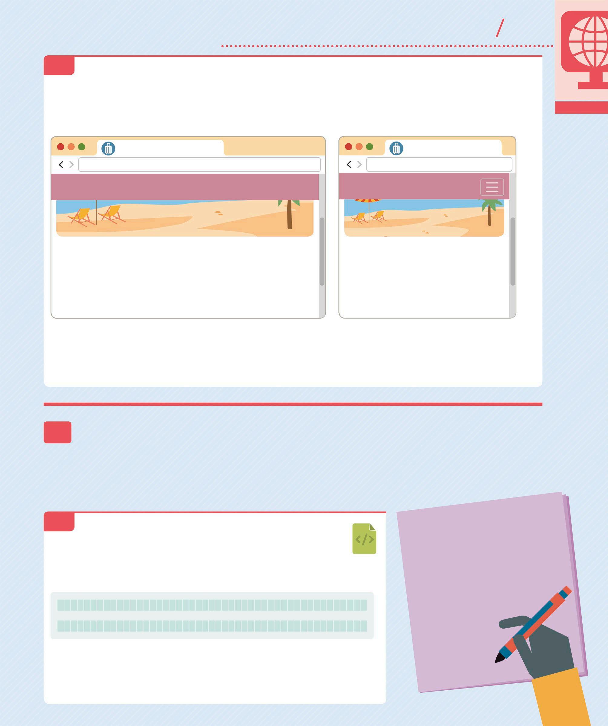
6.5 RUN THE PROGRAM Save the file and then refresh the page in the browser. The popular destinations section will resize according to the width of the screen. All the destination items will be displayed horizontally if the screen is wide, and vertically if the screen is narrow.
In a wide screen, the
destinationItems
appear as a horizontal list of images with hyperlinks
In a narrow screen, the
destinationItems
appear as a vertical list of images with hyperlinks
TRAVEL-NOW
file:///Travel-now/index.html
TRAVEL-NOW
Home Deals Contact Us
POPULAR DESTINATIONS
TRAVEL-NOW
file:///Travel-now/index.html
TRAVEL-NOW
POPULAR DESTINATIONS
France
Egypt
CSS
SAVE
France Egypt
WIDE SCREEN
Africa
Africa
NARROW SCREEN
7 Adding last minute deals The next element is the “last minute deals” section. This section will use a carousel to show a slideshow of two images. Each slide is a hyperlink that will take the user to the “deals.html” page. Bootstrap contains all the functionality required to create a carousel.
7.1 DEFINE THE ELEMENTS OF THE CAROUSEL In the “index.html” file, just below the “spacer v60” </div> closing tag of the popular destinations section, add the “featuredDeals” div and all its contents. This will include a header for the section and an ordered list of place markers that will show users which slide they are currently viewing.
The “h2” header contains the name of the section
HTML
<h2 class="heading">LAST MINUTE DEALS</h2> <div id="dealsCarousel" class="carousel slide " data-ride=
"carousel">
<ol class="carousel-indicators">
</ol>
</div>
</div>
The two attributes – “id” and “data-ride” – are used to manage the behaviour of the carousel These classes are used to style the contents of the <div>
These classes are used to style the place-marker indicators

7.2 ADD THE CONTENTS Below the “carousel-indicators” closing </ol> tag, add the “carousel-item” content for the slides. Make sure to add the class “active” to the first carousel item. This will instruct the JavaScript Engine to start the slideshow on that particular item. When the next slide shows, the “active” class will be removed from the first carousel item and will be added to the next carousel item. You also need to add two classes –“d-block” and “w-100” – to the <img/> tag to specify the size of the images. There are two carousel items being added here, but you can add more if you like.
Closing tag for the “carouselindicators” ordered list The slideshow starts with this carousel item
HTML
...</ol>
<div class="carousel-inner">
<div class="carousel-item active">
<a href="deals.html">
<img class="d-block w-100 roundCorners" src="images/Serengeti_Safari.jpg" alt="Serengeti Safari"> <div class="carousel-caption d-block"> <h3>SERENGETI SAFARI</h3>
</div>
</a>
</div>
<div class="carousel-item">
<a href="deals.html">
<img class="d-block w-100 roundCorners" src="images/Taj_Mahal.jpg" alt="Taj Mahal"> <div class="carousel-caption d-block"> <h3>TAJ MAHAL</h3>
</div>
</a>
</div>
</div>
Provides alternate text for an image if the image cannot be displayed Instructs the browser to display the image as a “block” element
Defines the header of the first slide
Contains the second slide of the carousel
Instructs the browser to scale the image to 100% of the width available to it. The size of the slide increases according to the width of the screen
Adds a caption to the slide
Closing tag for the “carousel-inner” div Defines the header of the second slide
7.3 CREATE THE BUTTONS Now add the “next” and “previous” buttons for the carousel so that the user can move forward and backward through the slideshow. Type this code after the “carousel-inner” </div> closing tag from step 7.2.
The “href” attribute is used by Bootstrap to manage the carousel button behaviour
...</div>
<a class="carousel-control-prev" href="#dealsCarousel" role="button" data-slide="prev"> <span class="carousel-control-prev-icon" aria-hidden="true"></span> <span class="sr-only">Previous</span> </a>
role="button" data-slide="next">
The <a> tag defines the button as a hyperlink
HTML
The “sr-only” class specifies that the <span> element will only be visible on a screenreader client
This <span> element will not be visible if the client is a normal web browser
7.4 ADD A HYPERLINK Next, within the “featureDeals” div, add a call-to-action hyperlink below the “dealsCarousel” </div> closing tag. This hyperlink will take the user to the “deals.html” page. Then, add a “spacer v60” div to include vertical distance before the next element on the web page.
Name of the call-to-action button that links the home page to the deals page
</a>
</div>
<div class="link">
<a href="deals.html">VIEW ALL LAST
MINUTE DEALS</a>
</div>
</div>
<div class="spacer v60"></div>
Closing tag for the “dealsCarousel” div
Closing tag for the “featureDeals” div Adds a vertical space of 60px between this element and the next
HTML
SAVE
7.5 ADD RESPONSIVENESS As the carousel functionality is already built in to Bootstrap, you will only need to define the font styles for the text you want to display. Start by adding the style definitions for the “h3” element in the “global.css” file.
CSS
width: 100%; } @media screen and (max-width: 575px) { .carousel-caption h3 { font-size: 24px; } } @media screen and (min-width: 576px) { .carousel-caption h3 { font-size: 40px; } }

Sets the font size for the header when the screen is narrow Sets the font size for the header when the screen is wide 7.6 STYLE THE TEXT Next, define the styles for the “carousel-caption” element that contains the “h3” header text in the slide. Add this code just after the code from step 7.5.
CSS
.carousel-caption { margin: 0;
color: black; The “h3” header will appear in black
position: absolute; top: 50%;
Positions the top-left corner left: 50%; of the “carousel-caption” to the middle of the parent width: 80%; “carousel-item” div color: #000; Centre aligns the contents text-align: center; on the slide
-webkit-transform: translate
(-50%,-50%); transform: translate
(-50%,-50%); }
Repositions the caption to centre it in the “carousel-item” div
7.7 STYLE THE HYPERLINK Finally, add styles for the “View all last minute deals” hyperlink that appears just after the carousel. This will require definitions for both “normal” and “hover” states.
Sets the “normal” state colour of the hyperlink to black
Sets the hyperlink “hover” state colour to red
.featuredDeals .link { text-align: right; } .featuredDeals a { color: #000; } .featuredDeals a:hover { text-decoration: none; color: #D7263D; }
CSS
Right-aligns the hyperlink contained in the “link” div
SAVE
7.8 TEST THE PROGRAM Save all the files and then refresh the page in the browser to see the updated website. The carousel will animate the slideshow and the text will resize according to the width of the screen. You should be able to move forward and backward through the slideshow using the next and previous buttons.
TRAVEL-NOW
file:///Travel-now/index.html
TRAVEL-NOW Home Deals Contact Us
LAST MINUTE DEALS
TRAVEL-NOW
file:///Travel-now/index.html
TRAVEL-NOW
LAST MINUTE DEALS
SERENGETI SAFARI
VIEW ALL LAST MINUTE DEALS

WIDE SCREEN
SERENGETI SAFARI
VIEW ALL LAST MINUTE DEALS
NARROW SCREEN
Click this button to move through the slideshow
8 Adding the copyright The last element of the home page is the “copyright” section. This will contain a footer with the copyright text. Just like the navigation bar, the footer will also be repeated on every page of the website.
8.1 DEFINE THE COPYRIGHT The “copyright” div simply contains a copyright notice with the specified year. Add this after the “container” </div> closing tag towards the end of the “index.html” file.
Links the footer to the index page of the website
HTML
</div>
</div>
</body>
Closing tag for the “container” div
HTML entity for the copyright symbol
The company logo
8.2 STYLE THE COPYRIGHT Go to the “global.css” file to define the “copyright” div. Then, add styling for the hyperlink that appears in the “Copyright” section. This will require definitions for the “normal” and “hover” states. Type this code just below the code added in step 7.7 and save the file.
Defines the height of the container with the copyright information
Sets the font size of the copyright text
The cursor is displayed as a pointer
Colour of the hyperlink in “hover” state
color: #D7263D; } #copyright { text-align: center; background-color: #345995; color: white; height: 58px; padding-top: 18px; font-size: 16px; } #copyright a { color: white;

cursor: pointer; } #copyright a:hover { color: #D7263D; text-decoration: none; }
Hex code for the colour red
CSS
Sets the colour of the footer to blue
Sets the colour of the copyright text in “normal” state
SAVE
8.3 RUN THE PROGRAM Save all the files and then refresh the page in the browser. The “Copyright” section will display at the bottom of the page for both wide and narrow screens.
TRAVEL-NOW
file:///Travel-now/index.html
TRAVEL-NOW Home Deals Contact Us
TRAVEL-NOW
file:///Travel-now/index.html
TRAVEL-NOW
SERENGETI SAFARI
VIEW ALL LAST MINUTE DEALS
© 2020 TRAVEL-NOW
WIDE SCREEN
VIEW ALL LAST MINUTE DEALS
© 2020 TRAVEL-NOW
NARROW SCREEN
9 Creating a template Almost all websites use an HTML template to add CSS, JavaScript, and common graphical elements to their pages. The template usually includes common elements, such as a navigation bar, menus, footers, and buttons that are used throughout the site. In order to achieve a standard look and feel for this project, you will create a “template.html” file and then modify it for all the subsequent pages on the website.
CREATE AN HTML FILE
Start by creating a new HTML file, just as you did in step 1.2 of this project. Name this new file “template. html”. Visual Studio creates the file with the minimum code required for a valid HTML page. Now copy the entire
9.1 <head> tag from the “index.html” file and paste its contents into the <head> tag of the “template.html” file. Replace the text in the <title> tag with some asterisks (*) and remove the <script> tag for “home.js”.
HTML
<title>******</title> Replace the asterisks with the correct page title when you use the template to make a new page
Delete this entire line of code from the “template.html” file
9.2 COPY ELEMENTS TO THE TEMPLATE PAGE Now copy the entire <nav> tag from the “index.html” file and paste its contents into the <body> tag of the “template. html” file. Within the <nav> tag, find the <a> hyperlink to “index.html”. Remove the “active” class from the <li class=”nav-item”> and the “<span class=”sronly”>(current)</span>” class from the hyperlink.

...<ul id="topMenu" class="navbar-nav mr-auto">
<li class="nav-item"> Remove the “active” class from this line
<a class="nav-link" href=
"index.html">Home</a>
</li>
Remove the “sr-only” span from this line as it indicates the active menu item for the screen reader
HTML
9.3 ADD A CONTAINER TAG Next, add a “spacer” and a “container” div after the </nav> closing tag in the “template.html” file. The spacer will add a vertical gap between the navbar and the next element in the template.
Contains all the HTML elements on the page
</nav>
Closing tag for the “navbar” div
</div>
HTML
9.4 EDIT THE HEADER Copy the “featureImage” div from the “index.html” file and paste its contents inside the “container” div in the “template.html” file. Replace the text in the “h1” header with asterisks.
HTML
<h1>
***** Replace the asterisks with the correct </h1> header text later on
</div>
</div>
Closing tag for the “featureImage” div 9.5 ADD THE CONTENT Within the “container” div, add a “spacer” div below the “featureImage” </div> closing tag. Then add a “pageContent” div with a row of asterisks inside it.
<div class="spacer v60"> </div>
<div class="pageContent">
</div>
Indicates the location of the content for each page that is created from the template
9.6 ADD THE COPYRIGHT Finally, add another “spacer” div after the “container” </div> closing tag. Then, copy the “copyright” div from the “index.html” file and paste its contents into the “template.html” file. Save the file.
The copyright text is copied onto the template page
</div>

<div class="spacer v60"></div> <div id="copyright"> <div>© 2020 <a href="index. html" class="logo">TRAVEL-NOW</a> </div>
</div>
Closing tag for the “container” div
HTML
HTML
SAVE
9.7 RUN THE PROGRAM Now, open the browser and type the url for “template.html” into the address bar. The url will be “file:///C:/Travel-now/template. html” in Windows and “file:///Users/[user account name]/Travel-now/ template.html” on a Mac.
file:///Travel-now/template.html
TRAVEL-NOW Home Deals Contact Us
Asterisks will appear in place of the page title
file:///Travel-now/template.html
TRAVEL-NOW
10 Creating a new page In this section, you will create the “last minute deals” page using the template page created earlier. The new page will display a table of items that will be styled using Bootstrap’s column definitions.
10.1 ENTER THE PAGE TITLE First, you need to make a copy of the template page. In the Solution Explorer window, right click on “template.html” and select Copy. Then, right click on Travel-now and choose Paste to create a copy of the template page “template(copy).html”. Right click on this file and select Rename to change its name to “deals.html”. Open the “deals.html” page and replace the asterisks in the <title> tag with the page title.
HTML
Find the <title> tag inside the <head> tag and enter the page title
Add the “active” class to indicate the current page in the Top Menu
The “sr-only” span is not visible in a normal web browser. It indicates the current page for a screen reader client
10.2 UPDATE THE CODE Inside the <nav> tag, find the <a> hyperlink to “deals.html”. Add the class “active” to the <li> tag that surrounds the “deals.html” hyperlink and then append <span class=”sr-only”>(current)</span> to the hyperlink content.
...</li>
<li class="nav-item active">
<a class="nav-link" href="deals.html">Deals
<span class="sr-only">(current)</span></a> </li>

10.3 ADD THE CONTENT In the “featureImage” div, replace the “homeIndex” class with the “deals” class to display a different feature image on the deals page. Then, go to the “text” div and update the content for the “h1” header.
Replace “homeIndex” with “deals” in the “deals.html” file
<div class="container">
<div class="featureImage roundCorners deals">
<div class="text">
<h1>
LAST MINUTE DEALS
</h1>
HTML
HTML
Replace the asterisks with the header text for the deals page
10.4 UPDATE THE PAGE
CONTENTS
Go to the “pageContent” div and replace the asterisks inside it with an “h2” header, a “spacer” div, and a new “lastMinuteDeals” div, as shown here.
Creates a horizontal rule between the “h2” header and the table of “deal” items
This <div> contains the various “deal” items arranged in rows This header contains the page title
HTML
10.5 ADD THE FIRST DEAL Now add the first “deal” item inside the “lastMinuteDeals” div. Each “deal” item will be a hyperlink that contains a Bootstrap “row” and four Bootstrap “columns”. These columns will appear horizontally when the screen width is wide, and vertically when the screen width is narrow.
...<div class="lastMinuteDeals">
<div class="deal">
<a href="deals.html">
<div class="row">
<div class="col-sm name">
Taj Mahal </div>
<div class="col-sm depart"> 21 July 2020 </div>
<div class="col-sm length"> 10 days </div>
<div class="col-sm price"> $1000
</div>
</div>
</a>
<hr>
</div>

HTML
This outer <div> acts as a container for the hyperlink that surrounds the row contents of the first “deal” item
There are four Bootstrap columns in each row
Content in the first Bootstrap column – name of the destination
Content in the second Bootstrap column – date of departure
Content in the third Bootstrap column – duration of the trip
Content in the fourth Bootstrap column – price of the deal
10.6 ADD THE SECOND DEAL Below the first “deal” </div> closing tag, add the second “deal” item. You can add as many “deal” items to this page as you like, but make sure to add an equivalent number of “carousel-items” to the “featuredDeals” div in the “index.html” file (see pp.327–29).
... </div>
<div class="deal">
<a href="deals.html">
<div class="row last">
<div class="col-sm name">
Serengeti Safari </div>
<div class="col-sm depart"> 27 July 2020 </div>
<div class="col-sm length"> 7 days </div>
<div class="col-sm price"> $800
</div>
</div>
</a>
</div>
</div>
<div class="spacer v60"></div>

Closing tag for the “lastMinuteDeals” div Closing tag for the first “deal” div
HTML
Container for the hyperlink that surrounds the row contents of the second “deal” item
Contents of the second “deal” item placed in individual Bootstrap columns
Add a vertical space between this item and the next
SAVE
10.7 DEFINE THE
BACKGROUND IMAGE
Now go to the “global.css” file and define the “featureImage” that will appear as the background image for this section. Type this code just below the code added in step 8.2.
.featureImage.deals { background-image: url(../images/ deals.jpg); }
CSS
Sets a new feature image for the deals page
10.8 STYLE THE ROW Next, define the styles for the rows that will apply to each “deal” item. Specify that the row with the class “last” should have a different border, and the row should change colour when the mouse hovers above it. Add this code below the code added in the previous step.
Defines the style of the row’s four borders
Sets a different border width for the last row
.lastMinuteDeals .row { padding-bottom: 15px; margin: 0; border-width: 1px 0 0 0; border-style: solid; border-color: #888; } .lastMinuteDeals .row.last { border-width: 1px 0 1px 0; } .lastMinuteDeals .row:hover { background-color: #BC8796; color: white; }

Changes the text colour from dark grey to white when the mouse hovers above the row
10.9 ADD RESPONSIVENESS TO THE ROWS The rows must appear vertically when the screen width is narrow. To do this, instruct the browser to apply a different padding definition to the “row” divs.
Defines a different padding for the row when the width of the screen is less than 576px
color: white; } @media screen and (min-width: 1px) and (max-width: 575px) { .lastMinuteDeals .row { padding: 0px 15px 20px 15px; } }
Adds spacing between the content and the container boundary
CSS
Sets the width of the border surrounding a row
Sets the border colour to a shade of grey
Hex code for the colour mauve
CSS
10.10 STYLE THE HYPERLINK Now add style definitions for the “link” div that contains the hyperlink for the rows, including the “normal” and “hover” states for the anchor tag.
Defines “hover” state
.lastMinuteDeals div { text-align: left; } .lastMinuteDeals a { color: #333; } .lastMinuteDeals a:hover { text-decoration: none; color: white; }
CSS
Defines “normal” state
10.11 ALTERNATING THE
ROW COLOURS
Make the “deal” items table more visual by adding styles that alternate the background colour of the “deal” div. Use the “nth-child(odd)” and “nth-child(even)” selectors to specify which deal divs qualify for the style definition.

Sets the colour of every even-numbered row to light grey
.lastMinuteDeals .deal:nth-child(odd) { background-color: #C0C0C0; } .lastMinuteDeals .deal:nth-child(even) { background-color: #D3D3D3; }
Sets the colour of every odd-numbered row to silver Defines a different padding for the column when the width of the screen is less than 575px
CSS
10.12 ADD RESPONSIVENESS TO THE COLUMNS Now add styles to define the Bootstrap columns. Specify the styles for both wide and narrow screen widths, then add a style definition for the name column so that the “name” field appears in a bold font. Then, save the file.
Sets the spacing between the content and the column boundary
.lastMinuteDeals .col-sm { padding: 15px 0px 0px 15px; margin: 0; } @media screen and (min-width: 1px) and (max-width:575px) {
CSS
.lastMinuteDeals .col-sm { padding: 15px 15px 0px 15px; } } .lastMinuteDeals .name { font-weight: bold; }
10.13 RUN THE PROGRAM Open the browser and type the url for “deals.html” into the address bar. The url will be “file:///C:/Travel-now/deals.html” in
Windows and “file:///Users/[user account name]/Travel-now/deals. html” on a Mac. You can also refresh the “index.html” page in the browser and then select “Deals” on the navigation bar to see what this page looks like.
TRAVEL-NOW

file:///Travel-now/deals.html
TRAVEL-NOW Home Deals Contact Us
The “name” column text displays in bold font
SAVE
TRAVEL-NOW
file:///Travel-now/deals.html
TRAVEL-NOW
LAST MINUTE DEALS
LAST MINUTE DEALS
Taj Mahal
Serengeti Safari 21 July 2020 10 days $1000
27 July 2020 7 days $800
2020
TRAVEL-NOW LAST MINUTE DEALS
LAST MINUTE DEALS
Taj Mahal 21 July 2020 10 days $1000
Serengeti Safari 27 July 2020 7 days $800
2020
TRAVEL-NOW
Hacks and tweaks
Google fonts
This project uses Google Fonts (https://fonts.google.com/) to provide the text fonts. You can explore this library and use different fonts and icons to enhance the look of your website. You can even go to Google Material Icons (https://material.io/) and search for more options for a favicon.
Updated line of code in the <head> tag with the new font names
Update the fonts in the comment section and use them wherever applicable in the code
The font “Oswald” is used for the “navbar” items
The font “Suez One” is used for the “featureImage” text
INDEX.HTML
font-family: "Suez One", serif; font-family: "Oswald", sans-serif; font-family: "Niconne", cursive;
GLOBAL.CSS
TRAVEL-NOW
file:///Travel-now/index.html
TRAVEL-NOW HOME DEALS CONTACT US

TRAVEL-NOW
Bootstrap SASS
This project points to a Content Delivery Network (CDN) version of the CSS file, which contains all the default styles used by Bootstrap. While programming, you will need to override these default styles with your own style definitions. To avoid doing this every time, you can simply modify the default Bootstrap files so that they produce your custom styles without the need to override them. This can be achieved by downloading the Bootstrap source files, editing the SASS variables (variables that define a value and can be used in multiple places), and compiling the final CSS file.
https://getbootstrap.com/ docs/4.0/getting-started/theming/
https://sass-lang.com/
PayPal “Buy Now” buttons
It is quite simple to allow users to make payments on your website. You can do this by adding a PayPal “Buy Now” button to the deal items on the “deals.html” page. To receive money via PayPal, it is necessary to open a PayPal account and verify your bank account details. The email address that you register as the login for your PayPal account will be used to identify you as the intended recipient of the payment. The code below creates a button that allows users to buy a deal. Clicking on the button will redirect users to a secure page on the PayPal site, where they can make the payment.
www.paypal.com
This form allows the user to make a payment to the Travel-Now website via PayPal
...<div class="col-sm price"> $1000
</div>
<div class="col-sm buy"> <form method="post" target="_blank" action= "https://www.paypal.com/cgi-bin/webscr"> <input type="hidden" value="_cart" name="cmd" /> <input type="hidden" value="yourpaypalemailaddress @example.com" name="business" /> <input type="hidden" name="upload" value="1" /> <input type="hidden" name="charsetmm" value="US-ASCII" /> <input type="hidden" value="1" name="quantity_1" /> <input type="hidden" value="Taj Mahal" name="item_name_1" /> <input type="hidden" value="1000" name="amount_1" /> <input type="hidden" value="0" name="shipping_1" /> <input type="hidden" value="USD" name="currency_code" /> <input type="hidden" value="PP-BuyNowBF" name="bn" /> <input type="submit" value="Buy Now" class="roundCorners" /> </form>
</div>
Closing tag for the “col-sm price” div
Content in the fifth Bootstrap column – “Buy Now” button Email address of the PayPal account that receives the payment The name of the item being purchased will be passed to the PayPal page

Clicking this input button submits the form data to the PayPal url This class defines the shape of the “Buy Now” button
TRAVEL-NOW
file:///Travel-now/deals.html
TRAVEL-NOW Home Deals
LAST MINUTE DEALS Contact Us
The button appears in the fifth column. Try styling it yourself
Taj Mahal
21 July 2020 10 days $1000 Buy Now
Serengeti Safari 27 July 2020 7 days $800 Buy Now
2020
TRAVEL-NOW
Web page templates
A website usually has a common template that is repeated on every page of the site. This template includes links to the CSS files, JavaScript files, and the common HTML elements, such as the header and footer elements that appear on each page. Unfortunately, there is no way to employ a template using only HTML and JavaScript. You would need to use a server-side language, such as C# MVC or Python Django to inject the header and footer into each page automatically.
This project also uses a template that is used to create the other pages of the website. It will be very difficult to maintain this process if there are a lot of pages. Explore the “layout file” concept in C# MVC and the “template inheritance” feature in Python Django to solve this problem.
Try creating this page using the concepts from a server-side language
https://www.asp.net/mvc
https://www.djangoproject.com
TRAVEL-NOW
file:///Travel-now/index.html
TRAVEL-NOW
Home Deals Contact Us
CONTACT US
CONTACT US TELEPHONE
ADDRESS