2 minute read
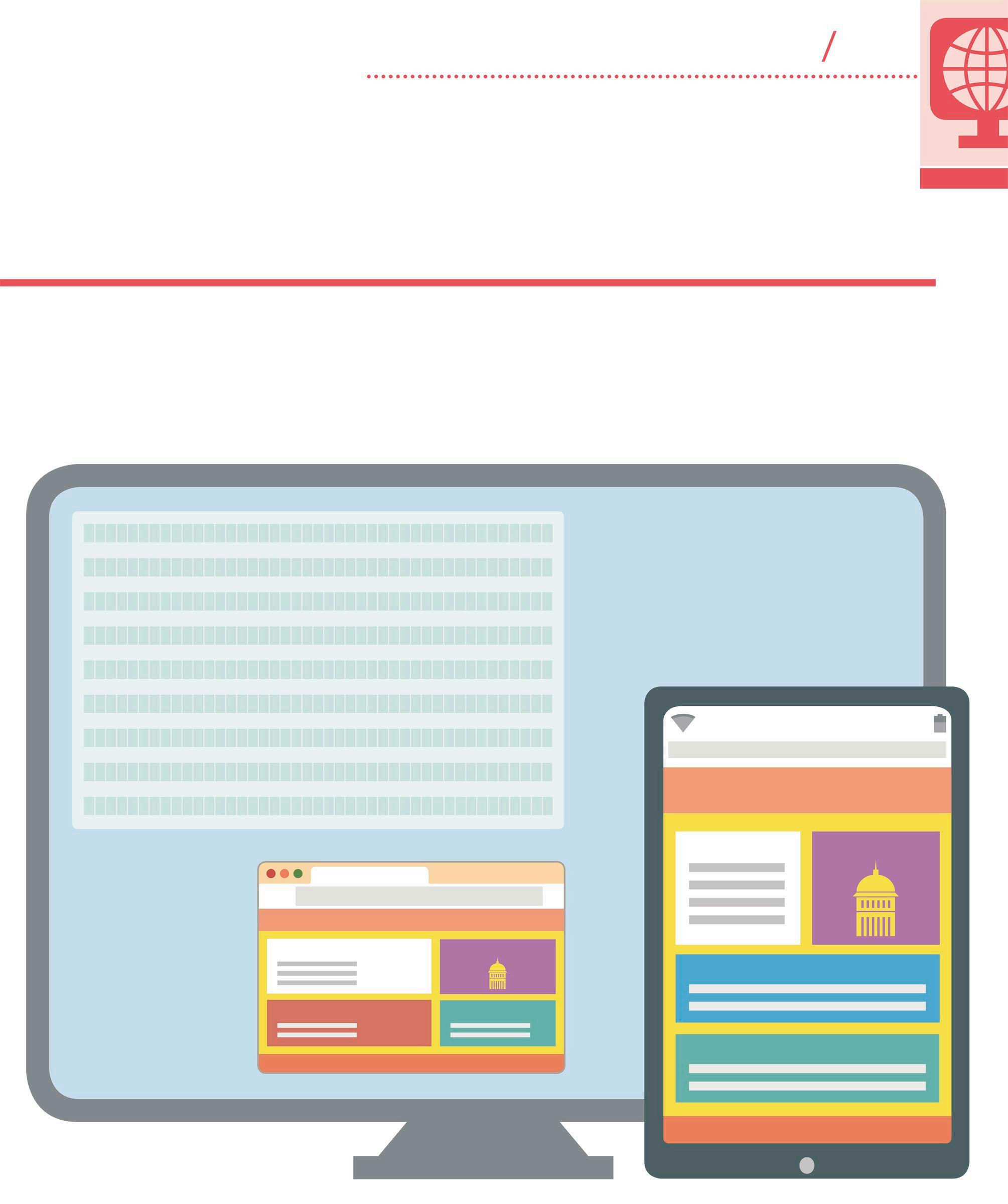
Responsive layouts


A responsive website has a design that can adapt to display correctly on any size screen, from desktop monitors and laptops to smartphones and tablets. This is achieved by a clever combination of HTML, CSS, and JavaScript.
Viewport
Advertisement
The “viewport” declaration tells a browser that a website has a responsive layout. The declaration is placed alongside other metadata. The “content” attribute instructs the browser to set the page width the same as the screen width. It also sets the initial zoom level. These meta instructions allow the page elements to adjust to the maximum width of the screen and improves the user experience by displaying the correct styling and layout for any screen size. Without these instructions, the browser will zoom out to show the whole page, rather than allowing the page elements to reshape to the width of the screen.
MULTIPLE CSS FILES CAN BE LINKED TO AN HTML DOCUMENT TO MAKE A RESPONSIVE WEB PAGE
<head>
</head>
The “viewport” declaration is placed inside the <head> tag
Flexible layouts
Including the “viewport” declaration in a responsive design allows the page elements to adjust to fit the screen size.
FEATURE BOX HEADER
IMAGE
The “content” attribute sets the page width and the initial zoom level to 1
HEADER
FEATURE BOX IMAGE
FOOTER
Why responsive?
When the Web was first created, almost all users viewed websites on a desktop monitor. Early websites were programmed to be viewed at a fixed width of 800px. This width was gradually increased over the years as the average user’s screen size increased. The arrival of browsers on smartphones with narrow screens forced programmers to maintain multiple versions of their sites, each designed to display correctly on a different size of screen. Today, there are many different device sizes that can display web pages. The solution to this is to have a single flexible layout that can adjust to any screen size.
Media query
Media queries are used to switch between different layout styles, depending on the width of the page. This is the primary way to create responsive web pages that can scale to fit correctly on any screen size. For example, in the code below, the background colour of elements in the “specials” class will change depending on the width of the screen. The default background colour is red. If the screen is more than 993px wide then the background colour will be blue.
.specials { background-color: blue; }
@media screen and (min-width: 993px) { .specials { background-color: red; } }
Flexible styles
Media queries fine-tune the CSS styles, so that each element looks its best on any screen size.
FEATURE BOX HEADER
IMAGE
SPECIALS CONTACT
FOOTER
Defines the default background colour of the “specials” class
Sets the minimum screen width to 993px