OR TF LOOI
GRAPHIC DESIGN
P
MANAVI
An enthusiastic and extremely curious person interested in how design can be made to play with the minds of the users.
EDUCATION
MANAVI
THIRD YEAR
B.Architecture NIT TIRUCHIRAPALLI 2019-2024 CGPA 9.41
National Institute Of Technology Tiruchirappalli Bachelor of Architecture (B.Arch), Architecture & Planning 2019 - 2024 CGPA: 9.41/10
Senior Secondary (XII) Saint Xavier School (ISC board)
Year of completion: 2018 Percentage: 92.00%
Secondary (X) Saint Xavier School (ICSE board)
Year of completion: 2016

ABOUT ME
SOFTWARE SOCIAL TECHINCAL
EXPERIENCES
Team HEAD Annual Nasa Design Competition(ANDC) National Association of Students of Architecture(NASA)
DESIGN Head of Housing and Urban Development Corporation(HUDCO) National Association of Students of Architecture(NASA)
Member of G-Sen Trophy, National Association of Students of Architecture(NASA)
2021
2022 2021
School head Saint Xavier School 2016
CERTIFICATES
DESIGN
DESIGN
IMAGEMAKING link here TYPOGRAPHY
here HTML, CSS, and JS for Web Dev
here VISUAL ELEMENTS OF USER INTERFACE DESIGN link here S K I L L S ADOBE PHOTOSHOP ILLUSTRATOR INDESIGN XD AFTER EFFECTS COMMUNICATION MANAGEMENT LEADERSHIP TEAM WORK REVIT LUMION JAVA MS EXCEL RHINO
FUNDAMENTS OF GRAPHIC
link here HISTORY OF GRAPHC
link here
link
link
INDEX INDEX INDEX
Self-Branding Digital Art Poster Design Social Media Post 3-D Modelling Logo Design
Product Design 2-D Composition 3-D Modelling Website Editing 1 2 3 4 5 6 . . . . . . 7 8 9 10 11 12 . . . . . .
Animation Character

TAGLINE
SIMPLIFY TO AMPLIFY. Anything from the sky to the bottom, I will simplify it like a dot. Purpose : Use my creative solutions to amplify your business.
EXPLANATION
The letter M is shown as figure and ground with other elements used to signify other letters of my name. Here the ideology that the data from the top to the bottom is going to be simplified by me as a dot is shown.
STYLE
Minimal, Neat and Geometric. Designed according to User-Experience.
COLOUR
Yellow to grab attention easily and be reflected as a bright and energetic colours to express the positivity and energy to be reflected as my brand image.
Black and White Strong formal and Sophisticated to reflect the idea of how details are given importance and all that is finally simplified Opposing to both black and white present showing great contrast yet blended together.
FONT
Rage Italic : Hand-written look which is used for personalised messages and slogans for more connection.
Futura : Sans serif used with variations in bold and regular for more neat, organised and geometric look.
LOGO

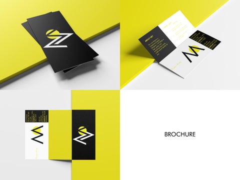
SELF-BRANDING

BUSINESS CARD
BROCHURE


NOTEBOOK


DIGITAL ART WITH ADOBE PHOTOSHOP R E N D E R I N G S

IDEATION:
Vibrant Red with Yellow to Orange
Shine on the border to make it feel as if it is dipped in Caramel to bring out the actual flavour of the product.
COOPER BLACK font is used which is personalised for the drip and personalised bulges in the word MAHA. The font is used for its playful nature caramel effect.
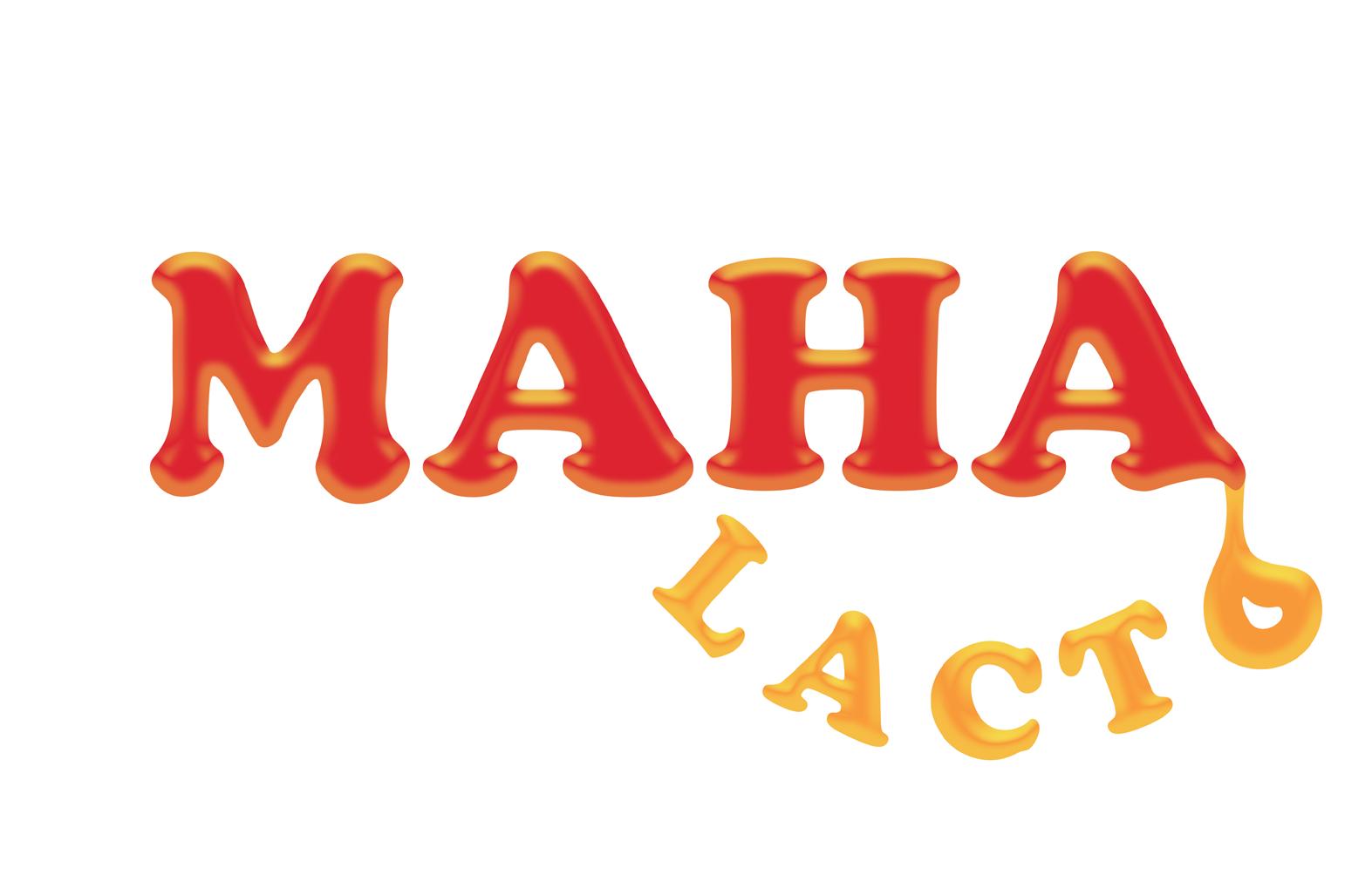
LOGO DETAILED
LOGO DESIGN


SCALABLE LOGO MODERN MINIMAL LOGO
“DROOP“ Paint


3D GRAPHIC MODEL LOGO DESIGN
DESIGN - Patna Metro Logo

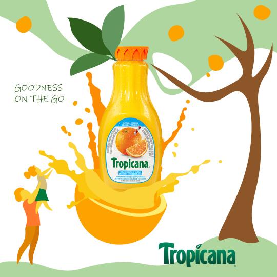
TROPICANA SOCIAL MEDIA POST
ELEMENTS:
1. Energetic
2. Healthy :
Shows product is natural .. .shown here as orange
3. Tasty : Orange shown in a luscious way
Shows product is natural shown here as orange Orange shown in a luscious way
4. Friendly brand : Shows how a family is plucking real orange . . . .and having a good time.
Shows how a family is plucking real orange and having a good time.
5. Flow illustration :
To express the liquid nature of product.
To express the liquid nature of product.


MINIMALISM
MAXIMALISM
AMAZON PROMOTIONAL POST


POSTS SOCIAL MEDIA


POSTER DESIGN
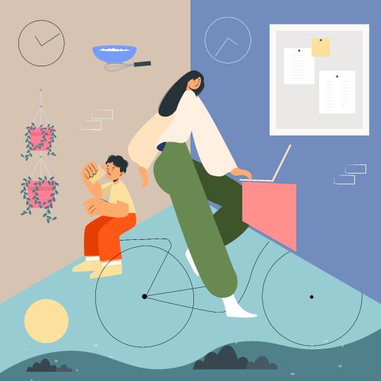
ILLUSTRATIONS


SALE POSTER
ILLUATRATIONT


FEATURES 1. Blink Feature 2. Rigs for hand, neck and body movement 3. Hair movement 4. Mouth movements 5. Eyebrows functioning with facial expression


PRODUCT REDESIGN ELEMENTS: 1. Energetic 2. INTERACTIVE: Variations to use as it should be handy to be used as an alternate breakfast 3. Reflect the flavour better 4. Healthy 5. Promote SPIRULINA as it is the brand element DESIGN EXPLANATION


COMPOSITITONS


2D
TROPHY DESIGN


3D MODELLING
EXPLANATION
DYNAMIC - EVER CHANGING
CONCEPT The illusion of movement


The dynamic nature of the world is shown by the crystal ball as the centre and the patterns around it which rotates and changes as we change the direction

:Trophy changes as it moves


1 3 2
UI/UX WEBSITE
DESIGN


WEBSITE
5 4


E D I
T I N G
g E t
E D I T I n G
E D I T I N G

manavi.xavier@gmail.com