BRAND-NEW
© Clariant
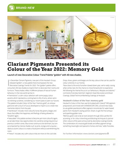
Clariant Pigments Presented its Colour of the Year 2022: Memory Gold Launch of new Decorative Colour Trend Palette “golden” with 40 new shades.
I
n December Clariant Pigments, now part of the Heubach Group,
Greys, blues, greens and beiges are the key colours that can be used for
released “golden”, a new palette that encompasses the new
colour schemes in our homes.
Decorative Coatings Trends for 2022. The “golden” palette offers
“Now close to the end of another slowed-down year, we’re really craving
consumers 40 new shades to inspire them to decorate their rooms and
what comes next, for the chance to move forward and re-experience
furniture. These shades reflect 4 different phases of natural human
life following the intense focus on our behaviours, lifestyles and desires,”
behaviour in the new world we live in:
comments Franziska Hammerl, Segment Head Decorative and Wood
• “memotions”: a calm colour selection with some poppy colour
Coatings, Global Technical Marketing Coatings at Heubach.
accents which represents a coming back to life of sorts, where we’re re-orienting ourselves, considering our recent pasts to plan our futures.
Heubach’s Colour of the Year: memory gold
This palette includes Colour of the Year “memory gold”, an antique
Heubach’s Colour of the Year was formulated with Colanyl® 500 pigment
gold tone with a touch of luxury developed to inspire us to create new
preparations and mixed with SHINEDECOR C393, a brand new ready-
memories distinct from the past.
to-use golden pearlescent effect pigment concentrate for water-based
• “wembrace”: includes more colourful tones like greens, beiges and
paints from Heubach’s styling partner, Eckart, to get the final antique
blues that reflect the happiness and feelings of being allowed to
and sparkling golden tone.
“breathe” again.
“Memory gold is set to be an ever-present through 2022, perfect for
• “wescalate”: this palette evolves to become yet more colourful again,
accenting, or for colour drenching and blocking techniques to partner
as we take these new opportunities into overdrive and go beyond our
other colours of the years announced by decorative coatings brands.
previous comfort zones. Blue tones continue to be dominant, but are
The combination of a neutral gold shade and effect pigment brings
accompanied by intense shades such as pink, orange and turquoise –
something meaningful and special to homes and lives,” adds Franziska.
ideal as accent colours to create a focal point without overwhelming the room. • “metox”: includes very calm colours that are more on the cool side.
For further information: www.clariant.com/pigments
international PAINT&COATING magazine - JANUARY/FEBRUARY 2022 - N. 73
61