BRAND-NEW
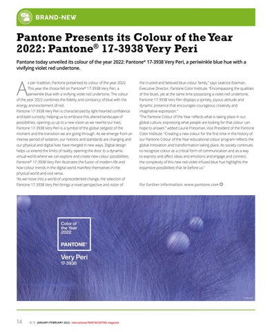
Pantone Presents its Colour of the Year 2022: Pantone® 17-3938 Very Peri Pantone today unveiled its colour of the year 2022: Pantone® 17-3938 Very Peri, a periwinkle blue hue with a vivifying violet red undertone.
A
s per tradition, Pantone presented its colour of the year 2022.
the trusted and beloved blue colour family,” says Leatrice Eiseman,
This year the choice fell on Pantone® 17-3938 Very Peri, a
Executive Director, Pantone Color Institute. “Encompassing the qualities
periwinkle blue with a vivifying violet red undertone. The colour
of the blues, yet at the same time possessing a violet-red undertone,
of the year 2022 combines the fidelity and constancy of blue with the
Pantone 17-3938 Very Peri displays a spritely, joyous attitude and
energy and excitement of red.
dynamic presence that encourages courageous creativity and
Pantone 17-3938 Very Peri is characterized by light-hearted confidence
imaginative expression.”
and bold curiosity, helping us to embrace this altered landscape of
“The Pantone Colour of the Year reflects what is taking place in our
possibilities, opening us up to a new vision as we rewrite our lives.
global culture, expressing what people are looking for that colour can
Pantone 17-3938 Very Peri is a symbol of the global zeitgeist of the
hope to answer,” added Laurie Pressman, Vice President of the Pantone
moment and the transition we are going through. As we emerge from an
Color Institute. “Creating a new colour for the first time in the history of
intense period of isolation, our notions and standards are changing and
our Pantone Colour of the Year educational colour program reflects the
our physical and digital lives have merged in new ways. Digital design
global innovation and transformation taking place. As society continues
helps us extend the limits of reality, opening the door to a dynamic
to recognize colour as a critical form of communication and as a way
virtual world where we can explore and create new colour possibilities.
to express and affect ideas and emotions and engage and connect,
Pantone® 17-3938 Very Peri illustrates the fusion of modern life and
the complexity of this new red-violet-infused blue hue highlights the
how colour trends in the digital world manifest themselves in the
expansive possibilities that lie before us.”
physical world and vice versa. “As we move into a world of unprecedented change, the selection of Pantone 17-3938 Very Peri brings a novel perspective and vision of
For further information: www.pantone.com
© Pantone
14
N. 73 - JANUARY/FEBRUARY 2022 - international PAINT&COATING magazine