Recycled materials transformed into highly durable, premium coatings.
17 - 19 July 2025
The strength of Europolveri products does not derive from the sole mixture of carefully selected raw materials, but rather from the people who study, model and formulate powder coatings thanks to more than 40 years of experience, and provide customers with the best solutions on the market A clear corporate philosophy and a shared vision have allowed to supply a vast range of products for three generations With more than 1000 products available in stock and over 40,000 already formulated, Europolveri offers infinite solutions to customer requests
Matching powder coatings to end-use applications: a practical overview
Assovernici’s new President: the industry’s future between new objectives, environmental responsibility, and market development
Lesta PAINT STUDIO 3.0: the new frontier of offline industrial coating with modifiable acquired trajectories
BASF Coatings transitioned to 100% renewable electricity in two U.S. sites
75 years of excellence. Innovation, internationalisation, and focus on people since 1985: Tecnofirma’s anniversary
Festina Lente adopts advanced automation for coating buttons and fashion accessories
Customising the production of hooks and load bars to make the coating process even more efficient
Improved production flexibility and environmental sustainability: the challenges of Galv.Ar’s new coating line
New technology from Dürr enables VOC-free colour changes with 2-component clear coats
i.dek: innovation, customisation, and sustainability in the production of polyester films for aesthetic effects on aluminium and pre-painted metal
OF THE MONTH
“The way of Living Emotions”: Color Design® Lechler
ON TECHNOLOGY
A market with different requirements but similar engineering needs: American company PTF Industrial Coatings chooses Italian technology
The durability of HEROair’s yellow coating for a ping-pong game that can last forever
ON TECHNOLOGY
Fit Out’s green revolution: achieving carbon neutrality through zero emission pre-treatment and powder coating
MARCH/APRIL 2025
Premium quality meets colour inspiration: transforming smart workspaces with Interpon
A new coating booth from AluK’s aluminium frames: more speed, more efficiency, and more colour changes
The importance of sound formulations when choosing coatings for outdoor architecture 106
An in-depth analysis of SurTec 313: innovation in aluminium anodising process, now Qualanod approved
Automation revolutionises High Technology Italia’s coating line
MAZU enhances the beauty of its pottery with Powdura ECO coatings
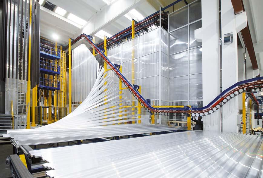
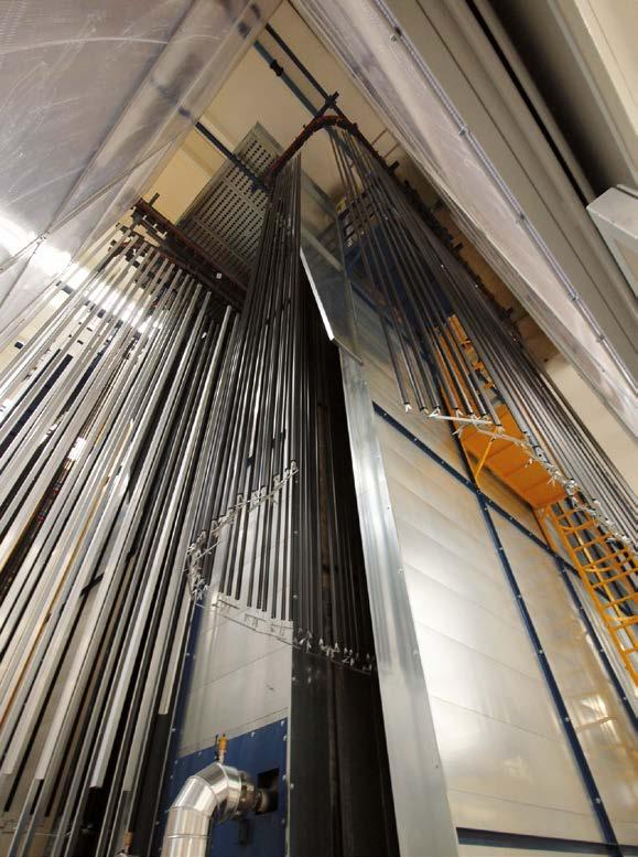
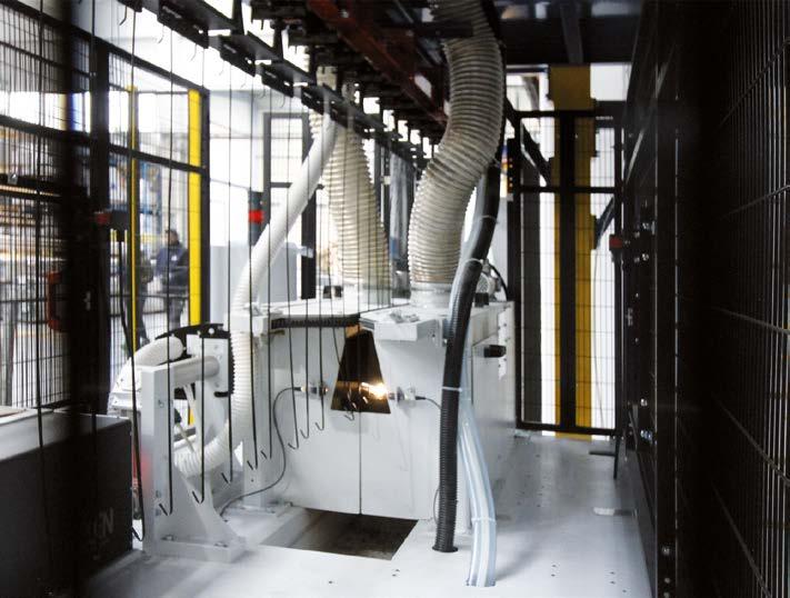
Alcom’s production revolution: powder coating 9 metre-long profiles and sheets in one vertical plant
OF THE MONTH
ST Powder Coatings presents its ‘green oasis’ of the future at Fuorisalone
ON
Decoral® Group enters the coil coating industry and installs one of the largest powder application plants in the world
Ponte Giulio’s new powder coating system helps create distinctive, inclusive, and age-friendly bathroom environments
OF THE MONTH
Sherwin-Williams: layering a world with colour possibilities
ON TECHNOLOGY
Carrduci: when little details make all the difference
ON TECHNOLOGY
A vacuum evaporator revolutionises Pintarelli Verniciature’s waste water management
OF THE MONTH
Driving sustainability in powder coatings: innovation, regulations, and market challenges
OF THE MONTH
The Phoenix turns 15
OF THE MONTH
Robotic spraying: will automotive standards become the norm across all industries?
TRAINING
ipcm® Academy has added two new courses to its programme: industrial PVD coating and ISO 12944:2018 Standard
UCIF INFORMS
The future of youth employment in the mechanical industry: a focus on the surface treatment sector
The peaceful power of light blue
EDITOR’S LETTER
Alessia Venturi
Editor-in-chief Direttore Responsabile
Maximalism, the art of exaggerating and celebrating an overabundance of styles, colours, finishes, and textures, is replacing the minimalistic approach that has dominated the last few years not only in fashion but also in the design, furniture, and car markets.
Instead of a prevalent use of neutral tones, moderation, and refined simplicity, we now have vivid colours, rich details, and lively shapes.
Maximalism is not just an aesthetic or a trend but a philosophy that values individuality and freedom of expression – imagine a world in which every product you own is a canvas for expressing yourself1
This concept aligns with that of chaotic customisation, or hyper-personalisation, a cultural shift promoted by Generation Z and driven by a collective desire for individuality and exclusivity.
It refers to a production model in which mass personalisation takes place in a highly dynamic and unpredictable environment. Each product can be customised according to multiple parameters without a rigid manufacturing sequence: customers can actively participate in its design and configuration. This approach is based on the integration of advanced technologies, such as artificial intelligence, additive manufacturing, flexible robotics, and digitalised production systems, to meet demands for extreme customisation without compromising efficiency, scalability, and delivery speed.
Examples of hyper-personalisation include the automotive sector, with highly customised vehicle configurations and components produced on demand; fashion, with tailor-made garments crafted from materials and designs chosen by the customer; and manufacturing, with personalised industrial components created through 3D printing or flexible processes.
How are the architecture, aluminium, and design sectors – to which this edition of ipcm® is dedicated –reacting to this trend?
Here, the concept of chaotic customisation refers to a design approach that combines extreme personalisation, formal complexity, and an apparently messy aesthetic. Advanced design and production technologies yield unique structures derived from generative models, as well as shapes and textures tailored to meet any specific aesthetic and functional requirement. Implementing an organic and non-linear approach to design with complex and irregular geometries, often inspired by nature or chaotic patterns, enables to develop and install structures that challenge traditional symmetrical and modular conventions. All this is possible thanks to the use of parametric design2 together with, once again, artificial intelligence, advanced and digital production technologies, modular and robotic assembly processes to manage unique elements efficiently, and innovative materials, including advanced aluminium alloys with customisable finishes (e.g. hybrid surface treatments such as anodising and powder coating, anodising and nano coating, plasma electrolytic oxidation, or PEO, and ceramic coatings).
In short, chaotic customisation in the field of metal architecture and design constitutes a synthesis of digital craftsmanship, algorithmic design, and advanced production, capable of giving life to unique and futuristic structures with increasingly strict, challenging, and technically demanding finishing requirements. Can the surface treatment sector keep up?
2 Parametric design is an approach in which forms and structures are generated and controlled through mathematical algorithms and parametric rules, allowing for the creation of complex and highly customisable geometries that would be difficult to obtain with traditional techniques.
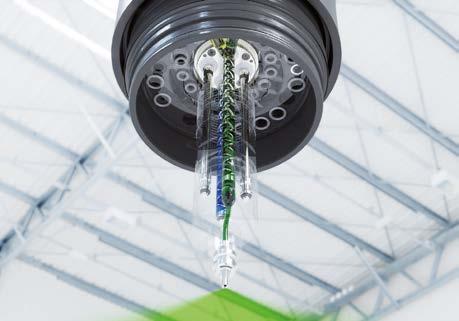
Dürr successfully supplies eight electrode coating lines to FIB S.p.A.
The new giga-coating system for lithium-ion battery production supplied by Dürr will strengthen its position in the battery production sector and reflects the increasing demand for advanced battery production technologies in Europe.
The engineering multinational company Dürr Systems AG has secured a major contract with the Italian battery manufacturer FIB S.p.A., part of the Seri Industrial Group. The order, placed in December, includes the delivery of a giga-coating system featuring four anode and four cathode lines, as well as the necessary calenders, slitters and solvent recovery systems. Dürr’s supplied equipment includes the tandem coater, a reliable system that coats the foil sequentially on both sides. Other components in the system include the webline, dryer, calender, slitter, and solvent recovery for the anode and cathode areas.
The plant’s capacity, based on FIB’s cell design, is projected to reach 8 GWh/a at full load.
This order marks a significant step in Dürr’s strategy to strengthen its presence in the battery production sector, which began in 2018 with the acquisition of the U.S.-based Megtec/Universal. Megtec contributed key solutions for coating, drying, and solvent recovery in lithium-ion battery production. In 2020, Dürr further expanded its capabilities with a partnership with Japanese coating equipment manufacturer Techno Smart Corp. The acquisition of Ingecal in 2023 added expertise in calendering technology.
“Particularly noteworthy is the short time from receipt of the order to the start of installation of the first lines in just 10 months – after all, the ink is only just dry,” has commented Bernhard Bruhn, Vice-President Global Business Unit Lithium-Ion Battery at Dürr.
As of January 2025, Dürr’s coating operations will be part of its new Lithium-Ion Battery business unit. The contract with FIB is a milestone for this unit, reflecting Dürr’s strategic decisions over the past few years. Amid global uncertainties, FIB S.p.A. is investing in a state-ofthe-art battery production facility in Europe, focusing on innovative, predominantly Western technology for lithium-iron-phosphate batteries.
For further information: www.durr.com/en
In the tandem coater, one side of the foil is coated after the other. The scope of delivery for FIB S.p.A. also includes calendering (left image).
AGTOS has been acquired by SINTOKOGIO LTD
The starting point for the future strategy of AGTOS is to continue and expand its activities with the existing management and employees.
The German developer and manufacturer of wheel blasting machines AGTOS has recently announced that its shareholders have decided to sell the company to Sintokogio LTD, a global producer of foundry equipment based in Nagoya (Japan) and with over seventy subsidiaries worldwide.
The purchase was carried out by the Winoa SA Group, an international manufacturer of high-quality blasting abrasives and other innovative and environmentally friendly products, solutions and services for surface preparation – which is also part of Sintokogio and has its headquarters in France.
‘AGTOS Gesellschaft für technische Oberflächensysteme GmbH’ has then been renamed to ‘Sinto AGTOS GmbH’, in order to emphasise the new affiliation. With the acquisition, the Japanese group aims to further strengthen its surface treatment business in Europe through the
good market position and high reputation of AGTOS, in order to supply customers from various industrial sectors with solutions for surface treatment, environmental protection, material handling, mechatronics and consumables.
Founded in 2001 in Emsdetten (Germany), AGTOS has a combined total of more than 160 employees at its plant in Konin (Poland) as well as in its headquarters and serves customers of all sizes, particularly in the automotive and automotive supply industry, foundries, forges, steel distributors, the fastener industry and mechanical engineering. The starting point for the future strategy for AGTOS is to continue and expand its activities with the existing management and employees at both locations.
For further information: www.agtos.com
From left to right: Andreas Bügener, Managing Director of Sinto AGTOS GmbH, with Atchi Nagai, President of SINTOKOGIO LTD.
Frequent colour changes in liquid coating made easy
The new version of the colour change block from WAGNER can be configured in a variety of ways and is suitable for various low-pressure applications in robotic and automatic systems.
Colour change blocks are indispensable if several colours are used in an automatic liquid coating system and therefore frequent colour changes are necessary. Typical areas of application are coatings in the wood and furniture industry, for example in flatbed machines, where there are high demands on colour variety. Or at automotive suppliers for the coating of interior and exterior components.
Fast colour change & low consumption of flushing agent
Automated coating systems must be able to ensure high cycle rates. To keep interruptions to ongoing operations to a minimum, fast and reliable colour changes are crucial. The WAGNER colour change block makes a major contribution to this. The desired application medium is simply selected via the respective pneumatically controllable valve. The time required for flushing and the consumption of flushing agent are very low thanks to the dead space-free inner geometry of the block - this shortens the time required for colour changes. The configuration with two or more output channels offers further time savings: while the active colour is being applied, the other channel can be flushed and a second colour can be applied.
Great advantages, compactly installed
In addition, the WAGNER colour change block scores particularly well with its individual configuration options: for example, as a compact
double valve block with one output channel and up to 24 valves, as a multi-channel block with up to 8 output and 24 input channels, or as a 2K mixing block. Thanks to the modular principle, with which several valve blocks can be flexibly arranged in a row, and many connection options (e.g. for gear pumps or material pressure regulators), it can be adapted to a wide variety of requirements. It offers significantly more flexibility than comparable products on the market. Depending on the material applied, needle or diaphragm valves can be installed to increase the service life even for abrasive materials. Thanks to its size and modular design, the colour change block can be perfectly integrated into various automated systems, e.g. on a robot arm, in installations with linear axes or 2K systems. It is easily accessible if maintenance is required, such as a hose change. It is also very easy to replace valves or valve blocks and extend the colour change block - without the need for special tools. WAGNER offers its customers a special service in its own web shop WAGNER365: They can use an online configurator to put together the colour change block themselves according to their needs and order it directly.
For further information: www.wagner-group.com
Eisenmann GmbH established the Italian branch Eisenmann Italy S.r.l.
The establishment of Eisenmann Italia reflects the efforts of the company in expanding its after-sales businesses and provide more targeted services.
Last September, Eisenmann GmbH founded Eisenmann Italy S.r.l. – based in Milano and led by the managing director Luca Bracchitta. The new branch will support the existing staff in Saronno (Varese province) and Modena and handle small and medium-sized new construction and modernisation projects for painting systems in the future.
Eisenmann is a German coating plants manufacturer that develops economically and ecologically sustainable engineering solutions specifically aimed at the automotive industry. The establishment of an Italian subsidiary reflects the efforts of the company
in expanding its after-sales businesses and provide more targeted services related to maintenance, spare parts management and minor rebuilds.
“Our customers in Italy will benefit from even closer dialogue, short distances and improved service from a single source. Together with our colleagues in Germany, we will do everything in our power to guarantee the quality, reliability and expertise that the Eisenmann Group is known for,” has stated Bracchitta.
For further information: www.eisenmann.com
ISOFAN ESS&RE!
Luca Bracchitta
Matching powder coatings to end-use applications: a practical overview
Eric Casebolt Vice President, The ChemQuest Group, Inc. ecasebolt@chemquest.com
Selecting the correct powder coating for a specific end-use application is critical but can be a mystery to applicators, product developers, and end users due to the variety of chemistries and industry terminology. To be clear, the best way to ensure you are using the right powder is to thoroughly understand the application requirements and consult with your supplier.
That said, gaining a fundamental understanding of why certain powder coatings are used for specific applications can help you make more informed decisions. This article serves as a high-level guide to the general classes of powder coatings, as well as the performance properties that influence their selection for use in different broad enduse categories (Table 1).
Before diving into specific applications, two important points must be addressed:
1. Powder coatings are typically classified by their main resin chemistry, so a basic discussion of chemistry is necessary for each section. However, this article will keep explanations at a high level.
2. Although each type of powder coating has general performance characteristics, properties can vary significantly within each category. This is why it is crucial to discuss your specific end-use application with your supplier to ensure the best choice is made.
With these points in mind, let’s explore how different powder coatings are selected based on application requirements.
Interior applications
Appliances, metal furniture, and home goods
Interior applications refer to finished products that will not be exposed to outdoor conditions. While this may seem straightforward, it’s important to distinguish between applications that will be used outdoors but shielded from sunlight and those that are strictly interior and won’t require a high level of corrosion resistance.
For interior applications, hybrid powder coatings are the dominant choice. These coatings are typically based on acid-functional polyesters crosslinked with bisphenol-A epoxies. In cases where higher hardness or chemical resistance is needed, acid-functional acrylics may be used instead of polyester.
In terms of performance, hybrid powder coatings provide sufficient corrosion and UV resistance for indoor applications and can be
formulated in a wide variety of colors, sheens, and textures. These coatings also offer a high level of chemical resistance to protect appliances from cleaning agents like bleach, and they exhibit excellent hardness and scratch/mar resistance for applications such as metal office furniture. In addition, they are cost effective and well-balanced in terms of performance.
Functional applications
Pipelines, rebar, and automotive underbody
Functional powder coatings refer to applications where UV exposure is minimal, but a high level of corrosion, chemical resistance, or some other “function” is required. These coatings must withstand harsh environments such as chemical exposure, moisture, and abrasion, but they do not require UV resistance.
For these demanding applications, epoxy-based powder coatings are the preferred choice. While epoxies cannot be used in direct sunlight due to their poor UV resistance, they offer unmatched levels of corrosion and chemical resistance, as well as excellent mechanical properties such as impact resistance, ductility, and hardness. Common epoxy powder coating types include:
Bisphenol-A epoxies—the most common epoxy resin; offer excellent adhesion, corrosion protection, and chemical resistance.
Novolac epoxies—provide higher crosslink density for increased chemical resistance; ideal for extremely aggressive environments.
Exterior applications
Architectural profiles, lawn and garden equipment, automotive trim, and bicycle frames
Exterior applications require powder coatings with varying levels of UV durability, depending on the product’s exposure to sunlight and weather conditions. While UV resistance is not the only property required for exterior coatings, it is typically the first “filter” used to narrow down to the type (chemistry) of powder coating that should be used in a given end-use application. The three main types of powder coatings used in exterior applications are standard-durable polyesters, super-durable polyesters, and fluoropolymers (FEVEs).
Standard-durable polyesters
Typically providing 1-3 years of UV durability, these powder coatings are based on acid-functional polyesters that are crosslinked with either triglycidyl isocyanurate (TGIC) or hydroxy alkyl amide (HAA; also known as TGIC-free). Common uses include lawn and garden equipment, as well as general outdoor metal furniture.
Super-durable polyesters
Though similar to standard-durable polyesters, superdurable polyesters are based on polyester resins that are composed of more UV-resistant monomers for improved longevity. They generally provide 3-7 years of UV durability in more rigorous applications such as automotive trim and architectural coatings.
• Without tooling costs
• Perfect for fitting tests
• No minimum order quantities
Fluoropolymer (FEVE) powder coatings
FEVE powder coatings are based on fluoroethylene vinyl ether (FEVE) resins, crosslinked with blocked isocyanates to create a highly UVresistant network. These products offer 10+ years of outdoor durability, making them ideal for high-performance architectural coatings and longlasting exterior applications.
Generally speaking, polyesters provide a good balance of cost and performance for moderate outdoor exposure, while fluoropolymers deliver the highest level of UV resistance and weatherability (though at a higher cost). While the exterior-grade coatings mentioned here perform well for corrosion resistance, an epoxy primer may be recommended to increase corrosion resistance for coatings that will be used in extremely harsh environments.
Less commonly used powder coating types
While this article focuses on the most widely used powder coatings for broad end-use categories, powder coatings also offer significant advantages in several specialized applications:
High-heat applications: silicone-based powder coatings are extensively used for applications like barbecue grills due to their superior heat resistance.
Clear, high-clarity coatings: glycidyl methacrylate (GMA) acrylic powder coatings are commonly used for wheel coatings, cabinet hardware, and other applications requiring smooth, transparent films with excellent clarity.
Anti-graffiti applications: urethane powder coatings are often used for their superior chemical and UV resistance, making them ideal for surfaces exposed to vandalism and harsh cleaning agents.
Make informed choices
Choosing the right powder coating requires a clear understanding of the specific application requirements, including environmental exposure, durability needs, and chemical resistance. While this article provides a broad overview, consulting with your supplier is essential to ensure the optimal selection for your unique needs. By understanding the different powder coating chemistries and their applications, you can make more informed decisions and improve the longevity and performance of your coated products.
industrial coating plants impianti di verniciatura industriale
spray booths for car body shop cabine di spruzzatura per carrozzeria
sandblasting booths cabine di sabbiatura
all the load-bearing structures of our coating plants are realised in aluminium tutte le strutture portanti dei nostri impianti di verniciatura sono in alluminio
industrial coating booths cabine di verniciatura
YOU CAN SEE MORE THAN 1000 PHOTOS AND VIDEOS
Assovernici’s new President: the industry’s future between new objectives, environmental responsibility, and market development
Edited by Assovernici Milan, Italy
Benedetta Masi, an architect specialising in bio-architecture and communication, the former vice-president of Assovernici and the managing director of Colorificio Sammarinese S.p.A. since 2018, was nominated in February as President of the Association representing the Italian manufacturers of industrial and building paint and coatings. Below is her first interview in this new role, which she will hold for three years.
Your term of office as President of Assovernici focuses on three key objectives: strengthening relations with the supply chain, consolidating sustainability reporting practices, and enhancing communication. Which aspects do you intend to address first, and what concrete actions do you plan to take?
We have already started to work on sustainability reporting through a strategic partnership. A confidential data aggregation system will support our Sustainability Committee, which will monitor European regulations and provide members with concrete tools to cope with changes. In an increasingly complex market, Assovernici also aims to expand its representative role and intensify dialogue with the supply chain to anticipate and, where possible, influence industry trends. Our goal is to help producers adapt to change in order to compete successfully. Finally, we will work to enhance our communication activities and redesign the agenda of the dedicated Committee to provide greater visibility to our activities and strengthen the value of our offer to the market, with the aim of setting the brands we represent truly apart.
What are the main challenges and opportunities facing the coating sector at this moment in history, characterised by climate change, ecological transition, and new technologies?
The paint industry is changing significantly due to environmental regulations and technological innovations. Companies must reduce their impact on the environment, review formulations, and adopt more rigorous production processes by investing in R&D and warehouse management, with significant consequences for both producers and retailers. Geopolitical tensions and difficulties in the supply of raw materials could once again affect their availability and costs, pushing companies to diversify their sources and optimise their supply chain. Automation and digitalisation are becoming crucial to address labour shortages and manage costs but require investment in infrastructure and training.
Despite the challenges, many opportunities are emerging around sustainability. Italian producers can take advantage of European guidelines to develop environmentally friendly paints and smart
solutions. Digitalisation enables more efficient management systems and the creation of customised solutions. Digital tools also allow for more efficient logistics and quality management, enabling to monitor and analyse data to offer tailor-made solutions. Collaboration among companies, research centres, and institutions can accelerate innovation and growth in the sector. The ability to adapt dynamically to this scenario by investing in technologies and new business models will be decisive for success.
How does Assovernici intend to support its member companies in the ecological transition process, promoting innovation and the adoption of environmentally friendly solutions throughout the supply chain?
The strategic advantage of Assovernici is its ability to generate networking opportunities for companies, experts, and institutions. Therefore, it can play a catalysing role in the ecological transition of its associated companies by leveraging the available data. In particular, we will act in areas such as regulatory updates, information on best practices, and dialogue with institutions. This latter aspect is crucial for us to influence future policies and favour the adoption of regulations that encourage sustainable technologies and streamline bureaucratic processes. We are going to assess the impact of the newly introduced EU’s Omnibus package to simplify the sustainability initiatives that companies will be called upon to undertake and the effects of this shift in European policies. Finally, I am convinced that good communication is also a powerful tool for promoting and stimulating research, as well as positioning ourselves as a point of reference for the sector.
In what ways do you think it could be more valuable and profitable to collaborate with organisations and institutions to promote farsighted industrial policies supporting the sector’s growth and, at the same time, protecting the environment and consumers?
Profitable collaboration with organisations and institutions stems from a participatory and structured dialogue. Assovernici actively participates in working groups and round tables promoted by institutions or other associations, bringing a shared and in-depth vision on crucial issues. We call on organisations and institutions to take a more decisive stance in translating European policies into concrete regulatory instruments that reward companies for investing in sustainable solutions and raising quality standards. Minimum Environmental Criteria should be an effective benchmark to ensure high-level formulations, adequate environmental performance, and durability of the adopted solutions, especially in public procurement. In general, it is imperative for any incentive policy to have a medium-term horizon in order to ensure structural, lasting, and beneficial change.
Powering the Industrial Future
How do you envision the future of the paint industry in the coming years, considering new market trends, regulatory changes, and consumer expectations? Will we see significant differences between the construction and industrial sectors?
The future will be characterised by a growing emphasis on sustainability – but it will take time for European policies, aimed at making our continent more autonomous and maintaining its cultural supremacy, to harmonise with national policies, which are often geared towards supporting each country’s economy to ensure stability in the present. However, there is no valid alternative to a virtuous path that includes increasingly responsible products, processes, and consumption practices, such as reducing the use of primary resources (mineral oils, energy, labour), closing loop cycles (reusing waste, minimising waste), and extending protection to local communities. The main areas of development here are the adoption of low-impact formulations, the reduction of VOCs, the use of renewable raw materials, and the design of intelligent paints. At the same time, integrating digital technologies into production processes will improve efficiency and quality control.
Differences between the building and industrial sectors will emerge mainly in terms of applications. The construction industry will aim to meet increasingly strict environmental requirements, focusing on the living comfort and energy certification of buildings. In the industrial sector, technical performance will remain pivotal, together with customisation and flexibility. Both, however, will have to focus on resilience strategies, such as the diversification of supply sources, flexible cost management, and strategic planning capable of taking into account various risk scenarios.
Ms. President, your multidisciplinary background, combined with your experience as a CEO, gives you a unique perspective on the coatings industry. How do you think these different knowledge areas will integrate into your new role, particularly with regard to promoting sustainability and innovation?
My education as an architect, combined with my specialisation in bioarchitecture, has always led me to consider projects holistically, also taking into consideration the impact of materials and people’s well-being. My experience as the CEO of Colorificio Sammarinese has taught me the value of thoughtful and informed decisions to navigate the complexity of the contemporary market. Yet, I am well aware that every perspective remains partial and can only be enriched through dialogue. That is why I am counting on the support of the whole Board of Directors. I also believe in the importance of transparent communication. Any idea or project, if not adequately communicated and disseminated, may remain unexpressed: in a context that is increasingly sensitive to sustainability issues, being clear is simply an ethical imperative. As for my role, I consider myself first and foremost a facilitator, and I would like to put my experience at the service of the Association and its member companies to help them realise their full potential.
What are the main factors at play in terms of innovation (raw material selection, formulation, and so on)?
Raw material selection and formulation are fundamental, but the service offered, including consultancy and training, is equally decisive. Specialised producers and distributors will become indispensable if they guide customers towards the most suitable solutions for each project, guaranteeing efficiency, safety, and performance. Transparency and personalisation of offers will prove to be winning factors: services themselves can become an unexplored field of innovation, where skills and proximity to customers play a decisive role.
On the other hand, how will the experience you gained in leading a company with a strong tradition and deep roots in its local community influence your approach to the presidency of Assovernici, representing a whole industry at the national level?
Leading Colorificio Sammarinese, a company with deep roots in its surrounding area, taught me the importance of authentic relationships, an inclusive vision, and constant dialogue with the local community. I think this approach is also relevant in the context of a national association, where the diversity of experiences and skills can be channelled and valued to help the entire sector grow: the goal is to foster an ecosystem in which each member feels part of a common project and can benefit from constructive exchanges.
Lesta PAINT STUDIO 3.0: the new frontier of offline industrial coating with modifiable acquired trajectories
Edited by Lesta Srl Dairago (Milan), Italy sales@lesta.it
Lesta, a leader in industrial painting automation, is proud to announce the new version of its innovative software, Lesta PAINT STUDIO 3.0, an advanced offline programming system for robotic painting arms. The major innovation of this version is the ability to modify acquired trajectories, a feature that provides unprecedented flexibility to optimize the coating process, reducing production time and costs.
The solution for automated, high-quality coating
In today’s industrial landscape, coating large items such as boats, agricultural vehicles, tractors and metal structures presents a significant challenge. The difficulty of finding skilled personnel and the need to optimize processes push companies towards automation. Lesta PAINT STUDIO offers an effective solution to these challenges, enabling companies to program painting paths directly from the technical office without requiring a specialized operator.
This advanced CAD CAM software, designed for robotic painting, allows for precise and efficient programming by creating coating paths within an interactive 3D environment that simulates the entire process. Companies can achieve high quality without sacrificing operational flexibility.
The innovation of Lesta PAINT STUDIO 3.0: modifying acquired trajectories
One of the key features of the latest version of Lesta PAINT STUDIO, version 3.0, is the ability to modify the paths recorded by the robot during its self-learning process.
Lesta PAINT STUDIO introduces a fundamental novelty that meets a growing market demand: once the robot has recorded a path using its self-learning system, it is possible to intervene and modify certain parameters (such as the distance of the spray gun from the surface or the application angle) without altering the originally recorded trajectories. This enables continuous optimization and customization of the coating process even after the path has been acquired, providing companies with unparalleled flexibility.
This ability to modify acquired trajectories through parameters is a significant advantage, as it allows for improvements in painting quality and efficiency without the need to reprogram the entire cycle or perform additional manual recordings. Moreover, the ability to make quick and precise adjustments greatly improves production times and reduces operational errors.
Key features of Lesta PAINT STUDIO 3.0
Lesta PAINT STUDIO 3.0 offers a range of advanced features to optimize the coating process:
Interactive 3D environment: allows the entire process to be visualized in a simulated environment, optimizing every stage of coating.
3D model import: easy import of models of the items to be coated and acquisition of key points through the robot’s movement.
Path creation and customization: ability to modify parameters such as speed, acceleration, gun distance and application angle.
Painting simulation: verifies paint deposition on the items and simulates the robot cycle.
Collision detection: monitors potential collisions during the painting cycle to prevent errors and damage to components.
Benefits of Lesta PAINT STUDIO 3.0 for industrial coating companies
Lesta PAINT STUDIO caters to companies that require precise painting of large objects, such as boats or tractors, without relying on manual coaters. This innovative software offers several advantages:
Operator-free coating: reduction in labour costs by programming paths directly from the technical office.
Suitable for large objects: the ability to create coating programs through the software is especially beneficial for painting bulky parts, as it resolves the difficulties of manually recording the paths.
Full control over quality: companies maintain complete control over the quality of the coating process by customising parameters such as gun distance and application angle. This ensures uniform painting, even on complex parts.
Flexibility and optimisation: the software provides excellent flexibility in modifying paths and simulating processes in real-time. This feature allows for continuous optimisation of the coating process.
Why choose Lesta PAINT STUDIO?
Lesta PAINT STUDIO 3.0 is the ideal choice for companies looking to automate the coating of large items, improve process quality and reduce operational costs. With its interactive 3D interface, ability to modify acquired trajectories and precise robot cycle simulation, it represents the perfect solution for modern industrial coating needs.
One of the key features of Lesta PAINT STUDIO 3.0 is the ability to modify the paths recorded by the robot during its self-learning process.
Frank Gläser joins KANSAI HELIOS Group Management Board
KANSAI HELIOS announced the appointment of Mr. Frank Gläser as a new member to the Group Management Board, effective from 1st February 2025. With nearly 40 years of experience in the coatings industry, Frank has held leadership roles at WEILBURGER Coatings and Grebe Holding, the parent company of the global WEILBURGER Group, contributing to innovation and sustainability in the sector. This appointment reflects the company’s commitment to strengthening its leadership team to support sustainable growth and market leadership.
The year 2024 was a transformative chapter for the KANSAI HELIOS Group, highlighted by the strategic acquisition of WEILBURGER Coatings and its subsidiaries. This acquisition not only expanded the group’s product portfolio but also reinforced its position as a leading system supplier in the coatings industry, particularly in the Industrial Liquid Coatings segment. Frank Gläser, who served as a driving force behind WEILBURGER’s strategic direction and operational success, played a key role in the KANSAI HELIOS’ acquisition process of WEILBURGER Coatings.
“With KANSAI HELIOS achieving significant growth, the addition of Frank Gläser to our Group Management Board strengthens our leadership team and supports our vision for sustainable expansion,” states Dietmar Jost, President of the KANSAI HELIOS Group. “Frank’s deep industry knowledge, exceptional leadership skills and proven track record will help us achieve our strategic objectives, including continued innovation and market leadership.”
Frank’s career spans nearly 40 years in the coatings industry, during which he has developed extensive expertise in specialty coatings, R&D innovation and strategic market development.
The majority of his professional journey has been dedicated to WEILBURGER Coatings, where he played a significant role in building the company into a recognized leader in the coatings industry. Over the course of his career, he held key leadership roles, including Managing Director of WEILBURGER Coatings GmbH and President and CEO of Grebe Holding, the parent company of the global WEILBURGER Group. Frank Gläser has been instrumental in shaping the strategic direction of the WEILBURGER Group, driving operational growth and building an excellent reputation in the Industrial Liquid Coatings sector.
His visionary approach and commitment to innovation align closely with KANSAI HELIOS’ mission to deliver cutting-edge and sustainable solutions.
With Frank Gläser joining, the KANSAI HELIOS Group Management Board now consists of five members:
Dietmar Jost, President, Executive Director
Mitsuru Masunaga, Executive Vice President, Executive Director
Bastian Krauss, Executive Vice President, Executive Director
Yoshihiro Tanaka, Executive Director
Frank Gläser, Executive Director.
“I am honoured to join the KANSAI HELIOS Group Management Board and contribute to the continued success of the KANSAI HELIOS Group and the entire KANSAI PAINT Group,” says Frank Gläser. “This is an exciting opportunity to build on our achievements, combine our strengths and deliver even greater value to our customers worldwide.”
With the addition of Frank Gläser, the Group Management Board is further empowered to guide KANSAI HELIOS towards its ambitious goals while enhancing agility in a rapidly evolving global market. United in their vision, the new Group Management Board is committed to driving the company’s next phase of growth by leveraging strategic acquisitions, expanding its global presence and strengthening its position as a leading system supplier for the industry.
Axalta and Dürr partner on automotive digital paint technology
Axalta Coating Systems, a leading global coatings company, and Dürr Systems AG, a leading mechanical and plant engineering firm, have entered into a partnership to provide a digital paint solution, combining Axalta’s NextJet™ technology with Dürr’s robotics integration.
Digital paint, also referred to as overspray-free application, is an advanced paint application that allows for precise paint placement. Under the terms of the agreement, Dürr will serve as the robotics integrator for Axalta NextJet™ for light vehicle Original Equipment Manufacturers (OEM).
“The maskless application of paint for two-tone and graphics takes collaboration,” said Hadi Awada, President, Global Mobility Coatings, Axalta. “Through our partnership with Dürr, we can better serve OEM customers, building on Axalta’s coatings know-how and Dürr’s robotics integration. Together we are driving the future of digital paint technology.”
Lars Friedrich, CEO, Dürr Systems AG, added “We are excited to collaborate with Axalta on the next generation of digital paint. As a pioneer in the field of overspray-free application, Dürr understands the requirements that OEMs demand for individual designs on their vehicles. This agreement will enable our joint technology to come faster to market and meet the needs of our customers.”
This partnership leverages the digital paint expertise Axalta and Dürr have each cultivated over recent years.
In 2023, Axalta and Xaar announced their digital paint partnership1 that brought their unique capabilities together to offer solutions to light vehicle OEMs. Xaar will continue to be an integral part of the digital paint solutions that Axalta and Dürr will offer to the OEM market.
Demonstrations with Axalta NextJet™ on Dürr robotics have already begun at Dürr’s test centre in Bietigheim-Bissingen, Germany. OEMs can reach out to their Dürr or Axalta representative for more information.
For further information: www.axalta.com and www.durr.com
Consulting for the professional and productive world.
Germedia addresses both the professional and productive sectors. Thanks to its cross-disciplinary expertise, it collaborates not only with professionals such as architects, engineers, and law firms, but also with builders, paint manufacturers, and craftsmen.
ROAD TO 2050
BASF Coatings transitioned to 100% renewable electricity in two U.S. sites
The use of 100% renewable electricity is expected to reduce the CO2 emissions of up to 11,000 tons annually.
The Coatings division of the international specialty chemicals manufacturer BASF has successfully transitioned to 100% renewable electricity at its U.S. sites in Greenville (Ohio) and Blackman Township (Michigan). The switch to renewable energy sources is expected to provide a reduction of more than 11,000 tons of CO2 emissions annually.
“Using renewable electricity is a key step that is empowering change for a sustainable today and tomorrow. The transformation in operations is another action driving our commitment to achieving our climate protection targets and making a difference. Additionally, we continuously innovate on CO2– reducing solutions to further support the green transition of our customers – such as thin film technologies or the usage of the mass balance approach,” has stated Markus Piepenbrink, responsible for the sustainability efforts of BASF Coatings.
At its Greenville facility, BASF Coatings produces resins, E-Coats and clearcoats, while the Blackman Township site is specialised in surface treatment solutions. By investing in renewable electricity, the company aims to minimise its environmental impact while supporting customers to reach their sustainability targets. Currently, seventeen plants operated by BASF globally rely on green electricity generated from renewable sources. For customers sourcing their products from these facilities, it means that their overall carbon footprint is reduced as well.
“The green transition to leveraging the full power of renewable electricity for our products not only enhances the sustainability contributions of our solutions, but also supports our customers in achieving their environmental goals. Beyond that, we are empowering the automotive industry to further reduce its carbon footprint,” has also added Jeffrey Jones, the vice-president of BASF Coatings in North America.
Magnify your efficiency with our automation solutions
Since it was founded in 1988, HUBO Automation has always focused the attention to the market needs and to the technological evolution. This allowed the company to establish itself as a leader for the industrial automation and painting. Thanks to the experience of the technical staff and to the continuous investment in new technologies, HUBO is able to satisfy dynamically the requests of a wide range of industries.
HUBO core business is the painting division. The wide range of automation solutions fully meets any need of automatic painting; in addition, the combination of special systems can satisfy particular requests and can guarantee a flexible and reliable painting system from all points of view.
75 years of excellence. Innovation, internationalisation, and focus on people since 1985: Tecnofirma’s anniversary
From
an interview
with Alessandro, Francesco and Giovanna Goi, Tecnofirma - Monza, Italy
Tecnofirma, whose brand appeared on the market in the early months of 1985, celebrates 75 years of experience in the field of surface treatments. Over time, this company has evolved through cutting-edge technologies, thus conquering international markets, opening offices in Europe, the USA, and China to provide local support to customers, and enhancing its human capital by promoting growth. To celebrate its 75th anniversary, the Goi family looks back at its history and presents a series of innovations and events that honour its past while strengthening its identity for the future.
“To trace the origins of Tecnofirma,” says Alessandro Goi, its president, “we must go back to the end of 1949, when Rotofinish Italiana was founded, a company that introduced the first mass finishing machines to the market under an American license. A few years later, alongside mass deburring machines, the first cleaning plants appeared, built under the American Ranschoff license, and soon after, the first coating systems. Given their success, the company decided to change its name from Rotofinish to Tecnofinish. The driving force behind the plant engineering division was engineer Giorgio Nironi, who, for many decades, would become one of the most respected and well-known Italian experts. In 1983, Tecnofinish was acquired by the German company Metallgesellschaft, and one year later, the plant engineering division was spun off and purchased by me and Carlo Morone, respectively the general manager and president of Tecnofinish. All 30 employees of the division joined the new company, which was named Tecnofirma, signing the acceptance document after a historic train journey to Milan to reach the notary’s office in Via Torino: it was February 15, 1985.”
With this transition, Tecnofirma inherited Tecnofinish’s acquired expertise, a close-knit and experienced team of employees, and an established order portfolio, laying the foundations for a new entrepreneurial adventure that would go on to prove highly successful. In 1990, the company moved its headquarters to the number 35 Viale Elvezia in Monza (Italy), in an iconic building designed by architect Angelo Mangiarotti.
From the left: Giovanna, Alessandro and Francesco Goi.
That was a turning point because it enabled Tecnofirma to expand its production and research capabilities. The Viale Elvezia building not only offers ample space for the design and construction of plants but is also a symbol of the company’s visionary approach, which has always focused on innovative and cutting-edge technological solutions. Today, it is the operational heart of Tecnofirma, as well as a point of reference for customers and partners worldwide. Here, new technologies are developed, prototypes tested, and custom solutions fine-tuned to meet the needs of a constantly evolving market.
A long series of strategic innovations for finishing surfaces
The diversification of its plant portfolio has played a fundamental role in this company’s history. Initially specialising in machines for industrial part cleaning, Tecnofirma then also expanded into coating. At the end of the 1990s, it launched some revolutionary innovations, such as a high-pressure deburring system, which was a great market success, and the prototype of a cleaning machine that used liquid carbon dioxide instead of water. “We presented that prototype at the Milan Trade Fair, with the ambitious goal of scaling the technology for domestic use to replace traditional washing machines using water,” recalls Alessandro Goi. “It was a pioneering idea – probably too much so, as it was not successful on the market, unlike high-pressure deburring.” As we know, research and development do not always hit the mark – sometimes they are too ahead of their time – but they certainly sow the seeds for the advancement of an industry.
In the 2000s, Tecnofirma continued on its path of innovation. Using its expertise in cleaning and coating systems, after an intense period of research that goes on today, it refines the impregnation technology for electric vehicle motors and generators. At the beginning of the new century, the company also focused on developing a UV-curing coating process applied mainly in the automotive lighting sector. “The car industry has always been our core business,” notes Francesco Goi, Tecnofirma’s General Manager. “In particular, we proved far-sighted with the impregnation technology, as we developed it when we sensed that the heat engine sector was entering a difficult phase and the electric engine one was gaining ground. We are still investing in it and have filed numerous international patents.”
A significant milestone in Tecnofirma’s history was the opening of an industrial trial, prototyping, research, and testing laboratory at its Monza headquarters, where the company can collaborate with automotive manufacturers on the development of new technologies. Today, every Tecnofirma office around the world has a testing and R&D laboratory to support local customers.
Years of internationalisation
In the 1990s, a new family generation made up of Alessandro Goi's children, Francesco and Giovanna, joined the company and gave a further boost to its development, starting an internationalisation project and transforming the family-run business into a corporate one. Tecnofirma opened branches in China in 2011, in Germany in 2021, and in the United States in 2022. “Our Chinese branch is particularly important,” explains
From left to right: Carlo Morone, Giancarlo Mamone, Alessandro Goi, Alessandro Giussani, Giorgio Nironi and Danilo Malavolti.
A period photograph of Tecnofirma’s technical offices in the 1980s.
Francesco Goi, “because it is not a mere sales office, but it also designs and produces plants locally. After 14 years, we can say that it is a very well-established firm, led by young local staff aged between 30 and 40.”
“After the Covid pandemic, we feel it is even more important to be close to customers in our target markets,” emphasises Marketing & Communication Manager Giovanna Goi, “to provide pre- and post-sales assistance quickly and efficiently through local teams of technicians. Before the pandemic, we had not felt this need as much because we had never been faced with the impossibility or extreme difficulty of travelling. Today, Tecnofirma is wherever its customers are.”
“The next step we are taking with our international offices is to set up a laboratory in each one, in order to supply systems but also provide assistance throughout the process definition phase,” adds Francesco. “In these labs, our customers can carry out tests and samples. The latter is becoming a strategic necessity when it comes to innovative technologies, and we want to offer this chance to our customers wherever they are, without them having to come to Italy.”
Focussing on the USA
“Opening a branch in the United States is proving to be a farsighted choice, to offset the objective decline of the European market over the past year,” says Francesco Goi. “Even in America, uncertainty about the future of the automotive world is slowing down new investments, but nevertheless, some important new programmes are being launched. To be credible, the market requires a solid local presence. In the metalworking and automation sectors, both Italian and German products are highly valued and often competitive. At least in these sectors, Europe can boast recognised technological excellence. Although the car industry – our core business, as already mentioned – is based in and around Detroit, we chose to open Tecnofirma USA in Charlotte, North Carolina. It is a state rich in
The prototype of the dispensing device developed for the company anniversary.
new settlements of international companies and, in some ways, it reminds us of our Brianza (an area near Milan): mild and often sunny climate, and a peaceful environment where one can live safely," - adds Giovanna Goi. "This has made it easier for our staff to move and adapt to their new life and work environment. When we open offices abroad, we know that the support of people from our country will be important because Italian professionalism is often difficult to find elsewhere. That is why we look for safe and pleasant environments to help our staff settle in.”
A company made up of people
Such a focus on the well-being and professional growth of its employees speaks volumes about Tecnofirma’s commitment to people. “We have a high level of employee loyalty with minimal turnover among both senior and junior staff members. Most of our employees pursue their entire career within Tecnofirma. This is true for both Italy and China – we will see if it is also the case in our other foreign offices,” indicates Alessandro Goi. “We are aware that our company has a certain appeal for employees, such as to retain them for a long time, many until retirement. As an entrepreneur, taking care of my staff members, making them feel at ease, and remunerating them adequately have always been key objectives for me. My office door is always open, and anyone can come in to ask questions or have a chat.”
“At Tecnofirma, our collaborators bring an added value: we do not build standard machines, and we are always evolving, growing, transforming, and researching. What we ask from everyone is to bring that extra something to the company that each individual, depending on their background and characteristics, can contribute to their work,” adds Francesco. “ We have not built up employee loyalty through special social policies, although they are clearly available. The reason why people stay here is that they have the opportunity to express themselves and grow in a stimulating environment where everyone contributes to the company’s success.”
“I would also like to point out that the average age of our employees has progressively decreased compared to 20 years ago through a natural process,” Giovanna says. “We aim to give more and more space to young people, aware of the fact that they have the energy necessary to conceive new products and open and cultivate new markets. They have an incomparable driving force when they are motivated.”
Sustainability: an approach shared with customers
“Sustainability is in the DNA of our technological evolution,” says Giovanna Goi. “Our main target market, electric mobility, is geared towards sustainability. We are also committed to reducing our consumption rates with an internal sustainability programme that has
GLOBAL SOLUTIONS FOR WATER TREATMENT
with a complete service that includes system design manufacturing, installation, technical support and chemicals
SPRAY BOOTHS WATER SLUDGE REMOVAL
RESIN DEMINERALIZATION SYSTEMS
REMEDIATION OF CONTAMINATED SITES
BIOLOGICAL SYSTEMS
BATCH TREATMENTS
PHYSICAL-CHEMICAL SYSTEMS
ADSORPTION FILTRATION
REVERSE OSMOSIS
MEMBRANE SYSTEMS
EVAPORATORS
BIOGAS BIOMASS SYSTEMS
OIL SEPARATORS
DESANDERS
DESALINATION SYSTEMS
MULTIDISC SCREW PRESS
OTHER SYSTEMS
CHEMICALS
The Tecnofirma lab in the historic headquarters of Monza.
entailed installing solar panels, replacing all lighting systems, eliminating plastics, and reducing our general consumption and impact. “Among the goals still to be achieved is the sustainability report, although we have already been working on this front for years, driven primarily by automotive sector clients, who have long encouraged us to reflect on the issue.”
The 75th anniversary celebrations
“The best way to celebrate our 75th anniversary is, once again, through product innovation,” states Alessandro Goi. “In our lab, we have developed a prototype for the dispensing (or potting) process, an alternative to impregnation for the electrical sector that also encompasses other industrial segments. We can define it as an evolution of impregnation.”
From a corporate perspective, Tecnofirma will commemorate this significant anniversary with a series of events throughout the year, as well as various communication-related projects, beginning with the introduction of a specially designed logo. “This logo, which will complement our image until the end of 2025, underlines the importance of looking back at the past as an integral part of our present and future identity, emphasising our solidity and renewing our thanks to all those who have worked for and with our company over the last 75 years,” Giovanna Goi concludes.
“To convey the importance of the contribution that every person makes and has made to Tecnofirma, we are also going to decorate a hallway’s walls with plaques bearing the signatures of all the people who have worked at Tecnofirma since 1985, creating a sort of ‘Walk of Fame’ collecting signatures from old work documents.” This seems the best way to summarise the history of a company whose original slogan, ‘Tecnofirma, tecnologia firmata’, plays with the Italian word firmata, meaning both ‘branded’ and... ‘signed’.
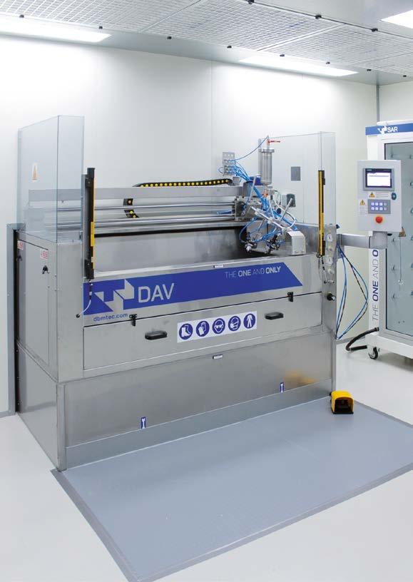
Festina Lente adopts advanced automation for coating buttons and fashion accessories
Monica Fumagalli ipcm®
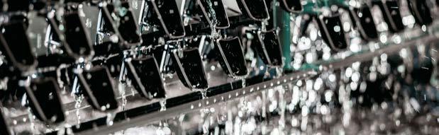
In Italy’s Bergamo button district, Festina Lente is setting up a new production facility for processes that combine traditional craftsmanship with the most advanced technologies available. With this in mind, it has recently installed two identical systems designed and built by DBM Tecnologie to coat buttons and fashion accessories automatically.
Festina lente, the Latin motto first attributed to Roman emperor Augustus, means ‘hurry slowly’ and evokes the drive to move decisively but cautiously towards a goal. It was no coincidence that in the 16th century, Cosimo de’ Medici associated it with the symbol of the turtle, the emblem of his fleet, as a reminder to be thoughtful when undertaking projects to ensure their success1. This motto has become not only the name of a company, Festina Lente Srl, founded in October 2022 in the area around Bergamo (Italy) known as ‘the button valley’, but also the synthesis of its growth strategy, aimed at developing an enterprise capable of facing the challenges of a fluctuating market. “As the luxury clothing and fashion accessory sector is going through a period of readjustment after the recent crisis,” explains Marco Faustini, the CEO of Festina Lente, “this strategy is enabling us to avoid damaging production slowdowns while laying a solid foundation for our future projects.”
1 https://en.wikipedia.org/wiki/Festina_lente
Located between Bergamo and Brescia with a focal point in Grumello del Monte, the button district – which in the 1930s reached an export volume of up to 2,700 tonnes of buttons worldwide2 – went through a period of crisis ten years ago. That pushed many companies to diversify their production and specialise in belt buckles, zip fasteners, and other accessories, thus targeting the fashion industry with a focus on luxury.
However, according to a new Business of Fashion and McKinsey report, this market is now experiencing a slowdown expected to continue into next year. As the consultancy firm’s report states, “Judged purely by the top line, the fashion industry’s outlook for 2025 appears to be a continuation of the sluggishness seen in 2024: revenue growth is expected to stabilise in the low single digits. While luxury has led in value creation in recent years, the McKinsey Global Fashion Index forecasts that in 2024, it is nonluxury that will drive the entirety of the increase in economic profit for the first time since 2010 (excluding the COVID-19 pandemic).3”
With a business strategy based on a vertically integrated production flow that combines artisanship and innovation, Festina Lente has excellent growth prospects.
"In 2024, despite a volatile market, the company demonstrated resilience and flexibility by keeping all production phases strictly inhouse," Faustini emphasises. "This allowed us to ensure on-time deliveries while maintaining a relationship of complete transparency with our customers." “Recently, we have invested in a new factory where we have moved two critical processes, foundry and coating. Both are characterised by a profound know-how that has enabled us to select the best technologies on the market to be used alongside the existing ones in the new production site. This led us
Some processes, such as those performed on buckles and other accessories, are carried out using robotic machinery.
A dry mass finishing plant treating buttons and accessories.
Resin abrasives used for mass finishing.
to contact DBM Tecnologie Srl (Casale sul Sile, Treviso, Italy) for the installation of two rack coating systems aimed at automating and thus accelerating our production of buttons (mainly in Zamak), buckles, and other metal accessories.”
The story of Festina Lente: from artisans to leading manufacturers of metal accessories and finishes
“Between 2019 and 2020,” says Faustini, “two nearby craftsman companies, Villa&Villa and MTV, specialising respectively in the die casting and coating of buttons and fashion accessories, merged to become Festina Lente Srl. In 2021, they were joined by Plating Gold (Vicenza, Italy), which has been performing galvanic, processing, and finishing treatments on precious and common metals for over thirty years, and in 2024, by
Italyart (Trissino, Vicenza), operating in the investment casting sector, and S&A (Calenzano, Florence, Italy), a brass turning shop. Meanwhile, in 2022, we started looking for a new site for the newly established company: we decided that the most suitable area was near Grumello del Monte, which is still the heart of the button district.”
Two new departments between craftsmanship and innovation
In the Grumello del Monte site, Festina Lente’s foundry department produces Zamak buttons and accessories on two lines, one devoted to casting with rubber moulds and the other to die casting with steel moulds. “Rubber moulds are more pliable and enable us to create more complex products, e.g. with numerous undercuts, or to manufacture small batches
One of the two identical water curtain systems installed by DBM Tecnologie. The booths are designed in full compliance with ATEX regulations.
The automatic device that rotates and moves the two spray guns.
or products that will remain on the market for only one season, thus reducing costs for our customers. On the other hand, steel moulds are always preferable for standard items and large batches.” The preparation of the rubber moulds requires uncommon manual dexterity, as the channels along which the injected metal flows are carved with scalpels; an external company makes the die casting moulds.
“After moulding, the workpieces are first dry-cleaned manually or by an automatic mass finishing operation with resin abrasives. Then, they are subjected to cleaning: previously, we outsourced this phase, whereas we now perform it in-house with a recently installed machine. Once the parts are ready, they can be delivered to our customers for coating or subjected to surface finishing treatments by the companies in our Group. These include electrogalvanising, barrel coating, and manual or automatic liquid coating, which we carry out at our headquarters. The automatic coating process, in particular, is carried out
in the two identical systems recently installed by DBM Tecnologie and in a robotic booth recovered from our old factory.”
“The preparation of the racks or trays for rack coating also requires uncommon skills and experience,” notes Alessandro Costa Laia from the Technical Sales Department of DBM Tecnologie. “In this case, too, craftsmanship meets innovation, reflecting this company’s winning combination.”
Advanced rack coating
“The two water curtain coating systems from our DAV series installed here,” continues Costa Laia, “are integrated with sophisticated automation devices ensuring perfect coating even on particularly complexshaped components. Designed in full compliance with ATEX regulations, these systems are unique in that the workpiece-holding racks are loaded from above, the rack gripping points are automatically protected, the 1-metre long racks ensure a limited footprint, and the
The two paint spray guns.
coating operation is automatic. The spraying phase lasts 40 seconds and is carried out by 2 spray guns attached to a support that rotates and moves them along the horizontal axis to coat even the most difficult-to-reach areas. Thanks to the PLC control and the electronic regulators connected to the inverters, the operator can select the most suitable coating cycle and set parameters such as the coating unit’s translation speed and the number of revolutions of the rack. Finally, it is possible to pre-load and set customised coating recipes according to every customer’s needs.”
The water curtain booths use a thin layer of water on the back wall to capture paint particles, which are collected in a tank equipped with a 3-stage filtration system to minimise the emission of vapours and solvents into the surrounding environment. “Inside the coating booths are fume abatement systems that reduce emissions, protect the operators’ health, and thus contribute to environmental sustainability. Each booth is divided into two parts: the front section, with the operator panel, the electrical panel, and photoelectric protection barriers, and the rear section, providing easy access for maintenance on pumps, motors, and filters. The latter include a labyrinth filter to facilitate the removal of droplets, a mechanical filtration unit, and a fibreglass filter for the final filtration phase. Each booth is also linked to an extraction fan and the factory’s centralised suction system.”
The system is completed by 2 flash-off stations with 12 slots each, where the frames dwell for 30 minutes, and an oven divided into two zones to set different temperatures (max. 160 °C) depending on production requirements. After drying, the components are sent for packaging.
When the operator’s expertise makes the difference
“As a company policy, when Festina Lente grows by acquiring or incorporating a new company, the previous owners are integrated into our management,” says Faustini. “The same goes for the employees to guarantee production
The control PLC where the operator can set different recipes depending on the required application process.
The flash-off station with 12 slots.
The oven’s opening is located inside the clean room.
continuity and, therefore, quality. Sometimes, however, operators can choose other paths and, especially in a department performing complex processes such as coating, finding specialised personnel is not easy. After a trial period, we have managed to find a department manager with fifteen years of experience. He was the one who recommended that we purchase our booths from DBM Tecnologie, with which he had already had the opportunity to work.”
The two machines have only been in operation for a few months, but Festina Lente’s CEO is already pleased with the investment: “We were looking for a solution that was compact, clean, and respectful of our work environment and surrounding area. Its high automation degree prevents the system from switching on if the booth’s pressurisation unit has not started. This has two advantages: on the one hand, the well-being of the operator, who can work in a room with purified air, and on the other hand, the guarantee that the applied coating has no defects and is of high quality, as our customer expects from us.”
Let‘s talk about powder coating.
A technology that is proven since decades and actually, it‘s just getting started with FLOWSENSE. FLOWSENSE? It‘s a software masterpiece and a bunch of small sensors that do big things: Consistent powder output from the rst to the last workpiece. Reliability, measured in real time. Put quality on repeat!
The outside of the clean room where the racks exit the oven.
‘Hurry slowly’
Festina Lente is entirely focused on the B2B market, comprising small and medium-sized companies and a few large manufacturing Groups.
“Last year,” concludes Faustini, “was tough for two companies in our Group that work with the luxury sector, where even future prospects are not rosy, as already mentioned. To ensure they did not stop production, we entrusted them with some processes that we usually carry out here – another example of how being part of a dynamic group like this can prove an asset. Currently, although Festina Lente continues to work for the fashion sector, we are trying to diversify our target markets, including the
furniture, eyewear, perfumery, and cosmetics sectors. The real challenge is finding products best suited to rack coating operations, such as those with three-dimensional geometries. Regarding business development, we will continue to pursue our insourcing strategy for vertically integrating our production flow and to rely on the most innovative and advanced suppliers, such as DBM Tecnologie, for replacing obsolete systems. We aim to be always ready for any request and do not stop until we are completely satisfied with our results. For us, that means truly embracing the values expressed in the motto ‘hurry slowly’ – proceeding at full speed but with caution.”
The back of the two booths: each of them is linked to an extraction fan and the factory’s centralised suction system.
Buttons at the end of the production process.
Customising the production of hooks and load bars to make the coating process even more efficient
From an interview with Guerra’s quality manager, Claudia Guerra, and sales manager, Matteo Cuman
Correctly managing the hanging phase on a coating line is key to optimal finishing results.
Guerra S.r.l., a company specialising in the production and supply of a wide range of industrial coating solutions, has particularly invested in expanding its customised hook and load bar manufacturing department. With a production rate of over 30,000 hooks a day, it now offers a highly personalised and fast service that meets the increasingly specific demands of the market.
In the industrial coating sector, every detail of the production process affects the quality of the final result. Among these, handling equipment plays a crucial role. Hooks, in particular, are not just simple accessories but critical elements for stable fastening, uniform load distribution, and flawless paint application. Of course, the needs of companies are numerous and diverse, depending on the type of plant used, the nature of the products to be treated, and the manufacturing cycle adopted. Some components to be coated are light and compact, others are bulky and heavy, and some have complex shapes requiring specific hanging points to avoid paint build-ups or shaded areas. Finally, it is essential to consider the constraints posed by overhead conveyors or handling chains to prevent the hanging devices from interfering with the operational flow.
Guerra S.r.l. (Zelo Buon Persico, Lodi, Italy), a company specialising in the production and supply of products and technologies for industrial coating, has recently expanded its design and production department for hanging hooks and load bars precisely to meet these challenges, aiming to develop tailor-made solutions that can be perfectly adapted to customer needs. Each item is designed according to the size and weight of the workpieces to be handled, as well as the space available along the coating line: such a customised approach ensures an optimised plant load, improved production efficiency, and precise and uniform paint application. In-house production for a more efficient and personalised service For years, Guerra has been a benchmark retailer of industrial coating
Guerra produces hanging hooks with different sizes, diameters, and load capacities to meet all market needs.
products, including hooks and load bars for handling parts along coating lines. Over time, the company has found that customer needs are becoming increasingly specific and diversified, requiring a more flexible and timely response. “Customers often order small quantities of highly customised products. That is why we started to produce hooks and load bars in-house a few years ago. This strategic step, together with the gradual expansion of our entire manufacturing department, has enabled us to reduce waiting times, guarantee greater customisation, and offer a fast and efficient service,” explains Matteo Cuman, the company’s sales manager.
Today, Guerra is well known for producing tailormade hooks that perfectly adapt to each customer’s requirements. It can manufacture hooks with diameters ranging from 1.5 to 25 mm and internal lengths from 50 to 1,000 mm. “Although we have a catalogue of standard models, the added value of our company lies precisely in our ability to design and produce customised hooks,” notes quality manager Claudia Guerra.
The expanded production department
“Each hanging device is the result of an initial idea and careful planning. In some cases, customers provide us with a model that must be faithfully replicated; in others, they present us with a specific need, and our technical team develops the most suitable solution to guarantee optimal coating operations,” says Guerra. The design process is carried out in-house, with a quick turnaround and a highly personalised approach. After identifying the ideal solution, a prototype is made for the customer to test. If it meets expectations, production begins, and the collaboration starts.
Guerra has a state-of-the-art production department with one manual and four automatic machines to ensure precision and efficiency. “The automatic systems manufacture hooks with smaller diameters, depending on their thickness range: two exclusively process 1.5 and 2 mm-thick steel wire, whereas the other two work on diameters from 3 to 6 mm. One of these is equipped with a rotating head to obtain complex folds and angles. In addition, some of our machines operate with 3D technology, allowing us to manufacture hooks with bends of up to 45° and
Overview of the hook and load bar production department.
90° and more complex geometries,” states Cuman. “On the other hand, for larger diameters, i.e. from 8 to 25 mm, we prefer manual processing, essential to guarantee maximum precision.”
The same approach is also applied to designing and producing load bars, always ensuring that each product can be precisely replicated. In addition, to guarantee maximum safety and reliability, Guerra collaborates with a certification firm that performs traction tests on the load bars to verify their resistance and compliance with industry standards.
The production cycle
The production process begins with selecting certified raw materials, which are carefully stored in the company’s warehouse before processing. An operator loads the steel wire onto the right machine, adjusting parameters according to the specific requirements and the desired shape. At the end of the production process, each batch is labelled with its technical characteristics for maximum traceability. “Currently, we produce about 30,000 hooks a day. This volume certainly reflects the growing demand for customised solutions,” Cuman notes.
Particular attention is also paid to packaging solutions, which Guerra is optimising to prevent its hooks from tangling during transport and to facilitate handling by the customers. “In the future, we would like to
automate this department further and make the preparation of goods before shipment faster and more efficient,” Claudia Guerra adds.
An extensive sales network and an e-commerce for an even more efficient service
Guerra operates through a wide network of retailers in various regions of Italy, including Piedmont, Emilia-Romagna, Tuscany, and Southern Italy. In Lombardy, the company manages relations with end users directly, whereas in the rest of the country, it relies on local partners to ensure a more widespread presence and responsive customer service. Attentive to the market’s needs, the company is always open to new collaborations with potential retailers interested in distributing its products. In addition, to offer an even more user-friendly and accessible shopping experience, Guerra has developed an e-commerce integrated into its website. Here, companies can consult its catalogue and order hooks and load bars directly online. “Upon receiving an order, our technical team contacts the customer for a final check, offering the possibility to personalise our products according to specific needs. This model combines the convenience of online shopping with the flexibility of customised production, always guaranteeing a fast and efficient service,” concludes the company’s sales manager.
The making of a hook on one of the automatic machines.
A tailor-made load bar from Guerra.
FOCUS ON TECHNOLOGY
Improved production flexibility and environmental sustainability: the challenges of Galv.Ar’s new coating line
Ilaria Paolomelo ipcm®
Long-standing surface treatment specialist Galv.Ar (Arezzo, Italy) has chosen Visa Impianti to design and install a new powder coating system. The goal? Achieving greater operational flexibility than with the old plant and reducing environmental impact, a commitment that the company has been pursuing for years to make its production increasingly sustainable. In Visa Impianti, Galv.Ar has found the ideal partner for making this vision a reality.
In the surface treatment industry, sustainability is now a strategic factor of primary importance. The growing attention to environmental issues and increasingly stringent regulations require companies to adopt technological solutions that reduce their ecological impact without sacrificing production efficiency. One of the main challenges for businesses operating in the industrial coatings sector, in particular, is wastewater management, a crucial factor in limiting pollution and preserving water resources. To this end, companies adopt purification systems that allow them to treat and reuse water in production or, if this is not possible, to dispose of it in full compliance with environmental regulations. Another key element is optimising energy consumption through technologies that recover the heat generated by various devices, including part drying and paint baking ovens; instead of releasing it into the environment, these systems allow the heat to be reused in other production phases. Finally, adopting renewable energy sources, e.g. installing photovoltaic panels, is an increasingly popular choice to reduce reliance on traditional energy sources and limit CO2 emissions.
These best practices that companies specialising in coating (and others, too) should take into consideration are precisely the ones that guided
Overview of the coating department.
The loading area.
the design of Galv.Ar’s new coating system. Specialising in a wide range of surface treatments, this company has always paid great attention to sustainability. That is why, when the need arose to install a new coating system, Galv.Ar found the ideal partner to meet its needs in Visa Impianti (Triuggio, Monza e Brianza, Italy). Their collaboration led to designing a powder application line that guarantees maximum operational flexibility while minimising environmental impact, reducing energy consumption, and improving finishing quality.
Galv.Ar: a history of evolution and innovation in metal finishing
Galv.Ar is headquartered in Pieve al Toppo, in the province of Arezzo (Italy). It was founded in 2000, although its origins date back to 1973 when Galvanica Aretina was established to provide electrolytic galvanising treatments. Its product quality and delivery timeliness have immediately enabled it to establish itself in the finishing industry, consolidating a degree of experience that is now its greatest added value. Over the years, Galv.Ar has grown and adapted to market developments. In 1984, it became Galvanica Aretina Snc and invested in new facilities in the industrial area of S. Lazzaro (Arezzo). In 1994, it
further expanded its production capacity with the installation of a semiautomatic system for phosphodegreasing and thermosetting powder coating processes. “We have always looked ahead without being afraid to innovate and improve our processes. Our philosophy has been clear from the beginning: offering high-quality treatments and adapting to market demands with maximum flexibility,” says Marco Montini, one of the owners.
Galv.Ar Srl was founded in response to the increasingly demanding market and the desire to further expand business volumes in 1999, with a modern 1,400 m²-wide factory and automated galvanising and powder coating lines. This new setup allowed it to further improve its production standards to the extent that in 2003, it obtained ISO 9001:2000 certification. Such growth continued in the following years: today, Galv.Ar covers an area of 15,000 m² and offers a wide range of surface treatments. ‘We work with companies from different sectors,
from furnishing accessories to heavy metal structures, from automotive to precision mechanics components. We have intentionally avoided specialising in one niche – and this is our strength. Our biggest customer does not account for more than 8% of our annual turnover, making us extremely flexible and capable of quickly adapting to any market need,” explains Montini.
The coating cycle
With decades of experience, Galv.Ar offers a variety of surface treatments, including electroplating, static and barrel galvanising, automatic shot blasting with iron grit, and cataphoretic and powder coating. “‘We have built our strength on operational flexibility. This enables us to adapt our treatments to the technical specifications, the materials to be processed, and the intended use of parts, providing customised solutions that combine different processes or use just one depending on each
Components entering the tunnel and the pre-treatment tanks.
customer’s needs,” explains Marco Montini. “We often use powder coating only – with polyester or epoxy-polyester products – but sometimes the components can be zinc-plated or galvanised before that.”
The powder coating cycle begins with a pre-treatment phase adapted to the treated material. This can be mechanical first – with an off-line shot blasting plant – and then chemical, or exclusively chemical if a less intensive treatment is preferable. “The components are manually hung onto the power & free conveyor supplied by Futura Convogliatori Aerei (Rebecco Pavese, Pavia, Italy) and taken inside the pre-treatment tunnel, where they undergo a phosphodegreasing stage followed by three rinses: two with mains water and one with demineralised water,” illustrates Paolo Massari, the owner of Visa Impianti.
After pre-treatment, the parts are transferred to the drying oven, where they dwell at a controlled temperature for 15 minutes before being sent to one of the two automatic coating booths equipped with Nordson guns.
Components dwelling in the drying oven.
The booths are equipped with an optical reading system that scans the shapes of the workpieces to be coated and optimises the guns’ operating parameters in real-time to ensure uniform coverage and minimise product waste. “We have two identical booths so that we can work with one or both at the same time, depending on our workload. We may carry out over 16 colour changes a day, although this number varies depending on the components to be treated; therefore, this operation must be performed quickly. Working with both booths also allows us to meet all our customers’ requests in a short time,” says Montini. The booths also feature manual touch-up stations, ensuring accurate quality control. Finally, the new booth is equipped with a PLC that is interfaced with the company’s management system, enabling constant process monitoring and precise analysis of production data.
A system designed to meet sustainability needs
“When we decided to install a new coating line, we had some clear objectives in mind. One of these was definitely adopting technologies that would guarantee maximum respect for the environment and sustainability. Galv.Ar has always paid close attention to these issues. When we moved to this new factory a few years ago, we immediately installed a photovoltaic system on its roof, equipped with 65-kW and 165kW storage batteries covering a significant part of the factory’s energy needs,” says Montini.
Therefore, when the company turned to Visa Impianti for a new plant, it requested technological solutions that could further support its efforts in this area, focusing on water treatment and reuse and optimised oven consumption. “We chose to design a closed-loop pre-treatment system
A detail of the Futura Convogliatori Aerei conveyor.
The coating application phase in the booth.
that enables treating waste water in a special unit supplied by Ecoteam (Scandicci, Florence, Italy) and then recirculating and reusing it in the tunnel. That has allowed Galv.Ar to optimise the use of water, which is a precious resource, while eliminating the need for external discharge. The waste generated by the water treatment plant is compacted to obtain sludge that is collected in special big bags disposed of according to current environmental regulations,” continues Paolo Massari. As already mentioned, the plant’s polymerisation oven has also been designed to guarantee maximum energy efficiency and optimised consumption thanks to an innovative residual heat recovery system. A dedicated pipeline transfers the excess heat generated by the burners of the oven, which can reach 190 °C, to an air-to-air heat exchanger. The heat is then conveyed to the drying oven, which maintains an average
temperature of 60 °C by using energy that would otherwise be dispersed into the atmosphere. If the recovered heat is not enough to maintain the required temperature, a burner is automatically activated to compensate for any losses.
As for the handling of parts, the power & free conveyor and the automatic lowerators supplied by Futura Srl make the loading and unloading stations ergonomic. Finally, integration with Industry 4.0 technologies guarantees total control over every phase of the production process. “Thanks to an advanced monitoring system and complete data traceability, we can optimise our operational efficiency and prevent any critical issues, intervening promptly to ensure continuous and smooth production. The result is a clear improvement in the quality of end products,” notes Montini.
The powder coating booth's cyclone.
The waste water treatment plant.
A successful collaboration that will continue in future
Installing the new plant, which has been in operation since summer 2023, was a key strategic step forward for Galv.Ar, significantly improving its production efficiency, reducing energy consumption, and resulting in more sustainable process management. Galv.Ar owner Marco Montini is fully satisfied with the result obtained: “We are very pleased with this system. I would not change anything – and that is not something that can be taken for granted with investments of this size. We studied every aspect in detail together with Visa Impianti’s technicians and designers, and thanks to this synergy, we managed to obtain the high degree of flexibility that is essential for us. The new system has overcome all the technological limitations of the previous one, taking us to a higher level of productivity and quality.”
“The Galv.Ar project was an exciting challenge. Our goal was to produce a high-performance, flexible, and environmentally friendly system. Thanks to an in-depth analysis and constant interaction with Marco Montini and his team, we were able to develop a cutting-edge solution that meets their production needs and the highest technological standards,” concludes Massari.
Looking to the future, Galv.Ar will continue pursuing its growth strategy with new targeted investments. “We have already planned a plant expansion,” indicates Montini, “and we have purchased a new, semi-automatic coating system from Visa Impianti for parts up to 9 metres in length. It will have two booths, one for liquid and one for powder coating.”
New technology from Dürr enables VOC-free colour changes with 2-component clear coats
Carina Lachnit Dürr Systems AG - Bietigheim-Bissingen, Germany carina.lachnit@durr.com
Dürr’s latest development enables mixed 2-component paint systems to be fed directly in the return system within the atomizer for the first time. This eliminates VOC emissions in the paint booth during flushing processes and colour changes. The new solution has been successfully deployed in two top coat lines for over a year.
Until now, significant amounts of volatile organic compounds (VOCs) were released into the paint booth during flushing and colour changes with mixed two-component (2K) paint systems.
In conventional processes, residual paint is flushed forward into a funnel or directly into the washout, leading to VOC pollution in over 70 percent of the booth air. The EcoBell PurgeBox collecting system with special filter mats already reduces VOC emissions by up to 60 percent.
Dürr’s new development further reduces VOC load by enabling a return system for 2K clear coats, similar to the classic 1C process. Previously, this was unthinkable for mixed clear coat systems consisting of hardener and stock paint. Using a patented process sequence with precisely coordinated parameters, mixed 2K materials can be flushed back via a return system integrated in the atomizer without curing. This technology includes up to two main needles in the atomizer and the established diaphragm valve technology, which ensures high mixing quality with
Once painting is complete, the mixed green 2K paint is returned in the atomizer. During this process, the blue paint is already mixed and can be applied without any loss of cycle time.
The green paint is mixed in the atomizer and applied (the clear coats are shown in green and blue for demonstration purposes).
minimal mixing volume. Low VOC emissions of only 5 percent occur solely during the bell disk cleaning in the EcoBell Cleaner D2, with no VOC release during flushing or colour changes.
Effect finishes within normal cycle times
The return system for mixed 2K materials is not only environmentally friendly, but also saves time. During cleaning of the bell disk and atomizer surface in the EcoBell Cleaner D2, flushing and priming can occur parallel. These steps, previously performed sequentially, are now completed in parallel within just 15 seconds, reducing colour change time by half, increasing system capacity, and allowing more time for painting. Tinted clear coats can now be applied without any cycle time losses, enabling car manufacturers to make much broader use of effect finishes, which were previously limited to exclusive segments. In combination with the EcoBell4 Pro this setup offers maximum flexibility. Two returns for 2K material (2x2K) are therefore integrated in each robot arm. This means that while one body is being painted, the stock paint and hardener for the next body can be prepared in parallel on a second channel. Even if manufacturers use multiple paints and hardeners that are chemically incompatible, these can be applied through separate channels. Dürr verifies the compatibility of customer clear coat systems in its test centre. So far, all 2K clear coats have been compatible with this new technology and can be returned and collected via the atomizers.
Return system reduces costs for fixtures and fittings
The EcoBell4 Pro rotary atomizer is available with the return system in the 2x2K and 1x2K variants, while the EcoBell3 can be retrofitted with 1x2K. Another system using this new technology is currently being commissioned. Beyond eliminating VOC emissions during flushing and colour changes and significantly reducing flushing agent consumption, this solution also offers low investment costs by eliminating the need for funnels, EcoBell PurgeBox units, and other fixtures and fittings in the paint booth.
For over a year, the return system for mixed 2K material has demonstrated its effectiveness at a leading electric car manufacturer, operating in two top coat lines with 42 high-rotation atomizers.
Get
Turn key solutions for industrial wastewater treatment
Design and manufacturing of plants and chemicals for industrial wastewater treatment
Chemical-physical plants
Sludge treatment and compactor systems
Ion exchange demineralization systems and reverse osmosis systems
Oil separators
Filtering systems
Batch type systems
Flotation units
Chemicals and spare parts for water treatment
Technical service, support and maintenance of wastewater treatment plants
Chemtec acquired Olivari Srl to develop innovative solutions for the surface treatment sector
This strategic move marks an important step forward in Chemtec’s growth, further consolidating its leadership position in the national market.
The global company specialising in the formulation, production and commercialisation of innovative technologies for industrial finishing Chemtec has acquired Olivari Srl, a historic Italian company operating in the pretreatment sector.
The acquisition of Olivari S.r.l. will bring Chemtec a number of significant competitive advantages, including:
Expansion of the product portfolio: the combination of the two companies’ expertise and technologies will enable them to offer customers an even broader range of products and tailored solutions to meet the specific needs of various industries.
Technological innovation: with continuous investment in research and development, Chemtec will provide cutting-edge solutions that enhance the quality of finished products and reduce environmental impact.
Consolidation of market presence: the unified sales network will allow Chemtec to strengthen its presence in the local market. Skilled technical support: a team of experts will be available to provide technical support and customised consulting for customers.
“The acquisition of Olivari represents a pivotal moment in the history of our company. We are confident that this move will allow us to accelerate our growth and strengthen our presence in the national market. The combination of our expertise will enable us to offer our customers even more innovative and sustainable solutions. We are excited to bring Olivari’s experience and expertise into our team, not just to ease the transition of this acquisition but also to foster a shared growth path that ensures the satisfaction of our customers,” has stated Carlo Enrico Guidetti, CEO of Chemtec.
Both companies have always prioritised environmental sustainability and technical support based on quality and customer centricity at the core of their operations. With this acquisition, Chemtec reaffirms itself as a reliable partner for companies in the industrial finishing sector, offering innovative and sustainable chemical solutions.
“I thank Chemtec for continuing the development of the Olivari brand in the Italian market. The shared values between
Chemtec and Olivari are the same: product quality, customer care and continuous process control. I am convinced that our end customers will benefit from this acquisition, as it will offer an expanded range of products and services without sacrificing the close contact and collaboration with our clients,” has added Paolo Olivari.
Lechler launches ISOFAN ess&re coating
Lechler’s ISOFAN ess&re stands out for its ability to combine protection, durability and reduced environmental impact without compromising performance.
Lechler has launched the ISOFAN ess&re, which marks a true revolution in the world of industrial finishes, as it combines innovation, sustainability and superior technical performance.
ISOFAN ess&re is an ultra-high-solid topcoat, low in Volatile Organic Compounds (VOCs) that provides long lasting protection even under the most extreme conditions. Thanks to its durability, it perfectly meets the needs of the most demanding professionals.
Another distinguishing feature of ISOFAN ess&re is its ease of application, making it suitable for all systems, from traditional spray to HVLP and Air-Assisted applications, while guaranteeing an impeccable aesthetic result, with a uniform gloss that enhances any manufacts.
ISOFAN ess&re’s contribution to sustainability is also reflected in its choice of raw materials, with over 25% of its composition coming from renewable sources. This ecological commitment also extends to hardeners and thinners, designed to be safe and environmentally friendly. The total absence of
DBTL (Dibutyltin dilaurate) is a further sign of Lechler’s focus on operator’s health and air quality. Furthermore, ISOFAN ess&re offers extraordinary flexibility thanks to its integration with the Lechsys tintometric system, which allows the reproduction of over 3000 pastel colours through the Master Chroma Advanced collection.
The modular system, with neutral (44310) and white (44311) binders, optimises the cost/performance ratio, guaranteeing excellent coverage across the entire colour range. Finally, to ensure optimum performance, ISOFAN ess&re is combined with two hardeners (13800 and 13801) and two thinners (01160 and 01161), designed to meet the specific needs of each application. This versatility makes ISOFAN ess&re the ideal choice for companies looking for high-performance with an increasing focus on sustainability and the environment.
For further information: www.lechler.eu/en
WHERE WE HAVE BEEN
60
OF THE MONTH
i.dek: innovation, customisation, and sustainability in the production of polyester films for aesthetic effects on aluminium and pre-painted metal
64 HIGHLIGHT OF THE MONTH
“The way of Living Emotions”: Color Design® Lechler
66 FOCUS
A market with different requirements but similar engineering needs: American company PTF Industrial Coatings chooses Italian technology
74
The durability of HEROair’s yellow coating for a ping-pong game that can last forever 78
Fit Out’s green revolution: achieving carbon neutrality through zero emission pre-treatment and powder coating
Premium quality meets colour inspiration: transforming smart workspaces with Interpon
90 FOCUS ON
A new coating booth from AluK’s aluminium frames: more speed, more efficiency, and more colour changes
The importance of sound formulations when choosing coatings for outdoor architecture
An in-depth analysis of SurTec 313: innovation in aluminium anodising process, now Qualanod approved
FOCUS ON TECHNOLOGY
Automation revolutionises High Technology Italia’s coating line
MAZU enhances the beauty of its pottery with Powdura ECO coatings
Alcom’s production revolution: powder coating 9 metre-long profiles and sheets in one vertical plant
128
ST Powder Coatings presents its ‘green oasis’ of the future at Fuorisalone 130
Decoral® Group enters the coil coating industry and installs one of the largest powder application plants in the world
Ponte Giulio’s new powder coating system helps create distinctive, inclusive, and age-friendly bathroom environments
146 HIGHLIGHT OF THE MONTH
Sherwin-Williams: layering a world with colour possibilities
AkzoNobel introduced the Interpon D Futura Collection in Australia and New Zealand
The Interpon D Futura Collection helps Australian and New Zealand architects and designers to deliver beauty, sustainability and style in powder coating.
The international paints and coatings manufacturer AkzoNobel has announced the launch of its Interpon D Futura Collection 20242025 to Australia and New Zealand. The powder coatings range has been specifically developed to allow architects and designers in the built environment to imagine and realise a new vision in colour and enable creations to reconnect with nature.
The Interpon D Futura Collection is the result of the rigorous testing and the scientific research led by the trend and colour specialists of AkzoNobel, particularly involved in the building and construction sector. It comprises three new colour palettes, matching aesthetic quality with proven sustainability performance:
Merging Worlds;
Healing Nature;
Soft Abstraction.
“The Interpon D Futura Collection has been created with the future in mind: our new collection provides architects with world class colours that enable them to bring their imagination to life. It also provides a sustainable choice in powder coatings that both protects buildings and
lowers the environmental footprint compared to other coating solutions,” has stated Şirvan Canıtez, the commercial director for South Asia of AkzoNobel Powder Coatings.
Since it is composed by powder coatings, the collection is solventfree, emits no volatile organic compounds and any overspray can also be recovered and reused to minimise waste, while delivering superdurable performance with a warranty up to 25-years. Furthermore, it has already achieved an Environmental Product Declaration (EPD) – an independently verified assessment of its environmental impact across the whole lifespan.
“The range demonstrates the commitment of Interpon in delivering the highest quality colours, textures and finishes to enable architects to Futura their world and ours. That is why we are constantly innovating, while collaborating with our Global Aesthetic Center to use deep insight and scientific research to predict future trends and ensure they are always one step ahead,” has added Canıtez.
Keymark Corporation expands with new coating facility
Keymark Corporation, a leader in aluminium extrusion, has completed the installation of a new vertical powder coating line, supplied by the Italian company SAT, at its Lakeland, Florida facility. This enhancement increases the company’s production capacity and further strengthens its reputation as a trusted partner in the aluminium extrusion industry.
Keymark Corporation is one of America’s leading full-service aluminium extrusion companies. With two locations in Fonda, New York, and Lakeland, Florida, the company, which has been in business since 1964, offers in-house finishing capabilities, including anodising, casting, extruding, extrusion die construction, painting (acrylic, kynar, and powder coating), thermal barriers, thermal struts, and custom packaging. It manufactures both custom and stock extrusions/profiles for various industries, including automotive, building and construction (curtain walls, commercial windows, and storefronts), consumer durables, distribution, electrical, machinery and equipment, and transportation.
In September 2024, Keymark Corp. completed the installation of a stateof-the-art, chrome-free, 25 ft (7.62 meters) vertical powder coating line at its Lakeland extrusion facility. The line was provided by the Italian plant manufacturer SAT, in partnership with Gema. This new addition strengthens the company’s commitment to meeting market demands in the architectural and residential fenestration sectors.
The new 76,000-square-foot (approximately 7,000 m²) facility complements the existing 40-foot (12 meters) horizontal wet/powder coating line, bringing the total production space at the Lakeland location to over 330,000 square feet (approximately 31,000 m²) and adding more than 40 new jobs to the community.
“The new facility will deliver superior coatings with exceptional durability,” the company states. “It will meet the rigorous standards required by industries from architecture to consumer durables. Key features of the new powder coating line include advanced non-chrome pre-treatment systems, automated powder coating booths, energy-efficient curing ovens, a 25 ft (7.62 meters) paint length capability, and paints compliant with AAMA-2603, 2604, and 2605 standards. The facility also includes stringent quality assurance and testing. Additionally, no solvents are used in the application process, ensuring zero emissions and pollutants, which translates into 100% sustainability. The annual capacity exceeds 40 million pounds (approximately 18,000 tons) of powder coating products, all of which are produced entirely in the United States.”
By investing in cutting-edge technology and operational excellence, Keymark Corporation continues to reaffirm its reputation as a trusted partner in aluminium extrusion, setting new standards for the industry.
For further information: www.keymarkcorp.com and www.sataluminium.com/en/
i.dek: innovation, customisation, and sustainability in the production of polyester films for aesthetic effects on aluminium and pre-painted metal
This is particularly evident in the furniture, design, and construction sectors, where the focus on customisation is complemented by a growing environmental awareness. i.dek, a company specialising in the production of polyester films that can be transferred on aluminium and pre-painted metals to create sophisticated wood-like effects, has strategically positioned itself in this context by responding proactively to these two trends.
i.dek’s journey, from Legnano to global horizons
Based in Legnano (Milan, Italy), i.dek Srl was founded in 2008 and, within a short time, it has managed to carve out a significant share in the market of sublimation polyester films for aluminium and pre-painted metal decoration. With an approach focused on innovation and sustainability, it has helped transform the sector with its high-quality products that create refined aesthetic effects, such as those that imitate wood, and are an ecological and durable alternative to traditional materials. Since its beginnings, i.dek has grown by investing in research and development, distinguishing itself from its competitors through a portfolio of sustainable solutions with a low environmental impact, such as waterbased inks. It has integrated advanced technologies into sublimation and distinguished itself as an innovation pioneer capable of gradually expanding its offer and establishing itself as a leader in Italy and abroad. It has a solid distribution network covering Europe, the Middle East, and Central and South America; it is now also conquering new markets, such as Asia and the United States.
“Thanks to the wide range of special effects that can be obtained through
sublimation, i.dek products are particularly appreciated in the architectural sector, especially in the window and door frame field, which requires original aesthetic solutions and high functional performance,” states Ambrogio Cacia, i.dek’s owner and founding member. “Our products are mainly used to coat aluminium extrusions and can be employed in the aesthetic renovation of building and palace façades.”
The company has also gained a prominent position in the industrial design and furnishing industry, thanks to a catalogue of over 500 products offering a wide range of finishes and colours and meeting the most varied market demands.
Three product lines to meet market needs
“The sublimation technology produces long-lasting decorations that are wear- and weather-resistant and visually flawless, with numerous effects and customisation options. It is also highly flexible as it allows decorating complex surfaces and applying sublimation films even on different materials and in small batches.
i.dek offers three product lines that perfectly meet the needs of different sectors through their unique features.
Designed for flat, two-dimensional surfaces, the i.Cover line includes decorative plastic films characterised by soft-touch, anti-scratch, antifingerprint, and anti-graffiti finishes, suitable for indoor and outdoor use. The i.Cover films are available in a range of pastel, metallic, and brushed colours, designed for vertical application and for laminated profiles used in kitchens and doors, accessories for the hospitality and healthcare sectors, transport, bathrooms, household appliances, and furnishing elements.
Thanks to the development of a flexible front sheet, they are also ideal for application on photovoltaic panels.
The i.Transfer sublimation films are available in about 500 different wood effects and are designed to beautify the material to which they are applied, giving it refined and elegant aesthetics. This product line is suitable for both indoor and outdoor surfaces, thanks to its high resistance and low maintenance requirements. In addition, the i.Transfer films are AAMA 2605 and 2604 and Qualideco FS-005 certified.
The i.Powder line, for which we hold the Powder Supplier PS-033 certification issued by Qualideco, consists of thermosetting powders for sublimation offering excellent durability and certified according to the highest standards, including Qualicoat Class 1, Qualicoat Class 2, and AAMA 2605 and 2604.”
i.dek: quality tests, certifications, and commitment to sustainability
“Our company stands out for its focus on product quality. That is why we have an in-house laboratory to conduct rigorous tests on our films, including adhesion, impact, UV resistance, and abrasion tests, and ensure that each product meets the highest standards. Finally, our
i.dek is a leading manufacturer of sublimation polyester films for decorating aluminium and pre-painted metal surfaces.
The production plant in Monticello d’Alba (Cuneo, Italy).
company is Qualideco certified, a testament to our constant pursuit of excellence,” notes Cacia. Another extremely important factor for i.dek is sustainability. The company adopts responsible production practices with a low environmental impact and promotes the use of ecologically certified inks and environmentally friendly materials. “In this regard, decorations imitating natural materials can be seen as an ecological alternative to traditional materials, enabling to adopt sustainable solutions without sacrificing high aesthetic and performance standards,” adds the company’s owner.
Innovation according to i.dek: day by day towards change i.dek is constantly committed to searching for innovative solutions in the sublimation sector. Over the years, it has developed several new, advanced technologies, including the No Manipulation System. “This entails using films and powders specifically designed to avoid manipulating the films applied on aluminium profiles. Normally, a profile is painted with a homogeneous green or brown base coat on which the film is printed in a solid block. However, being dyes and not pigments, our inks penetrate
the powder-coated base, overlapping it in transparency. The colour obtained derives from the colourimetric sum of the base coat and the film,” explains Cacia. “The final result is a wood effect achieved thanks to the Class 1.5 powder coating’s hue, composed of a mix of four shades in different grain sizes: we give the base a wood-like effect and use the film to add the grain.” This technology guarantees that the treated profiles are ultra-resistant to ageing and free of production defects. It brings numerous advantages, including reduced need for specialised labour, doubled production capacity, uniform colours along the entire length of the profiles, and above all, a significant reduction in waste.
A further top innovation from i.dek is its EM System, a patented line of decorative films that uses both sublimation and thermoadhesive inks applied in register, combined with a specially developed powder coating. This solution significantly expands the colour range available for decorative effects, including metallic ones. Finally, i.dek has launched a super durable (SD) line of inks with a very high molecular weight. These are designed to guarantee maximum resistance and durability, complying with Qualideco specifications even with decorations transferred on light bases.
The rotary press in operation.
i.dek products are particularly appreciated in the window and door industry thanks to the wide range of effects that can be obtained through sublimation.
The collection's colour schemes have been designed to enhance the emotional dimension of colour, thus designing environments that exalt the most genuine and profound sensations.
HIGHLIGHT OF THE MONTH
“The way of Living Emotions”: Color Design® Lechler
Edited by Lechler Spa Como (CO) – Italy communication@lechler.eu
SPECIAL ISSUE ON ARCHITECTURE & DESIGN
A chromatic journey that weaves together emotions and values, a narrative that embraces the past and looks to the future, thus translating interior nuances into collective experience.
“The way of Living Emotions”, the Lechler Color Design project for 2025, aims to convey authentic and lasting emotions, going beyond the simple concept of colour harmonisation. An inner journey made of progressive and significant steps that lead to a stable and conscious change.
The collection goes beyond the mere harmonious design of colour to focus on the emotional design of environments. The goal is to arouse slow-release emotions, capable of stimulating altruistic feelings, a
sense of shared responsibility and a deep connection with the social and relational context.
The intent is to draw a clear distinction between ephemeral, momentary and superficial happiness, and deep and lasting joy or happiness, while promoting an authentic and open approach towards others and the world.
The collection’s colour schemes have been designed to enhance the emotional dimension of colour, thus designing environments that exalt the most genuine and profound sensations.
This attention involves the entire habitat universe: from the industrial manufactured items of the Lechler Tech world, to the furnishings with IVE products, up to the walls characterised by the products and colours of the new Chrèon project “Color Trainer, Guida Interni, Inspiring Matrix”. It is the colours that guide the path of introspection that evolves over time, thus leaving an indelible mark.
The collection
The collection is structured into five thematic harmonies, characterised by their ability to embrace various sensory forms. Each theme represents a stage of a profound emotional journey:
1. Thoughtful Serenity: spaces that invite reflection, thanks to a colour palette without evident contrasts, able to create an atmosphere of tranquillity, serenity and introspection. This harmony is designed for those who wish to rediscover, through a visual context that encourages, a deep reflectiveness.
2. Natural Balance: colours inspired by nature, such as greens and desaturated colours, which evoke balance, natural equilibrium and harmony between the environment and the individual, thus rediscovering the bond with the natural context.
3. Comfort: welcoming environments that convey a sense of protection, security and emotional stability, offering refuge and support.
4. Enthusiasm: a celebration of enthusiasm and the joy of living, characterised by dynamism and lightness, while inspiring spontaneity and vitality.
5. Fresh Desire: a representation of the desire for renewal, hinting at the craving for innovation, for something fresh and lively, while inviting to explore new possibilities and embrace change.
The proposed emotional journey is divided into five main stages: inner reflection, connection with the universe, open-mindedness and emotional warmth, transformation and renewal. Each harmony contributes through building a unique story, while inspiring and accompanying people on a journey that goes beyond aesthetics to embrace the deepest and most universal values of the human soul.
"The way of Living Emotions" by Lechler will be open to the public from April 7th to 13th in the Tortona area at Antica Fabbrica 14 in Milan.
A market with different requirements but similar engineering needs: American company PTF Industrial Coatings chooses Italian technology
Alessia Venturi and Gabriele Lazzari, ipcm®
One of the most critical steps in aluminium processing is coating, aimed to improve the aesthetics of end products but also ensure their durability and weathering resistance. However, there are significant differences between the approach taken in the US and Europe when it comes to coating process selection. PTF Industrial Coatings (Hialeah, Florida, USA) has gained much experience in aluminium contract coating over the years, experimenting with various technologies but preferring powders for a long time. That is why it relied on European plant manufacturers such as Avin (Pordenone, Italy) and Futura (Pavia, Italy) to optimise its systems and equip its factory with compact yet highly efficient conveyors.
The Surf Club Four Seasons Private Residences in Miami. PTF Industrial Coatings supplied the coatings of the profiles used for the building.
The United States’ aluminium profile industry is profoundly different from the European one in terms of finishing technologies. The residential construction sector is largely characterised by the use of PVC or wood extrusions, whereas aluminium is the material of choice for so-called “monumental” architectural projects, including stadiums, arenas, commercial and community spaces, and skyscrapers. For finishing aluminium extrusions and external cladding solutions for these buildings, the preferred solution in the US market is the application of liquid coatings based on PVDF, a partially fluorinated thermoplastic polymer with high chemical resistance to strong acids, oxidants, and ultraviolet rays and a very wide thermal application window of -40–150 °C. For the American aluminium industry, firmly anchored to the stringent specifications of the American Architectural Manufacturers Association (AAMA) about the outdoor performance of pre-treatment+finishing systems applied on aluminium extrusions and panels, PVDF liquid coatings are the most versatile and popular way to meet resistance requirements. For example, the AAMA 2605 high-performance exterior specification calls for finishes with exceptional resistance to moisture (over 4,000 salt spray resistance hours), colour fading (5 ΔE after 10 years), loss of gloss (50% after 10 years), chemicals, and erosion, as well as a minimum dry film thickness of 30 microns. Although the research and development of polyester powder coatings for outdoors focuses on formulating increasingly high-performance products that are close to the performance of PVDF, the US aluminium industry continues to be very conservative and prefer the known route: liquid coatings. That is also due to a lack of legislative and social pressure related to environmental impacts, atmospheric emissions, and sustainability – all drivers that have instead led to the adoption of powder coating as the exclusive finishing technology for aluminium extrusions both in Europe and in markets closely linked to European technologies, such as the Middle East and North Africa.
Samples of the sublimation portfolio of PTF.
The immersion baths.
ipcm
Talking with Jerry Cabrera, the CEO of PTF Industrial Coatings in Hialeah, a small town just outside Miami, we had the opportunity to discuss this topic in more detail, thanks to his extensive expertise in the aluminium coating industry and his experience as a pioneer in the use of powder coating and dye sublimation technologies for extrusions. “Despite their undoubted environmental benefits and ease of application, powders still encounter much scepticism within the US aluminium industry because they are often perceived as less durable, reliable, and efficient for monumental architectural applications. Moreover, unlike Europe, where industry associations such as Qualicoat issue quality marks to certify powder coating applicators working with aluminium, thus setting a standard, the US market does not have equivalent organisations. As a result, the powder industry has been partly penalised by the superficiality and lack of expertise of some coaters that have undermined the credibility and effectiveness of this technology in favour of liquid paint,” says Jerry Cabrera.
Italian quality serving US requirements
Founded in 1992 in Hialeah (Florida, USA), PTF Industrial Coatings was indeed among the first to implement powder coating and wood-effect sublimation in the aluminium sector, relying exclusively on European and, more specifically, Italian technology. “In the United States, most aluminium profile extruders are equipped with high-productivity coating plants to handle large colour batches, and they only turn to contractors for small batches or special finishes,” notes Cabrera. “That is why I decided to focus on powder coating, a technology that was new to the US market and offered great environmental and operational benefits. And who better to turn to than Italian plant engineering companies for our powder coating lines first and sublimation systems later? The European aluminium market is dominated by powders and Italy has been the cradle of many leading manufacturers of coating plants for aluminium extrusions. Initially, I approached an Italian plant engineering firm for the installation of our first two powder coating plants. Afterwards, I got in touch with Avin to optimise and fine-tune them and with Futura to develop reliable and
The compact Power & Free conveyor designed by Futura Srl.
Superstudio Più, Via Tortona 27, Milano
stpowdercoatings.com
high-performance yet compact conveyors, maximising space in PTF’s production site by designing routes for finishing parts in several coats without continuous idling along the line.” Happy with the results achieved with these Italian systems, the company later put its trust in Avin and Futura once again for the project of a hybrid plant combining liquid and powder coating. The reliability, skills, and flexibility of European, especially Italian, plant manufacturers are highly valued in the US.
“Our collaboration with Futura and Avin is paradigmatic: the hybrid system they designed has increased our revenue by 30% year-onyear. Our sublimation materials are also Italian: the polyester sublimation films we use to give aluminium a wood effect are developed and produced by i.dek (Milan). We have a production facility of about 10,000 m2 divided into two buildings housing two powder coating plants, the first high-productivity sublimation system in the USA, and a Kynar® one-coat liquid painting line operated by our qualified team. Finally, we now have a high-productivity, hybrid liquid+powder coating line,” illustrates Cabrera.
The best of both worlds: a hybrid liquid and powder coating plant
“We have been working with powder coatings for over thirty years. Technological innovation is essential for the quality of our work, which in turn is critical for reaching new customers. We have always strived to expand the range of processes we offer the market,” indicates Cabrera. PTF Industrial Coatings now has all the necessary technologies to meet the needs of the American market at large while specialising in some niche sectors. Over the years, it has complemented its powder coating and sublimation processes with the application of liquid paint, including Kynar® PVDF. Recognising the need to diversify production, PTF recently chose to also invest in a hybrid line capable of handling both liquid and powder finishes. This decision was driven by the growing demand for finishes that could meet the durability, gloss retention, and scratching,
Aluminium profiles entering the first coating booth.
The inside of another coating booth.
weathering, and chalking resistance specifications imposed by AAMA standards for the US commercial, industrial, government, residential, historic, and institutional profile market, without sacrificing the potential offered by powder coatings and the company’s thirty years expertise in this technology.
Its new plant includes an eight-stage immersion pre-treatment tunnel (pickling, rinsing with water, deoxidation, rinsing, chromating, and double rinsing with demineralised water, followed by drying in an oven) to give the coating superior adhesion and corrosion resistance; three automatic booths for the application of liquid paints (primer, top coat, and clear coat); and a booth for the possible application of a powder coating. Additional technologies include a pre-treatment waste water purification plant and an RTO system for VOC abatement that treats the fumes of the facility to reduce emissions and enable the company to meet all US environmental regulations.”
“Here, space is a luxury”: the importance of a compact conveyor
During the initial design phase of the plant, PTF encountered several problems: “When we decided to invest in a new solution, we analysed the
market. In most parts of the United States, if a coating system requires a 30 m-long pre-treatment tunnel and a 15 m-long drying oven, it is spread over an entire 20,000-m2 building. But here in South Florida, space is a luxury. In fact, we noticed that many of our local competitors used to apply three layers (primer, top coat, and clear coat) in one booth, moving the components along the whole line several times. Logistically, there seemed to be no alternative. However, productivity-wise, this is not a very efficient solution,” says Cabrera. “Even adding a 2,350-m2 area to our factory would not have allowed us to develop a system with all the booths installed in series. We needed the conveyor to be a compact power & free system that could handle the parts in extremely confined spaces, creating storage buffers in front of the booths to enable them to work simultaneously. Avin suggested we entrust Futura with the supply of the conveyor and the design of an efficient and flexible path along the liquid and/or powder coating area. In our opinion, Futura can provide the best solutions in all of Europe.”
Avin’s direct assistance, even with an ocean in between Futura’s power & free conveyor is the heart of the plant’s high productivity. Its advanced technology gives PTF the flexibility to efficiently handle bulky
The colour formulation and quality control department.
profiles even in tight spaces, allowing it to optimise the workflow within its production area. Unlike conventional conveyors, Futura’s system is designed for stop-and-go operation, facilitating the efficient movement of components through the coating, flash-off, drying, and cooling phases. “Installing and setting up such a compact line with multiple elements moving independently was a challenging task, which took about two years. Thanks to Avin’s team – led by General Manager Morgan Infanti, who personally flew in from Italy on several occasions – we assembled, started up, and tested the line without a hitch. All partners involved collaborated closely with us, providing amazing technical expertise and paying meticulous attention to every detail,” states Cabrera. “Their help has been, and still is, invaluable, as we are always trying to perfect our plant and conveyor to achieve maximum efficiency. We are currently employing a dedicated maintenance team to ensure that the line is always working to its full potential. And when we need replacements parts, these are shipped to us directly from Italy in record time.”
High-quality products for high-end markets
To meet all the demands of its high-end customers, PTF sometimes needs to apply two or more different tints on the same components:
in addition to mechanical and chemical properties, such as corrosion, scratch, and weather resistance, a key element of its offer is colours and textures. “Since we process profiles intended for multi-million dollar buildings, high finishing quality is not enough: versatility is also of the essence. For example, we frequently produce two-colour extruded profiles, perhaps white on one side because urban regulations require so on exterior façades and brown or with a wood effect on the other side to bring a sense of warmth to homes. At PTF, we can apply the primary colour on our automatic lines, mask one side of the profile, and finish the other with the secondary colour or effect,” Cabrera emphasises.
In-house colour formulation
PTF Industrial Coatings has an in-house colour laboratory: it develops formulations, creates samples, and finally uses a mixing machine to produce the exact quantities of paint required. All sample cards are then stored to track every activity performed and its results and thus be able to provide a twenty-year warranty as required by specifications. “We have also drawn up an inspection and maintenance manual that every new employee is required to study thoroughly in order to learn how best to carry out quality control,” Cabrera adds.
Exceptional Versatility and Control
• All-digital controller
• Venturi or HDLV Pumps
• Maneuverable Design
Rigorous quality controls
To achieve these levels of quality and guarantee over 3,000 hours of resistance in a salt spray test chamber, PTF places the utmost importance on quality controls. The company implements rigorous measures to ensure that every component meets the highest standards. For each process, in addition to the parts themselves, it also pre-treats sample panels that are cut and X-rayed to approve the results before proceeding with the coating operations. That ensures the profiles meet all the specifications imposed by AAMA. PTF also performs adhesion tests, boiling tests, and colour readings with a gloss master device for exceptional repeatability.
Bright colours for a brighter future
PTF Industrial Coatings has long been a surface treatment and finishing leader in Florida thanks to its ability to meet diverse performance requirements by offering exceptional finishes that combine aesthetic quality with mechanical properties. Over the years, it has demonstrated a commitment to flexibility and innovation, consistently exceeding customer expectations. However, it had never used liquid coatings before, as it started out in the powder coating industry and then specialised in sublimation. Therefore, it needed experienced partners to help it understand how to use this technology efficiently.
“Powder coating has always been our strength, but we also had to implement liquid coating to meet the typical American design requirements. Fortunately, our cooperation with Avin and Futura was a success. With our new hybrid coating system, which enables us to apply three layers of liquid paint and, if needed, a powder finish, our revenue has increased by about 30% year-over-year. We could not be more satisfied. In fact, we have also installed a second line to treat smaller parts, and we are considering expanding the cooperation further through a new plant with an even higher production capacity,” Cabrera concludes.
The durability of HEROair’s yellow coating for a ping-pong game that can last forever
Edited by ipcm®
Australian design company, POPP, has launched HEROair, an outdoor table tennis engineered for durability and accessibility in public spaces, with a specially designed coating that ensures long-lasting protection, reduces glare, and enhances the overall playability of the table.
Founded in 2009 by three friends in Perth, Western Australia, POPP was born from a simple idea encapsulated in the motto ‘ping-pong for everyone.’ The company is focused on bringing life to public spaces through the installation of ping-pong tables accessible to all.
After growing and expanding with a second production facility in Los Angeles, California, the company has stood the test of time as a leader and innovator in weatherproof, permanent, and colourful outdoor table tennis tables.
The POPP’s mission
The company is inspired and energised by good design and the social capital generated from the game of outdoor table tennis. With this inspiration and energy, it has been on a mission to make one of the most playable games in the world - the most accessible. To date, the company has permanently installed its design-led outdoor table tennis tables in over 3,000 communities (and counting).
The release of the first POPP model was in Australia in 2010 - the colour-rich and undeniably heavy duty HERO outdoor table tennis table. 700 kgs of fully welded steel, the HERO is designed for colour, artwork and a long, robust life outdoors. Literally anything can be thrown at it, including cyclones and floods. HERO tables have been featured everywhere from Sydney’s beaches to the Olympic Games and Nike’s headquarters.
The iconic and industrially strong ICON outdoor table tennis table followed the HERO - launching in Australia before being made locally by the Los Angeles production team and released in North America. Made in steel, the ICON followed suit being designed for colour, artwork and a long life outdoors. POPP has thus started developing a recurring model of design and production, focusing on creating robust, durable, and outdoor-ready tables. ICON tables have been featured in places as diverse as the headquarters of Dropbox, Waymo and Hewlett Packardto Harry Seidler designed skyscrapers in Sydney, Australia and the banks of the Yarra River.
The latest born in POPP’s house - the HEROair
To meet the demand of customers interested in the HERO design in North America, the Middle East and Europe, in 2024 POPP launched the HEROair - its first robotic welded aluminium table available in the company’s most popular colour - golden yellow. Innovatively flat-packed for cost-effective freight and blissfully easy assembly, the HEROair is helping POPP realise its vision of making one of the most playable games in the world - the most accessible. Achieving strength and durability with aluminium fabrication, the new product is an eye-catching, weatherproof and engineer-certified outdoor table tennis table. The choice of aluminium is due to its strength, lightweight properties, and infinite recyclability. Robotic welding ensures precision and consistency in production, enhancing overall durability. The Yellow Edition is finished with a custom exterior-rated matte yellow powder coat with a light sandstone texture. Assembled with marine grade stainless steel fasteners (tamper-proof optional), the HEROair includes Secure Anchoring Footings for added security.
The HEROair’s features at a glance
210 kgs marine grade, strengthened aluminium including welded support channels and Secure Anchoring Footings
Heavy duty construction to the POPP Built standard
5+2 year limited warranty.
Colourway
The design follows the form of the original HERO table while incorporating features for improved usability. The playing surface is abrasive blasted and finished with an exterior rated two system powder coat treatment with a sandstone finish. The matte finish combined with the light sandstone texture is designed to reduce glare and improve playability in full sun locations, as well as optimize ball spin. Referencing RAL 1003 as a comparable yellow, all fasteners for this edition are finished in satin black. Integrated ball and racquet holders reduce barriers to play, encouraging spontaneous use in public spaces.
POPP’s outdoor table tennis design focuses on bold shapes and vibrant colours to create visual impact and foster interaction. The HEROair continues this approach, acting as both a recreational fixture and a piece of urban design. In collaboration with local artists, certain models incorporate “playable art” elements, enhancing a sense of place and community identity. Designed for long-term outdoor use in parks, plazas, schools, universities, and commercial areas, it promotes accessible and inclusive recreation in public spaces.
Ping-pong for everyone
“With a fifth POPP table in development - while also exploring collaborations on other outdoor recreation products, POPP is excited by the opportunities and partnerships it has developed in Australia, the United States and Europe. The company is incredibly proud to be working with some of the best landscape architects, architects and designers across the world - but we are more proud to be creating thousands (upon thousands) of free, social and active moments of table tennis playacross the world - every day” – the company states.
For further information: www.popp.world
FOCUS ON TECHNOLOGY
SPECIAL ISSUE ON ARCHITECTURE & DESIGN
Fit Out’s green revolution: achieving carbon neutrality through zero emission pre-treatment and powder coating
Alessia Venturi, ipcm®
Fit Out, a leading UK interior fit-out contractor, is committed to becoming a carbon-neutral enterprise by 2050. To achieve this goal, the company has integrated sustainability into its operations, including a move to in-house powder coating with Toran 3® technology developed by Chemtec. This multi-metal pretreatment process eliminates water, waste, and energy consumption, offering both environmental and economic benefits. The use of Toran 3® allows Fit Out to refurbish up to 75% of old fixtures, promoting a circular economy.
“Our aim is to become a carbon neutral enterprise by 2050 at the latest”. With this statement, Steve McWeeney, Managing Director Fit Out (UK) Ltd explains the sustainability program of its company.
The UK has an important role to play in leading global efforts in the transition to net zero by 2050. As the impacts of climate change become increasingly clear, the urgency to stay within 1.5°C of global warming, as outlined in the Paris Agreement, is growing. Government, public and private sectors must take bold and progressive action.
Fit Out (London, UK), a leading interior fit out contractor and logistics service provider working in the retail, leisure, commercial and residential sectors, recognises that the well-being of the planet is a
An interior fit out for the retail sector manufactured and powder coated by Fit Out (London, UK).
shared responsibility. This is why the company has woven sustainability into the very fabric of its values, day-today operations, and the choices it makes.
For some time now, Fit Out has embarked on a carbon reduction journey to boost efficiency and to reduce its ecological impact by closely monitoring its sustainability performance and switching to green energy and green technologies.
These include investments in metal fabrication and powder coating, that is a strategic production stage for Fit Out, and a strong focus on the practice of asset refurbishment, which aligns with sustainable development goals by fostering responsible resource management and minimising the environmental burden associated with constant production and disposal.
Fit Out’s sustainability strategy aligns with the 17 Sustainable Development Goals (SDGs) set by the United Nations, identifying seven among them that fit best with their impact of its activities to focus on: Good Health and Well Being; Quality Education; Decent Work and Economic Growth; Sustainable Cities and Communities; Industry, Innovation and Infrastructure; Responsible Consumption and Production; Climate Action.
These last three goals, out of the 7 identified, are the foundation of some technological choices made by Fit Out in 2021, when the London-based company decided to bring the powder coating phase of its steel products in-house. The company installed a high energy-efficient powder coating line designed to integrate the Toran 3® innovative and environmentally friendly single-stage pretreatment technology, developed by the Italian company Chemtec (Milan, Italy) and supplied by their UK and Ireland Distributor Metavate Ltd., to prepare metallic surfaces for coating.
“Toran 3® is a pretreatment alternative to phospho-degreasing or passivating processes with no rinsing or degreasing required and no sludge or waste byproducts to dispose of,”
Overview of the powder coating line designed by Eurotherm (Turin, Italy) and installed by PFS Paint Finishing Systems.
Fit Out has embarked on a carbon reduction journey to boost efficiency and to reduce its ecological impact.
explains Beatrice Turri, Chemtec marketing manager. “It is an anhydrous process, based on high-boiling organic fluids for effective degreasing and immediate protection against oxidation. Since it is applied by spraying at room temperature, energy and water consumption are zero. We can define Toran 3® as a carbon-reducing technology because it reduces the carbon footprint of the powder coating process”.
The ideal choice, then, for Fit Out to achieve its SDGs regarding climate action, responsible consumption and innovation.
Fit Out – integrated project delivery of interior fit out
Established in 2000, Fit Out (UK) Ltd operates throughout the UK with offices in London – where the company moved in 2007 – and Sheffield. Originally a joinery manufacturer, five years ago the company moved into metal fabrication, manufacturing shelving and all the associated metal work that goes with the shop fitting elements in the retail and commercial industry. Four years ago, Fit Out opted to purchase a powder coating machine, after outsourcing the finishing of its products for over one year. The line was designed with Toran 3® pre-treatment technology in mind, and the result was a line with zero emissions: no water, no waste, no air pollution, with usage of green energy produced by the company’s full solar PV array with battery storage.
Fit Out’s 80.000 sqft (7,400 m2) design, manufacture, finishing and pre-assembly facility in London helps to mitigate storage and delivery restrictions, whilst providing a convenient prototyping space for design development and equipment sign-off.
Fit Out’s in-house delivery model provides a streamlined programme, design and manufacturing solution, enabling the project teams to maximise installation efficiency without ever compromising on quality and whilst supporting its clients’ net zero ambitions.
“We have extensive experience in the manufacture of high-quality furniture and retail fixtures. Our manufacturing operations transform traditional construction methods into modern processes of component assembly using automation, quality assurance systems, reducing onsite activity, construction waste, and minimising disruption to our client trading operations,” Jamie Mason, Commercial Director at Fit Out, states.
“We offer a complete manufacturing solution for all types of interior fit out projects, including joinery and metal fabrication. We have invested in the latest pre-treatment and powder coating system, reducing our gas usage by 65% and supporting our clients’ asset reuse strategy.”
“Sustainability is at the forefront of our business operations, prioritising environmentally conscious practices to ensure a better future for generations to come and as well as prioritising the refurbishment and
Spraying of the Toran 3® pre-treatment technology and parts exiting the drying oven.
Scan the code to see the manufacturing and powder coating process
re-use of pre-used equipment rather than their replacement. Among our key achievements there are zero waste to landfill, usage of 100% renewable electricity, 10% reduction of diesel consumption, 68% reduction of business travel, 26% reduction in packaging and 65% less gas usage. Our asset refurbishment strategy is cost-effective and sustainable. This approach allows organisations to extend the lifespan of their current investments, reducing the need for large capital expenditures. From a sustainability perspective, asset refurbishment contributes to resource conservation. It minimises the demand for raw materials and energy that would be required to manufacture and powder coat new assets. In a few words, refurbishment promotes a more circular economy.”
The finishing: a strategic feature for Fit Out products
“100% of our production is powder coated, except for the portion of stainless-steel products. Most of our clients choose powder coating over stainless steel for
the colours, textures, and effects that powder coatings can offer to complement and strengthen their brand identity or to differentiate the departments inside a single store. In addition, powder coating is cheaper than stainless-steel,” explains Jamie Mason.
“The quality of the finishing is key at Fit Out. We are working with clients who have specific colours for their brand and they need that colour to be consistent every time they put a shelf into a supermarket, retail, or contract space across the UK. Colour matching is absolutely crucial as well, because it is connected to brand identity and brand recognition on the market. We had issues with colour matching when we outsourced the powder coating and this was one of the reasons that pushed us to insource the finishing process back in 2021.
The colour we apply on the fixtures must be longlasting because the lifespan of shelves is quite long: they are repainted every 10 to 15 years on average and during their service life the coating needs to resist chemical attacks, mechanical impact, and scratching deriving from intensive use. Corrosion resistance is
Overview of the powder coating booth supplied by Wagner.
The powder finish must be long-lasting because the lifespan of shelves is quite long and they must resist chemical attacks, mechanical impact, and scratching deriving from intensive use.
not a key feature, since most of our production is destined to interiors, although refrigerated shelves must withstand cold-chilled environment, with a temperature of 2°C that can produce a more corrosive atmosphere. Toran 3® as a pretreatment ensures the quality level required to our products. The powder coating line was designed with this product in mind as pretreatment technology. We did extensive testing with Metavate Ltd. before choosing this product and we are satisfied with the choice because it proved to be a robust technology.”
The finishing process
The powder coating system installed by Fit Out in 2021 and supplied by PFS Paint Finishing Systems, the UK partner of the Italian company Eurotherm, includes:
Ecojet tunnel for the application of Chemtec’s Toran 3® product
Drying tunnel
Wagner powder coating booth
Curing tunnel
Monorail conveyor.
“Most of our fixtures, kits and shelving are in mild steel, only a small part is in aluminium or stainless steel. In any case, the chemical pretreatment is the same for all metals because Toran 3® is a multi-metal technology,” continues Alex Hender, Production Manager at Fit Out. “For fixtures that must be refurbished we have a manual grinding prior to the chemical pre-
treatment to remove dust or dried food stuff on them. New kits are pretreated with Toran 3® only, because they basically have an oil film on their surface due to mechanical working. This oil film needs to be washed-off before powder coating to improve adhesion and to ensure high chemical and mechanical performances of the coating film.
Toran 3® is supplied ready-to-use, sprayed pure at ambient temperature on the parts for 90 seconds. After spraying, parts are allowed to drip for 5 minutes, then get dried in an oven for 8 to 10 minutes at 130 – 140°C. No rinsing is needed and the dripped solution is recycled through the system and re-sprayed, so we do not have any wastewater or sludge from the pre-treatment tunnel.
After drying, the pieces are powder coated in a Wagner application booth and then cured. We have six standard colours and we apply an average of 15-16, including a few special effects, like metallic or leatherette effect, but we can customize anything upon request. The powder coating booth is equipped with a quick colour change system that needs only 10 minutes to switch from a colour to another. All the over sprayed powder is recycled for sustainability and cost-savings.”
The reasons behind a green choice
“We chose the Toran 3® as pre-treatment because it is extremely sustainable, efficient and high performance,” Alex Hender continues. “It is self-contained, it is applied at ambient temperature so no power is
The powder centre.
needed, no water, no wastage, no disposal costs, ease of use.”
“We call Chemtec Toran 3® chemical pre-treatment technology “the standard” since it is the easiest to use: you just spray, drip, and dry. One stage, self-contained, no heat required, no drainage, no wastage. And you just keep reusing it, topping it up with fresh product when needed. The only strict requirement is the bath analysis every three months to ensure that the chemical is always performing at its best,” interjects Judith Bailey, General Manager at Metavate (Warwick, UK), Chemtec’ s UK distributor.
“If we compare the Toran 3® technology to the conventional ironphosphating process, users of the latter must make daily analysis of the bath to ensure a proper and consistent surface pre-treatment while users of Toran 3® can analyse just one sample every three months, which makes life very simple. However, this analysis must be done regularly to have consistent results,” Carlo Guidetti, Chemtec’s CEO adds. “There is a strong cooperation between Chemtec and Metavate to provide the technical support necessary to our clients in UK. Metavate supplies the in-field service whilst Chemtec do the lab work at our premises in Milan, where we can count on a state-of-theart laboratory.”
“Parts treated with Toran 3® and painted provide chemical, mechanical, and scratch resistance which is very high. Since it uses no water, there is no oxidation of the metal surface and it provides a temporary (up to 6 months) protection from H2O and O2. Paint adhesion is high, flexibility of the paint film is excellent and impact resistance is improved. In addition, Toran 3® guarantees high flexibility in the coating line because it not necessary to wait for the product to heat up, even when the line is stopped the pieces do not oxidize. Nor is it necessary to plan shutdown at the end of the day as there will be no flash rust on parts when you turn the line off. The smaller footprint
From the left Alex Hender of Fit Out, Judith Bailey, Jane Egan, and Rachel Stevens of Metavate, Carlo Guidetti and Beatrice Turri of Chemtec.
means initial investment is reduced by between 30 to 70% less and there are no fixed process costs to amortize,” Carlo Guidetti states. “Fit Out is very hot on carbon reduction, climate protection, and sustainability. Nevertheless, clients are also pushing the sustainability agenda. Toran 3® is aligned with our and their net zero targets, whilst Metavate and Chemtec shares with Fit Out the same ethos on sustainability,” Jamie Mason adds.
A robust technology
“Another advantage that the use of Toran 3® has brought us is the ability to achieve the same finish quality even on reworked metal,” Jamie Mason concludes. “Before insourcing the powder coating process and introducing the Toran 3® pre-treatment, we were throwing away at least 50% of old fixtures recovered from stores, because they were too damaged, too rusty to be properly coated without prior mechanical surface preparation.
Now we have increased the recovery rate to 75% because Chemtec technology can clean it and proved to be very robust also on rusty surfaces. If we consider that we probably have 1 to 2 million pounds worth of fixtures recovered per year, this a massive advantage.”
“I would like to add that, although the corrosion resistance of Toran 3® is not its main attribute, it proves to be effective for refrigerated shelving as well, which requires a thousand hours salt spray test. Therefore, it has been a great success for Fit Out to introduce this speciality chemical in our powder coating process.”
Salt spray accelerated corrosion test reports: comparison between a part with powder coat only and a part pre-treated with Toran 3® + powder coat.
CURE
Chemtec receives QUALICOAT certification for its innovative PRONORTEC solution
Chemtec, a leading company in industrial finishing technologies, is pleased to announce that it has received the prestigious QUALICOAT certification for its innovative PRONORTEC solution. This significant recognition confirms PRONORTEC’s excellence and reliability for the aluminium pre-treatment.
CERTIFICATE
for a CHEMICAL MANUFACTURER
Chemtec Srl hereby authorises Via Alberto da Giussano 36/O Corbetta 20011 Milano Italy to use the quality label in conformity with the QUALICOAT 2025 Specifications, applicable from 1 January 2025 and only when used with QUALICOAT approved powder coating systems
Approval Status:Provisional
Outdoor Exposure:In progress
Approval No.: PreTreatment Material: No Rinse Rinse Process: PRONORTEC AL-02 (No Rinse) System Name: A-162
What is PRONORTEC?
PRONORTEC is a cutting-edge solution for the pre-treatment of metal surfaces, leveraging nanotechnology to deliver superior performance compared to traditional phosphating processes, such as tricationic/microcrystalline phosphating, particularly zinc phosphating. PRONORTEC is a no-rinse technology that stands out for its eco-friendliness and cost-effectiveness, as it significantly reduces chemical usage and environmental impact.
The chemical process behind PRONORTEC is based on organic phosphorus compounds, which create a highly hydrophobic and adherent nanometric coating. This treatment results in a nanocoating with a thickness of approximately 50 nanometres, significantly enhancing the protection of metal surfaces. In fact, PRONORTEC’s nanometric structure provides superior corrosion resistance and paint adhesion, making it stand out from other nanotechnology solutions on the market.
How PRONORTEC works
The treatment with PRONORTEC creates a uniform Carbon-, Phosphorus- and Oxygen-based coating on the surface of the treated metal. The composition of this coating makes it:
Hydrophobic: highly resistant to corrosion, effectively protecting the metal substrate from environmental factors.
Reactive: promotes optimal paint adhesion to the substrate, enhancing the durability and aesthetic quality of treated surfaces.
PRONORTEC can be applied to metals that have been previously degreased, deoxidized and rinsed.
The treatment can be carried out using various techniques, such as spraying, immersion or nebulization, making it adaptable to different industrial needs.
QUALICOAT certification
The internationally recognized QUALICOAT certification confirms PRONORTEC’s compliance with the highest quality standards in the aluminium coating process, an achievement that highlights Chemtec’s ongoing commitment to research and the development of cutting-edge solutions.
PRONORTEC offers several benefits, ensuring superior and long-lasting performance in industrial applications. Key advantages include:
High corrosion resistance: provides exceptional protection against environmental factors and corrosion, extending the lifespan of aluminium products.
Excellent coating adhesion: ensures optimal adhesion of organic coatings, enhancing both the aesthetic quality and durability of treated surfaces.
Environmental sustainability: developed with cutting-edge technology, PRONORTEC is environmentally friendly and helps reduce the ecological impact of finishing processes.
Efficiency and ease of application: simplifies pretreatment processes, reducing production time and costs without compromising quality.
With this recognition, Chemtec strengthens its position as a leading player in industrial finishing technology, offering customers solutions that integrate innovation, quality and sustainability.
For further information: www.chemtec.it/en
Premium quality meets colour inspiration: transforming smart workspaces with Interpon
AkzoNobel is making an impact on the emerging smart workspace industry by offering premium finishes and innovative colour solutions to Telebooth, one of the market leaders in China.
In 2019, Telebooth repositioned itself as a manufacturer of phone booths, video conference rooms, and shared office cabins, to address a growing global challenge: how to maintain privacy and reduce noise in open workspace environments. With large-scale companies facing this challenge and placing a high value on quality and aesthetics, Telebooth required a coating partner that could deliver both premium quality and customized colours to meet these needs.
“We initially outsourced our powder coating to a job coater in Australia,” explains Mr. Qinhua Hou, General Manager at Telebooth, “but the finish was often inconsistent, with uneven surfaces and colour deviations. In particular, white coatings would yellow quickly, failing to meet our standards.” This inconsistency pushed Telebooth to build its own production line and seek a new powder coating partner.
Telebooth invited several companies to perform spray coat tests on its products, and AkzoNobel’s Interpon powder coatings quickly stood out, overcoming the previous challenges with the coater and delivering a smooth finish with excellent colour retention.
“We reached out to the AkzoNobel powder coatings team,” Mr. Hou continues, “and their technical expertise was invaluable. They recommended the ideal spray gun, helped us optimize our production line, and fine-tuned temperature settings, ensuring the quality and consistency we needed. This expert guidance and commitment to quality played a major role in our decision to partner with AkzoNobel.” Interpon’s solutions have since received overwhelmingly positive feedback, securing Telebooth’s leading position in China’s smart workspace industry.
A colourful, more sustainable future
Despite economic challenges in the post-pandemic era, Telebooth’s business has grown by 50% year-on-
year, and the company now plans to expand into new markets in Europe and North America to sustain its rapid growth.
“Our customers are primarily interested in aesthetics rather than just functionality,” Mr. Hou explains. “We receive many requests for different colours. AkzoNobel’s technical team has been extremely helpful in this regard, supporting on colour inspirations. This way, we can give our clients what they want and at a price that is competitive.”
Currently, Telebooth offers a selection of bold, eye-catching colours for the Chinese market but is considering adding a metallic range for
the European market to enhance its overall colour palette and meet customer demand for innovative styling.
“At the heart of our collaboration is the ability to create vibrant, colourful designs that define the Telebooth experience. By blending functionality with visual appeal, Telebooth’s colour selections transform smart workspaces into inspiring environments that promote productivity and creativity. Working with AkzoNobel gives us a competitive edge with features like enhanced gloss retention, environmental protection, and durability.“
“We are confident to continue receiving professional advice from AkzoNobel, especially regarding colour innovations, so we can stay ahead of trends,” he concludes. “We also aim to leverage AkzoNobel’s sustainable powder coating solutions to enhance the environmental performance of our products. Sustainability has been a core pillar of our long-term strategy, particularly as we prepare to enter the European market. By collaborating with the Interpon team, we seek to reduce carbon emissions and energy consumption, further improving our products’ environmental profile and reinforcing our leadership in the premium product sector.”
Engineering specialized in the supply of systems for surface treatment, painting and coating
A new coating booth from AluK’s aluminium frames: more speed,
more efficiency, and more colour
Gabriele Lazzari, ipcm®
Constantly striving to improve the finishing quality of its aluminium profiles for architectural applications, AluK has revamped its long-standing powder coating plant with a new application booth featuring state-of-the-art Gema technology. The rapid colour change system and advanced Smart Inline Technology for powder feeding enable it to efficiently apply up to 500 colours for increasingly high-performing, durable, and aesthetically impeccable doors and windows.
changes
Alittle more than ten years ago, the manufacturing industry was challenged by a market trend that eventually led to the ever-increasing customisation of products to meet the growing consumer demand for exclusivity, uniqueness, and a way to stand out. Whereas the ‘batch size 1’ philosophy was in its dawning stages back then, it is a common standard today, especially with consumer goods more closely linked to everyday life, such as furniture, cars, and houses.
Regus Cassala
To produce customised goods under industrial mass production conditions, i.e. efficiently and sustainably without losing production capacity, companies need to invest in technologies that are highly flexible, intelligent, and interconnected without being too complex so as to be adapted to older lines and plants.
In the aluminium sector, the right finish is a style statement that can determine the success or failure of a project. Investing in finishing equipment is key for companies designing aluminium profiles for windows and doors and manufacturing them with their exclusive extrusion dies. Whether for coating, oxidation, or sublimation (to achieve tactile effects), adopting the latest technologies makes it possible to satisfy every little wish or whim of end customers.
This was also the approach taken by AluK Group S.p.A., belonging to the Valfidus Group and specialising in the design, production, and marketing of aluminium systems for hinged doors, curtain walls, ventilated façades, shutters, sunshades, bioclimatic pergolas, wicket gates, interior doors, folding doors, sliding doors, and lift-and-slide doors for new or renovated residential, commercial, and industrial buildings.
In a short time, AluK has become a leader in the architectural sector, anticipating trends and positioning itself as an all-round partner for architects, contractors, and construction companies. Thanks to continuous technological upgrades, it has been able to steadily expand its product portfolio, also specialising in coating operations and optimising this process to quickly meet the ever-changing market needs in terms of functions and aesthetics. In particular, it has recently installed a Magic Compact® EquiFlow BA04 booth with Gema Europe’s Smart Inline Technology powder feed system as its latest investment in line with its revamping strategy on its horizontal coating line. With this solution, AluK can now apply over 500 different colours, including those present in its colour charts and, above all, the customised and exclusive hues requested by its customers – quickly, efficiently, and with a high degree of quality.
AluK: a pioneer in aluminium profiles for doors and windows
Founded in Verona in 1969, AluK was one of the first companies in the Italian window and door industry to implement continuous thermal break
Residenza “De Gasperi” was created by Ge-Homes: costruire è un’arte, abitare un piacere - www.ge-homes.com
technology for aluminium profiles, which were only used to complete double windows or shield wooden frames. The most common systems were mainly composed of PVC bars that could not be coated, thus limiting the range of finishes and effects offered to customers. However, continuous updates in thermal break technology allowed the company to use aluminium more and more, gaining considerable market shares. As a result of this approach, AluK’s growth has been consistent and geared towards continuous improvement. After expanding its warehouses, it set up an engineering firm to develop its own light frame systems and accessories and opened a new production plant in Isola della Scala (Verona, Italy) for thermal cutting, machining, coating, anodising (now outsourced), and assembly operations. The following years were focused on acquisitions in Europe, the Middle East, and Asia to consolidate its position on the international market while maintaining its production expertise firmly rooted in Italy through a factory with a multi-storey laboratory qualified to carry out tests on and aluminium doors, windows, and curtain walls, also on behalf of its customers.
AluK’s ‘closed system’: original profiles, accessories, and add-ons
Today, AluK Group S.p.A. is an international Group with a turnover of 220 million Euros, serving over fifty countries through production facilities in ten nations, including the UK, Belgium, France, Brazil, China, and the United States of America. Its Italian division relies on the collaboration of over 150 professionals among the offices in San Giovanni Lupatoto (Verona), which also include a consolidation warehouse, the factory in Isola della Scala, which produces more than 50,000 finished windows and doors every year, and the Design Studio in Milan, with a total covered space of 27,000 m2. At the same time, it has always maintained all the technologies and skills for the production and surface treatment of its aluminium profiles – characterised by a high technological and qualitative level and for which finishing is a critical strategic element – concentrated in one production site in Italy.
Starting from the aluminium extrusions produced by selected Italian companies with AluK’s dies, the company performs thermal cutting and
The power & free conveyor for handling the aluminium profiles and profiles enter the chemical spray pre-treatment tunnel.
machining operations on its profiles and then sends them for powder coating or in-house sublimation to obtain wood-like or tactile effects and anodizing.
“AluK has a glocal focus: we adopt the corporate strategies of a multinational company, but we tailor them to the context of each region in which we operate,” states Miro Giordano, the COO of AluK Group S.p.A. “What distinguishes AluK from other competitors is that our workflow is founded on a closed system to maintain total control over our offer. ‘Closed system’ means we produce in-house all the profiles, accessories, and add-ons needed for our windows and doors. Our customers choose us because we guarantee original products that are certified from extrusion to finishing.”
“We have been coating our products in-house for over thirty years, constantly upgrading our technologies to ensure higher flexibility and take advantage of innovative solutions. Our most recent investment in this respect included a new Gema automatic booth and an OptiCenter® All-in-One OC10 powder centre with Smart Inline Technology. The aim was to improve our operational efficiency, reduce colour change times, and achieve superior film distension to successfully cope with the
increasing fragmentation of our customers’ requirements in terms of profile size and colour,” explains Luca Cappellaro, AluK Italia’s coating department manager.
Technological revamps and parameter control: the heart of AluK’s coating process
The company’s automatic powder coating plant, recently revamped with the new Gema application booth, was built by Trasmetal thirty years ago with an innovative concept, since it was the first plant with a cells pretreatment, and still operates on three shifts, ensuring high efficiency and parts quality. Coating profiles up to 7.2 metres in length, this horizontal line starts with a loading area divided into two buffers, where operators can optimise the hanging operations according to the profiles to be coated. An overhead power & free conveyor then takes them into the chemical spray pre-treatment tunnel. The cycle here includes alkaline degreasing, rinsing with osmosis water, acid degreasing, another rinsing with osmosis water, and a no-rinse nanotechnology conversion applied by atomisation with Henkel’s PNR technology. The parts then reach a drying oven.
70 years of experience and innovation in surface finishing lines
The line also includes three paint application booths: an already-existing automatic booth provided by Trasmetal with Gema guns and a powder centre; the new, latest-generation Gema MagicCompact EquiFlow BA04 automatic booth, complete with an OptiCenter® All-in-One OC10 powder centre with Smart Inline Technology and OptiGun® GA04 110 KV guns; and a manual booth for touch-ups, small batches, and special colours. The plant layout includes a storage buffer before the new Gema booth – which also has a 2D scanning system at its entrance – and a second buffer before the air convection curing oven. Another investment made by AluK a few years ago to make the coating process more efficient despite the growing number of colours required by the market was for a tunnel with Infragas IR panels for powder gelling before the final curing stage. This technological choice allows applying light and dark colours in sequence without risk of contamination between load bars. Furthermore, the Trasmetal convection oven guarantees a perfect curing curve, with significant energy savings.
When the components reach the unloading area after a cycle lasting around 3 hours, the operators carry out a visual check on the finishes’ quality and measure the coating thickness and adhesion through a cross-
hatch test. However, quality control is not limited to coated surfaces: over the years, Trasmetal has integrated this line with a station to automatically check the concentration of the pre-treatment baths every hour, pumps to automatically refill the baths according to pre-set parameters, and probes to measure the temperature of the ovens. All of this data is sent to AluK’s management system to analyse any deviations in operating parameters and track each coated profile.
The most recent developments: a state-of-the-art booth and a powder centre
Gema’s Magic Compact EquiFlow BA04 booth is equipped with 7 OptiGun® GA04 110KV dispensing guns per side and 2 manual guns for the pre- and post-finishing stations, as well as the OptiCenter® All-in-One OC10 powder centre with dense-phase feed Smart Inline Technology. This solution allows AluK to coat around 75% of its production. The other two booths are generally used during cleaning and colour change operations to speed up the production flow as much as possible, as well as serving as storage buffers. In operation since September 2024, the new booth has already fully proved its potential.
Gema’s Magic Compact EquiFlow BA04 booth and powder coating application on AluK’s profiles.
“At the heart of the system is the OptiCenter® All-in-One OC10 powder centre, which incorporates the latest technology from Gema: it offers maximum efficiency with the smallest footprint, eliminating gun control modules thanks to dense-phase powder dispensing and charging technologies fully integrated into one device – a critical prerequisite for installation within an existing plant. Another key element is the OptiSpeeder tank, designed to optimally fluidise the paint products. Its large, sloping opening ensures quick and easy access to the powder container,” illustrates Gianluigi Baroni, Gema’s Technical Sales Manager. “The non-conductive plastic structure of the booth, in combination with the EquiFlow extraction technology, prevents powder from accumulating on the bottom and adhering to the walls, while its ‘H’-shaped floor ensures excellent air distribution and balanced suction, as the three slits in the bottom guarantee optimal powder containment and ventilation in the manual application area. This creates a uniform airflow that ensures easy control of the application process and outstanding coating results.”
Applying over 500 colours
Investing in Gema’s application technologies has enabled AluK to
improve the quality of its coated profiles, reduce powder consumption, and optimise its production flow thanks to rapid colour changes. That has positioned the company at the forefront of the architectural sector as a partner ready to fulfil any customer design vision. “The market is constantly changing and requiring new colours, while the demand for sublimation is also growing. We have multiple colour charts available, but our customers often request custom hues and special effects – in line with the typical building standards, such as Pantone or NCS, but also nonstandard solutions – which we can sample and put into production even for very small batches. In one year, we apply over 500 different colours, most with a QUALICOAT Class 2 quality degree, with some coatings specifically formulated for us by our suppliers,” Cappellaro explains.
“Over the years, architectural trends for aluminium have called for the expansion of colour palettes. We currently see a prevalence of matte and grey finishes, with dark grey 7016 being almost as popular as white in all its variations. These two shades alone account for 10% and 15% (semigloss white) of our orders, respectively. Half of our production volume consists of around 50 colours. A myriad of different hues and effects account for the remainder. As a result, working with equipment capable
The manual post-finishing station.
Wood-effect sublimation.
The new OptiCenter All-in-One OC10 powder centre and dense-phase pumps.
of rapid colour changes is crucial to optimising our production,” Giordano agrees. “That is why we have revamped our coating plant several times, for example by integrating the gelling oven with electric pre-heating –activated when we apply lighter and darker shades in close sequence –and the new Gema booth.”
Improved finishing and optimised production with Smart Inline Technology
The plant was initially designed to apply a narrower colour range, with one of the two booths used only to apply sublimation bases and less required colours. Recently, however, AluK decided to increase its production speed and standardise thicknesses even with smaller batches or those containing profiles in different sizes. When these requirements arose, it immediately turned to Gema.
“It had already supplied us with guns for the other two existing booths, and we believe that its expertise in powder coating is unrivalled,” states Roberto Silvestroni, plant manager at the Isola della Scala site. “Gema
supports its customers in every project phase, from plant design to testing, and keeps us informed about the new technologies available, knowing our requirements well. Its Smart Inline Technology, for example, improves flexibility in colour changes, reduces paint consumption, and makes coverage more consistent. We can also select the amount of powder to be recovered by manually setting the pump under the cyclone. This is a significant advantage, especially when applying metallic paints, because we can adjust the mixing ratio between fresh and recovered paint to achieve the desired effect without making compromises.”
“We have been working with Gema for over thirty years: they have always assisted us in every plant upgrade. They also followed us step by step with the new booth, designing it down to the smallest detail in order to fit it into a small space. In addition, its installation took place in a very short time during a period marked by huge order volumes. Without interrupting production, we were able to install a technological solution that improved the quality of our finishes and the productivity of our whole plant – a great success,” Giordano concludes with satisfaction.
The importance of sound formulations when choosing coatings for outdoor architecture
Monica Fumagalli, ipcm®
Sunroom, a company from Italy’s Romagna region specialising in the design and manufacture of outdoor architectural systems for over fifty years, has partnered with powder manufacturer TIGER Coatings to optimise the resistance and aesthetics of its aluminium profiles’ finishes. Thanks to their stable formulation and consistent quality among batches, the provided products guarantee high resistance to scratches and finger marks, two essential characteristics for smooth installation operations.
The so-called ‘outdoor feeling’, i.e. the feeling of connection with the external environment, is becoming an increasingly consolidated trend in the outdoor furniture and architectural systems sector. This evolution is reshaping outdoor design practices, which now aim to overcome the traditional distinction between indoor and outdoor spaces by transforming patios, terraces, and gardens into natural extensions of homes that create welcoming and harmonious environments where life in the open air can be enjoyed even in the colder seasons1
After years of extraordinary growth in the post-pandemic period, this industry is now going through a stabilisation phase, although still driven by the positive results of the contract sector2. It is precisely in this market that Sunroom SpA, a company based in Cattolica (Rimini, Italy) and specialising in metal and glass outdoor architectural solutions, took its first steps almost sixty years ago.
“In 1969, my father was the first to build folding glass panels to protect tourists from the bad weather while enjoying the sea and the bars along the Romagna coast,” says Michele Leardini, CEO of the company that recently changed its name to Sunroom SpA, reintroducing itself to the market with the name of the best-known brand in its range. “This ingenious idea, which took the form of a light and functional architectural structure through a clever combination of metal and glass, soon obtained a European patent. Today, after over fifty years, the Sunroom brand is still synonymous with products characterised by a high degree of functionality, aesthetics, and innovation. Our extensive experience and continuous research into new solutions enable us to offer a wide range of large glass surfaces that adapt to every customer’s needs: from folding and sliding glass walls to fixed and mobile covers for winter gardens, from folding and sliding all-glass systems to bioclimatic pergolas, our structures allow everyone to fully enjoy their homes while increasing their value and prestige. Thanks to the flexibility of our production, we can even create complete winter gardens, verandas, and solar greenhouses made to measure for various uses, from private homes to public places, in compliance with current energy saving regulations.”
In the powder coating industry for outdoor products, be they made of steel or aluminium, progress in research and development has led many manufacturers to become on par: as Leardini emphasises, “The powders we use must ensure high performance in terms of aesthetics, resistance to atmospheric agents, scratches, abrasion, and chemical agents, corrosion protection, and film distension consistency – and today, the majority of powder manufacturers have reached such high standards. However, we work with a high-end market, and a non-compliant coating is unacceptable. Therefore, what makes the difference is the soundness of a paint’s formulation, which determines its consistent quality from batch to batch and facilitates both our production and installation processes. Thanks to the established presence of Sunroom’s products in German-speaking markets, we came into contact with
Oskura, Sunroom’s innovative, fully extendable bioclimatic pergola with retractable slats, installed at a private residence in Crescent Beach (Canada).
The Sunroom products’ coating guarantees aesthetic perfection while offering superior resistance and durability thanks to the application process customised according to their intended use.
Austrian powder manufacturer TIGER Coatings GmbH & Co. KG, whose paints are specified by many contractors in this area. After testing them on our products and confirming their stability and anti-scratch and antifingerprint properties, we immediately included them in our catalogue.”
Bringing nature indoors all year round
“Whether in primary residences or holiday homes where one can relax and get away from everyday stress, our top priority is to enhance the indoor and outdoor spaces, making them comfortable in any season,” emphasises Leardini. “Throughout our history, we have developed and patented fixed and mobile covers, sliding systems, and thermal break windows that create an actual ecosystem designed for the home. We work with modern and technologically advanced systems, but we do not forget our craftsman heritage, which we combine with the creativity that has been in our DNA since 1969 and the search for aesthetic perfection – the foundations of
our all-Italian production, of which we are very proud. Our projects aim to ensure that customers can enjoy their outdoor spaces even in the coldest and rainiest seasons, taking advantage of the benefits of natural light and appreciating the colours of the surrounding nature. The same attention to detail from design to installation is applied to projects for contract spaces: protecting bar, restaurant, and hotel guests with customised solutions and flexible glazing systems, bioclimatic pergolas, and aluminium or glass roofs is our speciality. Our Oskura bioclimatic pergolas series, characterised by coverings with adjustable sunshade slats that create shade while allowing air to pass through, is one of our top products.”
Sunroom invests in the future focusing on the new generations
The company exports 45% of its production abroad: “We had already established ourselves in the DACH countries in the 1990s, even though my
This Italian company develops and patents fixed and mobile covers, sliding systems, and thermal break windows that create an actual ecosystem designed for the home.
electrostatic systems and spraying booths for powder coating
pneumatic systems for high-, medium-, and low-pressure painting
and UV drying systems
father likes to point out that he was the first to open up this market in the early 1970s. He exported his first handmade folding glass windows to the houses of German tourists who had appreciated their functionality in the bars along the Romagna coast and had thus become his first foreign customers,” recalls Leardini with a smile. “Today, these markets are experiencing a slowdown caused by the current economic uncertainty. Therefore, we began to explore whether there was fertile ground for distributing our products in Eastern countries, the Middle East, and above all India, and the response was very positive.”
The growth in exports was possible thanks to Sunsroom’s participation in the ELITE project of the Euronext Group, which helps Italian SMEs reach different markets by accelerating access to capital, expertise, and networking3
3 https://www.elite-network.com
and reciprocators
Sunroom’s projects aim to enhance indoor and outdoor spaces by making them comfortable in every season.
“This is Sunroom’s response to the current trend in the sector, which sees the most important Italian companies being bought by investment funds or foreign Groups. Even our company, which is still a family business, has received significant offers from foreign funds, but we have decided to decline them because we believe in our growth prospects in Italy and in our development plan to move from 60 employees and 12 million Euros in turnover to 20 million in a few years. This industrial plan relies heavily on the skills that our family’s young members are acquiring and that will contribute to our company’s growth when they join our executive team.”
High standards for outdoor design
The work of architects and designers entails specific colour choices that are submitted to retailers, installers, or directly to manufacturers of architectural systems for outdoor use, as in this case. “For most of our projects, we work directly with architects, involving them in the creation of our systems and responding to all their requests regarding materials and finishes, which must meet very high quality standards. We use aluminium for profiles and stainless steel for accessories, such as sliding guides and covers. This gives our products excellent strength and durability, further ensured by the coatings we apply through customised cycles depending on the intended use of each structure, e.g. Qualicoat Seaside-degree pretreatment or flash oxidation on aluminium structures that will be subjected to harsh and aggressive conditions, such as exposure to highly saline environments, temperature changes, or the mechanical action of intense rainfall.”
Although the coating process is outsourced, it is one of the most controlled phases of the whole manufacturing process, given the importance of Sunroom products’ aesthetic impact.
“The proper execution of these operations and the punctuality of deliveries from our carefully selected suppliers is crucial not only for product
TIGER Coatings supplies Sunroom with three types of powder coatings from the Metallics & Special Effects series.
performance but also for meeting order deadlines, as it is our policy to notify them immediately to our customers, regardless of their batches’ size.”
TIGER Coatings’ paint characteristics
Sunroom’s colour chart includes 12 standard and 12 premium hues, including metallic and anodised-look ones. “In the outdoor furniture sector, there is an increasing demand for dark colours, especially black, and that is exactly where TIGER Coatings’ powders make the difference. This manufacturer has a strong presence in the DACH markets, where Sunroom’s systems are very successful, as already mentioned. Our collaboration with its team began in 2007 to meet the needs of an Austrian client who had included a TIGER paint product in its specifications. Once we applied it, we realised that TIGER’s coatings have better anti-scratch and, above all, anti-fingerprint properties while achieving the same aesthetic performance as other powders, which makes them easier to use in our manufacturing process and, above all, during assembly. Especially with black or dark grey, particularly in demand today, they are the ideal solution because they reduce the risk of leaving
MADE IN ITALY
From left to right: Marzia Brambilla, TIGER Coatings Italy COO, with Sunroom CEO Michele Leardini, Alessia Venturi from ipcm®, and Lorenzo Ottaviani and Francesco Gencarelli from the marketing and technical departments of Sunroom, respectively.
indelible fingerprints during installation, which can happen despite taking all possible precautions.”
“We currently supply Sunroom with three types of powder coatings from the Metallics & Special Effects series,” says Marzia Brambilla, Operational Management at TIGER Coatings Italy. “These are Qualicoat and GSB certified bonded products and special effects, available in standard versions and ready for delivery, featuring mica and anodised effects. In addition to the well-known advantages of powder coatings, including clean and eco-friendly application, solvent-free and highly efficient, these powder coatings offer metallic effects with various performances, which open up multiple possibilities to make any project stand out in an innovative way. TIGER coatings provide a finish with extraordinary aesthetic as well as technical quality, creating added value for every product. That is why the demand for TIGER Coatings’ metallic effects is constantly increasing for both standard powders and customised products, such as those we are developing for Sunroom - further proof that our formulations’ soundness helps to lay the foundations for a profitable collaboration.”
A strategic, like-minded partner
“If in the next few years, not only foreign markets but also the European one recover with the same drive and liveliness as in the past, Sunroom will increasingly need reliable partners like TIGER Coatings,” says Leardini, “with whose support we aim to progressively expand our offer.”
TIGER’s range of colours and effects is practically unlimited and, as the analysis of colour trends for 2025 shows, it is increasingly oriented towards tones inspired by nature – a direction that architects and designers seem to have taken with the new concept of ‘outdoor feeling’, which is gaining more and more popularity.
“With the continuous evolution of the market and the emergence of these new trends, collaborating with TIGER Coatings is fundamental for Sunroom, not only in terms of service but also with regards to the colour range we can offer to our clients,” concludes the CEO of Sunroom.
The growing interest in creating an ‘outdoor feeling’ is transforming outdoor spaces into natural extensions of the house.
An in-depth analysis of SurTec 313: innovation in aluminium anodising process, now Qualanod approved
Fabio Vincenzi SurTec International GmbH, Bensheim – Germany fabio.vincenzi@surtec.com
Anodising, an electrochemical process widely used in industry, aims to create a protective oxide layer on aluminium surfaces, improving corrosion resistance, surface hardness, and aesthetic appeal. Among anodising bath additives, SurTec 313 emerges as a cuttingedge solution, Qualanod approved (Approval Number QND-020), offering significant advantages over conventional processes.
Energy savings: an achievable goal
In an industrial context where energy efficiency is paramount, SurTec 313 stands out for its ability to reduce energy consumption. The additive allows operation at higher temperatures and sulfuric acid concentrations compared to traditional methods. This, in turn, increases the bath’s electrical conductivity, decreasing the voltage required for the anodising process. Using SurTec 313 can lead to direct energy savings of up to 25%.
Beyond direct energy savings, SurTec 313 helps reduce energy costs related to bath cooling. The ability to work at higher temperatures reduces the need for cooling systems, generating additional savings and making the process more sustainable (Table 1 and Fig. 1, Table 2 and Fig. 2).
Crack reduction: a more resistant coating
A common problem in anodising processes is the formation of cracks in the oxide layer, which can compromise its integrity and functionality. SurTec 313 effectively addresses this challenge, offering greater crack resistance, particularly when anodized aluminium is exposed to sunlight or high temperatures. The additive acts during the anodising process itself, creating a protective barrier around the forming anodic oxide, preventing the electrolyte from attacking the oxide and preventing the
formation of weak oxides or burns. Crack resistance has been validated through tests conducted according to automotive standards TL 212 and TL182. Results show that under thermal stress conditions up to 160°C for 24 hours, samples treated with SurTec 313 show no cracking, unlike samples subjected to conventional anodising processes (Table 3 and Fig. 3).
Reduced aluminium dissolution: bath efficiency and longevity
Another crucial aspect in anodising is aluminium dissolution in the bath during the process.
This phenomenon not only reduces process efficiency but also leads to increased management costs and shorter bath life.
Table 1 and figure 1 -- Energy savings as a function of bath temperature at 1.5 A/dm2 at 180 g/l H₂SO₄.
Table 2 and figure 2 - Energy savings as a function of sulfuric acid concentration at 1.5 A/dm2 at 18 °C.
Oven at 160 °C for 24 hours (TL 182)
Option 1
Option 2
Anodising: 0.96 dm2/part Load = 6 parts 5.76 dm2/load
H2SO4 = 60 g/l
ST 313 = 100 g/l
21 °C - 1.5 A/dm2 - About 20.3 V 15 min - 6 microns
H2SO4 = 60 g/l
ST 313 = 100 g/l
21 °C - 1.5 A/dm2 - About 20.3 V 15 min - 6 microns
H2SO4 = 190 g/l
Option 3
19 °C – 1.5 A/dm2 - About 14.2 V 15 min - 6 microns
Sealing:
2 steps:
ST 359 Hardwall at 50 g/l at RT for 5 min.
ST 345 Hardwall at 90 g/l at 90 °C for 15 min.
3 steps:
ST 358 Hardwall at 5 g/l at 28 °C for 5 min.
ST 359 Hardwall at 50 g/l at RT for 3 min.
ST 345 Hardwall at 90 g/l at 90 °C for 15 min.
2 steps:
ST 359 Hardwall at 50 g/l at RT for 5 min.
ST 345 Hardwall at 90 g/l at 90 °C for 15 min.
Table 3 - Cracking after exposure in oven at 160 °C for 24 hours (TL 182).
Figure 3 - Under thermal stress conditions of up to 160 °C for 24 hours, the samples treated with SurTec 313 show no cracking, unlike to the samples subjected to conventional anodizing processes.
SurTec 313 proves effective in mitigating this problem, significantly reducing the amount of aluminium that dissolves in the electrolyte. The reduction in aluminium dissolution translates into two main advantages:
increased bath life: SurTec 313 extends the useful life of the anodising bath by up to 3-4 times, reducing bath replacement frequency and associated costs.
ability to work at higher aluminium concentrations: thanks to its ability to limit aluminium dissolution, SurTec 313 allows operation at higher aluminium concentrations in the bath, up to 26 g/l, without compromising anodic coating quality (Table 4 and Fig. 4).
Superior anodic oxide: hardness and compactness
The ultimate goal of any anodising process is to obtain a high-quality anodic coating that offers desired properties in terms of corrosion resistance, hardness, and appearance. SurTec 313 distinguishes itself by its ability to produce a harder and more compact anodic oxide compared to traditional processes, even under non-ideal operating conditions.The additive enables achieving superior coating quality even in the presence of bath temperature fluctuations or suboptimal cooling systems. Its ability to form hard and compact oxide is maintained even at elevated temperatures, ensuring a reliable and high-quality final result (Fig. 5).
Compatibility and approval: reliability and compliance
Beyond technical benefits, SurTec 313 offers advantages in terms of compatibility and compliance with quality standards. The additive is compatible with anodising bath purification systems (Acid Purification Units). This facilitates bath management, reducing the environmental impact of the anodising process.
Further confirmation of SurTec 313’s reliability and quality is its recent approval by Qualanod. Qualanod, an international organization that certifies anodising process quality, has recognized SurTec 313 as an additive compliant with its rigorous quality and performance standards. This approval gives manufacturers confidence in using a product that meets the industry’s highest quality standards.
Industrial case study: energy savings with SurTec 313
Numerous companies in the anodising sector already use SurTec 313 in their processes to improve energy efficiency and reduce operating costs. Among various success stories, we now examine one as a case study: a customer requested improvements to achieve electrical current savings during the anodising process and implemented the process with SurTec 313 additive, making significant modifications to their process. Before introducing the additive, the company used a sulfuric acid bath at 190 g/l, maintained at 20°C without additives. With the addition of SurTec 313, it was possible to make several operational changes, including:
Table 4 and figure 4 - Aluminium dissolution, oxidizing at 1.5 A/dm2 in 190 g/l sulfuric acid at 19 °C as a function of time with and without ST 313 (30 g/l).
Figure 5 - SEM images of anodic layers obtained at different temperatures with and without ST 313.
increasing sulfuric acid concentration to 240 g/l
raising bath temperature to 24°C.
These adaptations, made feasible by using SurTec 313, allowed reducing process voltage from 17V to 13V, with electrical current savings of approximately 25%.
Achieved benefits:
better conductivity: increased sulfuric acid concentration and bath
temperature improved solution conductivity, reducing resistance to current flow.
reduced voltage and energy consumption: the lower voltage needed to maintain the same current density translates into reduced energy consumption, with consequent reduction in operating costs (Fig. 6).
Conclusions: a step forward in anodising
In conclusion, SurTec 313 represents a significant innovation in aluminium anodising. Its multiple advantages, ranging from energy savings to crack reduction, from longer bath life to superior anodic oxide formation, make it an ideal solution for modern anodising processes.
Compatibility with purification systems and Qualanod approval add further value to this additive, confirming its reliability and compliance with the highest quality standards. The adoption of SurTec 313 represents a step forward toward a more efficient, sustainable, and high-quality anodising process.
AUTOMOTIVE PAINTING LINE
Figure 6 - Industrial case study: voltage reduction and electrical energy savings with and without SurTec 313 (actual data provided by customer).
Automation revolutionises High Technology Italia’s coating line
Turning a manual coating plant into a ‘hybrid’ automated/manual solution presented an exciting challenge for CAT Automation. Its anthropomorphic robot complete with paint supply systems managed with dedicated easyto-use software enabled HT Italia, a contractor specialising in a wide range of surface treatments for various industries including design, lighting, automotive, and home automation, to optimise production times and flexibility while achieving repeatable, high-quality results.
The principles of Civil Economy and Communion, that in Italy are particularly embodied by the AIPEC (Italian Association of Entrepreneurs for a Civil Economy and Communion), derive from the economist Antonio Genovesi who, in the second half of the 18th century, aimed to bring reciprocity, fraternity and the culture of giving into the business and between businesses, underlining the importance of gratuitousness, trust, and reciprocity within economic action and therefore how the economy can change by putting the person at the centre and conceiving profit as a means and not as a purpose. AIPEC then aims to bring the lived testimony of those who have already committed themselves to bringing the culture of giving and making available concrete tools, good practices and new languages to build brotherhood in the company by promoting a culture based on sharing.
Ilaria Paolomelo, ipcm®
For High Technology Italia (HT Italia), which has chosen to ground its activity on these values, it therefore means creating, living and safeguarding the community inside and outside the company, conceiving it above all as a common good that produces wealth, ‘relational goods’, work and public happiness.
Based in Cherasco, in the province of Cuneo (Italy), HT Italia specialises in a wide range of surface treatments for various sectors such as design, lighting technology, automotive, earthmoving machinery, and home automation. Recently, it entrusted CAT Automation (Val della Torre, Turin, Italy) with a major revamping project to optimise its manual coating line and make it automatic while retaining the option to operate manually when necessary. Installing an anthropomorphic robot has thus allowed the company to automate a part of its production process and, at the same time, maintain the high operational flexibility that has always distinguished it on the market.
HT Italia: from anti-fog applications to the Piano Black coating process
HT Italia was founded in 2017 as an evolution of the long industrial tradition of Bertola Srl, a well-established leader in the electroplating sector also serving prestigious brands. “Drawing on over seventy years of experience in metal treatment, seven years ago, the Bertola family’s third generation decided to expand the business’ range of activities by establishing HT Italia. The objective was to diversify the company’s core business and open up new opportunities in the field of surface treatments for materials such as plastic, aluminium, and other metals,” explains Alberto Airaldi, the production plant manager. Under the guidance of Livio Bertola, the President of the two companies
in the Group, HT Italia has implemented innovative processes such as PVD sputtering and high-vacuum metallisation as ecological alternatives to chrome plating. In recent years, in addition to providing contract coating services, the company has consolidated its experience in some niche treatments, such as anti-fog coating – which prevents water condensation and gives plastic surfaces excellent anti-fog properties by depositing a transparent layer with reduced thicknesses and application times – and anti-scratch coating – performed with special paints (including UV paints) that prevent the formation of scratches, make the parts more resistant and durable, and protect them from UV rays and other atmospheric agents.
“Finally, we have patented the Piano Black coating process, which entails the application of a glossy black paint especially on automotive and motorcycle original components that require a high gloss value and excellent corrosion resistance. We collaborate with world-leading manufacturers, carrying out high-performance surface treatments on their headlights and dashboards,” adds Airaldi. “However, our work is not limited to the automotive world: we are also active in the luxury home automation, design, fashion, and lighting technology sectors. A significant example is a recent project carried out on some lamps, for which we developed combined coating + metallisation cycles to create exclusive effects by matching titanium and liquid coatings.
The coating department
HT Italia offers a wide range of surface treatments on plastics, accounting for 70-80% of its work, and metals, accounting for the rest. “We receive moulded and machined raw parts and subject them to a series of finishing processes to obtain the technical-aesthetic result requested by
Overview of the coating booths.
CAT Automation supplied a 7-axis articulated robot.
From left to right:
Depending on production requirements, the robot can either operate in both coating booths or work in only one to allow an operator to coat manually in the other.
our customers,” explains Alberto Airaldi. The company has 3 complete coating lines and 6 coating units, some automatic and some manual, distributed along its various plants and in off-line stations. One of these lines has recently undergone revamping by CAT Automation. “As we work on small components, generally less than 40x40 cm, our pre-treatment phase always consists of a manual cleaning operation with solvents or detergents. Then, the parts are taken to one of our lines or stand-alone booths for coating application,” illustrates the production manager. HT Italia can manage up to 7 different coating cycles at the same time, making it highly versatile, flexible, and able to quickly respond to customer requests. “Although this is not a large company, we can work on both small batches, starting from 50 pieces, and higher volumes, with a production capacity of up to about 4,000 parts per shift.”
The need to automatise the manual line
In 2020, in response to a significant order from an important motorbikes manufacturer, which required coating 1,000 kits per month consisting of large parts, the need arose to convert one of the manual coating lines into an automatic one. The project entailed the application of three paint layers on aluminium with very high quality specifications. Initially, the coating cycle was carried out manually, but HT Italia soon realised that the process posed some problems related to the inconsistent quality of finishes. In addition, relying exclusively on human labour carried the risk of production stoppages, for example in the case of an operator’s absence, which could compromise process continuity and delivery punctuality. “We had to find a solution that would guarantee repeatable results and process reliability. We started to explore the various technologies available on the market and by getting in touch with CAT we were able to immediately evaluate the advantages determined by the
geographical proximity and the specific skills of the company.
“Although we had already implemented several automated solutions, this was our first experience with an articulated robot, a technology we did not know in depth. We needed an expert partner to guide us in this new challenge, and fortunately, we found the right supplier for us,” states Airaldi enthusiastically. The need to automate the process became a priority in 2022, and the robot has been operational since 2023. As a result, the line now features two adjacent coating booths that can be used either automatically with the robot or manually by the operator, along with a drying oven, a metallising station, and an area dedicated to testing and visual inspection. The loading and unloading of parts are manual.
“After careful analysis, we recommended a 7-axis articulated robot to HT Italia. It can either operate in both coating booths or work in only one to allow an operator to coat manually in the other, depending on production requirements. The entire line is managed by an external console that ensures the coating cycles are carried out correctly and high quality standards are maintained. The PLC carefully monitors the mixing of coating products and the management of application parameters, which are then sent to the robot for accurate application operations. The robot works in point-to-point mode, ensuring maximum control and absolute precision,” explains Ivan Conti, the owner of CAT Automation. The robot is equipped with off-line programming software to develop and test different coating programmes: starting from a 3D model of the workpiece, the ideal coating trajectories are defined to precisely determine the robot’s movements during the process.
The project’s challenges
“As problem solvers, we approached this project’s challenges with
The manual coating phase.
The inverted conveyor.
enthusiasm from the very beginning. HT Italia’s coating plant had been designed for exclusively manual use but now needed to be automated to guarantee consistent and repeatable results without sacrificing the flexibility of manual operations. The real challenge was precisely to integrate these two working methods into one plant designed for manual coating only. Introducing a large-sized robot was a complex step, but thanks to the close collaboration with HT Italia, we were able to integrate our solution seamlessly,” says Conti. In addition, the coating process performed originally was not static, as it took place with continuously rotating frames. So, it did not allow for real application optimisation in terms of transfer efficiency. It was, therefore, necessary to completely rethink the coating process, developing a programming method that would enable the robot to precisely identify the points to be coated, precisely varying the parameters to allow for a more uniform application as well as a reduction in consumptions. Finally, another crucial challenge was the need to integrate the robot without stopping production. “Since the line was already in operation, we had to plan every installation phase down to the smallest detail, coordinating plant stoppage activities to allow for the assembly, testing, and start-up of the robot without affecting operational continuity, ultimately allowing HT Italia to deliver all orders on schedule,” explains CAT Automation’s owner.
The advantages of the new plant and of genuine collaboration
The installation of the robot has resulted in significant improvements, particularly in terms of production consistency and finishing quality. “We have eliminated many variables that previously could cause defects and process issues. We are no longer dependent on the
wastewater recycling VACUUM EVAPORATORS
• > 90% WATER RECYCLING
• REDUCTION OF DISPOSAL COSTS
• ZERO LIQUID DISCHARGE
• ZERO EMISSIONS
• EASY MAINTENANCE
• FULLY AUTOMATIC
presence of trained operators and, therefore, on the skills of some individuals, which enables us to ensure consistent quality over time. That has enabled us to explore new opportunities, as in the case of components for lamps, for which we produced 2x1.5 m sheets with a gold effect,” says Airaldi. In that case, the application of a semitransparent coating combined with metallisation created a mirrored gold effect that would have been difficult to achieve with manual labour alone and without the help of the robot.
The robot has also allowed reassigning the coating personnel to other activities where the human factor remains fundamental, such as quality control on the end products’ coating. “Our work environment has improved significantly, as automation has reduced the manual workload and made the process more efficient and less burdensome for the operators,” notes Airaldi. “We had reached a point where our growth and evolution made it essential to implement automation solutions to optimise production and ensure consistent quality. Integrating a traceability system connected to the robot was a further step forward, enabling us to monitor and document every production phase. This way, we can quickly identify any anomalies, analyse any errors, and ensure the highest level of quality for our customers. The goal was not only to automate our coating plant but to do so without compromising the high flexibility that has always distinguished us. In CAT Automation, we found a true partner that supported us at every stage, from the analysis of our production cycle to the installation of the robot, up to the training of our technical team to enable us to operate completely independently,” HT Italia’s production manager concludes with satisfaction.
Lighting and home automation components coated by HT Italia.
The liquid paints supply system.
INNOVATION THAT STANDS THE TEST OF TIME, PRECISION BEYOND BOUNDARIES. We do not merely treat surfaces: we transform them into symbols of efficiency and beauty. For 75 years, Tecnofirma has been a global partner, enhancing your products with customized solutions and state-of-the-art technologies in the fields of washing, coating, and impregnation. From Italy to the world, we shape excellence with the meticulous craftsmanship of the past and the technological precision of the future.
“Tecnofirma: where technology meets beauty, for 75 years.”
MAZU enhances the beauty of its pottery with Powdura ECO coatings
MAZU uses premium European recycled aluminium for its outdoor furniture, and coats it with powders from Sherwin-Williams to create a truly unique product that combines the need for coatings that contain recycled materials with a high-performance, long-lasting finish.
MAZU, a company headquartered in Antwerp (Belgium) and specialising in outdoor home décor furniture, redefines pottery by incorporating advanced craftsmanship, diverse materials, and integrated lighting features to create pieces that not only decorate but also illuminate indoor and outdoor living spaces. It combines the timeless beauty of pottery with the elegance of ambient lighting, creating a truly unique product offering.
Their innovative concept allows customers to seamlessly blend decoration with functionality, adding subtle light accents to the plants or trees placed within MAZU’s planters. This fusion of pottery and lighting gives a new dimension to home decor, transforming ordinary spaces into atmospheric settings. They are proud to offer this one-of-a-kind concept, redefining pottery and bringing a fresh perspective to both design and functionality.
A new dimension in pottery:
combining elegant design with ambient lighting
MAZU faced a specific challenge: to upgrade the aesthetic quality of its pottery while preserving its focus on sustainability. This was possible by selecting Sherwin-Williams’ next-level Powdura® ECO FTX HD1 coatings for their high-end recycled aluminium pottery. This range provides customers a transformative solution for product protection, colour, and performance.
Creating the MAZU unique pottery style
Sherwin-Williams and MAZU partnered to apply the Powdura ECO coatings, boosting the visual appeal of the pottery. This process involved:
Source recycled aluminium: collect recycled aluminium and thoroughly clean them to remove dirt, oil, or other impurities.
Bend to desired shape: using appropriate tools, bend the aluminium into MAZU shapes for your ambient pottery design.
Surface preparation: mechanically polish the bent aluminium to create a smooth, even texture, ensuring better adhesion of the powder coating.
Apply powder coating: use a powder coating spray gun to apply Sherwin-Williams powder coating evenly on the bent aluminium, selecting the desired colour and finish.
Final touches: if necessary, apply touch-ups and perform a final quality check before the finished pottery pieces are ready for use or sale.
Bringing illumination and design together
Sherwin-Williams stepped in with their exclusive Powdura ECO FTX HD powder coating line-up, offering a transformative selection of coatings.
The main benefits of these powder coatings lie in their ability to provide durable and aesthetically pleasing solutions, making them ideal for ecoconscious companies like MAZU, which uses premium European recycled aluminium coated with powder from Sherwin-Williams, offering a highperformance, long-lasting finish for any decorative project.
The Sherwin-Williams Powdura ECO Collection
Powdura ECO is a specific line of powder coatings developed by Sherwin-Williams, designed to meet diverse industrial and commercial applications. While powder coating in general refers to a finishing process that involves applying a dry, electrostatically charged powder to a surface and curing it with heat. Powdura ECO from Sherwin-Williams stands out due to several unique features and benefits: enhanced durability, innovative technologies, and compliance with industry-specific requirements.
The Sherwin-Williams Powdura ECO Collection consists of powder coatings focused on quality products designed for the architectural market. Powder coatings from this series are a next-level approach to sustainability. This transformative product collection elevates powder coating sustainability to new heights – providing customers a more ecoconscious solution to product protection, colour and performance.
“The innovation behind Powdura® ECO powder coatings is extraordinary. Plastic waste converts into an ultra-durable, high-performing polyester resin that contains up to 10% post-consumer recycled plastic (rPET).
Each kg of coatings contains the equivalent of 17 recycled plastic bottles and delivers the same performance as conventional polyester powder coatings,” states the company.
Powdura® ECO FTX HD is a highly durable, premium quality coating certified as Qualicoat Class 2 and GSB Florida 3, validating its high quality and applicability for architectural applications.
As a transformative approach to powder coatings for the architectural market, Powdura® ECO FTX HD offers a full range of 21 trendy colours and trending effects that last, including RAL color range, and metallic and bonded colours and effects.
“Containing recycled materials, offering a large and low curing window, and providing enhanced UV fastness, Powdura® ECO FTX HD is the perfect answer to the market's unique needs and for companies like MAZU that have made environmental responsibility their mission,” – concludes the company.
Powdura® ECO FTX HD metallic and bonded effects, from left to right: Light Grey C31 - VDL1E0R01; Brown C34 - VDL1E0R02; Bronze C33 - VDL1E0R05; Brown - RAL 8022 HR - VNT1E0R02.
& Spray Scan
Dynamic Contour Detection
Programming-free coating of any shape!
The second generation of Dynamic Contour Detection detects the object contour fully automatic and positions the guns individually even for thin objects and at high conveyor speeds. In combination with the NEW Vertical Module ZA17 targeted positioning of the gun on the coating object was never that efficient and will complete your high level of automation. So you can achieve perfect coating results even with complex application requirements and difficult part geometries.
Alcom’s production revolution: powder coating 9 metre-long profiles and sheets in one vertical plant
Gabriele Lazzari, ipcm®
A new vertical powder coating system developed by Euroimpianti marked a turning point for Alcom Alluminio. Designed to coat both profiles up to 9,200 mm in length and sheets within the same cycle, it guarantees high-quality finishes, greater application flexibility, and increased productivity. This solution meets the requirements of increasingly ambitious architectural projects, with dimensions and layouts that call for cutting-edge solutions to ensure short lead times, while reinforcing the company’s commitment to environmentally sustainable processes, thanks to a closed-loop solution for heat recovery in the ovens in line with Industry 5.0 principles.
Aluminium has long been one of the most popular materials in modern architecture, thanks to its lightness, corrosion resistance, and aesthetic versatility properties. Its related industry is thus constantly developing, driven by the growing demand for sustainable and long-lasting solutions for residential and commercial buildings. From doors and windows to curtain walls, pergolas, and outdoor structures, aluminium profiles are ideal for combining design and technical performance. However, the evolution of contemporary architecture is making it increasingly necessary to integrate profiles with sheets used as a structural or aesthetic complement. That poses new challenges in terms of surface finishing, regarding both productivity and colour matching issues. As vertical powder coating systems are typically designed to treat profiles with an average length between 7,000 and 8,000 mm, many companies end up finishing sheets separately with different processes and systems, which lengthens production times and increases operating costs.
A turning point for the industry: Alcom Alluminio can now coat both extra-long profiles and sheets with a vertical line designed by Euroimpianti.
Alcom Alluminio, an Italian firm with extensive experience in manufacturing and marketing aluminium profiles and sheets, has always focused on innovation to expand its offer and respond to the needs of a constantly evolving market efficiently and promptly. Its latest investment in this area was precisely for a new vertical powder coating system from Euroimpianti (Valeggio sul Mincio, Verona) that marks a turning point for the sector because it coats not only extra-long aluminium profiles – up to 9,200 mm, well beyond the market standard – but also sheets. This was an unprecedented engineering challenge for Euroimpianti, which also developed an innovative solution to recirculate heat within the ovens and the pre-treatment tunnel in a closed loop, thus saving energy and meeting the sustainability criteria of the Industry 5.0 paradigm.
Coating both product types in the same plant with an integrated production cycle is a strategic solution for optimising efficiency, quality, and delivery times, thanks also to the possibility of using the line’s two diamondshaped booths simultaneously to apply dark and light colours at the same time or one after the other to apply a powder-on-powder system. With this new plant, more efficient and productive yet highly flexible, Alcom Alluminio has strengthened its position as a benchmark supplier, offering an even more competitive service, shorter delivery lead times, and reliable solutions to meet the growing demands of the metal architecture and industry sectors.
The evolution of Alcom Alluminio: from a retailer to an all-round frame manufacturer
Founded in 1985 in Castel Mella (Brescia, Italy), Alcom Alluminio initially specialised in marketing aluminium profiles for window and door frames. Soon, however, it evolved into a full-fledged frame manufacturer with its own horizontal powder coating line. In the following years, it also entered new markets to face the global economic crisis, introducing the
sublimation process for wood-like and tactile effects and specialising in profiles for industrial applications. This strategy proved successful, and since then, Alcom has continued to expand its range of services. In 2021, it also began offering anodic oxidation processes with a plant capable of handling parts up to 14 metres in length – a further breakthrough that opened up many new channels previously untapped.
“The crisis in the construction market prompted us to explore new sectors using profiles. 2025 began with the start-up of a plant that enables us to specialise even more in the manufacture and finishing of extra-long profiles up to 9,200 millimetres. To increase production speed without sacrificing operational flexibility or having to use two separate lines, we decided to replace our horizontal coating system with a new vertical one that powder-coats not only extra-long bars but also sheets, thus further differentiating us from the market standard. Today, Alcom Alluminio is a leader in the
production and marketing of QUALICOAT and QUALIDECO-certified profiles and sheets for doors and windows, façades, and industrial applications,” illustrates Luca Crescini, the company’s owner.
“We embody the modernity and efficiency of the most refined aluminium systems, with finishes suitable for all climatic zones and any cutting-edge architectural project, also in terms of acoustic and thermal insulation and even in contexts where safety on escape routes and noise reduction are essential, such as schools, hospitals, and airports. At the same time, our products meet the most stringent legal requirements regarding energy efficiency. Through careful research on materials and the implementation of technical innovations developed through our long-standing experience in direct contact with professionals in the sector, we manufacture and market highly versatile systems with a perfect balance between lightness and sturdiness. Finally, we
The fan-shaped loading area for profiles. The loading platform for metal sheets is visible in the background.
From left to right:
The pre-treatment tunnel, made with Fusion EcoPanel thermal insulation panels produced by recovering exhausted powder coatings.
The 2 powder coating booths in the clean room. The second is currently being built.
Powder coating application with Gema’s Smart Inline Technology.
The entrance to the drying oven in the background and the exit of the curing oven in the foreground.
can offer multiple aesthetic variations thanks to our innovative automatic systems for surface treatments, which ensure perfect result repeatability, reduced lead times, and low costs.”
Triple aces! Anodic oxidation, sublimation, and powder coating on extra-long parts
In its 21,000-m² production plant, which features a warehouse for storing profiles and sheets in various sizes and colours, Alcom Alluminio receives the raw materials from its suppliers, extruded using moulds developed inhouse by the company. After the thermal cutting operations, the products are subjected to finishing in three innovative systems. The fully automatic anodic oxidation plant consists of tanks suitable for simultaneously treating bars of different lengths, reducing processing times by grouping batches; it allows anodising several short profiles axially mounted on the load bars, 2 long profiles up to 7 metres, or individual bars up to 14 metres. In order to meet the demand for wood-effect finishes, Alcom Alluminio can also perform post-coating sublimation on aluminium profiles, arches, and flat sheets with a
maximum dimension of 7,000 x 1,600 mm. Finally, to offer its customers a complete service, the company now uses the new vertical powder coating system supplied by Euroimpianti to treat both profiles with a maximum size of 9,200 x 500 mm and sheets up to 1,500 x 4,000 mm.
Double capacity and maximum efficiency: Alcom’s tailor-made coating system
The new plant, therefore, enables Alcom to powder coat with one process both aluminium profiles and sheets, which can be used as frames for doors and windows or as cladding for façades. To facilitate loading operations, Euroimpianti has structured the line to accommodate a first loading bay for bars and a second area with a platform for the automatic loading of sheets. The monorail overhead conveyor then takes the load bars inside the hybrid spray + cascading pre-treatment tunnel performing alkaline degreasing, two rinsing stages, acid degreasing, two further rinses, a rinse with recirculated demineralised water and one with pure demineralised water, and passivation with Henkel’s PNR. Subsequently, the components are taken to the drying oven. This is connected to the
curing one: this special, compact layout, together with a device recovering the heat emitted by the cooling bars, reduces the energy consumption required to heat the ovens and their resulting emissions while eliminating any risk of contamination, as the two ovens have separate inlets and outlets to prevent colour contamination among different batches despite the air flow being stronger to retain the heat inside the unit. Euroimpianti has also installed two Diamond coating booths in a clean room equipped with a new generation Gema OptiCenter® All-in-One OC10 powder centre featuring a Smart Inline Technology dense-phase feeding system. These two booths can be used simultaneously to apply lighter colours in one and darker hues in the second or one after the other to treat products that require a double, powder-on-powder system to ensure greater penetration into very deep cavities and optimal film distension even on special geometries.
The plant is also ready to accommodate a gelling IR oven between the two booths in the future. At the end of the process, between coating cycles, a laser paint stripping system cleans the hanging hooks without the use of chemicals.
Diamond coating booths
“What distinguishes our Diamond application booth is precisely its diamond-like shape: thanks to the perfect symmetry of its components, the four opposing reciprocators, the special angular spray guns, and the linear path of the conveyor, it is possible to paint profiles and sheets with any shape and cross-section with maximum performance and at high speed rates but without sacrificing operational flexibility. The dispensing guns can be used in opposing mode to make the most of the electrostatic energy for a higher yield or in alternating mode to improve paint penetration on complex geometries,” explains Nicola Del Grande, project manager at Euroimpianti.
Laser paint stripping
The laser paint stripping system, equipped with a suction unit, eliminates residual paint on the hooks used to transport the profiles during the coating phase, thus always guaranteeing proper grounding of the parts to be coated. The machine uses 2 high-power, water-cooled CO2 laser sources and 2 optical scanning heads to paint strip the hooks while in
Gema application technologies
Like all the other technologies in its series, the OptiCenter All-inOne OC10 powder centre combines electrostatics and powder feeding technology in a single, very compact device whose design has been further streamlined by removing gun control modules. That allows for easy integration of the powder centre into any plant layout. The special construction of its sieve maximises the vibrations generated by the ultrasound, ensuring very high sieving performance. The OptiSpeeder tank optimally fluidises the powder. The closed-loop powder circuit is controlled automatically, providing a clean work environment and increased efficiency. Finally, the Smart Inline Technology system allows dispensing a variable quantity of powder based on each task’s actual needs, guaranteeing exceptional coating quality with considerable savings. This technology uses a single-channel circuit for a more homogeneous powder flow and better spray pattern management. That ensures the highest finishing quality for all types of powder, including the most challenging ones, such as metallic products.
motion. Its one-body structure encloses the laser head and the work area, making the system intrinsically safe. “Laser paint stripping has many advantages: it can remove any type of paint without using chemicals such as solvents and other materials to be disposed of, also avoiding the risk of altering the metal substrates,” continues Del Grande. “The paint stripping station also allows setting the laser parameters directly on board the machine, and the ablation effect can be adjusted using its control panel.”
The innovative closed-loop oven heat recovery system
“We requested a new powder coating system that could treat extra-long profiles – to attract new customers – but also sheets – to provide a complete and efficient service in a short time – while, at the same time, being in line with the Industry 5.0 paradigms in terms of sustainability,” notes Crescini. Euroimpianti, therefore, implemented numerous solutions aimed at minimising gas and electricity consumption and the waste of thermal energy: the cascading cleaning process in the pre-treatment tunnel takes place with a low-pressure system, the tanks are insulated, and the ovens are hermetically sealed to prevent heat from escaping and maintain a stable internal temperature.
Moreover, the system features an innovative heat recovery solution that optimises energy consumption. The drying oven’s burner only switches on when the system starts up. Then, the temperature is maintained through the heat recovered from the cooling station after the curing oven, where the bars can reach 180 °C. In turn, the heat generated by the bars exiting the drying oven is reused to feed the pre-treatment tanks, thus creating a closed system.
“This was another challenge we overcame successfully. Our heat recovery solution has dramatically reduced our gas and electricity consumption and eliminated the need for a boiler linked to the pre-treatment tunnel, thus reducing our environmental impact and emissions,” indicates Crescini. “Each technological choice has been carefully planned in collaboration with Euroimpianti to ensure maximum efficiency on such a unique system.”
The plant’s touch-screen control panel.
A successfully overcome plant engineering challenge
“Every vertical plant designed by us is configured and customised according to the number of aluminium profiles to be coated and the special requirements posed by the material’s flow within each specific production process. The main challenge we faced while designing this line, the first in Italy capable of handling components of this size, was developing a handling system that would allow for the easy movement of profiles and sheets but also increase hanging density as much as possible to optimise production,” says Guido Bergamini, Euroimpianti’s R&D Manager. With this in mind, the switch system of the monorail conveyor streamlines the parts’ distribution between the two booths and speeds up the application of two coats of paint. At the same time, the different loading and unloading areas for profiles and sheets optimise logistics and reduce operator intervention.
Euroimpianti’s laser paint stripper.
“This obviously also called for a safety system suitable for handling components with different sizes and shapes and of considerable length. Finally, the double cleaning method for the degreasing stage was specifically requested by Alcom to comply with the QUALICOAT and QUALIDECO standards: spray application ensures deep penetration even on profiles with complex geometries with more intensive mechanical action, whereas the cascading cleaning operation treats the entire length of the vertically-hung profiles evenly, also removing any pick-up marks and thus avoiding downstream brushing operations that could slow down productivity,” adds Del Grande.
Halved paint consumption
The system has been operational since 20 January 2025. Alcom Alluminio has already experienced significant benefits, including improved environmental sustainability and productivity but also decreased energy and paint consumption, with the latter being halved. “Colour changes are now much faster, the operators’ tasks have been simplified, and the
automated conveyor belts handle the heavy loads. We are absolutely pleased. We knew it would be a very challenging project, as this is one of the few vertical plants in all of Europe capable of coating 9,200-mm profiles as well as sheet metal. However, Euroimpianti immediately reassured us about the feasibility of installing such a cutting-edge system even within our existing factory hall, and its team was extremely open to listening to all our needs and recommending the most suitable technologies to meet our productivity, flexibility, and sustainability requirements. Furthermore, when we visited Euroimpianti’s headquarters in Valeggio sul Mincio, we saw first-hand its workshop and the cutting-edge tools it would use to produce our system, as well as its warehouse with spare parts ready for service: this is an aspect that is sometimes underestimated but to which we attach great importance. Finally, we chose Gema’s application technologies because we were already using them on our previous system, and we were well aware of their high quality and the reliability of this company’s technical assistance,” concludes Crescini.
Engineered for maximum flexibility, our system adapts to diverse automotive and industrial needs with unparalleled efficiency
SOLUTIONS
▪ State-of-the-Art Industrial Painting Line
▪ Built in 2020 and fully operational since 2021
▪ Utilizes 4 cabins equipped with Fanuc 6+1 axis painting robots, designed for handling complex 3D geometries and 2 transfer robots, providing unmatched operational flexibility
▪ Features WAGNER paint feeding system with gear pumps, ensuring high efficiency, versatility, and rapid color changes across 3 primers, 7 basecoats, and 2 clear coat circulations
▪ Designed with a large painting window and double-sided jigs to optimize maximum production output
▪ Employs RFID tracking for complete and reliable process traceability
Our robotic painting solutions deliver unmatched precision, reduced waste, and increased throughput for automotive and industrial applications
Discover our advanced solutions at motor-classic-solutions.com
ST Powder Coatings presents its ‘green oasis’ of the future at Fuorisalone
Edited by ipcm®
Aesthetics and functionality have always been pivotal in the research activities of ST Powder Coatings, geared towards developing coating solutions that perfectly merge these two characteristics. With the launch of its new Green Oasis powder coating series, the company combines these properties with the added value of sustainability, in line with the project that Materially will present at the Fuorisalone in Milan with the exhibition ‘The Scale of Commitment’, an interactive, digital installation to explore the technical data and design choices that lead to the creation and finishing of a product.
One of the most exciting times for the city of Milan is during Design Week, the seven days in April when two major events are held: the Salone del Mobile, a global trade fair for the furnishing and design sector, and the Fuorisalone, an event that spontaneously began in the 1980s alongside with the former and gradually became an international showcase for emerging and established design and architecture firms, attracting visitors from all over the world. One of these companies is Materially, which for over twenty years has been a point of reference in Italy for research into innovative and
sustainable materials for the manufacturing industry and design-driven applications, starting from the idea that materials are the element around which product and sustainability strategies are built involving design, R&D, production (in terms of both manufactured goods and coatings), marketing, and CSR.
During Milan Design Week 2025, Materially will present ‘The Scale of Commitment’, an exhibition focussing on concrete commitment in the research and development of innovative, high-performance, and sustainable materials. ST Powder Coatings (Montecchio Maggiore, Vicenza, Italy), a company specialising in innovative powder coating solutions for metal substrates, will also participate in this exhibition. “We offer a wide range of coating systems, including polyester, epoxy-polyester, epoxy, polyurethane, and silicone powders,
which combine excellent aesthetics and durability,” says Enrico Dall’Igna, Marketing & Communication Manager at ST Powder Coatings.
“In the context of ‘The Scale of Commitment’, we will present Green Oasis, our new sustainable powder coating line made with recycled raw materials and/or with some components derived from renewable sources. These innovative finishes offer a genuinely ecological solution for metal surfaces.”
The ‘green oasis’ presented by ST Powder Coatings
“Our R&D lab,” adds Dall’Igna, “has always strived to develop technical innovations that are not only pleasing to the eye but also able to bring benefits to people and the environment, offering an added value by optimising production and reducing environmental
impact while maintaining or improving their quality and reducing their users’ carbon footprint. These efforts led to the creation of the world’s first powder coating series produced with raw materials containing components from renewable sources as early as 2012. Based on the experience gained, we have now developed our new Green Oasis powder coating series, available in three versions:
P series: based on polyester resins containing recycled materials;
R series: based on polyester resins with part of the components deriving from renewable sources, certified through ISCC Plus scheme (mass balance);
PLUS series: based on polyester resins containing a combination of recycled raw materials and with part of the components deriving from renewable sources, certified through ISCC Plus scheme (mass balance). Some of these powder coatings are also available in low-cure variants, further reducing environmental impact by lowering energy consumption. The development of our ‘eco-sustainable oasis’ is ideally in line with what Materially stands for, and the Fuorisalone will be the perfect top-level showcase to present it to the world.”
The Scale of Commitment: the industry’s concrete pledge “With ‘The Scale of Commitment’,” as stated in Materially’s press release, “we intend to present the contribution of materials to the definition of products and environments through transparent and measurable solutions. The project emphasises the central role of sustainabilityrelated indicators in the contemporary debate, a theme that Materially has promoted and explored since the beginning, establishing itself as a facilitator among material producers, manufacturing companies, and designers. The event offers an exclusive overview of materials and
companies that stand out for their concrete and strategic commitment in light of recent regulations on greenwashing and eco-design. Alongside sensory installations where materials can be touched and explored in their physical and functional characteristics, an interactive installation will allow visitors to learn more about relevant technical data and information with immersive digital tools. The objective of Materially and the exhibiting companies is to communicate concepts and processes related to the measurement of sustainability and/or performance in a simple, precise, and engaging way. Several panels will provide clarity, challenge existing beliefs, and bring designers and professionals from the manufacturing industry closer to the choices that material producers face today.
“‘The Scale of Commitment’ will also have a symbolic and symbiotic presence inside the Rossana Orlandi Gallery in Milan, a place of excellence that has long been raising awareness of sustainability issues in design. The small exhibition space will host a selection of design products made with some of the materials presented at Superdesign Show, in the heart of the Tortona district, a point of reference for the international and Milanese creative community.”
“I would not want to give too much away and spoil the surprise,” concludes Dall’Igna, “but I am pleased to say that this year, the exhibition’s format has been particularly well thought out, giving uniformity to the materials on display and creating a central multimedia platform to ‘navigate’ through the content presented.”
The Scale of Commitment will be open to the public from 7 to 13 April at Superstudio Più, Via Tortona 27, Milan (Italy).
Scan the QR Code for information on the project
‘The Scale of Commitment’
Decoral® Group enters the coil coating industry and installs one of the largest powder application plants in the world
Monica Fumagalli, ipcm®
Consistent results and a solution to colour matching issues: the new aluminium and steel coil powder coating plant installed by Decoral Coil – the new division of Decoral® Group, which completes the Group’s range of surface treatments – responds to the increasingly stringent demands of the architectural sector by applying in-house produced powders on surfaces up to 4 mm in thickness.
Coil coating, i.e. the application of an organic coating on a laminated metal sheet for the dual purpose of protection and decoration, was developed based on the principle that it is much more efficient and economical to clean, chemically pre-treat, and paint a continuous flat surface rather than an irregularly shaped semi-finished product. This process of producing a coated laminate, known as prepainted laminate, was a significant innovation at the time because it means that the coating phase is performed before the forming of the finished parts rather than at the end of the production cycle. “Pre-painted products do not require any further treatment after leaving the coil coating plant and are therefore the same as those that the end users will see,” explains Andrea Piva from the Board of Directors & owner of Decoral® System Srl, “so they require utmost care and attention in all process stages as well as in handling and storage operations.”
Within the Green Island project in Rome, Decoral® Group supplied powder-coated aluminium sheets and decorated metal partitions.
Decoral® Group, one of the most important Italian companies specialising in surface treatments, has a history of over fifty years in the field of aluminium finishes. “The recent establishment of our Decoral Coil division in Arcole (Verona, Italy), which was equipped with a new plant, completes the range of treatments that our Group’s companies can offer. The distinctive aspects of coil coating include a high degree of quality guaranteed by continuous application control, consistency of results, and an evolution in the efficiency of plant technology, which today enables us to achieve high process speeds together with increasingly reduced curing times.”
With a 9-stage pre-treatment tunnel, two Gema coating booths, and an almost 50 m-long curing oven equipped with catalytic panels, the powder coil coating plant installed at Decoral Coil is one of the largest in the world. “Particularly in the architectural sector,” continues Piva, “one of the most common requirements, and one that is very difficult to meet, is perfect colour matching among all coated architectural elements. Our Group, founded on a completely integrated structure whose activities range from powder production to anodising and coating in horizontal and vertical systems, up to sublimation and now coil coating, can respond to this critical issue, one of the main pain points for any contractor. Indeed, we can ensure unrivalled coating consistency thanks to the fact that the same company produces the paints and applies them to the substrates, and we can also supply the same materials to other companies.”
Decoral®
Group, the company that has revolutionised the world of metal finishes
Decoral® Group is one of the major Italian players in the metal surface treatment sector. Founded in 1974, it specialises in coated and decorated finishes for the building and architecture industries, obtained using anodising or powder coating processes whose quality is guaranteed by internationally
Decoral Coil’s powder coil coating plant is one of the largest in the world.
One of the two decoilers in the entrance section.
ipcm
recognised certifications. “In these fields, the name Viv Decoral®1, our parent company, is inextricably linked to the first patent for a sublimation technology applying a wood effect on aluminium, registered in 1995,” says Piva.
“Ten years later, we opened a branch in America, and from here, we exported our expertise all over the world. Over the last ten years, our goal has been to increasingly harmonise the world of colour, eliminating chromatic differences among architectural elements.
“The inauguration of Decoral Coil last year was a milestone in this respect. Backed by our long history of continuous research into innovative solutions and the undisputed trust of our customers earned through the quality and reliability of our work, we are the only company in the world that manages in-house the entire production cycle for the finishing of aluminium and other metals, from raw material manufacturing (e.g. coating powders, sublimation films and systems) to coating, wood-effect decoration, and anodic oxidation. We stand out for our superior-quality finishes, certified through rigorous tests performed in our laboratories and by third parties. In short, we are the innovation that is revolutionising the world of metal finishes.”
1 https://www.ipcm.it/en/open/ipcm/2015/36/74-80.aspx and https://www.ipcm.it/ en/open/ipcm/2017/44/120-124.aspx
The solution to the colour-matching problem
The new powder coil coating system installed can paint surfaces up to 2 metres in height and with thicknesses ranging from 0.6 mm to 4 mm, making it one of a kind. “This continuous-flow coating process carried out on very thick metal sheet coils on which we can reproduce an almost unlimited range of colours with our powder coatings is unique in this industry. We can ensure the quick and efficient treatment of a large number of batches for products available on short notice and ready for delivery. Our pre-painted coils can be subjected to bending operations, and we also offer sheet flattening and cutting services.”
The most innovative aspect of this approach, and the one most appreciated by architects and designers, is the guarantee that all aluminium architectural elements, from profiles and intradoses to windows, doors, and façades, have the exact same colour tone. “Colour matching is the age-old problem that all architects and developers face regardless of the parts’ intended sector. The variables are countless, with batches coated not only by different contractors but even within the same work shift. Not having found an effective technological solution, our approach was to vertically integrate our offer further: our coils are coated with the same finishes applied by other companies in our Group
on different metal products, such as profiles and façade cladding elements, to offer homogeneous surface results and thus provide totally coordinated series of architectural structures.”
A new system that breaks with the past
The experience of a long-standing company like VIV Decoral® in the field of surface treatments was key to developing the project for the new coil coating line. “The operating cycle is obviously the same, but coil coating presents some significant engineering and process challenges compared to traditional powder coating – the recoiling phase at the end of the coating process, just to mention one example.”
From left to right:
The 9-stage pre-treatment tunnel.
Chrome-free passivation on a coil.
One of the two Gema powder centres.
The Decoral Coil team’s foresight was evident right from the design phase. As Piva explains, “We wanted to be able to coat both coil sides so that it would be possible not only to apply two different colours but also – to anticipate future market demands – play with different aesthetic and functional properties, for instance, painting the back with a highly corrosion and/or slip-resistant coating, and many more.”
This new service also brought new opportunities for the Group’s companies specialising in powder production, Gi Color and Decoral® System. “The new plant enables us to experiment with new powder formulations to be launched on the market for our customers worldwide and even offer innovative coating solutions that are out of the ordinary. For example, we can supply powder-coated coils or sheets that our clients can then sublimate or we sublimate based on their specifications.”
The powder coil coating process
The system installed at Decoral Coil’s premises is arranged over three storeys. On the lower storey, there is an accumulator with two decoilers and a 9-stage pre-treatment tunnel that performs acid degreasing, etching, and chrome-free passivation. After drying, the coating phase takes place in two booths supplied by Gema with bottom-up dispensing and dense-phase application technologies. The coating is then cured in an oven equipped with catalytic panels, and located on the upper storey. “Considering that the line’s current speed is 10 metres per minute, we can cure the powders in less than 5 minutes,” notes Marco Perin, the Production Manager of Decoral Coil.
The coils are then cooled – the resulting heat
From the top:
The curing oven.
The centring station.
is recovered to provide heating inside the factory – and treated by a machine with a centring device featuring 16 electrical boards that check for the slightest shift of the coil in the order of tenths of a millimetre. The lower storey also accommodates the plant’s exit section with a coiler, two vertical buffers, and a quality control station, where each coil is validated and then sent for the application of a protective foil. At that point, the coils are ready to be sent to be shipped to customers or flatten, cut, and eventually subjected to sublimation.
Dense-phase technology for the application phase
In the other Decoral® Group’s companies, the prevailing choice of application technology is dense-phase feeding. “We appreciate the better film distension and the optimised powder consumption it ensures,” confirms Piva.
“At Decoral Coil, we installed two MagicCompact booths in a version specifically designed for coating coils,” explains Mario Ferro, Gema Europe Srl’s Managing Director. “Each of them is equipped with an OptiCenter OC07 powder centre, OptiSpray AP01.1 application pumps, and OptiGun GA03 guns mounted on a horizontal reciprocator that moves transversally along the coil, spraying the powder from below. Both booths are managed by a MagicControl 4.0 Master panel, which interfaces with the rest of the line for the automatic management of the application process and the exchange of production data – including paint consumption since each powder centre is equipped with a scale to weigh the product introduced into the tank.”
From top, clockwise:
The coiler in the exit section.
The quality control station.
Incised sheets for quality control tests.
Thinking outside the box: the colour of the future
Although Decoral Coil has only recently been launched on the market, customer feedback is very positive: “We are newcomers to this sector,” concludes Piva, “but we are growing very quickly thanks to customers that already knew us and, happy with our results, have confirmed their trust. For us, this investment was a stimulating challenge because there is great room for improvement and growth in this industry on both a technological and commercial level. Decoral Coil’s coil coating system is an example of the best technologies available on the market.
“The architectural sector has immediately recognised the superior quality of our products and the advantage of chromatic consistency among all the elements that make up a building. Two perfect examples are the innovative, sustainable Green Island project in the EUR district of Rome, for which we supplied aluminium sheets coated and sublimated with a very special gold-effect finish, and the Pirelli 35 building in Milan, not yet completed, for whose entire façade we have developed a powder with a tactile effect recalling terracotta. All the products we manufacture comply with fire resistance standards as well as the major sustainability protocols.
“Other sectors are now recognising the advantages brought by our new line, opening up a wealth of possible applications for using powders while anticipating the colour trends of the future in the spirit of our slogan, ‘The colour of the future’, and always thinking outside the box, as is now the tradition of our Group.”
Andrea (on the left) and Alberto Piva, Owners & Board of Directors, with Ivana Giacomello, Owner & General Manager of Decoral® Group.
FOCUS ON TECHNOLOGY
SPECIAL ISSUE ON ARCHITECTURE & DESIGN
Ponte Giulio’s new powder coating system helps create distinctive, inclusive, and age-friendly bathroom environments
Ilaria Paolomelo and Gabriele Lazzari, ipcm®
The inclusivity and age-friendliness characteristics of the bathroom environments designed by Ponte Giulio combine stylish designer components and accessories with the comfort needed to make each solution accessible and welcoming regardless of the user’s age and ability. Ponte Giulio’s collaboration with Linea Eco Air has been key to increasing the quality of its finishes and optimising its production cycle, enabling it to respond quickly to diverse customer needs.
Design is much more than a matter of aesthetics: it is the ability to improve quality of life through solutions that meet the real needs of people. Designing a space, product, or service means creating an intuitive, comfortable, and functional user experience for everyone without distinction. In this context, the principles of inclusive and age-friendly design are redefining the concept of habitability, pushing research towards solutions that blend beauty, ergonomics, and accessibility.
Inclusive design is not just a design approach but a philosophy that aims to eliminate barriers, making every environment accessible and welcoming, regardless of its users’ age and motor or sensory abilities. A bathroom designed inclusively, for example, is not only accessible to people with disabilities but is truly designed for everyone, from children taking their first steps to older people seeking a sense of security and independence.
Age-friendly design, on the other hand, focuses on the evolution of user needs over time, ensuring that environments can adapt to changes in life without sacrificing style or comfort. An age-friendly home, hotel, or public environment is a space where anyone can move naturally, feeling safe and at ease.
Why are these concepts becoming increasingly relevant in the world of design? Because aesthetics and functionality do not have to be mutually exclusive. In fact, research into materials, the careful selection of finishes, and attention to detail can turn an inclusive environment into a refined, modern, and harmonious space. From furnishings to urban spaces, from everyday objects to buildings, the future of design is increasingly heading in this direction: places and products that not only respond to specific needs but are also designed to be comfortable, intelligent, and barrier-free.
For over fifty years, Ponte Giulio (Orvieto, Terni, Italy), has been
translating these principles into concrete solutions for 100% Italian-made bathroom environments that combine design, well-being, and safety. To further enhance the quality of its offer and provide the market with pragmatic solutions that are both functional and aesthetically pleasing, the company recently turned to Linea Eco Air (Sona, Verona, Italy) for the design and installation of a new powder coating system.
Ponte Giulio: fifty years of innovation for a safe and inclusive bathroom
“The story of Ponte Giulio began in 1956 when Emidio Carloni opened a shop selling bathroom furniture accessories. In 1973, however, it started on a new path with a clear objective: no longer being just a reseller but a company designing and creating bathroom solutions that could guarantee safety, comfort, and aesthetics to meet the needs of every user,” says Enrico Carloni, the founder’s son and managing director of Ponte Giulio. Over the years, this vision became a mission, driven by the ambition to innovate and make functional, safe, and beautifully designed bathroom environments accessible to everyone.
In the 1980s, the company distinguished itself for the production of prefabricated bathroom pods with all the necessary fixtures intended for hotels and accommodation facilities, marking a first step towards the creation of an offer oriented towards the hospitality sector and a
complete portfolio including components such as handles, grips, and seats. Ponte Giulio made a decisive choice between 1985 and 1990: to specialise in the design of accessible bathrooms for people with different abilities. Between 1996 and 2000, continuous research led to the development of the Safe Bath (Bagno Sicuro) concept, a design philosophy that not only responded to the specific needs of users with reduced mobility but also became a standard for guaranteeing safety to anyone without compromising on style. Ponte Giulio’s ambition knew no bounds: in 2001, it began distributing its products on foreign markets, with a particular focus on Europe and the United States, where it founded its subsidiary Ponte Giulio USA in 2004.
Ponte Giulio’s commitment to quality and innovation is also reflected in the continuous development of new materials and technologies. In recent years, it has implemented numerous cutting-edge solutions, from using acrylic stone to adopting articulated robots for metal polishing and, in 2021, installing a fully automated production line. The latest innovation was the implementation of an advanced powder coating system designed and installed by Linea Eco Air.
The in-house production cycle with Italian-made technologies
Ponte Giulio can produce all the components that make up its bathroom environments (e.g. tanks, handles, seats, and safety accessories) in-house using five-axis laser lathes and fully automated work centres; 30% of them are produced by external suppliers based on its designs.
The company carries out cutting, bending, and drilling operations on its raw materials, i.e. sheets and tubes in galvanised steel and nonmagnetic austenitic AISI stainless steel.
The
Overview of the powder coating system designed by Linea Eco Air.
Se.Po. overhead conveyor.
The galvanised steel products, such as handles, are then coated with biocompatible antibacterial vinyl, whereas the 304 stainless steel parts are polished and satin-finished with innovative automatic machines; these components, together with those made of 409 stainless steel, are then powder-coated and assembled. In the past, these operations were outsourced to a contractor operating at the company’s site: Ponte Giulio has a 30,000 m2 production plant in Orvieto that houses a warehouse, the product assembly and testing department, the shipping and retail division, and the old coating line.
“Having started using 409 stainless steel, which ensures greater production flexibility, we decided to optimise our entire production cycle even more without depending on external partners. We therefore decided to add a new powder coating system to our factory, knowing that the degree of quality ensured by this surface treatment technology is a critical competitive advantage,” says Carloni. “Our machining systems are developed by BLM and Penta, two Italian companies renowned for the reliability of their solutions. For our new coating line, we continued with this approach, selecting a manufacturer that makes the ‘Made in Italy’ label its distinctive trademark: Linea Eco Air.”
A powder coating system with maximum flexibility, even in a confined space
The powder coating system developed by Linea Eco Air is structured to guarantee high productivity. It starts with a station for manual loading and unloading. From here, the monorail overhead conveyor supplied by Se.Po. (Olginate, Lecco, Italy) transports the load bars with a stop-and-go movement. The components are taken along a chemical spray pretreatment tunnel where they undergo phospho-degreasing, two rinses, and drying. “One of the main challenges Linea Eco Air had to overcome was adapting the plant to the limited space available. We looked into various solutions and made several modifications to our technologies to make them more compact without compromising production speed. For example, the drying oven was inserted into the last rinsing stage to take up less space,” explains Gianfranco Soliani, the owner and founder of Linea Eco Air.
Subsequently, the load bars reach the manual coating booth, which is set up to facilitate the movement of operators applying the required antibacterial paints from AkzoNobel and Kansai Helios with a Gema OptiFlex 2 unit.
“The booth is ready to accommodate a toothed rail and an articulated robot in the future, should the need arise,” indicates Carloni.
After coating, the components dwell in the curing oven, equipped with automated doors for adequate thermal insulation, thus reducing energy consumption.
Coating thousands of components a day
Ponte Giulio’s new powder coating system can treat thousands of components per shift, according to their type. "The production peculiarity lies in the fact that each stop involves the movement of three hangers to which as many pieces can be hung as the size of the piece itself allows. Several studies have been carried out, and we managed, for a certain article, to hang up to 20 pieces", states Soliani. “Previously, we used large quantities of vinyl sheath to coat pipes and handles. It was a very long and complex process because the plastic materials’ colours
always had to be the same. Powder coating, on the other hand, makes it easy to apply a uniform hue to all workpieces while still giving them antibacterial properties. For many years, this phase was entrusted to a contractor. However, the need has recently arisen to insource it to have greater control over our coatings’ quality and respond more promptly to customer requests,” says Carloni.
Ponte Giulio has not only improved the aesthetic and functional qualities of its products but also optimised warehouse management, increased production speed, and reduced costs.
As a company that has always paid close attention to sustainability and energy efficiency, it is now planning to install a 400-kilowatt photovoltaic system on the roof of its factory to power the entire production plant – currently powered by electricity for motors, fans, and pumps – and, partly, the coating line – especially for heating the drying, curing, and pretreatment oven.
The inside and outside of the chemical spray pre-treatment tunnel.
Linea Eco Air: personalised advice for customised systems
“Our collaboration with Linea Eco Air has been and will continue to be fundamental to achieve these results. We especially chose it because of the reliability and expertise of its technical staff, who provided us with direct and personalised advice. We had never carried out coating operations in-house, so we had many technical doubts. Our R&D and production departments were in constant dialogue with Linea Eco Air’s technicians, developing a finishing cycle fully in line with our requirements,” explains Carloni. “This is the kind of partnership we want to establish with the companies that work with us. Ponte Giulio strives to create a supply chain made up of partners that can exchange ideas, opinions, and advice, growing together and moving beyond the traditional customer-supplier relationship. We believe that the ‘Made in Italy’ label should not only refer to products manufactured in Italy but also to the sharing of skills, ideas, and solutions. Linea Eco Air’s technicians have always been a point of reference in this respect.”
“We kept in constant contact with Ponte Giulio to determine how to best
design and install this compact coating line. For example, the initial idea of building it adjacent to the factory wall was changed because this would not have allowed for the integration of two manual application stations. We had to modify some of our standard plant technologies and, at the same time, move some of their already existing structures to guarantee the efficiency of the line and the safety of all operators, as well as to facilitate maintenance operations,” confirms Gianfranco Soliani.
A successful collaboration already looking to the future
Ponte Giulio’s history has always been characterised by the search for innovative and effective solutions, which allow it to offer complete products that combine excellent functionality, high-quality materials, and high-end finishes. From a small neighbourhood shop, it has rapidly evolved into a global Group with over fifteen representatives in Italy and more than 1,000 international retailers. However, Ponte Giulio has no intention of stopping there. The third generation is already joining the business, with Edoardo (Enrico’s son) who also intends to further
The Gema OptiFlex 2 unit for paint application and the manual coating in the new booth.
expand its range of products and services for shopping centres, airports, and railway stations – all sectors where aesthetics are often sacrificed but which Ponte Giulio wants to revolutionise.
“The finishing of components, the quality of the services offered, and the packaging used are taking on an increasingly significant role within our industry. Ponte Giulio’s mission is to standardise its products to make them inclusive and help businesses reach a wider audience; for example, safe and inclusive bathrooms increase the pool of potential customers for a hotel that chooses to install them in its rooms.
Clean and antibacterial surfaces are therefore essential, but the aesthetic appeal of products has also become indispensable.
“We mainly use two shades of white, RAL 9010 and 9016. However, our portfolio includes many other standard colours, and we offer the possibility of requesting customised products. The optimisation of our manufacturing flow has therefore made it necessary to insource the coating process as well. It was not easy because the space available inside our factory was limited and fragmented. However, Linea Eco Air managed to design a compact yet highly performing system that met all our requirements in terms of coating quality, productivity, energy consumption, and environmental impact. Plus, and perhaps most importantly, it will continue to stand by our side in future,” states Carloni with satisfaction.
The inside of the curing oven.
The quality control, testing, and shipping area.
HIGHLIGHT OF THE MONTH
Sherwin-Williams: layering a world with colour possibilities
Edited by Robyn Ommen, The Sherwin-Williams Company robyn.ommen@sherwin.com
Colour can help to tell a story. It can transform skylines and define brands. It can draw influence from the world – here and now – while actively curating a new vision of the future. The Sherwin-Williams DesignHouse team of colour experts channelled these layers of colour inspiration and built the FUSE architectural coil and extrusion (spray) metal coatings colour forecast.
Backed by real-world data, the FUSE forecast curated by the Sherwin-Williams DesignHouse team of colour experts identifies how colour is influenced by the world around us and what that means for the future of design. It provides strategic inspiration for today with long-lasting staying power that will continue to serve architectural coil and extrusion (spray) metal coatings for years to come. Presented in three curated colour collections – Accountability-Centered Technology (ACT), Building Fulfilling Futures (BFF) and Chief Empathy Officer (CEO) – the forecast not only explores colour evolution as it relates to architecture and manufacturing, but also considers how effects can be implemented to bolster aesthetic performance in a specific industry. ACT, BFF and CEO each has its own unique aesthetic and story, offering a starting point for the possibilities of the eighteen colours included within. Yet, the true possibilities of these colours extend far beyond how
they appear in these three palettes. The flexibility of these colours allows them to be utilised in many industries, including commercial, residential, agricultural, building products and more.
The following colour selections showcase a glimpse into the possibilities of how the FUSE colour forecast can be applied to various metal building and manufacturing segments.
Commercial Façade
This high-end approach to mimicking concrete is a charming choice for multiple uses in the commercial segment. Featuring a mica and a tactile texture along with warmer tones and a sparkle, Facade feels at home in a curtain wall setting, finished around windows in large buildings and more.
Rediscovery
This pearly, silver white with a mica finish shows the evolution from beige toward a high-sparkle, more satin metallic finish. The colour adds an elegance to multi-family housing apartment buildings, office spaces and more.
Awe
This bold accent colour provides a pop of interest and is perfect for use as a brand colour for wayfinding in commercial settings, such as in a hospital or library. Other uses for this red-pink colour include lively destinations such as zoos.
Symbiotic
Metal tones continue to evolve and remain very important in the commercial industry. Symbiotic provides an approachable cross between a brass and a gold tone, bridging the gap between these two tones without being too yellow-green. This colour makes an impact in stadiums, high rises and more commercial structures.
Residential Focal
This off-white colour has an inviting yet clean aesthetic that can be used in many different residential styles. Particularly notable for siding, Focal serves as a great base colour that can be built up with a range of other colours.
Untethered
This inspiring black-and-steel print adds a cool visual texture in any setting. Featuring a mica effect, Untethered would enhance the look of a metal roof while also providing the advantages and high performance of our products.
Reflection
In the residential segment, this dark hue is an ideal choice to reflect how black shades are shifting from true black to lighter off-black. It works great for siding, trim or roofing, offering a strong balance of darkness without being overbearing.
Compassionate
This true navy continues the movement of support for classic navy. Clean and simple while still providing flexibility to be utilised in many profiles,
Compassionate serves as accents and primary colours and is perfect for siding or trim.
Agricultural Vital
An evolution of navy, Vital merges the separate green and navy trends into a darker, green-toned navy. This colour presents a forward-thinking movement within traditional barn colours.
Procure
This walnut print offers an inviting, rustic choice for siding, mimicking the natural materials that already feel at home in the agricultural segment.
Placemaking
A natural evolution for green hues, Placemaking introduces a more subtle option to the industry. Lighter and more in-tune with greens occurring in nature, it harmonises with the landscape of typical agriculture settings.
Fair Trade
Evoking the life-giving familiarity of soil, Fair Trade is a brown tone with a cool finish. A mica effect delivers texture to the final look.
These colour selections are just the start to the inspiration that users can find within the FUSE architectural metal coatings colour forecast. Whether to use them within their schemes or layer with other Sherwin-Williams colours, the forward-thinking possibilities of this collection will last for years to come.
FOCUS ON TECHNOLOGY
Carrduci: when little details make all the difference
Alessia Venturi ipcm®
The button coating sector is rapidly evolving, driven by technological innovation and a growing focus on sustainability. Mexican company Carrduci uses Italian technology for finishing buttons and plastic components intended for the fashion and cosmetics industry, standing out for the adoption of advanced processes, such as UV coating and sputtering metallisation, which respond to new market demands through cutting-edge solutions and high quality.
In the fashion and fashion accessory industry, buttons are not merely functional elements but actual style details that reflect current trends. Button coating, in particular, is a constantly evolving field, driven by technological innovations and the market’s demand for solutions with excellent aesthetics and durability but also higher and higher sustainability. In recent years, the button coating market has indeed seen a growing demand for sophisticated and personalised finishes, with a particular focus on sustainability and production processes with reduced environmental impact. Companies in the sector are investing in advanced technologies to improve colour rendering, paint adhesion, and wear resistance, responding to the needs of brands and designers increasingly attentive to the quality and durability of their products. At the same time, colour trends profoundly influence the choice of finishes: metallic and iridescent hues, matte surfaces, and soft-touch textures are now gaining popularity, pushing manufacturers to adopt new paint formulations and application methods.
Mexican company Carrduci uses Italian technology to finish buttons and plastic components for the fashion and cosmetics industries. On the left: Metallised and coated closures for cosmetic packaging.
Globally, the market for clothing buttons has been valued at 3.202 billion dollars in 2023 and is expected to reach 6.102 billion dollars by 2030, with a compound annual growth rate (CAGR) of 7.4% in the period 2024-20301 The world’s production of buttons is concentrated in some key countries. Italy is renowned for its high-quality buttons, with about 80% of the world’s high-end buttons produced in this country. Portugal is also one of the world’s major producers, and Mexico is emerging as a new key supplier.
Mexico is also home to Carrduci (Zapotlanejo, Jalisco), one of the factories with the highest technological degree in terms of systems, materials, and production processes for the finishing of buttons, fashion accessories, and caps for the cosmetics industry.
Carrduci: Italian technology in Mexican hands
100% Mexican company Carrduci has been leading the way in new styles and trends for over 35 years. “We use Italian technology handled by Mexican hands to guarantee the highest quality of products and services along with the best delivery times,” explains Isaac Carrillo, the general manager of the Jalisco-based company. “We began in 1988 in Zapotlanejo, distributing buttons in this region where dressmaking was the core industry.”
Years later, aiming to offer better quality, innovation, and shorter delivery times, the company decided to focus on the production of buttons, quickly becoming a leading manufacturer.
1 Source: https://www.verifiedmarketreports.com/
Over the years, it has acquired different Italian technologies to improve its production process. Carrduci was eventually established in 2002, offering a wide range of buttons with attractive shapes, types, and finishes and excellent quality/price ratio.
Thanks to its drive for innovation, today, Carrduci no longer manufactures only buttons but has also entered the laser cutting and sputtering metallisation fields, expanding into the cosmetic packaging and fashion accessory markets and becoming a supplier to various Mexican global cosmetic and food packaging manufacturers.
“Plastic metallising is increasingly gaining market shares compared to electroplating,” notes Isaac Carrillo. “In Mexico, there are numerous electroplating companies, some of which have relocated from the USA. However, the new environmental regulations introduced by our Government require them to make huge investments in process water purification technology, and not all can afford to face these costs. That is why the market is starting to move towards different technologies to give components a metallic appearance, such as PVD and sputtering.”
Two identical coating lines
The first solvent-based liquid coating plant installed, which transformed Carrduci’s industrial production process, was designed and installed by Italian company MI Due Srl (Besana Brianza, Monza) in 2017 and completed with a Kolzer MK63 metallising machine. During those years, Carrduci pioneered the sputtering metallisation of buttons and other plastic components in Mexico.
Isaac Carrillo, the general manager of Carrduci and the line features an inverted chain conveyor with workpiece-holding bars.
“That first sputtering machine made us realise the many opportunities lying ahead. We began to expand our range of products, embracing the sector of caps for the food and cosmetics industries and becoming suppliers for Albea, one of the world’s cosmetic packaging giants,” says Isaac Carrillo. “We are now focusing on the metallising and coating of buttons, fashion accessories, caps, and plastic packaging. In 2022, we installed a new line, also supplied by M.I. Due, to further increase our production capacity.”
The new finishing line, identical to the previous one, works 24/7 and has a production capacity of 170,000 standard caps per day with a diameter of 20 millimetres. It consists of two water-curtain coating booths for base coat and clear coat application, each with 4 spray guns per side, 2 IR ovens for flash-off, and a UV oven for the final polymerisation phase. The inverted conveyor features 107 load bars. The sputtering metallisation machine is off-line and has a batch-based operation.
After loading, the parts undergo surface preparation (dust removal, blowoff, and flame hardening), primer application, and IR flash-off.
At this point in the cycle, the components to be metallised are unloaded and transferred to the sputtering machine and then sent back to the finishing line for the application of the top coat. Both lines enable to perform a coating cycle with two base coat + one top coat layers or a finishing cycle that includes metallising. In addition, the plant has an air treatment afterburner and a water treatment system for purifying and recycling the curtains’ water in the coating booths.
Finally, Carrduci’s coating department features a manual booth with two Sames spraying units to treat samples, small batches, and glass parts.
Conclusions
In addition to the opening of new markets in the wake of the slow shift away from electroplating, Carrduci’s opportunities for future development include a collaboration with a large Italian Group specialising in package coating, with which it is starting a joint venture. The company is ready to meet the relocation needs of any international firm with Italian quality and technology – but in Mexico.
The sputtering area for metallising plastic components and metallised and coated caps at the end of the finishing process.
Carrduci
COMMITTED TO INDUSTRIAL PAINTING SINCE MORE THAN 60 YEARS
The ELETTROSPRAY® manual and automatic painting equipment both for liquid and powder paints application are fully designed and made by RAVARINI CASTOLDI & C. S.r.l. and are on the market since 60 years.
ELETTROSPRAY® electrostatic generators in particular represent a “unicum” in the solvent and water based painting equipment market.
The ELETTROSPRAY® are compliant with CEI/CENELEC standards to guarantee the maximum working safety.
dive@ravarinicastoldi.it
www.ravarinicastoldi.it
Ravarini Castoldi & C. S.r.l. ELETTROSPRAY ®
A vacuum evaporator revolutionises Pintarelli Verniciature’s waste water management
Ilaria Paolomelo ipcm®
Pintarelli Verniciature has initiated a sustainabilityoriented process that has led it to invest in innovative solutions to minimise energy consumption and reduce waste production. Among these, a key role is played by a new evaporation system supplied by Saita, which has revolutionised the management of the waste water generated by the pre-treatment tunnel and made it possible to recover up to 95% of it.
Water is one of the most precious resources on the planet but also one of the most at risk due to the increase in demand caused by factors such as population growth, urbanisation, and industrialisation and the decrease in available reserves aggravated by climate change. Responsible water management is an absolute priority in the industrial landscape, where water consumption is typically high. This includes reducing waste and optimising usage but also minimising the environmental impact of waste water treatment and disposal operations.
In this context, Pintarelli Verniciature (Lavis, Trento, Italy), a long-standing powder coating contractor that was the subject of a report in ipcm®_International Paint&Coating Magazine no. 87 (May/June 2024)1, has embarked on a sustainability path that integrates technological innovation and eco-efficient practices through investment in cutting-edge solutions aimed at reducing energy consumption and waste production. An illustrative example of this approach is a new evaporator from Saita (Limena, Padua, Italy) installed to treat the water generated by the pre-treatment tunnel and recover 95% of it.
Pintarelli Verniciature is a powder coating contractor that has made sustainability and energy efficiency two key pillars of its growth. Always attentive to reducing its environmental impact, it has now embarked on a path of innovation aimed at improving production performance and optimising resource consumption through targeted investments in advanced technologies.
“In recent years, we have started a significant transformation, implementing solutions for increasing the energy efficiency of our factory,”
explains Alessandro Vettori, Operations Manager at Pintarelli Verniciature. “We installed a 236-kW photovoltaic system, renovated and insulated our office building, and adopted an innovative heating system that uses the heat recovered from the curing oven operating along our coating line.” These measures have contributed to significantly reducing CO2 emissions, thanks also to a modern air handling unit (AHU) and high-efficiency convector heaters using inverters and supported by a double-compressor heat pump, which further reduces electricity consumption by using underground water in summer and recovered heat in winter. The last step on this journey was the investment in a new water treatment plant, leading to a crucial evolution in the sustainable management of the waste generated by the company’s processes. “Until a few weeks ago, waste water was sent directly to the purifier, which treated it in compliance with the legal limits for industrial discharge,” illustrates Alessandro Vettori. “Today, with the evaporator supplied by Saita, not only do we fully comply with regulations, but we can also recover up to 95% of waste water in the form of distillate that can be reused in our cycle. This has enabled us to radically reduce our waste volume and greatly save on water resources.”
Selecting the ideal evaporator
“To identify the most suitable technological solution for Pintarelli’s production needs, we first analysed the composition of the waste water generated by its coating cycle,” says Alessandro Tonolli, the Technical Sales Manager of Saita. “The water leaving the pre-treatment station is characterised by the presence of degreasing agents and regeneration eluates produced by the demineraliser.” During the initial inspection, Saita’s team took some wastewater samples and subjected them to evaporation tests at their laboratory, the Saita Lab2. They had two objectives: verifying the distillate’s quality to ensure it could be reused in Pintarelli’s pre-treatment tunnel and determining the quantity of residual concentrate to be disposed of at specialised centres.
Based on the composition of the waste water, they selected an evaporator that could handle the presence of eluates from the regeneration of the demineraliser’s resins. “When these resins lose their ion exchange capacity, they are regenerated using hydrochloric acid and caustic soda.
Pintarelli Verniciature’s headquarters in Lavis (Trento).
The evaporation system supplied by Saita.
The presence of hydrochloric acid, known for its high corrosiveness, has made it necessary to use highly resistant materials,” notes Tonolli. That is why Saita selected a machine whose components in contact with liquids, such as the boiler and the heating coils, are built in SAF 2507 super duplex alloy, a special material appreciated for its exceptional corrosion resistance.
How the EV series vacuum evaporator works
At Pintarelli’s factory, Saita thus installed a vacuum evaporator from its EV series, designed to operate at low pressures and guarantee high efficiency in separating water and pollutants while reducing energy consumption. “The evaporation cycle includes various phases. The waste water is taken from the already-existing storage unit and sent to the evaporation unit for pollutant removal treatment. At the end of the process, the distillate is collected in a special tank to be reused, whereas the waste concentrate is
stored separately for disposal,” explains Tonolli. The evaporator uses heat pump technology with Freon gas to manage the heating and condensation of water vapour. By operating under a high vacuum, the system lowers the waste water’s evaporation temperature to about 35 °C, reducing energy consumption and preserving the distillate’s quality. “The process is automatic and does not require pumps to load the waste water, which is vacuum-sucked from the storage tank and enters the evaporator through a pneumatic valve, which opens at the start of the cycle until the optimal level is reached,” adds Saita’s Technical Sales manager. Once the evaporation cycle has started, the water in the waste liquid turns into vapour, which is conveyed to the condensation chamber. Here, the vapour is recondensed, generating a high-quality distillate that is subsequently sent to a tank for reuse in the company’s processes. “Inside the evaporator, vacuum is maintained by a closed loop consisting of a liquid-ring pump in stainless steel, a centrifugal pump, and a Venturi
The pre-treatment tunnel’s tanks and the evaporator’s PLC.
ejector, which creates the negative pressure necessary to first suck in the air and then the distillate. After evaporation, the system starts the concentration phase, during which the volume of residual liquid is reduced to a minimum, increasing the concentration of pollutants,” says Tonolli.
At the end of the process, opening the valve interrupts the vacuum cycle, and the waste concentrate is discharged into a dedicated tank for disposal. Thanks to this configuration, between 90% and 95% of the treated water can be recovered, significantly reducing water consumption in the pre-treatment phase and disposal costs. “Finally, in order to control the quality of the distilled water produced, the system is equipped with a conductivity meter that constantly monitors conductivity. This enables the operators to supervise the system in real time and intervene promptly in case of anomalies,” indicates Alessandro Tonolli.
The advantages of the new technology
“Thanks to the evaporation system supplied by Saita, we recover between 90% and 95% of the water used in our powder coating processes. This has brought benefits in terms of environmental impact and, at the same time, reduced the costs incurred for waste water disposal,” emphasises Vettori. Energy efficiency is another significant advantage ensured by
this system. By operating under a vacuum, it significantly lowers energy consumption compared to traditional systems, making the process even more sustainable and further reducing operating costs. “In addition, the plant has been designed to use the energy produced by our photovoltaic panels as much as possible.
Therefore, it mainly operates on weekends or when production rates are lower,” notes Pintarelli’s Operation Manager.
“We are very proud of the results obtained: the quality of the recovered water is high, and the system perfectly meets our production needs,” states Alessandro Vettori.
The distillate storage tank and the pipe distribution system.
“In the coming months, we will focus even more on optimising work cycles to maximise the potential of this technology and make it even more efficient within our factory.”
Although still in the start-up phase, as its installation was completed at the end of January, the plant has already demonstrated excellent performance, ensuring that the distillate produced complies with relevant standards while further consolidating Pintarelli Verniciature’s sustainability strategy.
A winning collaboration for sustainable innovation
“We decided to rely on Saita after a careful market analysis and a rigorous assessment of all the players specialising in the design of waste water treatment plants. We aimed to identify the most efficient and reliable solution for our needs,” says Vettori. “In addition to the high technological quality, optimal performance and energy efficiency were the factors that made the difference. This is a 200-litre/hour, heat-pump system
with a significant energy impact that, however, ensures tangible savings throughout the entire waste management cycle thanks to its advanced design.”
Besides the technical aspects, further key elements in the selection of Saita included its efficient service network, prompt assistance, and highly qualified personnel.
Looking to the future, Pintarelli Verniciature is already considering expanding the use of the evaporator, extending its application to other liquids currently sent to external purification plants. “This machine’s flexibility is an extraordinary added value because it allows treating a wide range of aqueous waste products and further optimising industrial waste management processes,” emphasises Tonolli. “However, Saita’s commitment does not end with the supply of the plant: we made ourselves available to analyse other waste liquids produced by Pintarelli and verify their compatibility with our evaporator in order to guarantee increasingly effective and sustainable treatment.”
The evaporator was designed to take full advantage of the energy produced by the photovoltaic panels during reduced production activity.
Driving sustainability in powder coatings: innovation, regulations, and market challenges
From an interview with Björn Greiff, KANSAI HELIOS Group Segment Director, Powder Coatings
The efficiency of powder coatings and their application process is a key focus of the industrial coating industry on a global scale. The innovation required in this field, both in terms of product and process, must keep pace with the evolution of the REACH Registry and the ESPR regulation. To address these challenges, the powder coatings division of KANSAI HELIOS has developed the “Green Powder” solution based on recycled raw materials, taking another step towards sustainability. We discuss these topics in an interview with Björn Greiff, KANSAI HELIOS Group Segment Director, Powder Coatings, in which we also talked about how to leverage the innovation rate of powder coatings in a price-driven market, how to communicate the added value of powder coatings to the market and the issue – common to various industrial sectors – of the shortage of skilled labour.
ipcm®: How can we enhance the efficiency of both powder coatings and their industrial application processes, to maximise sustainability?
BG: This is a very wide question. A powder coating supplier cannot do it alone, but must cooperate with the entire industry. Efficiency is a goal we must reach together with other market players. Today, there is a lot of innovation going on in the powder coating industry, just think about low bake systems. That is only one way of making the whole process more efficient. You can be sustainable or you can drive sustainability, creating positive business results for the whole supply chain, down to the endcustomer. We at KANSAI HELIOS want to provide powder coating systems that are fit for the future, to deliver the efficiency that the market is demanding by working with our customers to reach the goal of efficiency together: this means shorter production times, lower temperatures in the ovens, less waste generation. As a manufacturer of powder coatings, for KANSAI HELIOS it is easier to drive sustainability, because we can work on different coating systems, different raw materials in the formulation, different processes. Low-curing products are one of the most virtuous examples of sustainable development in powder coatings. We are working on sustainably together with our customers, because also they have to make an effort on their side: the powder coating producer is only one part of the chain; That’s something you have to be aware of.
ipcm®: What is Kansai Helios “Green Powder” technology, and how does recirculating raw materials contribute to a more sustainable coating process?
BG: “Green Powder” is one of the latest innovations from KANSAI HELIOS
and it refers to a new generation powder coatings formulated with resins and additives derived from renewable and recycled raw materials. We are very proud of this project, that makes our product offer more sustainable and helps us reach our sustainability targets. While the fillers contained in the Green Powder coating products are already of natural origin, the polyester resins in their formulation are made from renewable bio-based monomers and recycled PET. This means that the use of fresh fossil fuel can be largely dispensed with, apart from the manufacturing process and transport of the products.The challenge with these circular economybased technologies is not so much the development and industrialisation of the coating product itself, but rather opening the market – which means finding users willing to introduce these green powders into their production while accepting a slightly higher cost. These circular products can only be used by customers who understand and share our sustainable approach. We need to communicate the added value of these coating systems in the right way to take more customers on board and to open new markets to powder coatings. It is a long-term target for KANSAI HELIOS, but we plan to reach this goal step by step.
ipcm®: How do current and upcoming REACH and ESPR regulations impact the formulation and application of innovative powder coatings? BG: It all goes hand in hand. In a way, we are forced by regulations to innovate, to switch to greener technologies, to set ourselves ambitious goals in terms of sustainability and environmental impact reduction. It is this set of regulations and standards that force us to change the raw materials in our formulations, but this brings about two obstacles. The
Björn Greiff
first obstacle is the new price setting of certain products that derives from the use of new raw materials. For the customer, it is often difficult to understand that they need to pay a price for innovation and for sustainability. The second obstacle is the changed performances and surfaces delivered by a re-formulated product.This is something that must be transferred and accepted by our customer's client as well. This aspect represents the most difficult part of the story, the one we need to communicate better.
ipcm®: What strategies can be used to better communicate the sustainability benefits of powder coatings compared to liquid paints?
BG: You know, there is an old saying: “it’s all about communication.” As a system supplier, KANSAI HELIOS provides the most sustainable products in both liquid paints and powder coatings. To convince companies that, in many industries, powder coatings bring greater benefits in terms of efficiency, sustainability, and process simplicity is a long process, and it is based on precise communication of performance, achievable savings and efficiency rates, and the simplification of certain process phases. But it is also about reassuring the end customer that the quality of their finish
will not change when transitioning from a liquid paint to a powder coating. Let us think about those customers with a long history of using liquid coatings, extensive acquired expertise, and perhaps a recent investment to upgrade their liquid line. It is unrealistic to expect them to switch to powder coating overnight.
I think we need to be transparent about the costs of investing in powder coatings but also about their sustainability. Sustainability will be the main driver of investments for end users soon. At KANSAI HELIOS, we have a great responsibility: to properly inform our customers about the sustainability options offered by both liquid and powder coating systems. It is a fine line of balance on how you communicate powder coatings to the community of liquid coatings.
ipcm®: Do you think the powder coating segment is volume-driven with decreasing prices? If so, how can the industry better capture the value of innovation?
BG: You know, this is something which is close to me and my experience. For as long as I remember, the powder coating industry has been trying to sell on price, sometimes selling out the benefits and the good points
of powder coatings. There should be more value in the price of powder coatings. For me, as Director of the Powder Coating Segment at KANSAI HELIOS, it is extremely important to find innovative and strong cases for powder coatings to communicate their value. It is important to have the courage to stand behind the innovation rate of powder coatings that give to the end users much more value than other system technologies. Commodities today are purchased with price pressure, but when it comes to specialty coatings, like low-bake powder coatings, the end users must not look only at the selling price: they must look at the added value that a specialty coating is delivering and to the efficiency in the overall process. Some end users seem to ignore that if you decrease the cost of the full coating process by a 5%, for example, thanks to the use of specialty coatings, the benefits at the end of the year will be huge. The interesting question, then, is not the selling price of powder coatings, it is the added value it delivers to the customer. We have to make sure that the customer earns more value using our products. KANSAI HELIOS is switching to a more future-oriented product portfolio where value is the most important aspect for the customer.
ipcm®: The lack of qualified personnel is something common to many different industries. What initiatives can be implemented to address the lack of qualified personnel in the paint shops, and how can the industry attract new talent?
BG: In my opinion, this aspect is common to the whole society. We must foster a culture of listening rather than a culture of demands, if we want
to engage people in our work. Moreover, I believe that a company’s reputation is key to attracting talent. Today, it is easy to find well-designed websites filled with information about innovation, sustainability, and welfare. However, the reality is often different. The coating industry is a small world, where everyone knows everyone, so it is essential to have a truthful and solid reputation to attract talent. Companies need to better align with the culture of the new generations, with their approach to work, which is fundamentally different from the past. For me, it is all about involvement, trust, valuing people and give more status to their job. This is true in particular for people working on the coating/painting lines: they need to be seen and trained to be specialists, people who actually know what to do, how to do it and when.
ipcm®: How can digitalisation and automation help bridge the knowledge gap and improve efficiency in powder coating applications?
BG: Today it is all about efficiency and optimisation. We need to automate as much as possible the production processes. Everything that can be automated should be automated. I am afraid that the coating industry has been sleeping for a couple of years and now need to wake up. Likewise, digitalisation is the next step. Currently, in paint production, the entire process can be automated and digitalised – from recipe input to the selection, weighing, and dosing of raw materials, all the way to the finished product. I believe this is a necessity across all segments of the industry, but especially in the powder coatings sector to remain competitive in Western markets.
CUSTOMIZED SOLUTIONS
CIRCULAR ECONOMY & GREEN APPROACH
ECO-FRIENDLY CHEMICALS
CHEMTEC’S technologies are designed to have a very limited environmental impact, to reduce consumption of resources and for a greater operational simplicity.
CHEMTEC develops customized solutions that aim to maximize the customer’s satisfaction.
NANOTECHNOLOGICAL CONVERSION COATING
WATER PURIFICATION AND RECIRCULATION
ONE STEP METAL PRETREATMENT
PAINT STRIPPERS
DISCOVER MORE ON WWW.CHEMTEC.IT
HIGHLIGHT OF THE MONTH
The Phoenix turns 15
Carola Konitzer
PhoenixTM GmbH - Bad Oeynhausen, Germany carola.konitzer@phoenixtm.de
PhoenixTM, specialising in the design and manufacture of ‘thru-process’ monitoring systems (temperature and optical) for the heat treatment industry, celebrates its 15th anniversary.
For 15 years now, PhoenixTM has been changing the temperature measurement technology market in industrial ovens. With knowhow, service, speed, flexibility and charm, the company has managed to build a small but ambitious company with two locations in Germany and the UK from an idea.
A
look at
the history of PhoenixTM
In 2010, the founders, Michael Taake, Ian Budden and Dave Plester (†2017), developed the idea of rethinking temperature measurement in
industrial ovens. All three had and have many years of experience in this field and wanted to contribute their knowledge and expertise in their own way. The founding of PhoenixTM Ltd. in Ely, Cambridgeshire, in January 2010 laid the cornerstone for production and worldwide distribution. In the meantime, the English office has moved to Earith industrial park in Huntingdon (United Kingdom).
In April 2010, PhoenixTM GmbH was launched in Bad Oeynhausen, from where european region, as well as the North African countries and the Middle East, are served. In the beginning, it was a two-man office in the district of Wulferdingsen with Michael Taake, and an office worker. In mid2011, the company moved into new premises in Bad Oeynhausen-Rehme that offered more space for additional employees. In addition to a second member of staff, two further employees were added to the field sales force. When another three employees joined the company in 2016/2017, including one in customer service, these rooms also became too small
The PTM1-010-K-HT data logger with serial number 1005, the fifth logger ever built, is still functional and has found its place on PhoenixTM's 'Board of Fame'.
and the company moved to the Dehme district in October 2017, where business is still conducted today.
PhoenixTM today
The move to Dehmer Str. 48 enabled further expansion and realignment, including the DAkkS accreditation — the German national accreditation body, responsible for ensuring the competence of organizations in various sectors — granted in 2018. The new rooms in Dehme gave the opportunity to set up a complete laboratory that meets the high standards of the DAkkS specifications. Since then, we have been calibrating the data loggers of our customers from the entire sales area here, including the customer loggers of our partner, SolderStar.
Eight employees now take care of all customer needs. Michael Taake and Bastian Sulinski are always available to answer questions about the best
temperature measurement system for all applications. They advise and support customers from the initial enquiry to the first use of the systems. They are supported by the office staff, Dagmar Taake, Larissa Seiler and Carola Konitzer. In addition, Julia Kerber takes care of everything related to calibrations. Manfred von Prondzinski calibrates in the laboratory and Ben White is responsible for the customer service and technical support. Carola is also responsible for marketing and trade fairs, and Julia for social media.
In addition to the office in Bad Oeynhausen, the company has a large network of agencies and partners in all major industrialized countries, with whom its team has built long-standing, trusting relationships.
“We are very proud of our short decision-making processes and reliable partners, which enable us to offer perfect on-site service, from the initial offer to commissioning and beyond”, states the company.
Among the product innovations that PhoenixTM has released over the last 15 years, the heat protection barriers of the TS12 series certainly stand out, as they, for the first time, can travel through the entire carburising process, including the oil quenching bath, and thus not only display the temperature curve in the oven but also the heat transfer in the quenching bath. The intrinsically safe ATEX system (FIS04-Epsilon-x), which was developed for the high safety standards in explosion-prone areas (i. e., coating lines, especially powder coating) is certified in accordance with the 99/92/EC (ATEX 137-Zone 2) directive, is also worth mentioning, as is the optical system, which makes it possible for the first time to take a look into the heat treatment oven under real process conditions.
“Among the fun facts that have characterized our history, the most remarkable is that of one of our first customers, who purchased our data logger PTM1-010-K-HT with serial number 1005 (the fifth logger ever built) in 2010 and only traded it in 2022 because he liked the new
functions of its successor model, the PTM1210. You can see the data logger’s working hours, but it still performs perfectly to this day and could continue to do its job. However, it now has its resting place on our ‘Board of Fame,’ and we are delighted to be able to support our customers with such reliable and robust products.”
Future outlook
Upcoming projects include the further development of the optical system to make it usable for applications above 600°C and a data logger with a motion sensor to detect the position of the product in the oven, allowing for the adjustment of push times according to the measured temperature curves.
“The future remains exciting,” concludes the company, “and we at PhoenixTM look forward to further years of trust and challenges, in which we can continue to develop our products with and for our customers and bring new innovative devices to market.”
From left to right: Julia Kerber, Carola Konitzer, Michael Taake, Bastian Sulinski, Dagmar Taake, Ben White, Manfred von Prondzinski, and Larissa Seiler.
FILTRO ALVEOLARE MAX PAINT
L’esclusivo design alveolare permette di trattenere quantità di overspray notevolmente superiori rispetto ai filtri oggi in commercio
minori costi di smaltimento
minori costi di manutenzione
massima efficienza
massimo accumulo di vernice
massima durata
FILTRAZIONE PER IMPIANTI DI VERNICIATURA E SABBIATURA
Robotic spraying: will automotive standards become the norm across all industries?
Edited by Sames Meylan – France info@sames.com
Sames expands its automotive spraying expertise to other industries with the Nanocoat range, including Nanobell 801, 803, and 805. These atomizers offer high performance, paint savings up to 30%, and easy maintenance with a patented magnetic mounting system, which significantly reduces cleaning downtime.
For decades, the automotive industry has been the benchmark for robotic spraying, demanding uncompromising quality and maximum efficiency. This sector has always been a driver of technological innovation, with Sames playing a pioneering role. Today, with the expansion of its Sames Nanocoat range—including the Nanobell 801, 803 and 805—the company is bringing this expertise to other industries, paving the way for unmatched standards in performance and profitability.
Acknowledged expertise in automotive, extended to other industries
With years of experience working with automotive OEMs and their suppliers, Sames has met the growing demands of this sector for precision, repeatability, and paint savings. This expertise has driven the development of cutting-edge technologies such as high-speed rotary atomizers and electrostatic spraying systems. These innovations are now being adapted to the needs of other industrial sectors, delivering a level of finishing quality once reserved for automotive production lines.
Enhanced performance without compromising ease of maintenance
The Nanobell 801, 803 and 805 atomizers are equipped with rotary bell cups reaching speeds of up to 65,000 RPM and flow rates of up to 800 cc/min, making them suitable for the most demanding industrial production rates. Featuring a dual airflow system, these atomizers automatically adjust the spray pattern width to ensure optimal application quality, even with fluctuating flow rates.
Maintenance is a standout feature of this range: all three models allow for quick removal of the bell cup in seconds thanks to a patented magnetic mounting system, significantly reducing cleaning downtime. The smooth design and low contamination properties minimize contamination, while components such as maintenancefree turbines and valves designed to endure three million cycles ensure exceptional durability.
The Nanobell 805: greater flexibility for hollow-wrist robots
Complementing the Nanobell 801 and 803, the Nanobell 805 enhances the range with a version specifically designed for hollowwrist robots. This model, suited for larger robots, routes all cables and hoses through the interior of the robot, offering enhanced mobility. This configuration allows robots to paint complex-shaped parts and access hard-to-reach areas while boosting productivity.
Perfect finishes and paint savings
In response to increasing demands from manufacturers for superior finishes and complex processes, the Nanobell 801, 803, and 805 already exceed the highest expectations. Whether for complex parts or hard-to-access areas, these spray guns ensure precise application while reducing paint consumption by 15 to 30% compared to traditional spraying systems.
A range for every market
The Nanobell 801, designed for applications without high voltage, simplifies installation and reduces investment costs without sacrificing finish quality. The Nanobell 803, which integrates high voltage, delivers increased productivity and additional paint savings. Lastly, the Nanobell 805, tailored for hollow-wrist robots, rounds out the range by offering unprecedented flexibility for robotic applications.
These three models are already emerging as essential tools for manufacturers aiming to optimize their production lines. Early beta-test feedbacks have been extremely promising, hinting at resounding success upon their official launch.
The most important industry events at your fingertips
myFAIR is a free web app that can be accessed from both desktop and mobile devices, which allows you to stay up-to-date with the leading events of the surface treatment sector.
ipcm® Academy has added two new courses to its programme: industrial PVD coating and ISO 12944:2018 Standard
Edited by ipcm® Academy
This year, ipcm® Academy, the training division of ipcm® - International Paint & Coating Magazine, has expanded its training programme with two new modules designed to meet the industry’s growing need for technical and regulatory knowledge updates.
In the industrial surface finishing sector, technological innovation and compliance with regulatory standards are the foundations for guaranteeing quality, efficiency, and sustainability.
To meet the growing demand for technical refresher courses, as a benchmark training supplier in the surface treatment sector for over a decade, ipcm® Academy has expanded its offer with two new courses designed for professionals who aspire to stand out, with two new specialised modules:
Industrial PVD coating: from theory to practice – a productive approach to thin-film surface treatments, focusing on PVD technology as a cutting-edge and sustainable process that improves the performance and aesthetics of products.
ISO 12944:2018 standard: the protection of steel structures against corrosion by coating, a complete study on the application of the international standard for the corrosion protection of steel structures. These training courses combine theory and practice, providing immediately applicable skills to face the challenges of a constantly evolving industry and guaranteeing professional success.
The importance of ongoing training in the industrial finishing sector
In the industrial finishing sector, complying with regulations and adopting innovative technologies are key to guaranteeing quality, efficiency, and sustainability. Companies that invest in employee training improve their competitiveness and maintain high production standards. In an increasingly competitive and technologically advanced market,
academy
the demand for professionals with specialised skills related to industrial coating and corrosion protection is constantly growing. Many companies seek experts who can apply the most innovative technologies and achieve high quality and durability standards.
To meet this need, ipcm® Academy offers up-to-date courses covering both regulatory and technological aspects, enabling participants to immediately apply the knowledge acquired, improve production performance, and ensure greater compliance with current regulations. Investing in training in these areas, therefore, not only broadens the participants’ career opportunities but also offers a strategic advantage for companies to remain competitive.
Industrial PVD coating: from theory to practice – a productive approach to thin-film surface treatments
This course focuses on physical vapour deposition (PVD) technology, a vacuum process that allows applying thin films on solid surfaces by evaporation or material detachment from a target. Appreciated for its precision and versatility, PVD technology is fundamental for improving the performance and aesthetic properties of products in various sectors, from research to industry.
The course is divided into two parts. The first day is dedicated to online theoretical training, introducing the basic principles of PVD, deposition techniques, and its application advantages. The second day consists of a practical session at the premises of Kenosistec Srl in Casarile (Milan, Italy), exploring deposition systems in action through a tour of the company’s coating centre.
Topics covered
Introduction to PVD and deposition techniques
Benefits and industrial applications
The structure and management of a PVD system
Functional, decorative, and metallising coatings
Operational phases of the PVD process
Strategies to maximise productivity and quality control
Case studies and coatings with special properties.
Benefits for participants
Theoretical and practical in-depth study of PVD technology
Possibility to immediately apply the knowledge acquired in an industrial environment.
ISO 12944:2018 standard: the protection of steel structures against corrosion by coating Standards such as ISO 12944 lay the foundations for quality and
excellence in the corrosion protection sector. They stem from a process of technical collaboration and are designed to guarantee consistency, safety, and durability. However, their actual value lies in their ability to be interpreted, understood, and applied in a critical and informed way, taking into account current contexts and technological innovations. This course, therefore, aims to train professionals who are capable not only of applying the standard but also of promoting its correct implementation and adaptation to modern needs.
The module focuses on an in-depth analysis of the ISO 12944:2018 standard, with a particular emphasis on the practical aspects of its implementation, providing theoretical and practical tools to understand, apply, and comply with its requirements.
Topics covered
ISO 12944-1 - Introduction and durability classes
ISO 12944-2 - Environment classification
ISO 12944-3 - Design requirements
ISO 12944-4 - Surface types and preparation processes
ISO 12944-5 - Coating systems
ISO 12944-7 - Execution and supervision of coating works
ISO 12944-8 - Writing specifications for new and maintenance projects
ISO 12944-9 - Protective systems and test methods for offshore structures.
Benefits for participants
In-depth knowledge of ISO 12944:2018
Ability to correctly understand and apply regulatory requirements
Ability to improve the compliance and durability of the protective systems adopted.
Career opportunities and professional applications
Participation in these courses provides theoretical and practical knowledge while offering professional growth opportunities.
The skills acquired can be applied in various sectors, including:
Manufacturing and engineering
Automotive and aerospace
Energy and infrastructure
Structure protection and maintenance
Research and development on advanced materials.
Conclusions
With these new courses, ipcm® Academy confirms its role as a benchmark provider of technical and regulatory training in the surface treatment sector. Thanks to a practical and interactive approach, professionals will access essential tools for facing the challenges of the market and improving their skills.
For more information and to enrol on our courses, visit the official ipcm® Academy website: https://ipcmacademy.com/
The mechanical industry has evolved significantly in recent years, driven by technological innovation and new market demands. In particular, the surface treatment field is undergoing profound transformation through automation, digitalisation, and a growing attention to sustainability. What does all this mean for young people entering this sector? What opportunities lie ahead for them in the next five years?
A rapidly changing industry
Surface treatments are key processes in guaranteeing the high quality, resistance, and aesthetics of mechanical components. However, their
related sector is rapidly changing – new technologies are redefining the way companies operate, requiring new skills and professional roles.
Automation and Industry 4.0: robots, AI, and advanced control systems are reducing manual labour requirements. For young workers, that translates into the need to develop skills such as automatic system programming and management.
New finishing technologies: surface treatments are becoming more and more efficient and eco-friendly. For example, using nanotechnology coatings and low-environmental impact finishes calls for in-depth knowledge of chemistry and engineering.
Sustainability and environmental regulations: the growing attention towards eco-sustainability is leading to higher demand for green process and innovative material experts – companies are looking for professionals who can integrate sustainable solutions into their production processes.
Job opportunities for young people
In the next few years, the surface treatment sector will offer numerous new job opportunities, but with different requirements than in the past.
Growing demand for specialised technicians: operators with traditionally required skills will be gradually joined (or replaced) by automatic system maintenance and programming experts.
Targeted training: getting specific training related to mechanics, chemistry, and digitalisation will be key to entering the industry. Indeed, more and more companies are now collaborating with technical institutions and universities to train the new generations of professionals. Two examples of this are Poliefun, the association working within the Politecnico di Milano to bridge the gap between academia and the surface finishing industry, of which UCIF is a founding member, and ipcm®_Academy, which has been organising training courses for this sector for 15 years (see page 168).
R&D opportunities: continuous innovations in surface finishing technologies open the door to young engineers and researchers ready to develop new solutions for the industry.
More opportunities for start-ups and young entrepreneurs: thanks to the incentives and accessible technologies available, more young people can decide to start innovative businesses within this sector.
How to prepare for the future
Faced with all these changes, how can young professionals become more competitive in the job market? Based on employment forecasts, labour market analyses, and the European laws and regulations regarding environmental sustainability, we have drawn up a list of 4 key tips:
Focus on technical training: developing skills related to mechatronics, material chemistry, and machine programming is going to be critical.
Develop digital skills: increasingly more companies are looking for professionals mastering quality control and data analysis software.
Adopt a sustainable approach: knowing environmental regulations and the available eco-friendly solutions will be a competitive advantage.
Take advantage of internships and apprenticeships: many companies are investing in training programmes for young talents, offering interesting job placement opportunities.
A glance into the future
The youth employment landscape in the surface treatment sector is changing dramatically. In the next few years, adapting to the new technological and environmental paradigms will be crucial to seizing the best career opportunities. Investing in training and developing the right skills today, therefore, means building a solid future in a field that will continue to be strategic for the Italian mechanical industry.
Main sources:
- UCIMU-Sistemi per Produrre: for data on the Italian mechanical industry.
- MECSPE: for the latest trends in surface treatment technologies.
- Digital Innovation Observatories of the Politecnico di Milano: for insights on Industry 4.0.
- Unioncamere and Anpal: for employment forecasts and labour market analyses.
- European laws and regulations regarding environmental sustainability.
The peaceful power of light blue
Monica Fumagalli ipcm®
We began this journey into the history of colours, their meanings, their most common uses, and some curious facts about them by analysing one of the most popular hues: blue. In this article, we will explore light blue, a shade on the same chromatic scale, and how the history of these two colours is inevitably intertwined to the extent that English, as well as other languages, uses the same word for both.
Light blue is a softer, less intense shade of blue that seems to help us face the world with more serenity. In psychology, it is a symbol of spirituality, transcendence, calmness, idealism, and sensitivity – meanings connected to the intangibility of the sky. It also symbolises research and, therefore, also the eternal dissatisfaction with what we see around us. It encourages reflection and internalisation: using or wearing it gives great confidence in one’s actions and capabilities. In many cultures, light blue is associated with peace and harmony; for example, in some Eastern traditions, it is believed to promote meditation and contemplation. This shade is also associated with the throat chakra and recalls creativity through communication, finding realisation especially in artistic and psychic expression. In interior design, light blue is used in offices because it is thought to promote productivity and creative problem-solving. It is the colour of water, of the sky, of blue jeans, of Mary’s clothes in Christian culture and Krishna’s skin in the Hindu religion, of the planet Uranus, and of the shirts of several national sports teams, including Italy’s. Light blue eyes are rarer than one might think: only 8% of the world’s population have them, although the percentage can reach 40% in northern European countries. According to a study by the University of Copenhagen, between 6,000 and 10,000 years ago, a child was born in Europe with a small DNA defect, a harmless genetic mutation that caused blue eyes: he was the first person to have them, and all those who have them today are descended from this distant ancestor. Even in nature, this shade is relatively uncommon, although with some surprising exceptions that we will discuss later.
The origin of the words for light blue tints and shades Italian, Spanish, Portuguese, and German are among the few languages that distinguish blue and light blue with two different names, calling the latter azzurro, azul, and Azurblau, respectively. These derive from the Arab lāzuward (literally, “lapis lazuli”, the stone characterised by this hue), which originated from the Persian lāz̆ward, an adaptation of the Sanskrit rājāvarta. In Medieval Latin, it became lazur or lazulum; the initial ‘l’ was dropped, probably because it was mistaken for the Arabic article al-, although it survives in the stone’s name.
In French, English, and many other languages, there is no term to generically indicate the lighter shade of blue. “Light blue” and equivalent phrases are used instead. There are, of course, names for specific hues, such as “azure” (with the same etymology as described above) and “cerulean” (from Latin caeruleus, “sky blue”, as caelum meant “sky”).
The Sistine Chapel frescoed by Michelangelo: in the Renaissance, blue pigments were difficult to find and, therefore, expensive.
Pablo Picasso, “The Tragedy” (also known as “Poor People by the Sea”), 1903, oil on panel, National Gallery of Art, Washington (USA).
A shared history
The history of light blue is inextricably linked to that of blue, which we presented in our first article on colour meanings1
Let us just add a few elements here – first of all, the light blue-hearted mountain discovered more than 8,000 years ago by the people who lived along the Indus Valley in present-day Afghanistan. From here, the colour of lapis lazuli spread across the known world, from Egyptian ornaments to the robes of the Virgin Mary in the Christian religion, whose clothes, particularly her cloak, range from deep to light blue in the many frescoes that depict her. By grinding lapis lazuli, painters could obtain this precious colour for their Medieval frescoes. However, due to its exotic origin, the cost of this raw material was comparable to that of gold, and therefore, it was used very sparingly. Michelangelo is said to have used it extensively to paint the frescoes in the Sistine Chapel because, according to his contract, materials were to be paid for not by him but by the commissioning Pope. Pigments in various shades of blue remained unchanged until the 18th century when developments in chemistry allowed for the formulation and creation of other simpler and cheaper solutions.
Among the paintings in which light blue has been used the most are those of Pablo Picasso’s “Blue Period” and of the German Expressionist movement that took its name from this colour, The Blue Rider. Picasso’s “Blue Period” dates back to 1901-1904, one of the most difficult times in the life of the Spanish artist, who relied on light blue to express feelings of melancholy and sadness following, as he declared, the tragic death of his friend Carlos Casagemas by suicide. According to critics, this marked the beginning of a period of depression in which Picasso began to depict poor subjects in blue and light blue shades, where the absence of other hues seemed to take the paintings’ protagonists into an inner dimension separate from reality.
In 1911, a group of artists formed in Munich chose the name Der Blaue Reiter (literally “the blue rider” or “the blue knight”) to honour Wassily Kandinsky’s passion for this colour and Franz Marc’s love of horses. For Kandinsky, blue is the colour of spirituality; the darker the shade, the more it awakens the human yearning for the eternal. The Russian artist also presented a namesake work of art in 1903, where a knight with a blue cape can be seen galloping in the foreground of a hilly landscape. The subject of this famous painting, inspired by Russian and German Medieval traditions, is the heroic figure of the knight symbolising the struggle
between good and evil, and his cloak’s blue colour recalls the spiritual force that pervades him.
Light blue in architecture
In architecture, this colour can make a building stand out in its urban or natural context and, at the same time, convey an idea of calm and serenity, sometimes in contrast with the surrounding environment. Let us look at some examples.
The Luciole Concert Hall’s building in Alençon (France), designed by Moussafir Architectes, is composed of two inclined cylinders whose intersection forms an elliptical arch connecting the auditorium and the stage. During the day, the sequence of light and dark blue metal panels covering its façade reflects the clouds crossing the Normandy sky; at night, a canvas stretched across the circular, sloped ceiling of the hall serves as a projection screen for images generated by the music’s pulsations.
The BIG project in Geneva (Switzerland), created to host the independent art biennial, was designed by architectural firm Bureau A as a formal homage to Stonehenge: it is composed of a series of bright, light blue shipping containers positioned to recall the famous Breton stone circle. These containers’ colours cast a tranquil mood but also provide a bold contrast to its earth-toned setting.
The colour scheme developed by the Austrian architect-artist Jorrit
Tornquist for the waste-to-energy plant in Brescia (Italy) is less recent than the two previous examples but still retains its original charm: it began operating in 2000 and won the 1st Industry Award from Columbia University in 2006. Its architectural design and integration into the landscape were conceived to achieve a harmonious blend with its environmental context, creating a landmark along the Verona-Milan motorway. Its 120 metre-high tower, characterised by an unusual shape, a slender parallelepiped of concrete that is entirely different from the typical chimneys of this kind of structure, certainly contributes to this. The tower evokes the shifting hues of the glass walls of the Crystal Palace, the skyscraper that symbolises Brescia’s service sector hub. Its concrete supporting core is completely covered with metal sheets, which were subjected to a sophisticated chromatic treatment aimed at minimising the contrast between the building and its surroundings. However, considering the size of the structure, its focal relationship is the one with the sky.
As Alberto Ferlenga stated, “For this reason, the most commonly used shades are those of light blue, which are close to grey and almost white to reflect the colours of Lombardy, whereas pale green characterises the blocks closer to the countryside.”
Light blue in different cultures
In Greek culture, light blue is believed to ward off the evil eye. Due to the rarity of blue eyes in the Aegean region and other areas, it was thought
In nature, light blue is rarer than one might think.
that people with this eye colour could curse others, intentionally or not. To protect against this, amulets (na ar) resembling blue eyes were made and hung in houses, in shops, and on trees, as well as being worn on the body. In Thailand, too, light blue brings good luck, but only on Fridays: wearing light blue clothes on this day of the week attracts good luck, whereas on Sundays, it brings bad luck.
In German, blau sein (literally, “to be blue/light blue”) means “to be drunk”. In Russian, the term голубой (goluboy, literally “light blue”) is used as a euphemism for “homosexual”: the association between light blue and homosexuality is linked to a combination of wordplay and social stereotypes that have developed over time.
Does Prince Charming dress in light blue?
Prince Charming is a recurring character in popular fiction, particularly in fairy tales. He is generally described as a handsome young man, the son of a king, who helps the female protagonist to free herself from the evil spells that are persecuting her. Usually portrayed riding a white steed and wearing light blue clothes, in Italian and Spanish he is identified with this
colour and called Principe Azzurro and Príncipe Azul, literally “Light Blue Prince”, unlike in English and many other languages (for example, he is Prince Charmant in French and Príncipe Encantado in Portuguese). There are two hypotheses to explain this discrepancy: the less evocative one is that the Italian and Spanish versions derive from the French Prince Azur, whose use is documented in a period prior to the Italian version. The other hypothesis is that this name was associated with the traditional colour of the House of Savoy, of which there are still traces in the Italian military valour awards, in the scarves worn by officers in full dress or on picket duty, and perhaps more famously today, in the shirts worn by athletes representing Italy’s national team in international competitions.
Light blue from earth to sky
Although this colour shade is present in many elements that we constantly have before our eyes, such as the sky and water, it is much rarer in nature, as most animals are not able to produce blue or light blue pigments.
It is more commonly found in butterflies and birds, such as the morpho
A detail of the light blue and blue panels covering the façade of the Luciole building in Alençon (France).
The fungus Xylaria polymorpha, nicknamed “dead man’s fingers”.
butterfly, the azure jay, and the common kingfisher, but also in some reptiles, amphibians, and other animals, such as the blue iguana, the blue crab, the blue shrimp, the cobalt blue tarantula, or the surgeonfish. In botany, the fungus Xylaria polymorpha, nicknamed “dead man’s fingers” because it grows in small groups of 3 or 6 mushrooms that resemble fingers protruding from the ground, takes on a pale blue colour during the spore production phase and turns black with time. Looking up, we come across two planets, Uranus and Neptune, coloured light blue and blue, respectively. According to recent studies, this is due to the presence of methane in their atmospheres, which absorbs the red light of the Sun. Uranus, however, appears paler because of a thicker layer of haze, which is almost white.
Our last fun fact comes from the world of branding, where light blue is chosen for its connotations of calm and reliability. Did you know that even McDonald’s had to give up its logo’s iconic Golden Arches and convert them to blue? It happened in Sedona (Arizona, USA). Here, in 1993, the construction of a fast-food restaurant caused numerous debates regarding the possible alteration of the surrounding landscape by a symbol with such bright colours. The municipal council, in agreement with the company, opted for a softer turquoise, which blended more naturally into the surrounding landscape, famous for its reddish mountains.
In short, although light blue is sometimes only perceived as a weaker version of blue, it has a fascinating history, marked by curious stories and surprising applications. Despite its calmness, it can have quite a disruptive effect.
7 AMERICAN CONGRESS TH 11 & 12 JUNE 2025 THE HENRY FORD MUSEUM DEARBORN (MI)
HOTEL PULLMAN
CANNES MANDELIEU
DRIVE THE FUTURE OF PAINT SHOPS JOIN THE GLOBAL DIALOGUE
SCAN ME
Chemtec Lab Experience saw a high level of participation and interest in the ACET method
The Chemtec Lab Experience event of 20 February 2025 was a great success. Addressed to professionals in the sector, the meeting focused on the innovative ACET method, an advanced technique for measuring the corrosion resistance of coatings.
In the morning, at Italiana Hotels in Rho (Milan, Italy), the event’s participants learned more about the advantages of the ACET method, an accelerated testing system ensuring that precise results are obtained in just twenty-four hours, thus significantly reducing the required time compared with traditional salt spray tests while still guaranteeing scientifically valid results. The presentation highlighted the potential of this electrochemical method regulated by ISO 17463, which is establishing itself as an innovative solution to meet the industry’s growing quality requirements.
The morning began with an introduction from the moderator, who greeted the participants and presented the event. Beatrice Turri, head of communication & marketing and sales support at Chemtec, introduced the company and its mission, emphasising the key role of environmental sustainability in every corporate decision and innovation. Carlo Guidetti, the CEO of Chemtec, greeted all participants by highlighting the ACET method’s high degree of innovation. Gianmaria Guidi from Germedia Srl opened the series of speeches with a detailed analysis of contractual relationships complying with ISO 12944, exploring crucial aspects for operators in the sector. Carlo De Alessandri from Chemtec presented the ISO 17463 standard and explained how the ACET test works, offering a complete overview of its practical application. The presentation continued
with Daniele Bottacci from METROHM, who illustrated the instrumentation used for ACET tests, fundamental for guaranteeing measurement precision. Subsequently, Tommaso Giovenzana from Chemtec shared some case histories, comparing ACET with the conventional salt spray test and demonstrating the new method’s effectiveness. Nicolò Trevisan from Metalplast presented a concrete industrial application of ACET, attesting to its usefulness in coating protection. Finally, Stefania Muto from Chemtec illustrated the activities of the company’s laboratory, focussing on the technological resources available for corrosion analysis.
In the afternoon, the event participants visited Chemtec’s headquarters in Corbetta (Milan), including the laboratory and production plant, where they witnessed a sample preparation process. In fact, to complete the experience, each participant was given a voucher to conduct a series of comparative tests within twelve months of the event for an in-depth assessment of the corrosion resistance achieved on their own samples.
“We would like to thank all the participants for their interest and enthusiasm,” stated Chemtec’s CEO, Carlo Guidetti. “The Chemtec Lab Experience event was a unique opportunity to emphasise the importance of the ACET method, showing its potential to industry experts. We will continue to pursue our goal of joining forces within the surface treatment sector to promote technological progress, focusing on increasingly sustainable solutions that can meet the challenges of the future.”
The event also provided an opportunity for networking and exchanging ideas with other industry experts, confirming Chemtec as a point of reference in the innovation of industrial finishing technologies.
For further information: www.chemtec.it
Carlo Guidetti, CEO of Chetmec.
The visit to Chemtech's laboratory.
Kenosistec inaugurates its new PVD Coating Centre with a successful open house
Kenosistec officially inaugurated its new PVD coating centre with a very successful Open House event, drawing the attention of institutions, companies, and industry professionals. Participants could explore the potential of PVD technology and the innovative solutions offered by this company.
From 27 to 31 January, Kenosistec (Italy), a company specialising in the design and production of vacuum and sputtering equipment for PVD and PECVD coatings, opened the doors of its new coating centre with an event that successfully combined innovation and networking. During this five-day Open House event, visitors learned more about Physical Vapour Deposition (PVD), an advanced surface finishing technology with applications ranging from automotive and electronics to interior design and photovoltaics. “Our new coating centre was created to offer companies the opportunity to test PVD technologies and experiment with solutions ensuring high-quality surface finishes,” said Kenosistec’s CEO, Mauro Margherita.
Open House programme
The event programme included:
Technical presentations on Kenosistec’s patented PVD coating solutions, e.g. Chrome+, Hi.P.Po, and BioK technologies.
Guided tours of the new coating centre to explore its advanced operational capabilities.
Networking sessions fostering the exchange of ideas and the creation of new collaborations among companies, professionals, and institutions.
The five-day Open House began on 27 January with an opening ceremony for the traditional ribbon cutting event. Prominent figures
among those present included Giorgio Mantoan, the delegate councillor for economic development, youth policies, relations with the university system, urban forestry, and Forestami projects of the Municipality of Milan, and captain of industry Gianluigi Angelantoni, the owner of the holding company Angelantoni Technologies. The participation of the mayors of Binasco and Casarile, Liana Castaldo and Silvana Cantoro, emphasised the new centre’s positive impact on the local community in terms of innovation and economic development.
The inauguration of the PVD coating centre consolidates Kenosistec’s position as a leader in innovation and sustainability in the surface finishing sector. In addition to supporting technological progress, the new centre promises to be a driving force for the local economy, creating new job opportunities and attracting the interest of companies at the national and international levels.
“The opening of this new coating centre is a milestone for Kenosistec, which is expanding its portfolio to offer an all-round finishing service. This step allows any company without in-house plants to easily access advanced PVD coating solutions, benefiting from high quality and customised standards,” concluded the CEO of Kenosistec.
From left to right: Mauro Margherita, the CEO of Kenosistec, at the inauguration ceremony; Ribbon cutting during the coating centre’s inauguration; Some of the technologies housed in Kenosistec’s coating centre.
RISE 2025: innovation and research in Surface Engineering at Politecnico di Milano
The Poliefun association is organising RISE – Research and Innovation in Surface Engineering, a conference focussing on the progress of surface treatment technologies and material performance through R&D, to be held in June.
On 19 and 20 June 2025, Politecnico di Milano will host RISE –Research and Innovation in Surface Engineering, organised by Poliefun, the association bringing together the academic world and the surface treatment industry.
The conference will be held at the university’s long-standing campus in Piazza Leonardo da Vinci 32, Milan and will offer a unique opportunity to explore the most recent advances in the fields of surface treatment technology and material performance. RISE aims to promote interdisciplinary collaboration among materials science, chemistry, physics, and engineering experts to develop sustainable, highperformance solutions.
RISE 2025 will highlight new approaches to improving surface properties, durability, and functionality in various industrial sectors. Its main topics will include the integration of advanced techniques such as nanotechnology, innovation in coatings, and automation of production processes.
It will also be a significant networking opportunity, offering participants the chance to meet professionals, researchers, and representatives of several companies in the sector. The sessions will be in Italian and English, ensuring the broad involvement of the scientific and industrial community. RISE 2025 is a unique opportunity to witness research and innovation coming together for the surface engineering of the future.
About Poliefun
Poliefun is an association aimed at creating a bridge between the world of work and academia under the technical and scientific guidance of Politecnico di Milano. Operating within the Department of Chemistry, Materials, and Chemical Engineering ‘Giulio Natta’ and the Department of Mechanical Engineering, it facilitates the exchange of expertise among universities and companies in the surface finishing industry.
For more information and registration: www.poliefun.com and segreteria@poliefun.com
Surface & Coating Expo 2025: the premier Indian event for paints, coatings and surface treatments returns to Chennai
The fifth edition of the Surface & Coating Expo will take place from 17th to 19th July 2025 in Chennai (India), bringing together a wide audience of decision-makers and industry professionals to exchange ideas, foster commercial partnerships and develop technological breakthroughs in paints and coatings that will shape the future of surface treatments.
The Confederation of Indian Industry - CII is proud to present the fifth edition of the Surface & Coating Expo (SCE2025), which will take place from 17th to 19th July 2025 at the Chennai Trade Centre in Chennai (India). Since its establishment in 2014, the event has become one of the largest and most specialised trade fairs in the Asian continent dedicated to industrial painting, surface treatments and coating technologies. The upcoming edition is set to bring together industry leaders, innovators and professionals from around the world to showcase cutting-edge advancements and discuss the latest trends shaping the sector. SCE2025 will feature an extensive exhibition area spanning over 10,000 m2, where more than 350 exhibitors will present their latest solutions for paints, coatings, surface treatments and finishing technologies. The event is expected to welcome more than 20,000 business visitors, offering a dynamic platform for networking, business development, and knowledge sharing.
The expo will be further enriched by an extensive conference programme, with more than 150 expert speakers addressing key industry topics such as electroplating, corrosion management, adhesives and sealants, automotive materials, and fabrication.
Attendees will also have the opportunity to participate in a specialised training course on paints and coatings, designed to enhance skill development and open new professional opportunities.
For the exhibitors, the trade fair represents a unique opportunity to engage with a vast audience of decision-makers, industry professionals and potential clients. Companies will be able to present their most innovative solutions, conduct live demonstrations to showcase product capabilities and take part in discussions that position them as thought leaders in the industry. Moreover, the networking opportunities at the event will allow businesses to forge valuable connections, explore strategic collaborations and expand their presence in both domestic and international markets. Organised by the Confederation of Indian Industry, a leading organisation with over 125 years of experience in supporting the local industrial development, the Surface & Coating Expo continues to serve as a catalyst for innovation and growth in the sector. More than just a trade fair, the event fosters an environment where ideas, partnerships and technological breakthroughs take shape.
For further information: www.ciisce.in
More than 2,500 industrial exhibitors and over 45,000 visitors confirmed the success of Global Industrie 2025
After four days of meetings, exchanges and demonstrations, Global Industrie is bringing to a close a year marked by record attendance and unprecedented political support for the sector.
The annual edition of Global Industrie – that took place from 11th to 14th March in Lyon (France) – confirmed its central role in the industrial ecosystem, attracting an increasingly large and diverse audience. Over the course of four days, the trade fair hosted 2,500 industrial exhibitors and welcomed more than 45,000 visitors. A 20% increase compared to the previous show, illustrating the growing appeal of the event.
The trade fair has been once again an exceptional showcase for innovation, technology and manufacturing know-how, getting people involved at the heart of the industry and providing a strategic meeting place to express ideas and propose solutions. This edition also strengthened its commitment to training and employment, welcoming 8,000 young people and job seekers to explore careers within the industry through the Golden Tech competition and the GI Avenir village, underling the importance of the show in passing on knowledge and promoting careers for the younger generation.
“Once again, Global Industrie has demonstrated its central role in the industry. The success illustrates our expertise in organising large-scale industrial events, with a unique understanding of the challenges facing the sector and the expectations of exhibitors and visitors. With the twelve industrial events deployed across France, we are continuing our commitment to bringing together, inspiring and supporting industrial players as they move towards the future,” has stated Sébastien Gillet, the CEO of GL Events – the organisers of Global Industrie.
Throughout the show, the exhibiting manufacturers were also able to count on the
support of several local, national and European elected officials, who came to demonstrate their commitment to the French industry. As a matter of fact, in front of a packed Grande Scène arena attended by over 500 people, the French Prime Minister François Bayrou paid tribute to the industrialists in his speech: “In this world, who are the front-line combatants, apart from the soldiers? You are! And that is why I wanted to say thank you [...] I would just like to say that you ae not alone.”
Accompanied by Astrid Panosyan-Bouvet, Minister for Labour and Employment, and Marc Ferracci, Minister for Industry and Energy, he also urged manufacturers to take the lead in simplifying administrative procedures. A clear call to free the economy from bureaucratic
obstacles to promote international industrial competitiveness.
“Global Industrie 2025 is a collective success: the event has confirmed its status as the biggest factory show in France, representing the voice and solutions of the industry. We look forward to seeing you again in Paris from 30th March to 2nd April 2026” has concluded Julie Voyer, the director of the exhibition.
For further information: www.global-industrie.com
We drive the future - technologies that change the world!
Chemistry and Automotive conference will take place in Warsaw (Poland) on 13 and 14 May 2025.
In today’s rapidly changing world, keeping up with technological innovations is becoming crucial to professional and personal success. Arguably, few people like to come across as completely out of step with changing realities. If we were to ask such a question to anyone active in the workforce, especially in a managerial position, the answer seems obvious. To be out of touch is simply not an option; instead, we want to be modern, know our way around things and know what’s going on around us. And indeed, there has been a lot going on in recent years.
New developments in recent years
Nearly every day we notice how everything is evolving and how ever-new technological innovations appear, one after another. In the last 100 years alone, we have seen the advent of computers, the Internet, smartphones, 3D printers, antibiotics, jet engines and much more. Besides the major changes, we come across everyday items that we hardly pay any attention to anymore, like shopping trolleys, sticky notes, clothing fasteners, ballpoint pens and much more. One could go on forever enumerating them.
What can we already see on the horizon?
And yet, the changes and innovations do not stop there, and other solutions are already appearing, be it artificial intelligence, next-generation robots or hydrogen vehicles, and these are probably only the beginning. For example, wpbeginner.com reports that, on average, 42% of companies using artificial intelligence already report cost reductions of as much as 20%. Indeed, 52% also record revenue increases of up to 10%! So what comes next?
How do we approach these changes?
Of course, we could say that we do not care and let others — those who are directly involved — deal with it. But then, would that not be lagging behind as if in a previous era? Perhaps it is better to try to keep up to date with the novelties so that we are not forced to catch up with the world later? This is certainly the way professionals and modern individuals do things.
Chemistry and Automotive and its target group
This year’s Chemistry and Automotive conference, scheduled to be held in Warsaw on 13–14 May, is aimed at people who are curious about life and who care about their image and knowledge. Considering its highly versatile subject, it is likely to appeal to a wide range of professionals from various fields and industries, including those not related to automotive.
Subject
Presentations and discussions on the use of AI in business, including on how to increase company profitability and productivity and enhance employee competencies, are bound to pique the interest of managers at all levels, as well as of the more ambitious employees. Information on the potential use of robots, including human-like robots, is sure to interest many businesses, while the future of hydrogen fuels will certainly prove attractive to a wider audience, not just specialists. Still, traditional topics related to new developments in the chemical industry, including paints, varnishes and adhesives, will also be discussed. In other words, only intriguing issues.
Speakers
This diverse range of topics will be presented by the best specialists from the world of science and prominent practitioners from many countries. All in all, this is quite an event that will help participants to enter the world of new technologies, to prepare themselves for new challenges and expectations, and to avoid the mistakes and pitfalls that are easy to fall into in times of major and rapid technological change.
For further information: www.chemiaimotoryzacja.pl/en
Material Engineering and Industrial Technologies, University of Trento - Product Design
Kevin Biller ChemQuest Powder Coating Research
Gianmaria Guidi Consultant for industrial and anticorrosive coating processes
Gianmaria Gasperini
Head of the Paint&Coatings Laboratory of Innovhub SSI Divisione Oli e Grassi
Paolo Rami Director of ipcm®Academy, expert in anticorrosion, coating defects analysis, and process optimization
SUBSCRIPTION SERVICE / SERVIZIO ABBONAMENTI
Sale only on subscription - Vendita solo su abbonamento E-mail: info@ipcm.it
Subscription Rates 2025
Annual subscription print + digital:
EMEA €110,00 (postage included)
Rest of world €350,00 (fast airmail shipping included)
Single copy: €15,00
EMEA (postage included) - Rest of world (postage excluded)
Back issues: €30,00
EMEA (postage included) - Rest of world (postage excluded)
Subscriptions can be made via payment online at www.myipcm.com. Subscription and the sale of individual issues are exempt from VAT under Italian law: Article 74.1, letter C of DPR 633/72, DM 29/12/1989.
Tariffe Abbonamento 2025
Abbonamento annuale cartaceo + digitale:
EMEA €110,00 (spese postali incluse)
Rest of world €350,00 (spedizione via aerea inclusa)
Fascicolo singolo €15,00
EMEA (spese postali incluse) - resto del mondo (spese postali escluse)
Arretrati €30,00
EMEA (spese postali incluse) - resto del mondo (spese postali escluse)
Gli abbonamenti possono essere sottoscritti con carta di credito sul sito: www.myipcm.com. L’Iva sugli abbonamenti, nonchè sulla vendita di singole copie è assolta ai sensi dell’art.74 comma 1 lett. C DPR 633/72, DM 29/12/1989.
Imagine metal differently
Have you ever imagined a metal surface but think it is too expensive, too heavy, and not sustainable? Imagine again. With the Interpon D Natural Metals range of powder coatings, you can create the look and quality of copper, nickel, silver and other metals with all of the advantages in comparison with the real thing: being cost effective, product is easier to handle, and surfaces are warrantied for 25 years, when coated by an approved applicator.
With innovative solutions respected by architects around the world that push the boundaries of what’s possible, your imagination starts with our finish.