OUR WORLD IN REVIEW ECONOMIES OUR WORLD IN REVIEW ECONOMIES OUR WORLD IN REVIEW - ECONOMIES
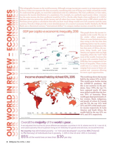
This infographic focuses on the world economy. Although average income per country is an important statistic to have, it does not represent the data accurately, considering that cost of living vary widely around the world. To understand the graphs, we must first understand some key definitions. The Gini coefficient, or Gini index, measures the income distribution of a population. For example, in a perfectly equal society where everyone has the same income, the Gini coefficient would be 0 (0%). On the other hand a Gini coefficient of 1 (100%) indicates that one person has all the income and all others have none. Another term is PPP which stands for Purchase power parity-a calculation that tells you how much things would cost if all countries used the same currency. Overall, it helps provide a more detailed picture of a country’s economic health. Similarly, the World Bank uses a theoretical currency “international dollars” to compare median incomes around the world.
GDP per capita vs. economic inequality, 2018
Gini coefficient
GDP per capita is adjusted for price differences between countries.
GDP per capita vs economic inequality, 2018 South A South Africa frica
60% Zambia Zambia Eswatini Eswatini
Mozambique Mozambique
Brazil Brazil
Angola Angola
Colombia Colombia
50%
Mexico Mexico
Cameroon Cameroon Malawi Malawi
Rwanda Rwanda
Philippines Philippines Kenya Kenya
40% Burundi Burundi
United States United States
C hina China
Russia Russia
Bangladesh Bangladesh
Australia Australia Canada C anada
Egypt Egypt
Austria Austria Denmark Netherlands N etherlandsDenmark Norway Norway United Arab United Arab Emirates Emirates
30% Kyrgyzstan Kyrgyzstan
Moldova Moldova
$1,000
Italy Italy
Nigeria Nigeria
Ethiopia Ethiopia
$2,000
$5,000
$10,000
$20,000
$50,000
Output-side real GDP per capita
Income share held by richest 10%, 2015
Source: World Bank, Feenstra et al. (2015) Penn World Tables version 9.1, Population (Gapminder, HYDE(2016) & UN (2019))
Income shared held by richest 10%, 2015
Percentage share of income or consumption accruing to the richest 10% of the population. In a country with 100 people, if you rank them by income the share of the top 10% corresponds to the sum of incomes of the top 10 people, as a proportion of total income in that country.
No data 0%
Source: World Bank
5%
10%
15%
20%
25%
30%
35%
40%
45%
Africa
ThisAsiagraph shows the income inEurope equality in the world. The size of North America the Oceania circles reflect population. South America There are some limitations to this 1.4B 1.4B data owing to the fact that data 600M 600M gathering metrics vary by country. Dots sized by But Population overall, the trend points to the fact that parts of Africa, the majority being South, and Latin America are regions with very high inequality, where the “rich” hold most of the wealth. Contrast this to most rich countries based on GDP, they face comparatively low levels of inequality. These results could owe to a variety of factors ranging from access to better education and resources allowing for more equal opportunities. This world map shows the income held by the richest 10% in 2015. This wealth grew further during the COVID-19 pandemic. But this is not exclusive to the pandemic. Since 1995, the top 1% have captured nearly 20 times more global wealth than the bottom 50% of humanity. These wealth gaps disproportionately affect women, black, indigenous, and people of colour. In Canada and the US, the top 10% hold 25% and 30% of the total’s country income respectively. In Latin America and South Africa, the wealth held by the top 10% are 40% and 50% respectively.
•
Overall the majority of the world is poor. . .
If we adjusted the income for price differences between countries in int-$, where one int-$ = one US-$, and used a poverty line of a person living on int-$30/day for goods and services, we would find that:
No country has eliminated poverty - in “rich and developed” countries 45% (Poland) to 7% (Norway) of individuals live in poverty, (~22% in the US and ~20% in Canada)
85% of the world lives on less than $30 per day
8 IMMpress Vol. 10 No. 1 2022


