Are Employers Paying More for Employee Benefits? By RICHARD WORKS
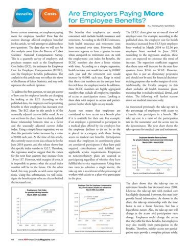
In our current economy, are employers paying more for employee benefits? How has the current shortage affected employee benefits? In this article, we will attempt to address these two questions. The data that we will use for this analysis come from the Bureau of Labor Statistics’ National Compensation Survey. This is a quarterly survey of employers and produces outputs such as the Employment Cost Index (ECI), the estimates for Employer Cost for Employee Compensation (ECEC), and the Employee Benefits publication. The analysis in this article may not reflect the views of the Bureau of Labor Statistics, and may only represent the author’s opinion. To address the first question, we can get a sense of how cost for employee benefits are changing by looking at the ECI. According to the published data, the employer cost for providing benefits to their employees has increased over time. The ECI chart in this article is of the seasonally adjusted current dollar trend. As we can see from the chart, there is a clearly defined linear relationship between time as a factor and the seasonally adjusted current dollar index. Using a simple linear regression, we see that this particular index increases by a value of 0.008 each year. At the time of this article, the currently most recent data release is for the June 2018 quarter, and this release shows that this specific index number is 132.7. Therefore, the regression analysis suggest that the values for the next four quarters may increase from 134 to 137. However, with margins of error, it is impossible to project what the actual index number will be in the future. On the other hand, this may provide us with some expectations. Using this information, we will investigate the benefit types to locate a factor behind the increased cost.
44
www.HRProfessionalsMagazine.com
The benefits that employees are mostly concerned with include health insurance and retirement. According to the ECEC estimates, both health insurance and retirement costs have increased over time. However, health insurance appears to have a greater increase when compared to retirement cost. As with the employment cost index for benefits, the ECEC numbers also show a linear relation with time. According to a simple regression, health increase cost would increase by 0.0002 each year and the retirement cost would increase by 0.0001 each year. Keep in mind that these cost numbers are the cost per hour for each hour the employee works. In addition, these ECEC numbers are highly aggregated numbers that include all employee, regardless of access or participation status. Looking at these data with respect to access and participation further sheds light on any trends. Access rate means that employees are considered to have access to a benefit plan if it is available for their use. For example, if an employee is permitted to participate in a medical plan offered by the employer, but the employee declines to do so, he or she is placed in a category with those having access to medical care benefits. Participation means that employees in contributory plans are considered participants if they have paid required contributions and fulfilled any applicable service requirements. Employees in noncontributory plans are counted as participating regardless of whether they have fulfilled the service requirements. Using these two rates to calculate a single metric, the take-up rate is an estimate of the percentage of workers with access to a plan who participate in the plan.
The ECEC chart gives us an overall view of employer cost. For example, according to the published data, the employer cost for health insurance increased from $1.53 per employee hour worked in March 2004 to $2.56 per employee hour worked in June 2018. According to the regression analysis, these costs are expected to continue this trend of increase. The regression coefficient suggests that these rates will increase for the next four quarters from $2.64 to $2.69. However, again this is just an elementary projection and should not be used for financial decisionmaking purposes due to the margins of error. Additionally, the Health category in this chart includes all health insurance plans, meaning that it includes medical, dental, and vision. The following will further narrow down on medical insurance only. As mentioned previously, the take-up rate is the percentage of employees with access to a benefit that participate in a benefit. The take up rate is a ratio of the participation rate in the numerator and the access rate in the denominator. The next chart shows the take-up rates for medical care and retirement.
The chart shows that the take-up rate to retirement benefits has decreased since 2008. Likewise, the take-up rate with medical care has slightly decreased. However, this may only provide broad information. As shown in the chart, the take-up relationship with the time factor is not a linear function, but has a logarithmic nature. Also, the take-up rate will change as the access and participation rates change. Employers could change the access that they offer for these benefits, but employees may also modify their participation in the benefits. Therefore, neither access nor participation may provide a complete picture solely.