HOPPER&FUCHS CATALOGUE


We are a haven for our artists and we build a home for their books every day. The beauty of the people we collaborate with is what inspires us. First and foremost we care for the human stories behind the façade of our operations, which motivate us to create something together with you. The myriad of art practices challenges us to make each book publication a unique one. From painting to photography, from dance or theater and opera to architecture and sculpture, from drawing to fashion and textiles. We love to take care of the artist and build an extra stage and space for them within the book.
To play the role of printer-publisher is well established in the HOPPER&FUCHS DNA, as we continue to build on the vision and 16th century artisan legacy of Christophe Plantin. What defines us is a sincere love of paper, typography and other serious matters in constructing the anatomy of the book. Innovative technology and artisanal skills fuse into our vision to create sustainable books for the future. HOPPER&FUCHS stands for craftsmanship with a soul. Bruno Devos’s signature is ‘curating art books’ and this condenses our culture and philosophy in making books and experiencing the process. Luc Depuydt’s passion is to construct the book as an object. We focus on deepening our relationship with artists, architects, designers, bookshops, institutions and galleries. We are proud to present to you some of our latest editions.
www.hopperandfuchs.com
Curated by Bruno Devos & Luc Depuydt
bruno@hopperandfuchs.com
luc@hopperandfuchs.com


Mass psychology and the spectacle, loaded with questions and an urge to belong
Marcin Dudek was just ten years old and living in a housing block outside Krakow when the Berlin Wall finally toppled. Poland’s freefall into capitalism followed as the country reeled from severe shortages, skyrocketing inflation, and suddenly-defunct industry. For many, food was scarce. Money, more than hard to come by. A frayed social fabric lacking civic associations left children vulnerable to new allegiances. Dudek grew up in a concrete council estate in Krakow’s Podgorze district. Like many youths born into bleak economic circumstances, conflict with authority and institution seemed inevitable and his childhood friends rejected the rules, regulations and failed promises of the broader civic system. Their futures felt lost in the national transition. Before becoming a teenager, he followed his older brother into the arms of a wild group of
football supporters who created havoc in and outside of the local stadium. Admiration was expressed for those who took pleasure in risk, revolt and rising adrenaline levels. Over time, many from this group moved from the council estate into the prison block as petty crimes escalated into enterprising criminal endeavors. Thanks in part to his sister, Dudek found an alternative path, moving to Salzburg, Austria to attend University of Art Mozarteum. He found work in art galleries, learned German and later moved to London, earning an MFA at Central Saint Martin’s while working as a technician to cover costs.
Art, as a methodology for living, coupled with the DIY survivalist strategies of his youth, became tools for transformation as well as dealing with childhood trauma. Shortly after settling in Brussels in 2012, he
began to publicly question and explore his past in the seminal exhibition “Too Close for Comfort.”
This book looks at some of his key creations in that period, focusing on what he refers to as Memory Boxes and touching on other elements of practice including collage, performance, sculpture and research.


Binding Hardcover

Measurements 260 x 210 mm
Weight 1,00 kg
Language EN
Number of pages 224
Book design Tom Besters

€ 50,00 - ISBN 9789464002294


‘I see music. I read a performance. I question art.’
Joris Van de Moortel is aware of the tension and subliminal power of destruction, of smashing up a guitar, of imploding definitions and expectations. God may save the Queen, but the artist saves neither. The artist Joris Van de Moortel suffuses the viewer’s gaze with discomfort. In times when rituals are being replaced by indifference, the artist orchestrates new rituals in the form of condensed actions imbued with meaning. (...) As though the artist is speaking about his own work, describing the conditions of the experience of a work of art or an artistic event. Form, substance and intention. This reminds me of Harald Szeemann. All works of art by Joris Van de Moortel — sculptures, installations, drawings or others — are the result of a succession of actions, ritual happenings, post-industrial shamanistic explorations. They are visual ‘recordings’ of time and
sound, traces of an era that has already been played. While performing, Joris Van de Moortel is not a persona; the artist does not become material for himself like Joseph Beuys. Joris Van de Moortel does things, finishes things, leads the experiment like a scientist in a laboratory. In one way or another, I am reminded of painting every time. Not of the development of painting in the 20th century, but the painting of the Baroque; the fixed movement of a religious or other scene in an all-encompassing image characterised by excess. Joris Van de Moortel creates something that is reminiscent of tableaux vivants, where considered decisions go hand-in-hand with orchestrated coincidence, where art history is camouflaged by the here and now, where permanent white noise and an enigmatic illegibility is an attitude for creating images, where the artist, in my opinion, does
what George Brecht once said: ‘My art is the result of a deeply personal, infinitely complex, and still essentially mysterious, exploration of experience’.
A co-edition with Galerie Nathalie Obadia
TECHNICAL SPECIFICATIONS
Binding Paperback
Measurements 300 x 240 mm
Weight 1,35 kg
Language EN / FR
Number of pages 248
Book design Tom Besters


€ 45,00 - ISBN 9789464002010


“Multum, non multa.” - Denmark
While archives may appear neutral, they are rarely innocent. The word ‘archive’ derives from the Greek arkhˉe, which means ‘power’ or ‘domination’. As repositories of documents which affirm power constellations or substantiate historical structures or reconstructions, archives provide tools to legitimise a state of affairs.
Yet archives also contain, through hidden stories and information, the potential for change and criticism. It is no coincidence that various artists have used archives as physical materials or recast archival work as a form of artistic expression. The Belgian artist Denmark happens to do both. By deconstructing and transforming bearers of information, Denmark questions power and knowledge as represented by information stacked in
archives. As such, he deserves the label of ‘anarchivist’. The ideas of rereading and recycling are both central to Denmark’s work. In looking for the essence (his motto is Multum, non multa — ‘less is more’), Denmark developed a unique artistic approach that would gradually include print media such as books, newspapers and magazines and folding, screwing and sanding them, gluing them together, freezing them, and preserving them in water, gelatine or paraffin.
In doing so, he is targeting not only the media industry but also the art world, and in that sense his work echoes the institutional critique prevalent in the 1970s. Denmark witnessed first-hand how contemporary art magazines, which were founded during the revolutionary late 1960s and early 1970s, evolved from

critical media outlets which played a democratising role, into slick advertising platforms, funded by galleries, forming crucial links in the art market.
TECHNICAL SPECIFICATIONS
Binding HARDCOVER


Measurements 240 x 170 mm
Weight 1,17 kg
Language NL / EN / FR
Number of pages 464
€ 72,00 - ISBN 9789464002188

A blank book, open to every possible idea and image.
Dinge, die nicht in Worte zu fassen sind (Des choses qui ne peuvent être mises en mots): What has disappeared, the torn away, the absent, the nothing, the void are made present.
Space for the conceivable, where words fail. The publication project consists of a mainly blank book, open to every possible idea and image. An artist’s book that openly invites the reader to critical thinking, dialogue and debate.

Translated into English, French, Dutch, Nepali and Japanese in 2023.This artist book is originally published in German in (Marie-Sophie Beinke’s native language) in an edition of one copy.

The publication has been translated in Dutch in 2021 and was published both in an original edition of one copy, but also as a pocket edition in 2021. Beinke will continue publishing this publication in the different languages that reflect the countries and cultures that the project will lead her through.


Co-published with M-S B Verlag
TECHNICAL SPECIFICATIONS
Binding Paperback
Measurements 167 x 107 mm
Weight 0,25 kg
Language EN / NL / FR / DU / JP / NP
Number of pages 320
UK - € 25,00 - ISBN 9789464002225
NL - € 25,00 - ISBN 9789464002218
FR - € 25,00 - ISBN 9789464002232
DU - € 25,00 - ISBN 9789464002249
JP - € 25,00 - ISBN 9789464002256
NP - € 25,00 - ISBN 9789464002263


“A clean atelier is not to be trusted”.

Van Heeschvelde is first and foremost a passionate painter and sketch artist who spends most of his time in his studio. He takes the subjects of his paintings from two basically infinite reservoirs: on the one hand, his own, astute observations of everyday human life. He takes on everyday events, human idiosyncrasies, social phenomena, questionable norms and values, which he often treats with humour, subtle mockery and deliberate disregard. He is particularly interested in the inclusion and exclusion principles of a highly academicised art business, which he registers with great sensitivity as a career changer. Last but not least, selfportraits with an ironic charge also play a major role in his artistic universe.
The second large reservoir of images that Van Heeschvelde taps into again and again is that of ‘serious’ art history, namely the late Middle Ages and the Baroque. He benefits from the sheer omnipresence of top-class works in the museums, churches and cathedrals of his home region of Flanders, by masters such as Jan van Eyck (1390-1441) or Peter Paul Rubens (1577-1640), to mention only the two most important. The adaptation of already existing, generally known pictures or elements of them is one of the basic constants of his painting. But more on that later.
Co-published with Berserk Art Agency
TECHNICAL SPECIFICATIONS
Binding Paperback
Measurements 230 x 170 mm
Weight 0,60 kg
Language NL / EN / DU
Number of pages 200
Book design Annie Naskyd


€ 45,00 - ISBN 9789464002287


Discovering Ilse
We know very little about Ilse D’Hollander: the facts of her reality remain largely unknown. She was born in 1968 in Sint-Niklaas, a small city between Ghent and Antwerp. She studied painting, graduating in 1991 and then moving from Ghent to Paulatem in the Zwalm countryside of the Flemish Ardennes. This is where she spent the last, highly productive years of her life, and where her life ended. At the age of 29, D’Hollander took her own life, crossing from this earthly reality into an eternal one.
Real Life brings together a group of eight artists of different generations and from different geographies who, like D’Hollander, use paint to engage with reality in its most porous and capacious sense. Pigment or picture, paint or illusion, poetic or mimetic, the artworks
in this exhibition freely oscillate between representation and abstraction; the literal and the spiritual or transcendental. Alongside visionaries Jesse Murry and Frank Walter, who passed away in 1993 and 2009 respectively, Real Life shows the paintings (and some writing) of the very much alive artists Lois Dodd, Christopher Colm Morrin, Heidrun Rathgeb, Trevor Shimizu, and Peter Shear to connect D’Hollander to her international peers and a younger generation of artists through whose work we might embrace the unknown and discover Ilse.
– Extract from a text by Wells Fray-Smith
Co-published with Gallery Sofie Van de Velde


TECHNICAL SPECIFICATIONS
Binding Paperback
Measurements 210 x 130 mm
Weight 0,20 kg
Language EN
Number of pages 96
€ 35,00 - ISBN 9789464002201

The World of Donatella Bianchi, Rooted Dreams
Donatella Bianchi’s work cannot easily be categorised under one particular movement or another. First and foremost, it is her way of facing the world from an artistic point of view. The book BIANCHI presents an overview of her work since 2010.


Works by Donatella Bianchi are usually imbued with a dreamy atmosphere, but are at the same time connected to her life. She regularly spends time staying in the remote wooded regions of rural Auvergne. The impressions that the area has made on her are all to be found in her drawings of trees and forests, which are produced in Chinese ink and pastel. Nature shows its rough and unruly side in the series entitled Harmonies secrètes (HS) and Les témoins immobiles (TI), in which we mainly see only bare trunks and branches.
They seem to be looking back at us, a little in the way of anthropomorphic beings. From time to time we see an eye socket or an open mouth amid the weathered, defenceless stumps. Are we somehow standing face to face with a petrified human who has taken on the form of a tree? Donatella Bianchi’s nocturnal landscapes are bathed in an atmosphere of mystery, wonder and silence. The moon is seen, glimpsed through the branches. In some of her other works, we also see human figures emerge: sometimes they are fairly recognisable, while in others, they have already faded into white silhouettes. It’s the world of memory, dream and melancholy.
– Extract from a text by Rik Hemmerijckx
TECHNICAL SPECIFICATIONS
Binding Hardcover

Measurements 280 x 210 mm
Weight 0,80 kg
Language FR / IT or NL / EN
Number of pages 164
Text by Willem Elias
NL/EN - € 45,00 - ISBN 9789464002157
FR/IT - € 45,00 - ISBN 9789464002164

The art of Arpaïs Du Bois always presents itself as an intimate experience, even a ripping apart of the self that is played out in the battle between language and painting.
In a low voice, almost a whisper in the rustling of the world. A low voice reciting time suspended, the wanderings of the soul, stretches of the heart, evoking the risk of thunder or the delicacy of a breath billowing the canopy. A low voice in which the suspicion of death roars as much as the spirited hope of everyday moments. For those who are able to hear them, it is all there, in the sentences of Arpaïs Du Bois. For this secret artist inscribes words, fragments of thoughts, the beginnings of texts on leaves still trembling with the colours that branded them. You will find no beautiful poems or any heroic declamations here. The power of these words lies elsewhere.
– Damien SaussetFor to be contemporary means this: for one to be the oeuvre of a time without any past or future, to be so vis-à-vis with oneself, assigned forcibly or through resignation with regard to this oeuvre, and to be simultaneously the author, the recipient, the product and the guardian; captured wholly in one’s mirror.
– Jean-Paul CurnierTECHNICAL SPECIFICATIONS
Binding Hardcover


Measurements 270 x 210 mm
Weight 1,25 kg
Language FR / EN / NL
Number of pages 304
Book design un’dercast bv, Reg Herygers

€ 49,50 - ISBN 9789464002034


Sculptures of Stones, a series of drawings sculpting and questioning the perceived position of women in contemporary times

Ronny Delrue’s drawings invariably contain a handwritten note of the date and time they were made. The record is always placed next to his signature and forms part of the pictorial composition. But beyond this, the data also makes every drawing seem like a page in a diary, thereby opening up Delrue’s studio practice to the chronology of the world, to the historical present. Consequently, it anchors his oeuvre within a dialogical context as a receptive entity, one that is in constant negotiation with the social reality.
Delrue’s recent series of drawings, entitled Sculptures of Stones, can be situated against this backdrop. They speak to the protests in Europe and the US calling for the removal of colonialera public monuments, as well for
non-discriminatory politics that focus on women’s rights and representation.
The Sculptures of Stones drawings depict female statues that are either made of bricks or covered with masonry-like patterns. They form a critical riposte to the heroic male statues of former leaders that are scattered around our cities. Furthermore, the forms also broaden our prior knowledge of the depiction and identity of figures in the public sphere. Delrue’s female figures are remarkable for being both idealized and de-idealized, both complete and broken.
The iconoclastic energy unleashed in Delrue’s recent work reflects the turbulent times in which we live. It situates his art as a symptom of tectonic changes, in which new idols emerge to replace
those that are toppled. Delrue’s art not only reports on these changes, but it also contributes to them.
– Ory DessauTECHNICAL SPECIFICATIONS
Binding Paperback
Measurements 295 x 213 mm
Weight 0,66 kg
Language EN / NL / FR
Number of pages 160
€ 45,00 - ISBN 9789464002058


The new art folder Victims and Murderers contains real size prints of 16 carefully selected gouaches from Klaus Verscheure’s ongoing series Faces. Printed on fine 60g art paper in delicate duotone offset, they capture the perfect look and feel of the original gouache drawings in every single detail. The prints are collected in a sturdy folder of red cardboard with black linen spine and black foil print.


“The question keeps coming: who’s who? Who’s the victim and who’s the perpetrator. It’s even the main question people ask me when they see work from my (Smiling) Faces series. Even more when I tell them that all the portraits I make are either perpetrators or victims. But I always leave the question unanswered. It doesn’t matter who’s who,
after all. Or does it? I make art. I am not a journalist, nor an archivist or a scientist, looking for explanations. I do what I do and reserve to myself the privilege of not sharing what I know: the answer to that question “who’s who”. It remains surprising to me how few people accept this.
Often they really try to live with the notknowing, but still, they can’t refrain from putting labels on my portraits. “That is an offender, you can see that immediately.” Or “it is obvious that this one is a victim”. Then they look at me, asking for confirmation. Alas... I prefer to leave everyone in the dark. After all, it doesn’t matter.”
– Klaus VerschuereTECHNICAL SPECIFICATIONS
Binding Hardcover folder
Measurements 420 x 290 mm
Weight 0,55 kg
Language EN / NL
Number of pages 20
€ 50,00 - ISBN 9789464002072


“The vertical line is the line of life! The horizontal line is the line of death.” — Dan Van Severen
In the seventies, he responds to the starkness of his teacher, Van Severen with bright colours. He portrays his family and creates grotesques, with a nod to Francis Bacon’s distortions. Soon he becomes a Flemish representative of pop art, a rarity. No sign of any neo-dadaism à la Broodthaers. nor of any naive neoexpressionism as presented by New Figuration at the time, with Raveel, who attached a pigeon cage to his canvas, as the urbanised painter of rural life. What Van Schuylenbergh produced was big-city pop art as imagined by someone living in Aalst, yet exuding Roy Lichtenstein’s shiny glamour, drawing on pop culture—a couple of symbols of which dangle from the canvas. It’s the Eighties. Grace Jones appears, or rather: her shadow, stylised by André Van Schuylenbergh. It is not just the striking shape of her head that comes


into view, but the whole culture she represents. All the while, André remains true to the new aesthetic that has become the main characteristic of modern art: primitivism. Africa has taught us how to create a powerful image. Starting from 1984, the clear line of pop art is getting scrambled: the Neue Wilden have arrived. The nod to Salome is undeniable. Graffiti art, spilling over from New York, gets an upgrade. Is André a Keith Haring from Aalst? This art form is forever indebted to Cobra... By the late eighties this wild adventure had culminated in a love of abstraction. Which actually yielded a nice backdrop against which to allow figuration to reappear in the early nineties—this time with the addition of posters, stuck onto his canvas. His masterpiece from this period is a portrait of Louis Paul Boon. The collages exist side by side with
exotic scenes, a return to a fairly clear-cut figuration featuring ladies in a sensuous colour bath. He who says ‘exotic’, is thinking ‘erotic’...
– Extract text by Willen Elias
TECHNICAL SPECIFICATIONS
Binding Hardcover


Measurements 290 x 230 mm
Weight 1,10 kg
Language NL / EN
Number of pages 164
Text by Willem Elias
€ 45,00 - ISBN 9789464002140


Visualising not so much that sliver of reality he has chosen and isolated, as the way in which he approches that sliver.
Roger Wittevrongel (born in Blankenberge, Belgian Flanders, 1933) is commonly considered an exponent of hyperrealism, a style of painting typical of later 20th century American and European art that typically takes photographs as its source material. Axiomatic in that art movement is the clear and instant recognisability of what is painted, next to the immense impact of photography in the way reality is perceived.
By completely eliminating all signifying context, Wittevrongel manages magically to disappear and thus to steer clear of all moralizing comments and of social commitment issues.
What Wittevrongel intends to create, is an autonomous world of forms in which the ever-deceitful interplay between reality and its depiction is utterly bracketed out.

For Wittevrongel, it is the paltry and the spare, at times even the wretchedly banal that receive full attention. What hits his retina is what you get. Rather than the anatomist’s dissecting quest for comprehensiveness or the coprophilous obsession with dung-eating and orduregathering, there is the strong and patent conviction that poetry resides, not in lofty thought and deep sentiment but in the exiguous details of everyday life which we had often rather not see.
TECHNICAL SPECIFICATIONS
Binding Hardcover
Measurements 310 x 240 mm
Weight 1,20 kg
Language NL / EN
Number of pages 160
Book design Annie Naskyd


I spent 4 years, 9 months & 1000’s of miles on the dash, documenting an honest & intimate story about the lowrider scene in Los Angeles, California, USA.

I can vividly remember the first lowrider event I attended in Los Angeles. I had driven out on a Sunday in October 2018 to attend an event called Sunday Funday. The concept is self-explanatory: Everybody comes together to have fun on Sunday, without any bullshit, with a common love for lowriders. It was located at the intersection of Rosecrans on South Broadway, on the border between Compton and Carson, in an industrial area—a very long boulevard with factory buildings and warehouses. When I first showed up in the early afternoon, there weren’t that many people out. But within one hour, the whole place was packed with barbecue vendors and people selling t-shirts and merchandise. I feel like there were 500 to 800 people there that day. And for me it was like, “Wow, all the
things that I’ve been interested in my whole life—L.A. culture, architecture, cars, and rap music—all come together in one place here.”
This project is a way to participate in a culture that I grew up with, but never was a part of because of the geographical distance. By documenting it, I feel a form of participation. I pursue Back to Back to celebrate the lowrider as a muse and to accurately represent the people behind it. To those who are involved in the project: Thank you. I’m forever grateful and carry you in my heart.
– Peace and Love. Stig De Block
TECHNICAL SPECIFICATIONS
Binding Paperback
Measurements 330 x 245 mm
Weight 1,20 kg
Language EN
Number of pages 240
Book design Vrints-Kolsteren


€ 50,00 - ISBN 9789464002089


“I think images are worth repeating.”
Bringing many years of work together in a single place, here on the page, rather than on the walls of a museum or gallery, we can consider both senses in which Roels thinks images are worth repeating. In the obstinate and dedicated labour of printing and arranging serial, but different, versions of single images together; and then also with regard to the overall effect of bringing these iterations of themselves into the same space. But there is another sense in which we might find Roels’s work echoing not only itself, but that of those that came before him; and that, funnily enough, is in his refusal to take himself, or his work, too seriously. Just seriously enough, it seems, to invest time, effort, and skill into the production of his complex and subtly nuanced work, but never to the point, that, like Ruscha before him, (the artist who made Various Small Fires and Milk),
he finds himself unable to resist, and more importantly, to play with, the constraints of his own logic. A little like Dalí too, perhaps, who, captivated as he was by the potential of photography to document and catalogue the world, was also sure that this very capacity would result in us never being able to see anything in the same way, ever again. From ‘the subtlety of aquaria’ as Dalí himself put it ’to the fastest most fleeting gestures of wild animals, the photograph affords us a thousand fragmentary images culminating in a dramatized cognitive totalization.’ That too, is something worth repeating.
– Simon BakerTECHNICAL SPECIFICATIONS
Binding Paperback
Measurements 300 x 220 mm
Weight 1,40 kg
Language EN / FR
Number of pages 336
Book design Reg Herygers


€ 60,00 - ISBN 9789464002041


Sheer visual poetry; the naked human body represented in fragile compositions
Chinese artist Ren Hang’s photographs are painfully provocative, but also inward looking and dreamily surreal. His genderqueer compositions are explicitly erotic but never pornographic. Hang depicts the human body as an abstract form, often in idiosyncratic arrangements and perspectives, referencing and simultaneously overwriting well-known motifs and traditions from Western art. He combines iconic images of William Shakespeare’s dying Ophelia in a river surrounded by flowers; of Leda, daughter of a Greek king, and the Swan; and of female nudes seen from behind using a distinctive visual vocabulary that draws on abstraction, Surrealism, Dada, and both historic and contemporary photography. Ren Hang’s analog photographs use a playful, humorous visual language to
relate the feelings, desires, fears, and loneliness of a young generation in China. His works stand as symbols of the youth’s rebellion against the conventions of a restrictive communist regime in which nudity and sexual freedom are subject to government censure and control even up to the present day. Most of the people portrayed are the artist’s friends, but they remain unnamed and anonymous, and the images bear neither title nor place nor date. Although carefully staged, they are infused with an element of fleetingness and evanescence that is often the result of the artist’s quick way of working.Ren Hang’s photographs are a rare ode to human beings, their bodies, sexuality, beauty, and vulnerability.
– C/O Berlin, Exhibition ‘Love, Ren Hang’

Ren Hang (b. 1987 in Changchun, China, d. 2017 in Beijing) was a photographer and poet. His work has gained a growing posthumous following and immense popularity worldwide. Up to his death by suicide at the age of twenty-nine, Hang lived and worked in Beijing.
Binding Hardcover


Measurements 280 x 220 mm
Weight 0,65 kg
Language EN
Number of pages 64
€ 50,00 - ISBN 9789464002003

Twins, twice with a twist
Jacques Sonck is a discrete and introverted artist who portrays our society in a very genuine way. He shows us our fellow citizens up close, his vision is tender yet sharp; his seemingly objective approach is sprinkled with a delicate touch of humour though.
Each and every one of us could end up in front of his lens. Most banal physical appearances as well as peculiar profiles, all genders, skin colours, sizes, religions, shy individuals and fully aware ones; all at once they all sense this moment of strength. Sonck’s portraits are the outcome of street encounters, no other appointments in any form are made.
Jacques Sonck makes his subjects feel totally comfortable, one can witness ephemeral deep contacts in full trust in
these remarkable portraits. He has this rare human gift of being able to approach strangers and ask them to open up to be captured on film. These encounters are furtive and truthful, they come to full bloom in particularly refined gelatin silver prints.


This new publication was initiated by Jean-Michel Meyers (also the graphic designer of the book) who came up with the idea of focusing on one aspect of Sonck’s rich oeuvre, in this case, pairs. All kinds of pairs: couples, friends, twins, relatives, siblings, but in the end it doesn’t really matter which link exactly binds them.


In this book we are triggered to know what exactly binds the two individuals, we are secretly fascinated by identical twins, by the sometimes bizarre duos, by the

mysterious relations. I’m pleased to invite you to dive into this specific world of binômes within the rich oeuvre of Jacques Sonck.
Binding Paperback
Measurements 236 x 167 mm
Weight 0,26 kg
Language EN / FR
Number of pages 88
Book design Jean-Michel Meyers
€ 35,00 - ISBN 9789464002133

Thirty years of backstage photography in Paris and Milano Sarajevo to Paris, fashion or reportage, deciding on the title of a book is mindboggling. I call myself a documentary photographer that accidentally ended up doing fashion.
The end of the ‘80s was an interesting and intense time in world history, and a particularly creative time in the world of fashion. As a young female photographer I was interested in both worlds. I was travelling for newspapers and magazines to the fashion weeks in Milan and Paris and to the conflict zones of Lebanon and Iraq.
It was during the war in the former Socialist Federal Republic of Yugoslavia and the siege of Sarajevo that I matured in documentary photography, fortunately without being injured.
Thirty years later, when looking back, those two worlds – documentary and fashion – still define my work. Both are equally represented in my archives.
This book, of my fashion work, is the first to be published. I called it Sarajevo to Paris because sometimes I would travel directly from one to the other. These two cities had a big impact on my life.
– Marleen DaniëlsPublished by Stockmans Art Books


TECHNICAL SPECIFICATIONS
Binding Hardcover

Measurements 276 x 210 mm
Weight 2,50 kg
Language EN
Number of pages 816
Book design Nousjka Daniëls
€ 100,00 - ISBN 9789077207925

I’ll ask someone else to come along ;-) Another crush Another crush? Other than you? Who says you’re a crush?
My true lovestory is a search book of 7 sweethearts +1, a messy account of an illegal dumping man with a beating heart.
Everyone is afraid of love, especially the love that is yet to come. Justly! Being a find is not easy. Because what if no one sees you? What if no one recognizes you! And after that! If someone thinks your so-and-so wants to move all your pathetic furniture! The glass box with who you really are. Looking for love is not safe.
Browse My true lovestory. Look again! Who who, why? And how many plates were on the table? In the morning too? Because sometimes visitors stay asleep. Sometimes it says the wrong things, way too tough or way too tacky or too rushed. My true lovestory is a very exciting story, because failure is lurking along with
giggles in the twilight. But above all, it’s none of your business! The apps in this paper find are intended for someone else.
Okay then, you can read them, if you can, if you dare. What kind of detective are you? One with a smelly raincoat? Or one with a nose for pollen and carbonated lemonade. What are you looking for in love? Because My true lovestory is also about you.
– Text by An OlaertsTECHNICAL SPECIFICATIONS
Binding Loose leaf


Measurements 148 x 103 mm
Weight 0,11 kg
Language EN / NL
Number of pages 80

€ 30,00 - ISBN 9789464002126


What is the weight of your Discobolus?
I confess: this book is not about bodybuilding. Well, not exclusively. It is about the aesthetics and mental strength underlying the sport. About the pursuit of unattainable perfection, the emergence of ideals of beauty and their influence. About mental strength and inner focus. About everyone’s particular Discobolus.


I alternate between conflicting thoughts. Extreme perseverance is often astonishing as well as alarming. I am fascinated by this paradox, many questions simultaneously fight for a place in my head. I project this idea onto our daily actions and thinking and ask myself: is overcoming inner insecurity a legitimate or deceptive driving force for achievement? Why is it that we associate so much happiness with the beauty we pursue? Does the gain in self-esteem outweigh
the damage to the body or psyche? Is our outer façade our daily stage performance? What lurks beneath the skin? In the quest for mental strength, inner focus and personal balance, do we also take into account the proverbial ‘backpack’ of experiences that have scarred us? And will that backpack get lighter in time, or are we like a whale that would collapse under its own weight on land... What is the weight of your Discobolus?
– Extract text by Lize Rubens
TECHNICAL SPECIFICATIONS
Binding Paperback
Measurements 225 x 165 mm
Weight 0,50 kg
Language EN
Number of pages 176
Book Design Tina De Souter


“What day is it?” asked Pooh. “It’s today,” squeaked Piglet. “My favorite day,” said Pooh. - A.A. Milne
Sexual transgressive behavior is a major social problem anywhere in the world and one that is terribly taboo. I had to deal with such a traumatic experience myself. For 7 years I did not dare to talk about it. Through making this book, I managed to talk about this experience more easily. ‘Bloom’ contains photos of my own healing process. The pictures show feelings I was dealing with throughout the process. The dark photos represent the somber and difficult moments and the light photos represent hope and healing.

My book also shows 11 portraits of women who had to deal with sexual transgressive behavior too. Some of the women wanted to share their story in the book. The unidentifiable portraits depict the taboo surrounding this subject as where the plain portraits show


strength and courage. All the women who participated in this project played an incredibly important role in my healing process. Because of this, I have found hope and strength again.
– Anniek Snoeijs
TECHNICAL SPECIFICATIONS
Binding Paperback
Measurements 235 x 165 mm

Weight 0,24 kg
Language EN
Number of pages 96
€ 35,00 - ISBN 9789464002065

The work of the physicist might be summed up like this: to take the everyday, to make it strange, and then to recover the prosaic from the strangeness. Perhaps not exactly to make it strange, for it’s not up to physicists how the world behaves. To reveal the strangeness, then. What the physicist is asking for is a willingness to accept that there is strangeness in the everyday, rather than complaining “It can’t be like that!”
The same might be said for the artist, and this collection of photographs by Karien Vandekerkhove shows why. The images could hardly be more prosaic in one sense. A glass of water on the table. Shadows on the wall. Reflections in the glass. Light doing what light does: that’s all. Offering clues, not all of them reliable.

It’s no exaggeration to say that the shadows in Vandekerkhove’s images pose questions of the same sort. What is causing them? What do they imply about the world beyond our field of vision? If we turned around, what will we see? They too are hints of something missing, of the limits of our perception. They are traces made of light and dark, and we are mere spectators.
– Extract text by Philip Ball
TECHNICAL SPECIFICATIONS
Binding Paperback
Measurements 240 x 170 mm
Weight 0,18 kg
Language EN
Number of pages 64
Book design Kim Beirnaert


€ 30,00 - ISBN 9789464002102


‘I Am Digital’ takes you on an intimate journey through Flora Miranda’s extraterrestrial world of phygital identities. Explore technological storytelling, artistic haute couture creations and visions for creative fashion software. In the book, the multitude of Flora Miranda’s work unfolds in different subject areas. Enjoy a beautiful outsight of an immaterial world, an immaterial self.


Flora Miranda’s fascination with the simultaneous evolution of human behaviour and new technologies has its origins in her upbringing: born in a family of musicians and artists, she learned how painters helped their eyes with the camera obscura and photography. She saw musical instruments tweaked, like the prepared piano by John Cage.
Experiencing the shift in the digital world with home computers and the internet, the ‘digital’ became her attitude to life. Expressing, shaping, and exploring this further evolving digital identity is the role of Flora Miranda’s creations.
This book is your companion to navigate through bits and bytes. To feel strong in a jungle of hackers. It can inspire you to take things into your own hand – may it be a change of perspective on the world, may it be transformative, may it support projects you believe in, or may it help to build your own world.

TECHNICAL SPECIFICATIONS
Binding Hardcover
Measurements 285 x 245 mm
Weight 1,90 kg
Language EN
Number of pages 352
Book design Tim Peters
€ 70,00 - ISBN 9789464002188

Thirty years of backstage photography in Paris and Milano Sarajevo to Paris, fashion or reportage, deciding on the title of a book is mindboggling. I call myself a documentary photographer that accidentally ended up doing fashion.
The end of the ‘80s was an interesting and intense time in world history, and a particularly creative time in the world of fashion. As a young female photographer I was interested in both worlds. I was travelling for newspapers and magazines to the fashion weeks in Milan and Paris and to the conflict zones of Lebanon and Iraq.
It was during the war in the former Socialist Federal Republic of Yugoslavia and the siege of Sarajevo that I matured in documentary photography, fortunately without being injured.
Thirty years later, when looking back, those two worlds – documentary and fashion – still define my work. Both are equally represented in my archives.
This book, of my fashion work, is the first to be published. I called it Sarajevo to Paris because sometimes I would travel directly from one to the other. These two cities had a big impact on my life.
– Marleen DaniëlsPublished by Stockmans Art Books
TECHNICAL SPECIFICATIONS
Binding Hardcover
Measurements 276 x 217 mm
Weight 2,50 kg
Language EN
Number of pages 816
Book design Nousjka Daniëls
€ 100,00 - ISBN 9789077207925


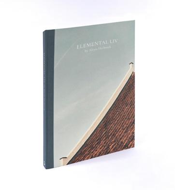
“Balance isn’t something you find, it is something you create.”
In his first monograph, defining 20 years of design practice and projects, Alexis Herbosch invites the reader to discover and engage step by step into his mental landscape, design language and love for materials. “Elemental Liv” guides the reader through the architect’s practice and visualises an extensive oeuvre, in which his clients appreciate the permanent search for noble simplicity. By making careful and deliberate choices while following the path he has taken, his visions on life and architecture are merged with the home stories of his clients.


“My motivation is to design high-quality outdoor and indoor spaces that allow us to experience small and big moments. Because our immediate surroundings influence our feelings much more than we think. Design with a future is my goal
and the character of a place remains my source of inspiration. We create living environments, in which people will live and experience. This fills me with pride, but above all gratitude, because it is a great honour for me to contribute from my vision to the lives of a growing number of clients and their families.”
“I am curious to see what will come my way in the near and further future. My lasting aspiration is to be able to inspire clients, in an open dialogue, with my creativity. That is my motivation: to inspire confidence in a design that is yet to be realised and that will give them the intended result, a comfortable building with which they feel connected. Always different, but always with the same intensity, experience and inspiration. This also applies to my life. I reduce as much
as possible to the essence. Everything superfluous is stripped away, like a building that fits into the landscape, where it shares the peace and quiet of the mist and dew with its inhabitants.”
– Alexis HerboschTECHNICAL SPECIFICATIONS
Binding Hardcover


Measurements 335 x 245 mm
Weight 2,00 kg
Language EN / NL
Number of pages 268
€ 75,00 - ISBN 9789464002096


Design with a capital A
I learnt about Casimir in the 1980s. He was a product design student, and I was his philosophy lecturer. He struck me as an intriguing personality. He was not concerned with the formal rules of our institution and didn’t take them too seriously. His wilful attitude may have given the impression of nonchalance or a lack of seriousness. However, he always worked with great passion. An (apparent) lack of seriousness and fanatic seriousness or nonchalance on the one hand and perfectionism on the other –how do you tie that together? This hybrid combination seemed to offer opportunities in my opinion.
When things don’t fit together, it is often the result of our own prejudice. Contradictory combinations can be the source of a different and unexpected
vision of the world. Casimir’s idiosyncratic contribution to the world of design can be understood in the light of this ‘non-fitting’. All his objects express a combination of non-seriousness and seriousness. Let me try to explain. I would like to add right away that I consider non-seriousness to be a very serious matter.
– Francis SmetsTECHNICAL SPECIFICATIONS
Binding Paperback

Measurements 230 x 170 mm

Weight 0,75 kg
Language EN
Number of pages 96 + 160
Book design un’dercast Reg Herygers

€ 55,00 - ISBN 9789464002119


Marc Van Hoe, an octopus with a heart for textile
“With this collection, I attempt to clarify that these are not only textile designs. There is a lot more to it than that: making links to developments in the fields of art, culture and politics is only logical and at least as important. My collection seeks above all to stimulate curiosity when reading (or learning to read) images.”
– Marc Van Hoe(…) If there has ever been a man to whom this motto applies, it’s Marc Van Hoe. The man, or more precisely the artist, behind this rich collection – formed from fragments, sketches, drawings, scale designs for fabrics and wallpaper – is far from being the anaesthetist of his collections. Sometimes simply held to the wall with magnets, the drawings, left free from frames or covering glass, have their
skin in contact with the air and the light: living. When they are not filed away in their drawers, it is with enthusiasm that he picks them out; a term that means to separate the wheat from the chaff. Because this collection is also a conversation, Marc Van Hoe, creator of designs and fabrics, has a non-stop dialogue with the drawings that he has saved from certain destruction.
But what also constitutes the strength of this collection is also due to the benevolence of its owner. It is not an edited-down ensemble in which only the leaves that might have pleased their owner are the ones to have been kept. He has a greater affinity for some of them; for others he expresses a slight disdain, and a few, despite being of inferior quality, appeal to him precisely because of their
clumsiness. It is very much this diversity –without even mentioning the multitude of styles that range from the neo-Louis XVI to the Atome – that make this ensemble so fascinating.
– Benjamin ZurstrassenTECHNICAL SPECIFICATIONS
Binding Hardcover


Measurements 280 x 210 mm
Weight 1,30 kg
Language EN / NL / FR
Number of pages 144 + 32 insert
€ 38,00 - ISBN 9789464002027


Please register as reseller / bookshop at www.hopperandfuchs.com/reseller
© 2023 HOPPER&FUCHS
All rights reserved. No part of this publication may be reproduced, stored in a retrieval system or transmitted in any form or by any means, including photocopying, recording, or otherwise, without the prior permission of the author.
Concept: Bruno Devos - HOPPER&FUCHS (www.hopperandfuchs.com)
p. The Book Photographer (www.thebookphotographer.com)
p. Paul Casaer
CONTACT: bruno@hopperandfuchs.com
M +32 497 52 52 81 luc@hopperandfuchs.com
M +32 498 92 62 46 www.hopperandfuchs.com


