1 minute read
XLIGHT ITALIC LIGHT ITALIC ITALIC MEDIUM ITALIC BOLD ITALIC BLACK ITALIC


The bands logo will be in the typeface of OWNERS WIDE ITALIC. The tyeface has a family of 6 line weights as well as wide and narrow alternatives so can be used for additional promotional materials.
Advertisement

The logo itself is simple but effective, using elongated lines of the T’s to frame and add interest to the overall presentation. It takes inspiration from a 70s aesthetic, representing the inspirations within their music.
The colour ways of red and purple will be used on promotional materials and stage accessories with studio albums and official promotions always being either black or white depending on imagery and background colours.
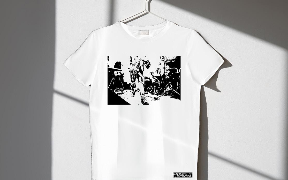
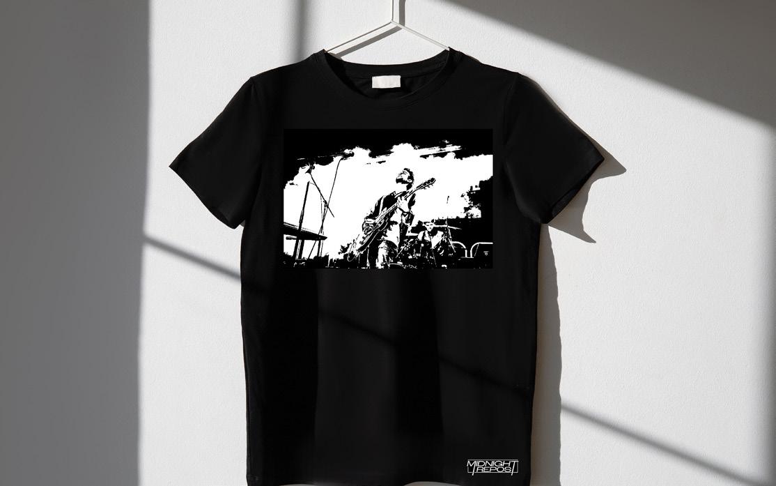
Band merch will feature black and white photography on the back and simple embroidered logo on the front at the top, on oversized black and white tshirts. This coincides with current trends in fashion, whilst staying true to the bands personal aesthetics. Eventually as the band grows, we will expand the merch into other products for example caps and bags.

On stage accessories will feature a striking drumskin with the logo in a black, white and red colour way. The colours link with the bands outlines palette, but also connects iconic rock branding of power, sex appeal and Rock n Roll.


