MY SPACE : Deepak Guggari
vol 13 issue 4
APRIL 2014
smstudio UNCOVERED
DESIGN DESTINATION : KYOTO
total pages 168
RS 100 HOME-REVIEW.COM
SPACE, NATURE AND MAGIC by Abraham John Architects Malik Architects’ STRUCTURAL SYNERGY
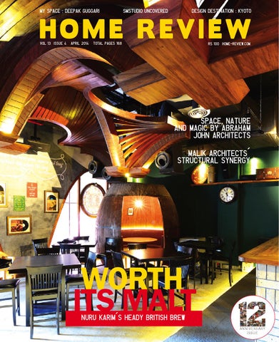
WORTH ITS MALT NURU KARIM’S heady BRITISH BREW
ANNIVERSARY ISSUE
$ B > 4 . / >C $ !! / ? 3 1 !; 8 3 ! 0 . $ ! 2 . / > $ 4 ! # !; !! / ! ! ;! 0 . ! B !1 @3 !; $ ? ; ! 4? $ B ? # ? ! / !; ! !; > ! B . !; $ 3 0 D3 ? ;! ! $ 3 ! $ 3! ?1 .. . $ !2 . / > > B 0 B ! !; B 8 0 . $ / >$ $ $ / ! 0 . ! ! .B ? ;! ! ! 1 $ B 8 . ! 4 ! 0 B ; / ;! ! $ 3! ?1
! $ B 3 > > $ ;$ ;$ . 0 3 0 / 3 B 3 1 B ;$ ! B 0 . ! 03 ! 3 ! ;$ !; 0 ? 3 / !; B < 0 $ . > $ B 3 0 $ 4 $ .< # $ ! ; ; ! $ > $ B ? 3 # 3B . ! 00 ! $ > . # ; !; > # ;$ 1 > 3 # $ !# ? 3 0 ? 3 B ! ; / $ B A ! ? ! # 0 > ? 3 B B ! ! 3 !! / ? B 1
! " 3.4 " # $ % ! & '" () ( (*+, & '" # $-. / !0 . 1 .2 / # 5 $ / & '" (6 (,7 66* & '" / / #8-. / !0 . 1 .2 9 ! $ 93 / & '" ((*)(:)+)* & '" ; ! $-. / !0 . 1 .< @ $ " 3. # $ & '" )(6(( ,(7+)2 & '" =4 > )*-? $ 1 .< $ !! " 1 !# . ! & '" )(+++) 6 & '" / !# -. / !0 . 1 .< % # " 34 A3. & '" (6* * *(72 & '" 34 - 00. 1 .
Photo: Cyrus Dalal
I
t’s been twelve years! Twelve years since we first started exploring and sharing our thoughts on India’s evolving design landscape. While time has flown by, it hasn’t been without some very memorable interactions and experiences. In this issue we take a walk down memory lane and bring you twelve projects from our archives which really caught our interest. These projects and the people who created them are special to us but more importantly they are timeless classics and beacons of progressive design in our country. Our cover story this month also profiles the work of a designer who doesn’t believe in walking the beaten path. Nuru Karim’s take on a pub stays clear of the clichéd colour and prop routine. Instead he focusses on creating a specific architectural quality for the space. A ceiling designed by this maverick designer is the Pièce de résistance of this watering hole. Its undulating parabolic arches generate a sense of movement and intrigue - something you just can’t help looking up to. Arjun Malik and his brand of architecture has also been a favourite over the years. The team at Malik Architects crafts a television studio experimenting with structural form. They model the space with bold features and angular lines creating a range of spatial experiences that’s incredibly edgy. Their work typifies a design scheme that’s rooted in functionality and doesn’t hold back. Just the kind we hope to see a lot more of. Here’s looking at another 12 years of great design! Anish Bajaj, Editor anish@marvelinfomedia.com
14 Home Review April 2014
A key exhibit at the Milan fair this year is “Where architects live”- the eight selected homes include the likes of Shigeru Ban, David Chipperfield, Zaha Hadid, Daniel Libeskind and our very own Bijoy Jain. Great going Mumbai Studio!
Home Review April 2014
15
“Awards and recognition always have played a big role in motivating me.”
36
44 Abraham John Architects redefines the concept of ‘space and privacy’ with Monsoon Retreat - a villa amidst the picturesque hills of Khandala
Deepak Guggari
30
Cover Story The British Brewing Company in Mumbai designed by NU.DE Architecture is a classy homage to the quintessential English pub
ANNIVERSARY
53
Home Review is now 12! A trip down memory lane - 12 favourites through the ages and some must-haves for your living spaces
98
april
A look at the Maison&Objet fair which brings together design aficionados from the world over to assess changing trends and witness burgeoning creativity
102 42 The Mathrubhumi Television Studio created by Malik Architects is angular, trendy and strikingly edgy; here aesthetic brilliance comes to fore through structural explorations
16 Home Review April 2014
110 86
Hungarian-born photographer Antal Gabelics creates Angkor Mandala Sequence, a mesmerising 5-minute video on Angkor Wat which receives close to half a million views every year
114
Darth Vader, Winnie the Pooh, Bugs Bunny all find a place in Philippe Starck’s democratic dream, the Mama Shelter Hotel in Istanbul
86
94
Home Review April 2014
17
127125
134 136 136
A look at Kanheri Caves - a getaway for tourists the relic also represent a Buddhist influence on the art and culture of India
121
GREEN PROJECT An air raid bunker from the times of World War II in Hamburg, Germany, finds a new life as a landmark renewable energy disseminator
GREEN SPEAK
132
139 product
designer
Under the dynamic label Daphna Laurens, Netherlands based Daphna Isaacs and Laurens Manders conjure up elegant designs that are functional and yet beautiful enough to be works of art
april
144 High on the sustainability quotient, a house in Vrindavan Farms designed by Ranjeet Mukherjee is earthy in its characteristics and elegant in its appeal
152
157
Mumbai-based smstudio is an expert at converting cold, empty shells into dynamic spaces full of natural light and charm
THE MARKETPLACE Get your hands on the latest products to hit the market
18 Home Review April 2014
156
Based in Forli, Italy lies the Essay House; completely attuned to its natural surroundings, the house balances classic and contemporary architecture with unassuming ease
162
KYOTO A DESIGN DESTINATION
Home Review April 2014
19
Editor & Publisher Anish Bajaj Creative Director Natalie Pedder-Bajaj
Shruti Nambiar Freelance Writer and Photographer In 2010, Shruti quit three years of corporate drudgery in Bengaluru to start a career in writing. A little over two years ago, she joined The Indian Express, Pune, as a features writer. Currently based in Pune she is pursuing freelance writing and photography.
Features Editor Mala Bajaj Assistant Editor Shweta Salvi Sub Editors Vikas Bhadra Ulka Vartak Rehana Penwala Contributing Writers Chryselle Dâ&#x20AC;&#x2122;Silva Dias Christabelle Athaide Dhanishta Shah Himali Kothari Kruti Choksi K Parvathy Menon Shruti Nambiar Designers Asif Shayannawar Snigdha Hodarkar Vikas Sawant
Claudia Woerndle Designer As a German designer living in India, Claudia Woerndle combines modern design aesthetics with the uniqueness of Indian traditional handicraft techniques.
20 Home Review April 2014
Home Review April 2014
21
Editorial & Marketing Mumbai Mr. Ganesh Gurav, Mr. Vivek Jadhav, Mr. Rakesh Kini (Digital), B-62, Cotton Exchange bldg., Cotton Green, Mumbai 400 033 T 022 23736133/1, 32958501 F 022 23743069 E response@marvelinfomedia.com
Arjun Malik Structural Synergy. Page 102 Arjun Malik pursued his undergraduate studies at the Rachna Sansad College of Architecture. He then went on to get a degree at the Columbia University and is now back home with a fresh outlook and a new take on design.
Delhi Ms Sumita Prakash Flat F 304, Rajasthan C.G.H.S. Ltd, Plot No. 36, Sector 4, Dwarka, New Delhi 110075 Tel 09899179540, Email: s_biswas1203@yahoo.com Chennai Mr S. Venkataraaman Flat No. 2, 3rd Flr, E-Block, Hansa Garden, 30 Madampakkam Main Rd, Rajakilpakkam, Chennai 600 073 Tel 044 22281180 / 09444021128 Email: svenkat@marvelinfomedia.com Kolkata Mr Subrata Mazumder 2, Nabapalli (Bidhanpalli). Kolkata 700084 Tel 033 2410 4296 Mob 9831131395 Telefax 033 2410 7605 Email: subrata22@rediffmail.com
Nuru Karim Worth its Malt. Page 36 Nuru Karim is a member of the thriving avant-garde architectural community in India. Nuru, who did his Masters in Architecture and Urbanism at the Architectural Association, AADRL, London, had a brief stint with Zaha Hadid Architects before returning to Mumbai.
Publishing Director Mr. R.I. Bajaj Distributed in India by India Book House Pvt. Ltd. 412, Tulsiani Chambers, Nariman Point, Mumbai 400 021. This issue has a total of 168 pages comprising of a 4 page cover plus 2 page belly band and 162 inside pages. We welcome unsolicited material but do not take responsibility for the same. Letters are welcome but subject to editing. All rights reserved. Nothing may beprinted in whole or part without written permission of the publisher. The editors do their best to verify the information published but do not take responsibility for the absolute accuracy of the information. All objections, disputes, differences, claims and proceedings are subject to Mumbai Jurisdiction. Editor Mr. Anish Bajaj. Published and Printed by Mr. Anish Bajaj on behalf of the owner Marvel Infomedia Pvt. Ltd, B-62, Cotton Exchange bldg., Cotton Green, Mumbai 400 033
22 Home Review April 2014
Manasaram Architects Green Speak. Page 132 Manasaram Architects is headed by Neelam Manjunath. Apart from being a proficient architect and planner Neelam is a self proclaimed activist and theoretician. She believes that a building is a living entity with a spirit and it should be perceived so by its occupants too.
Home Review April 2014
23
emails + feedback Refreshingly Consistent I have been following your magazine on a regular basis. The new products and design ideas that you feature with impeccable consistency are both inspiring and interesting. Deval Shah Architect, Mumbai
Reminiscing Childhood Kamath and Rozarioâ&#x20AC;&#x2122;s themed project based on old video games is perhaps representational of the childhood fantasies which never fail to impress even after we all grow up. Even Mario would have been impressed. Suketu Mehta Gujarat
Explosion of Colours Shabnam Guptaâ&#x20AC;&#x2122;s house in Pune was a wonderful read, not only is it rooted in tradition but the choice of colours and materials is truly the highlighting factor of this project. Being a Punekar I was delighted to read about it.
Comic Relief
Let us know what you love and hate about this issue. Mail us at letters@marvelinfomedia.com
Your article on sketches of Frank Gehry brought back wonderful memories of my college days. Thanks for featuring this iconic architect and his equally crazy sketches. Vineet Surat
Epitomising Minimalism The Fobe House truly highlights the core values of minimalism espoused by the project. A wonderful read accompanied by equally interesting images. Ralf Ludgren By Email
24 Home Review April 2014
Utpal Narvekar Pune
Home Review April 2014
25
PAST & FUTURE
E V E N T S TO 4Fête 31deMARla Photo, India
Fête de la Photo was a joint effort by the Embassy of France in India and the Government of India. The Embassy of France with The New Delhi Municipal Council in its centenary year organised a series of photography exhibitions to experience Indian cities in a novel manner. Fête de la Photo celebrated photography in various forms of its evolution. The exhibition took place in nine Indian cities in association with state governments and the Alliances Françaises network; it was the first pan-India photography festival in a public space. The festival encouraged initiatives of art in public spaces by drawing attention to the medium of photography. Through collaborations with a diverse group of organisations and artists, the festival brought both experimental and traditional art to the public in outdoor, indoor and online platforms. The festival was aimed at democratising photography by taking it out of art galleries, still perceived to be an elitist milieu. The photographs were exhibited on the street for public viewing, making art accessible to all. www.ambafrance-in.org
10Maison 13 MARCH & Objet Asia TO
Singapore
Much more than a trade-only show, Maison & Objet is the event reference for players in the art of living, home-fashion, interior decoration and design every year.
26 Home Review April 2014
The first Asian edition of Maison & Objet started with a very successful keynote speech delivered by Tom Dixon, designer of the year 2014, Maison & Objet Paris. On stage, Tom Dixon shared the limelight with colourful armchairs and tables from the Trame collection and the Matilda sofa designed by Kenneth Cobonpue, the first Maison & Objet Asia designer of the year.
The IFFS 2014 began on a bright note with celebrations marking 31 years of the ASEAN Furniture Show (AFS). In addition to the wellknown and steadfast supporters, the IFFS also attracted new European and international exhibitors who have stepped forward to seek bountiful opportunities in booming Asia.
Apart from presenting his works Kenneth Cobonpue also shared his philosophy, experience and point of view on design with the audience. The Rising Asian Talents section of the Maison & Objet Asia tradeshow featured the works of six promising young Asian designers who were selected and given an opportunity to showcase their works. The first Asian edition of Maison & Objet was held in conjunction with other major events in the furnishing sector and showcased in Singapore’s prestigious Marina Bay Sands Resort. The event ended with promising results and a record attendance with the majority of customers from Southeast Asia, China, Japan, India, South Korea and Australia.
The highly anticipated IFFS/AFS 2014, held alongside with The Décor Show, Hospitality 360° and Art of Living Asia, converged and congregated some 60,000 square metres of fine furniture and furnishings displays from over 25 countries. It was a destination to discover ideas, solutions and bring industry connections to the next level. www.iffs.com.sg
26 MAR TO 25 AUG
Designs of the Year, London
www.maison-objet.com/asia
13 TO 16 MARCH
International Furniture Fair Singapore
For over three decades, International Furniture Fair Singapore (IFFS) has received the strongest support from neighbouring ASEAN countries, backed by various furniture industry associations in the region.
Now in its seventh year, Designs of the Year gathers together a year of cutting-edge innovation and original talent; showcasing the very best in global architecture, digital, fashion, furniture, graphic, product and transport design.
PAST & FUTURE
E V E N T S
Home Review April 2014
27
PAST & FUTURE
E V E N T S Featuring Kate Moss’s favourite app, a floating school in a Nigerian lagoon, friendly lamp posts, a mobile phone you can build yourself and many others, Designs of the Year 2014 includes international design stars. These include Zaha Hadid, David Chipperfield and Miuccia Prada, alongside crowd-funded start ups and student projects. This not to be missed exhibition is a clear reflection of everything that is current and exciting in the world of design. www.designmuseum.org
TO 3Conservation 4 APR of Modern
8Salone 13 APRInternazionale del TO
Mobile Milan
The Salone Internazionale del Mobile is the global benchmark for the home furnishing sector. An invaluable tool for the industry, the Salone made its first appearance in 1961. The Salone has been designed to promote Italian furniture and furnishing accessories on the export market, and it has continued to do so impeccably, ensuring that the quality of Italian furniture is known to all four corners of the earth.
up-to-the-moment offerings. The fair also encompasses a series of fascinating, fun and edifying programs as well as a packed schedule of exhibits and features. The remarkable throng of exhibitors from all over the globe creates an unparalleled opportunity to view a broad yet highly focused selection of the world’s finest, most innovative and original avant-garde home and contract products side-by-side, under one roof. The celebrated design hub will be abuzz with interior designers, architects and store designers among others. Usually restricted to professionals of the industry the ICFF will open its doors to the general public on 20th May. www.icff.com
Architecture Chandigarh
30 MAY
Deadline for Entries World Architecture Festival
Early concrete buildings in India and especially in Chandigarh are threatened by deterioration. Effective protection or maintenance is the key to sustain good health and durability of exposed cement concrete structures. This calls for creating awareness and consistent attention towards repair or replacement of the sensitive deteriorated façade besides creating a trained work force. The conference will be held in Chandigarh and will consist of sessions structured around an overview on the theme by an invited specialist as well as a panel discussion for a rich exchange of experiences and approaches. In addition, poster displays on conference themes and an exhibition of related studies will enable sharing of lessons learnt in diverse territories of the modern heritage. The conference provides a good platform to exchange both scientific and practical information in a pleasant workshop-like atmosphere. www.heritageconservationnetwork. wordpress.com
28 Home Review April 2014
The 53rd edition of the Salone Internazionale del Mobile is ready to go, along with the biennial EuroCucina and International Bathroom Exhibition. Some 2,400 exhibitors are expected, bringing the very latest furnishing solutions to Milan. There will also be a major cultural event at the Milan Fairgrounds involving eight leading international architects. The Salone will be open to the public on Saturday and Sunday.
The annual search has begun to find the best new buildings on the planet as the World Architecture Festival (WAF) awards 2014, the world’s largest architectural awards programme, is now open for entries. The deadline for all entries is 30th May 2014.
www.cosmit.it
TO 17International 20 MAY Contemporary Furniture Fair New York
The International Contemporary Furniture Fair is North America’s platform for global design. In its 26th edition the fair will map the newest frontier of what’s best and what’s next at New York City’s Jacob K. Javits Convention Center. The ICFF annually lures those in determined pursuit of design’s timely truths and latest trends to an encyclopaedic exhibition of
Architects of every shortlisted project are invited to attend the festival to give a live presentation to a panel of judges, asserting their case for why their project should win. The winners of each category are put forward to compete for the coveted World Building of the Year award, presided over by the festival’s ‘super-jury’, with the presentation of the award being the culmination of WAF 2014. The Festival’s organisers, i2i Events Group, have unveiled this year’s ‘super jury’ comprising of a selection of the world’s leading architects and designers, led by renowned British architect Richard Rogers. Rogers will be joined on the super-jury by Rocco Yim, Julie Eizenberg, Enric Ruiz Geli and Peter Rich. www.worldarchitecturefestival.com
Home Review April 2014
29
Space and light and order. Those are the things that men need just as much as they need bread or a place to sleep - Le Corbusier And these very words by the venerated architect Le Corbusier have been embraced and embodied by the Pune-based young architect Deepak Guggari. In 1998, Deepak graduated in architecture and went on to work with renowned architect Christopher Benninger of CCBA. Six years later, Deepak started his firm VDGA with his landscape designer wife, Varsha and in a very short span of time made an eloquent mark in the field. Deepakâ&#x20AC;&#x2122;s bias towards natural elements is evident through his work, especially sunlight; the strategically deviced openings, courtyards and pergolas romance his built form. He deliberately shuns the much sought after gloss and trimmings - as clearly, the natural interventions applied in his spaces are enough to overwhelm you. The studio takes on a plethora of work in hospitality, institutional, corporate interiors and the redevelopment sector. However, private residences designed by the firm have given them a distinct identity. Subtle influences of starchitects like Le Corbusier, Geoffery Bawa and Ricardo Legorreta are evident through his spatial lingo, but the influence is not forced. Deepakâ&#x20AC;&#x2122;s deep understanding of the Indian context is certified by the right dose of traditionality adopted in his projects. He manages to bring in the right balance between modern language and vernacular architecture. The layered visual experience that one witnesses in his work owes its richness to his tasteful material vocabulary. Read on to know what makes this young gun tick...
my space Interview by Shweta Salvi
30 Home Review April 2014
Can you please share with us details about the inception of VDGA and its core fundamentals? Art has always fascinated me, but it excited me more when I got exposed to the vast body of work that was happening in the field of architecture - its subtleties started overwhelming me. After graduating from college, I had a huge desire of building for people - realising their dreams through my vision. I finally succeeded when I started my own design studio VDGA along with my wife Varsha. Our core fundamentals have always been to do full justice to the requirements of the end users through architecture. It gives us immense pleasure to witness our clients rejoicing in the spaces that we build for them.
There is this phrase from a book that I practically swore by during college days: Form, Space and Order. It reads “you never see the object but the light reflected by the object”
I have always respected natural light and all natural elements. I believe that half of my skills I owe to the abundant sunlight that we have in our country. I attempt to create artwork with the help of these sunbeams - walls being my canvas; sometimes cutting their trajectory through pergolas and sometimes letting them fill the entire space with their warmth. The shadows travelling on the walls, changing their profiles through the day, replaces the artwork. I get excited by every skylight, courtyard or open terrace through which I can draw in this natural light. My interiors have to abide by the laws of the light. They add value to everything I create. Our buildings emerge from the landscape and become one with it. I can feel that openness at every corner of our architecture. I believe that good architecture can be created by respecting natural elements.
Your fascination with natural elements and the physical form shine through in your work. How crucial are these aspects and how do you manage to bring out the harmonious co-existence between the two? There is this phrase from a book that I practically swore by during college days: Form, Space and Order. It reads “you never see the object but the light reflected by the object”; sounds simple but the moment we start realising this it is even more convincing.
Home Review April 2014
31
All projects for an architect have some memories attached to it. Was there one such project which remains your top favourite, for the way it turned out or what you took away from it after its completion?
Architecture is perceived differently by each architect, for some it is about function, for some it is all about visual experience. In today’s context it could also be about modern materials and technology. What is ‘architecture’ to you? There has been one undisputable primary function of architecture i.e. protection from weather. And after fulfilling this simple basic requirement architecture traverses more towards art. However beautiful a structure may be, if it does not allow sound protection from weather it refutes its purpose. Hence, functionality in architecture is the locus around which other parameters revolve. We have always worked with our intuition and closely followed the context in which we build. Simply put, architecture broadly can be divided into constants and variables. Constants being the region and material, whereas, variables being the technique with which we handle both the constants. I always feel what you are reflects in what you do and vice versa. Wisdom comes to you by dealing with interesting varied cultures, people behaviour and all this as a default gets interpreted in the final form of architecture.
Your work shows a synthesis of traditional features and modern sensibilities which over time have become the trademark of your practice. Is there a design constant you follow for every project?
Though all projects are very close to my heart but the one I would choose is the Patil House, as it was my first project. I had taken every effort to see that I abide by all the principles I had been taught since my college days. The simplicity of that house reflects my naivety, and yet it accomplishes spaces par excellence. The way in which I had conceived that house in my mind was finally realised in its built form.
As mentioned before yes, we do follow design constants. The climate and material prevalent in that region are our constants. We are continuously thriving to work with our context; and with that constant in mind we try to create different spatial atmospheres. We believe in creating vernacular architecture, more true to its purpose. Our buildings follow modern lines while still keeping the old values and traditions intact.
We see a substantial use of natural materials in your work that add texture and colour to the space. Is there any building material that fascinates you and one that you would like to explore? The Indian material palette captivates me a lot. Be it Shahbad, Cudappah or Black Basalt, I have used all these in abundance and thoroughly enjoy designing with them. But one material which I haven’t explored in my projects is concrete. The texture, colour and the feel of this material has the power to alter the language of a building.
32 Home Review April 2014
remarkable. The skylights are strategically placed. It gives one the feeling of total devotion and serenity. A structure you wish you had the opportunity to design... Though it is always easier said than done, but I feel if I had the opportunity to design the Lavasa township, it would have been conceived very differently, foremost respecting the Indian context.
An architect/ designer whose work continues to inspire you? Since my early days in architecture I have been following Charles Correa for his immense understanding of Indian architecture and the undeniable justice his work had done to this subcontinent. Apart from Correa, Ricardo Legorreta and Geoffery Bawa have also influenced my thinking in a strong way. However, in recent times I have been closely following works of Architect Ernesto Bedmar and Marcio Kogan. Both follow completely different vocabularies but have a strong hold on architecture and spaces. Their works show clarity in thinking, respect to the context and define a strong language for themselves. You have won several awards and your work has been widely published - what does this recognition mean to you? Awards and recognition always have played a big role in motivating me. It fuels our momentum and puts more responsibility on us to perform better. They actually hone us and give us the confidence to take this onus of building. This recognition puts us on stage with some of the finest architects of the country and abroad and automatically brings us into the competition. Hence we know that we are competing with the best in the field and that we have to continuously evolve as designers.
Your favourite architect/designer amongst your contemporaries. Though there are many talented architects across the world but I truly respect works of Architect Ernesto Bedmar. The simplicity that his buildings achieve is truly remarkable. The buildings, though appear effortless, are detailed perfectly. A local monument which you admire and why? I have been visiting the Jain Mandir in Dahigaon near my native village since childhood. The play of light in this temple has always lured me. The narrow corridors unwind into light wells, which filter in excellent natural light at the end of the passage. The journey from the ground floor of the temple to the basement is
We believe in creating vernacular architecture, more true to its purpose.
On a lighter note....any weird request that a client has made? Nothing can be weirder than the clients trying to negotiate architectâ&#x20AC;&#x2122;s fees by bribing them with future prospects, which are never realised.
mailvdga@gmail.in
Home Review April 2014
33
Home Review Now on Apple and Android Devices
All you need to do is download the free â&#x20AC;&#x2DC;Magzter app. Apple users can download Magzter from the App Store.â&#x20AC;&#x2122; Android users can download Magzter from Android Market.
Try it out today.
34 Home Review April 2014
Home Review April 2014
35
36 Home Review April 2014
British Brewing Company in Mumbai has been designed by NU.DE Architecture as a classy homage to the quintessential English pub.
After paying a visit to a bar, you may remember it for the beer, or for the happy hour offers, or for the entrĂŠes and the starters, or for the friendly service. But, for the ceiling? That would not happen, right? At the British Brewing Company that could just happen. Designed by Mumbai-based NU.DE Architecture, the British Brewing Company is a stylish pub fashioned after the legendary English watering holes that brought not just drink-happy folks, but entire communities together and triggered the formation of sub-cultures of various interests.
WORTH ITS MALT
Text By Shruti Nambiar Photographs Sameer Chawda
Home Review April 2014
37
Nuru Karim, who led the design team, says, “To put it simply, it had to have the look and feel of a British pub, without resorting to clichés.” And by working on a very specific brief, the expected results were achieved. So, back to the ceiling. The spectacular wooden roof here looks like playing cards being shuffled by an expert in a casino. The modular vaults are all minimally surfaced, ribbed, and made of plywood that has been treated with a weatherprotective coat. Parabolic arches are interspersed in this space. The sturdiness of the structure was tested through 3D printed models and large prototypes. “The vault ceiling system was generated using parametric digital modelling tools which allowed for a seamless workflow right from design to fabrication,” Karim explains further.
38 Home Review April 2014
The slick geometry of this ceiling will hold guests in thrall, and conjure up images of gothic palaces and cathedrals. The textural finish here seems to give the ceiling a sense of movement, like wooden waves passing each other by. Another key element which enhances the effect of the ceiling is the lighting scheme. â&#x20AC;&#x153;The entire minimal surface ribbed vault ceiling system was washed strategically with up-lighters. Several real time lighting tests were conducted to achieve the perfect ambience as desired by the clients,â&#x20AC;? attests Karim. The team scoured through local markets to source suspended lamps.
Home Review April 2014
39
The stone floor is illuminated with the help of bunches of lights, and not just by a sweep of light from overhead fittings. Here there are floor-up lighters, and concealed LED light strips which make the island bar counter look mysterious, and effortlessly elegant. The entire space measures 2,350 sq. ft., and eschews thoughtless frills, instead favouring the deep dignified presence of wood. Aged timber plank strips were specifically moulded to fit the curvature of the barrel pod, an effort that brings in the slight roughness of a tavern. Some RCC columns existed here before the project began, and they have been retained in their exposed form.
40 Home Review April 2014
The brief had also asked for large mirror frames, an old wall clock, an open kitchen with a service counter, use of fire bricks, framed quotes on the walls, and screens for relaying live sport events. All of these elements have been carefully included in the design scheme. The furniture has been brought in with a keen understanding of British Brewing Companyâ&#x20AC;&#x2122;s ambition of being a place where varied sets of patrons can feel right at home. So, the bar sections have comfortable chairs, with slender long legs, as well as stools, ideal for individuals or small groups. Vertical and horizontal barrel pods and dining booths are for the serious diners who love a smidgen of privacy. The external façade also features 2-seater tables.
Home Review April 2014
41
NU.DE Architecture has made a statement of minimalism through this project. In spite of the glut of bars and pubs in the market, it is hard to find one that ensures an ‘experience’. It is rarer still to find one that doesn’t go overboard with colour, or props, or overdone rock-n-roll references. British Brewing Company wants to be a place where one can eat-and-drink, talk-and-think, and its design ensures a sprint towards that aim. And to top it all, it is also a proud supporter of the café racer culture. This place’s design had to be cool, and it sure is! office@nurukarim.com
42 Home Review April 2014
Home Review April 2014
43
Monsoon Retreat, a villa amidst the picturesque hills of Khandala, is a luxurious extension of nature and gives a new meaning to the seldom experienced concept of ‘space and privacy’.
SPACE. NATURE. MAGIC.
Text By Namrata Joshi Photographs Alan Abraham
The living room is airy and laidback; the reflections on the blue waters steadily uplift holiday spirits.
44 Home Review April 2014
Home Review April 2014
45
‘The Dining island’ becomes an exotic “outdoor” space where one can enjoy the breeze, the proximity to the water and to the greenery.
46 Home Review January April 2014 2014
An evergreen courtyard, a clear blue sky and an open space that eagerly offers privacy, is a refreshing combination that greets you as soon as you follow a tree-lined road leading up to the villas designed by Abraham John Architects for Suniel Shetty’s real estate venture, S2 Realty & Developers. Located in Khandala, which is merely two hours away from Mumbai, this private gated community of premium villas called ‘Discovery’ offers everything that city life is devoid of - a breathtaking landscape, elegant structures, an enduring and green design, an abundance of natural light and fresh air and the excitement of ‘discovering’ skylights and courtyards that add an element of surprise to indoor spaces. Alan Abraham of Abraham John Architects collaborated with Mana Shetty of R House to create twenty one resort-like signature villas that are part of a luxury gated project. There is a community centre created on a water bed, while private swimming pools and evergreen gardens with exotic plants accessorise each villa. An additional four hundred trees have been planted in the property gardens, a paradise for birds and butterflies. The villa Monsoon Retreat encompasses five bedrooms with attached bathrooms (an optional media room), in addition to a staff room, a kitchen and powder room. Every room opens up to a private outdoor space. The C-shaped, private pool surrounding the dining room adds a dash of an exotic, island-like feel to the area. The proximity to the outdoors during meals is a pleasant surprise and this space has been conceptualised as ‘the dining island’. At Monsoon Retreat the indoor-outdoor boundaries are cleverly erased as the decks and landscaped gardens serve as expansive entertaining areas that come with artful illumination and mood lighting.
Home Review April 2014
47
Conceived as an ‘outdoor space’ by Abraham John Architects, the living room opens onto decks and gardens on either side. A rough stone wall serves as a textured backdrop to the living room and continues onto the deck, adding a rustic and earthy touch to the setting. The two floors of the villa are linked by a cantilevered wood and steel staircase, set against imposing double storeyed windows. This allows lush indoor plants to not only thrive but also create a raw yet pure ambience. A striking feature of the villa is the open floor plan that compels one to cherish the living cum dining cum swimming pool and deck areas as an expansive lounge. Here stylish lights suspended from the ceiling add to the magic and create an absolutely calming environment.
}
On the first floor, two bedrooms are separated from the master bedroom via a bridge that spans across the double height space of the living room. The master bedroom is a complete suite by itself and includes a private terrace, a master bathroom and a walk-in wardrobe. Indoor courtyards, skylights, double height sliding and folding windows keep you connected to the serene landscape from this vantage point. Each villa of the development has been designed in response to specific site conditions; here pitched roofs have been specified to withstand the extreme monsoon rains experienced in the area and a carefully chosen palette of ‘sustainable’ materials are included. Open spaces allow natural light to flush the indoors as well as enable effective natural ventilation - mitigating the need for excessive air-conditioning.
48 Home Review April 2014
Architect Alan Abraham sums up the experience of working on this illustrious and nature friendly project, â&#x20AC;&#x153;Suniel Shetty is a great nature lover and our team at Abraham John Architects enjoyed collaborating with him. It allowed us to create an inspirational landscape design for every signature villa at Discovery, Khandala, where the spectacular property gardens, foliage on terraces and indoor courtyards have enabled us to literally bring nature into the living spaces. Landscape and lighting design play an essential role in the project. Rain water and ground water discharges have been harvested to form the central water body for the amenities area and ensure the water necessary for landscaping of the entire project.â&#x20AC;?
mail@abrahamjohnarchitects.com www.abrahamjohnarchitects.com
Home Review April 2014
49
Subscribe to The Inside Track and stay connected
India’s leading trade publication that connects manfacturers, dealers and designers across the country No. of Issues
You Pay
You Save
36 + 8 Free
Rs. 900
20%
24 + 4 Free
Rs. 600
16%
12
Rs. 300
Please fill up this coupon and send it along with your cheque/DD to: Marvel Infomedia Pvt. Ltd., B 62, 1st Floor, Cotton Exchange Bldg, Cotton Green, Mumbai 400 033. Tel (022) 23736133/1, 32958501 Fax (022) 23743069 Email response@marvelinfomedia.com www.theinsidetrack.in
I am enclosing a cheque/DD No _________________ Dated __________________ drawn on ( name of bank ) ________________________________ favouring “Marvel Infomedia Pvt. Ltd.” for Rs.__________________________________( Add Rs 40/- for non Mumbai cheque/DD ) YOUR DETAILS Mr/Mrs/Miss/Ms_________First Name __________________________________________Surname ____________________________________________ Address_________________________________________________________________________________________________________________________ City____________________________________________State____________________________________________________Pin Code________________ Phone__________________________Email____________________________________________________Occupation_____________________________ the50 inside track reserves the right to extend, cancel or discontinue the offer without giving any reason or prior notice Home Review April 2014
Home Review April 2014
51
52 Home Review April 2014
12
This April marks Home Reviewâ&#x20AC;&#x2122;s th anniversary. To celebrate this occassion we take a walk down memory lane and bring you projects from our archives which really got our attention. These projects are special to us - but more importantly they are timeless classics and beacons of progressive design in our country.
12
12
We also highlight some of our most loved products iconic pieces of modern furniture and lighting for your living spaces; stylish products for the bathroom; kitchen gadgets and accessories that will help you cook up a storm and office essentials that will make going to work a delight.
12
12
Hereâ&#x20AC;&#x2122;s looking at another
12
12 years of great design! Home Review April 2014
53
Published In
APRIL
2002
Nilaya Hermitage, Goa. By Mozaic
Nilaya Hermitage, which means ‘a place of blue somewhere before heaven’ in Sanskrit, combines cosmic elements with free flowing architecture where one room smoothly gives way to another. It’s a long drive up the Arpora hills, through a 20-acre wooded jungle. At the peak of the hill, what looks like the highest point of Goa, stands Nilaya Hermitage, a retreat that feels more like a rich friend’s weekend getaway. Terribly exclusive, with French fashion designers, Indian millionaires and Hollywood stars as their regular guests, what makes Nilaya very interesting is its successful attempt at not resembling a resort.
54 Home Review April 2014
The star room is painted in blue and white and has stars sprinkled all over the floor and walls. A high dome roof allows breeze to flow in and out of the spacious structure.
The dining pavillion overlooks the azure blue pool.
Conceived and designed by architect Dean D’cruz along with Claudia and Hari Ajwani, owners of Nilaya, the 12-room holiday resort offers an alternative view of Goa, one that’s stylish rather than bohemian. “The way the rooms and the building is constructed adds a great deal of character to this place,” believes Claudia. “For instance, the dining room has no walls, which enhances the feeling of space.” In fact, the dining and living pavillions serve as informal meeting areas for the residents and the owners to share their meals and days. Nilaya is an earthy structure built from stone excavated from a nearby hill and uses renewable timber (coconut rafters) for it’s roofing. Incorporated into the design are ancient artifacts like temple columns and grinding stones and the use of old methods of constructing brick arches, vaults and domes. The interiors of each suite embody strong cosmic themes of air, fire, stars, moon, earth and the sun, with each theme permeating through the colour schemes, fittings, lamps, windows and even spilling onto the floor and ceiling. The star room, for instance, is painted in blue and white, and has stars sprinkled all over the ceiling and the walls. The bedroom is round, has a high dome roof, a large colonial-style bed canopied in mosquito netting, with breeze flowing in and out of the spacious structure. The theme extends even to the bathroom. Space is an important factor that the architect Dean D’cruz and the Ajwanis kept in mind while designing Nilaya. That’s why, the building is full of airy pavillions, high dome shaped roofs and plenty of open windows and arches, which not only lets the wind and the light in, but also allows them to circulate, resulting in a free flowing structure, where one room smoothly gives way to another.
A copper colour
pillar runs through the roof of the lobby, dividing the meeting place from the reception desk.
www.mozaic.in Compiled from an article by Deepali Nandwani Photographs Courtesy Nilaya Hermitage
ANNIVERSARY Home Review April 2014
55
Published In
JULY
2003
Weekend Getaway, Karjat. By Samira Rathod Design Associates
Samira Rathod’s architecture and interiors reflect the essence within the seamless parameters of design rather than the manifested elements of design itself. Samira Rathod’s three years of independent practice as an architect and designer seem to have brought forth the eccentric musings of many a lay person who have dared to dream (along with Samira) and achieve distinctive homes and offices that subtly reflect their personas. Understanding the sensibilities that guide her design is definitely not everyones cuppa; her designs are characterised by a starkness that leaves large areas bare of any artefacts or accessories, and can be called ‘minimalist of minimal’, if there ever is such a term! A weekend getaway in Karjat built on a plateau constructed around 14ft above the ground overlooking a natural lake is a sight to behold. Since the lake is a part of the plot, it was imperative that the house predominantly blends with the surroundings. So, the steep slope that leads from the road to the lake and that has a drop of approximately 25 to 30ft. has been interrupted at 14ft to build a table and a retaining wall - the house is perched here.
56 Home Review April 2014
This weekend
bungalow is built on a plateau perched 14 feet above a private lake.
As in all of her other projects, even this home has a touch of intrigue both within and without. Conceptualised on site, the entrance is through a box-like opening from the side that guides you in, almost immediately stirring your senses with the volume of its chiaroscuro of interior and open to sky spaces. There is no definite sequence or order of rooms. Just large expanses that are ingeniously built around the existing trees seamlessly enveloping nature into the home through intermittent courtyards, layered walls, large windows that frame the scenery outside and an arresting variation in volumes. Yet, the house is not invasive.
The natural light streaking in is skilfully orchestrated to form the focal point of the décor and is admirably counter balanced by the high aluminium roof. A spattering of earthy colours like rust, yellow, and maroon on the walls complement the brown Mandana flooring and are noticeably highlighted by a bold use of black. This is quite unusual for Samira who shows a marked preference for basically neutral palettes. It almost seems like the earthy textures and the vagaries of nature compelled the colour scheme as a natural enhancer of this home.
A view of the retaining wall and the intermediate plinth which was created to elevate the house.
Since it is designed as a home for a couple, there are no lock and key spaces; the living room has a double height ceiling and an L-shaped patio wrapped around it such that it becomes a large extension of space – one with nature, when the doors are left open; the dining room has one side completely open and the bedroom is equipped with large windows covered only by blinds for moments of privacy.
Brown Mandana flooring runs through the entire house and forms a formidable textural juxtaposition with the rust coloured wall in front and the stonewall behind. The staircase leading down to the lake is encased here.
www.srda.co Compiled from an article by Savitha Hira Photographs Rajeshwar Mande Courtesy The Architect
ANNIVERSARY Home Review April 2014
57
Published In
MARCH
2004
Penthouse Office, Mumbai. By Pinakin Patel Associates
A penthouse office is the ultimate in corporate aesthetics – a luxury known only to a fortunate few! Pinakin Patel and Deven Mehta strike a perfect chord in this client-designer nexus. When the corporate head decided to expand office and moved into this abandoned penthouse office on the 14th floor of South Mumbai’s busiest business hub, the literally bare, four walled expanse with the least encumbrances of load bearing columns and the like was a dream destination to fulfil the wants of the client’s exalted status. With Pinakin Patel as the designer in charge, and a tight time frame of three and a half months, the new office has been readied with a rejuvenated focus on fulfilling the visionary aesthetic aspirations of the twomember executive client and, it follows a novel working style. Thinking beyond the normal office layout and headcount, an approximate expanse of 2500 sq. ft. has been subliminally sectioned off into the staff areas, utility and pantry, and the mandatory reception foyer, while approximately 3500 + sq. ft is occupied by the overwhelming executive area with its conference room, executive cabins, luxurious washroom and the breathtakingly unparalleled open rooftop garden!
A perspective view of the executive area.
The box like structures that seem to float on either side, are mounted collages by well known artist.
58 Home Review April 2014
The idea is to bestow an aura of exclusivity to the executive duo (father and son) wherein the office would naturally double up as their private muse, live and work as they do at a frenetic pace; that the staff would be exposed to a highly attractive work environment that would soothe their frayed fiscal nerves is of course, an added bonus! A minimalist ambience is zeroed in on with the focus on light airy materials, natural illumination and a panoramic view. All executive furniture, light fittings, accessorising elements, and design essentials are characterised by the basics of a work cum relax equation to evolve a contemporary, ground-breaking flair that conforms to international standards. Mesmerised as you are by the sheer luxury and spill of space, you realise that you are standing in the middle of a volatile financially-brisk office where millions are made and done away with amidst the shrill buzz of the telephones and frantic pacing, as much as deals that are clinched entertaining clients in a soothing atmosphere, in the midst of talking shop and relaxing! No mandatory across the tables except when necessary, no interferences of strange faces and questionable service over tea or meals and no choc-a-block cabinetry that hints at the load of a conventional office! Instead, you have relaxing chairs and chaise lounges, a beatific atmosphere, serenity and assured hospitality that lulls you physically while your dynamic brain can grasp at the multifarious nuances of the job at hand. Bringing in nature and the ineffaceable urbane touch, Pinakin Patel satisfies the avant-garde working style of his client in a setting that is a silent proclamation of the artistic environs of todayâ&#x20AC;&#x2122;s highend culture. This penthouse office seems to have capped the recent upsurge of futuristic design and planning.
 The conference
table is framed by champagne-hued aluminium-panelled peripheral columns and is centrally positioned in the executive area. All executive chairs are from Italy while the ritzy light fittings in part clear and part frosted glass are Murano.
 Flame finished black granite covers the floor of the terrace and is complemented by the bar counter cum pantry here. A full fledged dining table is provided for a stately meal.
www.pinakin.in Compiled from an article by Savitha Hira Photographs Ravi Kanade
ANNIVERSARY Home Review April 2014
59
Published In
SEPTEMBER
2005
Thanks - Fashion House, Mumbai. By Serie Architects
Modern style marks the essence of Thanks - India’s only high-end fashion house with its exclusive shop-in-shop experience. Your first step in leaves you gawking at the enormity of fluidity in space and form! What appears to be a nonchalant uneventful subtly glowing box of laminated glass on the exterior is in fact, India’s one-of-its-kind high fashion luxury design house! Moments of release and capture lure you into a belly of design attired in black, white and shades of grey - where shadows meet reflections in a distinct chiaroscuro effect that not only leaves you bewitched but envelopes you as the focus of its design play; simultaneously, inducing you ahead, along its skewed path, as if transporting you from your natural habitat of a customary Mumbai street into a high-street fashion en bloc!
60 Home Review April 2014
The success of fluid geometries – the heaviness of the load bearing columns is absorbed into the thickness of the various skins that line each of the shop-in-shops.
This central curve
tends to anchor the customer in the heart of the store with its partial seating camouflaged into the pedestal spine. While lighting is ambient throughout, halogens form focal points overhead, creating varied elements of interest - reflected and otherwise.
Skewed pedestals, twisted columns, a bent ceiling and a graded floor surround you; angled walls create a geometry that draws you into the belly of the store. You move in slowly; savouring every moment as you experience a momentary bias against each of the shop fronts. The entire glowing ceiling also does another thing - it blurs your perception of depth. Hanging racks, pedestal-top and embedded display units are carved into the doubly curved surfaces of the store. Highgloss black and white automotive paint, Corian clad furniture, faux leather and rubber floors emphasise a monochromatic, synthetic and seamless formal order a seductive backdrop for a luxury shopping experience!! Situated in Shiv Sagar Estate on Anne Besant Road in Mumbai, ‘Thanks’ is a shopin-shop chic swish entrée blended with futuristic modern design for the exclusive and elite international fashion aficionado. Familiar names - Dolce & Gabbana, Fendi, Gucci, Valentino RED, Chloe, Stella McCartney, Paper Denim and Sergio Rossi vie with some fresh brands like Balenciaga, Iceberg, Neil Barrett, Narcisco Rodrigues, Missoni, D Squared etc. Unlike a large departmental store which assigns open corners to luxury brands, ‘Thanks’ houses six exclusive design brands within enclosed volumes with exclusive bent-glass shop windows to create a shopping street within the store; this street-like simulation is the centrally disarming multi-brand arena. Conceptualised and designed by Mumbai based architect and interior designer Kapil Gupta and his London based partner Chris Lee, its interior-architecture remarkably resolves the discordant formal and material languages of the exclusive shop-in-shop brands into a cohesive whole. For although the individual brands follow in their global signature footprints, it is the multibrand area and the rest of the store that synthesises a vocabulary designed to cater to elitist clientele and connoisseurs of high fashion.
Thanks is replete with
mirrored walls, carpeted floors and chic displays.
www.serie.co.uk
Compiled from an article by Savitha Hira Photographs Courtesy Kapil Gupta and Ashish Chordia
ANNIVERSARY Home Review April 2014
61
Published In
JANUARY
2006
Malpaso Carnival Diner, Bangalore. Ajay Shah Design Studio
Feisty hospitality beckons at a new food court in Bangalore… The hospitality industry continues to reinvent itself to keep pace with the evolving needs and wants of the masses. With entertainment a key issue in every stratum of society, and eating-out as the most prioritised preference, food courts seem to be the next big thing on the Indian scenario. The most recent one called “Malpaso Carnival Diner” has just opened its doors to Bangaloreans a few months ago. Located on Brigade Road, across St. Patrick’s Complex, the 10,000 sq. ft. terrace top expanse of the Eva Mall is conceptualised and designed by Mumbai based Ajay Shah Design Studio (ASDS). Using graphic design as the key element of spatial planning and décor, a street simulation has been cleverly staged with the new civil structure interposed throughout with long and narrow French windows. Drawing inspiration from a small town, ‘Malpaso’ in New Mexico, the restaurant gets its character from materials and finishes of stone, wood and iron, shared with sun-drenched colours of burnt ochre, colonial red and Maya blue. Interestingly treated, the décor is replete with sprightly hues, striped table tops, hand-painted
62 Home Review April 2014
The vibrant colour scheme is consistent with the table tops in the form of bold stripes with large replications of portraits by a Mexican artist called Frida Kahlo.
furniture and walls, and large replications of portraits by a Mexican artist called Frida Kahlo. A mural on the wall, a large graphic footprint as part of the floor design further emphasise the graphic element, cleverly playing with the floor as the major design element; the signage which is also part of the services of Ajay Shah Design Studio is admirably incorporated into the handmade-tile flooring, silently guiding one ahead without any explicit manifestations, while the remainder is customary with the hospitality industry. Custom-designed furniture with some wire framed chairs and lounge seats, and partly designed and partly sourced light fittings complete the ambience. While the lighting is generally kept comfortable and vibrant, a rope light travels through the interior creating a feeling of celebration translating the eatery into the ‘carnival’ mode at sun down.
“For me a well designed object or space is one that makes me smile when I use it. This might be… Because it surprises me, has character, triggers some kind of recognition, is the right price or simply because it is an innovative solution to a problem”, says Ajay Shah. Striving to build brands, ASDS attempts to create spaces wherein the client becomes the owner of a brand that is proprietary and very distinctive. And the bottom-line in such projects is generally always the free hand on creativity extended by the clients.
Especially developed graphics that associate with the North American character of the diner.
A blend of pattern, texture and hues hand-painted chairs and wall vie with hand-made floor tiles against the surrealist backdrop creating an arresting design element in the restaurant.
Although food courts have been visible over the last seven-eight years, their status has been more secluded than included. Refreshingly so, the first thing that strikes one about Malpaso is its graphic identity. As a premeditated interior requisite, this premise has been commendably catered to by self-made designer Ajay Shah. Qualified as a furniture designer, the man seems to be continually evolving his design skills and persona with his forays into brand identity, retail and entertainment scenarios over the last decade.
www.asdswow.com
Compiled from an article by Savitha Hira Photographs Ajay Shah / Nirav Shah
ANNIVERSARY Home Review April 2014
63
Published In
MARCH
2007
Shiro - Lounge Bar, Mumbai. By Khosla Associates
Bangalore based Khosla Associates, who have time and again proved their genius in this area, once again accomplish this undertaking with aplomb as they design a uniquely oriental Pan-Asian lounge bar – ‘Shiro’. Something about this deliberately stark exterior façade impels you towards Shiro’s stone walls that flank a 16ft high antique acid-finished metal door. The mysterious aura is sustained as you enter its lofty proportions - 4000 sq. ft of carpet and a ceiling height of 45 ft.! Unfolding like a page out of some fairytale, you are greeted by a 20 ft tall Balinese consort holding an earthen pot, pouring out water into a moat below. Lilies and pebbles fill the moat. Almost simultaneously you get distracted by the delicate red tear-drop curtains that flank you on either side – one hinting at a bar counter beyond and the other at a private seating. As you step in further, you realise that there are two more similar consorts on either side, right in the middle of the lounge, heralding a cantilevered platform at a height of approximately 10 ft. above. So while you have a choice to linger at either
A view of the lounge from
one of its private rooms. The restaurant depicts a high degree of customisation of objects, light fixtures, and accessories.
64 Home Review April 2014
of the two private rooms below or at the imposing 20 ft. long bar counter with its incredible chandelier of tiny red inverted cups, the sheer impact of the spatial flow compels you to the level upstairs. Another water body greets you here with typical oriental dragons and curtained sections that offer you varied seating. The roof above is clad in bamboo, the floor below is slate; there are murals on the walls and the furnishings in deep saturated colours such as crimson, magenta, garnet and ochre, in high quality silk, printed chenille and patent leather lend understated luxury and elegance to the ambience. The shell that envelopes you is rustic, warm, earthy and distressed, yet sensuous, serene and luxuriant, transporting you to a world familiar yet unknown! Designed as an elite, insular lounge bar that intends to shake you out of your routinic reverie and surprise you, Shiro is characterised by a definitive ambiencewithin-ambience. Little mood pockets have been created with an open bar area and private rooms that vary in their composition from low to normal seating and beds. The resultant feeling is surreal – a fantasy woven around the designer’s travels and inspiration of South East Asia. There are strong Pan-Asian overtones and clever reinterpretations of traditional Japanese, Chinese and Balinese elements. www.khoslaassociates.com Compiled from an article by Savitha Hira Photographs Pallon Daruwala Courtesy The Architect
The awesome proportions
of a 45ft high bambooclad dimly-lit pitched roof. A cantilevered cube of Andhra slate stone is replete with tiny niches for pillared candles. Water flows gently under this form on horizontal hand-chiselled ribbed granite walls into the moat below. To the left you can see the bar counter and towards the right lay one of the portals to a private room – their design reminiscent of a Japanese shoji screen. Handmade paper is fused on acrylic in repetitive squares and lit from within, throwing a subtle shadow of an old Japanese woodcut print on the paper.
ANNIVERSARY Home Review April 2014
65
Published In
MAY
2008
Weekend Home, Khadakvasla. By _Opolis Architects
Chiselling the sensory environment of a scenic locale into a work of art, _Opolis Architects sculpt a weekend home at Khadakvasla near Pune. The symphony of building design evolves out of several concerns…at Khadakvasla near Pune, with a lake 400 ft deep and a heavily contoured mountain is an estate aptly christened ‘Splendour Country’. At the peak of the mountain, towards the ridge, on its windward side, built along the North-South axis with its steep slope overlooking the lake below, stands this magnificent but simple dwelling that is a getaway home designed by Mumbai based Sonal Sancheti and Rahul Gore of _Opolis Architects.
66 Home Review April 2014
Pivoted doors connect the media room or the multipurpose room to the outdoors.
South-west view
with the veranda overlooking the landscape around.
“Siting of the house amidst a vast area of 2.5 acres was the principal consideration”, say the designers. Working hand-in-glove with client inputs, the house is situated at a point where the ground begins to slope dramatically. A 110ft long driveway up the winding mountainside leads one to the top of the peak; the house disappearing and reappearing as one moves up the slopes of the mountainside.
A 12m wide column-less opening offers an exceptional panoramic view - the piece-de-resistance of the getaway home.
Moving within involves stepping down towards the interior spaces and imparts a welcoming feel, completely cutting off the landscape…until…one steps onto a dramatic pavilion-like living-cum-dining room with a 12m wide clear opening that offers a pristine view of the sky above and the deep blue lake below. The pavilion-like living-dining area constitutes the main level of the home that seamlessly extends out into a linear veranda and small terrace space. A bedroom is also located on this level. Of the two perpendicular circulation spines, one runs parallel to the stone wall (the staircase spine), while the other connects all the living spaces. The master bedroom and guest bedroom are located at the midlanding, which further connects to a media room below the terrace. Centrally pivoted and sliding doors connect the inside spaces with the outside landscape, constantly framing vistas and establishing the natural bond. “We intended to investigate the relationship between built form and nature to mitigate the dominance of architecture over nature with a balancing relationship”, explains Sonal. “Consequently, there is no front or back to the house. The bedrooms are intentionally kept a little small - the aim being to get people out of their rooms and to use the main semi-open spaces of the home; while the veranda and living, dining and kitchen spaces connect seamlessly giving the house an open feel”.
The illuminated living room roof is seen as a serene structure in the landscape.
www.opolis.in
Compiled from an article by Savitha Hira Photographs Ariel Huber Courtesy The Architect
ANNIVERSARY Home Review April 2014
67
Published In
NOVEMBER
2009
Fish Breeding Centre, Ahmedabad. By Matharoo Associates
Matharoo Associates once again establish their “conventional wisdom” by exercising extreme restraint in an honest use of material and construction for an atypical project near Ahmedabad.
The living area can
be opened to either of the two outdoor spaces by top hung metal shutters which extend at eye level through the entire length of the walls.
Program always dictates design. With architectural firm Matharoo Associates, the onus of the design is generally contextual and evolutionary; quite self-effacing as far as the prescribed program is concerned. This dogged approach of the firm, quite tritely ‘to chisel spaces that emote’ tends to find a distinctive expression with each project. Near the Shilaj Village, twenty minutes outside Ahmedabad city, is this lush contoured farmland where one of their clients, an aquarium shop owner, needed a place to breed fish as well as to serve as a weekend retreat.
68 Home Review April 2014
Sunk about 1 metre deep into the
ground, the entire house is made of exposed concrete, which is in-situ, hand-mixed, hand-vibrated and hand-poured. In fact it is only the lengthy wall and its terminal curve that are visible to the eye.
A simple linear plan has fulfilled the objective of a home and observatory in an ingenious way by being a part of the hinterland.
Spread over a mere 130 sq. m. of the 530 sq. m plot, the aptly christened ‘house with balls’ appears sickle-shaped at first glance. Sunk about 1metre deep into the ground, the entire house is made of exposed concrete, which is in-situ, hand-mixed, hand-vibrated and hand-poured. In fact it is only the lengthy wall and its terminal curve that are visible to the eye. The living areas are all hidden away through a standard shuttering system that, at will, opens up the home to imbibe the bounty of its natural surroundings; or doubles up into an observatory and breeding activity centre towards its core area of interest. The layout is based on the simple premise of balancing aesthetics with ingrained functionality. All walls, beams and columns are made of 125mm thin standard concrete, and are used as a retention structure for the four large (nine thousand litres each) tanks that flank the core space of the house - the observatory cum living room. Resting half-sunken under the ground level (negating the need for foundations), the long concrete-box (fish tank) splits the plot space into two distinct yet continuously mingling spaces - the aquarium on one side and garden on the other. The living area can be opened to either of these two spaces by top-hung metal shutters, which extend at eye level through the entire length of the walls. When closed, each shutter is 13m long and 3.6m wide. When the shutters are opened, this linear space transforms completely into an infinite one, perpendicular to its original direction. The highlight and the chief reason for the christening of the house is its traditional system of counter-balancing weights that help open-and-shut the home to the outside elements. www.matharooassociates.com Compiled from an article by Savitha Hira Photographs Courtesy Matharoo Associates
A close-up of the fish breeding
tank with the concrete balls hovering above. The living space affords the inhabitant an uninterrupted view over the tanks when the windows are open, and view of the fish through belowthe-sill glass windows.
ANNIVERSARY Home Review April 2014
69
70 Home Review April 2014
Home Review April 2014
71
Published In
JANUARY
2010
Rohit Bal - Boutique, New Delhi By Lotus Design Services
Fashion rides high on creativity. With a label like the Rohit Bal Studio, it becomes imperative for the décor of the store to follow suit. A step into this phantasmagoric place and you can be sure the architects at Lotus Design Services have created a piece de resistance. Spread across 1315 sq.ft., the Rohit Bal Emporio, showcases class, style and sophistication… qualities akin to Rohit Bal himself. Ambrish Arora, Sidhartha Talwar, Ankur Choksi and Arun Kullu, heading the 15 member team at Lotus Design Services, started off the designing process with inputs from Bal. The client’s brief asked for a design that is dramatic and intense Indian yet contemporary.
72 Home Review April 2014
Poised as classical dancers, these brass temple-tops stand tall as focal points in the store. Enhancing the Indian-ness of the place, they complete the picture with their unique regal touch.
The dull gold finish on the walls as well as on the jaalis echo the grandness of Bal’s creations.
One look at the interiors and you get enveloped in the warm and rich milieu of the store. This effect is created by using myriad components like raw and elaborately detailed elements, motifs and colours. Since the entire store is spread across a single floor, it was necessary for the designers to chalk out each section carefully and complete every part with a touch of individuality. The very essence of this boutique is royal and it is due in no small measure to the colour palette and the unique flamed metal hangings from the ceiling. The entire ambience of the store is drenched in dull gold and dark metal greys. Since Bal’s garments and their embellishments had to be highlighted the most, it was necessary to keep the background tones dark yet rich as they allow for a better focus on the clothes on display. Moving on to the most important motif seen through the interior design - the lotus, not only is it Bal’s favourite motif, it also signifies Indian-ness. Since Bal wanted the interiors to show both Indian and contemporary edges, the architects used the lotus motif in many innovative ways to ascertain that the desired effect is created. From one designer to another, the tale of this boutique is indeed an odyssey of design. As grandiose as the fashion label it houses, the boutique design is a tribute to the architects’ designing genius in creating drama and style - terms that go well with contemporary fashion. www.lotuslink.in Compiled from an article by Kanishka Ramchandani Photographs Courtesy The Architect
The salon space is ensconced
between the men’s and women’s wear section. Surrounded by the jaalis and endowed with the chandelier, this space is where the entire drama of the interior design culminates, a store that shows off an interesting mix of dull gold, metallic grey and an indigo pigmented flooring.
ANNIVERSARY Home Review April 2014
73
Published In
AUGUST
2011
Farmhouse, Baroda. By M/s. Prabhakar B. Bhagwat and Samira Rathod Design Associates
Image : Aniket Bhagwat
‘Udaan’ is much more than a farm house. It is a dream realised by the collective efforts of its owner and the vision and skill of architect Aniket Bhagwat, interior designer Samira Rathod and their team. For Atul and Seema Dalmia the process of realising their ‘Udaan’ has been a journey of introspection, exploration, collaboration and determination. The large twin structure home surrounded by lush vegetation was born out of believing in a dream. It was also about sharing that dream with a group of inspired thinkers to build a home which was seemingly impossible. Udaan is a tribute to its owner, architect Aniket Bhagwat, interior designer Samira Rathod and various artisans who helped shaped this reality.
Image : Edmund Sumner
The grasses that
grow on the site are an exercise in textures. Traversing the steel frame of the bridge mimics the feeling of floating through air; it also offers an excellent vantage to admire the skyline and landscape.
The house sits spanning like a colossus at the base of a hill overlooking a river. The building consists of two parts, each on a small hillocks with a seasonal stream in between. This valley of sorts is turned into
The house comprises of a twin structure that straddle two mounds. An elevated steel structure on pillars bridges the gap.
Image : Edmund Sumner
74 Home Review April 2014
one of the primary organising features splitting the building into one public half and the other with the more private spaces. Each of the two parts of the house are loosely organised upon two walls that form the datum for the building. Upon these stone walls that you experience from both within and outside the building are clustered a series of rooms in a collage of materials and colours. There are no obvious precedents to the language. It is collision of forms loosely held together by an organisation diagram that collects the pieces together. This connecting element is a bridge that hangs high over the swimming pool and an amphitheatre within the valley between the two halves of the house. This bridge begins with a swirl outside the main entrance of the house and then swoops through and across both parts of the building until it hangs vertiginously over the landscape before swirling inwards like a giant snake and leaving you out into the thick underbrush below. This bridge breaks any conventional order within the home. The living spaces are separated from the more private rooms by a long walk. It is imagined that this bridge will serve as a space for accidental encounters and stories- a place from where you could observe the pool and the activities there, the fields that disappear into the distance and the faraway hills. Here domestic efficiency is definitely at the service of the greater imperative of creating narrative. On the bridge lies the pleasure of panoramas- the thrill of standing at the edge of a precipice and watching the world below. It is the thrill of commanding and controlling through vision- of possessing through the gaze. It is no wonder that options are being explored to ‘colour the mountains’ in the distance- to plant flowering trees on the slopes to ‘enhance the view’. The landscape around is thus embraced. The view a backdrop to the theatre of everyday life. Even the soundscape of this space is permeated with the sound of classical music that wafts through a piped in music system through the house. Morning concerts are to happen in the amphitheatre that sits near the swimming pool.
Image : Bimal Patel
Artist Walter D’ souza’s copper ribbon subtly compliments Samira Rathod’s metal dining table below. The floating ribbon over simmers in its copper patina as the spirals lead you to the inviting red balloon that is suspended in living room.
Image : Zubin Pastakia
The interior space designed
by Samira Rathod does not impersonate popular style. The typology of the interiors is experimental and expressive achieving a rhythmic balance with the structure itself.
www.landscapeindia.net www.srda.co Compiled from an article by Rohan Shivkumar
ANNIVERSARY Home Review April 2014
75
Published In
APRIL
2012
Nirma Vidyavihar - School, Ahmedabad. By Apurva Amin Architects
In this school project in Ahmedabad, Apurva Amin Architects designs a commensurate structure for the educational culture that this institute embodies. Nirma Vidyavihar as a school would emphasize value-based education. The young students would be motivated to exceed their potential. At the same time social values would be inculcated to channel their potential as much towards the overall good as towards their individual success. They approached Ahmedabadbased Apurva Amin Architects to give a physical form to their vision. Their brief to the design team was simple - ‘Create an environment that is student-friendly.’ Nirma Vidyavihar is located in the Bodakdev area of Ahmedabad, a dense residential neighbourhood. Low buildings have been planned within the green landscape to maintain the openness of the space. A long, narrow rectangular pond hemmed with planters bursting with hues of pinks and crimsons is part of the outdoor landscape and trees scattered across the grounds provide shade for when education moves outdoors. Considering the institute’s different approach to education, it was important that the same be reflected in its buildings. At Apurva Amin Architects, a philosophy that is adhered to is that all elements, functional and otherwise, must justify the projects’ requirement. They wanted the
76 Home Review April 2014
One expansive length of the
building’s concrete facade has been broken down into a jigsaw puzzle. Jigsaw pieces crafted out of colourful metal have been inlaid into this wall, interspersed with jigsaw-piece shaped cut-outs.
design to follow an austere geometry that would mirror the dignity of the institution. How, then, to inject it with a vibe that would befriend the students? The team decided to interweave playful elements within the structure that would soften the edges and lend its character some vivacity. One such element is the jigsaw puzzle wall - a favourite with the architectural team. One expansive length of the building’s concrete façade has been broken down into a jigsaw puzzle. Jigsaw pieces crafted out of colourful metal have been inlaid into this wall, interspersed with jigsaw-piece shaped cut-outs.
The zigzagging bridges add a touch of play to the movement from one class to another, usually a sluggish event for students everywhere.
Another interesting aspect is of the suspended bridges which are present inside the building. The design team was clear that a school that was looking to stand apart from the usual could not be planned with something as mundane as lengthy corridors connecting classrooms. They brain-stormed and developed a concept of suspending bridges from the ceiling that would flow from one classroom to another. The zigzagging bridges add a touch of play to the movement from one class to another, usually a sluggish event for students everywhere. The classrooms all open out into smaller courtyards providing the option for a change in the setting when required. The use of contrasting colours, the difference in the texture of the materials used, the playful vibe laced into the dignified serenity of the institute…all work towards creating a balanced environment, an environment that manifests the institute’s educational philosophy. www.apurvaamin.com Compiled from an article by Himali Kothari Photographs Samir Pathak Courtesy The Architect
ANNIVERSARY Home Review April 2014
77
Published In
JULY
2013
Studio, Surat. By Architecture and Beyond
The office of Architecture and Beyond in Surat has been built as a studio space, but infused with the warmth, fluidity and utilitarian perfection of a tasteful home. If an ideal office today is one that lies on the cusp of the home and work space, then this one truly fits the bill. In recent years, many office spaces have tried to push the limits of form, design and theme in a bid to stand out, but most importantly to afford their employees a feeling of belonging to an organisation with a difference. The Architecture and Beyond studio in Surat, Gujarat, achieves this coveted distinction by working on a subtle palette dominated by wood, brick and glass.
78 Home Review April 2014
Â
The studio has a fluid, casual break-up of spaces instead of rigid sections with severe division walls.
 The conference room
is a superbly dynamic place; but the impressive eyebrowraiser is the block of the conference room which is movable, and can jut out to go closer to the pond when the mood suggests so.
Since it is a studio space and not just a place dedicated to mechanical work, much thought has been invested in building a warm, nurturing environment where ideas can safely grow, and then move out when itâ&#x20AC;&#x2122;s time. Because it faces a busy road, the office has been provided a deliberate calm. A beautiful courtyard leads up to it, an element that enhances the homeliness of the space greatly. The peaceful aesthetics of this section are complemented by a line of trees, and that primary premise of all Zen thoughts - a lotus pond (and a water spout added here for good effect!). Walking across on grey tiles, and cutting through the shadows, will prove to be a good welcome every day. But the impressive eyebrow-raiser is the block of the conference room which is movable, and can jut out to go closer to the pond when the mood suggests so. Though most of the shapes around are conventional, they are contrasted by relatively eccentric props. This is further enhanced by specially designed light fixtures, and an industrial sweep of light instead of just short bursts of illumination. The conference room is a superbly dynamic place with a feel of so much happening, thanks to the slit doors and windows, milky curtains and of course, because of almost being afloat on a pond. Like in a home of gypsies, everything here is ready to move. Almost everything here has wheels, taking the idea of fluidity to a whimsical edge. To keep the floors clear for immediate movement and work, storage boxes hang from the ceiling in the workstation. Acrylic drafting tables transform into conference table tops, and there are personalised mobile storage caddies to encourage you to move about and ideate. The 85 square metres of this office is dedicated to a firm that obviously works as a family, and naturally expects a work space that feels like home. The founders, Aashish and Bhavesh Patel, are young professionals and their fresh perspective extends to where they work. This office clearly embodies the trademark of the architectural team - a mix of the traditional and the rebellious, sweeps of sublime shades, and interiors strewn with unexpected surprises.
 To keep the floors clear for
immediate movement and work, storage boxes hang from the ceiling.
anb.firm@yahoo.com Compiled from an article by Shruti Nambiar Photographs Courtesy The Architect
ANNIVERSARY Home Review April 2014
79
Published In
FEBRUARY
2014
Private Residence, Alibaug. By Architecture BRIO
The House on a Stream in Alibaug, Maharashtra, is Mumbai-based Architecture BRIOâ&#x20AC;&#x2122;s way of showing that concrete construction can indeed exist in total harmony with its natural surroundings. Some homes exist within natural vistas, basking in jade glory, and eternally grateful for the views. Some other homes become intelligent parts of their natural setting, taking on their shades and character, and becoming indistinguishable. House on a Stream belongs to the latter category, and is such a sublime presence in a green cove at the town of Alibaug in Maharashtra, that you will be forgiven for thinking of it as a non-human construct.
 Instead of demanding circumvention around the tricky stream-dominated landscape, the client asked them to take it on and make it a part of the scheme. And that is exactly how it has turned out - the grey, monolithic structure of the sprawling house imitates the general hue of the stream, and makes accommodations for its seasonal moods.
80 Home Review April 2014
Even the principals of Architecture BRIO, Robert Verrijt and Shefali Balwani, refer to the home as an “organism”, with its own limbs and wings, and a demeanour that is designed to complement and evolve with the surroundings. The home, built as a second abode for a Mumbai-based family, was always imagined as a simple space that embraced the trees, the beautiful stream, and the shrubbery that came with the site. The architects acknowledge that the client, instead of demanding circumvention around the tricky stream-dominated landscape, asked them to take it on and make it a part of the scheme. And that is exactly how it has turned out - the grey, monolithic structure of the sprawling house imitates the general hue of the stream, and makes accommodations for its seasonal moods. To keep the sense of privacy and belonging intact in this general plan of open-ness, the house has been split into two sections. One is populated by the social areas - the living room, the dining room, and the kitchen while the other is the master bedroom. The two sections are connected, however, by an elegant bridge that glides across the stream.
The house has
been split into two sections: the living room, the dining room, and the kitchen - while the other is the master bedroom. The two sections are connected, however, by an elegant bridge that glides across the stream.
Verrijt especially expresses the happy approach the firm took with a single building material of in situ concrete, and the conjuring up of a monolithic structure; “Concrete is such a beautiful material. The monolithic character too is a stronger concept for the house, rather than different joints.” The House on a Stream is a fresh, clean collection of spaces; the rooms are suffused with the positive energy of the sun and the wind, and the greenery has an untouched character to it that makes this home a true l’enfant sauvage. www.architecturebrio.com Compiled from an article by Shruti Nambiar Photographs Sebastian Zachariah
The orientation of the home
is key to understanding the overall design’s deep sensitivity to its surroundings. The more social areas - the kitchen, the dining section and the pool all face north.
ANNIVERSARY Home Review April 2014
81
LIVING
SPACES We spotlight 12 iconic pieces of modern
furniture and lighting for your living spaces.
BERTOIA’S DIAMOND CHAIR KNOLL Harry Bertoia’s experiment with bending metal rods into practical art resulted in a much appreciated collection of seating, including the exquisite 1952’s Diamond Chair. Surprisingly comfortable and strikingly simple, the chair’s delicate appearance belies its strength and durability. A classic, modern design that enhances any environment, Bertoia’s Diamond chair produced by Knoll remains a fascinating study in bent metal and an eternal muse of 50’s design. www.knoll.com
WISHBONE CHAIR
CARL HENSEN Strikingly simple, the Wishbone Chair is Hans J. Wegner’s most celebrated work. The manufacturers Carl Hansen & Søn have been producing the chair since 1950. This light and comfortable dining chair with it’s characteristic Y-shaped back is a triumph of fine craftsmanship. The chair’s simplistic appearance can be deceiving as it takes more than 100 steps to make one and its hand-woven seat consists of more than 120 metres of paper cord. www.carlhensen.com
TOGO SOFA LIGNE ROSET Michel Ducaroy’s Togo is a Ligne Roset classic. Last year, this caterpillar-like modular sofa system celebrated 40 years into production. This low-slung, cocooned style of seating helped usher in a new mode of sofa that is refreshingly relevant even today. The sofa which was always far ahead of its time forged a typology that fits into a variety of modern homes. In 2007, Ligne Roset introduced its first-ever kids collection which includes a mini version of the Togo. www.ligne-roset-usa.com
82 Home Review April 2014
NOGUCHI TABLE
HERMAN MILLER Japanese American sculptor Isamu Noguchi brought together a perfect balance between art and furniture in his distinctive table by joining a curved, wood base with a freeform glass top. The ethereal result does not diminish it’s practical design. This marriage of sculptural form and everyday function has made the Noguchi table an understated yet beautiful element in homes and offices since its introduction in 1948. www.hermanmiller.com
GEHRY’S WIGGLE SIDE CHAIR MARSHMALLOW SOFA
VITRA George Nelson’s polka dotted Sofa transforms the traditional sofa into a playful three-dimensional object which has 18 colourful cushions attached to a simple steel frame. Due to the unusual form and construction of the Marshmallow Sofa, it is one of the most extraordinary sofas in the history of design. The individual cushions are upholstered with a robust vinyl cover. www.vitra.com
VITRA The architect Frank O. Gehry is known for his use of unusual materials and distorted forms. In 1972, he came up with a furniture series ‘Easy Edges’ and with this line Gehry succeeded in bringing a new aesthetic dimension to an everyday material as cardboard. The monolithic sculptural form of the Wiggle Side Chair makes it stand out. Although surprisingly simple in appearance with its flat back and corrugated bottom, it is constructed with the consummate skill of an architect, making it not only very comfortable but also durable and robust. www.vitra.com
MAG TABLE
LC4 LOUNGE CHAIR
CASSINA Almost everything that Le Corbusier has designed eventually earns a cult status. His LC4 Chaise Lounge is no different. Designed in 1928, the LC4 Chaise Lounge was dubbed the “relaxing machine” because of the way it mirrors the body’s natural curves while appearing to float above its supports. It allows numerous sitting angles as the moveable frame adjusts along the base, from upright to full recline. The LC4 is included in the permanent collection of the Museum of Modern Art. As a product of Cassina’s Masters Collection each piece is numbered and signed and is available in cowhide and all leather colours along with a black leather headrest. www.cassina.com
OFFI Crafted by young designer Eric Pfeiffer for the brand Offi, Mag table has successfully found a place in many homes and offices since it was launched in 2000. A flexible side table this molded plywood masterpiece stores your magazines while providing a surface for a cup of coffee or even an extra seat. When it’s time to check email, flip this table on its side and it transforms into a laptop stand. www.offi.com
ANNIVERSARY Home Review April 2014
83
ARTICHOKE
LOUIS POULSEN Unanimously adjudged ‘the modern favourite’, Poul Henningsen’s Artichoke Lamp (1958) is composed of layers of overlapping leaves that produce crisp, glare-free 360-degree light. Each leaf is laser-cut for precision and configured by hand. The Artichoke manufactured by Louis Poulsen is available in copper, stainless steel and white painted options and is well suited for a dining room, entryway or reception desk.
www.kartell.com
www.loiuspoulsen.com
FORTUNY LAMP
PALLUCCO Lighting engineer Mariano Fortuny applied the dome concept to a collapsible, portable lamp to re-create indoor lighting and was originally intended for theatrical use. Fortuny Moda floor lamp’s very contemporary appearance, despite its 1903 patent, has made it a lasting icon of residential lighting. The lamp adjusts and pivots to many positions and includes a dimmer switch. Pallucco,the official manufacturers of the lamp since 1985 have come up with a LED version of the iconic design. The new version joins the conventional model with its incandescent bulb to bring Fortuny lamps into line with current world energy-saving trends.
TABLE 621
VITSOE Not only a side table, coffee table or bedside table, German legend Dieter Rams 621 table is an excellent 3 piece ‘therewhen-needed’ object. Its simple design allows it to stand alone or be combined as a group to satisfy a surprising range of uses in the home or office. Turned on its end it can slide over a sofa and work as a stand. Rams gives his table strength by concentrating material at the edges - by offsetting it along the perimeter. The recesses in the legs not only increase stiffness but act as a tray when the table is turned on its end. www.vitsoe.com
www.pallucco.com
84 Home Review April 2014
LOUIS GHOST CHAIR KARTELL Only Philippe Starck can dare reinvent a classical Louis XV chair and come up with an even better modern version. Louis Ghost armchair designed for Kartell in 2002 is the most daring example in the world of injected polycarbonate in a single mold.
Home Review April 2014
85
BATH
RITUALS 12 bath fittings and accessories that will transform
your bathroom into a haven of rejuvenation.
KARTELL BY
LAUFEN Kartell and Laufen have together launched an integrated and complete bathroom project. The rigid geometry of the Laufen ceramic items is tempered by the multi-coloured lightness of Kartell’s plastic elements. The palette of colours has been reinvented and includes earthy tones like orange yellow and blue.
www.duravit.com
www.laufen.com
iLOOK MOVE ADDS TO YOUR CHARM ORGANIC AXOR
HANSGROHE The combination of organically shaped and geometric elements works really well with Axor Organic. This new delightful creation by Starck is stripped of anything unnecessary - the handles visually blend in with the mixer body. The temperature is regulated at the top of the mixer - there it can remain at the energy-saving cold position or at any other preferred setting. www.hansgrohe.com
86 Home Review April 2014
X-LARGE DURAVIT The X-Large mirror cabinet by Duravit is visually calming. The lightness and the fine contour of the front edge of the consoles are important design features. These cabinets are capped by an elegant light canopy. Duravit has also developed an optional sound system for the mirror cabinets and added a matte white décor to the series.
KEUCO Feeling beautiful means feeling good, it is no wonder that a cosmetic mirror is right at the top of the popularity scale of daily beauty care accessories. As a practical utensil for your daily routine, Keuco’s cosmetic mirror iLook Move is particularly impressive. The mirror can be turned up or to the side and tilted for the ideal angle due to the flexibility of its adjustable arm. The mirror also has a LED light source that gives off a sensual aura of elegance - whether illuminated or not. The glare-free lighting technology comes in two versions - with one or two light colours. www.keuco.de
SILENZIO
ANTONIOLUPI Silenzio appears to come out of the wall, giving it a life and shape. The Silenzio washbasin is realised in Corian and after it has been positioned (with puttying and plastering), it can be painted just like the rest of the wall so that it disappears into the same. www.antoniolupi.it
ROOMY
VITRA The spacious sitting area in the Roomy compact shower unit can be transformed into a large storage unit with deep drawers. www.vitra.com
ADVANTIX VARIO IN-TANK ROCA Roca, a leading company in defining the bathroom space, stays true to its values of innovation, design, functionality and sustainability with its new WC- In-Tank. This is the first toilet in the world with a dual switch and cistern both integrated. This design incorporates the brand’s latest technology in water conservation and comfort, combining practicality, design and respect for the environment.
VIEGA The new Advantix Vario shower channel has a drain that is deliberately concealed. After the laying of tiles only a narrow drainage gap can be seen - optionally this can be surrounded with polished tile edges or a tile border rail. www.viega.com
www.roca.com
ANNIVERSARY Home Review April 2014
87
www.kludi.com
www.dornbracht.com
KLUDI Kludi Amba looks like it is cast in one piece as the operating mechanism is an integral part of the homogeneous faucet. At times this part of the mixer body acts as a handle to regulate the flow of water and temperature. It only becomes obvious when this function is used, then it blends back into the overall form.
SMART WATER DORNBRACHT Dornbracht Smart Water stands for the vision of using the possibilities of digitisation in the bathroom. Smart Water is an intelligent system that networks bathroom components with one another while conveniently individualising applications.
AMBA
MONOLITH
GEBERIT Masked behind an elegant glass and brushed aluminium cladding lies modern sanitary technology. The Geberit sanitary modules are an installation element, pre-wall system and bathroom furniture all rolled into one. The Geberit Monolith has already received multiple well-known design awards for its aesthetic and harmoniously functional concept, including the iF Product Design Award and was nominated for the German Design Award. www.geberit.com
88 Home Review April 2014
STARCK TUB DURAVIT The acrylic Starck 2 bathtub features one outstanding detail, the integrated neckrest. Inspired by archaic models, this element is typical of Philippe Starck. The neckrest forms a harmonious part of the overall design and resembles a board inset into the bathtub, enabling the user to lie back in comfort. www.duravit.com
Home Review April 2014
89
KITCHEN
CLASSICS 12 kitchen gadgets and accessories that will help you cook up a storm.
MOMENTUM
VILLEROY & BOCH Villeroy & Boch’s Momentum is probably the most aesthetic option for a corner sink to hit the market. The sink comprises of a large bowl, two drainage areas and a waste bowl. Designed with CeramicPlus, a material which builds resistance of the surface against heat and stains and ensures longevity, Momentum also comes in a wide range of 16 colour options. www.villeroy-boch.com
RETRO COLLECTION GORENJE Adding a sense of individuality and a retro spirit is Gorenje’s new collection of refrigerators. Gorenje adopted the classic form and combined it with a futuristic technology to add a statement to your otherwise utilitarian kitchens. Available in trendy colours Gorenje’s bold collection gives a new lease of life to a kitchen. www.gorenje.com
DISHWASHERS BOSCH Bosch dishwashers are fine examples of ergonomic design. Created to make human interaction easy, the dishwashers allow easy loading with its smartly designed loading trays. Along with the sound reducing technology Bosch dishwashers also come with an integrated energy efficient system. Their ultra - modern designs blend in with today’s trendy decor and add a touch of ‘hi-tech’ to your interiors. www.bosch.com
STARCK K
DURAVIT Philippe Starck’s minimalist design for a sink allows extensive draining surfaces and at the same time the hedged profile creates a generous container size. The sink’s clean form blends in with all surroundings and comes with an overflow protection. www.duravit.com
90 Home Review April 2014
TASSIMO HOT BEVERAGE SYSTEM 35CC
ELICA The Elica 35CC extractor’s body is fabricated with two interlocking C- shaped shells forming a cube of just 35cm. The extraction surface runs on three sides as opposed to just one, ensuring more efficiency in extraction of fumes. The thoughtful addition of LEDs ensure a natural and intense light on the hobs below. This state-of-the-art apparatus with its rotary intuitive control offers different extraction speeds depending upon the food being cooked.
BOSCH There are several options for coffee makers available in market but Bosch’s Tassimo hot beverage system sets a precedent. This single cup coffee maker comes with an intelligent identification barcode that sets the correct drink size, brewing and temperature for you. Leaving you with the simple task of just drinking it! www.bosch.com
www.elica.com
JUICY SALIF
+ARTESIO
POGGENPOHL +ARTESIO by Poggenpohl is not just a modular unit designed to cover our kitchen requisites but is conceived in such a way that it caters to a complete spatial entity. The unit uses modular construction with matching front and side panels to coordinate with the walls panels and furniture. The module comes with an arch and grooved wall that connects the kitchen with its surrounding space. This is an apt option for those who own large kitchens and who love, live and celebrate cooking!
ALESSI This fun Citrus squeezer also called as the ‘Juicy Salif’ has an equally fun design story behind it. This surprisingly functional Alessi squeezer was sketched in its essentials by Philippe Starck during a holiday by the sea in Italy, on a napkin. The squeezer resembles a squid and is made from cast and mirror-polished aluminium. The Juicy Salif immediately caught on with the masses and classes alike and went on to become one of the icons of industrial design. www.alessi.com
www.poggenpohl.com
ANNIVERSARY Home Review April 2014
91
www.boffi.com
www.deltafaucet.co.in
BOFFI Norbert Wangen’s minimalist and essentially functional mono- block that he designed for the kitchen mogul Boffi has revolutionised the concept of compact kitchen. K2 is a single stand-alone unit that contains all essential cooking and entertainment elements making it ideal for compact spaces. This ingenious contemporary piece of furniture unfolds to reveal state-of-the-art cooking system.
TOUCH2O® TECHNOLOGY DELTA It doesn’t matter if you have full hands or ten messy fingers. Keep the faucet clean, even when your hands aren’t. Tap anywhere on the Delta spout or handle with your wrist or forearm to start and stop the flow of water. Delta’s Touch2O® Technology helps you conserve water as you prepare food or wash up in the sink - it’s easy to turn the water flow off when it’s not needed between tasks.
K2
COOKWARE
LE CRUESET Le Crueset has pioneered the art of manufacturing cast iron cookware ever since its inception 85 years ago. Cookware by the brand adds a touch of sophistication and glamour to a standard kitchen and has received high commendations from the finest culinary experts in the world. The brand has been continuously evolving with time through innovations in technology, design and manufacturing. Their product range includes stainless steel cookware, forged hard – anodized non-stick cookware and stoneware.
DRESSED
ALESSI The Dressed series designed by Dutch designer Marcel Wanders for Alessi is every fine diner’s delight. Designed with humanist sensibility and intricate detailing it consists of stainless steel polished cutlery with relief decoration. Dressed flatware also includes neo-vintage styled glassware and intricately decorated porcelain dinnerware. This artistic collection adds a touch of stylised elegance to a table. www.alessi.com
www.lecreuset.com
92 Home Review April 2014
Home Review April 2014
93
OFFICE
ESSENTIALS 12 office essentials that will
make going to work a delight.
LED’S OSKAR
INGO-MAURER Lighting pioneer Ingo Maurer’s Oskar shelf lamp had created a wave when it was first launched in 1998. The LED version that hit the market in 2012 created quite a stir too. The eco-friendly LED version is crafted in black anodised aluminium and the lamp’s flexible metal arm allows variable adjustments of the square lamp head. The warm white 5 watt LED lights up not just shelves, but also works well on small desks. The Silver option will be available from this summer onwards.
www.knoll.com
www.ingo-maurer.com
TIZIO
ARTEMIDE Designed by celebrated industrial designer Richard Sapper in 1972 for Artemide, Tizio is an adjustable table fixture that can be moved in four directions. It swivels smoothly and can be set in any position - its balance ensured by a system of counterweights. The halogen bulb which is adjustable to two different light intensities is fed through the arm from a transformer concealed in the base. Mysterious, angled and minimalist, the lamp has become an icon of high-tech design. www.artemide.us
94 Home Review April 2014
BARCELONA CHAIR KNOLL The Barcelona Chair by legendary architect Mies Van De Rohe is one of the most iconic pieces of the modern movement. Its simple elegance and graceful profile follows Mies van der Rohe’s most famous maxim - “less is more.” From the handbuffed stainless or chrome frame to the individual leather squares carefully welted together, each Barcelona piece is a tribute to the marriage of modern design and exceptional craftsmanship.
STATIONERY
MUJI Muji - short for Mujirushi Ryohin, or “brandless quality goods” in Japanese-has been taking the notebook-nerd market by storm. The simple yet fun stationery products offered by the Japanese brand include memo pads, stickies, handy paper shredders, pen holders and more. The designer clan have enthusiastically embraced Muji’s intense minimalism and quirky designs. As they quote on their website, “Muji, the brand, is rational and free of agenda, doctrine and ‘isms.”. www.muji.com
TYDE DESK SYSTEM
VITRA The Tyde workstation designed by brothers Ronan and Erwan Bouroullec in 2012 is a sit-stand table option that cleverly tackles today’s work environment issues. Tyde offers the combined benefits of standing and sitting work postures to two workstations and conference tables. Tyde incorporates special features to address the acoustic challenges of today’s open plan offices. www.vitra.com
SAYL CHAIRS
HERMAN MILLER Inspired by the principles of today’s suspension bridges, Sayl is a delightful chair designed by Yves Béhar for Herman Miller. The frameless back of the Sayl work chair encourages a full range of movement while the perforated back material keeps you cool - all with an extremely small environmental impact. It is a cheerful piece that livens up an office space and that too at an attainable price. www.hermanmiller.com
HM LETTER OPENER
HANNAH MARTIN Known for their elitist and modern jewellery designs, the brand Hannah Martin of London was invited to reinvent the traditional letter opener by Wallpaper* Magazine. They had so many requests to put this artistic piece into production that they finally caved in and have put the triangular desk accessory into production in three finishes.
I2I LOUNGE CHAIR
STEELCASE The i2i is a lounge chair designed to foster collaboration. Its flexing back offers both movement and support and accommodates a variety of postures so people can remain engaged, focused and connected. The i2i enables eye-toeye contact and eye-to-information, simply and comfortably. The chair’s back and seat swivel independently allowing users respond to the moment while maintaining focus. www.steelcase.com
www.hannahmartinlondon.com
ANNIVERSARY Home Review April 2014
95
DOMECQ SIGNAL LAMP
JIELDÉ Among the task lamp’s most famous forms is the Signal Desk Lamp, a smaller version of the lamp created by French designer Jean-Louis Domecq in 1950. The Signal was originally intended to light Domecq’s own work space, but its practical, industrial aesthetic caught on at a time when minimalism was in rage. The lamp has simple ball-and-socket joints and its clean-lined base supports a bulbous, semicircular crown - its sole ornamentation.
KELVIN LED LAMP FLOS One pantograph arm, 2 steel cables and 30 LEDs never looked so good together. The Flos Kelvin LED Task Lamp designed by Antonio Citterio with Toan Nguyen has a touch on/off sensor inside its die-cast aluminum swivel head. The Kelvin LED lamp is indeed futuristic looking. Its robot like arm reaches out to help you illuminate just about anything you need to see, read or do. www.flos.com
www.jieldeusa.com
DESK LAMP
ANGLEPOISE Designed by the automotive engineer George Carwardine, the Anglepoise lamp is based on the ability of a new type of spring invented by Carwardine in 1932 to remain in position even after being moved in every conceivable direction. Efficient and energy-saving, this iconic desk lamp has remained in production ever since. www.anglepoise.com
96 Home Review April 2014
LITHE EAMES ALUMINIUM GROUP CHAIR HERMAN MILLER The Lithe Eames Aluminium Group chair bears the distinctive stamp of Charles and Ray Eames. This elegant chair introduced in 1958 sits equally well in retro interiors, elegant lobbies, or modern young offices. Executive and management models come with seat-height and tilt-swivel adjustments. www.hermanmiller.com
Home Review April 2014
97
report Maison&Objet, The decoration and home-fashion event has found a new destination - the trendy island-country of Singapore 1
The organisers of Maison&Objet set up the Asian edition of their iconic show in Singapore’s famous Marina Bay Sands Expo and Convention Center from 10th March to 13th March, 2014. The design fraternity discovered a new geography to showcase their latest collections. The maiden event in Singapore was an eye-opener that encouraged new business opportunities, revealed undiscovered talent and generally promoted creativity in this part of the world. Following the success of Maison&Objet Paris, this new annual event ‘Maison&Objet Asia’ is the first step in the show’s international development strategy targeting markets with high growth potential. Bringing the spirit of creativity and sophistication that characterises the Parisian event, more than 270 exhibitors were present on 14,000 square metres and showcased three universes: Luxury, Design and Interior Decoration - which were at the heart of this creative and sophisticated show. It was a one-of-a-kind gathering of some of the most talented designers, professionals and home enthusiasts from this part of the world. Maison&Objet Asia offered visitors the most luxurious visions - the best of highend decoration and home fashion within a unique space in which the prestigious brands came together.
Text By Rehana Penwala
98 Home Review April 2014
4
1. Kenneth Cobonpue, a flagbearer of Southeast Asian design and creativity, received the Designer of the Year award at M&O Asia. Photo credit: Greg Sevaz 2. Inspired by the graceful blossom of a flower, the Bloom by Kenneth Cobonpue is handmade of microfibre stitched over a resin top with a steel base. 3. Pungpung tissue box by Sittichai Ngamhongtong (Thailand) Photo Credit Nattachai Charunnarmsirikul. 4. The Apolite Table Lamp by Denny Rasyid Priyatna (Indonesia) is a rattan lamp which can accentuate or attenuate its shadow as per the userâ&#x20AC;&#x2122;s requirement. Photo Credit Denny Rasyid Priyatna & Junita Ratna Maryam
2
3
Home Review April 2014
99
1. Take Breath Pot by Lo Yu-Fen. 2. Fold stool by Lilianna Manahan is upholstered in a traditional, handmade geometrically patterned material. 3. Apollo by Boca do Lobo is a generously sized wall mirror featuring a highly decorative starburst shape. 4. The Rising Asian Talents awards ceremony honoured six young designers whose work was selected and showcased at M&O Asia through Talents A La Carte. Photo credit: Greg Sevaz
The thought process behind the inception of Maison&Objet Asia was to create an event that will give visibility to talents and brands in Asia - one of the most dynamic regions in the world. The choice was made to implement it in Singapore as it is an economic and financial hub in South-East Asia and nestled in the heart of the free trade area of ASEAN. A summit on lifestyle and interior design was organised at the venue which included a series of insightful conferences by trend forecasters, renowned architects, retail experts and design schools. Each shared their experience and highly regarded analysis. Visitors got a chance to decrypt key market trends, discover prestigious architectural projects and deepen the links driving the East and the West in lifestyle.
2
Falling in line with its Paris tradition, Maison&Objet Asia launched six emerging creators coming from four corners of Asia through Talents A La Carte. The Rising Asian Talents awards ceremony, honoured young designers Melvin Ong, Denny R. Priyatna, Yu-fen Lo, Mike Mak, Sittichai Ngamhongtong and Lilianna Manahan for their spectacular and forward-thinking design. Among other developments at Maison&Objet Asia, the Filipino Kenneth Cobonpue was selected as Designer of the Year. His trademark of combining local craftsmanship and materials with the most innovative technologies, and his eco-design has earned him plenty of international acclaim including this latest recognition. 1
Raj Anand & Associates tel: 022 25224081 email: raj_anand59@hotmail.com www.maison-objet.com/asia
The Asian edition of Maison&Objet witnessed a spectacular debut and opened new horizons for discovering talent and promoting creativity in this part of the world.
4
100 Home Review April 2014
3
Home Review April 2014
101
The angular planes glow in the translucent light and the neon lit hologram shines like a beacon.
102 Home Review April 2014
STRUCTURAL SYNERGY
The Mathrubhumi Television Studio created by Malik Architects is angular, trendy and strikingly edgy; here aesthetic brilliance comes to fore through structural explorations. Text By K Parvathy Menon Photos Courtesy Bharath Ramamrutham
Home Review April 2014
103
A hexagonal network of lights, mirrors the workstation profile; a futuristic appeal that the design team expound as â&#x20AC;&#x2DC;an interesting interplay of intelligent lighting and materialsâ&#x20AC;&#x2122;.
104 Home Review April 2014
The Mumbai based multi-disciplinary design practice, Malik Architecture, was approached by one of the oldest media houses of Kerala to expand their existing facility. Fulfilling a brief that included many technical spaces, the design team came up with an edgy, angular and trendy scheme that relates strongly with the prime time media house. With over thirty seven years of experience, Malik Architecture is known for its innovative approach which they describe as ‘a contemporary design syntax which is a synthesis of ecology and spirit’. The design team that included Arjun Malik, Mahesh Suthar and Ketan Seta, moulded the 30,000 sq. ft. space in such a way that its visual vocabulary speaks of clean powerful lines, a minimalistic approach and a calming neutral backdrop suffused with ample light. As you enter the studio an old printing machinery relic greets the visitor, further inside are clean achromatic surroundings that calmly guide you ahead - what lies in store are spaces which are not too loud but that certainly make their presence felt. Sitting in the waiting room and absorbing the panorama, you realise that what meets the eye does not conform to conventional box shaped rooms; instead the design balances bold and subtle structural features, lights, textures and colours - all of which when combined afford a range of spatial experiences.
}
}
The client’s brief required the architects to fit into an already existing building (that housed their printing facility) a variety of studios, staff working areas, a cafeteria, conference rooms and ancillary services. The existing structure had its pros and cons and raised innumerable questions for introducing the new programme. Arjun Malik says, quite so nonchalantly, “There are always time and budget constraints, the architectural expertise lies in working the constraints to one’s advantage.” This achievement is evident in every nook and corner of the television studio.
Home Review April 2014
105
A large central 15 ft. high ground floor volume flanked by shallow spaces on either side created structural and design complications. Arjun Malik points out, “It was stripped clean of all non-structural elements and we put the primary open studio at the far end of this space with critical staff working areas with glass walls in the foreground, within a hexagonal network.” This manoeuvre allowed natural light to penetrate the depths of the structure affording an easy visual access into the studios. Inadequate height was yet another major issue encountered while accommodating the three studios - an open broadcast studio, a sequestered regional studio and a large audience studio. In response, the architects modified the existing roof profile at the front of the building to accommodate the additional height requirements of the audience studio and its accompanying services. For the regional studio, the team went past the hitches by providing a creative and inimitable solution - a sculpted translucent regional studio. The team describes it as ‘a sculptural insert within the primary volume’. Binding planes of this studio are inclined and semitransparent, and from the exterior they create new dimensions, offering a unique spatial experience. The jutting white lucid walls also take the spaces from ‘archetypal’ to ‘sui generis’.
} ‘Form follows function’ is exemplified in this structural odyssey, where brown carpets guide us through the maze like passages.
Walking through the maze like passages into the workstation area, the striking image of the customised hexagonal ceiling lights seeks your attention. Thought of as a network, the design team has translated the floating interlinked linear luminaire system as a precise task lighting device. “Conceptually, this gesture exemplifies an approach that values the generation of the design idiom as a derivative of functional planning, as opposed to whimsical artifice,” elaborates Arjun Malik. The workstations are in dark shades of grey and brown, deviating from the regular ashen colours used across the studio. Bordered by the angular studio walls jutting out, there exists a visual dynamism that is matched by the broadcast display panels at the other end of the workstation.
106 Home Review April 2014
The graphics throughout the project were developed by Bharath Ramamrutham after studying the history of Matrubhumi and an intense scrutiny of the archives. This one, located near the pantry looks at the lighter side of life.
Home Review April 2014
107
Along with a refitting of the interior spaces the exteriors too were given a face lift. â&#x20AC;&#x153;The existing structure had a dilapidated and chaotic external appearance so we gave the facade a skin of corrugated metal and translucent polycarbonate and relocated the existing frontal to the rear, thus freeing up space for a landscaped entrance,â&#x20AC;? explains Architect Arjun Malik. Mathrubhumi is a name that evokes emotions in many hearts of Kerala, and Malik Architecture has given the television studio a space that defines its history and future in one arena. There are hexagonal lights that appear futuristic, angular walls and inclined translucent extensions, colourful wall art expressing various moments in the evolution of paper; all put into a canvas that is a balance of design dominated through a structural approach and not a well orchestrated piece of architecture merely following a trend.
kamal@malikarchitecture.com amrita@malikarchitecture.com
108 Home Review April 2014
Home Review April 2014
109
PERISCOPE The mandala is a fantastic visual form â&#x20AC;&#x201C; it contains multitudes and yet comes together as one tight circle of an intricate design. Prized by both Hindu and Buddhist cultures, it has always been the symbol of the complex universe we inhabit and the circular movement of life.
Angkor Mandala Sequence
By Antal Gabelics
Text By Shruti Nambiar Photographs have been used for representational purposes only. No copyright infringement is intended. Watch the video on: www.vimeo.com
110 Home Review April 2014
The enchanting form of mandala and the timeless beauty of Angkor Wat come together in a trippy kaleidoscopic video created by Antal Gabelics. The Hungarian-born photographer lives in the neighbourhood of the monument, in the Cambodian province of Siem Reap.
Through the Angkor Mandala Sequence, Gabelics makes an unconventional statement on beauty using the Theravada Buddhist mandala form as inspiration. The over-5-minute video presents time-lapse loops of images of the monument rising and melting into their own reflections, even as clouds run past them and waters flow below them.
Home Review April 2014
111
It is set to a dreamy soundtrack by the German DJ, Pantha Du Prince, whose light beats emphasise the fevered movements of people against the serenity of the stone monument. The Angkor Wat receives close to half-a-million visitors every year and the hullabaloo that comes with it stands in direct contrast to the resilient peace of the 12th century monument. The Angkor Mandala Sequence establishes this dichotomy beautifully â&#x20AC;&#x201C; in the initial frames, the temple floats about tenderly but as the video progresses, jarring colours of tourist clothes and seemingly-dismembered arms holding camera-phones aloft start invading the greyness.
112 Home Review April 2014
In some frames, these human bodies form loop after loop of moving circles, leaving you slightly breathless, as if the temple is being invaded. The images are sometimes on the outside, like wings, and sometimes part of the mandala heart. As the beat picks up, and the video tapers off, you are forced to wonder what deep disturbance such influx must be causing the largest religious monument in the world.
Home Review April 2014
113
The small informal stage decorated with musical instruments beckons the proficient and the amateur artist alike to come and break into song and dance.
114 Home Review April 2014
THE TURKISH MAMA
Go ahead feel at home! After all this is Mama Shelter Istanbul, a hotel where it is all conducive to letting your hair down just as you did when you were a kid. And if you feel like scribbling on the walls then that too is fine!
French designer Philippe Starck managed to raise many an eyebrow when he first came on to the hospitality arena with the opening of the Parisian Mama Shelter in 2008, the hotel he created in partnership with former Club Med chief executive Serge Trigano. This brand made its own mark as being nothing like anything of your average hotels; instead it was a curious amalgamation of a quirky, non conforming fun design catering to both the young and the young at heart! Mama Shelter in Paris was soon followed by one in Marseille, one in Lyon and then one in Istanbul.
Text By Mala Bajaj Photographs Courtesy Mama Shelter Home Review April 2014
115
The Istanbul branch opened in March 2013 and just like the others the location was once again far from the city’s well known cluster of hotels. Mama Shelter Istanbul sits atop a new departmental store on Avenue Istiklal Caddesi. Istiklal was once where the well heeled went, but that was in the olden days when it was one of the most famous avenues of Istanbul. Located in the historic Beyoğlu (Pera) district, Istiklal houses several boutiques, bookstores, art galleries, theatres, cafés, pubs, night clubs with live music etc. Mama Shelter Istanbul is situated in their midst and is in fact only a short walk or taxi ride away from the Sultanahmet and the old city where the Blue Mosque and the other iconic tourist attractions are located. At Mama Shelter the cyber world comes to you served on a plate, a 27” iMac in the rooms fulfills the space for a radio, TV, free and paid movies, weather forecasts, hotel bill, photo booth etc. The built-in iMac camera allows you to shoot impromptu ‘selfies’ and send them to your friends directly via e-mail as well.
} }
The rooms speak of Brutalist architecture which is balanced with elements of sheer fun. Masks (these could be in the semblance of Darth Vader, Winnie the Pooh, Bugs Bunny or Batman) double up as lamps. In the rooms the ceiling and walls are in unfinished concrete with two walls covered with large mirrors. The black carpet on the floor and outside the rooms in the corridor carries white stamps of calligraphy. It seems as if a child’s childhood is fiercely preserved by his Mama! The reception is situated on the fourth floor and opens out into a vast area composed of a lounge, a bar, a pizzeria, a restaurant, an open kitchen and al fresco seating.
116 Home Review April 2014
}
Home Review April 2014
117
118 Home Review April 2014
Once again graffiti makes its presence felt, but here on the ceiling. The bar has rows of colourful, inflated rubber tyres; this element is another one of the hallmarks of the brand Mama Shelter. The small informal stage decorated with musical instruments beckons the proficient and the amateur artist alike to come and break into song and dance. Mama Shelter is all about not walking the beaten path.
}
Even though there is no molly coddling meted out here by the management, there is every element of comfort present. Just feel at home, look around and it is all there. The décor doesn’t daunt instead it is young and hip and lets you do your ‘own thing’. Call it non conformist, call it non reverential, yet the brand Mama Shelter comes equipped with all the bells and whistles required for your comfort and above all as is printed on the bottles of their cosmetic line, ‘Mama loves you from head to toe.” We presented Philippe Starck, the iconic designer and the man behind the enigmatic brand ‘Mama Shelter’ a few questions. His answers will help better understand the ‘buzz’ behind the brand... Why the name Mama Shelter? Mama Shelter is a human story, a meeting, a sincere friendship; it’s about people who love each other. This is where it all starts. It first was a meeting with the Trigano family and Cyril Aouizerate, a dozen years ago. From the first second on, I was part of the family, it was osmosis. Next came on board, Michel Reybier. The founding principles of this enlarged family are friendship and love. The shelter brings together the Mama Shelter tribe.
Freshness oozes out in this inviting, airy and charming space.
What prompted you to use more of materials like steel, glass etc.? The only desirable style is freedom. The freedom to follow no trends; to be totally free in terms of culture and time, to be able to mix all and everything so that places reflect the richness of life!
Home Review April 2014
119
Are you particularly catering to a younger section of society? This adventure is about a democratic dream: trying to give the best to a maximum amount of people thanks to innovative ideas derived from the energy of youth. Mama Shelter is a place of freedom, sparkling, fizzing. The most interesting part is the people who will come here: intelligent, creative, very open, they can be young, they can be old, but they are always young in their brains. How is one Mama different from another? We are not reflecting folklore; so we do not need to make each Mama different: we speak to the same Mama Shelter tribe in Istanbul, as in Paris etc... The only difference is the moments shared by people: the private jokes, a wink between two friends.
info@starcknetwork.com www.starck.com
120 Home Review April 2014
DESIGNQUEST
By Claudia Woerndle
AFFILIATED BYDESIGN I am a graduate in Industrial Design as well as a trained sculptor from Germany. Currently, I practice as a design consultant based out of Ahmedabad (India) for various companies and organisations whereby I combine my passion for design as well as art effectively. After finishing school, I was educated as a sculptor for theatres, which broadened my horizons of creativity. Later I chose to study Industrial Design with a specialisation in Design of Playing and Learning at the Burg Giebichenstein University of Art and Design in Halle, Germany.
The study at this renowned university opened my mind, sharpened my observation, gave me valuable tools to link design with a wide range of contexts and concerns. During my design studies I came to India as an exchange student at the National Institute of Design (NID) in Ahmedabad. For the first time I was exposed to a different culture, which is quite opposite to what I was used to in Germany - and this cultural distinction opened a new world for me.
Home Review April 2014
121
The embroidered motifs were developed as a result of collaboration with Indian embroidery artisans and are influenced by traditional Kutchi sensibilities. One can use these blocks in a range of possible combinations using a nondescript metal bow connector according to oneâ&#x20AC;&#x2122;s individual preferences. It is a place for meetings, a relaxed get together for people of different age groups, communities and cultures too.
122 Home Review April 2014
This playful desktop can also be used as a paperweight and is made of three single wooden pieces providing multiple options of interaction.
Rhombiball Rhombiball is a playful desktop can also be used as a paper weight
The symbiotic relationship exhibited by the camels and the human beings in the desert landscape of Kutch, which I experienced during my stay in a Kutchi village, was my inspiration for the project Ludia. The final iteration resulted in a variable seating arrangement consisting of comfortable blocks in varying sizes.
Ludia The product draws inspiration from symbiotic relationships exhibited by camels and human beings in the desert landscape of Kutch
Ludia The embroidered motifs in Ludia are influenced by traditional Kutchi sensibilities
I retained my relationship with India post the completion of my education and sought various opportunities to explore this interesting country in different ways possible. I feel my current work is influenced both by German design education and my life and work experience in India.
Another very important factor of my work is the aspect of playfulness as an approach to design. Combining the positive features of play with the context of a conventional office life was an inspiration and a scope for product placement of Rhombiball.
Erizo The light spreads smoothly into the surrounding space to create an ambience
Klapp-Top Klapp-Top is an easy to handle, low table with foldable and self-locking legs
At times I get inspired by the material itself. I got exposed to Bandhani, which is a tie-and-dye handicraft traditionally done in Gujarat and Rajasthan. I wanted to use its unique structure in an unconventional way. If one uses light together with Bandhani fabric, it creates a very alluring environment.
Mikado is yet another floor lamp which I have designed. Mikado creates a soothing and pleasant interior experience with its interplay of light and shade. It can be dismantled without any tools. The lamp was developed for and is produced by TDW Furniture Pvt. Ltd.
For me the basic requirement to be successful in a creative profession is to be receptive to the new and unknown as well as be a keen observer. I seek to see the unseen and create high quality products with fine craftsmanship, which has a long lasting value and a positive impact on peopleâ&#x20AC;&#x2122;s life as an individual and as a part of the society. claudia.woerndle@gmail.com
Mikado The Mikado floor lamp creates a soothing pleasant interior experience with its interplay of light and shade
Rhombiball Rhombiball is made of three single wooden pieces providing multiple options of interaction
Klapp-Top is an easy to handle, low table with foldable and self-locking legs, so that one could sit anywhere on the ground and work in a relaxed position with the laptop. This product is inspired by the traditional accounting book in Gujarat (chowpada), which nowadays is almost completely replaced by computers.
This exploration was used for my latest product, the development of the Erizo lighting collection (The Erizo floor and table lamp). The light seeps through the fabric and spreads smoothly into the surrounding space to create an ambience which is true to the material and the design.
I believe my products should be both aesthetically pleasing and functional. The need to be an independent designer working for and with people of various backgrounds is enriching, as I constantly get to learn new aspects, which is finally reflected/projected in my work. I develop both limited edition products and the mass produced varieties applying various materials and techniques.
Home Review April 2014
123
SUBSCRIBE!
No. of Issues
Cover Price
You Pay
Benefits
36 + 9 Free
Rs. 4500
Rs. 3600
Pay for 36 and get 45 issues you save Rs. 900
24 + 5 Free
Rs. 2900
Rs. 2400
Pay for 24 and get 29 issues you save Rs. 500
12 + 2 Free
Rs. 1400
Rs. 1200
Pay for 12 and get 14 issues you save Rs. 200
Please fill up this coupon and send it along with your cheque/DD to: Marvel Infomedia Pvt. Ltd., B 62, 1st Floor, Cotton Exchange Bldg, Cotton Green, Mumbai 400 033. Tel (022) 23736133/1, 32958501 Fax (022) 23743069 Email response@marvelinfomedia.com
YES! I wish to subscribe to Home Review ¨36+9 Free =Rs.3600 ¨24+5 Free =Rs.2400
¨12+2 Free =Rs.1200
I am enclosing a cheque/DD No _________________ Dated __________________ drawn on ( name of bank ) ____________________ favouring “Marvel Infomedia Pvt. Ltd.” for Rs.______________( Add Rs 40/- for non Mumbai cheque/DD ) YOUR DETAILS Mr/Mrs/Miss/Ms_________First Name __________________________________________Surname ____________________________________________ Address_________________________________________________________________________________________________________________________ City____________________________________________State____________________________________________________Pin Code________________ Phone__________________________Email____________________________________________________Occupation_____________________________ Terms & Conditions: Home Review reserves the right to extend, cancel or discontinue the offer without giving any reason or prior notice. Your subscription will commence from the next available issue on a monthly basis. No cancellation will be entertained after the commencement of subscription.
To subscribe online log on to www.home-review.com 124 Home Review April 2014
GREEN PROJECT
The Energy Bunkerâ&#x20AC;&#x2122;s re-imagination was realised under the Internationale Bauausstellung IBA Hamburg (International Building Exhibition).
Energy Coefficient
An air raid bunker from the times of World War II in Hamburg, Germany, has found new life as a landmark renewable energy disseminator. Text By Shruti Nambiar Photographs Courtesy IBA Hamburg GmbH, Bernadette Grimmenstein, Martin Kunze Home Review April 2014
127
Apart from providing clean heat energy, The Energy Bunker also feeds the electricity grid.
128 Home Review April 2014
The Energy Bunker stood in a decrepit state in the Hamburg-Wilhelmsburg quarter for close to 60 years, before being picked for revival.
Till 2011, this unassuming structure stood like a silent sentinel in the midst of a burgeoning residential neighbourhood. In the midst of 21st century sensibilities, this building was a throwback to another era, a totem of a violent past. The ‘Energy Bunker’, as it is known today, used to be a decrepit bunker built in 1943, during World War II, standing at Neuhöfer Strasse in the HamburgWilhelmsburg quarter. The British Army tore down its insides in 1947, but thought it too dangerous for the surroundings to demolish it completely. So, it remained, a brooding concrete hunk waiting to be assigned a new life and purpose. That came in the form of a project imagined under the Internationale Bauausstellung IBA Hamburg (International Building Exhibition), made possible together by IBA Hamburg and Hamburg Energie.
The year 2006 marked the germination of the idea and the initial conceptualisation; four years later, in the year 2010 to be precise, static tests were conducted. Work on its reform, and its safety, began in earnest only in 2011. European Regional Development Fund (ERDF) and the Hamburg Climate Protection Concept provided the valuable funding needed to realise this renovation project. As remarkable as its back story is, The Energy Bunker’s future prospects promise to be a phenomenon made in energy-efficient heaven. The British Army’s raid had ensured the demolition of 6 of the 8 floors of the building, but had left the outer shell untouched. In its new avatar, the Energy Bunker has been built to provide clean heat energy to most of the Reiherstieg district, where it stands.
Home Review April 2014
129
The Energy Bunker used to be an air raid bunker built during the World War II.
The remarkable restructuring has ensured a burgeoning interest among tourists and history buffs.
This scheme also includes the production of renewable power that will flow into the electricity grid. Its capacity of 22,500 megawatt hours of heat can provide for the needs of close to 3,000 homes, and the 3,000 megawatt hours of electricity can light up approximately 1,000 homes. This accounts for a saving of about 6,600 tonnes of carbon annually. The fulcrum of the project is a large heat reservoir, with a monstrous capacity of 2 million litres. This reservoir is central to the bunker’s heat producing power. It acts as a massive heat buffer system, and is fed by a brilliant combination of fuel material. The four-pronged fuel system here features a biomethane-fired thermal power plant; a wood burning unit; a solar thermal system on the roof; and waste heat generation from an industrial unit nearby.
130 Home Review April 2014
In addition to its fantastic renewable energy credentials, the Energy Bunker’s renovation has ensured the attraction of tourists and enthusiasts, keen on absorbing the relic’s new form and substance. As IBA director, Uli Hellweg, stated during the bunker’s opening ceremony and plaque-unveiling in October 2013, “Not only does it produce clean energy to supply the district, but also demonstrates how local resources can be used to produce and store heat. With its viewing platform, permanent exhibition, and café, the ‘Energy Bunker’ also makes an appealing visitor attraction. Almost 100,000 people have visited the ‘Energy Bunker’ so far.”
The Energy Bunker today provides clean heat energy to about 3,000 households in the Reiherstieg district.
The Vju Café has been built at a height of 30 meters into one of the flak towers of the bunker, and has a beautiful cantilevered platform that runs around the building and offers panoramic views of Hamburg. Built at a cost of €27 million, The Energy Bunker represents a conceptual landmark, and sets a valuable precedent in the controlled and practical use of hydraulic energy in providing for the needs of small and large townships. An exhibition on the bunker’s remarkable journey realised in collaboration with Geschichtswerkstatt Wilhelmsburg (Wilhelmsburg & Harbour History Workshop), helps visitors better understand the scale of, and effort pooled into, the project.
And what is also cherry on the cake is that The Energy Bunker stands in great company - its eastern neighbour is the Georgswerder Energy Hill, Hamburg’s largest open photovoltaic system. Talk about energy-efficient community spirit. rainer.mueller@iba-hamburg.de
Home Review April 2014
131
The firm also believes that an architect is a catalyst who provides social and cultural stage sets for all human activities. Since the magnitude of responsibility on an architect’s shoulders is of staggering proportions a mix of responsible creativity and creative responsibility should determine the architectural character of any building.
GREEN SPEAK
We at Home Review got a chance to present principle architect Neelam Manjunath a few questions. This is her take on architecture in India, sustainability trends and the hallmarks of her approach.
NEELAM MANJUNATH Manasaram Architects is headed by Neelam Manjunath, who apart from being a proficient architect and planner is a self proclaimed activist and theoretician. After having worked with several well known architects from the world over, she started her own private practice in January 1991 in New Delhi. Now based in Bangalore since 1994, Neelam Manjunath provides simple and direct architectural solutions based on the function of the building, its economics, its aesthetical value and the climate in which its stands. “I try to be sympathetic to the immediate environment in terms of climate, statement of the building forms, local and green building materials etc. I believe that a building is a living entity with a spirit and it should be perceived so by its occupants too; for ever changing with the seasons, from spring to summer, to rainy season and so on,” she avers.
Compiled By Mala Bajaj
132 Home Review April 2014
What was the genesis of Manasaram Architects? Manasara is the name of the rishi who wrote one of the earliest books on Vastusastra, which is in eight volumes and named ‘Manasara’. It is a great piece of work on Architecture. I happened to read some of the volumes in Sanskrit and some in translations by other authors during my college days. I found them really fascinating and comprehensive, containing many aspects of architecture which I thought were lacking in the architectural education that I was receiving. It was then that I decided that the name of my office would be “Manasaram” and I would incorporate all these aspects of architecture in my professional practice.
How much of your work is based on sustainable architecture? For me sustainability is ingrained in the definition of architecture itself and it has been so, right from my student days. It was climate conscious or solar passive architecture at that time in the 1980’s and then it was called sustainable architecture, then green architecture and now it’s bioclimatic. But all these terms basically define what the true intent of the profession of architecture really should be. So, all my works could be counted in that category.
What is a sustainability trend that you wish would go away?
Clients try to give the main part of a project to trendy and gullible architects and ask me to make the security shed etc. in mud and bamboo!
One sustainability trend that I wish would go away is the use of lawns on terraces to call it a picture perfect ‘green building’. Drawings of buildings with every roof painted green is becoming very trendy these days. The water hungry lawns are the most unsustainable way of greening this earth.
On the opportunity side, I have carved a niche for my practice through a handful of international awards and presentations. I am one of the probably 30 odd architects and designers who work with bamboo globally and less than 5 architects nationally.
What are some of the hallmarks of your approach to architecture?
Where do you think architecture in India is headed?
The role of climate in the design of a building has always fascinated me since my student days. I have always felt that the sun in the interiors of your home in winters, cool breezes in summers and the sound of rain are priceless attributes one should always have in a building. A building should sit lightly on the ground (resources), work like a well oiled machine (infrastructure) and soothe you like a temple (ambience).
The architecture fraternity by and large is still infatuated by the western trends in architecture, which is very unfortunate. But there are a bunch of architects, who are driving the sustainability movement through their sheer tenacity of purpose. And there is lot of interest in colleges and universities to take this movement forward. What are some of the opportunities and challenges your office faces today? The biggest challenge is the problem of not enough projects and small size projects that are there in the market for the type of architecture that I do. Hence I have a tough time maintaining the economic sustainability of my practice.
I have always felt that the sun in the interiors of your home in winters, cool breezes in summers and the sound of rain are priceless attributes one should always have in a building.
I am running structured courses on Bamboo and provide information on the care of execution of buildings made with bamboo and promote its usage. I am also trying to get it introduced into the curriculum of architecture and civil engineering colleges as a major construction material.
mansarch@gmail.com www.manasaramarchitects.com
Home Review April 2014
133
Crea-re gives a second life to objects such as old newspapers, clothes’ clips, old truck tarpaulin etc. This studio is against the disposing of things. Here we will talk of their three very elegant lamps made out of waste. These can be run on LEDs and other energy saving bulbs.
GLOBE LAMP
This lamp is made out of wooden clothes clips. Yes, the very same ones that are used for drying clothes! The lamps create a beautiful, soft glow when turned on due to the clever arrangement of the clips. Clip lamps are handmade in Poland with Polish clothes pegs which are made out of Beech wood.
METAMORFOZIS DESK LAMP
The material used for this creation was paper which by using high temperatures was transformed into a new, completely different entity. The form of the lamp refers to the shape of the Earth. Its “nucleus” the source of light, brings it to life.
WOODEN CLIPS LAMP
This lamp is made out of wood and paper pulp transformed by heat. The formation can be controlled only to a point - heated pulp has a life of its own and takes different organic shapes. The lamp’s base is made of wood, and can be easily assembled and disassembled without the use of any tools as it does not have any nails. All three lamps are available on www.etsy.com www.crea-re.com
134 Home Review April 2014
Home Review April 2014
135
KANHERI CAVES TEXT AND PHOTOS BY VIDYAVATI CHANDAN viduj3@gmail.com
The Kanheri Caves constitute a group of rock-cut monuments dated from the 1st century BCE to the 10th century CE. Kanheri comes from the Sanskrit Krishnagiri, which means Black Mountain. Here 109 caves have been carved from the basaltic rock. These caves are located deep inside Sanjay Gandhi National Park, on the western outskirts of Mumbai.
The Kanheri Caves demonstrate the Buddhist influence on the art and culture of India. Inside the caves you will find pillars and walls carved with Buddhist sculptures, shrines and rock-cut stupas. In these caves there are “Chaityagrhas” or halls for congregational worship. “Viharas” or monasteries for living, studying, and meditating. “Podhis” or water cisterns, which were excavated ingeniously to trap the rain water and store them for use during dry summer spells and rock-cut benches and seats. During the monsoon season these caves transform into an ideal getaway for tourists as the hilly terrain of the caves creates several waterfalls - the road from the National Park to the caves is bisected by streams and is bustling with lush green forest.
136 Home Review April 2014
Home Review April 2014
137
138 Home Review April 2014
DAPHNA ISAACS PHOTO CREDITS: BART HESS
product
designer
OAP HNA L AUR ENS
Dutch duo Daphna Isaacs and Laurens Manders form the dynamic label Daphna Laurens. They conjure up elegant designs that have dual uses and yet are beautiful enough to be works of art.
Text By Chryselle Dâ&#x20AC;&#x2122;Silva Dias Photographs Courtesy The Designer Home Review April 2014
139
The award-winning label Daphna Laurens is in essence the coming together of Dutch designers Daphna Isaacs and Laurens Manders. Based in Eindhoven, the Netherlands, the two graduated from the Design Academy, Eindhoven and founded their design studio in 2008. The duo’s forte lies in their research of traditional materials and incorporating them into everyday objects with a contemporary edge.
Tafelstukken Collection
From their earliest work, Daphna Laurens has challenged conventional shapes and design. In 2009, Daphna Laurens designed Misshapes for the Fashion Biennale 2009 in Arnhem. These were five oversized objects that were deliberately devoid of any function. “Beauty is in the eye of the beholder,” they say, and indeed, these museum-worthy sculptural objects stand out in any setting. In the same year, the duo launched Tafelstukken (Centrepieces), an awardwinning, limited edition collection of five handmade bowls and lamps that have a dual function. The porcelain and oak confection double up as lighting and as a space to store your little essentials. A special series of the Tafelstukken lamps was exhibited at the London Design Week and a new range for Cappellini in walnut wood and coloured in chocolate brown, signal blue and sand was presented at the Salone del Mobile. Carrying on with the ‘worthless’ theme is ‘Vault’ a “valuable worthless vault in which you can treasure your personal richness”. The design of the Vault is inspired by the mineral Pyrite, also called Fool’s gold, because of its resemblance to the valuable metal, despite being pretty worthless itself. The Vault is a mishmash of wooden shapes, seemingly disjointed and falling apart, but then falls in place to reveal a set of drawers in which you can store letters and tiny objects, the kind that have no value but a lot of sentiment.
Vault
Doublefaced Cabine
Basis Table
140 Home Review April 2014
For a private collection, Daphna Laurens created the Basis Table made from 600 year old wood that once held up the gate to Eindhoven. This remarkable design shows a “fragment of the map made from the archaeological site of discovery”. The wooden legs of the table pierce through the glass table top, to reconstruct how the foundation rose from the water.
Cirkel Coffee-Table
Cirkel Leaning Lamp
Cirkel Wall Light
Cover Collection
The Cirkel Collection of lamps, mirrors and a coffee table is based on the circle and yet is rooted in fantasy. The Mirrors are abstract shapes that call to mind the Elephant, the Owl and the Mole. “The shapes seem to arise from the tabletop and so appear to be fluid shapes.” The Cirkel Leaning Lamp is an ingenious and fun floor lamp that is built to be leaned against a wall – there is no other alternative. This results in the lamp looking like a little creature peering through the wall from the other side. The Cirkel Wall Light is designed to be a piece of art during the day and a functional wall light when lit. The Cirkel Coffee-Table is an unusual convention-defying design with a conical appendage that acts as the third leg of the table. The cone which can be used as storage is a certain conversation starter. Following this is the ‘Cover Collection’, a collection of cork and aluminium containers that make you curious, and want you to reach out and touch them.
Photographs Credit Daphna Isaacs for Tafelstukken Collection. Mike Roelofs for Cirkel Leaning Lamp, Cirkel Wall Light and Cirkel Coffee-Table. Raw Color for Basis Table.
Home Review April 2014
141
The ‘C’ Chair for Poltrona Frau is an elegant, timeless chair created to “take your time in.” Like other Daphna Laurens designs, this one too has dual purposes; a sleek convertible, the ‘top’ of the chair folds down or up depending on the use. While down, it encourages conversation and leaving it up makes it a more intimate armchair where you can hide away with a book or your music. The Chair 01 and Stool 01 series for Austrian furniture company Wittmann is again, in a quirky, playful shape. The Chair 01 has a bulging backrest and a narrow headrest, while the Stool 01 has a duckbill shape with two loops of triangular steel that make up the base.
Trumpet Light
‘C’ Chair
Apart from furniture, Daphna Laurens has also designed other functional objects for the home. The ‘Ziel’ is a set of stunning glassware with a ‘dimple’ at the bottom.
Chair 01 Stool 01
142 Home Review April 2014
Ziel Is A Set of Stunning Glassware
In the ‘Inventory’ collection, the Grid Plank is a range of four cutting boards in different sizes and grid formations. The Grid Table is also from the same range. The Inventory collection boasts of the Lookshelf as well, which is a deceptively delicate-looking bookshelf that is designed to display individual books but can also hold your iPad or cookbook. The ‘Legged Frame’ is a ready-to-use display ladder inspired accessory that can hold your artwork and display other things as well. And adding a touch of Dutch whimsy is the ‘Bottle House’, a wooden bottle topper in the shape of a house. Start a collection to build your own little village. Daphna Laurens’ philosophy is to aspire to find a combination between design, applied art and fine art. Looking at these creative and eloquent products, you are left in no doubt about their aesthetics and indeed, their usefulness.
Grid Table
mail@daphnalaurens.nl www.daphnalaurens.nl
Legged Frame
Bottle House
Home Review April 2014
143
A farmhouse in an organic farm has to be, well…organic. This house of the Bhatia family at Vrindavan Farms is earthy in its character and elegant in its appeal.
Text By Jency Samuel Photographs Courtesy Ranjeet Mukherjee
144 Home Review April 2014
DOWN TO EARTH
The retaining walls have been fashioned into seating and steps also holding back the earth of the contoured land.
Home Review April 2014
145
The load-bearing rammed earth walls did not need plaster.
146 Home Review April 2014
The Bhatia family has transformed a barren land spread over eleven acres, into a green haven rich in trees and biodiversity. An avid ecologist, into ecofriendly waste management initiatives at his Marine Drive neighbourhood in Mumbai, the client was keen on introducing sustainability. â&#x20AC;&#x153;Be it the material, construction method or embodied energy, he wanted everything to be as green as possible. So we de-mechanised the processes and adopted ecological solutions,â&#x20AC;? says Ranjeet Mukherjee, the architect. Earth, local timber, local workforce and recycled joinery has been used, not only cutting down on the cost but on the carbon footprint as well. Natural lighting and ventilation has brought down energy needs substantially. The vaulted roof is the first thing that one notices at the Bhatiasâ&#x20AC;&#x2122; house. The vault spans the length of the building, over the living area and the bedrooms. Made of bricks, it lends an earthy charm and has done away the need for steel. As the partition walls are only up to lintel level, and the vault runs in continuum, it provides natural ventilation and illumination to the rooms. The thick vault renders the contained spaces naturally cool.
}
Where a flat slab was necessary (as over the patios), concrete consumption has been minimised by opting for slab fillers. The rows of locally available inverted terracotta pots inserted in the slab have produced a waffle like appearance which in fact adds visual appeal. The chains coming down from the roof channelise rain water into the moat.
Home Review April 2014
147
The striking gazebo is self-supporting and is a reinvention of the traditional sloping, Mangalore-tiled roofs of the region. The gazebo is a four-point star in plan; it is pyramid like in appearance and is a core space complete with comfortable seating that is just apt for relaxing at any time of day.
}
A stone-lined tank that doubles as a swimming pool has ingeniously been fashioned out of the depression formed while excavating earth for the construction of the house. Though the house seems to follow a simple plan, â&#x20AC;&#x153;If you take in the house, the pool, the gazebo and the retaining wall, it is complex since we did not alter the existing contour. Each space flows into the other and the three form a single organic entity,â&#x20AC;? avers Mukherjee. From foundation to roof, zero maintenance and sustainability have been primarily in focus. The walls and the foundations have been made entirely of rammed earth. The strip foundation is capped by a concrete plinth beam to provide earth quake resistance. A water channel runs along the external face of the plinth beam. It provides cooling and serves as a moat keeping out small creatures. Chains running down from the corners of the building channel rain water into the moats. The water then flows by gravity to the plantations below, besides recharging the natural aquifers. At the superstructure too, a lintel beam ties the walls together for stability. Concrete columns have been avoided and load-bearing walls have been opted instead. The shuttering technology used in the rammed earth construction has produced walls with a good finish, thus eliminating the need for plastering. The wooden columns, doors and windows have been created from recycled wood sourced from demolished Chettinad houses in Tamil Nadu. Locally quarried stones in varied finishes have been used for the floors and platforms.
148 Home Review April 2014
A vault spans the length of the building - made of bricks, it lends an earthy charm and has done away with the need for steel.
Inverted terracotta pots used as fillers in slabs reduce the required volume of concrete and hence the load.
Home Review April 2014
149
The pool’s design references traditional step wells, with random rubble buttress walls that retain the water. As in sourcing the materials, in the pool also, to be in harmony with nature, only enzymes are used for its treatment. Throughout the site, the use of concrete, chemicals and machinery have been kept to the bare minimum.
}
As the house is on a contoured piece of land, a retaining wall has been raised. It meanders along the house and wraps around the pool. This wall serves several varied purposes such as it becomes seating in places, a barbecue counter, a platform for tucking away, a wash basin, a pooja niche and even forms steps, providing access from the farm in to the house. Mukherjee is candid in stating, “It was an exciting learning experience that a fundamental and practical retaining wall could transform into such delightful focal points”. But what has been more gratifying for him is that a handful of local youths who worked at the site have gained knowledge about using locally available materials differently and have become very adept at using the same. Ensconced in the verdant rolling land, the house is in harmony with nature and offers a quiet retreat, with chirping birds for company. “In this canvas, I have been able to use a variety of forms, elements, features and structural expressions,” concludes Mukherjee, obviously pleased. ranjeet.mukherjee@gmail.com
150 Home Review April 2014
Advertorial Home Review April 2014
151
Mumbai-based smstudio is an expert hand at converting cold, empty shells of buildings into dynamic spaces full of natural light and charm. The firm smstudio came into being in 2007, with a wide-ranging interest in architecture, interior design, planning, base build and fit-out contracting services. Led by Meghna Shetty and Suresh Mistry, the team’s focus has always been on building minimalist and elegant spaces. The use of clichéd props and loud colours is absent here and mood-lighting is a huge favourite. The firm also has a distinct predilection towards constructing striking entranceways to buildings, be it homes or offices. And to top it all, solid aesthetics are matched by the shared vision of designing sustainable structures. This multiple-award-winning project by smstudio highlights the firm’s brilliance in making the most of any given space, no matter how cramped or unwieldy. This residence in the affluent area of Bandra in Mumbai exists in the generous space that connects two terraces at the top of an apartment building. To tackle the challenge of the unusual space swathe, and to give the home a private bungalow feel, the team came up with a ‘shielded open plan’.
152 Home Review April 2014
The roughly 9,000 sq. ft. area is split into two defined segments - the private and the public. The former includes the living room, the bedrooms, the puja room and across a raised platform, the kitchen and the guest room. The latter is populated by the business room, the bar and a formal office. The beauty of this project is in its detailing. To accord the house the intended personalised abode-in-the-sky look, specific elements were chosen a 20 ft. water curtain wall enhanced with mood lighting, patches of green grass, river washed pebbles across the terraces and lotus ponds. This home also has rock solid green credentials. Natural light is abundant here, with two service ducts serving on both sides of the living room as sunlight conduits. The entrance is especially ethereal because of its sky-light lounge look. The â&#x20AC;&#x153;extrovert-introvertâ&#x20AC;? quality of the home was achieved by creating smart folding partitions, which bring the private spaces in contact with the public ones whenever desired.
Text By Shruti Nambiar Photographs The Architect Home Review April 2014
153
Goverdhan Gardens is an exclusive 16-acre community of weekend homes in Jetpur-Surat, about 25 kms outside Surat, Gujarat. It is composed of 109 weekend homes that can each be designed according to the clients’ specific requests. The entire township is built to be an escape paradise, with great views of natural beauty around. The design team was determined to make eco-friendliness the fulcrum of this project. About 50% of each home here, built on a range of 367 sq. yards to 975 sq. yards plot size, is given to landscaped greenery. Sharp focus on the free flow of natural air and light make the villas stand low on the carbon-emission scale. An area of 4,500 sq. yards has been used to build a posh Club House that has a wide range of facilities like sauna, massage rooms, a reading lounge, a party hall, a pool-side cafeteria, a gym, as well as a ground for weddings and parties. The success of the smstudio team here is in realising a project that is spread across such a large area - but aims to be positioned at families looking for a ‘personalised’ second home.
154 Home Review April 2014
This head office reflects the calm minimalism of its product chain. The Mocha headquarters was built in a 100-year-old building in Byculla, Mumbai, with a design brief that specifically asked for restraint and minimalism. The smstudio team replied by putting in Cuddapah clad black flooring; retaining all the old beams and columns of the erstwhile bakery; and putting up grey concrete walls. This accords the space a quaint dated feel, which is then contrasted bya few eclectic pieces of furniture and fittings. The main office cabin overlooks the impressive conference room, which itself offers a view of the rest of the office - in effect building up a continuous gallery of transparency. The entire 5,000 sq. ft. office has a slick, linear feel. The design teamâ&#x20AC;&#x2122;s expertise was employed in recreating the cosy warmth of the flagship coffee chain outlets within the head office as well. Also interesting is the smattering of some smart interior design accents such as a monolithic table made of concrete and an antechamber full of meditative charm. studio@smstudio.co.in www.smstudio.co.in
Home Review April 2014
155
THE MARKETPLACE Hacker Offers Ahmedabad Customised Solutions For Modular Kitchen Hacker provides a total warranty on their products against any manufacturing defect and the backup after-sale service is easily available for maintenance and repair or replacement of all moving parts subjected to normal wear and tear or breakages.
Hacker Küchen GmbH & Co. KG offers customised modular kitchens for every segment ranging from low-end to the mid-segment and top-end. Hacker offers a range of 163 different options in material surfaces, colours and styles to choose from. The variety of finishes - laminates, high gloss laminates, veneers, solid wood and lacquer paint in matt and high gloss surfaces give clients plenty of option to mix and match designs for their kitchen. The materials used in producing the kitchen modules are also very carefully chosen and are of the highest quality standards available within Germany.
Cera’s Overhead Water Tanks Cera has launched overhead storage water tanks manufactured from virgin high density polyethylene material. These tanks have a unique anti-bacterial coating that prevents algae and bacterial formation. Cera water tanks are light weight and have special threaded lids which ensure airtight closure. They are available in 310, 500, 750 and 1000 litre capacities and are suitable for several uses including storing drinking water. Advance blow mould technology ensures a uniform thickness of the tank and zero degradation of the body.
The Hacker brand was brought to India by Kanu Kitchen Kulture Pvt. Ltd. in 2004 being the sole India dealer. Hacker has already setup exclusive showrooms in Delhi, Mumbai, Hyderabad, Bengaluru, Kochi, Coimbatore, Chennai, Ludhiana while the newest being Ahmedabad and Jaipur to follow shortly.
Century Ply has recently launched the Opulenza Works of Art; a unique range of premium laminates handpicked to stand as masterpieces, under their brand Century Laminates. This collection has 28 designs of high-quality laminates in matte, gloss and textures. Each laminate sheet is hotpressed with Century Laminates’ signature technology, ensuring high scratch and damage-resistance. The Opulenza collection can be used for furniture as well as wall paneling. www.centuryply.com
The company is planning to set up more stores in cities like Pune, Indore, Trivandrum and Kolkata in the near future. The price for a kitchen solely depends on the size of kitchen, finishes and the type of modules, however, as a benchmark a good workable kitchen for a room size of 8’ X 10’ could start around Rs. 3 lakhs and upwards. www.haecker-india.com
Villeroy & Boch bags a Red Dot for its Architectura MetalRim shower floor
into every bathroom. The shower floors are manufactured from high-quality acryl with an attractive high-gloss surface. A particular design highlight is the integrated valve cover that lies flush with the surface of the shower floor. The valve cover in white, chrome plated or matt chrome enhances the minimalistic design language of the shower floor family.
www.cera-india.com In 2014 the Bathroom and Wellness Division at Villeroy & Boch celebrated again for winning an internationally renowned design prize. The new shower floor Architectura MetalRim won the red dot design award: product design 2014. The new Architectura MetalRim shower floors are characterised by their ultra-slim, edgeless design, which fits harmoniously
156 Home Review April 2014
Century Ply Presents Opulenza Premium Laminates
This new shower floor generation utilises the MetalRim technology developed by Villeroy & Boch for the first time. A galvanised steel reinforcement is integrated around the rim of the shower floor, thus guaranteeing the greatest material stability and allowing unrestricted freedom of design. The fascinating diversity of models and the minimalist style provide individual design and installation options for every interior, including barrier-free access. All 31 Architectura MetalRim models are available in two edge heights (15 mm and 48 mm) and can be easily fitted in three different installation options. Additional safety is provided by the optional anti-slip coating with Class C Vilbogrip. www.villeroyboch-group.com
A single floor reduces the visual impact of the house and allows the tops of the trees in the orchard to emerge.
ONE DIRECTION
Parallel rows of orchards, furrows and fences in the Italian plain of Forli influence the shape, style and direction of this classic country house.
Text By Christabelle Athaide Photographs Courtesy Alvise Raimondi Home Review April 2014
157
Esse house faces the South in order to reduce the biting heat of summer as well as to take advantage of the prevailing wind pattern.
158 Home Review April 2014
Esse house in Forli, Italy has an enviably idyllic location: a sunny terrain surrounded by 15,000 sq. m. of walnut orchards and vineyards. Owned by the Director of a winery and home to his two sons, wife and aged mother, this 285 sq. m. country house embraces light, nature and everything else that is glorious about Italian country living. Rebuilt in 2012 to remedy structural faults in the earlier construction, the new house balances classic and contemporary architecture with an unassuming ease. Credit for this goes entirely to Ellevuelle - an Italian architectural firm which envisaged a house that blended in with the environment without disturbing or overpowering the natural aesthetic. “The client wanted to retain the classic values of a country house while adding context by introducing dialogue with the landscape,” reveal the architects. Giorgio Liverani, Luca Landi and Michele Vasumini - partners at Ellevuelle further explain, “Conventional country houses in Forli have two floors with pitched roofs and plastered walls, though in the case of Esse, we deliberately maintained a single floor to reduce its visual impact and to allow the tops of the trees to emerge on the plain.” From a top view, the landscape of Forli unravels in neatly combed tracks that run parallel to each other and which bring order to the innumerable orchard trees and vineyards in this fertile plain. These century-old man-made tracks form a distinct natural artistic visual which incidentally provided the basic inspiration for the design of Esse house.
}
Referring to the linear structure of the house, the architects say, “The project area is marked by the presence of walnut woods, furrows and rows of vines; all these elements identify with a predominantly linear formation. The architecture fits into this linear scheme perfectly without creating a ripple. Two thick stone-clad walls become the margins within which the one-floor house is built.”
Home Review April 2014
159
}
The compact house, lodged between two stone walls is divided into two sections: the larger portion for the owner and his family and the smaller one for his mother. Ceiling-to-floor glass doors at either ends invite light into the living areas and offer telescopic views of the orchards. In addition, a number of openings in the stone walls allow the outdoors to penetrate within. Recognising the fact that the human bodyâ&#x20AC;&#x2122;s dependence on sunlight for both warmth and illumination is so vital for mental and physical well-being, despite the presence of innumerable openings leading into the orchards, effort was made to trap even more light in to the house through an inner glass-walled courtyard attached to the master bedroom. The effect is positively brilliant and challenges conventional notions about the use or location of courtyards. Classic elements of country style like stone-tiled floors and walnut and oak wood are adopted to balance the contemporary layout of the house. The coated stone flooring runs constant in all the rooms and even overflows into the bathtub adding a welcome rustic touch that contrasts well with sleek, modern fixtures. The use of Corten steel door frames too is a welcome addition as it sits in perfect harmony with the stone and walnut.
}
160 Home Review April 2014
}
While the orientation of the house takes its cue from the natural surroundings, the chosen direction is also conducive to hosting solar panels on the roof for hot water and electricity. For the residents of Esse house who are clearly nature lovers, Ellevuelle has designed a space that acknowledges a deep respect and appreciation for nature and demonstrates ways in which one can not only live comfortably, but also in complete harmony with oneâ&#x20AC;&#x2122;s surroundings.
www.ellevuelle.it
Home Review April 2014
161
DESIGN DESTINATION
KYO WHERE Located in the centre of Japanâ&#x20AC;&#x2122;s main island, Honshu, Kyoto was the imperial city of Japan for 11 centuries and is thus the site of some grand architecture in the form of temples, palaces, shrines and parks. UNESCO has included seventeen historic sites on its World Heritage List under the title of Historic Monuments of Ancient Kyoto.
162 Home Review April 2014
OTO WHEN
WHY
The temperature in Kyoto is most hospitable in the fall months of October and November and spring season from March to May. In mid-March the cherry blossoms in full bloom turn the city a pretty shade of pink. Summer and winter sees extreme temperatures while typhoons may play spoilsport in September and early October.
Kyoto was the prime target of the atomic bombs in WWII. But, Secretary of War Henry Stimson had spent his honeymoon in the city and could not bear for its city centre to be destroyed. The city was spared the atrocity and today, it is the most preserved city of Japan.
Home Review April 2014
163
A LUCKY BREAK There are many reasons why the number thirteen is considered unlucky but the number works well for The Screen Hotel in Kyoto. The Hotel has 13 rooms each one designed by a different artist both from Japan and abroad. The outcome was the result of the direction that each oneâ&#x20AC;&#x2122;s imagination took. In one of the rooms hand-painted screens invoke the ambience of the Japan of yesteryears within a contemporary set-up. In another one, the extensive use of mirrors give it an ultra-modern appearance but the purpose of the mirrrors is to reflect the self. In some rooms light plays a key role, like the one inspired by a forest where light filters in like sunlight through foliage while in another light and colour have been used together to depict the different seasons of Kyoto.
164 Home Review April 2014
Colour has also been used in varied forms to create varied moods. In one of the executive suites, metallic touches on the walls and a red desk infuse the space with a glamorous touch. On the other hand, one semi suite has been done up entirely in white with smoky white curtains separating the different spaces the designerâ&#x20AC;&#x2122;s inspiration here was a palin enveloped in fog. The idea behind thirteen different rooms was to tickle the curiosity and the intellect of the visitor and make the process of choosing a room fun. The result is a hotel which reflects the history of Kyoto and passed down Japanese traditions with an innovative creative approach.
PATH TO NIRVANA The Ryoanji garden takes up a rectangular space of about 248 square metres behind the temple by the same name. White gravel is spread evenly over the rectangular space. It is painstakingly raked by the monks, every day. A total of fifteen rocks in five clusters of different combinations have been randomly placed on the gravel. Only fourteen of the stones are visible from any angle in the garden, one popular theory says that the fifteenth is visible only to those who have attained enlightenment. The trees along the border leaning over the Ryoanji garden and the wall that is tinted orange with the passage of time add to the serenity of this Zen rock garden. Home Review April 2014
165
THROW OUT THE BATH WATER
PACKED WITH NOSTALGIA When Izawaya started in 1865, it very quickly became the best stop for kimono accessories especially a high-end bag featuring exquisite Nishjin brocade which went with kimonos and Western dresses. Over the years this 140 year old shop has innovated its product list to include business card cases, scented Japanese paper, drinking flasks, phone covers and even toothpicks that are individually wrapped in traditional paper. Izawaya is a must stop for a souvenir wrapped up in some Kyoto tradition.
166 Home Review April 2014
Sarasa Nihijin was the most beautiful bathhouse in the city when it shut down but when it reopened in 2000, it had turned into a café to supplement the growing coffee culture in Kyoto. Fortunately, a soft hand was used on the remodelling and most of the interesting featues of the original structure were retained. The façade crawling with ivy, the intricate mosaic walls in myriad colours and wooden beams of the erstwhile bathhouse have been supplemented with a kitchen and wooden furniture to make a quaint café.
Home Review April 2014
167
168 Home Review April 2014