COLOUR INSPIRING

COLOUR WITH CONFIDENCE
Paint like a PRO a guide to colour harmonies
MAGIC MAKEOVERS
Budget and time friendly tips and tricks
DELIGHTFUL DOORS
Bring Joy to your doorstep with fresh front doors
MAKE A SPLASH DR121-1
KNIGHTLY STRAW
CC013-0
Only at New 100% acrylic formula provides a long-lasting, weather-resistant paint that offers enhanced protection for homes. It is environmentally concious, boasting extremely low odour and ultra low VOCs.

Due to printing process colours may not be exact. Refer to actual paint
for
chip
colour.
TM
Inspiring Colour
Over the last few years we’ve come to appreciate how important the home is to our well-being
Whatever your new normal, home is where the heart is, and we have four style directions that capture the latest trends in home interiors. Inside you’ll find out how to escape with a chilled 70’s vibe or create a personal sanctuary with a tranquil botanical mood.
Whether you’ve returned to the office and want a calming retreat or you’re continuing to work from
home and need somewhere that caters to both work and family time, we’ve got you covered.
With so many possibilities for home colour schemes out there it can feel overwhelming to redecorate. In this issue, you’ll discover how to apply colour theory to your home, as well as low-budget tips and tricks to transform your space with a simple lick of paint .
Inspiring Colour has everything you need to colour with confidence.

WELCOME TO
1


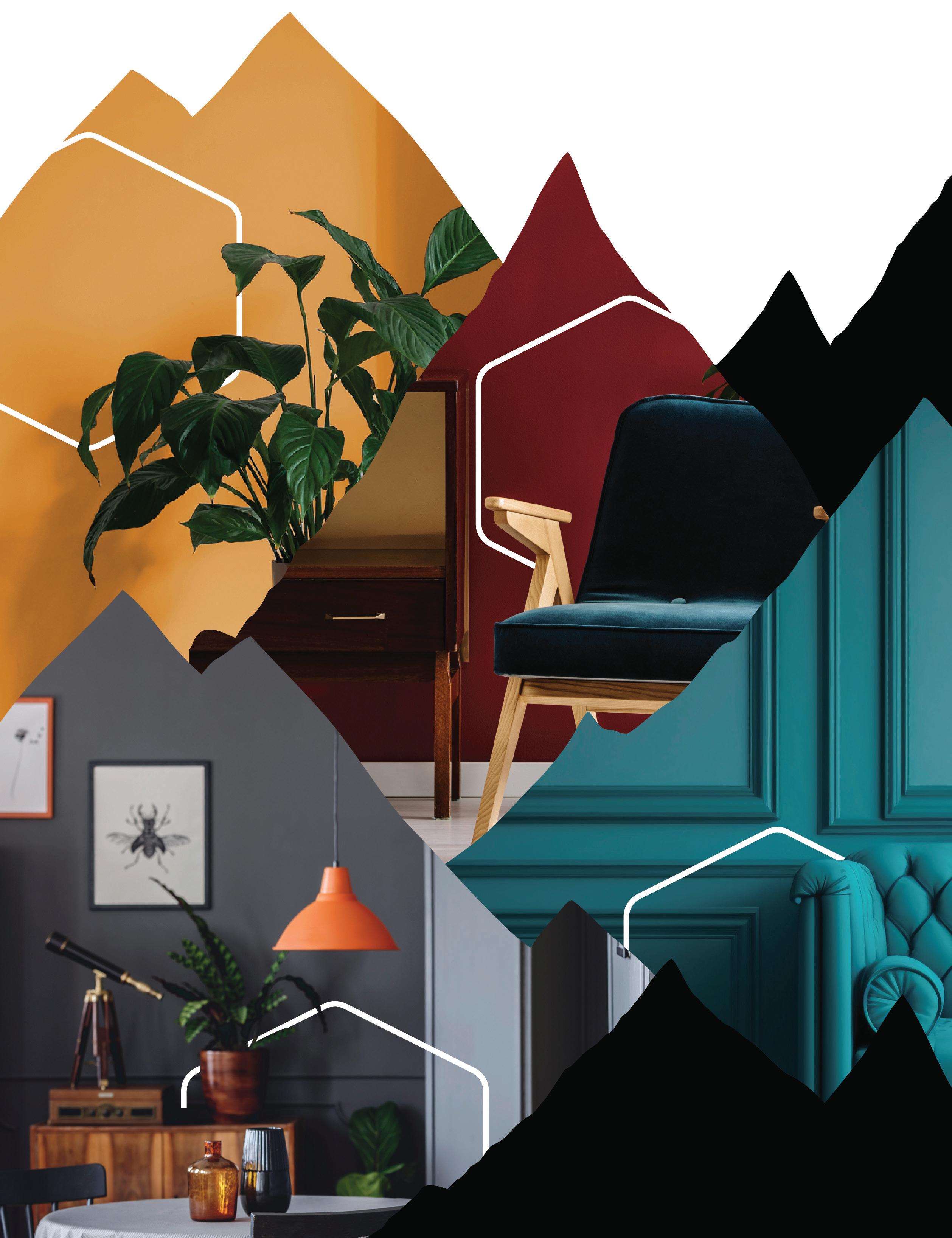
Contents...
New colour trends
your dream home with inspiration from our new style and colour directions.
Photo © Credit
16 Create
However small your space, there’s a home office for you.


10 Harmonies Become a colour expert with our colour harmony guide and discover the secret to getting it right every time. 12 1 Room 4 Ways See how a contemporary dining room is transformed four ways with colour 44 Magic Makeovers Get inspired with a few simple tips and tricks for a magic makeover in your home. 46 Delightful Doors Take inspiration from the seasons to update your front door and revamp your home’s façade in no time. Beautiful colour inspiration for the year ahead 42 Home WORK C o l o ur masterclassstarts on page08 22 30 36
INSPIRING COLOUR 3

by your favourite team, we have a palette that will show off your appreciation without sacrificing style. CURVE BALL TBJ6-0 POWER HITTER TBJ1-3 TRIPLE PLAY TBJ2-0 SLUGGER TBJ3-3 HOME RUN TBJ4-3 GRAND SLAM TBJ5-0 THE BIG CATCH TBJ7-3 OUT OF THE PARK! TBJ8-4 STRIKE ZONE TBJ10-0 BASES LOADED TBJ9-0 SLUGGER TBJ3-3 ™TORONTO BLUE JAYS, bird head design, and all related marks and designs are trademarks and/or copyright of Rogers Blue Jays Baseball Partnership (“RBJBP”). ©2023 RBJBP. Official Paint of the Toronto Blue JaysTM
Unleash your inner Blue JaysTM Inspired

COLOUR
TM INSPIRING COLOUR 5
Mural by Stephanie Boutari
TRENDS
2024 COLOUR OF THE YEAR

TR24-3-1
Indulge in the captivating allure of a soft and radiant yellow hue, which gracefully infuses your space with a warm and luminous embrace. With its gentle red undertones and radiant glow, this colour creates an enchanting ambiance that uplifts the spirit.
The 2024 trend collection
Embraces joy and creativity. Inspired by modern art, each hue offers a creative expression to make any space uniquely yours.

HEARTFELT TR24-1-3
FIRST LIGHT TR24-2-1
ILLUMINA TR24-3-1
EMERGENCE TR24-4-1
LITTLE PLEASURES TR24-5-1
SOUL DEEP TR24-6-3
ESSENCE TR24-7-1
HOPE TR24-8-1
SPIRITED TR24-9-1
BLISSFUL TR24-10-1
AFTER DARK TR24-11-3
INSPIRING COLOUR 7
COLOUR THEORY
The colour wheel is an essential decorating tool. Use it to find a synergy between the colours you like and colours that harmonize with them.
COOL COLOUR S
The colour wheel can be divided in half, with warm colours on one side and cool colours on the other. The colours that appear beside green, blue and violet are cool. With associations to the sea, sky and sheltering foliage, they can be used to good effect in rooms that call for relaxation and calm, such as bedrooms, bathrooms and workspaces. Cool colours are recessive and create an illusion of pushing back walls, thereby making a small room look larger. Use cool colours in sunny rooms to counterbalance the effects of direct sunlight.
COLOUR TERMS
HUE
Hue is simply another word for colour. It is the quality that distinguishes one colour family from another.
TINT
A tint is a variation of any colour mixed with white and is therefore lighter than the original colour, with low saturation.
Reds, oranges and yellows are universally associated with the warmth of the sun and fire and naturally heat up a room. These colours are a good choice for kitchens, dining rooms, living rooms, and playrooms. Warm colours tend to ‘advance’ and can make rooms appear smaller, this makes them ideal for making larger spaces feel more cozy.
UNDERTONE
The subtle underlying colour of a hue is its undertone. Olive Green is green with an undertone of yellow.
WARM COLOUR S
GREEN
YELLOW-
GREEN YELLOW BLUE-GREEN BLUE
RED RED-ORANGE ORANGE
YELLOW- ORANGE
BLUE-VIOLET
RED-VIOLET VIOLET
COLOUR TRENDS THEORY
THE COLOUR WHEEL
MONOCHROMATIC
The simplest of harmonies, monochromatic schemes use various tints, tones and shades from the same hue.
COLOUR HARMONIES
ANALOGOUS
A blended scheme incorporating two or more colours that sit in adjacency on the colour wheel.
COMPLEMENTARY
A complementary scheme uses colours that appear directly opposite or nearly opposite on the colour wheel.
TRIADIC
A triadic scheme includes any three equally spaced colours on the colour wheel.
SATURATION
Saturation is the intensity, brightness or purity of a colour in relation to grey. The most saturated colour is intense and pure with no grey.
SPLIT COMPLEMENTARY
A split-complementary combination is one colour paired with two colours on either side of the original colour’s direct complement.
DOUBLE COMPLEMENTARY
Double complementary harmonies feature two sets of complementary colours that sit next to and across from each other on the colour wheel.

SHADE
This is the result of adding black to any colour to create a darker version of the original colour.
TONE
Tones are created by adding both black and white to a colour and are softer in appearance than a pure colour.
INSPIRING COLOUR 9
HARMONIES
Colour harmony ensures that a room will not only look good but that it will feel good too. To achieve the best results, include the colours of your furnishings and accessories alongside your paint.
ANALOGOUS
Using hues that sit next to each other on the colour wheel creates a scheme that’s easy on the eye. Here, a cool mint and calm blue on panelled walls with accents of lavender make for a relaxed and tranquil bedroom.

Make a statement in kitchens with the combination of a confident orange and a complementary blue. Crisp white tiled walls and counters serve as the perfect companion to enhance this striking colour combination.
 Peninsula C18-2-0654-4
Mamma Mia B31-2-0976-3
Lilac Blossom A40-4-1289-0
Blue Pot C8-4-0624-0
Déjà Vu C2-5-0469-0
Peninsula C18-2-0654-4
Mamma Mia B31-2-0976-3
Lilac Blossom A40-4-1289-0
Blue Pot C8-4-0624-0
Déjà Vu C2-5-0469-0
COMPLEMENTARY COLOUR TRENDS IN PRACTICE
MONOCHROMATIC
Subtle and sophisticated, a monochromatic scheme is a great way to bring interest into a small kitchen. Here, base cabinets in a white with a hint of blue harmonize with a mid-blue wall feature and a splash of a stronger blue as an accent to furniture.
SPLIT COMPLEMENTARY
While it may seem tricky, with the help of the colour wheel, a split complementary scheme is simple and the results can be stunning. For a perfect finish we suggest using a trio of hues with a similar level of saturation. Create this contemporary living room update with natural green walls and a soft pink and warm yellow on cabinets.
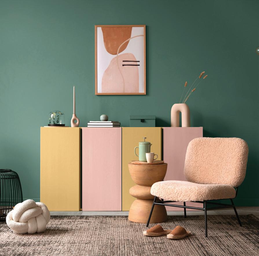 Sea of Atlantis C18-3-0653-4
Faded Into Hue C18-6-0650-0
Divine Inspiration C18-7-0649-0
Mountain Meadow C48-2-0703-4
Sunset in Italy B14-4-0911-0
Over The Rainbow KC4-1
Sea of Atlantis C18-3-0653-4
Faded Into Hue C18-6-0650-0
Divine Inspiration C18-7-0649-0
Mountain Meadow C48-2-0703-4
Sunset in Italy B14-4-0911-0
Over The Rainbow KC4-1
INSPIRING COLOUR 11
LIVE IN LAVENDER
A combination of delicate lavender Fragrant Snowbell and natural green upholstery works beautifully every time. Rustic wicker accents bring this nature inspired scheme to life.
TAKE 1 room
BREEZY BLUES
Try cool blue Restful Retreat as a fresh alternative to a typical grey scheme. Add a modern edge through clean colour blocked light fittings and a tone-on-tone sofa for a sleek and modern living space.

NATURALLY PINK
Prove that pink deserves a place in every room of your home with dusky Notice Me. This comforting shade creates a grown-up feel for an intimate dining area. The addition of tonal soft furnishings and rose gold light fittings add to the cozy mood.

Notice Me A7-3-0072-0
 Fragrant Snowbell A43-6-1224-0
Restful Retreat C6-5-0497-0
Fragrant Snowbell A43-6-1224-0
Restful Retreat C6-5-0497-0
COLOUR FOCUS
4 ways WITH COLOUR
MINIMALIST MONOCHROME
A monochromatic scheme doesn’t have to be stark, here we use Power Lunch, a soft and warming yellow-based grey for a subtle and sophisticated space. Rounded wooden furniture and a warm grey sofa add an overall softness to a contemporary scheme.

Power Lunch
D30-7-0572-0
INSPIRING COLOUR 13
 GOLDEN LARCH WST09-9
The importance of our outdoor spaces has increased over the past few years. From enhancing curb appeal to elevating a backyard oasis.
GOLDEN LARCH WST09-9
The importance of our outdoor spaces has increased over the past few years. From enhancing curb appeal to elevating a backyard oasis.
Enhance the natural beauty of your home’s siding deck, porch, fence, and outdoor projects with BeautiTone’s Wood-Shield & Wood-Shield Best stains.
 MISSION BROWN WST18-9
TRUE WALNUT WST13-9
NUT BROWN WST25-9
SUPERIOR WST39-9
Exterior Stains
LILY PAD WST36-9
WEATHERED GREY WST31-9
WORN NAVY
MISSION BROWN WST18-9
TRUE WALNUT WST13-9
NUT BROWN WST25-9
SUPERIOR WST39-9
Exterior Stains
LILY PAD WST36-9
WEATHERED GREY WST31-9
WORN NAVY
EBONY INSPIRING COLOUR 15
WST40-9 WST45
Natural Oasis
Experience the mood-lifting power of nature with this gentle colour collection.

COLOUR
TRENDS
You Are My Sunshine
DR93-1

Kingdom’s Keys
D6-6-0160-0
Golden Glow


B24-3-0814-4
Gold Tweed
B5-3-0884-4
Billowing Smoke
D34-3-0583-4
Poseidon’s Beard
D31-6-0419-0
DESERT DECOR
Enhance a soft sunny mood with elegant pampas grasses and buttery leather furnishings.

Big Fish
C46-4-0435-0
SIMPLE TOUCHES
Keep it natural with organic shaped ceramics and wicker touches.


Imagine the gentle sounds of nature as the sun rises and you know it’s going to be a good day. Capture that feeling in your home with a palette of soft neutrals, sun-bleached yellows and natural greens.


INSPIRING COLOUR 17
Inspiration
Come inside...
Bask in natural light with this collection of beautiful organic hues designed to bring a sense of calm throughout the home.


EASY BREEZY
Natural hues like You Are My Sunshine and Poseidon’s Beard bring soft light and calm to busy family areas.
You Are My Sunshine DR93-1
MELLOW YELLOW
Bring the summer sun in all year round with a combination of radiant Golden Glow and soft furnishings in a natural fresh green.
 Meraki
Golen Glow B24-3-0814-4
Poseidon’s Beard D31-6-0419-0
Meraki
Golen Glow B24-3-0814-4
Poseidon’s Beard D31-6-0419-0
COLOUR TRENDS
Big Fish C46-4-0435-0
KEEN FOR GREEN
Sleep naturally with stonewashed linen bedding by Piglet in Bed and plenty of air purifying plants. Get the look with walls in organic green Big Fish
Piglet in Bed

INSPIRING COLOUR 19
NATURALLY INDULGENT
Create a modern living room with brass lamps, velvet accent pillows and a natural white sofa by Sofology. Complete the look with dynamic feature walls.

COLOUR TRENDS
Sofology
Billowing
DARK DESIRE
Embrace the dark side in kitchens with Billowing Smoke on walls and base cabinets. Contrast with natural wood counters and wall cabinets to soften the atmosphere.

Discover the versatility in the darker hues of this nature inspired collection.

RUSTIC RETREAT
For a rustic, homely feel, pair the muted pink of Kingdom’s Keys with tonal furnishings and dried flowers.

“
Smoke D34-3-0583-4
Kingdom’s Keys D6-6-0160-0
INSPIRING COLOUR 21
Gold Tweed B5-3-0884-4
Line of Beauty
Welcome the luxury of minimalism with thoughtful, pared back styling and clean lines in a series of flowing hues.

COLOUR
TRENDS
Inspiration

Amid the hustle and bustle of modern-day living, one thing we can do is create a soothing sanctuary right at home. If a refined feminine mood is your idea of heaven, you’ll be inspired by this collection of monochromatic greys, soft pinks and a sumptuous red.


EFFORTLESS PERFECTION
Add some subtle romance with sprigs of gypsophila in glossy glass vases and tableware in a monochromatic colour scheme.


GEOMETRY RULES
Achieve a sense of balance and order with the timeless rules of geometry.
 Absolute WB071-1
Cool Elegance C11-6-0517-0
Let It Rain C11-5-0518-0
Midnight Magic C9-1-0508-3
Prosperity A1-3-0107-3
Pink Coral A5-6-0083-0
Pink Duet A4-7-0075-0
Absolute WB071-1
Cool Elegance C11-6-0517-0
Let It Rain C11-5-0518-0
Midnight Magic C9-1-0508-3
Prosperity A1-3-0107-3
Pink Coral A5-6-0083-0
Pink Duet A4-7-0075-0
INSPIRING COLOUR 23
LIGHT AND BRIGHT
Enhancing natural light with harmonious colour is the key to a restful atmosphere. This child’s bedroom feels light yet cozy with layered textiles in gentle pinks, and a family bathroom stays bright and airy with soft gauzy curtains. Try Pink Coral on walls in combination with a crisp white trim.


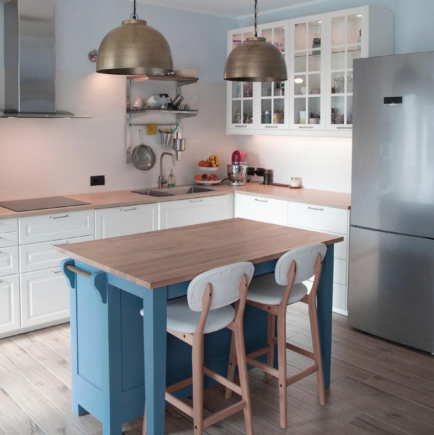
MODERN MINIMALISM
Create some contemporary calm with a monochromatic scheme in the kitchen. Lighting and bar stool by Caffe Latte. Try wall cabinets in Absolute, base cabinets in Let It Rain and walls in Cool Elegance.
 Pink Coral A5-6-0083-0
Let It Rain C11-5-0518-0
Pink Duet A4-7-0075-0
Caffe Latte
Pink Coral A5-6-0083-0
Let It Rain C11-5-0518-0
Pink Duet A4-7-0075-0
Caffe Latte
COLOUR TRENDS
THINK PINK
There’s more to monochrome than black and white, why not elevate your living room interiors with feature walls in Pink Duet and remaining walls in gentle Absolute for a modern update? Complete the monochromatic look with velvet textiles in delicate shades of pink.

Come inside
Visit the lighter side of the collection with colours that bring an understated elegance into your home.
INSPIRING COLOUR 25
“
Don’t be afraid to get experimental and introduce some colour into your home.
Prosperity A1-3-0107-3
COLOUR TRENDS
Koen Van Damme
GOING MONOCHROME
When considering paint colours for your kitchen, take inspiration from your marble and granite for perfect harmony. We love how this kitchen combines the darkest shade from the marble backsplash with Midnight Magic base cabinets and midtone Cool Elegance on the walls.

Cool Elegance C11-6-0517-0
GRAPHIC PAIRINGS
Indulge in some drama by creating focal points throughout the home. Use deep and luxurious Prosperity as a feature wall in pared back dining rooms, and for a touch of drama add a colour focus to the ceiling. Contrast with Absolute on remaining walls and trim.

 Midnight Magic C9-1-0508-3
AYTM
Absolute WB071-1
INSPIRING COLOUR 27
Chris Snook

KIND & BRAVE ST009
Creative spaces

Sometimes our creativity needs a little help; a home gives our imagination the room to run wild.
A little sparkle can go a long way
Your DreamhouseTM awaits
From the comfort of home we can set off on thrilling adventures, explore strange worlds or simply learn something new.
CURRENT MOOD CL5-0
SELF-CARE CL27-0
SO GLAM FO46-0
FASHIONISTA CH26-3
CAREER GOALS VF106-0
BELIEVE BIG ST019
STYLE ICON CH04-0
BARBIE™ BB001-4
GLOW UP ST006
KIND & BRAVE ST009
DREAMHOUSE™ ST010
YES I CAN ST008
BEACH DAY SC126-0
BEACH DAY ST126-0
BELIEVE BIG ST019
YES I CAN ST008
© 2023 Mattel
INSPIRING COLOUR 29
moment of reflection
Relax and rejuvenate with colours designed to clear your mind when you arrive home after a long day.

COLOUR TRENDS
Health and wellness are important considerations for many of us. This meditative palette of clean neutrals, crystal-clear pink, cooling purple and fresh yellow and green is designed to create a perfect state of calm in your home.


TAKE A BREATH
Discover a space that allows you to take a moment to pause with accents of natural textiles and healing crystals.
Merlins Beard D8-7-0124-0
Honey Dew List C43-6-0748-0
Elfin Magic C29-7-0775-0
Willa WB075-1
Refined Grace WB087-1
He Loves Me A39-7-1279-0
Pale Loden Green D32-6-0440-0
inspiration
INSPIRING COLOUR 31
Meraki
QUIET TIME
With a yellow red undertone, Willa is the perfect choice for home offices, designed for calm focus.


Explore tonal variations with the botanical inspired hues of this collection.
SWEET DREAMS
Prepare to feel energized after a great night’s sleep with walls in mood-lifting Elfin Magic
 Elfin Magic C29-7-0775-0
Honey Dew List C43-6-0748-0
Elfin Magic C29-7-0775-0
Honey Dew List C43-6-0748-0
COLOUR TRENDS
Willa WB075-1
Be inspired by this beautiful balance of colour and form
 with furniture by Normann Copenhagen. Get the look with walls in Honey Dew List
INSPIRING COLOUR 33
Normann Copenhagen
UNWIND AND DINE
For peaceful and relaxed dining, try walls in soothing Pale Loden Green. Create a subtle contrast with glossy and ceramic tableware in green and blue tinted hues.


 He Loves Me A39-7-1279-0
Pale Loden Green D32-6-0440-0
Normann Copenhagen
He Loves Me A39-7-1279-0
Pale Loden Green D32-6-0440-0
Normann Copenhagen
COLOUR TRENDS
House Doctor
NORDIC BLISS
Create an easy Scandinavian living space with an all-over coat of Willa to walls. Style up with a plush sofa and bleached wood cabinets.


For a tranquil state of mind, consider warm stone greys for kitchens. Complete the look with antique brass fittings and treat yourself to a luxury handwash by Meraki.

“
Invite nature in with soft touches of biophilia.
Merlins Beard D8-7-0124-0
Refined Grace WB087-1
INSPIRING COLOUR 35
Meraki
Bring the spirit of the 70’s into your home with this bold yet relaxed colour palette.

COLOUR TRENDS
The 1970’s are back! Inspired by the colours of an era seen through the filter of old photo film stock, this harmonious balance of earthy and playful colour will transform your home into a boho dream.


INSPIRATION
BLURRED LINES
Up your home accessories game with some strikingly patterned glassware.

70’S SONG
It’s time to dust off those old record players and make them front and centre.
 Motherland C25-3-0793-4
Portsmouth Spice CC002-3
Connoisseur D10-2-0143-3
Crispa C37-6-0391-0
Trisha’s Eyes C15-4-0666-0
Cape Hope C6-6-0496-0
Happy Tune C20-1-0648-3
Motherland C25-3-0793-4
Portsmouth Spice CC002-3
Connoisseur D10-2-0143-3
Crispa C37-6-0391-0
Trisha’s Eyes C15-4-0666-0
Cape Hope C6-6-0496-0
Happy Tune C20-1-0648-3
INSPIRING COLOUR 37
H&M Home


Look to complementary colours, blue and orange for a winning combination throughout your home. PRECIOUS MOMENTS Add a sense of intimacy to your dining room with walls in burnt orange Portsmouth Spice
COME INSIDE...
CC002-3 Happy Tune C20-1-0648-3 COLOUR TRENDS
Portsomouth
Spice
COCOONING CORNER
Make a cozy reading nook with delicious chocolate brown Connoisseur. Combine with rusty hues in upholstery and contrasting gloss and matte black accessories for a touch of intrigue.

Create a bedroom you’ll never want to leave with blue check bedlinen by Habitat and the gentle flicker of a candle. Get the look with earthy Portsmouth Spice on panelled walls and trim in Crispa

 Connoisseur D10-2-0143-3
Crispa C37-6-0391-0
Habitat
Connoisseur D10-2-0143-3
Crispa C37-6-0391-0
Habitat
INSPIRING COLOUR 39
Chris Snook
STATEMENT SOFAS
Rooms for relaxing don’t have to be neutral, add some fun colour to your living room with a vibrant sofa by Sofology. Try feature walls in Cape Hope and remaining walls in Trisha’s Eyes Sofology

COLOUR TRENDS
KEEN FOR GREEN
Inject confident colour into your kitchen with base cabinets in zesty Motherland and combine with yellow tinted neutral Crispa on walls to soften the mood. Complete this bold setting with mini succulents and brass trays.

Cape Hope C6-6-0496-0
BEAUTIFUL BLUES
You can’t go wrong with blue for bathrooms, so why not try combining the two hues of Cape Hope and Trisha’s Eyes to add a touch of style to your morning pamper session?


C15-4-0666-0
Bring
Motherland
C25-3-0793-4
“
your home to life with these zingy and fresh hues.
Trisha’s Eyes
Sweetpea & Willow
INSPIRING COLOUR 41
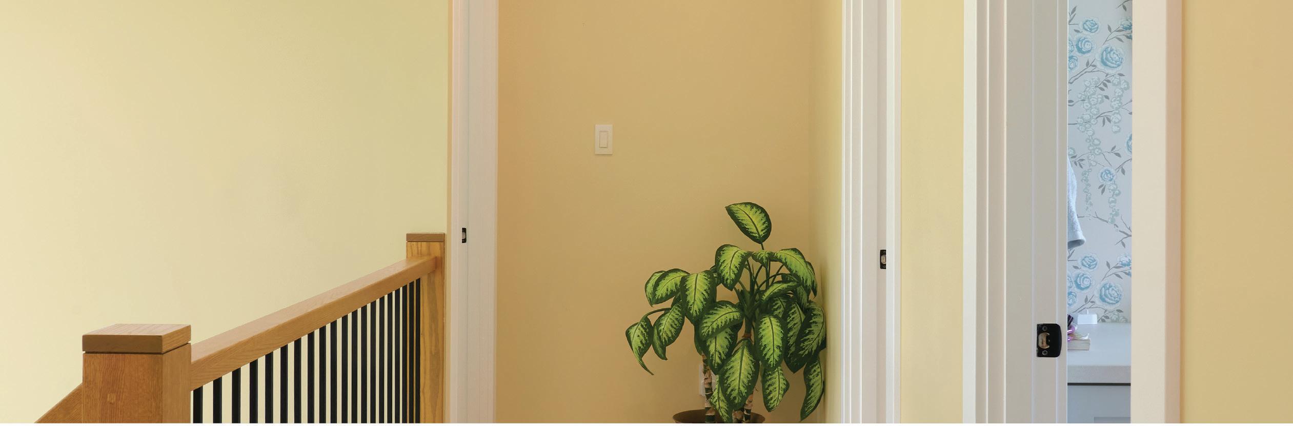
BACK TO BLACK
Black walls are a great choice for home offices, making the room feel more spacious as well as effortlessly sophisticated. Soften a monochromatic scheme with natural wood furnishings and delicate floral photographs. Set the tone with Black Licorice D35-1-0529-3

HOME
COLOUR TRENDS STORIES
WORK
NO SPACE? NO PROBLEM
With a little imagination, you can make the most of small spaces in your home. It might feel counterintuitive, but taking dark colour to walls can make a room feel larger than it is, while also promoting space to focus.


Go blue with Day Spa C7-1-0634-3 or try grounding Temptation D7-2-0150-4
CONVERTED CORNERS
Take advantage of every nook and cranny and create a cozy corner for your home office. Keep things natural with a shaded green and complete the look with a pale wooden desk, rattan chair and hanging succulents.
Create an office oasis with Malarca C47-2-0458-4.

For many of us, changes in lifestyle mean that working from home is here to stay. Whatever space you have, there’s a home office for you.
INSPIRING COLOUR 43
John Lewis
TRADITIONAL TWIST
Add a contemporary twist through painting panelled backsplashes in mood-lifting hues. Frame counters in traditional country kitchens with this sunny Sassy Yellow designed to add charm.

MAGIC MAKEOVERS
Short on time? Low on budget? Get inspired with simple tips and tricks to transform your spaces.
FUNKY FREESTYLE
For big visual pay off without having to paint the whole room, dare to go freehand with a large brush straight onto white walls. There’s beauty in imperfection for this trend, brush marks and lines all add to the character of your room.

COLOUR POP
With this budget friendly hack, take existing furnishings as a starting point for inspiration. Here, we add a pop of colour to nightstands in a soothing green to complement the bedframe.
 Sassy Yellow B16-3-0933-4
Perennial Garden C31-2-0759-4
Auburn Wave B38-5-0049-0
Sassy Yellow B16-3-0933-4
Perennial Garden C31-2-0759-4
Auburn Wave B38-5-0049-0
COLOUR TRENDS STORIES
Original BTC
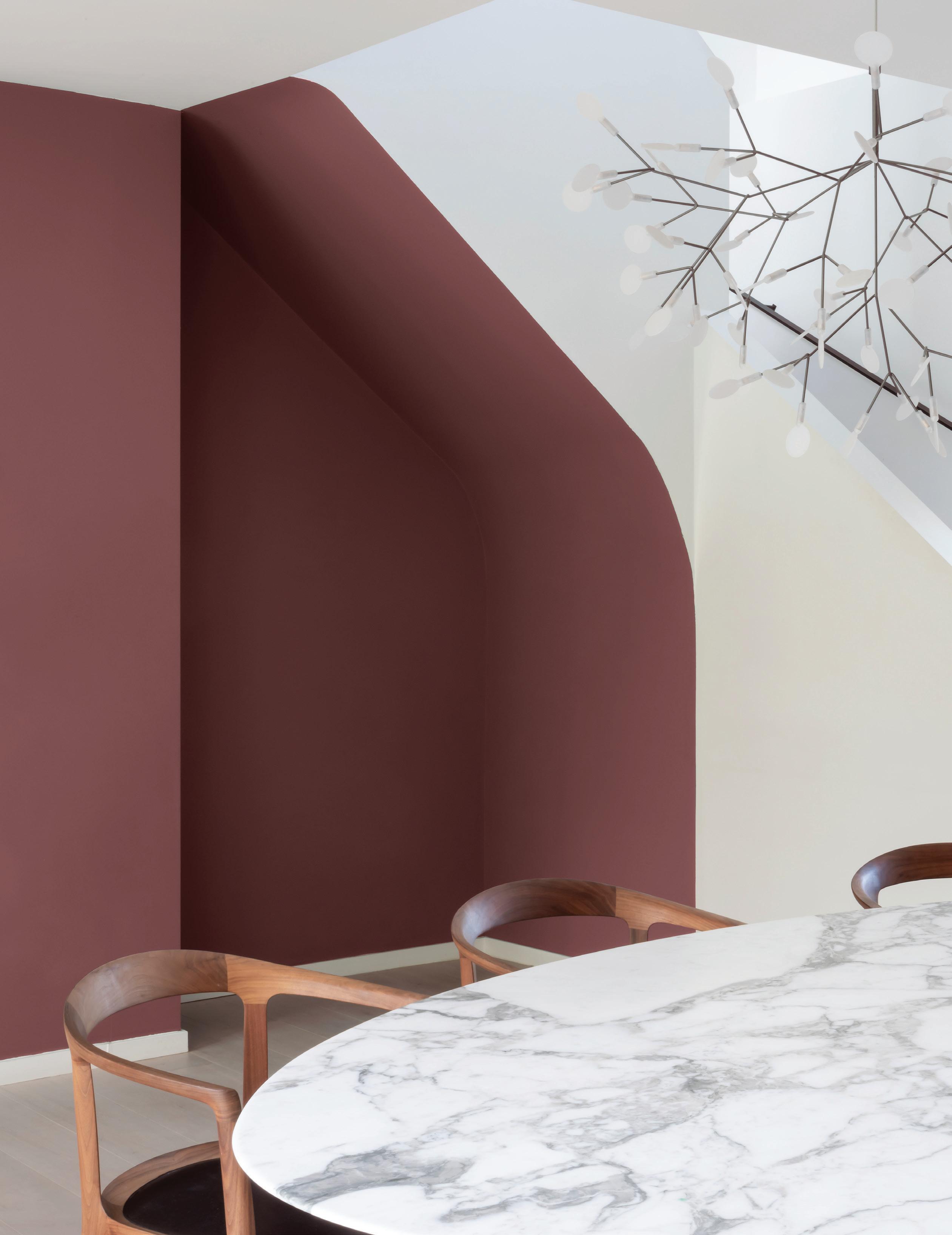
SPACE TO FOCUS
Use colour blocking to define zones in open-plan homes. We love the idea of spotlighting desk space with a bold geometric shape to follow the line of the stairs. Get the look with paint in Object Of My Affection DR79-4 and accessorize with a contrasting yellow.

INSPIRING COLOUR 45
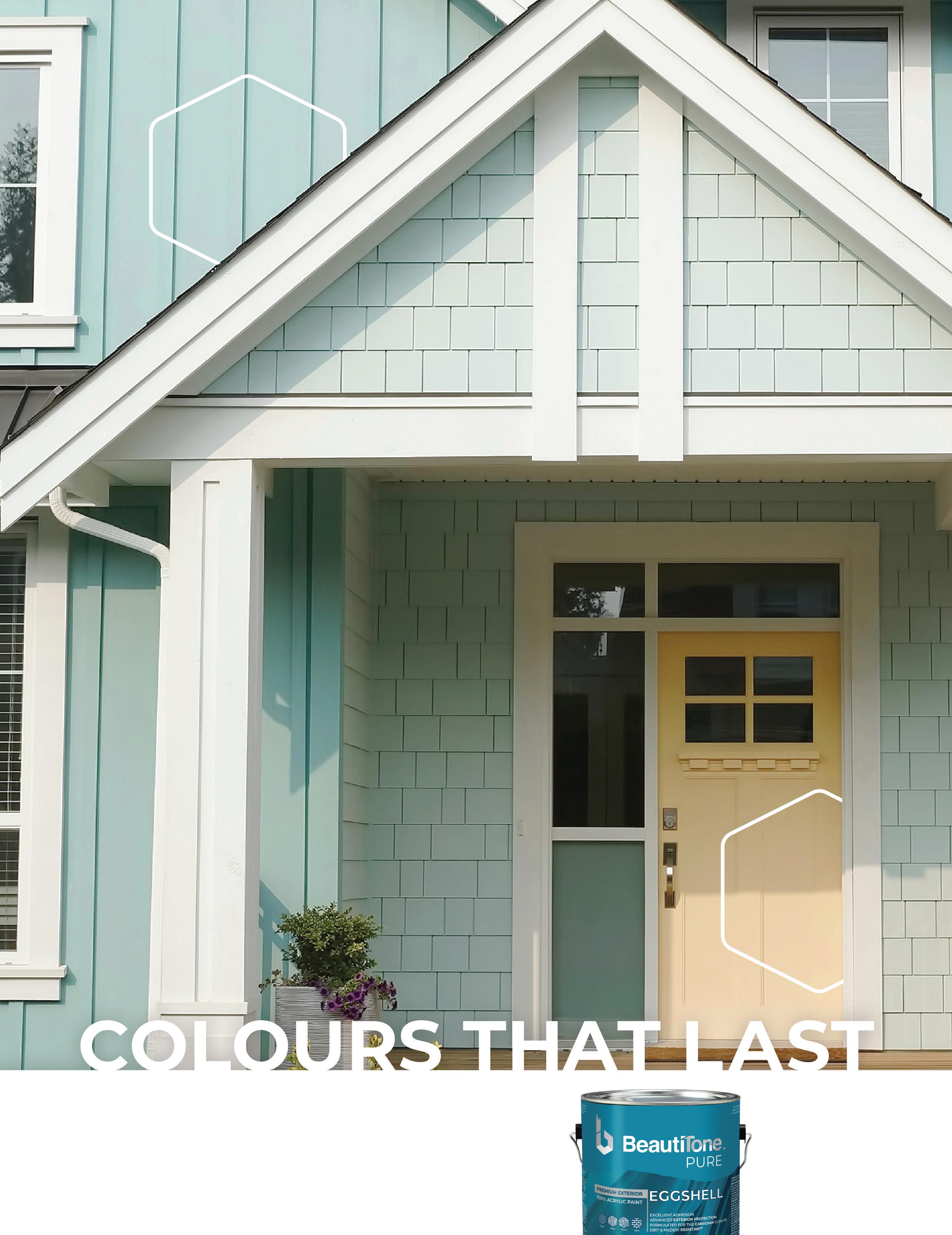
John Lewis
Make
SUMMER
Bring joy to your doorstep with an energizing yellow, Citron inspired by the height of summertime and contrast with a brilliant white.


Delightful
Look
SPRING
If an uplifting entrance is what you’re after, then look no further! Create a seamless flow from outdoors to indoors with Frog Green or introduce Catarina Green to complement the natural surroundings. Frog
 Citron B20-2-0850-3
Green C29-3-0779-4
Catarina Green C35-4-0708-0
“
a good first impression with a fresh front door.
to the seasons for colour inspiration. COLOUR TRENDS STORIES
AUTUMN
Think falling leaves, pumpkin pies, and all things autumnal for colour inspiration. Transform dull doors to fantastic façades with a dash of bright Lemon Dream, or set the tone for the cozy months ahead with warming red Cherry Blink

Doors
WINTER
With a classic colour, you’ll never be out of style. Welcoming winter red Looks to Thrill is a beautiful complement to red brick and white trim, and you can be sure your guests will never miss your front door!

 Lemon Dream B34-1-0942-3
Cherry Blink A23-1-1075-3
Looks to Thrill DR68-3
Lemon Dream B34-1-0942-3
Cherry Blink A23-1-1075-3
Looks to Thrill DR68-3
INSPIRING COLOUR 47
CREDITS


 Page 22 © Sofology sofology.com
P33 © Normann Copenhagen normann-copenhagen.com
Page 36 © Dimitri Weber
Page 29 © Chris Snook
Page 39 © Chris Snook
Page 43 © John Lewis johnlewis.com
Page 3&43 © Followtheflow
Page 31 © Meraki merakimoments.com
Page 35 © Meraki merakimoments.com
Page 28 © Koen Van Damme
Page 38 © HAY hay.dk
Page 41 © Sweetpea & Willow sweetpeaandwillow.com
Page 2&20 © Artjafara
Page 21 © Piglet in Bed pigletinbed.com
Page 34 © R. Architecture
Page 37 © H&M Home hm.com/home
Page 34 © House Doctor housedoctor.com
Page 29 © AYTM aytmdesign.com
Page 39 © Habitat habitat-design.com
Page 44 © Original BTC originalbtc.com
Cover & Page 23 © Artjafara
Page 18 © Radovan
Page 24 © Lorna Roberts
P34 © Normann Copenhagen normann-copenhagen.com
Page 30 © Rawpixel
Page 37 © HAY hay.dk
Page 40 © Sofology sofology.com
Page 45 © John Lewis johnlewis.com
Page 20 © Meraki merakimoments.com
Page 22 © Sofology sofology.com
P33 © Normann Copenhagen normann-copenhagen.com
Page 36 © Dimitri Weber
Page 29 © Chris Snook
Page 39 © Chris Snook
Page 43 © John Lewis johnlewis.com
Page 3&43 © Followtheflow
Page 31 © Meraki merakimoments.com
Page 35 © Meraki merakimoments.com
Page 28 © Koen Van Damme
Page 38 © HAY hay.dk
Page 41 © Sweetpea & Willow sweetpeaandwillow.com
Page 2&20 © Artjafara
Page 21 © Piglet in Bed pigletinbed.com
Page 34 © R. Architecture
Page 37 © H&M Home hm.com/home
Page 34 © House Doctor housedoctor.com
Page 29 © AYTM aytmdesign.com
Page 39 © Habitat habitat-design.com
Page 44 © Original BTC originalbtc.com
Cover & Page 23 © Artjafara
Page 18 © Radovan
Page 24 © Lorna Roberts
P34 © Normann Copenhagen normann-copenhagen.com
Page 30 © Rawpixel
Page 37 © HAY hay.dk
Page 40 © Sofology sofology.com
Page 45 © John Lewis johnlewis.com
Page 20 © Meraki merakimoments.com
CREDITS
Page 26 © Caffe Latte caffelatte.com
Bring the outside in
Our national parks represent the majestic beauty of Canada. We have gathered a colour to represent each park individually so you can bring your favourite home with you.
 PITCHER PLANT NPC47-3
PELEE MONARCH NPC45-3
LAPIS LAKE NPC33-3
RUGGED BEAUTY NPC5-3
PITCHER PLANT NPC47-3
PELEE MONARCH NPC45-3
LAPIS LAKE NPC33-3
RUGGED BEAUTY NPC5-3


TAUPE THIS! DR30-0 TRAILBLAZE KC13-3 Due to printing process colours may not be exact. Refer to actual paint chip for colour. Only at TM
