CAPA s t ra t e g i e s
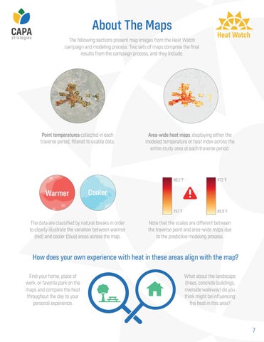
About The Maps The following sections present map images from the Heat Watch campaign and modeling process. Two sets of maps comprise the final results from the campaign process, and they include:
Point temperatures collected in each traverse period, filtered to usable data.
Warmer
Heat Watch
Area-wide heat maps, displaying either the modeled temperature or heat index across the entire study area at each traverse period.
80.2 F
97.2 F
73.1 F
83.3 F
Cooler
The data are classified by natural breaks in order to clearly illustrate the variation between warmer (red) and cooler (blue) areas across the map.
Note that the scales are different between the traverse point and area-wide maps due to the predictive modeling process.
How does your own experience with heat in these areas align with the map? Find your home, place of work, or favorite park on the maps and compare the heat throughout the day to your personal experience.
What about the landscape (trees, concrete buildings, riverside walkway) do you think might be influencing the heat in this area?
7

