LEBER
HANNAH LEBER ARCHITECTURE PORTFOLIO
BY: HANNAH LEBER UNIVERSITY OF MADRID 2019

“I THINK SPACE, ARCHITECTUAL SPACE, IT’S NOT ABOUT FACADE, ELEVATION, MAKING IMAGE, MAKING MONEY. MY PASSION IS CREATING SPACE”
-PETER ZUMTHOR
SHOT
RESUME
INFORMATION
HANNAH LEBER
HANNAHLEBER62@GMAIL.COM
LINKEDIN
EDUCATION
TEXAS A&M UNIVERSITY
COLLEGE OF ARCHITECTURE
MAJOR IN ENVIRONMENTAL DESIGN
CLASS OF 2021
UNIVERSITY OF HOUSTON
COLLEGE OF ARCHITECTURE
MASTERS IN ARCHITECTURE
GRADUATION MAY 2023
EXPERIENCE
GEEK APPAREAL
2018
INTERN GRAPHIC DESIGNER
COLLABORATED WITH A TEAM TO DESIGN GRAPHIC TEES.
POWERS BROWN ARCHITECTURE
2022- PRESENT ARCHITECTURAL INTERN
SOFTWARE
EXPERTISE
RHINOCEROUS (GRASSHOPPER)
REVIT
AUTOCAD
PHOTOSHOP
ILLUSTRATOR
INDESIGN
MICROSOFT OFFICE
ORGANIZATION
AIAS
TEXAS A&M BRANCH OF AIAS
DELTA GAMMA
ETA GAMMA CHAPTER
FRESHMEN LEADERS IN PROGRESS
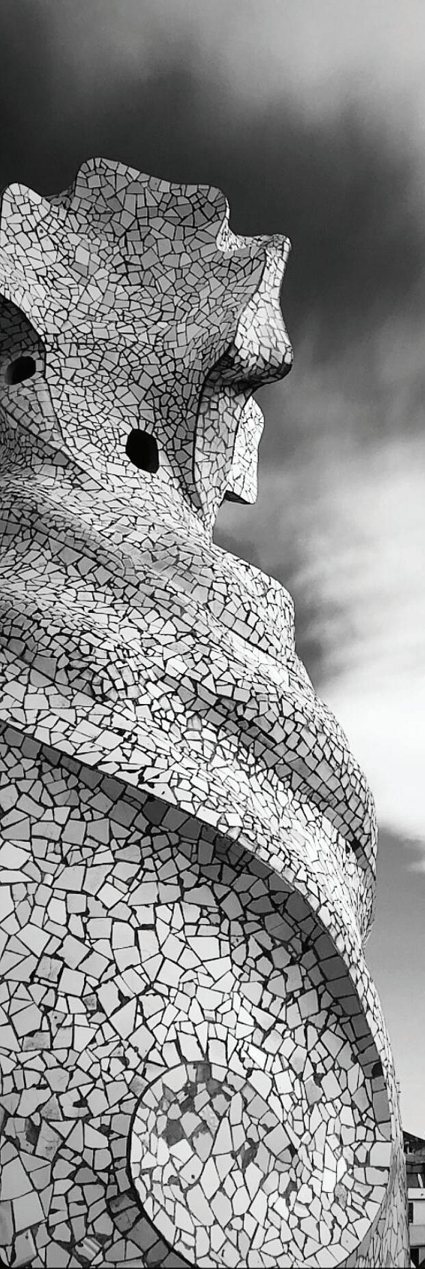
SHOT BY: HANNAH LEBER
ROOF SPIRE AT CASA
MILA 2019
“WE BORROW FROM NATURE THE SPACE WHICH WE BUILD ON.”
-TADAO ANDO
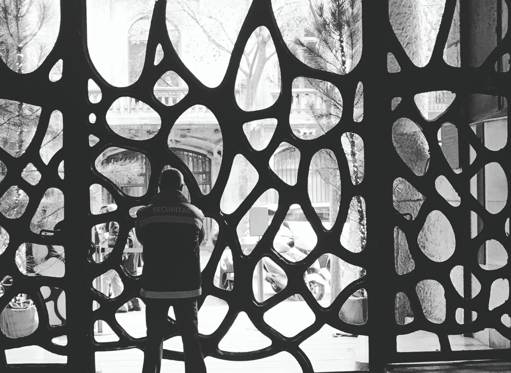 SHOT BY: HANNAH LEBER FRONT GATE AT CASA MILA 2019
MOSAIC
Studio: Arch 6604 SP.2022
Professor: Matt johnson
Mosaic is a social housing project designed for adults with learning disabilities. “Group Homes,” the official terminology for this type of housing, are recently being redesigned across the United States to make this form of living more suitable. Mosaic is designed foolowing the “Autism and the Built Environment” essay’s guidelines for comfortable designs for people on the spectrum. These include easy wayfinding, retreatable spaces, and limiting noisey surfaces and spaces.
2.4 million households with non-elderly people with disabilities have worst-case housing needs. Nearly 40% of all worst-case housing in the US.
About 11 percent of the U.S. population has some level of chemical sensitivity (CS) that is likely to require housing that is free of disabling environmental triggers.
1


PRIVATE VS PUBLIC
NON ACTIVE PARTICIPANT
ACTIVE PARTICIPANT NON PARTICIPANT
INCREASE VISIBILITY
ELEVATE SITE CONNECT COMUNITY SPACE
36 PUBLIC PRIVATE


3M Class: Arch 6603 FA.2021
Professor: Matt Johnson

2


Rec Center
Plan


10 50 100
Plan
Main Level


Level 1 0’ Level 2 & 3 28’

Restaurant Restaurant Restaurant Restaurant Level 1 0’ Community Kitchen Dining Hall Storage Level 2 28’ Level 3 40’ Restaurant Stalls Community Garden Gallery Seating


Level 1 0’ Level 2 28’


Level 2 28’ Level 1 0’
Rock Climbing Wall
Pool Pump Room


COSMOS
Professor: Bruce Race 3
Studio: Arch 6605 FA.2022
Project consisted of two projects. The first a team of 6 students designed a city master plan in Houston Texas, Protostar. Next, each student designed their own building inside the city, Cosmos.
Protostar:
ProtoStar is the world’s next international innovation Hub. Centered in South East Houston, near NASA and UHCL, it brings together the Brightest and most creative minds in the world. Focusing on 3 Primary characteristics
1. INNOVATION
2. INTEGRATION AND
3. INCUBATION
It is here that our futures come to a reality. Using sustainable means, we transformed a greatly undervalued region in Houston’s satellite suburbs, to one of the first Green, Carbon Neutral Cities in the United States.

Cosmos
Located in the heart of Polaris’ innovation center next to METRO’s Park And Ride, Cosmos is a landmark and hub for the districts activity. Cosmos is comprised of large gathering spaces such as ballroons, conference rooms, and an auditorium to accomodate STEM conferences, host TED talks, and NASA award ceremonies. The space also has an exhibition hall to showcase the groundbreaking research happening in Polaris. As well space for working on revolutionary discovries, accomodated by four floors of dry lab space. Not only are the people who occupy this space extrordinary, so is the building itself by being sustainable. Through the use of passive cooling, water recycling, and solar panels, Cosmos produces neary 85% of it’s own energy consumption.

PROTOSTAR GROUP WORK


0 0.25 0.13 Miles GALVESTONRD E MEDICALCENTERBLVD RKAVE PARKAVE BAY AREA BLVD BAY AREA BLVD TOWN CENTER BLVD TOWN CENTER BLVD 1 2 3 4 2 3 4 SATELLITE SQUARE COSMIC COLONY SUNRISE SPRINGS LUNAR LANDING 0 0.25 0.13 Miles MAINAXIS PARK ARK ARK ARK IMPORTANTSTREET IMPORTANT STR E E T MA R H D W N D R HW 0 0.25 0.13 Miles PARK AND RIDE P P P P 0 0.25 0.13 Miles 0 0.25 0.13 Miles WALKERPARK ASTEROID REC APOLLOPARK AMBIT PARK Master Plan Districts Institutional Commercial Residential Office Park Parking MU Office MU Residential Master Plan Land Use Metro 15 Min Pedestrian Bike Car Master Plan Circulation Low Activity High Activity Master Plan Activity Main Axis Pedestrian Access Activation Zones Urban Diagram Open Spaces Master Plan Open Spaces


PARKAVE BAYAREABLVD 0 250 500 100 Feet PED DIAGONAL SIDEWALK VEGETATION VEGETATION SIDEWALK SEATING SEATING MEDIAN BUS/BIKE BUS/BIKE 15 ft 6 ft 6 ft 15 ft 3 ft 3 ft 4 ft 12 ft 12 ft SCALE: LOOP PEDESTRIAN
WALKER
1. CONNECTION TO PLAZA


2. SEPARATION OF SPACE


3. CONNECTION OF SPACE

PLAZA FORM EVALUATION
LEVEL 07
DRY LABS
LEVEL 06
DRY LABS
LEVEL 05
DRY LABS
LEVEL 04
GARDEN PATIO


LEVEL 03
MEETING ROOMS
LEVEL 02
EXHIBITION HALL
LEVEL 01
CONFERENCE CENTER


Fire Station X
Studio: Arch 405 Fall 2020
Professor: Marcel Erminy
Partner: Angel Gomez
Professor Erminy prompted us with the idea to build a hybrid firestation. With the introduction of Corona Virus we felt that there needs to be a shift in architecture. A building can no longer function for a single use. It needs to be able to be a building that can support a community during a global crisis. This is why we decided to have a community center attached to our firestation that can support our community in multiple different ways.
We were presented with two large site in the Bryan College Station area to choose to build on. Both sites are relatively huge. Our site that we chose in Bryan, connected to Texas A&M’s Rellis campus, is a traingular shape about 30.5 acres. Considering how much space is needed to be occupied we decided to create two seperate buildings that attach in the middle by a bridge. We were inspired to also use this land as part of our building. The landscape birms up to the building and the building slopes into the landscape. Working in a symbiotic relationship to blur the line between what is building and what is site.

4

Site Location


Rellis Campus
Texas A&M University
Bryan, TX
This site is next to Texas A&M’s Rellis campus, which is an area far off main campus. We chose this site because it’s proximity to the highway. Also, because there is a definite need for this portion of campus to have a fire station close by. Considering it is where all the labs, containg heavy machinery, are located.
Up Up
FP Level 1
FP Level 2 15’-30’
N up up up up up Up Dn Dn Dn Dn Dn Dn Dn Dn
0’-15’
Topography From North
Topography From South


View 1 View 2 View 3 View 1 View 2 View 3 View 3 View 3 View 2 View 2 View 1 View 1


View Towards North

View Towards North-West

Fire Station X main design factor relating and integrating into the landscape.


Division
Professor: Andrew Hawkins 5
Studio: Arch 306 Spring 2020

The design of educational facilities is a large market within the field of architecture. The world of education and learning continues to evolve based on newly developing technologies and we should be preparing for future technologies. Architecture education is special in its programmatic elements and the needs for space. This project is meant to be an expansion of the current Texas A&M Dept. of Architecture. It will be considered as a “remote” location meant to supplement the currently over-occupied Langford Complex.

Surrounding Context
25% Restaurants
12% Churches
7% Offices
5% Government Facilities
50% Residential

N
Private vs Public Solid vs Voids Accessibility
As the level of the building increases so does the level of authority one must have to access that portion of the program. The first level is open to the public. Located here is a coffee shop, and theater room that can by used by students of the school and citizen of Bryan. These areas have their own entrances and exits, to limit the foot traffic of non-university people in the building. These areas can be closed off from the rest of building at closing, to protect the safety of the students who are still occupying the rest of the building. The second floor is occupied by university students, the third floor by architecture students, and fourth by professors and graduate students.
Division contains many spaces that are created from large voids that were cut from the building. There is a large contrast between these void spaces and the surrounding areas. The void spaces are meant to resemble spaces that are “class-free.” Meaning that these areas are solely for students who are not in a class at this time and need a leisurely place to study, work with friends, or just hang out. They contrast with the surroundings that are made up of closed off areas that are more so dedicated to teaching.
The building can be divided up longitudinally. These were the main axis used for the structure and the program. The areas located on the far left and far right (highlighted in the above image), are specifically for holding class and studio. To access these areas one will most likely either be enrolled in a class using this space of a professor teaching a class. This contrast with the middle portion of the building in between these spaces (the non-highlighted portion). These spaces can be rented out by anyone in the university and can be used as all times.
Section Facing East
Level -1
Level 1
Level 2
N Level 3 Level 4
Section Facing West
Section Facing North


When designing an interior it’s important to think about every detail. I would like to point out and clarify mu favorite detail. This image shows the linear sculpture that follows down the stairs. This sculpture is actually the soundwaves of the Aggie War Hymn.


The Denver Library Project is a place where the citizens of Denver can come to hangout or just work. the main design features are all based on environmental factors. My team and I spent countless hours researching the wind paths, sun paths, and radiation on the building to come up with the most environmentally friendly building. The design features such as the roof, overall layout, and positioning are all based on the environmental factors of Denver. Our design goals included:
1. Maximize wind circulation in summer and minimize in winter.
2. Maximize radiation in winter and mininize in summer
3. Add shading to South East and West facades.
6
Denver Library
Studio: Arch 215 Spring 2019

Professor: Kim
Partner: Abby Zuber
Design Process
The L shape was chosen to maximize the amount of sunlight being projected onto the building. Especially for winter months, becuase of the cold temperatures in Denver at this time. The L shape opens up toward the corner of the site that gets the most wind flow. This helps cool the building in the summer time. The shape was better adapted to the site by using the northern and western boundaries. In order to further finalize the design concept the North-West corner of the mass was lifted to resemble the shape of the surrounding mountains, while also encouraging air flow.
Preliminary Mass Step 1 Step 2 Step 3 Step 4 Final Mass
Wind Simulation

Simulation created on ANSYS Workbench by Hannah
The orientation of the building allows for wind to flow into the center courtyard. This brings the wind in to the building. The walls are made up of glass and the upper most portion opens to allow the wind to enter the building and circulate up through the atrium and out of the roof.
 Diagram of wind circulation. Designed and diagramed by Hannah.


Towards A Sustainable Architecture
Class: Arch 317
Professor: Gabriel Esquivel
My main question when beginning this project was: How can the second digital turn be used to better our current state of living? One way to improve the quality of our life is to nourish and preserve our home, Earth.
Right now, the building industry is responsible for 50% of the extracted materials from the Earth, 40% of carbon emissions, and 20 million tons of construction waste each year. So as of as now were not doing too great.
Luckily, we have come to a second digital turn, and contrary to popular belief AI and robotics will not be our demise, it will be our answer. I focused my studies around three of the many ways these new advancements will lead to a more sustainable architecture.
First, AI has allowed us to structurally optimize our forms, directly based on the loads that are acting on the object. Subtracting the inconsequential materials needed to hold the loads. Ultimately leading to less excess material.
Second, with robotics comes additive manufacturing, By having a robotic arm we no longer are required to use formwork when construction. It also provides us with opportunity to use new innovative, unthinkable materials.
Third, mass customization allows us to no longer have to use over produced mass manufactured 2 by 4’s and wide flanges. We now have the ability to create project specific structures, allowing us as architects to have creative freedom.

7
Architecture styles changes with revolution.


In this project I hypothesize what our new style will be. The column is the best way to recognize a style of architecture. Throughout every era, and new technological advancement the style of the column has evolved.


A new style for a new era. In this project the shapes that we get when optimizing the columns create an organic structure, one of which you could find in nature. I hypothesize that organic shapes will be the new style. This is because nature knows best. Nature creates what it can from it’s ready materials. Meaning it doesn’t use more than it needs. And every detail in the form of an animal serves a specific functions, while still remaining beautiful. I think we can take from this, instead of having form or function following one another, they can work simulataneously, form and function in unison.

7th
1st
16th
17th
20th
20th
Century BC
Century BC
Century
Century
Century
Century
Lilac Breasted Roller Image: Zooinfotech.com
Banyan Tree Image: Oralleff/istock.com
Dried Human Tear Drop Image: Nikonsmallworld.com
Structural Optimization. For this portion I used the TOPOS grasshopper script and also Fusion360. TOPOS created more intricate outcomes, while Fusion360 produced on the more realistic side.

TOPOS Script:
Step 3: Ran the TOPOS script. The inputs were:
Structural Capacity: Steel

Voxel Size: .2
Simulation Run: 400 trials
Step 1:
Input the initial column form Step 2: Input the loads (red) & supports (blue)


After the simulation ran, I was able to adjust the percentage of voxels that I wanted to create the form. For most simulations I used 20% of the voxels.
Step 4: Final Product. Render and Smooth mesh
Fusion360: SInce Fusion360 is more logical than the TOPOS script. I inserted than inputs of a brige to receive more complex results.
Step 1:
Input the initial geometry (green)
Input loads, direction & magnitude (blue)
Force of gravity (yellow)

Step 2: Insert obstacle geometry to limit where the material can be added. Input the materials: Steel


Step 3:
Aftrer inputing the dimmensions of the robotic arm, run the simulation and get results
Printing Set-Up. After running the TOPOS scripts with several different inputs, I finally chose three to print. Since the columns are so tall and thin, I was unable to print the full columns. Instead, I printed a third of each one.
Column 1: Step 1:Finalized form
Column 2: Step 1:Finalized form


Column 3: Step 1:Finalized form

Step 2: Chose portion to print


print
print
 Step 2: Chose portion to
Step 2: Chose portion to
Step 2: Chose portion to
Printing Process.
Since I did not have metal available to print in the lab, I made the decision to print anyway but in clay. Printing in clay still provided the knowledge and experience of how the robotic arm works. It is necessary to note though, that the outcomes of the prints may have differed if they were printed in metal.


Conclusion: In attempts to find a more sustainable architecture, I believe that the use of optimization and additive manufacturing will lead decrease the amount of waste on site, formwork, and tools, making this a sustainable solution. I also believe that this organic form will be one that defines the second digital turn in architecture.


Column 1:
Column 1 printed famously without any errors. The initial column was just thick enough that it could hold the weight of the clay being poured. Overall it was the most simple form that I printed, bearing the best results for printing.


Column 3:
As you can see here the clay was unable to print the small branches leading to excess clay and the need for supports while printing.
Column 3 did ultimately fail at the end toppling over before the print was complete. This was because some branches of the column were too think for the clay to print. If this was a metal print it would still be standing today. As I advace more in this project I will keep the material in mind. Although failing, I learned the most from this print.

Column 2, if it’s not obvious was my favorite print. I didn’t not believe it was going to print well. Contrary to my belief it printed beautifully. I only encountered a few errors. One being the arms failing to stop printing between paths causing random unwanted lines of clay (seen in image on the left). The other fault was the clay doubled up at the begining and end of each path causing a seam (seen in image above).


Column 2:
Continuum Studio: Arch 105 Summer 2018

Professor: Julie Rogers
Continuum is a shadow box project that we were given to form a basis on linework, shading, toning, and model construction. We were given an image created by Ginny Herzog from which we had to create our own line drawing inspired by her painting. In our linework we emphasized the areas of the painting we found to be intriguing. From here we created depth by shading our image. Then moved it from the 2D to 3D by making a paper cut model. After we got the 3D image we wanted we moved to our final model. The final model is made out of chip board and balsa wood, and encased in an oak frame.

INITIAL ARTWORK BY GINNY HERZOG

8
PHASE ONE: LINEWORK

PHASE TWO: SHADING

3D PAPER CUT


FINAL PRODUCT


 SHOT BY: HANNAH LEBER
DOUBLE HELIX STAIR VATICAN, ITALY 2019
SHOT BY: HANNAH LEBER
DOUBLE HELIX STAIR VATICAN, ITALY 2019
“IF YOU WEREN’T AN OPTIMIST, IT WOULD BE IMPOSSIBLE TO BE AN ARCHITECT.
-NORMAN FOSTER
Thank You!

