style
| essay
One place where vivid color has always ruled is in our gardens. Thanks to our subdued light, Northwesterners tend to find colorful or variegated foliage restful rather than jarring, says renowned plant breeder Dan Heims, president of Terra Nova Nurseries in Canby, Oregon, which has introduced a record 800 new hybrids—many of them unusually colorful—in the past two decades. Heims, an Oregon native, believes that
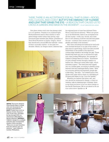
ABOVE: Vancouver designer Chris Hunter likes to sneak color into his projects via Formica-clad millwork. RIGHT: Purple hues such as Radiant Orchid, Pantone’s color of the year, will likely be big through 2014, as witnessed in Max Mara’s Spring collection. FAR RIGHT: Callison’s design for a multiple sclerosis clinic incorporates shades of blue and gray. “Blues are an easy transition from the exterior into our interiors,” says Callison’s Lindsay Willingham.
46
GRAY ISSUE No. FOURTEEN
his regional point of view has informed Terra Nova’s horticultural alchemy. “When one grows up in the Northwest, there is an acceptance for all that is gray—rocks, fog, clouds, and coast. But it’s the vibrancy of flower and leaf that grabs the eye—a beacon that causes us to cross a garden and bask in the moment.” Still, there will always be holdouts for tried-andtrue neutrals because in our part of the world, a gray area is a good thing. And if you find yourself somewhere in the middle of the spectrum, cutting-edge metallics can bridge the gap. Those finishes feel fresh and new in architecture right now, says Lindsay Willingham, the manager of Callison’s Design Resource Center. “Sometimes it’s just a thread woven through a textile or a leather trim. Gloss and metal reflect light, which activates a space.” The trend has even tipped into our cocktail glass, according to Seattle’s longbeloved chef and mixologist Kathy Casey. “With our economy getting reinvigorated, people like a little bling,” she says. “I’ve created quite a few drinks with luster dust in them or a sprinkling of 23-karat gold flakes on top. I love the sparkle.” Whether you believe that silver, ash, and iron should be embraced in design, or that our weather calls for kaleidoscopic contrasts, there is one thing we know to be true about design in the Pacific Northwest: We’re not afraid to let our true colors show. Sparkle on. h
clockwise from top: Jeremy Van Nieuwkerk; ©2013 Callison LLC; courtesy max mara
“HERE, there is an acceptance for all that is gray—rocks, fog, clouds, and coast. But it’s the vibrancy of flower and leaf that grabs the eye—a beacon that causes us to cross a garden and bask in the moment.” —plant Breeder Dan heims