SIX College of Fine Arts Leadership Council

Art Education
Art History
Dance
Interior Architecture & Design
Studio Art Theater
2022
2023
-


Art Education
Art History
Dance
Interior Architecture & Design
Studio Art Theater
The Fine Arts Leadership Council was the first organization I joined here at FSU, so it holds a special place in my heart. As a transfer student, I was scared trying to get involved on campus, but I was able to find my footing in the leadership council. I quickly rose to the Chair position, only serving one year on the council. Finally, however, my passion and work ethic shined through, and I was chosen to Chair this fantastic organization. For this, I will be forever grateful.
This has not been an easy endeavor, with council events getting canceled this year due to natural disasters or, like myself, council members stressing over their last few semesters and thinking about their journey ahead. However, through all of this, we have counited to advocate for the students in the College of Fine Arts, and SIX Magazine is proof of that.
As the Chair of the Fine Arts College Leadership Council (CLC), I am thrilled to welcome you to the latest edition of SIX, our annual magazine celebrating students’ diverse and innovative work across the College of Fine Arts.
Since our founding in 2010, the CLC has been committed to promoting collaboration and communication between students across all six academic departments within the College. Our mission is to create a supportive and inclusive community that encourages creativity, fosters connections, and empowers students to achieve their full potential.
One of our biggest initiatives each year is the publication of SIX, which showcases our
students’ incredible talent and achievements. From thoughtprovoking art installations to powerful dance performances, from cutting-edge interior design projects to groundbreaking research in art history, SIX is a testament to the breadth and depth of creativity that can be found within the College of Fine Arts.
But SIX is more than just a showcase for our students’ work. It is also a reflection of the values and vision of the CLC. We believe collaboration, communication, and community are the keys to success in any creative endeavor, and we strive to embody these principles in everything we do.
As we look ahead to the coming year, we are excited to continue building on the momentum of past successes and expanding our reach and impact even further.
I want to take this opportunity to thank everyone who has contributed to the success of the CLC and SIX, from our dedicated student representatives to the professors, the deans, and everyone who works to better the College of Fine Arts. Your commitment and enthusiasm make our organization and our magazine possible.
To Tyler, Jasmine, & Jamie, thank you for your leadership, creativity, and unwavering commitment to the College of Fine Arts community. Your contributions have been invaluable, and I am grateful for the opportunity to work alongside such talented and dedicated individuals.
Together, we have achieved
so much this semester, from organizing engaging and informative events to producing a truly exceptional edition of SIX. I am incredibly proud of everything we have accomplished, and I can’t wait to see what we will achieve in the future.
Thank you to the entire College of Fine Arts Council Members for your hard work and dedication. You are an inspiration to us all.
I hope you enjoy this year’s edition of SIX and that it inspires you to join us in celebrating the incredible creativity and talent of the College of Fine Arts community.
Sincerely,
Erick Rivers Chair, College Leadership Council for the College of Fine Arts
103 x 163 cm - 40 11/20 x 64 17/100

The concept of heritage supports the themes in the artist’s artwork, including historical buildings, such as towers and castles, which reflect the society from the time they were built to the current day by watching over the land and people. Every major city in the world seems to have a characteristic tower representing its historical background: the Eiffel Tower in Paris, Big Ben in London, the Tower of Pisa in Pisa, and the Galata Tower in Istanbul. She mainly uses the Galata Tower as a reference in her paintings because of its aesthetic form and historicalsocietal role. For example, the Galata Tower, one of the most famous historical towers of Istanbul, has witnessed many historical periods like the 507 AD Byzantine period, 1348 Genoese, 1453 Ottoman Empire, and 1923 Republic of Turkey/Turkiye. It has served different functions in the service of many civilizations, like a prison and a fire tower; however, due to a lack of funding, the people have no means to preserve or renovate it, which generally ends with a fire disaster or neglect.
After these catastrophes, suddenly, there might be new investment projects in these areas, such as luxurious restaurants and hotels, leading me to wonder: Are all these catastrophes a coincidence or purposeful? We, as world citizens, have many problems with our historical structures, such as insufficient restoration, unusual use, and ridiculous colors. Sena Karatas-Ozturk deforms the historical towers like simple objects and worthless toys by criticizing this insensitive attitude toward our historical heritage. With this critical style she adopts in her artworks, she aims to question the audience’s adherence to their cultural, artistic, and historical heritage. While transferring her sketches to the textured canvas, she uses oil or acrylic paint as an impressionist artist because she believes that using textured canvas and these painting mediums helps to obtain textures similar to reflect the spirit in the surface of architectural structures that are our historical heritage. Although the artist prefers to harmonize color, sometimes a social issue like people’s ignorance about heritage might inform a given color palette.
Gocen Kulerer Sersi, Zitik (Migrating Towers Series, Diserepancy), 2013 Acrylic Painting on canvas

My area of responsibility at the Asia Culture Institute was curating special exhibitions when it comes to democracy, human rights, and peace (what means special is to commemorate, remember, and recall for the national celebration day in South Korea). In collaboration with the National Museum of Korean Contemporary History, a special photo exhibition called ‘Hello! Democracy’ was held to commemorate the 100th anniversary of the Provisional Government of the Republic of Korea. Although the exhibition debuted at ACC, MUCH in 2019, we can currently view it online at https://www.much.go.kr/online_exhi/hello/index.html.
Photos documenting South Korea’s democratic past were on display in the “Hello! Democracy” exhibition. The nation has transitioned from a time of the Cold War and division, when freedom and human rights were all but lost, to the present, when democracy and peace are the very cornerstone of life. The bravery of our people and the sacrifices they made this voyage possible. Together, we have struggled for our liberties and rights, for the distribution and diversion of power, and for free and open elections. Every one of us has helped to build a society that values human dignity above all else (MUCH, 2018). ‘Hello, Democracy’ consisted of 6 sections (Peace: Elevating Democracy, Power: Inhibiting True Democracy, Labor 1: Initiating Human Condition, Labor 2: Initiating Living Condition, Respect: Moving Forward, Square: Gathering Together) and showed Korean democracy history by comparing past & present, suppression & freedom, and power & peace.

My practice focuses on combining traditional oil painting techniques with digital art and installation to create a narrative about how people turn animals into commodities and fetishize them for aesthetic value. More specifically in Florida, there has been a “trendy exotic pet” to invasive species pipeline, due to people buying exotic animals and releasing them into the wild, because they thought the animals were pretty and not acknowledging that they are in fact living beings. The release of these pets has caused a surge in invasive species within Florida and wrecked havoc on native populations/habitats. Currently, my practice is examining the impact of Lionfish in Florida and the Caribbean, by creating bold saturated paintings and patterns of the Lionfish to demonstrate how they were treated as a commodity before they became invasive. In the 1980’s massive numbers of Lionfish were released on the east coast of Florida and they began to rapidly outcompete native fish species. Additionally, they have no predators in the areas they are invading due to their venomous spines. Since the 80’s when we started witnessing their rising populations, we have inversely seen the drop of native fish species by over 70%. Even with these shocking statistics, the numbers of lions-fish sold to people in aquariums is staggering, and local governments are turning to unconventional ways to contain the growing fish populations. Florida has created sport fishing tournaments and bounties for people who help curb the Lionfish population. And while that solution seems to be the only viable answer at the moment, it also raises its own ethical dilemmas. If we want to fight the damage caused by the commodification of Lionfish, why are we trying to commodify them in a different way? We put them there so is it ethical to remove them violently?


Altar of Self-Actualization utilizes the historical conventions of its genre in conjunction with contemporary context to create a new understanding of the functions of an altarpiece. The Renaissance-era personal devotional piece was historically commissioned by wealthy patrons looking to express piety. Often depicting the patron alongside a holy figure, these pieces provided sacred imagery for the individual to reflect upon in prayer. The intimate size of the personal altarpiece promotes portability and frequent worship, and ultimately the creation of a personalized ritual for the individual/patron. Through the use of my own likeness and contemporary objects and dress, themes of ritual and devotion are translated into contemporary understandings of growth and selfactualization. Allegorical objects take on a personal symbolism within the narrative as opposed to the ubiquity of religious iconography. In the center panel, an emancipated self beckons to the naïve “lamb” of my younger self as a reminder of my personal strength and agency. Through this work, Renaissance-era devotion to icons in hopes of salvation is transformed into a modern devotion to maintaining one’s fully realized self in a sort of “self-salvation.”

References to masterworks such as Titian’s Sacred and Profane Love and Bouguereau’s Innocence inform the work both thematically and contextually, creating a canonical foundation upon which I explore modern reinterpretation. to harmonize color, sometimes a social issue like people’s ignorance about heritage might inform a given color palette.
 Oil and Glitter on Panel, Wood Frame
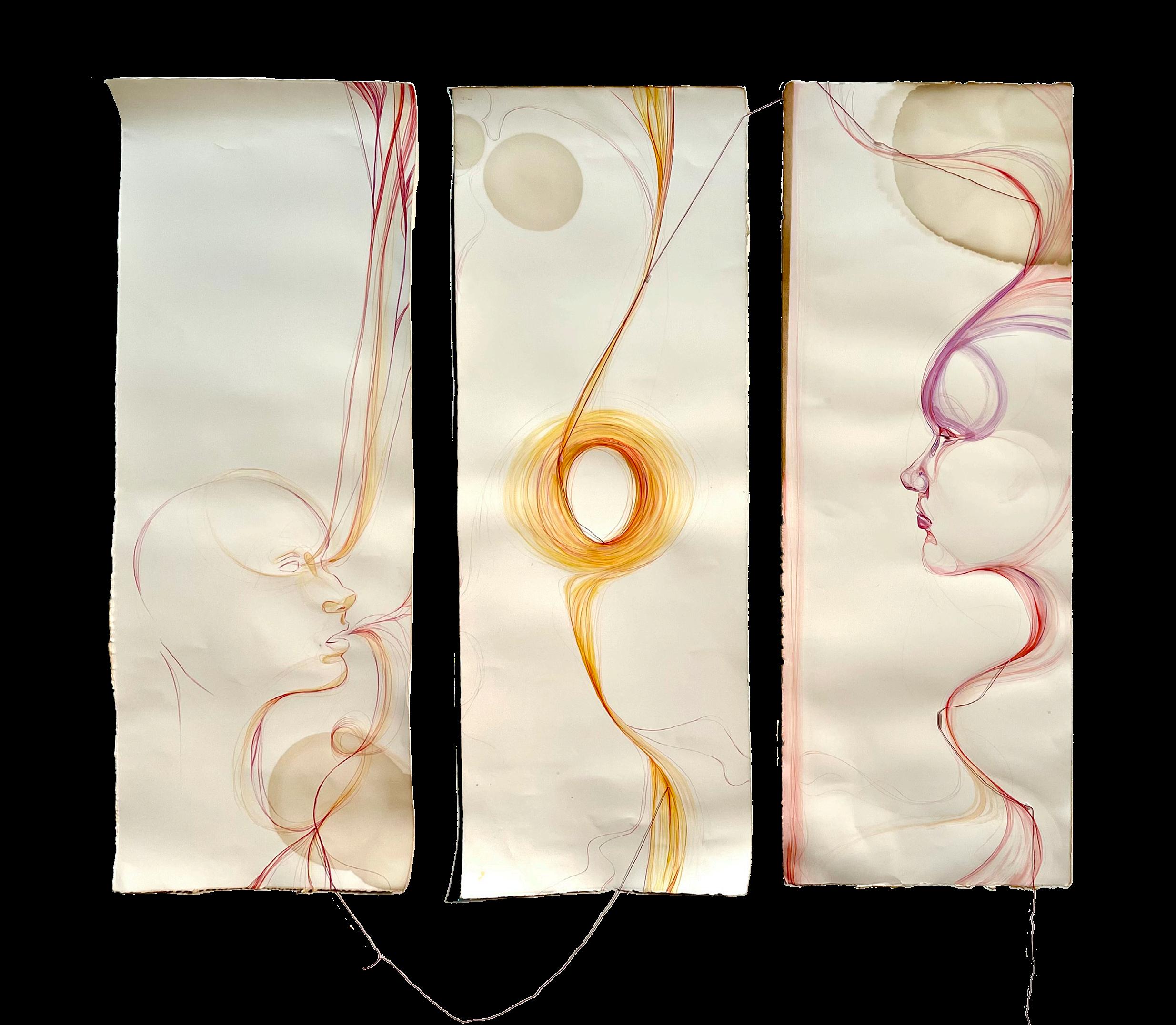
Merging portraiture with abstraction is my personal interest and focus of exploration. I like to blur the lines between realism and abstraction through gestural mark-making that is inspired by my choice of medium. In this piece, I add string to transform the three illustrations into a three-dimensional installation that interacts with the space it is displayed in. A theme that pops up in a lot of my work is the interconnectivity of objects, people, and spaces. I like to show this idea through leaving figures transparent and allowing them to breathe the material into their forms, as if they were alive for a moment on the paper. I also enjoy playing with ideas of line weight and physical weight with material and drawing the eye from one portion of the composition to another in a fluid manner. Another way I draw the eyes around the canvas is through color placement and arrangement transition my warm palette into pockets of cool tones to balance the composition and provide relief from the glowing warm tones throughout the piece.

Hunted Enchanter is a rumination on the novel Lolita, its cultural impact, and how it relates to my own experiences. By using bedsheets, tulle and satin trim from a wedding dress, stockings, a garter belt, sunglasses, spikes and chains, along with techniques of embroidery and printing, I challenge the cultural narrative of Lolita as a love story. Ultimately, I assert the gaze of a former so-called “nymphet” as an adult survivor.
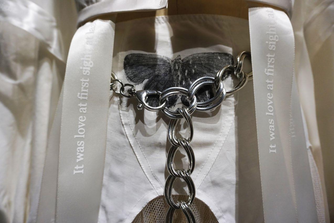
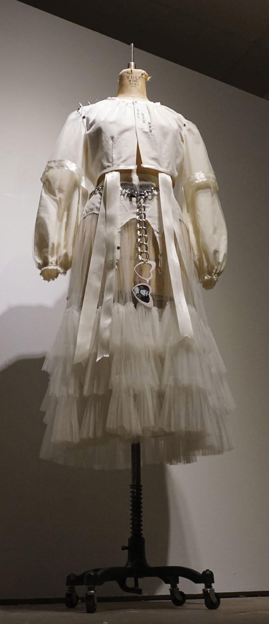
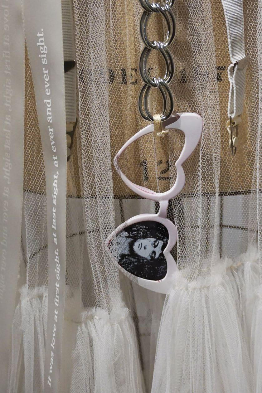
“It was love at first sight, at last sight, at ever and ever sight.”
-Vladimir Nabokov, Lolita
Varied lighthearted studies have been done on the correlation between political affiliation of a person and what beer they drink. Most graphs display the data as a scale of Democrat to Republican on the x axis, and voter turnout on the y axis. I began also questioning how these factors relate to income. I found that the most conservative beer with the lowest voter turnout is the least expensive, and the most liberal beer with the highest voter turnout is the most expensive. Conservative ideology preys on the working class and their goals of simply making ends meet. At the same time, they suppress the votes of the poor, pitting the classes against one another. This search to understand why the average working class conservative thinks the way they do may seem too forgiving considering social factors, but this understanding based on my experience with these exact people is perhaps helpful in us reaching the same goals.

“My muñequita, my Spanish harlem Mona Lisa... I would change my life to better suit your mood, because you’re so smooooooth.”
This print, which follows the lyrics of “Smooth” by Santana, is heavily inspired by a strong feeling of nostalgia, hanging by the pool on a hot Miami summer day. Loud Spanish music, lot’s of alcohol for the adults, bbq, and a gang of under supervised kids...

“At night, it is difficult to stay on task and on trail, it has been said the darkness consumes unsparingly all those who wander lost. Lucky for you, a lantern is lit and unbeknownst to our friend here she herself becomes a light to guide us in the night. Night now welcomes us into her fold and embraces us with a cold kindness.”
Number 2 in a short series of S based spanish/ portuguese titled works is suerte, a piece based on a fictional character I created. She started as a daydream, a face I drew over and over that I thought could be a cool comic character one day. She is now brought to life in this linocut.

I am passionate about coral reefs, for the same reason I am passionate about ceramics: both are diverse and unique, but also fragile and vulnerable. Despite being used as cups, plates, and common house decor, ceramics can go unnoticed regardless of playing an important role in our daily lives. The same holds true for coral reefs. Even with their small size, these valuable reefs play an important role in marine ecosystems because of their diversity. Due to factors of rising sea temperatures, pollution, and fossil fuel emissions, coral reefs are struggling to survive.


Coral Grief investigates the relationship between fossil fuels and coral bleaching. This piece combines glazed earthenware clay with mixed media elements to investigate the negative effects of fossil fuels on healthy coral. When coral comes into contact with oil, it begins to bleach, obstructing its growth and reproduction, and causes it to die. However, when coral bleaches, it is not dead; it is simply more vulnerable to damage. The gasoline container was painted white to represent the outside factor that causes healthy coral reefs to bleach. The coral pieces have a variety of textures, and are glazed with a variety of colors, to reflect healthy coral. Some coral pieces are white and dull, indicating bleached, unhealthy coral caused by the oil.

As a person who grew up with a difficult upbringing, I have repressed many of my memories as a coping mechanism, causing me to forget most of my adolescent life. I create art that reclaims my childhood through nostalgia and creative storytelling to rekindle a lost part of me. As a child, I knew it was time for bed once I smelled the aroma of tea herbs brewing in my mother’s cup. It was routine to help her relax at night, and I soon developed the same habit after mimicking my mother’s love for utilizing the night’s stillness to soften from the relentless day. Flattened teabags form the woman’s nightcap and the rising crescent moon behind her, signifying the preparation of nightfall. Her glossy eyes and distant stare focus out of reality and into a subconscious dream. The woman’s lackadaisical gaze and the smell of dried chamomile evokes the memories of hushed nights I enjoyed with my mother. I believe there is a certain tranquil beauty she shares similar to those of humans right before they sleep, as this is the time we are ever truly resting.

The sky above our heads place us within the embrace of nature’s space and tethers everyone in their environment without necessarily localizing the place. Utilizing the narrative of “the sky is falling” I bring the immediacy of nature’s threat to the audience, using digital photography to take images of sky and intervene with a human and technical hand to subvert the nature depicted in the image. I used databending, changing the image’s code with text editing, to insert quotations from scientists, psychologists, and articles about climate change into the image, creating man-made coded artifacts and glitches. By coding I could disrupt images without immediately seeing alterations, much like how our actions can create imperceptible changes in the environment. In some images I imposed parts of the coded text with the hidden, yet explicit, placing of those quotes. I further distorted the images through Photoshop, inserting more human interference and alterations.

This to scale-model of a single residential loft is a 3D expression of a design for an individual with a very specific hobby: attending renaissance fairs. Through the concept of a corset, a physical representation of renaissance fair attire, this design incorporates functional and formal inspiration from this piece of renaissance clothing including movement and structure as well as concave curves and lace-like details in order to account for the many needs and requirements of a renaissance fair goer. This space aims to address the issue of storage that can hinder any artistic crafter. With the use of open storage throughout the space, the user is able to openly display their work and fulfill the maximalist look of the renaissance period while also creating a practical and easily accessible storage solution.

The functional characteristics of the corset are demonstrated through the use of a grand, open wardrobe to store and display costumes, a large workspace to create said costumes and other crafts, as well as a hidden full-length mirror stowed underneath a murphy bed to convert the space into a fitting area. The characteristics of the form/aesthetic of the corset are conveyed through details from the castle-like spiral staircase and tavern-like bench style seating to smaller details including the lace-back storage unit and the ornate frames hung on the walls.

During our Interior Design Studio II class, we were tasked with designing a residence that fulfills aging-inplace requirements, a set of standards that ensures the house is accessible and safe as the homeowners age. This residence is designed for Mr. and Mrs. Williams, an African-American couple in their mid 60’s in Atlanta, GA. The design is inspired and informed by the concept of urbanism, or the visual and theoretical principles that are fundamental to the planning of urban and suburban communities.
The interior design of the home features accessible bedrooms and bathrooms, custom built-in cabinetry, and a lively complementary color scheme to complement the Williamses’ hobbies, travels, and goals and unify the design of the home. A large kitchen with a butler’s pantry allows the Williamses to unload groceries from their carport easily. The kitchen island features many accessibility features to meet aging-in-place and universal design requirements, including a portion of the kitchen island that can be utilized in a seated position. The primary bathroom features a wet area with a curbless walk-in shower, an undermounted bathtub, and large vanity. The design of the home’s rear patio features elements of biophilic design, including water and fire features and utilization of natural elements to combine wellness principles with all of the amenities expected in a modern exterior space.
Overall, the design of the Williamses’ residence will allow the homeowners to reside in their home for decades to come, providing the modern amenities expected in a high-end residence while ensuring the safety of Mr. and Mrs. Williams as they age.


The Bloom Wellness Clinic aims to attend to young patients with substance abuse or dysregulated eating issues, and those with mood and anxiety disorders. To best serve these patients, the clinic must act as a place of sanctuary while destigmatizing the negative connotations that are associated with mental illness. The incorporation of the salutogenic model into the design, salutogenesis being the study of how people’s life experiences affect how they deal with stressors, allows for the controlling and lessening of stressors to better patient health rather than “making an ill patient well.” This type of design prioritizes the mental state of patients as a means of facilitating recovery. The concept that drives this clinic’s design is Hygge. This is a Danish concept of being in a mental state marked by coziness and togetherness. By adopting this concept as the underlying design principle of the Bloom Wellness Clinic, the clinic will become a place of rest and refuge for all staff, patients, and caregivers. Emotions of empathy and individuality will be expressed through the universal usability of the space, along with user-controlled amenities to allow occupants the reassurance of feeling welcomed. Simple signage and clear sightlines will be used to ease the wayfinding experience to decrease feelings of stress, anxiety, or confusion. Overall, the clinic will be a safe space for all occupants to come together to support and uplift those working towards the common goal of positive change in patient health.


Habitat for Humanity is a nonprofit organization that works to provide affordable housing for people in need of shelter all around the world. This project aimed to design a new office space to accommodate Habitat for Humanity’s expansion in Atlanta, GA. The concept for the design is Foundation. A solid foundation is necessary before building a house and also before building an international non-profit that has helped over 39 million people. With this project, we plan to highlight the foundational aspects that make this company what it is today. These images show the breakroom for the office. The breakroom, fondly called The Kitchen, highlights the brand’s colors and vision statement. The dining area of The Kitchen also features wooden slats that resemble the framing of a house. Like the hearth of a home, the goal of The Kitchen is to provide a comfortable gathering place for the Habitat for Humanity employees.


Physical illness can rob you of your strength, often leaving a person feeling weak, but worse yet, out of control. Finding your power through and after recovery is an act of rebellion and defiance. This creative project explores the reframing of the recovery process after a near death experience exposing both the vulnerability and fierceness of a creative soul. These images capture the journey of someone taking back their story after going through a long hospital stay, two surgeries, and several complications. After being sick and confined to bed for weeks, losing weight, and being too weak to walk, the artist chose to own her situation. The camera lens reveals that taking control of the narrative once in recovery and showing the strength, beauty, and sexuality of oneself serves to make one feel more powerful and in control rather than accepting the label of victim that society would naturally put upon you.

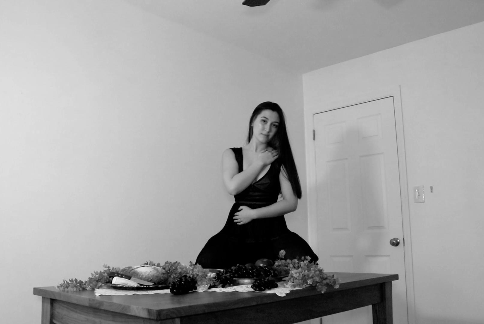
Reap What She Sows explores the ways in which femininity has historically been attached to the role of nurturer. Women quite literally bring their entire selves to the table, often being emptied by such continuous giving that there is nothing left to take. I also wanted to explore how the role of food, the dinner table, and the kitchen, while sometimes seen as a barrier, can also be a place of empowerment.
Please scan this QR code to watch the video of this performance.
The term, Anthropocene, can evoke an immense scale of calamity and at times be more comfortably suppressed than felt. This combination of emotional discomfort and difficulty of comprehension can lead to what Bruno Latour calls “climate change denial.” Latour applies this term to not just to a specific political party, but also to the entire movement of individuals who deny that “nature is becoming something that we have never seen” (Magnason, 11). The rest of this essay will focus on what climate change denial is, the stakes of not addressing it, and how to counter its existence through Anthropocenic visualization.
For the purposes of this short essay, Anthropocenic visualization refers to the act of envisioning the highstake effects of climate change. This essay will focus specifically on the creative forms of visual art and literature, which effectively transmit embodied experiences related to climate change. The examples of JMW Turner’s The Scarlet Sunset and Frederic Edwin Church’s The Icebergs will analyzed according to their ability to capture early versions of the Anthropocene. In addition, John Freeman’s edited work, Tales of Two Planets: Stories of Climate Change and Inequality in a Divided World is a direct response to the need of visualizing effects of the Anthropocene on an individual level. By engaging with these forms, climate change denial is undermined, the Anthropocene is made apparent, and an elusive issue becomes relevant.

 Church, Frederic Edwin. The Icebergs, 1861, Oil on Canvas, 1.64 x 2.85m. Dallas: Dallas Museum of Art. Photo: Dallas Museum of Art.
Turner, Joseph Mallard William. The Scarlet Sunset, 1830-40. Watercolor and gouache on paper, 134 x 189 mm. London: Tate Britain.
Photo: Tate Britain.
Church, Frederic Edwin. The Icebergs, 1861, Oil on Canvas, 1.64 x 2.85m. Dallas: Dallas Museum of Art. Photo: Dallas Museum of Art.
Turner, Joseph Mallard William. The Scarlet Sunset, 1830-40. Watercolor and gouache on paper, 134 x 189 mm. London: Tate Britain.
Photo: Tate Britain.
Special thanks to the members of the College of Fine Arts Leadership Council

 ERICK RIVERS
CELIA PENA
ALEX DAVIDOFF
TYLER WILLIAMS
NATALIE STILES
NICOLINA MORRA
MADELINE MOORE
JAMES DZWIL
KALEY WISNER
SOPHIA PFITZENMAIER
ZEPHANIAH MALKA
JASMINE BURELSMITH
ANNA SPEER
KATHRYN BOUCHER
ERICK RIVERS
CELIA PENA
ALEX DAVIDOFF
TYLER WILLIAMS
NATALIE STILES
NICOLINA MORRA
MADELINE MOORE
JAMES DZWIL
KALEY WISNER
SOPHIA PFITZENMAIER
ZEPHANIAH MALKA
JASMINE BURELSMITH
ANNA SPEER
KATHRYN BOUCHER