1 minute read
Typography


Logo Typography
Typography plays a critical role in conveying personality, tone, and quality. Careful attention to typographic details works to distinguish the brand by achieving harmony throughout all Balentine communications.
Advertisement
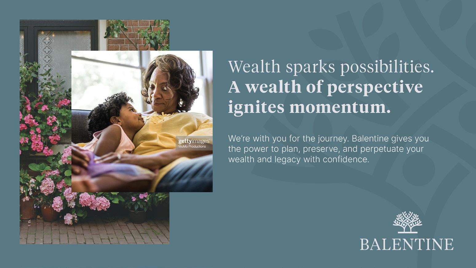
For consistency across the whole brand, use Tiempos Light and Semibold in sentence case for large headings and Tiempos Medium for subheadings. Set body copy in sentence case using Inter Regular.
Tiempos: klim.co.nz/retail-fonts/tiempos-text » Download Here
Inter: fonts.google.com/specimen/Inter » Download Here
Web-Safe Typography
Whenever Tiempos or Inter is not available in any given operating system, or when generating collateral for internal communications, use Georgia for headings and subheadings and Arial for body copy (both are included as a font option with Microsoft Windows). While there are distinct differences between these fonts, Georgia and Arial are sufficient replacements for headlines and short bursts of copy.
AaBbCc
(Tiempos Light, 42 pt)
(Tiempos Semibold, 42 pt)
Heading Example
Subheading Example (Tiempos Medium, 12 pt) Body copy (Inter Regular, 12 pt) Oloriandi alit, utatus ab ipiciene nonesen imusdandae velit volupta temquis magnis magnis eturibus molupie nectum verument, sinvelendel ipitium la nis a core soles iscipsae pro. Udandis ea sapicimusape sus idia prenia di aut aute si aliquas aut ratur aligendam rerias repernatet eum il idi beat. Sum volest quam, cusamentio elictas que vendel et eaqui omnimag natqui inctem aut fugitesequi tesciendunt.