8 minute read
Tobias Rylander


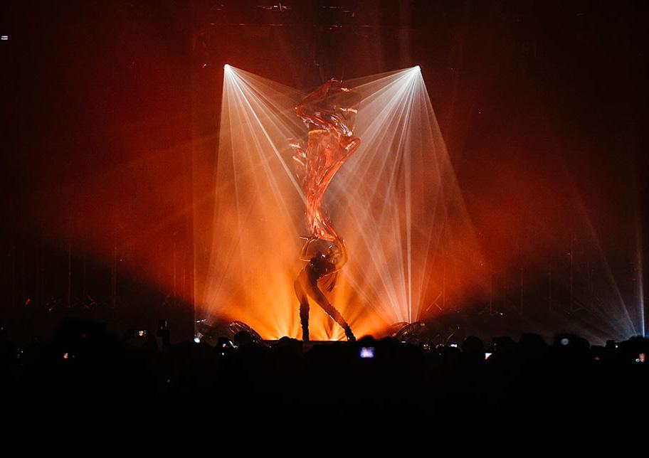
There is a cinematic quality to Tobias Rylander’s lighting designs. The subtle shifts in shadows, the sharp contrast between light and dark, the bending of scenic elements, all evoke images of the convention defying New Wave films of the 1960s, such as those created by his fellow Swede, Ingmar Bergman. For Rylander, lighting is about more than illumination and colors, it’s also about creating shapes and contrasting images that help tell the stories of his client-artists.
Advertisement
Always ready to push the creative envelope, Rylander has pioneered new design concepts that have earned the admiration of his peers. For example, his 2014 design for a tour by the indie group 1975 was perhaps the first work of its kind to rely almost exclusively on projection video.
Not surprisingly, Rylander has attracted a loyal client following among leading progressive and alternative artists like Of Monsters and Men, The Strokes, The XX, FKA Twigs, and Explosions in the Sky. More recently, he has begun lighting fashion shows for the likes of Balenciaga and Calvin Klein. During his time as a partner in Seven Design Works with LeRoy Bennett and Cory FitzGerald, he participated in many of that company’s high-profile projects. Recently, the innovative designer spent time with us to discuss the art of sculpting with light.
When it came out in 2014, your design for the “1975 World Tour,” attracted attention and critical acclaim for using projection video almost exclusively with the exception of some aerial and key lights. Can you tell us how this innovative design came about?
When I first met the band I really didn’t know much about them. But doing my homework and understanding how very specific, graphical, monochrome black and white all their artwork, social media and visual identity was, I immediately came to think of this idea that I had been working in the back of my head for years. The aerial graphical projections are directly inspired by one of my favorite installation artists, Anthony McCall, and his light sculptures. Looking back at it, I guess it was kind of a brave move for both me and the band–as well as management–considering how expensive and ‘fragile’ it is to tour with projections. I had not seen it done in a club or theater environment and the end result was fantastic. Even though projectors and projections don’t really like smoke, in this installation they really did.
What is the most challenging part of the design process for you?
It is really always TIME... and, of course, budget. You are always asked to design something ‘incredible’ or ‘fantastic’ that no one has ever seen before. And of course, by the way, it needs to pack down and fly in ‘pelly cases.’ It should cost close to nothing in the weekly touring budget and be able to transform in a stage changeover time of 20 minutes. You are also often asked to program a full show in a few days or over a night.
You’ve been an early adapter of new technology. When new lighting technology hits the market, does it give you new ideas, or is it just a matter of new technology making it easier for you to execute the ideas that were already in your head?
I remember being young and naive swearing that I would never use LED fixtures in my designs. And here I am using every pixel in an LED screen as a light source. So new technology absolutely opens up new ideas and room for creativity. I was never a fan of the RGB mix or seeing the light source of lights, but then again who was?! But I think that when I see a new light or fixture, I tend to think of how to use it in a way that was not necessarily intended. I like turning things inside out and upside down. Your designs are very intricate; do you ever change/tweak them after a tour has begun?
Not once they are out on the road. Of course you always wish that you had had that extra day at pre-production and rehearsals. Once it comes back in for rehearsals and programming new songs, then I might change something that has been bugging me. I just designed my first arena tour, which is a lot of fun, but I do enjoy the dance shows with FKA Twigs and fashion shows as much. As long as it is challenging in a creative way, I look forward to it.
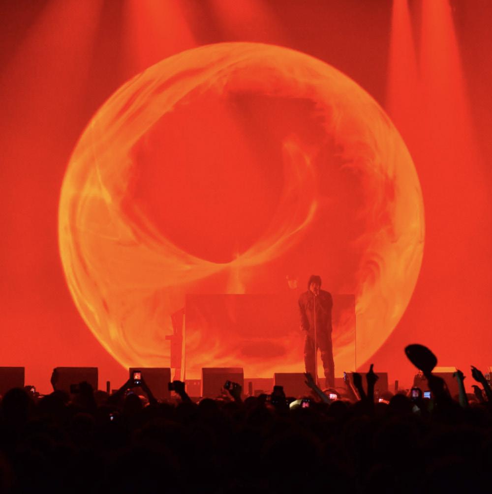
SKEPTA – Alexandra Palaca

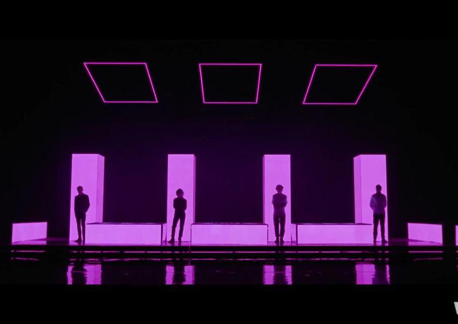
FKA TWIGS – 2019 TOUR Lighting and conceptual design

Picking up on that thought — in an age when many designers want to go brighter and brighter, you sometimes stand out for your willingness to allow darkness and smokiness play big roles in your designs as you did with 1975 World Tour, XX and others. Can you tell us what you think dark spaces bring to a design?
With the risk of sounding pretentious or poetic, I have always preached that light is nothing without darkness and vice versa. Really what we do as designers is to enhance the music and the message or feeling that the artists are trying to reach out with and communicate. If you start too strong you have nowhere to go from there. Darkness can be just as impactful and overwhelming as building and blinding light. It is all dynamic drama. ‘Less is more’ is a cliché, but in many situations it is true.
Who were the biggest influencers in your career?
They are so many, of course. My two partners Cory FitzGerald and Roy Bennett, but also–and maybe mostly–all the guys in Sweden in my early years who taught me the basics and took care of me, Ola Melzig being one of them, even though maybe not aesthetically in his case. We’ve always been impressed by how your designs blend stage, set and lighting so seamlessly together. What is the key to creating this kind of holistic design?
To me it has always been one and the same thing. There is a lot that you can do with just lights, of course. But just trusses and moving lights have never really done it for me. It can be something small as just unifying the band’s backline, custom building a keyboard stand or working with shadow play or reflections in materials and fabrics. But a show always starts with the appearance of the artist and the band. To claim the stage and space and create a world and experience that makes the audience forget the room or venue they are in — and hopefully even make them forget that what they are experiencing is lights or video elements or fixture and technology.
What do you think you would have done if you weren’t a lighting designer?
Since I was a little boy I have always wanted to become a blacksmith. Part of me still does. I always joke with my grandmother, with much seriousness from her side, that one day I will move back home to the village where I grew up and start up the old forge.
‘An Encounter with Lux Prima’ Los Angeles’s Marciano Art Foundation.

SKEPTA Alexandra Palace

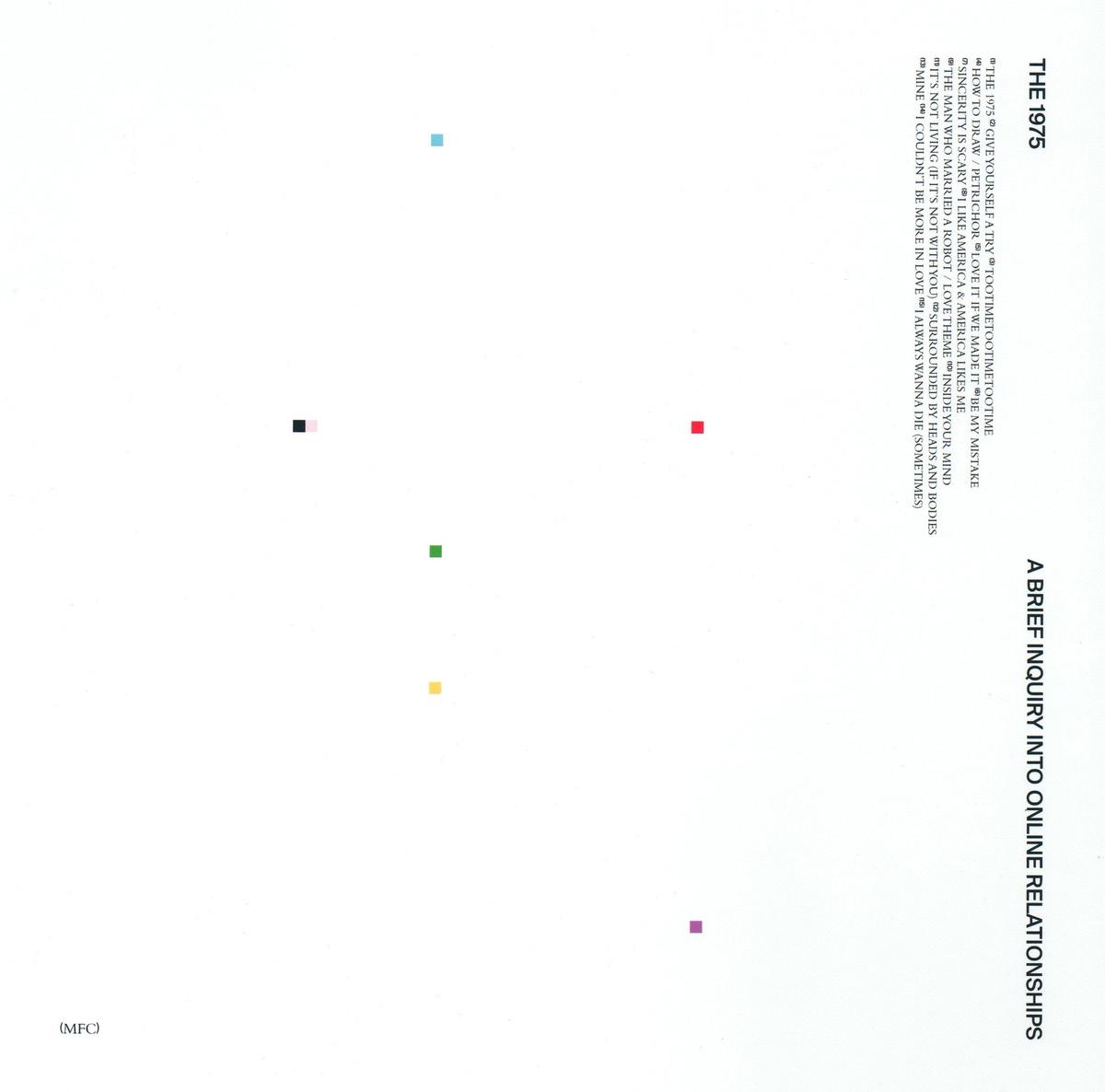
THE 1975

Creative director, artist, graphic designer and photographer, Samuel Burgess Johnson, is most known for his typographic and photographic work for British pop rock band, The 1975. But for Samuel, the band are much more than just a client: “They are a part of my life, almost separate from the rest of my career. We are close friends and talk every day,” he tells It’s Nice That. On top of working with the band, Samuel’s portfolio is as vast as his multidisciplinary job title, working for high-profile clients such as Nike and Unilever, for which he recently worked on a range of projects, from branding to macro painting.
‘ABIOR’ - 1975 Matthew Cooper (2018)
With such a mix of disciplines, you would think that Samuel would be hard pushed to pick a favourite. But, on the contrary, he says it’s a no brainer: “Graphic design and art were always natural inclinations as far back as I can remember. Hard to pinpoint why above anything else, but graphic design is something I became obsessive with and explored seriously in my late teens,” he says. “My career has transitioned more towards creative direction in recent years but I am still at my happiest working within graphic design and image making parameters.”

‘Blond’ - Frank Ocean Samuel Muir (2015)
Other recent career developments include relocating from his longstanding base of London to Los Angeles, where new ventures are already underway. Over the past year, conceptualising identities featuring his botanical motifs, Samuel has worked with other big names in music such as Ta-ku & Wafia and Warbear (Yuuki Ozaki). 2018 also saw him collaborate with iconic American rock band, Thirty Seconds to Mars on the artwork for their single Dangerous Night, through which he was able to combine his skills in art direction, graphic design and photography.
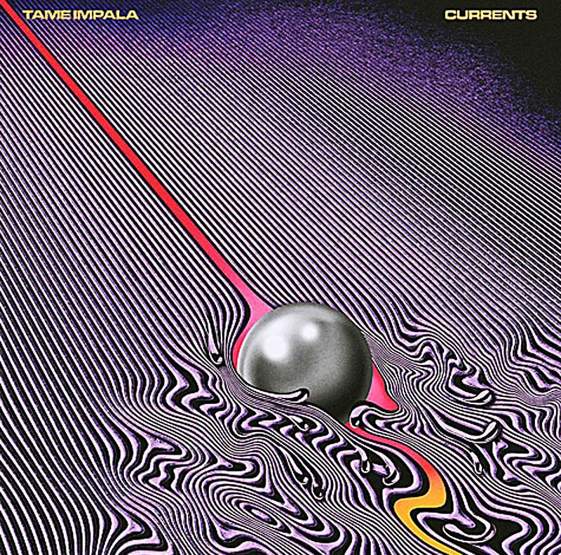
‘Currents” - Tame Impala Robert Beatty (2015)
Other recent career developments include relocating from his long standing base of London to Los Angeles, where new ventures are already underway. Over the past year, conceptualising identities featuring his botanical motifs, Samuel has worked with other big names in music such as Ta-ku & Wafia and Warbear (Yuuki Ozaki). 2018 also saw him collaborate with iconic American rock band, Thirty Seconds to Mars on the artwork for their single Dangerous Night, through which he was able to combine his skills in art direction, graphic design and photography.

‘AM’ - Arctic Monkeys Matthew Cooper (2013)