2 minute read
Barney Bubbles


The development from the modern philosophy of placing an accurate visual representation of the music at the forefront to creating an image which reflects an idea, the music’s mood or musicians behind it shows post modernism’s renewed interest in symbolism and visual wit.
Advertisement
Bubble’s favourite medium was the record sleeve. Trivial, ephemeral, and available to everyone, it suited his lack of preciousness about his work, while giving him almost total creative freedom. Remembered with awe by one generation of rock fans for his foldout album covers for Glastonbury Fayre and Hawkwind in the early 1970s, Bubbles is equally revered for his work for punk and new wave bands on the Stiff, Radar and F-Beat record labels. Superficially, his career might seem to span an unbridgeable gulf from the love-and-peace of the hippies to the hate-and-gob of punk. It is an indication of his intuitive grasp of what was right for the moment, and his seemingly instinctive ability to be in the right place at the right time, that his work is seminal to two such different eras.
For so long, unlike that of similar designers whose contributions in the 1970s and 1980s graphics are now widely acknowledged? Is the almost mythic reputation Bubbles retains among a few London-based designers at least in part a product of the sentiment that inevitably surrounds a talented, much loved person.
These concepts are exhibited visually in Barney Bubble’s 1977 album cover for The Damned’s ‘Music For Pleasure’. The various markings and geometric shapes belonging to paintings such as ‘Black and Violet’ (fig.13) evidently inspired Bubbles and appear homage like, an element synonymous with post modern design, on ‘The Damned’ cover. He has borrowed the ‘available’, the already existing constructs of abstract expressionism, which had been explored and established by Kandinsky to create an album cover that served the music industry and society of the time.
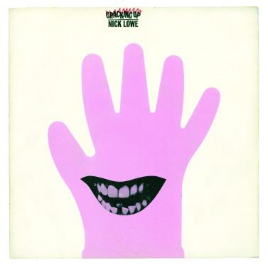
‘Cracking up’ - Nick Lowe -Barney Bubbles (1979)
He has borrowed the ‘available’, the already existing constructs of abstract expressionism, which had been explored and established by Kandinsky to create an album cover that served the music industry and society of the time. These concepts are exhibited visually in Barney Bubble’s 1977 album cover for The Damned’s ‘Music For Pleasure’. The various markings and geometric shapes belonging to paintings such as ‘Black and Violet’ (fig.13) evidently inspired Bubbles and appear homage like, an element synonymous with post modern design, on ‘The Damned’ cover.
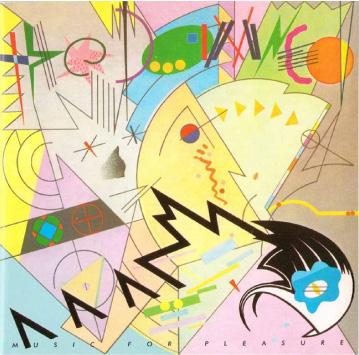
‘Music For PLeasure’ - The Damned Barney Bubbles (1977)
I COULD SMELL COLOURS


I COULD FEEL SOUNDS