84 minute read
Retratos Desde Babilonia

retratos desde babilonia
Marina García
Advertisement
Proxecto fotográfico sobre os signos do
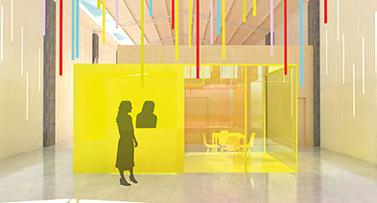
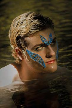
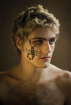
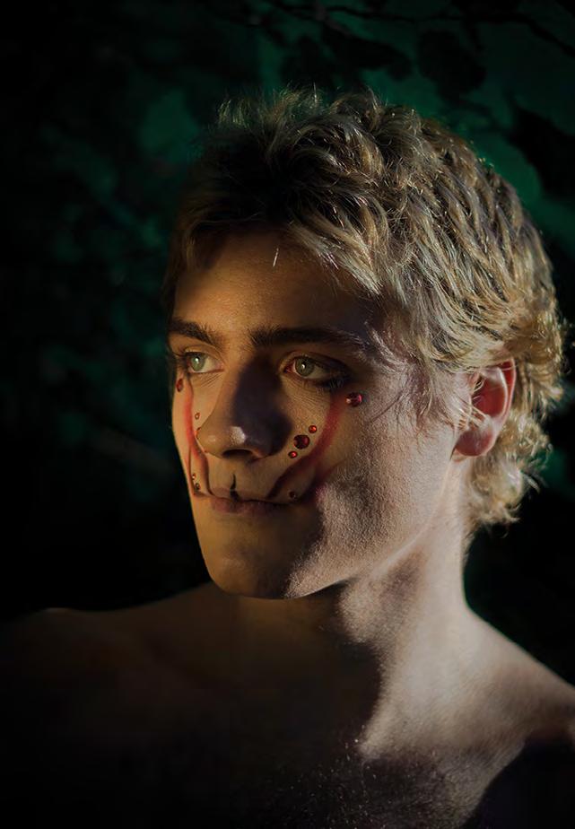
zodíaco, realizado a partir das maquillaxes de Marta Salgueiro, maquilladora e estudante de caracterización. Trátase de retratos nos que, a través da maquillaxe, a atmosfera recreada e o tipo de modelo, represéntanse tódolos signos zodiacais. Imaxes, que segundo algunhas teorías, xa se veñen facendo dende a antiga Babilonia. Cada modelo está vinculado a un dos elementos da natureza e está fotografado nos tres signos que pertencen a ese elemento: o Lume, cos signos de Aries, Leo e Saxitario; a Terra, cos signos de Tauro, Virgo e Capricornio; o Aire, cos signos de Xéminis, Libra e Acuario; e a Auga, cos signos Cáncer, Escorpio e Piscis.
Marina García Cabanas | 658 576 518 mdrmarinamdr@gmail.com
Leo Saxitario
Capricornio Tauro Virgo

Acuario
Libra Xéminis
Piscis Escorpio Cáncer
el viaje de simón
Marcos Puga
Ao pé das árbores que ían saíndo da aldea, cando chovía, formábanse unhas pozas anchas e profundas nas que se afundían os pedais das bicicletas. Lembro tamén cando caían follas daqueles altos chopos e ían quedando pousadas na auga. Seguro que por iso imaxinaba algún outono pasado, onde lucíamos botas altas de goma e chuvasqueiros amarelos nos que esvaraba o barro que nos salpicábamos os uns aos outros. Lembro tamén as leiras segadas e os campos de terra enchoupada. Como esquecer que cunha palliña fina podías “engatusar” a unha formiga e
facela crer que ía seguindo o seu camiño mentres subía ao pau enganada para deixala atrapada na deriva dunha folla? Que podería haber máis semellante a ser Deus...? Era eu quen empurraba a folla sutilmente e era tamén eu o que recollía coa palma a auga que balanceaba a balsa; despois deixaba caer unhas pingas co puño pechado coma se bombardease aquel insecto. Non era un Deus benévolo non, non o era... era un Deus curioso que desexaba saber se aquela pedra, dende o alto, como calquera fenómeno natural podería crear as impredicibles ondas que darían volta por fin a aquela folla...
Pero sempre, nos meus adentros, quixen saber que era o que sentía aquela formiga.
Técnicas: óleo, acuarelas,
gouache e lapis de cores
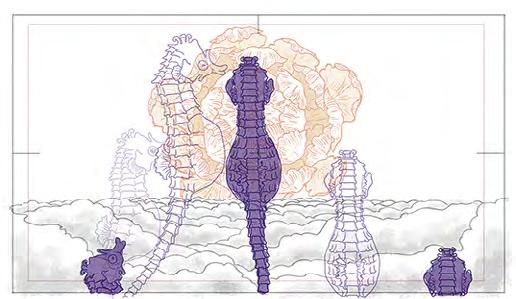
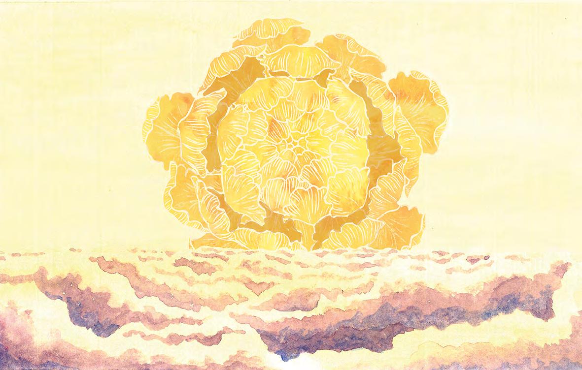
amento masculino, ágil caballito marino
Esperanza Valentina Castro
Preprodución para desenvolver unha curtametraxe animada. O guión, storyboard, deseño de personaxes e fondos, animática e layout conforman esta fase. Previa á animación, considérase a base imprescindíbel do proxecto animado, ademais da máis creativa. A cabalo entre o uso de técnicas tradicionais como a acuarela, o gouache e o grafito e aplicacións
dixitais como Photoshop e Autodesk. Usando unha estética de debuxo distinta para o fondo e para o personaxe principal tentouse reforzar a diferenza entre o uso dos recursos manuais e dixitais. Xerando unha historia fantasiosa na que se mestura a función biolóxica do personaxe principal, cabaliño de mar e flor de abeleira ao mesmo tempo, plámase
o interese persoal pola natureza, a animación e o surrealismo. O baile destas flores foi o estímulo para
xerar esta obra, que pretende encantar o ollo do que a mira.
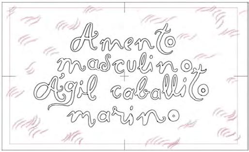
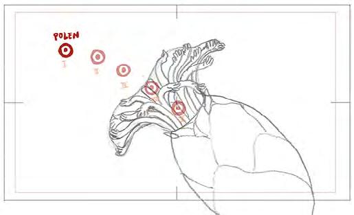
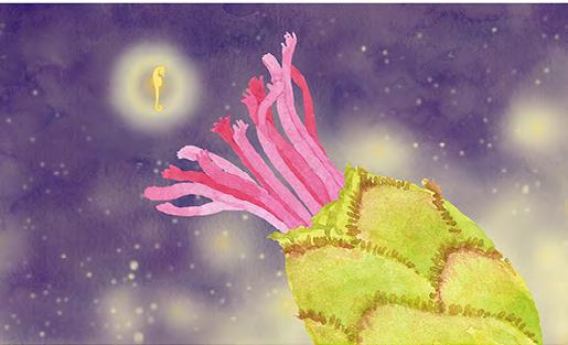

Ilustración para
travelling vertical
Bosquexo de animación
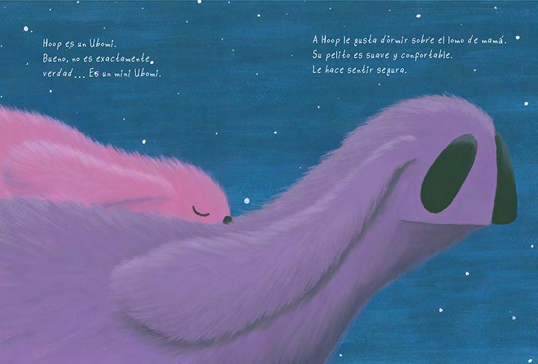
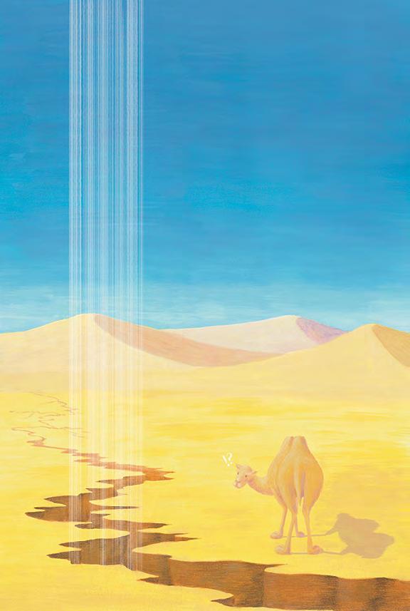
hoop
Daniel Jiménez
Hoop é un conto infantil ilustrado que trata dun ser que ten que afrontar o seu medo e ser valente nun incidente inesperado. As ilustracións foron realizadas en acrílico e lapis de cores sobre papel Canson de 360 g/m2 e posteriormente retocadas en Procreate e Photoshop. O formato do libro é de 19 x 25 cm e de tapa dura, mais este cambia a orientación no transcurso da historia de horizontal a vertical para novamente volver ao estado inicial.
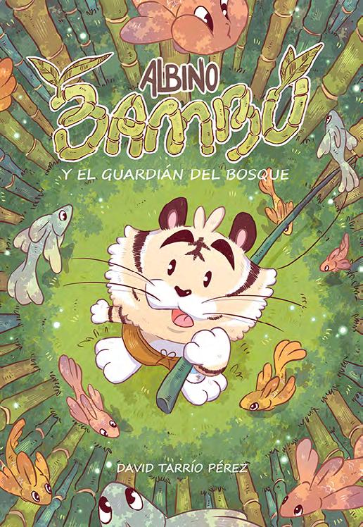
albino bambú y el guardián del bosque
David Tarrío
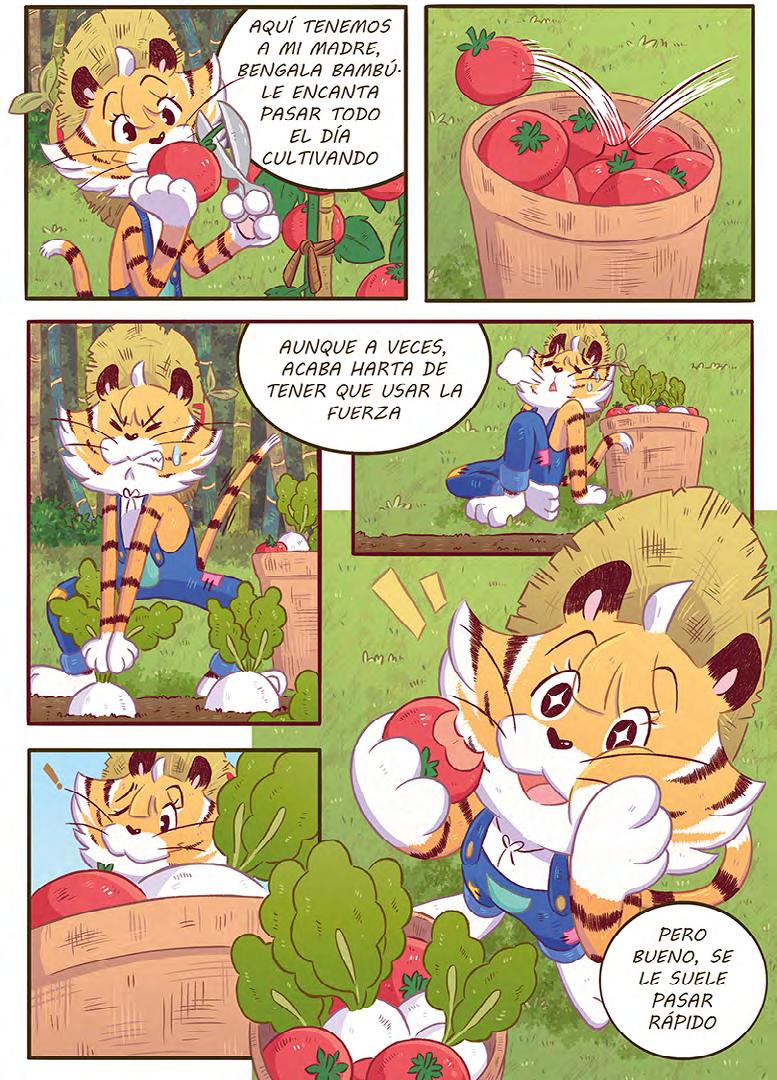
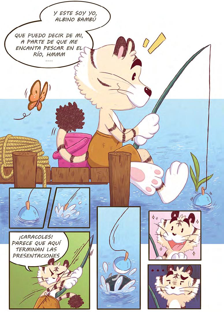
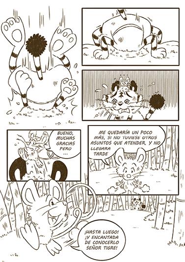
Cómic infantil. Xorde da reinterpretación dun traballo realizado previamente, en formato de álbum ilustrado, para a asignatura de proxectos. Técnicas dixitais e tradicionais. Proxecto dirixido expresamente ao público infantil e xuvenil. Albino Bambú y el Guardián del Bosque trata da historia dunha familia de tres tigres que viven illados no medio dun bosque de bambú, baixo unha serie de normas que deben cumprir, sendo a máis importante: “Está totalmente prohibido adentrarse no bosque de bambú”, para non chegar a ser obxectivo dos posíbeis perigos que axexan no exterior. Un día, Albino Bambú, o noso protagonista, decide romper esta norma e perseguir un sospeitoso personaxe cara ao interior do bosque. O cómic consta de varios personaxes, entre principais, secundarios e antagonistas. Os máis importantes: Albino Bambú, o noso pequeno protagonista, aventureiro e despreocupado; Bengala Bambú, nai do noso cachorro, traballadora, forte e valente e Maltés Bambú, pai de Albino, mañoso, algo torpe e asustadizo. Cada un da familia representa unha especie distinta de tigre, como ben indican os seus propios nomes.
Á esquerda portada, á dereita arte final e bosquexos a lapis


Entintado dixital e arte final
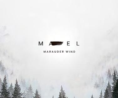
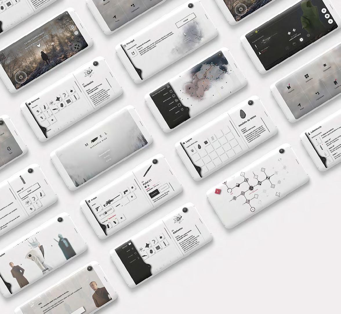
mael, marauder wind
Patricia Hueso
Actualmente os móbiles son un obxecto indispensable nas nosas vidas. Mael nace da necesidade de tomarnos o móbil en serio, de explotar todas as súas posibilidades e de adiantarse a unha nova consola portátil accesible a todo o público creando un produto novo e interesante. Mael é un videoxogo de rol mundo aberto dun só xogador exclusivo para móbil. É un proxecto de investigación no que se mesturou a estratexia utilizada en videoxogos exclusivos de consola coa das aplicacións móbiles. A suma de investigación e deseño deu como resultado un produto cargado de
Un dos múltiples fondos de
pantalla de Mael simbolismo, limpo e cómodo no que todo encaixa e funciona. Historia, deseño e formato van collidos da man facendo de Mael un proxecto de innovación atractivo para un público que ten nas súas mans o futuro dos videoxogos.
Patricia Ferreiro Hueso | 636 188 891 patriciaferreirohueso@gmail.com
Despregamento. Un deseño baseado
en múltiples capas, estudado,
limpo e funcional
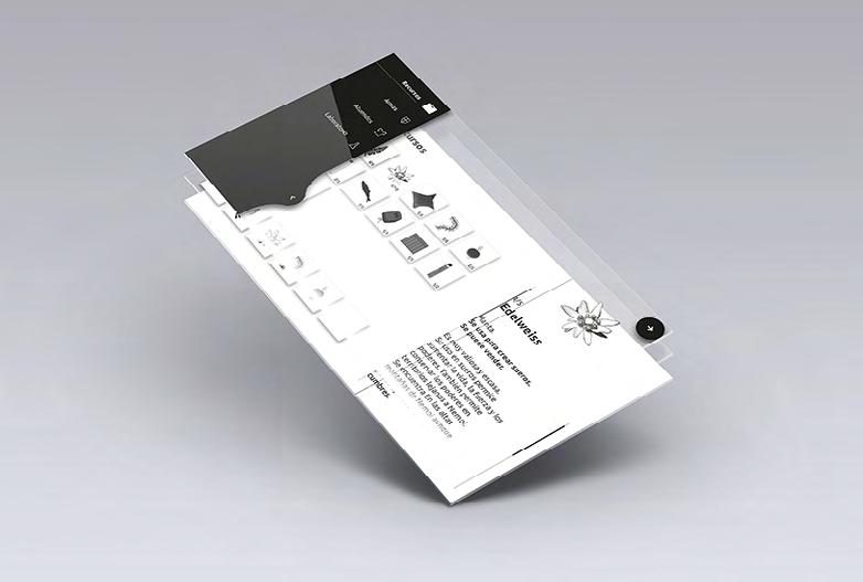
Múltiples pantallas pensadas para resumir datos e información aumentando a experiencia de xogo. Con máis de 150 iconas, o táctil e un deseño adaptable poderase ver desde un punto máis xeral ou aumentando ao detalle mapas, recursos e moito máis. E cunha historia enlazada a unha paisaxe nevada; branco, gris e negro tómanse como protagonistas dunha interface clara, limpa e minimalista
brandtrait. creatividade online, dende galiza & worldwide
Gabriel Martínez
Este traballo é o resultado do desenvolvemento da marca persoal e do portfolio web do autor. Tamén inclúe o perfil da marca en redes sociais
como Facebook ou Instagram e o Brand Identity Guideliness, que explica como usar a marca correctamente e o que se pretende transmitir con cada trazo, forma e cor. O obxectivo é lograr unha identidade corporativa e visual coherente co estilo do portfolio e a personalidade do deseñador. A marca pretende transmitir optimismo e seguridade comunicándose con claridade a través dunha linguaxe moderna e minimalista, para ser visto como un profesional confiado e decidido. Os principais
valores da marca son a empatía e a liberdade. A través da marca ofrécense servizos online de deseño gráfico e dirección creativa especializados
en identidade visual corporativa e dirixidos a pequenos empresarios con grandes soños que precisan mellorar a súa identidade de marca. Brandtrait céntrase nun target que valora a flexibilidade horaria e xeográfica que ofrece un
servizo remoto, sen renunciar a un tratamento personalizado one-to-one. Facer este traballo fíxome pensar nas miñas habilidades e ambicións como deseñador gráfico e no modo
de comunicarme para acadar os meus obxectivos.
Gabriel Martínez Cabrera | 671 429 407 gabriel@brandtrait.com
heii, kit familiar de educación lúdica sobre a ansiedade
Noa Alonso
Gran parte da sociedade cando escoita a palabra ansiedade non sabe o que é nin o que provoca na persoa. Este feito fai que moita xente teña ansiedade e non a detecte; por outra banda, os que non o teñen, interprétano como unha esaxeración para chamar a atención, dando lugar a enfrontamentos e falta de apoio. Este proxecto naceu para axudar aos membros da familia a entender a ansiedade e establecer lazos naquelas relacións que se viron danadas por falta de empatía ou coñecemento. Por iso, este kit educativo podería ser unha peza a poñer a disposición de estas persoas e das súas familias, permitíndolles comprender e axudar á persoa con ansiedade no seu día a día, sendo parte dos seus logros. Heii está composto por heii mr.coco e diario heii. Heii mr.coco é un xogo de preguntas e respostas, formado por 5 categorías (adiviñas, animais, arte, cálculo e xeografía), cuxo obxectivo é crear un ambiente distendido e divertido onde se reforce a confianza e o afecto entre as persoas. Todos os
xogadores, resolvendo as preguntas, gañan anacos de madeira que usarán para crear un amuleto que levarán diariamente. Este obxecto permitiralle recordar momentos agradables nos momentos máis irritantes. Heii Diario é un libro de actividades para dúas persoas, que lles permitirá coñecerse un pouco máis e que pouco a pouco a palabra ansiedade non sea unha terminoloxía descoñecida. Consta de 152 páxinas, cuxo contido divídese en 5 capítulos constituídos por sesións que conteñen actividades, xogos de todo tipo e ao final unha sección onde se
mostra información detallada sobre o tema a tratar. A particularidade deste libro reside na distribución das súas páxinas, obrigando a ambas persoas a realizar as actividades ao mesmo tempo. O libro está cuberto de tea co logotipo bordado, xogando así coa textura e o volume. Todo o proxecto está infundido de tranquilidade, diversión, benestar e sobre todo proximidade, polo que ten multitude de elementos, texturas e cores que potencian e reforzan as sensacións. Finalmente, todo está protexido e gardado nunha caixa de madeira maciza, que se pode usar como decoración para o fogar.


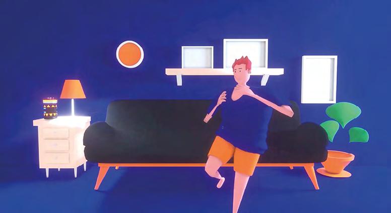
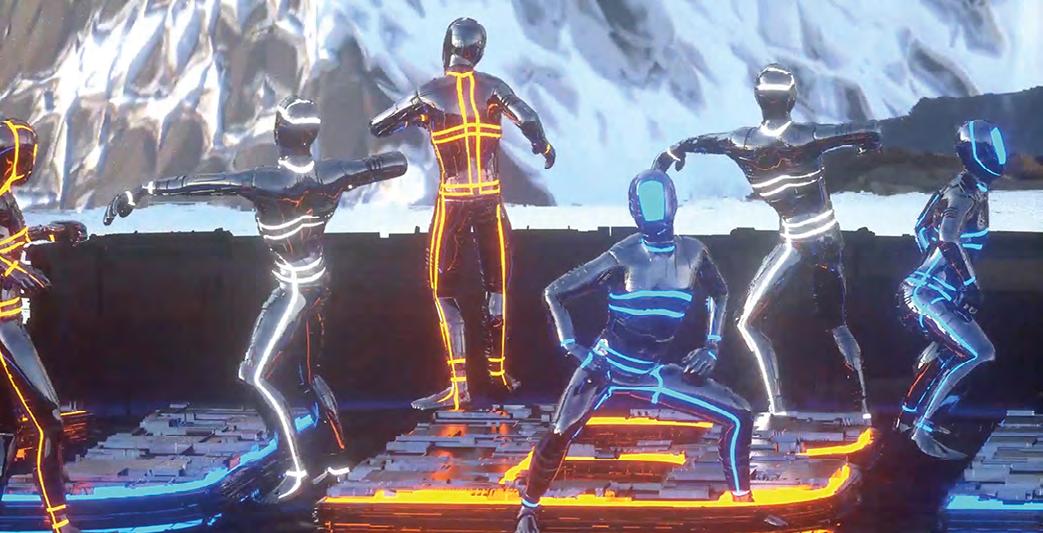
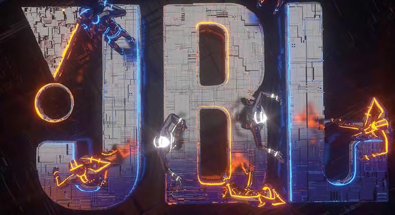
jbl, real experience
Andrés González
Este proxecto fíxose para facer unha promoción ficticia dun novo altofalante portátil da marca JBL
que vai saír ao mercado proximamente. Este vídeo promocional céntrase no concepto da experiencia de usuario que permite desfrutar destes altofalantes, somerxéndote nunha experiencia única. Plantéxase de maneira que o suxeito do vídeo, o personaxe, está na súa casa, túmbase no sofá e dálle por pórse algo de música no móbil para entreterse. Está desfrutando da música cando de repente lle chega un aviso ao móbil e ve que se trata de que un novo dispositivo conectouse. A música para cando lle chega a notificación e
o personaxe mira para a pantalla con cara de estraño e ve que se trata dun dispositivo de JBL. Cando se conecta, a pantalla absorbe a personaxe somerxendo ao espectador e transportándoo a un entorno ao aire libre no cal pódese ver unha especie de plataforma na que varios personaxes están bailando ao ritmo da música nunha especie de escenario que resulta ser o altofalante. O escenario cambia co movemento da cámara ata chegar ao salón do protagonista onde comezou todo.

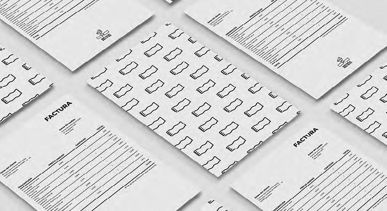
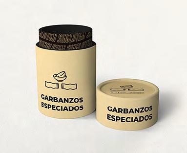
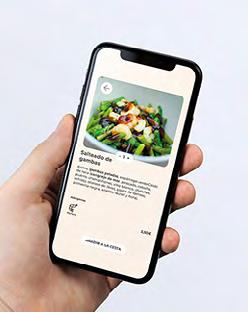
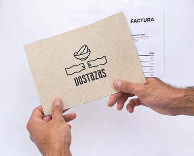
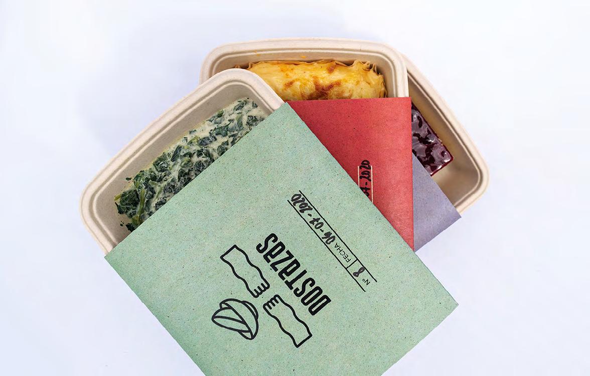
dostazas
Claudia López
Dostazas é unha empresa que se adica a enviar tuppers a domicilio de comida caseira e totalmente libre de gluten. A súa filosofía de traballo é axudar ás
persoas a comer ben cada día independentemente do seu ritmo de vida, en especial ás persoas celíacas. Ademais persegue normalizar e non etiquetar a estas persoas nin á propia marca, abríndose así a que clientes non celíacos proben os seus produtos. A personalidade da marca é xove e moderna, cunha comunicación próxima, pero sen deixar de lado ao público obxectivo máis adulto. Tamén se busca transmitir a idea de que os produtos son caseiros, elaborados de xeito artesanal e que teñen unha gran calidade, pero sen chegar a ser un produto de luxo. Co seu nome, que provén do dito popular: “Non queres caldo, pois toma dúas tazas”, preténdese establecer un vínculo especial co consumidor, apelando a un remorso das orixes populares da comida caseira, así como na sensación de quedar cheo coa comida que lle vai chegar a casa. Seguindo con esta idea de comunicación, créase un identificador con formas
curvas e amables, pero con carácter. O packaging creado é continuista coa imaxe de marca xuvenil e próxima, que non deixará indiferente ao cliente na experiencia unboxing, e permitirá que a empresa poida realizar os seus envíos de maneira correcta e eficaz. Así como a App, que ten unha navegación limpa e pragmática, o que complementa unha experiencia de usuario satisfactoria. En definitiva
o que se busca é crear unha identidade para a empresa a través dun identificador potente e
un naming con gancho e memorable. Así como unha liña de packaging funcional e esteticamente atractivo, cunha app sinxela e funcional.
Claudia López c.lopezg96@gmail.com
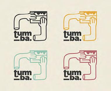
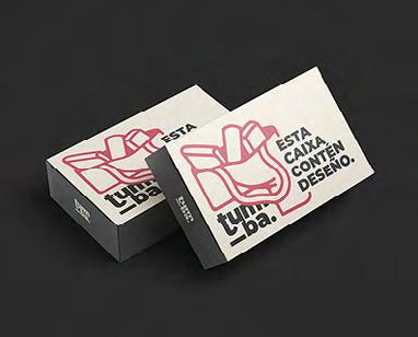
tumba
Olalla Fernández
O obxetivo deste proxecto é a creación dunha marca para un espazo cultural e de creación
artística, onde serán ofrecidos unha serie de servizos relacionados con estes campos. Este
espazo inclúe a creación dun colectivo de deseñadores e artistas.
Neste espazo terán lugar talleres, relatorios e exposicións, xunto cunha tenda e un servizo de
préstamo de libros. Sendo este un espazo relacionado directamente co deseño, a marca non é só unha necesidade
senón un valor engadido moi importante. Debido á intención de achegar o espazo a un público
moi diverso precisamos dunha imaxe de marca potente pero simple. Óptase polo tanto por unha marca dinámica, cun identificador principal e outros
auxiliares basados neste mesmo.
Os obxectivos deste proxecto son o posicionamento como centro do deseño en Galicia así como converterse nunha ferramenta de creación e difusión do traballo do colectivo e de cultura, deseño e arte en xeral.
Olalla Fernández | 663 307 538 olalla.feres@gmail.com

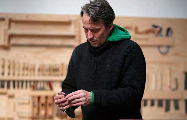
momentos de verdade
Frank Buschmann | artigo
A finais de 2019 recibín unha invitación desde a
EASD Antonio Faílde de Ourense para participar nas Xornadas de arte e deseño CREA cunha charla/ taller sobre a arte de transformar a madeira no meu traballo. Teño que dicir que o contexto ofrecido para compartir as miñas experiencias e coñecementos ilusióname como ningún outro xa que as escolas son como campos de sementa e cultivo: fértiles e cun gran potencial transformador. As xornadas ían ter lugar en abril, o cartel que as anunciaba xa estaba a se imprimir e eu tiña a miña achega máis ou menos preparada cando pasou o que tiña que pasar, anunciado por científicos hai anos. Un día
de marzo amencemos e xa nada era como onte. De súpeto o pequeno era o novo grande -“Small is the new big”-. As Xornadas CREA e tantas outras cousas xa non existían. A poboación do planeta encerrábase nas súas casas (aquelas/vos que podían) e rápido a pregunta máis dominante nas nosas mentes era: que vai ser do mañá. Nese momento de re-organizacion e reorientación chegoume unha nova invitación: substituír charla/ taller cun texto para revista “Anuario” da escola dado que os eventos presenciais xa non eran unha opción. Temos que compartir a distancia. E aquí estou agora buscando algo de distancia de min mesmo e os meus pensamentos para ordenar e buscar prioridades, pensando de que vou falar neste texto. Pregúntome: Vale o de sempre? Vale falar dunha cadeira, dunha mesa ou un taburete? A miña intuición dime con voz forte que non! Podería falar de como para o meu a ebanistería é sempre un traspaso de planos encadeados nos que a forma final do obxecto preexiste no plano anterior. E de como a perfección do obxecto é cada un e a suma de todos estes planos e como cada paso esixe entón a perfección de si mesmo e como cada paso é o obxecto. Ou quizais podería falar de como a procura da perfección tanto en forma e acabado son como preguntarme que longa é a costa de Galicia e comprobar que esta é infinita se aplicamos o
método da curva de koch, a orixe da teoría do caos. Quizais podería falar da miña vida e das viaxes que me levaron a pisar e coñecer catro continentes. Da miña aprendizaxe para entender que vivimos sobre esta “nave espacial terra” cunha responsabilidade compartida, baixo unha realidade na que o micro e o macro gardan unha estreita relación e un forte vínculo co humano e que por iso a integridade individual é indispensable para a integridade do total. Podería ilustrar esta visión falando do vídeo “The power of ten” realizado polos Eames en 1977 para IBM ou describindo as imaxes das mitoloxías nórdicas onde a árbore representa o vínculo entre terra e cosmos. Podería falar de como o ego e os atallos corrompen o obxecto e da “tensegridad”, unha palabra inventado por Buckminster Fuller para expresar a integridade tensional baseado na observación dos planetas e as estrelas no universo onde todo está conectado pero nada se toca. Podería falar das características do comportamento da madeira, as súas tensións e o seu estado dinámico e como as unións empregadas para construír con madeira non son só elementos estéticos ou puramente construtivos pero tamén metáforas de aperturas a novas posibilidades ou metáforas a compromisos, aprendizaxes de aceptación do límites pero nunca a completa entrega de liberdades. Podería falar de como a caixa de ferramentas coas que construímos o futuro debería incluír tamén as ferramentas dos artesáns, e non me refiro ao martelo, o serrucho, a agulla ou a
tesoira senón ás ferramentas feitas das súas actitudes e capacidades por exemplo a intuición, inmensamente desenvolvida, ou a paciencia, ou a previsión, o coidado e a capacidade para facer un bo traballo co único obxectivo de facer un bo traballo. Podería falar de deseño e de como para celebrar a “singularidade” dun obxecto non pode un deterse no que ve a primeira vista senón profundar nas complexidades que unha soa forma pode conter e logo ser capaz de recoñecelas. Podería falar de como desenvolvín esta idea coa A cadeira #3 investigando as orixes e relacións dunha secuencia de cadeiras -Conoid, Kufenstuhl, Zigzag e Z Rasch- consideradas clásicos cowntemporáneos no mundo do deseño. Falando de deseño podería tamén contarvos dos “Shakers” e de como esta comunidade utópica de finais do século XVIII foi o berce do deseño
contemporáneo e sobre a bela frase de Thomas Merton que desvela onde está a maxia das súas cadeiras atribuíndo ao facer shaker “a capacidade de crer que un anxo podería vir e sentar en ela”. Como dixen ao comezo a miña intuición avisábame de que nesta ocasión era mellor non falar de mobles nin de deseño senón traer cara ao primeiro plano a importancia de cultivar a vista longa, os horizontes afastados, sexan estes celestes, visibles
ou astronómicos, detrás deles sitúase a utopía que aínda que non sexa habitable serve de compás e de motor. Pensar no bonito que é o feito de que a terra sexa unha bóla e non un prato como nos queren coar os movementos planaterristas. A bóla regálanos un novo horizonte con cada paso que facemos cara a adiante e así podería neste punto volver a esa idea de que cada paso é o obxecto. Pero non, non debería falar de todo isto. O momento en que nos atopamos, cheo de fallos multisistémicos, é un momento no que a verdade nos esta mirando de fronte e pídenos a berros outra cousa. Silencio e un esforzo colectivo para pensar se somos capaces e se temos a coraxe de aceptala. Se somos capaces e si estamos dispostos a formar parte dunha totalidade íntegra que require a integridade individual, a integridade sobre o que facemos, como o facemos e por que o facemos. Deixo por último a Buckminster Fuller coa súa voz de febreiro 26, 1983:
”[…] creo que estamos nunha especie de exame final sobre se os seres humanos agora, con
esta capacidade de adquirir información e de comunicarse, estamos realmente cualificados
para asumir a responsabilidade que se nos encomendou. E non se trata dun exame dos tipos de goberno, nada que ver coa política, nada que ver cos sistemas económicos. Ten que ver co individuo. Ten o individuo a coraxe de aceptar realmente a verdade?”
Premio Artesanía Galicia 2019 e Premio Antonio Fraguas 2020, categoría de Artesanía Tradicional.
Fotografía de Cristóbal Manuel
a biblia kennicott: unha viaxe de encontros
Manuel Gago | artigo
Escoller unha páxina. Non podía pensar que ese podía ser o gran desafío. Pensaba que unha vez superadas as negociacións, aseguradas as condicións de seguridade, establecidos os protocolos, xa todo estaba feito. Pero resulta que o máis difícil era escoller a páxina de apertura. A carta de presentación dun dos códices máis fermosos da Idade Media europea. E, desde logo, a cimeira artística dos libros confeccionados na Galicia medieval. Tiña que decidir entre as 238 páxinas iluminadas das 922 totais das que consta o códice. Ese códice era a Biblia Kennicott, un riquísimo manuscrito coidadosamente conservado nas Bodleian Libraries de Oxford. Conseguiramos que, por primeira vez este códice “volvera a casa”, como describiron o proceso os propios conservadores das Bodleian. Era unha das pezas máis destacadas da exposición “Galicia, un relato no mundo”, que se celebrou fisicamente no Museo Gaiás da Cidade
da Cultura do 15 de novembro ao 12 de abril de 2020 como primeira mostra da programación do Xacobeo 21, e que se pode visitar virtualmente no web da Cidade da Cultura (http://www. cidadedacultura.gal). O confinamento provocou que
a exposición tivera que pechar un mes antes da súa clausura oficial. Nesta mostra, explorabamos as
interaccións, presenzas e influencias do mundo en
Galicia e de Galicia no mundo a través da Historia. Dúas plantas do Museo Gaiás que na primeira visita como comisario me pareceron enormes e, cando comezamos a deseñar a mostra e escoller as pezas, pequenas. A Biblia Kennicott ocupaba un lugar central no discurso expositivo da exposición. Como poucos obxectos, a súa relevancia viña dada por ser un excelente exemplo da confluencia entre
un resultado artístico, visual e tanxible, e unha intrahistoria que dotaba ao obxecto dunha biografía singular para a sociedade galega do século XXI. A Biblia foi rematada na Coruña o mércores 4 de xuño de 1476 polo escriba Moisés ibn Zabara, por encargo de Isaac, fillo de Salomón de Braga, un acaudalado
comerciante da Coruña. Pero na Biblia Kennicott dase tamén un fenómeno pouco frecuente nas Biblias xudeas: tamén asina o traballo o iluminista, Joseph ibn Hayyim. Este foi o único traballo que lle podemos atribuir, pero a xulgar pola mestría da súa arte, había ser ben coñecido o seu tempo. Persoalmente, estou convencido ademais que tiña un gran sentido do humor. Os investigadores que teñen investigado o códice consideran que o traballo entre Moisés e Joseph foi moi coordinado, man a man, construíndo pouco a pouco esta obra mestra. Xunto os 24 libros da Tenakh (o Antigo Testamento), a Biblia engadía un tratado gramatical, o Sefer Mikhol, posiblemente encargado por interese do cliente, Isaac. Aínda que as ilustracións están distribuídas por todo o códice, é precisamente no tratado gramatical -se cadra pola súa menor solemnidade e sacralidade- no que Joseph ibn Hayyim deixa escapar toda a súa creatividade, incluíndo vintesete páxinas cheas de fastuosas arquerías que enmarcan o texto. Durante un tempo considerouse este encargo coruñés como unha especie de rara excepción. Os datos que temos sobre as comunidades xudías que existiron en Galicia son escasos, vinculados a documentos administrativos. Non dispoñemos de obxectos da época que reflictan a súa cultura,
sociedade ou modo de vida. Pero se consideramos que tamén no mesmo periodo se atopaba na Coruña a fastuosa Biblia de Cervera, composta a principios do século XIV, e considerada como un dos códices que inspiraron a Kennicott, poderiamos falar -aínda que fora a nivel hipotético- dun ambiente cultural xudeu na Coruña, vinculado sen dúbida á existencia dun porto de relevancia comercial e a unha comunidade que dispuña de recursos económicos para cultivalo. E esa comunidade non estaba illada nin funcionaba como un ghetto. A Biblia Kennicott é recoñecida pola capacidade de expresar, a través da expresión da arte, a existencia -e confluencia-
das diferentes tradicións artísticas da Península Ibérica. Xunto coa paixón pola xeometría e a simboloxía tradicional propias da iluminación hebrea, na Kennicott conflúen representacións
humanas e de animais fantásticos procedentes da tradición cristiá e motivos de clara inspiración musulmana, recoñecibles nos teitos da Alhambra granadina. A propia caixa de coiro que protexe desde hai cincocentos anos o libro é un magnífico
traballo de artesáns musulmáns. Na Biblia Kennicott converxen tres culturas, tres relixións e tres modos de ver o mundo. Cumpriría dicir que, nesa calidade e delicadeza, de maneira única no contexto europeo. O mar xoga un papel importante nesa historia. En 1492, a penas dezaseis anos despois de ser rematada, a Biblia e os seus propietarios tiveron que emprender o camiño do exilio. Co decreto de expulsión dos Reis Católicos, os xudeus víronse
A imaxe foi reproducida por cortesía das Bodleian Libraries / University of Oxford e a Cidade da Cultura de Galicia.
obrigados a abandonar o reino de Galicia. Sabemos, ademais, que moitos dos membros da comunidade xudea da Coruña marcharon nun barco fletado
especialmente para a ocasión, no que levaron numerosos bens de valor. Se cadra, entre eles, a Biblia Kennicott. O códice tivo unha vida azarosa por distintas xuderías do norte de África ata que foi adquirido en Xibraltar a finais do século XVIII por un
cóengo de Oxford, Benjamin Kennicott. A Biblia, a súa biografía e a súa prodixiosa festa visual, ten a capacidade de dialogar coas mulleres e homes do século XXI, a nosa visión do mundo e as problemáticas internacionais. Somos quen de recoñecer o conflito subxacente por
detrás das páxinas da Kennicott, e fronte a el a Kennicott funciona como unha sorte de solución. Na exposición Galicia, un relato no mundo, empregabamos a Biblia como unha mensaxe para as novas xeracións, pero tamén un recordatorio de que fronte a visións simplificadoras e mitificadoras,
o pasado e as sociedades do pasado foron tamén complexas. Fronte a unha idea monolítica de Galicia, hai moitas Galicias. O retorno da Kennicott era tamén unha emocionada homenaxe aos compatriotas que tiveron que abandonar os seus fogares por concibir o mundo e a espiritualidade de xeito distinto, e tamén unha advertencia da riqueza cultural, intelectual e humana que perden os países cando tal cousa sucede. E volvo ao parágrafo do principio. A escolla da páxina de apertura da Biblia na exposición. Eu sufro moito coa exhibición de libros nas exposicións. Un códice encerrado nunha vitrina blindada é como un paxaro preso nunha gaiola. Por iso estou sempre argallando sistemas tecnolóxicos para poder superar este problema e facer máis agradable e produtiva a visita a unha exposición de libros. A responsable da Bodleian Library permitiume examinar -antes de pechar a Biblia na vitrina- todas as ilustracións do orixinal, e sen dúbida é unha destas experiencias que fican para a vida
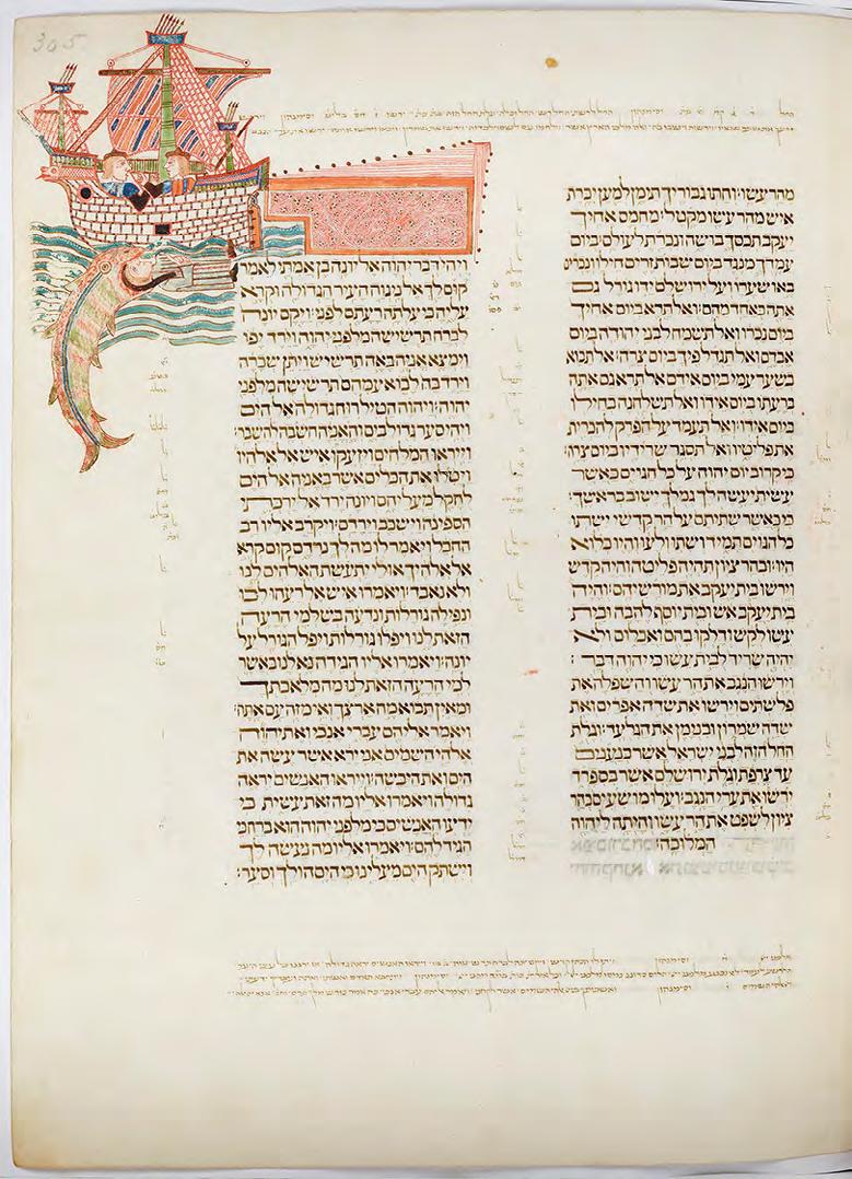
enteira. Aínda que hai un excelente facsímile do códice, co que eu traballei previamente -existen varias copias en Galicia-, teño que dicir que a copia moderna non lle fai nin sombra a este orixinal do século XV. As cores, a textura, o estado de preservación, como se fora un libro destinado a superar o tempo. Impresionoume máis alá do que tiña previsto. A conservadora de Oxford miroume, como concedéndome unha última oportunidade á hora de seleccionar a páxina. Non os quero enganar: ese aspecto negóciase moi ao principio do proceso, así que todo estaba decidido desde o primeiro momento. Pero parecía como que se me permitira a oportunidade do arrepentimento. Todas as páxinas eran fastuosas. Pero unha vez máis tiven claro que debiamos amosar: o folio 305r. Nel represéntase con gran detalle un barco galego de finais do século
XV, con dous tripulantes na ponte. No mar, unha balea devora a Xonás. Ese barco había ser ben parecido ao que tiveron que empregar os xudeus coruñeses para marchar con precipitación dos seus fogares. Ese folio era unha homenaxe, pero tamén unha fiestra máxica pola cal os galegos do século
XV se podían comunicar cos do presente ao redor dunha mensaxe universal. Era unha despedida, pero tamén un reencontro. Manuel Gago Mariño (Palmeira, Ribeira, 1976) é doutor en CC. da Información pola Universidade de Santiago de Compostela. Na actualidade, é director de culturagalega.gal, o portal de divulgación cultural do Consello da Cultura Galega e profesor na Facultade de CC. da Comunicación da Universidade de Santiago de Compostela. É editor de Capítulo Cero (www.manuelgago.org/blog), un dos blogs referentes da rede galega, no ámbito da divulgación histórica, científica, en estilos de vida, gastronomía
e cultura, e por el ten recibido premios e mencións de diferentes colectivos profesionais galegos. É fundador de patrimoniogalego.net, a rede social do patrimonio cultural de Galicia. Como comisario de exposicións, Gago foi responsable en 2016-17 de Galicia 100. Obxectos para contar unha cultura, producida polo Consello da Cultura Galega en colaboración con A fundación e exposta en Santiago de Compostela, A Coruña e Vigo. En 2018 comisariou a exposición Alba de Gloria de Castelao. Unha experiencia, producida polo Consello da Cultura Galega e inaugurada na igrexa de San Domingos de Bonaval. En 2019 comisariou a exposición Galicia, un relato no mundo no Museo Gaiás da Cidade da Cultura, a primeira das tres grandes exposicións do Xacobeo’21.
artesanía de galicia. facendo marca
Elena Fabeiro | artigo
Á diferenza do que acontecía hai uns anos, nos que o global o inundaba todo, a corrente actual a nivel mundial é de posta en valor do feito a man empregando o tempo necesario. O slowmade é unha realidade, e cada vez a xente prima máis o local, o próximo, o sustentable, e, sobre todo, a historia desas persoas que están detrás das pezas. Neste contexto, a artesanía está afianzando a súa
toma de postura, achegando un valor engadido cada vez máis demandado, polo que se está a configurar
como unha saída profesional dos máis novos, que están a impulsar con forza os oficios respectando
as tradicións e enriquecéndoas con frescura e modernidade. As escolas de Arte superior e deseño EASD están a desenvolver un papel fundamental na súa profesionalización e competitividade, promovendo a formación e impulsando o talento destas novas xeracións que apostan polo traballo artesanal, pola conexión coas materias primas e cos nosos raizames, defendendo a nosa identidade. A artesanía está a xogar un importante papel como nova canle de acceso ao mercado e nos últimos anos estase a producir unha notable incorporación de mozos no eido laboral a través de actividades artesanais. Enriquecen o tecido artesán, con novas competencias e disciplinas, formación, visións e modelos de negocio, ademais de innovación a todos os niveis (materiais, técnicas, produtos e procesos). Conscientes da importancia da artesanía como motor económico e cultural da nosa Comunidade, desde a Xunta, a través da Fundación Pública Artesanía de Galicia, estamos a promover a innovación, o deseño e a calidade como elementos definitorios dun sector que mantén vivos oficios artesanais en máis de 80
actividades distintas, entre as que se inclúe o traballo da madeira. Froito do traballo desenvolvido xunto co sector, a artesanía galega cada vez goza de máis visibilidade e fortalecemento, e hai 3150 artesáns inscritos no Rexistro Xeral de Artesanía da Xunta e 705 talleres rexistrados baixo a marca de Artesanía de Galicia. A metade dos novos obradoiros están integrados por novos talentos, mozos como os que se están a formar nesta Escola de Arte Superior e Deseño de Ourense, que enriquecen o sector artesán, o renovan e o actualizan. A marca Artesanía de Galicia ofrece unha imaxe común, harmónica, coordinada e representativa dos produtos artesanais galegos, configurándose como un
selo de prestixio que constitúe un sinal de identidade propia e garantía de calidade para os consumidores. Así, Artesanía de Galicia inclúe produtos de alta calidade, coidadosamente deseñados e que contan unha historia fascinante: as raíces da nosa cultura combinadas co deseño contemporáneo, coa personalidade dos creadores e coa mestría das súas mans. Coa mirada posta no fortalecemento e na protección da artesanía como valor cultural definitorio da nosa
sociedade, na Fundación Pública Artesanía de Galicia temos entre os nosos obxectivos desenvolver liñas de investigación destinadas a especializar e perfeccionar técnicas de elaboración que permitan mellorar a calidade dos produtos artesanais, ademais de optimizar o proceso produtivo, xa que entendemos que a innovación, o deseño e a calidade son as bases coas que conta a artesanía para seguir adiante. O principal fin da Fundación, creada no ano 2003, é dotar o sector artesanal dunha infraestrutura especializada para que poida desenvolver programas de asistencia, formación, innovación, catalogación, promoción, comercialización e calquera outro aspecto inherente á cultura dos oficios artesanais en Galicia.
No actual contexto socioeconómico, é preciso ademais adaptarse ás circunstancias que vivimos e á progresiva dixitalización dos mercados e novos hábitos de consumo. Por iso, estamos a promover novas formas de comercialización e comunicación cos clientes, implementando a dixitalización e o uso das novas tecnoloxías como ferramentas imprescindibles no actual escenario. Neste sentido, estamos a impulsar accións de promoción comercial e de acceso a innovadores canles de venda, tanto nacionais como internacionais, a través da organización e participación en eventos, feiras, certames e pop ups virtuais de interese comercial e artesanal. Neste novo contexto é preciso potenciar a comercialización dixital, a través de tendas efémeras, plataformas ou páxinas de market place. Confío na capacidade de aproveitamento do alumnado desta escola, que aposta polos oficios e
a creación artesanal, que lles facilitará a conexión con eles mesmos e cos demais. De seguro que este período formativo no que se mesturarán emocións, creatividade e aprendizaxe servirá para afianzar as
súas capacidades co fin de abrirse aos novos mercados
nos que a artesanía é un valor á alza que está gañando protagonismo nos fogares, na gastronomía ou na imaxe persoal, con aplicacións cada vez máis diversas marcadas pola súa personalidade e autenticidade.
mobilidade internacional
Marisol Rojo e Olalla Sío | artigo
Relatar sobre o acontecido o pasado curso sobre o desenvolvemento dos programas internacionais nos que participa a EASD Antonio Faílde produce un pouco de nostalxia debido á situación internacional de alerta pola pandemia do Covid 19. En certo modo as inquedanzas que motivan un intercambio de estudos con outros países quedaron en pausa. Desde hai moitos anos un dos piares fundamentais na formación continua da nosa comunidade escolar é o contacto a través de distintos programas internacionais con alumnado, profesorado, institucións académicas ou, incluso, empresas. Ás veces estes contactos fanse a través da presenza destes axentes na Escola, sendo moi inspirador porque a experiencia é de aproveitamento para todo o grupo. Outras, somos nós quen visitamos outros centros educativos con similares intereses. Toda esta motivación deriva na posta en marcha diferentes proxectos dentro do programa Erasmus+, nos que facemos os intercambios con outras escolas, academias e facultades socias. Estas repártense por varios países como Portugal, Lituania, Italia, Polonia, Dinamarca, con escolas de referencia como a ESAD de Matosihnos, Kea, ISIA ou Vilnius, entre outras. Un dos intereses do noso centro é ampliar o número de institucións socias co fin de obter a maior variedade de experiencias cos
intercambios internacionais. Ademais dos intercambios de estudos, trátase de fomentar as experiencias de prácticas formativas no estranxeiro. É unha oportunidade moi interesante para os/as futuros/as profesionais do deseño, ilustración, fotografía e ebanistería, nos seus primeiros contactos co mundo laboral nun entorno máis internacional, manexándose noutro idioma, e rompendo barreiras de cara ao seu futuro profesional. Neste curso tivemos a presenza nas nosas aulas de dúas alumnas orixinarias de Italia, da Accademia di Belli Arti Macerata, ambas estudantes de Deseño Gráfico. E tres estudantes de Deseño Gráfico da
nosa escola comezaron mobilidades de estudos en Portugal (Escola Superior Gallaecia), Lituania (Academia de Artes de Vilnius) e Italia (Accademia di Belli Arti Macerata). Por mor da pandemia do Covid-19 só dúas delas puideron rematar a súa estancia e de xeito telemático, polo que a experiencia educativa non foi como cabía esperar pero, comprensiblemente, as circunstancias foron bastante especiais. Hai xa algúns anos que a nosa institución forma parte dun consorcio chamado CARTES con outras escolas e facultades españolas, 20 institucións educativas vinculadas ás disciplinas artísticas de Belas Artes, Conservatorios Superiores de Música, e Superiores de Arte e Deseño, para poder facer deste xeito intercambios con países non pertencentes a CEE e en desenvolvemento. Este curso estaba previsto participar con mobilidades tanto para a formación continua de profesores como a formación en prácticas de alumnos a Filipinas, Serbia, Bosnia e Albania. Levándose a cabo só dúas mobilidades para docentes a Albania (Universidade das Artes de Tirana) e Serbia (Facultade de Belas Artes de Novi Sad). Podemos dicir que o resto queda mais que suspendido, adiado, ata que mellore a situación sanitaria internacional. O interese desta escola pola súa internacionalización dende hai moitos anos foi froito do tesón e traballo dalgúns membros da comunidade educativa como o profesor César Taboada, a quen queremos agradecer a súa colaboración coa Escola para manter relacións con certas Institucións Internacionais á marxe dos programas Erasmus+. Destes contactos académicos internacionais derivan invitacións á participación en eventos, obradoiros, seminarios e exposicións. Aínda que este ano polas circunstancias excepcionais de pandemia non puido ser, todos os cursos convídannos a participar na Bienal de Venecia ou en Manheim. De feito esta ano, dado o interese que a nosa Escola desperta recibimos a visita de dous profesores da “Kyoto Saga University of Art e Kyoto Saga Art College” interesados por asinar con nós futuros intercambios de formación. A nosa Escola tratará de continuar con estas propostas de formación no estranxeiro porque cremos que é un estupendo complemento á aprendizaxe nas artes, no deseño e na vida.
traducións
joinery
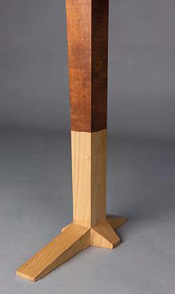
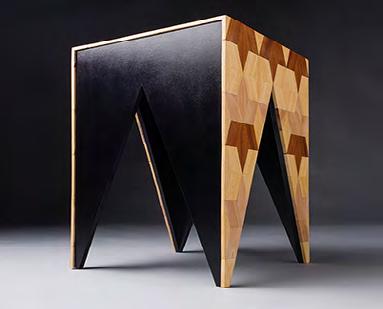
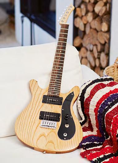
06 | Batea
Ester Núñez
BATEA is made as a sofa side table. It is a central piece of furniture, with an asymmetrical diamond shaped tabletop of great visual strength. The table is supported by three legs joined by two crossbeams resting on the floor,
joined with dovetail joints. BATEA is made up of two woods chosen for their duality, both in terms of aesthetics and representation: beech wood and Galician-sourced walnut wood. In the tabletop, as an informal marquetry, some identically shaped modules were embedded. The craftsmanship of this marquetry reminds us of the Southern European, to the marquetry from Granada, and also the marquetry from Damascus. The Galician-sourced walnut is the chosen wood for the modules, in this case, given its diverse joints and its varied shapes, it was necessary to carefully choose the pieces of wood for this design. These modules create a rhythm that reminds that of the rafts where mussels are grown, also known in Galicia as “bateas”. Thus its name: BATEA.
08 | Bau
Iria Rodríguez
The BaU is an advertisement display. Simple, useful and original. It was created to be placed in fairs, civil and administrative buildings’ foyers and exhibitions. Its name evokes an artistic movement of great relevance whose influence is still felt today because character: the Bauhaus. BaU is a creation with a functional analysis that claims, above all, a lasting validity. It combines utility and necessity by trying to unify the principles of mass production, and design democratisation with an individual artistic vision. This design is an abstract three-dimensional composition, in which there is a deep connection between form and primary colour — a nod to her Dutch neoplasticism and Bauhaus background. The idea came from the most basic framework, two parallel crossbeams in light koto wood and two bark panels integrated into a geometric structure. Great attention was paid to the refinement of forms
to reach their fundamental components: lines and planes. There are no visible joints. The requirements were simplicity, lightness and standardisation, ease of assembly and transport.
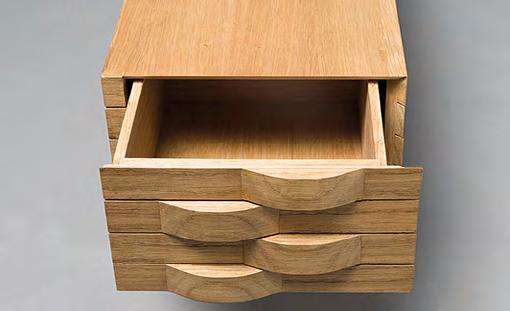
09 | Kokorokó
Daniel Vázquez
Kokorokó is a desk or console. It evokes the rooster, the most emblematic poultry on the planet for its activity as a domestic bird from which to obtain meat and eggs. The furniture has a support of two straight legs. Iroko wood was used for the upper side of the and chestnut wood to the lower area or feet. On top of the legs, there is a rectangular set of drawers with curved angles, and two fully functional drawers. The big highlight is the way of inserting the legs, where the double and quadruple doweled joint, the halved joint and the sword tip are combined, which, in turn, represents the spur of the rooster. The furniture aims to transport us to the rural world where the author invites us to reminisce over the simple and peaceful lifestyle of our ancestors in contrast to the way of life of hustle and bustle of the cities. 10 | Chess
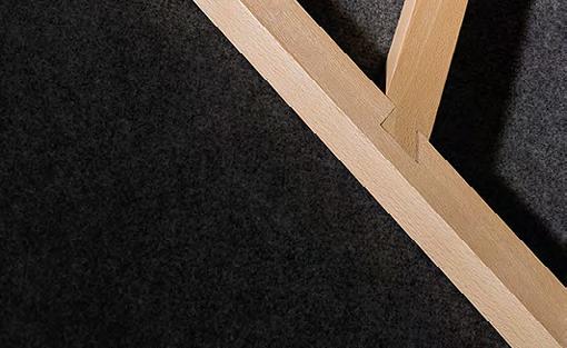
Eva Pereiro
“Chess” is a sofa side table. It was developed around the marquetry design of its tabletop, and therefore, its name, Chess, which obviously suggests a chess board. Created alternating sapelli and oak wood to form the marquetry. Solid wood pieces of different sizes
glued together on a beech board that was embedded between the legs. Another interesting feature that can be observed in the legs and the tabletop is its continuity, the width of U-shaped crossbeams that act as legs matches the width of the marquetry pieces above it, creating a feeling of continuity. This also resulted in each leg being of different width and allowed for the
construction of a very light piece of furniture with narrow profiles, creating an interesting structure
that gives strength to the piece as a whole.
12 | Faixa
Marcos Pérez
FAIXA is a battery box container inspired by Galician costumes and traditions. For the creation of FAIXA we focused on traditional Galician culture, more specifically
on a piece of clothing, the “faixa”. The “faixa”, a fundamental piece in traditional Galician male costume, is a type of broad sash worn around the waist, and it runs twice around it. And it is worn so one of the ends hangs down the side of one leg to show the drawing or embroidery, as well as the fringes. Its lines and drawings inspired us to design the decoration of our work using prefab marquetry. This container is made of a MDF board veneered in beech wood, solid beech wood, and chestnut
wood. It consists of 12 pieces, of which the sides, the door and the legs have the design reminiscent of our references.
14 | K-eli
Fernando Ferradás
K-Eli is a lightweight hallway piece of furniture. It is designed to store inside those small objects that we are with us when we arrive home, keys, wallet, mobile phone, etc. Its name comes from the Latin “caeli” and it covers several definitions: sky, space, air... concepts that
we had in mind when designing this piece furniture. The prominence of the empty space and the feeling of lightness were achieved with a structure of slats made in natural beech and united by different joints,
creating an enveloping space where the drawers are inserted. The drawers are built in natural oak and have two different opening systems, one that slides out
horizontally and a second one that opens vertically thanks to a hinge.
15 | Valo
Tomás García
We mixed to design a small open box, natural structures that we can find in nature, straight tree
trunks looking for light in a forest, with simple traditional constructions, fences using wooden slats. We isolate, leaving the inner part empty, as a space of easy observation. We deposit in it objects that we use every day; they are not forgotten. There they are stored, and, through the openings on the walls of the box, our eyes can observe the contents; therefore, we can locate what we need. We add hidden, useful and new elements to the furniture: an LED light, which lights up when the lid is opened and put our hand in, making it easier to locate the stored objects. Also, if we leave it on, it serves as a small mood lamp. In the base, there is a wireless mobile phone charger. The main element of the furniture is a squarebased prism, built with vertical sapelli wood slats, which we prime to obtain a darker shade that resembles logs or sticks. Its high number of pieces, 60 slats in balance, requires a meticulous work of elaboration and placement, using small hidden joint at the base. The opening is a cover that slides smoothly, and it is coherent with the support element. All the components are tied up like pieces of a puzzle, hiding the areas of union to obtain a complex piece in its structure, but simple from the outside observation. The box is supported by a long shelf, made of solid wood, built in the steamed beech and supported on the wall, without showing any element that supports it. Its light colour, slightly orange, contrasts with the dark colour of the upper container. The name VALO (Galician for “fence”) refers to those traditional constructions that, with sticks or trunks of small trees, delimit and close a space, in which sometimes, there are the important things for the people, their source of sustenance.
16 | Duna
José A. Alonso
Manzil, which is pronounced Nándilon, is a word of Arabic origin meaning home. The idea is that the wrap-around shapes of the furniture pieces from this collection produce a textured feel that resembles desert sand. “Duna” is part of this collection, a piece of furniture designed for the hallways of our homes. Made of oak wood, its grain is reminiscent of sand and its handles emulate the softness of dunes. The body of the furniture is made of small boards separated by a millimetre longitudinal distances, and it has a continuous and uninterrupted grain around that continues on the sides and the front of the piece.
18 | Sestrelo
Manuel González
Sestrelo is a low small table that can also function as a seat. The idea for Sestrelo comes from the original word “setestrelo”, which, in Galician culture, is the constellation of the Ursa Major or Great Bear because of its outstanding seven stars. In contrast, in our work, we played all the time with the shape of a six-pointed stars, and from that, the play on words comes to form “sestrelo”. Just as the stars are drawn in the sky on the infinite black, our work
sits on a dark background that covers the legs. The piece consists of four triangular-shaped legs, which make it stable and strong, and a tabletop that continues the design ideas of the legs. The marquetry part is created from a modular element, the rhombus, which builds the six-pointed star pattern that gives the furniture its name. Three different woods were used to bring together three
different colours, the yellowish Koto, the reddish
sapelli and the lighter beech. All the work is handmade, and the marquetry was created piece by piece, the gluing, sanding and finishing was
done manually, as the structure and the rest of the work. This piece combines the ébéniste tradition of an ancient and ancestral trade of the creation of marquetry, and it adapts both to a simple and timeless structure with modern shape and expressing its cultural Galician background. With this style of furniture, we manage to transmit ancient techniques so that they might striving
towards a modern style, creating a future for this type of craft.
This work was one of the nine finalists in the Rado
Star Prize Spain 2020 and won the audience award. It was exhibited at the Espacio Rado, located at the Colegio Oficial de Arquitectos de Madrid (COAM),
within the Madrid Design Festival.
interior design
20 | Obradoiro de teatro: A cuarta parede
María Cuadrado
The building in question is a warehouse located on the Carretera de Santiago, in the Concello de Coles. The stage, where the play generally takes place, has four walls: the one at the back, the two on the sides and a fourth imaginary wall that separates the characters from the audience. To break the FOURTH WALL means to address the audience and make them participants in the play itself. In this warehouse the main facade was eliminated making an allegory of this imaginary wall. Instead, several colourful fabrics were suspended from the structure, simulating the backstage of a stage that welcomes any spectator, directing it to a new glass façade through a walkway. On the other hand, a common aspect of acing work is DISOCIATION. That is, to separate reality and fiction when interpreting a character. This concept
is applied in the restoration work through two blocks: a light and a dark one. The light block includes the foyer, reception, administration, office and stairs. The colour white predominates and penetrates natural light through a large glass facade and skylight. For artificial light,
vertical LED tubes are used paying homage to the rays of the sunlight. All these elements refer to reality, the day and the light. The dark block covers the auditorium and the toilets. In these rooms, grey tones can be seen, as well as fine woods. As the auditorium is designed to put on
shows, it avoids natural light and it is centred on a focused light, creating a starry sky. So, it refers to fiction, night and darkness.
The aim of designing these blocks and a new facade is to create a sensory experience for the viewer as they move from one area to another.
24 | Espazo Cosewing
Sheila Iglesias
Sewing, is a space conceived to design, produce and sell fashion collections. IT was born from the desire of precisely communicating the fashion process, from design to production, with a very special emphasis on recovering the lost value of sewing and handmade garments. All that, turning the exterior outward and proposing a deeply sensitive and pedagogical walk of the projected set. In order for the indoor activities to be visible from the outside, an interior empty space is created in parallel to the main façade, in addition with this decision, natural lighting fills the basement making
it ideal as one more work area and providing a visual cohesion to the whole. The vertical connection of the 3 floors also
takes place in this strip and is made through the staircase as a connecting link between the floors.
The formalisation of this void is done by a new structure through panels configured with structural
metal profiles and a metal mesh, which form a are shown, representing different types of points
of the fabric. These panels filter the natural light
that is important due to the orientation of the facade towards the south and, at the same time, they act as a protective barrier for that double height. This “second facade” made up of 1.20 m panels was fundamental to the development of part of the project. Each module forms a rectangle with two vertical and two horizontal tubular CHS profiles welded together and a white steel mesh
that gives us the necessary transparency for an outside viewer to see the inside. In that grate intertwined silk cords are fixed. The dimension of
the panels is also used for the design of the floor
and in the ceiling for the lighting and the pieces where the garments are placed. The staircase railing also follows that measure as well as some of the furniture.
26 | Assam. A Tea Shop
Javier Pérez
The idea of the project is based on 3 fundamental premises that not only inspired the idea itself, but also became the values that helped inform all the decisions of the project. The first of the premises was that the design of
the space should convey the same ideas that the product sold does. Tea is a very natural product, simple and with little processing, so the concept must be related and express the most natural part of the product. The second was to introduce elements of the culture surrounding tea, due to its great impact on it. The third one has to do with the space where the work had to be done, they wanted to eliminate the shape of the container, transforming so it would store new content.
Therefore, the final idea is to create a design that
suggests a space achieved through elements related to tea and the tea culture.
28 | Interior Architecture Firm
Antonio Martínez
The goal is to investigate how the implementation of an object in an urban environment generates a series of immediate relationships with its context, and how architecture on a concrete scale and the development of the activities it promotes are the theme of the interior design project. That is why interior design becomes a human and urban factor and not a series of arbitrary decisions at a given time. The space is organized by establishing a visual and human control and relationship of work to share the activity of the studio on both the ground and basement levels and creating communication elements between two storeys. This continuity results from partially emptying the space between concrete arcades so the link is created. The created empty space becomes the materialisation of the expression of the property in which the project gathers its qualities, its previous volumetric sensitive appreciation and it serves, together with the location of the staircase, in the organisational, expressive and moving element of the project. Premises of the project: 1 - Continuous visual referencing the access and light holes, as well as the double height hole in the search for transparency and spatial continuity, so that users feel positioned positively and temporarily during a working day. 2 - Coexistence of the activities of an architectural and interior design studio, with those related to leisure, looking for spaces of confrontation of results as well as activities of dispersion and leisure, according to the coherence of the project’s program and the seeks to implement communicative content and independence and freedom of movement in the project area. 3 - Accessibility on routes without restrictions: location of a lift for people with reduced mobility can circulate and develop their activity throughout the premises. Guarantee the wide dimensions in the routes and manoeuvrability. 4 - Service elements such as the staircase, the double height and the elevator, are not necessarily physically integrated in the pre-existence, more than as an object, like the staircase with its own interpretative autonomy, as generators of the project, being the previous structure a variable to take into account that does not prevent the independence of the proposed project that becomes physical in having of mass and transparency and to take references and spatial continuity in the area that was proposed before. 5 - Idea of spatial concentration of elements to guarantee the free plan and the useful perimeter, as well as that these constructive elements serve as intermediation of the study activities with the idea of communication and personal independence. 6 - Elements with organizational quality that generate space 7 - A gap is opened in the floor of the previous
structure, with the demolition of joists and vaults. However, the situation of beams and pylons is respected without eliminating any of them. The construction element of the staircase with its plateau on a mass of perforated concrete appears between the previous structure and serves, as explained above, as an organisational reference, looking out from the empty space, digging holes in it, becoming an element that also serves furniture, and as the piece that integrates basement in the whole. 8 - The central void of the staircase and the double height absorb all the content of the project, creating a situation similar to the one felt in the premises without being reformed, a feeling of uneasiness that, far from being hidden, makes clear the constructive, functional and emotional sincerity that the project proposes.
30 | Netos. Intergenerational Toy Library
Nuria Verde
In the last decades, our society suffered changes
that affected mainly the social structure,
which caused an awakening in the study of the intergenerational relations, especially between old people and children. The intervention is located in A Guarda, a small village south of the Rías Baixas, where a change of use is intended: from a single-family home to an intergenerational playground. Since the word “Ludoteca” (playroom) comes from the Latin word “Ludus” which means game and the Greek word “Théke” which means box, it is proposed that the building be like a box where toys are kept and displayed inside. A fun, functional and versatile centre completely devoted to play and reading, where members of different ages share and experiment through
physical and mental activities in a controlled way.
32 | Reading Space. Light Factory
Natalia Collazo
On the banks of the Tea River there are some ruins. These ruins are intended to be revived, to get most of their organs working again, ruins through which the water continues to flow with force trying to keep
them alive. Ruins that were once a mill, but not just any mill. A mill that was born to serve its neighbors. In the beginning, he would break up the cereals
grown by the people and turn them into flour.
Years later, it ended up being the first light factory
in the area, bringing the amount of electricity that the neighbors needed closer. With the passing of time and the advance of technology, this mill was forgotten, and its strong stone walls were left standing. A mill that was everything to its neighbors. A mill that to this day only remains as a living memory. A mill that became a ruin. The function of transforming some elements into others throughout the history of this building was key to the development of the project. Given the historical importance of this building, its location, surroundings and mainly what it meant to the residents, a project is being developed concerning the nature and industrial character of the factories. A space is designed within the existing walls, differentiating through the materials
the existing one with the new one. A contrast is made, using natural materials to create interior spaces, and materials of an industrial nature for the elements that cause the link between the exterior and the interior. The miller’s granddaughter.
“Of the various instruments invented by man, the most amazing is the book; all the others are extensions of his body... Only the book is an extension of the imagination and memory” Jorge Luis Borges
34 | Pazo De Toubes Recovery Project
Sofía Regueiro
The Pazo de Toubes, Riobo (Ourense) is the forgotten “pazo”. The years went by and different
owners were disinterested in maintaining a history, a culture and a work significant architectural value. to a manor house) situated in rural areas and constituted a kind of local management unit around which the life of the villagers developed. In the search for a place to back to the past and disconnect, this location seems perfect, without the bustle of the city, only nature. It is surrounded by vineyards and bounded by a natural water channel. With this rehabilitation project, traditional architecture will be enhanced by adding a contemporary construction, enhancing the value of original elements. Bringing back to life the granite walls, the wooden structures of the floors and roofs
finished off with the characteristic herringbone tiles
typical of the traditional Galician architecture of this area. The aim is to add natural light to the interior spaces, warmth through the use of wood and play with it as a contrast between the weight of the stone and the transparency of the glass, maintaining a contemporary interior that respects the preexistent elements.
photography
36 | Inc.ertidume
Martín Dacal | Tamar Fernández | Sara Álvarez | Laura Novoa | Iria Rodríguez
“A terrible curiosity assailed us” Even before we understood the complexity of the events, the need to address the situation that we were going through gave way to the initiative to unwind Inc.ertidumbre (Un.certainty) as a photographic-narrative project. Carried out by students of the EASD Antonio Faílde, and with the literary contribution of M. Núñez, Inc.ertidumbre (Un.certainty) tries to tackle two perspectives of the situation, far from the main initiatives that, soon after, would take shape. Thus, the unpredictable nature of events forced a constant adaptation, trying to explore the possibilities of both social and personal matters, giving rise to countless questions that make us start looking for answers in times of global uncertainty.
“What will become of us if we are not on the that we should go? What will become of us all, I say, if the deck does not hold, if the rudder is taken away from us, if it breaks, in short, if we are shipwrecked?” (M. Nuñez)
Ourense, November 3, 2020 Martín Dacal Domínguez / Tamar Fernández Pereira
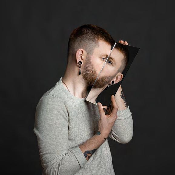
40 | Hollow
Paula Garcia
The Hollow series is made up of portraits inspired by the artist Trine Søndergaard, and is characterised by the presence of the mirror, an element of great symbolic charge that in this case alludes to the personal reality of each one of us that we avoid showing to others. In the photographs, the mirrors, instead of showing what is in front of them, reflect an empty space.
This, together with the partial or total absence of the face, refers to concepts such as the existential void, absence or identity.
42 | Maria Feijóo. Paint, silk and fashion
Laura Cadenas
A visual journey through the workshop that the artist and textile designer María Feijóo has in Santiago de Compostela.
43 | Be Free
Néstor Álvarez
Fashion Photography. Women’s suits with pants and blazer in the same colour, for the springsummer collection...
44 | Essence
Antía Álvarez
When a being we love dies we feel great pain and with it we go through a natural process of life, mourning, a feeling that mixes life with death. Loss produces an internal conflict that every human
being faces at some time, causing a major impact in all areas of his life, resulting from the essence of the loved one who is no longer there and that endures over time. In part, as it made us feel desolate, there is also something inside of us that dies as well. The memories persist in the spaces or impregnate the objects, which often or as times passes, are forgotten and disappear, leaving only the memory and the absence. On many occasions and in my case, where there was life, now there is only deterioration and oblivion. “Resentment” is a project based on the memory of my maternal grandmother Dosinda. She was a second mother to me and when she died a great pain flooded my heart and I discovered new
sensations that I had never felt before, but what worried me the most is to think that at some point I may forget her. At first it was very difficult for me to think that I
would never see her again, the only thing I have left is her memory which, little by little, with the passing of time, is lost and the pain is overcome. But the feelings that remain within me are stirred up strongly each time I return to this space. It was hard to come back the first time, but today
I do not want it to go away, as the essence of my grandmother still lingers in it. I intend to capture it by going through the rooms of this house where the daily life, our daily life, arose, by means of photographs constructed by placing objects in those spaces with my personal ritual, the route I always follow when I return, stopping when a memory emerges, either by a bundle of light, an object or a shadow.
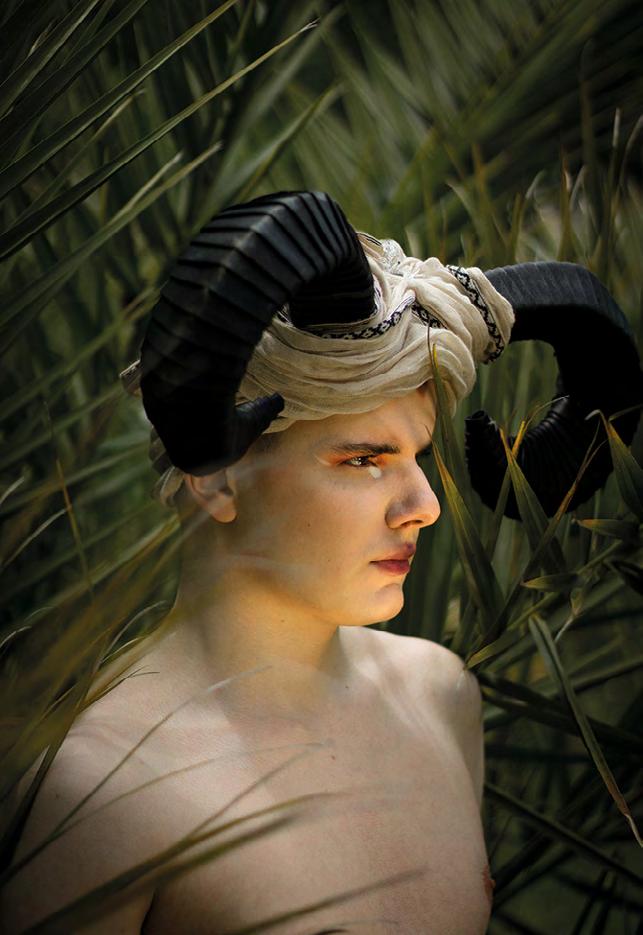
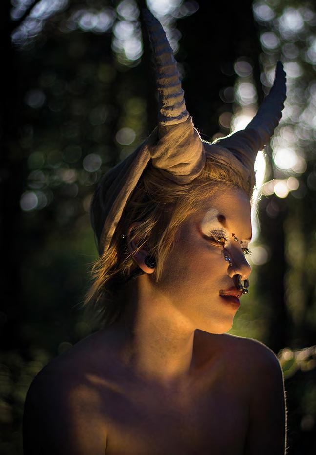
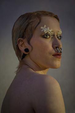
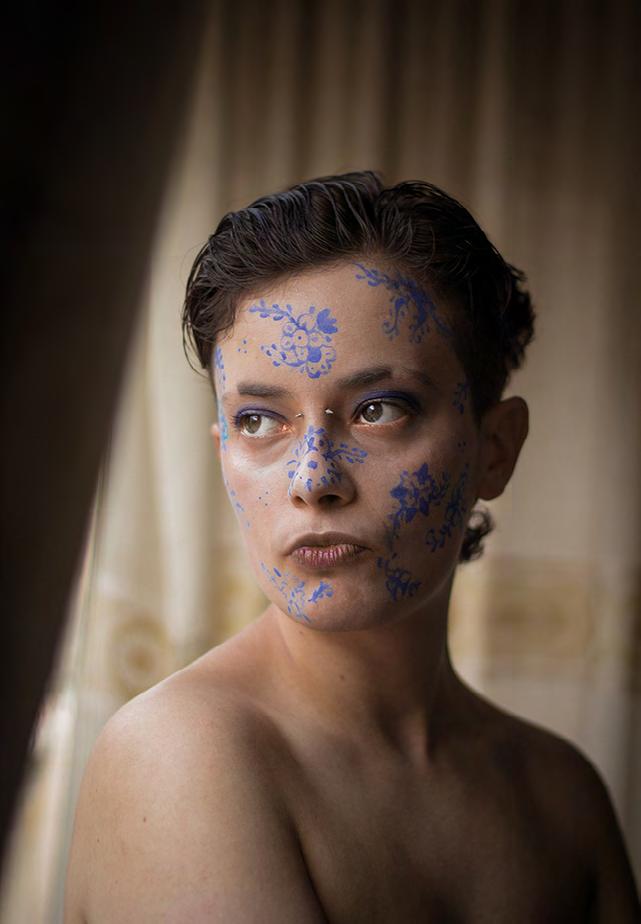
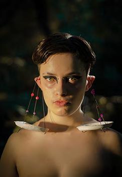
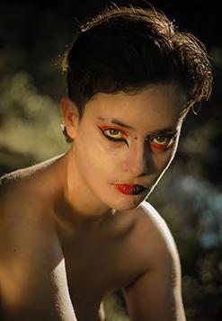
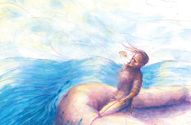
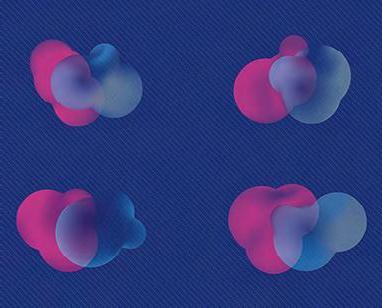
48 | Portraits from Babylon
Marina García
Photographic project on the signs of the zodiac, based on the make-up of Marta Salgueiro, makeup artist and characterisation student. These are portraits in which, at the bias of the make-up, the recreated atmosphere and the type of model, all the zodiac signs are represented. Images, which according to some theories, have been made since ancient Babylon. Each model is linked to one of the elements of nature and is photographed in the three signs that belong to that element: Fire, with the signs of Aries, Leo and Sagittarius; Earth, with the signs of Taurus, Virgo and Capricorn; Air, with the signs of Gemini, Libra and Aquarius; and water, with the signs Cancer, Scorpio and Pisces.
illustration
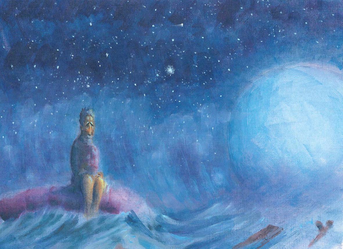
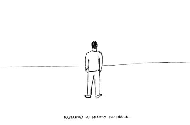
52 | Simon’s journey
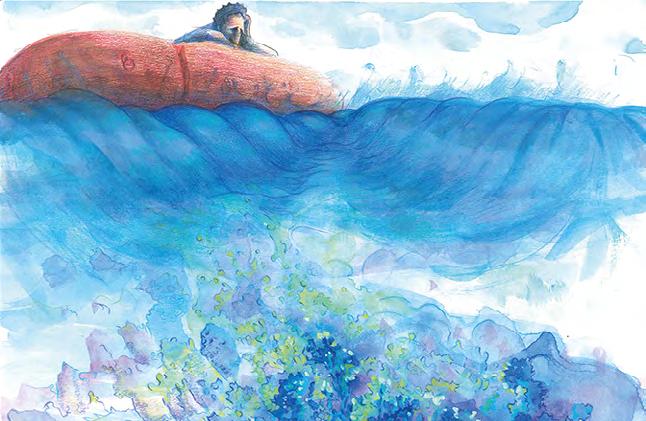
Marcos Puga
At the foot of the trees, those who left the village, when it was raining, would form large puddles in which you could quietly lay down a bicycle. I remember that once upon a time, leaves fell from those trees and stayed on the water. I guess that is why I imagine it was an autumn of high rubber boots and the yellow raincoat from where the mud that we always splashed on each other slipped. I also remember that with a fine straw you could trick an
ant into thinking that it was on its way up the stick and leave it trapped drifting on one of the leaves. What is closer to being God? It was the one who pushed the leaf subtly and was also the one who collected the water that swung the raft with his palm, then he let go of some droplets with his closed fist as if he were
bombarding that insect. He was not a benevolent God; no, indeed he was not... He was a curious God who wanted to know if that stone, from that height, like any natural phenomenon could create the unpredictable waves that would finally turn the leaf.
But I always wanted to know what was that the ant felt...
54 | Amento masculino, ágil caballito marino
Esperanza Valentina Castro
Pre-production to develop an animated short film.
The script, storyboard, character and background design, animation and layout make up this phase. Before the animation, it is considered the indispensable basis of the animated project, as well as the most creative. It straddles the use of traditional techniques such as watercolour, gouache and graphite and digital applications such as Photoshop and Autodesk. By using a different drawing aesthetic
for the background and for the main character, there was an attempt has been made to reinforce the difference between the use of manual and
The personal interest in nature, animation and surrealism are expressed by creating a fantasy story in which the biological function of the main character, a being that is a seahorse and a hazelnut flower at the same time. The dance of these flowers
was the stimulus to generate this work and it aims to enchant the eye of the beholder.
58 | Hoop
Daniel Jiménez
“HOOP” is a children’s picture story about a being who must face his fear and be brave in an unexpected incident. The illustrations were made in acrylic and colour pencil on 360 gr Canson paper and later retouched in Procreate and Photoshop. The format of the book is 19 x 25 cm and has a hard cover, but it changes orientation during the course of the story from landscape to portrait to return to the initial state.
60 | Albino Bambú y el Guardián del Bosque
David Tarrío
Children comic book. It is the fruit of the reinterpretation of a work previously done, in picture book format for the project subject. Digital and traditional techniques. Project aimed specifically at
children and young people. Albino Bambú and the Guardian of the Forest, tells the story of a family of three tigers, who live isolated in the middle of a bamboo forest, under a series of rules they must comply with, the most important of which is that “It is absolutely forbidden to go into the bamboo forest”, so they won’t become targets for the possible dangers that lurk outside. One day Albino Bambú (our protagonist), decides to break this rule and chase a suspicious character into the forest. The comic consists of several characters, including main, secondary and antagonistic. The most important ones: Albino Bambú, our little protagonist, adventurous and carefree, Bengal Bambú, mother of our puppy, hardworking, strong and brave and Maltés Bambú, father of Albino, handyman, somewhat clumsy and fearful. Each of the family represents a different tiger species, as their names suggest.
graphic design
64 | Mael, Marauder Wind
Patricia Hueso
Nowadays mobiles are an indispensable object inour lives. Mael was born from the need to take the mobile phone seriously, to exploit all its possibilities and to anticipate a new portable console accessible to the whole public by creating a new and interesting product. Mael is an open-source, single-player, mobile-only role-playing game. It is a research project in which the strategy used in exclusive console games has been mixed with that of mobile applications. The sum of research and design has resulted in a product that is full of symbolism, clean and comfortable, where everything fits and works. History, design and format
go hand in hand making Mael an attractive innovation project for an audience that holds the future of video games in their hands.
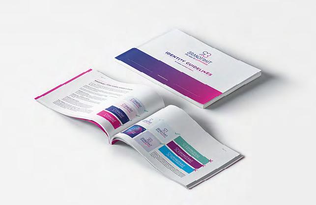
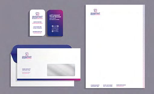
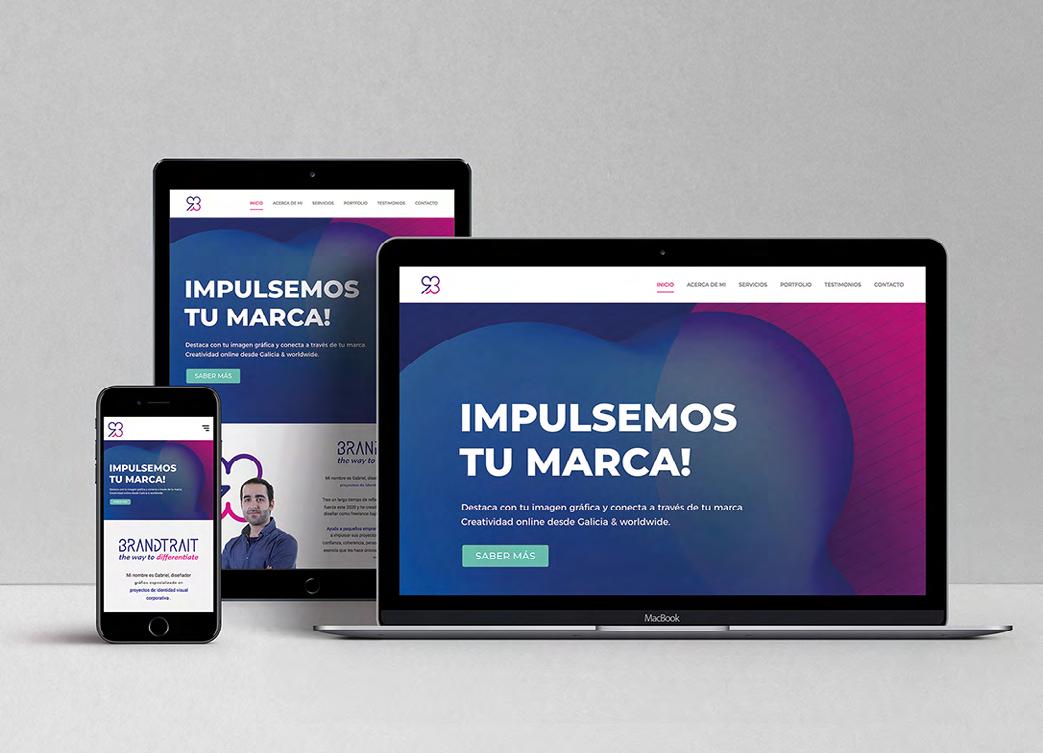
66 | Brandtrait. Online Creativity, from Galicia & Worldwide
Gabriel Martínez
This work is the result of the development of the author’s personal brand and web portfolio. It also includes the brand profile in social networks such
as Facebook or Instagram and the Brand Identity Guidelines, which explains how to use the brand appropriately and what is intended to be conveyed with each stroke, shape, and colour. The goal is to achieve a corporate and visual identity consistent with the style of the portfolio and the personality of the designer. The brand aims to convey optimism and security by communicating clearly through a modern and minimalist language, to be seen as a confident and
determined professional. The main brand values are empathy and freedom. The brand offers online graphic design and creative
direction services specializing in corporate visual identity and aimed at small business owners with big dreams who need to improve their brand identity. Brandtrait focuses on a target that values the time and geographic flexibility offered by a
remote service, without giving up a personalized one-to-one treatment. Doing this work made me think about my skills and ambitions as a graphic designer and how to communicate to achieve my goals.
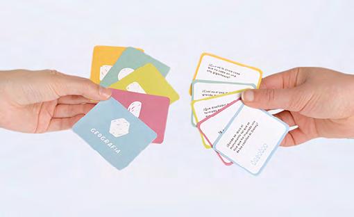
68 | Heii, family anxiety education play kit
Noa Alonso
Much of society hearing the word anxiety does not know what it is or what it does to a person. This fact makes that many people suffer from
anxiety without being aware of it; on the other hand, those who do not suffer from it, interpret it
as an exaggeration to attract attention, leading to confrontations and lack of support. This project was born to help family members understand anxiety and establish bonds in those relationships that have been damaged by lack of empathy or knowledge. Therefore,
this educational kit could be a piece to make available to these people and their families, allowing them to understand and help the person with anxiety in their daily life, and transform that understanding into achievements. Heii consists of heii mr. coco and heii diary. Heii mr. Coco is a question-and-answer game, made up of 5 categories (guess, animals, art, calculus and geography), whose objective is to create a relaxed and fun atmosphere where trust and affection between people is reinforced. All
players, by solving the questions, earn wooden pieces that they will use to create an amulet that they will wear every day. This object will allow you to remember pleasant moments in stressful and annoying situations. Heii Diary is an activity book for two people, which is going to allow you to understand each other a little more and so little by little the word anxiety does not seem like such an obscure term. It consists of 152 pages, the content of which is divided into 5 chapters formed by sessions containing activities, games of all kinds and at the end a section where detailed information on the subject is shown. The particularity of this book lies in the distribution of its pages, because it makes so that both people have to do the activities at the same time. The book is covered in fabric with the logo embroidered, playing so with the texture and volume. The whole project is impregnated with tranquillity, fun, well-being and above all closeness, so it has a multitude of elements, textures and colours that enhance and reinforce the sensations. Finally, everything is protected and stored in a solid wooden box, which can be used as home decoration. 70 | JBL, Real Experiencie
Andrés González
This project aimed to create a fictitious promotion of
a new portable speaker of the brand JBL that would have been released soon. This promotional video focuses on the concept of user experience that allows you to enjoy these speakers, immersing you in a unique experience. It is set up so that the subject of the video, the character, is at home, lying on the couch and he wants to listen to some music on his mobile to entertain himself, he is enjoying the music when suddenly a notification comes up on his mobile
and he sees that it is about a new device being connected. The music stops when the news arrives, and the character looks at the screen with a strange expression and sees that it is a JBL device. When connected, the screen absorbs the character immersing the viewer and transporting him to an outdoor environment where you can see a kind of platform where several characters are dancing to the music on a kind of stage that turns out to be the speaker. The scene changes with the movement of the camera until it reaches the protagonist’s living room where it all began.
72 | Dostazas
Claudia López
Dostazas is a company dedicated to sending home food containers with homemade food and totally gluten free. His work philosophy is to help people eat well every day regardless of their pace of life, especially coeliacs. In addition, it aims to standardise and not label these people or the brand itself, thus opening up to non-coeliac customers to try their products. The personality of the brand is young and modern, with a close communication, but without leaving aside the more adult target audience. It also seeks to convey the idea that the products are homemade, made in a traditional way and have a high quality, but without turning into a luxury product. With their name, they provide the popular saying: “Non queres caldo, pois toma duas tazas” (“You say you don’t want broth, so there you go two bowls”), it is intended to establish a special bond with the consumer, appealing to a remorse of the popular origins of home cooking, as well as the feeling of being filled with the food that will come to their homes.
Following this idea of communication, an identifier
is created with curved and friendly forms, but with a defined character.
The packaging created is consistent with the brand image as youthful and close to the customer, which will create an impactful unboxing experience, in addition of allow to make their shipments correctly and effectively. The brand also
includes the app, which has a clean and pragmatic navigation, which complements a satisfactory user experience. In short, the aim is to create an identity for the company through a powerful identifier with a
great hook and memorable naming. As well as a functional and aesthetically attractive packaging line, with a simple and functional app.
74 | tumba
Olalla Fernández
The aim of this project is to create a brand for a cultural and artistic creation space, where a series of services related to these fields will be offered.
This space includes the creation of a collective of designers and artists.
Workshops, lectures and exhibitions will take place in this space, along with a shop and a book lending service. Given that this a space intrinsically related to design, branding is not only a necessity but an especially important added value. Due to the intention of bringing the space closer to a remarkably diverse public we need a powerful and simple brand image. A dynamic brand is therefore chosen, with a main identifier and other auxiliary
identifiers based on it.
The objectives of this project are to positioning the brand, and initiative as a design centre in Galicia, as well as becoming a tool for the creation and dissemination of the work of the collective and of culture, design and art in general.
articles
76 | Moments of truth
Frank Buschmann
At the end of 2019 I received an invitation from the EASD Antonio Faílde of Ourense to participate in the Art and Design Conference CREA with a talk/ workshop about the art of transforming wood into my work. I have to say that the context offered to
share my experiences and knowledge excites me like no other, since schools are like arable fields:
fertile grounds with great transformative potential. The conference was going to take place in April, the poster announcing it was already being printed and I had my contribution more or less prepared when what had to happen, announced by scientists years ago, happened. One day in March we wake up and nothing resembled the day before. Suddenly, small was the new big. The CREA Days and so many other things no longer existed. The population of the planet was locked down in their houses (those who could), and quickly the most dominant question in our minds was: what will happen tomorrow? At that moment of reorganisation and reorientation, a new invitation arrived: since face-to-face events were no longer an option, the talk/workshop would be replaced with a text for the school magazine, “Anuario”. We have to share the distance. And here I am now trying to take some distance from myself and my thoughts, to look for priorities and sort them out, keeping in mind the topic of this text. I ask myself: Is the usual approach still relevant? And how important is a speech about a chair, a table or a stool? My intuition answers out loud that it is not! I could talk about how, for me, woodworking is always a transfer of chained planes in which the final form of the object pre-exists on the previous
plane. And how the perfection of the object is each and the sum of all these planes and how each step then demands perfection for itself and how each step is the object. Or perhaps I could talk about how the pursuit of perfection in both form and finish is like asking me
how long the coast of Galicia is and finding out
that it is infinite, if we apply the measuring method
used for Koch curve, the origin of chaos theory. Perhaps I could talk about my life and the journeys that led me to set foot on four continents. From my learning to understand that we live on this “spaceship earth” with a shared responsibility, under a reality in which the micro and the macro have a close relationship and a strong link with the human and that therefore individual integrity is indispensable for the integrity of the whole. I could illustrate this vision by talking about the video “The power of ten” made by the Eames in 1977 for IBM or by describing the images of the Nordic mythologies where the tree represents the link between the earth and the cosmos. I could talk about how the ego and shortcuts corrupt the object and about “tensegrity”, a word invented by Buckminster Fuller to express the tensional integrity based on the observation of the planets and stars in the universe where everything is connected but nothing is touched. I could talk about the characteristics of the behaviour of wood, its tensions and its dynamic state and how the joints used to build with wood are not only aesthetic or purely constructive elements but also metaphors of openness to new possibilities or metaphors of commitment, learning to accept limits but never the complete surrender of freedom. I could talk about how the toolbox with which we build the future should also include the tools of the craftsmen, and I do not mean the hammer, the saw, the needle or the scissors but the tools are made of their attitudes and capabilities. For example, intuition, immensely developed, or patience, or foresight, care and the ability to do a good job with the sole aim of doing a good job. I could talk about design and about how, in order to celebrate the “uniqueness” of an object, one cannot stop at what one sees at first sight but
rather delve into the complexities that a single form can contain and then be able to recognise them. I could talk about how I developed this idea with A cadeira #3 (the hair #3) by investigating the origins and relationships of a sequence of chairs — Conoid, Kufenstuhl, Zigzag and Z Rasch — considered contemporary classics in the design world. Speaking of design, I could also tell you about the “Shakers” and how this utopian community of the late 18th century was the cradle of contemporary
design and about the beautiful phrase by Thomas Merton that reveals where the magic of their chairs lies, attributing to Shaker “the ability to believe that an angel could come and sit in it” As I said at the beginning, my intuition warned me that on this occasion it was better not to talk about furniture or design but to bring to the fore the importance of cultivating the long view, the distant horizons, whether these are celestial, visible or astronomical, behind them lies the utopia which, although not habitable, serves as a compass and a motor. Think about the beauty of the fact that the earth is a ball and not a plate as the flat earth
movements want us to believe. The ball gives them a new horizon at every step we take forward, and thus it could show us how that every step is the object itself. But no, I should not be talking about all of this. The moment we find ourselves, full of multi-
systemic failures, is a moment when the truth is staring at us in the face and it is begging us out loud for something else, an alternative. The silence and a collective effort to think if we are capable and
have the courage to accept it. If we are able and willing to be part of an integral whole that requires individual integrity, integrity about what we do, how we do it and why we do it. I finally leave you with Buckminster Fuller’s voice
from February 26, 1983:
“[...] I think we are in a kind of final examination as
to whether human beings now, with this ability to acquire information and to communicate, are really qualified to assume the responsibility entrusted onto us. And this is not an examination of the types of government, nothing to do with politics, nothing to do with economic systems. It has to do with the individual. Does the individual have the courage to really accept the truth?” 78 | The Kennicott Bible: A Journey of Encounters
Manuel Gago
Choosing a page. I could not believe that this choice could be the big challenge. I thought that once the negotiations were over, the security conditions were assured, the protocols were established, everything was done. But it turns out the hardest part was choosing the opening page. The introduction letter of one of the most beautiful codices of the European Middle Ages. And, of course, the artistic summit of the books made in Medieval Galicia. I had to choose among the 238 illuminated pages of the 922 pages that make up the codex. That codex was the Kennicott Bible, a very rich manuscript carefully preserved in the Bodleian Libraries of Oxford. We had achieved that, for the first time, this codex “had come home”, as
the Bodleian curators themselves described the process. It was one of the highlights of the exhibition “Galicia, a story in the world”, which was physically held at the Gaiás Museum in the City of Culture from 15th November to 12th April 2020 as the first exhibition in the programme of the
Jacobean 21st, and which can be visited virtually on the website of the City of Culture (http://www. cidadedacultura.gal). The lockdown meant that the exhibition had to be closed a month before its official closure. In this exhibition, we explored the
interactions, presences and influences of the world
in Galicia and of Galicia in the world through history. Two floors of the Gaiás Museum that on my first visit
as curator seemed enormous and, when we began to design the exhibition and choose the pieces, then it seemed small. The Kennicott Bible was central to the exhibition’s narrative. As few other objects, its relevance was given by being an excellent example of the confluence between an artistic, visual and tangible
result, and an inner-history that provided the object with a singular biography for the Galician society of the 21st century. The Bible was finished in A Coruña
on Wednesday June 4th 1476 by the scribe Moisés ibn Zabara, commissioned by Isaac, son of Solomon of Braga, a wealthy merchant from A Coruña. But in the Kennicott Bible there is also a phenomenon not often seen in Jewish Bibles: the work is also signed by the illuminist, Joseph ibn Hayyim. This was the only work we can attribute to him, but judging by the mastery of his art, he must have been well known in his time. Personally, I am also convinced that he had a sense of humour. Researchers who have investigated the codex believe that Moses and Joseph worked very coordinated, hand in hand, to gradually building this masterpiece. Along with the 24 books of the Tenakh (the Old Testament), the Bible added a grammatical treatise, the Sefer Mikhol, possibly commissioned in the interest of the client, Isaac. Although the illustrations are found all throughout the codex, it is precisely in the grammatical treatise - perhaps because of its lesser solemnity and sacredness - that Joseph ibn Hayyim let his creativity flow, including twenty-seven pages
full of lavish arches that frame the text. For a time, this commission from A Coruña was considered to be a kind of rare exception. The data we have about the Jewish communities that existed in Galicia are scarce, linked to administrative documents. We do not have objects from the period that reflect their culture, society or way of life. But if
we consider that also in the same period there was in A Coruña the lavish Cervera Bible, composed at the beginning of the 14th century, and considered as one of the codices that inspired the Kennicott, we could speak —although it had been at a hypothetical level— of a Jewish cultural environment in A Coruña, linked without a doubt to the existence of a
port of commercial relevance and the a community that had economic resources to cultivate it. And that community was not isolated or ghettoised. The Kennicott Bible is recognised for its ability to express, through the expression of art, the existence, and confluence of the different artistic
traditions of the Iberian Peninsula. Along with the passion for geometry and traditional symbolism typical of the Hebrew Enlightenment, the Kennicott brings together human and animal fantasy representations from the Christian tradition and motifs of clear Muslim inspiration, which can be seen on the roofs of the Alhambra in Granada. The leather box itself, which has protected the book for five hundred years, is a magnificent work of Muslim
craftsmen. In the Kennicott Bible three cultures, three religions and three ways of seeing the world converge. I would be happy to say that, in that quality and delicacy, in a way that is unique in the European context. The sea plays an important role in that story. In 1492, only sixteen years after its completion, the Bible and its owners had to take the road to exile. With the decree of expulsion of the Catholic Monarchs, the Jews were forced to leave the kingdom of Galicia. We also know that many of the members of the Jewish community of A Coruña marched on a boat chartered especially for the occasion, carrying many valuable items. Perhaps, among them, the Kennicott Bible. The codex lived a haphazard life in different
Jewish quarters of North Africa until it was acquired in Gibraltar at the end of the 18th century by an Oxford canon, Benjamin Kennicott. The Bible, its biography and its prodigious visual feast, has the capacity to dialogue with the women and men of the 21st century, our vision of the world and international issues. We are the ones who recognise the underlying conflict behind the as a kind of solution. In the exhibition Galicia, a story in the world, we used the Bible as a message for the new generations, but also as a reminder that in the face of simplifying and mitigating interpretations, the past and the societies of the past were also complex. As opposed to a monolithic idea of Galicia, there are many Galicias. The return of the Kennicott and Ranat also an emotional tribute to the compatriots who had to leave their homes to conceive the world and spirituality in a different way, and a warning
of the cultural, intellectual and human wealth that countries lose when such a thing happens. And I am back to the paragraph at the beginning. Choosing the opening page from the Bible for the exhibition. I struggle with the display of books at exhibitions. A codex locked in an armoured cabinet is like a bird in a cage. That is why I am always thinking about technological systems to overcome this problem and make the visit to a book exhibition more pleasant and productive. The person in charge of the Bodleian Library allowed me to examine —before closing the Bible in the showcase— all the illustrations of the original, and it is certainly one of those experiences that remain for a lifetime. Although there is an excellent facsimile of the codex, with which I worked previously - there are several copies in Galicia —I have to say that the modern copy does not even cast a shadow on this 15th century original. The colours, the texture, the state of preservation, as it had been a book destined to overcome time. It impressed me more than I had anticipated. The curator at Oxford looked at me, as if giving me one last chance and selecting the page. I do not want to deceive you: that aspect is negotiated very early in the process, so everything was decided from the beginning. But it seemed as if I had been allowed the opportunity for repentance. All the pages were lavish. But once again it was clear to me that we had to show: folio 305r. It shows in great detail a Galician ship from the end of the 15th century, with two crew members on the bridge. In the sea, a whale devours Jonah. That ship must have been very much like the one the Jews in A Coruña had to use to rush out of their homes. That sheet was a tribute, but also a magic window through which the Galicians of the 15th century could communicate with those of the present around a universal message. It was a farewell, but also a reunion.
Manuel Gago Marino (Palmeira, Ribeira, 1976) took a doctor’s degree in Information Sciences at Santiago de Compostela University. Nowadays, he is the director of culturagalega.gal, the cultural divulgation portal of the ‘Consello da Cultura Galega’ and Professor in the Faculty of Communication Sciences at Santiago de Compostela University. He is the editor of Capítulo Cero (www.manuelgago.org/blog), one of the reference blogs of the Galician network, in the field of historical, scientific, lifestyle, gastronomy and cultural popularisation, and for it he has received prizes and mentions from different Galician professional groups. He is the founder of patrimoniogalego.net, the social network of the cultural heritage of Galicia. As exhibition curator, Gago was responsible for Galicia 100 in 2016-17. Objects to tell a culture, produced by the Consello da Cultura Galega in collaboration with The Foundation and exhibited in Santiago de Compostela, A Coruña and Vigo. In 2018 he curated the exhibition Alba de Gloria by Castelao. An experience produced by the Consello da Cultura Galega and inaugurated in the church of Sano Domingos de Bonaval. In 2019, he curated the exhibition Galicia, un relato no mundo (Galicia, a narrative in the world) at the Gaiás Museum in the City of Culture, the first of the three great exhibitions of Xacobeo’21.
81 | Galician Craftmanship. Brand Building
Elena Fabeiro
Unlike a few years ago, when the global production was flooding everything and everywhere, the current
trend is to value the hand-made aspect and the time dedicated in the production. The slow made is a reality, and more and more people give priority to the local, the next, the sustainable, and, above all, the history of those people who are behind the pieces. In this context, craftsmanship is consolidating its position, bringing an added value that is increasingly in demand, so that it is becoming a professional outlet for the newest ones, who are strongly promoting crafts while respecting traditions and enriching them with freshness and modernity. The EASD schools of art and design are playing a fundamental role in their professionalization and competitiveness, promoting training, and encouraging the talent of these new generations who are committed to craftsmanship, to the connection with raw materials and to our roots, defending our identity. Craftsmanship is playing an important role as a new channel of access to the market and in recent years there has been a notable incorporation of young people into the workforce through craft activities. They enrich the artisan fabric, with new skills and disciplines, trainings, visions, and business models, as well as innovation at all levels (materials, techniques, products, and processes). Aware of the importance of craftsmanship as an economic and cultural engine of our Community, from the Xunta, through the Galician Public Crafts Foundation, we are promoting innovation, design and quality as defining elements of a
heterogeneous, diverse, and rich craft sector, which keeps alive craftsmanship in more than 80 different As a result of the work developed together with the sector, Galician craftsmanship is becoming more and more visible and strengthened. There are 3150 craftsmen registered in the General Register of Crafts of the Xunta and 705 workshops registered under the trademark of Artesanía de Galicia. Half of the new workshops are made up of new talents, children like those who are being trained at this School of Higher Art and Design in Ourense, who enrich the craftsmanship sector, renew it, and bring it up to date. The Artesanía de Galicia brand offers a common,
harmonious, coordinated, and representative image of Galician craft products, making it a sign of prestige and a guarantee of quality for consumers. Thus, Artesanía de Galicia includes high-quality, carefully designed products that tell a fascinating story: the roots of our culture combined with contemporary design, with the personality of the creators and with the mastery of their hands. With a view to strengthening and protecting craftsmanship as a defining cultural value of our
society, in the Galician Public Crafts Foundation we have among our objectives to develop lines of research aimed at specialising and perfecting production techniques that will improve the quality of craft products, as well as optimising the production process, as we understand that innovation, design and quality are the foundations on which craftsmanship can be built. The main aim of the Foundation, created in 2003, is to provide the craft sector with a specialised infrastructure so that it can develop programmes of assistance, training, innovation, cataloguing, promotion, marketing, and any other aspect inherent to the culture of craft trades in Galicia. In the current socio-economic context, it is also necessary to adapt to the circumstances we are living in and to the progressive digitalisation of markets and new consumer habits. Therefore, we are promoting new forms of marketing and communication with customers, implementing digitalization and the use of new technologies as essential tools in the current scenario. In this sense, we are encouraging commercial promotion actions and access to innovative sales channels, both national and international, through the organization and participation in events, fairs, competitions, and virtual pop ups of commercial and artisan interest. In this new context, it is necessary to promote digital marketing, through ephemeral stores, platforms, or marketplace pages. I am confident in the ability of the students at
this school to make good use of their skills and the creation of handicrafts, which will help them to connect with themselves and with others. In faith that this formative period in which they will mix emotions, creativity and learning will serve to strengthen their capacities to open up to new markets in which craftsmanship is a rising value that is gaining prominence in homes, in gastronomy or in personal image, with increasingly diverse applications marked by their personality and authenticity.
Manager of the Galician Public Crafts Foundation.