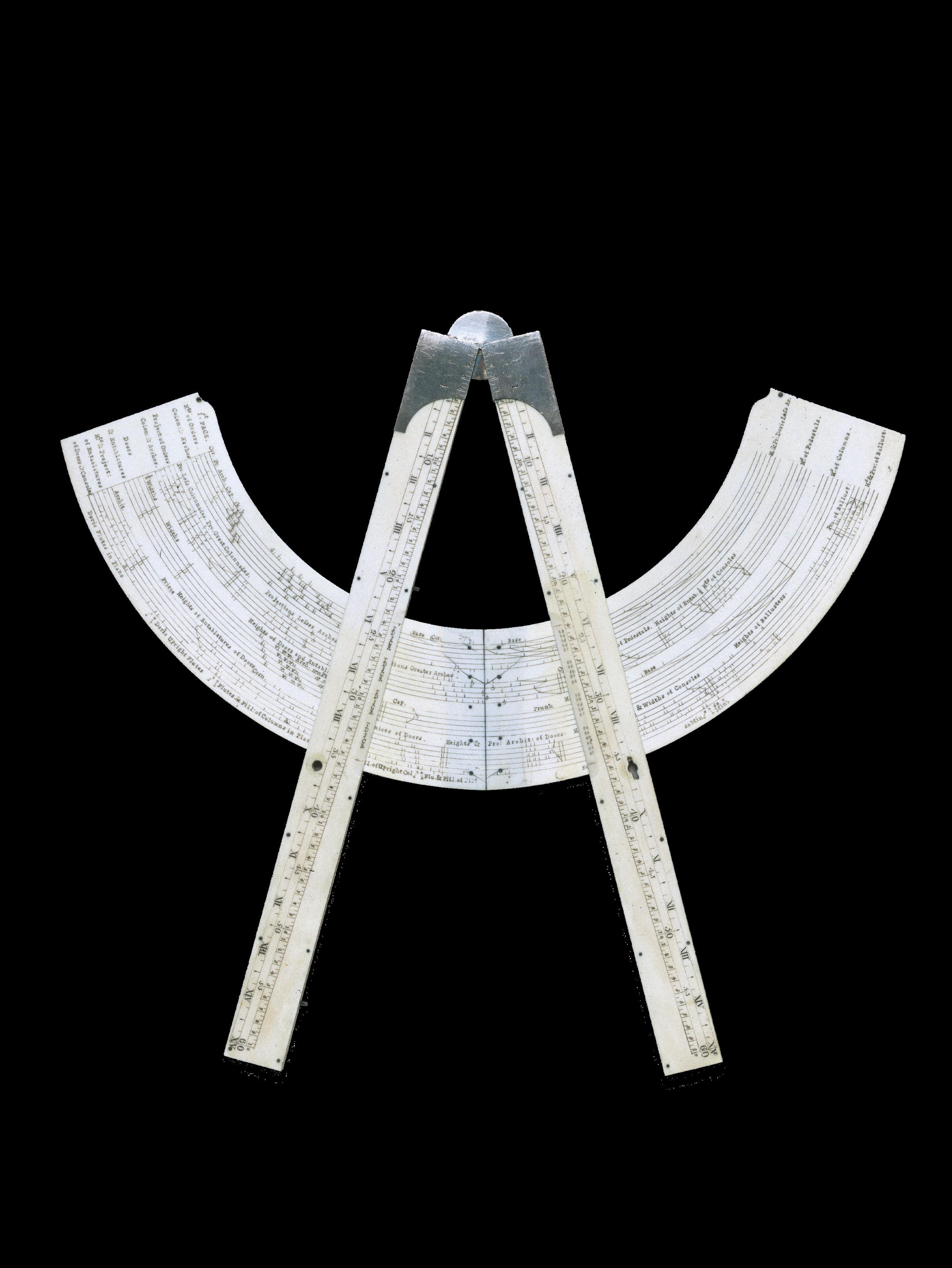
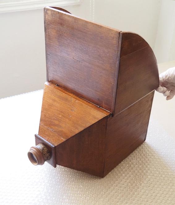
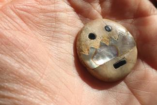
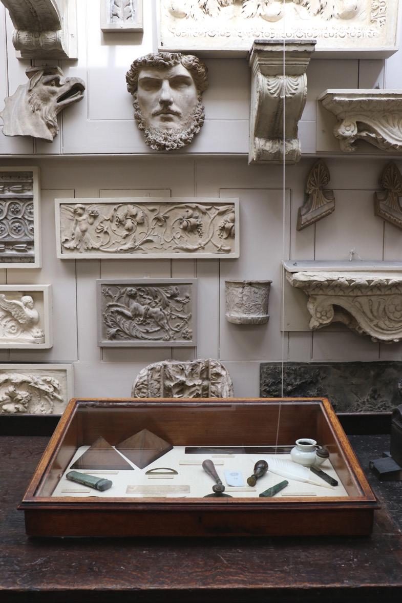
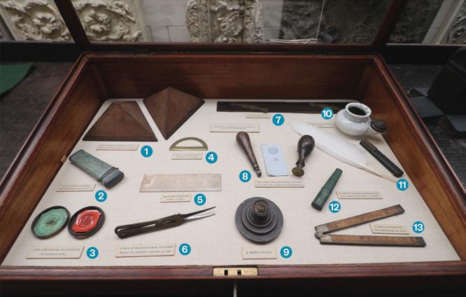
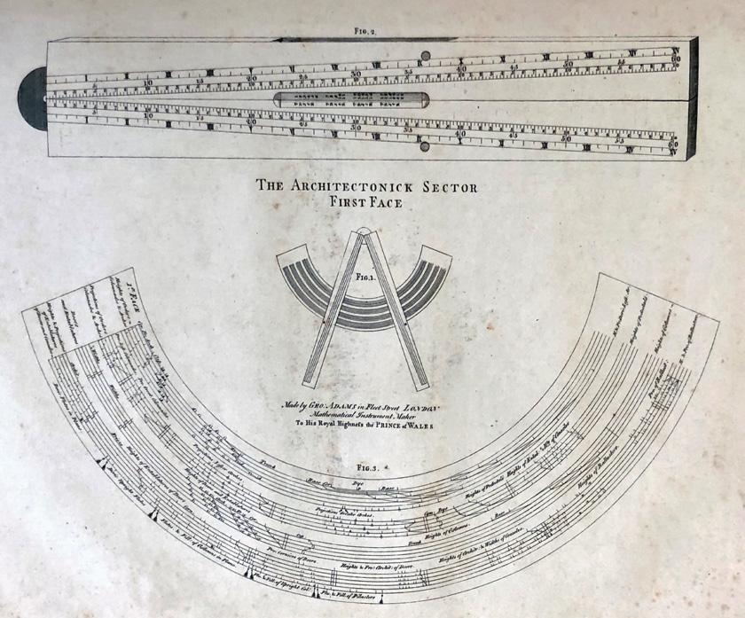
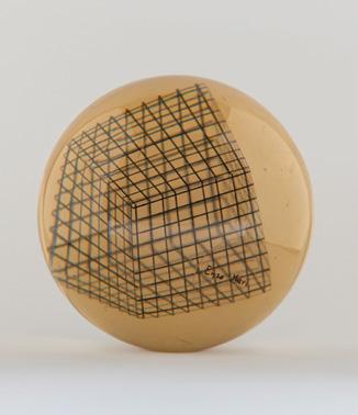
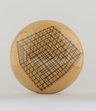
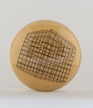
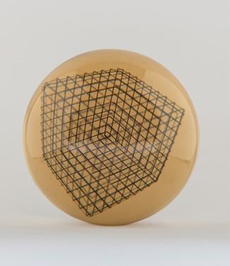
12 inch architectonic sector in silver and ivory, made by George Adams, 1770. 32 x 34.5 x 1.5 cm. Object 1927–1010, Science Museum Group.
Edited by Mark Dorrian and Paul Emmons
In memory of Kurt Forster and Deanna Petherbridge
Helen Dorey on Sir John Soane’s drawing office 75
Pablo Garcia on the Zeiss Stereoautograph
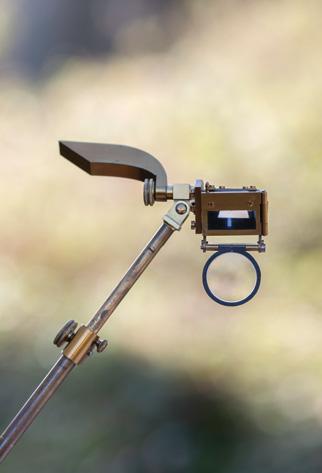
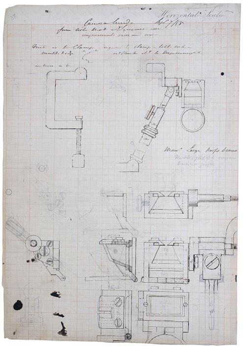
Philip Steadman on Isambard Kingdom Brunel’s camera lucida 175 Sue Palmer on Soane’s instruments 195
Neil Bingham on the history of drawing instruments
Rosie Ellison-Balaam on Enzo Mari’s optical dynamism
Paddi Alice Benson’s laser drawings
Laura Harty on Aldo van Eyck and circles
84
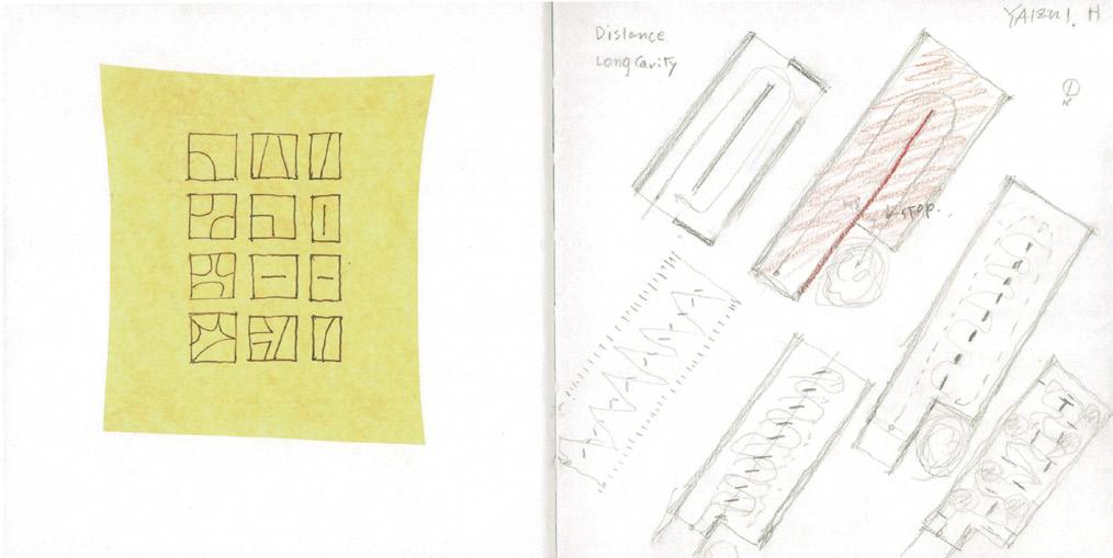
Pencils, Computers, Cameras: Itsuko Hasegawa’s Instruments of Distance — Ahmed Belkhodja
02
Canaletto’s Venetian Sketches and the Camera Obscura — Philip Steadman
150
Grids and Squared Paper in Renaissance Architecture — Fabio Colonnese
114
Instruments of Uncertain Occupation — Nat Chard
44
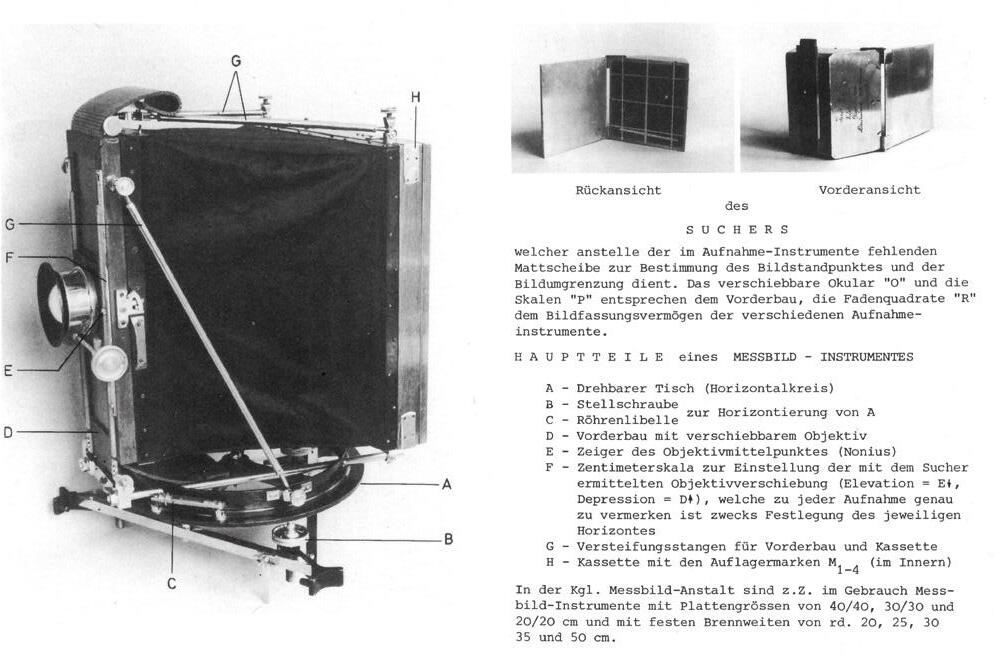
The Art of Measuring Images: Albrecht Meydenbauer and the Invention of the Photographic Survey — Emma Letizia Jones
236
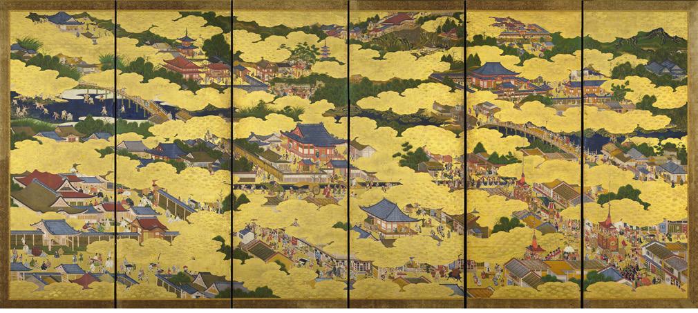
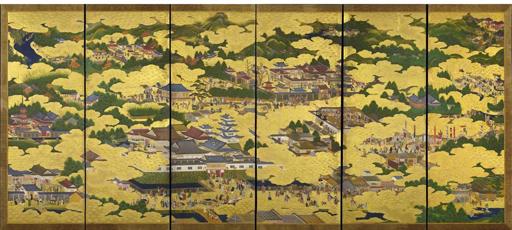
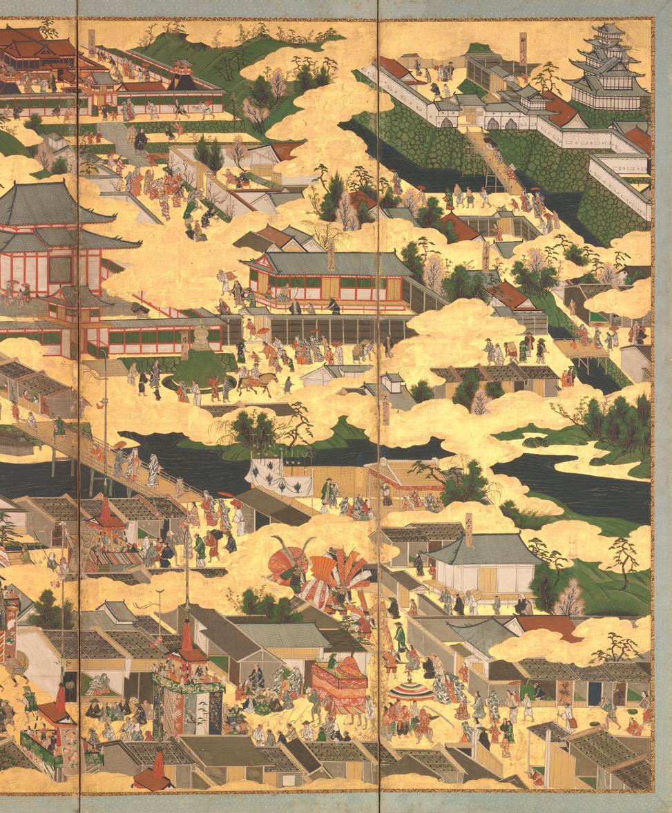
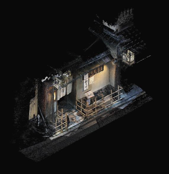
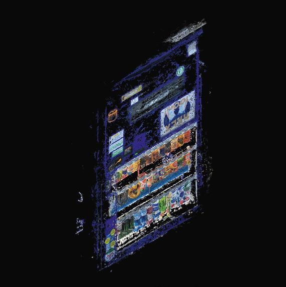
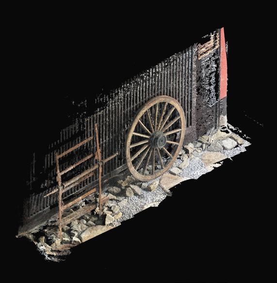
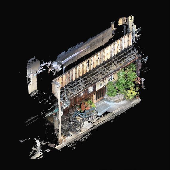
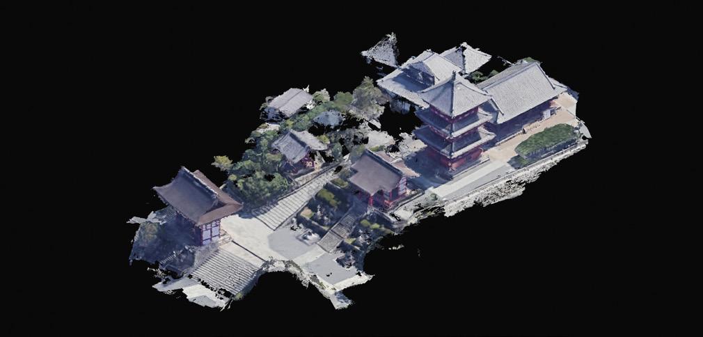
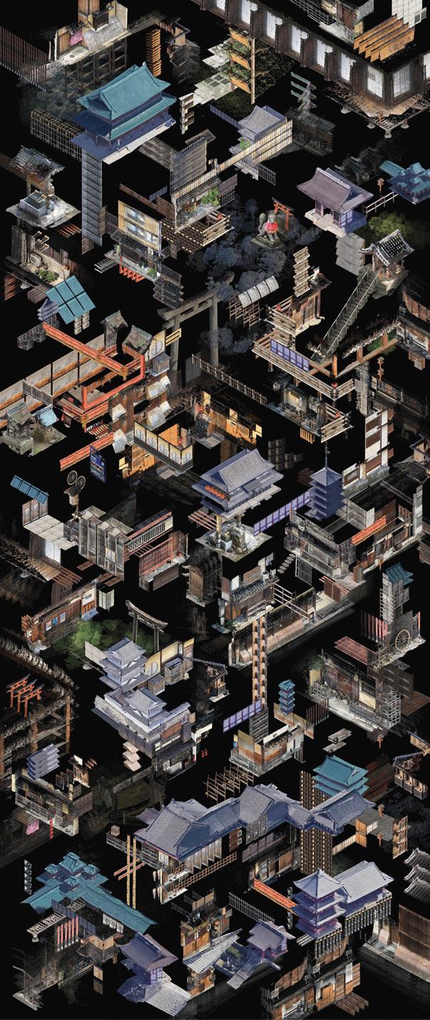
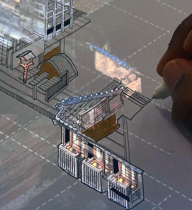
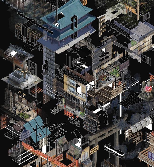
Devices of Dream-Like Precision: Tracing the Streets of Kyoto using Photogrammetry and Layered Drawing — Sayan Skandarajah
206
The Sun as Drawing Machine: Towards the Unification of Projection Systems from Villalpando to Farish — Francisco Javier Girón Sierra
178
On Lines Terrestrial and Occult: Friedrich Gilly, Alberto Sartoris, Adolphe Appia, and the Matter of Perspective — Ross Anderson
266
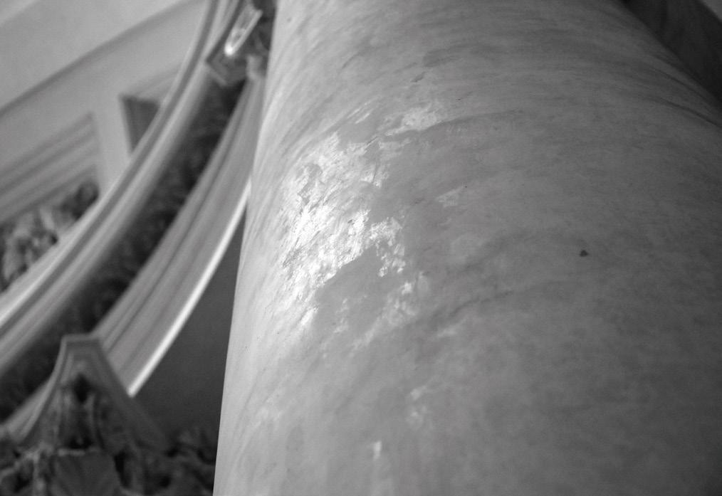
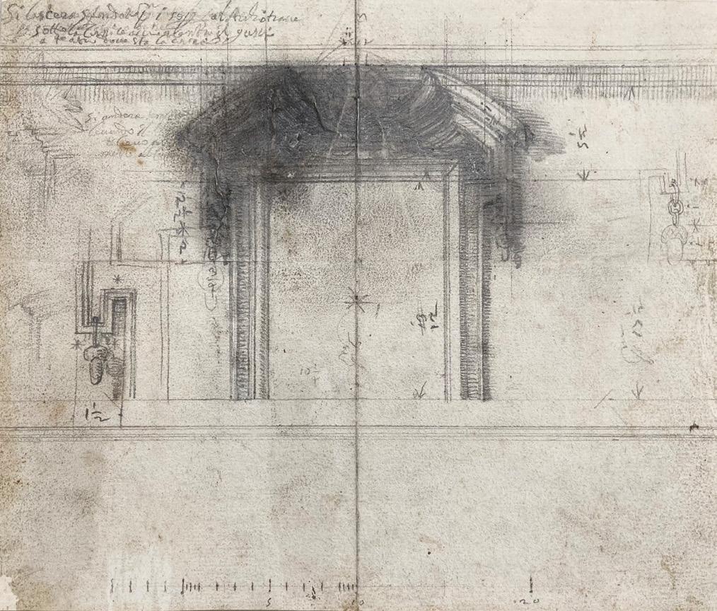
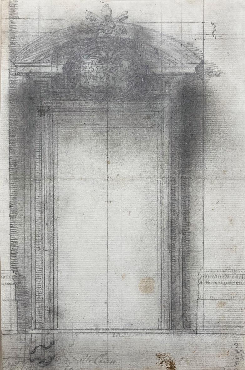
Borromini’s Smudge — Jonathan Foote
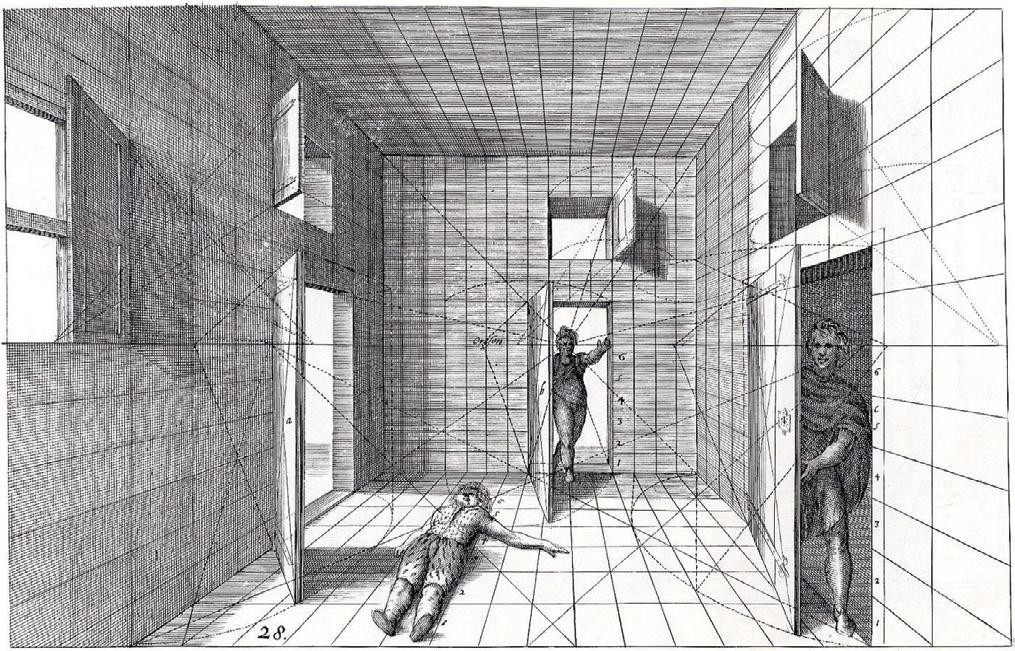
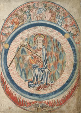
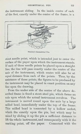
Plate I, from George Adams, Geometrical and Graphical Essays, 2nd edn (London: J. Dillon and Co., 1797). Reproduced under a Creative Commons Attribution 4.0 International (CC–BY) licence with the permission of the National Library of Scotland (Newb.2989). https:// creativecommons.org/licences/by/4.0/.
Editors’ Introduction —
Place the thumb and middle finger of the right hand in the opposite hollows in the shanks of the compasses, then press the compasses, and the legs will open a little way; this being done, push the innermost leg with the third finger, elevating, at the same time, the furthermost, with the nail of the middle finger, till the compasses are sufficiently opened to receive the middle and third finger; they may then be extended at pleasure, by pushing the furthermost leg outwards with the middle, or pressing it inwards with the fore finger.1
This is George Adams, instrument-maker to the King, describing in detail something that we might think simply self-evident and banal – how to open a closed pair of compasses. The intricacy of the description, with its staged set of procedures, anticipates the accounts that he will shortly provide regarding the use of the device for transferring, dividing and scribing, and leads us to imagine our hands as themselves ‘instruments’, the precision of the device disciplining the body that will come to wield it. In the preface to his translation of Nicolas Bion’s Traité de la construction et des principaux usages des instrumens de mathematique, in whose wake Adams was writing, Edmund Stone had observed that ‘MATHEMATICAL INSTRUMENTS are the Means by which those Sciences are rendered
Mark Dorrian and Paul Emmons
useful – the Affairs of Life. By their Assistance it is, that subtile and abstract Speculation is reduced to Act. They connect, as it were, the Theory to the Practice, and turn what was bare Contemplation, to the most substantial Uses.’ 2 Here instruments are presented as mediating objects that negotiate between the ideal realm of geometrical figuration and that of material reality, and the exactitude toward which they strive is reflected in their own material constitution and the forms they take. The mediation brings a certain loss as well as profit, even if Stone’s emphasis comes down firmly upon the latter – the absolute is diminished, but this is the necessary precondition for the bringing to bear of mathematical knowledge upon the world. The legs of compasses straddle domains.
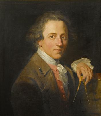
Signifying the demiurgic activities of measuring, apportioning, and setting in proper relation, compasses or dividers would become the characteristic emblem of architects, appearing in the frontispieces of their treatises and in their portraits, in which they are depicted as receiving or holding them – as in the 1776 portrait of the young John Soane, which Sue Palmer reproduces in this issue as part of her article on the drawing instruments of Soane’s office. Such images allow us to recognise that, as symbolic objects, instruments are never just narrowly functional and instead are things whose associations, morphologies and forms
of action carry meanings for us and engage our imagination in manifold ways. Throughout history, tools have exerted a powerful, even uncanny, fascination, exuding simultaneously promise and threat. As objects that, by turns, extend, amplify, and refine capacities of the body, and in doing so both mimic and reorganise it, so they have been imagined to display ‘character’ (explored, for example, in Toolbox, the 1996 book by the Mexican poet Fabio Morábito) or even to operate magically under their own volition. In ancient Athens, building tools like an axe that fell and injured someone were tried in a court of law with all the rights of a human defendant. If convicted, the tool was banished. 3 The esoteric power of tools is often relayed through ritual. Prescribing observances for the first entry into a newly constructed house, the medieval-age South Indian architecture treatise Mayamata directs that: ‘The builder’s implements are arranged on strewn grains contiguous to vases in the west. Offerings should be made to them and [prayers] should be pronounced from the middle of them.’ 4 Afterwards, the architect is instructed to stand and salute all the tools before carrying them away. The 15th-century Chinese building manual Lu Ban jing recommends the ideal number of tools to be 28, corresponding to the number of constellations in the sky. 5 And yet in 1615 we find Vincenzo Scamozzi cautioning that those who ‘have come to believe that to draw well one has to rely on the quality and beauty of the instruments … deceive themselves, because the beauty of the invention, the elegance of their form, and the levity of the wrist in guiding the hand, accustomed to drawing well, prevails over everything else’. 6 William Ford Stanley would preface his 1866 treatise on drawing instruments with an epigraph drawn from the writings of the poet and statesman Alphonse de Lamartine: ‘It was the hand of man which was the only machine of the spirit.’ 7
Architectural drawing has long been executed with the use of instruments which become somatically incorporated, so that even ‘freehand’ architectural drawing comes to reflect their influence. Over 2,000 years ago, Vitruvius instructed the use of the straight edge and compasses for drawing plans, the same instruments allowable for constructing Euclidean geometrical proofs. 8 Until recently, drafting tools were known as ‘mathematical instruments’, which encompassed a diverse field of procedures for measured geometrical drawing shared by architecture, astronomy, cartography, engineering (including ballistics), navigation and surveying, and which incorporated optical contrivances including devices for drawing in perspective, such as the camera lucida.
While mathematical instruments aim at universality (a circle, or straight line, or right angle is to be true irrespective of wherever and whenever it is drawn), there is, at the same time, an affective dimension in their use, which makes them not simply
equivalent. This may be to do with their provenance (with the way an instrument passes through time and our sense that something is conveyed through it), with the way an instrument ‘feels’, and with the pleasure that derives from drawing with it. Around these, attachments grow up that give a specific value to the use of something. We see the presence of this sensory aesthetic quality in, to take one example, John Farey’s discussion of rulers when he writes: ‘Ivory is the best substance for small rulers and divided scales, because being so smooth, the drawing pen slides freely against it, and draws beautiful lines.’ The only problem, he continues, is its ‘liability to warp on every change of the weather’, and so he recommends cutting it from the ‘tooth’ in such a way that the grain of the ivory radiates from the centre of the ruler ‘to appear something like the feather of a quill’, this ensuring that contraction and expansion are regular in all dimensions. 9 Moving away, and consciously so, from mathematical instruments, in her contribution to this issue Laura Harty gives us a striking example of the affective power of something taken up as a drawing tool when she discusses Aldo van Eyck’s propensity to use appropriated objects to draw circles with. These included, it seems, a totemic amulet for which he harboured particular affection and whose image he reproduced in his circularplan Sonsbeek pavilion. It is something that seems to bring an entire thought-world to the work and to enchant it.
This example also allows us to recognise the way things harbour latencies or capacities that allow them to unexpectedly enter the stage of drawing and to play a role upon it. John Ruskin, for example, recommended stale breadcrumbs for the removal of pencil marks so as not to ‘waste the good bread, which is wrong’, making of them an instrument whose edibility resonates with the later characterisation of Carlo Scarpa’s eraser, by his associates, as a ‘stomach’.10 (The intimate relation of drafter to drawing instrument is further exemplified by the modern practice of moistening a plastic eraser with one’s saliva to make it more efficacious for removing ink from Mylar plastic drawing sheets.) Archizoom famously used a typewriter, with its incremental character spacing, tabs and line return, to set out the spatial field of their No-Stop City (1969). Contemporary architects have developed approaches such as throwing rice grains or splashing liquids on drawings to produce aleatory outcomes. On the other hand, sometimes drawing tools evolved for specific purposes become displaced, taken up and put to other uses to powerful effect – in the pages below, Neil Bingham makes a case for the importance of the ship curve in the early work of Zaha Hadid.
In his contribution, Bingham also writes about William Ford Stanley’s Descriptive Treatise, to which we have already referred, a multi-edition
volume that is part scholarly exposition and part commercial catalogue for the prodigious production of instruments that flowed from his factory at South Norwood, Surrey. The proliferation of instrument types during the 19th century – a phenomenon of industrial development, invention, manufacturing capability, commercial exploitation and the distribution of competencies involved in production – was testament to a significant mechanisation of drawing in which knowledge of the process of the geometrical construction of figures increasingly became inscribed in the material assemblage of the instrument itself and thus ‘objectified’. A publication like Stanley’s comes to resemble a natural-historical taxonomy with genera and species, a strange bestiary of mechanical creatures (the Centrograph, the Elliptograph, the Helicograph, the Conchoidograph, and so on), each evolved in relation to its own ecological niche in the realm of drawing. While such elaborated instruments are constructed to produce precise and foreseeable outcomes, at the same time the delegation of knowledge and agency to them can foster dreams of machines whose operation returns to us not the constant repetition of the same but instead the unexpected and contingent, and whose workings have the character of an event. Nat Chard’s ‘instruments of uncertain occupation’ are cases of such postDuchampian devices, impelled by obscure forces and desires. Iteratively elaborated mechanisms that stage chance, they have one foot in the kind of complex drawing instruments we find in Stanley’s Descriptive Treatise and another in the histories of perspective and ballistics.
In framing this issue, we wanted to press upon the question of how we conceptualise instruments and where they are taken to begin and end. While we tend to think of instruments as things that are directly manipulated and that we understand as ‘active’, the result of drawing is the outcome of a complex series of interactions, to which – for example – the specific qualities of the kind of paper (the way it interacts with ink, its resistance to the movement of the pen, its texture, tonality and stability) contribute as much as the instrument in the hand. A familiar historical object like a T-square is likely to be viewed as somehow more an ‘instrument’ than the material surface in relation to which it moves, but its use implied a ‘true rectangular drawing board’,11 whose sides would come to be defined by a hard ebony strip, like the edges of the T-square itself. Equipment, a singular word that is invariably plural, expresses the interlinkage of instruments working together in order to constitute a world. Thought in this way, the idea of the instrument extends outward into the more general environment of drawing, an environment patterned by manifold physical, technological and ideational interrelations (recipes and procedures for doing things themselves being instruments).
With this complexity in mind, we sought also to be attentive to the specific materiality of contemporary digital devices and instruments and to the kind of media transformations that occur as drawings pass through – or emerge within – the operations and effects they enable.
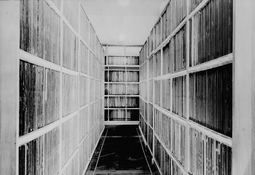
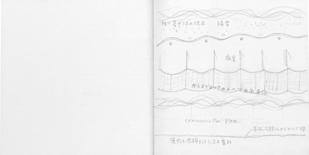
This breadth of approach to the concept of the instrument is reflected in the contents of this issue. We begin with Philip Steadman’s exploration of the use of the camera obscura by the 18thcentury Venetian painter Canaletto (Giovanni Antonio Canal). Key to the argument is a series of sketches of locations in Venice drawn in a notebook that is now held in the Gallerie dell’Accademia. By overlaying these drawings on contemporary photographs, Steadman is able to demonstrate a degree of accuracy in their delineation that would require the support of an optical device. Turning to Canaletto’s painting Campo Santi Giovanni e Paolo (1735–38), he shows how the artist was able to combine and adjust drawings taken from more than one location to produce what is in effect an early form of photomontage. We stay with cameras and with questions of visual position in Emma Letizia Jones’ study of the Messbildkunst (‘art of measuring images’) developed by the Prussian architect and surveyor Albrecht Meydenbauer in the second half of the 19th century to enable measured drawings, such as plans, to be made from photographs. Working in the wake of J.H. Lambert’s Die freye Perspective (1759), as it was transmitted through the instruction of Berlin’s Bauakademie, Meydenbauer’s photogrammetry used the geometrical analysis of an array of photographic perspectival images to ‘restitute’ the orthographic form of structures. Meydenbauer would leave behind an archive of around 20,000 photographs, a record of the city and its surroundings as an organised collection of discrete urban objects that, Jones observes, contrasts with the dizzying metropolis disclosed in his 1868 panorama with which the article begins. In Ahmed Belkhodja’s piece, which follows, we are again seeing through the apparatus of the camera, but now it is directed toward a computer monitor. Starting with a series of colour transparencies that the Japanese architect Itsuko Hasegawa took of representations of her early projects, the author builds an argument that these ‘drawing instruments’ – the early computer modelling software and screen interface, coupled with the camera that permitted the image to be effectively fixed (better than the contemporary printing technologies of the day) – allowed the visualisation of a particular concept of ‘distance’ that was fundamental to her idea of architecture and that she sought to achieve in her work. From this we move on to Nat Chard’s instruments, already discussed. Here too the mediation of the camera is positioned as essential to the experience of what is drawn, although in this case it is the speed and resolution of image capture that are key.
Next comes Fabio Colonnese’s consideration of squared paper as an instrument of drawing. While his focus is upon Italian material from the 15th and 16th centuries – he discusses complex uses of the grid to organise the relation between architectural elements by architects including Filarete, Francesco di Giorgio Martini, Bramante and Peruzzi – his wideranging account extends to the argument that, after early experiments, it would be in the context of large projects of landscape and territorial scale that the grid would come to the fore and exert its particular capacities as a structured surface of representation and instrument of design. We then pass to Ross Anderson’s discussion of the teaching of perspective technique, which reflects upon a remarkable and enigmatic drawing produced for didactic purposes by Friedrich Gilly, which was later owned by his pupil Karl Friedrich Schinkel. Referring to the scenographer Adolphe Appia and the painter Caspar David Friedrich, Anderson discusses how the rigorous construction of perspective would remain, albeit occluded, a component of the characteristic affective atmospheres of the landscapes of German Romanticism. Next Javier Girón explores the motif of the sun as a drawing instrument via the projection of shadows. Girón argues that the Vitruvian vestigium (plan), understood like a footprint in terms of pressure and weight, was conceptually transformed in 17th-century Jesuit thought into an optical condition – that is, understood as a shadow cast by the divine emanations of the sun as they pass through the diaphanous body of architecture. This leads toward a cultural history of the parallel projection of volumes, with its intricate deliberations regarding the nature of an eye required to comprehend such a projection. It was, Girón claims, the 19th-century disarticulation of the question of the observer’s position from the understanding of parallel projection that allowed the figures it produced to be recognised as shadows cast upon a surface of representation by a distant sun. We continue with axonometric projection in Sayan Skandarajah’s Inside/Outside Kyoto project, which refers to the extraordinary 17th-century views of the city on folding screens, in which scenes of buildings and urban life are revealed through openings in golden clouds. Working with point cloud files produced by photogrammetry, the project –with a view to these historic forms of representation – explores a poetics of gaps, indeterminacy and incompleteness in the depiction of the city. We conclude the long form articles with Jonathan Foote’s close reading of Borromini’s graphite drawings, which are vigorously rubbed and smudged, distressing their paper support and producing powdery crepuscular penumbrae that envelope and obscure the linear elements of the architecture. Foote argues for a sympathetic correspondence between the materiality of these drawings and that of the construction of the buildings that they
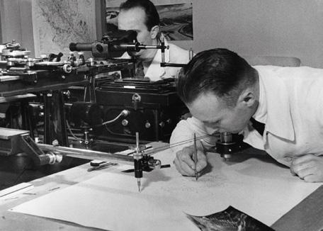
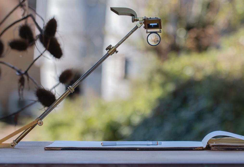
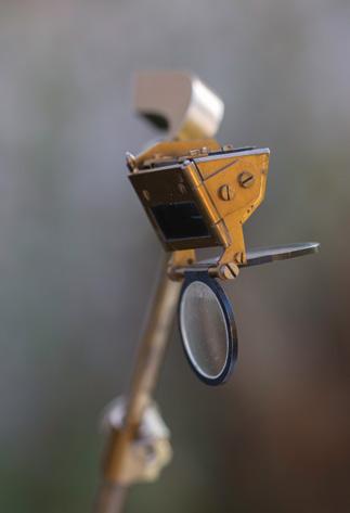
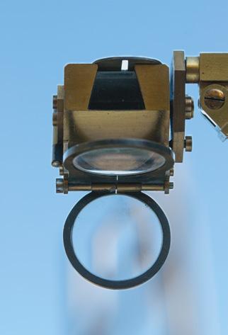
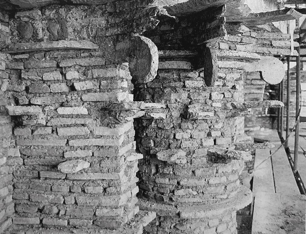
depict – tevolozze (recovered, typically broken, ancient bricks held within a thick mortar matrix) covered with stucco romano (a mixture of lime and marble dust). Interspersed with the long articles is a sequence of shorter ‘interpolations’. As well as the pieces by Sue Palmer, Neil Bingham and Laura Harty already mentioned, these include a consideration of Sir John Soane’s ‘upper’ drawing office by Helen Dorey, which invites us to think of the office itself as a complex pedagogical instrument; a report by Pablo Garcia on the Zeiss Stereoautograph, a vast and intricate early 20th-century photogrammetric drawing machine that enabled detailed maps to be made from the paired images produced by a stereoscopic camera; a consideration by Philip Steadman of a camera lucida owned by the engineer Isambard Kingdom Brunel, which is now held in Drawing Matter Collections; a presentation by Rosie Ellison-Balaam of an object of optical play by the Italian designer Enzo Mari; and a documentation of Paddi Alice Benson’s material explorations of the digitally controlled laser cutter as an instrument of drawing.
In the collections at the Soane Museum there is a curious object that the architect acquired in 1822, apparently believing that it had once belonged to Sir Christopher Wren. It takes the form of a walking stick with a bulbous rosewood handle within which is mounted a magnetic compass. When the handle is unscrewed from the cane, a pair of hinged and graduated 30-inch rods is revealed, which can be unfolded to make a single 5-foot rule. Moreover, the compass – which forms the cap of the handle – can be removed to expose a set of instruments nested below, comprising a pair of dividers, an ivory scale, a pencil in a brass mount, and a ruling pen (one item is missing). There is no record of Soane himself ever using this, and it is likely to have remained within the house as an imagined relic of the great predecessor whom he believed to have owned it. Still, it is interesting to think about, not least because of the suggestive consonances between tools of drawing and building that it intimates. Many mechanical drawing instruments developed as reduced versions of the equipment of building construction, giving us a vision of the drafting table as a miniature building site with all the tools of construction arrayed across it. The cane bears upon this relation, but from the other direction. It is a holder of instruments, but at the same time turns out to be a kind of instrument itself, its magnetic compass top providing orientation and the stick a support for the way a construction might be paced out on site (the 5-foot folded rule secreted within it approximated two paces). So, just as the architect might imaginatively pass across a drawing of a plan while ‘walking’ the legs of a divider across a sheet of paper, the building site itself might in turn be walked across and measured out with cane in hand.
1 George Adams, Geometrical and Graphical Essays, Containing a General Description of the Mathematical Instruments Used in Geometry, Civil and Military Surveying, Levelling, and Perspective. 2nd edn, corrected and enlarged by William Jones (London: J. Dillon and Co., 1797), 15.
2 Edmund Stone, ‘The Translator’s Preface’, in The Construction and Principal Uses of Mathematical Instruments, Translated from the French of M. Bion, Chief Instrument-Maker to the French King 2nd edn (London: J. Richardson, 1758), v.
3 Walter Woodburn Hyde, ‘The prosecution and punishment of animals and lifeless things in the Middle Ages and modern times’, University of Pennsylvania Law Review and American Law Register, vol. 64, no. 7, (May 1916), 696–730. Derek Collins, ‘Nature, cause, and agency in Greek magic, Transactions of the American Philological Association, vol. 133, no. 1 (Spring 2003), 17–49.
4 Bruno Dagens, ed. and trans., Mayamatam: Treatise of Housing, Architecture and Iconography, vol. II (New Dehli: Indira Gandhi National Centre for the Arts, 1994), 617–619.
5 Klaas Ruitenbeek, Carpentry and Building in Late Imperial China: A Study of the Fifteenth-Century Carpenter’s Manual Lu Ban jing (Leiden: E.J. Brill, 1993), 21.
6 Vincenzo Scamozzi, L’idea della architettura universale, vol. I (Venice: Girolamo Albrizzi, 1615), 49.
7 ‘C’était la main de l’homme qui était la seule machine de I’esprit.’ Titlepage to William Ford Stanley, A Descriptive Treatise on Mathematical Drawing Instruments, their Construction, Uses, Qualities, Selection, Preservation, and Suggestions for Improvements (London: Published by the Author, 1866).
8 Vitruvius, De Architectura , I. 2. 2. Wilbur Richard Knoff, The Ancient Tradition of Geometric Problems (New York: Dover, 1986), 15.
9 [John Farey], ‘Drawing Instruments’, in David Brewster et al., The Edinburgh Encyclopaedia , vol.VIII, (Edinburgh and London: William Blackwood, etc., 1830), 121–132 (122).
10 John Ruskin, The Elements of Drawing: In Three Letters to Beginners (New York: John Wiley & Sons, 1876), 21. On Scarpa’s rubbing out, see Carolina Dayer, ‘On becoming petrified: the erotic gaze in architectural conception’, in Mark Dorrian and Christos Kakalis, eds, The Place of Silence: Architecture/Media/Philosophy (London: Bloomsbury, 2019), 113–125.
11 From William Halfpenny, Magnum in Parvo or the Marrow of Architecture (1728), cited in Maya Hambly, Drawing Instruments: Their History, Purpose and Use for Architectural Drawings (London: RIBA, 1982), 31.
Canaletto’s Venetian Sketches and the Camera Obscura —
Philip Steadman
The sketchbook
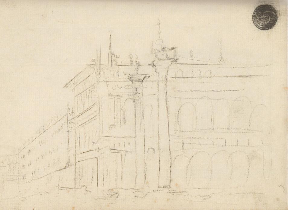
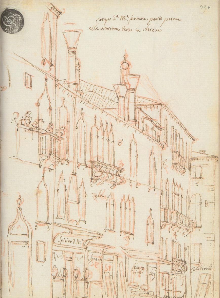
In 1949 Guido Cagnola presented a quaderno, a sketchbook, to the Gallerie dell’Accademia in Venice.1 The book is small, measuring just 23 x 17cm. It contains some 140 pages of drawings of Venetian buildings. We know that it belonged to Antonio Canaletto (1697–1768) because the drawings correspond closely to some of his paintings. A few pages are devoted to very rough sketches – Canaletto calls them scaraboti or ‘scribbles’ –drawn rapidly by eye or from memory, in which he seems to be exploring ideas for compositions. Fig.1 shows a ‘scribble’ of Jacopo Sansovino’s Marciana Library with the two great columns that stand at the end of the Piazzetta, next to the Doge’s Palace. 2 The remainder of the book is filled with careful, accurate drawings of the built fabric of Venice, made in red or black pencil, or metalpoint. Many are worked over in brown or black ink. Fig.2 reproduces a sample page showing buildings lining one side of the Campo Santa Maria Formosa, one of the city’s smaller squares. 3 There are notes with the names of shops – Spicier d. Ma (the apothecary of Maria, at bottom left) – and the colours of walls – zalo (yellow), B for Bianco (white). If one goes to the square today one finds that Maria’s apothecary is still in business as a modern pharmacy. Other pages have notes on building materials and on the numbers of windows, arches, or columns in rows.
When the sketches are matched to the paintings it turns out that there are between four and ten sketches per painting, plus one panorama of the Bay of San Marco, the Bacino, made up of 12 pages. Of the groups of sketches, 13 are for paintings sold to the Duke of Bedford in the mid-1730s (now at Woburn Abbey), showing that the quaderno itself dates from that decade. 4 Each group of sketches covers a subject in parts, running in sequence, one part to a page of the book, with each drawing in general matching edgewise with the next in sequence, which may be on the opposite side of a double spread or over the page. The sketches are not only preparatory for paintings. Canaletto uses some as the basis of larger finished drawings for sale.
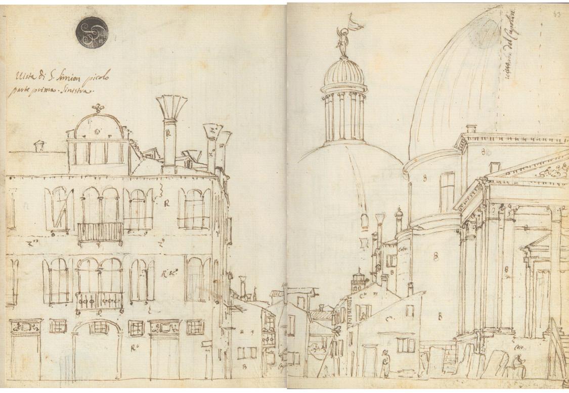
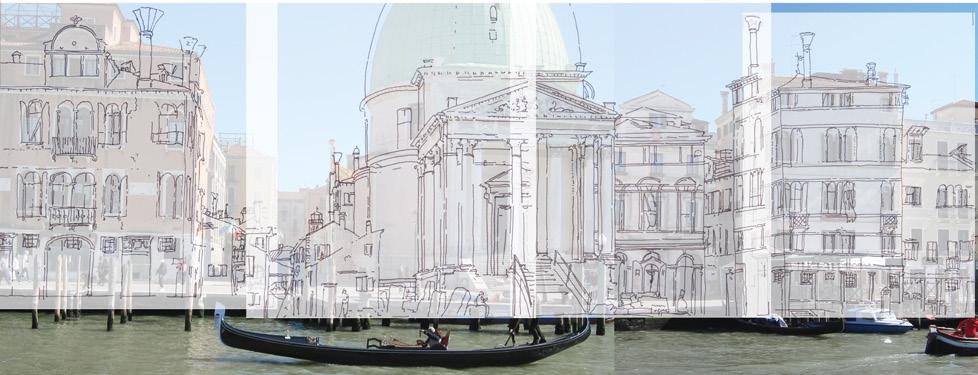
Fig.3 shows four successive pages (two spreads) from the quaderno covering the classical church of San Simeone Piccolo and palazzi and houses on either side of the church, seen from the opposite bank of the Grand Canal. 5 Canaletto must have made these sketches around 1738 when the church was just being completed. He drew blocks of unused stone, and a makeshift flight of steps made of planks, with temporary wooden handrails. He produced two slightly different finished drawings from these sketches. (There is no painting.) Close analysis shows that Canaletto worked from two viewpoints, not far apart. Fig.4 superimposes the sketches over two photographs taken from these positions by Gregorio Astengo.
Fig.1 Antonio Canaletto, a scaraboto (‘scribble’) from his Venice sketchbook, the Quaderno, page 6 recto, showing Jacopo Sansovino’s Marciana Library and the two freestanding columns in the Piazzetta. Pencil, 17 x 23 cm. While there are no dates inscribed in the book, it is clear it is from the 1730s. This and all other pages from the Quaderno are reproduced with the kind permission of the Gallerie dell’ Accademia, Venice.
Fig.2 Quaderno 39 recto; buildings on one side of the Campo Santa Maria Formosa. Red crayon and ink, 23 x 17 cm.
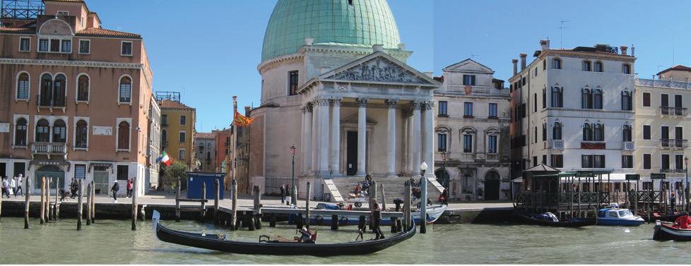
The view has hardly changed in the intervening three centuries, except for a few minor alterations to the houses. The comparison shows how faithful Canaletto is to the dimensions and details of the architecture.
The camera obscura
Canaletto made the quaderno sketches with a camera obscura. We can be confident about this, for several reasons. First, his contemporaries said that he was practised in the use of the instrument. Anton Maria Zanetti the Younger was a historian who included an entry on Canaletto in his book On Venetian Painting, published soon after the painter’s death. 6 Zanetti is a reliable witness. He knew Canaletto and talks about ‘my memories of this excellent Master’:
Canal taught the proper use of the camera ottica and showed what defects can be introduced into a painting when its whole perspective arrangement is taken from what can be seen in the camera, particularly the colours of the atmosphere, and when one does not eliminate things offensive to the senses. The Professor will understand me.7
A French collector and dealer in drawings and prints, Pierre-Jean Mariette, wrote another brief life echoing Zanetti, saying that Canaletto ‘made use of the camera obscura, of which he knew how to moderate the faults’. 8 Antonio Conti, a priest turned scientist from Padua who knew Canaletto’s lifelong patron Joseph Smith, wrote about how the artist used the camera ‘to make the perspective of a canal in Venice with its buildings’. 9 Francesco Algarotti, another associate of Smith and a friend of the artist, wrote a popular book about Newton’s optics in which he compares the luminous coloured image on the camera screen to a ‘vista by Canaletto’.10
The second form of evidence for the painter using the camera is the great fidelity of the sketches to the buildings of Venice. We have seen this accuracy in the drawings of San Simeone. Following the economic decline of Venice in the 18th century and the fall of the Republic to the French in 1797, change in the city largely ceased. It is thus still possible for the most part to compare the sketches against their subjects. In 1959 Decio Gioseffi published the only book to date on Canaletto and the camera obscura.11 Gioseffi used a special viewing device to compare sketches with photographs.12 Gregorio Astengo and I have been following Gioseffi’s lead. Astengo has photographed most of the scenes covered by the quaderno, and we have been superimposing the sketches using Photoshop and other digital tools.
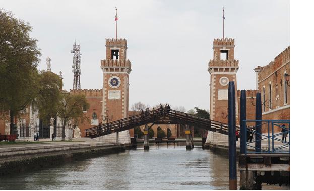
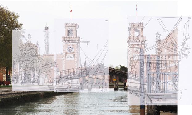
There are occasional discrepancies, and of course some buildings have been altered or replaced. But in general, the matches are as accurate as those illustrated for San Simeone. For example, four pages of the quaderno are devoted to the gates of the Arsenale, where ships were built for the Venetian navy.13
Fig.5 shows three of these superimposed over a photo taken from Canaletto’s viewpoint. The chapel in the form of a Greek temple at the right has gone, and the wooden bridge has been reconstructed and repositioned, but otherwise the correspondence is close.
The third reason for believing that the camera was used is to be found in certain revealing idiosyncrasies of the sketches themselves. It is clear that they were executed quickly, only rarely with any shading. The images are flattened and lack depth – lines can run continuously around many overlapping buildings and roofs, even though these are at very different distances. The lines are grasped immediately without hesitation, and there are few corrections or second thoughts. Terisio Pignatti, who published the first facsimile and analysis of the quaderno, remarks on his first impression of the ‘instrumental monotony’ of the book.14
Most of the sketches have no ticks or dots to set out the regular spacing of openings, although there are a few places where Canaletto uses guidelines to straighten up columns or to position rows of windows, some of which are ruled. The elliptical curves of domes are drawn smoothly without kinks. Sometimes the rooflines of long buildings dip very slightly towards the middle, as they can do in reality because of the ridge beams sagging, an effect hardly noticeable to the naked eye. There are a few places where the sketches are rough and seemingly hurried, but comparison with the subjects shows that they are nevertheless broadly true to the proportions and dimensions of the architecture.
All this is suggestive, but not definitive proof of a camera being used. Such characteristics could be the product of careful observation and extreme skill in making freehand sketches by eye. There are further features, however, that are much more difficult to explain, other than by reference to the camera. They have to do with the placing of images on the page.
The entire page of the quaderno is generally filled to the edges. Buildings can run off the page at the sides and the top, and important monuments like churches are often cut off arbitrarily. This phenomenon would result from the standard-size page of the sketchbook being placed under the projected image and catching just what fell on to the sheet. By contrast, a draughtsman working by eye would surely judge the overall size of a subject first and would want to make sure that all of it fitted on to his paper.
Unless they are very far away, tall structures such as belltowers and the domes of churches can go off the top of the sheet – in which case the missing upper parts are drawn separately in the empty sky of the view. This could have been done by sliding the sketchbook up the drawing table, since the image would extend beyond the area of the page. The sketches of San Simeone Piccolo provide an example. Fig.6 reproduces two pages of the quaderno on the front and back of one sheet.15 On the first page Canaletto draws two thirds of the church’s great dome but does not have space for the columned lantern on top, so he moves the book to record the cupola at the left of the page.
Fig.3 Quaderno 52 verso, 53 recto and verso, 54 recto; the church of San Simeone Piccolo and adjoining buildings on the Grand Canal. Pencil and ink, each page 23 x 17 cm.
Fig.4 The sketches of Fig.3, retraced for clarity, superimposed on two joined photographs by Gregorio Astengo.
Fig.5 The gates of the Arsenale, retraced for clarity from Quaderno 34 verso, 35 recto, and 36 recto and superimposed over a photograph by Gregorio Astengo.
Quaderno 53 recto and verso. Pencil and ink, each page 23 x 17 cm; showing how the church of San
is drawn in parts on the front and back of one sheet.
Fig.6
Simeone Piccolo
Fig.7 Box-type camera obscura in the Correr Museum in Venice stamped on the top with the name ‘A CANAL’. Photograph by Gregorio Astengo.
of the view direct (right). The image in the camera obscura is mirrored. Photographs by
Fig.8 Optical image of the Campanile in the Piazza on the screen of the ‘A CANAL’ box camera (left), compared with a photograph
Gregorio Astengo.
He draws two dotted vertical lines on the main dome to show where the lantern should be aligned. The remaining third of the main dome is traced on the next page, on the back of the sheet. This would be a very odd procedure for an artist sketching by eye, but is again explained by the exigencies of a camera method.
Another suggestive trait: Canaletto omits certain features of buildings that it is possible to see directly, but which could have been difficult to make out in an optical image. These include dark glazing bars against the blackness of window glass, which he often renders cursorily with rough criss-cross lines, and the ribs on the domes of churches.
The type of camera
By the 18th century several types of camera obscura were described in print and were available for sale.16 It was possible to turn an entire room into a camera obscura – as in the original meaning of the term –by blacking it out, putting a lens in a hole in a window shutter, and setting up a screen opposite the lens. Smaller freestanding cameras could take the form of closed booths, cubicles, or tents in which artists worked on drawing tables, and which were reasonably portable. Or cameras could be made in the form of yet smaller closed boxes with ground-glass screens on the outside, like 19th-century photographic plate cameras.
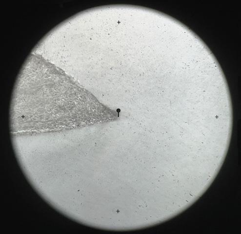
In 1901 there was a dramatic development in the story of Canaletto and the camera: Luigi Vason donated a box-type instrument to the Correr Museum in Venice, with the name ‘A. CANAL’ stamped on its case (Fig.7). (The painter was christened Antonio Canal – he acquired the diminutive later.) The tube at the front of the box contains the lens and can be moved in and out to adjust the focus. There is a mirror inside, set at 45°, that reflects the optical image up on to the ground-glass screen on top. Above this, there is a wooden hood that shields the image from ambient light and makes it easier to see. To draw, one must place transparent paper over the screen and trace the image that appears upon it. Gregorio Astengo examined the instrument in 2022 and pointed it out of a window of the Correr at the Campanile in Piazza San Marco.17 Fig.8 shows the image on the camera screen, set alongside a photograph of the Campanile taken directly. The image in the camera obscura is reversed left to right.
On the face of it, this rediscovery of what is apparently the painter’s actual camera would seem conclusive. Over recent decades, however, doubts have emerged. Questions have been raised about the authenticity of the inscription, and there has even been a rumour – to my mind quite implausible – that the instrument is a fake. However this may be, there are two reasons why the sketches in the quaderno could not have been made with a camera of this type. First, with a box camera the image is projected upwards, and one must draw on tracing paper, while the sheets of the quaderno are opaque and have sketches on both sides. Secondly, the image in a box
camera is flipped horizontally and the drawings in the quaderno are not. The ‘A. CANAL’ camera has proved an unfortunate distraction to Canaletto scholars. It may well be authentic and may have belonged to the painter, but he could only have used it for observing views and perhaps judging questions of framing and composition.
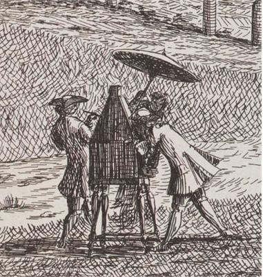
By contrast, in a booth or tent camera the image can be projected downwards from above on to a drawing table. There is a mirror set at 45° on top of the instrument that reflects the scene down on to the lens, which is in a vertical tube. The artist faces in the opposite direction from the view. This means that the image on the table is the right way up and is not mirrored left to right. Fig.9 reproduces one of a series of etched views of scenes along the Brenta canal by a contemporary of Canaletto, Giovanni Francesco Costa.18 The enlarged detail shows an artist – perhaps Costa himself – making a drawing with a tent camera on legs. The view is reflected in a tilted mirror on top of the camera and is projected down on to the drawing surface. We can see that the user has his back to the scene. An assistant holds an umbrella over them. This is not to keep them dry or cool, but is to stop light from the sky spilling down the lens tube and weakening the image.
I believe Canaletto must have used a similar instrument, either a tent like Costa’s or a more substantial cubicle in which he was completely enclosed. In cameras of these kinds the image seen in the darkness seems, once the eyes have adjusted to the low level of light, to be subjectively much brighter than images formed with box cameras. There were several instrument-makers selling camera obscuras for draughtsmen in Venice in the 18th century, including the renowned workshop of Domenico Selva and sons.19 It is possible to link Canaletto indirectly to the Selvas via Algarotti and others of Joseph Smith’s scientific acquaintance. 20
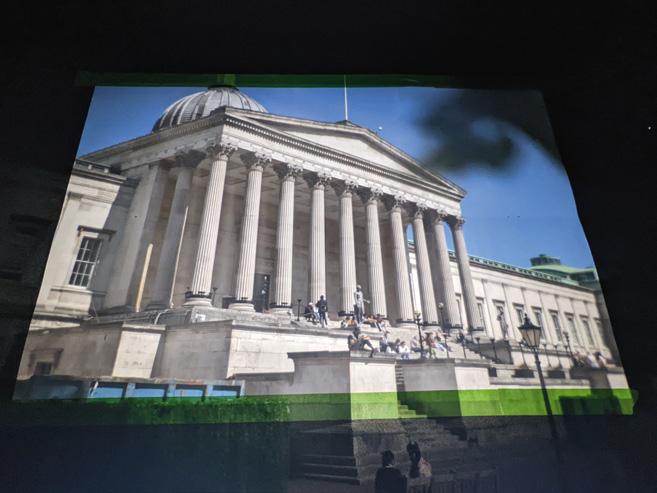
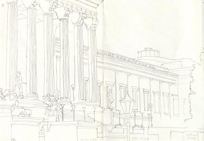
My colleague Adam Azmy has built a reconstruction of an early 18th-century design of a tent camera, illustrated in a book on perspective by the Dutch mathematician W.J. ’s Gravesande. 21 Algarotti knew ’s Gravesande’s work, and there is a copy of the first edition of his book in the library of the Correr Museum. I have been using this instrument to make sketches comparable, at least technically, with those in the quaderno. There are no great difficulties. This work is to be reported in detail elsewhere. Fig.10 shows an image on the screen of our camera of the front quadrangle of University College London, my place of work. The instrument has a single lens with no special refinements or coatings, of no higher quality than those that would have been available to Canaletto. The brightness, sharpness and clarity of the image are typical of larger camera obscuras generally. Fig.11 reproduces two pages of my sketches of UCL’s Wilkins Building, each of which took about 20 minutes to trace. Working fast, I was able to capture some of the many students sitting or standing still in the quad.
Giovanni Francesco Costa, etching of a view on the Brenta canal, 26 x 34 cm; from Delle Delicie del Fiume Brenta , published by the author (Venice, 1750–62). The enlarged detail shows an artist using a tent-type camera obscura.
Fig.9
Fig.10 Projected optical image of the front quadrangle of University College London on the drawing table of an eighteenth-century design of tent camera, reconstructed by Adam Azmy.
Fig.11 Two pages of sketches of the Wilkins Building at UCL drawn by the author in Azmy’s reconstructed eighteenth-century tent camera.
In summary, then, Canaletto used a booth or tent camera like Costa’s to make the sketches in the quaderno. Experiments with our reconstructed camera show that this is perfectly feasible. If the ‘A. CANAL’ instrument is authentic – and the inscription certainly encourages that idea – then Canaletto could only have used it for studying optical images, not for the quaderno tracings. The quality of images in 18th-century cameras was excellent, and concerns expressed by some historians about optical distortions and problems of focus have been exaggerated.
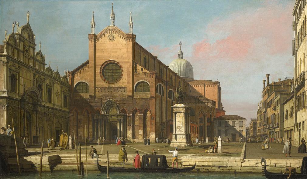
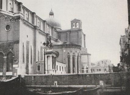
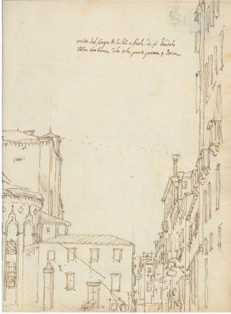
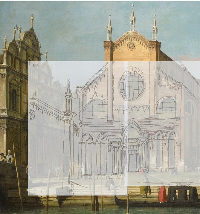
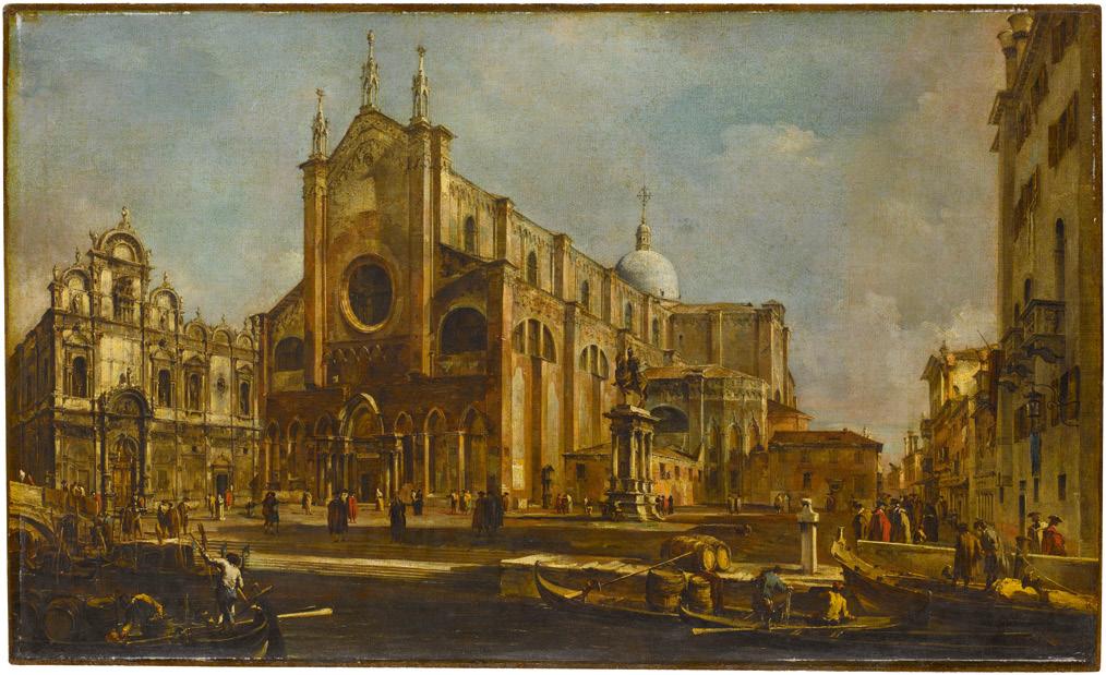
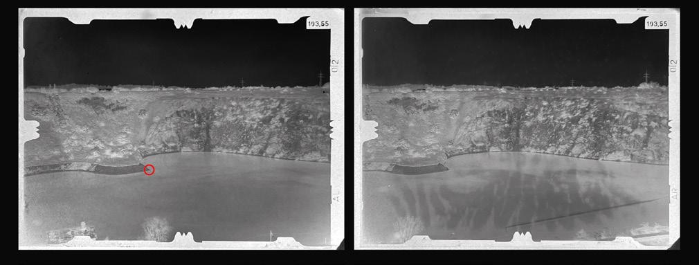
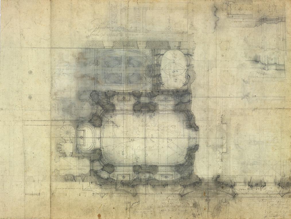
The church of SS Giovanni e Paolo I will now make a close examination of a scene for which there are four pages of sketches (two spreads) in the quaderno. This is the church of SS Giovanni e Paolo and the adjoining Campo. Fig.12 shows the painting in question. We are facing the west front of the church. To test the accuracy of the quaderno sketches we overlaid them on photographs. Now, by superimposing the sketches on a painting, we can see both where Canaletto follows the sketches, and where he decides to depart from real appearances. In this particular case there are several differences between sketches and painting, of kinds that are found in the artist’s work more generally.
In the centre of the picture of Fig.12 is the equestrian monument to Bartolomeo Colleoni,
Captain General of the Venetian Republic, sculpted by Andrea del Verrocchio. At the extreme left, seen obliquely, is the Scuola Grande di San Marco, a building erected for one of the city’s medieval confraternities. In the foreground is a small canal, the Rio dei Mendicanti. There have been some changes to the architecture of the church since the 18th century, including replacement of the 17th-century semi-circular windows with round windows, and the addition of a belltower. The painting was acquired by Joseph Smith, who sold it in 1763/64 to King George III of the United Kingdom. It remains in the Royal Collection today.
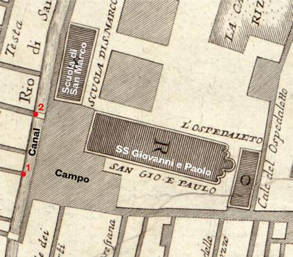
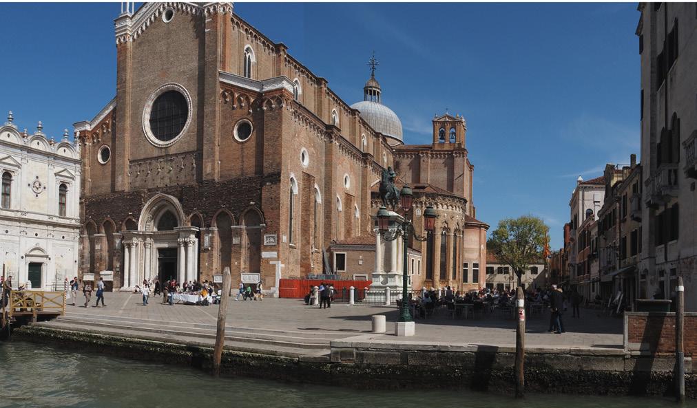
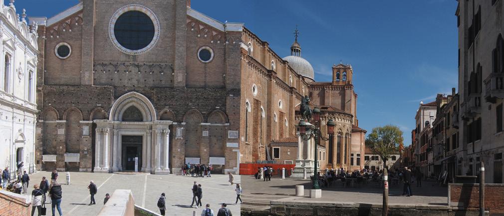
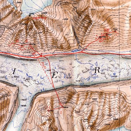
Decio Gioseffi compared the painting with a photograph that he took from a position on the opposite side of the canal, where a narrow alley –the Calle del Forno – opens on to the water. 22 Fig.13 shows a plan of the Campo and the church, with this viewpoint marked ‘1’. The match of Gioseffi’s photo to the right-hand half of the painting was close (Fig.14). Fig.15 shows a wider-angle photo from this position in the Calle del Forno. What is immediately clear is that the west front of the church is not painted from the same viewpoint as the open space of the Campo – the façade is seen frontally in Canaletto’s picture and does not recede at an oblique angle. Canaletto has also made the dome of the church taller than it really is.
The four pages of sketches are on sheet 50 verso, sheet 51 recto and verso, and sheet 52 recto
Fig.13 Plan of the Campo SS Giovanni e Paolo showing the church, the Scuola Grande di San Marco, and the Rio dei Mendicanti. A first viewpoint 1 is indicated at the opening onto the canal of the Calle del Forno. A second viewpoint 2 is indicated on the Ponte del Cavallo. The base of this plan is from Ludovico Ughi’s map of Venice of 1729.
Fig.14 Photograph by Decio Gioseffi from viewpoint 1 in the plan of Fig.13, of the righthand half of the scene of Canaletto’s painting. From Gioseffi, Canaletto: Il Quaderno delle Gallerie Veneziane (Università degli Studi di Trieste, 1959), 43 Fig.36.
Fig.15 Photograph by Gregorio Astengo from viewpoint 1 of the whole of the scene of Canaletto’s painting.
Fig.16 Quaderno 51 recto (left) and 50 verso (right, making a spread). Pencil and ink, each page 23 x 17 cm; and tracings superimposed on the right-hand half of Canaletto’s painting. Notice on 50 verso the broken line joining the top of the church transept to the chimney on the house at the right.
Fig.17 Quaderno 52 recto (left) and 51 verso (right, making a spread). Pencil and ink, each page 23 x 17 cm; and tracings superimposed on the left-hand half of Canaletto’s painting. Notice that one half of the top of the nave of the church is drawn at the left, since the building is too tall to fit on the page. The Scuola di San Marco, which should be on 52 recto, is missing. On 51 verso, at bottom right, at a reduced scale and in pencil, there is a ‘double exposure’ of the aisle of the church.
In order that the sketches are readable in the digital superimpositions we have retraced them carefully in ink. The right half of the painting is covered by the double spread of pages 50v and 51r (Fig.16). Canaletto’s raising and enlargement of the dome in the painting can be clearly seen.
He has also made changes to the row of buildings seen in steep perspective that line the Campo at the right. These are traced accurately, but Canaletto then alters the sizes and positions of houses for the painting. The house at the extreme right is shifted rightwards. Other more distant houses are made taller. Canaletto signals his intention to do this on page 50v by drawing a broken line across the sky from the roof of the transept to a trumpet-shaped chimney on a house at the right. He uses this convention a number of times in the quaderno to indicate that he intends features of roofscapes to be depicted on the same level, sometimes adding the note ‘alto come questo’ (‘as tall as this’). His purpose in changing the buildings in this case may perhaps have been to close the composition more decisively at the right.
I am not completely decided as to whether Canaletto has altered the size and position of the Colleoni monument. If he has, it is only by a small amount, perhaps to give it an enhanced visual prominence. (The way he has lit the plinth also makes it stand out against its background.) The statue seems not to be in exactly the same position in our photograph and in the painting (compare Fig.15), but this may be because the photographic viewpoint is at a slightly different height from Canaletto’s –his seems to be closer to the level of the water. One suggestive feature of the camera tracing, however, is that Canaletto has ruled vertical pencil lines over the plinth, whose purpose might have been to help in re-drawing it in a different position. There are very few other ruled lines elsewhere on this spread.
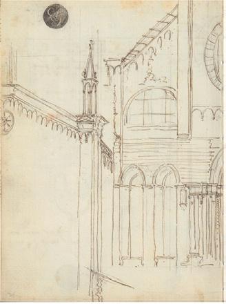
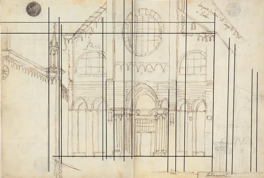
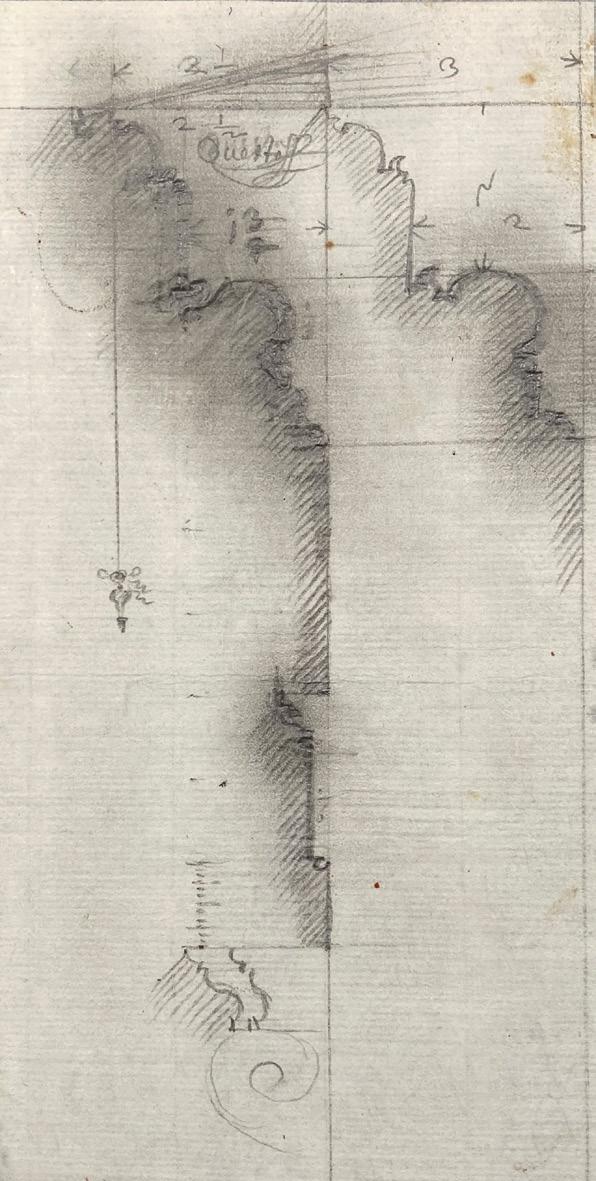
Turning now to the left half of the picture with the west front of the church and the Scuola di San Marco, we find that these are traced with the camera on the two pages 51v and 52 r, which together form a second spread in the quaderno (Fig.17). The sketches have several odd features. First, the upper part of the nave is drawn separately on the left of page 52 r. This is a regular feature of the quaderno where buildings go off the top of the sheet, as we have seen. Canaletto also draws only one half of the top of the nave. This is another frequent gambit. Where the façade of a symmetrical building is seen frontally, he draws just half, always the right half. He presumably has some way of mirroring the drawing to produce the matching half, back in the studio.
A further oddity is that the Scuola di San Marco does not appear where it should on page 52 r. The exact profile of the right-hand edge of the building is traced where it meets the church, but that is all. The Scuola’s rightful place is taken by the top of the nave. This is yet another recurrent feature of the quaderno sketches. Canaletto can work his way along a series
of anonymous buildings facing, say, on to the Grand Canal, but when he reaches some architecturally significant palazzo, he leaves a blank space. I interpret this to mean that he is not going to rely on a camera sketch for the building but will take his view from some other existing image, perhaps a measured drawing by the architect or an engraving by another artist.
One striking fact about Canaletto’s surviving Venetian camera sketches is that the vast majority cover the anonymous everyday fabric of the city and not its monuments. The only remaining camera sketches for buildings around the Piazza San Marco are for the Campo San Basso, off the Basilica, the one section lined with small houses and shops. It is of course perfectly possible that Canaletto and his studio made camera drawings of palazzi, churches and other great buildings, and that these have been lost, perhaps worn out by repeated use. But there could be another explanation.
Canaletto scholars have suggested that the artist might have made use of the many engravings of palazzi and churches published by the older topographic painter Luca Carlevarijs (1663–1730) in his Buildings and Views of Venice of 1703. 23 In his book Canaletto: Una Venezia Immaginaria (1985), the urban historian André Corboz discusses possible ‘graphical sources’ at length, including Carlevarijs and the engraver Domenico Lovisa. 24 While Canaletto certainly uses Carlevarijs as a source of compositional ideas, comparisons with the real buildings show Carlevarijs’s drawings to be quite unreliable in detail. 25 He systematically makes buildings narrower in relation to their height than they really are, and there are also inaccuracies in spacing and fenestration. Gregorio Astengo and I have new ideas about Canaletto’s sources of measured drawings, which will be the subject of a future publication.
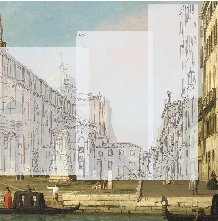
Returning to the sketches on the spread illustrated in Fig.17, their strangest property is in their perspective geometry. The façade as a whole is seen frontally – it does not recede at an angle to the left, as in the photograph (compare Fig.15). One might immediately think that Canaletto has made these sketches from a different position, directly opposite the façade. Astengo has taken a second photograph to test this idea, from a bridge across the canal, the Ponte del Cavallo (see the plan in Fig.13, where this second viewpoint is marked ‘2’). Fig.18 is a composite of our two photographs, joined at the corner of the church. (Like Canaletto, we had difficulty getting the top of the nave into view from this standpoint without pointing the camera upwards.) While there is a broad resemblance to Canaletto’s picture, the proportions of the west front are quite different –it is much wider in relation to its height, compared with what the painting shows.
And there is another perplexing oddity. In the photo of the façade the entrance door and the blind arches at either side are seen frontally. But in the quaderno sketches these are all drawn obliquely,
Fig.18 A composite of two photographs by Gregorio Astengo from viewpoints 1 and 2 in the plan of Fig.13, approximating the whole of Canaletto’s painting. The join is at the corner of the church.
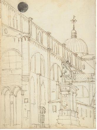
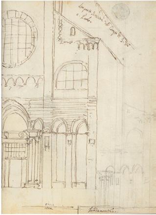
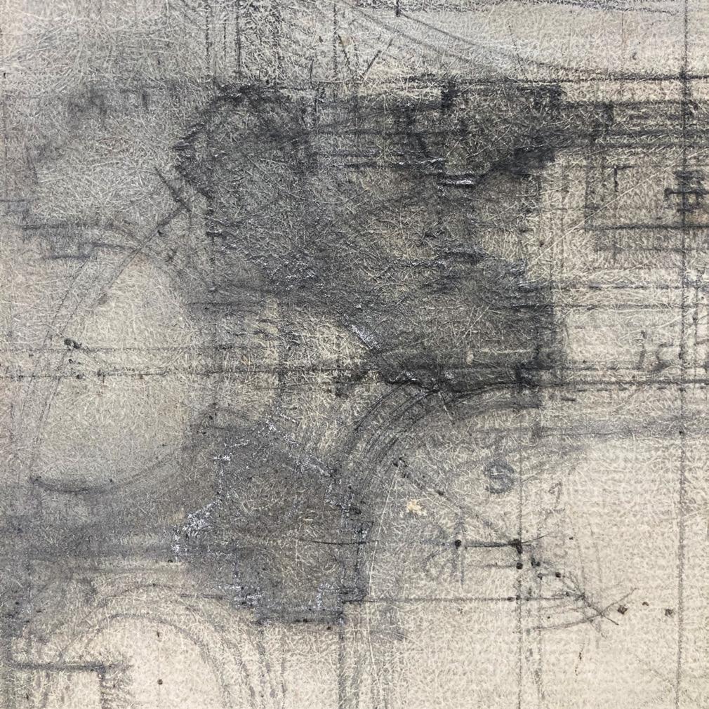
Fig.19 Canaletto rules a framework in pencil on the Quaderno sketches 52 recto and 51 verso of the west front of SS Giovanni e Paolo. Here the pencil lines are emphasised.
not from directly in front. We see more of the reveal of each arch at the left than at the right. It is as though the outline of the west front is viewed from one angle, and its architectural detail from another.
I have come to the conclusion that in this left half of the painting Canaletto does something quite unusual compared with his standard practice. He seems to be producing a sketch that is partly made with the camera and partly by geometrical construction. He has drawn the façade with the same width as it has in an oblique view taken from the first viewpoint at the Calle del Forno. He has ruled a framework of pencil lines to guide him as he converts the oblique view projected in the camera, working by eye, into a rectangular frontal view. I have illustrated this pencilled framework in Fig.19 by reinforcing the lines. Part of the right-hand side of the façade is repeated in a small pencil sketch at the bottom of page 51v (Fig.17). This is what Gioseffi would call a ‘double exposure’. 26 Could Canaletto be making a graphic trial here of what he intends to do to the complete façade?
Manipulations of reality
What are the purposes of these various manipulations? The changes that we see in SS Giovanni e Paolo are typical of many of the view paintings. Why does Canaletto depart from the faithful transcriptions of the camera sketches? One can only speculate, but the changes presumably serve a series of compositional purposes. When he raises and enlarges the domes of churches, which he does repeatedly, this must be to give these buildings the visual prominence they deserve. In his views of the Piazza from the west he greatly magnifies the Basilica of San Marco to make it larger in both height and width.
A psychological issue, of which photographers are aware, is the tendency of people to imagine that tall buildings, or hills, are taller than they appear in correct perspective pictures. This is why, when people take snapshots of landscapes, they are often disappointed by how minuscule the grandest mountains look. I once assisted at the making of a television programme where an artist was asked first to make an accurate drawing by eye of a view of Delft in Holland, and then to trace the same view in a camera obscura. Working by eye, he had considerably exaggerated the heights of the church spires. Canaletto is evidently aiming to meet his viewers’ mental expectations in this respect, and not disappoint them.
Then there is Canaletto’s habit of turning façades seen at angles to face frontally, as with the west front of SS Giovanni e Paolo. He does this elsewhere with the Doge’s Palace, the front of the Palazzo Balbi on the Grand Canal, and the return walls of several other palazzi. The purpose, I suggest, is to stop the viewer’s eye being led out towards the edges of the picture, and to keep the focus on the central space of the composition. Canaletto started his career as a scene painter. The typical 17th- and early 18th-century Italian stage set had a central piazza or street, lined
on either side by ‘houses’ that always faced front. Maybe Canaletto was following his original theatrical training here.
A further gambit, not seen in this picture, is to quietly move the Campanile or other towers and spires sideways, behind the rooflines of nearer buildings. In this way Canaletto can place vertical emphases in the most visually appropriate places.
Finally, there is the question of multiple viewpoints in one picture. The painting of SS Giovanni e Paolo is, in some sense, a composite of two views from different positions, as we have seen. This is yet another recurrent characteristic of Canaletto’s procedures. Among the many paintings that Astengo and I have analysed, there are a few that have single viewpoints. But more often Canaletto works from two or more positions. He has the skills in perspective to mask the ‘joins’ or make these in discreet places so that they are not noticed. For example, in his Grand Canal pictures the viewpoint for buildings on one bank is often different from the viewpoint of the opposite bank, as several Canaletto scholars have noted. 27 The join is made in the distance where the two sides meet. By this means he can paint panoramas without the obtrusive perspective distortions that can arise with the use of single wide-angle views.
As we have already noted, Anton Maria Zanetti the Younger said that Canaletto was able to avoid the defects in perspective associated with using the camera obscura. I suggest that the manipulations made by Canaletto to the camera sketches of SS Giovanni e Paolo show what Zanetti was talking about.
Canaletto in a tradition of view painting with the camera Canaletto was the greatest European painter of urban scenes. He was not, however, alone in using the camera obscura. He can be positioned in a tradition of vedutisti that arguably has its origins in Holland in the 17th century. Johannes Vermeer (1632–1675) would not usually be described as a view painter, but his View of Delft marks a high point in the history of European topographical art. Kenneth Clark described the picture as ‘the nearest ... painting has ever come to a coloured photograph’. 28 Tim Jenison has proved recently, by an analysis of the precise positions of the buildings and the angles at which they are seen, that the View was made with a camera. 29
The drawings of the Amsterdam painter Jan van der Heyden (1637–1712) have some of the characteristics of camera tracings that we have seen in Canaletto. He too traces just one half of a symmetrical feature, repeats selected details (Gioseffi’s ‘double exposures’), and adds notes on colours. 30 Sir Joshua Reynolds went to Holland and saw Van der Heyden’s pictures, commenting that they had ‘very much the effect of nature, seen in a camera obscura’. 31 Reynolds was in a position to know, since he owned at least two cameras himself.
Fig.20 Francesco Guardi, Campo of the Church Giovanni and Paolo with the Scuola di San Marco, Venice, c.1760. Oil on canvas, 72 x 120 cm. Photo
It was Gaspard van Wittel (1653–1736) who brought this tradition from Holland to Italy, where he pioneered the painting of topographical views as an Italian genre. In time Van Wittel turned from a Dutchman into an Italian, becoming Vanvitelli. Many of his camera sketches are now in the National Library in Rome. Again, there are affinities with Canaletto’s quaderno drawings. It is at least possible that Canaletto met Vanvitelli in Rome in 1719 or 1720, although there is no documentary evidence for this.
Canaletto’s nephew Bernardo Bellotto (1722–1780) began work in his uncle’s studio and quickly became much more than an assistant. It was Bellotto who took camera painting back to Northern Europe, having great success in the 1740s and 1750s in the royal courts of Dresden, Vienna, Munich and Warsaw. Bellotto made paintings and drawings from Canaletto’s Venetian camera sketches and adapted his uncle’s technical methods to develop a distinctive darker style of his own. Two more painters who were also close to Canaletto at the beginning and end of his career were Michele Marieschi (1710–1743) in the 1730s and Francesco Guardi (1712–1793) in the 1760s. Both may well have worked with or for him. They repeated many of Canaletto’s subjects, and both made paintings of the same view of SS Giovanni e Paolo that we have been examining.
A hint that Marieschi used the camera obscura is provided in a caricature of the artist by Anton Maria Zanetti the Elder, the cousin of his namesake. This shows Marieschi standing in front of a box camera set on a pedestal, pointed at a rather schematic urban scene with towers. 32 Marieschi’s version of SS Giovanni e Paolo copies Canaletto’s painting exactly. He must have worked from the very picture or possibly from a working drawing that has not survived. 33
Pietro Gradenigo, a Venetian Senator, wrote explicitly about Guardi using the camera in an entry in his diary in 1764:
Francesco Guardi, a painter working in the SS. Apostoli quarter on the Fondamente Nuove, is a good pupil of the famous Canaletto, and has been very successful in painting, with the help of the optic camera, two big canvases ordered by an Englishman of the view of Piazza S. Marco looking towards the church and the Clock, and of the Rialto bridge and the buildings towards Cannaregio. 34
Fig.20 shows Guardi’s painting of SS Giovanni e Paolo made around 1760. It differs markedly from Canaletto’s. The picture does not have two viewpoints, and matches the single view from the Calle del Forno in every detail, as we can see from the photograph of Fig.15. Unlike Canaletto, Guardi has not enlarged the dome of the church, nor has he increased the height of any buildings towards the right. The Colleoni monument is less prominent than in the Canaletto and is seen in its true position. And the west front of the church is seen obliquely.
This is surprising because Guardi is often described as a loose, careless, ‘impressionist’ painter with an unreliable grasp of perspective. 35 Here Guardi must have taken his own camera to the Calle del Forno, transcribed the scene more faithfully than Canaletto, and made his painting direct from the sketches without major changes.
There is a general lesson here. Canaletto’s style of painting in the works produced in quantity in the 1730s and early 1740s can be described as ‘calligraphic’. Architectural detail is rendered with great precision in thin black or dark grey lines. This can be plausibly attributed to the transfer into paint of the camera sketches. Critics, starting with John Ruskin, have accused Canaletto of a dry, mechanical, ‘photographic’ manner. 36 This might be fair. But one should not assume that these are universal symptoms of optical methods. The fact that Vermeer, Vanvitelli, Bellotto and Guardi all use the camera obscura in support of their varied styles proves this idea to be misconceived.
This paper is one product of a project on Canaletto and the camera obscura, funded by the Leverhulme Trust through an Emeritus Fellowship from 2021 to 2023. I am immensely grateful for this generous support, which made possible the employment of two research assistants. Gregorio Astengo took photographs in Venice, several of which are reproduced here, and made superimpositions over Canaletto’s sketches and paintings. Adam Azmy built a camera obscura to an 18th-century design for making experiments in sketching.
1 The sketchbook was first published in facsimile by Terisio Pignatti (Il Quaderno di Disegni di Canaletto alle Gallerie di Venezia , Venice: Daria Guarnarti, 1958) with an introduction and a catalogue relating all the pages to Canaletto’s paintings and finished drawings. Two more facsimiles have since been published: Giovanna Nepi Scirè, ed., Canaletto’s Sketchbook (Venice: Canal & Stamperia, 1997), again with extensive notes in English; and Annalisa Perissa Torrini, ed., Canaletto: Il Quaderno Veneziano (Venice: Marsilio, 2012), as part of a catalogue of an exhibition held at the Palazzo Grimani in that year. The sheets of the book are numbered, and the pages referred to as recto (front) and verso (back), e.g. 52 recto, 52 verso
6 Anton Maria Zanetti the Younger, Della Pittura Veneziana e delle Opere Pubbliche de’ Veneziani Maestri (Venice: Giambattista Albrizzi, 1771), 462–63.
7 Ibid., 463.
8 Pierre-Jean Mariette, Abecedario sur Les Arts et Les Artistes, vol.1 (Paris: J.-B. Dumoulin, 1851–53), 298. In the early 19th century the Venetian professor and historian Agostino Segredo wrote that ‘Canaletto was the first to use the camera oscura for reproducing views’, although Segredo might well have been repeating Zanetti and Mariette. See the entry on Canaletto in Emilia de Tipaldo, ed., Biografia degli Italiani Illustri, vol.1 (Venice: Alvisopoli, 1834), 351.
9 Antonio Conti, Prose e Poesie, vol.II (Venice: Pasquali, 1739), 250.
10 Francesco Algarotti, Il Newtonianismo per le Dame, ovvero Dialoghi sopra le Luce e i Colori (‘Naples’ [actually Venice], 1737), 80–81.
11 Decio Gioseffi, Canaletto: Il Quaderno delle Gallerie Veneziane e l’Impiego della Camera Ottica , no.9 (Università degli Studi di Trieste, Istituto di Storia Dell’Arte Antica e Moderna, 1959).
12 Ibid., 42, figure in note 48.
13 Quaderno, op. cit., 34v, 35 r, 35v, 36 r
14 Ibid., 12.
15 Ibid., 53 r, 53v
16 For a general history of the camera obscura and its uses in art, see J.H. Hammond, The Camera Obscura: A Chronicle (Bristol: Adam Hilger, 1981). Also, ch. 1 of P. Steadman, Vermeer’s Camera (Oxford: Oxford University Press, 2001).
17 Gregorio Astengo and I are grateful for the kind permission and assistance of the Director of the Correr Museum, Andrea Bellieni.
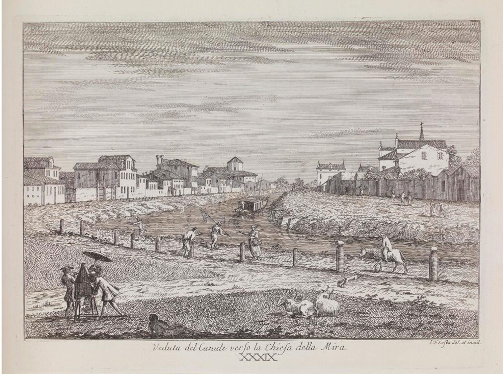
18 Giovanni Francesco Costa, ‘Veduta del Canale verso la Chiesa della Mira’, in Delle Delicie del Fiume Brenta (Venice: published by the author, 1750–62).
19 See Alberto Lualdi, ‘Venetian makers of optical instruments of the 18th–19th centuries: Part 2, The Selva Family’,
Bulletin of the Scientific Instrument Society, no.77 (2003), 10–13. According to Lualdi, Domenico was in Venice by 1696, and his son Lorenzo, aged nine, joined him in the business in 1725. Lorenzo Selva published a series of catalogues of the products of the workshop, including Esposizione delle Comuni, e Nuove Spezie di Cannocchiali, Telescopj, Microscopj, ed Altri Istrumenti Diottrici, Catottrici, a Catadiottrici Perfezionati ed Inventati de Domenico Selva (Venice: Giambattista Pasquali, 1761). This describes the camera obscuras offered by the firm.
20 Lorenzo Selva’s catalogue of 1761 was dedicated to Algarotti.
21 W.J. ’s Gravesande, Essai de Perspective (The Hague: Albert Troyel, 1711). Two designs of camera are described in the chapter ‘On the Use of the Camera Obscura for Drawing’, with its own pagination, 1–37. Our tent camera follows broadly Fig.77, Plate 32.
22 Gioseffi, op. cit., 43, Fig.36.
23 Luca Carlevarijs, Le Fabriche e Vedute di Venetia (Venice, 1703).
24 André Corboz, Canaletto: Una Venezia Imagginaria , vol.I, part 2, section 5 (Milan: Electa, 1985), 188–239.
25 See Constable and Links, op. cit., 70, 73.
26 Gioseffi, op. cit., 36.
27 Several instances are noted by Corboz, op. cit
28 Kenneth Clark, Landscape into Art (New York: Harper and Row, 1976), 65.
29 Tim Jenison, ‘Reconstructing Vermeer’s View of Delft ’, currently in press.
30 See Arie Wallert, ‘Painting methods of Jan van der Heyden’, in Peter C. Sutton, Jan van der Heyden (1637–1712) (New Haven: Yale University Press, 2007), 91–103.
31 In The Works of Sir Joshua Reynolds, ed. Edmond Malone, 3 vols. (London: T. Cadell, Jr, and W. Davies, London, 1801): see vol. II, 79, where Reynolds reports seeing a Van der Heyden in Amsterdam, ‘his best’, a view of the church of S. Andreas in Düsseldorf.
32 See Caricature di Anton Maria Zanetti, catalogue of an exhibition at the Fondazione Cini, no.326, ed. Alessandro Bettagno (Venice: Neri Pozza, 1969).
33 Marieschi’s painting was exhibited in Oglethorpe University Museum of Art’s 1997 exhibition The Grand Tour: Landscape & Veduta Paintings Venice & Rome in the 18th Century, and appears on the exhibition webpages: https://museum.oglethorpe.edu/ exhibits/michele-marieschi-view-camposs-giovanni-e-paulo-calleoni-monument/ [accessed 09.10.23].
34 The 64 manuscript volumes of the diary are now in the library of the Correr Museum. Extracts were published in Notizie d’Arte tratte dai Notatori e dagli Annuali del N.H. Pietro Gradenigo, ed. Lina Livan (Venice: La Reale Deputazione editrice, 1942). The translation here is by Moschini. The Englishman has not been identified.
35 See for example J.G. Links, Canaletto and His Patrons (London: Paul Elek, 1977), 96. Also George A. Simonson, who writes that ‘Guardi’s aims in art differ so much from the more methodical and scientific ones of his master [Canaletto]’: Francesco Guardi 1712–1793 (London: Methuen, 1904), 26.
36 John Ruskin, Modern Painters (London: Smith, Elder & Co., 1843). Ruskin declared that Canaletto ‘professes nothing but a coloured Daguerreotypism’. But there are ironies here. The three paintings that he cites are not by Canaletto, but by Bellotto, Marieschi, and an unknown artist. Also, Ruskin took Daguerreotypes himself and on occasion copied them precisely in drawings.
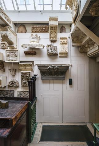
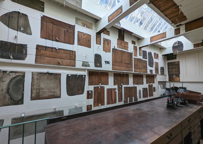
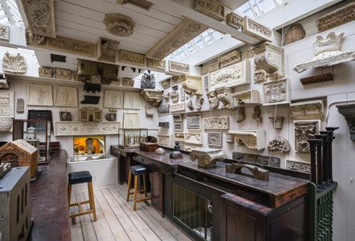
Sir John Soane’s drawing offices at Nos 12 and 13 Lincoln’s Inn Fields were the fulcrum of his practice between 1794 and his retirement in 1833. His unique surviving ‘upper’ office was restored in 2022–23. In this article, I will trace the history of the office and recount its use as an instrument in the training of Soane’s pupils.
When the young architect John Soane bought No.12 Lincoln’s Inn Fields in 1792, he demolished and rebuilt the main house as a home for his family, designing a singlestorey purpose-built office at the back, accessed from a mews street, Weston’s (today Whetstone) Park. In this new working space Soane’s articled pupils were supervised by one or more clerks and the office drawings and business papers were housed.
At some point, probably in either 1803 or 1806,1 this first office was expanded by the addition of an ‘Upper Office’ above, accessed via a wooden staircase. 1806 seems the more likely year, for not only did Soane have a larger number of pupils and clerks then 2 but he also required more space for the production of drawings following his appointment as Professor of Architecture at the Royal Academy in March. Although he didn’t actually deliver his first lecture until 1809 3 he began preparatory work immediately and in May started his pupils on the production of lecture drawings. Henry Hake Seward worked on a ‘Drawing from Sir William Chambers’ 4 while a day or so later two other pupils were busy with drawings ‘from Vitruvius’ and ‘from Palladio’ and another started work on a drawing of the entablature of Soane’s favourite Roman building. 5 The production of lecture drawings remained a mainstay of the pupils’ work for the remainder of Soane’s career.
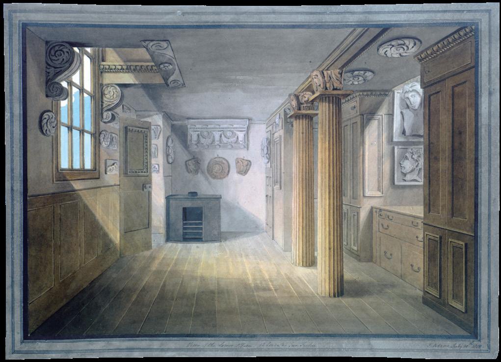
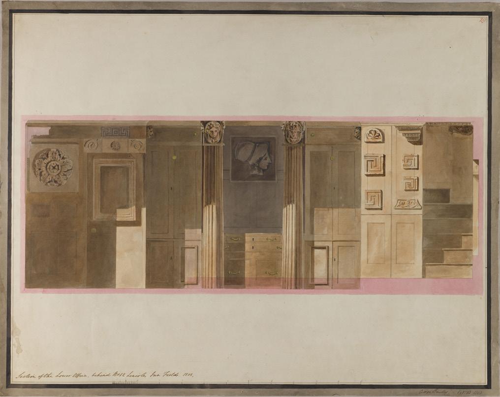
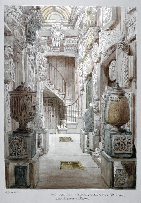
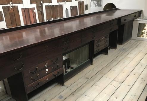
The appearance of the Lower Office is recorded in two watercolours made in 1808 (Figs 1, 2), one of which shows the staircase to the Upper Office. These reveal the extent of built-in storage for records, including full-height cupboards. A plan chest in a recess created by two cupboards (on the right in Fig.2) is shown with deep drawers at the bottom, probably used for bundles of documents. A clerk could have worked at a drawing board resting on the top of this plan chest, either standing or seated. Although we have no view of the Upper Office, we can deduce that the long drawing tables must have been up there and see how light penetrated down through floor apertures into the Lower Office below.
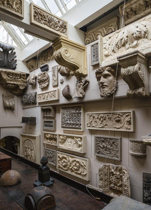
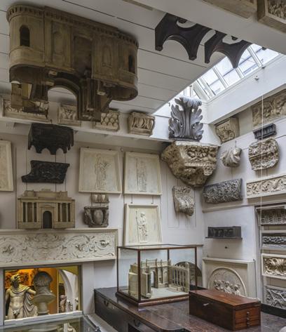
The two views show plaster casts after antique and Renaissance architecture and sculpture hung in the Lower Office. Several, including the circular salver on the far wall and the female head in the recess on the right (Fig.1), can be identified in the collection today. 6 In Fig.2 we can see a series of small variations on the Greek key decoration –an essential part of the repertoire of any architect of the neo-classical period – as well as a large relief of Minerva.7
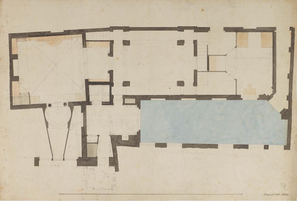
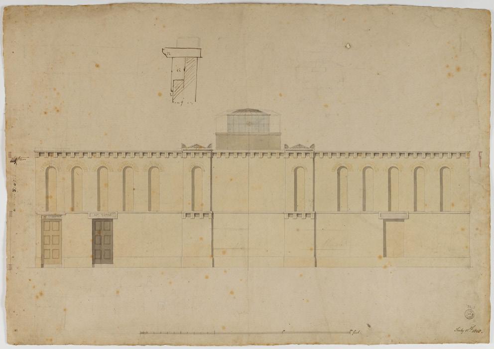
In 1807 Soane negotiated the purchase of 13 Lincoln’s Inn Fields, the house next door, and the following year, 1808, redeveloped the rear premises as an extension to his existing house at No.12, pulling down a stable block on the site. Here he built a ‘plaister room’ for the display of plaster casts and fragments (today the Dome Area) as well as new lower and upper offices. In 1812 Soane took over the whole of the No.13 premises, pulled down the front part of the house and rebuilt it,
connecting it to the new area at the back and blocking off and renting out No.12. Soane then lived at No.13 until his death in 1837, when his home became Sir John Soane’s Museum. 8 Although we have no views of the new Lower Office behind No.13, two design plans from the construction period (1808–09) record its basic elements (Figs 3, 4). On both plans the office is to the top right. It has an entrance opening on to the street and incorporates a staircase that runs north–south behind the solid east wall of the adjacent ‘plaister room’, giving access to an office on the level above. Fig.3 shows the initial layout in August 1808 with a desk and chair beneath the south window of the office, probably for a clerk who could supervise and be ready to meet visitors, whilst the pupils worked upstairs. In Fig.4, dated March 1809, a modified layout is proposed with a ‘writing desk’ shown alongside a large bookcase flanked by cases for drawings. Soane owned multiple copies of important architectural texts ranging from Vitruvius’ treatise to those of contemporaries such as William Chambers and it seems likely that he allowed his pupils to study them. 9 Both plans show that a servant’s bedroom, close to the back door, was incorporated within the Lower Office, probably in part to ensure security at night.10
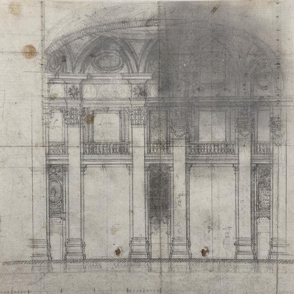
In 1812 we get our first glimpse of the top-lit Upper Office behind No.13, with long desks each side (Fig.5). The perspective is not perfect but a void beyond the far desktop and a glimpse of the top of an arch indicate that the office is a space within a space. When this view was made, Soane was busy rebuilding the main house at No.13 Lincoln’s Inn Fields.
Fig.3 Soane Office, ground floor plan of the rear buildings of Nos 12 and 13 Lincoln’s Inn Fields, 18 August 1808, showing the new Lower Office behind No.13 top right, pen and watercolour on paper (SM 32/3/51).
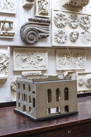
Disassembled Kent tables stacked under the desks perhaps hint at his being in the midst of this. Perched on a ledge above the desk, to the left, are three small models (the middle one is of the façade of No.13 Lincoln’s Inn Fields, and the one on the right is of the portico of the Royal College of Surgeons on the south side of the square) made for the court case
Soane fought concerning the façade of his new house in 1812.11 Two do not survive but one, the small façade model for No.13, is now back on show in the restored office, displayed as at the time of Soane’s death in 1837 (Fig.6). Further to the right are other small models for attics at the Bank of England. These are of the sort routinely produced to present alternative designs to clients.
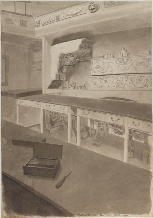
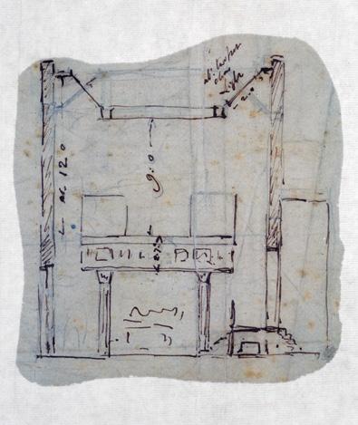
Soane’s offices behind No.13 were remodelled extensively in 1818 when the Lower Office was converted into additional display space as a consequence of his purchases of antiquities and casts at the Robert Adam Sale.12 The Upper Office was modified again in 1821 when the roof was raised and the staircase up to it moved to the east end. Fig.7 is a sketch in Soane’s hand, capturing the idea of the Upper Office as a table-like platform within a larger space, supported by columns in the colonnade below and showing how light from the skylights falls not only on the desks but also illuminates the spaces below the office.
Fig.8 is the only other view of the Upper Office from Soane’s lifetime, by Joseph Michael Gandy (1822). It looks from the top of the stairs up to the office towards the Dome Area (glimpsed through the aperture at the far end) and renders the drawing office as a trompe l’oeil drawing, as if on a sheet of paper curling up at top and bottom. Since 1812 the space
under the desks has been infilled with many additional drawers and cupboards – no doubt the consequence of the loss of the Lower Office a few years earlier.
One final alteration to the office was made in 1824–25 when Soane rebuilt 14 Lincoln’s Inn Fields and expanded his Museum across the back of that house. The staircase up to the office was relocated to the north end of the new ‘Museum Corridor’ (Fig.9), where it remains today.
A total of 54 men worked in Soane’s office as pupils, clerks or assistants between 1784 and Soane’s death in 1837, six days a week, initially from 7am to 7pm in the summer and 8am to 8pm in the winter. After 1810 this changed to 9am to 8pm as standard yearround office hours. Most were pupils articled for five years for a £157 premium – their articles promising that Soane would educate them in the ‘Art, Profession and Business’ of architecture. The earliest of these documents concerns Soane’s first pupil John Sanders in 1784, requiring that the new pupil ‘shall faithfully and diligently serve him [Soane] … his secrets keep and his lawful command obey and conform, he shall not part or absent himself from the service of his said Master without his leave during the said Term or unduly or negligently spend or waste any of his said Master’s property.’ A clause which was only relevant to Sanders, who lived with the Soane family, bound Soane to ‘find and provide … good and sufficient meat drink and lodging’. All later surviving articles stipulate that the parent make provision for ‘proper and sufficient board, lodging, washing and apparel’ and at present we know very little of the pupils’ lives outside office hours. David Laing’s
Fig.7 John Soane, sketch of the drawing office, conveying the idea of the upper office as a table-like platform within a larger space, pen on paper (SM 32/3/52 verso).
articles of 1790 state that the pupil ‘shall not unduly spend or waste any of the Monies, Goods or Chattels of the said John Soane nor any of his Employers [clients] which shall be in the custody of or intrusted with him, but shall at all times during the said Term truly account for, pay and deliver to the said John Soane … all and every such sum and sums of Money, Plans, Draughts, Accounts, Writings, and other things with which he be intrusted’. This expansion of the previous wording reflects how regularly pupils were placed in a position of trust, couriering money and drawings to and from clients and contractors and taking responsibility for entering and reconciling accounts.
The pupils arrived in the morning at the back door of the office (Fig.10), entering close to the stairs up to the office. At no time did they use the front door and they were not permitted to go to the kitchen or fraternise with the servants – as a letter from a pupil apologising for an infringement in 1800 reveals.13 Soane himself did not work in the office but had his desk in the ‘Little Study’ nearby on the ground floor, with a small dressing room and water closet between that room and the office providing facilities that he could use before going through to the office to see employees or meet a visitor.14
As pupils entered the office each day they were greeted by a model of the classical orders set on a balustrade (Fig.11). New pupils usually spent their first few weeks drawing the orders and this model was a reminder of their centrality to any architect’s training. The arrangement is a typically idiosyncratic – even humorous – Soanean riff on the nature of the column, the formality of the
orders contrasting with the freely inventive variations on the ‘column’ represented by the barley-twist balusters. On the adjacent wall is a full-size model of one of Soane’s own inventive neo-classical pilaster capitals for the Bank of England.
The pupils’ names and times of arrival, along with a note of work done, were entered daily in the Office Day Book.15 In accounting, day books were in common use as early as the 16th century, a ‘day book’ being synonymous with a ‘journal’ and providing a chronological account of money coming in and out. However, in Soane’s office the day book had a broader function, recording the entirety of daily business. Some financial transactions were included, which would later be entered into a ledger or journal (one job done by pupils was to reconcile the two). Soane Office day books survive for an almost unbroken run of 45 years, providing an extraordinary window into his business practice (Fig.12).
They record the pupils producing copies of drawings, done by pricking through the outlines on to new sheets of paper or sometimes by tracing, amending them to incorporate Soane’s scrawled corrections as designs evolved. The pupils also ran errands, received deliveries, went on site visits, mounted and framed drawings for Royal Academy exhibitions, entered accounts and wrote out invoices. They were permitted days off at Christmas and Easter and Soane allowed a Jewish pupil – David Mocatta, whose name appears on the pages reproduced in Fig.12 – not to work on Saturdays.
Once in the office the pupils worked at long mahogany desks – built from salvaged elements from the previous office at No.12
– with a good north light falling on their drawing boards, which probably rested on the front edges of the desks.16 We know they sometimes perched on stools because the 1837 inventory lists ‘3 Stools covered in leather the seats stuffed with Horse [i.e. horsehair]’.17 Grated apertures below the desks enabled heat to circulate from Soane’s innovative central heating system without the need for a fireplace (the key to the viability of the inventive structural form of the office) and also enabled every word said to be heard from adjacent spaces –an incentive to disciplined, quiet work!
Pupils sat under the watchful eye of the Roman Emperor Lucius Verus, a cast of whose face is the only human presence among all the casts in the office (Fig.13). This seems no accident as he was famed as an exceptionally good student.18
Only a few of the drawing instruments used in Soane’s office survive, including pens with metal nibs, mass-produced in England from 1822.19 Quill pens were bought in bulk (500 at a time for a few shillings), probably already washed, dried and trimmed of much of the feather itself, and would then have been cut and shaped to form a nib using a quill cutter, a task that was part of the routine of daily life of the office. Three surviving ink-stained quills are a tangible and evocative link with the pupils and the survival of these implements a miracle of serendipity (Fig.14).
Pupils were thoroughly trained in draughtsmanship and the day books record some attending classes at the Royal Academy or being sent to private tutors. The casts on the walls of the office provided subject
matter for drawings, fostering familiarity with classical ornament (Fig.15), and the pupils also undertook exercises such as ‘drawing shadows’, requiring the casting of strong shadows using lamps or candles (Fig.16). Intriguingly, during the restoration of the office, one framed cast of egg-anddart moulding was discovered to have burn marks, although no fire is recorded there (Fig.17). 20 Perhaps a naked flame got too close?
As well as working in the office, pupils were sent out to learn about construction processes through making progress drawings on site (Fig.18) – a method in architectural training that seems to be unique to the Soane office.
Soane’s pupils also produced more than 1,000 watercolours to illustrate their master’s Royal Academy lectures. Some exceed 6 feet in length – their production making full use of the long desks in the office. These too could involve work elsewhere, as when a group of pupils were sent to survey Stonehenge in 1817. Henry Parke produced the watercolour shown in Fig.19 with its delightful vignette of one of the party (himself?) sketching the scene. Parke also accompanied Soane on a ten-day trip to Paris in September 1819 and made sketches for a series of exceptional lecture drawings illustrating the city (Fig.20). When Parke left the office, Soane gave him a gift of £100, which enabled him to travel to Italy, Sicily, Greece and Egypt from 1820 to 1824. For many of Soane’s pupils, like Parke, their time studying in Soane’s office provided, in the words of Edward Davis, ‘a passport … through life’. 21
Fig.19 Henry Parke, Royal Academy lecture drawing to illustrate Stonehenge, showing a survey being made by Soane’s pupils using a plumb-line, dated 23 September 1817, watercolour on paper (SM 24/9/2).
The restoration of the office completed earlier last year enabled us to learn more about the construction and use of the space. It involved the removal of almost 200 casts from the walls for cleaning, revealing that many had never been taken down and were still held up by their original long hand-forged nails. Our conservators carefully prised the casts off, removed and straightened the nails and a year later re-fixed the casts with the same nails using the original holes. Fig.21 shows the areas of unpainted, bare wood revealed where items were taken down that still occupied their original spaces and had been left in situ and painted around in later redecorations. Our redecoration carefully preserved all this evidence. Over the period of a year the casts were surface-cleaned before their re-fixing in January 2023.
Analysis of the original hang of the office revealed just how many items had been moved elsewhere since Soane’s death and needed to be brought back. Now, postrestoration, it is the reintroduction of architectural models that is most striking, from small wooden models of domes which, after an absence of more than half a century, could be re-hung on their original fixings, still in the beams (Fig.22), to the large models for the Bank of England on the desks (Fig.23). 22
Examining the desks and drawers during their restoration by Peter Holmes also brought new insights. Most are numbered with ivory discs, the numbers cross-referencing with the lists of drawings drawer by drawer in the 1837
inventories. Some of the drawers down at floor level are unnumbered: perhaps these were used for storing the many reams of paper that the office required. Other elements were clearly constructed from salvaged elements – probably from Soane’s earlier office behind No.12 –adapted and carefully reused in the new spaces (Fig.24). A gap beneath a desktop may have been the place where drawing boards were slotted in, out of the way –just where two surviving ones were found in the 1980s (Fig.25).
Soane’s office is, as far as we know, the only surviving architect’s office worldwide from before the late 19th century and is one of the most important spaces in the Museum, largely unaltered since it was used by Soane and his pupils. Its form continues to inspire architects today and we hope that its restoration returns Soane’s busy architectural practice, around which the life of the house must have in large part revolved, to the fore.
I am greatly indebted to our former Director, Margaret Richardson, whose fascination with the workings of Soane’s office practice first inspired my interest in this extraordinary space. This article is dedicated to her with grateful thanks for her encouragement and friendship over the last 40 years.
Free public tours of the restored drawing office take place on Thursdays and Saturdays at 2.30pm. For information see www.soane.org/visit
1 Unspecified office alterations are recorded in 1802 and 1806.
2 Soane Museum curatorial records: spreadsheet of pupils/employees in the Soane office (unpublished).
3 David Watkin, Sir John Soane: Enlightenment Thought and the Royal Academy Lectures (Cambridge: Cambridge University Press, 1996), 288.
4 Soane’s first lecture was about Civil Architecture, the title of Chambers’s famous Treatise on Civil Architecture (1759). Chambers was a founding member of the Royal Academy and someone Soane knew and admired, and it seems a fitting tribute to an early mentor that the first lecture drawing produced would be taken from this work.
5 Soane Museum Archives: DB/11: dates in May 1806 with the first entry for a lecture drawing on 9 May.
6 The salver is either SM A20 or SM M1044 (there are two casts from the same original in the collection) and the head is SM M813, cast from the figure of ‘Dawn’ on the tomb of Lorenzo Duke of Urbino, one of Michelangelo’s Medici tombs in the Basilica of San Lorenzo, Florence.
7 SM M102.
8 On Soane’s death on 20 January 1837 the Soane Museum Act of Parliament (1833) came into force, vesting the Museum in a board of Trustees, named in Soane’s Will, on behalf of the nation and requiring it to be kept ‘as nearly as possible’ as it was left at that time.
9 Soane owned 13 versions of Vitruvius and multiple copies of Palladio’s celebrated four books of architecture,
in Italian and English, as well as six copies of Laugier’s Essai sur l’architecture (1753), in French and English editions, and four copies of Sir William Chambers’s Treatise on Civil Architecture
10 Soane’s first Office at No.12 had an ‘alarum bell’ fitted, which was altered and repaired in 1803 (SM Archives: 16/1/2 and duplicate bill 6/50/9).
11 Soane was accused of contravening the Building Acts with his projecting ‘loggia’ on the façade of No.13 and presented the model of his own projecting façade alongside the two others showing projections on other buildings in Lincoln’s Inn Fields in support of his case, which he won.
12 Christie’s sale of the ‘valuable collection of antique sculpture … also architectural specimens and fragments, from celebrated remains in Italy; cinque cento carvings, and original compositions in terra cotta, with casts from the same, which were procured at great expense by that distinguished architect, R. Adam, Esq.’, 22 May 1818 and on following days.
13 SM Archives: Letter from pupil Charles Malton to John Soane, 23 September 1800, in which he explains ‘my only reason for going into the kitchen was to enquire if you were from home’ and that ‘beyond common civility’ he has never spoken to Soane’s manservant. See Susan Palmer, At Home with the Soanes (London: Pimpernel Press, 2015), 16.
14 This had also been the case at No.12, his first home, where Soane’s desk was in the Breakfast Room on the ground floor with a small dressing room and water closet on one side of the central courtyard between that room and the office.
15 Sometimes the entries are in pupils’ individual hands but sometimes a clerk seems to have made the entries.
16 The front edges of the desk-tops are much eroded and the damage could easily have been caused by this practice. In the AB 1837 inventory a list of ‘Sundry Mathematical instruments, Drawing Apparatus &c. &c, found in different places’ includes four drawing boards: ‘1 mahogany Drawing Board, D[ou] ble Elephant size, 2 deal [pine] ditto Antiquarian size, and 1 ditto [deal drawing board] smaller’. Aside from the small number of instrument cases and instruments for office use (dividers, compasses, T-squares and rules) on the list, the other equipment comprises surveying instruments to be used out of the office (‘A Beam compass, with shifting legs’; ‘A mahogany stand for a Theodolite, in a box’ and ‘A Hollow stick containing a pair of “Five Feet Rods”’). It is interesting that although no museum numbers were allocated to these objects, by including them at all the first Curator of the Museum, former pupil George Bailey, recognised that there was value in their preservation.
17 SM Archives: AB inventory, op. cit., 407.
18 SM M1400. The cast is from a marble bust in the Louvre (MR 550; Ma 1170) dating from c. AD 180.
Fig.25 The restored office looking northwest, after restoration, 2023. The gap beneath the desk-top at the right-hand end of the north side (beneath the bridge model) was for the storage of drawing boards.
19 In 1792 ‘New invented’ metal pens were advertised in The Times newspaper. Bryan Donkin patented a metal nib in 1803 and in 1822, John Mitchell of Birmingham began mass-production of machine-made, steel pen nibs.
20 SM M1372.
21 Letter, Edward Davis to Soane, 30 April 1828, SM Archives Private Correspondence XV.B.23.1.
22 It seems likely that these large Bank models returned to Lincoln’s Inn Fields when Soane retired from the Bank in 1833 and were previously in his office there. They could not have been on the desks at Lincoln’s Inn Fields earlier as this would have made the work of the busy office impossible.
The Art of Measuring Images: Albrecht Meydenbauer and
the Invention of the
Photographic Survey —
Emma Letizia Jones
In 1868, the little-known project architect and government surveyor Albrecht Meydenbauer (1834–1921) climbed to the top of the Rotes Rathaus in Berlin to shoot the first 360-degree photographic record of the city (Fig.1). In contrast to the idealistic, hyper-real clarity of a more famous painted panorama of Berlin made only 30 years before, Eduard Gaertner’s Panorama von Berlin, Meydenbauer’s photographic panorama is shaky, blurred, unstable. While Gaertner’s survey (Fig.2), painted with the aid of a camera obscura, is crisp, stiff and hyper-real, Meydenbauer’s unsteady photographs betray the limits of his new technology. But it would not be long before Meydenbauer would find a way to overcome these deficiencies, continuing to experiment with film in the scientific recording of the city by using the photographic survey image – or photogram – to document important buildings for posterity. The still existing Meydenbauer archive in Waldstadt, Brandenburg, containing around 20,000 photographs of Berlin and its environs, is an example of one of the earliest uses of architectural photography to document and preserve urban monuments. 2 However, these photographs were never intended to be simply visual records. Instead, they attest to the potential of the photograph to act not just as a representational device, but also as a generator of a newly projected order in the real spaces of the city. In short, Meydenbauer would begin to use photography to realise an ambition that Leon Battista Alberti could have only dreamed of when he first attempted to survey the city of Rome in the 1440s by ‘measuring with sight’: that of measuring and ordering the world with nothing but a recording device (in Alberti’s case, a circular measuring table and compass) and a point of view. 3
The idea behind Meydenbauer’s development of pioneering photographic technology to survey buildings and map terrains –a process he called Messbildkunst (‘the art of measuring images’) –began with a near-death accident when he was 24 years old (Fig.3), and conducting freelance work for the Prussian Conservator of Monuments, Ferdinand von Quast. While surveying an 11th-century church in the town of Wetzlar in 1858, Meydenbauer decided to forgo the use of scaffolding, finding it cheaper and quicker to hoist himself up and down the side of the building in a timber box hung by ropes typically used for cleaning the high glass windows.
At the end of one measuring session he attempted to step out from the box on to one of the windowsills and slipped, causing the box to slide out from under him. At the last moment, he managed to propel himself through the open window, where his fall was broken by a spiral staircase fixed to the inside of the wall. After regaining consciousness, Meydenbauer, still shaken by the near-fatal experience, began to wonder how a building surveyor could obtain the geometric properties of those inaccessible parts of a monument without putting his life in danger. 4
In Meydenbauer’s day, photography was already being used widely during surveying for documentation purposes, but still played a role subordinate to the act of measuring, which remained a laborious manual exercise. However, to solve problems of accessibility he had encountered at first hand, Meydenbauer had the idea of taking the mathematical principles of projective geometry and applying them not to the construction of pictorial perspectives, but to reversing the perspective view already captured in his photographic images – which he had begun to call photograms. 5 From these photograms alone, Meydenbauer devised a method for plotting the extent of a building in plan without the need for direct surveying, relying instead on two known systems of spatial interpolation. Both of these methods derived the geometric properties of an object by using a process of restitution from a perspective image; that is, by working ‘backwards’ from the perspective (in this case the photograph) to the orthographic drawing using the conventions of projective geometry.
The Art of Measuring Images: Albrecht Meydenbauer and
the Invention of the
Photographic Survey —
Emma Letizia Jones
Fig.1 Albrecht Meydenbauer, photographic panorama of Berlin, 1868. Brandenburg State Office for the Preservation of Historical Monuments and Archaeological Museum.
Fig.2 Eduard Gaertner, Panorama of Berlin, 1834. Photo Jörg P. Anders. Property of the House of Hohenzollern, HRH Georg Friedrich Prince of Prussia/SPSG.
Fig.3 ‘Der Königliche Bauführer, Albrecht Meydenbauer’. From Albrecht Grimm, 120 Jahre Photogrammetrie in Deutschland, vol.2 (Munich: R. Oldenbourg Verlag, 1977), 13.
Meydenbauer’s idea, in principle, was as old as the invention of perspective itself. Writing around 1480, Leonardo da Vinci had explained that ‘perspective is nothing else than seeing a place behind a sheet of glass, smooth and quite transparent, on the surface of which all the things may be marked that are behind this glass. The things approach the point of the eye in pyramids, and these pyramids are intersected on the glass plane.… Among objects of equal size that which is most remote from the eye will look smallest.’6 In Meydenbauer’s case the photographic surface, rather than the transparent glass, became the intermediary device – one from which an entire set of data could be extrapolated about the object being seen: a modern update to Albrecht Dürer’s 16th-century ‘Perspective Machine’.7 Meydenbauer himself explained this relationship between the object and the picture plane in one of his own diagrams, showing the relationship of the point ‘P’ on the picture plane to the same point ‘P’ on the architectural object (Fig.4).
After his accident, around 1860, Meydenbauer began to learn the principles of photography in order to apply his method with accuracy. His first mathematical reconstruction was done from an existing photo of the great pyramid of Giza. Meydenbauer used the photo to calculate the geometrical relations of the structure, and then favourably compared it to values known from existing technical literature. This success was followed by an experiment in drawing the elevation of a house façade from a photograph he took himself. The photograph and the drawing were both exhibited side by side, with a short explanation, at the first International Photographic Exhibition in Berlin, in the summer of 1865. In 1867 he convinced the Prussian Ministry of War and the Ministry of Trade and Public Works to contribute the funds needed for a full-scale surveying experiment in the town of Freyburg an der Unstrut, covering an area of about 2.5km² (which included a particularly detailed photogrammetric survey of the town church). From then on Meydenbauer began to use photogrammetry regularly in his work as a surveyor and construction foreman, and travelled globally to test the method, including to Baalbek (Fig.5). Messbildkunst thus came to refer to a method of determining the exact size, shape and position of an object from photographs of it, to the extent that the surveyor was able to provide drawn surveys without the need for manual measurement at all. Meydenbauer described this process in numerous slides and publications over the second half of the 19th century, culminating in a detailed summary publication in 1912, Handbuch der Messbildkunst in Anwendung auf Baudenkmäler- und ReiseAufnahmen (Manual of the Art of Measuring as Applied to Architectural Monuments and Travel Recording). 8
The origins of perspective restitution
While the photographic tools Meydenbauer invented to make his surveys were relatively new, the principles he employed and described in his publications were not. In applying the method of perspectival restitution to the new technology of photography, Meydenbauer was drawing upon a long investigative history of quantifying the visible, showing that perspective has never been content to settle into a merely illustrative function. One of the earliest examples is Leon Battista Alberti’s small publication of ‘mathematical games’, the Ludi mathematici, produced during the 1440s (Fig.6). 9 This text and accompanying set of diagrams presented a series of exercises for using the eye to measure different elements in the landscape that could not be reached easily by the body (such as, say, the height of a tall tower or the distance of an object across an unbridgeable body of water) by using a combination of triangulation and ratio, and knowing a few key dimensions such as the distance of the eye from the object or from an intermediary measurement tool like a stick. By the early 17th century, these rudimentary games involving the restitution of geometric properties using only the eye had given way to
Fig.4 Relationship between object and picture plane. From Jörg Albertz and Albert Wiedemann, eds, Architekturphotogrammetrie gestern –heute – morgen (Berlin: TU Berlin, 1997), 71.
Fig.5 Meydenbauer with Prof. Schleyer on a survey assignment in Baalbek. From Grimm, op. cit., 48.
Leon Battista Alberti, Ex ludis rerum mathematicum, c.1440s. Fol.1r of the manuscript Galileaiana 10. Biblioteca Nazionale Centrale, Florence.
Fig.6
more extensive and complex studies involving perspectival projection systems in drawing. Around 1600, various authors began using the principles of perspective to work out how to reconstruct the space of an already existing painting, expressly so that one would know from what vantage point the perspective was created, and therefore from what position the image should best be appreciated.10
These investigations eventually culminated in the production of what was possibly the most comprehensive manual on the problem of perspectival restitution available to Meydenbauer in Berlin at the time of his surveying work: the Swiss-Alsatian optician J.H. Lambert’s 1759 treatise Die freye Perspective, published whilst Lambert was in residence at the Prussian Academy of Sciences in Berlin.11 Die freye Perspective was primarily known for being the first practical work on perspective to demonstrate a clear and unified method for constructing objects directly in the picture plane of a drawing (that is, in the perspective image) without the assistance of an intermediary orthographic drawing such as a plan or section. Lambert called these kinds of constructions ‘free perspectives’, and conceived of them as having their own geometry, which he called ‘perspective geometry’.12
Lambert’s methods for bypassing orthographic drawing in the construction of perspectives were aimed primarily at landscape painters, whose art, growing in popularity, was nonetheless deemed by Lambert to be imprecise, too much reliant on observation alone, and in need of a more mathematically accurate method of composition. However, it turned out to be far more useful as a tool for architectural designers who wanted to accurately test the visual effect of architectural compositions directly on the picture plane. It was used in the teaching of architectural drawing to many later generations of architects and artists in Berlin, contributing to the education of both the young genius architect Friedrich Gilly (1772–1800) and, by the early 19th century, his apprentice Karl Friedrich Schinkel (1781–1841).13 When Gilly was invited by the first director of the newly founded Berlin Bauakademie, Johann Albert Eytelwein (1764–1848), to teach architectural drawing in 1799, he devised a course outline for Berlin’s first polytechnical architecture school that included Lambert’s manual, and devised a number of teaching aids describing how to use his free perspective method (Fig.7).14 Eytelwein himself had already published his own Handbuch der Perspektive in 1810 based on Lambert’s method, as did Johann Erdmann Hummel (1769–1852), painter and professor of perspective, architecture and optics at the Prussian Academy of Arts from 1809, who released his Die freie Perspektive in 1825 (Fig.8). Both of these pamphlets were aimed squarely at artists and architects, attempting to translate Lambert’s complex steps into a series of visual exercises for students. Schinkel, famously, ushered these pedagogical exercises into the realm of concrete spaces, buildings and spectators when he used corrective perspective to play a wry trick on the audience enjoying Goethe’s theatre dedication prologue, which was commissioned for and performed on the occasion of the opening of Schinkel’s own Berliner Schauspielhaus on 26 May 1821. Displayed on his design for the stage backdrop curtain – like a portion of a painted Gaertner panorama – was a distant urban image of the very theatre the audience were sitting in. Recently, Kurt Forster was able to calculate, by starting with Schinkel’s perspective just as Meydenbauer started with the photograph and worked backwards, from which real viewpoint in the city the image was conceived: it recreates the King’s view, from the window of his palace across the city.15 With an ambiguity by now characteristic of Schinkel’s approach to dealing with the political inferences of architecture, this could either be read as a validation of sovereign power over the urban landscape and its citizens, or, more provocatively, as the opposite – a gentle suggestion that the privileged view of the city, as of the action on the theatre stage, is increasingly to be surveyed
Fig.7 Friedrich Gilly, Perspective study with landscape scenery, before 1800. Photo Dietmar Katz. Berlin State Museums, Kunstbibliothek/ bpk, Inv. Hdz 7718.
1824).
Fig.8 Johann Erdmann Hummel, Die freie Perspektive, plate 9 (Berlin,
and shaped by the middle-class metropolitan subject. That Schinkel built this restitution game directly into his stage design reflects his mastery and active application of the Lambertian principles that had infused the drawing education of the Berlin schools 20 years before, when he himself had been a student at the Bauakademie.
Also trained at the Bauakademie and specialising as a RegierungsBauführer (Government Construction Foreman) in the mid-1850s (he graduated in 1858), Meydenbauer, too, would have been familiar with the ‘free perspective’ projection regimes outlined and taught by Lambert, Eytelwein and Hummel. In fact, Meydenbauer was the product of an education system that was exceedingly broad, but also allowed its graduates to specialise. For example, not all Bauakademie graduates became architects: many became surveyors, civil servants, engineers (hydraulic, structural, civil), or master builders. But all, no matter their specialisation, were educated in optics, drafting and perspective drawing, in building ornamentation (the orders), in urban and rural architectural design and in the history of architecture; as well as in mathematics, statics, mechanics, building physics, hydraulic engineering, surveying and agriculture. Due to the incredibly broad range of subjects (about 18 in total) that students were required to study, an engineer would receive training in drawing, architectural history, and the art of representation, while an architect, conversely, would be required to study numerous technical subjects.16 Despite many reforms over the years between its founding and Meydenbauer’s own term of study there, this basic principle of crossdisciplinary instruction persisted – while the subject of ‘architectural invention’ (or what we would now term ‘design’) was introduced for the first time in 1828 and in 1849, Bauführer in training were still receiving a full technical education alongside drawing, perspective and optics training, and historically-minded subjects like ‘forms of ancient architecture’.17 Such a model differentiated itself from the architectural education offered at the Berlin Academy of Arts, which, at the time of the Bauakademie’s founding, was strongly aligned with the Oberhofbauamt – the ministry responsible for royal and other ‘magnificent’ buildings. The supervision of Landbau – or provincial architecture, agricultural infrastructure and engineering – was the responsibility of the separate Oberbaudepartement, of which J.H. Lambert himself had been an integral part in its earliest days (in 1770 he was designated an honorary member, as an academic expert in the mathematical calculations required for large-scale engineering works).18 The Bauakademie was originally set up to train and feed students into this more practical department, and many were subsequently deployed as state construction supervisors to provincial regions outside Berlin, ostensibly to raise the general standard of infrastructure and public buildings across the region.19 Thus, at the Bauakademie, Meydenbauer received training ideal for his career as a surveyor and building project manager working throughout the Prussian provinces, including on vast road and railway constructions. 20 However, he was also the recipient of knowledge that would have once been reserved only for the Oberhofbaumeister, or first-tier royal architects: such as the ability to judge historic and aesthetic value in architecture according to the established cultural value systems, as well as an ability to understand and practise the art of drawing, particularly the various techniques in perspective construction. This unique combination of skills was the product of broader Prussian educational reforms instigated in the first half of the 19th century, of which the founding of the Bauakademie formed just one part, which aimed to harness the power of the growing bourgeois classes and funnel it directly into the service of the state and the Crown. 21
Meydenbauer was therefore in many ways a textbook Bauakademie graduate and civil servant, yet he was also a perceptive inventor since for his restitution process he made use of another aspect of Lambert’s theory that was less commonly understood and appropriated. Lambert believed
that if one could construct objects directly on the picture plane using perspective geometry, then it followed that those universal properties could be translated back from the picture plane into the reconstruction, or restitution, of an orthographic drawing. Lambert was thus proposing a reversal of the normal conventions of projection, by suggesting that one could begin with the object’s perspectival image in order to end with its geometrical properties, not the other way round – and it is this part of the theory that Meydenbauer was able to make the most effective use of when he applied it to photographs.
The first scholars to establish a clear relation between projective geometry of the kind discussed by Lambert and the processes of photogrammetric surveying were the Germans R. Sturms and Guido Hauck, as late as 1883, but nonetheless before Meydenbauer’s definitive and final publication on the subject. 22 In around 1899, too, Sebastian Finsterwalder published a series of papers dealing with perspective restitution in photogrammetry. 23 Thus we can assume that the link was becoming increasingly well understood within the scientific community over the course of Meydenbauer’s activities. Yet there is no other instance, other than Meydenbauer’s, where this link was discussed specifically in the context of surveys of architecture.
A comparison between Lambert’s and Meydenbauer’s methods explains the mathematical basis of Meydenbauer’s speculations, but it also highlights the ways in which Meydenbauer departed from previous discourses. For example, while his methods may be more comprehensive than those of most of the authors that had dealt with the subject before him, Lambert’s interest in perspective restitution was chiefly based, like theirs, on finding the point in space from which an already existing picture had been constructed. Meydenbauer also deals with this objective, which becomes an essential first step when the surveyor is presented with a photograph he did not take himself (and therefore does not know from where on site the photograph was captured). But he also goes further than Lambert, in that he is not just interested in how a picture is made, but also how to reconstruct all the information contained within it.
Meydenbauer’s
methods
Like Lambert’s treatise, Meydenbauer’s Messbildkunst manual is a largely theoretical work in which mathematical principles are laid out in a series of diagrams, none of which have a great deal to do with real situations. To command the attention of more practically minded listeners, Meydenbauer prepared a series of slides demonstrating his process using real buildings. 24 One shows how the general survey plan of a church (the Meißener Dom –Fig.9) was prepared using the correlation of points plotted between three photographs, and indicating from where these photographs were taken. The photographs, noted as 1, 2 and 3 on the plan, are shown alongside it (Figs 10, 11).
In section 8 of Die freye Perspective Lambert gives four conditions that must be known for the restitution of a perspective image, which can be made roughly equivalent to the terms Meydenbauer uses in these slides: the horizon line (plotted on Meydenbauer’s photographs and shown as H); the ‘eye point’ (equivalent to the points on the photographs, I and II, whose properties Meydenbauer wants to determine); the distance of the eye from the picture plane or ‘depth of sight’ (Meydenbauer’s focal length, or Brennweite, given by f); and the base line determining the height of the eye (or in Meydenbauer’s case, the height of the camera horizon line) from the ground. 25 To this we could also add the vertical dividing line of the photographs given by Meydenbauer’s V, which gives an origin from which various points in the photograph can be measured. If the focal length for each photograph is not known – for example, if the surveyor happened to have been working from a found picture and not one self-taken – various geometrical operations for obtaining its location are detailed
Fig.9 Albrecht Meydenbauer, survey of the Meißener Dom showing the shooting point of photograms 1–3. From Grimm, op. cit., 41.
Fig.10 Albrecht Meydenbauer, photograms 1–3 of the Meißener Dom, cross-referenced to Figs 9 and 11. From Grimm, op. cit., 45.
Fig.11 Albrecht Meydenbauer, construction drawing for determining the position and height of two building points, I and II, from 3 photograms (see Fig.10). From Grimm, op. cit., 43–44.
in Meydenbauer’s Messbildkunst manual (see Fig.12, showing the horizon line PN, the vertical centre line and the subsequently obtained focal length OM, found by tracing a semi-circle between P and N). These instructions follow Lambert’s process of locating the point from which a picture was made (Fig.13).
To determine the location of, for example, points I and II marked in the photographs and diagrammatic plan of the Meißener Dom in Figs 10 and 11, Meydenbauer plots the rest of the known information in plan to scale. Lines of sight are then drawn through where the points I and II occur on each of the three picture planes, and where these lines come to intersect determines the real location of each of the points. In this way, the position of the point sought can be checked between more than one photograph. Heights can be obtained in a similar way by correlating the distance between two or more fixed points that are represented in all the different photographs, wherever they are taken from. These fixed points relate themselves in height, by ratio, to the horizon line determined in the photograph itself and the scale given on the viewfinder (as in the derived elevation of the Meißener Dom, in Fig.14). With a combination of the position and height of every point, Meydenbauer asserts that a plan and elevation of any existing building can confidently be produced in no greater time than it would take to manually measure and then draw it up. A simpler in-principle diagram detailing this process, showing the relationship between the picture plane and the drawn plan, is given in Messbildkunst (Fig.15). There is also a variation on this method – which owes a great deal to Lambert’s ‘free perspective’ instructions – that Meydenbauer demonstrates in the diagram reproduced here as Fig.16.
As others besides Meydenbauer were also engaged in researching the photogrammetric possibilities of early photography, we certainly cannot attribute the invention of the entire technique to him. Yet what distinguishes Meydenbauer from his contemporaries, like the Italian geodesist I. Porro or the French Aimé Laussedat who both experimented with the principles of photogrammetry in other forms, was not only Meydenbauer’s invention of the term in language but also his application of its principles specifically to the architectural object. Meydenbauer also set himself apart particularly through his invention of the photogrammetric camera (Fig.17) – a device that combined all the features of a commercial camera with a wide-angle lens suitable for capturing urban scenes, along with various other gadgets for correcting angle distortions caused by the lens which might affect the perspectival accuracy of the final image.
The first Meydenbauer cameras, designed in 1864 and then manufactured for sale in a workshop associated with his photographic archive (Fig.18), consisted of a stable frame and a lens at an angle of 105 degrees. The focal length of the lens was 25cm, and a fixed aperture (1:77) was used. The plate size was a square 30 x 30cm, and later, 40 x 40cm for more detailed and accurate images. The camera could be rotated horizontally about its axis by means of a spirit level, and a rotating table on the tripod controlled to a high level of accuracy the camera’s vertical and horizontal position. It also contained a viewfinder enclosing the image in a mechanical frame, with a measured scale beside it for adjusting the vertical position of the lens (lens displacement). This helped to locate accurately the horizon line (H) necessary for the later restitution process as well as various other heights on the building by ratio (see Fig.19). The camera parts, in comparison to earlier methods of mounting telescopes and cameras, were located down low on the tripod, as in the example on the far right of Fig.20, for added stability. Meydenbauer continued to develop different iterations of these cameras as the technology improved – such as the one shown in Fig.17, developed after 1890 with an image area of 20 x 20cm, mainly to allow easier portability for photographing on difficult terrains. All the pictures taken using one of Meydenbauer’s Messbild cameras can be said to have been taken ‘photogrammetrically’,
Fig.12 Method for discovering the focal point (Brennweite) of an image. From Albrecht Meydenbauer, Handbuch der Messbildkunst (Halle a. S: Wilhelm Knapp, 1912), 71–72.
Fig.13 J.H. Lambert, Die freye Perspective, plate VI (Zurich, 1759).
Albrecht Meydenbauer, survey elevation of the west façade of the Meißener Dom, as shown in figs 9–11. From Grimm, op. cit., 46.
Fig.14
Fig.15 Albrecht Meydenbauer, diagram showing the process of locating a survey point through the correlation of two points on separate picture planes. From Grimm, op. cit., 18.
A method of restitution from a perspective image. From Meydenbauer, Handbuch, op. cit., 198.
Fig.16
Fig.17 Top: The first Meydenbauer Messbildkamera , 1864. Bottom: Meydenbauer’s Messbildkamera , built after 1890 for easier portability, with format 20 x 20cm. From Albertz and Wiedemann, eds, Architekturphotogrammetrie, op. cit., 30, 33.
Fig.18 The workshop of the mechanic Benndorf, constructing Messbildkameras in Meydenbauer’s Messbildanstalt, Breitestrasse 36/37, Marstallgebäude, c.1934. Brandenburg State Office for the Preservation of Historical Monuments and Archaeological Museum.
Fig.19 Albrecht Meydenbauer, an explanation of the Messbildkamera . From Grimm, op. cit., 42.
Fig.20 Albrecht Meydenbauer’s mounting system for the Messbildkamera (shown on far right). From Meydenbauer, Handbuch, op. cit., 77.
meaning that they use a specific method and have a specific purpose. Often, they are distinguishable not only for their static clarity but also for the angle from which they have been taken: typically, obliquely, at 45 degrees, placing a corner or edge of the monument in the centre of the frame so the vanishing points of the photograph can be clearly identified and plotted for the easiest restitution. These photograms are not just pictorial records, as we might use photographs typically to record buildings in a conservation capacity today. Instead, they form the basis for exact restoration, refurbishment or even reconstruction.
The apparent shape of the city
The fundamentals of photogrammetry that Meydenbauer developed have become the theoretical foundation of an entire field, albeit not necessarily in the sphere of architecture. With the success of his method in its application to architectural monuments, Meydenbauer eventually came to the conclusion that everything that could be photographed was measurable, and also began to photograph natural terrains for mapping purposes. 26 He met with limited success because of limitations in technology and lack of institutional support – but it is nonetheless here that Messbildkunst coincides most closely with present practices. Today, photogrammetry is still the best-known method worldwide for the production of topographical maps, usually from aerial photographs. For the reconstruction of objects, infra-red 3D scanning is now a preferred method. However, programmes like Autodesk ReMake still work with 2D photographs, automating the same processes Meydenbauer once undertook. One need only input the photos, and the software will correlate similar points in the set using a series of matching algorithms and plot them as points in space. Furthermore, a number of components of Meydenbauer’s photogrammetric cameras are still echoed in modern surveying equipment.
On another front, Meydenbauer’s photogrammetric archive also represents the early origins of the now indispensable field of Denkmalpflege (‘monument preservation’), a movement that emerged in the 19th century at the precise moment that the rapid industrial expansion of European cities put the value of such architectural monuments under threat. In Prussia, the discipline of monument preservation took root in tandem with the broader phenomena of German patriotism and cults of remembrance after the Napoleonic wars. It was also accompanied by a flurry of governmental as well as private architectural competitions for the creation of entirely new monuments to the state, 27 in response to increasing nationalist sentiment in the population after the wars of liberation and the withdrawal of Napoleon’s troops from Berlin in 1813. 28 The resurgent popularity of Johann Wolfgang von Goethe’s paean to Strasbourg Cathedral, published as part of his 1772 essay ‘On German Architecture’, stirred a strong cultural sentiment that posited that the roots of a true German identity were to be found in its monuments, and this idea persisted into Meydenbauer’s day. 29 It was formally cemented when state administrations dedicated solely to providing expert advice to local regions on the preservation of castles, churches, ruins and other buildings assumed to be of cultural significance were set up in Bavaria (1835) and Prussia (1843 – the office held by Meydenbauer’s early employer von Quast), these being swiftly followed by other German regions including Baden and Württemberg. 30 Meydenbauer himself was appointed to just such a post in 1882, when he became Conservator of Monuments in Potsdam.
While art historians often advocated only the preservation of historic monuments, governments, church organisations and private individuals largely supported completion, renovation or reconstruction – often as a means of promoting aspects of their own contributions to the memorial landscape. 31 During Meydenbauer’s tenure aesthetic ideals still promoted
Fig.21 Messbild archive, with storage system designed by Meydenbauer, in the Staatliche Bildstelle Berlin, Marstallgebäude, 1935. Brandenburg State Office for the Preservation of Historical Monuments and Archaeological Museum.
Fig.22 The return of the Meydenbauer archive from the Architecture Museum of the USSR Academy of Architecture and Construction in Moscow to the Berlin State Museums, Berlin, 1959. Brandenburg State Office for the Preservation of Historical Monuments and Archaeological Museum.
visual unity in such reconstructions, which often meant removing later additions to buildings, both inside and out, in order to revert to their socalled original plans. In a famous example, Cologne Cathedral, which was the subject of renovation from the 1840s to the 1880s, was restored to its medieval form and surrounding shops and buildings that had attached themselves to the church over time were cleared away, leaving the building as an autonomous and freestanding monument in the city. The church was thus ‘rescued’ from complex urban changes over time, evidence of which was eradicated. 32 Similarly, when Leo von Klenze – another graduate of the Berlin Bauakademie and trusted architect of the King of Bavaria – was overseeing preservation works in Athens in the 1830s, he did not hesitate to order the removal of Byzantine and Ottoman structures from around classical monuments all over the city (but most notably on the Acropolis) with the goal of restoring them to their ‘pure’ state. 33 Meydenbauer’s activities should be considered in this context as part of a general drive for the ‘monumentalisation’ of Germany (which was unified in 1871) in the process of its formation as a nation state. But even more than this, his selection of tools for monument recording and preservation both reinforced and simultaneously created these prevalent aesthetic ideals about what a monument should be. That is, photogrammetry privileged the recording of a freestanding building dissociated from its complex urban condition. For the technique to work, it needed to be free of visual obstructions (to allow a series of photographs to be taken from a good distance away), and to be easily recorded in an image without other structures intervening and potentially disrupting the accuracy of the survey. A monument obscured by complex structures or embedded in a dense urban tissue would not have been a suitable candidate for Meydenbauer’s photograms and would have had to be recorded by other methods. It is therefore not easy to understand whether the monuments in Meydenbauer’s photograms were chosen for their pre-existing status as such, or whether certain buildings’ situational suitability for recording also played a large part in cementing their monumental status.
With the cultural urgency of Denkmalpflege as his justification, Meydenbauer founded the Royal Prussian Photogrammetric Institute in 1885 with assistance from the Prussian state. It was located in Schinkel’s Bauakademie on the Spree river in Berlin (an iconic building completed in the late 1830s, of which he had also made photographic surveys). Its employees took over 20,000 photographs of buildings in Imperial Berlin up to the early years of the Weimar Republic (Fig.21). In 1921, it was closed because of the economic effects of World War I and integrated with the newly founded Staatliche Bildstelle Berlin (Berlin State Photographic Record). During World War II the photographic negatives were hidden in a mineshaft (although the technical information accompanying them was destroyed in a Berlin air raid), and then after the war taken to Moscow, only to be eventually returned in 1958 (Fig.22). In the tumult of war and of Germany’s reconstruction, Meydenbauer’s contributions were largely forgotten, his method no longer taught, and the credit for photogrammetric developments passed to figures like Laussedat. Nonetheless, the survival of the Meydenbauer archive proved immensely useful in certain cases for German reconstruction efforts after the war; and when the bombed French Cathedral in Berlin was reconstructed in 1977, it was done largely on the basis of surveys taken from Meydenbauer’s 1882 photographs (Fig.23). However, from the time of the archive’s integration with the Bildstelle until today, Meydenbauer’s photographs, housed at the Brandenburgisches Landesamt für Denkmalpflege in Waldstadt, have largely ceased to act as resources for the surveying of monuments during reconstruction works. Instead, they have become rarefied objects in themselves: photographs preserved for their value as historical and artistic artefacts from before the collapse of the German empire – a value they did not previously possess as part
Fig.23 Albrecht Meydenbauer, photogram of the French Church in Berlin, 1882 (reconstructed 1977 on the basis of Meydenbauer’s photographic survey). Original 40 x 40 cm. Brandenburg State Office for the Preservation of Historical Monuments and Archaeological Museum.
of Meydenbauer’s working practice. The photographs in question have undergone a status shift, achieving a certain level of autonomy from their value as useful objects in passing from working tools to works of art: partly because surveying technologies have passed beyond what the photographs can offer, and partly because of the changing status of the photograph as an artistic medium over the course of the 20th century.
Quite apart from practical applications, properly assessing the theoretical ramifications of Meydenbauer’s Messbildkunst requires a return, again, to Lambert’s Die freye Perspective. By way of a general introduction to his method, Lambert had begun by explaining that there was often a discrepancy between the way an object appeared before the eye – its ‘apparent shape’ (scheinbare Gestalt), and its complete form and outline, or its ‘true shape’ (wahre Gestalt). ‘The art of seeing’, he wrote, ‘is concerned with the laws by which we distinguish the appearance of things from their true form.… Perspective leaves the true form behind and strives instead to design the apparent form.’34
This distinction, he reasoned, led to two different methods (or ‘arts’) of representation: perspective and parallel (orthographic) projection. As Lambert explained, perspective projection usually dealt with an object’s impact on the viewer, taking the stance that ‘what an object appears to be is that which it is in effect ’, and so it was usually concerned primarily with showing an object as it appeared to be, not as it really was. 35 While perspective projection was primarily representational and concerned with describing apparent shape, orthographic projection by contrast attempted to explain the intrinsic geometric properties of an object by devising a means of explaining its true shape, in a specific drawing language (plan, section, elevation) that would avoid the potential errors and omissions of human perception. However, Lambert demonstrably altered the previously prescribed functions of these two respective drawing conventions. Since he could demonstrate – like Meydenbauer after him – that any geometric property of an architectural object could be obtained not only from a plan or a section, as was the convention in architectural drawing, but also directly from a perspective view, he was able to prove that truth and the appearance of it were not so far away from one another after all.
We tend to imagine photography – at least in its earliest incarnations – in a similar way to Lambert’s characterisation of perspective: as a medium that deals in the appearance of things (apparent shape), and as a medium with some inherent degree of representative finality: it captures the world instantaneously, preserving it for posterity. But Meydenbauer’s photographs are not an end product, but rather just one stage in a process of architectural representation that ends with the orthographic drawing instead of beginning with it. In Meydenbauer’s practice, the tool of photography allowed, for the first time in the entire history of architectural representation, the ‘apparent shape’ of the artefact to actually precede the definition of its ‘true shape’ (to use Lambert’s terms). This premise is what makes Meydenbauer’s method so captivating because it represents a system by which a form of representation considered to be both absolute and universal (represented by orthographic projection) develops directly out of one assumed to be contingent and relative (the photograph, taken from the subject’s point of view). Repeating a preoccupation of Berlin architects since the days of Gilly’s instruction at the Bauakademie and precipitated by the particular influence in that city of Lambert’s manual, Meydenbauer’s Messbildkunst develops from the ‘point of view’ to the universal view, from the empirical to the absolute, reversing the more common lineage of architectural representation. In doing so, it strips the perspective image of its secondary status in architectural documentation as a representational after-effect, and endows it with an entirely new, determinative function.
1 For a history of this painting see Birgit Verwiebe, ‘Erdenstaub und Himmelsdunst: Eduard Gaertner’s Panoramen’, in Eduard Gaertner 1801–1877, ed. Dominik Bartmann (Berlin: Stiftung Stadtsmuseum Berlin, 2001), 97–111; ibid., cat. 59, 236–37; and Stephan Oettermann, The Panorama: History of a Mass Medium, trans. Deborah Lucas Schneider (New York: Zone Books, 1997), 215–16.
2 The architect campaigned tirelessly for the establishment of this archive, which was finally set up in 1885, and is currently in the hands of the Brandenburgisches Landesamt f ür Denkmalpflege in Waldstadt.
3 Alberti’s findings, achieved with a compass tool he devised himself and called a ‘horizon’, are detailed in Leon Battista Alberti, Descriptio urbis Romæ, c.1450. Recently translated as Leon Battista Alberti’s Delineation of the City of Rome, ed. Mario Carpo and Francesco Furlan, trans. Peter Hicks (Tempe, AZ: Arizona Center for Medieval and Renaissance Studies, 2007).
That such a powerful mathematical tool had begun to assume an operative function in the realm of architecture is vindicated by a prevailing methodical thread that runs through the work of the many figures, some discussed here, who employed it. Furthermore, the way they used it runs counter to the prevailing wisdom inherited by the architect since the Renaissance through the writings of Alberti: that perspective sketching was to be avoided by architects in the process of designing buildings (and should be left to the painters) because it was too prone to being manipulated in the creation of ‘deceptive appearances’ by which the merits of the design could no longer be judged accurately. 36 Yet those who adapted Lambert’s method to their own ends privileged the apparent view rather than mistrusting it, and even gave it a kind of agency to determine the very nature of urban landscapes themselves. This agency is explicit on paper in Gilly’s platonic, freestanding cubes arranged on a ceaseless gridded picture plane, and at built scale in Schinkel’s dynamic institutional monuments, their forms designed first and foremost in perspective, and calculated by restitution to be observed from visually and politically strategic points of view in the open, flat marshland of Berlin. Meydenbauer’s city, correlated through surveying, is also a city of freestanding monuments captured singularly from various angles, redrawn, and thus preserved. One could even imagine all 20,000 of the photographs of churches, town halls and the like that are currently sealed in his archive resurrected and cobbled together in the manner of Alberti’s early map of Rome, in which the city’s autonomous urban monuments were plotted in an empty field, 37 or a Piranesian Campo Marzio ideal, which resuscitated those same monuments and juxtaposed them together, the spaces between them left undefined. 38 Meydenbauer’s understanding of Denkmalpflege rested on the fact that it was the monuments one preserved or reconstructed in the process of city-making, not the gaps in between.
The one exception to this in Meydenbauer’s photographic output is that jumbled urban panorama captured from the Rotes Rathaus, which omits nothing, and therefore distinguishes nothing. In this image, Meydenbauer’s Berlin is shown ringed by industry on a colossal scale and inundated by an unprecedented population explosion, while there is no longer any hierarchy to the conglomeration of rooftops. 39 The city’s reach is indeterminable, and Schinkel’s monuments from 30 years before are barely distinguishable. It is perhaps not too fanciful to suggest that it was the sublime horror of this modern urban scene that Meydenbauer spent the rest of his careful and ordered life devising methods to counteract.
4 Meydenbauer’s diary entry recounting the event is reproduced in Rudolf Meyer, ed., Albrecht Meydenbauer: Baukunst in historischen Fotografien (Leipzig: VEB Fotokinoverlag, 1985), 15–16.
5 The term ‘photogrammetry’ was first introduced in the title of an article ‘Die Photogrammetrie’, unsigned at the time but later attributed to Meydenbauer, and published in the Wochenblatt des Architektenvereins zu Berlin (Berlin Architectural Society – Weekly Journal), 6 December (1867).
6 Oxford World’s Classics: Leonardo da Vinci: Notebooks, ed. Thereza Wells, selected by Irma A. Richter, preface by Martin Kemp (Oxford: Oxford University Press, 2008), 113–14.
7 As drawn by Albrecht D ürer, e.g. ‘An Artist Draws a Lute’, 1525, engraving, 13.6 x 18.2cm. From D ürer, Underweysung der Messung mit dem Sirckel und Richtscheyt ; or ‘Perspective Machine’, 7.7 x 24.4cm, from the same publication.
8 Albrecht Meydenbauer, Handbuch der Messbildkunst in Anwendung auf Baudenkmäler- und Reise-Aufnahmen (Berlin: Wilhelm Knapp, 1912).
9 These games have been translated into English in The Mathematical Works of Leon Battista Alberti, eds Kim Williams, Lione March, Stephen R. Wassell (Basel: Birkhäuser, 2010), 9–140.
10 A key figure in this discourse on perspective restitution was Guidobaldo del Monte, whose book Perspectivae Libri Sex (1600) dealt comprehensively with the issue and can therefore be thought of as an early precursor to J.H. Lambert (see note 12). Other mathematicians that later dealt with the issue were Charles Bourgoing (La perspective affranchie … sans tracer ny supposer le plan geometral ordinarie, 1661), and Brook Taylor. See Kirsti Andersen, The Geometry of an Art: The History of the Mathematical Theory of Perspective from Alberti to Monge (New York: Springer, 2007), 261.
11 J.H. Lambert, Die freye Perspective (Zurich: 1759).
12 J.H. Lambert, La Perspective affranchie (simultaneous French translation of Die freye Perspective) (Zurich: 1759), 30; see also Andersen, op. cit., 649.
13 Schinkel himself used perspectival restitution methods derived from Lambert and Gilly in many sketch studies for paintings and buildings, and most famously in one of his designs for the stage. Further examples will be discussed in the author’s forthcoming monograph on Schinkel’s representational methods, titled Schinkel in Perspective (Cambridge, MA: MIT Press, 2023).
14 Gilly outlines his intention to teach his course in accordance with the ‘Lambert system’ in a letter to Minister Freiherr von Schr ö tter, 17 May 1799, in Staatsbibliothek zu Berlin – Preussicher Kulturbesitz, Sammlung Darmstaedter, D 1798 (1): Friedrich Gilly, segments of the letter reproduced in Fritz Neumeyer’s introduction to Friedrich Gilly: Essays on Architecture 1796–1799, eds Julia Bloomfield, Thomas F. Reese and Salvatore Settis (Santa Monica, CA: The Getty Center for the History of Art and the Humanities, 1994), 98–99. In the letter Gilly also refers to an album of his own drawings, which he is currently compiling, and intends to use as a complement to already published works from Lambert and others.
15 Kurt Forster calculated the perspective and first ventured this hypothesis in ‘Only things that stir the imagination: Schinkel as a scenographer’, in Karl Friedrich Schinkel: The Drama of Architecture (Tübingen: Wasmuth, 1994), 31.
16 Christiane Salge, ‘Ästhetik versus Wissenschaft. Die Entwurfsausbildung an der Bauakademie in Berlin (um 1800)’, in Wissenschaft Entwerfen (Leiden, The Netherlands: Brill), 382–414 (394–95).
17 Three articles give a broad overview of curriculum changes as well as continuities from the Bauakademie’s founding until its closure in 1879: Hans Joachim Wefeld, ‘Preussens erste Bauschule’, in Von der Bauakademie zur Technischen Universität Berlin – Geschichte und Zukunft, ed. Technischen Universit ät Berlin (Berlin; Ernst & Sohn, 2000), 64–74; Erich Konter, ‘Die Preussische Bauwerwaltung und Ihre Ausbildung von 1770 bis 1850’, ARCH+ 7 (1975), 18–35 (32); Michael Boll é, ‘Akademien und Kunstschulen im deutschsprachigen Raum [um 1800]’, in Entwerfen, Architektenausbildung in Europa von Vitruv bis Mitte des 20. Jahrhunderts, Geschichte, Theorie, Praxis, ed. Ralph Johannes (Hamburg: Junius, 2009), 450–80 (469–70).For a comparison of the list of subjects being taught at the Bauakademie in 1799, as well as those closest to the period in which Meydenbauer was resident at the school, see Wefeld, op. cit., 65, 70–71.
18 Konter, op. cit., 19.
19 Salge, op. cit., 392–94.
20 As part of his studies, Meydenbauer was required to record an old building and submit a set of architectural drawings – he selected the Nicolai Church in Brandenburg. His drawings were seen by Ferdinand von Quast, himself a graduate of the Bauakademie, who appointed Meydenbauer to carry out the fateful surveying work at Wetzlar on the strength of them. Meyer, op. cit., 15.
21 Konter, op. cit., 32–33; Boll é, op. cit., 450.
22 Guido Hauck, ‘Neue Constructionen der Perspective u. Photogrammetrie’, in Journal für reine und angewandte Mathematik, 95 (1883), Plate 1 (Figs 1–7); and p.31, where Hauck praises Lambert’s pioneering achievements in the field. For further details see Frederick J. Doyle, ‘The historical development of analytical photogrammetry’, Photogrammetric Engineering, XXX(2) (1964), 259–65.
23 As detailed in Doyle, op. cit., 259–60.
24 The whereabouts of the original photographs and slides that are reproduced in Albrecht Grimm’s Photogrammetrie, and sometimes featured in this article, are unknown. According to Grimm himself, they once belonged to the Meydenbauer collection of the former DDR Messbildstelle, headed by Herr Rudolf Meyer. Grimm was given permission to publish these visual materials in return for obtaining for Herr Meyer a series of film documents from an archive in the USA, documenting crimes committed by the German Wehrmacht in Yugoslavia during the Second World War (Meyer was unable at the time to travel to the west to collect this evidence). The current Meydenbauer archive at the Brandenburg State Monuments Preservation office has no record of the items that were featured in Grimm’s publication, and Herr Meyer is now deceased.
25 Lambert, Die freye Perspective, op. cit., 278.
26 Meyer, op. cit., 20.
27 An early and notable competition in this vein was that run by the Prussian Academy of Arts in 1796, for a monument to Frederick the Great on Leipziger Platz, Berlin. Friedrich Gilly’s famous entry –a classical temple in the round – is well known for, as hearsay goes, inspiring a teenaged Karl Friedrich Schinkel to study architecture. For a description of Gilly’s project see Adrian von Buttlar, ‘Entwurfswege in der Architektur’, in Johannes, ed., op. cit., 110–13. For an example of a nationalist competition closer to Meydenbauer’s time, Mari Hvattum discusses at length the infamous King Maximilian II of Bavaria’s ‘competition for a new architectural style’ (1850) in chapter 6 of her forthcoming book Style and Solitude (Cambridge, MA: MIT Press, 2023).
28 For a historical background to these architectural developments, see Annette Dorgerloh, Michael Niedermeier and Horst Bredekamp, eds, Klassizismus –Gotik: Karl Friedrich Schinkel und die patriotische Baukunst (Berlin: Deutscher Kunstverlag, 2007), a collection of essays that explores the intersection of state politics, patriotic cultures of remembrance and architectural style in the formation of the German nation in the 19th century.
29 The original text appears in Johann Wolfgang von Goethe, ‘Von deutscher Baukunst’ (1772), in Goethes Werke, Hamburger Ausgabe, vol. XII (Hamburg, 1960), 7–15. For a short commentary on Goethe’s famous text in English with translations of key passages see Christopher S. Wood, A History of Art History (Princeton: Princeton University Press, 2019), 167–75.
30 See Winfried Speitkamp, ‘Heritage preservation, nationalism and the reconstruction of historical monuments in Germany during the long nineteenth century’, Kunstiteaduslikke Uurimusi/ Studies on Art and Architecture, vol.23, no. 3/4 (2014), 37–54 (41), and Speitkamp, ‘Kulturpolitik unter dem Einfluß der Französischen Revolution: Die Anf änge der modernen Denkmalpflege in Deutschland’, in Tel Aviver Jahrbuch f ür deutsche Geschichte, vol.18 (1989), 129–159. Historic preservation was previously dealt with from within the state building departments.
32 T. Nipperdey, ‘Der Kö lner Dom als Nationaldenkmal’, in Nachdenken über die deutsche Geschichte. Essays (Munich: Deutscher Taschenbuch Verlag, 1990), 189–207.
33 For a history of the urban planning of Athens in the first half of the 19th century see Eleni Bastea, The Creation of Modern Athens: Planning the Myth (Cambridge: Cambridge University Press, 2000).
34 Lambert, Die freye Perspective, op. cit., 217.
35 Lambert, La Perspective affranchie, op. cit., 120.
36 While the painter, in the striving for effect in the representation of a building, might well be concerned with ‘shading and diminishing lines and angles’, Alberti believed the architect’s proper method was the taking of projections first from the ground plan to form the orthographic elevations of each part of the building. This, he believed, would ensure ‘calculated standards’. Furthermore, these projections were to be rendered in outline, without shading or shadow, to avoid the design being judged by ‘deceptive appearances’. See Leon Battista Alberti, On the Art of Building in Ten Books, trans. Joseph Rykwert, Neil Leach and Robert Tavernor (Cambridge, MA: MIT Press, 1988), 34.
37 See note 3.
38 Giovanni Battista Piranesi, Il Campo Marzio dell’ Antica Roma, Opera di G.B. Piranesi socio della reale società degli antiquari di Londra (The Campus Martius of Ancient Rome, the Work of G.B. Piranesi, Fellow of the Royal Society of Antiquaries, London), 1762.
39 Between 1810 and 1840 the city’s population more than doubled; and between 1830 and 1847 four major workers’ uprisings would occur. By the time Meydenbauer took his photograph Berlin was a fully industrialised city, though long after both Paris and London. On the growth of Berlin and the workers’ uprisings, see Marsha Morton, Johann Erdmann Hummel: a Painter of Biedermeier Berlin, PhD thesis, New York University (1989), 427–28.
Fig.1 (Previous) The 1914 stereoautograph in the Zeiss archive today, and with a period photograph. Photo: author.
Fig.2 Stereoautograph stereopair.
The stereoscopic photographs are glassplate negatives that were donated with the stereoautograph by the Technical University of Hanover, and are the only surviving stereoautographic plates I have found. The approximate viewing area is circled in the left-hand plate. Photo: author.
Fig.3 Stereoautograph reticle view This is the view inside one of the stereocomparator eyepieces. The reticle is a ‘pin’ that appears to ‘stand’ on the landscape when viewed stereoscopically. The entire magnified field of view is about 3mm wide. Photo: author.
The Zeiss Stereoautograph 1914 Bild II is a mammoth device (Fig.1). It weighs over 400kg and has the same footprint as a Smart Car. When it was retired and donated to the Zeiss Archive in 2004, the Technical University of Hanover had to remove part of its roof in order to lift it out by crane. In the era of GPS and Google Maps, it sounds unimpressive to say ‘This machine draws maps’ – but when it was developed in 1908, the stereoautograph was hailed as a singular achievement in cartography and a triumph of photogrammetry.1 For the first time, a cartographer could draw precise maps without labour-intensive field surveys. The stereoautograph’s extraordinary claim was that it was able to turn photographs into topographic drawings.
Throughout the late 19th-century spread of photography, photogrammetry’s goal of plotting maps from pictures contained much promise. The entire process is predicated on a simple geometric question: how do you turn a photograph’s implied Z-axis – the apparent depth recorded in it – into the scaled elevational contours of a map? Can you extract measurements from a photo and convert that information into graphical planimetric data?
As an architect trained in the pre-digital era, I have done the reverse of this many times. I know how to use orthographic drawings – plans and sections – to construct a perspectival image. But the geometry works both ways: it is also possible to reverse-engineer plans and sections from linear perspective drawings. Amazingly, the stereoautograph does this without calculations or drafted construction lines. Archival photos depict an operator looking
into a binocular eyepiece while turning hand cranks. The complex array of linkages and carriage slides somehow results in a contour drawing of incredible precision.
To better understand how the stereoautograph works, I went to the Zeiss Archive in Jena, Germany. The machine had not been touched since it arrived from Hanover two decades earlier, and I spent several days restoring it to working condition, eager to try this drawing process. 2 But to comprehend the operating mechanics of the stereoautograph, we first have to recognise the mathematical and technological innovations that preceded it.
The underlying principles of photogrammetry were developed through efforts by Albrecht Meydenbauer in Germany, Aimé Laussedat in France, Édouard-Gaston Deville in Canada, and others from the 1850s until 1900. 3 Mathematically sound but laborious and often impractical, early photogrammetry required careful calculation to extract precise three-dimensional coordinates. This process was tedious and error-prone, even when using the most detailed photographs and especially when mapping complex terrain. Photogrammetry leapt forward when Carl Pulfrich, a Zeiss optical factory researcher, proposed using stereophotography to extract distance data. 4
When you look at a pair of stereoscopic images, the apparent depth of an object is a function of the baseline shift, or ‘parallax’, between the pairs. Nearby objects have a significant baseline shift; distant objects shift very little. This mimics human optical ‘vergence’ – the rotation of the eyes in our binocular vision system. To look at your
outstretched hand, your eyes rotate towards each other (convergence); to shift focus towards a distant mountain peak, your eyes rotate away from each other (divergence). Part of our mental image of depth comes from this physiological process. We instinctively know that the amount of eye crossing – the magnitude of parallax – tells us how far away something is. To measure the baseline shift between stereophotographs, Pulfrich invented the stereocomparator in 1901.
The stereocomparator is a binocular microscope mounted over a pair of glass plate stereoscopic photographs fixed to sliding carriages. Inside the eyepiece, the operator sees a small reticle at the centre (Figs 2, 3). By rotating hand cranks, the operator can move the photographs in unison in the X (horizontal) and Y (vertical) axes, making it appear that the reticle is ‘travelling’ across the image or up and down. A third crank controls the Z-axis, or travel distance between foreground and background. This carriage slide moves the stereopair closer or farther apart, making it seem as if the reticle is travelling nearer or farther away. The stereocomparator measures the Z-axis distance as a function of the parallax baseline shift, and because it is a microscope of 10x magnification, operators have a precision of 0.02mm. From this shift, trigonometric calculations can provide accurate distance measurements for any location within the photographs. By operating all three cranks to locate the reticle in the landscape, the operator can locate an X-Y-Z coordinate directly from stereoscopic photographs.
The Pulfrich stereocomparator launched a sub-discipline of photogrammetry:
‘stereophotogrammetry’. But it was still only a measuring device. It could read distances and coordinates accurately but still required an operator to do numerous calculations to produce even basic maps. The stereocomparator couldn’t draw. The magic, provided by the Austrian scientist Eduard von Orel, was to turn Pulfrich’s machine from a stereometric device to a stereographic one.
Von Orel’s stereoautograph integrated linkages and sliding carriages into the stereocomparator (Figs 4, 5). Each stereocomparator movement by the operator, in the photograph’s X, Y, or Z directions, directly translated to a pencil moving on the drawing board, but only in the planimetric X and Y axes. Moving the reticle in the X direction moved the pencil in the X direction. Moving it in the photographic Z-axis (nearer or farther) moved the pencil in the map’s Y direction.
The operator’s job was to identify a specific point on the terrain and ‘take the reticle for a walk’ along that elevation, moving in, out, and across the image using a combination of hand cranks. The machine then automatically generated the contour line of that path through the coordinated trigonometrically aligned system of gears and hinges. Once that contour was complete, the operator moved to the next contour using the comparator’s Y-axis crank. Scaled rulers on each slide allowed the operator to create maps from 1:5000 to 1:50000 scale.
In 1908, to demonstrate his machine to his Austria-Hungary Military superiors, von Orel sent a team of surveyors with purposebuilt stereoscopic cameras to photograph
the Ortler peak in the Tyrol, Austria. 5 They took basic tachymetric surveying measurements and photographed the peak from across several valleys to obtain views from different angles. His first drawing, made from a single viewpoint, shows the system at work. The Standpunkt is the station point, where the camera stood. The field of view is a triangle – the plan view of the cone of vision (Fig.6).
However, to produce a complete map of a region, the operator was required to use multiple stereopairs to observe the terrain from different vantage points. The von Orel team photographed the peak with overlapping fields of view to produce the first stereoautographic map, delivering on the promise of photogrammetry proposed nearly a half-century earlier (Fig.7).
The stereoautograph also automatically generated a reference composite image while drawing the topographic map. If the operator mounted a positive print alongside the left-hand negative, a pen attached to the stereocomparator would also generate a ‘terraced’ contour overlay as the reticle travelled across the terrain. This quick data visualisation was both useful as a legend for the drawn contour map and as a proofof-concept image confirming the precision of the stereoautograph (Fig.8).
Von Orel’s achievement was short-lived. Even though Zeiss effectively invented the stereoautograph market, aerial stereophotogrammetry had begun to supersede the Zeiss-von Orel terrestrial system by the early 1920s. Gyroscopic mounts and finely calibrated cameras produced by Zeiss – a project consolidated
in the subsidiary Zeiss Aerotopograph in 1921 – began efficiently capturing terrain from above. The stereoautograph was simplified. Instead of converting baseline parallax into terrestrial distance, aerial stereophotographs used vergence to measure topological height variations. The stereocomparator no longer answered the question ‘How far away is that?’ – it now determined ‘How high is that?’
No doubt this was a necessary efficiency to produce better maps and sell more devices, but the architect in me laments what is lost in that 90º reorientation. When you extract a plan from a view, you explore centuries-old spatial representation conventions through drawing. When you make a map from an aerial photograph, you convert a plan into a slightly better plan.
But the advent of aerial stereophotogrammetry wasn’t the end of von Orel’s invention. The stereoautograph’s finest hour was still to come. The machine’s especially precise mechanics were best suited to mapping mountainous terrain, where dramatic elevation changes proved challenging for conventional surveying techniques. Weimar Germany’s fascination with images of heroic mountaineers 6 set the stage for some of the most ambitious automated drawing projects ever attempted.
The 1931 German Himalayan Expedition set out to conquer the Kanchenjunga peak in Sikkim, India. No one had yet successfully climbed this mountain – the third highest in the world. Geologists, glaciologists and cartographers joined the team to study the remote territory, focusing on the Zemu Glacier that sits in the shadow of the formidable mass. Dr Richard Finsterwalder,
the lead cartographer for the expedition, observed, ‘[Aerial photogrammetry] was impracticable, not only because of expense but also owing to the difficulty of flying high enough above the objective, itself over 8,500 metres.’7 He made a case for taking terrestrial stereophotographs to produce new maps on von Orel’s stereoautograph (Fig.9). Between July and October 1931, the photographic team captured 195 pairs of stereoscopic images from ten groups of bases on both sides of the 26-kilometre glacier. Finsterwalder utilised 51 pairs of photographs to draw the entire Zemu Glacier and Kanchenjunga in five weeks (Figs 10, 11, 12). 8
Publishing a highly detailed map and comprehensive account in English announced a triumph for German cartography, and served as a victory lap for von Orel’s ‘obsolete’ terrestrial stereoautograph. In the same journal, Finsterwalder shared a rare glimpse of a different map in progress. In 1934, he joined the ill-fated German Expedition that failed to surmount the extremely treacherous Nanga Parbat peak, in which nine German scientists and six Sherpas were killed. His ambition was to make the largest stereoautographic map ever attempted of mountainous terrain, personally photographing over 1,000 square miles of the Western Himalayan territory. Alongside a tribute to his fallen colleagues, he shared a reproduction of a small section of the machine-drawn stereoautographic map, drawn by his protégé Hans Biersack.
The drawing is a dizzying array of dense contour lines with handwritten notes, small corrections and incomplete areas – a true process drawing (Figs 13, 14). Unlike the printed Zemu Glacier map, this drawing does not identify
camera locations or other expedition data, but it has smudges, broken lines and tiny hesitations. These hallmarks of a manual drawing imbue this mechanical process with a sense of time. Every change of line direction relates to the way the mechanism was manipulated in a deliberate, coordinated manner by Biersack’s hands. The drawing reveals this process as a physically intensive, durational performance extended across hundreds of hours. Each line is a slow walk along a slope, a careful path executed through a unique human-machine collaboration. While I managed to restore the Stereoautograph 1914 Bild II mechanics, I could not calibrate the delicate stereocomparator lens array to precisely generate a drawing from the pair of stereophotographs. The journey from Hanover, through the roof and on a truck, caused misalignments within the stereocomparator’s sealed optical system. I could move the stylus as Finsterwalder, Biersack and other stereoautographers did, but it was not aligned with the photographic terrain. It was still a worthwhile investigation of a forgotten machine, one filled with history and wonder. I value the opportunity to draw in obsolete and forgotten ways; there is much to learn about drawing from walking in the footsteps of past draftspersons. And this – it turns out in this case to be literally true. The provenance of the stereoautograph in the Zeiss holdings confirmed that not only did von Orel oversee the construction of this machine sent to Hanover, but documents also reveal that Finsterwalder and Biersack produced the Nanga Parbat map on it. Although it may be tucked away in an anonymous warehouse in central Germany, it has an importance for drawing history that outweighs even its colossal mass.
Fig.4 Schematic for the stereoautograph, 1911. The operator rotates cranks Kx, Ka, and Ky to move the reticle around the stereoscopic image of the terrain. The movements correspond to pivoting linkages connected to the stylus P, outlining the contour for that elevation. Courtesy Zeiss Archives.
Fig.5 Stereoautograph, 1914. The physical manifestation of the schematic geometry required significant engineering to allow overlapping elements to slide past each other and move in concert. The robust build ensures continued calibration as tiny reticle movements – as tiny as 0.2mm – scale up to large drawings. Courtesy Zeiss Archives.
Fig.6 Eduard von Orel, stereoautograph drawing 1907–08.
Fig.7 Eduard von Orel, stereoautograph composite drawing 1907–08. Von Orel produced this topographic map of the Ortler Peak and surrounding terrain using seven different stereoscopic views. Each station point (Standpunkt) is identified with a photograph number, a vector showing the direction and distance of each photograph, and a baseline number corresponding to the trigonometric values of the similar triangles required to scale each stereoscopic pair to the same 1:25000 contour map. The map legend records the work as taking eight days in the field and ten days drawing in the winter of 1908–09.
Fig.8 Eduard von Orel, photograph overlay 1907–08.
Fig.9 Dr Richard Finsterwalder operates the stereoautograph while a research assistant adds annotations to the map as the machine plots the drawing, c.1932. Courtesy Leibniz Universität Hannover.
Fig.10 Map of the Zemu Glacier (Sikkim Himalaya), The Himalayan Journal, VII (1935). Author’s collection. The 1935 English version of the Finsterwalder map of the Zemu Glacier outlines the mountaineering team’s camera locations and view directions in red (see enlargements, Figs 11, 12).
Fig.11 Map of the Zemu Glacier, 1935. Detail showing camera positions and orientations. Author’s collection.
Fig.12 Map of the Zemu Glacier, 1935. Detail showing camera positions and orientations. Author’s collection.
Fig.13 Preliminary drawing of Nanga Parbat, 1935, drawn by Hans Biersack with the Stereoautograph 1914 Bild II. Author’s collection.
Fig.14 Detail of the preliminary drawing of Nanga Parbat, 1935. Author’s collection.
1 Arthur Hinks, ‘Stereographic Survey: The Stereoautograph’, The Geographical Journal, vol.59, no.4 (Apr. 1922), 273–284.
2 I am indebted to Zeiss Archive Director Dr Wolfgang Wimmer and Dr Jürgen Hellwig for their generous hospitality in July 2023, including granting access to the Stereoautograph and invaluable documents within the Zeiss company files.
3 For a contemporary account of the state of the Photogrammetry field in the early 1900s, see Max Weiss, Die geschichtliche Entwicklung der Photogrammetrie und die Begründung ihrer Verwendbarkeit für Meß- und Konstruktionszwecke (Stuttgart: Strecker & Schröder, 1913).
4 To share his discoveries, Pulfrich launched the Ferienkurs in Photogrammetrie (Vacation Course in Photogrammetry) in 1910, continuing these workshops until the outbreak of World War I. For these efforts, he is sometimes called the ‘father of stereophotogrammetry’. See Dieter Fritsch, ‘The Photogrammetric Week Series – A Centennial Success Story’, in Photogrammetric Week 5 (Heidelberg: Verlag, 2005), 4–6.
5 Von Orel produced a report published in 1910 in Mitteilungen des k. u. k. Militärgeographischen Institutes, Band XXX (‘Messages from the Imperial and Royal Military Geographical Institutes, vol. XXX’).
6 Famed mountaineer Paul Bauer is credited with casting his German expeditions to the Himalayas between the wars as a way to ‘utilize the experiences generated by German mountaineers under great sacrifices for the well-being of the German Volk’. See Harald Höbusch, Mountain of Destiny: Nanga Parbat and Its Path into the German Imagination (Rochester: Camden House, 2016), 37. This book provides an important historical appraisal of Bauer and the German fascination with treacherous mountain climbing in this era.
7 Richard Finsterwalder, ‘On the map of the Zemu Glacier’, The Himalayan Journal: Records of the Himalayan Club, VII (1935), 125.
8 An exhaustive account of this scientific and cartographic enterprise was published across several articles in The Himalayan Journal: Records of the Himalayan Club, VII (1935).
Pencils, Computers, Cameras: Itsuko Hasegawa’s Instruments of Distance —
Of the 120,027 items included in the archives of the Centre Pompidou in Paris, 16,010 are part of the collection called ‘Architecture’, and 22,877 are filed as ‘Negative film’. Astonishingly, only one entry sits in both: ‘Ensemble de 12 négatifs couleur (4 pour le projet Bizan, 6 pour le projet Yaizu 2 et 2 pour le Mix)’.1 The author of this ensemble of objects is the Japanese architect Itsuko Hasegawa, and the work dates from 1985 (Fig.1). To be more precise, the ‘négatifs’ are colour transparencies meant for projection, a quite common by-product of many architecture practices of the time, but one that rarely found its way into museum archives. They are usually thought of as intermediate objects – devices allowing the reproduction of drawings or photographs, but that are usually considered less important than the drawings or photographs themselves, less important even than good reproductions on paper. However, it seems that Hasegawa and the Centre Pompidou thought these specific items had a value of their own. The images they carry are long-exposure photographs of a screen displaying 3D models of her projects. At the time, this was the most efficient way to immortalise computer-generated models. The fact that an architect experimented with photography is of course not unusual, and perhaps even to be expected. But what makes Hasegawa’s exploration intriguing is the way in which she used the graphic possibilities of
Ahmed Belkhodja
photography and of the computer to reflect on her own creative practice.
In 2012, Hasegawa commented that ‘through all this time – from her plodding solo architect days to now, when she designs with computer – her basic approach has never really changed’. 2 Photographer, critic and philosopher Koji Taki, who has been an important influence on Hasegawa, once stated that ‘there are always two different qualities discernible in the works of an architect: one is variable, and the other invariable’. 3 Indeed, the different approaches to representation that she developed during her career underline the ‘variable’ quality, giving at times the impression of a trajectory comprising strongly different phases. One of the aims of this paper is to understand or locate the never-changing ‘basic approach’ – or the invariable quality – throughout her works, by looking first at the hand-drawings that constitute the starting point of her process.
Moving the hand and sketching are actions synonymous with thinking that enable a closer reading of the program. My hand fluidly improvises form, and has long given me command over both the physical and non- physical aspects of architecture. 4
Still, the computer meant new possibilities and new vantage points enriching this constant method.
Fig.1 (Overleaf) Itsuko Hasegawa, Drawings by Computer Graphics, corresponding to the ‘Ensemble de 12 négatifs couleur ’, as published in Space Design, no. 247 (April 1985), ed. Kobun Ito. (Tokyo: Kajima Institute, 1985). Work/image created by Itsuko Hasegawa; reproduced courtesy of the architect.
All perspectives became possible, free from the limitations of a physical camera lens (except for the one used to shoot the computer screen) –buildings could be ‘photographed’ from below and from above, one could see through them as with an X-ray scan. They became objects without gravity or matter, networks of lines and surfaces in a void. Looking at hand-drawings of Hasegawa’s precomputer projects, and then at the way the images of the computer screen extended or contradicted them, one is tempted to try to understand whether, as Milan Kundera argued in 1986, ‘today one can make music with computers, but the computer has always existed in the head of the composers’. 5
Within the head of the architect the pencil, the computer and the camera might coexist and interact, each carrying their own possibilities and limitations. But the arrival of the new drawing instrument coincided with what seems like an important shift in Hasegawa’s approach to the project. Essentially, one could say that she started conceiving projects in which the sections took a new importance, but also projects in which the architectural elements and their assemblage found new meanings. Her trajectory through the late 1970s and early 1980s is a tale of sequential experiments in which modes of representation always seem to coincide with the compositional ideas developed in the constructed edifices.
Although Hasegawa always started projects with hand-drawings, she published them only once, in a 2012 monograph titled Of Seas and Nature and Architecture. They are shown with little context, and no final drawings or photographs of the buildings. She seems almost dismissive, remote from the process: ‘They would create a book compiling my sketches, I was told.’ 6 Still, each chapter of the monograph is introduced by a short text by her. In one of these she explains that most of her drawings –often the most important ones – were given to staff and consequently have gone missing. However, all drawings reproduced in the present essay appear in the chapter titled ‘From My Sketchbook’, which focuses on her works up to 1980. Perhaps because these were from her personal sketchbook, and because she started hiring staff only in 1978, these sketches seem to convey her thinking process quite fully.
These drawings are of a series of houses which Hasegawa started in 1971. They explore how domestic spaces can be organised around what she calls ‘a long distance’. The last house of this series might seem like an anomaly, in that it was conceived primarily as a system of sections, organised in layers. Distance therefore took a new meaning in it, alluding to the perception of layers of elements rather than to the effective circulation of the inhabitants within an enclosure. This understanding of the project as
a network of elements became the basis of her next works, and it is also precisely what the negative films provided an image of. Finally, Hasegawa conceived further computer images in which the parts take even more importance relative to the whole. In these, the unitary aspect of the projects is challenged, as well as their relationship with their context. The theme of ‘distance’ took on a third and final meaning there, related more directly to the apprehension of architecture by its users and the audience of its publications. Thus, if ‘distance’ might provide a key to understanding the ‘invariable quality’ of Hasegawa’s work, this can only be developed through a step-by-step reading of her projects, and for this we must turn to drawings and publications of the time.
A Long Distance
Hasegawa’s first projects are houses with very compact volumes and prosaic demands. Their overarching idea is that a specific handling of the plan can increase distances within a house, and therefore challenge conventional forms of habitation.
With the idea of ‘a long distance’ I introduced a means of separating human beings as subjects from the physicality and muteness of architecture, thus keeping them both autonomous. My aim was to let the two entities that have no dialogue come close and react to each other, which would hopefully generate a new meaning.7
She records these various experiments in a handdrawing on an oddly shaped piece of yellow paper, which is somewhat difficult to date with certainty (Figs 2a). It was published first in 2003 with the handwritten date ‘85/04/30’ (Fig.2b). However, a slightly different version of it appears in a scan of her sketchbooks in the 2012 monograph, placed just before the sketches of the first house (Fig.3). In Thomas Daniell’s Anatomy of Influence (2018), it appears with the legend ‘House at Yaizu 1, preliminary sketches, 1972’. 8 So perhaps it is indeed from 1972 –before the various projects on ‘long distance’– and it would take on the role of a road-map, setting a range of possibilities to explore in the following years. But there is also another possibility – that the drawing was done in late April 1985 and attached to the beginning of the 1970s sketchbook. As such, it would act more like a kind of personal ‘retroactive manifesto’, an attempt to make sense of a decade of small houses and to clarify what tied them together.
The drawing is a set of abstracted plans, reduced to rectangular outlines and to a few lines representing the main walls that organise the ‘interior distance’. The plans refuse both the romantic approach of the ‘inspired sketch’ and the accuracy of measured drawings. They function as a hinge between the idea (‘a long distance’) and the concrete requirements of the building. A handful of
these plans corresponds to actual projects, while the others are essentially possibilities. To Hasegawa, it seems that mapping the unexplored potentials of the ‘long distance’ idea was as relevant as situating the houses she had built. 9
Despite this effort to gather a decade of works in one drawing, one house of that period – House at Yaizu 2 – was omitted from the exercise. Somehow, a method based on plans and pencil drawings gave birth to an exception – a project that couldn’t be reduced to a simplified plan along with its siblings. On the other hand, the computer ‘négatifs’ of 1985 showed that project nestled among projects of a different phase of Hasegawa’s work, which seems to owe more to the computer. While the grid of plans aimed to exhaust the possibilities of an idea, to close a chapter, a previously written page had to be kept aside. That page (Yaizu 2) became the starting point of a new chapter. But to understand this anomaly, one needs to rewind to the early 1970s, flipping through some pages of her sketchbook.
Yaizu 1
Hasegawa’s first project as an independent architect is House at Yaizu 1 (1971–2).10 In her sketchbook, the page devoted to it shows six iterations of a pencildrawn plan. The theme is declared in the upper left corner of the page: ‘Distance – Long Cavity’ (Fig.3). The plans are drawn in freehand, without rigorous scale, and their oblique orientation seems to correspond only to a will to disobey the square format of the page. They all have similar rectangular outlines, and show no sign of functions. The fact that the house is on two levels seems to be ignored as well. Effectively both the site and the programme are erased – they are not what the sketch explores. Instead, what matters is the distance one can fold into the possible footprint. The inhabitant is understood primarily as a moving subject. If most buildings can be compared to variations of Tetris, placing various rigid objects within a frame, Yaizu 1 seems to be closer to a game of Snake, filling a frame with a single bendable object. If the former is worried with functions and parts-to-whole relationships, the latter is more interested in circulations and continuities. Hasegawa explains:
In the interstices between one wall and another, that is between surfaces, a white cavernous space extends which is given a room name. In the hollow cavity formed by these surfaces, I hypothesized, a logic of plurality would emerge, and I still believe in the free character of this kind of space.11
The ‘long distance’ is drawn on each plan as a thin arrow. While these arrows are the raison d’être of the drawing, they remain fleeting, difficult to pin down. They start from where the entrance would
Fig.2a Itsuko Hasegawa, House at Yaizu 1, preliminary sketches, 1972, published in Thomas Daniell, An Anatomy of Influence, (London: Architectural Association, 2018). Work/image created by Itsuko Hasegawa; reproduced courtesy of the architect.
Fig.2b Itsuko Hasegawa, Prototype of small house plans for producing a ‘long distance’, dated 1985, published in Itsuko Hasegawa, Garando and the detail of the field, special issue of Detail, July 2003 (Tokyo: Shokokusha, 2003). Work/image created by Itsuko Hasegawa; reproduced courtesy of the architect.
Fig.3 Itsuko Hasegawa, Sketches for House at Yaizu 1, 1972, published in Itsuko Hasegawa, Of Seas and Nature and Architecture (Tokyo: Shokokusha, 2012). Work/image created by Itsuko Hasegawa; reproduced courtesy of the architect.
Fig.4 Itsuko Hasegawa, Sketches for House at Midorigaoka , 1975, published in Itsuko Hasegawa, Of Seas and Nature and Architecture (Tokyo: Shokokusha, 2012). Work/image created by Itsuko Hasegawa; reproduced courtesy of the architect.
Fig.5 Itsuko Hasegawa, Sketches for House at Kamoi, 1975, published in Itsuko Hasegawa, Of Seas and Nature and Architecture (Tokyo: Shokokusha, 2012). Work/image created by Itsuko Hasegawa; reproduced courtesy of the architect.
Fig.6 Itsuko Hasegawa, Sketches for House at Kakio, 1977, published in Itsuko Hasegawa, Of Seas and Nature and Architecture (Tokyo: Shokokusha, 2012). Work/image created by Itsuko Hasegawa; reproduced courtesy of the architect.
be, and then meander in the space. The thicker lines (walls) are attempts to modulate them, to extend the travelled distance while preserving a certain floating hesitation – the same kind of hesitation and meandering of which Marc Guillaume wrote in 1985: they ‘have no place in a functional world’, but they can be ‘antidotes against the sorrow of modernity’.12 So, in order to maximise the interior distance, most of Hasegawa’s iterations operate a subdivision following the longitudinal axis of the rectangle, with varying degrees of permeability.
Midorigaoka
With House at Midorigaoka (1973–5), the smallness of the site meant once again measuring the possible within the maximum footprint, a simple rectangle. Here, the arrows have disappeared, to be replaced by coloured ovoid objects that suggest loosely defined zones in which activities can take place, but without mentioning any function (Fig.4).
A single written indication about these reads: ‘Communication – FREE’.
However, the most important new exploration concerns the geometries of the partitions, which in some cases are curved or bent, and in others oblique. And it is the oblique wall that is ultimately chosen, and highlighted in red. ‘I divided a rectangular plan at a diagonal to produce linear perspective in the space and give it a greater psychological sense of depth’, Hasegawa writes.13 In other words, visual distance within the two spaces seems to be more important here than a single promenade.
The variety of colours and lines indicates that the drawing was made in several moments, progressively clarifying the differences between the options. The trapezoid twin spaces of the chosen plan are coloured in two shades of pink, indicating they have a certain autonomy. So, while House at Midorigaoka relies on a division rather than on spatial continuities, the sketches for it attempt to measure the ‘floating hesitation’ and ‘free communication’ that is possible within this strategy via the varyingly coloured forms and their relative distances.
Kamoi
House at Kamoi (1973–5) sits on a more generous plot, but the same method is employed (Fig.5). However, some of the subdivisions of the maximum footprint are exterior, coloured green and marked ‘G’ for Garden. The bubbles of suggested functions have departed and now the programme is clearly laid out with letters. The chosen plan proposes two equal interior spaces on the west and east sides of the plot, each of them apparently similar to the twin spaces of Midorigaoka, but this time distanced from each other by a void (the garden) rather than a wall. Crucially, this ‘inner void’ is not conveyed through poché, or any other method that would state a hierarchy between spaces. The simplicity of the drawn lines underlines this fact, avoiding any allusion to construction,
whether of walls, columns, or a distinction between perimeter walls and partitions. The garden is a room like all others, and all rooms take equal part in a game of piercing views and oblique surfaces.
Kakio
As opposed to House at Kamoi, House at Kakio (1975–7) is dense – it proceeds by filling the maximum volume with programme, an ‘aloof container’ (Fig.6). The left-hand page explains how this container is divided into two parts – a small box (小さい箱) containing the kitchen, bathrooms and staircases, and a big box ( 大きい箱) for the living, dining, sleeping and study areas. The project revolves around two distinct realms, with functions that aren’t interchangeable. But the equal importance given to both realms in the drawings suggests that Hasegawa’s reasoning is about a variety of scales, rather than a hierarchy of symbolic importance. There are no served and servant spaces à la Louis Kahn, but boxes of different sizes. The nine plans seem to focus on curves. Some orthogonal options have even been erased and drawn over. The larger space always reaches the four sides of the square, as if to appear as vast as possible. The chosen option proposes a space spanning between two opposite corners of the square, bent in a quarter circle.
Kakio (Prequel)
The few pages of Hasegawa’s sketchbook already discussed might give the impression of a linear process of iteration and selection, a ‘method of trial and of error-elimination’.14 But what makes Hasegawa’s sketchbook special is not so much that method as the fact that she exposes it in drawings, putting all trials on the same plane. However, scrutiny of early publications shows that her sketchbook isn’t a purely transparent exhibition of her method, but a careful staging of it.
In an issue of the quarterly Toshi Jutaku (Urban Housing) that came out in 1976, an unbuilt and very different project for House at Kakio is published (Fig.7). It shows a house made of two clearly readable volumes – a three-level parallelepiped containing the same functions as the ‘small box’ of the sketchbook project and a vast volume, triangular in plan, containing a double-height living room. As Midorigaoka and Kamoi have just been completed, she writes: ‘10° obliques have become 45° diagonals, approaching a definite structure.’ 15 What Hasegawa meant by ‘definite structure’ might seem vague at first, and it is unclear why the project would be abandoned in the following months. What can be said, however, is that while the arrangement of sketches discussed earlier conveys a self-contained image of a method involving variants from which one was selected, perhaps the real ‘trial and error-elimination’ had happened beforehand. Despite the similarities in general organisation of the programme, the ‘small box+triangular prism’ could not sit with the various iterations of the ‘small box+big box’ of the sketchbook. The ‘definite structure’ brought by the 45° lines was incompatible with the research
Fig.7 Itsuko Hasegawa, Early proposal for House at Kakio (Work T), 1976, published in Toshi-Jutaku Quarterly (Urban housing), no. 12 (winter 1976), ed. Makoto Ueda (Tokyo: Kajima Institute, 1976). Work/image created by Itsuko Hasegawa; reproduced courtesy of the architect. Photo by the author.
for a long, curved space within a rigid container. Perhaps the early project for Kakio is an attempt to break away from the type of compositions gathered on the yellow paper of April 1985 in favour of something more geometrically absolute, or ‘definite’. She opposes its isosceles triangle to the 10° oblique walls of Midorigaoka and Kamoi, which she describes as ‘indefinite’ and ‘entailing the danger of being easily linked to expressiveness.’ 16 In other words, what matters is that the early project for Kakio is an addition of two clearly autonomous parts, rather than a subdivision of a given, generic volume. In such a project, talking of a continuous ‘long distance’ is of course impossible. In any case, it didn’t go to construction – but it planted a seed that sprouted later.
Yaizu 2
The sketchbook pages for House at Yaizu 2 are very different from the ones for previous houses – three spreads instead of one, and no variants of plans. The first sketch is situated at top left on the right-hand page of the first spread. It is a plan of a hatched rectangular space, aligned with a vast triangle, and with a round staircase connecting the two (Fig.8). Broadly speaking it is a repetition of the unbuilt scheme for Kakio, published in 1976 (the sketches are most probably from later that year). But departing from this – and for the first time in her sketchbook –Hasegawa switches to sections. The rest of the page is filled with options of possible relationships between a vertical hatched object and a system of lines suggesting a frame-like structure. While the vertical object has constant size and form, the structure takes a variety of shapes and positions. In the first section, the two elements are adjacent, aligned. The next sketches show the structure progressively swallowing the vertical block (Fig.9). The focus on these two elements is inspired by the initial proposal for Kakio but also draws from very pragmatic considerations:
All the houses, thus far, were low in cost, but House at Yaizu 2 was remarkably so.... I had no leeway to think about contriving a ‘long distance’ in plan, because just deciding where to put the water system demanded all my attention.17
The last spread of sketches brings together two consequences of the modular structural system (Fig.10). The right page focuses on the various complements to the linear frame: infill walls, aluminium openable doors and fixed glass windows drawn after the structure and inserted in its geometry. Written under the drawing we find 開口デザイン (‘open design’). The last page, on the left, directly stems from this conclusion. The linear structure is potentially endless: the triangular frame could be repeated, but also flanked with frames of other shapes based on the same square grid. The page is drawn in a less precise
manner than the previous one, the hand getting quicker as it switches from constructive and physical concerns to more conceptual and speculative ones. The bottom sketch is the most gestural, suggesting a plan in which the linear repetition of the system would produce a long, potentially infinite building with varying depths.
It is worth noting that this variety of possible forms ties back to the first sketches for the house, but that the idea of an open system bringing them together only arose from the development of the project and the discovery of its potentials. Furthermore, Yaizu 2 constitutes a radical shift from Hasegawa’s previous houses, which all started from the definition of a perimeter. Indeed, its section is precisely not understood as a vertical plan or perimeter. When one is concerned with the experience of distance – and therefore with the body of the inhabitant moving laterally on a floor – shifting from a horizontal to a vertical understanding means moving from the unique and co-planar to an infinity of possibilities. In other words, one plan is enough to talk about distance as Hasegawa conceived it at the time (in her history this is even true when a project has several levels), but the experience of it is achieved by going through an infinity of sections. The project lies therefore less in the drawing of these sections than in their organisation – here through a modest constructive system. Seen from this point, openness and infinity are not spiritual ideals that the project tries to reach, but rather means through which the project ties together the experience of its users and the formal and physical necessities. In the search of the ‘long distance’, Yaizu 2 is a shift but also the discovery of a boundless territory, in which visual perception becomes more important and in which the relationships of parts to whole take new meanings.
Layers
Taking Yaizu 2 into account is therefore crucial to understanding the next steps of Hasegawa’s trajectory, which led to the 1985 ‘négatifs’. Immediately after it, she began conceiving projects that were characterised by a specific focus on architectural elements. Her hand drawings for these projects show plans without outer limits, filling entire pages with objects loosely organising the programme in layers. Yaizu 2 had offered a glimpse of the possibility of conceiving the interior as a field, potentially infinite. Still, for Hasegawa, these experiments seem to be in direct continuity with her earlier research on domestic spaces. About the Tokumaru Children’s Clinic she writes:
I formed distinct areas in the residence by placing ‘fluttery’ walls, functioning like byobu folding screens, where they were structurally necessary. By furthermore layering these ‘fluttery’ walls like clothing, I produced visual partitioning while maintaining long, continuous distances in plan.18
Fig.8 Itsuko Hasegawa, Sketches for House at Yaizu 2 (1/3), 1977, published in Itsuko Hasegawa, Of Seas and Nature and Architecture, (Tokyo: Shokokusha, 2012).
Work/image created by Itsuko Hasegawa; reproduced courtesy of the architect.
Fig.9 Itsuko Hasegawa, Sketches for House at Yaizu 2 (2/3), 1977, published in Itsuko Hasegawa, Of Seas and Nature and Architecture, (Tokyo: Shokokusha, 2012).
Work/image created by Itsuko Hasegawa; reproduced courtesy of the architect.
Fig.10 Itsuko Hasegawa, Sketches for House at Yaizu 2 (3/3), 1977, published in Itsuko Hasegawa, Of Seas and Nature and Architecture, (Tokyo: Shokokusha, 2012).
Work/image created by Itsuko Hasegawa; reproduced courtesy of the architect.
Fig.11 Itsuko Hasegawa, Sketches for Tokumaru Children’s Clinic, 1979, published in Itsuko Hasegawa, Of Seas and Nature and Architecture, (Tokyo: Shokokusha, 2012). Work/image created by Itsuko Hasegawa; reproduced courtesy of the architect.
Fig.12 Itsuko Hasegawa, Cover design for Space & Concept: Contemporary Architecture in Drawings #18 , published in Space & Concept: Contemporary Architecture in Drawings #18 , ed. Takao Doi, Yuzuru Tominaga and Hajime Yatsuka (Kyoto: Dohosha, 1986). Work/image created by Itsuko Hasegawa; reproduced courtesy of the architect.
Fig.13 Itsuko Hasegawa, Drawing overlayed on photograph for Stationery Shop at Yaizu, published in Space & Concept: Contemporary Architecture in Drawings #18 , ed. Takao Doi, Yuzuru Tominaga and Hajime Yatsuka (Kyoto: Dohosha, 1986). Work/image created by Itsuko Hasegawa; reproduced courtesy of the architect.
Photo by the author.
Fig.14 Itsuko Hasegawa, Drawing overlayed on photograph for House at Kuwabara Matsuyama , published in Space & Concept: Contemporary Architecture in Drawings #18 , ed. Takao Doi, Yuzuru Tominaga and Hajime Yatsuka (Kyoto: Dohosha, 1986). Work/image created by Itsuko Hasegawa; reproduced courtesy of the architect.
Photo by the author.
Fig.15 Itsuko Hasegawa, Drawing overlayed on photograph for Tokumaru Children’s Clinic, published in Space & Concept: Contemporary Architecture in Drawings #18 , ed. Takao Doi, Yuzuru Tominaga and Hajime Yatsuka (Kyoto: Dohosha, 1986). Work/image created by Itsuko Hasegawa; reproduced courtesy of the architect.
Photo by the author.
As in Yaizu 2, the structural framework becomes the main generator of the spatial logic. The aim isn’t any more to organise the space around a unique way of circulating but rather to consider a plurality of ‘long, continuous distances’. In the House at Kuwabara Matsuyama, this logic is emphasised by a series of partitions made of perforated metal sheets and glass. The interior space is continuous, but perception is filtered by these layers. The only signs of specificity within the field are in the few words indicating programmes or special features.
The first sketch for Tokumaru Children’s Clinic has a wall at its bottom, spanning between the left and right edges of the page, with the legend ‘drawing wall by Jiro Takamatsu’ (高松次郎さんのドロイング 壁) (Fig.11). Takamatsu (1936–1998) was a prominent artist, whom Hasegawa invited to conceive the pattern of the joints of the blind concrete wall of the street façade’s base. Only through this indication do we understand that the drawing is a plan of the ground level, and that the bottom line is the limit of the building. By inviting Takamatsu – a painter and sculptor with an established interest in architecture and its elements – to ‘draw’ that wall (or rather its geometric joints), Hasegawa seems to want to echo the contrast between straight and curved elements existing on the inside:
The joints for preventing cracks on the concrete are curves like arcs drawn with a giant compass forming a clear contrast with the straight lines of the aluminum paneling on the upper portion of the building.19
So, as in some of Takamatsu’s prints, the drawing of the wall renders the architectural element uncertain and fragile. Gravity doesn’t act as its main defining force – the fact that it is a drawing, and that it alludes to the community of elements it hides, is certainly more important. In Hasegawa’s first houses, structural elements were as often as possible hidden within the abstract surface of the walls, emphasizing the logic of interior circulations and spatial definition of the spaces. Here, they are brought to the foreground, but their role is more ambiguous. They are structure but they also populate the field, organising it in permeable or transparent layers.
This logic of layering finds some echoes in Hasegawa’s approach to publication as well. For projects of that time, she conceived frontal axonometric drawings that emphasised the layering of interior elements. In 1986, Hasegawa was invited to publish in an issue of a magazine titled Space & Concept (Fig.12). Its uniqueness among the vast array of Japanese publications on contemporary architecture of the time was that each issue was dedicated to a single practice and that each architect was responsible for the curation of the content and its graphic layout. Hasegawa’s issue contains seven projects, the presentation of each starting with
a full-spread photograph overlaid with a drawing. For the Stationery Shop at Yaizu (1978) and House at Kuwabara Matsuyama (1980), she sets frontal axonometrics of the interiors over the photographs, as if to insist on the contrast between the rather mute exteriors and the composite quality of the interiors (Figs 13, 14). For the Tokumaru Children’s Clinic, rather than one of the axonometrics, she places the elevation of the street wall (with the Takamatsu-designed joints) on a photo of itself. The built and drawn lines become indistinguishable from each other – a cheerful chaos alluding once again to the complexity of the interior system (Fig.15).
Thus, in a similar manner to the inhabitant of her projects, the reader is placed in front of a construction of layers that forces a lengthier perception – one could even say, a task of translation. The understanding of architecture as the purposeful layering of its elements grew from the conception of Yaizu 2 – or more precisely from the moment the plan gave way to an array of sections. It led to a different way of thinking about the projects, and consequently influenced the way Hasegawa worked out how to communicate them.
It is reasonable to imagine that the ‘négatifs’ also stemmed from this mode of thinking. These computer images facilitated a quick choice of which layers to show or omit, and allowed an emphasis on the structural systems. Their first publication is in a 1985 issue of Space Design magazine, which was completely dedicated to Hasegawa’s work. In this, she uses the computer to explain five projects (out of the 18 present in the magazine). Three of them are unfinished at the time or not meant to be built (BY House, House at Oyama and Work M ), and two are constructed (House at Yaizu 2, finished in 1977, and Bizan Hall, finished in 1984). The computer images of unbuilt projects are shown in relation to detailed physical models, as if to find comparable viewpoints, always from a distance, with an almost scientific gaze. They are shown in groups, providing sequences. For BY House, the first computer image shows the structural double-system, recalling some early sketches for Yaizu 2 – a concrete tower in the back (blue), then a metal structure creating split-levels and a slanted profile (red) (Fig.16). In a second image, the third layer appears – metal panels as façade, drawing an arrow-shaped opening. The third and fourth images place us in front of this façade, and then in the same viewpoint as the model photograph. For House at Oyama, the interior partitions of the building are omitted – only the shell is shown, with colours distinguishing its different elements (Fig.17). A variety of viewpoints is used, as if one were holding a physical model and looking at it from different angles. With Work M, the sequential approach is taken more rigidly (Fig.18). The different parts of the structure are added step by step. At the bottom of the page, two other images provide frontal views, as if to underline the unusual silhouette that the system generates.
Taken together, these computer images of unbuilt projects seem to have a didactic purpose. The reader is meant to understand the construction system as something finite but fragile, made of parts that could be configured in a variety of manners. For the two built projects, the ambition is slightly different, and the physical limits of the projects are questioned. The last image for Yaizu 2 takes the same viewpoint as the photograph by Mitsumasa Fujitsuka next to it (Fig.19), but the structure is multiplied to produce an effect of perspectival recession away from the viewer into the horizon, suggesting an endless repetition of the construction system. This image follows the potential expansion of the project that the hand sketches hinted at in the mid-1970s. It might also be the first image Hasegawa produced with a computer:
My younger brother owned a very primitive, 60-bit computer in the early 80s, which he used to play the game Go. In this spirit, I drew the section of the ‘House at Yaizu 2’ and took pictures of the screen – because printers at the time had really low resolution – and I superimposed pictures of the same drawing with different colours. 20
Between Yaizu 2 and that first interaction with the computer, Hasegawa had designed at least a dozen projects. If it was indeed the subject of her first digital drawing, this suggests it seemed to her a prefiguration of her work of the 1980s. Yaizu 2 also happens to be the project that was omitted from the yellow-paper drawing bringing together the houses of the 1970s. As that hand-drawing is dated late April 1985 in some publications, one is tempted to conclude that the yellow-paper drawing might be a consequence of the experience of the ‘négatifs’. It is as if computer modelling allowed her to finally get Yaizu 2 – both in the sense of understanding it and of capturing it, capturing a meaningful image of it. In parallel, it also allowed sense to be made of the group of remaining 1970s houses as a coherent entity, to archive it by placing the yellow paper in the old sketchbook.
What is of interest here is the fact that the images emanating from the computer screen led to this new organisation, and not because the new projects were designed with it. The shift clearly comes from the computer’s possibilities for representation – if we follow Kundera’s suggestion, the computer only facilitated the presentation to Hasegawa’s eyes of an image which was always, albeit latent, in her brain. Perhaps it is that the ‘potentially infinite field’ is properly pictured for the first time, and in a perspectival rather than two-dimensional projection.
So, it is quite logical that in the first spread of the 1986 issue of Space & Concept, Hasegawa puts the lines of a ‘négatif ’ from that same initial viewpoint over that same shot by Fujitsuka (Fig.20). The
photograph’s contrast is toned down, emphasising the opacity and enigmatic aspect of the building’s expression. In addition to sharing the same viewpoint as the photograph, the computer image also has a similar scale in print. However, their vertical positions are different. The overall result recalls double-exposure photography, as if a glitch of the camera had brought together the portrait and the X-ray image. The finite and material are overlaid by the infinite and transparent. However – and this is crucial – they do not merge, and one is not the consequence of the other.
In addition to these two elements, a text is printed at the top right. Its layout is triangular to avoid the edge of the building in the image, and its title is ‘Free Film on the Rational Frame’. The ensemble recalls the conceptual artwork by Joseph Kosuth, One and Three Chairs (1965), (Fig.21) which incorporates a chair, a photograph of it, and a textual definition. In the publication, Yaizu 2 is presented as the totality of these elements (text+photograph+computer image), but each element taken independently is Yaizu 2 as well. This is a traditional paradox of the architectural project, but if we take into account the chronology of the different layers, it assumes an additional dimension. The computer drawing is not a mere description of the house or its system. It is an image of an aspiration that is the consequence of the project. It portrays an architecture that refuses hard limits and opacities –an architecture in which all ‘distances’ are relative, and hardly measurable, and of which the frontal photograph could only show an opaque fragment.
Vertigo
Going back to the first publication of the ‘négatifs’, one more project was represented with them – Bizan Hall, a multipurpose annex of a high school (Fig.22). Its computer images are shown together with night photographs that play down the size of the project in its context. As with Yaizu 2, the last images show elements of the project repeated in the black void of the screen, but this time in a much less ordered manner. The last one ends the sequence with a chaos such that no vanishing point is discernible any more. The screen is filled with a rainbow of transparent pyramidal roofs. In addition to being a practical way to break down the perceptible scale of the building and to allow for light and ventilation in a dense urban setting, this accumulation of roofs seems to have other meanings for Hasegawa:
These overlapping roofs constitute a set of analogical signs suggesting to visitors natural images such as a sea of trees or a range of mountains. I have long believed that a building that is used by many people should not be like a single structure but a group of structures suggestive of a city. One day, in looking down on this work from the roof of the five-storied school
Fig.16 Itsuko Hasegawa, Computer drawings and model photograph for BY House, published in Space Design, no. 247 (April 1985), ed. Kobun Ito (Tokyo: Kajima Institute, 1985). Work/image created by Itsuko Hasegawa; reproduced courtesy of the architect. Photo by the author.
Fig.17 Itsuko Hasegawa, Computer drawings and model photograph for House at Oyama , published in Space Design, no. 247 (April 1985), ed. Kobun Ito. (Tokyo: Kajima Institute, 1985). Work/image created by Itsuko Hasegawa; reproduced courtesy of the architect. Photo by the author.
Fig.18 Itsuko Hasegawa, Computer drawings and model photograph for Work M, published in Space Design, no. 247 (April 1985), ed. Kobun Ito (Tokyo: Kajima Institute, 1985). Work/image created by Itsuko Hasegawa; reproduced courtesy of the architect. Photo by the author.
Fig.19 Itsuko Hasegawa, Computer drawings and photograph for House at Yaizu 2, published in Space Design, no. 247 (April 1985), ed. Kobun Ito (Tokyo: Kajima Institute, 1985). Photo by the author.
Fig.20 Itsuko Hasegawa, Drawing and text overlayed on photograph for House at Yaizu 2, 1986, published in Space & Concept: Contemporary Architecture in Drawings #18 , ed. Takao Doi, Yuzuru Tominaga and Hajime Yatsuka (Kyoto: Dohosha, 1986). Work/image created by Itsuko Hasegawa; reproduced courtesy of the architect. Photo by the author.
building across the street, I began to have difficulty distinguishing where the structure ended, because it appeared so integrated with the city. 21
Perhaps is it this ‘suggestion’ that the computer images are trying to mediate. In a short essay focusing on later works by Hasegawa and on her discourse on nature, Ole Bouman and Roemer van Toorn described this approach in an otherwise bluntly critical text:
The architect has found her calling: architecture is supplying suggestion. That is why Hasegawa’s work fits so perfectly into the virtual universe that has become such an integral part of Japanese culture. Imagination shows its power in compensating the physical constraints of an over-successful island surrounded by ocean. 22
While the Dutch article overlooked the fact that the Japanese understanding of the city does not traditionally place it in opposition to nature, 23 it is true that the ‘négatifs’ may seem like a perfect illustration of the attraction of the ‘virtual universe’. For what interests us, however, it is important that the computer images were made after – or rather from – the design. Each line represented can be tied back to a very physical architectural element that takes a role within the complex system that is the building. In other words, Hasegawa does not fit functions into sculpted volumes alluding to nature or the city. The ‘suggestions’ are not a starting point but a consequence of a formal logic involving a plurality of elements. So, if Bizan Hall manages to ‘appear so integrated with the city’, it is not due to an excess of virtuality or to a metaphorical approach of form, but rather to the opposite, a deliberate handling of the fragmentary (and material) aspects of architecture. Furthermore, suggesting something does not mean pretending to be it, and Hasegawa underlines the diversity of readings that visitors have of Bizan Hall:
Visitors have told me ‘This courtyard reminds me of a European monastery’, ‘The space is light and airy, as if it’s a place where one can undergo training in a natural environment’, and ‘The large room under the courtyard is like a place created below the floor of a valley, and the voices of children there seem elvish.’...
Visitors have many interesting, fresh and poetic comments to make on the building, and my wish is that this work will continue to be a ‘poetic machine’. 24
The old ‘rationalist machines’ are taken over and diverted, to discover something that the initial principles of reason couldn’t foresee. Hasegawa’s
works probably should be understood as overt challenges to architectural rationality – they celebrate it as something which can escape pre-determination, or at least as something which could ultimately allow for a plurality of readings.
This intent is even clearer in another kind of chaotic computer image that appears in the pages of the magazine (Figs 23, 24, 25). Unlike the others, these are published as full-spread close-ups, as if one were looking through them with a magnifying glass. They are zoomed-in images, heavily pixelated and almost psychedelic in effect, with a whirlwind of vibrant blues, yellows, pinks, and reds spiralling from the blackness of the page. More importantly, they do not ‘belong’ to any single project, because each of them includes elements of several. For instance, the first one includes myriads of copies of both tridimensional and flat elements: the structural frames of Yaizu 2 and Oyama, and façades of Bizan Hall and Yaizu 2. In the three images, the elements are mingling freely, unleashed from ‘their’ project and spreading throughout the virtual void. The objects are placed with no reference ground, their scale and distance impossible to measure. Once again, interpretation is open. Groups of vaults sometimes evoke flocks of birds, other moments give impressions of aquatic worlds. In all cases, gravity doesn’t belong in these landscapes. But still the main ‘suggestion’ is surely the context in which the buildings are engulfed. The images are titled ‘City 1985’. Hasegawa seems to point at the idea that the urban chaos results from an accumulation of orders, and that each of these orders is fragile, holding a multiplicity. By focusing simultaneously on constructive elements and the ocean of the city, Hasegawa is looking for another image of distance, a certain vertigo. The author Michel Houellebecq once wrote that ‘there is no vertigo without a certain disproportion of scale, without a certain juxtaposition of the minute and the unlimited, the punctual and the infinite’. 25 It is this tension between the column and the metropolis that the computer has allowed to be portrayed, and that the ‘machines’ aim to hold in a state of irresolution. So, if they are ‘poetic’, it is through a strong contrast (or ‘disproportion’) with the already known. The same year, although in another publication, Hasegawa writes in a telegrammic manner:
Something that is in opposition to the reason that is architecture. An ad hoc character that is in contrast to the logical nature of reason. Reason that is revelatory and stimulating in character. A bop reason.... A transparent building full of fresh air and light. Freely arranged walls. A building packaged in perforated aluminum panels. Quarreling machines. Poetic machines. Technological landscape. Neutralizing machines. Indeterminate domain. Computer. Acquiring unknown meanings. Architecture that has become distant. 26
Through the ‘négatifs’, the computer provides an image of that ‘indeterminate domain’ in which ‘new meanings could be acquired’. But in this, the reader becomes an important and active (but necessarily distant) figure – an interpreter of the works. In a text on the advent of dance as a paradigmatic art form through the 20th century, Jacques Rancière described a similar regime of representation through distances and translations:
[One is reminded] of the gap between the dancer’s performance and the spectator’s ‘translation’ of it. Dance is not the movement that generates another movement in the spectator. It is a singular synthesis of sensitive states that calls for another synthesis in the spectator.... Dance acts as a paradigm through the double gap that keeps its gestures doubly at a distance: at a distance from gestures assigned to useful functions but also from any fusional choreography of the community. 27
Following the parallel, the shots of computer screens are not transmitting buildings to the audience, but synthetic images of spatial configurations. They aim to be as close as possible to that translation operated by the readers of architecture publications and it is in that sense that they propose an ‘architecture that has become distant’ – distant (but not unrelated) to its physical reality. Of Lucinda Childs’ Dance and the fact that its representation included screen projections (imagined by Sol LeWitt) of the representation itself, Rancière adds:
The dance was thus performed in a double space: on the real space of the stage and in the imaginary space defined by their enlarged images on the tulle screen. It was performed as its own translation – a translation that only amplified its movement in order to subtract from its reality, bringing it closer to the immaterial translation of the spectators. 28
If the computer images subtract from the reality of architecture to publish it ‘as its own translation’, it is important also to consider another unexpected experiment that Hasegawa conducts around them. On the cover of the same magazine, she places some of the ‘négatifs’ – not the images ‘contained’ in them, but a photograph of the films themselves, complete with the markings of the brand, stock, and technical specifications.
One could say that by doing that she goes in the opposite direction, and adds to the reality of the images, distancing them from the ‘immaterial translation’ as it normally unfolds. The readers are not facing the images any more, but an image of these images, making them aware of their incapacity to experience them in vivo, with light passing
through them, further mediating the visual effect of the computer screen. The question of the ‘negativity’ of these images is also left open: are we seeing (dia) positives with black background? Or negatives of drawings on white-as-paper backgrounds? One can perhaps see why Baudrillard talked of the negative film as ‘a deferment and a distance, a blank between the object and the image’. 29 That distance and the logic of translation it implies were rendered perceptible by Hasegawa, highlighted in preparation for the more immersive approaches in the pages of the magazine.
A reminder – in her own words, the ‘long distances’ within her early houses were attempting to ‘separate human beings as subjects from the physicality and muteness of architecture, thus keeping them both autonomous’ and ‘to let the two entities that have no dialogue come close and react to each other’. Here we are discussing a different kind of distance (via mediation), but the aim might have been the same: to build and maintain the necessary distance allowing translations between entities. Rancière’s text about dance ends on a note on the conditions of intellectual emancipation, after Joseph Jacotot:
An emancipated man or woman is a person capable of speaking about the activity he or she performs, capable of conceiving this activity as a form of language. But it is necessary to understand what ‘language’ means: not a system of signs but a power of address that aims to weave a certain form of community: a community of beings who share the same sensitive world insofar as they remain distant from each other, that they create figures to communicate through distance and by maintaining this distance. An emancipated community, Jacotot said, is a community of narrators and translators. 30
Perhaps is it in this manner that Hasegawa approached the project both in relationship to its inhabitants and to its audience via publications. That approach went through three stages: first, the distance in the physical experience of the houses that the hand drawings of plans allowed to configure; then, from Yaizu 2, a distance related to physical perception, through layers of elements, for which transparent axonometric drawings became crucial; finally, distance as the condition that separates a building from its translation in the mind – and this the computer images tried to emulate. But of course, each of these moments might have been present in a latent form in the previous ones. Beatriz Colomina’s description of the discovery of X-ray images might be a good parallel here: ‘The X-ray is not something done to an object. The object is already transparent, and the X-rays allow us to see it as such.’ 31 Similarly, and recalling Kundera’s statement as well, the
Fig.22 Itsuko Hasegawa, Computer drawings and photographs for Bizan Hall published in Space Design, no. 247 (April 1985), ed. Kobun Ito (Tokyo: Kajima Institute, 1985). Work/image created by Itsuko Hasegawa; reproduced courtesy of the architect. Photo by the author.
Fig.23 Itsuko Hasegawa, City 1985-1, published in Space Design, no. 247 (April 1985), ed. Kobun Ito (Tokyo: Kajima Institute, 1985). Work/image created by Itsuko Hasegawa; reproduced courtesy of the architect. Photo by the author.
Fig.24 Itsuko Hasegawa, City 1985-2, published in Space Design, no. 247 (April 1985), ed. Kobun Ito (Tokyo: Kajima Institute, 1985). Work/image created by Itsuko Hasegawa; reproduced courtesy of the architect. Photo by the author.
Fig.25 Itsuko Hasegawa, City 1985-3 , published in Space Design, no. 247 (April 1985), ed. Kobun Ito (Tokyo: Kajima Institute, 1985). Work/image created by Itsuko Hasegawa; reproduced courtesy of the architect. Photo by the author.
‘négatifs’ only provided images of logics which might have pre-existed them – but these logics could now become starting points rather than contingencies of the process. The corollary is that even in Hasegawa’s works of the 1980s, the question of the physically experienced distance is still present. The particularly long entrance sequence of Bizan Hall, with its exaggerated perspective, is a case in point. One of the computer images gives an intense view of it.
Hasegawa’s trajectory through the 1970s and 1980s is apparently the result of an incremental process, with each project bringing new light to a continuing study of the apprehension of architecture. As she said: ‘My aim was to let the two entities that have no dialogue (human beings and architecture) come close and react to each other.’ This is what ties together the early pencil drawing and the ‘negative’ photographs of computer screens – a search for dialogue, and for the often vertiginous distances it requires.
1 Centre Pompidou. Ensemble de 12 négatifs couleur (4 pour le projet Bizan, 6 pour le projet Yaizu 2 et 2 pour le Mix). https:// www.centrepompidou.fr/fr/ressources/ oeuvre/cj5X8ag [accessed 22 August 2022].
2 Itsuko Hasegawa, Of Seas and Nature and Architecture (Tokyo: Shokokusha, 2012), 3.
3 Koji Taki, ‘Oppositions: The Intrinsic Structure of Kazuo Shinohara’s Work’, Perspecta: The Yale Architectural Journal, 20 (Cambridge/London: The MIT Press, 1983), 46–60.
4 Hasegawa, op. cit., 3.
5 Milan Kundera, L’art du roman (Paris: Gallimard, 1995), 85.
6 Hasegawa, op. cit., 3.
7 Itsuko Hasegawa, ‘An exercise of formally structuring a house’, E-Flux (2020), trans. Kayoko Ota: https://www.e-flux.com/ architecture/confinement/352547/anexercise-of-formally-structuring-a-house [accessed 20 August 2022]. Originally published in Toshi-Jutaku Quarterly (Urban housing), no. 12 (winter 1976), ed. Makoto Ueda. (Tokyo: Kajima Institute, 1976), 121–7.
8 Thomas Daniell, An Anatomy of Influence (London: Architectural Association, 2018), 127.
9 The top three plans correspond to (l-r) House at Kakio (1977), House at Kamoi (1974), and House at Midorigaoka (1975); the right-hand-side one of the second line loosely relates to the first House at Yaizu (1972).
10 Actually, she seems to have first realised and published a small housing block in 1971, but it was then omitted in all other publications on her work.
11 Itsuko Hasegawa, ‘My Work of the Seventies’, Space Design, no. 247 (April 1985), ed. Kobun Ito. (Tokyo: Kajima Institute, 1985), 108–9.
12 Marc Guillaume et al., ‘Méandre’, Epreuves d’écriture, eds Jean-François Lyotard and Thierry Chaput (Paris: Centre Georges Pompidou, 1985), 134–7.
13 Hasegawa, Of Seas and Nature and Architecture, op. cit., 89.
14 Karl Popper, ‘Of Clouds and Clocks’, in Objective Knowledge: An Evolutionary Approach (Oxford: Oxford University Press, 1972), 206–55.
17 Hasegawa, Of Seas and Nature and Architecture, op. cit., 89.
18 Ibid., 103.
19 Hasegawa, ‘Tokumaru Children’s Clinic’, Space Design, op. cit., 115.
20 Marcela Aragüez and Itsuko Hasegawa, ‘A Gentle Revolution’, in Lobby. no. 6 (Autumn/Winter). (London: The Bartlett School of Architecture, 2017), 40–55.
21 Itsuko Hasegawa, ‘Poetic Machine’, The Japan Architect, no. 339 (July 1985). (Tokyo: Shinkenchiku-sha, 1985), 17–24.
22 Roemer van Toorn and Ole Bouman, ‘On the Work of Itsuko Hasegawa: Man Without Qualities … is a Woman!’, in The Invisible in Architecture, eds Roemer van Toorn and Ole Bouman (London: Academy Editions/ Berlin: Ernst and Sohn, 1994), 476–80.
23 Cf. Yann Nussaume, Anthologie critique de la théorie architecturale japonaise: Le regard du milieu (Brussels: Ousia, 2004), 361.
25 Michel Houellebecq, H.P. Lovecraft : Contre le monde, contre la vie (Paris: J’ai lu, 1999), 97.
26 Itsuko Hasegawa, ‘Mandala’, SixtiethAnniversary Issue of Shinkenchiku: A Style for the Year 2001, Special issue of Shinkenchiku, ed. Shozo Baba, Takeshi Ishido, Toshio Nakamura, Fumihiko Maki, Koji Taki, Hiroshi Hara and Osamu Ishiyama, July 1985 (Tokyo: Shinkenchikusha), 98–99.
27 Jacques Rancière, Les Temps modernes: art, temps, politique (Paris: La Fabrique, 2018), 105–108.
28 Ibid., 110.
29 Jean Baudrillard, Pourquoi tout n’a-t-il pas déjà disparu (Paris: L’Herne, 2007), 24–25.
30 Rancière, op. cit., 113–14.
31 Beatriz Colomina, X-Ray Architecture (Zürich: Lars Müller, 2019), 120.
Fig.1 (Previous) Overlay of tracing paper on image of Zuni Amulet copy (Scale 8.5:1) in Sonsbeek seat with typesetting notes/ instructions by Aldo Van Eyck for Vincent Ligtelijn. Photograph by the author. From the Aldo van Eyck Archive.
For a time, Aldo Van Eyck kept this little amulet in his pocket. An alabaster disc, inlaid with mother of pearl and jet, 30mm in diameter, it is coin-sized, weighted against and warmed by the heat of the body, passing though the fingers. Its uses are both symbolic and instrumental. It is a figure which acts.
The token came from a journey undertaken by Van Eyck in western New Mexico, near the Arizona border. This expedition was a planned conclusion to the visiting professorship held by Van Eyck at the University of Washington in December 1961, during which he began working on his book The Child, the Artist and the City 1 This project, funded by a Rockefeller grant, was commissioned as a result of enthusiasm for Van Eyck’s teaching during a previous appointment at the University of Pennsylvania in 1960. The conditions of the book contract required the architect to spend a specific amount of time in the United States, a schedule complicated by work on his own (unbuilt) house in Baambrugge and other ongoing demands. The trip, then, formed a useful respite at the conclusion of two years of travel, teaching and deep reflection.
The Zuñi plateau sits at an elevation of 2,000m, a semi-arid plain in which every drop of water is precious. For the indigenous people who live there, the year is organised in cycles, where seeds occupy a central cultural position sustaining life and directing spiritual practice.
2 These kernels act as both symbol and gift, the means by which ongoing life in this place is made possible. In these seeds all futures are germinated.
The Zuñi people structure the year around great ceremonies, the Shalako in winter and
the rain ceremony in summer. These rituals are conducted under the slopes of Dowa Yalanne, a steep sandstone mesa , forming part of the southeastern Colorado Plateau. This mountain acts as both elevation and gauge; the sweep of the sun across its surface determines times for solstice and harvest. Dowa Yalanne, jagged-edged and profiled against the sky, is therefore an instrument of rhythm, its shadows and lines marking out time in place.
On the tablet we see such a profile, picked out on a nacreous surface, inlaid distinctly across the breadth of the face. And a face is how it communicates, a benevolent roundel, a slipped party hat binding its middle. Beneath this zone we see a regular quadrangle, a shadow, a depth, a scored recess. Above it two circles, eyes, eclipsed suns, split vision. Both in jet, these elements communicate across the divide of the mountain itself. 3
The notion of dual phenomena, later twin phenomena, is central to the thinking of Van Eyck, detailed extensively in the text previously mentioned but also in his then ongoing work – on the Amsterdam playgrounds, the recently completed Orphanage, and in his teaching, arguments and editorial contributions, fruitfully expounded within Forum magazine.4 Open and inclusive, such thinking aimed to resolve polarities into reciprocities, and was often related to the spiral. The analogue method of constructing a spiral requires, at minimum, a pair of points. These points form the centres of alternating and sequential semicircles. Each 180-degree rotation requires a switch of position, an oscillation
between equally necessary poles as the curve extends outwards. A dialogical figure, it requires a shifting, rather than a fixed centre. Like the solar and lunar movements that track across the surface of Dowa Yalanne, the eyes of the amulet are both distinct and congruous, belonging to a single spiral, a continuous unfolding.
In the cultures and traditions of the Zuñi, these thoughts were manifested in place. Here too, the circle as place (kiva) and as occasion (ceremony) were critical to habitation. 5 Van Eyck refused to reduce the circle to an abstract point, and avoided the compass.6 Where possible, instead, his circles are drawn around objects – like the Zuñi talisman, but also, more prosaically, cups, saucers and plates frequently pilfered from cabinets – appropriated as drawing instruments for their service to drawings at various scales. These drawings are often large. 1:50 and 1:20, which results in table-sized sheets, filled with Pentel marker lines, traced around artefacts in compulsive stirring movements. At these scales, 30mm is a door swing, or a circular seat.
A circle is also, unfortunately, a wheel. Around its single centre, this kind of circle rotates, spinning in a singular direction, uncouth and uncaring. From the stoop on the Binnekant, as visitors Carel Vissler and Joost Van Roojen were waved off in their cars, an almighty crack ripped through the afternoon. When the wheel passed, a little broken face appeared on the herringbone brick pavers.
Aldo’s daughter, Tess, who was there at the time, tells me that she saw a tear run down her father’s face.
Fig.2 Original Zuni Amulet inlaid with jet and mother of pearl. Photograph by the author. From the Aldo van Eyck Archive.
Fig.3 Image of Sonsbeek model, on white and aluminium oil painted chipboard base, with the shadow of the photographer. Photograph by Aldo Van Eyck. From the Aldo van Eyck Archive.
Fig.4 Interior of Sonsbeek pavilion, view from gallery to gallery. Fontana, Zuñi, Arp. Photograph by Aldo Van Eyck. From the Aldo van Eyck Archive.
The amulet, later repaired, now sits in a perspex box on a shelf in the Van Eyck family house in Loenen. Its splintered face scarred, it continued to offer itself for use, wheeling through heaven to appear, reconstituted in stone and aluminium, in the 1966 sculpture pavilion in Sonsbeek on the face of a cylindrical concrete seat. It sits there still, offering a moment of pause.7
1 Vincent Ligtelijn and Francis Strauven, eds, Aldo van Eyck: Writings (Amsterdam: Sun Publishers, 2008).
2 The Zuñi territory, which forms part of the Pueblo region, is home to one of a number of distinct communities, each with their own histories, rituals and languages. A:shiwi (‘the people’) is the term the Zuñi use to refer to themselves or the tribe. A:shiwi neighbours include the Hopi, Akoma, and other indigenous inhabitants. The name ‘Zuñi’ comes from a word used by the Akoma to refer to the A:shiwi people. In this text, following Van Eyck, I refer to the amulet as Zuñi. For more on the A:shiwi community see: https://www. ashiwi.org [accessed 18 December 2023]. The National Museum of the American Indian also has helpful resources on the Zuñi Pueblo: https://americanindian.si.edu/ sites/1/files/pdf/educ ation/poster_zuni.pdf [accessed 18 December 2023].
3 Jet is a type of lignite, a kind of coal. It is extracted from the ground. The name is derived from ancient texts recalling the stone of Gagates, and known to drive away serpents, calm hysteria and evacuate worms.
4 Forum was founded in 1946 by the architectural society Architectura et Amicitia. From 1959 to 1963 Aldo Van Eyck, Jaap Bakema, Joop Hardy and Jurriaan Schrofer, Herman Hertzberger and Dick Apon led the editorial team. The August 1962 issue was devoted to the Pueblo. See Ligtelijn and Strauven, op. cit., 350–370.
5 Kiva is a Hopi word used to describe a circular assembly room, often semisubterranean, used for spiritual
ceremonies and gatherings. The kiva of Pueblo Arroyo appears in the 1962 (2nd) version of the Otterlo circles diagram, with the caption ‘extensions of collective behaviour’. The Otterlo circles were a form of collage manifesto produced by Van Eyck initially for the final CIAM conference held in 1959 at Otterlo in the Netherlands and later revised for his book The Child, the Artist and the City. Their aim was to draw attention to that which is common to human experience across history, calling for a joyous expansion of lived experience through contemporary architectural production. For more on the Otterlo circles see Mariabruna Fabrizi, ‘The Otterlo circles by Aldo van Eyck: collage as condensed theory’, Piano b: Arti e Culture Visive, vol.4, no.2 (2020), 1–15.
6 ‘I prefer to think of the circle as a disk or a ring. There’s no question of a centre. It’s just a muscular movement.’ Lecture given at the 1987 INDESEM conference at TU Delft. See Ligtelijn and Strauven, op. cit., 552. The text is illustrated with an image of a spiral pattern textile from Thailand.
7 The original Sonsbeek pavilion was a temporary pavilion built for the 5th International Sculpture Exhibition, 1966, in Arnhem. It was later demolished. On the occasion of the demolition, the original pill-shaped seat was moved to the Van Eyck family garden in Loenen aan de Vecht, where it now sits. In 2005 the pavilion was rebuilt in the grounds of the Kröller-Müller Museum in Otterlo. There a second version of the seat can now be seen, centred on an opening, offering a chance to move left or right, or to sit still in-between.
Instruments of Uncertain Occupation —
What is the disciplinary core of architecture?
We are familiar with its status as a practice but when architecture is discussed it is mainly on the terms of other disciplines in the social sciences, arts and humanities, and science. Architecture touches these but is none of them. In schools of architecture the subject is cut up into parts that relate to these other disciplines – its social implications, its history and theory and the various technologies involved in its manufacture and operation. The act of being an architect, however, is in the bringing together of all these things. In architecture schools this happens in the studio and is enacted through design. One of the reasons that architecture has struggled to establish itself as a discipline in its own right, despite its venerable reputation, is that as a practice it relies on tacit knowledge. Other disciplines gain their authority from articulating explicit knowledge; or, in the case of the artist or the poet, their mysterious ways have a relational rather than a practical responsibility. Architecture operates in both realms at the same time. While architecture students sit through lectures that relate to the arts and humanities or to science, the core of their education is learning in the studio from experience, constructing personal or tacit knowledge.
In his consideration of tacit knowledge, Michael Polanyi observes that we know more than we can tell.1
Nat Chard
If other disciplines rely on their methods of constructing knowledge and then their ability to make that knowledge explicit in such a way that they can discuss their realm on their own terms, how can architecture, which is so dependent on tacit knowledge, operate on its own terms? This is a central question for the work discussed in this paper and originates from an inquiry into how to articulate the multiple uncertainties involved in the performance of architecture. The motivation for the work presented here has been to value those occurrences that go beyond what is anticipated in the programme as a source of the pleasure we find in architecture. Before addressing this, however, we must ask why this work might matter beyond its academic and practical aims.
For most of architecture’s existence its disciplinary status has not been a topic of debate. More recently this has changed. Over the last 50 years, under the guise of ‘accountability’, politicians have devised strategies to gain substantial control, and simultaneously divest themselves of responsibility, by measuring everything that professionals do and setting performance targets. Such activities require a method and, consequently, attributes become valued for their quantifiability rather than for any value intrinsic to what is being measured.
Attributes, however profound, that cannot be measured lose their value. For a practice without explicit disciplinary registers, this means that architecture is now assessed on the terms of other disciplines (this is also the case with architectural research). A practice and discipline unable to be explicit about the core of what it does cannot participate in these politics on its own terms. As a consequence, the core contributions that architecture can make to society have no voice and can be lost to external discourses.
This development leaves architecture without a set of terms on which it can play at the politicians’ table. How can architecture speak on its own terms so that its potential is not subsumed? How can it declare its purpose and do so with the level of integrity on which a democratic society depends, when it lacks its own voice? These are questions outside the scope of this paper, yet they identify where work that attempts to establish a means of creating and discussing architecture-specific knowledge might contribute beyond the academy or in its application to architectural design. Some encouragement in addressing this question can be found when Marjorie Perloff explains:
David Antin’s definition, in the midseventies, of poetry as ‘the language of art’, a form of discourse which, rather than ‘saying one thing and meaning something else’, returns to the literal but with the recognition that ‘phenomenological reality is itself “discovered” and “constructed” by poets’. 2
The instruments that I will discuss in this paper attempt to discover and construct such realities.
Constructing architectural knowledge Polanyi cites our ability to recognise faces as an example of knowledge we cannot tell. To counter this, he mentions police identikit methods, and suggests that:
we can communicate, after all, our knowledge of a physiognomy, provided we are given adequate means of expressing ourselves. But the application of the police method does not change the fact that previous to it we did know more than we could tell at the time. Moreover, we can use the police method only by knowing how to match the features we remember with those in the collection, and we cannot tell how we do this. This very act of communication displays a knowledge we cannot tell. 3
Is it possible to make tools for architecture that provide an adequate means of expressing our tacit knowledge, or engage our tacit knowledge in a way that makes sense to others? The drawing instruments examined in this paper are built with the ambition of helping us construct tacit knowledge and with the hope of being able to express that to others through the agency of the instruments, without it having to be translated into explicit knowledge.
The larger project learns from didactic instruments of explicit knowledge including anatomical and botanical models, planetaria and their projectors, as well as geometric forms and mathematical models. The most helpful examples, however, have been the habitat dioramas found in natural history museums. The initial interest in these came from their practical requirement to map an image on to a curved picture plane (I will return to this later), but they also provided myriad other gifts. One of these was the realisation that, through their careful construction by a group of scientists and artists, they could present explicit knowledge in such a way that visitors to the museum could tacitly (and unreliably) reconstruct that knowledge for themselves. In the best examples a rich spatial ecology is set out that makes sense for the casual observer even if they cannot articulate the basis on which that sense rests. Rather than being told the answers, the visitors discover the knowledge for themselves in such a way that their imagination is implicated in the construction.
Examining the instruments of explicit knowledge might appear antithetical to studying conditions of indeterminacy and uncertainty, yet the lessons have been manifold, both instrumentally and relationally. If the instrument is carefully constructed and is charged with a sense of purpose it acts as a seduction, leading one not only to engage with the apparatus but also to treat its performance seriously. There is also the implication of method, which confers a sense of authority. The careful and consistent methods of the chronophotographic work of Étienne-Jules Marey and Eadweard Muybridge, which produced revelatory insights into human and animal physiology, also provided a legitimising mask for their exploration of other desires. The didactic instrument and method thus have the capacity to help both discover and construct phenomenological realities.
What might the equivalents of scientific didactic devices be – equivalents that embody architectural knowledge or help enact architecture? Architectural models can perform in widely ranging ways, but for the purposes of this discussion I want to highlight the history of didactic models that explain mechanics
Instruments of Uncertain Occupation —
What is the disciplinary core of architecture?
We are familiar with its status as a practice but when architecture is discussed it is mainly on the terms of other disciplines in the social sciences, arts and humanities, and science. Architecture touches these but is none of them. In schools of architecture the subject is cut up into parts that relate to these other disciplines – its social implications, its history and theory and the various technologies involved in its manufacture and operation. The act of being an architect, however, is in the bringing together of all these things. In architecture schools this happens in the studio and is enacted through design. One of the reasons that architecture has struggled to establish itself as a discipline in its own right, despite its venerable reputation, is that as a practice it relies on tacit knowledge. Other disciplines gain their authority from articulating explicit knowledge; or, in the case of the artist or the poet, their mysterious ways have a relational rather than a practical responsibility. Architecture operates in both realms at the same time. While architecture students sit through lectures that relate to the arts and humanities or to science, the core of their education is learning in the studio from experience, constructing personal or tacit knowledge.
In his consideration of tacit knowledge, Michael Polanyi observes that we know more than we can tell.1
Nat Chard
If other disciplines rely on their methods of constructing knowledge and then their ability to make that knowledge explicit in such a way that they can discuss their realm on their own terms, how can architecture, which is so dependent on tacit knowledge, operate on its own terms? This is a central question for the work discussed in this paper and originates from an inquiry into how to articulate the multiple uncertainties involved in the performance of architecture. The motivation for the work presented here has been to value those occurrences that go beyond what is anticipated in the programme as a source of the pleasure we find in architecture. Before addressing this, however, we must ask why this work might matter beyond its academic and practical aims.
For most of architecture’s existence its disciplinary status has not been a topic of debate. More recently this has changed. Over the last 50 years, under the guise of ‘accountability’, politicians have devised strategies to gain substantial control, and simultaneously divest themselves of responsibility, by measuring everything that professionals do and setting performance targets. Such activities require a method and, consequently, attributes become valued for their quantifiability rather than for any value intrinsic to what is being measured.
Fig.1
Scan by Thomas Parker. All images by Nat Chard except where otherwise noted.
(of elements such as trusses) and statics. With regard to the latter, the Musée des Arts et Métiers reserve collection in St-Denis, just outside Paris, has a number of plaster and wooden models that tested and explained the geometries of stereotomy, explaining how various arches and domes might be formed and assembled. Architectural drawings may be divided into absolute and relative projections. Absolute drawings include plans, sections and elevations, in which the projection is abstract and independent of a single viewing position. Perspectival drawings, on the other hand, are relative to an observer who holds a point in time and space and provide a representation of that observer’s optical experience. There are many tools for both types of drawing but for this paper those instruments that enable either relative drawings or the translation between absolute and relative drawings are the most relevant. To project perspective drawings from plans and sections tools such as the centrolinead or the perspectografo were developed, 4 while to make absolute drawings from views of the Château du Pierrefonds, in 1866 Auguste Chevallier built a panoramic camera that allowed him to make a photogrammetric survey from the camera’s photographs.
Earlier, during the Renaissance, the development of projective geometry led to a range of didactic architectural devices and practical tools. These ranged from Filippo Brunelleschi’s experimental perspective viewer to a variety of instruments related to the projection of munitions by cannons. Several of these, including the radio latino and a number of triangulating instruments, were used for projection (by those manning the cannons to calculate aim and range) and for ‘reception’ (by the military engineers constructing the geometry of the earthwork defences). 5 The reason for mentioning this example will become clear later, as the drawing instruments under discussion shift from optical projection to the projection of matter, and how the reception of that projection might be enacted in a critical manner. These brilliant inventions helped metrify their fields of operation with a degree of certainty by embodying knowledge that had already been constructed. The understanding of projection and linear perspective allowed discussion about the nature of the physical object and how it might be experienced, but what of the more nebulous performances of architecture – those aspects that are harder to grasp, let alone tell? The measured architectural perspective was based on a geometric understanding of the world, but presumptions of such universality of experience would come increasingly to be questioned.
In 1927 the Russian rationalist Nikolai Ledovsky set up a series of psychotechnical experiments at the Vkhutemas school of architecture in Moscow. He claimed his experiments were based
on those of Hugo Münsterberg, from the Harvard Psychological Laboratory, whose early experiments had concentrated on perception and sensation. Ledovsky’s experiments included the U-glazometr and the Plo-glazometr to test the eye’s accuracy in measuring line angles and planes respectively, and the more elaborate O-glazometre and Prostrometr for testing the volumetric and spatial properties of form. 6 The instruments had timber frames to locate the painted surfaces, mechanisms and charged vessels that were the active parts of the experiments. They were more overtly spatial than the instruments from Münsterberg’s Harvard laboratory (which became widely known through their exhibition at the 1893 World’s Columbian Exposition in Chicago). Nevertheless, Ledovsky’s devices had the appearance and apparent authority of scientific instruments. While these experiments acknowledged the importance of our psychological engagement with space, Ledovsky’s colleague at the Vkhutemas school, Viktor Balikhin, considered them too rationalistic and disregarding of that part of our consciousness that is touched by artistic practice.7 By trying to find absolute measures in his psychotechnical experiments, Ledovsky was paradoxically trying to make the particular universal.
Relative representation and indeterminacy Architects are trapped in a dilemma when they are asked to provide for something that their client wishes to happen in a certain place. The instrument of prediction is the programme, which sets out what is proposed to happen and how to allow for such events or actions in the architecture. The programme is necessarily reductive, for it is subject to both, on one hand, the impossibility of predicting circumstances and changes of ambition and, on the other, the variety of ways in which different individuals engage with the world. Indeed, for many of us this engagement is inconsistent from day to day, fluctuating with our moods and situation. Yet it is these indeterminate conditions, beyond what can be predicted in the programme, that contribute so much to our experience of the world. Similarly, by placing an emphasis on geometry and pictorial accuracy, the typical architectural perspective representation ignores conditions of perception brought by the observer. In architecture the relational structure of interpretation is complicated by the operational and legal imperative that the architect’s drawings are understood similarly by all the agencies that come into contact with them – the injunction is that they all interpret the drawings in the same way. It is helpful, therefore, to step outside architectural representation for a while, not into a purely artistic world where relational poetics are completely open, but into attempts at rigorous ways of addressing the deeper personal
contributions we bring to the meaning and character of architecture.
In the 1770s the German physician Franz Mesmer developed a theory of animal magnetism, a flow of energy transference between all living and inanimate things. 8 His story is complicated, but one of the reasons he struggled to gain recognition for his theories was the invisibility of the phenomenon and its consequent lack of representability. It was hard for his audience to find a point of communion with this secular theory. With the advent of photography, however, new realms of scientific analysis opened up, giving insights into previously unseen conditions. In addition to the physiological revelations of Marey and Muybridge, whose cameras were able to record a sequence of temporal instances with a clarity never seen before, the British physicist Arthur Mason Worthington was able to take relatively high-speed flash photographs of the splash of a drop of milk, illustrating conditions ungraspable by the naked eye. Beginning in the 1840s, photographers such as William Henry Fox Talbot, Jean Bernard Léon-Foucault and Auguste-Adolphe Bertsch photographed (respectively) plants, bodily fluids and minerals through microscopes revealing previously hidden worlds to a larger audience, 9 while shortly afterwards telescopic photography revealed both the detail of the earth’s moon and all sorts of astronomical occurrences, such as the transit of Venus across the sun. This revelatory capacity of photography, along with the apparent veracity of the images, made it an ideal medium for those with a fascination for phantasmagoria, resulting in work that ranged from poetically inventive speculations to cynical and manipulative practices.
In December 1895 the German physician Wilhelm Conrad Röntgen discovered what he called X-rays and made an image of the bones of his wife’s hand that with normal vision were hidden by their surrounding flesh.10 This repeatable process not only caught the public’s imagination but also rebuilt its confidence in strange photographic procedures. The presence of such rays also suggested the possibility that other sorts of similar emanations might exist and added plausibility to a range of photographic processes that were capturing strange phenomena. One of these was the French physician Hippolyte Baraduc’s photographic plates, catching what he claimed to be people’s thoughts and even their soul.11
Dr Baraduc was a clinician at the Salpêtrière Hospital in Paris, a specialist in nervous illness and a student of Jean-Martin Charcot, a French neurologist and professor of anatomical pathology. Charcot is best known for his work on hysteria, although his clinical reputation is based on a wider study of neurology together with the impressive
list of students he mentored, including Sigmund Freud and George Gilles de la Tourette (after whom Tourette’s syndrome is named). As with Charcot, Baraduc is now best known for his work that now has the least credibility in medical circles, but it is that which is of relevance to this discussion. His book, The Human Soul: Its Movements, Its Lights, and the Iconography of the Fluidic Invisible was first published in 1896, shortly after Röntgen revealed his X-rays.12
Baraduc called his photographic plates iconographs (X-ray images were called radiographs) and his practice fluidic photography (Fig.2). Some of them included figurative content with auratic registrations revealing the thoughts, anxieties or, in the case of the photographs of his dead wife, the departing soul of their subjects. These were taken with cameras, but many of his iconographs were taken with a simple light-tight container holding a sheet of light-sensitive material with no lens. He had previously tried to detect the fluidic invisible (his development of Mesmer’s animal magnetism) with magnetometers and electrographs before settling on fluidic photography. He was a contemporary and sometime collaborator with Louis Darget, a French Commandant, and together they made images of thoughts from a photographic plate attached to a headband.13 Jules Bernard Luys was a neurologist at the Salpêtrière who, with his colleague Émile David, started taking fluidic photographs following those of Baraduc and Darget. These gained greater attention through Luys’ reputation.14 In 1897 another French doctor, Adrien Guébhard, who had an additional degree in physics, made demonstration photographs following the publication of Luys’ and David’s research. In these prints he showed how the same results could be obtained with a combination of a faulty developing solution and the calorific action of the epidermis.15 There is no pretence in this paper that Baraduc’s iconographs were registrations of ideas or the soul – rather, what seems helpful from this work is that the speculation on the content of these images made such content discussable.
When Muybridge’s chronophotographs untangled the legs of galloping horses, the images were plausible partly because people were familiar with horses and their anatomy. It was therefore straightforward to make sense of the sequence of instances contained in Muybridge’s images. We are less familiar, however, with what ideas or, indeed, the human soul might look like, and our imagination has to work to reconcile the auratic figures with what an image of an idea or a soul might be. The auras produced in Baraduc’s iconographs might be the outcome of several processes or emanations, yet as artifacts they provide something to attach speculations about the nature of the soul or of ideas to, establishing a relation that Mesmer was missing.
Fig.2 ‘Nocturnal photography of black points, small entities of subtilising force (soul germ) without apparatus, plate near head.’ From Hippolyte Baraduc, The Human Soul: Its Movements, Its Lights, and the Iconography of the Fluidic Invisible (Paris: Librairie Internationale de la Pensée Nouvelle, 1913). Public domain.
Prelude to the drawing instruments
The architectural programme sets out what we can be confident will happen in the architecture we are designing. The drawing instruments that are the subject of this paper set out to explore what we cannot predict, happenings that are contingent on chance, coincidence, attitudes, turns of events, or are just too complex to predict. They also address the way that we, as occupants of architecture and the city, are implicated in their character and meaning. Two projects that precede the instruments help clarify the interest in this relational structure. The first was a speculation concerning two simple spaces (a hall and a staircase) whose conditions were generated by the desires and anxieties of their inhabitants, providing them with a share of authorship and giving the architecture its meaning as much from its occupation as from the work of the architect (Figs 3–7). A series of drawn studies hypothesised how we might develop a different spatial consciousness in such spaces. The second, which had several iterations, looked at the same issue from the opposite end. Instead of wondering how to make an architecture that is available for its occupants to take possession of, these body projects asked how we can take possession of architecture and the city as it already exists and is presented to us. Both architecture and the city make many claims about the closeness of their relationship with the human body. These projects implanted an internal architecture within the body that would alter its performance in relation to fundamental sites of connection with the city – via digestion and waste, heating and cooling, hygiene and so on – so that one could change the city for oneself, while another person might occupy the same place but experience it in a completely different way, depending on the internal architecture’s settings. It would only be a person’s consequent behaviour that would in any way change the city for others, unless everybody was inhabited by such architecture and the city adapted in turn. Instrument One, the first of a series of drawing instruments, was constructed to speculate on what the third version of the body architecture might do to the city of Copenhagen, where I was living at the time. The sets of drawings for both projects were helpful in considering the respective issues, yet they were more illustrative, showing what was already known, than exploratory. While their quest felt vibrant, the manner of drawing seemed at odds with the subject of the inquiry.
Projection and reception in ten types of drawing instrument
All of the instruments learn from the core aspects of the most common relational architectural drawing, the perspective. Their small innovations are to make the resulting image contingent on the particular circumstances and characters involved in their situation. They all project from a station point, have horizons, and register their image on a picture plane.
The picture plane
The picture plane is the surface on which projected content is received. Since at least Leonardo da Vinci, artists have manipulated the picture plane, usually curving it in plan but sometimes in section as well, to make their images appear more true to life. A measured perspective with a flat picture plane will appear distorted except when viewed from a position that exactly equates with the station point (the point of projection, or the eye of the observer), a condition discussed and addressed by Leonardo through his three-column rule.16 If bending the picture plane can make the image more true, it can therefore act critically, and by adjusting it in one way or in another for your friend, you can affect the resulting image on your own terms. The picture planes on all the instruments fold in some way. In the early instruments they provide a range of articulation; in the later instruments, as the agency of folding is better understood, the folds are bespoke to the content being addressed.
In 1934, during the Great Depression, James Perry Wilson, an architect who graduated from Columbia University in 1914 and then worked for Bertram Goodhue in New York for almost 20 years, lost his job. He took up a position as a diorama painter at the American Museum of Natural History (AMNH), where he brought the rigour of architectural perspective projection to diorama painting. The methods of projection used prior to Wilson were described by Francis Lee Jaques, another talented painter at the AMNH, in his paper ‘The Artist and the Museum Group’ in the 15 April 1931 edition of Museum News. In this, Jaques sets out how he would project a flat picture plane on to the curved shell of the panorama. Wilson’s innovation was a ‘dual grid’ method of projection, which involved producing oil paintings to establish an accurate record of colour and taking a series of photographs from a single position on a tripod in order to make up a panorama from which he would generate the projective geometry.17 The 35mm cameras he was using had flat film planes (an equivalent of a flat picture plane), meaning that the resulting panorama was necessarily faceted (a facet for each photograph). To translate the faceted picture plane into one that was smoothly curved on plan, Wilson introduced a virtual gridded semicircular picture plane, centred on the viewing position of the diorama, which was also the camera position. Conceptually, this plane sat between the photographic panorama and the diorama shell. If the co-ordinates of the grid were projected back to the station point and out to the diorama shell, those lines would establish a distorted grid on the shell and another on the photographs. When one cell on the photograph was translated on to the corresponding cell on the diorama shell, Wilson could then compensate for both the geometry of the shell and the faceting of the photographic panorama. In this way, he was able to project an image in which the angle of view from the ideal viewing position would equate exactly to his view of the site from the camera tripod.
Fig.3 Hall and staircase frame one (airbrush).
Fig.4 Hall and staircase frame two (airbrush).
Fig.5 Hall and staircase frame 2 cut-away perspective (airbrush).
Fig.6 Second body project layer 8, stereoscopic pair (airbrush on Polaroid transfer).
body
Fig.7 X-ray drawing of second
project (airbrush on inkjet print).
There is not room here to go into the intricacies of Wilson’s method, but in order to study the whole process I built three cameras particular to Wilson’s Cold Bog diorama at the Yale Peabody Museum. Michael Anderson, the chief preparator at the Yale Peabody and the authority on Wilson’s work, arranged for access to the original site, a sphagnum moss bog in Connecticut, as well as organising the removal of the glass from Wilson’s diorama in the museum so that the cameras could register both. Ruth Morrill, who had helped Wilson paint the Cold Bog diorama, accompanied us to the bog site. The original survey was made on 17 June 1949 and so the site visit to take the photographs with the new cameras was also arranged for 17 June 2001 (Figs 9, 10). Although the mathematical basis of Wilson’s ‘dual grid’ method was understood before building the cameras, developing and building them provided a far deeper grasp of the potential of the folded picture plane than an abstract mathematical understanding would allow.
When we view a conventional perspective drawing or painting there will be an ideal viewing position, yet we are so familiar with the idea of perspective and the frame that from wherever we view the image we compensate and absorb the picture as if it were viewed frontally. With anamorphic projections, where the picture plane is not perpendicular to the line between the station point and the subject of the image, the distortion of the image is unfamiliar and to make sense of the picture we are tempted to find the point of projection (and as a result become spatially implicated in the image) because from outside this ideal position the picture makes less sense. The pictorial surface of a panorama surrounds the observer in a way that is roughly equidistant from their eye and consequently requires no distortion of the image to make it appear realistic. Diorama shells, however, rarely have a pictorial surface that is equidistant from the viewer, and so the perspectival projection typically involves anamorphic distortion. One might expect this to make the viewing position highly specific. This is the case when the perspective is forced (exaggerated) and the foreground scenery is also made anamorphically, as in Wilson’s Coast Redwood diorama (1957, AMNH), which has a viewing aperture of restricted width. With most of Wilson’s diorama backgrounds, however, the picture works from most positions as you move around. One reason for this may be that perspectivally they are a composite of many vanishing points (like a panorama) and wherever you are looking from, the part of the picture you see frontally will make sense in perspectival terms.
The lessons from studying Wilson’s techniques for the drawing instrument picture planes were to do with the degree to which the picture plane could be manipulated and still make sense, and the point at which the image would collapse for the observer.
Instrument Two and Instrument Three have a model in a box that is illuminated (Figs 11, 12, 13). The box has a wide-angle lens taken from a five-by-four monorail camera at its base that projects the image of the model on to a folding picture plane below. The model is an architectural persuasion. The person drawing with the instrument can fold the picture plane to accept that persuasion in a critical manner. A second model, identical to the one in the box except for its scale (which is adjusted to compensate for the cone of projection), sits on the picture plane and casts a shadow on the same surface as the projection. The folding picture plane holds a piece of photographic paper captive in order to register both the projection and the shadow of the second model, as a way of making the drawing. In Marcel Duchamp’s painting Tu M’ (1918) there is a pictorial depth where figures diminish in perspective, while shadows of a bicycle wheel, hat rack and corkscrew sit on the material surface of the painting (rather than land on the objects depicted within its perspectival depth). This is technically what is happening with the shadows from the second model on the instruments, except that the familiarity between the figure of the projection and that of the shadow suggests that they exist on the same terms. In folding the plane to accept the image, the person drawing is implicated in the content of the drawing. The paradoxical shadow that resides in the drawing appears to have the possibility of making sense, yet that sense can only be constructed by the observer, implicating them as well. The critical capacity of the folding picture plane worked exactly as intended, perhaps even better. Normally this would be a good thing, but when working with conditions of indeterminacy and uncertainty this apparent success seemed a failure, akin to the frustration with the earlier more illustrative drawings in that the instruments were proving more than venturing. Nevertheless, they, along with Instrument One, had confirmed the critical potential of the folding picture plane. The images produced by Instrument Two and Instrument Three were also figurative – they were to do with things rather than the performance of things, closer to Baraduc’s photographs of people with auras than his iconographs of just the aura.
Projection
The disappointment in the early optical instruments lay in the method of projection, and more particularly in the reliability and repeatability of optical projection (normally the very qualities desired in an experiment). A new medium of projection was required that was unreliable, to mirror the unreliability of the way that we occupy architecture. A switch to latex paint rather than light provided such a medium. This was chosen as it is a nonNewtonian fluid, like blood, so that the digital and analogue techniques employed by forensic scientists to work out the events that caused splatter might also be employed to work out what happened
Fig.9 Bog cameras specific to James Perry Wilson’s sphagnum moss bog diorama at the Yale Peabody Museum. Their film plane is a scale model of the diorama shell and the pinhole is in the (scaled) ideal viewing position relative to that (upside down) plane.
Fig.10 Sphagnum moss bog survey with Ruth Morrill and Michael Anderson with bog cameras in foreground. June 17, 2001. Two dedicated bog diorama cameras are used to produce stereoscopic pairs and a third test camera with Polaroid film and the same focal length and aperture as the bog cameras is used to check exposure times. James Perry Wilson made his photographic survey of the site on June 17, 1949.
Fig.11 Instrument Three.
Fig.12 Projection of model onto folded picture plane of Instrument Two. Note second model (identical to the model being projected except scaled up to compensate for the cone of projection) that sits on the surface of the picture plane and registers its shadow on it, rather than within the perspectival depth of the projection.
Fig.13 Drawing produced by Instrument Two. The image is resolved on photographic paper and is produced by the projection of an illuminated model in a box onto a folding picture plane, on which a model identical (but at a compensated scale) to the one in the box sits.
Instrument Five paint throw. Note the paint half-forming a meniscus on the top right element of the model.
Fig.15 The four instruments that make up Instrument Five before any paint is thrown. These instruments are shown without the paper covers on the folding picture planes, which collect the paint splatter.
in a paint throw.18 Instrument Six and Instrument Nine chase the potential of floating shadows in mid-air, but all the others from Four onwards develop the technique of throwing paint. Also consistent among these instruments is the setup, each instrument being made up of several sub-instruments that carry a paint catapult, an architectural model and a folding or folded picture plane. In each, a throw of paint indexes a particular circumstance while the model is an architectural model that acknowledges that it will be occupied by flying paint standing in for a human presence. An elastic-band-powered catapult throws the paint. As the instruments evolved these were redesigned each time to modulate the nature of the throws. When trying out Instrument Four (essentially a media test) it was evident that something was happening during each throw, but at a speed that was too fast to register (Fig.15). As with Arthur Worthington’s studies of the splash of a drop of milk, high-speed flash photography showed what was happening to the paint during a throw and the photographs were at least as revealing as the splatters of paint. Equally important, the flash and camera were set off manually, a split second after the catapult trigger had been pulled. A combination of an unpredictable biting point for the catapult trigger and a short remote cable for the camera would
leave the person making the drawings stretched to the limit, trying to judge the exact moment to release the shutter and fire the flash. Before this could happen, the catapult was charged with latex paint and aimed towards the model, with a hope of what might happen. The picture plane was folded to capture the splatter coming off the model once it had been hit by the paint and then the paint was thrown and camera exposed with the hope that a certain something (set up with the aim) would happen, but an even greater anticipation that something more than that would transpire. The desires that impelled the making of the drawing and the anxieties attending the process gave rise to sublime sensations of indeterminacy that were the concern of the process and drawings. After the paint had been thrown there was the question of whether the initial desire had been realised; what else had happened; what the splatter had registered on the picture plane; had the camera caught the flying paint, and if so, what did it reveal (Figs 16–19)?
With practice, the camera came to record one in three or four throws of paint. The sequence of photographs revealed the suitability of the medium, for while it was possible to aim the trajectory of the paint in line and length with helpful accuracy, the character of each throw was unique.
Fig.14
Fig.16 Instrument Five paint throw. Note the folded patterns in the paint in this throw.
Fig.17 Instrument Five paint throw. The contrast with Fig. 14 and Fig.16 shows how each throw, while accurate for direction, has a unique character and figure.
Fig.18 Instrument Five drawing, where the picture plane is sited behind the model relative to the paint throw.
Fig.19 Instrument Seven drawing where the picture plane is sited beside the model relative to the paint throw.
Instrument Ten
All of this is leading to the discussion of Instrument Ten, a collection of four instruments that relate to the design of a pair of chairs. A larger ambition in the research is to learn about the nature and potential of architecture and embody that knowledge in things in such a way that tacit knowledge can be shared (however unreliably) rather than forced into explicit knowledge and reduced to text. The aim of the chairs is to keep tacit knowledge active. Their purpose is to provide the kind of framing of objects learned from museums while locating them in a situation that remains charged – within the sight and reach of those sitting in the chairs. They provide a site for ideas that are in gestation, where the inquiry is still active and the nature of things still uncertain. The curatorship of the chairs is nondisciplinary, but instead gathers didactic items of explicit and tacit knowledge in such a way as may fuel thoughts on the work in hand in the studio (largely when sitting in the chairs). That is their programme. The role of the four instruments that comprise Instrument Ten is to open up that ambition to unforeseen possibilities or other perspectives (Fig.21).
The model
The one-sixth scale models of chairs that sit on each instrument are figurative, while the figures that sit in the chairs are abstract paint deflectors. If there were a model of you in one of the chairs, at one-sixth scale it would make very little difference if that model were of one of your friends (Figs 22, 23). The deflectors provide an opportunity to characterise those sitting in the chairs in a way that registers with the scale of operation of the flying paint as well as providing a capacity to adjust their performance. The models in Instrument Four and Instrument Five were far more tuned to the paint, including elements that might have various forms of memory. Comblike elements that learned from the forms of pasta that try to hold as much sauce as possible might catch the flight of paint, only to drip on to the picture plane after a subsequent throw. Other small hoops with their edge in line with the vector of the throw would catch the paint and form a meniscus that would then burst, again perhaps after a subsequent throw, translating into an entirely different character of splatter. The dilemma for this construction is that, just as providing for occurrences in the programme can lead to prescription in the architecture, anticipating the behaviour of the paint in the models could prescribe its performance. As a result, the models in each subsequent instrument became more figurative. The combination of figurative chair and abstract, flying paint related to people was an attempt to capture the benefits of each in appropriate places.
Sciagraphy
With the optical projections in Instrument Two and Instrument Three, the folding of the picture plane distorts the projections and shadows of the original figure. When the paint hits a model in the later instruments there are two sorts of shadow – the void behind the model where the flight of paint is obstructed and the splatter that is the consequence of the collision between the paint and the model. While the design of Instrument Four and Instrument Five imagined that the former (rather like the optical shadow) would provide the helpful registrations, through their use it became evident that the splatter was far more interesting. Instead of being captive to the shape of the model, the nature of each engagement, or collision, had a unique character (registered as a dispersion on the picture plane). As with Baraduc’s auratic photographs, the images capture the content more than the thing, including those aspects that exist outside the figurative pictorial realm.
Learning from these observations, after Instrument Five the folding picture plane was situated alongside the trajectory of paint and next to (instead of behind) the model in all the subsequent instruments. One consequence of this was that it made the capture of the deflected paint more sensitive to folds in the picture plane and so these became more subtle.
High-speed flash photography and slowmotion filming
Earlier, the discussion of the importance of the experience of taking the high-speed flash photographs identified the camera’s role in the broader representational capacity of the project. Another attraction of high-speed flash photography is its use in scientific research, exemplified by Worthington’s work and later that of Harold Edgerton at MIT. The capacity of these photographs to reveal the unseen also resonates with Baraduc and Darget’s practices. The practice provided another opportunity to use a didactic method from the world of explicit knowledge to construct tacit knowledge. Another such method is high-speed filming (shot at just over 4000 frames a second), which was always tempting, but due to the experiential ‘risk’ of the flash photography – viewed as a positive aspect of the set-up – this was avoided until the last throws of paint with Instrument Ten, by which time most of what could be learned had been exhausted.
The high-speed flash photographs tell a parallel story to the splatter. The variations in the character of the flight of paint, even when the same amount was thrown with the same catapult settings, provide nourishment to imagine what they might discuss. As well as adjusting the various settings of the catapults, these characteristics were also sensitive to the viscosity of the paint and the character of the paint cups (Figs 24, 25, 26). Most of the
Fig.20 Instrument Ten set-up for throwing paint after one instrument has projected paint at another. This plan view gives an idea of the trajectory of the paint relative to the receiving picture plane of the instrument that is top centre in the image.
Fig.21 View underneath chairs discussed in Instrument Ten (multimedia).
Fig.22 Model of chair and paint deflectors on Instrument Ten before paint throwing.
Fig.23 Model of chair and paint deflectors after paint throwing.
Fig.24 Instrument Ten, latex paint in flight. Latex paint is a non-Newtonian fluid, like blood, for which forensic scientists have analogue and digital techniques to divine some aspects of the events leading up to the blood splatter at a crime scene. As the throws of paint happen faster than the eye can register, such an opportunity was appealing in advance of using high-speed (Slo-Mo) filming.
Fig.25 Instrument Ten, paint in flight. Note the two colours of paint with resonant but not identical figures.
Fig.26 Bespoke paint throwing cups. Each of the four instruments that make up Instrument Ten have one or two dedicated paint throwing cups. Each one is shown here from above and below.
instruments employed culinary measuring spoons, both hemispherical and with vertical-sided cups to hold the paint at the end of the catapult. Unique and bespoke paint cups were 3D printed for each of the four instruments that make up Instrument Ten, a number of which were dual-pronged to allow two colours of paint to be thrown simultaneously.
The photographs are less mysterious than the paint markings on the picture plane. There are examples where flows of paint wrap around parts of a model and you can see the paint getting stretched out at the point of collision. The sharpness and material presence of the richly coloured paint in these images provokes an imagining of literal episodes of spatial encounter, while the uniqueness of each throw encourages an analysis of the differences. This part of the work was not anticipated at the outset but has provided some of the richest experimental material.
The drawings
The pieces discussed in this paper are described as drawing instruments, which emerged partly out of a frustration with the inquisitive capacity of conventional forms of architectural drawing. The term ‘drawing’ is convenient, for if they were given a more precise identification it might prescribe their interpretation. The drawings made by the instruments that utilise optical projection are easier to talk about, for they are of recognisable things with recognisable characteristics (such as figurative shadows) and the nature of their content is held in the degree and manner of the distortion of these things. They sit in a tradition of anamorphic painting where such distortions allow the registration of a presence beyond the normal perceptual spectrum. They rely on the observer to translate a deformation of a figure as analogous to a process of transformation. In my case, the hope is that they can instantiate a particularity or critique that makes something that is given (the projection) more particular to whoever is working with the instrument.
The paint splatter on the picture planes is less accessible. It is less recognisable than the optical projections and less seductive than the frozen images of flying paint. All three forms of representation are caught in a paradox of trying to reveal a condition whose totality is beyond description – one that, if it could be identified and articulated clearly, would fall out of the realm of interest in the project. It is a form of research that attempts to enrich and enliven the question rather than provide an answer – its desire is to sustain the desire of inquisitiveness. When the question is how architecture can provide for and draw out the pleasure from those situations that we cannot predict, or those sorts of engagement that we cannot imagine, there is not an explicit answer. If the drawings make an explicit prediction, they collapse the construction. It is therefore more helpful to suggest what the drawings do, rather
than say what they are. As with Baraduc’s fluidic photographs, it is a representation of something that we have not seen – but the attempt to picture this invisible condition makes the content available for consideration in a way that escapes logical conjecture. They are images that we can understand but cannot tell of what that understanding consists.
Knowledge
How do the instruments create and express knowledge? As with the Bog Diorama cameras, working out how to build the instruments is a productive realm of conjecture, while drawing with them provides a most edifying experience from which to build tacit knowledge. For those who might observe the instruments and their production of drawings, photographs and films, they provide a provocation and perhaps a seduction to consider the issues at stake in the work while providing just enough to hold on to. They do not, however, try to persuade. If normally evidence is employed to put an end to a matter, these instruments and their production are the evidence presented to keep an issue alive. This is the realm in which architecture operates, not one of solutions and closure but a constantly evolving set of circumstances and situations.
Fig.27 Still from one of the slow-motion films of Instrument Ten in action. Note how the character of the paint changes after its collision with the chair.
The four instruments that constitute Instrument Ten positioned to throw paint at each other. Scan and Photogrammetry by Thomas Parker.
Fig.33
1 Michael Polanyi, The Tacit Dimension (Chicago: Chicago University Press, 1966, repr. 2009), 4.
2 Marjorie Perloff, The Poetics of Indeterminacy: Rimbaud to Cage, 3rd edn (Chicago: Northwestern University Press, 1999), 35.
3 Polanyi, op. cit., 5.
4 Susan C. Piedmont-Palladino, ed., Tools of the Imagination: Drawing Tools and Techniques from the Eighteenth Century to the Present (New York: Princeton Architectural Press, 2007), 66–69.
5 Jim Bennett and Stephen Johnston, The Geometry of War 1500–1750 (Oxford: Museum of the History of Science, 1996), 56–70.
6 The nomenclature for Ledovsky’s instruments is taken from Anna Bokov, Avant-Garde as Method: Vkhutemas and the Pedagogy of Space, 1920–1930 (Zürich: Park Books, 2020), 256. Selim O. Khan-Magomedov, Pioneers of Soviet Architecture, The Search for New Solutions in the 1920s and 1930s (London: Thames and Hudson, 1983), 143, does not include the hyphens in the names and lists the O-glazometre as the Obemometer
7 Khan-Magomedov, op. cit., 136.
8 Clément Chéroux, ‘Photographs of fluids’, in The Perfect Medium: Photography and the Occult, eds Clément Chéroux and Andreas Fischer (New Haven: Yale University Press, 2005), 114.
9 There are examples of these and the early telescopic photography in Corey Keller, ed., Brought To Light, Photography and the Invisible, 1840–1900 (New Haven: Yale University Press, 2008).
10 Chéroux, op. cit., 114.
11 In George Didi-Huberman, Invention of Hysteria: Charcot and the Photographic Iconography of the Salpêtrière (Cambridge, MA: MIT Press, 2003), 92, Baraduc is described as a psychiatrist. The understanding of his role at the Salpêtrière in this section is taken from Didi-Huberman, Chéroux and Rousseau, as none of them individually gives a full account.
12 The understanding of Baraduc’s aims in this paper is taken from a facsimile reprint of the 1913 English translation of Hippolyte Baraduc, The Human Soul: Its Movements, Its Lights, and the Iconography of the Fluidic Invisible (Paris: Librairie Internationale de la Pensée Nouvelle, 1913), by the Andesite Press, no date given.
13 Pascal Rousseau, ‘Psychography: from spirits to thought photography’, in Imponderable: the Archives of Tony Oursler (Zurich: LUMA Foundation, 2015), 483–494.
14 Chéroux, op. cit., 127.
15 Ibid., 132.
16 Erwin Panofsky, Perspective as Symbolic Form, trans. Christopher S. Wood (New York: Zone Books, 1991), 78–81.
17 The understanding of Wilson’s ‘dual grid’ method is taken from Ruth Morrill’s paper ‘A dual grid system for diorama layout’ The Curator, December (1996), 280–87, and also an interview with Morrill on 17 June 2001. Morrill helped Wilson paint some of his diorama backgrounds at the Yale Peabody Museum and was married to Ralph Morrill, chief preparator at the Yale Peabody, who constructed scenic foregrounds to the dioramas in which Wilson painted the backgrounds.
18 Martin Matisoff and Larry Barksdale, ‘Mathematical and statistical analysis of blood splatter’, The Forensic Examiner, vol.2, no.1, Spring (2012), 26–33.
Fig.1 (Previous) Camera lucida owned by Isambard Kingdom Brunel. Troughton & Simms, London. Lacquered brass and glass, approx. 44 x 9 x 7 cm. DMC 2724, Drawing Matter Collections.
Figs.2–5 Camera lucida owned by Isambard Kingdom Brunel. Troughton & Simms, London. Lacquered brass and glass, approx. 44 x 9 x 7 cm. DMC 2724, Drawing Matter Collections.
Fig.6 Isambard Kingdom Brunel, Sketchbook page with drawings of camera lucida components, 1858. Image courtesy of the Brunel Institute, a collaborative venture of the University of Bristol and the SS Great Britain Trust. University of Bristol Special Collections, Brunel Collection, reference DM162/8/1/1/Large Sketchbook 2/folio 37.
In the Drawing Matter collection there is a camera lucida that belonged to Isambard Kingdom Brunel (1806–1859) (Figs 1–5).1 The camera lucida is an instrument for drawing from life, patented in 1806 by the versatile English chemist and physicist William Hyde Wollaston (1766–1828). 2
The term camera lucida (‘well-lit room’) is quite misleading. It was presumably coined to contrast with the name of the instrument’s precursor, the camera obscura (‘dark room’). 3 But the camera lucida is not a closed room or box of any kind, instead consisting of a foursided glass prism supported on a flexible arm. The user lays a sheet of paper flat on a table and looks vertically downwards through the prism, which reflects the object or view to be drawn, so that an image of the subject appears to be superimposed on the paper. With the eye in the correct position, the user can also see his or her hand and pencil directly and thus trace the image.
One might immediately imagine that Brunel found uses for the camera lucida in his work as an engineer, perhaps in surveying the route of the Great Western Railway. There seems, however, to be no evidence that he owned one until the very end of his life. In 1858 he took a long holiday in Switzerland. 4 He brought a sketchbook with him and, during a stay in Lucerne, filled two pages with notes and working drawings of the components of a camera lucida. 5 The Drawing Matter camera carries the name of the well-established London firm of instrument-makers Troughton and Simms. From these sketches by Brunel, it looks as though he might have been thinking about technical improvements to their design (Fig.6).
The struggle to build his gargantuan oceangoing ship the Great Eastern had ruined Brunel’s health, and later the same year he was advised by his doctors to winter in a warmer climate. He went to Egypt accompanied by his wife and younger son Henry Marc. He was also joined by his old friend, the railway engineer Robert Stephenson.
Wollaston arranged for the manufacture of camera lucidas by two firms of instrumentmakers, Newman and Dollond, and put them on sale from 1807. They were a big success and were taken up by artists and amateurs for making landscapes and portraits. The camera lucida was much lighter and more easily carried than the camera obscura, and remained in wide use until the 1840s, when it was largely superseded by the photographic camera. David Hockney has argued that J.-A.-D. Ingres used a camera lucida to make his tiny and exquisite pencil portraits of visitors to Rome in the 1810s. 6 Sir Francis Chantrey had front views and profiles of the heads of his sitters drawn with a camera in preparation for his portrait sculptures.7 The astronomer and mathematician Sir John Herschel – one of the pioneers of chemical photography – was particularly successful in drawing landscapes in Europe and South Africa. 8 Several travellers and explorers took camera lucidas with them to record monuments and curiosities, notably Frederick Catherwood in Central America and Captain Basil Hall in North America. 9
However, the camera lucida is not an easy tool to master. There is a narrow boundary at which the eye must be placed so that one sees the subject superimposed on the drawing surface. The field of view is small, and it is
difficult to see enough of the subject at once to trace long lines smoothly. David Hockney had trouble with the instrument when making portraits, despite his lifelong experience. In the end he used it only for marking the key points in faces which are the secret to getting likenesses, before resorting to drawing directly from the model for most of the detail. The co-inventor of chemical photography Henry Fox Talbot was so disappointed with his own weak and spidery efforts at capturing Italian landscapes with the camera lucida that he became only the more determined to fix the optical image in the camera obscura.10 Niall Hobhouse and the present author tried to draw with Brunel’s camera in October 2023 but with little success, despite consulting his drawings and notes and experimenting with various adjustments of the component parts. Isambard’s son, Henry Marc, wrote a diary of their travels in Egypt.11 On 20 January 1858 they visited the temple complex at Dendera on the Nile. Isambard got out his camera lucida and started to draw but found it was not in working order and made the sketch without it. There appears to be no record of anyone ever successfully using Brunel’s camera lucida, not even its owner. Brunel went back to England and died in September that year.
1 Drawing Matter Collections: 2724.
2 British Patent No 2993 was granted in 1806 to William Hyde Wollaston for ‘An Instrument whereby any person may draw in Perspective, or may Copy or Reduce any Print or Drawing.’
3 For a comprehensive history see John H. Hammond and Jill Austin, The Camera Lucida in Art and Science (Bristol: Adam Hilger, 1987). Brunel is however not mentioned.
4 Isambard Brunel, ‘Chapter XVII: Private Life’, in The Life of Isambard Kingdom Brunel, Civil Engineer (London: Longmans, Green and Co, 1870). The author was the engineer’s elder son.
5 Isambard Kingdom Brunel, sketchbook kept at Lucerne 1858, folios 37 and 38; in Brunel Collection, Bristol University Library, DM 162/8.
6 David Hockney, Secret Knowledge: Rediscovering the Lost Techniques of the Old Masters, 2nd edn (London and New York, 2006), 28–31.
7 Helen Smailes, ‘Thomas Campbell and the “camera lucida”: the Buccleuch statue of the 1st Duke of Wellington’, The Burlington Magazine, vol.129 (1987), 709–714.
8 Larry J. Schaaf, Tracings of Light: Sir John Herschel & the Camera Lucida, Drawings from the Graham Nash Collection (San Francisco: The Friends of Photography, 1989).
9 Frederick Catherwood, Views of Ancient Monuments in Central America, Chiapas and Yucatan (London: published by the author, 1844); Captain Basil Hall, Travels in North America, in the years 1827 and 1828 , 3 vols (Edinburgh and London: Simpkin and Marshall, 1830).
10 Martin Kemp, ‘Talbot and the picturesque view: Henry, Caroline and Constance’, History of Photography, vol.24 (1997), 270–282.
11 Henry Marc Brunel, diary entry for 20 January 1859, in Brunel Collection, Bristol University Library, DM 162/6/5.
Grids and Squared Paper in Renaissance Architecture — Fabio Colonnese
There was a time when a piece of squared paper was the architect’s favourite surface on which to develop their project. Thus, by the mid-18th century, we find Bernardo Vittone’s Istruzioni Elementari 1 including ‘a great number of plates in which the grid was used for the determination of plans of buildings and gardens, for the composition of elevations, and as the basis for tracing abstract geometrical figures or emblems’ such as columns, walls, openings and whole façades. 2 A decade later, the Neapolitan Nicola Carletti endorsed the grid as a multipurpose system to encourage ‘the universal practice of arts’. 3 For his part, Thomas Jefferson explored drawing on a squared paper that was produced in Paris for silk-weavers and presumably favoured the use of metric – as opposed to imperial – measurement in some of his projects. 4
In 1794, while Jean-Nicolas-Louis Durand was presenting the grid as a way of combining the architect’s exaltation of invention with the engineer’s attention to economic and constructional issues, 5 the physician Dr Buxton began selling rectangular gridded paper sheets in London. 6 ‘Such charts may be obtained, neatly engraved,’ wrote the astronomer Frederick William Herschel years later, ‘and are so very useful for a great variety of purposes, that every person engaged in astronomical computations, or indeed, in physico-mathematical inquiries of any description, will find his account in keeping a stock of them always at hand.’ 7
During the 19th century, parallel to the spread of transparent paper so reviled by Gottfried Semper, 8 the production of squared paper increased – a reflection of the efficiency of its use in industrial processes. Graph or co-ordinate paper featuring a tighter and differentiated grid was created to encourage the drawing of mathematical functions. This was in part a consequence of the so-called ‘Perry Movement’, named after the president of the Institute of Electrical Engineers in Great Britain
Fig.1 Anon., Manuscript album of designs for lace and embroidery, German, c.1596. The figures were drawn by the owner on a woodcut printed grid. Overall dimensions 20 x 14cm. Acc. no. 53.566.7 (fols 6v–7r), Metropolitan Museum of Art, New York. Gift of Mary M. Greenwood, in memory of Eliza Rudd Greenwood, 1953.
in the 1910s, John Perry, who promoted a reform in mathematics education that soon extended to the United States. In 1900, he explicitly wrote that ‘the practical engineer needs to use squared paper’, 9 emphasising its facility for the drawing of graphs and diagrams. But this paper was soon adopted by architects more generally to aid the metric control of the architectural drawing and papers with special geometric grids were also designed for supporting the construction of axonometric and perspective views.
While squared paper is still currently used in schools, most architects have dismissed it. The massive expansion of digital drawing has been reshaping their design processes, the organisation of their offices, their media, and their construction procedures. New digital tools, initially conceived as reproducing traditional ones,10 have also replaced grids and squares or simply made them ‘invisible’,11 and have subtly reshaped their use in architectural form. ‘What we have to write contributes to the formulation of our thoughts’, wrote Friedrich Nietzsche about his new typewriter.12 In addition, computerisation has contributed to a retrospective reading of previous design processes, casting a fresh light on prior practices. From this perspective it is, for example, possible to discern forerunners of pixels in documents such as that illustrated in Fig.1 – a curious late 16th-century book, a prototype of the squared notebook, whose pages present a large, dense and empty xylographic grid to facilitate the design of patterns for tapestry and fabric.
Exloring the origins of the use of squared paper in architecture, this article will focus on the Renaissance as a key moment in the rise of the grid as a proportional system that is posed against – but is also complementary to – both medieval and Vitruvian compositional procedures. After tracing the several uses of the grid back to early 15th-century applications, I will discuss –based on an analysis of materials held in the Uffizi – a group of architectural designs on squared paper from Bramante’s circle as a manifestation of this trend. A number of applications of the grid in the practice of 16thcentury architects, occasionally connected to the motif of the labyrinth, are then described to demonstrate the developing use of squared paper in the design of military buildings, gardens and ‘extra-large’ projects, which thereby gradually lead to a flexible, universal system of design that will, in turn, promote the presence of the grid as an organising substrate.
Renaissance grids
The use of square grids is generally linked to Greek civilisation, mathematics, the city planning of Hippodamus of Miletus, and the square module of Hellenistic temples, such as that of Athena Polias on the hill of Priene. There is evidence that the Egyptians and Romans used some in the design of sculptural elements, to scale and control engravings and excavations13 – and also to reproduce them – while the astonishing stone-carved map Yu Ji Tu, the Map of the Tracks of Yu Gong (1137), demonstrates its use in 12th-century Chinese cartography (and, indeed, earlier).
To understand the early diffusion of squared paper in the Renaissance, it is first important to focus on the many uses of the grid in artistic practices during the period when a design system based on drawing on paper developed.14 While artisans had learned to square paper before tracing designs to be reproduced on fabrics and tapestries,15 the development of the theory of perspective produced a primary shared operative framework in which artists and architects experimented with the grid. Thanks to Leon Battista Alberti, painters learnt how to construct drawings starting from a square grid placed in perspective on the ground that became embodied in elegant, coloured, chequered floors in paintings. Piero della Francesca also developed grid-based procedures to bypass the problem of using distant vanishing points on the wall and to determine the foreshortening of bodies in depth in a mathematical way.16
Fig.2 Raffaello Sanzio, The Liberation of St Peter, Vatican Palaces, 1513–14. Detail of the prison. Raphael, Public domain, via Wikimedia Commons, https://commons.wikimedia.org/ wiki/File:Raphael_–_Deliverance_of_Saint_ Peter.jpg [accessed 03.01.24].
Fig.3 Albrecht Dürer, Draughtsman making a perspective drawing of a reclining woman, c.1600 (originally from Dürer’s Unterweysung des Messung, 1525). Woodcut, 7.7 x 21.4cm. Acc. no. 17.37.314, Metropolitan Museum of Art, New York. Gift of Henry Walters, 1917.
Raphael’s The Liberation of St Peter (Fig.2) in the Hall of Heliodorus, Vatican Palaces (1513–14), is just one of the many examples that show the diffusion of linear perspective in Renaissance painting. Such a mathematical construction of pictorial space is grounded on the homogeneous and continuous space of modernity. It is postulated by Alberti as a spatium that, Branco Mitrovic writes, ‘can be depicted independently of the bodies that fill it’ and whose points ‘are quantifiable and geometrically definable’ 17 as well as consistently representable from any point of view. At the same time, the bars of the prison window look like a demonstration of the pictorial procedures used by artists who squared their bozzetti to reproduce or enlarge them on panels and walls by means of scaled grids.18 An alternative to the spolvero technique (pricking holes along the lines of the drawing and dusting charcoal powder through them), the mise au carreau also made it possible to subdivide a fresco into batches, transferring one square at a time. This operation suggests an ‘assembly line’-like form of production, in which something is produced by a series of discrete but inter-related actions that can be apportioned between various operatives.19 This also gives the grid the sense of a ‘scientific’ tool, still present today in archaeological or police surveys, which often use a network of wires stretched to a square wooden framework to organise the visible. Applied to a sort of ‘open window’, Raphael’s cage also evokes instruments that were devised to visualise Alberti’s veil or reticolato and to produce perspective views on paper that was correspondingly squared, of the sort illustrated by Albrecht Dürer in his celebrated engravings (Fig.3). 20 Added to this, the optical analogy between perspectiva naturalis (concerning natural vision) and perspectiva artificialis (concerning representations) is here emphasised. The shadows of the bars splay in relation to the light projecting from the centre of the angel’s bright aura, which is both source of the light and perspectival vanishing point. At the same time, they seem to prefigure the practice of projecting grids on to walls and vaults to reproduce drawings and construct quadratura and anamorphic schemes upon complex surfaces in the Baroque Age. 21 Raphael’s work benefited from decades of pictorial and architectural experimentation. Perspective construction had been gradually encouraging a mathematisation and modularisation of architectural elements; 22 according to Arnaldo Bruschi, design based on architectural drawing had tended to promote a simplification of compositional rules and forms 23 – especially so in the definition of the plan. In opposition to this process, the expanding studies of antique buildings and the growing authority of ancient sources – think of Vitruvian precepts and all their interpretative problems –introduced elements of complexity 24 and favoured the persistence of proportional systems based on regulating lines and the golden ratio. An early manifestation of both these trends can be found in the work of Filippo Brunelleschi (1377–1446). He began to compose his own architecture on a square grid that allowed the positions of structures to be located on plan according to a module, but adopted Vitruvian proportions to design the elements of the architectural orders,25 assigning to perception the task of unifying a structure already conceived in mechanical and serial terms, almost ready for the prefabrication that would arrive with the industrial age. While acknowledging that it is difficult confidently to separate interpretative inclination from historical truth – especially when dealing with a work such as Brunelleschi’s innovative, modular project for the church of Santo Spirito in Florence – one might argue that the following decades of the 15th century provided a period needed to assimilate and systematise these early results and to foster squared paper as a design environment.
Fig.4 Francesco di Giorgio Martini, Plan of fortress (drawing by author, after Codex Magliabechianus II.I.141, f.55), with a proportional grid and the sequence of the Attackers’ (A) and Defenders’ (D) positions in nine stages.
The grids of Francesco di Giorgio Martini and Filarete
The transition from the abstract tool of the square grid to the material instrument of squared paper can be traced back to the treatises of Antonio Averlino, called Filarete (1400–c.1465), and Francesco di Giorgio Martini (1439–1501). Unlike Alberti’s De Re Aedificatoria, which had no illustrations and trusted the reader’s skill in following his elementary algorithms, 26 both Filarete and Di Giorgio interspersed the written text of their manuscripts with diagrams, schemes and drawings of architecture, machines and decorations.
Francesco di Giorgio’s matrix for the design of religious buildings is generally a combination of quadrature procedures, regulating lines and square grids, 27 while many of his schemes for civic buildings are based on regular square grids. However, it is not clear how these linear diagrams – which are without structural thicknesses – would be turned into actual plans. 28 ‘The proportional grid can be expressed through lines and immaterial points; but architecture is made of walls, pillars, physical elements that, as Alberti would have said, “occupy a place”.’ 29 Thicknesses ‘not only generate inconsistencies in the relationships between solids and voids, in the structural plausibility of wall thicknesses, and in the connections between the parts, but also change the proportional relationships’. 30
Conversely, in illustrating his military projects, Di Giorgio represented the plan of his fortresses with the actual form of the walls. The grid’s use is particularly evident both in the definition of the wall thickness and in the arrangement of rooms, which turn the plan into a defensive system able to slow and disorientate the attackers (Fig.4). Although no explicit reference is given in the text, reconstructing the mazy plans of Di Giorgio’s capannato proves that the thickness of internal walls is equivalent to one square and that of external walls is twice this – as large, indeed, as most of the internal rooms. 31 Filarete tested the use of the grid on buildings, cities and gardens. 32 He explicitly described and used square grids both as a proportional scheme and to scale a drawing, which also provided him with a simple aid in drawing lines and calculating distances. He returned several times to the use of the grid in scaling, often emphasising that, even if the ‘things of the building’ were designed appropriately, ‘to understand’ the building in the drawing requires ‘thinning the intellect a little’. 33
Filarete invoked the grid for reasons of proportion when discussing the plan of the city of Sforzinda and its churches. He used it to define the sizes of buildings in both plan and elevation, and the thicknesses of their walls. In particular, the description of the Cathedral of Sforzinda is associated with the diagram of an otherwise vacant square grid, which implicitly invites the reader to draw its plan to reproduce the project. 34 However, the reconstructions attempted over the years by John R. Spencer, 35 Liliana Grassi 36 and Jens Niebaum 37 have highlighted several inconsistencies, which can be solved only by superimposing two or three different grids. 38 This approach may be derived from Vitruvius: 39 as the Roman architect used different modules to establish proportions and dimensions of the different parts of the architectural orders, 40 so perhaps Filarete overlapped different grids to design his plans and elevations.
Drawing the urban plan of Sforzinda is even more problematic. In the text, Filarete reports the instructions for first dividing the 7,500 braccia-sided square (equal to 20 stadia) into five parts, each 1,500 braccia long (or four stadia): ‘I will show you [...] by drawing [lineamento] [‘the proportional scheme and you will see it’] squared in quadri piccoli […] of four stadia for each one’. 41 But the main square is required to be divided into 375 parts to obtain the reference module, which is completely impracticable in the restricted space of the sheet of paper. 42
Niebaum’s attempts at reconstruction demonstrate that Filarete considered the square grid as a communicative, scaling, proportioning and dimensioning tool. They also reveal his difficulty in using a single grid to design complex architectures. Moreover, as the squares reduce in size in order to encompass every single element, the grid itself – while it can still work as a design tool – becomes useless for communicating (and easily reproducing) the project.
Bramante, his followers, and squared paper Filarete’s words and diagrams, known through copies of his manuscripts, are reputed to have influenced not only the reception of Vitruvius but also the modus operandi of Donato Bramante (1444–1514). Presumably, Bramante had become familiar with the proportioning uses of the grid in Milan around 1480, when Filarete was working at the Ospedale Maggiore, although he probably had already learned to use grids from his training as a painter and perspective designer. 43 However, only in Rome did he achieve a complete mathematisation of the plan, employ the architectural orders to mark the intersections of the grid’s lines – as in the convent of S. Maria della Pace (1500–1504) 44 – and begin to use squared paper.
In 1505, while designing the Vatican Belvedere, a garden 100 x 300 metres in area that was to develop architecture on a landscape scale, Bramante was entrusted with another ‘extra-large’ project, the St Peter’s Basilica in Rome. Some of his original plans, which are conserved at the Uffizi in Florence, show lines made with a pencil upon a squared paper.
Guido Beltramini 45 has lucidly explained Bramante’s design procedure regarding one of them, the f.20A (Fig.5). 46 With pale sepia ink, Bramante traced a grid of squares, in which 60 squares (‘minutes’) are as long as a Roman palm (22.34cm). He then established that each of them (which has sides 0.37cm long) corresponded to a dimension of five palms (111.7cm) in the building, thus obtaining a drawing at a scale of approximately 1:300. At this point, he scaled and traced the plan of the already existing Constantinian basilica of St Peter and the choir of Nicholas V before beginning to superimpose his design. For this purpose he adopted, for the first time among architects, a sanguine pencil (red chalk) which, unlike the pen, offered lower resistance upon the paper and allowed him to draw continuously and fluently, with no interruption for tipping in the ink. 47 Beltramini has argued that precisely this technical innovation allowed Bramante to focus on the shape of the void and to make it the fluid protagonist of the project, obtaining the form of the walls as a result. From this point of view, the underlying grid – which acted as a sort of ruled design environment – therefore constituted a barely perceptible visual reference that guided Bramante’s hand and channelled its trajectories.
A square grid is present in other variants of the design for St Peter’s at the Uffizi, such as f.7945A (where the grid is subdivided according to increments of 48 rather than 60), 48 while it is missing in the famous Parchment Plan, 49 the presentation half-plan that has given birth to many interpretations. 50 Although Hubert 51 overlaid a grid based on subdivisions of 60 to demonstrate that even the Parchment Plan largely fits it, it occasionally differs and gives rise to alternative proportional hypotheses. Tim Benton, for example, has identified a spatial and modular system composed of the large Greek cross of the central naves (120 palms wide) and four minor Greek crosses in the corners (60 palms wide), which largely complies with the grid, although it is contradicted by the central pillars and the detailed forms of the many niches. 52 This, like other interpretative attempts, seems to show that Bramante’s project
is based on complex geometric operations, the outcomes of which could be comprehended only by a very dense grid. At the same time, the grid allowed Bramante to pursue what Trachtenberg defined as ‘seemingly innumerable multicellular, multilayered, and multileveled spaces around the central domed void’ according to an ‘unstable scheme [that] had the intrinsic tendency to fragment and multiply in fractal-like levels of complexity.’ 53 In this sense, the grid could be used to relate explorative sketches of singular elements of the project, ranging in scale from the polygonal pillars to the general plan.
While Bramante’s squared paper always represents the unit of measurement chosen and manifests the scale of reduction, it also provides an abstract visual reference that symbolically demonstrates that the curvilinear plan of St Peter’s, which could be mistaken for a decorative pattern or a parterre in a garden, was anchored in a rational process.
Bramante taught the use of the grid to his assistants: first Antonio da Sangallo the Younger (1484–1546), who helped him on the designs for St Peter’s; 54 then Baldassare Peruzzi (1481–1536), formerly a painter and prospettico (‘perspectivist’). Together with Giovanni Battista da Sangallo, called il Gobbo (1496–1548), 55 they produced a group of drawings on squared paper, now in the Uffizi. All of them are plans and, in some cases, present surveys of ancient buildings, mainly drawn by Antonio 56 and by Baldassare. 57 Some of these drawings might have been made in a limited time frame, given the similarity and the closeness of the sites. The lack of measurements suggests that they resulted from a redrawing procedure, almost a restitution in pulito from other sheets of notes and measurements. Alternatively, they could result from a sort of experimental rapid surveying of antiquities, in which the squares allow the restitution of the measured elements directly to scale and automatically rectify any irregularities. The latter hypothesis seems closer to the vast cultural project of Raffaello Sanzio (1483–1520). As known, after Bramante’s death in 1514, Raphael intended to systematically survey and represent Roman antiquities in orthogonal projections.
Raphael also shared Bramante’s method of design and his way of painting the sectioned part of the plan. Two plans of the Chigi Chapel drawn by Raphael and Antonio on a squared sheet are dated to 1513. In this case, the back wall’s length of 15 2/3 palms almost corresponds to 16 squares in f.165A and 32 squares in f.169A. In the former sheet, a small square with sides 0.7cm is equal to a palm (22.34cm), according to a scale of 1:32, while in the latter, the module is half-palm.
Most of the design drawings of this group show important preexisting elements, too. For example, the project for the church of S. Francesco a Ripa 58 derives from the survey of the existing church, with half the plan showing the building ante-operam and the other half post-operam.
The project for the Palazzo Orsini 59 was designed by Baldassare in collaboration with Antonio for the sons of the Count of Pitigliano around 1518–19. 60 Made of four squared sheets (each of the small squares represents two palms) fixed together, it shows an accurate plan of a large palace around the circular remains of the calidarium of the ancient Baths of Agrippa by the Pantheon, with a rectangular courtyard and a number of secondary ones (Fig.6). All the rooms are described with their function, size, doors and windows, and some are equipped with baths and fireplaces. Most of the plan is delineated in ink but some constructions and alternative solutions are in lapis and red chalk. While existing structures are registered by pink ink, the new ones are filled with sepia and aligned with the lines of the grid, with a few apparent exceptions (Fig.7).
Fig.5 (Previous) Donato Bramante, Plan study for the Basilica di San Pietro, Rome, 1506. Red chalk on squared paper, 47.2 x 69cm. Gabinetto Disegni e Stampe degli Uffizi, Florence, f.20A. Reproduced with the permission of the Ministry of Culture.
Fig.6 Baldassare Peruzzi, Plan for Palazzo Orsini, c.1519. Gabinetto Disegni e Stampe degli Uffizi, Florence, f.456A. Ink, red chalk and watercolour on squared paper, 57.8 x 80.7cm. Reproduced with the permission of the Ministry of Culture.
Fig.7 Baldassare Peruzzi, Plan for Palazzo Orsini, c.1519. Gabinetto Disegni e Stampe degli Uffizi, Florence., f.456A (detail). Ink, red chalk and watercolour on squared paper, 57.8 x 80.7cm. Reproduced with the permission of the Ministry of Culture.
Toward a grid-based design system
After Sforzinda, the Sienese Pietro Cataneo (1510–1569/73) – a pupil of Baldassare Peruzzi, like Serlio himself – was the first to publish designs for fortified cities on grid patterns. 61 Parallel with this, a vertical use of the grid as a system to establish sectional proportions emerged in the Premier tome of the French architect Philibert de l’Orme (1514–1570). 62 In particular, the section of a three-nave church 63 demonstrates the transition from a scheme of regulating lines (derived from Di Giorgio, or perhaps an earlier source 64) into a seven-square diagram that is ‘modulated into a grid on the intersections of which all the main measures are determined’. 65 Vertical grids had already appeared on the pages of the commentary on Vitruvius published in 1521 by Cesare Cesariano, a follower of Bramante, where they were used to demonstrate the proportions of the human body. His Vitruvianderived Homo Corporis Mensura is drawn on a grid of 30 x 30 squares, half of Bramante’s 60 x 60 grid, even if some elements are elusive and require additional graphic devices and units of measurement. His Homo Ad Circulum et Ad Quadratum (Fig.8) shows, on the other hand, a use of the square grid that is principally symbolic. As Veronica Riavis has noted, ‘the grid has more representative utility than metric, as it is independent from the graphic scale reported by the author’. 66
Added to this, in Cesariano’s Cavaedii Tuscanici Figura 67 the canonical chequered floor of perspective views is extended to the walls (Fig.9). Although only partially serving to size and place doors and windows on the façades, the grid’s lines highlight the relationship between the horizontal and vertical planes and consequently imply a mathematisation of architecture. While Sebastiano Serlio used the grid in his Second Book to demonstrate perspective compression and acceleration on the slopes of the theatrical scenes, 68 the Florentine engineer Bonaiuto Lorini (1540–1611) endorsed his profilo graticolato (grilled profile), with a square corresponding to one step, as a procedure to quickly measure and restore the shape of the fortifications as well as to describe the inclinations of walls (Fig.10). 69
In this proliferation of applications, grid-based systems also affected garden design, a new field of architectural experimentation. As the paper drawing surface promoted the meeting and crosspollination of different visual arts, scales and techniques, so the garden became the place where territorial and urban planning met with hydraulics, botany, architecture, antiquity, decoration, and many more concerns. An overarching design system was required to orchestrate functions and perspectives and to organise the work of different operators, and the square grid was seemingly able to provide this.
In this sense, garden labyrinths can be viewed as an early manifestation of grid-based design. Already widespread in Roman floor mosaics and medieval cathedrals, labyrinths were utilised during the Renaissance to express the idea of protection and were consequently associated with weapons and fortresses, as testified by the literary works of Giovanni Fontana,70 Di Giorgio or Francesco de’ Marchi.71 At the same time, they became a recurring element in Italian gardens, both as the emblem of Daedalus’ skills and as a figure of mediation with myth and antiquity. The early labyrinths designed by Italian architects – Di Giorgio drew two, Filarete five, Serlio two, Giulio Romano some for the court of Mantua – are irregular structures, most of which were presumably to be built of wooden planks covered with climbing plants, as documented in Rome and Tivoli. Their walls are generally thinner than the corridors, which may vary in width.72
Conversely, the vegetal labyrinths designed by the Flemish architect Hans Vredeman de Vries (1556–1604), who derived much of his architectural knowledge from Serlio’s books, were designed on a regular square grid, with corridors as wide as the walls. One of the
Fig.8 Cesare Cesariano, Homo Ad Circulum et Ad Quadratum, from Di Lucio Vitruvio Pollione de Architectura Libri Dece […] (Como: Gottardo de Ponte, 1521), f.50r.
Fig.9 Cesare Cesariano, Cavaedii Tuscanici Figura , from Di Lucio Vitruvio Pollione de Architectura Libri Dece […] (Como: Gottardo de Ponte, 1521), f.96v.
Fig.10 (Overleaf) Bonaiuto Lorini, Section according to a profilo graticolato, from Delle Fortificationi di Buonaiuto Lorini Libri Cinque, I (Venice, 1597), 30–31.
Fig.11 Hans Vredeman de Vries, Cubic room in perspective, from Perspective c’est à dire, le très renommé art du poinct oculaire (Lugduni Batavorum, 1604–1605), pl.28.
Fig.12 Daniel Loris, How to draw a labyrinth on a square grid, from Le Thrésor des parterres de l’univers: contenant les figures et pourtraits des plus beaux compartimens, cabanes, et labyrinthes des jardinages (Geneva: Estienne Gamonet, 1629), 61, 63.
main exporters of Italian architecture to Northern Europe, Vredeman de Vries was a polymath, producing books on orders, ornaments, antiquities, architecture, urban views, perspective, and – of course –gardens.73 The cubic room illustrated in his perspective treatise looks like a manifesto proclaiming the homogeneity of space, in which the invisible grids that cover the floor, ceiling and walls, regulating the form and position of the openings, are revealed (Fig.11). 74
Not only did church-floor labyrinths in the Netherlands have corridors and walls made with square tiles of the same size but different colours,75 but the garden labyrinths designed by Vredeman de Vries and his followers are rigidly based on regular square grids. In the 1597 book Gartem Ordnung, the German Lutheran pastor Johann Peschel proposed a grid of 18 × 18 squares and dedicated several pages to describe carefully how to make a labyrinth out of it, according to one of Serlio’s designs.76 In his Le Thrésor des parterres de l’univers (1629), Daniel Loris proposed a grid to realise a labyrinth with the walls twice as thick as the corridors (Fig.12).77 Garden designers such as Daniel Marot and Johann Herman Knoop were first referred to as ‘mathematicians’.78 Shared by major architects, their science, which was ‘a combination of survey, horticulture, and mathematics’,79 contributed to the definition of a multi-scale, grid-based design system that intrinsically presented an alternative to Vitruvian dispositions. The early architectural consequences of these applications can be found in the works of a small group of Dutch architects, active in the mid-17th century, whose work has been scrutinised by Konrad Ottenheym. While some of them, like Jacob van Campen or Pieter Post, demonstrated a generic interest in Italian Renaissance architecture, others pursued geometric methodologies to simplify the complex architectural formulae presented in Italian treatises into mathematical applications of the grid that could still carry ideas of universal harmony. This can be seen in Nicolaus Goldmann’s cubic villa, in Philips Vingboons’ ideal villa, and in Adriaan Dortsman’s designs for the Town Hall of Maastricht or Finspång Castle. These are all projects whose drawings –as Ottenheym puts it – display the use of ‘arithmetical grid systems as well as geometrical constructions to achieve unity and coherence within their designs’. 80
Considerations
During the Renaissance, grids primarily found their early applications as proportional systems in specific fields, such as military architecture and garden design, which could not be addressed by antique models and required an interdisciplinary, pragmatic approach. Leaving regulating lines aside, Di Giorgio adopted the grid to design his labyrinthine fortified buildings and to dimension both voids and wall thickness; Cataneo deviated from the tendency to identify Vitruvius’ urban descriptions according to radial (and cosmological) schemes and extended the grid to the whole fortified city; Lorini rotated the grid on the vertical to manage the profile of bastions and the castle plans at different levels. Through these steps, too, military architects were to depart from the sphere of Vitruvian influence, 81 to acquire new competences, to surround themselves with mathematicians, politicians, medics, adventurers, and topographic draughtsmen working as spy-painters, 82 and to develop innovative representations, such as the prospettiva soldatesca (axonometric view) or other figure di dimostrazione 83
Although the ancient sources and models can be mainly considered as an obstacle to this process of mathematisation, Hans Hubert has conjectured that Filarete and Bramante derived the idea of using a square grid as a proportioning system from original Latin sources such as the notes of the Roman soldier and civil engineer Sextus Iulius Frontinus and the land surveyor Siculus Flaccus about centuriatio 84
The 6th-century manuscript of the Corpus Agrimensorum Romanorum
in Wolfenbüttel presents many diagrams with square grids applied to land and city planning (Fig.13) and some of them show affinities with Filarete’s figures. In this regard, the many labyrinths Filarete designed in his treatise – five, as previously mentioned, and all square – could be interpreted as evidence of this legacy. Whilst a combination of grids was needed to proportion the parts in plan and elevation, a square grid helped express the scale of reduction and worked as a pedagogical, communicative tool that allowed the reader to sketch the project and to establish a rational line of communication between the architect and the kind of enlightened client Filarete expected to encourage.
Presumably inspired by ancient practices of land division, Filarete also adopted grids as a flexible system to design large buildings such as the Milan hospital, or the whole city of Sforzinda. Similarly, the pioneering design experience with the extra-large size of the Vatican Belvedere and St Peter’s Basilica might have convinced Bramante that he should test squared paper in surveying and designing architecture. Though it was probably adopted as a modulated background onto which existing structures could be traced and the plan of the garden or the church drawn freehand, squared paper was revealed as a powerful, universal tool to facilitate exchanges with his close collaborators, and to approve and manage their contributions.
While Cesariano oscillated between a metric and a symbolic use of the grid, expressing both the measure and the invisible relationships that bind the parts, Antonio da Sangallo, Giovanni Battista da Sangallo and Baldassare Peruzzi used squared paper to survey monuments and design plans that match the pre-existing elements and the new constructions according to a module, as can also be seen in the designs of Raphael himself. In particular, Peruzzi’s plan for the Palazzo Orsini shows a mature and aware use of squared paper as a tool for calculating the proportions and dimensions of architecture. Conjecturally, such a squared plan can also refer to his practice in perspective drawings, providing a geometrical support to create, for example, a bird’s-eye view of the palace.
However, it is difficult to write anything definitive about the group of drawings at the Uffizi. Hubert stressed that the phenomenon of squared paper is limited to about 30 years (1506–1536) and to the area of Rome. 86 Wolfgang Lotz has argued that ‘squaring the sheets was … an annoying and tiring procedure’, and it is therefore ‘no coincidence that the group of these drawings is small in number. The squared paper experiment had a short duration and was soon abandoned’, 87 presumably in favour of the graphic scale and the practice of tracing fundamental lines with a metal point to guide the actual drawing.
The diffusion of gardens by palaces and villas in the 16th century gradually promoted the recovery of the Agrimensorum’s approach and its harmonization with architectural design procedures. In the late 16th century, Vredeman de Vries linked the design method of land planners and garden designers with the practice of architects, indirectly also promoting the use of the grid to compose buildings. According to the geometric suggestions provided by labyrinths, the grid proved to be a rational, scientific and generally applicable instrument of design. However, its ability to replace hybrid systems derived from the interpretation of Vitruvius and ancient buildings was recognised slowly in the 17th century (and at first outside Italy), when philosophers, scientists and architects began to distance themselves from the preestablished authority of ancient writers. Copernicus and Galileo, for example, boosted the process of ‘geometricisation’ of lived space, supplanting visible reality with a world of abstractions, relations and equations whose language is mathematics, 88 contributing to turning perspective from a symbolic figuration into a tool for visualisation.
Sometimes, this distance emerged properly in the new editions of Vitruvius. 89 For example, in his edition of De Architectura, 90 Claude Perrault denied the a priori status of given harmonic relationships and the need to derive proportions from the human body, questioning the authority of Vitruvius and legitimising research and experimentation into new criteria of proportion. But it was only in the 18th century, after the definitive formulation of ‘descriptive geometry’, that drawing lost its symbolic residue and the grid turned into a fully abstract representation of inhabitable space – a ‘practical device for providing simple rules for determining the proportions and locations of rooms, doors, and windows. No longer a network of invisible lines to elucidate architectural meaning, the grid became a mere instrument for simplifying the design process.’ 91
Conclusions
As children, we use squared paper for arithmetic, because squares help to isolate the individual digits and put them in rows and columns. We use it to draw geometric flowers or butterflies by tracing lines along the edges of the squares and filling them in with colours, like pixels on the screen. And we also use it to play games like Battleships, in which the Cartesian grid is deployed to establish the position of the vessels through two co-ordinates shared by distant sheets. These functions – to isolate or to differentiate, to modulate, to size, to place, to share and transfer – were also known to Renaissance architects. Yet, the architectural drawings that show a grid pattern in the 15th and 16th centuries are very few. The main reason seems to lie, rather than in the effort of preparing the squared paper, in the implicit resistance offered by other design systems which, although more complex, carried greater authority, either because they referred to exemplary buildings or were supported by ancient literature.
In parallel to civil and sacred buildings, architects used square grids to simplify and mathematise compositional procedures in military architecture and gardens. Alternative or complementary to Vitruvius, they were required to orchestrate large, multi-disciplinary projects in direct relationship with the natural territory. The diffusion of square labyrinths and their direct connection with antiquity and architecture offers a solid clue here.
While the grid constituted an instrument shared by artists engaged in different fields and disciplines, from forms of perspectival representation to the design of decorative patterns, it is likely that it was the spread of larger and larger gardens which most significantly contributed to its further development and diffusion in architecture as a generalisable approach to design – a tendency that would also in due course entail the extension of the grid to vertical surfaces. And notably this happened first in Northern Europe, where Vitruvius’ voice was softer.
1 Bernardo Vittone, Istruzioni Elementari per Indirizzo de’ Giovani allo Studio dell’Architettura Civile: Divise in Libri Tre (Lugano: presso gli Agnelli, 1760).
2 Alberto Pérez-Gómez, Architecture and the Crisis of Modern Science (Cambridge, MA: MIT Press, 1983), 109.
4 Peter Collins, ‘The origins of graph paper as an influence on architectural design’, Journal of the Society of Architectural Historians, vol.21, no.4 (1962), 159–62.
5 Jacques Guillerme, La Figurazione in Architettura (Milan: Franco Angeli, 1982), 107.
6 Luke Howard, ‘On a periodical variation of the barometer, apparently due to the influence of the sun and moon on the atmosphere’, Philosophical Magazine, 7 (1800), 355–63 (357).
7 Frederick William Herschel, ‘On the investigation of the orbits of revolving double stars’, Memoirs of the Royal Astronomical Society, 5 (1832), 171–222 (171–72).
8 See Fabio Colonnese , ‘Transparent paper as a modernist architectural design environment’, in Digital Modernism Heritage Lexicon, eds Cristiana Bartolomei, Alfonso Ippolito and Simone Tanoue Vizioli (Cham: Springer, 2020), 57–79.
9 John Perry, England’s Neglect of Science (London: Unwin, 1900), 30. See also 50–56.
10 See Lev Manovich, Software Takes Command (New York: Bloomsbury Academic, 2013).
11 I thank Mark Dorrian for this suggestion.
12 Friedrich Nietzsche, Epistolario (IV), trans. M.L. Pampaloni Fama and M. Carpitella (Milan: Adelphi, 2004), 163.
13 According to Panofsky ‘the Egyptian network does not have a transferential significance, but a constructional one, and its usefulness extended from the establishment of dimensions to the definition of movement’. Erwin Panofsky, Meaning in the Visual Arts (Garden City, N.Y.: Doubleday Anchor Books, 1955), 60–1. See also: Yoshifumi Yasuoka, ‘A new interpretation of the grid system reform in the Late Period’, The Journal of Egyptian Archaeology, vol.107, nos 1–2 (2021), 265–80; Whitney Davis, ‘Scale and pictoriality in ancient Egyptian painting and sculpture’, in To Scale, eds Joan Kee and E. Lugli (West Sussex: John Wiley & Sons, 2016), 26–43.
14 Marco Frascari, ‘A reflection on paper and its virtues within the material and invisible factures of architecture’, in From Models to Drawings: Imagination and Representation in Architecture, eds Marco Frascari, J. Hale and B. Starkey (London: Routledge, 2007), 23–33.
15 Johann Schönsperger the Younger, Ein New Getruckt Model Büchli (Augsburg, 1529). Metropolitan Museum of Art, New York: 18.66.2.
16 Riccardo Migliari and Marta Salvatore, ‘Il “teorema fondamentale” del “De Prospectiva Pingendi”’, in Le Teorie, le Tecniche, i Repertori Figurativi nella Prospettiva d’Architettura tra il ’400 e il ’700, eds Maria Teresa Bartoli and Monica Lusoli (Florence: Florence University Press, 2015), 3–23. Over the years, artists learnt how to measure, represent, and report images on every kind of surface.
17 Branco Mitrovic, ‘Leon Battista Alberti and the homogeneity of space’, Journal of the Society of Architectural Historians, vol.63, no.4 (2004), 424–39 (435).
18 Architects also used this technique. For example, Giovanni Antonio Dosio squared some of his sketches of monuments of Rome to transfer them into final drawings. See Franco Borsi, Cristina Acidini, Fiammetta Mannu Pisani and Gabriele Morolli, Giovanni Antonio Dosio. Roma Antica e i Disegni di Architettura agli Uffizi (Rome: Officina, 1976), 50, 55, 69.
19 Still in the 18th century, the Dutch painter Gaspard van Wittel used the grid to enlarge and transfer the palimpsest of sketches traced in the camera obscura on to the canvases, prefiguring a protoindustrial process of production able to create dozens of versions from a single disegno preparatorio. See Marco Carpiceci and Fabio Colonnese, ‘Rome from behind. Notes on Gaspar van Wittel’s vedute of the Tiber for camera optica ’, in Disegno e Città. Cultura Scienza Arte Informazione, eds Anna Marotta and G. Novello (Rome: Gangemi, 2015), 477–82.
20 Albrecht Dürer, Underweysung der Messung, mit dem Zirckel und Richtscheyt, in Linien, Ebenen und Gantzen Corporen (Nuremberg: Hieronymus Andreae, 1525), 2v-3r.
21 Marta Salvatore, ‘Perspective ingenuity: methods and tools for the construction of applied perspective’, Disègno, 6 (2020), 95–108.
22 Wolfang Jung and Paola M. Poggi, ‘La prospettiva in pittura, architettura e scenografia, 1500–50’, in Storia dell’Architettura Italiana. Il Primo Cinquecento, ed. Arnaldo Bruschi (Milan: Electa, 2002), 562–75.
23 Arnaldo Bruschi, ‘L’architettura a Roma negli ultimi anni del pontificato di Alessandro VI Borgia e l’edilizia del primo Cinquecento’, in Bruschi, op. cit., 15.
24 An example is the contradictory reception of some apparent irregularities of the Pantheon. In their drawings, Francesco di Giorgio Martini, Antonio da Sangallo the Younger and Sebastiano Serlio corrected the vertical misalignment between order and pillars of the drum, which in their eyes had to appear to be a violation of the ancient code. See Tod A. Marder, ‘The Pantheon in the seventeenth century’, in The Pantheon from Antiquity to Present, eds Tod A. Marder and Mark Wilson Jones (Cambridge, MA: MIT Press, 2015), 304–7.
25 Gabriele Aroni, ‘Vitruvian proportions in the design of the architectural orders of the Basilica of San Lorenzo’, Annali di Architettura , 31 (2020), 7–21. Aroni’s analysis reports the existence of a general system based on a square and root-two rectangle and a secondary system based on the column module and Vitruvian proportions.
26 See Mario Carpo, ‘Drawing with numbers: geometry and numeracy in early modern architectural design’, Journal of the Society of Architectural Historians, vol.62, no.4 (2003), 448–69.
27 Florence, Biblioteca Nazionale, Codex Magliabechianus II.I.141, fol.42. See Francesco di Giorgio Martini, Trattati di Architettura Ingegneria e Arte Militare, ed. Corrado Maltese (Milan: Il Polifilo, 1967), II, pl.235.
28 Marco Carpiceci and Fabio Colonnese, ‘The quincunx as architectural structure. Geometry and digital reconstructions after Leonardo da Vinci’s centralized plan temples’, in ICGG 2018: Proceedings of the 18th International Conference on Geometry and Graphics, ed. Luigi Cocchiarella (Cham: Springer, 2018), 1907–18.
30 Francesco Paolo di Teodoro, ‘Leonardo da Vinci: the proportions of the drawings of sacred buildings in Ms. B, Institut de France’, Architectural Histories, vol.3, no.1 (2015), 1–10 (2).
31 See Marco Carpiceci and Fabio Colonnese, ‘Labyrinth as passive defense system: an analysis of Renaissance treatise of Francesco di Giorgio Martini’, in FORTMED 2018. Defensive Architecture of the Mediterranean, Vol. VII, eds Anna Marotta and R. Spallone (Turin: Politecnico di Torino, 2018), 303–10.
32 See Hans Hubert, ‘In der Werkstatt Filaretes: Bemerkungen zur Praxis des Architekturzeichens in der Renaissance’, Mitteilungen des Kunsthistorischen Institutes in Florenz, 47, 2–3 (2003), 311–344.
33 ‘Assottigliando un poco l’intelletto.’ Antonio Averlino detto Filarete , Trattato d’Architettura , eds Anna Maria Finoli and L. Grassi (Milan: il Polifilo, 1972), 536. On this topic, see also 165, 180, 192, 255, 272, 292, 314–15, 333, 390, 408, 502, 652.
35 John R. Spencer, ‘Filarete and centralplan architecture’, Journal of the Society of Architectural Historians, vol.17, no.3 (1958), 10–18 (11); and ‘The dome of Sforzinda cathedral’, Art Bulletin, 41 (1959), 328–30 (329).
36 Filarete, op. cit., I, Figs 9, 17, 18, 19–26.
37 Jens Niebaum, ‘Filarete’s designs for centrally planned churches in Milan and Sforzinda’, Arte Lombarda , vol.155, no.1 (2009), 121–38.
38 Trying to reconstruct the hospital church in plan and elevation (on a sheet of squared paper, of course), Niebaum highlighted the existence of two different grids, one based on modules of 6 br. and the other, used mainly for the heights, on modules of 10 br. Ibid., 124.
39 In the Cathedral plan, Filarete starts from a square whose side is 150 braccia (br) long. This is divided into 15 quadri, quadretti or parelli (a term derived from Alberti) of 10 br and each of them is then divided into 10 parts. Later, the main square is instead divided into nine 50 br-large squares and then into 36 smaller squares, each 25 br-sided. Although Niebaum highlighted the existence of a second grid with a module of 22 br to include the thickness of the walls, inconsistencies remain, both in the relationship between description and illustration and in some measures, which seem to contemplate the existence of a third grid. Niebaum, op. cit., 128–29.
40 Mario Carpo, L’Architettura dell’Età della Stampa (Milan: Jaca Books, 1998).
41 Filarete, op. cit., I, 62.
42 Danilo Samsa, ‘“Verba” e “picturae” di “lineamenta” e di “res gestae” nel Filarete’, Humanistica , 7 (2013), 159–207 (173, n.34).
43 Filippo Camerota, ‘Bramante “prospettivo”’, in Donato Bramante (1444 –1514). Ricerche, Proposte, Riletture, ed. Francesco Di Teodoro (Urbino: Accademia Raffaello, 2001), 19–46.
46 Gabinetto Disegni e Stampe degli Uffizi (GDSU), Florence, f.20A.
47 A century later, Carlo Maderno and Francesco Borromini will introduce graphite in architectural drawing with the effect of making tracing even more fluid.
48 See Hans Hubert, ‘Ipotesi sul metodo progettuale di Bramante’, in I Disegni d’Archivio negli Studi di Storia dell’Architettura. Atti del Convegno (Naples, 12–14 June 1991), eds Giancarlo Alisio et al. (Salerno: Mondadori Electa, 1994), 14–19.
49 GDSU, f.1A.
50 For example, see Michael Young, ‘Paradigms in the pochè’, in Black Box, 107th ACSA Annual Meeting Proceedings, eds Amy Kulper, G. La and J. Ficca (USA & Canada: ACSA, 2019), 190–95.
51 Hubert, ‘Ipotesi’, op. cit., 17–18.
52 See Tim Benton, ‘Bramante and the sources of the Roman High Renaissance’, in Locating Renaissance Art, ed. Carol Richardson (New Haven: Yale University Press, 2007), 251–90.
53 Marvin Trachtenberg, Building-in-Time. From Giotto to Alberti and Modern Oblivion (New Haven and London: Yale University Press, 2010), 398.
54 GDSU, fols 34A, 35A, 36A.
55 GDSU, f.1636A, Porch of Maxentius; f.1638A, S. Sebastiano at Porta Capena.
56 GDSU, f.1637A, Temple of Fortuna Virile or S. Maria Egyptiaca at Porta Capena.
57 GDSU, f.4128A, Plan of the Basilica of Maxentius.
58 GDSU, f.1643A, Plan of S. Francesco a Ripa. Frommel attributed it to Peruzzi and dated it to 1509. See Christoph L. Frommel, ‘“Ala maniera e uso delj bonj antiquj”: Baldassare Peruzzi e la sua quarantennale ricerca dell’antico’, in Baldassare Peruzzi 1481–1536 , eds Christoph L. Frommel et al. (Venice, Marsilio, 2005), 3–82 (21). For alternative attribution, see: Karen Perlove Shelley, Bernini and the Idealization of Death. The Blessed Ludovica Albertoni and the Altieri Chapel (University Park, PA, and London: The Pennsylvania State University Press, 1990), 55–56.
59 GDSU, f.465A.
60 Frommel, op. cit., 35–38.
61 Pietro Cattaneo, I Primi Quattro Libri d’Architettura (Venice: Figli di Aldo, 1554).
62 Philibert de l’Orme, Le Premier tome de l’architecture […] (Paris : Federic Morel, 1567), f.4v.
64 See Anthony Blunt, Philibert de l’Orme (1958), ed. Manuela Morresi (Milan: Electa, 1997), 183.
65 Galli Giovanni, ‘A regulated suasion: the regulating lines of Francesco di Giorgio and Philibert de l’Orme’, Journal of the Warburg and Courtauld Institute, 65 (2002), 95–131 (108).
66 Veronica Riavis, ‘On a human scale. Drawing and proportion of the Vitruvian figure’, Diségno, 7 (2020), 43–54 (50).
67 Cesare Cesariano, Di Lucio Vitruvio Pollione de Architectura Libri Dece […] (Como: Gottardo de Ponte, 1521), f.96v.
68 Sebastiano Serlio, Tutte l’Opere d’Architettura et Prrospetiva [i.e. Prospettiva] di Sebastiano Serlio Bolognese (Venice, Francesco de’ Franceschi, 1600), fols 48v., 49r.
69 Bonaiuto Lorini, Delle Fortificationi di Buonaiuto Lorini Libri Cinque, I (Venice, 1597), 28–33. See Antonio Manno, ‘Bonaiuto Lorini e la scienza delle fortificazioni’, Architettura. Storia e Documenti, 2 (1985), 39–40. The Sienese engineer Teofilo Gallaccini would quote this technique in his unpublished L’Idea della Fortificazione per Teofilo Gallaccini Matematico Senese Ad Uso dell’Architettura Militare e dell’Arte della Guerra , c.1630, Siena, Biblioteca degli Intronati, Ms.S.IV.3, c.69r.
70 Giovanni Fontana, Bellicorum Instrumentorum Liber cum Figuris et Fictitiis Literis Conscriptus. Cod. Icon. 2112, Bayerische Staatsbibliothek, Munich. See: Eugenio Battisti and Giuseppe Saccaro Battisti, Le Macchine Cifrate di Giovanni Fontana (Milan: Arcadia, 1984).
71 Francesco De Marchi, Della Architettura Militare [...] Libri Tre [...] (Brescia: Comino Presegni per Gaspare dall’Oglio, 1599). In any case, De Marchi still mentions Pliny’s list of antique labyrinths as a model for modern fortified architecture. See Carpiceci and Colonnese, ‘Labyrinth’, op. cit
72 Filarete explicitly listed the different widths of the labyrinthine moat of the Sforzinda castle. In a 1500br.-wide square, Filarete prescribed how to dig a trench. It must be 40 br. wide and 12 to 14 br. deep. Then he asked to repeat the operation six more times, sizing trenches and swathes of land according to different measures: 30 (trench) and 30 (land); 40 and 25; 40 and 25; 40 and 20; 40 and 20; and finally a 50 br. wide trench around the central square site. See Filarete, op. cit., 149. For his part, Serlio designed schemes in which the corridor gets narrower as it approaches the centre. See Serlio, op. cit., 199.
73 Fabio Colonnese, ‘The labyrinth as an architectural mediator: Vredeman De Vries and the geometric garden in the Netherlands’, in Enchanted, Stereotyped, Civilized: Garden Narratives in Literature, Art and Film, eds Sabine Planka and F. Cubukcu (Würzburg: Königshausen & Neumann Eds, 2018), 435–54.
74 Hans Vredeman de Vries, Perspective c’est a dire, le tr è s renommé art du poinct oculaire (Lugduni Batavorum, 1604–1605), pl.28.
75 See those in the church of St Bertin at Saint-Omer and the Cathedral of Ghent. Hans Puechfeldner, who further developed Vredeman’s results, presented labyrinthine gardens inspired by the labyrinths of Rheims Cathedral, St Bertein, and Ghent. See Hans Puechfeldner, Nützliches Khünstbüech der Gartnereij, 1590–1600. Rare RBR B Roller 3–3, Dumbarton Oaks Research Library, Washington DC.
76 See Sebastian Fitzner, Architekturzeichnungen der Deutschen Renaissance: Funktion und Bildlichkeit Zeichnerischer Produktion, 1500–1650 (Germany: Modern Academic Publishing, 2015), 164–69, 574–76.
77 Daniel Loris, Le Thrésor des parterres de l’univers: contenant les figures et pourtraits des plus beaux compartimens, cabanes, et labyrinthes des jardinages (Geneva : Estienne Gamonet, 1629), 3–4.
78 Erik A. De Jong, ‘For profit and ornament: the function and meaning of Dutch garden art in the period of William and Mary, 1650–1702’, in The Dutch Garden in the Seventeenth Century (Dumbarton Oaks Colloquium on the History of Landscape Architecture, 12), ed. John Dixon Hunt (Washington DC: Dumbarton Oaks Research Library and Collection, 1990), 13–48 (22).
79 Ibid
80 Konrad Ottenheym, ‘Proportional design systems in seventeenth-century Holland’, Architectural Histories, vol.2, no.1 (2014), 1–14 (1).
81 See Kenta Tokushige, Pietro Cataneo and the Fortified City. The Use of the Grid Plan, Masters Thesis (University of Virginia, 2016), 44.
82 Massimo Scolari, ‘La Prospettiva Soldatesca’, in Il Disegno Obliquo. Una Storia dell’Antiprospettiva (Venice: Marsilio, 2005), 264.
83 Massimo Scolari, ‘Figure di dimostrazione’, in ibid., 202–28.
84 Hans Hubert, ‘In der Werkstatt Filaretes’, op. cit.
85 Corpus Agrimensorum Romanorum, Hyginus, Constitutio Limitum, C 136.1822. MS Arcerianus A, 6th century CE. Wolfenbüttel, Herzog August Bibliothek: Cod. Guelf. 36.23 Aug.
86 Hans Hubert, ‘Freihand-, Raster-, Schauzeichnung. Bramantes Entwurfsmethodik’, paper presented on 4 October 2014 at the International Congress ‘Inventor e luce della buona e vera Architettura’: Bramante e gli ‘Ordini Nuovi’ nell’Architettura del Cinquecento e Oltre (2–4 October 2014, Accademia di S. Luca, Rome): https://www.youtube. com/watch?v=zq4HtOmbj-0 [accessed 17.10.23].
87 Wolfgang Lotz, ‘Sull’unità di misura nei disegni di architettura del Cinquecento’, in L’Architettura del Rinascimento, ed. Massimo Bulgarelli (Milan: Electa, 1997), 213–19 (217) (trans. by the author).
88 Pérez-Gómez, op. cit., 19.
89 A Dutch edition of Vitruvius’s treatise was planned also by Jacob van Campen and Constantijn Huygens, father of the mathematician Christiaan, who had translated the Latin treatise together with Count Johan Maurits van NassauSiegen. See Ottenheym, op. cit, 12.
90 Claude Perrault, Les Dix Livres d’Architecture de Vitruve Corrigez et traduitz nouvellement en françois avec des notes et des figures (Paris: Jean Baptiste Coignard, 1673).
The bold numbers in brackets refer to the list of instruments in the display case, Appendix 1 1
This display of drawing instruments (Figs 1, 2), which can be seen in the newly restored Drawing Office at Sir John Soane’s Museum, rather charmingly evokes the atmosphere of the office when in the early 19th century it was the busy epicentre of Soane’s architectural practice, filled with his young apprentices and clerks. Left behind in the office after Soane’s death in January 1837 and recorded in the inventory of the contents of the house and museum taken that year by the first Curator, George Bailey – who had himself been first a pupil and then Soane’s chief clerk – they were arranged in this case in the mid-1980s by Margaret Richardson, then Assistant Curator at the Museum, with the help and advice of Maya Hambly, author of Drawing Instruments 1580–1980 (Sotheby’s Publications, 1988).
In the main, we know little about their individual provenances as remarkably few bills for drawing instruments survive in Soane’s archive, but two items at least we can be sure belonged to Soane himself. The first is a small shagreen-covered tapered pocket instrument case with a flip-top and spaces for a scale, pen and two other instruments (all missing) (2). Dating from c.1800 and with brass and silver mounts, it is inscribed J.S. on the top. Of similar date and also marked John Soane is (12), a small, green, fish-skin-covered eight-sided case for compasses (missing), marked on the base ‘Wellington, Opticians, Crown Court, Soho, London’. Alexander Wellington, who described himself on his bill-head as a ‘Mathematical
Instrument Maker’, was someone whom Soane patronised on a regular basis, as can be seen from the two bills illustrated below (Figs 3, 4).
Another instrument bearing a maker’s name is the pair of brass proportional dividers, marked up for circles, plans & solids and inscribed J. Sisson, London, probably by Jeremiah Sisson (fl.1736–88), c.1780 (6) 2
The 23-year-old Soane is pictured holding just such a pair in his 1776 portrait by Christopher Hünneman (Fig.5), painted to celebrate his being awarded the gold medal for architecture by the Royal Academy in that year. Is it too fanciful to suppose that they might have been purchased as part of a set to replace the two sets of drawing instruments, one in silver and one in brass, Soane had had the misfortune to lose when coming back over the Alps from his Grand Tour in 1780 when the bottom fell out of his trunk? 3
The quill in the display is a modern one, but countless quills were used and worn out by Soane’s pupils during the 50-odd years his architectural practice lasted, as finds during the restoration of the Drawing Office reveal. 4 The quill cutter (11) was an oft-used piece of equipment, as testified by the small pieces of quill that regularly fell out of the margins of the Office Day Books when I was cataloguing them.
Appendix 1 – Items in display case (see Fig.2 for numbered key)
1. Two mahogany pyramids, probably used by Soane to demonstrate geometrical solids, or, if used in conjunction with adjacent lamps, the effects created by shadows (SM X284, X285).
2. A small green shagreen-covered tapered instrument case, silver-mounted with a flip-top, with spaces for a scale, pen and two other instruments (missing). Top inscribed J.S., c.1800 (SM X296).
3. A turned mahogany flat case containing an example of Soane’s seal in red wax (SM X295).
4. A semicircular brass protractor, c.1800 (SM X1206).
5. A 6-in. ivory drawing scale, inscribed Elliott Bros of the Strand, London, c.1800 (SM X1205).
6. A pair of proportional dividers, brass with metal tips, inscribed J. Sisson, London and marked up for circles, plans & solids Probably made by Jeremiah Sisson c.1780 (SM X1207).
7. A parallel ruler, mahogany with brass fittings (SM X283).
8. A brass oval seal engraved with initials J.S., and a brass stamp with raised initials J.S., both with wooden handles, used for stamping drawings prior to their leaving the office (SM X280, X281).
9. A circular metal paperweight with a brass knob with decorative lion’s head to top (SM X297).
10. A china ink-pot with small ink-well with brass lid (SM X287).
11. A mahogany quill cutter with brass fittings (SM X286).
12. A small, green, fish-skin-covered eightsided case for compasses (missing), silvermounted with top inscribed J. Soane and base marked Wellington, Opticians, Crown Court, Soho, London, c.1800 (X290).
13. A French boxwood folding rule with brass hinge and tips, c.1800 (SM X291).
3 Pierre de la Ruffinière du Prey, John Soane’s Architectural Education, 1753–80 (New York: Garland Publishing 1977), 332–35. In a letter in slightly halting French to an unnamed Swiss official Soane lists the possessions lost, including: ‘Quelques instruments pour un Architecte d’Argent dans une boite avec le nome Quelques instruments pour un Architecte du Cuivre dans un boite’, adding that, of everything he has lost, it is his two Royal Academy medals and the drawing instruments that he would most like to retrieve. Whilst the modern translation of ‘Cuivre’ is copper, it seems likely that Soane means brass here.
4 See Helen Dorey’s article on Soane’s drawing office in this issue.
Of Lines Terrestrial and Occult: Friedrich Gilly, Alberto Sartoris, Adolphe Appia, and the Matter of Perspective —
Ross Anderson
This essay presents an analysis and offers an interpretation of three one-point perspective drawings. The first of these is a Perspektivisches Studienblatt (‘perspective study’) that the precocious late-18th-century architect and teacher Friedrich David Gilly made in preparation for the lecture course on perspective that he would deliver to his architecture students at the Bauakademie in Berlin; the second was made in the early 20th century by Alberto Sartoris while he was an architecture student at Geneva; and the third was produced by Adolphe Appia, who studied in that same city, though at the Conservatoire rather than the École des Beaux-Arts, and whose primary concerns were music and scenography rather than architecture. These particular drawings have been chosen for discussion in part because they possess compositional similarities – each is an orthogonal configuration of unadorned rectilinear volumes, steps or ramps, platforms and landings. But more fundamentally, it is because by considering them together we can cast light on some of the transformations in the theory and practice of perspective drawing over the stretch of time bracketed by the case studies.
The first two drawings, by Gilly and Sartoris, were made in educational contexts and are testament to the fact that the ability to execute a perspective drawing correctly – involving the delineation of forms and the shadows they cast – was long considered fundamental to becoming an architect. Both drawings are concerned to maximise the legibility of their perspectival armature – to push the hidden lines to the surface, both figuratively and literally – in order to demonstrate what can be achieved by mastery of technique. The third drawing, by Appia, presses in the opposite direction, since the scenographer erased all traces of its setting-out, choosing to make a diffusion of form and contour secondary to an overarching mood or atmosphere, that of a calm moonlit night. The perspectival set-up is a spectral presence,
Fig.1 Friedrich Gilly, Perspective study in a landscape setting, before 1800. Ink and watercolour over graphite on paper, 22.5 × 27.5 cm. Photo Dietmar Katz. Berlin State Museums, Kunstbibliothek/ bpk, Inv. Hdz 77
as too is the German Romantic Landschaftsseele (‘ensouled landscape’), inviting consideration of the issue of occultation, of hiding, placing in shadow, which complements my detailed discussion of the explicit geometric-metaphysical construction of the first two drawings.
The importance of perspective to architecture had been long attested. Sebastiano Serlio – writing at the time when perspective drawing as a method of representing three-dimensional forms on a two-dimensional page in a manner that is consistent and convincing was systematised and articulated – insisted: ‘Perspective is absolutely necessary for the architect. Or, rather, perspective would be nothing without architecture and the architect nothing without perspective.’ 1 It was Serlio who invented the term linee occulte (‘concealed lines’) for regulating lines that served as a practical guide when setting out the armature of a perspective drawing on the drafting table and that, for the Renaissance architect, also brought to the level of visual appearance the underlying order of natural – and potentially also constructed – forms. These linee occulte occupied the province between the vanishing point on the horizon, at which all lines converge, and the terrestrial line in the foreground that is the very first line drawn upon the page (Serlio tells us that it is the one from which ‘all things have their beginning’). 2
In September 1799, Friedrich David Gilly posted a précis of his proposed lecture course on ‘Optics and Perspective as the Foundation of Theoretical-Artistic Instruction in the Art of Draughtsmanship, Especially for Architects’ to the director of the Bauakademie in Berlin, where Gilly had been appointed a professor just two years before at the age of 26. 3 In alliance with the lectures that he was proposing to deliver to the seven students in his Privatgesellschaft junger Architekten (‘Private Society of Young Architects’), which he had divided into three sections – ‘Linear Draughtsmanship in Theory and Practice; Lessons in Light and Shade; and Lessons in Colour’ – Gilly made a set of drawings that were as inventive as they were didactic. One of these, Perspektivisches Studienblatt mit landschaftlicher Szenerie (Perspective study in a landscape setting), is emblematic of the new architecture that he was proposing, one impelled by the practice of architectural drawing itself (Fig.1).
Gilly’s ink and wash Studienblatt, which is in fact scarcely larger than a contemporary A4 sheet of paper in landscape format, is divided horizontally in two – a pictorial part above, and what might be thought of as the technical, mechanical part of the drawing below. In the upper part, a collection of variously sized stereometric prisms bears down on sandy ground, standing before a sea horizon that stretches from one side of the drawing to the other and above which rises a landscape that might be Mediterranean but could equally be Baltic. This ambiguous terrain is quite barren – a mere profile – and this, coupled with the fact that the prisms are devoid of decorative detail and of an indeterminate scale (they might be the size of chess pieces, or of a building, or of an entire urban configuration), allows the drawing to intimate that primary forms underlie the complexity of nature and that these might be discovered and then composed, if only one had both the discipline and the creativity to do so.
For Gilly, it was the geometric framework of linear perspective that was fundamental for the exercise of what we would now call ‘imagination’, enabling an artist, architect or scenographer – and Gilly seems to have thought of himself as each of these at various times – to compose drawings in a way analogous to how a composer works with scales and modes when constructing a musical score.
The story of the development of perspective – from Latin perspicere, ‘to see through’ – as a method of representing three-dimensional reality on a two-dimensional page, in a manner that is reliable and believable, of course centres on the Renaissance. An important aspect of this history is the significance that came to be assigned to correctly locating the ‘eye’ of the observer of a scene, which was naturally coincident with
the ‘eye’ of that scene’s creator. It was Leon Battista Alberti who formulated the insights and observations of those who came before him – most notably Filippo Brunelleschi – into a simple, universal and readily demonstrable method that even in his own time came to be recognised as indispensable for making drawings and paintings. Alberti accompanied his axiomatic written assertions with elemental diagrams of extraordinary clarity, the most famous – justifiably so –of which appears at the end of the first book of his three-part treatise Della pittura (On Painting, 1435). 4
Alberti begins with a horizontal line that is drawn down towards the base of the page and over to the right-hand side. This baseline is the ‘sill’ of the ‘window’ through which the creator and then afterwards the observer of the drawing will view the scene in front of them (‘I inscribe a quadrangle … which is considered to be an open window through which I see what I want to paint’, he writes) (Fig.2a). 5 The height of the largest human figure to be painted in the picture is then determined, and this measurement is divided into three braccia, the unit of measurement used by artists and builders in Florence at Alberti’s time of writing. Using this same braccio measure, six lengths are marked out along the baseline, thereby determining the length of the ‘sill’. Directly above the centre point of the baseline – at the height of three braccia – a point is placed representing the target of sight, ‘a point that occupies that position where a centric ray would strike’ (Fig.2b). 6 Lines are then drawn from each of the divisions of the baseline up to this. These ‘visual rays’ represent lines that are parallel to each other in plan but that converge on a position in the infinite distance of perspectival space – the vanishing point (Fig.2c).
That which has been marked out thus far is the bilaterally symmetrical frontal view, and now the same equal divisions of the baseline and also the vanishing point are used to lay out the visual rays in profile. A horizontal line is drawn across the page at the height of the vanishing point – this is the horizon line of the drawing. A point is then placed on this horizon at a distance along the plane of representation which must be slightly greater than the distance between the ‘eye’ of the spectator and the picture plane, meaning that the point necessarily stands outside the frame of the ‘window’ (Fig.2d). Lines are then drafted between the original baseline divisions and this point, intersecting with the sill of the picture frame on the way. These points of intersection establish the diminishing intervals of the baseline divisions and are transferred across to the frontal view as horizontal lines that cross the foreshortened ‘visual rays’, meaning that now a ‘chequerboard’ of braccia quadrate (‘square tiles’) has been marked out in perspective, and will be the basis and guide for constructing figures and buildings in the correct proportion relating to the established viewpoint of the creator – and then later the observer – of the drawing (Fig.2e). Since in Alberti’s method the eye of the creator-observer and the vanishing point are necessarily located directly opposite each other – a conjunction of the viewing and the viewed – the vanishing point is a ‘counter-eye, so to speak, to the true eye that views it and is inseparably and reciprocally connected to it’.7
A vast literature on the construction of perspectival drawings accumulated in the wake of Alberti’s concise theoretical formulation – his costruzione legittima – including critical commentaries and texts proposing alternative systems that were nevertheless tied, through concepts such as that of the relation between the eye and the vanishing point, to the original. Thus, by the time that Gilly was assembling his own library in the final decade of the 18th century, along with the reading list for his eager Privatgesellschaft students, some discernment was needed. Gilly devoted the first section of his
Fig.2 Reconstruction by the author of the drawing operations followed by Alberti in the set-up of his paradigmatic perspective drawing in Della pittura (On Painting, 1435).
2c
three-part lecture course to ‘Linear draughtsmanship in theory and practice’, beginning this with a ‘Critical-historical overview of the art of perspective drawing’ that he would have prepared on the basis of a host of books in his library on the topic of perspective drawing. 8 It is impossible to review them all here, but on the basis that they accord in many ways and generally share a common lexicon for the parts of a perspective drawing and the procedures followed to arrive at them, a look at one these books – Jean Dubreuil’s The Practice of Perspective: Or, An Easy Method of Representing Natural Objects According to the Rules of Art (I will be using the 1765 English translation from the original French) – will help first to identify various constituent elements of Gilly’s Studienblatt and then to serve as the basis for its interpretation. 9
The horizontal line that divides the upper, pictorial part of the drawing from the lower, mechanical part of it below is in effect the sill of Alberti’s window, but by Gilly’s time it had become referred to as the ‘terrestrial line’ (Fig.3a). Much as Alberti had done before him, Gilly divided this horizontal line into equal lengths that can be thought of as one measure within the particular world of this perspective drawing. He then drew a perpendicular line through one of the points that he had marked out along the ‘terrestrial line’, near the centre of the page. This vertical line would become the hinge for the bilaterally symmetrical perspectival set-up, and in recognition of its special importance within the hierarchy of lines in the drawing, it was called the ‘principal ray’ (Fig.3b).10 At a distance of four measures along the horizontal line from this ‘principal ray’ – right and left – he drew lines that met up at the same four-measure distance below the terrestrial line, which they therefore met at 45 degrees each, making a right angle turned through 45 degrees, as it were. He extended each of these lines – which were called ‘extreme rays’ – above the ‘terrestrial line’ for the same distance as they projected below it. The endpoints of the two ‘extreme rays’ are termed ‘points of distance’ and they lie on the horizon, as of course does the vanishing point, which Alberti had termed the punctus centricus but by Dubreuil’s time was referred to as the ‘point of sight’. The distance along the horizon line between the ‘point of sight’ and each of the ‘points of distance’ is crucial to the success of a perspective drawing: ‘For as the beauty of a perspective depends on the point of distance, so the eye ought never to be placed too near the object, nor too far from it, but at a convenient distance, for in this situation the visual angle will be at a right angle or 90 degrees, and this is the largest angle that the eye can well discover at one cast.’ 11
The reason that the ‘cast of the eye’ is invoked with respect to the ‘points of distance’ is because the latter lie as far along the horizon line from the ‘point of sight’ as the eye of the creator-observer does from its position on the picture plane. Indeed, this equidistance is didactically denoted in Gilly’s drawing by the protractor drawn near the bottom of the page. Gilly joined up all the measures along the ‘terrestrial line’ to one of the points of distance to create one radial set of lines, and then joined up the measures to the other ‘point of distance’ to create another, resulting in a dense web of lines – ‘visual rays’ – that tile the ground plane on which the stereometric prisms stand (Fig.3c). These tiles would be squares if seen in plan, or in ‘ichnographic projection’, to use Dubreuil’s terminology. The term he used for a ‘projection made on a plane perpendicular to the horizon’ 12 – what we would now refer to as an elevation drawing – was ‘orthographic projection’. On the principal ray that in the picture plane stands perpendicular to the horizon, Gilly marked out the same regular measure – four in total – spanning the distance between the ‘terrestrial line’ and the ‘point of sight’. By drawing a line parallel to the horizon through one of these measures until it intersects with a given vertical line drafted up from one of the measures on the ‘terrestrial line’, and then joining this point of intersection back
Fig.3 Reconstruction by the author of the likely sequence of drawing operations followed by Gilly in the set-up of his drawing Perspective study in a landscape setting
to the ‘points of distance’, the corner of a volume that is one measure high is delineated. By way of demonstration, Gilly drew a dashed line across to the left from the point that is one measure up until it met with a dashed vertical line that he extended from the point where the ‘terrestrial line’ meets the ‘extreme ray’ – that is, four measures across. And then, finally, he joined this point of intersection back to the left-hand ‘point of distance’. These kinds of dashed lines were called ‘occult’ lines, as they brought to vision the three-dimensional, cubic grid that despite its omniscience was otherwise invisible. As we have already noted, it was Serlio who coined the term linee occulte for these lines that ultimately served as a practical drafting guide for the architect, but that for Serlio himself were in fact testament to an underlying formal order.13
Those, then, are all the constituent elements of the perspectival construction on the basis of which Gilly composed his ‘cubes in the sand’ that proclaim, as Fritz Neumeyer has asserted, ‘the utopian vision of an architecture cleansed of superfluity, a naked architecture that gains its three-dimensional suggestiveness only through the effects of abstract solids’ (Fig.3d).14 The shadows that these abstract solids cast on the ground and on each other of were of course drawn last, and although they are prominent in the final drawing, they were less systematically constructed than were the forms themselves. The sun must be high in the sky on the left of the scene, but its rays do not all fall parallel. And the edges of some shadows have been established by drafting lines back to one of the two ‘points of distance’ while others are parallel to the ‘terrestrial line’. For Gilly, there was evidently more room for personal discretion regarding the delineation of shadows than there was in the creation of the forms that cast them. In addition to the shadows themselves, the faces on the shadowy side of the forms are darker than those on which the sun shines, and Gilly has ‘feathered’ the shading to approximate the effect of light reflecting off the sandy ground back on to the forms (Fig.3e).
Below the ‘terrestrial line’, in the deep blue lower portion of the Studienblatt, Gilly drew a small isometric drawing over to the left-hand side that is descriptive of the mechanics of the perspective drawing above, and that offers itself up for consideration as a telling depiction of a style of seeing and thinking – a way of seeing oneself seeing, as it were. This is drawn as though it is an apparatus mounted on a table whose upper surface is parallel to the ‘terrestrial line’ and registers the precise location of the ‘eye’ of the creator-observer, not only in ‘ichnographic projection’ as is the case in the actual perspective drawing above, but also in ‘orthographic projection’; it thus reveals what is in fact a fundamental property of the perspectival set-up that Gilly has adopted and that differs from Alberti’s original formulation –the horizontal distance from the ‘eye’ to the ‘point of distance’ is equal to the height of the ‘eye’ from the table. One consequence, and it is revealed only in the isometric, is that the ‘principal ray’, which seems to be a line on the ground coursing towards the horizon if we only look at the ‘painterly perspective’, is in fact best understood as a vertical line dividing the picture plane in two. In addition, the isometric drawing reveals that the protractor, which, read in relation to the perspective drawing, seems to appear in plan, should also be understood to have a vertical counterpart that is set at 90 degrees along the axis of the ‘principal ray’, and therefore the 45-degree angles that it denotes with purpose in its horizontal iteration also hold for the vertical.
On the basis of both his drawings and his writings – such as an essay in which he lamented that even though architecture had long been admitted as a companion of the fine arts, in recent times it had only been ‘conceded half a vote in the congress of the arts, citing its ignominious subservience to necessity and utility’ 15 – the overall
Fig.3 Reconstruction by the author of the likely sequence of drawing operations followed by Gilly in the set-up of his drawing Perspective study in a landscape setting
impression one receives is that Gilly was in fact a painter at heart, and that it was this painterly sensibility, which needed the geometry of perspective to apply some discipline to what might otherwise be dismissed as fantasy, that allowed him to imagine an architecture that took his contemporaries by such surprise. It is not easy to account for why so strange a drawing should appear just when it did – perhaps its strangeness is to do with his position as a young, original thinker still finding his feet but sufficiently authoritative to have been employed as a professor at the Bauakademie. In any case, it certainly seems to be true that Gilly’s drawn projects, most significantly his Friedrich der Große Denkmal (Frederick the Great Memorial ), was the seed for the architecture to come, Prussian Classicism. Karl Friedrich Schinkel is of course the most famous proponent of the style, and it is worth noting here that he had in fact been among the very first cohort of students in Gilly’s lecture course at the Bauakademie and was awarded his teacher’s highest grade, ausgezeichnet und viel Fähigkeit (‘excellent, and much ability’).16 Though it is probably apocryphal, the story goes that Schinkel decided to become an architect – then and there – upon sighting Gilly’s Denkmal drawing as a 16-year-old schoolboy in 1797. What is certain, however, is that the impression it made on Schinkel was an enduring one.17 The future Baumeister inherited it when his teacher died tragically young at the age of 28 in 1800, and then many years later he hung it in the Bauakademie that he had designed to replace the original one in which Gilly had taught his lecture course on ‘Optics and Perspective as the Foundation of Theoretical-Artistic Instruction in the Art of Draughtsmanship, Especially for Architects’ to his Privatgesellschaft junger Architekten, accompanied by a suite of drawings that included his remarkable Perspektivisches Studienblatt Moving forward into the 20th century, we will now turn to a Studienblatt that was likewise made in the context of the academy rather than architectural practice, and that was, like Gilly’s, preoccupied with issues of architectural representation rather than with the messy entanglements of physical construction on the building site (Fig.4). This drawing, by Alberto Sartoris, is locatable within the same disciplinary tradition as Gilly’s, in that it is testament to the fact that the ability to execute a perspective drawing accurately was regarded as essential to becoming an architect. However, this time it was made by a student rather than a teacher, which means that it serves in part as a demonstration of what this pupil has learned. At the same time, for us it equally serves to foreground the creative opportunities of perspectival representation that emerged between the time of Gilly and Sartoris as the ‘rules’ of perspective drawing –codified by Alberti and Serlio and that still held sway in Gilly’s time –became more malleable. They were tried and tested procedures that had been found to work out well on the drawing board, and that could now be treated more freely – adjusted, combined and occasionally discarded in the service of the expression of modern architectural ideas and forms.18
Sartoris was a final-year architecture student at the École Supérieure des Beaux-Arts (School of Fine Arts) in Geneva when he made his perspective drawing at the age of 18 in 1919. His minimal orthogonal composition – everything is either parallel to the picture plane or perpendicular to it – involves a long wall of continuous height that starts out parallel to the picture plane and proceeds from the left-hand side of the drawing towards the right, halting approximately two thirds of the way across and pivoting through 90 degrees to return towards us – the viewers – before turning again and covering the short distance that remains to the right-hand edge of the picture frame. A flight of stairs runs most of the length of the first section of wall, ascending to the right and meeting in the corner with a second set
Alberto Sartoris, perspective drawing exercise made while a student at the School of Fine Arts in Geneva, 1919. Swiss Federal Institute of Technology, Archives de la construction moderne, Lausanne, Inv. 0172.04.sc
Fig.4
of identically composed stairs – six treads, an intermediate landing, and then another six treads – that is turned through 90 degrees, running almost the entire length of the second section of wall standing perpendicular to the first. They reach a common top landing level, the height of a balustrade below the upper edge of the walls, so a notch that accords with the width of the landing is cut out of the first section of wall to permit passage through it. Whether the walls are freestanding or retaining and what lies beyond them are mysteries, since they are taller than we are – the horizon beyond is at the height of the tenth step. The architectonic expression is an abstract stereometric one; the opaque walls and stairs cast shadows but possess no clues as to their materiality. It is as though the whole monochromatic composition has either been cast in plaster or carved from alabaster.
Sartoris’s first act when setting out his perspectival armature, and it was two-part, must have been to locate the vanishing point – just left of centre and a little over halfway up the page – which simultaneously determines the line of the horizon (Fig.5a). This was not required, though, for the set-out of the long section of wall with which the composition proper commenced, since it stands parallel to the picture plane, but as soon as the ‘space’ of the drawing was introduced by the return of the section of wall standing at right-angles to the first, the vanishing point towards which the top and bottom of the wall converge became ineluctable (Fig.5b). Once the extents of those two lengths of wall fundamental to the composition had been established, the armature of the drawing was in place and Sartoris could turn his attention to the set-out of the stairs that sidle up to them. He measured out the treads of the stairs along the horizontal line that is the base of the first section of wall, and marked out their risers on a vertical line drawn on the face of the second length of wall near the edge closest to the viewer (Fig.5c). He could then align an edge of his set-square with the vanishing point and with each of these measured points in turn, and draft lines that projected forward or backward as required to demarcate the edges of the stairs in either plan or elevation. It is probable that Sartoris drew the set of stairs parallel to the picture frame before the set perpendicular to it, since its horizontal measurements are true rather than foreshortened. A key decision that he then had to make was how wide the stairs should be, and he probably did this by eye, based upon what seemed intuitively right given the riser and tread dimensions already established. He proceeded to mark out the stairs in plan – though it was a perspectival plan rather than an orthogonal one – and from there projected lines up vertically to meet the correct height for each stair, forming a web of lines, the intersections of which became coordinates within the threedimensional space of the drawing. The next thing Sartoris had to do was to translate the true horizontal dimensions of the first set of stairs to the second set that is perpendicular to the picture plane and that therefore cannot be marked out in the same straightforward fashion. In order to do this, he placed a point on the horizon some way off, to the left-hand side of the drawing. Again, there is no ‘correct’ place to pin this point. The effect that its location has is ‘leverage’, or ‘mechanical advantage’ to use the language of engineering; the closer to the picture it is, the further towards us elements of a composition will project – in this case the stairs – and if it encroaches too far then these stairs will break through the picture frame and will continue their descent behind our heads. So here – as elsewhere – aesthetic judgement is called for; the run of stairs was always to conclude its final descent to the ground within the bounds of the scene as presented to us, stopping one tread’s length short of the final right-angle turn in the wall. And with that, so far as form goes, the drawing is complete (Fig.5d).
But the shadows cast by these forms are still to come. And it is at this point that the sway of individual interpretation truly comes to the fore, since the rendering of shadows in a way that was both scientifically assured and subjectively convincing was a matter of contention; the various competing solutions were more often than not the result of a great deal of trial and error, and it was difficult to explain why they delivered a serviceable approximation of the way that rays from the sun are occluded by the forms they strike. A textbook for architects entitled Architectural Shades and Shadows can help to contextualise the whole issue of perspective and skiagraphy – the rendering of shadows – in the early 20th century. Henry McGoodwin entitled the introduction to his 1904 book ‘The Point of View’, and in it he wrote that the student ‘should realise at the outset that in casting shadows on architectural drawings he is dealing with materials of art rather than with materials of mathematics. The shades and shadows of architectural objects are architectural things, not mathematical things. They are architectural entities, having form, mass and proportion just as have other architectural entities.… The student is urged, then, to regard the mathematical part of the study of architectural shadows not as its object or its essence, but merely as its means – having no greater architectural importance than the scale or triangle or other tools used in making drawings.’ 19 And later on, he wrote: ‘A shadow should never be “guessed at”. By this it is not meant that it should never be drawn without being constructed geometrically, but that it should be drawn with intuitive reasonableness and a knowledge of its form, at least, which is not “guessing”.’ 20
The particular method for the casting of shadows passed down to Sartoris by one of his teachers at the School of Fine Arts in Geneva is indeed intuitively reasonable, involving first of all drawing a square that has its top edge coincident with the base of the first section of wall, and its right-hand edge directly below the vanishing point. The meeting of these two lines located the top right-hand corner of the square. Now, once again, individual judgement was called for – the square needed to extend down and across to the left, but just how far was at the discretion of the creator of the drawing. Sartoris decided to locate the bottom left corner of his square just to the left of the first tread and down below it. He used his magentacoloured pencil to draft the square using dashed lines, and further extended the left-hand edge of it up to the horizon line – the point of intersection would be used in one of the later shadow-drawing operations. The first operation involved picking up his pale blue pencil and drafting a web of lines from the bottom left corner of the square up to the right, meeting with both the top and bottom corners of the treads that make up the second run of stairs. The point where the extended left-hand edge of the square intersected with the horizon line then came into play; a line drawn from it over to the base of the corner that forms the junction between the second and third sections of wall determined the angle at which the shadow it cast met the first tread of the second run of stairs, from which the shadows cast on the other treads rising above the first could be drawn in turn. The shadows are all given a solid outline – like the forms of the walls and stairs themselves – which is a feature that distinguishes Sartoris’s drawing from Gilly’s Studienblatt, in which the shadows cast by the prisms are uniformly shaded fields of grey. Sartoris too filled in the outlines of all the shadows cast by the sun, which he did in a mid-range grey wash. And, last of all, he shaded the ground in the homogeneous light grey wash that he also used for the sky (Fig.5e). Since Sartoris’s drawing is at least as much an educational demonstration as it is an architectural proposition, it is unsurprising that the elements making
Fig.5 Reconstruction by the author of the likely sequence of drawing operations followed by Sartoris in the set-up of his perspective drawing exercise made while a student at the School of Fine Arts in Geneva, 1919.
up the composition – the stairs foremost amongst them – are to a certain extent paradigmatic for perspective drawings, recalling Serlio’s assertion that ‘of all the elements which have a great power of demonstration in perspective, I find that staircases come out best, and the more returns they have the better the effect’. 21 And, again bearing in mind that the drawing is an illustration of technique, it is no surprise that the perspectival set-up and the steps that the young student of architecture correctly followed to arrive at his composition of walls and steps, plus the shadows that they cast on each other, can be clearly read; he drafted everything in coloured pencil first – magenta for forms, pale blue for shadows – and left these lines on the drawing as evidence for his teacher after carefully outlining with sharp black lines the final composition that they delivered to him.
The disciplinary context within which Sartoris made his drawing was a wholly architectural one. Our discussion of perspective will now shift into the related domain of scenography, via one exemplary drawing from amongst a set of austere yet atmospheric one-point perspective drawings that the modern Swiss scenographer Adolphe Appia made in 1909 – ten years earlier than the Sartoris exercise that we have been considering – and that he collectively termed Espaces rythmiques (Rhythmic Spaces). 22 Delineated in graphite pencil and charcoal and illuminated in part by white pastel, these drawings frame a series of minimal but monumental scenes taking in walls, terraces, platforms, stairs and landings. The composition of one of these Espaces rythmiques – Clair de lune (Moonlight) – is very similar to Sartoris’s perspective drawing; a run of stone steps ascends parallel to the picture plane up and to the left – one shallow step, then a platform, then six more steps rising to another platform that extends beyond the bounds of the drawing (Fig.6). The run of steps and platforms abuts a wall of carefully laid ashlar masonry, above which there is an evenly illuminated slot of sky. What might lie beyond the wall is unknown and, unlike in Sartoris’s drawing, there is no gap in it through which one might pass. The lower part of the drawing is cast in the shadow of a bright but low-lying moon off to the right, beyond the frame of the drawing. The angle and height of the shadow it casts intimates that there is a right-angle return to the ashlar wall, back towards the apprehending perspectival eye of the creator-observer. There is both less and more in Appia’s drawing than in Sartoris’s; there is less evidence or information with regard to just how the perspective drawing was made, since the scenographer removed all traces of its setting out, but there is much more in the way of material expression – the unyielding ashlar masonry has clearly been hewn, probably a long time ago and by masons both capable and strong. And the whole scene, which might be a fragment of an ancient citadel or the forecourt of a temple, is imbued with the quiet atmosphere of a moonlit night. It reads as a semi-sacred nocturnal setting for gods just departed or soon to arrive, and the German Romantic Landschaftsseele – a surrogate for the deities who have fled – is a spectral presence in this drawing as it is in Appia’s other Espaces rythmiques. And this invites comparison with paintings that were made around the same time that Gilly was drawing his Studienblatt, but which seem to be unconditioned by perspectival geometry, made by artists who were part of the project of German Romanticism, and who in Joseph Leo Koerner’s words navigated a purgatory, ‘where the artist fashions his works again as altars but must leave out the gods’. 23
The best-known German Romantic painter of all is Caspar David Friedrich, whose enigmatic paintings mediate a religious experience. In Koerner’s words, what his canvases are finally about ‘remains
Fig.6 Adolphe Appia, Espace rythmique: Clair de lune, 1909. Charcoal, graphite and chalk on paper, 49.2 × 66.5 cm. Swiss Archive of the Performing Arts, Bern, Inv. Appia 07f
always only almost visible’. 24 While Koerner was referring to content, the ‘almost visible’ also generally holds for what one literally sees in Friedrich’s paintings, master as he was of ‘all transitions between the visible and the invisible’. 25 That is certainly so under normal lighting conditions, but when his paintings are seen under other conditions, a great deal more is revealed. Infrared radiation has a greater wavelength than visible light, and it penetrates deeper into the structure of a painting, making any otherwise hidden underdrawing visible. An infrared reflectogram was made of Friedrich’s famed painting Abtei im Eichwald ( Abbey in the Oakwood ) – which shows a sombre wintry scene centred on the ruined remains of an abbey dimly lit by a sliver of crescent moon –as part of its 2016 restoration by the Nationalgalerie in Berlin. 26 This infrared image is interesting for us as it discloses that the building was in fact diligently set up in one-point perspective; the columns of the fragmentary remains of the nave of the abbey recede behind the west façade towards the ‘point of sight’ that with symbolic significance is located on the altar. In Koerner’s words, Friedrich ‘allows loss, absence, the departure of things close to us, all to occur within our immediate experience of the image: as the fog that renders nature fugitive’. 27
One of the things that has been ‘rendered fugitive’ in Abtei im Wald is its perspectival set-up, which is also the case in Appia’s Espaces rythmiques, likewise palely illuminated by the moon. And in this respect, they extend our understanding of linee occulte by introducing the theme of occultation and shadowy concealment alongside the summoning of form seen in the sunlit drawings by Gilly and Sartoris that make the geometric-optic construction as explicit as possible for the sake of those architecture students or teachers for whom they are to serve as a demonstration of knowledge and skill.
Gilly’s Studienblatt invites reflection that the intrinsic revealingconcealing character of linee occulte is naturally part of the appeal of perspective drawing. Returning to it, we observe that the prisms stand in the liminal location on the very edge of the shoreline – between water and land that is in constant flux, since the tide ebbs and flows. It is not obvious whether the prisms have just been revealed by the ebbing of the tide as the water returns to the sea, or whether they will soon vanish out of sight under the incoming waters, sand will wash over them, and they will never be seen again. It is possible that when making his drawing, Gilly had in mind the idea that those same processes of decay and renewal taking place in the natural world are also at play in architecture, and that, in time, it will be on the basis of the geometric-optic discipline of perspective that a new architecture for his time will be created. The drawings by Sartoris and Appia might be seen in the same light, insofar as they delineate compelling architectural forms but do not describe fully worked-out propositions for buildings; for his part, Appia described his Espaces rythmiques ‘not as destinations, but rather only as points of departure’. 28
Finally, as fragmentary ‘set pieces’ all three drawings can be thought of as a conjunction of architecture and scenography. They exist not in the two-part world of ‘ichnographic’ and ‘orthographic’ projection, but rather in the third type of projection in that triumvirate – that defined in one of those books on perspective on which Gilly based his lecture course: ‘When the projection of any object is made by rays flowing from the several parts of the object, uniting in one point where the eye is supposed to be placed’, the representation is called the scenography of that object, so that to ‘draw the scenographic projection of any object is to draw the several parts of it as they will appear to the eye situated at a convenient distance from the object upon a plane placed perpendicular to the horizon, and in a proper situation to receive the object; and how this is to be done, is the proper business of perspective’. 29
1 Sebastiano Serlio, On Architecture. Books I–V of ‘Tutte l’opere d’architettura et prospetiva’, trans. Vaughan Hart and Peter Hicks (New Haven: Yale University Press, 1996), Book 2, folio 25v.
2 Ibid., folio 25r.
3 A transcription of Gilly’s Richtlinien für den Unterricht an der Bauakademie that is held in the Geheimes Staatsarchiv Preußischer Kulturbesitz is reproduced in Friedrich Gilly und die Privatgesellschaft junger Architekten, ed. Carlheinz Feye and Jürgen Nottmeyer (Berlin: Verlag Willmuth Arenhövel, 1987), 245–47.
4 Leon Battista Alberti, On Painting, trans. John Spencer (New Haven: Yale University Press, 1966). For a compact treatment of Alberti’s perspectival method, see Alfonso Procaccini, ‘Alberti and the “framing” of perspective’, The Journal of Aesthetics and Art Criticism, 40.1 (1981), 29–39.
5 Alberti, op. cit., 56.
6 Ibid., 177.
7 Timothy Kitao, ‘Prejudice in perspective: a study of Vignola’s perspective treatise’, The Art Bulletin, 44.3 (1962), 178.
8 For a list of all the books on perspective drawing that Gilly held in his library, see Friedrich Gilly: Essays on Architecture 1796–1799, ed. Lynne Kostman (Santa Monica: The Getty Centre for the History of Art and the Humanities, 1994), 99.
9 Jean Dubreuil, The Practice of Perspective: Or, An Easy Method of Representing Natural Objects According to the Rules of Art, trans. Ephraim Chambers (London: John Bowles, 1765).
10 The term that Alberti used for what came to be known as the ‘principal ray’ in a perspective drawing was a ‘centric ray’, and for him it was above all an optical phenomenon: ‘The centric ray is the most active and the strongest of all the rays.… We could say many things about this ray, but this will be enough –tightly encircled by the other rays, it is the last to abandon the thing seen, from which it merits the name, prince of rays.’ Alberti, op. cit., 48.
11 James Hodgson, ‘The Theory of Perspective’, in Dubreuil, op. cit., ii.
12 Ibid., iii.
13 Drawing an analogy between linee occulte and the human skeleton, Serlio stated that there is ‘no difference between a transparent body and a solid body, any more than there would be in seeing the skeleton of a dead body without the flesh upon it and seeing the same body alive with its flesh.… In the same way, those artists who have seen the skeletons of humans and animals are more skilful and have a better understanding of the art than those who deal with the subject superficially, only making use of the outward appearance.’ Serlio, op. cit., Book 2, folio 25r. Alberti’s concept of lineamenta , or building lineaments forming construction lines defining and enclosing the surface of a building, was similar to that of Serlio’s linee occulte See Alberti, On the Art of Building in Ten Books, trans. Joseph Rykwert et al (Cambridge, MA: MIT, 1988), 7–32.
14 Fritz Neumeyer, introduction to Kostman, op.cit., 72.
15 Friedrich Gilly, ‘Some thoughts on the necessity of endeavouring to unify the various departments of architecture in both theory and practice’, in Feye and Nottmeyer, op. cit., 170.
16 Cited in Mario Alexander Zadow, Karl Friedrich Schinkel: Ein Sohn der Spätaufklärung (Stuttgart: Axel Menges, 2001), 148. On Gilly as a teacher see ‘Friedrich Gilly als Lehrer Die “Privatgesellschaft junger Architekten”’, in Feye and Nottmeyer, op. cit., 174–78.
17 Many years later Schinkel hung it in the meeting room of the Bauakademie that he had by then designed as a place of education for the next generation of architects. Barry Bergdoll has gone so far as to say that this single drawing ‘might be said to have stamped Schinkel’s entire career’. Bergdoll, ‘A postponed architectural career: Schinkel’s vision for architecture’, in Karl Friedrich Schinkel: An Architect for Prussia (New York: Rizzoli, 1994), 10.
18 It is here worth noting that Sartoris became best-known for his oblique parallel projection drawings, for which he generally adopted the paradigmatic 45/45-degree angle of axonometry, a prominent example of which is the one that Kenneth Frampton placed on the cover of his seminal 1980 book Modern Architecture: A Critical History Since there is no convergence towards a vanishing point in parallel projection, one is never closer or further away from one part of the drawing than another; there is no privileged vantage point as there is in perspective drawings, which is what gives axonometrics their ‘floating’ quality. They are precise, reliable and measurable – qualities that are all highly valued in science and engineering, and also in the project of Rationalist architecture. That Gilly decided to use oblique parallel projection to clearly communicate the ‘mechanics’ of his Perspektivisches Studienblatt can also be understood in the light of the drawing technique’s ‘scientific’ qualities.
19 Henry McGoodwin, Architectural Shades and Shadows (Boston: Bates & Guild, 1904), 11.
20 Ibid., 17.
21 Serlio, op. cit., 72.
22 Further on Adolphe Appia, within the theatre studies context see Richard Beacham, Adolphe Appia: Artist and Visionary of the Modern Theatre (Berlin: Harwood Academic Publishers, 1994); and with particular reference to his place within architectural history and discourse see Ross Anderson, ‘The Appian Way’, AA Files 75 (2017), 163–82.
23 Joseph Leo Koerner, Caspar David Friedrich and the Subject of Landscape (London: Reaktion Books, 1990), 20.
24 Ibid
25 Ibid., 93.
26 See Kristina Mösl and Philipp Demandt, eds, Der Mönch ist zurück: Die Restaurierung von Caspar David Friedrichs Mönch am Meer und Abtei im Eichwald, (Berlin: Staatliche Museen zu Berlin – Nationalgalerie, 2016), 7, 27.
Fig.1 (Previous) J. Chiurazzi & Fils, Replicas of the collection of tools discovered at Pompeii, recast from the originals c.1890. Bronze. DMC 2855, Drawing Matter Collections.
Fig.2 Signpost of the master builder Diogenes with building tools and lucky phallus, buried at Pompeii in 79CE. Limestone. Casa del Marianaio. Antiquarium di Pompeii.
Fig.3 Funerary relief with architectural instruments, Roman, 1st or 2nd century CE. Marble. Gift of the Laura Nelson Kirkwood Residuary Trust. 41-63/4. The Nelson-Atkins Museum of Art, Kansas City, Missouri.
Instruments of building in ancient Rome Vitruvius, writing in the first century BC, portrays being an architect (architectus) in ancient Rome as a daunting task. The knowledge of the architect, he notes, must encompass the understanding of geometry, engineering, optics, history, philosophy, astronomy, and even music and medicine. At a more practical level, he asks that this super-architect be a ‘skilled draughtsman’ ( peritus graphidos) and ‘not unskilled with his drawing instrument’ ( graphidos non inperitus).1 As examples of his own skill, he describes a group of drawings that he had made and presented at the end of his treatise De Architectura which included a detailed diagram and a formula for drawing Ionic volutes with a compass.
Vitruvius’ drawings, now lost, would have been made on papyrus paper. Occasionally, architects used the more expensive parchment for drawing upon, as Aulus Gellius notes in Noctes Atticae (‘Attic Nights’): ‘A number of builders were present, engaged in designing new baths, and showed various kinds of baths depicted on parchment [membranulis].’ 2
Although these friable documents have disappeared over time, architectural drawings do survive from Rome and other outposts of the Empire, suggesting that they were widespread if not always commonplace. 3 Known survivals are incised on the stone of building walls or slab fragments, some full-size to the object being created (such as a cornice or pediment), the remainder at reduced scale. The majority were made with crafted tools, with the straight and curved lines showing
how well practised the draughtsmen were in the art of using them.
Pompeii, buried in 79CE, has given us proof of such builders’ tools. One of the most important finds is a set of implements, now held in the Naples National Archaeological Museum. 4 Around 1900, the local Chiurazzi Foundry made a reproduction of them, a rather humble item in its extensive catalogue of bronze casts of ancient objects. 5
The assortment is very much an on-site kit. The bronze Chiurazzi set – patinated green with oxidisation and now in the Drawing Matter Collection (Fig.1) – principally consists of measuring instruments: a compass, a series of callipers with their bowed arms to measure outside forms like masonry, and a pair of foot rules with articulated arms and a locking device, each half of the standard Roman foot but opening out to a full foot (29.57cm). There is also a setsquare, for ensuring the accuracy of right angles. For verticals, there is a plumb bob replete with part of its chain. The most interesting tool, in terms of drawing, is a pair of styli with sharp-pointed iron rods for making lines in a wax tablet - a common writing surface of the ancient worldsuggesting that the owner of the set could write, or at least draw.
This set belonged to a builder of more refined standing than that of the stonemason Diogenes, a neighbour who affixed a limestone relief sign to a wall depicting his tools of the trade: a wedge, a hammer, a chisel and a levelling square, showing his involvement with heavy work, all, typically for Roman culture, accompanied by a fascinus –a phallus to ward off the evil eye (Fig.2).
Roman builders sometimes had their funerary stones embellished with instruments like Diogenes’. A similar example to the Pompeii tool set, currently in the Nelson-Atkins Museum of Art in Kansas City, Missouri, is a carved Roman marble relief with writing/ drawing instruments, demonstrating a more educated approach to building design (Fig.3). 6 Alongside precision implements like a graduated rule, a compass and a (damaged) square, nearly half of the plaque is taken up with writing materials: a portable writing case attached to a belt clip containing an iron stylus and a reed pen for dipping into the ink well that is fastened to the case. A bundle of scrolls – long sheets made of papyrus – is part of the set. These could have been used for contracts, financial accounts or architectural drawings. If the owner was not quite the exemplary architect portrayed by Vitruvius, they were at least a builder (structor) with the skills of a master.
1 Vitruvius, On Architecture (Cambridge, MA: Harvard University Press, 1995 [1st edn 1931]), 8–9. Trans. Frank Granger, with amendments by the author. Granger uses the common translation of graphidos as ‘pencil’, although there were no pencils in the ancient period as we know them today.
2 Aulus Gellius, The Attic Nights of Aulus Gellius, vol.3 (Cambridge, MA: Harvard University Press, 1970), 387. Trans. John Carew Rolfe, with amendments by the author.
3 For an inventory of all known surviving Greek and Roman architectural drawings, and references in ancient literature, see Antonio Corso, Drawings in Greek and Roman Architecture (Oxford: Archaeopress, 2016).
4 Photo illustrated in Jean-Pierre Adam, Roman Building: Materials and Techniques, trans. Anthony Mathews (London and New York: Routledge, 1994), 68.
5 Fonderie artistiche riunite J. Chiurazzi & Fils, S. De Angelis & Fils: società anonima. Bronzes, Marbres, Argenterie, catalogo di vendita (Naples: Officina tipografica Ferrucio Lazzari, 1911), 42.
6 Robert Cohon, ‘Tools of the Trade: A Rare, Ancient Roman Builder’s Funerary Plaque’, Antike Kunst, vol.53 (2010), 94–100.
Fig.1 King Offa of Mercia and his master mason, who holds a giant compass and square, in the building of St Alban’s Cathedral. From Matthew Paris’s Book of St Albans, c.1230-50. Ink and pigments on vellum. Courtesy Trinity College, Dublin Library, MS 177, f.59v.
The medieval master mason’s giant compass
The giant drawing compass seems more like a mythical tool than a historical one. In those rare instances in which medieval master masons appear in illustrated manuscripts, they are shown wielding an outsized pair of iron compasses (Fig.1). How many of them actually acquired such giant compasses is uncertain – no examples are known to survive.1
The outsized compasses served as a symbol of the master mason’s high office, depicted in manuscripts larger than the sceptre of the kings whom the master is often seen to be attending. In medieval iconography, only God might be seen to wield a bigger pair of compasses – but then he did have the greater job of creating the heavens and the earth (Fig.2).
Giant compasses, like the smaller and common compass-divider, were used by stone masons to delineate arcs and circles. Employing such a large tool for making fullscale measurements and drawings was an advancement on the ancient practice of using a peg, a rope and a drawing point.
When using the hand-size compasses, with paper not yet readily available and parchment expensive, drawing surfaces were by nature ephemeral. Most drawing surfaces were manageably small – a smoothed patch of dirt or a stone slab. In more sophisticated settings, trestle tables coated with soot or skimmed with a thin plaster surface were used. These were often found in temporary drawing-office rooms, erected during construction and either dismantled after use or put to work for other purposes. 2
If exact measurements for full-size details were required, such as that of a large window, then the drawn image had to remain present for the duration of the works to allow the masons to deduce measurements from it. This is where the giant compasses came into play. In Europe, two of the best surviving examples of their use can be seen in England: one is located in Wells Cathedral, and the other, and finer, is in York Minster. 3 Up a narrow twisting staircase and through a small wooden door high above the Chapter House vestibule is the remarkable drawing office, dating from between 1350 and 1500, with its tracing floor filled with etched patterns. This has been preserved in good condition, only because the room was largely abandoned and used for storage. 4
Hundreds of fading white lines cover the plaster floor of York Minster (Fig.3). The largest design is for a three-metre pointed arch, made with a giant compass by a master mason skilfully sweeping and grinding its spiky tips into the floor surface, its pattern echoing the tracery of an aisle window in the Minster. The dark plaster surface would have been constantly renewed, skimmed over with a new thin layer of gypsum, or the cuts simply rubbed down, enabling the giant compasses to make their multiple marks on the floor.
1 The following reference the use of the giant drawing compasses: Jan Svanberg, Medieval Masons (Uppsala: Carmina, 1983), 121; Anthony Gerbino and Stephen Johnston, Compass and Rule: Architecture as Mathematical Practice in England, 1500–1750 (London and New York: Yale University Press, 2009), 21; Louis Francis Salzman, Building in England down to 1540 (Oxford: Clarendon Press, 1952), 16.
2 L.R. Shelby, ‘Medieval masons’ tools. II. Compass and square’, Technology and Culture, vol.6, no.2 (Spring 1965), 243–44.
3 My thanks to John David, Master Mason of York Minster, for showing me the tracing floor of the drawing office in York Minster and for sharing his skilled expertise.
4 John H. Harvey, ‘The tracing floor of York Minster’, in The Engineering of Medieval Cathedrals. Studies in the History of Engineering, vol.1, ed. Lynn T. Courtney (Aldershot: Ashgate, 1997), 81–86. (Reprinted from Friends of York Minster, 40th annual report [York: 1968], 1–8).
John H. Harvey, ‘Architectural history from 1291 to 1558’, in A History of York Minster, eds G.E. Aylmer and Reginald Cant (Oxford: Clarendon Press, 1977), 149–92.
Fig.2 God holds a giant wing compass as he creates the world set between the angels of heaven and the fires of hell, God the Creator from the Holkham Bible Picture Book, c.1327–35. British Library: Add MS 47682, f.2r.
Fig.3 Marks on the plaster drawing floor of York Minster of an aisle window with quatrefoils made by a master mason using giant compasses, c.1367. Photo: author.
Fig.1 The personification of architecture holds Joshua Kirby’s architectonic sector while leaning on an architectural drawing in an illustration by the artist Samuel Wales published in Joshua Kirby, The Description and Use of a New Instrument Called, an Architectonic Sector. By Which Any Part of Architecture May be Drawn with Facility and Exactness (London: R. Franklin, 1761).
Fig.2 Diagram of Joshua Kirby’s architectonic sector in ibid
An architectonic sector fit for a king In the late 18th century, at the height of the classical revival, attention to the complex act of delineating measured architectural orders reached a zenith. Weighty illustrated treatises were published showing methods for drawing the proportions of antique elements, from columns to entablatures, mouldings to balustrades. A Treatise on the Decorative Parts of Architecture (1759) by William Chambers was to become one of the most famous of these works.
But would it not have been easier if an architect possessed a drawing instrument that could provide measurements of the dimensions of the orders? A few skilled specialists set about designing such instruments, with the ‘architectonic sector’ created by Joshua Kirby about 1761 being both the most remarkable and the most complex (Fig.1).1
Joshua Kirby and William Chambers were associates, both tutors to George, Prince of Wales, who in 1760 became King George III. Chambers was his architectural mentor, and Kirby a drawing master. George was keen on the discipline of architecture with his wide interest in the arts and sciences. A collection of fine architectural drawings of classical temples and residences produced by him, made with the guidance of his coaches, is held in the Royal Collection. 2
Kirby, primarily a painter, had been bolstered in his profession through his friendship with Thomas Gainsborough, who painted a full-length portrait of him and his wife, now in the National Portrait Gallery, London. Kirby was to turn his attention to perspective, publishing on
a new system that he believed steered away from pure mathematical formulation to how things ‘appear to the eye’. 3 He shared his observations on the visual power of perspective with his friend William Hogarth, who was at the time writing his Analysis of Beauty (1753), an aesthetic treatise advocating for the role of natural forms in artistic compositions while critiquing the recognised academic positions of the art establishment.
Contrary to Hogarth’s interests and ideas, Kirby’s architectonic sector is an instrument of control, immersed in regulated methods of applying architectural proportions (Fig.2). The hinged 12-inch-long instrument is marked by numbered divisions and made to slide over a broad crescent, the ‘limb’, which details parts of a classical building. Following Chambers’s treatise, Kirby’s architectonic sector concentrates on the five orders of architecture – Tuscan, Doric, Ionic, Corinthian and Composite –and arranges these in staves akin to the five lines of musical notation.
Kirby’s device was accompanied by a handbook on how to use it, with a frontispiece designed by Hogarth, and dedicated to King George – another weighty tome in the genre of mathematical instruments. 4 In fact, the King took such a close interest in the use of the instrument that he transcribed a draft of Kirby’s manual before publication, 32 pages long, making edits to the text as he went along, all of which were accepted for printing. 5 However, the sector proved so intricate to use that few were made. Also, it would have been expensive to produce, another reason
for the small number known to exist, all made by the famous instrument-maker of the day, George Adams senior. The most beautiful two are a full silver version in the RIBA and a silver and ivory example in the Science Museum (reproduced on the cover of this issue), both exquisitely engraved, one of which probably belonged to the King. 6
1 Kirby’s architectonic sector is discussed in Maya Hambly, Drawing Instruments 1580–1980 (London: Sotheby’s, 1988), 137–42, and Anthony Gerbino and Stephen Johnston, Compass and Rule: Architecture as Mathematical Practice in England 1500–1750 (New Haven and London: Yale University Press, 2009), 131–42.
2 David Watkin, The Architect King: George III and the Culture of the Enlightenment (London: Royal Collection, 2004); Felicity Owen, ‘Joshua Kirby’, The Oxford Dictionary of National Biography, 3 January 2008 (Oxford University Press): https:// www.oxforddnb.com/display/10.1093/ ref:odnb/9780198614128.001.0001/odnb9780198614128-e-15646 [accessed 5 January 2024].
3 Preface to Joshua J. Kirby, Dr Brook Taylor’s Method of Perspective Made Easy, Both in Theory and Practice
(London: Printed by the Author, 1754). Also, see Eileen Harris and Nicholas Savage, British Architectural Books and Writers 1556–1785 (Cambridge: Cambridge University Press, 1990), 254–58.
4 Joshua J. Kirby, The Description and Use of a New Instrument Called, an Architectonic Sector. By Which Any Part of Architecture May be Drawn with Facility and Exactness (London: R. Franklin, 1761).
5 Royal Collection Trust, George III Essays: Geo/Add 32/1742–1760. My thanks to Julie Crocker, Senior Archivist, Royal Archives, for her observations on the manuscripts.
6 John R. Milburn, ‘Adams family ( per. 1734–1817), The Oxford Dictionary of National Biography, 3 January 2008 (Oxford University Press): https:// www.oxforddnb.com/display/10.1093/ ref:odnb/9780198614128.001.0001/odnb9780198614128-e-49854 [accessed 5 January 2024].
Stanley’s treatise on drawing instruments
In 1866, following in the long tradition of scholarly treatises that includes Vitruvius, William Stanley (1829–1909) self-published his accurately titled A Descriptive Treatise on Mathematical Drawing Instruments, Their Construction, Uses, Qualities, Selection, Preservation, and Suggestions for Improvements; With Hints upon Drawing and Colouring. By its seventh edition, in 1900, Stanley had added 120 pages, including new illustrations of drawing and engineering instruments. The treatise became a wellknown textbook and catalogue worldwide –scientifically instructive and well-illustrated, it was consulted by architects, engineers, surveyors, technicians, students and many more gaining experience in making technical drawings. Stanley hoped it would be understood by workmen, traders and professionals (Figs 1–6).
The book reflected its author’s great scientific knowledge and ability in the design of instruments, as well as an astute business acumen. The year before the first publication of the treatise, Stanley had set up a thriving factory manufacturing metal instruments. A decade before, he had started making wooden implements, including a T-square (then spelled ‘tee-square’) that – with its tapered blade, which was light and easy to manipulate – became one of the most used drawing tools (and continues to be so, for
those who use them today).1 From the very first edition, Stanley listed the sales price of each of the instruments at the back of the volume. By 1900, although there were over 225 of these pieces itemised, this was but a small percentage of the 3,000 instruments that he was manufacturing in South Norwood, London. 2 The commercial success of his enterprise led Stanley to list the company on the Stock Exchange that year. Stanley wrote with humility, respectful of both past and contemporary instrumentmakers, often referencing the influential instruments produced by George Adams Senior and the book Geometrical and Graphical Essays (1791) by his son George Adams Junior. There were a few instruments to which Stanley did not make modifications, and newly patented tools were often compared to their previous versions. He also admitted the failures in some of his experiments, such as his attempt to improve the design of a double-jointed bow compass.
Today, many of Stanley’s drawing instruments may be perceived as bizarrely anachronistic – like surreal mechanical creatures taken from the science-fiction pages of steampunk novels. Perhaps Stanley’s ‘oograph’ (Fig.6), an idiosyncratic instrument for drawing the eggs of birds that he created for an oologist friend, might still find use today by researchers searching for the perfectly shaped, genetically modified egg.
Fig.1 Optical Compasses, from William Ford Stanley, A Descriptive Treatise on Mathematical Drawing and Measuring Instruments, Their Construction, Uses, Qualities, Selection, Preservation, and Suggestions for Improvements, with Hints Upon Drawing, Colouring, Lettering, etc., sixth edition (London and New York: E. & F.N. Spon, 1888), 147.
Fig.2 Burstow’s Patent Elliptograph, from William Ford Stanley, A Descriptive Treatise on Mathematical Drawing and Measuring Instruments, Their Construction, Uses, Qualities, Selection, Preservation, and Suggestions for Improvements, with Hints Upon Drawing and Colouring, fourth edition (London: Published by the Author, 1873), 71.
Fig.3 Antigraph, from Stanley, op. cit. (1888), 106.
Fig.4 Parallel Bows, from Stanley, op. cit. (1873), 41.
Fig.5 Stanley’s Geometrical Pen, from ibid., 89.
Fig.6 Oograph for striking Egg Ovals, from Stanley, op. cit. (1888), 83.
1 Anita McConnell, ‘William Ford Robinson Stanley’, The Oxford Dictionary of National Biography, 23 September 2004 (Oxford University Press): https:// www.oxforddnb.com/display/10.1093/ ref:odnb/9780198614128.001.0001/ odnb-9780198614128-e36250?rskey=gWI1BP&result=5 [accessed 5 January 2024].
2 Jane Bruccoleri, ‘Longlasting Legacy’, Croydon Guardian (12 July 2006): https://www.yourlocalguardian.co.uk/ news/features/830846.Longlasting_ legacy [accessed 30 November 2023].
Fig.1 Zaha Hadid, Office building competition, Kurfurstendamm, Berlin, exploded perspective, drawn by Zaha Hadid/ Michael Wolfson, 1988. Xerox, 297x 420mm. DMC 3075.12, Drawing Matter Collections.
Fig.2 Ship curve used in Zaha Hadid’s office, 1980s. Acrylic. Provenance: Philip Michael Wolfson. DMC 3073.1, Drawing Matter Collections.
Zaha Hadid and the ship curve Can a drawing tool generate an architectural movement? In the last two decades of the twentieth century, when handheld instruments still reigned supreme and computer-aided drawing programmes were in their infancy, Zaha Hadid employed the arced edge of a ship curve to inscribe flowing bowed lines in her drawings (Fig.1) – lines that were further translated in her paintings and designs of buildings to produce a style later recognised to be uniquely hers.
In 1982, Hadid was working with assistant Michael Wolfson, whom she had tutored at the Architectural Association in London. The pair travelled to Paris where they purchased an acrylic ship curve. This was a tool whose two sides were curved slightly differently. One end of the instrument resembled a beaked bird’s head with an ‘eye’, a hole for pinning the drawing tool to the drawing board (Fig.2). These patternmaking templates had been manufactured since 1800, and historically were principally used for shipbuilding. When smaller versions with tighter curves made an appearance they became suitable for broader use, from dressmaking to engineering and architectural drawing. These are now known as French curves.
The ship curve quickly became a common drawing tool in Hadid’s office, fostering her experiments in the making of ‘the continuous line’.1 For the early project of the Peak Leisure Club in Hong Kong, a competition entry that dates from 1982, Hadid and her collaborators used the ship curve to create a set of perplexing yet beautiful drawings and designs, strange and suggestive of early-20th-century Suprematism (the work of Malevich had a decisive influence on her) (Fig.3). The ship curve made the warping
Fig.3 Zaha Hadid, The Peak Leisure Club, Hong Kong, 1982–83. Acrylic paint on canvas, 260 x 150 cm. Zaha Hadid Foundation.
of the imagined skyline of Hong Kong possible, as well as the swooping lines of the club building perching on the mountainside.
As computer-aided drawing software entered Zaha Hadid’s office, Hadid was able to manipulate her continuous line in unexpected ways, while still producing hand-drawings. From 2003 until her death in 2016, Hadid was assisted by the architect Antonio de Campos, who had worked briefly for her in the early 1990s, but now rejoined as her principal perspectivist. Working between digital and analogue drawings, de Campos reinforced Hadid’s reign as ‘Queen of the Curve’. 2 Together they explored even further the various forms of the curve, as de Campos experimented with preparatory drawings and models as well as larger acrylic paintings during the final stages of a proposal (Fig.4). In the translation from the digitally created lines of these drawings to the analogue ones, de Campos returned to the humble ship curve to reconstruct and represent the fluidity of Hadid’s architectural style. 3
1 ‘Plane Sailing: Zaha Hadid RA on the influence of Malevich in her work’, RA Magazine (Summer 2014), https://www.royalacademy. org.uk/article/zaha-hadid-ra-on-theinfluence-of [accessed 30 November 2023].
2 Caroline Davies, Robert Booth and Mark Brown, ‘“Queen of the Curve” Zaha Hadid dies age 65 from heart attack’, The Guardian (31 March 2016), https://www.theguardian. com/artanddesign/2016/mar/31/stararchitect-zaha-hadid-dies-aged-65 [accessed 30 November 2023].
3 The author would like to thank Michael Wolfson and Antonio de Campos for their generous information.
The Sun as Drawing Machine: Towards the Unification of Projection Systems from Villalpando to Farish — Francisco Javier Girón Sierra
The difference between the appearance of a body for us and for God is the difference between scenography and ichnography.
Leibniz, ‘Letter to Des Bosses’ (1712), quoted in Jonathan Crary, Techniques of the Observer: On Vision and Modernity in the Nineteenth Century (Cambridge, MA, and London: MIT Press, 1990), 51.
As for the uses of shadow, besides that it serves to avoid the heat of the Sun, & its inconveniences, it represents all kinds of bodies, & seems to have given birth to painting, and to all the arts which teach the method of representing something.
Jean François Niceron, La Perspective curieuse (Paris: Jean Depuis, 1663), 48–9.
‘Virtual machines’ and representation
To what do we refer when we use the term ‘drawing instruments’? Certainly, material objects like setsquares, rulers and pantographs, devised to enable drawing operations. Yet we can also consider as instruments those ‘virtual machines’ that, without the mediation of our dexterity, serve to capture a non-subjective image of a three-dimensional body.1 Examples are to do with gravity or light projection, and the material devices that come to be based
on them, such as the plumb line and the camera obscura. In western culture, such instruments have guaranteed the ‘truth’ of a drawing, at certain times endowing the forms of representation they generate with a higher ontological status.
An early and influential architectural example is found in Vitruvius. The plan (ichnographia) of a building is related to gravity, which transfers its imaginary footprint to the ground, while the elevation (orthographia) remains as a mere procedure of translation of measures. 2 As each of the types of drawing Vitruvius considers (plan, perspective and elevation) is linked to a different ‘virtual machine’, so they are conceptually separated from one another – and this is the situation that the Renaissance will inherit. To further complicate the situation, during the 17th and 18th centuries forms of representation unauthorised by Vitruvius emerged – the ‘protoaxonometric’ drawings, 3 which, not being the result of any ‘virtual machine’, lacked objective legitimacy and tended to be used only for the representation of specific domains of reality.
‘Virtual solar machines’, transparent shadows, and the concept of orthogonal projection
The hypothesis of this article is that the conceptual development of a ‘virtual solar machine’ during the 17th and 18th centuries would have played a significant role in the construction of the concept of projection
Fig.1 The sun and the candle’s shadows and the origin of painting. From Joachim von Sandrart, L’Academia Todesca della Architettura, Scultura e pittura: Oder Teutsche Academie der Edlen Bau- Bild- und Mahlerey-Künste, Vol. 1, 2 (Nuremberg, 1675), plate II. Public domain, courtesy Deutsches Textarchiv.
on which the creation of modern systems of representation starting in the 19th century is based. Throughout the Renaissance, while Vitruvius’ text was ‘recovered’ and discussed, narratives circulated inherited from the Greco-Roman world concerning the delineation of shadows. As is well known, Pliny’s story of Butades’ daughter tracing the shadow of a young man on a wall was taken to represent the ‘origin of painting’ (whether it was in lamp- or sunlight is unclear). In another story, Quintilian relates it to the shadow that a shepherd traces with his staff on sand (there is no doubt that this is a shadow cast by the sun). Studies have shown how these stories were collected (by Vasari and Alberti, among others) and spread through engraving and painting, with the tale of Butades enjoying extraordinary popularity at the end of the 18th century. 4 An illustration from Joachim von Sandrart (1675) can serve as a visual registration of these two narratives (Fig.1).
What I wish to emphasise here is that these two narratives suggested the possibility of creating two drawing machines – one using a light-source such as a candle or torch, and the other the light of the sun. While examples of the ‘candlelight machine’ and its association with perspective have been studied and are well known, the development of the ‘solar machine’ has gone largely unremarked upon. It is possible to surmise that the conjunction of both luminous ‘machines’ might have stimulated a first synthesis of what today we call ‘projection systems’ (whether parallel or radial). 5 In this article, I have collected material to verify this hypothesis, trying to locate these machines or virtual instruments that ‘draw’ using shadows projected by the sun and to understand their role. The period covered stretches from the latter part of the 16th to the early 19th century, when isometry was defined. As we will see, this ‘virtual solar machine’ becomes possible thanks to the development of the concept of a transparent body and its corollary, its transparent shadow. Therefore, it is worth saying something about its origin.
As Victor Stoichita has pointed out, in the fictional accounts of Pliny and Quintilian, the shadow is only a silhouette, and thereby ignores everything inside the outline – a fact that significantly limits the possibility of these stories inspiring ‘effective drawing machines’ and inevitably implies that reflection is a superior model. 6 Stoichita, however, does not mention how an intermediate way emerged, a surprising product of our Western graphic culture – the invention of the ‘transparent shadow’, which is linked to the emergence of the also unique concept of corpo transparente as opposed to corpo solido
Corpo transparente and transparent shadow
The idea of representing bodies in these two ways seems to begin with Renaissance studies of Platonic solids. They appear in Leonardo da Vinci’s drawings for Luca Pacioli’s Compendio de Divina Proportione (1498), labelled as planus and vacuus
It is a representation favouring the assimilation by the spectator of the geometrical properties of the bodies, and pointing to a vision of the world that, following Platonic and Pythagorean doctrines, understands that behind the appearance of sensually apprehended reality, there exists a deep form which the drawing could bring to light.7 However, what was initially limited to Platonic solids would be extended by Sebastiano Serlio (1475–1554) to the representation of any material body that we want to draw. In his second book on the construction of perspective (1551), Serlio coins the terms ‘transparent body’ and ‘solid body’. The draughtsman will make the transparent version first (in his example, an octagonal prism [Fig.2]); and this will benefit him in a way comparable to that in which a knowledge of anatomy benefits those depicting living creatures. 8
The notion of the ‘transparent body’ will extend throughout the period we are studying here, from the field of painting to that of architectural representation, and will eventually give rise to a novel analytical drawing. 9 In 1620 Bernardino Amico of Gallipoli published a remarkable wire-like diagram of the interior space of the Church of the Sepulchre of the Blessed Virgin in the Holy Land, which he described as ‘a transparent body [corpo transparente] ... which, by means of its visual lines, shows in perspective the space enclosed by a building devoid of walls and enclosures’ (Fig.3).10 While traditionally a body was understood as opaque and cast opaque shadows, in its version as a corpo transparente (drawn or materialised in ‘wireframe’ or hollow models) it would cast ‘transparent shadows’, within which previously hidden features would be seen to delineate themselves. It was enough to place this transparent body under a light source – the sun – to conceive a possible drawing instrument. As we will see, this instrument, composed of a sun illuminating a transparent model, usually has a virtual character.
From gravity to sunlight: Vitruvian ichnographia as transparent cast shadow
We find a striking first example of this virtual instrument in a work of the Spanish Jesuit Juan Bautista Villalpando (1552–1608) devoted to elucidating the Temple of Solomon. Villalpando had been sent to Rome in 1592, accompanying another priest, Jerónimo de Prado (1547–1595), with the mission of thoroughly interpreting the Book of Ezekiel, which contained a vision of a sacred building that both Jesuits identified with the original Temple. Villalpando – who apparently had collaborated with Juan de Herrera in the design of El Escorial – would oversee the chapters related to the architectural description of the edifice. The endeavour would consume the rest of their lives – three years after arriving in Rome, Prado died, and Villalpando had to continue alone until his own death in 1608. Fortunately, thanks to the financing of King Philip II, the enormous effort would not be in vain, and the work was published in three splendidly illustrated volumes entitled In Ezechielen Explanationes et Apparatus Urbis ac Templi Hierosolomitany (1595–1606) (Fig.4).
Fig.2 Serlio praises the profound perception of form that may be acquired by visualising a version of a ‘transparent body’ from a ‘solid body’. From Sebastiano Serlio, Il Primo (-secondo) Libro d’Architettura (Venice, 1545), 35–36. Public domain, via Internet Archive/Getty Research Institute.
Fig.3 (Jacques Callot) Plate 43, ‘Pianta et Alzata di tutto il corpo della chiesa esepolchro della Madonna Chiamandolo corpo transparente’, in Bernardino Amico, Trattato delle Piante & Immagini de Sacri Edifizi di Terra Santa Disegnate in Ierusalem secondo le regole della Prospettiua, & uera misura della lor grandezza (Florence: Pietro Cecconcelli, 1620). Public domain, via Internet Archive/Sterling and Francine Clark Art Institute.
Fig.4 Frontispiece of De postrema Ezechielis Prophetae visione, second volume of Juan Bautista Villalpando and Jerónimo del Prado, In Ezechielen Explanationes et Apparatus Urbis ac Templi Hierosolomitany (Rome, 1605). Public domain, courtesy Biblioteca de la Universidad de Sevilla.
In the second volume, De postrema Ezechielis Prophetae visione, Villalpando tries to demonstrate that the Temple, which had been directly inspired by God, also met the Vitruvian principles of harmony (Fig.5). Throughout his argumentation, Villalpando demonstrates knowledge of the most advanced science of the time across areas such as music, mathematics, and – especially – mechanics.11 To see how Villalpando proposes his ‘solar machine’, we will turn to an explanation in Chapter 12 of this volume, ‘What does ichnography offer architects, and how is it done?’ 12 In this, Villalpando first defines what Vitruvius means by vestigium: it is an impression ‘absolutely similar and equal to the sole of the foot’. According to him, this Latin term would be translated into Greek by ichnographia, into Spanish and Italian by planta, and into French, following ‘Philandro’ (Guillaume Philander), as quasi plana 13 But Villalpando then introduces a radical change in his argument –the plan would not be the outcome of a ‘machine’ that presses or acts under gravity, but a result of optics. This is a shift that would allow the unification of all graphic documents describing architecture under the same source of legitimisation. As he emphasises: ‘we have reduced ichnography ... to the precepts of optics, on whose principles it is founded, no less than orthography or scenography itself’ (Figs 6a, 6b, 6c).14 Defining ichnographia as ‘a graphic description ... that describes the plan of a reduced building [a model] that is seen by an eye equal to the same building’, he then goes on to imagine that, instead of the eye, it is light which draws its plan.15 Thus:
If we place the model of a building on a board or on the flat pavement and we illuminate it with a light source equal to the same building, superimposed and perpendicular to it, the shadow, certainly parallel, will make noticeable on the pavement all the limits of the building. If you remove the building, make these limits remain, and somehow separate the illuminated parts of the pavement from the shaded parts, you would describe the ichnography of the building on the pavement.16
And if we were to imagine the building as a transparent body, this shadow would disclose all the information relating to it in a single drawing. As Villalpando writes: ‘if the whole building were diaphanous, all its limits would be seen, the intermediate parts not impeding its vision, from which it follows that the intelligent architect knows in ichnography the disposition, magnitude, and place of each of the parts’.17 Villalpando concedes that in practice this could engender ‘no little confusion’, and that is why architects are in the habit, when drawing a building with several floors, of making ‘an ichnography for each of these’. Even so, based on this imaginary ‘solar machine’, he proposes a new form of representation
akin to what, in digital representation, we will come to understand by ‘layers’:
We have judged it opportune to offer before a piece of salubrious advice to the architects, namely, that they describe in one ichnographia all the levels, and then distinguish with lines of different colours the different plans of the floors, and then transfer them separately to various papers. This way, all the superior members will correspond adequately to the inferior ones.18
The ‘solar machine’ of Villalpando will reappear 70 years later in the work of the Cistercian monk and polymath of Spanish origin, Juan Caramuel Lobkowitz (1606–1682). In his De la Arquitectura Civil (1678–79) – his only work devoted to architecture – he fiercely criticises the errors of interpretation of Villalpando. However, this does not prevent him from agreeing that if the sun at its zenith illuminates a transparent version of the building (omnes lapides in plano adumbret), the shadow thus produced would coincide with the ‘[i]chnographia, which outlines the whole building on the plane’.19 This is why, according to Caramuel, the hidden lines of projection in one of his illustrations should be seen as the ‘shadows of various mouldings’. 20
The Catholic thought of the Counter-Reformation – particularly that of the Jesuits – had established a link between divine emanation and the sun. Caramuel, elsewhere in his work, explicitly addresses how ‘the sun signifies Christ’. 21 It is a connection worth exploring in relation to the two authors, and might offer a clue as to why both resorted to the idea of the ‘transparent body’. According to Alberto Pérez-Gómez and Louise Pelletier, Villalpando had in mind ‘an infinite God, identified with the light of the sun, omnipresent in the world of experience and yet casting “precise” parallel shadows’. 22 However, symbolic localisation was not easy given the entanglements of Catholic theology. Robin Evans has discussed the complications that faced Renaissance painters and architects who tried to organise the centres of attention of their works to correspond with the existence of a God who simultaneously envelops creation and is the focus from which it emanates. 23
In my view, Villalpando’s machine would not escape – if we take the symbolic divinisation of the sun seriously – the type of conflict that we could call ‘topological’. An omniscient God identified with the sun must also be able to see shadows, and Villalpando’s imaginary of a diaphanous building – as an object made transparent by its subjection to the divine gaze – might be a way of resolving this. However, perhaps less curious than the fact that both conceived buildings as transparent bodies (we have already noted how in 1609, only a year after Villalpando’s death, Bernardino de Gallipoli published his extraordinary corpo transparente drawings of the interior of a building) was the very invention of the ‘solar machine’ itself – that is, the placing of a body under the sunlight to generate an image from its shadow. To what extent was this a novel idea?
Fig.5 ‘Vestigium Primum Sanctuarii’. Ichnographia (plan) of the Temple, Plate I of De postrema Ezechielis Prophetae visione, second volume of Juan Bautista Villalpando and Jerónimo del Prado, In Ezechielen Explanationes et Apparatus Urbis ac Templi Hierosolomitany (Rome, 1605). Public domain, courtesy Biblioteca de la Universidad de Sevilla.
Figs 6a, 6b, 6c Ichnographia as transparent shadow in Villalpando’s De postrema Ezechielis Prophetae visione. Schematic drawings supporting his discussion on light and optics in chap. 4, lib. II. From Villalpando and del Prado, In Ezechielen Explanationes et Apparatus Urbis ac Templi Hierosolomitany (Rome, 1605). Public domain, courtesy Biblioteca de la Universidad de Sevilla.
Fig.7 Sunlight and transparent shadows in Cousin’s method of foreshortening the human body. From Jean Cousin, La Vraye science de la Pourtraicture et demonstrée par Maistre Jean Cousin, peintre & geometrien (Paris: chez Guillaume Le Bé, 1656), 36. Public domain, courtesy Bibliothèque nationale de France, dép. Estampes et photographie, 4-KC-2 (B).
The sun as a device for drawing human bodies: the case of Jean Cousin
To answer this, we must explore other fields of graphic representation. Caramuel had recalled how the main challenge for painting since its mythical birth, as described by Quintilian, had been to know how to complete the interior of the silhouette projected by the sun. Might the ‘solar machine’ that projects transparent shadows have already appeared in pictorial theory as a possible solution? 24
Let’s turn to an earlier case applied to the pictorial representation of the human body. In 1571 Jean Cousin (the younger, 1522–1594) published a book that would have enormous influence, La Vraie science de la portraicture, going through a considerable number of editions (under a somewhat different title from 1663). 25 In this, Cousin deals with a particular problem of representation –the foreshortening of the human body. One of the most striking aspects is that the procedure he follows produces the figure’s shortening through an oblique projection. This may seem bizarre, since it may imply that two rules can coexist in the same painting, with elements of architectural scenography foreshortened according to the rules of perspective and human bodies reduced orthographically. However, authoritative commentators such as Jacques-Nicolas Paillot de Montabert (1771–1849) would later praise Cousin’s approach, 26 arguing that he was not alone,
his approach being anticipated by painters such as Andrea Mantegna, among others. (It is suggestive to compare Cousin’s plate ‘Figure entiere du corps humain racourcie de front, veuë per la sommité de la teste, le ventre dessus’ [Fig.7] with Mantegna’s The Lamentation over the Dead Christ [c.1483; Fig.8]. In this, the bed is diminished while the body seems to be shortened in orthogonal projection, thus preserving the full dignity of the head of the recumbent Christ, in comparison with his feet in the foreground). Even more surprising is that the graphic process for the foreshortening of the human body involves obtaining a ‘transparent’ shadow cast by a virtual sun, as Cousin often explicitly points out in the text that accompanies his plates. Why did he resort to this?
Painters could see in Cousin’s method an alternative to the use of lamps advocated in certain schools for the foreshortening of the human body (as illustrated by the well-known image in the Huygens Codex [Fig.9]), since the projected shadow produces deformations that are difficult to master via perspectival technique. In other words, more educated artists would see that Cousin’s procedure connects with the parallel (and not radial) rays of Quintilian’s account, and is preferable for its simplicity and formal constancy to shadow projection via a lamp, which connects with Pliny’s account, with the additional advantage of indicating how to draw the interior of the shadow.
Fig.9 Drawing a candlelit human body’s shadows on the wall. Carlo Urbino, Del foco Terza per l’ombra dimostratione, Codex Huygens, f.90, c.1560–70. Black chalk, pen and brown ink, red chalk, lines inscribed with stylus on laid paper. 18.2 x 23cm. Morgan Library & Museum, New York (2006:14).
Now, what kind of perspective is this? Cousin risked being misinterpreted. Grégoire Huret’s scathing critique (1670) was based on what he saw as a tremendous mistake. According to Huret, the bodies drawn by Cousin:
do not admit any point of view or position of the eye ... [establish] infinite points of view for a single figure, & consequently infinite positions of the eyes of the beholder, who should even be all covered with eyes to see it well, or rather have each of his eyes as large as the whole picture. 27
Cousin’s sun, however, would precisely respond to this interpretation by refuting such a totalising optical condition. In his plates, Cousin carefully distinguishes the sun that produces the shadow from the human eye that contemplates it from a nearby position. There is no such generalised spectator. The sun is not an eye as big as the object, as Villalpando will describe it; instead, it is simply a focus.
Transparent shadows and ‘proto-axonometry’:
Pietro Accolti and the blindness of the sun If, in Villalpando, the ‘virtual solar machine’ justified the plan of a building, and, in Cousin, a parallel projection of a body, would those transparent shadows generated by the sun give theoretical support to the ‘proto-axonometries’ that proliferated throughout the 17th and 18th centuries? As we shall see below, there were times in the 17th century when such recognition seemed imminent – yet ultimately there was a failure to recognise that the shadows they drew for other purposes coincided with the ‘protoaxonometric’ images of ‘military views’.
The first case we will discuss is a striking illustration in Pietro Accolti’s (1579–1642) Lo Inganno de gl’Occhi, published in 1625. In this treatise, in which he deals with a specific problem of perspective (the drawing of the shadows cast by bodies), we find an image of a cube (with an octagon inscribed in each face, which he termed organo ombrifero) and its transparent shadow that reminds us of what today we would call ‘military axonometry’. 28 Where does this image come from? Accolti wanted to solve the problem of putting into perspective the shadows cast by the sun on a regular body. To do this, he proposed a two-step procedure. First, the sun would draw the transparent shadow of the model on a horizontal surface in its true magnitude; then the draughtsman would copy and manipulate it according to the rules of perspective (Fig.10). One wonders whether in this case we are dealing with a ‘virtual machine’ or a real one. Certainly, it seems more like a mental experiment – otherwise we are faced with the laborious creation of a model for each object.
As with Villalpando, Accolti clearly and explicitly identifies the sun as an ‘eye that sees’ with parallel rays, drawing from this an even more surprising conclusion –the sun is an eye condemned never to see the shadows it casts.
Therefore … we understand that the Sun never sees any shadow of the opaque surfaces, which he contemplates and illuminates, so we intend all that comes into his sight to remain illuminated, while on the contrary, all that is hidden to remain shadowy and deprived of his splendour. 29
Ironically, the human being has a power that the sun lacks, able to perceive what it can never see –an extraordinary observation to which Filippo Camerota has drawn attention because of its possible relationship with Galileo’s discoveries. 30 The truth is that this was an idea already in circulation, so it could have shaped how both Accolti and Galileo thought about shadows. 31 But beyond the vertigo provoked by these conclusions, this ‘sun able to see’ will have a decisive impact on the future development of the concept of axonometry. As we shall see, in an exchange of roles, its humanisation will make it possible to substitute the spectator in infinity for the sun.
Transparent shadows and ‘proto-axonometry’: the ichnographia of floating bodies in the treatise of Jean Dubreuil
There is a further work on perspective in which we again encounter transparent shadows virtually cast by the sun, whose images suggest an axonometry of the bodies that project them: Jean Dubreuil’s Perspective pratique (1642–1649, 1679). In the third volume of his treatise, Dubreuil (1602–1679) states that the first step in solving the problem of constructing the perspective of various geometric bodies in different positions in space is to have an objective description of them. This is obtained by using a projection of parallel beams at right angles to the horizontal plane upon which the bodies ‘float and rotate’.
For Dubreuil, the images thus obtained could be seen as the transparent shadows cast by these bodies under the sun at its zenith. He called them ichnographies which broadened a concept hitherto limited to the traces of a body resting on a horizontal plane.
I call the shadows that render bodies illuminated by the Sun when it is directly above, the Ichnographic Plan, which is the correct name for what is commonly called Geometral. This I have not done without reason. Because if for the purely Geometral or Ichnographic plan, we mean a trace that represents the vestiges that would be on earth, the foundations of that which we want to raise; this name in the art of Perspective is not poorly suited to the shadows that solid bodies make when the Sun falls on them perpendicularly…. This is why when we say, Ichnographic plan, one must understand the shadow of these bodies illuminated by the Sun: & by the Perspectival plan, the same Ichnographic plan put in Perspective. 32
Fig.10 A ‘proto-axonometric’ image. On the left, the ombrifero, a sunlit transparent shadow of a body in Pietro Accolti’s Lo Iganngio, which is meant to be put, after that, as shown on the right, into perspective. From Pietro Accolti, Lo inganno de gl’occhi, prospettiva pratica , vol. 2 (Florence: Appresso Pietro Cecconcelli, 1625), 140–141. Public domain, via Internet Archive/Getty Research Institute.
Figs 11a, 11b, 11c ‘Proto-axonometric’ and ‘proto-isometric’ images in Dubreuil’s Perspective pratique: the ichnographie as the transparent shadow and first step in constructing the perspective of regular bodies. From Jean Dubreuil, La Perspective pratique, necessaire a tous peintres, graveurs, sculpteurs, architectes, orphevres, brodeurs, tapissiers, & amp; autres qui se meslent de desseigner (Paris: Antoine Dezallier, 1679). Public domain, courtesy Bibliothèque nationale de France.
Throughout the treatise, there are many of these constructions. We see regular bodies in multiple positions in space that are projected orthogonally and which – he often insists in the text – are sorts of ‘transparent shadows’ drawn by the sun. This is the case with, for example, the isometric-like projection of a cube shown in ‘Traité V, Pratique XI’, ‘finding the plane of a cube raised on an angle’ (Fig.11c). 33 As before with Accolti, we ask: does Dubreuil sense that these shadows may be the basis for building an ‘axonometric’ projection system? Again, this does not seem to be the case. Faced with the ‘isometric’ shadow of the cube he limits himself to pointing out that ‘its shadow ... in this situation gives a perfect & circular hexagon’, that is, a flat figure. 34 He does not see the similarity between his shadows and a hypothetical axonometric view from infinity.
The ‘solar machine’ and representational theory at the beginning of the 19th century What prevents Accolti or Dubreuil from seeing what we today call an ‘axonometric projection’ in their shadows? As we have already seen with Cousin, there are domains of reality (the military, the human body) that claim their own representational domains, each with its own source of legitimacy. In other words, one does not conceive a universal scene under a single principle of representation. Still, it can happen –without this being shocking – that in the same scene, there coexist objects drawn with those procedures that are divergent but are proper to them. The stage of representation is not a coherent space but a place where ‘objects appear’. For Accolti or Dubreuil, the ‘iconographic shadow’ and the proto-axonometric which it resembles would belong to domains of reality whose fields of representation did not need to coincide. 35
For it to have been possible for Accolti or Dubreuil to have recognised axonometry in these shadows, two conditions would have needed to be met. The first is that there be a radical break in the implicit theory of representation they shared – that a new one appears in which there is a single basis for legitimacy, a ‘system’ that creates scenes in which all bodies, regardless of their origin, may be inserted within a coherent space. The second is that the source of this legitimacy be the sun, so that the flat shadow of an object can be identified with its axonometric projective image.
As we will see below, both circumstances will occur in the context of argumentation that laid the foundations of isometry in the early 18th century in England. Concerning the first condition, it is the first source of universal legitimacy that will appear – with William Farish – and will be ‘visual’, so that the idea of a system is split into the isometrical (when the spectator ‘sees from’ infinity) and perspectival (when the location of the observer in relation to the object is determined). (This would not yet favour recognising the similarity between a flat shadow and a body, since
they seem to be different entities for ‘the eye’ that contemplates them.)
However, the ‘spectator’, as a basis of legitimisation, will soon be replaced in the work of some specific authors by a ‘solar machine’ that casts transparent shadows. Thus, the two systems (isometric and perspectival) correspond to shadows, either cast (respectively) by the sun or a lamp. The sun, which had played an ambivalent role as a non-human spectator in the ancient theory of representation, and which had made it possible to imagine virtual machines that solved ‘local’ drawing problems (the layout of the plan in architecture, the projections of regular bodies, etc.), becomes the potential universal foundation of representational procedures.
Isometry as a universal mode of representation: William Farish and the spectator at infinity ‘Proto-axonometrics’ had remained throughout the 17th and 18th centuries appropriate drawings for particular phenomena born of a sequence of graphical operations that ‘coincidentally’ produced a resemblance to the object from which they derived. At the end of the 18th century, the idea of legitimising them – as a view seen from a great distance, or even infinity – began to proliferate. But soon, this subjective spectator would be revealed to be problematic, not to say absurd. Proposals and intuitions in this sense (such as those of C.F. Milliet Dechales [1684] or George Fournier [1706]) would be eroded by the criticism and sceptical arguments of Johann Heinrich Lambert (1759) or Nicolas François Chevalier de Curiel (1777), which joined with those of Aguilones and Huret, which we have already mentioned.
36
At last, the British scientist William Farish (1759–1837) found that locating the object in a particular position, and the spectator at infinity, seemed acceptable. In 1822, he published an article explaining the basis of his system. 37 In this, he avoids any geometrical or mathematical complexities, opting instead for a visual description – isometric perspective is the image of a cube seen by a spectator who has moved diagonally away from it indefinitely. 38 While Farish’s system was initially intended for the representation of machines and mechanisms with wheels and gears, he would in fact break with the paradigm of representation centred on specific objects, realising that, although he had started its demonstration with a simple cube, his isometry described a space able to contain all things seen from infinity. Throughout his text a vocation emerges, an ambition for universality, which no ‘proto-axonometric’ text had hitherto postulated.
With enthusiasm, Farish points out the advantages of this position from which the viewer contemplates the whole scene of the world. In his text, he comments how it can be used to
represent a building, a bridge, a cathedral, a college, a palace (including ‘even the rooms and internal structure’ 39), a plan of a city, subterraneous objects, a ship, animals, a regular fortification (which was a sort of claim laid upon the preferred object of continental pre-axonometry), a mountainous country, or geological strata. All this implicitly requires moving from the idea that one is looking at a body (a cube) to the notion that one is projecting the space that contains it, measured in cubical units, a concept that would later be manifested very explicitly in a drawing by Edward Cresy (1792–1858), an architect and engineer of the next generation (Fig.12). It is interesting to note how the frame of the drawing is not a conventional rectangle, but a hexagon inscribed in a circle – a remnant of the ‘cube’ which gave rise to the system and which is now the natural boundary of a modular space in which a threedimensional representation of the nave of Amiens cathedral can be accommodated. 40
On the other hand, in this nascent phase of isometry, it is striking to find an echo of the imaginary transparent shadows Villalpando had conceived to forge a new definition of ichnographia Farish even played with the possibility of drawing transparent isometries of objects, although he discarded it to avoid confusion (Fig.13). 41
Thomas Sopwith’s ‘solar machine’: the disappearance of the spectator This ‘model’ of Farish’s would initially be maintained by his epigones, such as Thomas Sopwith (1803–1879) who, in his A Treatise on Isometrical Drawing (1834), enthusiastically extended the domains of isometry and definitively broke down the walls that assigned the modes of representation to certain professions (and also gender, suggesting its teaching and use to ‘ladies’). 42
Sopwith initially put forward the idea that isometry coincides with the perspective of a cube, whose position vis-à-vis the viewer allows the distortion on all sides to be the same when seen from infinity. 43 In demonstrating this, Sopwith is forced to follow a process that develops by successive approximations to a limit. He shows the reader views of a cube which, as it moves progressively away towards infinity along its diagonal, produces images that grow closer and closer to isometric projection (Fig.14). To be more convincing, he takes care to tabulate the measurements of these images. This is, for him, what gives isometry an advantage over other oblique projections –although they may have ‘geometrical truth’, they lack the ‘visual truth’ of isometry. 44
But Sopwith then changes his strategy and develops a demonstration in which the spectator disappears, replaced by an ‘objective’ machine –empirical, alien to our subjectivity, and capable of generating the isometry of a cube ‘immediately’. A wireframe model (real or virtual) can be created
so that the sun draws ‘transparent shadows’ that match the isometry. To begin with, Sopwith describes how the ichnography of such an object can be obtained:
The shadow of an object by the sun upon a plane perpendicular to its rays is the orthographical projection of the contour of the object, and if in solids comprised under plane surfaces, we construct, or supposed to be constructed, a frame or cage of wires, which shall form the same angles, and which shall have the same proportion to one another as the edges of the solid, the shadow of the frame by the sun upon a plane perpendicular to the rays of light, would be the orthographical projection of the linear edges of the solid, and exactly what ought to be drawn when the position of the object to the plane of projection is known. 45
He goes on to explain how, from this ‘cage’ of wires, the sun can draw the ‘Isometrical projection’ of the solid it envelops (Fig.15):
[If] the wire frame were similarly constructed to the edges of a solid comprised under rectangular planes, and the sun’s rays parallel to the diagonal of a cube, which has its edges parallel to those of the wires, the shadow of this frame would be the isometrical projection of the linear edges of the solid. 46
Moreover, Sopwith notes that this virtual machine shows that both isometric and perspective can now be understood as transparent shadows drawn, in the first case, by the sun and, in the second, by a candle:
[If] in a point at a limited distance from the object, the flame of a candle be supposed to be condensed, the shadow of the wire frame by this light, upon a plane behind it, would be the perspective representation of the linear edges of the solid; and if the light were in the diagonal produced of a cube similarly situated to the wire frame, and the plane of the picture perpendicular to this diagonal, we should have the isometrical perspective representation of the linear edges of the solid. 47
This statement prefigures the creation of two representation systems sharing light as their fundament. This change of mental framework could finally allow us to read the transparent shadows of Dubreuil or Accolti as the image of an axonometric. 48 As Sopwith observed, the isometry of a cube produced a hexagon, a plane figure known since antiquity but only recently recognised as the image of a projection. Perhaps, in saying this, Sopwith had in mind some of the illustrations related to the problem of constructing the perspective of ideal bodies in the books of Cousin or Brook Taylor. 49
Fig.12 Edward Cresy’s drawing of Amiens Cathedral in a modulated isometrical space framed into a cube. From Edward Cresy; (engravings by R. Branston), An Encyclopædia of Civil Engineering: Historical, Theoretical, and Practical, new impression (London: Longmans, Green, Longman and Roberts, 1861), 1665. First edited as Supplement to An Encyclopaedia of Civil Engineering, Historical, Theoretical, and Practical (London: Longman, Brown, Green, and Longmans, 1856). Courtesy Biblioteca del Colegio de Ingenieros de Caminos, Canales y Puertos de Madrid.
Fig.13 Farish’s devices and templates that facilitate isometric drawings in a plate including as an example a transparent version of a vase. From William Farish, ‘On isometrical perspective’, Transactions of the Cambridge Philosophical Society, I (1822), 1–20. Public domain, via Wikimedia Commons.
Fig.14 Diagrams demonstrating isometry as perspective from a viewpoint approaching infinity. From Thomas Sopwith, A Treatise on Isometrical Drawing, and Applicable to Geological and Mining Plans, Picturesque Delineations of Ornamental Grounds, Perspective and Working Plans of Buildings and Machinery, and to General Purposes of Civil Engineering, Second Edition (London: John Weale, 1838), plate XII. Public domain via e-rara.
Fig.15 A model constructed akin to Sopwith’s ‘wire cage’ to test isometry as a shadow cast by the sun. Photo: author.
According to Sopwith, the same ‘solar machine’ that justifies isometrics prevents the rest of the ‘proto-axonometries’ from being legitimate. Sopwith finds that not all shadows are correct representations. Oblique shadows may bear little relation to the proportions of the object. For this reason, Sopwith prefers to consider them only as valuable drawings which are merely the result of graphic operations on paper. Thus, Sopwith calls what we know as cavalier axonometric ‘vertihorizontal drawings’, prescribing how they can be measured and constructed on oblique axes using scales and hand instruments designed for this purpose. 50
Joseph Jopling on true and false projections: the morality of isometry
It is striking that only a year later, Joseph Jopling (1788–1867), in his version of Taylor’s treatise on perspective (1835), explored the possibility of seeing some ‘proto-axonometric’ projections as shadows cast by the sun or the moon. 51 Jopling first defines the projection by beams of parallel lines orthogonal to a projection plane as ‘direct radial projection’. He then points out that this relates to ‘isometrical perspective’, the plans or elevations of a building, as well as ‘the shadows of any objects on any plane on which the sun or moon shines direct, as the rays of these (to all sense) are parallel to each other’. 52 In the case that the plane of projection is tilted with respect to the rays, we would have an ‘oblique radial projection’: ‘The shadows of any objects on any plane on which the sun or moon does not shine direct, are of this projection’, Jopling points out. The diagrams accompanying his explanation show that what he has in mind are the shadows cast by objects resting on a plane that receive this beam of inclined rays (Figs 16a, b, c). 53 Then Jopling states a principle that would imply accepting that all ‘proto-axonometries’ are shadows: ‘Oblique sections of any object ... are the same as this projection’. 54 This is relevant because, given this formulation, one can now see, for example, the shadow drawn by Accolti in terms of a ‘military perspective’. But he immediately concludes that such shadows are ‘false’, insofar as they misrepresent the dimensions of the object to which they refer:
In fig.8 the sun is supposed to shine on each of the two faces of the cube … at an angle of 45°…. Thus … the greater the obliquity of the rays, the more the length of the shadow or projection exceeds the dimensions of the object in the other direction. 55
As Jopling observes, slanting shadows can confound the relationship between objects, even making the shorter appear longer, and vice versa:
If one object be long and another short, but in other respects the same, by a greater obliquity in the rays, the projection of the shorter may be made as long or in any degree longer than the other. 56
From this mental experiment with shadows, Jopling concludes that to represent objects in oblique projection (as is the case with ‘military’ or ‘cavalier’ perspective) is to ‘give them a false appearance’. 57 The only actual shadow is that of the isometric, that which ‘seen from an infinite distance, or the sun or moon, appears the same, in whatever plane its shadow is cast’. 58 Ultimately, what prevents Jopling from accepting that there is an axonometric system with several variants is not only a geometrical argument but a somewhat moral one: although all ‘proto-axonometric’ projections can be acknowledged as shadows cast by the sun, only the isometric one has the force of truth.
We end here, having seen how, in the early 19th century in England, there was a radical shift represented by the attempt to ground the isometric system and perspective on the same basis. At first, with Farish, this source of shared legitimacy was constituted by the presence of a spectator who, Sopwith thought, could be eventually replaced by ‘light’. There are understandable reasons for this change. Sopwith would realise that the old alter ego of that spectator, the sun, could – in an exchange of roles – advantageously replace the viewer in the infinity of isometry. The transparent ichnographic shadows cast by the sun of an object rotated in a particular and concrete position in space were images equivalent to those contemplated by Farish’s anthropomorphic spectator. Better still, the ‘solar machine’ constituted an excellent source of validation, allowing for an immediate, objective, empirical demonstration of isometry, which avoided all the paradoxes and difficulties posed by assuming a hypothetical viewer at infinity. The sun could even be disembodied – it was no longer necessary to see it as a ‘non-human spectator’. It was simply a source of radiation that mechanically generated isometric shadows.
Once this approach had been elaborated, one was on the verge of recognising that the rest of the ‘proto-axonometries’ could also be seen as shadows of bodies cast from different angles by the sun’s rays upon a horizontal plane.
Conclusion
We can summarise the main conclusions in three ideas: that between the end of the 16th and the beginning of the 19th centuries a ‘virtual’ solar drawing instrument was invented and developed; that this machine played a role that deserves to be considered in a comprehensive history of the concept of projection; and finally, that this machine, which was the fruit of a fusion of particular cultural
Figs 16a, 16b, 16c Joseph Jopling, projections as shadows, with (16c) the oblique as the false appearance of an object. From Joseph Jopling, Dr Brook Taylor’s Principles of Linear Perspective, a New Edition with Additions Intended to Facilitate the Study of this Much Extended Work, by Joseph Jopling (London: M. Taylor, 1835), 4–6. Public domain, via HathiTrust.
presuppositions, calls into question a purely logical account of the birth and evolution of the concept of projection.
This machine was based on the idea of placing a transparent version of the body to be drawn under the sun and using its diaphanous shadow as an objective representation of it. Its source (the sun), the emission (luminous radiation), and the projected figure (a transparent shadow) appealed to earthly empirical experience, allowing an approach to the abstract concept of parallel projection. This ‘solar machine’ facilitated painterly explorations of the foreshortening of the human body (as we have seen in the case of Cousin), enabled mathematicians and scholars of perspective to define the representation of geometric bodies floating in space on a plane (Dubreuil), and supplied an intermediate step for those (such as Accolti) who sought to determine cast shadows in perspective.
However, during the period the ‘solar machine’ conquered only limited territories, as growing doubts about its status arose. Was it a perspective, and if so, who saw it? A divine sun, or a frustrated sun-eye that does not see the shadows it draws, as a puzzled Accolti noted? In addition, it evolved in a visual culture in which bodies (platonic solids, buildings, or fortresses) could claim their own form of representation. This was a significant impediment to the development of a universal concept of parallel projection.
With Sopwith, at the beginning of the 19th century, a radical change took place. Farish had postulated isometry as a system capable of generating a coherent space in which any object can be inscribed and to which the drawing of any profession can be attached. But his definition of isometry as the perspective of an eye approaching infinity was somehow unsatisfactory. Sopwith realised that the ‘solar machine’ offered a better solution. It was only necessary to renounce the idea that any distanced spectator was needed. Isometry was, substantially, a palpable sensible empirical shadow cast by the sun of a box, a kind of spatial module of isometric space extending in all directions, placed in a particular position relative to the plane of projection. The ‘solar machine’ offered objective, empirical, irrefutable proof that isometry was possible.
This decision might be viewed as transforming the ‘solar machine’ into a universal virtual drawing instrument applicable to any object. It heralded a new stage in which all parallel projections (including axonometry and plan) could be conceived in the same way. The diaphanous module could have adopted other positions under the light and generated axonometric shadows corresponding to cavalier or military perspective but the British promoters of isometry, Sopwith and Jopling, were reluctant to take this step.
Throughout this study, we have verified how the concept of parallel projection, which today we appreciate as a logical and rational construction, took
shape in relation to a particular magma of ideas, in which myth and thaumaturgical and symbolic thought had a place. The machine’s components – the sun and the transparent body – were based on specific cultural premises. It fused a myth inherited from our classical culture with the subtle Renaissance concept of the corpo transparente, which arose from the enigmatic Neoplatonic doctrines of Luca Pacioli and was recommended by Sebastiano Serlio as a figure expressing the mental penetration of the hidden features of any object. The sun, often understood symbolically as an eye, appeared, in some cases – like that of Villalpando, with which we began – wrapped in the peculiar religious and philosophical atmosphere of the Counter-Reformation, which imbued light with a transcendental significance.
Francisco Javier Girón Sierra teaches at the Universidad Politécnica de Madrid.
1 The concept applied here is an extension of the common idea of a machine as an apparatus or device composed of elements that takes advantage of an external energy source in order to produce a particular effect or movement. In the meaning I use here, it is a device that ‘passively’ (in that it does not require much articulation through internal components) uses a natural force or agent, such as gravity or light rays, to produce on a plane a two-dimensional picture that corresponds to a threedimensional object. In this sense, a plumb line, a wire cube, and a camera obscura would all be machines. At the same time, machines of this sort do not need to be material or physical objects – they can be speculative theoretical models. The desired goal is to generate drawings, or graphic substitutes, without human intervention, thereby eliminating any subjectivity. In this way, their images acquire the status of the true and positive, as opposed to those which are contingent on the perception and artistic and manual skills of a human agent and are therefore fallible.
2 Vitruvius, On Architecture, I,. ii, trans. Richard Schofield and Robert Tavernor (London: Penguin Classics, 2009).
3 I will use this neologism to distinguish those drawings, often not understood as projections, from those which follow the projective rule. The term axonometry was coined by M.H. Meyer, Lehrbuch der axonometrischen Projektionslehre (Leipzig, 1863).
4 Pliny the Elder, Natural History, vol.9, 33–35, trans. H. Rackham, Loeb Classical Library (Cambridge, MA: Harvard University Press, 1984) and The Instituto Oratoria of Quintilian, X, ii, 7, trans. H. Edgeworth Butler, Loeb Classical Library (Cambridge, MA: Harvard University Press; London, William Heinemann Ltd., 1922).
5 Regarding the use of shadow in the empirical investigation of perspective, see George Bauer, ‘Experimental shadow casting and the early history of perspective’, The Art Bulletin, vol.69, no.2 (June 1987), 211–19.
6 Victor I. Stoichita, A Short History of the Shadow (London: Reaktion Books, 1997). Of particular interest here are chapters one and two, 11–88.
7 On this issue, see George L. Hersey, Pythagorean Palaces: Magic and Architecture in the Italian Renaissance (Ithaca: Cornell University Press, 1976).
8 Author’s translation from Sebastiano Serlio, Il Primo (-secondo) Libro d’Architettura (In Vinetia [Venice]: per Cornelio de Nicolini da Sabbio: a instantia de Marchio Sessa, 1551), 35–36.
9 In a manuscript (c.1560) by the Spanish architect Hernán Ruiz el Joven we find a clear early example of the influence of Serlio’s idea on architectural drawing: see the pavilion drawn in both versions (opaque and transparent) in Pedro Navascués Palacio, El Libro de Arquitectura de Hernán Ruiz el Joven (Madrid: ETSAM, 1974) lam. LI, y LII folio 52, y 53.
10 Bernardino Amico da Gallipoli, Trattato delle Piante e immagini de I Sacri Edifizi di Terra Santa Disegnate in Gierusalemme secondo le regole della Prospettiva, &
vera misura della lor Grandeza (Rome, 1609), plate 24. The explanatory comment is found in the second edition (Firenze: Pietro Cecconcelli, 1620, 54, ‘Corpo transparente della passata Chiesa’, plate 43). How Amico ‘crystallises’ and gives form to the architectural void does not seem to have precedents in other graphic cultures.
11 He probably had contact with figures of the stature of Christoph Clavius at the Roman College. It should be no surprise that later Isaac Newton referred to Villalpando when tackling his own reconstruction of Solomon’s temple.
12 Juan Bautista Villalpando and Jerónimo del Prado, In Ezechielen Explanationes et Apparatus Urbis ac Templi Hierosolomitany, 3 vols (Rome: ex typographia Aloysij Zannetti, 1595–1606). Here I have referred to the second part of vol.2, entitled De postrema Ezechielis Prophetae visione This section deals with architectural issues and has been translated into Spanish as a stand-alone book: Juan Bautista Villalpando, El Tratado de la Arquitectura Perfecta en La última vision del profeta Ezequiel, ed. José Corral Jam, trans. Fray Luciano Rubio O.S.A. Editor (Madrid: Colegio Oficial de Arquitectos de Madrid, Patrimonio Nacional, 1990). I focus on part two,’Explanations of the graphic descriptions of the temple’, 135–90, with special attention to chap. 2, 169–71.
13 Villalpando, op. cit., 169.
14 Ibid., 170.
15 Ibid. The translation into Spanish from the original Latin uses the phrase ‘edificio modico’, which I am rendering as ‘model’. Villalpando’s use of the phrase ‘seen by an eye equal to the same building’ signifies a hypothetical ocular position capable of comprehending the parallel rays of orthographic projection.
16 Ibid
17 Ibid., 171.
18 Ibid
19 Juan Caramuel, ‘Tratado VI en que se enseña la architectura obliqua, Artículo III, De la ichnographia o sciographia’, vol. II, Architectura Civil, Recta, y Obliqua, Considerada y Dibuxada en el Templo de Ierusalem (Vigevano: Camillo Corrado, 1678), 4–5.
20 Ibid., also in Tratado VI: ‘Artículo VI, De qué figura han de ser las bases y las columnas que se pusieren en un edificio circular’, 9 and plate XLV.
21 Indicative of this is the progressive substitution during Villalpando’s lifetime of the traditional pavilion monstrance that houses the sacred host by the ‘sun monstrance’. For an overview of the symbolic role of the sun in Jesuit thought see Kevin Duffy, Christian Solar Symbolism and Jesus the Sun of Justice (London: Bloomsbury, 2022), 61–63.
22 Pérez-Gómez argues that Caramuel and Villalpando’s concept of projection, much permeated by their religious ideas, differs from later and more abstract developments. See the section ‘Sciographia and projected shadows’, in Alberto Pérez-Gómez and Louise Pelletier, Architectural Representation and the Perspective Hinge (Cambridge, MA, and London: MIT Press, 1997), in particular 119–24. Quote from p.123.
23 Robin Evans, The Projective Cast. Architecture and Its Three Geometries, (Cambridge, MA, and London: MIT Press, 1995), 1–47.
24 Caramuel, op. cit., vol. II, Tratado VII, ‘De algunas artes o ciencias que acompañan y adornan a la arquitectura Artículo I, De la Pintura’, 41.
25 Livre de pourtraicture de Maistre Jean Cousin, peintre et géométrien trèsexcellent (Paris: Le Clèrc, 1595). Reissued as Jean Cousin, La Vraye science de la pourtraicture (Paris: chez Guillaume Le Bé, 1647). The book was perhaps based on the work of Cousin’s father and has been regularly reprinted (24 editions by 1909). For a review of the work of father and son see Cécile Scailliérez and Helène Billat, Jean Cousin père et fils. Une famile de peintres au XVIe siècle (Paris: Musée du Louvre, 2013).
26 In his Traité complet de peinture, vol.6 (Paris: J.-F. Delion, 1829–51), 197, Jacques Nicolas Paillot de Montabert defends Cousin’s approach, saying that ‘there is nothing against this new theory’ and pointing out that it has been suggested and tried by ‘many geometrical painters’ such as Albrecht Dürer, Paul Lomazzo, Daniele Barbaro, Bernardo-Zénale, and Vincenzo Foppa.
27 Grégoire Huret, Optique de portraiture et peinture, d’optique en deux parties (Paris: Chez l’auteur, 1670), 84. This attack on Cousin also targets Daniele Barbaro ‘for wanting to extend Albrecht Dürer’s thinking beyond what he did’. This aversion to placing the eye at infinity had already arisen in the second half of the 16th century. Guidobaldo Bourbon Del Monte, in book II of his Planisphaeriorum Universalium Theorica (Pesaro: apud Hyeronimum Concordiam 1579), 58, reacts against the reasoning that justified the construction of the astrolabe and the universal planisphere because ‘placing the Eye at an infinite distance meant putting it in no place’, a concept that ‘is abhorrent to perspective itself’.
28 Pietro Accolti, Lo inganno de gl’occhi, prospettiva pratica (Florence: Appresso Pietro Cecconcelli, 1625). For a historical overview of the problem addressed by Accolti see Thomas DaCosta Kaufmann, ‘The perspective of shadows: the history of the theory of shadow projection’, Journal of the Warburg and Courtauld Institutes, vol.38 (1975), 258–87. Reprinted in Thomas DaCosta Kaufmann, The Mastery of Nature. Aspects of Art, Science and Humanism in the Renaissance (Princeton, N.J.: Princeton U.P., 1993), 49–78.
29 ‘Onde si come specolando intendiamo il Sole non vedere giamai alcuna ombra degl’opachi, & superficie, ch’egli rimiri,& illustri, cosi tutte quelle, che vengono in sua veduta, intendiamo restar lummegiate, & per il contrario tutte l’altre a lui ascose restar ombreggiate , & prive di suo splendore.’ Accolti, op. cit., 139.
30 Filippo Camerota, ‘The eye of the sun: Galileo and Pietro Accolti on orthographic projection’, in Perspective, Projections & Design. Technologies of Architectural Representation, eds Mario Carpo and Frédérique Lemerle (London and New York: Routledge, 2008), 115–25. Camerota pointed out that the considerations made by Accolti reflected Galileo’s arguments in his Siderius Nuncius (Venice, 1610) supporting his interpretation of the orographic nature of the moon.
31 Leonardo da Vinci had articulated it thus: ‘If the sun is in the east and you look towards the west, you will see all things illuminated, for you see what the sun sees; if you look towards the noon or the north, you will see all bodies enveloped by light and shadow, for you see what the sun does not see.’ B.N. 2038, 18b Codex Urbinas Latinus, Biblioteca Apostolica Vaticana, here translated from Ángel González García, Leonardo da Vinci, Tratado de Pintura (Torrejón de Ardoz, Madrid: Ediciones Akal, 1986), 181. On the other hand, the image of the human eye as sun was also circulating, eventually facilitating an exchange of roles in the theory of ‘solar machines’. See, for example, François Niceron, L’Optique et la catoptrique du reverend Père Mersenne minime (Paris: Veuve F. Anglois, 1651), 60: ‘The eye is like the Sun of man’.
32 Jean Dubreuil, La Perspective pratique, necessaire a tous peintres, graveurs, sculpteurs, architectes, orphevres, brodeurs, tapissiers, & autres qui se meslent de desseigner (Paris: Antoine Dezallier, 1679), ‘Avis au lecteur’, unnumbered page.
33 Ibid., 99.
34 Ibid., 100.
35 For an example of the co-existence of different modes of representation see Alain Manesson Mallet, Les Travaux de Mars (Paris: Denys Thierry, 1685), Fig. LXVI, 161, in which a curved perspective scene progressively becomes a map (cf. Jacques Callot, The Siege of Breda , 1626–28, in the Museo del Prado), effortlessly accommodating a ‘proto-axonometric view’ of a fortified citadel.
36 I will deal with this issue in greater depth in a subsequent publication, but collect here a few quotations to give an idea of its controversial development. George Fournier, in his Traité des fortifications ou architecture militaire (Paris: Jean Henault, 1648), saw ‘military perspective’ as a zenithal view, ‘the eye being infinitely raised over the centre of the square’ (65–66). For his part, Milliet Dechales, in L’Art de fortifier, de defender et d’attaquer les places (Paris: Estienne Michallet, 1684), took it as true perspective seen from ‘a very distant point of view’ (403). But those assumptions led to embarrassing conclusions that would impede acceptance. In La Perspective affranchie de l’embarras du plan géometral (Zurich: Heideggueret Comp, 1759), Johan Heinrich Lambert conceded that ‘in orthographical projection, use is made of a point of view infinitely distant’ . However, this perspective lacks a positive basis – it is only valid when our eyes observe tiny objects such as ‘insects, or small instruments’ and when it is used for ‘larger machines, whole cities or fortresses cannot be expected to look natural’ (148–66). In his article ‘Perspective cavalière et militaire’, in Supplément à l’Éncyclopédie ou Dictionnaire raisonée des sciences, des arts, vol. IV (Amsterdam: chez Mme Rey, 1777), 304–305, Nicolas François Chevalier de Curel arrives at a disturbing conclusion: that the view from such a point in the infinity will have no frame, ‘ [f]or if the eye is infinitely distant, the sphere of vision will be infinite; and if it travels successively through all the visual rays, there is nothing to prevent this supposition from being extended as far as one wishes’.
37 William Farish, ‘On isometrical perspective’, Transactions of the Cambridge Philosophical Society, I (1822), 1–20.
38 Ibid., 2–3. Here he suggests starting a perspective from a near point where the eye could be placed ‘on the line formed by producing the diagonal of the cube’. But considering it not good enough for picturing machines, he proposes that ‘the distance of the eye, and consequently that of the paper, be indefinitely increased, so that the size of the object may be negligible in relation to it’. Farish states that this way he would eventually reach a point where ‘all lines drawn from any point of the object to the eye can be considered as perpendicular to the image, which becomes, therefore, a sort of orthographic projection’ (5).
39 Ibid., 12–13.
40 Edward Cresy showed how ‘Within an isometrical cube may be placed the entire nave of Amiens’ in his Supplement to An Encyclopaedia of Civil Engineering, Historical, Theoretical, and Practical (London: Longman, Brown, Green, and Longmans, 1856), reproduced later in An Encyclopædia of Civil Engineering: Historical, Theoretical, and Practical, New impression (Longmans, Green and Co., 1872), 1665.
41 Farish, op. cit., 13: ‘But in thus exhibiting buildings as transparent, and their interior laid open, there is a danger of being confused by a multiplicity of lines, which is a difficulty in a building containing many rooms, that would need some address to get over. It is better adapted to exhibit the inside of a single room, of a Cathedral, for instance, the aisles, and transepts of which would not cause any great perplexity.’
42 Thomas Sopwith, A Treatise on Isometrical Drawing, and Applicable to Geological and Mining Plans, Picturesque Delineations of Ornamental Grounds, Perspective and Working Plans of Buildings and Machinery, and to General Purposes of Civil Engineering (London: John Weale, Taylor’s Architectural Library, 1834), 194.
43 Ibid., 69–70.
44 Ibid., plate XII.
45 Ibid., 73.
46 Ibid., 73–74.
47 Ibid., 76–77.
48 Sopwith lets us see how a new representation theory is emerging, which calls for the avoidance of any ambiguity between these two domains: ‘The word projection is used by writers in a general sense, either for the perspective or for the orthographical representation of an object. The celebrated Brook Taylor, in his new principles of linear perspective, uses the word projection, and the words perspective representation, as synonymous, viz. the former in the sense of the latter. Other writers on perspective, who have not treated of orthographical projection, have used the same expressions indifferently for the perspective figure of the object. To avoid this ambiguity, the word projection is here used to signify orthographical projection, and perspective representation for the figure of the object or objects in perspective’. Ibid., 78.
49 Sopwith claims that ‘the origin of isometrical projection is at least coexistent with the inscription of a hexagon in a circle, for if all the opposite angles of a hexagon be joined by straight lines, a perfect isometrical representation of a cube is thereby produced; but while these few obvious geometrical principles claim so great antiquity, their application to projection is altogether modern’. Ibid., 73. This ‘pre-isometric’ image appears in several treatises when dealing with the perspective of regular bodies, including Dubreuil, as we have seen.
50 Ibid., 139–42 and plate XVII.
51 Joseph Jopling, Dr Brook Taylor’s Principles of Linear Perspective, a New Edition with Additions Intended to Facilitate the Study of this Much Extended work, by Joseph Jopling (London: M. Taylor, 1835). Jopling had recently published a book aiming to facilitate the dissemination of isometry, The Practice of Isometrical Perspective (London: Taylor, 1835).
52 Ibid., 4–5, figs 1–4.
53 Ibid., 5–6, figs 5–8.
54 Ibid., 7.
55 Ibid
56 Ibid
57 Ibid
58 Ibid
Enzo Mari, Formazione Dinamica di una Sfera Reticolata — Rosie Ellison-Balaam
Figs 1-10
Enzo Mari, Formazione Dinamica di una Sfera Reticolata , from the series Relatione tra Contenuto e Contenitore. Transparent polyester resin with black gridded cube. Produced by Danese, Italy, 1959–1963. 12 cm diam. DMC 3800, Drawing Matter Collections.
Enzo Mari’s Formazione Dinamica di una Sfera Reticolata (Dynamic Formation of a Reticulated Sphere), one of a series of objects produced under the title Relatione tra Contenuto e Contenitore (Relation between Content and Container), was manufactured by the Milanese company Danese between 1959 and 1963. It is a transparent polyester resin sphere with a serigraph-printed black square mesh cube contained inside. Measuring 12cm in diameter, it sits comfortably in the palm of the hand. It invites you to pick it up or to roll it around; once you do, the cube warps and distorts depending on the angle at which it is viewed or how the light refracts through the resin.
In an interview with Hans Ulrich Obrist in 2004, Mari described how he would have liked to have ‘invented’ the ball because ‘it is an object that never dies in a person’s life. People can play with a ball from when they’re one year old until they’re ninety, by themselves or in a group. It’s an archetype’.1 The ambition to make archetypical objects characterised Mari’s approach to design, inspired by the perfection of the natural world and as a critique of contemporary consumerist tendencies.
Yet for Mari the relationship between politics and design was also a frustrated one. In an interview for the Finnish furniture company Artek about the rerelease of his famous Autoprogettazione range, which had originally been circulated as a set of DIY manuals sent via the post, he recounts an interaction with a young political leader who, despite his utopian
dreams of equality, revealed his desire for a house with lavish furnishings, from marble floors to large Murano chandeliers. 2 Perhaps the Relatione tra Contenuto e Contenitore series was one way of addressing this conflict: a reminder that simple, well-designed gestures can open different ways of perceiving things. In doing this, the sphere takes the form of a kind of drawing instrument that is also – in its constant re-figuring of the orthographic gridded cube contained in its interior –an instrument of pleasure. It seems no coincidence that the ‘content’ enveloped by the globe is an object of such impeccable solemnity and authority, nor that the ‘container’ returns it to us in a spirit of such joyful play. 3
1 Hans Ulrich Obrist and Enzo Mari, ‘Utopia Station, Munich, 2004’, in Enzo Mari curated by Hans Ulrich Obrist, eds Hans Ulrich Obrist and Franscesca Giacomelli (Milan: Electa, 2020), 47.
2 ‘Enzo Mari for Artek: Homage to Autoprogettazione’ (2010): https:// www.youtube.com/watch?v=xoH8ViJarg [accessed 22 March 2024].
3 An exhibition, held in Milan in November 1963, was described as showing ‘some studies, variants and copies concerning the opticaldynamic deformation of a regular volume highlighted graphically inside a sphere or cylinder or cube’. La Sfera di Enzo Mari (Milan: Bruno Danese, 1963), poster 63 x 45cm.
Devices of Dream-Like Precision: Tracing the Streets of Kyoto using Photogrammetry and Layered Drawing —
Sayan Skandarajah
Forms of parallel projection drawing, described by such terms as axonometric and isometric, have long been understood to demonstrate precision, objectivity and scientific truth via their retention of properties of scale, geometry and dimension.1 The embedded rationality of parallel projection was, however, challenged by 20th-century artists’ fascination with this way of imagining space. They had been inspired by its ambiguous qualities, which had for many centuries in East Asia been used to capture a dreamlike world that was unbound, weightless and infinite.
This paper will begin by examining claims made in relation to two technologies of representation – parallel projection and contemporary 3D scanning. 3D scanning is a way of digitising a subject through the production of a 3D ‘point cloud’ model by means of in-place survey. The type of survey conducted depends on the type of scan. LIDAR (Light Detection and Ranging) scanning relies on an instrument that emits lasers towards its surroundings to translate these dimensional data into a virtual model of its corresponding space. Alternatively, photogrammetry is a process of comparing multiple images of a subject, using the nature of parallax to reconstruct the space from data embedded within the images. To create a more detailed and ‘complete’ model, a systematic set of images that have been taken at regular intervals, circling and surrounding the site from a range of positions and angles, is needed. While the processes and instruments of scanning are very different, the results of LIDAR and photogrammetry are very similar – a point cloud model of the subject that is understood to be geometrically and objectively precise (Fig.1).
While an axonometric and a scan are unrelated in many ways –3D scanning can (seemingly) only depict extant spaces whereas parallel projection has the potential to be propositional – both envision space as ‘seen’ from a disembodied eye with connotations of precision and
Fig.1 ScanLab Projects, A Museum Made Digital, LIDAR scan of Sir John Soane’s Museum, 2016. Courtesy ScanLab.
accuracy. In this text, and through the design work presented with it, I aim to put pressure on the assumption of objectivity that attends such tools of representation, exploring the speculative possibilities latent in them. Using Kyoto as an example, I will move on to an examination of how such means of representation have been implemented in the depiction of the city. Referring to both the 17th-century Rakuchu Rakugai zu (Scenes In and Around Kyoto) screen paintings, which employ parallel projection, and the ongoing Virtual Kyoto project that integrates Geographic Information Systems (GIS) with virtual reality, I will outline the limits and opportunities of using such approaches to capture a city in its entirety.
The paper will then focus on a drawing investigation, which moves between diverse modes of representation and forms of recording place. The piece, entitled Inside/Outside Kyoto, combines elements of in-person photogrammetry (a form of 3D scanning), remote virtual survey via Google Earth, hand-tracing via a lightbox, and ComputerAided Design (CAD) drawing, to build a documentation of Kyoto using tools that have connotations of clinical objectivity. The project regards reproductions of images and drawings produced as sites in and of themselves, inviting subsequent tracings and re-inhabitations.
My analysis of this project will investigate acts of drawing that correlate graphic tracing by hand with human vision’s ocular tracing of space. I will outline an alternative reading and application of photogrammetry, which conceives this technology of scanning as a means of tracing, rather than cloning, space. This interpretation highlights the capacity of the photogrammetric surveyor to reveal, highlight, omit or montage the subject through the layered and embodied process of producing a scan, as it relies on in-person inhabitation and movement. I argue that tracing is not merely a passive act of replication, but a creative re-telling, adaptation and revision of the original that has its own agency. By examining these questions through the lens of parallel projection, itself a form of representation tied to connotations of truth and disembodiment, I seek to build an alternative version of the portrait of Kyoto.
Architectural representations as instruments of truth In the introduction to Temple Island, an exploration through architectural drawing of geometry, velocity and cones of vision, Michael Webb describes viewpoint in parallel projection as presuming an observer who ‘is everywhere (almost) and nowhere’. He goes on to refer to Pascal’s description of God as ‘a sphere whose centre is everywhere and whose circumference is nowhere’. 2 In a sense, a form of representation that removes the viewer from the scene and conceptualises space in relation to a disembodied viewpoint is a description of parallel projection that could just as easily apply to 3D scanning. The capacity to command a representation of space in this way entails a notion of being ‘everywhere and nowhere’ and confers a God-like empowerment upon the spectator of a 3D scan, who has the power to manipulate what can be perceived within the virtual model.
The removal of the individual from representation, Massimo Scolari and others argue, omitted perspective bias and suggested mathematical truth, particularly as parallel projection correlated directly to the conventions of the plan and elevation. During the Renaissance, understanding of knowledge was tied to rational concerns over scale, measurement and dimension, instead of the illusion of the gaze. 3 However, while orthographic drawing such as plan and section offered such qualities, the representation of the third dimension within parallel projection meant that it wasn’t just measurement and precision that made such representation useful, but its ability to reveal the whole from an omniscient viewpoint.
Fig.2 Photogrammetry scan screenshot, showing the spatial positionings of the original photographs used to build the model, drawn by the author.
This fascination with precision has extended to contemporary understandings of 3D scanning (Fig.2). It is a tool that is understood and implemented on terms that are forensic in nature and start to redefine architectural drawing as more than just another ‘representation of space’. Discussing their scans of heritage sites, the directors of the imaging company Scanlab suggest that their work may eventually replace live field investigations, for ‘to observe or navigate a scan is to visit, or revisit, with uncanny, unnerving accuracy’. 4
The nature of photogrammetry as a process of documentation transforms spaces and places into objects. As we must circumnavigate the subject in near-360 degrees, we point our cameras inwards towards it condensing its surface into a tangible, finite ‘thing’. Any context that happens to slip into our scans is accidental, partial and fractured, a by-product of the angles of our photographs. This in turn relates to the forms of scanning – while, as already noted, the LIDAR shoots outwards from a singular point, like a sun emitting rays in all directions, photogrammetry is more akin to a planet in orbit, continually directed towards its gravitational anchor. The result is a scan of the object, unbound and weightless, floating free in the virtual non-place of our computer screens. This is a condition that, again, is linked to a particular cultural history of representation. Where perspective is formed and constructed in relation not only to the viewer and their eye, but to some sort of context – the vanishing point, the horizon, ground, and in turn, place – parallel projection is not only without a fixed point of view but renders spaces as groundless, with no vanishing point towards which lines might converge (Fig.3).
Fig.3 Auguste Choisy, Fragment of a Gallery Vault at the Palatino, Rome, from L’art de bâtir chez les Romains (Paris: Ducher, 1873).
Contemporary and historical portraits of Kyoto
To understand the impact of reading architectural representation as an instrument of truth, I wish to explore how such systems have been employed in the representation of the city from a historical and contemporary perspective. Kyoto is, of course, far from the only city to be the subject of multiple portrayals across history, but its complex cultural context and symbolic relationship to Japan as a whole make it a useful case study through which to explore how the image of the city had a part in the construction of its own identity.
Perhaps as a response to the ever-growing influence of Google Earth, Keiji Yano, Professor at Ritsumeikan University in Kyoto, set up Virtual Kyoto to archive digitally the space of Kyoto across place and time. The objective, according to Yano, is to investigate ‘historic Kyoto’s past, present and even its future’, 5 and the project attempts to do this through the use of advanced Geographic Information Systems (GIS) and virtual reality to ‘reproduce Kyoto’s distinctive street scenes on a computer’. 6 The idea of building a virtual Kyoto that encapsulates, as far as technology and precise data can allow, something that can resemble ‘the real thing’, is a natural extension of what Google Earth has alluded to – a mirror world.
Virtual Kyoto nevertheless seems aware of the potential trap of such ambitions in creating a static, lifeless cast of a city and has tried to address this by incorporating a temporal element, not just by retracing Kyoto’s rich history but also turning our gaze to the future. While temporal mapping is by no means new, what makes Virtual Kyoto’s ambition particular is the diverse range of source material that is incorporated into its database. While Google Earth’s temporal archive includes what has been captured using consistent image-capture apparatuses, Virtual Kyoto is happy to delve into alternative sources: historical maps, old photographs, and even early modern paintings of the city. This ties into the ambition to archive not just the physical form of the city, but the evolving culture and consequential memories of place. These paintings, entitled Rakuchu Rakugai zu, are picture-maps of the then capital city produced during the 17th century. It is particularly interesting that Virtual Kyoto refers to these paintings as sources, because one could describe such paintings as themselves aspiring to provide a holistic overview of Kyoto. Matthew McKelway points out that they were produced during a highly volatile period in history, when the capital was still recovering from the hugely destructive consequences of the Onin War, and as such the depiction of a thriving and culturally rich capital city was thereby simultaneously nostalgic and aspirational.7 The fact that they have become used as reference points for an archive of Kyoto’s past is interesting, because they too were intended as archives, not of the city’s geographical make-up but of its identity. They were used as political tools to perpetuate a selective version of Kyoto to rival warlords as a way of establishing authority. While they may be untrustworthy as archaeological records, they instead reveal more about how the city existed in the collective imagination. Virtual Kyoto therefore incorporates the hyper-precise forms of data such as GIS mapping, as well as the imagined and ambiguous depictions of the city in the Rakuchu paintings.
Like all traditional Japanese Yamato-e painting from this era, the Kyoto paintings depict the city’s iconic landmarks as well as the ubiquitous machiya townhouses using what appears to be parallel projection, peering through a maze of golden clouds that sprawls and interrupts our view of the city (Figs 4, 5). The use of parallel projection, which we have already established was an instrument of objective and mathematic rationality in a European context, was here being used to blend fact with fiction in a way that edited how the city was presented as a coherent whole. Kyoto’s geography is adjusted in these paintings
Fig.4 This version of Rakuchu Rakugai zu is known as the ‘Seiganji screens’ due to its prominent portrayal of the Seiganji temple. Anon., Sights in and around Kyoto, 1615–1624. Ink and colour on gold-leafed paper, pair of folding screens, each screen 170 x 366.2cm. Property of Bureau of Public Enterprise Shimane Prefectural Government/Deposited in Shimane art Museum.
Fig.5 Anon., Scenes in and around the Capital, 17th century. Panels 1 and 2, right screen, of pair of six-panel folding screens; ink, colour, gold, and gold leaf on paper, each screen 170 × 366.2cm. Acc. no. 2015.300.106.1, .2, Metropolitan Museum of Art, New York, Mary Griggs Burke Collection, Gift of the Mary and Jackson Burke Foundation, 2015.
using the golden clouds, which move the viewer from one part of the city to another. Furthermore, specific and iconic buildings themselves are not represented with any degree of architectural accuracy, with distortions in scale and proportion. These are not defects or faults of the painting, but manipulations of the viewer’s perception of the city by the artists – McKelway speaks of the ‘artist’s ability to modulate the degree of “truth” in the painted image’. 8
This is partly because representations of buildings did not need to be accurate – they had more to do with how the space was imagined and remembered in the collective consciousness, rather than any notion of scale or dimension. Architecture was not reliant on drawing in this period but instead on an understanding of carpentry and craft. It is unlikely that artists even visited the sites to conjure their depictions; the portrayals of famous landmarks were instead based not on the actual buildings themselves, but on earlier paintings and images of such places. These iconic temples and palaces had been the subject of artistic works for centuries and the depiction of such places was popularised through fan paintings and reproductions 9 of famous scenes and characters. It could be argued that, in many ways, people in Japan were far more familiar with the images of buildings in Kyoto than through any experience of the actual structures themselves, as such paintings had built the identity of these places within collective culture.
Through the fusion of seemingly more precise and less precise information, Virtual Kyoto taps into a wider memory of Kyoto. It asserts that ‘what people have in mind when they think of Kyoto is a grid-work of street lines with kiyomachiya, sprinkled with numerous shrines and temples, set against a backdrop of mountains’,10 suggesting that representations of the city feed off and feed into the urban imaginary. We are now used to being able to ‘visit’ distant lands via remote means and Yano suggests that, just from online tour guides, we can ‘imagine strolling through temples and shrines or along the banks of the Kamo River’.11 This sense of remote inhabitation of a city is essentially the aim of the Virtual Kyoto project – to activate the ‘mind’s eye’ and create a ‘digital diorama’ 12 of, and perhaps for, the city. The means of representation – the nature of computergenerated 3D modelling, Virtual Reality and the backbone of GIS data – lend an air of concrete believability to the representation of Kyoto. However, the means and apparatuses used to document the city in an apparently absolute way have their own flaws and drawbacks which can wrongfoot the viewer of such images. As Virtual Kyoto puts it:
creating the most detailed virtual space would involve placing CAD data for each building in the city into the GIS along with indications of each building’s scale. However, to do this for such a large volume of data would require a supercomputer.13
While Virtual Kyoto attempts to create a digital copy of the surfaces of an entire city, contemporary technology still cannot cope with the demands of such an ambition. What is provided instead is a virtual environment that has the semblance of totality, but only in clouds of resolution, rendering famous landmarks and key buildings in an accurate fashion using building plans, while modelling the more generic and repetitive parts of the city in less detail. This hierarchy of precision/importance is not too different from the approach taken by the artists of the Rakuchu Rakugai zu paintings, which were built through depictions of famous sites interspersed in a sea of machiya townhouses, greenery and golden clouds, lending the appearance of a complete image while shrouding vast swathes of the city.
The parts of the city rendered in less detail – the machiya townhouses –also seem to be the object of Virtual Kyoto’s fascination. Although these were once a symbol of ‘typical’ Kyoto – the ubiquitous generic language of houses that lined the grids of the city – as Virtual Kyoto points out, ‘their distinctive façades are disappearing day by day’.14 Virtual Kyoto has worked very hard to index and map out the extant machiya houses in the city, even categorising them into separate typologies based on their physical properties. But their appearance in the virtual interface is based on a generic model that is used in all instances, with texture mapping providing the appearance of individuality.
While Virtual Kyoto has amassed an impressive collection of images and 3D models, the representation of Kyoto in such a platform does not correspond or relate to how we experience or imagine the city, despite its semblance of authenticity. Rather than embracing the inevitable impossibility of trying to capture the whole, as the artists of the Rakuchu paintings seemed to, Virtual Kyoto has relied heavily on contemporary technology to bridge the gap between representation and reality.
What interests me here is the possibility that the representational devices of precision and accuracy might be freed from the obligation to map the physical reality of the city and instead open on to abstract and irrational imaginations of space, which may have more in common with how we envision or how we may dream of these places. Architectural drawing has the capacity to provoke the imagination, creating in one’s mind an entirely new and alternative place that may have connections to the real, but is fundamentally separate in nature.
Tracing/scanning
Perhaps the way in which the act of 3D scanning is understood is limiting how we interpret the resultant images and representations. What if, instead of reading such scans as copies of real places, demonstrative of objective truth, we instead understand them as acts of tracing – in which the agency of the draughtsperson or instrument is retained? Tracing is in itself a form of drawing that has its own connotations of truth and accuracy, but may also involve diversions.
In Victims, John Hejduk likened the act of tracing to ‘touching the surfaces of the face in order to understand a sense of volume, depth and penetrations’.15 This way of thinking of the act of tracing could be applied to the process of 3D scanning. Whether it is LIDAR or photogrammetry, both systems of scanning are means of engaging with the surface or the skin of the environment to ascertain a sense of its spatial capacity. Michael Young suggests that 3D scanning ‘is not only trying hard to see as many qualities of environmental surfaces as possible, it is also trying to give them spatial depth, in a way it is trying to touch reality’.16 This ‘layering’ upon the original, be it a drawing or a building, in order to re-enact its marks, lines, or points, is an aspect of tracing as a drawing technique that is just as much about discovery as it is about copying.
The act of tracing is the production of a copy of an original that might be understood more as generative than passive. Ray Lucas asserts that tracing is a form of knowledge production, in that such processes are not instantaneous replications but ask the draughtsperson to re-enact the embodied process of drawing, and, in doing so, this reveals and produces something that may share many properties with the original but is also different from it. Lucas writes that: ‘The original is grounds for invention rather than something to be blindly reproduced.’ 17 Similarly, Thomas Pearce suggests that 3D scanning be viewed as ‘endowed with its own creative agency, performing and creating rather than merely representing phenomena…. The scanner is thus turned into a productive agent, a creative complicit.’ 18 While Pearce refers to edge noise readings
of ‘ghost points’ within LIDAR scanning, my own interest in the scanner as a ‘creative complicit’ is not about the minutiae of detail, resolution and tolerance, but more in understanding authorship in the act of scanning. Photogrammetry is an entirely different form of 3D scanning and requires negotiation between a person, the subject, and the digital apparatus.
In other words, while a LIDAR scanner is a somewhat autonomous technology that, once set up in effective positions, sweeps its rays across the scene – every surface that it touches being captured and the rest lying in shadow – photogrammetry instead asks the user to be the equipment, manually documenting the subject from multiple angles, moving and adjusting their position to ensure all has been captured with enough overlap. At each stage of the process of photogrammetry, decisions are made that reduce the capacity of the scanning process, shifting from producing an entire replica to creating a curated and singular perception. It is a conversation between these processes, from the act of photographing to the translation into a point cloud and finally to the extracted image/view/animation selected by the draughtsperson on a computer. This builds up as a series of layers, insinuating this notion of tracing, retracing and fixing things into something that can be represented.
Inside/Outside Kyoto – a drawing study
Inside/Outside Kyoto is a design investigation that posits an alternate reading and positioning of photogrammetry as not simply a scan of the built environment, but instead as a tracing of it. The work seeks to produce a contemporary urban portrait of Kyoto, drawing upon the imagery and language of the 17th-century Rakuchu Rakugai zu paintings as well Virtual Kyoto’s oscillation between the forensic and the mythological. As in the paintings, parallel projection is used to create seamless aerial depictions of the city’s urban fabric, playing with the relationship between maps and pictures. In my exploration of the city, I seek to disrupt the assumptions of truth and accuracy that are associated with parallel projection and extend this scrutiny to a contemporary device of precision – 3D scanning. The use of photogrammetry up close, and in situ, as well as far away and remote using Google Earth, aims to play with the connotations of embodied and disembodied forms of subjectivity provoked by such representations. I conducted these drawing studies during multiple field visits to Kyoto in 2018 and 2019. Fieldwork conducted on-site involved the documentation of hundreds of buildings, architectural elements, street furniture and urban fragments through systematic photography for the purposes of photogrammetry modelling. The sites were selected during a series of walks through the urban grid, enacted systematically. Rather than focus only on the famous sites that are located on the city’s periphery (stemming from an historic separation of the religious quarters from the city proper),19 my studies tended to seek out the everyday assemblage of the machiya building typology in the inner city. While these are ordinary houses, restaurants and shops, in many ways their coherent architectural language is as much a signifier of the city’s identity as famous landmarks and sites. Although this historic typology is becoming more rare today, the city still can be recognised through the scatterings of lattice shutters of the street houses and arched inuyarai barriers. In this way, during my walks through the streets, I constantly looked for such moments and opportunities to document this persistent although intermittent architectural vocabulary. These initial surveys of the city led to a series of point cloud models, of varying scales and resolutions, of fragments of temples, shrines and machiya houses, as well as street furniture and parts of building façades. The subjects of my scans are mostly architectural elements,
Fig.6 Sayan Skandarajah, Photogrammetry scan of Kyoto machiya house, isometric view of dense cloud, 2020.
Fig.7 Sayan Skandarajah, Photogrammetry scan of Kyoto vending machine, isometric view of dense cloud, 2020.
Fig.8 Sayan Skandarajah, Photogrammetry scan of rickshaw wheel, isometric view of dense cloud, 2020.
Fig.9 Sayan Skandarajah, Photogrammetry scan of Kyoto machiya house, isometric view of dense cloud, 2020.
but the nature of photogrammetry means that surrounding pot plants, bicycles, lanterns and restaurant menus are included equally in my survey of fragments of the ‘real’ Kyoto. These sets of subjects blend architectural elements with that of ‘entourage’ – which Young explains as ‘how all the stuff of the world – trees, furniture, vases, cars, lamps, rocks, animals, and people – is represented in an architectural image’. 20 While Google Earth tries its best to erase ‘background noise’ such as cars from its 3D models, my attitude is to include these elements of architectural clutter within the city portrait. The omnipresence of vending machines and air-conditioning units forms as much the urban grain of Kyoto as the iconic shrines, gardens and temples. The Rakuchu paintings were very aware of the importance of the ‘stuff of the world’, and it is no accident that the thousands of unique individual characters that occupy the space of the paintings tell us as much about the city as the portrayals of mansions and castles. It is this focus that is also missing from Virtual Kyoto, whose 3D models of generic housing typologies lack detail in the haphazard signs of inhabitation that usually surround the houses.
In addition to first-hand documentation of architectural ‘moments’ on my field trip, subsequent imagery acquired remotely, using Google Earth, was extracted to depict buildings and places of a different kind. The use of Google Earth feeds into a discussion on the levels of resolution in the urban image as well as the blurring of ‘site’ and ‘subject’ in my design investigation. In the scans produced from my own first-hand survey of parts of the city, the resultant models are highly detailed, bespoke and for the most part representative of everyday nameless fragments of townhouses and shop façades (Figs 6–9). In contrast, the models produced from the Google Earth images are a result of a double process of photogrammetry, where the subject being surveyed is not the site itself but a modelled representation of it, also produced through photogrammetry. These models are far less detailed and were produced from a disembodied and remote form of survey. The models are not just lacking in resolution but are loose approximations of the sites, built from simplified, generic and repetitive models that are made to seem like reality (Fig.10).
In a way, this might be compared to the painters of the Rakuchu Rakugai zu, who based their depictions of iconic sites not from firsthand observation but from already established depictions of the buildings in famous paintings. The subject isn’t the actual city, but how the city exists in the collective and touristic consciousness. When we see such images of Google Earth, we are led to imagine Kyoto in ways with which we are familiar – and it is more the semblance of precision rather than the reality of it that leads us to believe in its imagery.
In Virtual Kyoto, the subjects of greater precision were landmarks with a more iconic status, modelled with greater accuracy using floor plans and drawings, whereas in my study, it is the everyday and generic that receives this detailed level of scrutiny. Famous sites such as Kiyomizudera, the Meiji Shrine, Nijo Castle and Toji Tower have been included in my remote survey in a much lower level of resolution, rendering these sites as a generic backdrop to the more humanscale entourage of urban sprawl. This reversal in some way positions these townhouses, street furniture and even vending machines as the protagonists of the study.
The drawing investigation sought to bring the individual point cloud scans together into a collective ensemble. The objective was to break down the understanding of these elements from being scans of objects to being traces of places through the reconfiguration of the models within the representational plane. To do so, the models were positioned to form a sense of coherence and consistency with other models.
Fig.10 Sayan Skandarajah, Photogrammetry scan of Kiyomizu-dera using views from Google Earth, isometric view of dense cloud, 2020.
Fig.11 Sayan Skandarajah, Inside/Outside Kyoto, initial montage layer. Digital drawing, 153.5 x 65cm, 2021.
The transformation of the 3D virtual point cloud into a singular isometric viewpoint, rendered into a file, is the translation of the model into an image. In this case, the idea of drawing-as-image is particularly interesting given the qualities of parallel projection. Any typical drawing is constructed with the act of producing a line on a surface, but parallel projection is fundamentally bound to lines as the framework of the drawing’s logic. Here, however, we have a form of parallel projection that contains no lines but points. Instead, it is the computer that is repackaging the point cloud within the framework of parallel projection, obeying its laws and shifting the viewer’s relationship to the subject under a similar logic. The lines of projection are, however, not concrete as in drawing – they are phantom lines that may be traced out and revealed but are not in themselves embedded within the image. The representation thus has more in common with a pointillist painting than a form of architectural drawing, even if the language of such drawing systems is shared.
My drawing process seeks to unearth the oneiric dimension of photogrammetry – its ability to conjure dreams and ‘remembrances’ of spaces. In this, my techniques yoke the analytical to the speculative whereby systematic and rigorous data collection is toyed with, manipulated and distorted in a way that interacts with memories and imaginations of place. Drawing is therefore an act of curation, positioning supposedly objective and precise information (the photogrammetric models) in a way that builds a new Kyoto in and of itself. As this process is sequential – I tamper with the models only once they have been produced after the fact – it is a layered approach, one where each drawing or image is treated as the site from which the next tracing starts. By moving between digital collage, hand-drawn tracing and occupations of the space of the drawing via CAD software, the process builds a layered series of tracings of the city within the logic of parallel projection (Fig.11).
This produces a conversation between the digital manipulation of the flattened point cloud and the act of tracing – not simply to redraw, but to rewrite, embellish and extend. The apparatus that allows for this, the ability of multiple scans to ‘speak’ to one another, is the use of parallel projection, which means elements of each view can be extracted and repositioned, rotated, multiplied and combined with a different space without destroying the visual logic of the whole. The act of collaging the original scans echoes Lucas’s suggestion that ‘tracing can also be a form of compositing, allowing elements to be gathered together from a variety of sources and placed into an overall composition; pieces contributing to a whole’. 21
This process binds disparate conditions of buildings together through a shared ‘common’ language, weaving together repetitive elements within these spaces. Integrating these separate scans into a common scene and navigating the transition through drawing transforms them from being ‘objects’ into being ‘places’ that have proximities and relationships with other entities. The revised spaces of Kyoto are further inhabited by people, giving an effect of the solidification and anchorage of spaces that are free-floating and inherently abstract. These figures represent an embodied engagement with the city that was required by the act of documentation and is typically removed from representations such as Google Earth. The spaces of the Rakuchu paintings are compelling because they are inhabited, as the city is treated as a living body and its inhabitants contribute to its urban identity.
Even though these adjacencies and relationships are entirely invented and, in some sense, arbitrary, the imagery of the scans and the format of the isometric lend an aura of seamless believability. This is akin to how the artists of the Rakuchu paintings would distort
Fig.12 Sayan Skandarajah, Inside/Outside
Kyoto (detail), Inhabiting the montage through hand drawing, 2022.
Fig.13 Sayan Skandarajah, Inside/Outside
Kyoto (detail), inhabiting the montage through digital drawing, 2022.
the make-up of Kyoto, moving from one part of the city to another using golden clouds that shift our gaze without interrupting the visual coherence of the overall image. These artists knew that you did not have to show every part of it to be able to depict the city as a whole, and instead used strategies of representation and composition to do so. In my drawing, the golden cloud is replaced by the black void in which the buildings float freely, like a form of exploded viewpoint. This representational device that peels walls, floors, façades and roofs from the building in a way similar to the Japanese technique of fukinuki yatai (‘blown-off roof’) allows the viewer to peer into spaces that would otherwise have been concealed. In my study this device is used to hold elements together rather than pull them apart.
The inhabitation of the montage through CAD line drawing seeks to re-write the spaces and their assumed spatiality. The linework interrogates the digital scans, adding a speculative layer of tracing that is bound to the language of the original scans but is at the same time independent. By masking out parts of walls, roofs and doors, this layer of drawing peels away the surface that the 3D scans map, allowing spatial elements to pierce through these thresholds.
Lucas suggests that, in tracing, ‘[l]ines can be selected and given permanence through repetition, others are abandoned, corrected, altered’, 22 and this mode of selecting, highlighting and deleting mimics the ways in which our eyes trace the spaces we inhabit – darting along their edges and shifting elements in and out of focus. In this way the drawing process, through its layered approach of shifting between modes of tracing, is a form of dreaming of the city. Such dreams are both tied to a bodily inhabitation of the place but also charged with distortion in the flickering of our eyes (or cameras) and the capacity of memory and recollection to be simultaneously lossy and fruitful.
Conclusion
The drawing process described here is a series of tracings upon tracings, engaging with the surface of the spaces it traverses while creating new ones. This act therefore produces a convergence between an analytic and creative process of representing place. From an embodied act of photographing space to the digital process of manipulating the resultant image, the inhabitation of this space through hand and computerised drawing creates sequential tracings of Kyoto that are anchored to, yet divorced from, the real place. This process also oscillates between embodied and disembodied means of drawing, between the connection to the fabric of the city and the means of hand and digital drawing. The documentation of Kyoto through photogrammetry scans starts from a position of accuracy and objectivity, capturing the city through analytical survey. The initial studies produce a digital replica of the city but only through virtual data manifest in the point cloud. It is in the act of manipulating this data to form viewpoints, representations and drawings that the information is curated, controlled and edited to form a selective and specific image of the real. Despite the instrumental character of parallel projection, the transformation of the point cloud into isometric is the moment at which the analytical survey becomes a creative and speculative exercise. This initial curatorial organisation of the city is furthered through a series of traced layers and a modal shift that uses drawing as an act of cumulative and performative memory.
In this sense, the drawing study comprised three separate stages and forms of tracing. The first layer involved the act of producing photogrammetry scans of many sites of the city through an embodied process of re-tracing the spaces of each site and documenting them through photography. Secondly, a digital manipulation of the point cloud, using Photoshop and parallel projection, was used to stitch together the disparate fragments of the city into a seamless, though fictitious, whole. The final act of tracing is the most direct, in that the montage itself was re-inhabited, initially through hand drawing (Fig.12) and then through computerised drawing, to bring forth entirely new spaces that co-exist and overlap with the originals (Fig.13). In this way, Inside/ Outside Kyoto is intended to reorient the representational devices that we tend to accept as providing an objective and precise depiction of our built environment.
2 Michael Webb, Temple Island: A Study, Mega 5 (London: Architectural Association, 1987), 1.
3 Massimo Scolari, Oblique Drawing: A History of Anti-Perspective (Cambridge, MA and London: MIT Press, 2012), 17.
4 M. Shaw and W. Trossell, ‘Digital doppelgängers: future scanscapes’, Architectural Design, 84 (2014), 20–29 (25).
5 Keiji Yano, Tomoki Nakaya and Yueuru Isoda, eds, Virtual Kyoto: Exploring the Past, Present and Future of Kyoto, trans. Minae Savas (Kyoto: Nakanashiya Publishing, 2007), 2.
6 Ibid., 3.
7 Matthew P. McKelway, Capitalscapes: Folding Screens and Political Imagination in Late Medieval Kyoto (Honolulu: University of Hawaii Press, 2006), 2.
8 Ibid., 5.
9 Ibid., 33.
10 Yano et al., op. cit., 7.
11 Ibid., 3.
12 Ibid
13 Ibid., 26.
14 Ibid., 12.
15 John Hejduk, Victims, Text 1 (London: Architectural Association Publications, 1986), 7.
16 Michael Young, Reality Modeled After Images: Architecture and Aesthetics after the Digital Image (New York: Routledge, 2021), 50.
17 Ray Lucas, ‘The discipline of tracing in architectural drawing’, in The Materiality of Writing: A Trace Making Perspective, eds C. Johannessen & T. Van Leeuwen, Routledge Studies in Multimodality (New York: Routledge, 2017), 116–37 (117).
18 Thomas Pearce, ‘Orchestrating the edge: towards a noisy point cloud onto epistemology’, Design Ecologies, 4: 1+2 (2014), 142–70 (147).
19 Matthew Stavros, Kyoto: An Urban History of Japan’s Premodern Capital (Honolulu: University of Hawaii Press, 2016), xxi.
20 Young, op.cit., 69.
21 Lucas, op. cit., 124.
22 Ibid
This article documents a series of material studies of prepared surfaces that use laser cutters as instruments of drawing – and, at times, of weathering. They are part of a study that explores, through texts and images, the role that islands have played as topoi of imagination and experimentation. I begin these island stories with the novel Greenvoe (1972) by the Orcadian poet George Mackay Brown …
Fig.1 (Previous) Detail of the Broch of Ingarth, from the laser-etched pages of Greenvoe, Chapter Two (October 2019). The advance of each laser-line is incremental as it removes part of the material to create a raised mark or a cavity between pages. A series of low-level photographs of the same broch and its mossy stone walls were then raster-engraved on the following pages. Their combined image depth resulted in large paper wells and vaporised areas of text, the vestiges of which were held within the cavities of the preceding leaves.
Fig.2 A Storm-within-the-Text (November 2019). The pages of Chapter Four in Greenvoe (which signal the beginning of a sea swell), were unfolded and joined together and then laseretched with a satellite image of Storm Abigail, which struck Orkney in 2015. The machine produces a kind of weather that agitates the pages, tearing and burning them directed by the imagery of clouds.
Fig.3 Clouds become islands, islands become text… (November 2019). Detail of laser-etched fragments salvaged from the wreckage of Chapter Four.
Fig.4 Ariel’s survey – ‘a true reportory of the wracke’ (August 2021). Another ‘storm-within-thetext’, this time drawn onto untreated cotton khadi (100 x 115cm, 200 thread count). Its gridded texture was frayed and adhered to a muslin underlay by the machine’s unfocussed flame. This burning drawing re-enacts Ariel’s spell from the opening scenes of The Tempest, when the magical spirit summons a violent storm that shipwrecks travellers on the edge of Prospero’s Island and shrouds its location:
Ariel:
To every article.
I boarded the King’s Ship: now on the beak, Now in the waist, the deck, in every cabin I flamed amazement. Sometime I’d divide And burn in many places – on the topmast, The yards and bowsprit would I flame distinctly, Then meet and join. Jove’s lightening, the precursors O’th’ dreadful thunderclaps, more momentary And sight-outrunning were not; the fire and cracks Of sulphourous roaring, the most might Neptune Seem to besiege and make his bold waves tremble, Yea, his dread trident shake.
William Shakespeare, The Tempest, 1.2.195–206.
Fig.5 Kodak-Wilson clouds (November 2021). An ‘aerial fragment’ of nuclear fog etched onto a folded cotton sheet (200 x 124cm, 217gsm). Its woven substrate was brought to the surface by the laser machine’s flame and linear motion as worn paper threads in both the warp and weft. The reference-image used for this drawing was a black and white photographic still taken from a drone flying over Bikini Atoll during the Baker nuclear test on 25 July 1946 – partially obscured by the radiation fallout of ‘Fat Man’ (also known as ‘Mark III’), that was detonated 27 metres underwater.
Fig.6 Waxed Sailcloth, a Thickened Register [front] (October 2021). Para-soy wax was applied to the ‘facing surface’ of untreated linen canvas (200 x 183cm, 265gsm) to improve the material’s structure when laser-etched with the same reference image as Ariel’s Survey. Areas of incineration were then both marked and preserved by liquid wax, produced by the heat of the machine’s optics.
Fig.7 Waxed Sailcloth, a Thickened Register [back] (October 2021). Underside of a waxed linen ‘chart’ with field samples attached. Where the raster image is darkest, the wax has melted into and through the material, to form a dual relief mapping.
Fig.8 Detail of A Thickened Register, and Waxy Relics from the Island of Icaria’ (November 2021). The underside of Waxed Sailcloth was treated with black chalk and magnetic paint (before etching) to re-trace the drawing’s ‘melt’ as scales of shade.
Fig.9 A Thickened Register [framed] (November 2021). Utopographic-like fragments of waxed linen, with black chalk and magnetic chalk on the underside.
Fig.10 Double Exposure (November 2021). Underside of wax-coated linen treated with black gesso paint. A hole has been burnt through the material as result of the laser machine’s misaligned optics. The material was laser-etched multiple times with varying ‘exposure’ values. In this instance, different reference-stills of Operation Crossroads (the first nuclear tests ever conducted at Bikini Atoll) were superimposed onto the same surface to create a compound image of the Marshall Islands.
Fig.11 A photomicrograph of displaced slide film and residue (December 2021). Field samples recovered from the wreckage of the laser-drawings were re-examined using a stereomicroscope – from Ariel’s Survey to A Thickened Register to Double Exposure to Kodak-Wilson Clouds
Fig.12 A Thickened Register viewed through a microscopic lens of x20 magnification (December, 2021). Visible in this field sample are waxed linen fibres and displaced particles of black chalk and magnetic paint.
Figs 13, 14 Errors of Microscopy, Focus Burns and Scale Transgressions (December 2021). Two photomicrographs of the same field sample illuminated by an inbuilt Halogen light source and viewed through a microscopic lens of x50 magnification using two focal depths. Beneath the microscope and their light transmitters, the material composition of these samples was visibly altered (and ‘burned’) by varying the depth of focus – like the fogging of photographic film. While examining this field sample through a lens of x50 magnification, a particle of black chalk and magnetic paint was dislodged from the material’s underside and slowly migrated through a channel of wax-coated fibres to a well in the laser-etched surface of Ariel’s Storm. Because the object of scrutiny falls both within and outside the focus region, there is a sense of moving through the territory-like fragments.
Borromini’s Smudge —
Jonathan Foote
‘Shall I then wallow in the geometrician’s dust? ’ 1
Seneca, Epistle 88.39.
Introduction
Widely admired for their intensity, layering and depth, the drawings of Francesco Borromini (1599–1667) captivate the viewer not only for their daring designs, but even more for the finely granular, dusty quality emanating from their surfaces. Hatch lines dissolve into fogs of smoke, while ornaments and cornices emerge from beneath mysterious crevices and corners. The levity of graphical textures gives the sense that the marks and smudges are lifted up from the drawing surface, inviting the imagination inside (Fig.1). Scholars have generally understood Borromini’s smudgy graphite marks as evidence in the progression from rough to precise geometrical resolutions – of teasing out form from formlessness, thus following in the theory of creative, graphic production in place since the late 15th century. This interpretation, however, tends to overlook the way that Borromini actually engaged architecture, where both the drawing and the building site were utilised in a process of continuous ideation. 2 For Borromini, the drawings not only represent specific forms or spaces but are also fundamentally imagined as constructions in their own right, based on corresponding, material practices. Thus, when not only the form but also the architect’s construction materials and techniques are brought into consideration, the smoky character of his graphite drawings invites new readings.
As is well known, Borromini’s architecture relied on relatively inexpensive, yet highly malleable building materials. 3 Primarily, this involved a wall and vault construction of re-used brick, called tevolozze, covered with white stucco made with marble dust, called stucco romano
Fig.1 Francesco Borromini, Plan of campanile, Sant’Andrea delle Fratte, Rome, c.1657. Graphite on paper, 26.7 x 19.5 cm. AzRom114, The Albertina Museum, Vienna.
This material dialectic, firmly rooted in Roman building culture, provided the support for the architect’s signature approach to light and space. The inherent anti-modularity of chipped and broken bricks, along with the ‘pasty’ stucco covering, offered the possibility to explore the architectural potential of details and surfaces more freely. Borromini’s approach to drawing – often characterised by making repeated passes, pressing deeply into the paper, allowing the graphite to smudge and smear – produces a result that easily recalls his plastic approach to the broken brick and stucco material dialectic. It furthermore suggests material sympathies between the graphite dust and other kinds of particulate matter imagined in the building process, such as dusty matter in the air, or the fine, white powders produced for the stucco. Placed together – smeared graphite and supple wall materials – Borromini’s approach to shaping and profiling offers surprising readings and stands in stark contrast to the idealised geometrical schema in which he is normally framed.
This essay argues that, for Borromini, graphite was a critical tool for evaluating not only the visual aspects of a building but also for initiating those relations in terms of the construction process. As a multi-sensorial tool, involving both vision and touch, the graphite smudge activated an inimitable forecasting of experiences and practices based on the analogous role between drawing materials and the materials of building.
Smudgy graphite
Borromini’s pervasive use of lapis piombino, or graphite, was a drawing material of then-recent provenance that had been hardly tested by architects in Rome. Graphite offered a number of advantages over previous drawing materials. Compared to black chalk ( pietra nera) or charcoal (carbone), graphite is very hard, allowing the drawing tool to be brought to a sharp point. It leaves a resolute and penetrating mark that can be smeared or erased, yet it adheres well to textured drawing surfaces. 4 Having a crystalline structure, it has a dull, reflective quality that causes it to be immediately recognised over the matt surfaces of chalk or charcoal. It was cited for the first time by Johan Mathesius in 1564 as a ‘new metal of natural origin, used for writing’, and it was initially mined and used primarily in England. 5 Graphite entered into Roman architects’ use only in the latter part of the 16th century, arriving in the pockets of immigrating Lombardy architects and craftsmen. 6 Although experimenting early in his practice with different drawing materials, Borromini seems to have switched overwhelmingly to the use of graphite, whether sketching, developing designs, or preparing drawings for his patrons.7
In spite of his ability to render extremely fine line-work with the material, as evident in some of his early drawings, Borromini relished the capacity of graphite to be smeared, blurred and smudged. A working drawing of a portal threshold for San Giovanni in Laterano (c.1649) shows a number of commonalities in how he utilised the graphite pencil (Fig.2). 8 As in many of his drawings, a dusty ambience permeates the sheet, most likely to have been caused by handling and the sliding of drawing tools. A second, more concentrated darkening occurs in areas of high line density, such as the left side of the entrance portal, where lines packed tightly together may be used to describe wall poché or shade effect, or they may be the result of multiple alterations placed on top of each other. They provide the raw material for the smudge, prompting a range of possible actions. A certain amount of dust is released from the graphite line just by applying multiple lines on top of each other, either for alteration, shading, or both. The discharge and spread of dust is emphasised through the tracking of the hand or drawing tools across the sheet. Normally in his sketches and process drawings, Borromini used a paper with a heavy tooth, creating a secondary texture of brighter, closely spaced lines within the smudges, caused from the raised laid lines in the paper. Although some incidents are consequential to the drawing act, in other places there seems
Fig.2 Francesco Borromini, Plan of entrance wall, San Giovanni in Laterano, Rome, c.1649. Graphite on paper, 32.7 x 61.7 cm. AzRom377r, The Albertina Museum, Vienna. Photograph by the author.
to be deliberate smearing of graphite through the resting of the knuckles on the sheet near areas of heavy alteration, such as around the left-side entry columns. These kinds of marks are rarely observed exclusively and are normally seen concurrently. The extent of the graphite smudge certainly goes beyond any incidental smearing induced by stacking, storing and the rubbing of the sheets, although this certainly contributed, not least, to the light layer of graphite dust that pervades most sheets. The examined drawings stem principally from the Albertina collection, which have a well-documented provenance and do not exhibit any substantial evidence of modification by hands other than Borromini’s. 9 Given the consistency and intensity across his drawing oeuvre, most smudges can be seen as intentional or, at the very least, actively allowed to occur. Borromini’s smudge is generally seen as evidence of a working method that proceeds from rough towards increasingly defined geometrical resolutions. This interpretation follows in a long tradition of linking indeterminate graphic forms to the initial stages of creative thinking in drawing and painting. Leonardo da Vinci advised painters to first compose their figures grossamente, or roughly, with a focus on the mental and bodily movements as can be detected in ambiguous forms such as clouds and stains. For Leonardo, ‘inventions are seen in smudges [machie]’ and ‘may arouse the mind’; and ‘although these smudges were completely lacking the perfection of any part, they did not lack perfection in their movements or other actions.’ 10 The preparatory focus on movements and gestures relates to Giorgio Vasari’s description of the sketch, or schizzo, which he wrote was ‘made in the form of a smudge [macchia].’ 11 The close link between the sketch and smudgy lines was strengthened by later theorists, such as Giovan Battista Armenini, who used the terms interchangeably. In his De’ Veri Precetti della Pittura of 1587, the ‘manner of the smudge [ guisa da macchia]’ is a kernel of creative confusion, inviting reworking and repetition.12 By the 1747 edition of the Vocabolario della Accademici della Crusca, the connection between graphite, revisions and smudges is clear: graphite is ‘an instrument for making first drafts [strumento, da formare i primi abbozzi ]’ for drawings to be later perfected in ink, but it should not be used for under-drawing, as such lines lead to a ‘smudgy drawing [disegno macchiato]’.13
The scholarship on Borromini’s graphite stems principally from a 1993 essay on the subject by Joseph Connors.14 Able to be easily altered and erased, graphite was for Connors highly suitable as a medium for Borromini to work out his innovative architectural forms. Referring to the antique allegory of a mother bear licking her young cub into shape, invoked by Borromini in the dedication of his Opus Architectonicum, Connors argued that the architect utilised graphite similarly – as a means to tease out form from formlessness.15 Scholars have generally followed Connors’s analysis, with some important points added. Federico Bellini linked Borromini’s use of graphite with his documented use of red wax and clay for making models, believing that these soft materials analogously allowed for easy corrections and revisions.16
The interpretation of Borromini’s creative process in terms of geometrical form has long been a feature of evaluating the complex layering and depth of the architect’s drawings, and it continues to do so today with ever more sophisticated digital survey tools.17 Following Leo Steinberg, who published a highly influential text on the symbolic geometry of San Carlo alle Quattro Fontane (San Carlino) in 1974, it has become commonplace to analyse Borromini’s plan by extracting a rigid framework of lines, arcs and circles to discover the underlying geometric apparatus – hidden, as it were, by a cloud of dust.18 By this method, Borromini’s graphite dust is a practical consequence of the inventive search for form; as residue from ghost lines, iterations, or pentimenti. It is thus a ‘process cloud’ to be mentally whisked away in order to discover the architect’s true intentions. This critical approach to drawing practice can be traced
back to Vasari, who saw a strict line from sketches (schizzi ) to drawings in buona forma, finishing with drawings measured ‘with the compasses or by eye [con le seste o a oc(c)hio]’.19 From a larger perspective, it can also be a problem of art history’s bias in Baroque historiography towards reading the drawings from a formal-aesthetic perspective. 20 That Borromini didn’t operate within a strict line from formlessness to form is further evidenced by the robust collection of drawings, again highly smudged, that were prepared for his publication project, long after the buildings were finished. 21
Borromini’s unusual and pervasive use of graphite must be seen as more than simply an innovative tool for graphic metamorphosis. Indeed, what is explored below is the notion that the drawing smudges were a protagonist in the material sympathies between the drawing materials and the materials of the building. This assertion stems from the fact that architectural drawings operate as a consonant forecast of construction rather than as a means to tease out visual or pictorial forms. 22 The distinction between projective and mimetic drawing is still preserved in the Italian verb progettare, ‘to project’, referring specifically to architectural design practice, in lieu of the more common derivatives in English of disegnare – to design or draw. The careful selection of drawing tools and materials was already linked to architectural practice just a few years before Borromini by Vincenzo Scamozzi, whose treatise, L’Idea della Architettural Universale, was quite possibly among Borromini’s personal library of over 900 books. 23 Furthermore, his immersion in the Seicento culture of curiosity and natural science, even to the point of keeping a personal curiosity cabinet, would have opened him to the multi-sensorial and imaginative dimension of materials. 24
Borromini arrived in Rome as part of a tradition of immigrating craftsmen from the Ticino region, starting his education directly on the building site of St Peter’s under the tutelage of Carlo Maderno. 25 His profound technical knowledge of construction and daily interest in the workings of the building site point towards a deeper reading of the graphite smudge, leading one to reasonably ask if such smudges are a constituent component in the imagining of architecture’s physical constitution. In this way, rather than an exhaustive search for form, the marks represent a building-up of the project on paper, working in parallel with the imagining of a future building, utilising reciprocal, material sympathies and constructional logic. 26
Graphite and tevolozze
These assertions can be introduced through a working drawing for the Cappella dei Re Magi, made late in life (c.1660) during the work on the Collegio di Propaganda Fide (Fig.3). 27 Graphite smearing permeates the sheet. There are concentrated areas of blackened haze and blurred fields from erasure. Intense over-drawing has compressed the sheet and caused it to buckle in places, recalling the paper’s pulpy origin, giving it a solid grey sheen. Copious ghost lines, compass pricks, scale marks and dimension notes are concealed between various beclouded regions. In a detailed look at one of the corners from the upper left (Fig.4), the pressing and concentration of the graphite are easily seen, aided additionally by erasure. The wall thicknesses and profiles are heavily reworked and repeatedly offset, creating a fuzzy, ambiguous condition where surface profiles dissolve into the wall poché, and vice versa. Changes and alterations concentrate on localised gestures, such as door-jamb thicknesses and niche profiles. The walls maintain a tightly integrated field of contours: a simultaneity of possible architectures. This highly localised approach to shaping and profiling offers a contrasting reading to the predominant emphasis placed by scholars on Borromini’s meta-level, geometrical compositions. Rather, what seems plausible is that the smears of graphite follow a similar logic to that of
Fig.3 Francesco Borromini, plan of Cappella dei Re Magi, Rome, c.1660. Graphite on paper, 49.5 x 66.6 cm. AzRom889, The Albertina Museum, Vienna.
Francesco Borromini, plan of Cappella dei Re Magi, detail, c.1660. Graphite on paper, 49.5 x 66.6 cm. AzRom889, The Albertina Museum, Vienna. Photograph by the author.
Fig.4
the architect’s well-documented use of tevolozze – the re-used, often fractured, Roman bricks excavated from nearby ruins, 28 an integral part of Roman building culture for centuries. Borromini explored the technique in innovative ways through a combination of inflected wall surfaces, niches and sculpted moulding details, utilising tevolozze in nearly all of his major building projects. 29 Unlike new bricks, which are mediated through an intrinsic construction logic of seriality, regularity and modularity, tevolozze are an entirely different material, governed by the anti-shape of fractured bricks suspended in a matrix of up to 40% mortar. 30 Throughout the early modern period, building with tevolozze was a common and established building practice, one with specialists in excavation and handling, and generally held building standards. 31 Together with the intended covering in stucco, discussed at length below, they acted as a material dialectic for constructing ductile walls and mouldable building details. This unique approach is plainly visible in two examples where Borromini’s tevolozze never received the intended stucco finish: the façade of S. Maria dei Sette Dolori and the tiburio of Sant’Andrea delle Fratte (Fig.5).
Under the agency of the graphite pencil dust, walls dissolve into a single, plastic material that can be moulded and kneaded, something similar to Borromini’s well-known use of clay and red wax models. 32 The art historian Hans Sedlmayer took this inherent plasticity as evidence that ‘the material in which Borromini’s structures are imagined is not an actual specific material’. 33 However, this is not the moulding of a sculptor freely carving and shaping in a homogenous, compliant material – a re-playing of the hylomorphic supremacy of form over matter. 34 Rather, Borromini was working within the limits of his materials. Although the tevolozze technique utilises re-used and broken bricks, it is governed by a strict adherence to the regular horizontal coursing enabled by the flattened proportions of Roman bricks. Thick mortar joints absorb the vertical irregularity of the brick, normally between 2 and 4 cm. The emphasis on horizontal continuity is critical for maintaining structural integrity, a point made by Cavalieri San Bertolo in his 19th-century treatise on materials engineering. 35
The horizontal order of tevolozze is certainly consistent with Borromini’s highly inventive approach to developing architecture through planimetric drawing, particularly in moments where the walls are able to be freely rotated, nested, and altered according to highly localised curves and niches. This is reiterated in Borromini’s frequent reliance on sweeping, horizontal cornice profiles, often made in tevolozze. 36 The construction principles can be seen in a detail from Sant’Andrea, where the monolithic treatment of the column, wall and window pediment is governed by a remarkable and evenly spaced horizontal coursing (Fig.6). In fact, the building structure and roughed-out surface relief can be read as an organic whole, built up in hundreds of horizontal layers. This is inadvertently acknowledged by Mario Botta in his full-scale re-creation of San Carlino in 1999, where the horizontal layering of the architecture is expressed in hundreds of layers of stacked wood, nearly identical to tevolozze in their vertical coursing dimension. 37
The horizontal coursing, together with its intrinsic anti-modularity, meant that tevolozze had certain similarities to ashlar stone construction. Thus, calculating wall areas in re-used bricks was measured more like stone than that of new bricks. In building contracts, a given area of wall in either tufo or tevolozze was assigned a nominal thickness, usually one or two Roman palmi (22.3 cm–44.6 cm), whereas the same square area in new brick would be calculated strictly by the testa, or the width of the brick. 38 Furthermore, since in tevolozze the logic of the brick as an independent, serial and modular element is negated, the bricks invite themselves, like stone, to be broken, chipped and sculpted. The well-seasoned, hard-fired clay responded well to filing and chipping, and the bricks could be sculpted into rather fine details with a relatively low cost, especially in comparison to specially moulded ones. This can be observed around a detail of the
Fig.5 Francesco Borromini, exposed tevolozze, campanile and tiburio, Sant’Andrea delle Fratte, Rome. Photograph by the author.
Fig.6 Francesco Borromini, exposed tevolozze, detail of tiburio, Sant’Andrea delle Fratte, Rome. Photograph courtesy of the Biblioteca Hertziana.
Fig.7 Francesco Borromini, chipped and sculpted tevolozze, detail of tiburio, Sant’Andrea delle Fratte, Rome. Photograph by Federico Bellini.
profiling and column orders at Sant’Andrea (Fig.7). Here, terracotta tiles and bricks construct a highly sophisticated under-wall, or bozzatura, that becomes practically an art in itself. Many were chipped and formed either in situ or as in-progress pieces that were placed immediately after shaping. 39
With these conditions in mind – the anti-shape of tevolozze, its capacity to be chipped and shaped, and its relation between planimetric drawing and horizontal consistency – we can return to the graphite drawings again. In a working plan drawing for San Carlino from c.1634–38, the multiple, overdrawn lines are conducted free-hand, with a soft graphite pencil, dissolving into a gentle smear that maintains the provisional aspect of the project (Fig.8). 40 The measured lines and underlying geometric framework, so critical to modern attempts to analyse the plan, are extremely limited. 41 Rather, each inflection, kink or crook in the wall drawing could be read in an analogous way to a possible layer of tevolozze, which can also be locally altered in wall thickness or edge conditions. Not only do the graphite lines suggest revisions at a single, horizontal level, there are also multiple levels on top of each other. By this reading, the graphite smudge registers a mental ‘building up’ of the wall following the planimetric order of tevolozze. Or, perhaps what we witness is a simultaneous ‘building up’ and ‘building down’, where multiple, horizontal levels above and below are imagined at the same time through a fuzzy, graphite matrix. This is certainly evident in a plan drawing for the campanile of Sant’Andrea delle Fratte (Figs 1, 9), produced around 1657, where heavy graphite overdrawing on one of the four pillar elements recalls the localised plasticity of tevolozze employed during the raising and detailing of the surfaces. 42
The indeterminate and provisional nesting of fragmented bricks in tevolozze parallels an approach to planimetric wall poché that dissolves the strict definition between wall thicknesses and edge profiles. Perhaps not surprisingly, then, Borromini’s wall poché provides one of the predominant sources of graphite dust throughout his oeuvre. By putting down a broad and even layer of graphite, normally via tightly spaced parallel strokes, the raw material for smudging is freely activated through sliding drawing tools, a dragging knuckle or fist, or the pushing pencil point. This correlation between wall poché and tevolozze brings new relevance to the deep smudges observed above in the plan for the Cappella dei Re Magi (Figs 3, 4), where edge profiles deliquesce into wall poché and vice versa. The contingent character inherent in fuzzy fields of graphite may readily be associated with a spread-out, heterogenous field of flat, broken bricks. A similar phenomenon may be observed, for example, in a study for the entrance to the Collegio di Propaganda Fide (Fig.10). 43
Graphite and stucco romano
So far, we have been peering ‘inside’ Borromini’s architecture, analysing the smudges from building footprints and section cuts. A number of the architect’s smudgy drawings, however, are working studies of interior and exterior elevations that were later rendered in stucco. For Borromini’s pervasive white interiors, a special stucco was applied over the tevolozze, known as stucco romano – a hard, matt wall covering whose signature ingredient is marble dust taken from ruined statues and building elements. 44 On San Carlino, for example, covering two Roman palmi of tevolozza (approximately 45 cm), stucco romano consists of two layers: the first of lime and pozzolana between 0.5 and 5 cm thick, and a final, very thin layer of finely crushed lime and white marble dust, between 1 and 4 mm thick (Fig.11). 45 The walls and vaults thus act as a cohesive construction, where stucco romano and tevolozze operate as a material dialectic. The variability and fragmentation of tevolozze create a strong, mechanical bond with the first layer of stucco, while at the same time the stucco accommodates and invites a plastic approach to the wall surface. In this way, stucco not only ‘covers’ the tevolozze, it also demonstrates and expresses it. 46
Fig.8 Francesco Borromini, plan detail, San Carlo alle Quattro Fontane, Rome, c.1634–38. Graphite on paper, 52.3 x 37 cm. AzRom171, The Albertina Museum, Vienna. Photograph by the author.
Francesco Borromini, plan of campanile, Sant’Andrea delle Fratte, Rome, c.1657. Graphite on paper, 26.7 x 19.5 cm. AzRom114, The Albertina Museum, Vienna. Photograph by the author.
Fig.9
Fig.10 Francesco Borromini, entrance to Collegio di Propaganda Fide, Rome, c.1660–62. Graphite on paper, 16 x 24.7 cm. AzRom 915, The Albertina Museum, Vienna. Photograph by the author.
Fig.11 Francesco Borromini, stucco romano, San Carlo alle Quattro Fontane, Rome. Photograph by the author.
These resonances may be introduced through a pair of exterior window and portal studies for the Collegio di Propaganda Fide, executed around 1660–62 (Figs 12, 13). 47 These sheets are typical of Borromini’s later, elevation drawings, where substantial graphite smudging permeates the details and modénature, often on heavily toothed paper. The architect’s carefully rendered shadow marks and ornamental reliefs disband in the air and provide the raw material for a graphite fog of possible resolutions. In this sense, the same provisional impulse at play with tevolozze can be observed also in the working out of stucco details. 48 In the window study (Fig.12), the re-working is intense enough to crease the paper, leading to a pulpy coagulate of graphite and paper fibres. Upon closer study, it can be seen that much of the graphite smudge is induced by the dragging of the right-hand knuckles, grinding on the sheet and tightly gripping the pencil during scores of markings and remarkings. Almost as a rule, whenever heavy, localised smudging appears, there appears a secondary smudge around 8–10 cm to the right and around 2 cm lower, a result of the resting fist. This means that a deeper smudge on the left is often countered by a softer, more diffuse one on the right, depending on the concentration of the lines being smudged. This consistent smudging by the architect on his own drawings leads one to speculate that, in addition to graphite’s many advantages for both presenting and working out a design, there were other motivations. In comparison with Borromini’s shadow hatching (Fig.13), the deliberate and extensive hand smudge is not a render or representation, but it is a real presence of material sympathies in the drawing. The drawing dust is imagined dust: marble dust of the stucco, dust floating in the air, dust reflected in the sunlight, dust accumulating on the surfaces. It was actually Sedlmayer who first pointed out the dusty feeling of Borromini’s white interiors, writing: ‘The material often appears dull, dead and dusty.’ 49 But what he reads as blunt and lifeless –a classical association with dust as inanimate flesh – I interpret as vital and potent, following in the beatific experience described by Fra Juan de San Bonaventura, of visitors to San Carlino who ‘for some time are seen not to move ...’. 50 Ever since antiquity, dust or powder has acted as a resilient vessel for associations with intensity and fertility, and the rebirth of matter. 51 We know by remarkable intuition that matter in its powdered state is mysteriously more energetic, conjuring intense reactions and images, from poison to pollen. 52 The Jesuit polymath Athanasius Kircher, for example, wrote that the final projection ( proiezione) of the Philosophers’ Stone is achieved by harnessing the secrets of powders. 53 The Danish painter Vilhelm Hammershøi captured the synchronicity of airborne dust and sunlight, in his Dust Motes Dancing in Sunbeams (Støvkornenes dans i solstrålerne) of 1900 (Fig.14). Marcel Duchamp and Man Ray’s Élevage de poussière , or Dust Breeding, explored the fertility of falling dust as a locus of passing time. These artworks explore dust as a subtle material, lacking geometry but having atmospheric and spatial extension, manifesting an otherwise transparent medium, such as air and light, and piercing our imagination with powerful associations.
By working deliberately with graphite dust and inducing a play with its qualities, Borromini engages with the multi-sensorial potential of powdered materials such as marble dust. Unlike other drawing materials, such as charcoal or ink, the dry, crystalline shimmer of graphite leads to an obvious sympathy with the crystal matrix of marble, a material property not shared with tufo or travertine, particularly in a powdered state. Marble dust was known since antiquity as one of the primary ingredients in luminous, finish plastering, the others being slaked lime, sand and/or pozzolana 54 However, these highly decorative techniques were mostly forgotten and only popularised in Rome in the early 16th century with the discovery of the stucco vault decorations in the Domus
Francesco Borromini, façade window, Collegio di Propaganda Fide, Rome, c.1660–62. Graphite on paper, 21.4 x 25.5 cm. AzRom918, The Albertina Museum, Vienna. Photograph by the author.
Fig.12
Fig.13 Francesco Borromini, main portal, Collegio di Propaganda Fide, Rome, 1662. Graphite on paper, 24.6 x 16 cm. AzRom909, The Albertina Museum, Vienna. Photograph by the author.
Fig.14 Vilhelm Hammershøi, Støvkornenes dans i solstrålerne (Dust Motes Dancing in Sunbeams), 1900. Oil on canvas, 70 x 59 cm. Ordrupgaard Museum, Denmark.
Aurea. 55 Beyond the hard surface and bone-white colour, what made stucco romano unique was its link to the antique. ‘Use marble from Paro, reduced to dust,’ wrote the great antiquarian Pirro Ligorio, ‘which can be easily found among the Roman ruins, or excavated from broken statues.’ 56 Leaving aside the ‘ease’ by which these antique fragments were so casually pulverised, fashioning a material link to antiquity was nonetheless critical for Borromini. 57 He conducted surveys of antique buildings and excavations, kept books on antiquity in his library, and was closely associated with some of Rome’s leading antiquarians, such as Virgilio Spada and Fioravante Martinelli. The latter was a personal friend and consulted closely with the architect on the ancient sites in his guidebooks to Rome. 58 White marble dust recovered from antiquity, pervasively utilised in large quantities as in the interiors of San Carlino, Sant’Ivo and San Giovanni in Laterano, would have induced infallible associations with past grandeur. 59
The relation between dusty materials may be further elaborated at the level of detail in an entablature section study for the Palazzo Falconieri (Fig.15), a tightly-cropped drawing cut away from its original sheet. 60 The graphite smudges are quite prominent and appear in discrete locations along the profile edge, intensified by the use of parallel shading lines to accentuate the profile in relation to the surrounding ether, inducing a graphite fog that both emanates from and penetrates into the surface. The profiles have been heavily reworked to the point of mollifying the paper. The smudge marks were probably induced by the dragging knuckles protruding from Borromini’s tightly-held pencil while overdrawing and hatching, as evidenced by the overall size of the profile, which measures only 15 cm in height. This remarkable drawing seems related to imagining a cornice as a device for producing subtle effects in light and shade. 61 Such cornice profiles, the complexity of which could only be rendered in stucco, appear in the drawing to ‘grab hold’ of the air – the same attribute, in fact, which has led to an irresistible attraction between San Carlino’s crystalline surfaces and the black dust of the modern, polluted city (Fig.16). 62 Air as a subtle material is activated by Borromini’s cupola lantern, from which the heavenly light of the Holy Spirit, represented in the centre of a camera di luce, gently descends. This is a stark contrast to Bernini’s geometric ‘rays’, generating chiaroscuro effects through raking light. 63 Paolo Portoghesi has described the quivering effect of Borromini’s mouldings as a kind of sfumato, a reference to the subtle control of light in painting as achieved and theorised by Leonardo da Vinci. 64 An especially difficult technique requiring expert control of brush and paint, it was palpable but not apparent: it was visible by being invisible. 65 Whereas Leonardo addressed sfumato in relation to pictorial effect, however, Borromini had to forecast such an experience through his moulding and decorative designs. His sfumato is therefore constructed, not painted, and transcends the purely visual realm. In this way, the smoky properties of graphite provided an ideal metonymic device for tuning the profile physiognomies to the light and air conditions.
A partial section and interior view of the Cappella dei Re Magi, drawn late in life in 1664 (Fig.17), brings up the question of sfumato in the upright view. 66 The upper right is dominated by a descending, smoky cloud, no doubt due to a heavy fist dragging across the sheet while fiddling with the stucco ornaments in the upper left. A second, more contained smudge dominates the lower, centre niche design. Windows above call out openings for light, designated by the word luce. The outspread dust cloud, even on Borromini’s terms, is notable, diffusing the surface of the sheet into a multi-sensorial, imagined interior. The pervasiveness is aided by the chromatic consistency of graphite, which is spread around by drawing tools, rubbing sheets, and the hand. The rife diffusion of cloudy marks recalls a contract with stuccatori
the author.
Fig.15 Francesco Borromini, cornice section, Palazzo Falconieri. Graphite on paper, 22 x 11.2 cm. AzRom1061, The Albertina Museum, Vienna. Photograph by
San Carlo alle Quattro Fontane, pre-restoration, 1990. Photograph courtesy of Soprintendenza Speciale Archeologia Belle Arti e Paesaggio di Roma.
Fig.16
Fig.17 Francesco Borromini, section-elevation, Cappella dei Re Magi, Rome, 1664. Graphite on paper, 26.7 x 27.5 cm. AzRom906r, The Albertina Museum, Vienna. Photograph by the author.
at San Giovanni in Laterano, where the craftsmen were instructed to finish the church ‘covered in stucco made from the whitest marble dust, just as much in the large nave as in the smaller areas’. 67 By revising, rubbing, and erasing, the profile moulding emerges from the drawing and makes its effects present. Rather than representing reality, it is reality: dust on the drawing is the marble dust of the stucco; the dust in the air.
‘Pasty’
materials
We have been ruminating on the smudgy qualities of Borromini’s graphite marks, drawing parallels between drawing materials and building materials. This has been argued from two points of view. On the one hand, the contingency of the homogenous graphite smear is brought into parallel with the provisional capacity of building walls from thick mortar paste and left-over brick fragments – tevolozze. On the other, the dry and crystalline emanations of graphite dust are brought into sympathy with the doughy mix of lime and marble dust that constituted Borromini’s signature surface finish – stucco romano These three materials, graphite, tevolozze, and stucco romano, in spite of each having their own material logic, are all characterised by a high degree of pliability and suppleness. Taken together, they defy the rigid, geometric schema by which Borromini’s work is normally evaluated, emphasising instead the generative potential of drawing materials and techniques in a complex dialectic between imagining and building. Yet, in resisting the intransigence of form, the materials of the drawing and the building are linked through a substantial intelligibility, each having concrete practices and associations.
The shared, matrix-like quality of these materials is perhaps at the root of common understandings of Borromini’s architecture as ‘uniform’, ‘cohesive’, ‘monochrome’, or a ‘single mass’. Borromini himself apparently wished, on several occasions, for an architecture made of a single piece or body. 68 Or perhaps it was John Evelyn who pointed us in this direction when he visited the newly completed San Carlino interior and recorded in his diary: ‘Here we enter’d the Church of St. Carlo, a singular fabrique for neatness as built all of a new white stone...’. 69 In our geometrically conditioned mind, these are intelligible descriptions. But does that starve us of the full range of possible material images? A retrospective look at Borromini’s smudge shows how a rock-solid approach to geometrical form might be softened through drawing to conceive of architecture as a constituent, material body. We see that the graphite smears respond to the provisional logic of the architect’s building materials while at the same time instilling a resonance with the dry, pliable atmosphere that results from their encounter with the light and dust in the air.
In his 1933 treatise on the imagination of the small and invisible, Les Intuitions atomistiques, the scientist-philosopher Gaston Bachelard challenged us to moderate our hardened, logical view of the world, viewing the materiality of dusts and powers as a key to unlocking our material intuitions. In this way, we engage the depth of reality by disassociating surfaces from geometrical lineaments and seeing them in their substantial reality: ‘In lieu of a world of geometrically well-defined solids,’ he remarked, ‘let us imagine a world of pasty objects.’ 70 This was actually suggested for Borromini’s architecture in a 1907 essay by the art historian Max Dvořák. Remarking on the architect’s mouldings, he asserted that they twist and bend like ‘dough [Teig]’, an observation arising from the ‘total architectural picture [architektonisches Gesamtbild ]’ of Borromini’s spaces.71 Maybe, when this is taken as a flash of material intuition rather than visual metaphor, Dvořák was on to something. To build an architecture that invokes associations with powders and pastes, Borromini had all the right materials, both in his drafting hand and on the building site.
1 ‘Itane in geometriae pulvere haerebo?’.
2 This approach is well summarised by Federico Bellini, ‘Dall’ideazione al cantiere’, in Borromini e l’Universo Barocco. Catalogo, ed. Richard Bösel and Christoph L. Frommel (Milan: Electa, 2000), 349–351.
3 An account left by a Trinitarian father for San Carlo alle Quattro Fontane summarises Borromini’s work: ‘He guided the builder’s shovel, the plasterer’s darby, the carpenter’s saw, the stonemason’s chisel, the brick-layer’s trowel and the iron-worker’s file, with the result that the quality of the work is high but not the cost ...’, from Anthony Blunt, Borromini (London: Penguin Books, 1979), 84.
4 On the advantages of graphite over other drawing materials in the Seicento, see Federico Bellini, Le Cupole di Borromini: La ‘Scienzia’ Construttiva in Età Barocca (Milan: Electa, 2004), 110, n.26. Borromini also used graphite to draft letters, see La Fabbrica della Sapienza: l’Università al Tempo di Borromini, ed. Orietta Verdi (Rome: Croma-Università degli Studi Roma Tre, 2015), no.17, 102ff.
5 Johan Mathesius quoted in Joseph Meder, Die Handzeichnung: Ihre Technik und Entwicklung [with plates] (Vienna, 1923), 140. On graphite in early modern drawings in general, see ibid., 140–147; Annamaria Petrioli Tofani et al., Il Disegno: Forme, Tecniche,Significati (Cinisello Balsamo, Italy: Silvana Editoriale, 1991), 227ff.; Paul Emmons, Drawing Imagining Building: Embodiment in Architectural Design Practices (New York: Routledge, 2019), 171–178.
6 On graphite via Milanese masters to Rome, see Nicola Soldini, ‘Milano 1619’, in Francesco Borromini: Atti del Convegno Internazionale, Roma, 13 –15 gennaio 2000, ed. Christoph L. Frommel (Milan: Electa, 2000), 33–39 (34); and Heinrich Thelen, ‘Sui disegni di Borromini’, in Bösel and Frommel, op. cit., 65–74 (64).
7 Thelen, ibid., 65.
8 AzRom 377 (Collection of the Albertina Museum, Vienna). For recent bibliography see Paolo Portoghesi, La Vita e le Opere (Milan: Skira, 2019), XCI, 453 and Bösel and Frommel, op. cit., cat.XII.19, 233.
9 Borromini burned many of his publication drawings before dying by suicide, but hundreds of process drawings survived and were preserved by his nephew, Bernardo. They were acquired by the antiquarian Phillip von Stosch in 1730 and auctioned off to the Royal Imperial Court Library in Vienna in 1769, being eventually absorbed into the Albertina collection in 1919. See https://www. albertina.at/en/research/architecture/ history/. Aside from an occasional script in the hand of Stosch or Bernardo, there is little if any indication of smudging by agents other than Borromini. See Heinrich Thelen, Francesco Borromini. Die Handzeichnungen, I, 2 vols (Graz: Akademische Druck- und Verlagsanstalt, 1967), I, 75–82.
10 Leonardo da Vinci, ‘Trattato di Pittura’, in A. Pillip, Treatise on Painting (Codex Urbinas Latinus 1270), 2 vols (Princeton, NJ: Princeton U.P., 1956), vol.2, fol 62r. See analysis in Philip Sohm, ‘Maniera and the Absent Hand: Avoiding the Etymology of Style’, RES: Anthropology and Aesthetics, 36 (1999), 100–124 (123).
11 ‘Gli schizzi ... sono fatti in forma di una ma[c]chia’, Giorgio Vasari, Le Vite de’ più Eccellenti Pittori Scultori ed Architetti, ed. Gaetano Milanesi, 9 vols (Florence: G.C. Sansoni, 1906), 1, 117. See entry for ‘macchia’ in Filippo Baldinucci, Vocabolario Toscano dell’Arte del Disegno (Florence, 1681), 86.
12 Giovan Battisa Armenini, De’ veri Precetti della Pittura (Ravenna: Tebaldini, 1587), 72.
13 See entry for Piombino, in Vocabolario degli Accademici della Crusca (Naples: Giovanni di Simone, 1747), 3, 373. Also described in 1606 as a tool for first lines in Henry Peacham, Art of Drawing with the Pen (London: Richard Braddock, 1606), 10; originally cited in Emmons, 173.
14 Joseph Connors, ‘Die Revolution des Graphits’, in Von Bernini bis Piranesi: Römische Architekturzeichnungen des Barock, eds Elisabeth Kieven and Joseph Connors (Stuttgart: Hatje, 1993), 33–38. See also Joseph Connors, ‘Un Teorema Sacro: San Carlo alle Quattro Fontane’, in Il Giovane Borromini: dagli Esordi a San Carlo alle Quattro Fontane, ed. Manuela Kahn-Rossi (Milan: Skira, 1999), 459–474 (464ff.).
15 Connors, ‘Revolution’, op. cit., 38; and Connors, ‘Teorema’, op. cit., 465. The allegory was invoked by Borromini in the dedication page of his Opus Architectonicum: Francesco Borromini, Opus Architectonicum, ed. Joseph Connors (Milan: Il Polifilo, 1998), 3.
16 Bellini, Le Cupole, op. cit., 102–104.
17 Andrew Saunders, Baroque Topologies (Modena: Palombi Editori, 2018), 110–118.
18 Leo Steinberg, San Carlo alle Quattro Fontane: A Study in Multiple Form and Architectural Symbolism (Ann Arbor: UMI, 1974), 15–42. The importance placed on the plan geometry of San Carlino has been explored recently in Michael Hill, ‘Practical and symbolic geometry in Borromini’s San Carlo alle Quattro Fontane’, Journal of the Society of Architectural Historians, vol.72, no.4 (2013), 555–583; Marco Canciani, ‘Il disegno della cupola del San Carlino alle Quattro Fontane dei Borromini: ovale canonico?’, Disegnarecon, vol.8, no.15 (July 2015), 12.1–12.22; Skender Luarasi, ‘Toggling through San Carlino: A speculative inquiry into the geometry and process in San Carlino and its interpretations in history’, in Finding San Carlino, eds Adil Mansure and Skender Luarasi (London and New York: Routledge, 2020), 25–48.
19 Vasari, op. cit., 1, 117ff.
20 Werner Oechslin, ‘On Borromini’s drawings and “practical geometry”: voleva dentro una cosa cavare un’altra, e nell’altra l’altra senza finire mai’, in Finding San Carlino, 8–24 (17); Vlad Ionescu, ‘Architectural Symbolism: Body and Space in Heinrich Wölfflin and Wilhelm Worringer’, Architectural Histories, 4 (1) (2016), article 10, 1–9 (1).
21 On drawings for publication, see Martin Raspe, ‘The final problem. Borromini’s failed publication project and his suicide’, Annali di Architettura , 13 (2001), 121–136.
22 That architects’ drawings differ from those of painters begins with L.B. Alberti in De Re Aedificatoria , II. i; Raphael and Castiglione in their letter to Leo X write that, unlike painters’ drawings, architects’ drawings must have ‘tutte le misure
giustamente’, in Lettera di Rafaello d’Urbino, ed. Pietro Ercole Visconti (Rome, 1840), 31; see also Vincenzo Scamozzi, L’Idea della Architettura Universale, 2 vols (Venice: Presso L’Avtore, 1615), 1, 41.
23 Scamozzi, ibid., 1: 49–52; Carolina Dayer, ‘Spelling ink: Vincenzo Scamozzi and the magical practice of tinting architecture’, unpublished manuscript. On Borromini’s library, see Paolo Portoghesi, ‘La Biblioteca di Borromini’, La Festa delle Arti, no.1 (2014), 358–365 (358) and Joseph Connors, ‘Borromini’s House of Books’, Annali di Architecttura: Rivista del Centro Internazionale di Studi di Architettura Andrea Palladio, no.31 (2019), 135–144.
24 See Filippo Camerota, ‘Le bizzarrie dell’ingegno: architettura e scienza per villa Pamphili’, in Bösel and Frommel, op. cit., 297–311; Antonella Romano, ‘Les jésuites dans la culture scientifique romaine (1630–1660)’, in Francesco Borromini: Atti del Convegno Internazionale, 329–334. Connors explores connections between Borromini and the so-called virtuosi in Connors, ‘Revolution’, op. cit., 36ff. On Borromini’s relation to curiosity cabinets, see Bösel and Frommel, op. cit., cat.II.1, 24.
25 Pierluigi Silvan, ‘Il Borromini alla fabbrica di San Pietro e l’ascesa romana’, in Il Giovane Borromini, op. cit., 367–386.
26 Vitale Zanchettin, ‘Building accounts as architectural drawings. Borromini’s construction practice and the role of Francesco Righi’, in Practice and Science in Early Modern Italian Building, ed. Hermann Schlimme (Milan: Mondadori, 2006), 113–124 (113); Thelen, ‘Sui disegni di Borromini’, op. cit., 72; Oechslin, op. cit., 17.
27 AzRom 889. For recent bibliography see: Bösel and Frommel, op. cit., cat.XVIII.12, 307ff., and cat.XXI.24, 347; Connors, Von Bernini bis Piranesi, 35 and cat.16, 76ff; Portoghesi, La Vita , op. cit., 319ff.
28 On tevolozze in the Seicento, see Nicoletta Marconi, ‘“Muro fatto di tevolozze”: laterizi di reimpiego nei cantieri di Roma barocca’ in Demolire, Riccilare, Reinventare: La Lunga Vita e l’Eredità del Laterizio Romano nella Storia dell’Architettura , ed. Evelyne Bukowiecki, Antonio Pizzo and Rita Volpe (Rome: Edizioni Quasar, 2021), pp.65–74; Elisabetta Pallottino, ‘Costruire in laterizio nell’area romana tra XVI e XIX secolo: produzione, apparecchi, vocazione estetica’, Archeologia dell’Architettura , XX (2015), 75–78. Vitruvius comments on the superior strength and water resistance of re-used, ceramic roof tiles (tegulæ) in Vitruvius, De Architectura , II.8.19. Compared with new bricks, tevolozze was less expensive, but it was often more expensive than alternatives in tufo. Tevolozze was praised for its durability and resistance to water intrusion, and was quite common in foundations.
29 Borromini would have directly observed the use of tevolozze at Carlo Maderno’s building site of San Pietro in 1620. On brick re-use in the early modern period, see Pier Nicola Pagliara, ‘Materiali, techniche e strutture in architetture del primo Cinquecento’, in Storia dell’Architettura Italiana: Il Primo Cinquecento, ed. Arnaldo Bruschi (Milan: Electa, 2002), 522–545 (531ff.)
30 On plasticity of tevolozze in Borromini’s architecture, see Bellini, Le Cupole, op. cit., 284ff., and Marconi, op. cit., 72.
31 See Marconi, op. cit., 65–67. Technical treatises of the 19th century codified longestablished practices: Nicola Cavalieri San Bertolo, Istituzioni di Architettura Statica e Idraulica , 3 vols (Naples, 1869), II 78ff. and III 352; and Giuseppe Valadier, L’Architettura Pratica, 1829 –39, 5 vols (Rome: Sapere, 1992), III 252–254 and fig. CCXIV.
32 Bellini, Le Cupole, op. cit., 102–104. This connection is analysed recently in Matthew Mindrup, The Architectural Model: Histories of the Miniature and the Prototype, the Exemplar and the Muse (Cambridge, MA: MIT Press, 2019), 162ff. Red wax, clay and wood models were recorded in Borromini’s death inventory, La Fabbrica della Sapienza , 95–101.
33 ‘Die Materie, in der die Gebilde Borrominis gedacht werden, ist kein bestimmter wirklicher Stoff’, Hans Sedlmayer, Die Architektur Borrominis, facsimile of 1939 edition (Zürich: Georg Olms Verlag, 1986), 93.
34 The common analogy of Borromini to a modeller (e.g. Bellini, Le Cupole, op. cit., 182; Connors, ‘Revolution’, op. cit., 35) should be taken with scepticism.
35 ‘Tutto lo studio, nella composizione de’ muri di tevolozza dev’esser rivolto ad ottenere appunto la perfetta orizzontalit à dei filari ...’, Cavalieri San Bertolo, op. cit., 78. See also Marconi, op. cit., 66.
36 On Borromini’s cornices, see analysis in Portoghesi, La Vita , op. cit., 537–539.
37 The wood layers are stacked 5.5 cm oncentre; by comparison the tevolozze on Sant’Andrea are about 6 cm on-centre vertically. Mario Botta, ‘Appunti sulla rappresentazione lignea del San Carlo a Lugano’, in Borromini sul Lago, ed. Gabriele Cappelato (Milan: Skira, 1999), 13–20 (17ff.).
38 Marconi, op. cit., 71.
39 Bellini, Le Cupole, op. cit., 283–287 (285).
40 AzRom 171.
41 The rigid geometrical framework by which this plan is normally discussed is probably based on drawings prepared by Borromini much later. The San Carlino plan sequence was analysed by Connors in Bösel and Frommel, op. cit., 110, and Bellini, Le Cupole, op. cit., 139–147. The relation between idealised geometry and project execution was taken up by Hill, who suggests a middle ground, see Hill, op. cit., 561ff.
42 AzRom 114. For recent bibliography see: Bösel and Frommel, Borromini: Architekt im barocken Rom, op. cit., cat.XVII.12, 524; Portoghesi, La Vita , op. cit., 330ff. See also Vitale Zanchettin, ‘Il tiburio di Sant’Andrea alle Fratte: propositi e condizionamenti nel testo borrominiano’, Annali di Architettura: Rivista del Centro Internazionale di Studi di Architettura Andrea Palladio, no.9 (1997), 112–135 (123ff.). See also the concept of the cantiere verticale in Bellini, Le Cupole, op. cit., 63ff.
43 AzRom 915.
44 On stucco romano in general, see Sergio Bettini, ‘“Opus tectorium”, “opus albarium”, “gypsum”. Note sullo stucco romano tratte dalle fonti antiche’, in L’Arte dello Stucco in Friuli nei Secoli XVII–XVIII: Storia, Tecnica, Restauro,
Interconnessioni, ed. Giuseppe Bergamini (Udine: Udine Musei, 2001), 75–86; Federico Bellini, ‘Lo stucco. Con note alle tecniche di Vitruvio, Vasari e Giocondo Albertolli’, Rassegna di Architettura e Urbanistica , vol.35, no.103/104 (Jan/Aug 2001), 91–103. Domenico Fontana, Carlo Maderno and Borromini (all Ticinese) were trained in the art of stucco, see Tommaso Manfredi, ‘La presenza di architetti e maestranze ticinesi nel sistema dell’edilizia pubblica a Roma da Sisto V a Urban VIII’, in Il Giovane Borromini, op. cit., 209–229.
45 Maria Alessandra Petretto, ‘Le indagini endoscopiche: contributo agli studi sulla cupola e sulle strutture murarie della chiesa’, in La ‘Fabrica’ di San Carlino alle Quattro Fontane: Gli Anni del Restauro, ed. Paola Degni (Rome: Istituto poligrafico e Zecca dello Stato, Libreria dello Stato, 2008), 199–207.
46 In the 16th century there is an increasing emphasis on the quality of the bozzatura – walls that are specifically designed to receive stucco, see Pagliara, op. cit., 526 n.24.
47 AzRom 918 (window), see Bösel and Frommel, op. cit., cat.XVIII.23, 313. AzRom 909 (portal).
48 These exterior details would not receive stucco romano but rather a limepozzolana-based stucco finished off with a finely ground whitewash in travertine, as was typical for the Seicento. See Elisabetta Pallottino, ‘Stucchi in esterno. La nuova scabrosit à delle superfici nell’architettura del Seicento romano. Precedenti di una tecnica borrominiana tra Como, Genova e Roma’, in Il Giovane Borromini, op. cit., 315–321 (316).
49 ‘Das Material wirkt oft stumpf, tot und staubig’, in Sedlmayer, op. cit., 95.
50 Portoghesi, La Vita , op. cit., 534.
51 Images of the imaginative potency of dust and powders are well summarised in Steven Connor, ‘Pulverulence: the power of powder’, Cabinet, no.35 (Fall 2009), 71–77.
52 Gaston Bachelard, Les Intuitions atomistiques (Paris: Boivin, 1933), 28–32.
53 Anna M. Partini, Pasquale Faccia and Athanasius Kircher, Athanasius Kircher e l’Alchimia: Testi Scelti e Commentati (Rome: Edizioni mediterranee, 2004), 98, 192. Borromini’s personal connection with Kircher has been explored in John Hendrix, ‘Francesco Borromini and Athanasius Kircher’, in Neoplatonism and the Arts, ed. Liana de Girolami Cheney and John Hendrix (Lewiston, 2002), 133–148 (134).
54 See marble-dust stucco recipes from ancient and early modern authors, in Carla Arcolao, Le Ricette del Restauro: Malte, Intonaci, Stucchi dal XV al XIX Secolo (Venice: Marsilio, 2001), 73–115.
55 On the Domus Aurea and 16th-century projects in stucco romano, see Maura Bertoldi, Maria Cristina Marinozzi et al., ‘Le tecniche edilizie e le lavorazioni più notevoli nel cantiere romano della prima met à del Seicento’, Ricerche di Storia Dell’Arte (1983), no.20, 77–124 (97–104).
56 ‘Marmo di Paro, ridotto in polvere, lo si trova facilmente fra le rovine romane, oppure lo si recava da statue rotte.’
See Bertoldi, Marinozzi et al., op. cit., 116 n.123; Pirro Ligorio’s full recipe is reproduced in Arcolao, 103ff.
57 Borromini’s re-use of antique materials included re-using entire building elements, see Martin Raspe, ‘Borromini e la cultura antiquaria’, in Bösel and Frommel, op. cit., 46ff.
58 Ibid., 46–47; Stefano Fogelberg Rota, ‘Fioravante Martinelli’s Roma ricercata’, in Rome and the Guidebook Tradition, ed. Anna Blennow and Stefano Fogelberg Rota (Berlin/Boston: De Gruyter, 2019), 163–196 (167ff.).
59 Torsten Tjarks, ‘Monochromie und Material als Bedeutungsträger in den Architekturen Borrominis’, Zeitschrift für Kunstgeschichte, no.82 (2019), 377–399 (390–392).
60 AzRom 1061. Connors, ‘Revolution’, op. cit., cat.17, 78; Portoghesi, La Vita , op. cit., 498, no.CLXXXII; Bösel and Frommel, op. cit., cat.XXII.28, 367 (attributed to Sant’Andrea delle Fratte).
61 Portoghesi, La Vita , op. cit., 535–537; Michael Hill, ‘Sunlight in San Carlino’, AA Files 74 (2017), 59–69.
62 Daniela Luzi, ‘Gli apparati architettonici e decorativi all’interno della chiesa’, in Degni, op. cit., 209–222.
63 Fabio Barry, ‘Lux and lumen: the symbolism of real and represented light in the Baroque church’, Kritische Berichte, vol.4 (2002), 22–37 (25).
64 Portoghesi, La Vita , op. cit., 535.
65 Alexander Nagel, ‘Leonardo and sfumato’, RES: Anthropology and Aesthetics, 23 (1993), 7–20 (14ff.).
66 AzRom 906. See Bösel and Frommel, op. cit., cat.XVIII.13, 308. Portoghesi, La Vita , op. cit., 320ff.
67 ‘Coprendo di stucco con polvere di marmo bianchissimo ... tanto nella Nave grande, quanto nelle Navi piccole’, Archivio di Stato di Roma (ASR), Archivio Spada, vol.192, f.156, referenced in Augusto Roca De Amicis, L’Opera di Borromini in San Giovanni in Laterano: Gli Anni della Fabbrica (1646–1650) (Rome: Dedalo, 1995), 106.
68 See references in Augusto Roca De Amicis, 106; Connors, Opus Architectonicum, op. cit., 87.
69 Esmond Samuel De Beer, The Diary of John Evelyn, 6 vols (Oxford: Clarendon Press, 1955), 2:242 (12 November 1644).
70 Bachelard, op. cit., 24.
71 Dvořák was cited by Dagobert Frey in 1924, who was in turn cited by Sedlmayer in his 1930 monograph. This obscure citation was revived once again in a recent essay by Werner Oechslin, who spurned the statement because it overlooked the precision of Borromini’s architectural process: Oechslin, op. cit., 18.
Author biographies —
Ross Anderson
Ross Anderson is an Associate Professor of Architecture at the University of Sydney. He writes on the pivotal role played by drawing in the development of modern architecture and aesthetics within the European context. His forthcoming book on the modern Swiss scenographer Adolphe Appia will be published by MIT Press.
Ahmed Belkhodja
Ahmed Belkhodja is a Swiss architect and co-founder of FALA in Porto, Portugal. He is also a studio critic at HEAD – Genève and EAVT Paris-Est. He studied at EPF, Lausanne, CTH, Gothenburg, ETH, Zurich, and ETH’s Future Cities Laboratory in Singapore. He has taught at several institutions in Europe and elsewhere, including IUAV (Venice), the University of Toronto, and the Royal College of Art in London.
Paddi Alice Benson
Paddi Alice Benson studied at the University of Cambridge, University College London, and the University of Limerick, where she undertook a master’s degree in music. She has previously worked with Benson+Forsyth, Avanti Architects and Fielden Clegg Bradley Studios. She is currently completing an Architecture by Design PhD at ESALA, University of Edinburgh (ESALA), exploring the cultural history of the island as a site of speculation,
invention and experimentation. Concerned with cross-disciplinary ways of working, she produces drawings and installations that combine sound, image and text.
Neil Bingham
Neil Bingham is an architectural historian and curator specialising in the history of architectural representation and modern design. He is a former curator of architectural collections at the Victoria & Albert Museum, the Royal Academy of Arts and the Royal Institute of British Architects. His books include Patrick Gwynne (2023); Mark Fisher: Drawing Entertainment (2021); 100 Years of Architectural
Drawing: 1900–2000 (2013); Masterworks: Architecture at the Royal Academy of Arts (2011); Wright to Gehry: Drawings from the Collection of Barbara Pine (2005); The New Boutique: Fashion and Design (2005); Modern Retro: Living with MidCentury Modern Style (2000); Christopher Nicholson (1996) and C.A. Busby: Architect of Regency Brighton and Hove (1991).
Nat Chard
Nat Chard is Professor of Experimental Architecture at the Bartlett, University College London, following professorships held at the Royal Danish Academy, Copenhagen, the University of Manitoba, and the University of Brighton. He is an architect registered
in the UK and has practised in London. His work has been published and exhibited internationally. His research practice develops means of discussing uncertain conditions in architecture, explored in his recent work through the construction and operation of a series of drawing instruments.
Fabio Colonnese
Fabio Colonnese is an architect and senior researcher at Sapienza University of Rome, Italy. His PhD dissertation on the labyrinth and its manifold relationships with art, architecture and city was published as Il Labirinto e l’Architetto (2006). He has taken part in major survey campaigns in Italy, Turkey and Armenia. His latest book is La Farnesina ai Baullari e la Rappresentazione dell’Architettura Romana (Artemide, 2023).
Helen Dorey
Helen Dorey is Deputy Director and Inspectress of Sir John Soane’s Museum. For 37 years she has worked on its authentic restoration and published widely on its collections. She has curated exhibitions at the Soane, the RA and Tate Britain and served as a Trustee of the Twentieth Century Society and Moggerhanger House Preservation Trust. She is a member of the Councils of the Attingham Trust and the Society of Architectural Historians, of the Collections and Interpretation Panel of the National Trust, and a Fellow of the Society of Antiquaries. She was appointed MBE in 2017 for services to heritage.
Mark Dorrian
Mark Dorrian is Editor-in-Chief of Drawing Matter Journal, holds the Forbes Chair in Architecture at the University of Edinburgh, and is Co-Director of the practice Metis. His work spans topics in architecture and urbanism, art history and theory, and media studies. Dorrian’s books include Writing On The Image: Architecture, the City and the Politics of Representation (2015), and the co-edited volume Seeing From Above: The Aerial View in Visual Culture (2013).
Rosie Ellison-Balaam
Rosie Ellison-Balaam graduated from the Courtauld Institute of Art with an BA hons degree in 2019. She is a writer and editor based in London. Her interests span architecture and design, working for Drawing Matter and gallery space Lot Projects, as well as on her own journal, Folly
Paul Emmons
Paul Emmons is a registered architect and the Patrick and Nancy Lathrop Professor of Architecture at Virginia Tech, serving as Associate Dean for Graduate Studies for the College of Architecture, Arts, and Design. He is based at the Washington–Alexandria Architecture Center of Virginia Tech, where he coordinates the PhD programme in
Architecture and Design Research. His research on the history and theory of architectural practices, focusing on drawing and representation, has been presented at conferences around the world and is widely published, including in his book: Drawing, Imagining, Building (2020).
Jonathan Foote
Jonathan Foote is an architect and Associate Professor at Aarhus School of Architecture, Denmark. His teaching, editorial work and research focus on the relations between architectural drawings and materials, and between architectural history and workshop-based knowledge. Foote has published on the drawings and workshop practices of Michelangelo Buonarroti, Francesco Borromini and Sigurd Lewerentz. These intersections between the workshop, teaching and academic work have led to a number of international exhibitions and externally funded creative projects. He is also project leader of Ecologies of Stone, a transdisciplinary research group that examines massive stone and extractive landscapes in historic and contemporary practice.
Pablo Garcia
Pablo Garcia is Associate Professor at the School of the Art Institute of Chicago. His multidisciplinary research practice blends forgotten analogue methods with cutting-edge digital technology, paying homage to our long history of human–machine collaborations in art and design. Since 2013, Garcia has commercially produced the NeoLucida, a contemporary camera lucida. His extensive research into 600 years of drawing machines can be found at drawingmachines. org. Garcia holds architecture degrees from Cornell and Princeton Universities.
Francisco Javier Girón Sierra
Francisco Javier Girón Sierra is an architect and senior lecturer in the Department of Architectural Graphic Ideation at the Escuela Técnica Superior de Arquitectura de Madrid (ETSAM, Universidad Politécnica de Madrid-UPM). Between 2017 and 2022, he was Vice-Dean of the PhD and research programme at the school. His research focuses on the role of drawing as an intellectual tool in the emergence of disciplines such as the ‘History of Construction’ and the ‘History of Architecture’ in the 18th and 19th centuries. In his publications, he has paid particular attention to the work of Auguste Choisy, with reference to precursors, such as Piranesi and Rondelet, and pioneers, such as Caumont, Willis and Viollet-le-Duc. His most recent contribution has been the chapter dedicated to Choisy’s Histoire de l’architecture in the collective volume Narrating the Globe: The Emergence of World Histories of Architecture (MIT, 2023). He is currently exploring the impact of natural light on theories of graphic representation and the appreciation of architectural form.
Laura Harty
Laura Harty is an architect and Director of the Undergraduate Architecture Programme at the University of Edinburgh. In both roles she engages daily with drawing instruments and instrumental drawings, many of which stand their ground and show us the way. As she lives in Perthshire, Scotland, with a young family and a long commute, most of her drawing is on others’ shoulders.
Emma Letizia Jones
Emma Letizia Jones is an architectural historian and Assistant Professor at Hong Kong University. She writes about architectural drawing, architectural media and the globalisation of the building industry in the 19th century. She was educated at the University of Sydney, the Architectural Association and the University of Zurich, and has taught at the University of Technology, Sydney, the EPF, Lausanne, and the ETH, Zurich. Her research has been supported through grants and residencies from Harvard, the Victoria & Albert Museum, the Istituto Svizzero in Rome, the Graham Foundation and the Swiss National Science Foundation, among many others, and she currently sits on the Editorial Board of the EAHN journal Architectural Histories. Her book Schinkel in Perspective is forthcoming from MIT Press.
Sue Palmer
Sue Palmer has been the Archivist at Sir John Soane’s Museum since 1989. She is the author of At Home with the Soanes. Upstairs, Downstairs in 19thCentury London (Pimpernel Press, 2015), and has written a number of articles on Sir John Soane and his times. She is a Fellow of the Society of Antiquaries.
Sayan Skandarajah
Sayan Skandarajah is a Lecturer at the School of Architecture in Reading whose design research focuses on drawing-led methodologies. His role involves leading design studios and running a range of modules that deal with architectural representation and reflective model-making. His PhD research, conducted at the Bartlett School of Architecture, engages with non-Western forms of urban representation, such as those found in traditional Yamoto-e-style Japanese painting. Alongside Kirsty Badenoch, he is co-curator of the Cartographies of the Imagination project, an ongoing research collaboration that has produced exhibitions, drawing workshops, academic forums and a publication released in 2021.
Philip Steadman
Philip Steadman is Emeritus Professor of Urban and Built Form Studies at University College London. He trained as an architect and has taught at Cambridge University and the Open University. In the 1960s he co-edited and published Form, a quarterly magazine of the arts. He has contributed to numerous
exhibitions, films and books on perspective geometry and the history of art. In 2001 he published Vermeer’s Camera (Oxford University Press), on the Dutch painter’s use of the camera obscura. The full-length documentary film Tim’s Vermeer (Sony Pictures, 2014) was largely inspired by Vermeer’s Camera. In 2022 he was awarded an Emeritus Fellowship by the Leverhulme Trust for a project on Canaletto and the camera obscura. He is working on a book to be called Canaletto’s Camera
DMJournal is published in collaboration with the Edinburgh School of Architecture and Landscape Architecture (ESALA), Edinburgh College of Art, University of Edinburgh
Publisher
Drawing Matter Trust
Editor-in-Chief
Mark Dorrian
Guest Editor
Paul Emmons
Editorial Assistant
Paddi Alice Benson
Drawing Matter
Maria Mitsoula, Sophie Wehtje, Matt Page, Susie Dowding, Jackie Brooks, Rosie Ellison-Balaam, Orinta Fowler, Cassandra Truan
Copy Editing
Elisabeth Ingles
Advisory Committee
Stan Allen, Brian Carter, Paul Carter, Maarten Delbeke, Mark Dorrian, Paul Emmons, Anthony Geraghty, Niall Hobhouse, Olivia Horsfall Turner, Tim Ingold, Peter Wilson
Peer Review Statement
Long-form articles submitted to DMJournal are subject to a double-blind peer review process, involving two readers. Accepted articles are subsequently developed for publication in close dialogue with the editors.
Images
All efforts have been made to secure rights for images reproduced in this issue. In the event of omissions, rights holders should contact DMJournal via the editorial address.
Design
Cartlidge Levene
No. 2: Drawing Instruments/Instrumental Drawings Spring 2024
Purchase and subscriptions: www.drawingmatter.org/journal
The Editors would like to thank:
Julia Bloomfield; Brian Carter; Cartlidge Levene (Ian Cartlidge, Simon Young, and Ellen Jonsson); Elisabeth Ingles; Perry Kulper; Nicholas Olsberg; Tess van Eyck Wickham; all those who submitted articles under the issue theme and the anonymous peer-reviewers who commented on the texts.