22 minute read
The effects of font and colour on text legibility


The effects of font and colour on text legibility
Ethan Ho
Ryde Secondary College
Abstract
The present study aimed to investigate the relationship between the colour and font on the legibility of text. A survey was conducted that measured the legibility between seven colours (white, black, red, green, blue, yellow, purple) and two fonts (Arial, Times New Roman) and an Anova: Single Factor test and a Tukey HSD test was conducted on each stimulus pair to compare variables. A total of 63 participants took part in the experiment. The study found that sans serif fonts had a statistically significant higher average legibility score than serif fonts. Statistical significance was found when comparing the variables of text and colour within all the stimuli pairs, however comparing the pairs, the relationship between the colour and font did not have any statistically significant difference in legibility for most pairs. Further studies are needed to determine the extent at which a wider range of colours and fonts affect the legibility of text.
1.Literature review
1.1 Introduction
The legibility of text is defined as the quality of being clear to read or easy to decipher. Legibility can be significantly impacted through the use of certain colour combinations in the text and background with a positive correlation between colour contrast and legibility (Ko, 2017). In addition to colour, fonts can also impact legibility with serif fonts and sans serif fonts having differing effects on reading time (Bernard et al., 2001). The research of colour combinations and typography is applied in sectors relating to media, communication, art and design, affecting the comfort, feelings and experiences of the observer (Aslam, 2005; Jalil et al., 2012).
1.2 Colour and Text Legibility
According to a study by Ko (2017), both luminance contrast and text and background colour caused a statistically significant difference in legibility. The results when accounting for the luminance levels set to match saturation showed that the three most legible colour combinations were yellow on black (legibility value = 0.818), yellow on blue (0.818) and white on blue (0.815), while the least legible colour combination was turquoise on blue (0.657). It is noted that luminance contrast ratios may vary depending on the colour. When taking into account the search times of 6 s, 9 s and 12 s, the three most legible colour combinations were yellow on black (0.694), white on blue (0.875) and white on black (0.944), respectively and the three least legible colour combinations were turquoise on blue (0.463), turquoise on blue (0.625) and turquoise on red (0.866) respectively. It is interesting to note that certain colour combinations were more effective at specific search times despite no statistical comparison being conducted. The study also indicated that colour combinations had a statistically significant difference compared to achromatic colours despite having similar luminance levels. The study had a sample size of 108 participants, however was limited to college students of mean age 22.8 years. The experiment was soundly controlled, with ambient lighting set to 400 lux and the angle of the screen and distance from the screen regulated for all participants. All participants had 20/25 corrected visual acuity or better and normal colour vision.
Funkhouser et al. (2008) extends on existing studies through his experimental research on a real-life scenario, exploring the use of unique background colours and the effects on the visibility and legibility of road signs. The experiment recorded the distance at which 14 different signs were completely legible in 4 data collection time slot periods, including both daytime and nighttime data. The study observed the difference between purple signs with white text and green signs with white text. The results of the study showed that there was no statistically significant difference between the purple and green signs in terms of legibility. However, the purple sign had a higher legibility than the green sign in all 14 comparable trials. 12 out of the 14 trials had purple signs being recognised at over 2400 feet (732 metres) whilst no green signs in any trial were legible at over 2400 feet. Statistical significance was identified in letter height (p < 0.01) and time of day (p < 0.01) but was factored by undergoing trials in both daytime and nighttime and using legibility index. The experiment had a sound sample size of 48 drivers with an average age of 41 and each participant was given a Snellen visual acuity test and a colour-blindness test.
1.3 Font and Legibility
Font type and size is identified to have an effect on legibility with results from a study showing statistical significance (p < 0.01) between the legibility of the sans serif font Arial (0.770) and the serif font Times New Roman (0.748) (Ko, 2017). However, a study by Bernard et al. (2001) found that there was no significant difference between legibility of sans serif and serif fonts at the same font size. Between the font sizes of 12 and 14, it was recorded that 12-point serif fonts were significantly slower to read compared to 14point serif fonts (p < 0.004) with a difference of 28 s average reading time. When comparing 12 and 14 point sans serif fonts, only a difference of 11 s average reading time was recorded. The varying results may have been attributed to the small sample size of 27 participants compared to other studies. Additionally, age may have been a factor with only older adults of mean age 70 ranging from to 83. All participants were tested to have 20/40 or better vision.
1.4 Effects of Colour Psychology
A study by Ou et al. (2004a) explores the relationship between colour emotion and colour preference, wherein certain colours may have different associations which can impact how colour is perceived. The results showed the Pearson correlation value between male and female data with the bipolar scale warm-cool and fresh-stale having the highest value (r = 0.94) and tenserelaxed having the lowest value (r = 0.62). The results also showed that between the two cultural groups of British and Chinese observers, a poor correlation was recorded in the factors of like-dislike and tense-relaxed. The study had a sample size of 31, limited to members of the Colour & Imaging Institute of the University or Derby and all participants having colour science training prior to the experiment. This study can be related to legibility through certain colour associations, for example the colour red having connotations of urgency (Braam, 2019). This could potentially be coupled with font and stylisation choices such as bold letters and capital letters however few studies explore this relationship between colour and typography. The claim is supported by Funkhouser et al. (2008) through the suggestion that pre-existing knowledge of road sign colour can lead to drivers becoming aware of the meaning of signs. It is identified in a report by Chrysler and Pezoldt (2008) that drivers exposed to experimental purple guide signs had considered the colour to be indicative of Electronic Toll Collection System payment after a time frame of one year. This can lead to the measurement of legibility of text changing as observers become more accustomed to certain connotations. It can be inferred that colours can be recognised and attributed to experiences over short periods of time and that attributed colour connotations can change depending on geographical location or age group.
1.5 Conclusion
Numerous academic articles have been published providing substantial data on the subject of legibility regarding font and colour combinations of text and background, however a limited number have examined the relationship between the two variables. The present study aims to reproduce the results of previous research and investigate the gap in literature regarding the potential relationship between font and text colour.
2. Scientific research question
How does the relationship between colour and font affect the legibility of text?
3. Scientific hypothesis
Null Hypothesis (H0):
There is no relationship between the colour and font on the legibility of text.
Alternate Hypothesis (H1):
There is a relationship between the colour and font on the legibility of text.
4. Methodology
4.1 Participants
A total of 63 participants volunteered for the experiment. A majority of participants were Year 10-12 students at Ryde Secondary College with the experiment being conducted on school grounds during school hours.
4.2 Experimental Design
The dependent variable measured was the legibility of text, recorded on a 1-9 scale using the participants' judgement after being given set criteria.
Two independent variables were investigated:
1. Colour
The 3 primary colours of the RGB model were chosen (Red, Green, Blue) along with two additional common colours (Yellow, Purple) chosen as RYB contrast pairs (Table 1). Black and white were also used due to widespread application and maximum colour contrast ratio value. The colour of text and background was defined quantitatively using HEX code values for colour consistency in digital display and compact representation. This ensured that colour could be recorded and identical for all devices. Colours HEX values were chosen using HTML colour names. Text and colour background pairs were presented with their inverse pairs in each stimulus. 7 pairs were chosen: White-Black, Yellow-Black, Green-Black, Blue-White, Red-White, Yellow-Blue, Yellow-Purple Table 2). The colour combinations were chosen based on usage rates and contrast ratios.


2. Font and text
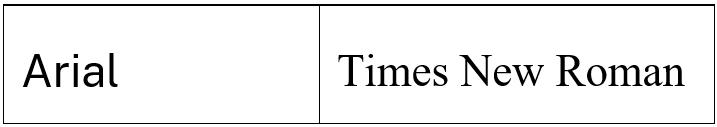
Two fonts were identified for the experiment. Times New Roman is chosen as the standard serif font and Arial is chosen as the standard sans serif font due to being the most commonly used fonts of each typeface (Bernard et al., 2001). The sample text and font size is identical for stimuli, although this may vary between observer devices. Lorem Ipsum is used as the industry standard for sample text. Legibility cannot be measured using reading speed as the passage would need to be identical for each colour pair. Reading the same passage multiple times would result in a change in reading speed. Thus, an individual judgement of legibility on a scale factor was used.
4.3 Stimuli
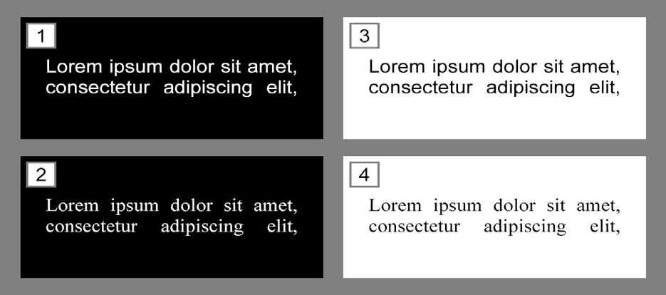
The background colour was represented through four 70 mm x 150 mm rectangles with a 10 mm neutral grey (#808080) border. Text is set to 10 mm size and justified and placed in the centre of each rectangle. This reduced the effect of the shape of the background and positioning on the data. Sample text is numbered from 1 to 4 for easier identification when answering survey questions. It is important to note that lengths will vary based on the screen size.
4.4 Procedure
The survey was conducted in a well-lit indoor environment with viewing device settings constant for all participants. This included settings such as the screen brightness, colour settings and magnification in order to reduce random error. The experiment began with participants reading and completing a consent form with any question or queries being answered. Participants were given verbal instructions using a script regarding how to complete the first section. Participants were asked to sit at a self-judged comfortable reading distance and advised to minimise unnecessary movement. Participants were presented with the stimuli, each colour pair with two coloured backgrounds and text of each font type. Participants were then asked to rate the legibility of each sample text on a scale of 1 to 9 using their own judgement, given set criteria. 1 was labelled as ‘Low legibility (hard to read)’ and 9 was labelled as ‘High legibility (easy and clear to read)’. Participants then completed the survey for the 6 remaining pairs. An automated email was sent out to each participant with details regarding questions, queries and opting out.
4.5 Data Analysis
All legibility scores were recorded under each colour pair and confidence intervals were calculated for each average and plotted on a graph. An Anova: Single Factor test and a Tukey HSD test was conducted on each stimulus pair to calculate statistics and compare the 4 categories. The statistical difference between individual fonts regardless of colour was also calculated. A pvalue of <0.05 was considered significant, where the null hypothesis was rejected and alternate hypothesis was accepted.
5. Results
5.1 Font
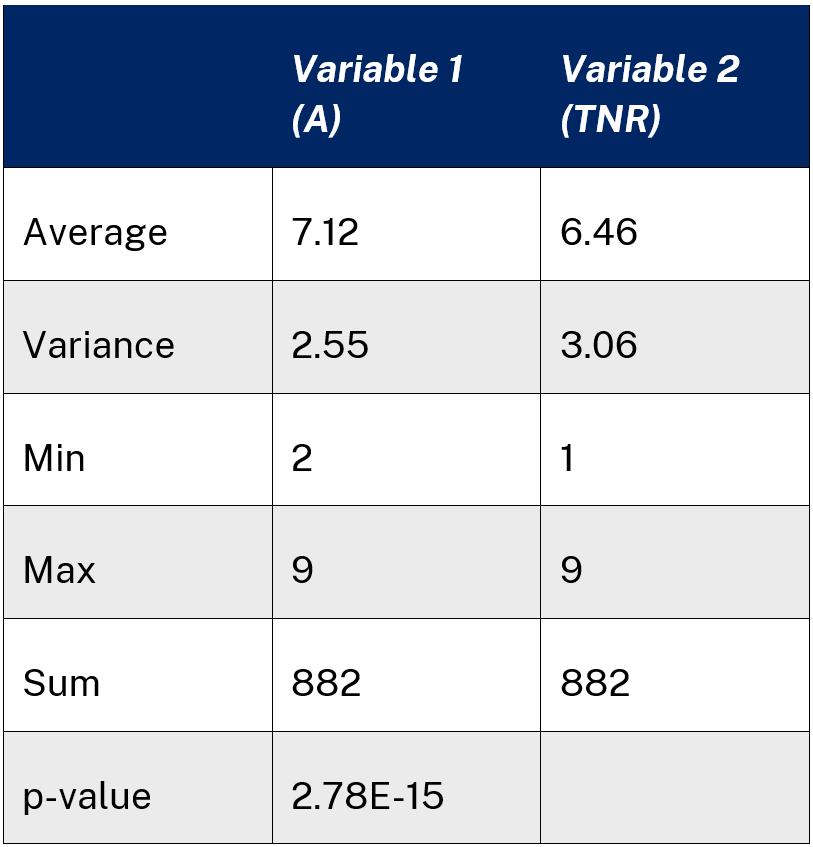
The results showed that Arial had a statistically significant difference (p = 2.776E15) to Times New Roman. Arial had a higher average of 7.12 and smaller spread of variance 2.55 compared to Times New Roman with an average of 6.46 and variance of 3.06. The sum of all data values totalled to 882, with each participant scoring the legibility of 14 instances. The data was plotted on a column graph for visual representation and comparison.

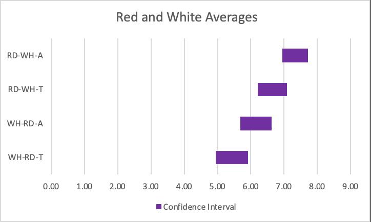
5.3 Colour Group Combinations
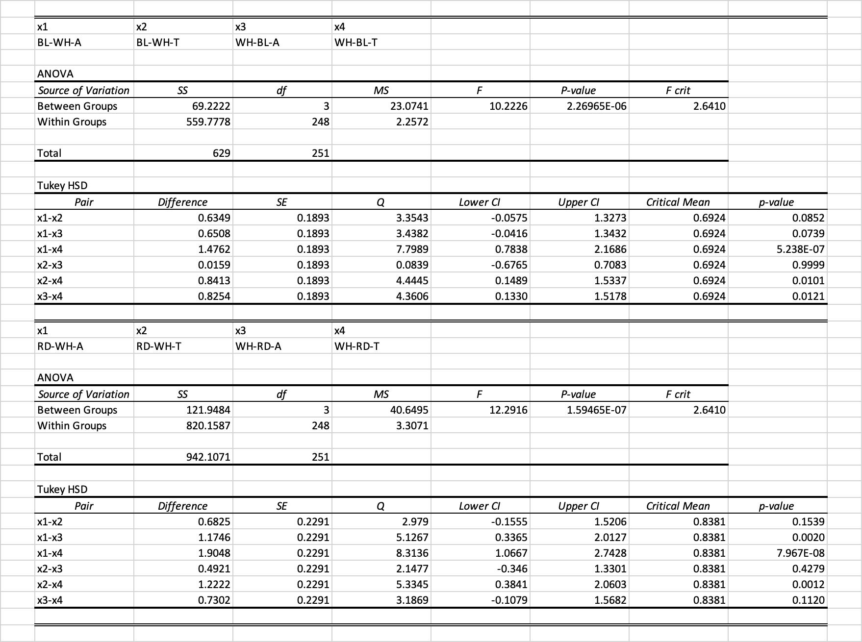
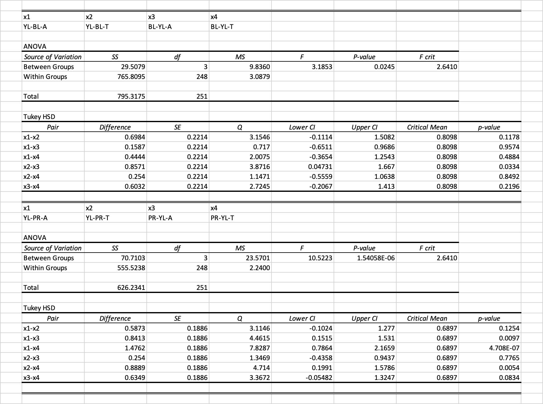
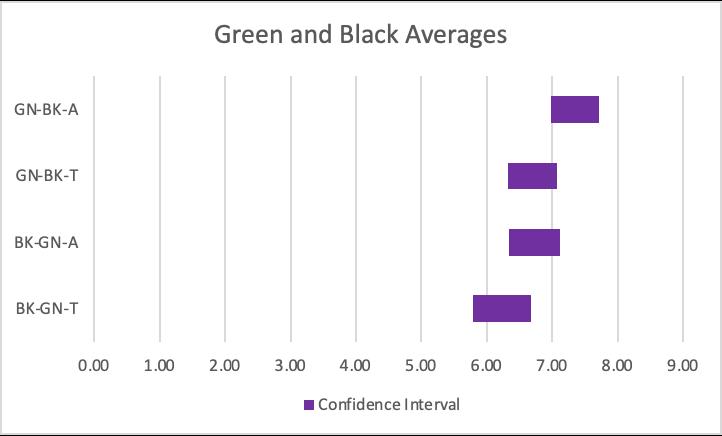
The groups are labelled using colour and font abbreviations, following a XX-YY-Z format where XX is the colour of the text, YY is the colour of the background and Z is the font. The data for each stimuli is plotted on a graph for visual representation and comparison. Confidence intervals were calculated for more accurate graph representation (CI = 95%).
The results for the white and black stimuli showed that there was a statistically significant difference between white on black Arial and black on white Arial (p = 0.0095) and white on black Arial and white on black Times New Roman (p = 0.0015). No statistically significant difference (p > 0.05) for other pairs.


The results for the yellow and black stimuli showed that there was a statistically significant difference between yellow on black Arial and yellow on black Times New Roman (p = 0.0454) and yellow on black Arial and black on yellow Times New Roman (p = 1.354E-05). No statistically significant difference (p > 0.05) for other pairs.


The results for the green and black stimuli showed that there was a statistically significant difference between green on black Arial and black on green Times New Roman (p = 0.0007). No statistically significant difference (p > 0.05) for other pairs.

The results for the blue and white stimuli showed that there was a statistically significant difference between blue on white Arial and white on blue Times New Roman (p = 5.238E-07), blue on white Times New Roman and white on blue Times New Roman (p = 0.0101) and white on blue Arial and white on blue Times New Roman (p = 0.0121). No statistically significant difference (p > 0.05) for other pairs.


The results for the red and white stimuli showed that there was a statistically significant difference between red on white Arial and white on red Arial (p = 0.0020), red on white Arial and white on red Times New Roman (p = 7.967E-08) and red on white Times New Roman and white on red Times New Roman (p = 0.0012). No statistically significant difference (p > 0.05) for other pairs.

The results for the yellow and blue stimuli showed that there was a statistically significant difference between blue on yellow Arial and yellow on blue Times New Roman (p = 0.0334). No statistically significant difference (p > 0.05) for other pairs.

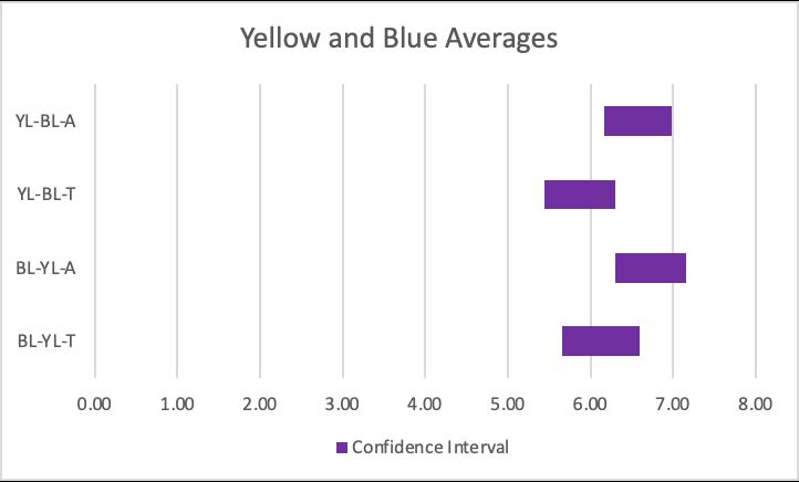
The results for the yellow and purple stimuli showed that there was a statistically significant difference between yellow on purple Arial and purple on yellow Arial (p = 0.0097), yellow on purple Arial and purple on yellow Times New Roman (p = 4.708E-07) and yellow on purple Times New Roman and purple on yellow Times New Roman (p = 0.0054). No statistically significant difference (p > 0.05) for other pairs.


6.Discussion
6.1 Font
The results when comparing the two fonts disregarding colour showed that Arial had a statistically significant difference (p = 2.776E-15)in legibility compared to Times New Roman. Arial had a higher average of 7.12 compared to the Times New Roman average of 6.46. The data supported the study by Ko (2017) and aligned to claims that Arial performs better in terms of legibility on a digital screen. This could have occurred due to Arial having simple block shapes and thickness compared to Times New Roman. For the same coloured text and background, Arial had a higher legibility than Times New Roman with significant difference in white on black (p = 0.0095), yellow on black (p = 0.0454) and white on blue (p = 0.0121). The remaining pairs had no significant difference, however the average legibility score for Arial was higher than Times New Roman for all pairs of the same coloured text and background. The data suggests that Arial may have a higher legibility than Times New Roman for digital display.
6.2 Background and Text Colour
When comparing the legibility of the colour and black stimuli, all the black backgrounds had a higher average legibility than colour backgrounds for the same font despite having no statistical significance. When comparing colour and white backgrounds, red on white had a higher legibility than white on red for both Arial (p = 0.0020) and Times New Roman (p = 0.0012) and white on blue had a higher legibility than blue on white for Times New Roman (p = 0.0101). For two colour pairs, blue on yellow had a higher average than yellow on blue for both fonts and yellow on purple had a higher average than purple on yellow, however no statistically significant difference was found (Appendix 3). The higher performance of white and black backgrounds could have been a result of colour luminance and intensity, with colours of high hue appearing unnatural. Black and white are common background colours for digital mediums which may be more familiar to the reader, resulting in a higher legibility score. The data suggests that low value backgrounds are more effective in terms of legibility, however this observation varies when bright coloured backgrounds are used.
6.3 Comparing Colour Pairs
The results showed that the averages of all colour pairs ranged roughly between the scores of 6 and 8 on the scale with variance ranging between 1 and 4. Contrast ratios appear to have a minimal effect on the legibility considering the small range of averages compared to the variance. However, the lowest contrast ratio pair of red and white (3.99) had the lowest average score of 5.43 for white on red Times New Roman. The colours paired with black had higher averages than the remaining four pairs, however no statistical significant difference was recorded. The results for the yellow and blue showed that there was no statically significant difference when comparing the legibility of different coloured backgrounds for the same font. This varied with results for yellow and purple that showed statistically significant differences between yellow on purple and purple on yellow for both Arial (p = 0.0097) and Times New Roman (p = 0.0054). This indicated that yellow text on a purple background performs better in terms of legibility compared to purple text on a yellow background despite blue and purple being similar colours. Overall, the colour of the text and background did not have any statistically significant difference in font legibility. The data did not support existing studies by Ko (2017) and Funkhouser et al. (2008) which may be accredited to differences in methodology, using qualitative participant judgement rather than quantitative time measurements.
6.4 Experimental Design and Sources of Error
The experiment was approved by the Ryde Secondary College Ethics Committee before proceeding. A consent form was signed by all 63 participants to ensure that informed consent was given and any questions or queries were answered to participant satisfaction. The personal information of the participants was confidential to the researchers and all participants were given the opportunity to opt out at any time. Data was recorded using an odd 1-9 scale with criteria given, which allowed participants to input a neutral response. Data was automated to four decimal places using Excel, with values less than a four decimal threshold being represented in scientific notation to four significant figures. The main source of random error was likely the fluctuating ambient lux of the survey location. Despite all participants conducting the experiment in environments of 300+ lux, the lux still varied due to time of day and specific location lighting. Another source of random error was the viewing distance and angle of the survey device which could not be regulated for all participants. To improve the validity of the experiment, a controlled room environment should be used for all participants so that lighting and positioning can be controlled and monitored. The reliability of the experiment can be improved by performing the experiment with a larger sample size and comparing the consistency results. This can be achieved by increasing the time frame of the experiment.
6.5 Future Studies
Future studies could explore various relationships between colour and font on text legibility. A wider range of colour and font combinations could be explored to identify pairings of higher legibility and improve the reliability of the experiment by ensuring data is consistent across a spectrum. The effect of fonts may only be statistically significant for Arial and Times New Roman as no other fonts were explored. The present study used only colours of maximum saturation, where a range of a saturation for the background colour may affect the legibility as the unfamiliar impact of the background is reduced. The comparison of digital and physical printed stimuli could be explored due to the difference between fonts used in light emitting screens and traditional print.
7. Conclusion
The present study aimed to investigate the relationship between font and colour of text and background on the legibility of text. The methodology and experiment variables were valid in addressing the study, providing relevant data. The specific colours chosen were black, white, red, green, blue, yellow and purple. The specific fonts chosen were Arial for sans serif and Times New Roman for serif. The findings of the study showed that sans serif fonts (Arial) had a statistically significant higher average legibility score than serif fonts (Times New Roman) when not accounting for colour. Low value backgrounds tended to perform better in terms of legibility when comparing black/white and colour pairs, however varied when comparing two colour pairs. The alternate hypothesis was accepted for certain relationships, however most of the pairings found no statistically significant differences.
Further studies are needed to determine the extent at which a wider range of colours and fonts affect the legibility of text. Improving the range of colour and font combinations ensures that data is consistent across the colour spectrum and not limited to specific colours and fonts.
8. Reference list
Aslam, M. (2005). Are You Selling the Right colour? a cross-cultural Review of Colour as a Marketing Cue Publication Details (pp. 1–14). School of Business Administration. https://ro.uow.edu.au/cgi/viewcontent.cgi?arti cle=2092&context=commpapers
Bernard, M., Liao, C. H., & Mills, M. (2001). The effects of font type and size on the legibility and reading time of online text by older adults. CHI ’01 Extended Abstracts on Human Factors in Computing Systems - CHI ’01. https://doi.org/10.1145/634067.634173
Braam, H. (2019). Color Psychology. Color Psychology. https://www.colorpsychology.org/
Funkhouser, D., Chrysler, S., Nelson, A., & Park, E. S. (2008). Traffic Sign Legibility for Different Sign Background Colors: Results of an Open Road Study at Freeway Speeds. Proceedings of the Human Factors and Ergonomics Society Annual Meeting, 52(23), 1855–1859. https://doi.org/10.1177/154193120805202305
Jalil, N. Ab., Yunus, R. M., & Said, N. S. (2012). Environmental Colour Impact upon Human Behaviour: A Review. Procedia - Social and Behavioral Sciences, 35(35), 54–62. https://doi.org/10.1016/j.sbspro.2012.02.062
Ko, Y.-H. (2017). The effects of luminance contrast, colour combinations, font, and search time on brand icon legibility. Applied Ergonomics, 65, 33–40. https://doi.org/10.1016/j.apergo.2017.05.015
Nassau, K. (2019). Colour - The visible spectrum. In Encyclopædia Britannica. https://www.britannica.com/science/color/The -visible-spectrum
Ou, L.-C., Luo, M. R., Woodcock, A., & Wright, A. (2004a). A study of colour emotion and colour preference. Part I: Colour emotions for single colours. Color Research & Application, 29(3), 232–240. https://doi.org/10.1002/col.20010
Ou, L.-C., Luo, M. R., Woodcock, A., & Wright, A. (2004b). A study of colour emotion and colour preference. Part II: Colour emotions for two-colour combinations. Color Research & Application, 29(4), 292–298. https://doi.org/10.1002/col.20024
9. Appendices

Note: The groups are labelled using colour and font abbreviations, following a XX-YY-Z format where XX is the colour of the text, YY is the colour of the background and Z is the font.