ME A D HIGH S CHOOL Pantera | Spokane, WA Adviser: Makena Busch Editors: Amanda Stephens, Yunadi Bogatyrev
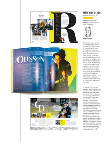
AMANDA STEPHENS “ Our book is about taking a deeper look into what this school is really about and exploring the reality of students’ lives behind the façade, the masks they wear on the outside. We used profiles to highlight certain students who have stories to tell and gave other students a new perspective. On the cover, we wanted a typography-based visual as a representation of the variety of students at our school. We used strategic embossing and debossing to reflect the inside and outside nature of the theme. The ‘outside’ letters are embossed while the ‘inside’ are debossed, sinking into the book.” IF YOU’VE EVER HEARD a designer suggest type can become art and didn’t know what they were saying, here’s your visual aid. Feast your eyes on Pantera. (Let’s digress to talk about how that flashy yellow cover alone ensures this book will never be forgotten. OK, back to type.) Stacked type is tricky. It’s not just about how the letterforms fit together, it’s whether the words remain readable. Mead mastered that skill, but didn’t overdo it. They found ways to take advantage of big, beautiful type. On each divider, a letterform creates a place for the table of contents. On coverage pages packed with content, they don’t get crazy with big type, but use it to ensure there’s hierarchy. Then you turn the page and, bam! In-your-face splashes of yellow pair with black to highlight cool topics and make the most of unconventional coverage. We could go on and on. //YBKhq