1 minute read
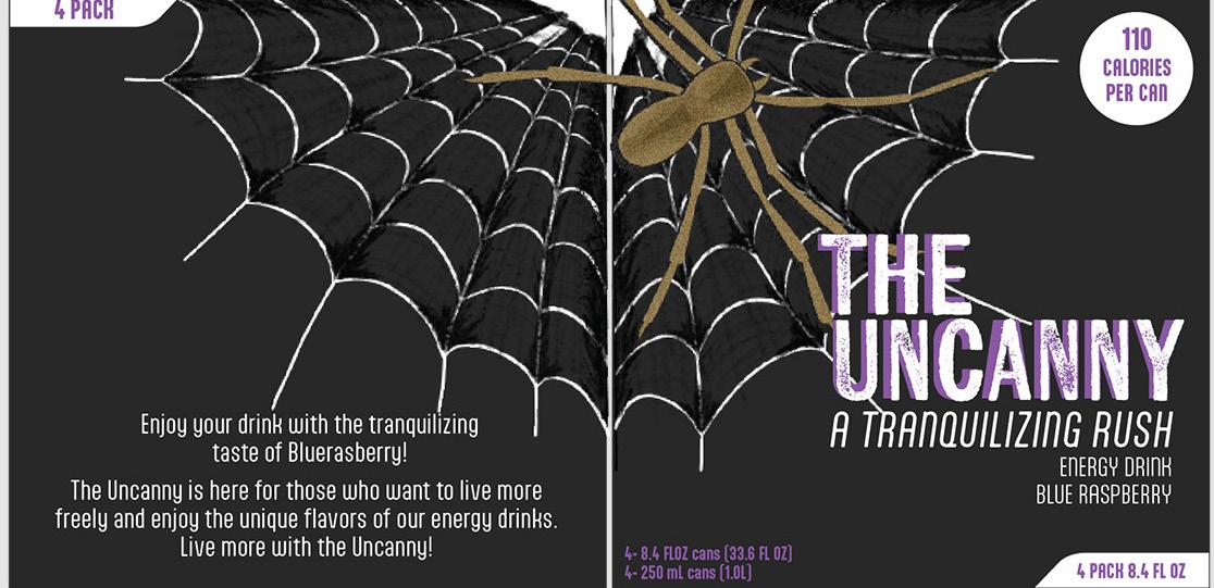
Package Design The Uncanny Energy Drink

from Danitza's Portfolio

Approach:
Illustration
Advertisement
Typographic-
Hierarchy
Through extensive research on package design specifically energy drink ones, I was able to gather a good sense of direction I wanted to take this packaging design, like adding in illustrations and stylized fonts.
Process:
By concentrating mostly on the illustration and typographic hierarchy I was able to attain the visual direction I was aiming towards to capture the “customer” attention.
Results:
A simple energy drink package design concept that captivates my audience’s attention.


Logo Design
Kendy’s Bakery Logo
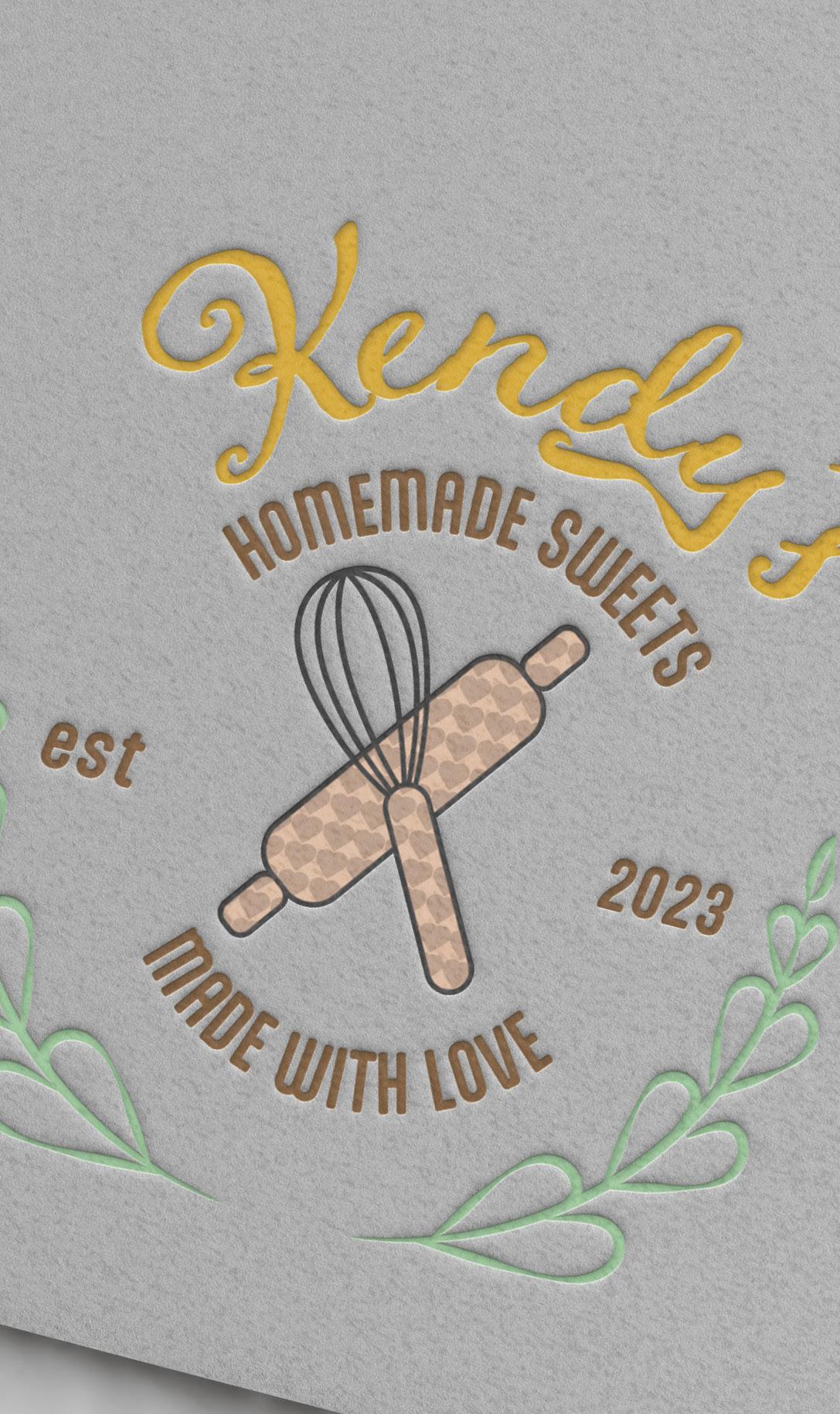
Approach:
Illustrations Font Pairing
Through in-depth research of many logos that include all of the elements and references that she sent to which how she wanted her logo to be like, I was able to gather inspiration for this very particular design.
Process:
By focusing mostly on the illustrations, and typographic hierarchy I was able to achieve a sophisticated look for the client’s logo.
Results: A well-rounded logo that communicated what the business is.