
CONTACT US Josh@createatelier.com Alexa@createatelier.com Johanna@createatelier.com LEARN MORE www.CreateAtelier.com CONNECT WITH US @Create_Atelier
PROJECTS


SLOW STEADY COFFEE

MONTE ANDERSON
MURALS & PRODUCTS


 LIVE LOCAL OAK CLIFF SOUTH POLK PIZZERIA
KATHY TRAN CREATIVES STAY EMBER AIRBNB
LIVE LOCAL OAK CLIFF SOUTH POLK PIZZERIA
KATHY TRAN CREATIVES STAY EMBER AIRBNB
OURphilosophy
CREATE: /krēˈāt/ verb 1. Bring (something) into existence.
ATELIER: /ˌadlˈyā/ noun 1. A workshop or studio, especially one used by an artist or designer.
KATHY TRAN CREATIVES
Designed brand guidelines and website for the logo system involving 5 brands under Kathy Tran Creatives.
STAY EMBER | AIRBNB
Designed brand guidelines, logo, website, and products for Stay Ember, an Airbnb located in Dallas, TX.
SOUTH POLK PIZZERIA
Created brand guidelines, logo, menu, and pizza box designs for South Polk Pizzeria, a local pizza company based in Oak Cliff.
MONTE ANDERSON
Designed brand for Monte Anderson, and developed social media content for his personal account.
LIVE LOCAL OAK CLIFF
Designed brand guidelines, logo, and social media stories for Live Local Oak Cliff, a local influencer who advocates for small businesses in the area.
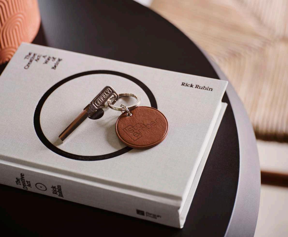
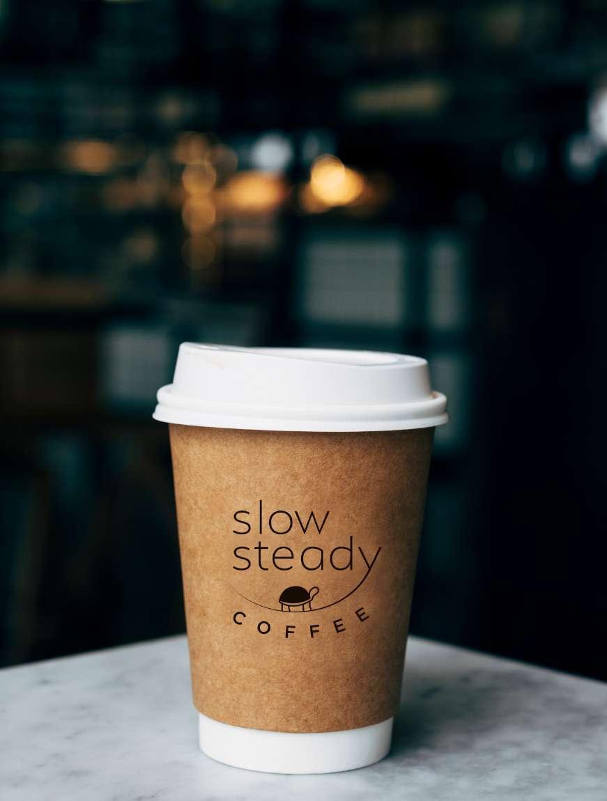
SLOW & STEADY COFFEE
Designed brand guidelines and logo for the Slow & Steady Coffee brand.
CREATE ATELIER


2 MOOD BOARD | ELECTRIC NOIR
BOLD • DELICATE • EDGY


3 MOOD BOARD | GOSSAMER
MODERN • ELEGANT • FRESH


* PRIMARY LOGO FONT
ANILEZ REGU L AR
ANILEZ REGU L AR
HALCOM MEDIUM
SECONDARY FONT
HALCOM MEDIUM
STRUCTURE 03
A B C D E F G H I J K L M N
Ñ O P Q R S T U V W X Y Z
a b c d e f g h i j k l m n
ñ o p q r s T u v w x y z
* Only to be used on logo & web titles
A B C D E F G H I J K L M N
Ñ O P Q R S T U V W X Y Z
a b c d e f g h i j k l m n
ñ o p q r s T u v w x y z
FONT ACCESS DOWNLOAD & ACCESS
HALCOM FONT FAMILY
SOCIAL ICON LOGO BRAND B R A N D


13
BRAND GUIDELINES
by Create Atelier
LOGO USAGE by Create Atelier STAY EMBER | AIRBNB
COLOR SCHEME
PRIMARY

by Create Atelier GLORIA’S LATIN CUISINE LAKE CLIFF PARK THE SALTY TRIBAL ALL DAY PARADISO TACO Y VINO WILD DETECTIVES NEIGHBORHOOD CELLAR BLACK SWAN YOGA OASIS PLANT SHOP W D A V S S T R E E T S Z A N G B L V D AME INDIAN FOOD W E H T S T REET M E L B A S T R E E T The Salty Donut: 414 W Davis St, Dallas, TX 75208 Ame Indian Food: 418 N Bishop Ave, Dallas, TX 75208 Gloria’s Latin Cuisine: 600 N Bishop Ave, Dallas, TX 75208 La Bodega: 208 W Eighth St, Dallas, TX 75208 Tribal All Day: 263 N Bishop Ave, Dallas, TX 75208 Paradiso: 308 N Bishop Ave, Dallas, TX 75208 Wild Detectives: 314 W Eighth St, Dallas, TX 75208 Taco y Vino: 213 W Eighth St, Dallas, TX 75208 Black Swan Yoga: 407 W 10th St Suite 100, Dallas, TX 75208 Neighborhood Cellar: 246 W Davis St, Dallas, TX 75208 EXPLORE LA BODEGA
SECONDARY #7B9E96 #D3C8C4 #D6AE0A #959D91
INITIAL LOGO IDEAS
STAY EMBER | AIRBNB by Create Atelier


COMMUNITY • FUN • ADVENTURE
BRAND GUIDELINES
by
Atelier
Create
LOGO USAGE
The word mark should be displayed on a solid orange, teal or white background. Keeping the background clean of any patterns or gradients is important to ensure high visibility for the logo. If in any case, the background must be black, the color should still be white.
LIVE LOCAL OAK CLIFF
horizontal vertical space around
by Create Atelier
the logo
LOGO MARK
SECONDARY
PRIMARY PRIMARY
SECONDARY
#ED602C
by Create Atelier
#49BEAE #397F73 #B7B7B7
TYPOGRAPHY USAGE
The fonts used on the logo are: Adage Script, and a modified version of glodok display. These are the main fonts; however, the usage on newsletters, web design, and any other platform or medium should be the font ‘Kanit.’
GENERAL TEXT FONT
Kanit Light
Kanit Regular
Kanit Medium
Live Local Oak Cliff
Live Local Oak Cliff
Live Local Oak Cliff
WEB - FONT USAGE
BUTTON TEXT
FORM FIELD
adage script
*Should only be used on logo
Kanit Bold
Live Local Oak Cliff
*Should only be used on logo glodok display
LIVE LOCAL
CLIFF
OAK
OAK CLIFF live local
BUTTON HOVER by Create Atelier
The Oak Cliff logo concept is a vibrant and colorful representation of the community's liveliness and fun-loving spirit. The logo features an interplay of orange and teal colors that symbolize the fusion of warmth and energy with a refreshing and playful vibe.


In addition, the drop pin icon, a nod to the digital age of maps, has a brick texture that represents the historic architecture and cultural heritage of the community. The design incorporates elements that highlight the thriving businesses and diverse community of Oak Cliff. Overall, the logo captures the essence of what it means to live, work, and play in this dynamic and exciting part of town.
• Business cards
• Mugs
• T-shirts
• Tote Bags
• Stickers


• Tumblers
• Hats
• Keychains
MERCH
BRANDING IDEAS /
LOOK & FEEL / BRAND CONCEPT
by Create Atelier
1. Solid background: If the logo must stand out against a solid shape, choose one of the brand colors and turn the logo white. The logo can’t be placed on black background.
2. Turtle icon: There is more freedom when using the icon. The color can be interchangeable, with the rule that the turtle should always remain yellow when the background is white.
LOGO RULES OF USAGE 08

SOCIAL ICONS 06


2 MOOD BOARD | OPTION 1 | ZEN


4 MOOD BOARD | OPTION 2 | DAYDREAM
IDEATION & SKETCHES

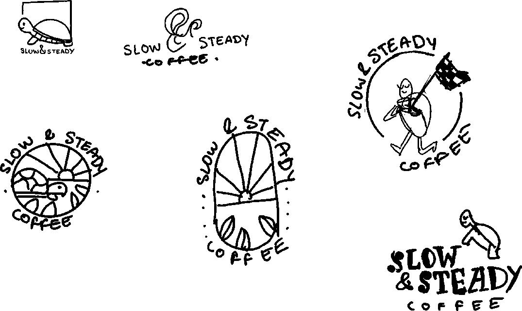

Following our dedicated efforts in crafting mood boards for Slow & Steady Coffee, we seamlessly transitioned into the sketching and ideation phase of the project. Here, we embarked on the digital refinement of our initial sketches, nurturing innovative concepts to their full potential.


4 5 1 2 3 4 5 1 2 3 4 5 9 10 9 10 6 7 6
5 C O L O R S
BRAND VOICE
The brand voice of Slow. Steady. Coffee resonates with the comforting and genuine warmth of a perfect cup of hot coffee on a crisp morning. It embodies a friendly and approachable demeanor, inviting coffee lovers to embrace the unhurried moments of life. Slow. Steady. Coffee aims to foster connections, share stories, and create a sense of belonging, much like the way a cup of coffee brings people together.
BRAND VOICE 02
BRAND GUIDELINES
by Create Atelier
INITIAL LOGO IDEAS
SOUTH POLK
PIZZERIA PIZZERIA


LOGO USAGE
The word mark should be displayed on a solid dark gray, yellow or white background. Keeping the background clean of any patterns or gradients is important to ensure high visibility for the logo. If in any case, the background must be black, the color should remain white.
by Create Atelier SOUTH POLK PIZZERIA
LOGO MARK
PRIMARY
SECONDARY
#FBA316
#262626
#595959
by Create Atelier

BRAND GUIDELINES
by Create Atelier
17 LOGO USAGE by Create Atelier MONTE ANDERSON | BRAND
COLOR SCHEME

PRIMARY
SECONDARY
#D68C40 #09846F #5B4B45MOTIVATIONAL QUOTES
Sometimes you have to destroy and clean, before you design
Dedicate your life to a place and see how your luck changes and miracles start to work.
Until we decide to work on the problems instead of the symptoms, we will continue to have crime. Our people need opportunity and purpose, not a $15 per hour job.
by Create Atelier
— Monte Anderson
— Monte Anderson
— Monte Anderson
STORIES & REELS


MURALS & PRODUCT DESIGN
Golden Triangle is a complex located in the Oak Cliff area, this commercial space is being remodeled and part of the project includes the creation of a mural facing the highway.

The concept is meant to reflect the vibrant and fun community of Oak Cliff, with a modern twist that elevates the entire complex.

These patterns were engraved on plywood to create a composition for a headboard. The same pattern will be used to create tiles to be used on commercial and residential projects.


LET’S create & elevate CONTACT US Josh@createatelier.com Alexa@createatelier.com LEARN MORE www.CreateAtelier.com CONNECT WITH US @Create_Atelier