51
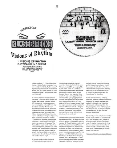
release you know it’s a Trax release. If you look at a Strictly Rhythm release you know immediately it’s a Strictly Rhythm release.” By employing these specific visual devices, Hunter feels he’s able to channel the aural language of Zodiac’s techno output: noisy, weird and dark. In contrast, his art for Klasse’s releases vary wildly. On his own recent trip-hop and broken beat-inspired Visions of Rhythm EP, made with Mr Ho, beady eyes peer out menacingly (or, is it sexily?) from atop the label’s name. For Phran’s electro house-tinged Bad Format EP, Hunter has drawn an unpolished, two-headed figure wearing a cap. Here, as on many other Klasse releases, track titles and other text appear to be degenerating in quality, having been copied and recopied ad infinitum. “Each time, I try and make something that resembles a weird record I’ll find for 50 cents in a record store,” he states. “You have all these regular labels and you’re so used to seeing some Detroit stuff, or some Chicago stuff, and then there’s these weird things that pop up in between made by people who have probably never made a record before. So with Klasse, I’m trying to emulate that in some way.” A common thread running through all of Hunter’s designs is an interest in
nontraditional typography, whether it resembles classic blackletter fonts, retrofuturistic pixelated 80s type, or juicy 70s bubble letters. There are a handful of typefaces he uses regularly, including the ever-popular Helvetica, which he likes because “it’s very easy to project ideas onto it; it’s such a boring, plain font.” He also researches type by digging around online as well as taking pictures of street signs and storefronts, which he’ll then adapt to his liking. “I try and use stuff that’s not so pre-packed and readily available,” he says, “stuff that’s not done by a designer, stuff that’s just done by a normal guy who wants to advertise that they’re selling ice cream for two euros, stuff that’s not intentional, it’s all accidental.” This attention to typographic detail has also manifested in Hunter’s life by way of graffiti, which he got into in the early 90s when he was just 13. Though he doesn’t write much himself these days, he created Klasse’s Grafiti Tapes imprint as an attempt to stay involved in the scene. The cassette-only series sees him releasing tracks by graffiti writers who also create sleeve art. The first tape, put out in March 2014, featured a throwback-y electro track and imagery by Swedish artist Luke Eargoggle; it’s clear from its deep yellow sleeve and streetwise handstyles that Hunter seeks out kindred
spirits for this pet project. He thinks the graffiti lifestyle imparted some crucial lessons about work ethic on him, too. “With what I’m doing now I’ve definitely taken a lot of influence from that, just in the kind of determination and pigheadedness,” he describes. Hunter doesn’t care about achieving perfection, preferring to keep things moving constantly. By pushing new ideas both sonically and visually at all times, he’s ultimately able to be quite prolific. “As things are getting busier and more people are asking for work, I’m trying to complete stuff satisfactorily but also to be less precious about things.” “I think that you can’t really force creativity,” Hunter argues. “When it’s good, it’s really quick. You can make a track in a day or a flyer in a couple of hours. That doesn’t mean it’s any less in comparison to things that have taken weeks. For me, when it comes naturally is when it comes fast – when you’re in the moment, just to wrap it up and then move on.” Find more of Hunter’s work at planetluke.com