Displaying and interpreting data
12.3
the majority of the pay is less spread out for males. The median and quartiles for males are higher than those for females, so on average males earn more than females at age 40. The cross on the plot for the males indicates an anomaly or rogue data item which doesn’t seem to fit the trend – an outlier. Identifying outliers using quartiles The interquartile range is simply the difference between the quartiles, or Q3 − Q1. An outlier can be identified as follows (IQR stands for interquartile range):
›› any data which are 1.5 × IQR below the lower quartile ›› any data which are 1.5 × IQR above the upper quartile. Example 9 The following data set lists the heights of employees. 1.45 1.48 1.46 1.52 1.46 1.61 1.60 1.51 1.55 1.56 1.61 1.64 1.53 1.51 1.48 1.70 1.70 1.62 1.45 1.50 Are there any outliers in this data set?
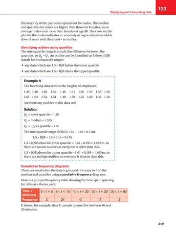
Solution Q1 = lower quartile = 1.48 Q2 = median = 1.525 Q3 = upper quartile = 1.61 The interquartile range (IQR) is 1.61 − 1.48 = 0.13 m. 1.5 × IQR = 1.5 × 0.13 = 0.195 1.5 × IQR below the lower quartile = 1.48 − 0.195 = 1.285 m, so there are no low outliers as everyone is taller than this. 1.5 × IQR above the upper quartile = 1.61 + 0.195 = 1.805 m, so there are no high outliers as everyone is shorter than this. Cumulative frequency diagrams These are used when the data is grouped. It is easy to find the median and quartiles using cumulative frequency diagrams. Here is a grouped frequency table showing the time spent queuing for rides at a theme park: Time, t (minutes) Frequency
0 < t ⩽ 5 5 < t ⩽ 10 3
24
10 < t ⩽ 20
20 < t ⩽ 30
30 < t ⩽ 60
41
17
15
It shows, for example, that 41 people queued for between 10 and 20 minutes.
319
04952_P299_341.indd 319
07/07/17 3:35 AM