Socio-Economic Atlas of Kenya Introduction & Background
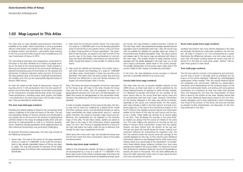
1.03 Map Layout in This Atlas This atlas aims to make detailed socio-economic information available to the public. More importantly, it aims at providing relevant information and analyses from Kenya’s 2009 census to decision-makers and planners – particularly those working in the first and second levels of government established by the new Constitution of Kenya in 2010. The sub-national overviews and comparative county-level information in this atlas will likely be of interest to people working at the level of the central government. Those involved in planning and decision-making at the county level will likely appreciate having easy access to information on the variation and distribution of relevant indicators within counties. To that end, the atlas presents data at the level of individual sub-locations, the smallest units that can be meaningfully depicted based on Kenya’s 2009 census.
2. Map insets for central and western Kenya: Two map insets at a scale of 1:2,500,000 zoom in on the densely populated areas of central Kenya and western Kenya, which are home to about three-quarters of Kenya’s population. The insets, both of identical size, are placed to the right and left of the country map. In the insets, most sub-locations in rural settings are clearly identifiable; sub-locations can also be identified, though less clearly, in most smaller to medium-sized towns. 3. M ap insets for Nairobi and Mombasa: Two further map insets show Nairobi and Mombasa at a scale of 1:600,000 and allow urban sub-locations in these two counties to be identified. The insets cover the same surface area and thus illustrate the differences in size and density between the largest and second-largest cities in Kenya.
To meet the needs at both levels of governance, Kenya’s 47 counties and its 7,149 sub-locations form the core spatial reference units of this atlas. Each section of the atlas is comprised of five components arranged side-by-side across two pages. These components – including maps, texts, graphs, and tables – are presented in the same layout each time to ease comparison. They are described in detail below.
Map 1.03 shows the extent and position of the four map insets on the Kenya map. All maps in this atlas include the Kenya map with the four insets, with the exception of maps 1.01 (geographical overview) and 2.02 and 2.03 (demographic variables that cannot be disaggregated to the sub-location level). However, the positioning of the insets on the Kenya map is not repeated.
The main map (odd page numbers)
In order to enable navigation of the maps of this atlas, the Kenya map and its insets are underlaid by a digital terrain model and show national, county, and sub-location borders as well as major waterbodies and major conservation areas (i.e. national parks). However, the names of counties, major towns and settlements, and waterbodies are not repeated on the thematic maps of this atlas. To see these names, readers are asked to refer back to the maps in this introductory chapter (especially maps 1.01 and 1.02). The key to repeated elements is found on the right side below the insets, while the key to elements that change for each map is positioned to the left.
Providing the desired degree of detail at the sub-location level posed a challenge to the scale and layout of the atlas. The size and population density of Kenya’s counties and sub-locations vary greatly due to the country’s rich diversity of geographical contexts rooted in the range of ecological belts (from arid and semi-arid to high-potential) as well as in historical developments. Depicting densely populated urban agglomerations by their individual sub-locations was particularly challenging. To represent all contexts adequately, the main map consists of the following components: 1. Kenya map: The map at the centre of the page represents Kenya at a scale of 1:4,000,000. At this scale the sub-locations in less densely populated regions of Kenya are clearly visible. The map also provides an overview of the highly populated areas, but without each sub-location being clearly identifiable.
14
When texts refer to the main map, this includes the Kenya map and the four insets that show sub-location values at the scales mentioned above. County map (even page numbers) Unlike in this introductory chapter, all maps in chapters 2 to 7 are accompanied by a map at a scale of 1:11,500,000 in the lower right corner of the evenly numbered page, that shows the respective themes at the county level. By displaying average values
per county, this map provides a national overview. Contrary to the main map, which uses proportional symbols representing the population size of sub-locations (see map 1.04), the county map uses no symbols but displays the average values per county in conventional area shading (choropleth map). The colour scheme and classes used in the county maps are identical with those in the main maps. This enables readers to easily compare county averages with the details displayed in the main map, e.g. to see what varying sub-location values result in the county average. The smaller reproduction of the county maps is also used in the content tables of each chapter to enable easy orientation.
Rural–urban graph (even page numbers)
In the texts, the map displaying county averages in national overview is generally referred to as county map.
The first two columns contain a text explaining and commenting the map at hand. It normally starts by justifying the relevance of the theme displayed, followed by methodological explanations where needed. Then the overall national figures are explained and commented, followed by observations, comments, and interpretations of the variations shown at the county and sub-location levels, and ending with some general conclusions. It is important to note that these texts provide facts and background, but that the interpretation of these facts is done by the authors of this atlas. Readers should feel free to make additional observations based on the rich information displayed, and to draw additional or other conclusions than those of the authors. In that sense, the texts are intended to provoke further interpretation and discussion of the findings presented in this atlas.
County table (even page numbers) This atlas does not aim to provide detailed statistics of the 2009 census, as these have been or will be published by the Kenya National Bureau of Statistics in other formats. Instead, it is designed to provide information on the variation of relevant census data at the county level (see county map) and the sub-location level (see main map). However, information on the themes displayed in this atlas may still be of interest, especially at the county and national levels. For this reason, each map includes a table in the third column of evenly numbered pages (or, in the case of this introductory chapter, in the fourth column) that displays concrete figures and information related to the theme of the map for each county and for Kenya as a whole. These tables are referred to as county tables in the texts. They all display the counties in the same order, so readers can always find the county of interest in the same row. This order follows the sequence of counties as they are listed in Kenya’s 2010 Constitution, except that the capital, Nairobi, has been shifted from the bottom to the top row. The last row gives the overall figures for Kenya, making it an important reference for interpreting the respective map. The first two columns show the county name and average of the variable displayed on the map. Further columns give additional information relevant to the displayed theme. Most maps show relative values (e.g. percentage of the population). To complement these relative values, absolute numbers (e.g. how many people) were added in the county tables. It is important to note that all figures for absolute values per county of households or persons are given in thousands. This was done deliberately to show the wider dimension rather than an exact figure for each and every household and person.
Analyses have shown that many themes displayed in this atlas are strongly influenced by rural–urban gradients. For this reason, all maps in chapters 2 to 7 are accompained by a graph illustrating the differences between rural and urban areas. In each case, this graph is placed above the county map and referred to in the texts as rural–urban graph. Section 1.05 explain these graphs in more detail. Texts (odd page numbers)