Your creative spirit is itching to try something new, and we’ve got some ideas for you!
We see you trying bold new fonts, flirting with florals, and diving into trending color palettes. Whether you’re working on wedding stationery, party invites, or your own line of boutique cards, you’re always pushing the envelope (often literally).
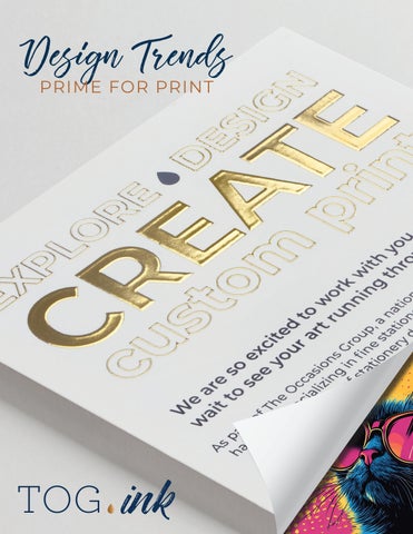
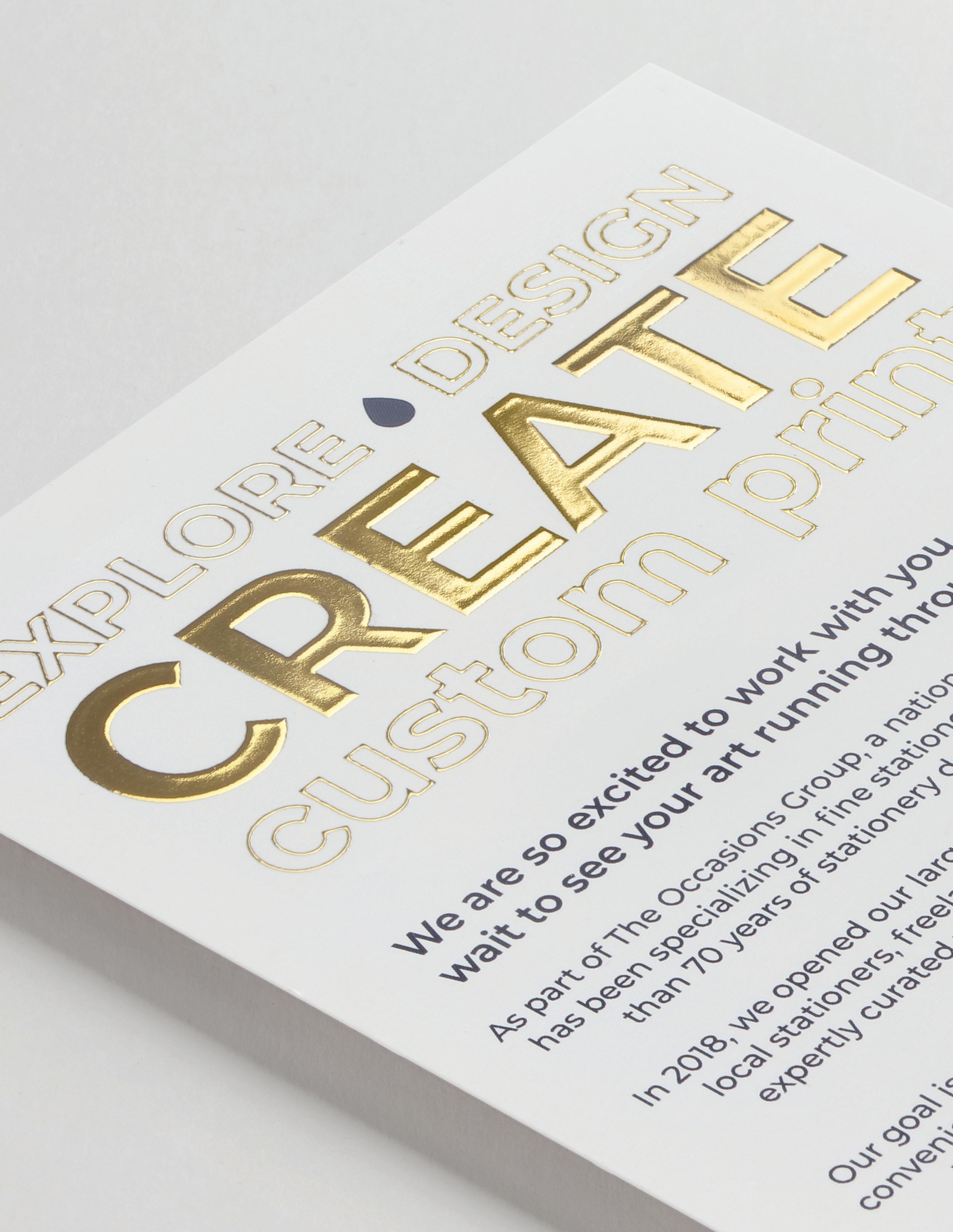
Design Trends Prime for Print are here to spark that next big idea. We’ve rounded up ten captivating trends that are catching eyes and hearts this season, plus the print processes that bring them to life.
Here’s to trying something new, discovering what works, and creating unforgettable print.
Are you up for a creative adventure?
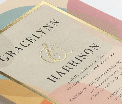
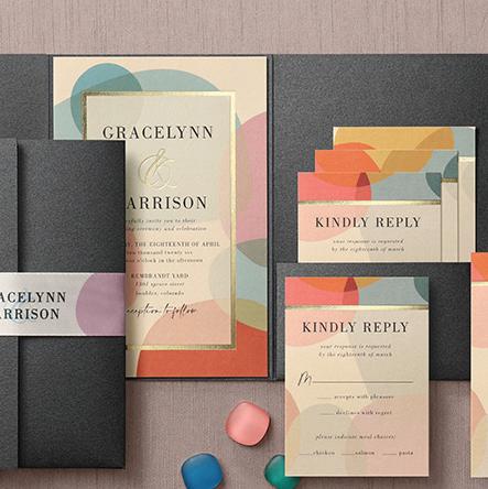
2. Trend: Shapes
Geometric elements and unexpected die cuts are adding personality and playfulness to print. Shapes help guide the eye and create movement while giving your design its own rhythm.
Print Process Matchup:
Digital printing brings bold color and an essential element of dimension to print design focusing on shapes. You can stop with digital printing or you can build off it by accentuating details with other print processes like foil.
Designers often forget there are more ways to incorporate custom shapes than just digital print. Think die cuts, belly bands, pockets, and seals.
Shown: digital + foil
digital printing
Designed by Todd Ouren
Read: Blog Post
PRO TIP:
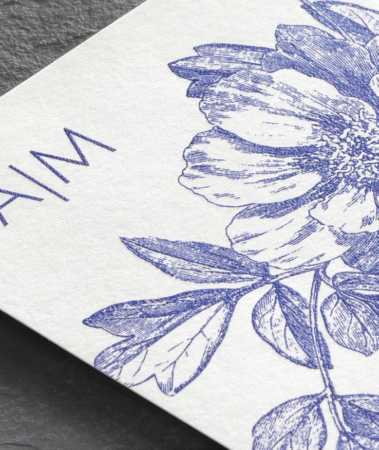
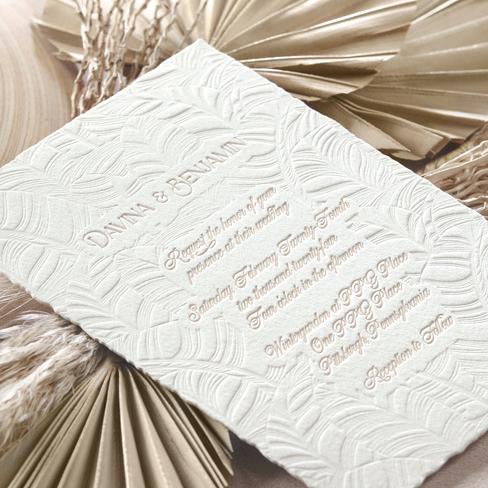
3. Trend: Nature Patterns
Inspired by natural textures and earthy tones, the “new naturalism” brings calm, grounded vibes to print with an emphasis on simplicity and sustainability.
Shown: 2-color letterpress
PRO TIP:
Print Process Matchup:
letterpress
Blind letterpress mimics the quiet detail of pressed leaves or grains in wood. When you want color, go for muted tones with letterpress inks or mix in digital elements for more layering. Check out our blog post about How to Order Blind Letterpress
Designed by Angela Pro Design
Read: Designer Spotlight
More clients are asking about sustainability. Letterpress on cotton paper (100% tree-free) with minimal ink hits the natural trend and the eco-box.
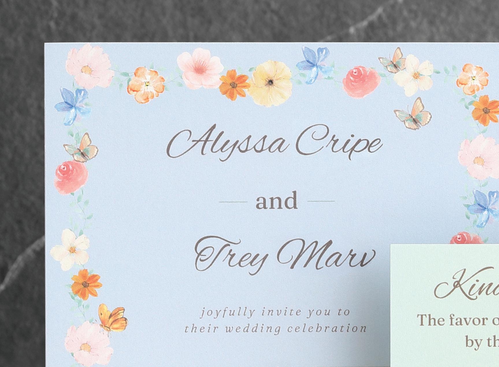
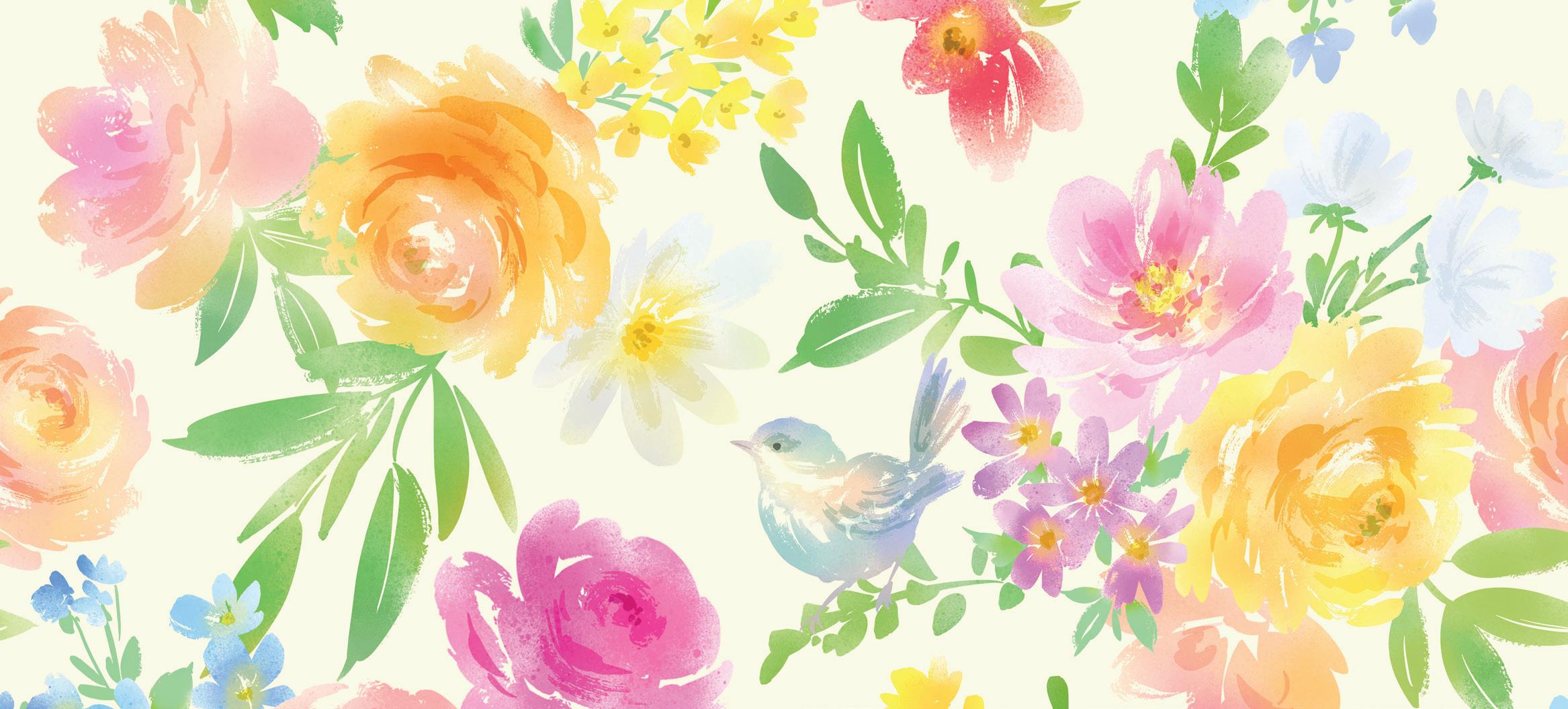
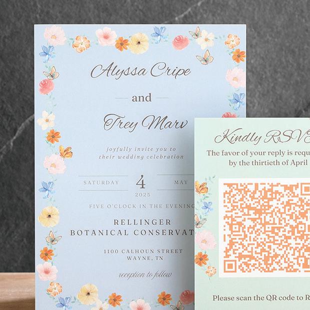
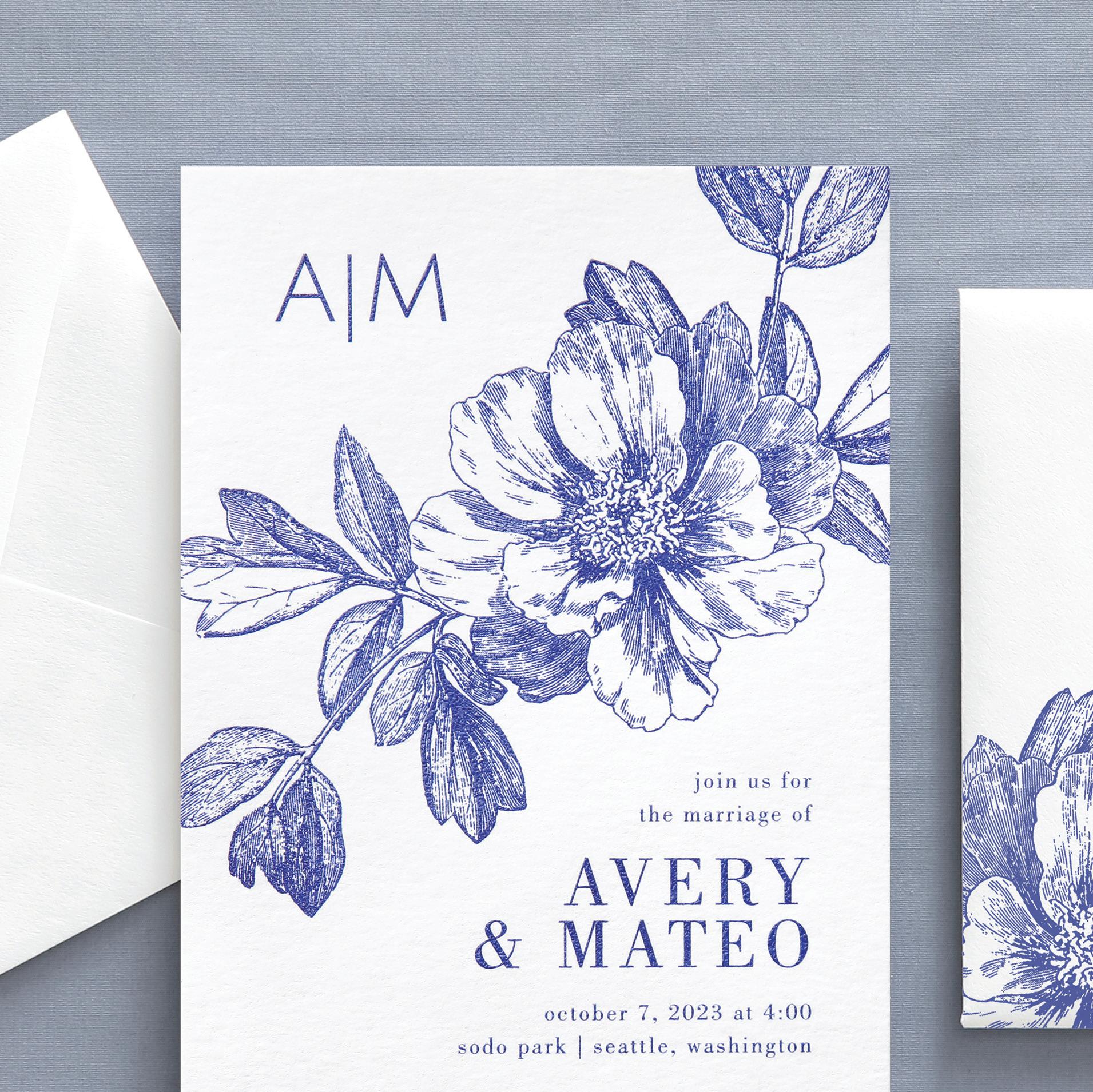
4. Trend: Painterly Florals
Loose brushstrokes, watercolor effects, and dimensional shading give florals new energy. They feel emotional, fresh, and a little imperfect—in the best way.
Print Process Matchup: digital
Our state-of-the-art digital printing produces vibrant color for the best and brightest print. Digital printing also captures subtle gradients and intricate strokes beautifully. Not to mention digital printing is affordable and allows for easy scalability of popular products.
QR code usage in stationery has risen dramatically in the last few years. Customers can easily link to the couple’s wedding website as well as a registry, itineraries, and maps.
Shown: digital
Designed by Alyssa Marvel Read: Hot Trend
PRO TIP:
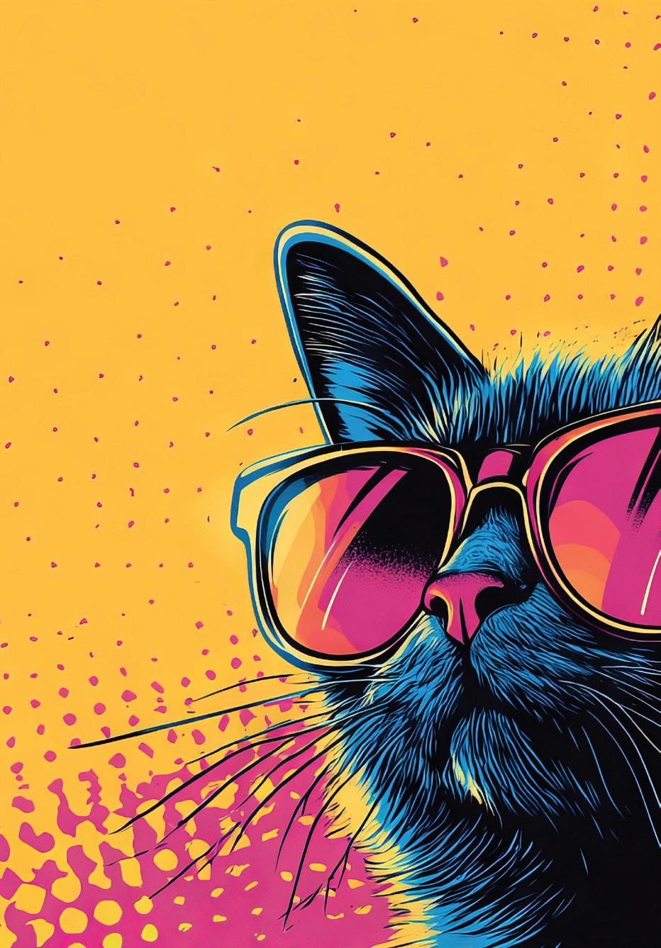
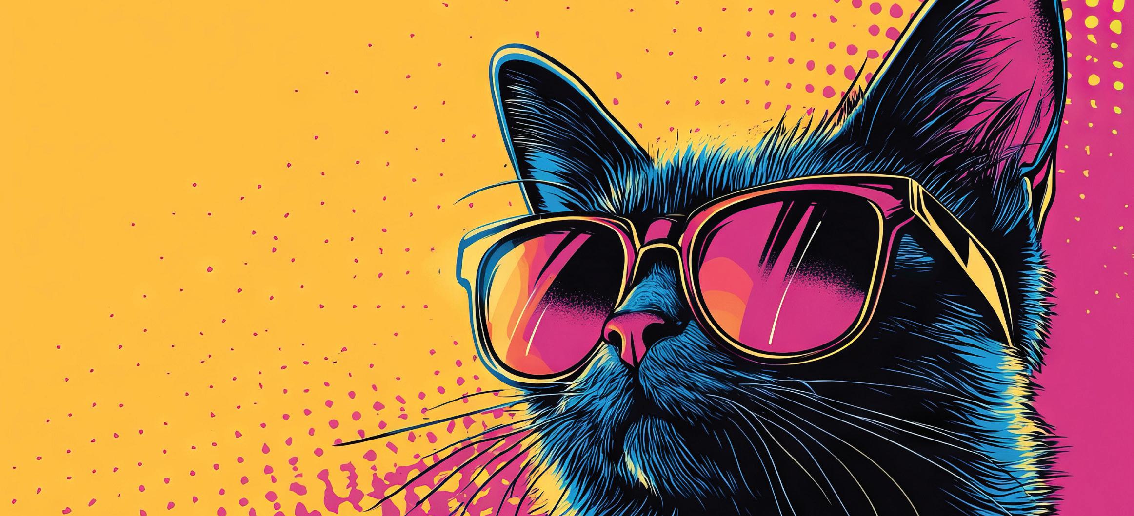
5. Quirky and Joyful
Bright, punchy, and a little unexpected! Designs are getting more personal and fun. Think mixed fonts, cheeky icons, and subject matter that make you smile.
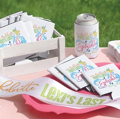
sublimation
Print Process Matchup: digital sublimation
Digital sublimation printing provides exceptional print quality for premium results on a variety of products from can coolers and ceramic mugs to satin ribbon and decorative tiles. You can get the same color-rich and high-energy printing with digital print on paper products.
PRO TIP: Joyful design works great on birth announcements, party invitations, boutique greeting cards, and keepsake gifts. It’s a great way to expand your offering and let the creative juices flow.
Shown:
Designed by Carynn Klingel Read: Blog Post
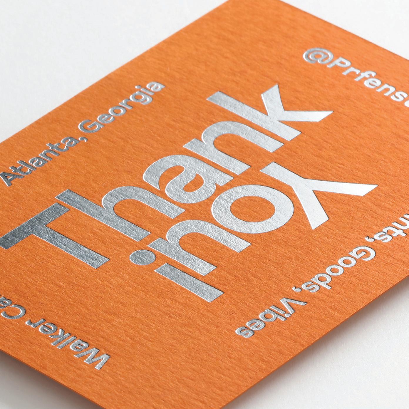
6. Bold Minimalism
Minimalism isn’t going anywhere, it’s just louder! This trend strips away clutter while amplifying typography and color to make a striking impact.
RUNNING CHAMPIONSHIP 2025 26TH JULY SATURDAY
5
Print Process Matchup:
foil or letterpress
Use foil or letterpress to highlight one key element like a phrase, a name, or a motif. Let white space work its magic. Don’t overthink it. The boldness is in the restraint.
Please note: Available paper options are shown on each product detail page.
Designed by Walker Carney Read: Hot Trend
Clean design + premium print = high-end feel. One strong visual in a specialty process says “luxury” without overdesigning.
Shown: foil
PRO TIP:
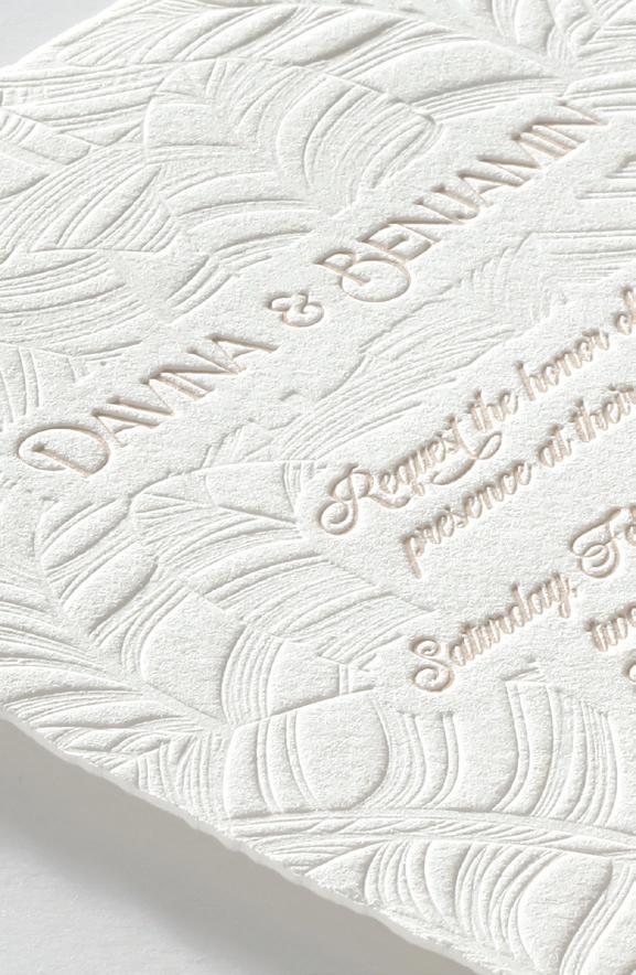
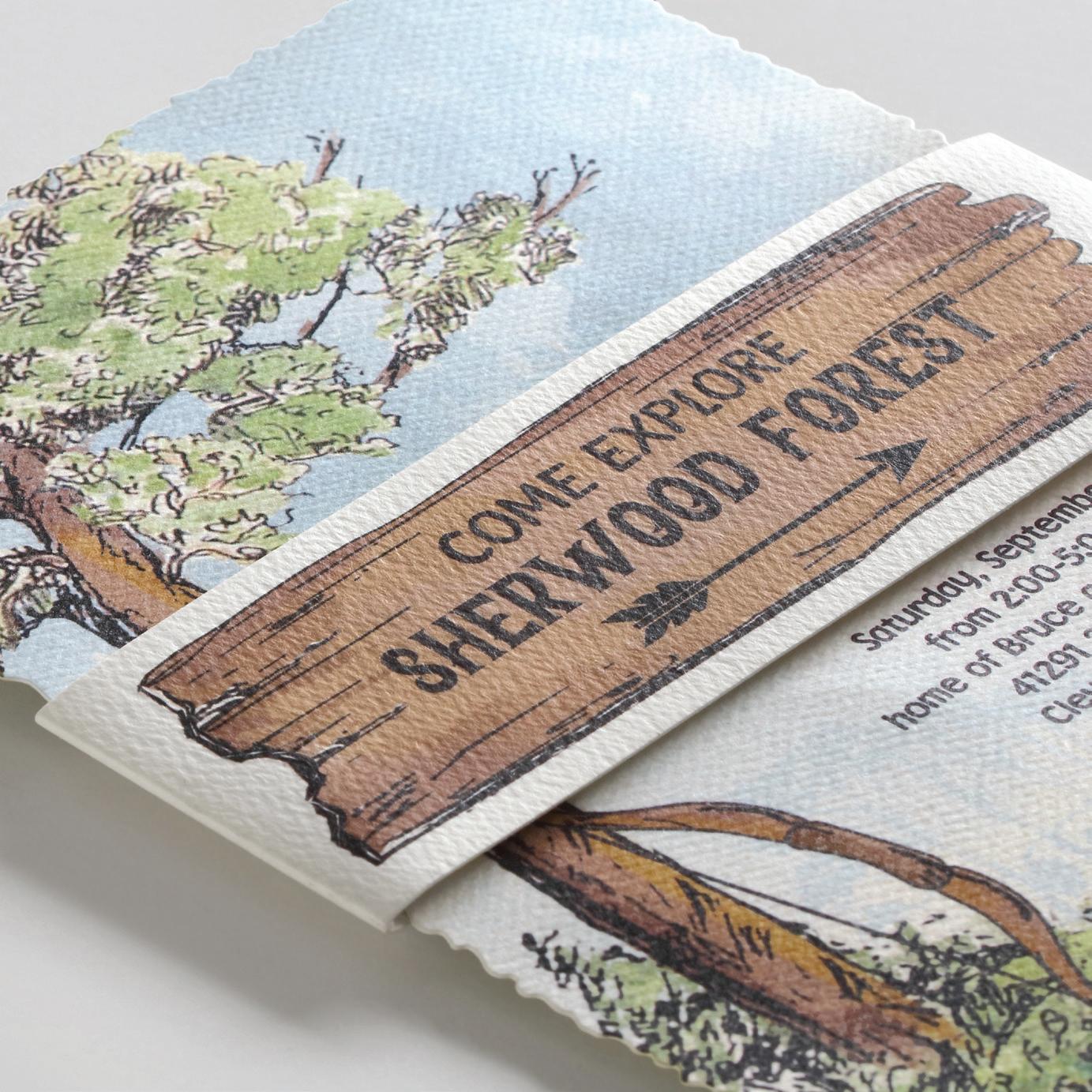
7. Organic Nature
Fluid lines and natural symmetry are taking over. Think sand dunes, tree rings, and the way water flows for an organic look but with intentional placement.
Print Process Matchup:
thermography
Thermography (a.k.a. raised printing) adds a soft raised texture that feels organic and offers a subtle sparkle, all for a price you can’t pass up! Thermography is by far our most underated print process. It’s always the bridesmaid, never the bride. Make it the bride!
Designed by TOG.ink Design Team Read: Blog Post
PRO TIP: Shown: thermography
Rough, textured papers are having a moment and tie into the organic feel perfectly. Consider unique finishes as well like deckle edge papers or belly bands.
8. Thoughtful Minimalism
Clean but emotional, this trend focuses on subtle storytelling through one meaningful design element, soft palettes, and intentional use of space.
Print Process Matchup: white ink
White Ink printing provides a modern look that’s polished but understated, and we offer White Toner Printing technology that makes the vibrant white print you crave possible!
Designed by TOG.ink Design Team Read: Blog Post
Designers know how to embrace the luxury of space and use it to enhance the printed piece. Not every inch needs to be filled for the piece to feel complete.
Shown: white ink
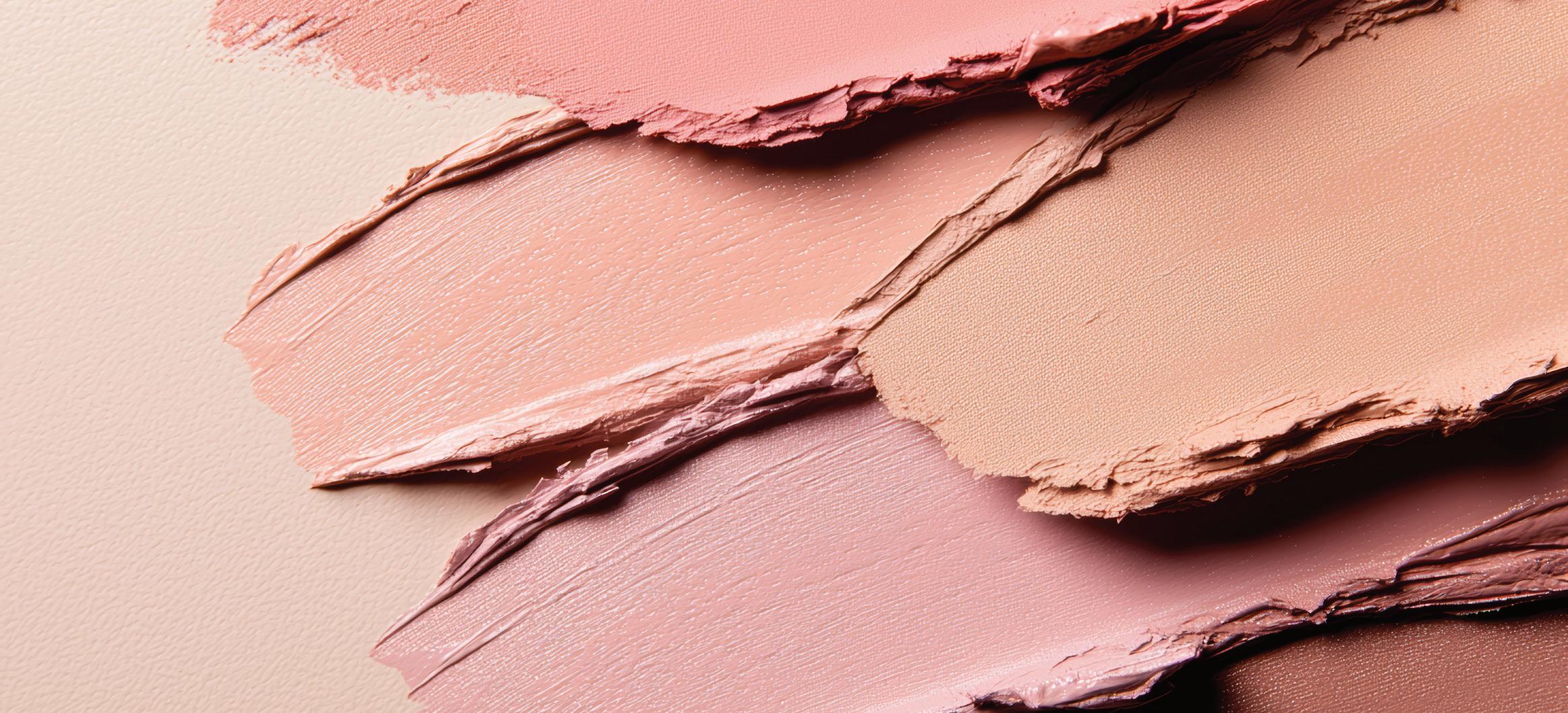
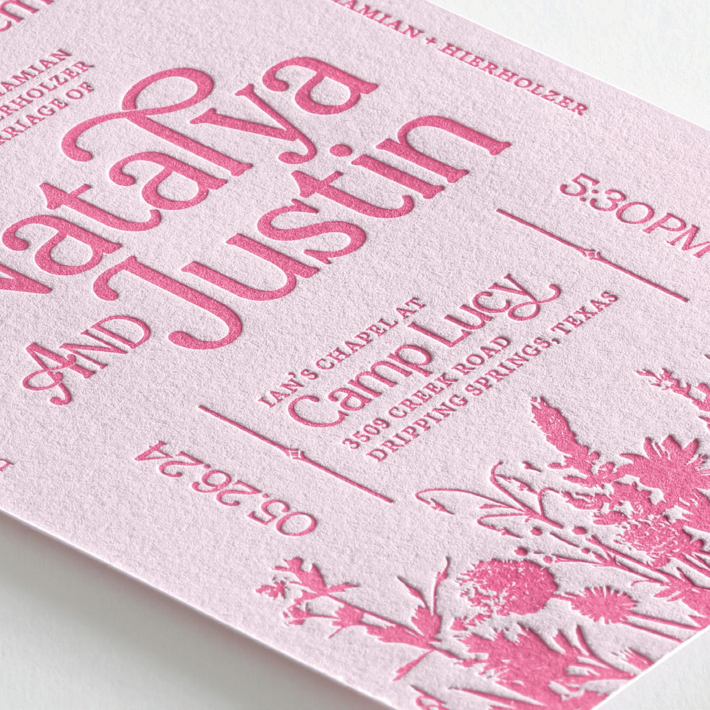
9. Color on Color/Tone on Tone
Layering similar hues adds visual interest without the clutter. Whether it’s burgundy on blush or slate on stone, it feels modern and cohesive.
Shown: digial + letterpress
Print Process Matchup: digital
and letterpress
Use digital printing to lay the groundwork and letterpress to introduce the tone on tone look, with subtle shifts in texture as a bonus. The result is simply stunning.
Designed by Natalya Hierholzer
Read: Hot Trend
A growing trend! Designers are building full suites (invites, enclosures, menus, thank-yous) in one color family with variations in print processes for contrast.
PRO TIP:
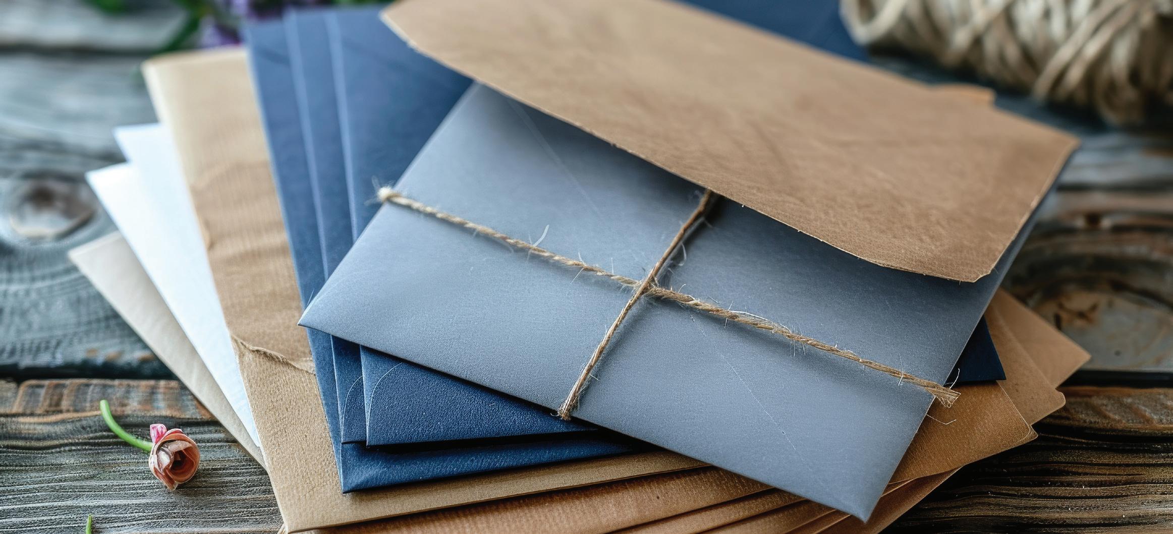
10. Wrap It Up/Band It
Presentation matters. Belly bands, wraps, and layered packaging bring a tactile experience to your printed pieces. These additions also give you more real estate to tell a story.
Print Process Matchup: pocket and belly band printing
Did you know we offer specialty print on panel pockets and belly bands? Try foil printing on panel pockets. Try digital, foil, thermography or White Ink on belly bands! Clients will SWOON.
Go after that unboxing experience! Clients are starting to treat invitations like brand packages. Belly bands, pockets, ribbon, and seals make every open feel special.
Shown: belly band, digital
Designed by Jeremy Schulz Read: Blog Post
SHOWCASE YOURdesigns
Interested in being featured on the TOG.ink Blog?
Email a few examples of your work to creativeteam@tog.ink
Your artwork could be showcased in our next Hot Trend Off the Press or Designer Spotlight!