2 minute read
Huge home center totally revamps store interior
If EOPLE find shopping in warehouses to be intimidatF ing. Or at least'tttutis the assumption behind one home center owner's plan to "de-warehouse" his store.
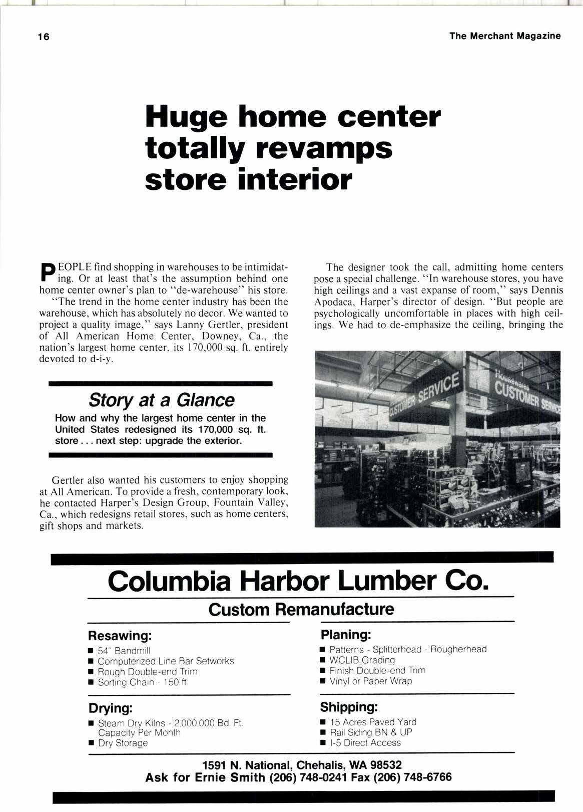
"The trend in the home center industry has been the warehouse, which has absolutely no decor. We wanted to project a quality image," says Lanny Gertler, president of All American Home Center, Downey, Ca., the nation's largest home center, its 170,000 sq. ft. entirely devoted to d-i-y.
Story at a Glance
How and why the largest home center in the United States redesigned its 170,000 sq. ft. store. next step: upgrade the exterior.
Gertler also wanted his customers to enjoy shopping at All American. To provide a fresh, contemporary look, he contacted Harper's Design Group, Fountain Valley, Ca., which redesigns retail stores, such as home centers, gift shops and markets.
The designer took the call, admitting home centers pose a special challenge. "In warehouse stores, you have high ceilings and a vast expanse of room," says Dennis Apodaca, Harper's director of design. "But people are psychologically uncomfortable in places with high ceilings. We had to de-emphasize the ceiling, bringing the
Golumbia Harbor Lumber Co.
Resawing: r 54" Bandmill
I Comouterized Line Bar Setworks
I Rough Double-end Trim r Sortinq Chain - 150 ft
Drying: r Steam Drv Kilns - 2 000,000 Bd. Ft Capacity Per Month r Dry Storage
Planing: r Patterns - Splitterhead - Rougherhead r WCLIB Grading r Finish Double-end Trim r Vinyl or Paper Wrap
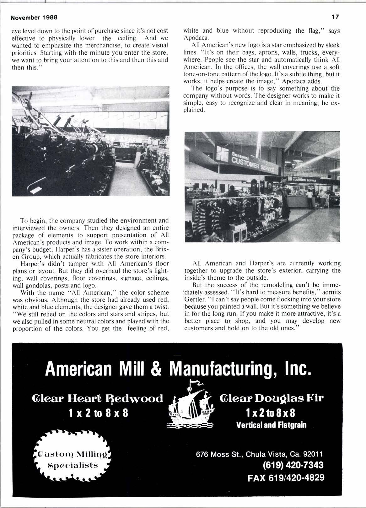
Shipping: r 15 Acres Paved Yard r RailSiding BN & UP r l-5 Direct Access eye level down to the point of purchase since it's not cost effective to physically lower the ceiling. And we wanted to emphasize the merchandise, to create visual priorities. Starting with the minute you enter the store, we want to bring your attention to this and then this and then this." white and blue without reproducing the flag," says Apodaca.
All American's new logo is a star emphasized by sleek lines. "lt's on their bags, aprons, walls, trucks, everywhere. People see the star and automatically think All American. In the offices, the wall coverings use a soft tone-on-tone pattern of the logo. It's a subtle thing, but it works, it helps create the image," Apodaca adds.
The logo's purpose is to say something about the company without words. The designer works to make it simple, easy to recognize and clear in meaning, he explained.
To begin, the company studied the environment and interviewed the owners. Then they designed an entire package of elements to support presentation of All American's products and image. To work within a company's budget, Harper's has a sister operation, the Brixen Group, which actually fabricates the store interiors.

Harper's didn't tamper with All American's floor plans or layout. But they did overhaul the store's lighting, wall coverings, floor coverings, signage, ceilings, wall gondolas, posts and logo.
With the name "All American," the color scheme was obvious. Although the store had already used red, white and blue elements, the designer gave them a twist. "We still relied on the colors and stars and stripes, but we also pulled in some neutral colors and played with the proportion of the colors. You get the feeling of red,
All American and Harper's are currently working together to upgrade the store's exterior, carrying the inside's theme to the outside.
But the success of the remodeling can't be imme'diately assessed. "lt's hard to measure benefits," admits Gertler. "l can't say people come flocking into your store because you painted a wall. But it's something we believe in for the long run. If you make it more attractive, it's a better place to shop, and you may develop new customers and hold on to the old ones."


