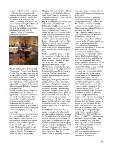
overhead projector system. Marian is a brilliant artist who works in all mediums and can manipulate a broad edged pen as easily as a pointed pen. Blackletter, in its many different forms, fits perfectly with pointed pen, as you will see from a photo I took on the night of the Healey Exhibit. The desk featured below (circa 1909) is in its original state from the Zanerian College of Penmanship, courtesy of Zaner-Bloser.
Day 3: Barbara Close demonstrated Contemporary Pointed Pen & Exciting Florals. This was a fun class, but over far too quickly. I am happy to hear she will be here to teach next February. I floundered a bit when painting with my watercolours as they sunk into the paper and I was stuck with the results. A lesson learned. The paper was great for pen and ink! In the PM the instructors took part in a Round Robin, and this was our opportunity to try out fun techniques and watch some demonstrate their penmanship. In another area small groups were gathered where information and questions were answered by "technical" volunteers, as well as instructors, on the challenging advent of calligraphy meeting technology. I have not mentioned how much most of us enjoyed Happy Hour! It was a time where we could catch up, meet new members, and relax over a glass or two of choice of beverage and munch on fresh veggies and other treats. Most evenings small groups would get together and go for supper to one of the many fine restaurants across the street at the Biltmore
Shopping Mall or, if we felt a bit lazy, we relaxed in the Omaha Steakhouse in the hotel. There was no shortage of company - calligraphers have to be the friendliest of people. Day 4: Linda Schneider "wowed" me in this class, Ornate Pictorial Calligraphy. I had borrowed her book Designing Faces, Figures, Florals and More a couple of times from our library and had been fascinated by her work, so was excited to see her listed in the faculty. Linda is a sweetie, she shared so much with us (including Hershey Kisses), and we all loved her. She had us tear our paper into small pieces, thus enabling us to easily rotate as we worked with our pointed pens. Another class that was way too short. Linda is second vice-chair, so in 2014 the conference will take place in the Seattle area, close to her hometown. In the afternoon I was with Michael Sull again, this class entitled Spencerian Monogram Design. Obviously one needs to have a degree of competency in either Spencerian or Ornamental Penmanship to be able to create the flourishes required to produce appealing designs - practice, that's all it is! In designing monograms, dimension can be achieved by the addition of colour as well as gilding. Designing monograms is not spontaneous, but composed, meaning a lot of drafting takes place using quarter-inch graph paper, coloured pencils (red, green and blue) to represent each letter, tracing paper cut into pieces measuring approximately 4 x 6 inches to be used as overlays for each letter until a final layout is achieved, and a myriad of supplies which most of us have in our stash. When Michael is commissioned to design a monogram for a family, he uses the initial of the family's surname for the middle letter, the lady's initial on the left and the gentleman's on the right. Many examples of his designs were in our handout, all exhibiting the magical oval shape that Spencer based his handwriting upon more than a century ago. Michael demonstrated, using a system of dots, the incorporation of imaginary ovals into
his designs. I have to confess I am not ready to tackle ornamental monograms at this point! The Silent Auction took place on Friday night, and everything sold, raising approximately $3,400 for the Association. I "won" a decorated paste paper book made by Donna Sabolovic, featuring beautiful flowers and quotations. I love it! Day 5: Saturday morning, the last class, Spencerian Ladies Hand with Bob Hurford. This style of ornamental penmanship is a "dainty version," as the title suggests, and one I want to study after mastering Copperplate and Contemporary Pointed Pen; many goals to be met, no doubt about that. This hand concentrates on fine lines and less on shading, and is written faster for that reason. Traditionally this hand was written with a straight penholder, but an oblique works well. Bob uses a straight penholder, he says it works for him. He is a wonderful teacher, has a wealth of knowledge, a great sense of humour, and is most candid. For many years he was editor of The Penman's Journal. At the present time he serves as the Association's official photographer. He has contributed much to the Association, not the least of which is his article on nibs which I mentioned previously. I concur with his comments in The Penman's Journal, 2003: "Good penmanship has the power to identify the penman or woman as someone special. Even good handwriting rendered with a ballpoint pen or pencil will set one apart from the crowd. The dramatic lines and shades, products of pointed or broad dip pens, will set a writer even further above the crowd." The closing ceremonies took place on Saturday night during the banquet, along with the induction of Jacob Weidmann into the Master Penman Society of IAMPETH. Jake's parents and sister were in attendance; how proud his family must have been, especially after a letter was read by Rick Muffler, penned by The First Lady, Michelle Obama, congratulating Jake on his achievements at such a young age. Do I want to attend next year's conference? You betcha!
19