17 minute read
IMPROVING DISTRIBUTION OF HEALTH WORK FORCE


IMPROVING DISTRIBUTION OF THE HEALTH WORK FORCE – ACHIEVING EQUITY An analysis of the distribution of general practitioners paid by medical schemes across district level healthcare markets
AUTHORS Phakamile Nkomo Mondi Govuzela
Advertisement
PEER REVIEWER: Laetitia Rispel
EXECUTIVE SUMMARY
There are important reasons to enquire into whether access to health care is equally distributed and accessible in the private health care industry. One of these is the need to coordinate access through a supply-side regulator to reduce market concentration of health care delivery. The second is so that mandatory cover can be achieved, and adverse selection (anti-selection) in the medical schemes industry can thus be curtailed through accessible networks. The third is that the primary care prescribed minimum benefits (PMBs) require access to general practitioners (GPs) for all beneficiaries.
We calculated equality indices using density ratios, patient loads, Gini coefficients and Hoover indices. The overall access to GPs is also illustrated using Lorenz curves. We then evaluated access to GPs relative to efficiency ratios by employing data envelopment optimisation techniques. We then used quantile regression to compare the impact of GP supply and the number beneficiaries on the whole distribution of health care utilisation across districts in Gauteng.
We found that districts with relatively higher density ratios (a high concentration of GPs): i) enjoy large shares of health care utilisation, and ii) that adding additional GPs will diminish returns from utilisation at an increasing rate. In the districts with relatively lower density ratios (a low concentration of GPs), the opposite effects apply. It was observed from the Lorenz curves and Gini coefficients that access to GP services is extremely unequal. The findings drawn from quantile regressions show differences in accessing health care across districts, although these are not significantly different from the mean estimate derived from ordinary least squares.
The policy implications are that a concerted effort should be made to rationalise the distribution of health care providers to achieve equal access to primary care.
INTRODUCTION
The purpose of this paper is to describe the distribution of GPs and assess whether the current distribution best serves the interest of medical scheme beneficiaries in accessing primary care benefits. The crux of the investigation revolves around whether health care utilisation in Gauteng districts is informed by an equal or unequal distribution of GPs. In addition, we consider whether there are trade-offs that will benefit access to health care for all medical scheme beneficiaries. We consider, based on the Hoover index, whether GPs can be incentivised to relocate to underserved areas from concentrated areas, with better potential for creating beneficial access to newly developed primary health care PMBs across all districts of Gauteng.
The World Health Organization (WHO) argues for coordinated action when it comes to investing in the health care sector as an integrated inclusive economic growth strategy (WHO, 2018). Its recommendations spell out that intersectoral economic collaborations for investment in human resources for health, which include private sector investment, should focus on interventions that provide the right amount of resources where needed, particularly in underserved areas. This should be supported by appropriate research and dissemination of information that affords communities transparent accountability.
Among its other functions, the Medical Schemes Act 131 of 1998 requires the Council for Medical Schemes (CMS): i) to protect the interests of beneficiaries: (section 7(a)), and ii) to coordinate the functions of medical schemes in a manner that is consistent with health policy (section 7(b)). The White Paper on National Health Insurance seeks to improve access to health care for all by using private-public partnerships to supplement public sector capacity (National Department of Health, 2016). In fact, the CMS has developed a PMB package for primary care, which makes equal access to GPs more important for all medical scheme beneficiaries (CMS, 2019). Therefore, it is imperative that we understand the supply of GPs that provide services to beneficiaries, and where there is access capacity at district level. PMBs are benefits to which all beneficiaries are equally entitled. Therefore, if there is a maldistribution of access to GP services, it means beneficiaries do not have equal and effective cover.
The Health Market Inquiry’s (HMI) final findings and recommendations identify the appropriate coordination of private health care delivery as important to reduce high market concentration in the industry (HMI, 2019). The report also prescribes that health care delivery through accessible networks is an important aspect of reducing adverse selection through mandatory cover interventions. The HMI recommends that at least 50% of all medical scheme beneficiaries should obtain health care through accessible provider networks before mandatory cover becomes a meaningful solution to negligible enrolment in the private financing sector. Since GPs are the first point of contact, the equal and accessible distribution of GP networks is important.
The HMI found there to be elements of supplier-induced demand in the private health industry (HMI, 2019). Research literature cites reasons why this may happen in concentrated health care markets, or in regions that have a high concentration of physicians (Bickerdyke et al, 2002). This happens because health care providers may be responding to the pressures of competition, particularly when they provide services in highly concentrated geographical areas (i.e. areas with high physician-to-patient ratios) (Bickerdyke et al, 2002). Also, the CMS undertook to investigate over-servicing reported by medical schemes in 2019 (CMS, 2018). This overservicing was allegedly due to fraudulent conduct on the part of health care providers or beneficiaries.
That said, over-servicing may be caused by factors other than the preferential location of physicians. It is important to keep this in mind when analysing health care utilisation associated with the distribution of providers. This is because observations related to the size of health care expenditure in geographical areas with a high concentration of GPs may not be related to over-servicing caused by moral hazard on the part of the provider.
In the rest of this section we cite some research literature in which the number of providers and the size of the population served were used as variables of interest to explain the geographical distribution of providers. In all these papers: i) the health care delivery systems have a mixed public and private profile; or ii) are predominantly private or public in nature on both the demand and supply sides.
The European Observatory (Observatory) conducts health system reviews on individual countries. The Observatory’s health reviews describe the capacity of health care delivery systems by using physician-topatient ratios (density ratios). We list a few country reviews: i) England, where the health delivery system is predominantly public sector in nature (Boyle, 2011); ii) the Netherlands, where the health financing (private non-profit sickness funds) and delivery system are private in nature (Kroneman et al, 2016); iii) the United States of America, where there is a strong private sector slant in both the demand and supply sides (Rice et al, 2013).
Newhouse et al (1982) test whether the geographical distribution of human resources for health explains market failure (no access to health care services when a need for access is present). The authors use a regression to estimate the number of physicians by speciality in cities, using population size and whether the town is a metropolitan city. This is done to see if these variables explain the supply of physicians (Newhouse et al, 1982). The study did not include health care utilisation to explain provider location, but the authors found that city size explains physician preferences for city amenities. Thus, health provider distribution is associated with city size and is not an effect of market failure. However, the authors overlooked the impact of actual health care consumption in assessing whether unequal distribution of health care has caused market failure (differentiated access across geographical areas).
Tao et al (2014) explain that Lorenz curves and Gini coefficients are the ‘foundations of welfare economics’ and are used to assess equality in health care access. Gaynor (2020) uses a Lorenz curve to describe the shares of health care consumed by the United States of America’s population across its whole cumulative distribution. The research found that those at the 95th percentile of the distribution and above (5%) of the population consume 50% of health care expenditure, while the cumulative population at the 50th percentile (50% of the population) consume 2.8% of the health care expenditure.
Hollingsworth (2014) explains that data envelopment analysis (DEA) has been used hundreds of times to measure the efficiency of health care interventions. The methodology is based on using the number of health care resources as inputs to optimise outcomes. The result of the calculation generates an efficiency score, which can be used to benchmark the performance of peers.
METHODS
Equality analysis
We calculated Gini coefficients for describing access to GPs at district level and illustrated equality of access using Lorenz curves.
Physician-to-patient ratios (density ratios) were calculated by using medical scheme beneficiaries as denominators. The density ratios are calculated at the scale of 10 000 beneficiaries per GP. The mathematical inverse of the density ratio calculation translated into a coverage ratio. This is the number of beneficiaries per GP or practice; we used this ratio to infer patient loads per GP practice. Patient loads and density ratios were not calculated based on actual visits by beneficiaries, but the denominator was based on the number of medical scheme beneficiaries living in a geospatial area, e.g. postal code, district or province.
Gini coefficients range from 0 (pure equality) to 1.0 (complete inequality). Tao et al (2014) say that an index
greater than 0 but less than 0.3 means perfect equality. An index ranging from 0.3 to 0.4 is rated as normal equality. An index that is greater than 0.4 but less than 0.6 indicates a level of concern (‘high alert’), and an index of 0.6 or higher reflects a situation of high inequality.
CALCULATION OF THE EQUATION FOR GINI COEFFICIENTCalculation of the equation for Gini coefficient:
ILLUSTRATION FOR GINI COEFFICIENT CALCULATION
The Hoover index is a measure that reflects the proportion of redistribution required to achieve equality in the distribution of resources.
CALCULATION OF THE HOOVER INDEX: Calculation of the Hoover index: ������ ������ 1 2 �� � ��� �� ������ � � �� ������ Where: �� ���� ������ ����� ���������� ���������� ������� �� ���� ����� �� ���������� ����������� �������� �� ����� �������� �� ������ �� ����������
Efficiency analysis
We conducted a DEA using GP visits and number of GPs per Gauteng district. This is a spreadsheet modelling technique using the Microsoft Excel Solver tool. Summary statistics were used as in a mini-max optimisation procedure to calculate efficiency scores and returns to scale at district level.
The model adjusts for differences in locations using a variable returns to scale approach. The reason for this is that, if the districts were not adjusted for differences, then the optimisation analysis efficiency scores would be calculated at constant returns to scale. This would mean that the performance ratios would be comparing the districts as though they were peers, and each district had the same capacity or resources. This is not true as the districts have different numbers of GPs and scheme beneficiaries.
The full technical note to this methodology section can be accessed in the discussion document under research brief on the CMS website (CMS, 2019a).
Regression analysis
We ran a linear regression and a quantile regression using medical scheme claims (dependent variable) relative to the number of GPs, number of beneficiaries and districts as location indicators (independent variables). We compared the quantile regression mean quantile estimates with the linear regression means.
RESULTS
Limitations
Our data do not include morbidity or effectiveness, so they reflect only health equality and not health equity. This is because equality espouses pure egalitarianism, and equity is distribution based on needs. The regressions do not use a Heckman two-stage least squares procedure for controlling for unseen endogeneity caused by location effects on the number of GPs per district.
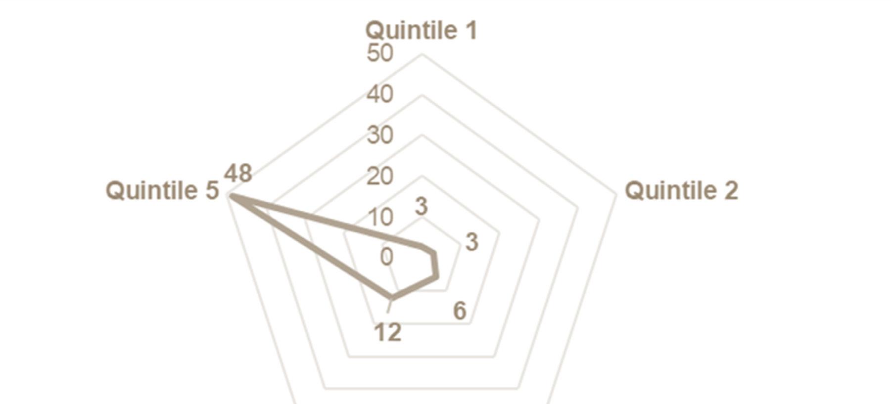
FIGURE 1. GP TO BENEFICIARY DENSITY RATIOS BY QUINTILE IN GAUTENG (2018)

Overview of GP allocation in Gauteng
Figure 1 (on oage 22) and Figure 2 (below) express data supply and coverage ratios by quintiles. Quintiles are ranked by per capita health care expenditure. The lowest per capita expenditures are in quintile 1 and the highest are in quintile 5.
Figure 1 shows density ratios by quintile in Gauteng. In quintile 1 and 2 there are three GPs per 10 000 beneficiaries. In the highest quintile (quintile 5), there are 48 GPs per 10 000 beneficiaries. The highest supply of GPs occurs in quintile 5, where there are 16 times more GPs than in quintile 1 when expressed per 10 000 beneficiaries.
Figure 2 is a web diagram that shows patient loads (number of beneficiaries per GP practice). Quintile 1 has the highest patient loads and quintile 5 the lowest. The patient loads are 18 times higher in quintile 1 than they are in quintile 5. This means that there is potentially more pressure on GPs in lower quintiles, suggesting lower-quality interpersonal patient encounters. The higher quintiles suggest that these are concentrated areas, requiring GPs to compete with quality health care interventions.
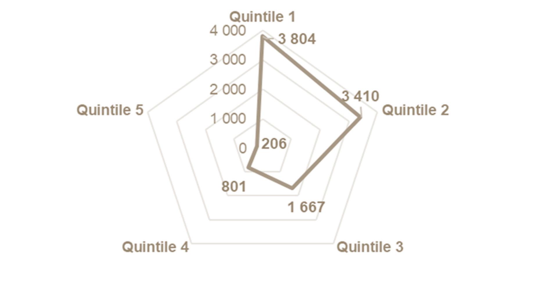
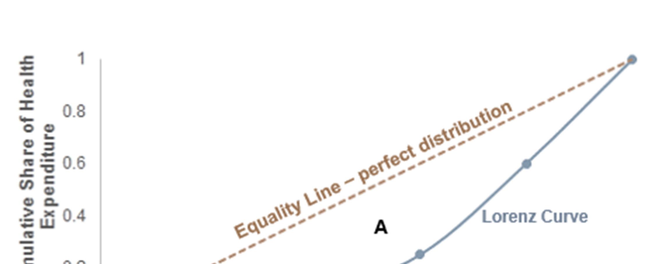
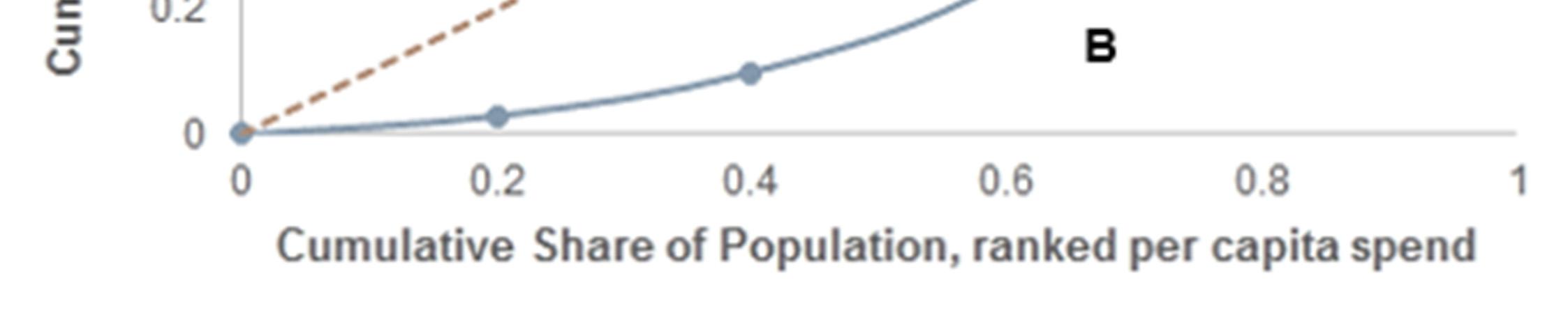
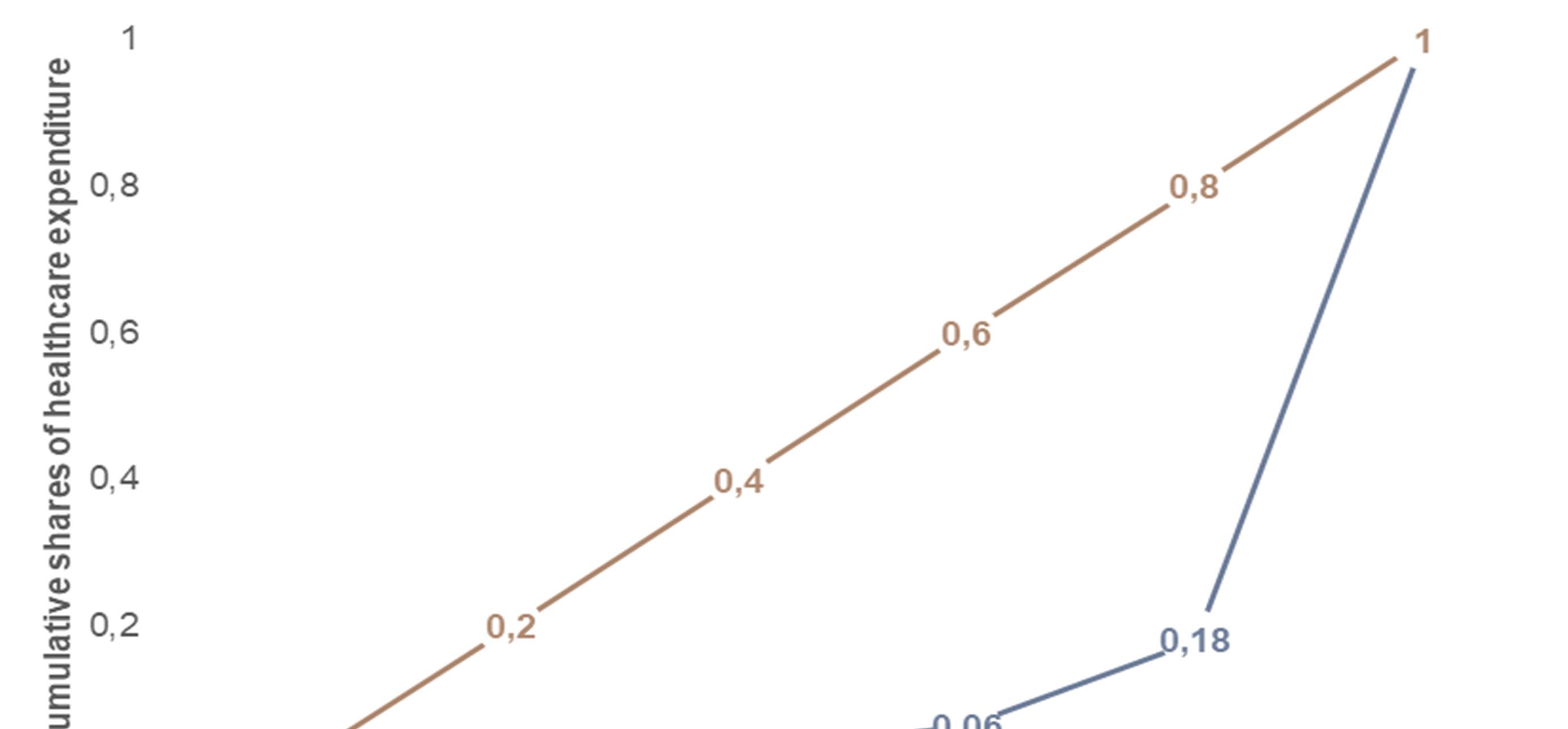
Figure 3 (on page 23) is an illustration of a Lorenz curve. The curve shows a cumulative distribution of beneficiaries on the x-axis, and a similar distribution of health care expenditure on the y-axis. The beneficiary distribution is ranked by per capita health care expenditure. The area between the equality line (linear line) and curvilinear line is the area of concentration, which reflects the degree of inequality in health care expenditure. In this instance the Gini coefficient is 0.69, which indicates an extremely high level of inequality.
As a result, the lowest ranked 20% of beneficiaries receive 1% of health care expenditure, while the highest ranked 20% receive 82% thereof. Clearly, expenditure is highly concentrated among the highest ranked beneficiaries in the beneficiary distribution.

Equality of access to GPs in Gauteng districts
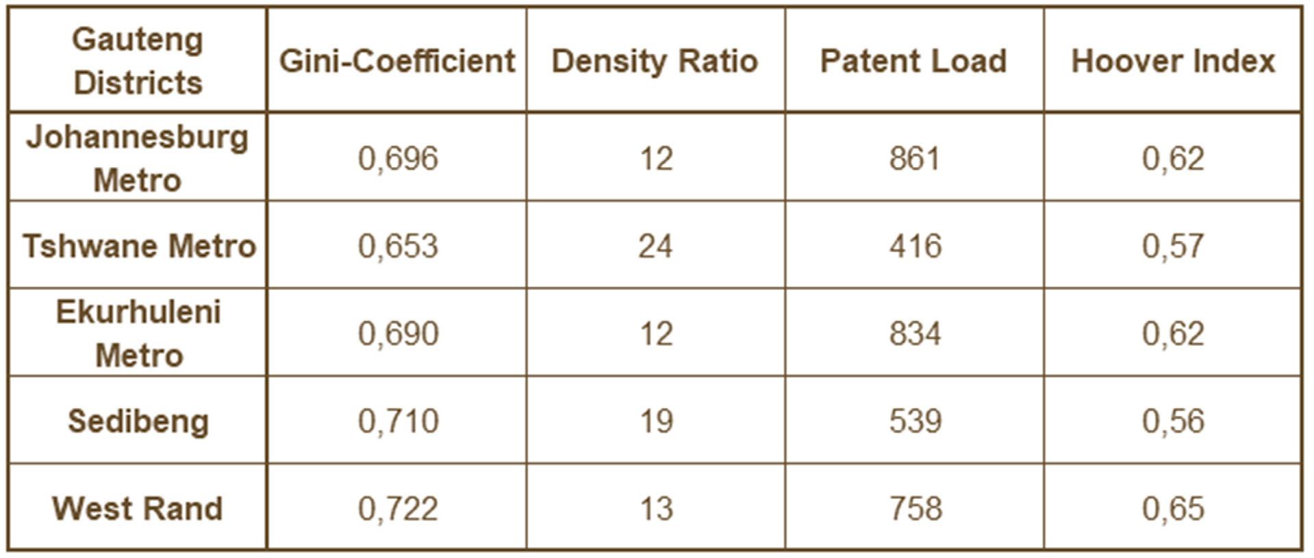
Table 1 shows inequality and GP density ratios and patient load indicators for all Gauteng districts in 2018. All Gini coefficients are extremely high, but Tshwane had the lowest patient loads and highest density ratio. This translates to the lowest required Hoover index. The Hoover index describes the level of redistribution required for equality to occur. Tshwane required a 57% redistribution of health care expenditure from the highest ranked 50% of beneficiaries to the lowest ranked 50% in the distribution.
TABLE 1. EQUALITY AND COVERAGE RATIOS IN GAUTENG DISTRICTS (2018)
Efficiency of GP allocation
Figure 4 shows the results of a DEA. The y-axis reflects scale efficiency (productivity) of GP allocation across districts. The slope of the curvilinear line decreases at an increasing rate, as more GPs are allocated to districts. This means that the return to scale diminishes from the West Rand to Johannesburg Metro. This means that the benefit of accessing more GPs diminished as more are allocated to the Johannesburg Metro than to the West Rand.
Figure 4 also reflects some slack in the Tshwane Metro. It shows that there are increasing returns to scale in the West Rand, Sedibeng and Tshwane Metro. It also shows that there are decreasing returns to scale in the Ekurhuleni and Johannesburg Metros. Decreasing returns to scale mean that there are negligible benefits from increasing health access by increasing GP allocations, and increasing returns to scale mean that there are positive benefits to access by increasing GP allocations.
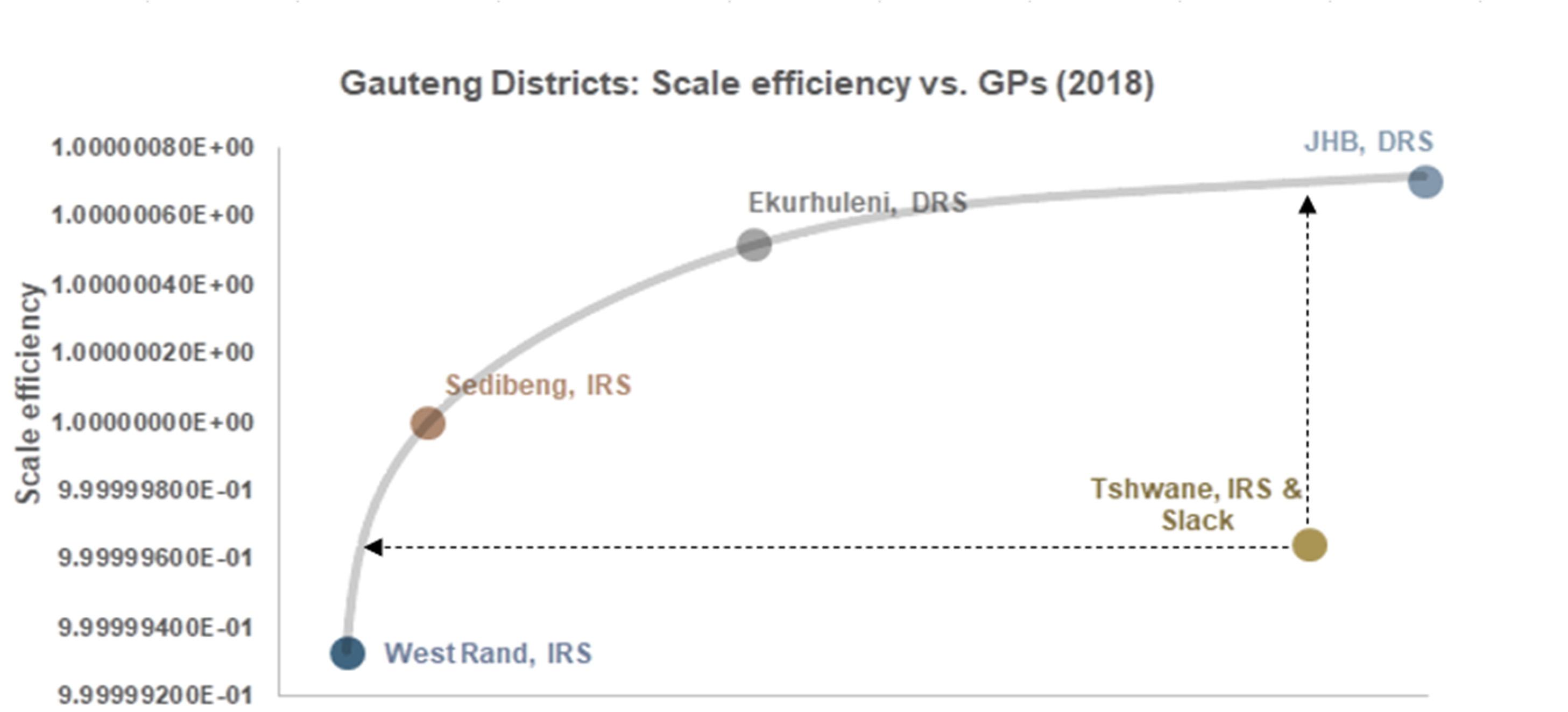
FIGURE 4. SCALE EFFICIENCY BY NUMBER OF GPS PER GAUTENG DISTRICT (2018)
Regression results

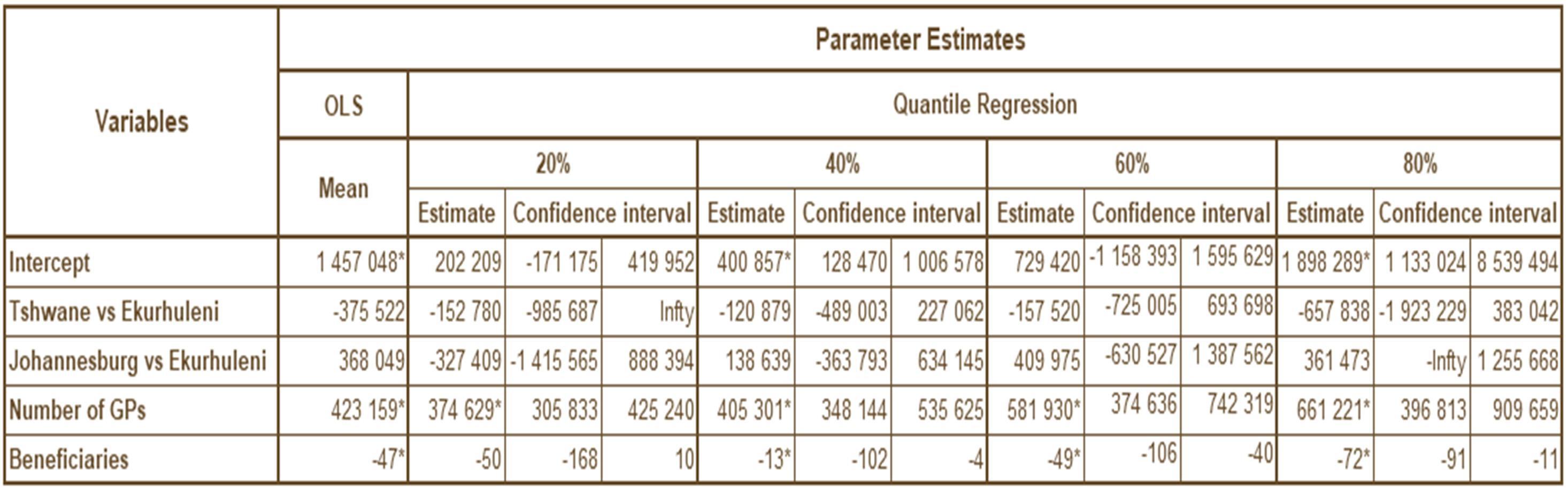
Table 2 shows the results of the ordinary least squares (OLS) and quantile regressions. The outcome is health care claims, and the dependent variables are location dummy variables, number of GPs and number of beneficiaries. The number of GPs variable is significant on both OLS and quantile regression models, showing a positive relationship between GP supply and health expenditure. That said, there is an unexpected negative relationship between number of beneficiaries and health care expenditure, and no significance in the location dummy variables. Therefore, there seems to be unseen endogeneity impacting number of beneficiaries. The regressions need to be remedied by using location as an instrumental variable and number of GPs as an endogenous variable in a Heckman two-stage linear regression. An instrumental variable quantile regression method should be used for the quantile regression.
TABLE 2. OLS AND QUANTILE REGRESSION ESTIMATES (2018)
DISCUSSION
The findings show concerning patterns regarding the availability of GPs in Gauteng quintiles. Underserved areas (areas with low density ratios) had high patient loads. This means that there is potentially more pressure on GPs in lower quintiles, suggesting lower-quality interpersonal patient encounters.
This is of concern, considering what we have learned from the COVID-19 pandemic. Health delivery systems need to be nimble and able to adjust to changing patient load requirements, if we are to keep health delivery systems resilient under pressure.
What we also see from the analysis is that the higher quintiles suggest that these are concentrated areas, requiring GPs to compete with quality health care interventions. This has the potential to increase health care costs while productivity diminishes, as we have seen from the DEA results.
There are inequalities in accessing health care at the first (GP services) point of contact; these are leading to large disparities in health care utilisation costs across geographic markets within Gauteng. The results show that it is conceivable that the policy options for the imminent supply-side regulator are:
i) keeping the status quo and thus pumping money from the contribution and reserves of medical scheme beneficiaries into concentrated markets with diminished returns to scale, or:
ii) that based on the Hoover index showing that for beneficiaries to access benefits they are entitled to, there needs to be a redistribution of GPs to underserved areas, which has the potential to improve returns to scale and improve the social net benefit of beneficiaries through increased access and equity, resulting in better health outcomes for all.
A reimbursement mechanism ought to be used to incentivise GPs to provide services in underserved areas. This will also reduce wasteful expenditure that results from keeping human resources for health concentrated in specific geographical areas.
Providing beneficiaries with monitoring and evaluation results on health care access at regional or local community levels will assist them in governing the health care reserves of medical schemes effectively for the benefit of the collective (all beneficiaries equally entitled to PMBs). Medical scheme annual general meetings would be the ideal place to demonstrate the impact of participatory governance, providing beneficiaries with transparent accountability and empowering them with information at grassroots or district level.
REFERENCES
Bickerdyke I, et al. 2002. Supplier-induced demand for medical services. Staff Working Paper. Canberra: Productivity Commission, Australia.
Boyle S. 2011. United Kingdom (England): Health system review. Health Systems in Transition. Copenhagen: European Health Observatory, 1-486.
CMS. 2018. Medical schemes fraud, waste and abuse. CMS News. Pretoria: Council for Medical Schemes.
CMS. 2019. Allocation of human resources for health in the medical schemes industry by discipline. Research Briefs. Pretoria: Council for Medical Schemes.
CMS. 2019. Draft: Primary health care services. Pretoria: Council for Medical Schemes.
Gaynor M. 2020. What to Do about Health-Care Markets? Policies to Make Health-Care Markets Work (Policy proposal). Washington, DC: The Hamilton Project, The Brookings Institute.
Health Market Inquiry. 2019. Health Market Inquiry: Final Findings and Recommendations Report. Pretoria: Competition Commission, South Africa.
Hollingsworth B. 2014. Evaluating efficiency of a health care system in the developed world. In: Culyer AJ, ed. Encyclopedia of Health Economics. Waltham, Mass: Elsevier.
Kroneman M, et al. 2016. The Netherlands: health system review. Health Systems in Transition. Copenhagen: European Health Observatory, 1-239.
National Department of Health. 2016. National Health Insurance for South Africa: Towards Universal Health Coverage. Pretoria: National Department of Health, South Africa.
Newhouse JP, et al. 1982. Does the geographical distribution of physicians reflect market failure? Bell Journal of Economics; 13(2): 493-505.
Rice T, et al. 2013. United States of America: Health system review. Health Systems in Transition. Copenhagen: European Health Observatory, 1-431.
Tao Y, Henry K, Zou Q, Zhong X. 2014. Methods for measuring horizontal equity in health resource allocation: A comparative study. Health Economics Review; 4: 10.
World Health Organization. 2018. Five-year action plan for health employment and inclusive economic growth (2017-2021). Geneva: WHO.


