plot viii
tarmac ‘seven ts’ 1964-1996
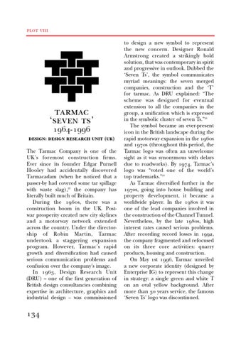
design: design research unit (uk) The Tarmac Company is one of the UK’s foremost construction firms. Ever since its founder Edgar Purnell Hooley had accidentally discovered Tarmacadam (when he noticed that a passer-by had covered some tar spillage with waste slag),22 the company has literally built much of Britain. During the 1960s, there was a construction boom in the UK. Postwar prosperity created new city skylines and a motorway network extended across the country. Under the directorship of Robin Martin, Tarmac undertook a staggering expansion program. However, Tarmac’s rapid growth and diversification had caused serious communication problems and confusion over the company’s image. In 1963, Design Research Unit (DRU) – one of the first generation of British design consultancies combining expertise in architecture, graphics and industrial design – was commissioned
134
to design a new symbol to represent the new concern. Designer Ronald Armstrong created a strikingly bold solution, that was contemporary in spirit and progressive in outlook. Dubbed the ‘Seven Ts’, the symbol communicates myriad meanings: the seven merged companies, construction and the ‘T’ for tarmac. As DRU explained: “The scheme was designed for eventual extension to all the companies in the group, a unification which is expressed in the symbolic cluster of seven Ts.”23 The symbol became an ever-present icon in the British landscape during the rapid motorway expansion in the 1960s and 1970s (throughout this period, the Tarmac logo was often an unwelcome sight as it was synonymous with delays due to roadworks). By 1974, Tarmac’s logo was “voted one of the world’s top trademarks.”24 As Tarmac diversified further in the 1970s, going into house building and property development, it became a worldwide player. In the 1980s it was one of the lead companies involved in the construction of the Channel Tunnel. Nevertheless, by the late 1980s, high interest rates caused serious problems. After recording record losses in 1992, the company fragmented and refocused on its three core activities: quarry products, housing and construction. On May 1st 1996, Tarmac unveiled a new corporate identity (designed by Enterprise IG) to represent this change in strategy: a single green and white T on an oval yellow background. After more than 30 years service, the famous ‘Seven Ts’ logo was discontinued.