40
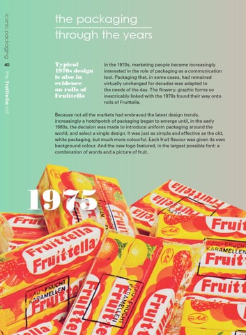
Typical 1970s design is also in evidence on rolls of Fruittella
the Fruittella roll
iconic packaging
the packaging through the years In the 1970s, marketing people became increasingly interested in the role of packaging as a communication tool. Packaging that, in some cases, had remained virtually unchanged for decades was adapted to the needs of the day. The flowery, graphic forms so inextricably linked with the 1970s found their way onto rolls of Fruittella.
Because not all the markets had embraced the latest design trends, increasingly a hotchpotch of packaging began to emerge until, in the early 1980s, the decision was made to introduce uniform packaging around the world, and select a single design. It was just as simple and effective as the old, white packaging, but much more colourful. Each fruit flavour was given its own background colour. And the new logo featured, in the largest possible font: a combination of words and a picture of fruit.
1975
Iconic-Fruitella-ENGELS.indd 40
28-06-12 07:07