Name of typeface OCR-B
Client European Computer Manufacturers Association
Designer Adrian Frutiger
Design | Publication Since 1963 | since 1965
Typesetting technology Letterpress, Computer Composition, Typewriter Composition PostScript digital typesetting
Weights Manufacturer 1 – Several computer and typewriter manufacturers – Adobe | Linotype Bitstream Elsner + Flake
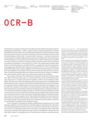
OCR-B In 1961 thirteen computer and typewriter manufacturers founded the ‘European Computer Manufacturers Association’ – ECMA – based in Geneva.1 The main objective for its founding members was the creation of an international standard for optical character recognition to be used, for instance, in payment transactions. But most of all they wanted to avoid the wider adoption of OCR-A /02/ – we used to call it ‘robot type’ – in Europe. It was one of the first machine-readable typefaces that came from the United States. For the European OCR manufacturers it was a given that the shape of its capitals would never be accepted over here, and they were intent on coming up with a European answer, OCR-B, that would be aesthetic and pleasant to the human eye. In 1963 I was approached by Robert Ranc, director of the École Estienne, and Gilbert Weill 2, an engineer from the R &D department at Compagnie des Machines Bull, asking me to develop OCR-B. In a first meeting they explained their goals: they wanted to suggest an international standard using a non-stylised form of the alphabet. The problem with this task was that all companies that were members of ECMA had developed their own readers and each of those worked in a different way; some read the counter, others the contours and yet others the centreline. Over a space of five years we would meet up every three months at one of the companies’ offices. First they had to agree on a common grid. Then, at one of the following meetings, they gave me a template and said the typeface would be read according to these points. The cells were only a few millimetres big and the system was considerably finer than the matrix of OCR-A with its 5 by 9 cells /03/. I would always draw curves in my designs. The engineers said that adjusting them to the grid wasn’t the task of the designer, it was the task of the computer. In my studio we created hundreds of drawings, all filled in with black. The grid was only superimposed later for copying purposes, so that the manufacturers could read the character’s mass precisely. If a cell was more than half full it counted as a plus, if it was less than half full it counted as a minus. Initially only horizontal steps were possible but later the cells could also be divided diagonally. The resulting computations were done by the computer firms. They looked after legibility and the typewriter manufacturers looked after the execution of the typeface. The characters had a consistent line weight and the most important thing was to determine the form-giving ‘centreline’. It was needed for the milling of the typewriter face /01/. Since I insisted, it was agreed to develop a differentiated ‘letterpress font’ for book printing in addition to the font with the consistent weight. Up until this point only numerals and capitals had been important but now we also had to deal with lower case characters. As far as the letterpress shapes were concerned, it was important that I built them up from the centreline. The shape of the type around it, the difference between fine and bold, didn’t matter in technological terms. The discussion revolved around the question 176
Worldwide standardisation Since the beginning of the 20th century many countries have devised national standards – for electrical sockets or paper sizes, for example. Due to growing globalisation an increasing need emerged to make these national standards compatible with each other. This resulted in the foundation of the International Organisation for Standardisation – ISO in 1947.3 It is this organisation to which ECMA4 submits its applications for the certification of worldwide standards. The increasing use of computers, which were being produced by a growing number of manufacturers to their own standards, created the need to standardise basic operating technologies for software applications. With the main objective of coordinating the different computer standards, three companies – Compagnie des Machines Bull, IBM World Trade Europe Corporation and International Computers and Tabulators Limited – initiated a meeting of all major European computer manufacturers that led to the foundation of ECMA in 1961, a private standards organisation for the standardisation of information and communication systems. One of ECMA’s projects dealt with automatic character recognition. Adrian Frutiger developed two versions of OCR-B: the first one featured constant stroke weight and round terminations. In the second, called Letterpress , the stroke weight was adapted according to optical criteria and the terminations were angular. Initially OCR-B was monospaced. Additionally the width of the glyphs varied, i. e. it was a proportional typeface. Besides the drawing and manufacture of the typeface, the technology for reading and processing information was important. The computer manufacturers agreed on the ‘system curve of merit’ as a common basis for the differentiation of individual characters. OCR-B, which was initially developed for typewriter setting, was swiftly adapted to other typesetting systems (for example Monotype in 1971) 5 and is still used in contemporary computerised technologies. Frutiger was one of the first designers worldwide who – with regards to machine-readable typefaces – dealt with questions of aesthetics in combination with technology. This led to his giving numerous talks on the subject, the first of which took place in 1967 in Paris at the ATypI conference. After a first recommendation by the ISO committee in 1966, OCR-B was declared a worldwide standard in 1973.
T E X T T Y P E FA C E
21 OCRB_27_EN def_BL+SH.indd 176
21.9.2008 15:56:54 Uhr