
3 minute read
Web Presence Advice


Stay visible in search engines and enhance your conversion rates with a responsive web design that loads rapidly and works well across all devices.
In this digital age, it is imperative that trade professionals market their services online. Gone are the days of the Yellow Pages and direct mail, today it’s all about the website, and with over one billion websites now registered online, there is no reason for you to avoid having one.
Advertisement
Why do I need a website?
Contrary to popular belief, websites are a relatively low cost form of marketing. Aside from the initial outlay, they require very little maintenance and can vastly improve your turnover. Unlike many other marketing techniques, there is no need to pay high ongoing costs for distribution and printing fees. Instead, good website branding allows you to control your voice and showcase your services on a constant basis, meaning you never have to close for business. Posting regular content will also help customers get to know your brand and understand exactly what it is that separates you from your competitors.
So, if you’re under the impression that referrals are the most effective way of generating business, then you need to think again. A recent article in the Guardian has revealed that 94% of Internet
THE IMPORTANCE OF A RESPONSIVE WEB PRESENCE IN 2018
Lee Sturgess from Polar Creative
users rely solely on websites to seek out local businesses*. Information is expected to be a click away, so if your services are not advertised online, you are at great risk of losing customers. Having a professional website will show that you operate a credible business and prove to customers that you are willing to be transparent. A personalised domain space also provides numerous benefits, including the opportunity to create a professional email address.
The Role of Responsiveness
In order to really gain an advantage over the competition, your website needs to be fast and responsive.
When a potential customer launches your website, they expect it to fit the screen on the device that they’re using. If it doesn’t load correctly, or looks unappealing, then they’ll quickly click out and you’ll lose out on any potential work. By having a responsive website, background technology will allow it to adapt to the screen that it is being viewed on. A responsive site typically uses CSS

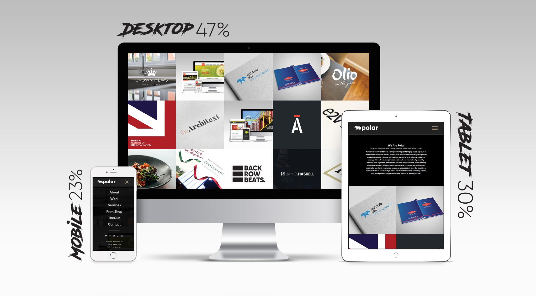
media queries to change styles based on the width and height of the target device. By making your website responsive, you will increase engagement with your site visitors, which will assist in turning those initial clicks into customers.
Responsive Vs Adaptive
The alternative to having a responsive website is to use an adaptive approach. With an adaptive web design, webmasters need to use a number of static layouts which will detect the screen size of the tablet, desktop or mobile that is being used before loading the appropriate layout. Typically, a minimum of six layouts would be necessary in order to cover the most common screen widths.
In comparison, responsive web design is much easier to manage when there is only one single layout to consider. Each time you need to update your content, you need to do so only once, which will bring down the costs of your web management.
Search Engine Optimisation
Google’s preferred approach to web design layout for mobiles is responsive. When the search engine backs a particular technique, it is wise to pay attention. Google’s algorithms place a lot of emphasis on how mobile-friendly a website is, ever since mobile searches surpassed desktop searches in early 2015. They even offer a handy mobile-friendly test so that you can ensure your website can be viewed correctly by visitors who are using any device. Sites that pass the test with flying colours are more likely to rank well within the search results. One of the key elements to designing a web layout that is optimal for web visitors is to ensure that it loads quickly when a user clicks on it within a search engine or types in the URL. 40% of users are thought to abandon a web page that takes longer than 3 seconds to load on a mobile device; therefore, it is essential to prioritise speed over other features such as JavaScript which may add bells and whistles to the look, but will slow your page launch right down.
If you want to improve your online presence, get in touch with the Polar team today...
* What are businesses missing out on by not having a website? (2017). Retrieved October 12, 2017, from The Telegraph.


