BRAND GUIDELINES
BY B. COLE DESIGN STUDIO
AUGUST 2023 VERSION 1.0
THE HOME AK
Table of Contents 02 The Brand Values 35 Digital Media 04 The Brand Mood & Personality 06 Imagery 09 The Target Audience 12 16 Logo Mark 22 Brand Colors 27 Brand Typography 31 Brand Stationery Purpose, Mission & Vision
Transforming spaces into harmonious havens through expert design and organization.
AUGUST 2023 THE HOME REVIVE AK | 1
The Brand Values
THE HOME REVIVE AK | 2 AUGUST 2023
Empowering Reliability Trust
These are our core values & What we stand for
At The Home Revive, we hold dear to empowering our clients with the peace that comes from organized and functional rooms. We recognize that today's fast-paced lives leave little room for transforming houses into homes. Perhaps it's not only about time constraints, but also the depletion of energy to tackle such tasks.
Moreover, many are left confused, unsure where to initiate this transformative journey. Driven by unwavering passion and commitment, The Home Revive steps in to alleviate these pain points, ensuring that every space is a haven of comfort and functionality.
THE HOME REVIVE AK | 3 AUGUST 2023
The Brand Mood & Personality
THE HOME REVIVE AK | 4
AUGUST 2023
Reviving Homes for Lasting Order
Harnessing the Transformative Power of Habits
We believe that every home can become a sanctuary of order and tranquility. By infusing this philosophy into our approach, we not only restore homes but also empower you to reclaim time for what truly matters – the activities you love and enjoy. Our mission goes beyond physical transformations; it's about helping you build habits that ensure your spaces remain as harmonious as the day we revive them.
AUGUST 2023 ORGANIZE. DESIGN. REVIVE.
“Alongside Great Systems And Routines, Habits Are Key To Becoming, And Staying, Organized”
CHRISSY HALTON
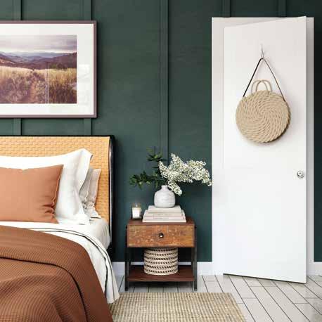
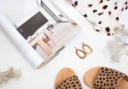
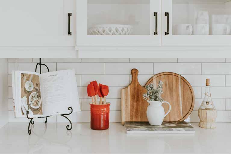
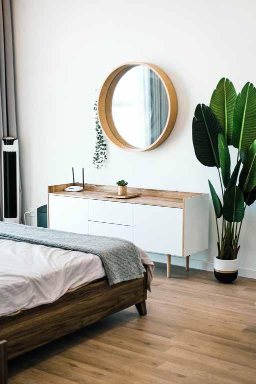
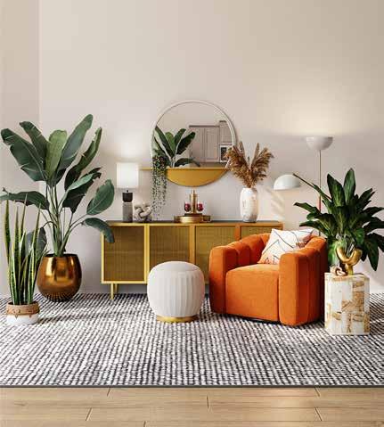
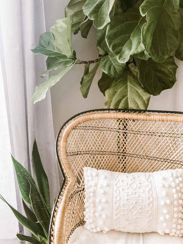
IMAGERY
Modern & Fresh
Keywords to use when searching for photos- Elegant, Modern, Baskets, Organize, Clean.
ORGANIZE. DESIGN. REVIVE. | 6 AUGUST 2023
MOODBOARD

ORGANIZE. DESIGN. REVIVE. | 7 AUGUST 2023
CHARACTER
FEMININE MASCULINE
LUXURY ECONOMY
YOUTHFUL MATURE
PLAYFUL SOPHISTICATED
ORGANIZE. DESIGN. REVIVE. | 8 AUGUST 2023
The Target Audience
THE HOME REVIVE AK | 9
AUGUST 2023
TARGET AUDIENCE
Your target audience consists of busy mothers, professional women, and real estate agents seeking efficient home solutions. Knowing your audience is crucial as it allows you to tailor your services to their pain points, such as lack of time for organization, overwhelm, and staging challenges. This understanding empowers you to offer personalized, effective solutions that directly address their needs, fostering stronger connections, higher engagement, and ultimately, business success.
AUGUST 2023 REVIVING SPACES, ELEVATING LIVES.
THE IDEAL CLIENT
The ideal client is not only women but a dynamic blend of busy mothers, professional women, and real estate agents who value the harmony of well-organized spaces.
The ideal client, often aged 28 to 45, is immersed in the juggling act of career, family, and personal aspirations.
With an average income of $60,000 to $100,000, they seek efficient solutions that restore balance to their lives.
Our services resonate particularly with those in committed relationships, as they aim to create havens of comfort for themselves and their loved ones within the confines of their homes.
28-45 THE AVERAGE
RELATIONSHIP STATUS 60k+ AVERAGE
AUGUST 2023 TARGET AUDIENCE | 11
AGE Married
INCOME
Purpose, Vision & Mission
AUGUST 2023 THE HOME REVIVE AK | 12
Our clients seek order and functionality within their homes, allowing them to embrace their passions. Through innovative solutions, we enhance everyday living spaces, fostering a strong client connection while utilizing our passion for organization and efficiency. Our business was born from a desire for flexibility and a shared love for organizing and decorating.
AUGUST 2023 THE HOME REVIVE AK | 13 OUR PURPOSE
Our vision is to empower busy mothers, professional women, and real estate professionals by creating harmonious living spaces through expert home organization, innovative interior design, captivating home staging, and the artful enhancement of events.
AUGUST 2023 THE HOME REVIVE AK | 14 OUR VISION
Our mission is to empower busy mothers, professional women, and real estate professionals by creating harmonious living spaces through expert home organization, innovative interior design, captivating home staging, and the artful enhancement of events.
AUGUST 2023 THE HOME REVIVE AK | 15 OUR MISSION
Logo Mark
THE HOME AK
AUGUST 2023 THE HOME REVIVE AK | 16
THE HOME AK
THE HOME THE HOME AK AK MAIN LOGO ALTERNATE MAIN LOGO BRAND MARK
The White Space Around The Logo
White space around a logo is vital for maintaining its visual clarity and impact. By creating a buffer zone between the logo and other elements, white space prevents visual clutter and ensures that the logo remains distinctive and easy to recognize. Adequate white space also preserves the legibility of any text or intricate design elements within the logo, preventing them from becoming cramped or hard to read.
This clear space is especially important when the logo is used across different mediums, ensuring that it appears consistently well-designed and professional. Furthermore, white space contributes to the overall aesthetics of your logo and its integration into various layouts, allowing for a harmonious and balanced visual presentation. Ultimately, white space plays a crucial role in leaving a lasting positive impression and enhancing brand recognition.
THE HOME AK AUGUST 2023
WHITE SPACE | 19 MAIN LOGO
THE HOME AK THE HOME AK WHITE SPACE | 20 HORIZONTAL LOGO AUGUST 2023 THE HOME AK
The Logic Behind The Design
The Home Revive is all about bringing order and freshness to a new space. The shape of the home is obvious that The Home Revive uses homes in their business. The sharp edges of the house bring in a solid structure and modernism.
Freshness is added with the botanical leaves.
A handwritten but playful font is added to the name to create a feeling authenticity.
Brandon Grotesque is used as a font to compliment the cursive because it disaplyes a little softer edges around the endcaps to compliment the movement of cursive font.
THE HOME AK
THE HOME REVIVE AK | 21 LOGO CONSTRUCTION AUGUST 2023
Brand Colors
AUGUST 2023 THE HOME REVIVE AK | 22
VIBRANT SUNRISE TRANQUIL BREEZE BUTTERCREAM GLOW
Vibrant Sophistication
A Contemporary Fusion of Energetic Hues and Modern Elegance
The carefully selected hex codes for your brand colors hold powerful psychological associations that resonate deeply with your business. The Vibrant Sunrise exudes energy and enthusiasm, reflecting your passion for transforming spaces and lives.
Complementing it, Tranquil Breeze conveys a sense of balance and tranquility, aligning perfectly with the peace and order you bring to homes. The warm and inviting Papaya Whip embodies positivity, mirroring the joy you infuse into spaces and events. Lastly, the sophisticated Timeless Slate signifies stability and professionalism, capturing the expertise you offer in organization and design. Together, these colors mirror the journey your clients embark upon – from chaos to harmony, all guided by your expertise and vision.
#FF785A #619B8A
SLATE
#FFEFD3
TIMELESS
#3E4E50
Vibrant Sunshine
Timeless Slate
Buttercream Glow
Tranquil breeze
THE HOME REVIVE AK | 24 BRAND COLORS AUGUST 2023
HEX #3E4E50 R62, G78, B80 C74, M56, Y56, K36
HEX #FFEFD3 R255, G239, B211 C0, M5, Y17, K0
HEX #FF785A R255, G120, B90 C0, M67, Y64, K0
HEX #619B8A R97, G155, B138 C65, M23, Y50, K2
Color Psychology
Why these colors work in your branding
Timeless Slate exudes sophistication and professionalism, reflecting the expert guidance and refined solutions you offer in interior design and home organization, grounding clients in trust and excellence.
Papaya Whip evokes warmth and optimism, echoing the joyful atmosphere your holiday and event decorating services create, making celebrations memorable.
Tranquil Breeze signifies balance and renewal, aligning with the sense of order and serenity you infuse into spaces through your organization and design expertise.
Vibrant Sunrise symbolizes enthusiasm and action, mirroring the energetic transformation and positive change your business brings to homes and events.
75% 50% 25% 10% 75% 50% 25% 10%
Timeless Slate Buttercream Glow Tranquil Breeze Vibrant Sunrise
DO’S AND DONT’S OF MIXING COLORS
Use darkest or lightest color as a background
If using a white background do not use Buttercream Glow
Only use secondary colors as accents
Never use secondary colors as a solid background
Only use as an accent color.
Never use more than 3 per graphic.
YES NO
Brand Typography
AUGUST 2023 THE HOME REVIVE AK | 27
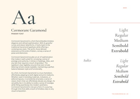
Cormorant Garamond
PRIMARY
Aa
A timeless and refined typeface, Cormorant Garamond evokes a sense of sophistication and elegance. With its graceful curves and classic appeal, it adds an air of distinction to headings, titles, and branding materials.
HEADLINE FONT Aa
Vv Ww Xx Yy Zz
AUGUST 2023 THE HOME REVIVE AK | 28
How to use it: Use Cormorant Garamond for headings, titles, and any prominent text that requires a sophisticated and elegant touch. Bb Cc Dd Ee
Ff Gg Hh Ii Jj Kk Ll
MmNn Oo Pp Qq Rr Ss Tt Uu
OPEN SANS
SECONDARY FONT
The versatile and modern Open Sans offers a clean and legible aesthetic, making it ideal for conveying information with clarity. Its contemporary simplicity lends itself seamlessly to body text, ensuring optimal readability across digital and print platforms.
How to use it: Open Sans is font that's really good for reading comfortably. Whenever you have a lot of words to read, like in articles or paragraphs, you can use Open Sans. It also works nicely for writing small bits of text, like captions or labels, because it's clear and simple.
AUGUST 2023 THE HOME REVIVE AK | 29
Vv
Aa Bb Cc Dd Ee Ff Gg Hh Ii Jj Kk Ll MmNn Oo Pp Qq Rr Ss Tt Uu
Ww Xx Yy Zz Aa
Aa
Cormorant Garamond
PRIMARY FONT
Cormorant Garamond is a font that embodies timeless elegance and refined sophistication. With its graceful curves and classic letterforms, it harks back to the traditional Garamond typefaces while offering a contemporary twist. The serifs, those delicate extensions at the ends of letters, convey a sense of poise and distinction.
Cormorant Garamond exudes an air of sophistication that makes it well-suited for conveying a sense of prestige and authority. It shines in headings, titles, and any text that requires a touch of grandeur. The typeface's clear legibility ensures that even ornate lettering remains easily readable, maintaining a perfect balance between style and functionality.
As a font, Cormorant Garamond is a true chameleon, effortlessly adapting to both digital and print mediums. Whether used in branding materials, invitations, or editorial layouts, it consistently emanates a sense of classic charm that can effortlessly elevate any design. Its versatility lies in its ability to evoke a sense of nostalgia while fitting seamlessly into modern aesthetics.
Cormorant Garamond is not just a font; it's a journey through time that adds a touch of timeless class to any visual composition.
Semibold Extrabold
Light Regular Medium
Extrabold
THE HOME REVIVE AK | 30
Light Regular Medium Semibold
Italics
Brand Stationery
AUGUST 2023 THE HOME REVIVE AK | 31
Business Card
BUSINESS CARD IDEA
The business card is a meticulously designed embodiment of your brand's essence. On the front, the logo takes center stage, immediately capturing attention with its modern yet sophisticated charm. Positioned alongside, the contact information offers a seamless touch of professionalism.

On the reverse, a QR code stands ready to effortlessly integrate your business into clients' lives – a simple scan, and your details become part of their contacts, streamlining connectivity.

Crafted with your consistent color palette, this business card not only imparts essential information but also exudes the aura of harmony, elegance, and functionality that defines your services. It's a compact representation of your dedication to transforming spaces and lives, inviting them to engage with the efficiency and beauty your brand embodies.
Size:3.5 2 2”
Paper: Premium
Finish: Matte
THE HOME REVIVE AK | 32
Brochure
FOR COMPANY DOCUMENTS

This tangible leave-behind material enhances credibility, professionalism, and brand recognition, making it an essential asset for events, trade shows, and client interactions. By condensing crucial information into one package, brochures simplify the decision-making process for potential clients, educating them about the benefits of your services and showcasing how you can address their specific needs. In a digital age, a well-designed brochure complements your online presence, leaving a lasting impression and effectively reaching target audiences, ultimately contributing to business growth and client engagement.
Size: 8.5 11
Fold: Trifold


Finish: Matte

Revive re-vive to restore to consciousness or life become active or restore interest in Services We believe that every space has the Mission NEW LISTING/ HOME STAGING Getting your home ready for listing to sell ROOM REVIVE Interior Design ORGANIZING Hands-On Organizing Consultation Sort & Purge Organize! HOLIDAY & EVENT DECORATING Embellishing the way for timeless memories PROMOTE PHYSICAL HEALTH LOWER YOUR STRESS GET BETTER SLEEP Putting simple organizing systems in INCREASE YOUR PRODUCTIVITY SAVE TIME A SENSE OF ACCOMPLISHMENT 6 -HANS HOFMANN THE HOME Contact us to book your consultation! Hey There! (907) 521-6466 Thehomereviveak@gmail.com www.thehomereviveak.com The Home Revive AK @thehomereviveak Christi Crotsley Wasilla, AK
THE HOME REVIVE AK | 33
NOTES
New Listingchecklist
Offering new listing and home staging checklists with your business stationary is crucial as it not only provides valuable tools for your clients during critical real estate stages but also serves as a branded reminder of your expertise and services, fostering a lasting connection.
R


R p ce an wa p pe r mu a w h a e h oa o p n n a n u a o r
Additional resources for your target audience could include:
Home Organization Guides: Share downloadable guides on decluttering and organizing spaces, showcasing your expertise and helping clients achieve order.

Interior Design Lookbooks: Curate digital lookbooks featuring design trends, color palettes, and decor ideas, offering inspiration for clients looking to refresh their spaces.
Event Planning Tips: Provide a guide to planning and decorating successful events, positioning yourself as an authority in event design and decoration.
Seasonal Home Decor Tips: Offer seasonal decor tips and DIY projects that resonate with your target audience's busy lifestyle, showcasing your creativity and understanding of their needs.

ns de r p a e on-wo k g gh b b a ned e n s m s ng e br ke w dows and doo s he v y r ch d oo s & o he g s ne e Ou d o k o r ke o m ng h g s pa o pa e s an oo e r gs r p co s e ep c ng gh u b o ma h an ha e m mum o 6 wa s
D E C L U T T E R eep he u s e we -ke d nd nv ng ou h-up r r pa n m umm Ke p h g a s cu ed e on e dewa k & pa s and ma n n owe s & h ub W n e P ow o ho e t e d ewa an wa kwa e d n o h on d o
S r w h on oom o e en a o on oom a m an d e e away e y e r sh e pa e ha s b e on d s s & cou e op Don e bo k o s c o h n nd du a e ou eho ems P o p yo a e e n u t ed a d y u an dea w h a o he a k o ape o hoe ox o o pho o pu hem n a p a ub nd a k omewh r ou he wa
D E C L U T T E R S O M E M O R E
O R G A N Z E C L O S E T S Thehomereviveak@gmail.com (907) 521-6466 www.thehomereviveak.com


When a bu er goes nto a hou e tha s taged hey nge They sta to env s on themse ves and the r h ngs n he space How the r ouch wou d ook n the v ng room them s t ng n he avor e cha r ook ng ou he w ndow adm r ng he v ew et When a bu er goes nto a hou e tha s NOT s aged - se e s am y p c u es a e hang ng on wa s and he spor s s hedu e s up on he dge Buyers wa k n and fee ke hey are n rud ng
C R E A T E C U R B A P P E A L R du e b 5 % - ou av 1 h gs on he pu away o g d 5 o ho e h g T k a oo a h ms on ou he v s a e oun op and n d bu e a d o h g s d o o op n he ab e o e uc c u e R mo e p r on em ha a e n d sp ay an ma e ha d r o po n a bu e o ma ne hem e ve v g h e - ame oe o m o po a r e g us na u e
C L O S E T S C A B N E T S A N D D R A W E R S
ze pa e R E M O V E E X C E S S A N D O V E R S I Z E D F U R N T U R E
Re
p h en w y nd wa w y S r an o s o equ pme t y ng n he y rd
e tem nc ud ng sh & ewe y Remove ug to h w o f ha dwood oor
A D D C U R R E N T A N D F R E S H A C C E S
S O R
D E C L U T T E R A N D D EP E R S O N A L I Z E H

-back d apes o h wca e n c v ew S age he ron por h or d k w h urn ure and po d p ant S o e ou -o
R O O M C L O S E T S
THE HOME REVIVE AK | 34
yo don ha e p ope n y ea yo r own b add ng pa ded b n h u ked up ga ns wa and h ng a ew h ok o oa C R E A T E A W E L C O M N G E N T R Y W A Y Add s pe odo s t n e bo t F X P E T S S U E S Re a ou wood or ch n- nk en e ne ds a e LC F X F E N C N G I S S U E S Rep ac ou d ed nob o and s on you r w s & ab ne w h m de n one P o p g t n os s ews on ab e doo U P D A T E H A R D W A R E C e n o wa h us on o e s du e co e a d p owc se ab c- ov r d u n t r ou d ed r mo e o c ve w h a neu a -co o s pc ve C L E A N F A B R C S Me s ac ed c se c e m T e e no e oug
DESIGN IDEA Checklist
s o ge n h h me Wee -ou o e b 50% a d m ke su e w a e s c an and r an e n a k o b s P o p k ep o h ng r t e u r n s as n on y n he c se E M O V E W A L L P A P E R
Then hey ge d s rac ed b the am y v ng n he home n tead o see ng hem e ves n the home They want o ge n and out o he home qu ck y Too much c u er can a so make the po en a buyer h nk cou d take onger or he se er to pack he h ngs and move Can he be eady o ose n 6 week ? Are hey rea y omm t ed to mo ng the other house he buyer ook ng a ha been dec u e ed the buyer w h nk the e er cou d be more mo va ed to se o s eady o move out oon qu ck y Th ma n on e n o b ye o ag Ke p p c s ha
Home Stagingchecklist
Home Stag ng = h gh dec u e ng mak ng each oom ha e a s ngu a purpo e mak ng he pa e fee b g br gh spac ous and e h
r ng u n u e t ma m
I E S Swe
C H E C K T H E F R O N T D O O R D O O R B E L L A D D R E S S N U M B E R A N D W E L C O M E M A T S ure a
-
O R G A N I Z E B E D
S rvic Organizing Decluttering Interior Design Holiday and Event Decorating From Sold to Settled- Listing and Moving in
Remo e 50-7 % he em n yo r home C e r su a e a d oun e op A ma a p nc s oa e c o kpo m e c To s nd m ga n s Pe ms be oo bow oy Remo e am y p o os pe ona co e on em med a ns e S o e x e s em om h g r ge o -s e
nd owe s h ow p ow oo ma cu a ns e Kee he e o ed n a de g a ed b n o pu ou o how n s nd pen ou es
uab
Pu
ea on c t e
M A K E R E P A R S F N S H P R O E C T S Pa n n p o e e ng n s a c
Digital Media
AUGUST 2023 THE HOME REVIVE AK | 35
RESPONSIVE LAYOUT


Your website serves as a dynamic hub for clients to explore your expertise in interior design, home organization, and event decoration, offering insights, inspiration, and a glimpse into your portfolio. With its responsive design, it ensures seamless access to information and engagement across devices, reflecting your commitment to transforming spaces into havens of beauty and functionality.

Website Design Social Media
AESTHETICALLY ON BRAND
Maintaining an aesthetically pleasing and on-brand social media feed is crucial as it not only visually communicates your business's identity but also captivates your audience, leaving a lasting impression that resonates with your services and values. Furthermore, since your target audience frequents platforms like Instagram, a well-curated feed becomes a powerful tool for engaging and connecting with them on a platform they actively use and enjoy.
AUGUST 2023 THE HOME REVIVE AK | 36
Meet the founder
AUGUST 2023
Reviving Spaces, Enriching Lives
I'm Christi, the Founder, Lead Organizer, and Interior Decorator at The Home Revive AK. Established with a vision to transform living spaces into functional and efficient havens, I'm dedicated to offering fresh and creative solutions. As a wife and mom, I understand the significance of optimizing daily routines to make time for what truly matters.

THE FOUNDER
My passion for organization and decoration took root in childhood while helping my mom with holiday décor and witnessing her ingenious storage solutions. Over the years, friends and family turned to me for practical advice, nurturing my innate design and organization skills. This journey evolved into a business where I empower people to love their living spaces.
With an innate eye for balance, design, simplicity, and functionality, I specialize in unveiling the untapped potential of living spaces. By collaborating on tailored solutions, we can unlock the full utility of your environment.
Beyond design, my heart lies in exploring Alaska's stunning outdoors with my family—hiking, kayaking, fishing, and embracing every adventure.
AUGUST 2023 THE HOME REVIVE AK | 38
Christi Crotsley
WASILLA, ALASKA THEHOMEREVIVEAK@GMAIL.COM (907) 521-6466 AUGUST 2023 REVIVING SPACES. ENRICHING LIVES. WWW.THEHOMEREVIVEAK.COM Organize. Design. Revive.