Anderson University
Brand Guidelines
Intro
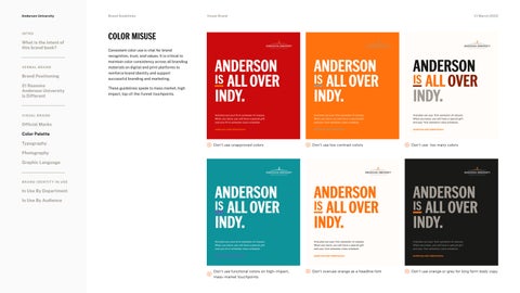
Color Misuse
What is the intent of this brand book? VERBAL BRAND
Brand Positioning 21 Reasons Anderson University is Different VISUAL BRANd
Official Marks Color Palette Typography
Consistent color use is vital for brand recognition, trust, and values. It is critical to maintain color consistency across all branding materials on digital and print platforms to reinforce brand identity and support successful branding and marketing.
These guidelines speak to mass market, high impact, top-of-the-funnel touchpoints.
Visual Brand
V1 March 2023
ANDERSON is ALL OVER
INDY.
ANDERSON is ALL OVER
INDY.
ANDERSON is ALL OVER
INDY.
anderson.edu/admissions
anderson.edu/admissions
anderson.edu/admissions
Don’t use unapproved colors
Don’t use low contrast colors
Don’t use too many colors
ANDERSON is ALL OVER
INDY.
ANDERSON is ALL OVER
INDY.
ANDERSON is ALL OVER
INDY.
anderson.edu/admissions
anderson.edu/admissions
anderson.edu/admissions
Don’t use functional colors on high-impact,
mass-market touchpoints
Don’t overuse orange as a headline font
Don’t use orange or grey for long form body copy
And plan out your first semester of classes. When you leave, you will have a special gift and your first semester class schedule.
And plan out your first semester of classes. When you leave, you will have a special gift and your first semester class schedule.
And plan out your first semester of classes. When you leave, you will have a special gift and your first semester class schedule.
Photography Graphic Language BRAND IDENTITY IN USE
In Use By Department In Use By Audience
And plan out your first semester of classes. When you leave, you will have a special gift and your first semester class schedule.
And plan out your first semester of classes. When you leave, you will have a special gift and your first semester class schedule.
And plan out your first semester of classes. When you leave, you will have a special gift and your first semester class schedule.


