REDS
Signal Red–0520 R 189 G 46 B 50
Scarlet–8085 R 190 G 37 B 53
Georgia Clay–5158 R 160 G 99 B 57 Code Red–X120 R 196 G 52 B 45
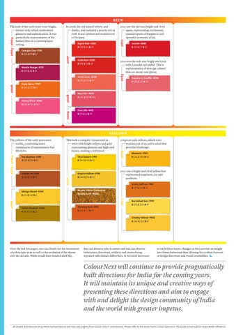
2013 sees the reds stay bright and vivid with a peachy red added. This is representative of new age colours that are snazzy and glossy.
2013
Moulin Rouge–X125 R 169 G 56 B 81 Coral Cove–8030 R 225 G 125 B 99 Deep Spice–7997 R 210 G 107 B 51
2009
Young Wine–8086 R 224 G 106 B 120
2008
2006
2012 saw the red turn bright and vivid again, representing excitement, unusual spurts of happiness and sporadic moments of joy.
2012
In 2008, the red turned velvety and darker, and included a peachy red as well. It was opulent and reminiscent of the past.
2007
2003 – 2004
The reds of the early years were bright, intense reds, which symbolized glamour and sophistication. It was particularly representative of the Indian ethos in a contemporary setting.
Raspberry Soufflé–8054 R 232 G 127 B 121
May Fair–8078 R 205 G 103 B 102
Pink Silk–9413 R 151 G 61 B 95
YELLOWS
Thar Desert–7917 R 240 G 169 B 10
Amber–N–5103 R 188 G 115 B 75
Empire Yellow–7918 R 248 G 186 B 56
Ochre Shadow–X106 R 191 G 147 B 52
2009 saw pale yellows, which were reminiscent of an active mind that provided challenge.
2009
Pocahontas–3198 R 224 G 156 B 82
Dusky Saffron–7981 R 217 G 134 B 58
Royale Glitter Collection Royale Gold–M006
Glowing Rust–X112 R 232 G 121 B 49
Mustard–7901 R 234 G 180 B 30
2012 saw a bright and vivid yellow that represented happiness, joy and positivity.
2012
Mango Mood–X109 R 255 G 183 B 0
2006
This took a complete turnaround in 2007 with bright yellows and gold representing glamour and high-end luxury, making a statement.
2007
2003 – 2004
The yellows of the early years were earthy, comforting tones reminiscent of maintenance free lifestyles.
Burnished Sun–7919 R 255 G 204 B 97
Cheeky Yellow–7902 R 246 G 202 B 81
Over the last few pages, one can clearly see the movement of colours per year as well as the evolution of the theme over the decade. While trends have limited shelf life,
they are always cyclic in nature and one can observe behaviours, directions, artifacts and stories being repeated with minute differences. It becomes necessary
to track these micro-changes as they provide an insight into future behaviour thus allowing for a robust forecast of design directions and visual sensibilities.
ColourNext will continue to provide pragmatically built directions for India for the coming years. It will maintain its unique and creative ways of presenting these directions and aim to engage with and delight the design community of India and the world with greater impetus. All shades and textures are printed representations and may vary slightly from actual colours and textures. Please refer to the Asian Paints Colour Spectra or the product manuals for exact shade reference.